Tag Archives: Draut

The Art of Romance, Chapter 15, The Action of Romance

(May 1951 – July 1951: Young Romance #33 – #35, Young Love #21 – #23)


Number of Romance Titles 1947 – 1952 (the period covered in this chapter is shaded in blue)

Besides the two romance titles, Simon and Kirby were also producing bimonthly Black Magic (for Prize) and Boys’ Ranch (for Harvey). At this point I believe it can safely be said that Joe and Jack had little to do with the Prize crime titles. While Mort Meskin and Marvin Stein would appear in Prize comics both produced by Simon and Kirby and those that were not, they were the only artists that seemed to do so. John Severin had been another artist that worked in both the romance and crime titles but at this point the only Prize title he was working on was Prize Comics Western (also not a Simon and Kirby production).

Young Romance switched back to drawn covers for May and June (Young Love had already been using art covers). Both titles would revert to photographic covers for their July issues and would remain using photo covers until 1954. I really do not know what to make of YL consistently and YR sporadically using art covers for a period of about a year.

In a certain respect Jack Kirby was the primary studio artist during this period as in fact he was during the entire time Joe and Jack produced comics together. Except for a period in 1954 and My Date #4, Jack would provide the art for the cover of all Simon and Kirby productions that did not use a photograph. During this period Kirby would also do the lead story for all the issues of Young Romance and one for Young Love (YL #21). But if the total number of pages of art produced is used to judge who was the primary artist then Mort Meskin wins out be a large margin. For these six romance issue Jack did a total of 51 pages of art while Mort did 80. The difference is all the more striking with the knowledge that Meskin did all his own inking while Kirby did not. I will say that I feel that Meskin’s art sometimes suffers from his higher rate at producing art while Kirby always seems to provide high quality work no matter how many pages he drew. It also pays to compare Jack’s 51 pages with Bill Draut’s 36 and John Prentice’s 34 or 37 pages (the uncertainty about Prentice page count is due to the short feature “Will You Help Me?” from YL #21 which I will discuss below). Jack was still working at a high rate; it is just that Mort was even more exceptional. Marvin Stein is another contributor during this period with only 3 stories and 23 pages. There are 3 very short pieces (a total of 7 pages) that I have not been able provide artistic credits for.


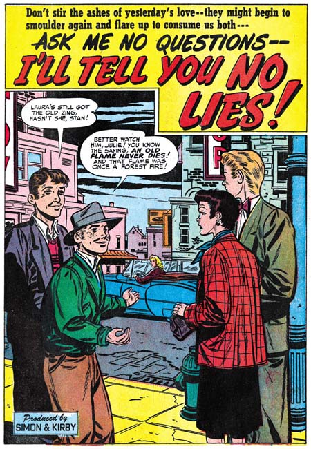
Young Romance #34 (June 1951) “Old Fashioned Girl”, art by Jack Kirby

Perhaps others do not share my view, but I find Kirby’s confessional splashes powerful drawings despite their lack of action. While Kirby is generally (and quite reasonably) famous for his dynamic drawing it was a mark of his genius that he could be so effectively in such static compositions. Much of this has to do with Jack’s careful use of characterization. I have said it before but it is worth repeating, I do not agree with those who claim that Kirby did not draw beautiful women. It is true the protagonist in the splash for “Old Fashioned Girl” does not have the type of attractiveness that would be found in a beauty pageant contestant. But her frail like form has its own beauty and most importantly is totally appropriate for her antique dress style. The thing is Kirby did not draw the same women over and over but created unique individuals that were well matched to the theme of the story. The woman’s downcast eyes and the demur way she holds her hands augment the characterization. The old woman looking on and all the antique surroundings complete the picture. If all that was not enough, Jack has added a small panel that is not a story panel but another means of showing the conflict between the lady’s old fashioned ways and what was then modern society.

I feel that Jack Kirby’s romance splashes are much more interesting then the covers. I present the line art for the cover of YR #34 which is based on the “Old Fashioned Girl” story in a post above (My Two Cents). The reader can compare the two and reach their own conclusion.


Young Romance #35 (July 1951) “Temptations of a Car Hop”, art by Jack Kirby

The splash for “Temptations of a Car Hop” provides a nice contrast to the one in “Old Fashioned Girl”. The protagonist was certainly meant to represent a thoroughly modern woman, or at least what would have been modern in 1951. However 58 years later and the car-hop has disappeared a casualty of the fast food drive through. I do remember them from my younger days but none that I ever visited had such and attractive waitress wearing such a short dress.


Young Love #21 (May 1951) “All Work and No Love”, pencils by Jack Kirby inks by Marvin Stein

With all the work I am doing for Titan’s Simon and Kirby library, I have not had time to devote to investigating the various inkers of Jack Kirby’s work. Still from time to time I come across a piece that just screams a particular inker. Such is the case with “All Work and No Love”. In the splash the simplicity of the woman’s eyes and eyebrows and the slight angle they have in relation to one another leaves little doubt that Marvin Stein was involved in the inking. The same sort of eyes appears elsewhere in the story as well. Also there are some cases where the eyebrow is extended into a crease of the forehead which is a trait often found in Stein’s own art. I should point out that inking of Kirby pencils in the Simon and Kirby studio was like an assembly line with various artists taking care of different chores. So when I say Marvin Stein inked this story I am saying no more then he was the one inker of this work that I have been able to identify but there are others that I have not. In this case Marvin seems to have done the outline inking, the first step in the inking process. Note however how the spotting uses the picket fence crosshatching, drop strings and shoulder blots that are characteristics of the Studio Style inking (see my Inking Glossary for explanations of the inking terminology that I use). Stein’s inking of his own work does not use such techniques. Further Stein’s own inking was a bit rough and lacked control. It would improve greatly in future years but at this point I cannot believe he could have been the artist that did the spotting.


Young Romance #33 (May 1951) “Take a Letter, Darling” page 6, art by Mort Meskin

While I have frequently remarked how action is more often found in the romance stories Jack Kirby draws I do not want to leave the impression that action played no part in stories drawn by other studio artists. So I thought I would provide some examples. First up is a page by Mort Meskin. Meskin has his own unique and very stylized version of a slugging as can be seen in the second panel. Note in particular how the angular position of the victim’s head and how his legs are folded up beneath him. I say it is stylized both because Mort uses it over and over again and because it appears nothing like how a photograph a fight would look. I am not using the term stylized in a negative manner because I believe a comic artist job is to tell a story, not to try to produce a sequence of photorealistic images. With his technique Meskin has condensed several instants of time into one image (the victims head responding to being struck by the fist is the first instant, with the torso soon following and finally the loss of control of the legs as the effect of the knock out is completed).


Young Romance #33 (May 1951) “Not in the Act” page 8, art by Bill Draut

The second example of a fight comes from Bill Draut’s “Not in the Act”. Draut uses an interesting compositional device of presenting the fighters in depth. I am not sure where Bill got this idea but it is pretty effective. I do not believe I have seen Draut use it before so it is not as an important part of his repertoire as Meskin’s or Kirby’s more stylized slugging.


Young Love #23 (July 1951) “Cradle Robber”, art by John Prentice

The splash for “Cradle Robber” provides an example of a fight as portrayed by the more recently arrived studio artist. Actually calling it a fight is not quite correct as Prentice has chosen to present the moment just before the punch is thrown. The other thing about this splash is that it is actually a teaser as there would be no fight seen in the story. It is however the closest example of a fight that I could find by John Prentice in the period covered by this chapter.


Young Romance #35 (July 1951) “The Catskill Man-Chasers” page 8, art by Mort Meskin

Mort Meskin is famous for his use of blacks but that does not always show up in his romance art. That may in part be a result of his high rate of art production. But it may also be because for Meskin telling the story properly had become a higher priority then making interesting art. Sometimes Meskin would have the best of both worlds (story and art) as in this page from “The Catskill Man-Chasers”. For many comic artists only night scenes would get an abundance of black but here Mort uses it to make the light parts so much brighter as would be appropriate for a hot summer day by the pool. Mort also uses it in the second panel to hide in plain sight Tom, the love interest of the story. Tom’s presence in the panel is not obvious at a glance because Mort only provides a silhouette but at closer examination the pipe clearly indicates that the shadowed figure is Tom. Starting with the second panel, Meskin moves in closer and closer so that the view progresses from a crowded scene to one that focuses on just the couple. While Meskin is restricting the focus he is paradoxically increasing the use of black until in the final panel the reader can make out only a little of the faces. While Mort has obscured the features he has made the scene all the more intimate. It is a masterly orchestrated page all the more so because nobody else working for Simon and Kirby, including Kirby, worked blacks anything like this.


Young Romance #33 (May 1951) “Charity Case” page 5, art by John Prentice

Since John Prentice is a new addition to the Simon and Kirby studio it behooves me to begin to try to discredit the opinion that too many Kirby fans have that Jack supplied layouts for the various studio artists. While that is true for some of the more minor artists that Simon and Kirby occasionally used it is decidedly not true for the more common talented artists. John Prentice certainly falls in the talented group and except for a special case from years later and from outside the romance genre Prentice did not work from Kirby layouts. One piece of evidence in Prentice’s case comes from the dramatic close-ups like panel 3 in the page shown above. While Jack Kirby occasionally did close-ups they generally are not as radically cropped as Prentice often uses.


Young Love #22 (June 1951) “Cry Baby”, art by John Prentice

It was not uncommon for Studio Style inking techniques to show up in splashes of stories of the artists that otherwise were inked with other brush mannerisms. Often I suspect it was the work of Joe or Jack stepping in to touch up the art. That is not however what I judge happened to “Cry Baby”. All the major features of the studio style are present in this page if not in the splash itself; picket fence crosshatching, drop strings, abstract shadow arch and shoulder blots (see my Inking Glossary). What makes me believe this was not the work of Simon or Kirby is the way the picket fence crosshatching is done particularly on the man’s jacket. The rails are not done in the standard way of the Studio Style but match Prentice’s cloth folds. The pickets vary in both spacing and execution in ways not typical of Simon and Kirby. This leads me to believe that the spotting was actually done by Prentice himself.


Young Love #21 (May 1951) “Will You Help Me?”, art in part by John Prentice

I must admit I am uncertain what to make of “Will You Help Me?” from YL #21. The overall simplicity of the style is different then work assigned to Prentice yet the brunette has the elegant beauty so typical of John’s work. The inking of the splash panel looks like a combination of that by Prentice and another artist. The spotting of the hair is typical of Prentice’s technique but the cloth folds are not nor are the way they are arranged along the edge of her sleeve which suggests either Simon or Kirby. The inking in the first story panel all looks like it was done by Prentice. On the other hand the crosshatching in the last story panel is not typical of any of the parties considered so far. It is possible that Prentice is inking Kirby pencils but the way the brunette turns to talk to someone behind her is a common Prentice mannerism. The other possibility is that Prentice is working from Kirby layouts with which he takes liberties in some places. It could be that John did the pencils and final spotting but that the outline inking was done by someone else. At the present I am undecided except that John Prentice participated in the art in some fashion.


Young Love #23 (July 1951) “Nag, Nag, Nag”, art by Marvin Stein

I thought I would close off with an example of what Marvin Stein was doing during this period. The style is still typical of Stein’s early period but there are hints like the man in the second story panel that are typical of the style he would develop later.

Chapter 1, A New Genre (YR #1 – #4)
Chapter 2, Early Artists (YR #1 – #4)
Chapter 3, The Field No Longer Their’s Alone (YR #5 – #8)
Chapter 4, An Explosion of Romance (YR #9 – #12, YL #1 – #4)
Chapter 5, New Talent (YR #9 – 12, YL #1 – #4)
Chapter 6, Love on the Range (RWR #1 – #7, WL #1 – #6)
Chapter 7, More Love on the Range (RWR #1 – #7, WL #1 – #6)
Chapter 8, Kirby on the Range? (RWR #1 – #7, WL #1 – #6)
Chapter 9, More Romance (YR #13 – #16, YL #5 – #6)
Chapter 10, The Peak of the Love Glut (YR #17 – #20, YL #7 – #8)
Chapter 11, After the Glut (YR #21 – #23, YL #9 – #10)
Chapter 12, A Smaller Studio (YR #24 – #26, YL #12 – #14)
Chapter 13, Romance Bottoms Out (YR #27 – #29, YL #15 – #17)
Chapter 14, The Third Suspect (YR #30 – #32, YL #18 – #20)
Chapter 15, The Action of Romance (YR #33 – #35, YL #21 – #23)
Chapter 16, Someone Old and Someone New (YR #36 – #38, YL #24 – #26)
Chapter 17, The Assistant (YR #39 – #41, YL #27 – #29)
Chapter 18, Meskin Takes Over (YR #42 – #44, YL #30 – #32)
Chapter 19, More Artists (YR #45 – #47, YL #33 – #35)
Chapter 20, Romance Still Matters (YR #48 – #50, YL #36 – #38, YB #1)
Chapter 21, Roussos Messes Up (YR #51 – #53, YL #39 – #41, YB #2 – 3)
Chapter 22, He’s the Man (YR #54 – #56, YL #42 – #44, YB #4)
Chapter 23, New Ways of Doing Things (YR #57 – #59, YL #45 – #47, YB #5 – #6)
Chapter 24, A New Artist (YR #60 – #62, YL #48 – #50, YB #7 – #8)
Chapter 25, More New Faces (YR #63 – #65, YLe #51 – #53, YB #9 – #11)
Chapter 26, Goodbye Jack (YR #66 – #68, YL #54 – #56, YB #12 – #14)
Chapter 27, The Return of Mort (YR #69 – #71, YL #57 – #59, YB #15 – #17)
Chapter 28, A Glut of Artists (YR #72 – #74, YL #60 – #62, YB #18 & #19, IL #1 & #2)
Chapter 29, Trouble Begins (YR #75 – #77, YL #63 – #65, YB #20 – #22, IL #3 – #5)
Chapter 30, Transition (YR #78 – #80, YL #66 – #68, YBs #23 – #25, IL #6, ILY #7)
Chapter 30, Appendix (YB #23)
Chapter 31, Kirby, Kirby and More Kirby (YR #81 – #82, YL #69 – #70, YB #26 – #27)
Chapter 32, The Kirby Beat Goes On (YR #83 – #84, YL #71 – #72, YB #28 – #29)
Chapter 33, End of an Era (YR #85 – #87, YL #73, YB #30, AFL #1)
Chapter 34, A New Prize Title (YR #88 – #91, AFL #2 – #5, PL #1 – #2)
Chapter 35, Settling In ( YR #92 – #94, AFL #6 – #8, PL #3 – #5)
Appendix, J.O. Is Joe Orlando
Chapter 36, More Kirby (YR #95 – #97, AFL #9 – #11, PL #6 – #8)
Chapter 37, Some Surprises (YR #98 – #100, AFL #12 – #14, PL #9 – #11)
Chapter 38, All Things Must End (YR #101 – #103, AFL #15 – #17, PL #12 – #14)

The Art of Romance, Chapter 14, The Third Suspect

(February 1951 – April 1951: Young Romance #30 – #32, Young Love #18 – #20)


Number of Romance Titles 1947 – 1952 (the period covered in this chapter is shaded in blue)

Besides Young Romance and Young Love, Simon and Kirby were also producing Black Magic and Boys’ Ranch during this period. Jack Kirby supplied some covers for Headline and Justice Traps the Guilty so it is possible that Joe and Jack still had something to do with the Prize crime titles as well. However Kirby, Draut and Starr, artists important to the other Simon and Kirby productions, did not appear in the crime titles. That plus the lack of a Simon and Kirby production cartouche seems to indicate that Headline and Justice Traps the Guilty were no longer produced by Joe and Jack. Romance comics in general were just starting to rebound from the relative low that followed the love glut. However with more then 45 titles, romance comics were still a lucrative part of the industry. Since both Young Romance and Young Love were both monthly titles it can be presumed that they were still selling quite well.


Young Romance #31 (March 1951) “One Way to Hold Him”, art by Jack Kirby

Since Joe Simon did not do much penciling anymore, Jack Kirby was by one definition the primary artist for the studio. Jack would provide the cover art that was still appearing on Young Love (Young Romance had converted back to using photographic covers). The all important lead stories for Young Romance were all done by Kirby. At 12 to 14 pages long, Jack’s lead stories for YR were longer then the work by any other studio artist (a maximum of 9 pages). But if the primary artist is considered the one producing the greatest number of pages of art, Kirby was no longer the primary romance artists. During this period Kirby produced 55 pages of romance art while Mort Meskin did 66 pages. Jack’s work for Boys’ Ranch #3 (February) meant that for February Jack produced the greatest number of pages in the studio for all genres but by April that was no longer true and Mort would take the lead.

About three and a half years since the start of Young Romance and Kirby is still finding ways to put special interest into his romance stories. Jack could write a story without action but he certainly like to add it when possible. Who else would use the rough and tumble roller derby world to tell a love story. I often wonder how the original teenage girl readers thought of Jack’s stories but for the modern comic reader there is no question that Kirby’s romance stories are fascinating reads.


Young Romance #30 (February 1951) “Different”, art by Jack Kirby

Jack Kirby was not averse to using a love story to tackle social themes as well. “Different” is not really about romance but about intolerance instead. Initially when the family moved into the neighborhood they were well received. Only after the visit of the grandparents reveals that the family’s original name had been Wilheims did the community turn against them. Love is just a background to the story of initial acceptance followed by rejection based only on the towns prejudiced perception of the family’s background.


Young Love #18 (February 1951) “Unwilling Bride”, art by Mort Meskin

As discussed above, it was during this period that for the first time Mort Meskin output exceeded Jack Kirby’s. Meskin’s art production rate is all the more remarkable considering that Mort did all his own inking while Jack’s work was mostly inked by others. I wish the original art for the splash from “Unwilling Bride” was available as I would love to know how the negative figure of the jailed man was done. The spotting looks like it was brushed with white ink but I would think it would have been difficult to work white over a black background. Would Simon and Kirby have agreed to the extra expense to make a negative stat? However it was done it provides an effective way to put an image to the troubled girl’s thoughts.


Young Romance #32 (April 1951) “Hand-Me-Down Love”, art by Bill Draut

Once again Bill Draut takes third place in the amount of work provided; 6 stories with 45 pages.

Previously Bill Draut’s splash art seemed to be in a bit of a rut; not bad but not particularly exciting. Perhaps because of his work in the new Black Magic title Draut seems to have his mojo working again. Whatever the reason Bill has some nice splashes during this period. “Hand-Me Down Love” is a confessional splash which makes me suspect that it was originally meant to be the lead story for Young Love but was moved to Young Romance instead. Since Kirby was doing all the lead stories in Young Romance Draut’s work then became one of the backup stories. Like many of Kirby’s romance splashes at the time there really is not much going on but what is presented tells a whole story. The woman’s apron identifies her as a housewife. The drab background with a wall having small flaws indicates her humble surroundings. Two photographs should be her loved ones. The man obviously would be her husband but what can be made of the woman? While the splash tells a story it purposely leaves some things unanswered to entice the viewer to read the story.


Young Romance #31 (March 1951) “The Things You’re Missing”, art by Marvin Stein

The fourth most used artist was Marvin Stein with 4 stories and 32 pages. Stein would produce some nice work for the crime titles in the future but at this point his style is a bit clumsy. Some of Marvin’s characteristic traits can be found at this earlier stage, such as the shallow depth to the face of the man in the splash. When inking his own work Stein was always a bit rough but at this point his brush also lacks the assurance he would eventually gain. Without that confidence his inking just looks as clumsy as his pencil work.


Young Romance #30 (February 1951) “Weekend For 3”, art by Leonard Starr

For whatever reason, Leonard Starr only provided a single story in the period covered in the last chapter but now he does 3 stores with 22 pages. Starr seems to have completely abandoned the tall and very narrow panels that he had previously favored. Occasionally he would divide a panel row into three panels and even more rarely extend the height slightly but the panels never become as narrow as before. For the most part now Starr adhered to a standard panel layout of 3 rows with 2 panels per row. Leonard still likes to use a vertical splash as for example “Weekend For 3”.


Young Love #18 (February 1951) “The Cave Man Type”, art by Leonard Starr

It was not just Starr’s panel layouts that were evolving. I mentioned in the Chapter 12 how Leonard had begun using a sultrier female along with the more pixie look his females previously had. In “The Cave Man Type” Starr uses what was for him a very different type of man.

My database indicates that February 1951 was when Starr would do his last work for Simon and Kirby until 1954 (and I have gone back to verify the attribution of the two 1954 pieces). But originally my database only included a single Starr work for February but with this recent review I now add two more. Considering that Starr stopped providing signatures on his later S&K work and that his style was changing I wonder if I will find more of his work when I write the next couple of chapters to this serial post?


Young Love #20 (April 1951) “Big Bertha”, art by John Prentice

“Big Bertha” from YL #20 marks the first appearance in a Simon and Kirby production of work by John Prentice. My previous short biography on John Prentice (John Prentice, Usual Suspect #3) is seriously flawed* and incomplete and I really should put together a better one. Prior to coming to work for Joe and Jack, Prentice had been working for Hillman and perhaps some other publishers as well. Prentice shared an apartment with Starr so perhaps Leonard aided John in getting work from Simon and Kirby. Most artists that worked for Simon and Kirby had adopted (directly or indirectly) aspects of Milt Caniff’s style but John was greatly influenced by Alex Raymond. So much so that when Raymond died suddenly in 1956, Prentice was able to easily take over his syndication strip Rip Kirby. John’s arrival in the S&K studio filled a significant gap created when Bruno Premiani left. Artists would come and go in Joe and Jack’s studio, but the presences of Bill Draut, Mort Meskin, John Prentice, and of course Jack Kirby meant that all Simon and Kirby productions would have a healthy and interesting combination of artists.


Young Love #19 (March 1951) “Later Then You Think”, layout by Jack Kirby

I have been able to provide attributions for all of the romance work during the period covered by this chapter with the exception of “Later Then You Think”. This looks like the work of some minor artist working from layouts provided by Jack Kirby. Normally when I describe a work as based on Kirby layouts I am uncomfortable using that term because it was obvious that what Jack had provided were very tight in some places. In this particular case that is not true; the artist style is present throughout and no parts have an overly Kirby look. The only exceptions are the photographs in the splash panel that totally look like they were done by Jack. Interestingly the entire story is inked in the Studio Style; shoulder blots, abstract shadow arches, and picket fence crosshatching are found throughout.

Footnotes:

* The most serious error in my previous post on John Prentice is my attributing to him “Two-Timer” from Young Love #4 a piece that I now questionably credit to Bruno Premiani.

Chapter 1, A New Genre (YR #1 – #4)
Chapter 2, Early Artists (YR #1 – #4)
Chapter 3, The Field No Longer Their’s Alone (YR #5 – #8)
Chapter 4, An Explosion of Romance (YR #9 – #12, YL #1 – #4)
Chapter 5, New Talent (YR #9 – 12, YL #1 – #4)
Chapter 6, Love on the Range (RWR #1 – #7, WL #1 – #6)
Chapter 7, More Love on the Range (RWR #1 – #7, WL #1 – #6)
Chapter 8, Kirby on the Range? (RWR #1 – #7, WL #1 – #6)
Chapter 9, More Romance (YR #13 – #16, YL #5 – #6)
Chapter 10, The Peak of the Love Glut (YR #17 – #20, YL #7 – #8)
Chapter 11, After the Glut (YR #21 – #23, YL #9 – #10)
Chapter 12, A Smaller Studio (YR #24 – #26, YL #12 – #14)
Chapter 13, Romance Bottoms Out (YR #27 – #29, YL #15 – #17)
Chapter 14, The Third Suspect (YR #30 – #32, YL #18 – #20)
Chapter 15, The Action of Romance (YR #33 – #35, YL #21 – #23)
Chapter 16, Someone Old and Someone New (YR #36 – #38, YL #24 – #26)
Chapter 17, The Assistant (YR #39 – #41, YL #27 – #29)
Chapter 18, Meskin Takes Over (YR #42 – #44, YL #30 – #32)
Chapter 19, More Artists (YR #45 – #47, YL #33 – #35)
Chapter 20, Romance Still Matters (YR #48 – #50, YL #36 – #38, YB #1)
Chapter 21, Roussos Messes Up (YR #51 – #53, YL #39 – #41, YB #2 – 3)
Chapter 22, He’s the Man (YR #54 – #56, YL #42 – #44, YB #4)
Chapter 23, New Ways of Doing Things (YR #57 – #59, YL #45 – #47, YB #5 – #6)
Chapter 24, A New Artist (YR #60 – #62, YL #48 – #50, YB #7 – #8)
Chapter 25, More New Faces (YR #63 – #65, YLe #51 – #53, YB #9 – #11)
Chapter 26, Goodbye Jack (YR #66 – #68, YL #54 – #56, YB #12 – #14)
Chapter 27, The Return of Mort (YR #69 – #71, YL #57 – #59, YB #15 – #17)
Chapter 28, A Glut of Artists (YR #72 – #74, YL #60 – #62, YB #18 & #19, IL #1 & #2)
Chapter 29, Trouble Begins (YR #75 – #77, YL #63 – #65, YB #20 – #22, IL #3 – #5)
Chapter 30, Transition (YR #78 – #80, YL #66 – #68, YBs #23 – #25, IL #6, ILY #7)
Chapter 30, Appendix (YB #23)
Chapter 31, Kirby, Kirby and More Kirby (YR #81 – #82, YL #69 – #70, YB #26 – #27)
Chapter 32, The Kirby Beat Goes On (YR #83 – #84, YL #71 – #72, YB #28 – #29)
Chapter 33, End of an Era (YR #85 – #87, YL #73, YB #30, AFL #1)
Chapter 34, A New Prize Title (YR #88 – #91, AFL #2 – #5, PL #1 – #2)
Chapter 35, Settling In ( YR #92 – #94, AFL #6 – #8, PL #3 – #5)
Appendix, J.O. Is Joe Orlando
Chapter 36, More Kirby (YR #95 – #97, AFL #9 – #11, PL #6 – #8)
Chapter 37, Some Surprises (YR #98 – #100, AFL #12 – #14, PL #9 – #11)
Chapter 38, All Things Must End (YR #101 – #103, AFL #15 – #17, PL #12 – #14)

The Art of Romance, Chapter 13, Romance Bottoms Out

(November 1950 – January 1951: Young Romance #27 – #29, Young Love #15 – #17)


Number of Romance Titles 1947 – 1951 (the period covered in this chapter shaded in blue)

Besides the monthly Young Romance and Young Love, Simon and Kirby were now also producing bimonthly titles Black Magic for Prize and Boys’ Ranch for Harvey. Boys’ Ranch was the first work that Joe and Jack had done for Harvey since Stuntman and Boy Explorers were cancelled in 1946 (other Simon and Kirby features that Harvey had published since then were inventoried material left over from the sudden cancellation of those titles). It was too soon to tell whether Black Magic and Boys’ Ranch would be successful (Black Magic would be, Boys’ Ranch would fail) but the romance titles still seemed to be very lucrative. Both romance titles had returned to art covers (YL in August and YR in October) but after just two art covers, Young Romance reverted back to photo covers. As for other publishers, the romance glut had finally reached a relative low point and in future months the number of love titles would begin to increase. While the number of romance titles was much lower then at the height of the glut there were still a respectable 45 romance comics books on the racks.


Young Romance #28 (December 1950) “Hot Rod Crowd”, art by Jack Kirby

Once again Jack Kirby was the primary artist during this period with 4 covers, 13 stories and 69 pages. Jack would provide the lead feature for 5 of the issues. The lead stories Kirby did for Young Romance would still be longer then those by any other artists (10 to 12 pages for Kirby compared to a maximum of 9 pages in a story by Bill Draut and another by Leonard Starr). While I was less then enthusiastic about some of the Kirby splashes in the last chapter some of those that Jack provided in these issues are back to his high standards. Kirby continues to use the confessional format for his lead feature splashes. Actually Kirby’s contribution was somewhat greater then I have outlined because as we will see below he provided some layouts as well.


Young Romance #28 (December 1950) “Will You Help Me?”, pencils by Jack Kirby, inks by Bill Draut

It should always be kept in mind when I point out that Kirby was the primary artist that Jack had a substantial advantage over the rest of the studio artists. I am not talking about his greater talent (although that is true) but on the availability of inkers. The Simon and Kirby studio operated very different from say the Marvel studio under Stan Lee during the silver age. Artists working for Simon and Kirby were expected to provide finished art while Stan Lee would typically assign pencils to one artist and afterwards pass the work on to another to do the inking. Most S&K studio artists did their own inking but some made their own arrangements with another artist to do the inking (for instance John Severin would often have Bill Elder ink his work). However Jack Kirby’s pencils were most often inked by others. Joe has described it as an assembly line approach with different hands doing different inking chores. Under that arrangement it is not possible to recognize all the inkers who worked on a particular piece. To make matters worse Kirby inkers never signed their work (that is other then Joe Simon and a Simon and Kirby signature does not necessarily mean Joe inked it). Nonetheless comparing brush techniques on work penciled by Kirby with art drawn as well as inked by other artists allows some of Kirby’s inkers to be identified. For instance the simple eyebrows found on the woman and the cloth folds of the man’s jacket in the last panel of the page above indicate that story had been inked by Bill Draut.


Young Romance #29 (January 1950) “Love Also Ran”, art by Bill Draut

The second most used artist was Bill Draut (7 stories with 53 pages). Previously Draut primarily did horizontal half page splashes but recently has been doing some full page splashes as well. I greatly admire Draut’s art and he has done some nice half page splashes but I must admit that I am underwhelmed by most of his full page romance splashes. They are not bad just not very exciting. That is except for the splash for “Love Also Ran”. Unlike some of his other full pages splashes, here Draut has concentrated on the drama and leaves the background to provide visual interest without overwhelming the image. It is not how Simon and Kirby would have laid it out but it still works just fine.


Young Love #17 (January 1951) “I Saw Him First”, art by Mort Meskin

The third most used romance artist was Mort Meskin (7 stories with 52 pages) although with just one less page then Draut. Generally Meskin provided half pages splashes but for “I Saw Him First” he does a full pages one. Mort does his own take of the confessional splash. What first appears to be a story panel in the corner turns out on reading to be the protagonist introducing the story. And unlike in Simon and Kirby’s confessional splashes, her introduction does not provide the story title. In fact the design of the title is quite unusual for a Simon and Kirby production so perhaps Meskin created the logo as well. It all works out quite well and one wonders why Meskin did not do this sort of thing more often.


Young Love #15 (November 1950) “Lover Boy”, pencils by John Severin, inks by Bill Elder

Kirby, Draut and Meskin did most of the work in these six issues of the romance comics. There are few other artists used and what artists there are supplied limited amounts of material. The next most prolific artist was John Severin who did the art for 4 features but because only one story had more then 2 pages this meant John only did 13 pages of art. John provides his usual quality art but just as typically he seems to be a little out of place in the romance genre. There is not a single kiss to be found in this work.


Young Love #15 (November 1950) “Beauty and The Benefactor”, art by Leonard Starr

Leonard Starr provides a single 9 page romance story in this period. While Starr had not been one of the primary artists for Simon and Kirby productions, he had been a steady presence since April 1949. “Beauty and the Benefactor” will not be the last work by Starr to be used by Joe and Jack but the rest will be more infrequent. The splash shown above is unusual for Leonard who normally did half page splashes and favored vertical ones in particular. This is the only splash Starr did for S&K with a row of floating heads. Further the posses are not typical of Starr either. All of these features are however found in some Simon and Kirby splashes and I am sure that here Starr is working from their layout.


Young Love #15 (November 1950) “Beauty and The Benefactor” page 9, art by Leonard Starr

Starr generally had his own way of laying out story panels. Often he would use tall narrow panels constructed by dividing a row into three panels instead of the normal two and either limiting the page to two rows (thereby making a 2 X 3 panel arrangement instead of the typical 3 X 2, as seen in Chapter 7) or by reducing the vertical dimensions of two of the rows (Chapter 10). While tall narrow panels would not occur on every page they would be found on many. Tall narrow panels are not found at all in “Beauty and The Benefactor” nor were they used in “Hired Wife” published in the previous month (and briefly discussed in the last chapter). Their absence calls for an explanation but unfortunately I can only offer a guess. Since Simon and Kirby provided a layout for the “Beauty and The Benefactor” splash (but not the one for “Hired Wife”) one suggestion might be that they laid out the stories as well. However I do not think that is the case. The page layouts are not a perfect grid of three rows and two columns on all pages but they approximate that arrangement more then was typical for Simon and Kirby. Further the way these stories by Starr are graphically told does not appear to match Kirby’s more cinematic approach.

I would instead propose two, not mutually exclusive, explanations for Starr’s change in panel layouts. One was to speed up the work. With Starr’s previous layouts he could not construct the panels until he had decided what he was going to draw on each page. By adhering to a 3 by 2 panel layout he could construct the horizontal rows for an entire story before actually beginning to draw it and then supply the vertical separation between the two panels in a row as he worked. Simon and Kirby had used this technique on their more complicated panel layouts found in Stuntman and Boys Explorer. The other explanation for Starr’s change in panel layouts may have to do with his desire to break into syndication strips. While the tall narrow panels were very effective in a comic book they would not work well in a syndication strip. Perhaps Starr was consciously changing his working methods to gain experience working in a format more appropriate for syndication work. Starr would in a few years succeed in breaking into syndication with his “Mary Perkins on Stage”.


Young Love #17 (January 1951) “She Loves Too Wisely” page 4, art by unidentified artist

While most of the romance issues covered in this chapter were produced using artists that we have seen often before, there are some artists that seem to be new. I am not sure what to say about “She Loves Too Wisely”. Some of the men in it look like they might have been done by John Severin but not all and none of the women look like his work. Perhaps what makes the art for this story so hard to place is that it would appear from the cinematic approach used in this story that it was drawn from a Simon and Kirby layout. It is even inked in a version of the Studio Style. Note the abstract arch in panel 2 and the frequent shoulder blots (Inking Glossary).


Young Love #17 (January 1951) “Go Home and Grow Up”

Another artist did “Go Home and Grow Up”. This is one of those artist that, although they are not bad, are not as talented as most artists employed by Simon and Kirby.


Young Romance #28 (December 1950) “A Shattered Dream” page 2

Here is the same artist in “A Shattered Dream”. Again not bad but not particularly great either.


Young Romance #28 (December 1950) “A Shattered Dream” page 8

Unlike “Go Home and Grow Up”, not all the art in “A Shattered Dream” is forgettable. Some of it looks very much like Jack Kirby drew it. This is particularly true for page 8. Can there be little doubt about Jack’s hand in the woman in the panel 4? These two pages are the extremes with page 2 showing little evidence of Jack while page 8 looks like almost pure Kirby and the rest of the story falling in between. The layouts of most of the pages look like Kirby’s cinematic approach. If all the pages looked consistently the same I would say that this was the result of some artist’s heavy handed approach to inking Kirby’s pencils. But in a case like this were the art varies I conclude Kirby provided layouts that another artist finished and then inked. Apparently Kirby’s layouts typically were tighter in some spots and loose in others.


Young Romance #27 (November 1950) “Heart of Steel”

Each publisher had his own house style. This certainly was true with the comics that Simon and Kirby produced. I doubt that Joe and Jack actually told their artists what style to use. I am sure part of the Simon and Kirby house style came from the artists that they selected to work for them. I also believe that Jack Kirby was so well known and respected that he had a great influence on other studio artists. But there are two stories in a single Young Romance issue (YR #27, November 1950) that do not seem to share in the Simon and Kirby house style. In fact they look very much like the very different house style found in Harvey romance comics. This is particularly true of “Heart of Steel”. One of the things that gave Simon and Kirby productions their own unified look was that a single letterer was used (first Howard Ferguson and later Ben Oda). But look at the lettering in the captions above; the lettering is very small in size and uses lower case letters. This is so very different from the lettering used in Simon and Kirby comics that there can be little doubt that it was done by a different letter. Unfortunately I have not had a chance to compare this with Harvey comics from the same period but I have looked at a couple of Hi-School Romance issues from about a year latter and exactly this same lettering is found in them.


Young Romance #27 (November 1950) “My Tormented Heart”

“My Tormented Heart” does not use the same letterer but then again not all Harvey comics that I have seen do. Both stories use the same splash page layout that is found in almost all Harvey romance comics. The title logo and the small circular caption are not typical for Simon and Kirby but can be found in Harvey romance comics. Even the coloring for these two stories has a lighter quality more typical of Harvey then Simon and Kirby productions.

But why would stories with the Harvey house style appear in Young Romance? I think part of explanation can be found in the aftermath of the love glut. While not as big a contributor to the glut as Timely, Fox, Fawcett and Quality, Harvey still had 7 romance titles at the height of the glut. However between April and June of 1950 6 of these titles would either be suspended or cancelled. Only First Love would be continually published during this period. Simon and Kirby had a long history with Al Harvey and had recently starting producing Boys’ Ranch for Harvey. So it would seem that Joe and Jack were picking up some inventory from Harvey. I believe the art was from Harvey and not his artists because it was completed including the lettering and possibly the coloring as well. The question then becomes not so much why Simon and Kirby obtained art from Harvey but rather why they did not pick up more? While Harvey was, like many other publishers, hurt by the love glut it was still obvious that there was good money to be made in romance comics. Harvey would relaunch Hi-School Romance in December, Love Problems and Advice in January and First Romance in June (Love Lessons, Sweet Love and Love Stories of Mary Worth would never resume).

Unfortunately I have no idea who either of the two artists was. I am sure I have seen the artist for “Heart of Steel” in other Harvey romance comics. He provides his women with eyebrows that are reminiscent of Bob Powell. I have heard that Powell often used assistants but I do not believe that is what happened to “Heart of Steel”. Unfortunately it is hard to be sure about anything when it comes to artists working on Harvey’s romance comics. Only Lee Elias, who had a long association with Harvey, ever signed romance art (some covers) so I suspect there was a policy against signatures in Harvey romances. Joe Simon has told me there was such a policy about signing art for Harvey’s humor comics and Joe felt that was why Warren Kramer did not get the recognition that he deserved.

During this period the romance comics were largely made by just three artists; Jack Kirby, Bill Draut and Mort Meskin. While I greatly admire all of those artists I feel that the absence or near absence of Bruno Premiani? and Leonard Starr left a big hole in Young Romance and Young Love. Even Vic Donahue’s presence would have gone a long way to making these more satisfying comic books.

Chapter 1, A New Genre (YR #1 – #4)
Chapter 2, Early Artists (YR #1 – #4)
Chapter 3, The Field No Longer Their’s Alone (YR #5 – #8)
Chapter 4, An Explosion of Romance (YR #9 – #12, YL #1 – #4)
Chapter 5, New Talent (YR #9 – 12, YL #1 – #4)
Chapter 6, Love on the Range (RWR #1 – #7, WL #1 – #6)
Chapter 7, More Love on the Range (RWR #1 – #7, WL #1 – #6)
Chapter 8, Kirby on the Range? (RWR #1 – #7, WL #1 – #6)
Chapter 9, More Romance (YR #13 – #16, YL #5 – #6)
Chapter 10, The Peak of the Love Glut (YR #17 – #20, YL #7 – #8)
Chapter 11, After the Glut (YR #21 – #23, YL #9 – #10)
Chapter 12, A Smaller Studio (YR #24 – #26, YL #12 – #14)
Chapter 13, Romance Bottoms Out (YR #27 – #29, YL #15 – #17)
Chapter 14, The Third Suspect (YR #30 – #32, YL #18 – #20)
Chapter 15, The Action of Romance (YR #33 – #35, YL #21 – #23)
Chapter 16, Someone Old and Someone New (YR #36 – #38, YL #24 – #26)
Chapter 17, The Assistant (YR #39 – #41, YL #27 – #29)
Chapter 18, Meskin Takes Over (YR #42 – #44, YL #30 – #32)
Chapter 19, More Artists (YR #45 – #47, YL #33 – #35)
Chapter 20, Romance Still Matters (YR #48 – #50, YL #36 – #38, YB #1)
Chapter 21, Roussos Messes Up (YR #51 – #53, YL #39 – #41, YB #2 – 3)
Chapter 22, He’s the Man (YR #54 – #56, YL #42 – #44, YB #4)
Chapter 23, New Ways of Doing Things (YR #57 – #59, YL #45 – #47, YB #5 – #6)
Chapter 24, A New Artist (YR #60 – #62, YL #48 – #50, YB #7 – #8)
Chapter 25, More New Faces (YR #63 – #65, YLe #51 – #53, YB #9 – #11)
Chapter 26, Goodbye Jack (YR #66 – #68, YL #54 – #56, YB #12 – #14)
Chapter 27, The Return of Mort (YR #69 – #71, YL #57 – #59, YB #15 – #17)
Chapter 28, A Glut of Artists (YR #72 – #74, YL #60 – #62, YB #18 & #19, IL #1 & #2)
Chapter 29, Trouble Begins (YR #75 – #77, YL #63 – #65, YB #20 – #22, IL #3 – #5)
Chapter 30, Transition (YR #78 – #80, YL #66 – #68, YBs #23 – #25, IL #6, ILY #7)
Chapter 30, Appendix (YB #23)
Chapter 31, Kirby, Kirby and More Kirby (YR #81 – #82, YL #69 – #70, YB #26 – #27)
Chapter 32, The Kirby Beat Goes On (YR #83 – #84, YL #71 – #72, YB #28 – #29)
Chapter 33, End of an Era (YR #85 – #87, YL #73, YB #30, AFL #1)
Chapter 34, A New Prize Title (YR #88 – #91, AFL #2 – #5, PL #1 – #2)
Chapter 35, Settling In ( YR #92 – #94, AFL #6 – #8, PL #3 – #5)
Appendix, J.O. Is Joe Orlando
Chapter 36, More Kirby (YR #95 – #97, AFL #9 – #11, PL #6 – #8)
Chapter 37, Some Surprises (YR #98 – #100, AFL #12 – #14, PL #9 – #11)
Chapter 38, All Things Must End (YR #101 – #103, AFL #15 – #17, PL #12 – #14)

The Little Shop of Horrors, Chapter 1, Expanding Their Fields

(October 1950 to February 1951, Black Magic #1 – #3)

In the early part of 1950 Simon and Kirby had established their studio and were producing comics with a relative small but generally talented group of artists. Their most important, perhaps only, product were two monthly romance titles, Young Romance and Young Love. I do not believe Joe and Jack were still producing the Prize crime titles (Headline and Justice Traps the Guilty) but if they were their involvement was minimal and coming to an end. Few of the studio artists found in the romance titles contributed to the crime titles. Further Jack Kirby would provide some cover art for the crime titles but no interior stories. Simon and Kirby’s deal with Prize for the romance titles was very lucrative but the two were always ambitious and keen to try new challenges.


Young Romance #23 (July 1950) house ad, art by Jack Kirby

The July issues of Young Romance and Young Love featured a full page house ad for a new Prize title, Black Magic. The ad does not provide a date for the first issue but it would be three months before it was released. Synopsis and titles are given for four stories all of which would be in BM #1 although “I’ll Never Sleep Again” was renamed “Last Second of Life”. The cover illustrated was never published. It is one of three versions that I am aware of (another was eventually published, with some additions, on a DC reprint comic). Despite all their efforts, in the end the cover was replaced with one based on the “My Dolly is the Devil” story. The cover title logo would also be modified when the comic was finally released.


Black Magic #2 (December 1950) “The Scorn of the Faceless People”, art by Jack Kirby

The modus operandi for new Simon and Kirby titles was for a lot of the art to have been drawn by Jack at least for the first couple of issues. This was not true for Black Magic. While Jack was the primary artist and provided more pages of art (41 pages) then the other artists (Meskin was the second most used with 24 pages) the difference was not as great as usually found in the initial issues for a new title. One explanation is provided by Mark Evanier (introduction to the DC Demon archive) where he has stated that horror was not a particular favorite of Kirby’s. I must admit I was a bit surprised by that comment since I have always found Kirby’s work in Black Magic as having the same high quality as anything else he every did for Simon and Kirby. There is another explanation for the lack in Black Magic of the typical Simon and Kirby start off and that is Jack was putting his efforts into another new title that came also out in October 1950, Boys’ Ranch. Except for some single page features and a single story from issue #3, Kirby provided all the art for the first three issues of Boys’ Ranch. Did Kirby prefer the western theme of Boys’ Ranch over the horror of Black Magic? Or was it simply that Simon and Kirby made a better deal with Harvey then with Prize? I will leave that answer to the reader. (I will not be posting on Boys’ Ranch at this time as I wrote about not too long ago: part 1 and part 2).


Black Magic #2 (December 1950) “The Scorn of the Faceless People” page 3, art by Jack Kirby

“The Scorn of the Faceless People” is a masterpiece that stands out among all the great work found in Black Magic. The dream analysis theme is unusually and would have been very much at home in a title that Simon and Kirby would produce a couple years later, Strange World of Your Dreams. This story suggests that Simon and Kirby were already feeling the influence of Mort Meskin who had a particular interest in this subject. There is much to commend the art in this story, but check out the unconventional layout of page 3. The carefully use of perspective in the splash-like panel is such that the other two panels really are not intrusive. It is a panel layout that Jack would rarely, if ever, repeat. But then again it was a measure of Kirby’s genius that he would do the unexpected and make it work. There really is nothing much happening in this page but nonetheless it is filled with drama.


Black Magic #3 (February 1951) “A Silver Bullet for Your Heart”, art by Jack Kirby

I remarked in my serial post The Art of Romance chapter 11 (covering a period just prior to this one) that the punch seemed to have gone out of Kirby’s romance splashes. I do not think that is the case for Kirby’s Black Magic splashes. “A Silver Bullet for Your Heart” is just one of many splashes throughout the Black Magic run that are just terrific. As with all truly great comic book splashes it presents the theme of the story in a single scene without, however, revealing how this dramatic point was reached or how it would be resolved (for that you were expected to buy the comic).


Black Magic #1 (October 1950) “His Father’s Footsteps”, art by Mort Meskin

While Kirby was the primary artist for Black Magic, as he usually was for Simon and Kirby productions, other studio artists did great work as well. Perhaps the most outstanding of the other studio artists was Mort Meskin. While Meskin’s romance art was first rate he seemed to particularly shine in the horror genre. Unfortunately his carefully orchestrated horror stories are often neglected by the modern audience whose main interest is in superheroes. Mort developed his own cinematic approach to graphic story telling which fully complemented the scripts.


Black Magic #1 (October 1950) “Don’t Look Now”, art by Bill Draut

Bill Draut was an important artist in the Simon and Kirby studio. Joe Simon has often remarked to me about how much he could depend on Draut. However it seems to me that Bill’s romance art was getting into a routine. It was still fine art and Bill was great at graphically telling a story but I get the feeling he was not pushing himself as much anymore. Black Magic seems to have shaken him out of that in a big way. I recently posted  an example of a full page romance splash just because it was an unusual deviation from his standard half pages splashes. Above I provide another full page splash whose merit goes way beyond the untypical splash size.


Black Magic #1 (October 1950) “My Dolly is the Devil”, art by Leonard Starr

I have discussed Leonard Starr a number of times in The Art of Romance. Starr provided great romance art for Simon and Kirby and of course he is most well known for his long running syndication strip Mary Perkins On Stage. All of which makes his “My Dolly is the Devil” that more interesting as an example of Starr’s art in another genre. Although this story is unsigned it truly was done by Leonard. The mother of the story has the pixie look that Starr used often in Simon and Kirby productions (wide forehead, widely separated eyes and narrow chin). Further the tall narrow panels that Starr preferred appear on a number of pages. A satisfying graphic story but unfortunately “My Dolly is the Devil” would be the only story that Starr ever did for Black Magic.

Note how in the light cast by the lamp transforms the doll’s hair into what looks like horns in the shadow.


Black Magic #2 (December 1950) “I’ve Seen You Before”, art by Bruno Premiani?

An ancient curse, an Egyptian mummy come back to life, a cast off lover’s cruel fate, what more could you want? I know many comic fans consider EC horror comics as the epitome of the genre but I prefer stories that are less gruesome and rely more on plot development. Bruno Premiani is another artist we have seen often in the Prize romance titles but it is nice to see his hand in another genre. Of course if this is really Premiani then he also did work for DC superheroes and westerns but that work is drawn in such a different manner it is not at all clear that they were done by the same artist. Premiani did only two stories for Black Magic and “I’ve Seen You Before” would be the last Simon and Kirby work by the artist.


Black Magic #3 (February 1951) “The Voices in the Night”, art by Marvin Stein

We have seen Marvin Stein often in Headlines, Justice Traps the Guilty and Prize Comics Western. In fact he would become a fixture in Prize publications not produced by Simon and Kirby. But he would appear in Simon and Kirby productions as well although perhaps not as frequently or so prominently placed. “The Voices in the Night” is signed and the style agrees well with other work Stein did at this time. This is not his mature style and frankly is a little bit on the primitive side. Joe Simon once remarked to me that he did not originally care that much for Marvin Stein’s art but that latter he became quite good.


Black Magic #3 (February 1951) “The World of Shadows”, art by George Roussos

I am sure that, when they were young and in a darken room, most of my readers have placed a flashlight below their face to provide eerie shadows. Well it seems many of the artists in Black Magic had done that as well. But perhaps none of them used that type of dramatic lighting as often as George Roussos. Roussos is a name we have not encountered yet in the serial posts The Art of Romance or It’s A Crime. George is perhaps most famous as a silver age inker of Jack Kirby at Marvel under the alias George Bell. “The World of Shadows” is unsigned but the art is so similar to other work with signatures that there is little question about the attribution. The artwork is a bit of a hodge-podge but I am unsure if this is due to the use of swipes or a style that has not set settled into place. In places the art clearly shows the influence of Mort Meskin whose work Roussos had inked previously. In all honesty Roussos is not among my favorite Simon and Kirby studio artists.

The Little Shop of Horrors, Chapter 2 (#4 – 6), Up and Running
The Little Shop of Horrors, Chapter 3 (#7 – 8), The Same Old Gang
The Little Shop of Horrors, Chapter 4 (#9 – 11), Another Hit
The Little Shop of Horrors, Chapter 5 (#12 – 14), New Faces
The Little Shop of Horrors, Chapter 6 (#15 – 17), Mix Bag
The Little Shop of Horrors, Chapter 7 (#18 – 20), Kirby Returns
The Little Shop of Horrors, Chapter 8 (#21 – 23), The Gang’s All Here
The Little Shop of Horrors, Chapter 9 (#24 – 26), The Party’s Ovetr
The Little Shop of Horrors, Chapter 10 (#27 – 29), A Special Visitor
The Little Shop of Horrors, Chapter 11 (#30 – 33), The End

The Art of Romance, Chapter 12, A Smaller Studio

(August – October 1950: Young Romance #24 – #26, Young Love #12 – #14)

Romance Titles to 1951
Number of Romance Titles 1947 – 1950 (the period covered in this chapter shaded in blue)

The trend of the decreasing number of romance titles that was found in the period covered in the previous chapter has continued. As far as can be judged the Prize love comics, Young Romance and Young Love, were still successful; at least enough to continue on a monthly schedule. Young Romance is now entering its third year of publication. The most obvious change is that Young Love replaced the previous photographic covers with drawn versions for the August issue and Young Romance would follow a couple months later. Frankly I am unclear what drove the use of photos on comic covers but as we will see in future chapters the use of art covers would be temporary for Young Romance and a little more extended for Young Love. Printing is somewhat more expensive for photographic covers but according to Joe Simon for the publication sizes involved the extra cost was very minimal.

I have noted in previous chapters a decrease in the number of artists used in producing YR and YL. This trend continues to the extent that a total of six artists were used in the six issues issued during the period covered in this chapter. In fact this is the first period that I have covered in this serial post where I can confidently identify all the artists involved (or as confidently as I can where Bruno Premiani is concerned). The drop in the number of contributing artists is not random; it is the less talented artists that are no longer used. Some, like George Gregg, would continue to appear in the Prize crime comics (Headline and Justice Traps the Guilty). There is one exception to dropping the less talented artists and that is John Severin. Although Severin does not show up in any of the comics from this period he has not yet been truly dropped as he will appear again in the next chapter. In any case as talented an artist on western stories that Severin was he really was not very good at romance stories. His diminished appearances in the romance titles seemed to have been offset by his work for Prize Comics Western.


Young Love #13 (September 1950) “Everybody Wants My Girl”, art by Jack Kirby

Jack Kirby would be, as he has been, the primary artist for the Prize romance titles. In these six issues he provided 4 covers, 7 stories and a total of 62 pages. Jack would do all the lead stories for Young Romance and one of them for Young Love. These lead stories would start with a confessional splash (where someone is introducing the story and their speech balloon is used for the title). All but one of the splashes would be half page designs and none of them had quite the punch as those from the earlier issues. Perhaps this is because Simon and Kirby’s creative juices were directed elsewhere but that will be discussed in a separate post.


Young Romance #24 (August 1950) “Buy Me That Man” page 14, art by Jack Kirby

Jack Kirby drew a lot of romance stories and it is clear he had a hand in plotting these stories as well. So it is not surprising that some plot devices would be used more then once. The use of an sudden plunge in a plane to throw a couple into each others arms found in YR #24 (see above) was used previously in YR #8 (November 1948 “Love Can Strike So Suddenly”, see Swiping off of Kirby). It would be found again in In Love #2 (October 1954, “Marilyn’s Men”). While Marilyn’s Men was mostly drawn by Bill Draut, Jack probably was involved in the plotting of that as well.


Young Love #14 (October 1950) “Girls like Her”, art by Mort Meskin

As with last chapter, Mort Meskin would be the second most used artist for this period drawing 14 stories with 54 pages. While the number of features is doubled that done by Kirby most of them are very short, 1 to 3 pages long. Previously these featurettes were done by a number of different artists but during this period Mort did all but two of them (the two Meskin did not do were done by Kirby). Mort would provide one of the lead features (Young Love #12).


Young Romance #24 (August 1950) “Take a Chance”, art by Mort Meskin

Although I have not found any evidence that the more talented artists working for Simon and Kirby were ever supplied layouts for the stories they drew, Joe and Jack did seem to be involved in at least the plotting of the scripts. Therefore recurring themes would also show up among other artists. The theme of a woman’s love of a racecar driver and the fear of the risks involved in that occupation can be found in “Take a Chance” shown above. It also would return many years later in a cover a story drawn by John Prentice (“Take Me as I Am”, Young Brides #14, April 1954).


Young Love #14 (October 1950) “I’ll Tell You No Lies”, art by Bill Draut

Bill Draut continues in the number three spot with 6 stories and 46 pages but as we shall see he barely holds that position. At this point Draut arrives at a style that will not change very much for the rest of the work that he would do for the Prize romance titles or for that matter Harvey’s love comics as well. I do not say that disparagingly as he has a clean style and is good at portraying body language. Bill generally uses half page splashes so I have provided an image from “I’ll Tell You No Lies” even though it is well below Draut’s usual quality.


Young Love #13 (September 1950) “Two Can Play the Game”, art by Leonard Starr

Leonard Starr was used often during this period with 6 stories and 45 pages, only one page less the Bill Draut. Starr had his own style of inking but compare the brush work between the man’s jacket and the woman’s dress in the splash for “Two Can Play the Game”. The inking on the man is typical of Starr but the picket fence crosshatching found in the dress is not. This looks like typical S&K studio style inking and suggests that either Joe or Jack did that particular spotting. I am not sure why this was done but it was not that unusual for studio style inking to appear in splashes that were otherwise inked by the artist.


Young Romance #25 (September 1950) “Out of the Running”, art by Leonard Starr

In two stories from this period (“Out of the Running” YR #25 and “Hired Wife” YR #26) Starr introduces a new type of beauty. Previously his women a pixie or elfin look to them; wide foreheads, widely separated eyes, smaller mouths and narrow chins. The pixie look can still be found in some characters in these stories but there are also women with larger eyes, smaller foreheads, and fuller lips giving them a more sultry appearance. This new type of beauty will play an important part in the syndication strip “Mary Perkins on Stage” that Starr will launch in 1957.

Note the inking on the man’s jacket in the splash panel. The shoulder blot and blunt brushwork is not typical of Starr’s inking. Once again Simon or Kirby has step in as art editor to alter the art. This splash is actually based on a stat of a blowup of a story panel. The panel chosen was one of Starr’s tall and narrow ones that had to be expanded on both sides to accommodate the more horizontal splash panel. Most of the jacket was not present in the story panel and the inking was touched up even in that portion that was original present. Although this technique of using a stat in the creation of comic book art is rarely found in Simon and Kirby productions it was a method that would be turned to when needed. I suspect that Joe and Jack were unhappy with Starr’s original splash.


Young Romance #26 (October 1950) “Hired Wife”, art by Leonard Starr

Above is the splash page for the other example of Starr’s more sultry beauty. This story is unusual in that the tall narrow panel that is found in all previous stories by Starr occurs only in the splash panel of “Hired Wife”. I am not sure what to make of this change in panel layouts but it suggests that he may have been working from someone else’s layouts. I will return to this subject in the next chapter of this serial post where we will find another example.


Young Romance #24 (August 1950) “Portrait of a Lady”, art by Bruno Premiani?

Bruno Premiani(?) has been a persistent presence in Simon and Kirby productions since August 1949. During this period Bruno provided 3 stories and 26 pages. While he did not appear as much as Kirby, Draut or Meskin what art he did was all first rate work. The romantic interest between an artist and his model is a recurring theme in Simon and Kirby productions. It is found in the very first cover for Young Romance (The First Romance Comic) and can be found many years later as well (Artist and Model). The artist and model theme appears to be particularly popular for this period since it occurs in three stories. We have previously seen Leonard Starr’s splash from “Two Can Play the Game” (see above) now we can compare it with Premiani’s version “Portrait of a Lady”. For me this is not a question of which was the better artist but rather individual interpretations from two talented practitioners of comic book art.


Young Romance #26 (October 1950) “Simpson and Delilah”, art by Bruno Premiani?

Premiani repeats the use of a dancing woman for the splash of “Simson and Delilah” (a south Pacific dancer graced “Untouched” from Young Love #10, June 1950). Although this is a repeat performance of the theme it is by no means a duplicate of the previous version.

This would be the last romance story that Bruno Premiani(?) would do for Simon and Kirby. As I have mentioned in the past this body of works were all unsigned in Simon and Kirby productions and were done in a style dissimilar to that used in art done for other companies that were signed by Premiani. While this does not disprove that the artist was Bruno Premiani it does beg the question as to why he was originally credited with this work. Although I am hesitant to fully accept Bruno Premiani as the artist (hence my use of question marks) I have no doubts as to the talent of this creator. His absence would leave a hole in the romance titles that would not be filled for some months to come.


Young Love #13 (September 1950) “The Woman Across the Hall”, art by Vic Donahue

Vic Donahue played a minor part in the romance titles of this period providing only 2 stories with 15 pages. His art is improving both in his in his ability to depict figures and to graphically tell a story. His women in particular have become more interesting largely because his use of arching eyebrows brings more emotion into their faces. My database indicates that these are Vic’s last work for Simon and Kirby but I hesitate to say that with conviction until I had a chance to more carefully review future issues. In any case I do not feel the same about Donahue’s absence then I do about Premiani’s disappearance.

Chapter 1, A New Genre (YR #1 – #4)
Chapter 2, Early Artists (YR #1 – #4)
Chapter 3, The Field No Longer Their’s Alone (YR #5 – #8)
Chapter 4, An Explosion of Romance (YR #9 – #12, YL #1 – #4)
Chapter 5, New Talent (YR #9 – 12, YL #1 – #4)
Chapter 6, Love on the Range (RWR #1 – #7, WL #1 – #6)
Chapter 7, More Love on the Range (RWR #1 – #7, WL #1 – #6)
Chapter 8, Kirby on the Range? (RWR #1 – #7, WL #1 – #6)
Chapter 9, More Romance (YR #13 – #16, YL #5 – #6)
Chapter 10, The Peak of the Love Glut (YR #17 – #20, YL #7 – #8)
Chapter 11, After the Glut (YR #21 – #23, YL #9 – #10)
Chapter 12, A Smaller Studio (YR #24 – #26, YL #12 – #14)
Chapter 13, Romance Bottoms Out (YR #27 – #29, YL #15 – #17)
Chapter 14, The Third Suspect (YR #30 – #32, YL #18 – #20)
Chapter 15, The Action of Romance (YR #33 – #35, YL #21 – #23)
Chapter 16, Someone Old and Someone New (YR #36 – #38, YL #24 – #26)
Chapter 17, The Assistant (YR #39 – #41, YL #27 – #29)
Chapter 18, Meskin Takes Over (YR #42 – #44, YL #30 – #32)
Chapter 19, More Artists (YR #45 – #47, YL #33 – #35)
Chapter 20, Romance Still Matters (YR #48 – #50, YL #36 – #38, YB #1)
Chapter 21, Roussos Messes Up (YR #51 – #53, YL #39 – #41, YB #2 – 3)
Chapter 22, He’s the Man (YR #54 – #56, YL #42 – #44, YB #4)
Chapter 23, New Ways of Doing Things (YR #57 – #59, YL #45 – #47, YB #5 – #6)
Chapter 24, A New Artist (YR #60 – #62, YL #48 – #50, YB #7 – #8)
Chapter 25, More New Faces (YR #63 – #65, YLe #51 – #53, YB #9 – #11)
Chapter 26, Goodbye Jack (YR #66 – #68, YL #54 – #56, YB #12 – #14)
Chapter 27, The Return of Mort (YR #69 – #71, YL #57 – #59, YB #15 – #17)
Chapter 28, A Glut of Artists (YR #72 – #74, YL #60 – #62, YB #18 & #19, IL #1 & #2)
Chapter 29, Trouble Begins (YR #75 – #77, YL #63 – #65, YB #20 – #22, IL #3 – #5)
Chapter 30, Transition (YR #78 – #80, YL #66 – #68, YBs #23 – #25, IL #6, ILY #7)
Chapter 30, Appendix (YB #23)
Chapter 31, Kirby, Kirby and More Kirby (YR #81 – #82, YL #69 – #70, YB #26 – #27)
Chapter 32, The Kirby Beat Goes On (YR #83 – #84, YL #71 – #72, YB #28 – #29)
Chapter 33, End of an Era (YR #85 – #87, YL #73, YB #30, AFL #1)
Chapter 34, A New Prize Title (YR #88 – #91, AFL #2 – #5, PL #1 – #2)
Chapter 35, Settling In ( YR #92 – #94, AFL #6 – #8, PL #3 – #5)
Appendix, J.O. Is Joe Orlando
Chapter 36, More Kirby (YR #95 – #97, AFL #9 – #11, PL #6 – #8)
Chapter 37, Some Surprises (YR #98 – #100, AFL #12 – #14, PL #9 – #11)
Chapter 38, All Things Must End (YR #101 – #103, AFL #15 – #17, PL #12 – #14)

Bill Draut’s Demon

After Joe Simon and Jack Kirby had fulfilled their military service they could easily resumed working primarily for DC. Instead a deal was made with Harvey to produce some new titles, Stuntman and Boy Explorers. Ignoring very short features these comics included:

Stuntman #1 (April 1946)
 3 Stuntman (Kirby)
 1 Furnished Room (Draut)
Boy Explorers #1 (May 1946)
 1 Boys Explorer (Kirby)
 1 Duke of Broadway (Simon)
 1 Danny Dixon Cadet (Riley)
 1 Calamity Jane (Draut)
Stuntman #2 (June 1946)
 2 Stuntman (Kirby)
 1 Duke of Broadway (Simon)
 1 Furnished Room (Draut)

At this point both titles were cancelled, victims of the glut of new comic book titles that appeared now that wartime paper restrictions were lifted. However Harvey sent to subscribers small issues of Stuntman and Boy Explorers. These were small not only in size but also in content (only two stories) and without color printing.

Stuntman #3
 1 Stuntman (Kirby)
 1 Kid Adonis (Simon)

Boy Explorers #2
 1 Boy Explorer (Kirby)
 1 Danny Dixon Cadet (Riley)

However original art in Joe Simon’s collection indicates that a Vagabond Prince story (“Trapped in Wax”, Simon) was also originally meant to be included in Boy Explorers #2. This origin story would never be published.

Comic book art is created well before it appeared on the newsstand, so when the two titles were suddenly cancelled it would be expected that some of the art would already be completed for the unpublished issues. This would not go to waste as Harvey would include them in some of their other titles in the following year (as well as reprinting most of those from Stuntman #3 and Boy Explorers #2). These previously unpublished inventory stories included:

1 Stuntman (Kirby)
2 Duke of Broadway (Simon)
1 Vagabond Prince (Simon)
2 Kid Adonis (Simon)
1 Furnished Room (Draut)
4 The Demon (Draut)
7 Danny Dixon Cadet

The more observant reader may have noticed two anomalies in the list of inventoried stories published elsewhere by Harvey. While most features had only one or two stories there were 4 for the Demon and 7 for Danny Dixon Cadet (the subject of a future post). The Demon was also unusual in that it had never previously appeared in either Stuntman or Boy Explorers. My original reaction when I was reviewing this was that perhaps The Demon really was not a Simon and Kirby production but something that Bill Draut pitched to Harvey after the two titles were cancelled. However on further thought I considered this unlikely because the origin story was the third Demon story that Harvey published. This sort of error would have been unlikely to happen if The Demon was new feature but just the sort of thing to be expected if the Demon was just inventoried material.

I think a better explanation for the Demon anomaly would be that a third title was originally proposed. Work may have already progressed when Harvey decided to test the waters with just two titles. If there was to be a third comic book it was most likely that the Duke of Broadway would have been the title feature. The Duke’s appearance in the other two titles would have been a means of generating interest. Bill Draut’s Demon would have been a backup feature.


Black Cat #6 (July 1947) “The Midnight Killer”, art by Bill Draut

Simon met Bill Draut through a mutual friend while Joe was stationed in Washington during the war. Bill was in the marines working as a combat artist. I used to believe that Bill did not have any previous comic art experience but in fact in 1945 and 1946 he worked on the syndication strip Stony Craig. Joakim Gunnarsson has written a nice post about this with some examples (Coming Soon and Stony Craig by Bill Draut). This work would have been done while Bill was still in the marines. After fulfilling his military service, Bill accepted Joe’s invitation to join him in New York and try his hand at comic books. The work Draut provided for Stuntman and Boy Explorers was his first published comic book art

Draut’s art for the Demon, the Furnished Room and Calamity Jane along with Stony Craig was already very distinctive. Not that all the characteristics of his later work for Simon and Kirby were present but there is enough that it is easy to recognize his hand. I had previously considered Jack Kirby a big influence on Bill but the Stony Craig art clearly shows that is not strictly true. Many of the similarities between Draut and Kirby are the due to their common interest in Milton Caniff’s art.


Black Cat #6 (July 1947) “The Midnight Killer” page 7, art by Bill Draut

As I mentioned above, the origin story for the Demon was not the first one printed. This can be clearly seen from page 7 of “The Midnight Killer”. Here the judge posing as a bank thief on the run finds the costume worn at a party by the murdered victim. This device would make no sense unless it was the origin story.

Black Cat #4
Black Cat #4 (February 1947) “Double Trouble”, art by Bill Draut

Because so much of the work Bill Draut produced for Simon and Kirby would be for romance titles there is not much depiction of action in most of his art. However action plays an important part of the early work by Draut particularly in the Demon. Frankly in some cases Bill is not very effective in drawing fight scenes. In the splash for “Double Trouble” it is clear that the woman has thrown the man into the Demon. But how did she accomplish this feat, was is some sort of Judo trick or was she stronger then she looks? How was the man standing before the throw that could explain his final position? Draut’s splash is just not very convincing.


Black Cat #7 (September 1947) “Too Cold for Crime” page 4, art by Bill Draut

But it would be a mistake to conclude that Draut simply could not handle action scenes. The page shown above from “Too Cold for Crime” is a great example. While the layout is not done the way Jack Kirby would have handled it, it still is very dynamic page. The high angled view used in the first panel along with having the fight occur during a snow storm both are very graphically interesting. Unfortunately the page is marred somewhat by the colorist use of blue for both figures in the first and third panels.


Black Cat #4 (February 1947) “Double Trouble” page 8, art by Bill Draut

Although I now credit Milton Caniff with jointly influencing Bill Draut and Jack Kirby (among many other comic book artists) there are still aspects of Bill’s art in the Demon that suggests that he had lately studied Kirby’s art. The use of exaggerated perspective when depicting a fist fight is not something associated with Caniff, but it is a classic technique for Kirby. While I do not think Jack would have made the slugger in panel 4 so relatively small, the perspective of the sluggee does remind one of Kirby’s art.


Black Cat #5 (April 1947) “The Man Who Didn’t Know His Own Strength” page 9, art by Bill Draut

I will close with another action sequences. This page opens with the Demon battling his opponent only to end with the hero turning to the villain for help. Of course an unknown writer should likely be credited for this plot but Draut does a great job of graphically presenting the story. I love the way the smoke is introduced in one corner of the first panel and how the fire progressively takes over more and more of the panel until the fourth one where the Demon carrying his defeated foe is almost lost in all the smoke and flames.

The Art of Romance, Chapter 11, After the Glut

(May – July 1950: Young Romance #21 – #23, Young Love #9 – #11)


Number of Romance Titles 1947 – 1950 (the period covered in this chapter shaded in blue)

This chapter will cover the period from May to July 1950. This is during the rapid decline of romance titles that followed the love glut. Simon and Kirby were not immune to the effects of the over abundance of romance comics; their most recent titles, Real West Romance and Western Love had been cancelled. There were other western romance comics published during the glut as well but all ended up being terminated. Western love titles would never again be tried by any publisher. Although Joe and Jack failed with their western love titles, their standard romance titles, Young Romance and Young Love, seemed unaffected. Both titles had gone monthly during the glut and would remain so for years afterwards. The name brand recognition that Simon and Kirby’s Young Romance had achieved before the glut had allowed it to find a place on the comic racks while newer titles often never had a chance. Young Love’s similar name and logo let it join it Young Romance on the racks as well. Apparently both titles did very well during the period when other titles were rapidly disappearing.

As I discussed previously in It’s A Crime, it is unclear exactly what Simon and Kirby’s contribution was at this time for the Prize crime comics, Headline and Justice Traps the Guilty. These titles seem now to have been made on the cheap. Either Joe and Jack were doing nothing more then supplying some covers, or they were still producing them but because less money was involved they were not putting much effort into it. So Simon and Kirby’s source of income was largely based on two monthly romance titles.


Young Romance #22 (June 1950) “The Savage in Me”, art by Jack Kirby

Jack Kirby was still the primary artist for the romance titles although still somewhat below his normal output. For the 6 issues discussed here Kirby did 6 stories for a total of 56 pages. Kirby drew no covers as they were done with photographs. Jack did all the lead stories for Young Romance and all were much longer then any of the other stories in the issues (14 or 15 pages for the lead stories as compared to 7 or 8 for the longest of the other stories. Jack’s contributions to Young Love were more limited and all the lead stories of that title were done by other artists.

For two of the lead stories Jack used full page splashes with what I describe as the confessional  splash where someone talks about the story to the reader with the word balloon used to include the title of the story. Kirby’s lead stories are still very different from stories by other studio artists. They generally are more complicated, include more action, and sometimes use exotic locations. While original writers have indicated that Jack contributed to the plotting of their stories, it is clear that Jack had even further impact on the scripting of the stories that he drew. It was just a few months short of the third anniversary of the Young Romance title, but Kirby was still putting much effort to make his stories as interesting as possible, and I may add succeeding. This was particularly true with “The Savage in Me” a tale that combines an exotic location (China), drama (the threat presented by a warlord’s army) and humor. The story was, I may add, discussed at length in an article by Kirby scholar Stan Taylor (“Simply the Best”, The Jack Kirby Quarterly #12, Spring 1999).


Young Love #10 (June 1950) “The Girl I Picked From the Phone Directory” page 2, pencils by Jack Kirby, inks by Mort Meskin

At a glance one story, “The Girl I Picked from the Phone Directory”, looks like it was done by Mort Meskin. Typical Meskin traits such as the woman’s eyes and for some men Mort’s characteristic grin. However the shifting viewing angles found in the story are more like Kirby’s then those used by Meskin. Further some of the people depicted have typical Kirby mannerisms such as the gesture of the man in the last panel of the above page. I have no doubt that this story was penciled by Kirby but inked by Meskin. As such it is the earliest example of Meskin inking Kirby that I am aware of. Either Mort was untypical heavy handed in his inking or Jack’s pencils were not very tight.


Young Romance #22 (June 1950) “Child Bride”, art by Mort Meskin

While Meskin still had not reached his high productive levels, he had now become the second most prolific artist in studio. Mort did 8 stories for a total of 50 pages. Even when Meskin provided the lead stories for Young Love #9 and #11, he still did not use a full page splash. Mort was also using vertically oriented captions, a device not typical of Kirby. While Meskin had a cinematic approach to story telling it was done differently from Jack’s. Once again I find no evidence to support the idea, promoted by some Kirby scholars, that Jack supplied layouts.


Young Love #10 (June 1950) “My Backwoods Love”, art by Mort Meskin

It maybe just a coincidence, but there seems a more abundant use of “cheesecake” poses in Mort Meskin’s work at this time; not something I normally associate with him. Further he does them quite well.


Young Romance #23 (July 1950) “A Woman’s Honor”, art by Bill Draut

Bill Draut has been displaced from his number two position by Mort Meskin. During this period Bill did 4 stories with 31 pages. Enough to secure the number three spot but still significantly less then Meskin. Bill consistently provided good art and so he continued to be an important contributor to Simon and Kirby productions.


Young Love #10 (June 1950) “Untouched”, art by Bruno Premiani?

We have seen all the other important artists before, there were no changes in personnel at this time. I still have not been able to confirm that artist who did some very distinctive work for Joe and Jack was in fact Bruno Premiani. But I continue to use that attribution (with a question mark) until something convinces me otherwise. Premiani normally used half page splashes, but for the lead story that he did for Young Love #10, “Untouched”, he provided a full page splash.

By the way do not get confused by the “Produced by Simon and Kirby” credit that appears on this splash. It is not a claim by Joe and Jack that they drew this story. Rather it was used to indicate that the entire comic was put together by Simon and Kirby. It appeared on the first story of all the Simon and Kirby titles at this time (and for some time to come) regardless who actually drew the lead story.


Young Love #9 (May 1950) “Carbon Copy” page 6, art by Bruno Premiani?

I guess “cheesecake” must be the theme for this chapter of Art of Romance because I could not resist including the above page from “Carbon Copy”. I do not know what the original teenage girl readers thought about this page but I certainly am not going to complain about a beach full of bikinis. Today such a scene, while enjoyable at least for the men, would not be considered remarkable. But back in 1950 it would be quite unusual at least on American beaches. For instance bikinis were banned in 1951 from use in the Miss World beauty pageant. It would not be until the early ’60s that the two piece swimsuit would become the norm in beach movies such as “How to Stuff a Wild Bikini”. Was Premiani’s page a flight of fantasy or wish fulfillment or was Bruno taking his queue from more liberal European beaches?


Young Love #10 (June 1950) “At Your Own Risk” page 3, art by Leonard Starr

Leonard Starr was another S&K studio regular who continued to appear during the period considered here. During this period he drew 3 stories with 21 pages. Starr is most easily recognized by his women that he draws with widely separated eyes, wide foreheads and narrow chins; a look I like to call elfin. Another easy way to pick him out is his use of tall narrow panels. Not every page in a story would use six narrow panels as in the example above, but other combinations of a row of tall panels with two vertically diminished panel rows are also commonly found. It is an arrangement that is not found in Kirby’s work so again claims of Kirby supplying layouts to not seem to be correct. Starr puts his tall panels to good use and it has the added benefit of allowing the talk balloons to be place out of the way of the image.


Young Romance #23 (July 1950) “Love on A Budget” page 4, art by John Severin

Previously John Severin was more a presence in the western love titles then in the standard romances. With the cancellation of the Western Love and Real West Romance the expectation might be that Severin would appear more often in Young Romance and Young Love. While John still shows up in the romance titles during this period, his participation does not appear to have increased. One explanation might be that Severin did not need the extra work since he had begun doing work for Prize Comics Western. But I do not think that is the likely explanation as PCW seemed to have been done “on the cheap” and probably did not pay as well as work for Simon and Kirby. It is more likely that Simon and Kirby just did not want to give him further work. The fact is Severin just was not that great of a romance artist. It was not that John could not draw well; it is just that he did not seem comfortable with depicting romantic scenes. He rarely, if ever, drew a kiss in his stories. The absence of true romance in Severin’s work may not have been a problem for the western love titles but it certainly was a hindrance for the standard romance. Still he did provide 19 pages of art during the period discussed in this post although none were signed and this includes a few that are questionable attributions.


Young Love #11 (July 1950) “I’ll Never Get Married”, art by John Severin?

Included in the work I credit to John Severin is one that looks distinctively different, “I’ll Never Get Married”. Perhaps my attribution is just incorrect but I suspect what makes this story look so different from others by Severin was the inking. During this period most of John’s art was inked by Will Elder. While I do not claim to be very familiar with Elder’s inking a comparison of this story to works signed by Severin and Elder clearly shows Elder did not ink “I’ll Never Get Married”. Whoever the inker was he was not nearly as talented as Elder.


Young Love #11 (July 1950) “Little White Lies”, art by Vic Donahue

Vic Donahue is another artist that we have seen previously and continues to make an appearance. During this period Vic’s contribution consisted of 5 stories with 21 pages. This includes three “Problem Clinic” stories but they are all questionable attributions and only amount to a total of 6 pages. Donahue also provided to longer stories one of which was signed.

Unlike some earlier chapters, there are only a few stories that I have not been able to credit. Most of the artists used were therefore studio regulars.

Chapter 1, A New Genre (YR #1 – #4)
Chapter 2, Early Artists (YR #1 – #4)
Chapter 3, The Field No Longer Their’s Alone (YR #5 – #8)
Chapter 4, An Explosion of Romance (YR #9 – #12, YL #1 – #4)
Chapter 5, New Talent (YR #9 – 12, YL #1 – #4)
Chapter 6, Love on the Range (RWR #1 – #7, WL #1 – #6)
Chapter 7, More Love on the Range (RWR #1 – #7, WL #1 – #6)
Chapter 8, Kirby on the Range? (RWR #1 – #7, WL #1 – #6)
Chapter 9, More Romance (YR #13 – #16, YL #5 – #6)
Chapter 10, The Peak of the Love Glut (YR #17 – #20, YL #7 – #8)
Chapter 11, After the Glut (YR #21 – #23, YL #9 – #10)
Chapter 12, A Smaller Studio (YR #24 – #26, YL #12 – #14)
Chapter 13, Romance Bottoms Out (YR #27 – #29, YL #15 – #17)
Chapter 14, The Third Suspect (YR #30 – #32, YL #18 – #20)
Chapter 15, The Action of Romance (YR #33 – #35, YL #21 – #23)
Chapter 16, Someone Old and Someone New (YR #36 – #38, YL #24 – #26)
Chapter 17, The Assistant (YR #39 – #41, YL #27 – #29)
Chapter 18, Meskin Takes Over (YR #42 – #44, YL #30 – #32)
Chapter 19, More Artists (YR #45 – #47, YL #33 – #35)
Chapter 20, Romance Still Matters (YR #48 – #50, YL #36 – #38, YB #1)
Chapter 21, Roussos Messes Up (YR #51 – #53, YL #39 – #41, YB #2 – 3)
Chapter 22, He’s the Man (YR #54 – #56, YL #42 – #44, YB #4)
Chapter 23, New Ways of Doing Things (YR #57 – #59, YL #45 – #47, YB #5 – #6)
Chapter 24, A New Artist (YR #60 – #62, YL #48 – #50, YB #7 – #8)
Chapter 25, More New Faces (YR #63 – #65, YLe #51 – #53, YB #9 – #11)
Chapter 26, Goodbye Jack (YR #66 – #68, YL #54 – #56, YB #12 – #14)
Chapter 27, The Return of Mort (YR #69 – #71, YL #57 – #59, YB #15 – #17)
Chapter 28, A Glut of Artists (YR #72 – #74, YL #60 – #62, YB #18 & #19, IL #1 & #2)
Chapter 29, Trouble Begins (YR #75 – #77, YL #63 – #65, YB #20 – #22, IL #3 – #5)
Chapter 30, Transition (YR #78 – #80, YL #66 – #68, YBs #23 – #25, IL #6, ILY #7)
Chapter 30, Appendix (YB #23)
Chapter 31, Kirby, Kirby and More Kirby (YR #81 – #82, YL #69 – #70, YB #26 – #27)
Chapter 32, The Kirby Beat Goes On (YR #83 – #84, YL #71 – #72, YB #28 – #29)
Chapter 33, End of an Era (YR #85 – #87, YL #73, YB #30, AFL #1)
Chapter 34, A New Prize Title (YR #88 – #91, AFL #2 – #5, PL #1 – #2)
Chapter 35, Settling In ( YR #92 – #94, AFL #6 – #8, PL #3 – #5)
Appendix, J.O. Is Joe Orlando
Chapter 36, More Kirby (YR #95 – #97, AFL #9 – #11, PL #6 – #8)
Chapter 37, Some Surprises (YR #98 – #100, AFL #12 – #14, PL #9 – #11)
Chapter 38, All Things Must End (YR #101 – #103, AFL #15 – #17, PL #12 – #14)

The Most Poorly Reworked Story in the History of Comics

Harvey comics had a long history of reprinting stories. According to Joe Simon, any comic that included previously published material was supposed to be labeled as such but that Harvey generally ignored that restriction. At the time comic book readers typically lasted on a few years before giving up comics. Use older material and it was unlikely that many would notice. However when the Comic Code arrived, Harvey Comics had a problem. There was nothing in the code against reprints, but the Code was stringent enough that older stories were unlikely to pass unless edited. I have previously provided an example of such editing (Rewrite!) although at the time I did not fully understand why it was done. I have not found a copy of it yet, I am sure the story that I had posted about, Gangster’s Girl, was originally published before the Comic Code.

The editing used to produce “Remember, I’m Your Girl” from “Gangster’s Girl” was relatively seamless. Despite the extensive editing involved, nothing obvious in the final story betrayed its reworked status. The handwriting was found on the margins of the original art looks like Joe Simon’s and so it likely Joe retrofitted “Remember, I’m Your Girl” for post-Comic Code publication. I have recently come across another example of editing done to reprint an older story for Comic Code approval. But in this case the final result was anything but seamless.

“I Went Too Far” from Hi-School Romance #19 (February 1953) was not that unusual for Harvey Comics. Harvey romances at that time were a little bit more risque then those produced Simon and Kirby for Prize Comics. By today’s standards they were still pretty tame stuff. Even then a youngster could see similar “adult” themes in the movies. When the Comic Code was introduced (the stamp started to appear on comics with cover dates about February 1955) what was suitable for a comic book reader underwent severe limitations. So when Harvey decided to reprint “I Went Too Far” changes had to be made. That changes had to be made is not at all surprising, but how they were made certainly was. The final results must have been the most poorly reworked story in the history of comics. If not I shudder to think what the worst one looked like.


Hi-School Romance #19 (February 1953) splash

Hi-School Romance #43 (September 1955) splash

The problem faced by “I Went Too Far” under the Comic Code started with its title and theme. The whole suggestion underlying going too far was strictly taboo. Not that “I Went Too Far” truly went too far. There was nothing truly explicit presented but the protagonist Jennie was involved with men whose ulterior motives clearly extended beyond just aiding her career. Removing traces of the theme throughout the story would require significant editing, but the changing of “Gangster’s Girl” into “Remember, I’m Your Girl” showed it could be done. To start with a new title had to be used and “Broadway Lights” was a good beginning. However the caption that accompanied the title and the script in the speech balloons of the splash would never get Comic Code approval. Right away it can be seen why “Broadway Lights” would be such a disaster. Rather then come up with some new, more innocuous text, the editor simply discarded all the offending writings. That was bad enough but when combined a decision to keep the original color plates it would only highlight that something had been done. Areas could be removed from the color plates, but colors could not added. So the top of the splash page became emptied of all color.


Hi-School Romance #19 (February 1953) page 4, panels 4 and 5

Hi-School Romance #43 (September 1955) page 4, panels 4 and 5

Just about any pre-Code romance story had art that needed to be changed in order to get approval. For instance any prominent display of the female figure, even when clothed, had to be adjusted. Normally this was done by judicious application of ink to shadow the offending art. This was also done in “Broadway Lights” and was the most successful of the editing changes done on that story. The Comic Code would never approve of Jennie showing her leg during an audition in “I Went Too Far”, so the leg was just shadowed in panel 4 above. Yes it left her in an inexplicable pose, but only the more observant reader would have noticed. Similar, relatively minor, additions of ink can be found throughout “Broadway Lights”.

But changes to the art were not all that needed to be done in panel 4 as the manager request for Jennie to show he leg had to be removed. Also the description of Mr. Tindal’s importance in panel 5 was obviously considered too explicit. These panels highlight another shortcoming of the editing done. It was bad enough that a shorter text was to be substituted for the manager’s speech in panel 4; no effort was made to center it in the balloon. The editing to the speech balloon in panel 5 required just the removal of previous text, but since no attempt was made to center the remaining speech the balloon looks ridiculously spacious.


Hi-School Romance #19 (February 1953) page 3, panels 1 and 2

Hi-School Romance #43 (September 1955) page 3, panels 1 and 2

As bad as the examples were of poorly edited speech balloons that I provided above, take a gander at panel 2 from page 3. Could the editor have made it any clearer to the original readers that they were getting damaged goods? In panel one Jennie’s remark was completely eliminated but the color plates left behind a trace of the original balloon like some sort of ghost. The primary reason of all this editing was the need to remove any reference to the agent offering Jennie a check for a train ticket! The editor felt that it would be okay under the Comic Code to offer a business card but not any money! Unfortunately in all likelihood the editor was probably right. Note also the editor felt that agent’s running his fingers through Jennie’s hair was also objectionable and so his fingers get the shadow inking treatment.


Hi-School Romance #19 (February 1953) page 6, panels 1 and 2

Hi-School Romance #43 (September 1955) page 6, panels 1 and 2

Most of the art changes made were done with covering over areas with black. One exception was the first panel of the last page. The original version showed Jennie’s man, Roy Tindal, packing a suitcase. This was probably the most explicit indication of the extent of the relationship between Jennnie and Roy. It was probably too subtle for most of the story’s readers to understand, but not subtle enough for the Comic Code. The suitcase was redrawn as a set of drawers or a filing cabinet. It is hard to be sure which, but that was enough. Since the color plates were not altered, this art modification left an inexplicable red patch on the side of the bureau.


Hi-School Romance #19 (February 1953) page 4, panels 1 to 3

Hi-School Romance #43 (September 1955) page 4, panels 1 to 3

In order to remove the “went too far” theme anything remotely suggesting the trading of sexual favors by Jennie in order to advance her career had to be eliminated. Actually there was little to suggest that in the original “I Went Too Far” but there were two stolen kisses. Jennie’s reaction to the first showed it clearly was unwelcome but that did not matter it still had to go. A little shadow to a kiss scene would not hide the kiss, so more drastic measures had to be done. The logical approach would have been to have some artist provide a new panel, but obviously little in the way of artist’s fees were going to be added to the costs of updating “Broadway Lights” to the Comic Code. Instead the editor toke a copy of the line art from panel 2 enlarged it slightly and used it to replace the kiss in the first panel. Naturally the color for panel 1 was no longer appropriate so all color was removed. The results are glaringly unnatural.


Hi-School Romance #19 (February 1953) page 5, panels 3 to 5

Hi-School Romance #43 (September 1955) page 5, panel 3 to 4

While inking in a little shadow would not hide a kiss, inking in a lot would. Completely filling in the panel was the editor’s solution for the other stolen kiss. This drastic solution for modifying art was used in another panel as well. I do not know what I find most egregious; duplicating art or completely removing it.

I have by no means pointed out all the changes made to this story in order to get it approved by the Comic Code Authority. Every single page had multiple examples of glaring obvious changes of very heavy handed editing. I am sure even the most unsophisticated original comic book owner must have known that they were reading reworked material. That reader must have been confused by the ending because while Jennie’s former small town boyfriend comes to the rescue, the scenes where he punches out Roy Tindle and the one where the cops lead Tindle away have been inked out. While in the original ending Jennie’s attempt to renew her relationship with her rescuer fails as he reveals he is to be married the next day, for the rework version the relationship is repaired. Frankly the “I Went Too Far” version really did not go too far. Nothing was explicit or beyond what might been seen in the movies of that day. None of Jennie’s actions were at all glamorized. The story was a true morality tale with Jennie’s ill made choices resulting in her loosing everything she previously had while gaining her preciously little. The Comic Code “Broadway Lights” version completely looses the moral message because despite some of her errors Jennie looses nothing of significance.

Ironically the Simon & Kirby studio regular, Bill Draut, was the artist for both the more kindly editing of “Gangster’s Girl” to “Remember, I’m Your Girl” and well as the horrendous job of transforming “I Went Too Far” into “Broadway Lights”. In neither case would the reprinting of the stories have been of any concern of Draut as he almost certainly did not get any reprint fees. Joe Simon once remarked to me that Harvey had used the left over material from Stuntman and Boy Explorers without any permission from Simon and Kirby. As Joe put it, in the comic book business even a friend would take advantage you.

The Art of Romance, Chapter 10, The Peak of the Love Glut

(January – April 1950: Young Romance #17 – #20, Young Love #7 – #8)


Number of Romance Titles 1947 – 1950 (the period covered in this chapter shaded in blue)

This chapter will cover the period from January to April 1950. This is the height of the love glut and the beginning of the decline in romance titles that followed. For Prize Comics the dropping of titles had not begun since the final issue of Real West Romances would come out in April. Young Romance had been and would remain a monthly. The presumably poor sales experienced by the western romance titles because of the glut was not shared by Prize’s standard love comics as Young Love became a monthly with the April issue. Frankly I am not clear what Simon and Kirby’s status was at this time with the crime titles Headline and Justice Traps the Guilty. At some point Joe and Jack seemed to have passed on the production of those titles to Prize Comics. A better understanding of exactly when that happened will hopefully be achieved as I advance further in my serial post It’s A Crime.

I have no explanation why in the last chapter Jack Kirby’s output dropped so much but now he returned to being the primary artist, at least by page count, with 6 stories and 71 pages (I am excluding illustrations for text features as they are minor works and may include recycled art.) Bill Draut, now again the second most used artist, actually had more stories but fewer pages (8 stories with 53 pages). The discrepancy is caused by the lead stories provided by Kirby have the highest page counts (13 to 15 pages). The two longest stories by artists other then Kirby were 10 and 9 pages while most were 8 pages long. As noted in the previous chapter Kirby would provide the lead story for Young Romance while Bill Draut would have the honor for Young Love. The general rule from now on will be Kirby more or less regularly providing a long lead story to Young Romance and this would be the only real distinction between the contents of Young Romance and Young Love where the lead story was generally done by other artists.

Other artists significantly trailed Kirby and Draut in page counts. The number of artists used in YR and YL drops, and the artists have been seen previously in either the standard or the western romance comics. As was true in the last chapter, Kirby did not supply layouts to any of the artists in this period. This was in contrast to the early issues where some of the less talented artists worked using Kirby layouts.


Young Romance #17 (January 1950) “The Girl Who Tempted Me”, art by Jack Kirby

Jack Kirby persists in providing exceptional splashes for his long lead stories. The use of a character introducing the story with the word balloon forming the title has become a trademark of Simon and Kirby romances. (As this splash layout will be repeatedly seen, I am going to refer to it as the confessional splash.) The very provocative splashes would be more risque then the actual story. These splashes are often very simple in composition but very effective nonetheless.


Young Romance #20 (April 1950) “Hands off Lucy”, art by Jack Kirby

Okay maybe I do not have much more to say about Kirby’s splashes, but they are so great (in my opinion) that I cannot resist including an image of another one.


Young Romance #19 (March 1950) “That Kind of Girl” page 13, art by Jack Kirby

Of course comic books are not all about splashes, those were just the devices to entice a reader to buy the comic and read the story. Jack always considered himself as mainly a graphic story teller. Although today Kirby is primarily for his work on superheroes, he was exceptional in pretty much every genre that he worked on. Because of the unique nature of his romance stories, it is clear that Jack was not just illustrating someone else’s script. He must have been an active participant in the plotting and I am sure that he continued the long S&K tradition of changing the script as he saw fit. At this time Jack liked to give a special quality to his romance stories by adding something beyond just romance. I am not sure how the readers of Young Romance and Young Love at that time (overwhelmingly teenage girls) felt about Jack’s romances but I am convinced that if these stories were given a chance many of today’s more adult readers would find them interesting reading.

For the most part Jack has adopted a very standard page layout of three rows with two panels in each row. Kirby would occasionally depart from that pattern when the story called for it but that would be the exception. Gone were any uses of circular panels. Figures would not extend beyond a panel’s border although captions or speech balloons might. My description of Kirby’s layouts might make his work sound dry and uninspired but that is certainly not the case. Using a standard panel layout seems to allow Jack to concentrate on depicting the story. Further when the story called for an alteration in the panel layout it was then that much more effective. Kirby was a master of use of changing view points, the addition or removal of background, and even the careful accommodation of speech balloons as the above page amply shows. It was not just melodrama, it was great melodrama! (An honest appraiser would admit that was true of Kirby’s superhero work as well.)


Young Love #7 (February 1950) “The Carnival Girl”, art by Bill Draut

Bill Draut’s position as the number two artist at this time was justified. He could fill a splash panel with a cast of characters each with their own distinctive personalities. Bill was no longer used as an artist in Headline or Justice Traps the Guilty, but this was not due to any problem in handling action since in his romance art he had no problems when action needed to be depicted. Perhaps of even greater importance for love comics, his women, while stylized, are attractive. All of these talents and more are shown in the above splash. Some of Draut’s stories start with a confessional splash even though they are not lead stories. Perhaps they were originally intended as lead stories but in the end placed elsewhere in the comic. Although I have seen this happen to Draut, I do not recall a Kirby confessional splash that was not the first story.


Young Love #8 (April 1950) “Every Man I Meet” page 4, art by Bill Draut

Like Kirby, Bill Draut generally kept to a standard six panel page layout. If anything he adhered to this layout even more then Jack. Bill would vary view points to keep the visuals interesting but he was not as cinematic as some other comic book artists. Draut graphically tells his story in a straight forward and understated manner. While the reader may not always be amazed by Draut’s art he will always find an entertaining and clear story.


Young Romance #18 (February 1950) “I Own This Man”, art by Mort Meskin

Mort Meskin first solo work for Simon and Kirby appeared in the month before the time covered in this chapter. During this period Mort played no more important a roll then any of the other studio artists (excluding Kirby and Draut). He supplied 4 stories and 2 short features with a total of 32 pages of art. While his presence was not insignificant it was nothing like the prolific output that Mort would achieve in the future. Interestingly Mort was initially used only for the standard and western romance titles, his first crime work would be in the March issue of Headline. Perhaps Meskin’s artist block was not completely overcome by Joe’s strategy of placing random pencils marks so that Mort would not be faced with a blank page.

Meskin’s preference was for a first page; two thirds of which would be used for a splash panel leaving room for a single row of story panels. Most commonly it would have the layout seen in the image above. (Again, these splash page layouts are seen so often that providing them with a name seems a good idea; I will use square splash for those with the story panels arranged horizontally and vertical splash for when the story panels are arranged vertically.) While working in the Simon and Kirby studio Mort did his own inking. Generally this included spotting formed by long parallel, sometimes overlapping, groups of lines. Occasionally, as in “I Own This Man” Meskin would use picket fence crosshatching similar to that found in the Studio style. (For a more complete discussion of Mort Meskin’s inking technique see my post Kirby Inkers, Mort Meskin, for an explanation of the terms I am using to describe inking techniques see the Inking Glossary). My search of Meskin’s work prior to joining Simon and Kirby have so far failed to uncover any examples of the use of picket fence crosshatching so Mort may have adopted it up from Joe and Jack.


Young Love #8 (April 1950) “Danger, Soft Shoulder” page 8, art by Mort Meskin

Mort Meskin’s art was more subdued compared to his earlier hero genre comic art. Some of the more dramatic compositional devices would largely disappear. Techniques, such as the mass of floating heads used in the third panel of page 8 of “Danger, Soft Shoulder”, would now be the rare exception in Mort’s work. Instead, like Bill Draut, Meskin would concentrate more on graphically telling a story. Few other artists, if any, could do it better. Unfortunately for Mort Meskin’s current reputation, it is all too easy to overlook what he was doing. Also it should be admitted that Meskin’s art was not consistently at the same high level, perhaps a result from his push to achieve a high page production rate (with a corresponding income boost).


Young Romance #19 (March 1950) “The Fisherman’s Daughter” page 2, art by Mort Meskin

But it would be mistake to say that now Mort was only interested in telling a story. Mort was also a master at his use of blacks. The shadows found in the first panel of the page from “The Fisherman’s Daughter” shown above are very effective. Even when blacks are used in more limited amounts that are carefully placed to provide the most impact as can be seen elsewhere on the page and the fifth panel in particular. In a way though, Meskin’s use of whites and blacks was not separate aspect of his work. It was carefully used as one of Mort’s tools for advancing the story.

At this time Mort was also working primarily in the standard six panel page layout. But he would use other design techniques to add interest. Note the use of vertical caption boxes on the page shown above. Mort sets up a pattern of vertical captions for the left edge of the first and third panel rows, and the center of the second row. This while using horizontal captions in the second part of the first and third rows. It all provides a pattern that helps to pull the page together without being obtrusive.


Young Romance #17 (January 1950) “Love’s Little Teacher”, art by Bruno Premiani?

I may not be able to truly show that this artist is Bruno Premiani but he is a great creator nonetheless. The splash here is unusual for him in that he provides a split scene. It is so well integrated that it is easy to overlook two separate views are presented. I have described Premiani’s women as attractive but not striking. But in the end to understand an artist’s style well enough to identify his work requires seeing enough examples. So as I continue with work on this serial post I will include further samples of the more important Simon and Kirby studio artists.


Young Romance #17 (January 1950) “Love’s Little Teacher” page 5, art by Bruno Premiani?

Bruno had an interesting drawing style but he was also, like most of S&K studio artists, adept at graphically telling a story. The page from “Love’s Little Teacher” opens with a couple’s kiss, usually more properly placed as the last panel on a page. But Premiani has other things in mind as he proceeded to show the protagonist following the advice of her cousin. Premiani indicates to the reader that the cousin is secretly scheming by the pose he provides her in the background of the final panel. Evidentially Bruno is not just following some formula but carefully brackets the cousin’s influence between the love scene in the first panel and the misguided rejection of a date in the last. I particularly like the fifth panel with the man shown calling in the caption box and the close-up of the telephone receiving the call in the actual panel. With Premiani’s careful arrangement of the towel on the leading lady, the depiction really is not very revealing but just seems so.


Young Romance #17 (January 1950) “I Want Him Back”, art by Leonard Starr

When I first entered the Simon and Kirby productions into my database I was not that familiar with Leonard Starr’s style and so it was largely stories with a signature that ended up attributed to him. Unfortunately this made Starr seem like a minor contributor since, like most Simon and Kirby studio artists, he did not sign all his art. With my current reviews and armed with a better understanding, I have been adding a number of unsigned stories as works that can be credited to Starr. I have long stressed the importance to the studio of three artists (the usual suspects: Draut, Meskin and Prentice) but there is also a second tier of artists who made an important contribution to Simon and Kirby productions but only for shorter periods of time. I would put Starr in this second tier along with artists like Premiani?, Severin, Donahue, Albistur and Brewster.

Leonard did 4 stories with 33 pages during this period. All were unsigned but with styles that are in complete agreement with contemporary signed work. Starr’s splashes were either the square or vertical layouts with, perhaps, a preference for the vertical format as seen above in “I Want Him Back”. It is the drawings of woman that I find the greatest help in identifying Starr’s work. They have an appearance that is almost frail with generous foreheads, small mouths, and narrow chins giving them a look I often describe as elfin.


Young Romance #18 (February 1950) “Mother Tags Along” page 4, art by Leonard Starr

While I would not call Starr’s splashes spectacular they were well done. But it is his story art were Leonard really shines. Like some of the other studio artists, Starr would carefully vary the view point to keep the pages interesting and the story progressing. What makes Starr unique among the S&K studio artists at this time are his panel layouts. More then any of the other artists, Starr would break from the standard page layout of three rows with two panels per row. Instead Leonard preferred to introduced, when possible, a row of three panels with an extended height. Sometimes this was achieved by switching to a page layout of two rows with three panels per row. More frequently the greater height provided for one row would be compensated by decreasing the vertical dimensions of the remaining two rows. These panel layouts did more then provide interesting pages as Starr would use it to aid the story telling. Note how in the page from “Mother Tags Along” Leonard uses the narrow panels for the meeting of the two lovers physically bringing them close together while the more horizontal panels are used the woman’s discussion with her mother allowing the distance that is possible in these panels to suggest the emotional separation between them. No other studio artist at this time made such effective use of panel shapes although Mort Meskin would soon begin to use narrow panels as well.


Young Love #7 (February 1950) “A Secret Affair” page 7, art by Vic Donahue

Vic Donahue’s contribution to the standard romances diminished in the previous chapter and this state continues here. There is a difference though; in Chapter 9 Vic work was restricted to the Nancy Hale feature which was 2 or 3 pages long. During this period the Nancy Hale feature was drawn by other artists. Instead Donahue would draw 1 story and 2 short features with a total of 10 pages which was well below artists like Meskin, Premiani? or Starr.

I have included the above story page to show that while Donahue was not as talented as some of the other studio artists; he was more varied in his panel layouts. I feel, however, that the handling of the story leaves a bit to be desired. For instance this page ends with one man’s confrontation with a rival. Since the last panel depicts such a critical moment the reader would expect the next page to show the result of this confrontation, perhaps even a fight. There was a fight of sorts, but at the start of the next page it is all over with the original man already defeated and on the ground! We really do not know anything about the scripts given to studio artists or how carefully they were expected to be followed, so I cannot say whether Donahue or the writer is responsible for this rather poor handling of what should have been a dramatic scene.


Young Love #8 (April 1950) “The Man in My Dreams”, art by John Severin and Jack Kirby

While Jack Kirby did not supply layouts for any of the artists during this period, there is at least one example of his assuming the roll of art editor. The man in the splash panel of “The Man in My Dreams” is clearly penciled by Kirby, and I believe inked as well. This is the second case of Kirby adding to or altering a splash by John Severin that I have seen (the other was in Chapter 7). If, as I believe, Kirby inked his part of the splash then most likely Kirby was correcting Severin’s finished art.

During this period Severin played a small roll in the standard romance titles. John only did 1 story and 3 features with a total of 8 pages. This is in sharp contrast to the amount of work Severin had done during this same time for the Prize western love titles.

Chapter 1, A New Genre (YR #1 – #4)
Chapter 2, Early Artists (YR #1 – #4)
Chapter 3, The Field No Longer Their’s Alone (YR #5 – #8)
Chapter 4, An Explosion of Romance (YR #9 – #12, YL #1 – #4)
Chapter 5, New Talent (YR #9 – 12, YL #1 – #4)
Chapter 6, Love on the Range (RWR #1 – #7, WL #1 – #6)
Chapter 7, More Love on the Range (RWR #1 – #7, WL #1 – #6)
Chapter 8, Kirby on the Range? (RWR #1 – #7, WL #1 – #6)
Chapter 9, More Romance (YR #13 – #16, YL #5 – #6)
Chapter 10, The Peak of the Love Glut (YR #17 – #20, YL #7 – #8)
Chapter 11, After the Glut (YR #21 – #23, YL #9 – #10)
Chapter 12, A Smaller Studio (YR #24 – #26, YL #12 – #14)
Chapter 13, Romance Bottoms Out (YR #27 – #29, YL #15 – #17)
Chapter 14, The Third Suspect (YR #30 – #32, YL #18 – #20)
Chapter 15, The Action of Romance (YR #33 – #35, YL #21 – #23)
Chapter 16, Someone Old and Someone New (YR #36 – #38, YL #24 – #26)
Chapter 17, The Assistant (YR #39 – #41, YL #27 – #29)
Chapter 18, Meskin Takes Over (YR #42 – #44, YL #30 – #32)
Chapter 19, More Artists (YR #45 – #47, YL #33 – #35)
Chapter 20, Romance Still Matters (YR #48 – #50, YL #36 – #38, YB #1)
Chapter 21, Roussos Messes Up (YR #51 – #53, YL #39 – #41, YB #2 – 3)
Chapter 22, He’s the Man (YR #54 – #56, YL #42 – #44, YB #4)
Chapter 23, New Ways of Doing Things (YR #57 – #59, YL #45 – #47, YB #5 – #6)
Chapter 24, A New Artist (YR #60 – #62, YL #48 – #50, YB #7 – #8)
Chapter 25, More New Faces (YR #63 – #65, YLe #51 – #53, YB #9 – #11)
Chapter 26, Goodbye Jack (YR #66 – #68, YL #54 – #56, YB #12 – #14)
Chapter 27, The Return of Mort (YR #69 – #71, YL #57 – #59, YB #15 – #17)
Chapter 28, A Glut of Artists (YR #72 – #74, YL #60 – #62, YB #18 & #19, IL #1 & #2)
Chapter 29, Trouble Begins (YR #75 – #77, YL #63 – #65, YB #20 – #22, IL #3 – #5)
Chapter 30, Transition (YR #78 – #80, YL #66 – #68, YBs #23 – #25, IL #6, ILY #7)
Chapter 30, Appendix (YB #23)
Chapter 31, Kirby, Kirby and More Kirby (YR #81 – #82, YL #69 – #70, YB #26 – #27)
Chapter 32, The Kirby Beat Goes On (YR #83 – #84, YL #71 – #72, YB #28 – #29)
Chapter 33, End of an Era (YR #85 – #87, YL #73, YB #30, AFL #1)
Chapter 34, A New Prize Title (YR #88 – #91, AFL #2 – #5, PL #1 – #2)
Chapter 35, Settling In ( YR #92 – #94, AFL #6 – #8, PL #3 – #5)
Appendix, J.O. Is Joe Orlando
Chapter 36, More Kirby (YR #95 – #97, AFL #9 – #11, PL #6 – #8)
Chapter 37, Some Surprises (YR #98 – #100, AFL #12 – #14, PL #9 – #11)
Chapter 38, All Things Must End (YR #101 – #103, AFL #15 – #17, PL #12 – #14)

It’s A Crime, Chapter 8, The Chinese Detective

(Charlie Chan #1 – #5; June 1948 to February 1949)

During the period covered in last chapter of It’s A Crime, Simon and Kirby were also producing another title, Charlie Chan. This title was not a pure crime genre comic but instead was based on a successful movie character. Deriving a title from the movies was out of character with either Simon and Kirby or Prize Comics, neither of which would otherwise use such licensed material. In this case it was probably due to the fact that Joe and Jack’s lawyer, Fleagle, also represented the estate of Earl Derr Biggers, Charlie Chan’s creator. I last discussed this title in a post a little over two years ago (Charlie Chan & Carmine Infantino). I should warn the reader that while that post includes images that I will not be repeating here, some of my opinions have changed.

Charlie Chan #1
Charlie Chan #1 (June 1948) “Charlie Chan” by Carmine Infantino (signed)

In a Jim Amash interview (The Jack Kirby Collector #34) Carmine Infantino describes taking on the Charlie Chan job despite the fact that he was already getting enough work from higher paying DC. He did so for the sole reason that the job offered the opportunity of working along side of Jack Kirby and Mort Meskin. Carmine specifically says that he did not do any other work for Simon and Kirby and that he never inked Kirby’s pencils. Although there was a time that I thought these statements may not have been accurate, that was due to some confusion over work that I now believe was actually done by Warren Broderick. At this point my opinion is that Carmine did not do any work for Simon and Kirby outside of the Charlie Chan title. Most of the art that Infantino provided was for Charlie Chan feature, although he did draw some backup stories as well.

Two of the stories from the first issue of Charlie Chan (the one shown above and “Land Of The Leopard Men” that was included in my previous post) have splash pages inked in the Studio style. The inking for the above splash is particularly elaborate. Previously I felt that this inking was done by Carmine himself, but I no longer believe that. Instead I feel this inking was probably done by Joe Simon. Unfortunately some current book projects that I am working on preclude my having enough spare time for a careful examination of Joe’s inking until sometime in the future. (While this is regrettable for this blog, the results of the book projects should be appreciated by Simon and Kirby fans.) Without such a study my inking attribution must be considered very provisional, but I will say that these splashes were not inked by Jack Kirby.


Charlie Chan #1 (June 1948) “The Train Robber’s Last Trip”, art by Carmine Infantino

Above is an image of the splash page to a non-Charlie Chan story by Infantino. It provides a good contrast to the Studio style inking previously shown. Carmine’s brushwork found in this page, and on many other story pages, is very different then what is seen in the Studio style splash pages. Of particularly note are the distinct methods of inking cloth folds. While it is conceivable that Studio style techniques such as picket fence crosshatching could be applied over earlier inking by Carmine, the different cloth fold inking suggests that is not the case. (see the Inking Glossary for explanations of the terms I use to describe inking techniques) Infantino’s inking of the Studio style splashes, if he did any at all, would have been limited to the outlines and not including any of the spotting.


Charlie Chan #2 (August 1948) “The Vanishing Jewel Salesman”, art by Jack Kirby (first panel) and Carmine Infantino (all the rest)

Jack Kirby drew the covers for all five Prize issues of Charlie Chan but he did not provide anything for the interiors. That is with the sole exception of the splash panel for the page above. It almost seems inappropriate to describe this panel as a splash since it is barely larger then the story panels. However the splash panel provides a preview and does not belong to the story proper. The odd shape of the panel suggests that Jack provided his contribution after Carmine had already finished the story. Despite the diminished size and lack of any action, Kirby has made an interesting scene by depicting the crisis moment; Charlie Chan’s wisdom has once again deterred his number one son from a rash move but will it be enough to save them from an armed and very aware opponent? Kirby’s inking is very reminiscent of the much later Severe style but we have seen other earlier occasions when he adopted a simpler inking style when appropriate.


Charlie Chan #1 (June 1948) “The Weasel of Wall Street”, art by Bill Draut

Carmine Infantino provided four stories for issues #1 and #2. This left only a single backup story by another artist. For Charlie Chan #1 this story would be “The Weasel of Wall Street”, by Bill Draut. At this time Bill was the second only to Jack Kirby in terms of the amount of work used by the Simon and Kirby studio so his presence in Charlie Chan is not surprising. Bill Draut tends to get overlooked today. There maybe some justification for the neglect of some of his work after the Simon and Kirby studio closed. At that time Bill modified his style to conform more closely to the type of art popular during the silver age of comics. Unfortunately, in my opinion, he lost more then he gained. But while working for Simon and Kirby, Draut produced some fine material. Look at the cast of characters in this splash. Each is individualistically portrayed and each tells their own story. It was because of work like this and his dependable nature that Bill did so much work for Joe and Jack.


Charlie Chan #2 (August 1948) “Hocus-Pocus Hearse”, art by H. Colden?

While Bill Draut was not a surprising choice for a backup story in Charlie Chan #1, the artist for “Hocus-Pocus Hearse” for issue #2 was. I identified a single story by this artist in the last chapter of It’s A Crime. There maybe more of his work to be identified, but I am pretty sure that he was never supplied a significant amount of art for the Simon and Kirby studio. There is no reason, however, to believe that the these backup stories were commissioned specifically for use in Charlie Chan. Rather they were likely just selected from the crime stories being produced at that time and could just as easily have ended up going into Headline or Justice Traps the Guilty. However the appearance of this artist in Charlie Chan came about, he still was a good choice. This splash actually gives a better idea of his style then the one I used in the last chapter. Note the faces he draws are square and massive.


Charlie Chan #2 (August 1948) “Hocus-Pocus Hearse”, signature of H. Colden?

When I reviewed the splash for “Hocus-Pocus Hearse” for this post I immediately recognized the artist and quickly turned to the last panel of the story to see if it was signed. Sure enough there was the same signature, only this time isolated from the rest of the image. I can see that my suggestion of H. Colben was clearly wrong. That looks like an ‘O’ not a ‘C’ and a ‘d’ not a ‘b’. There is also another letter in there. But I still cannot make any sense out of it. Perhaps some reader might want to try to come up with a suggestion?

Charlie Chan #3
Charlie Chan #3 (October 1948) “Charlie Chan”, art by an unidentified artist

Carmine Infantino did all the Charlie Chan stories for the first four issues, except for an untitled story from issue #3. In this I differ from my previous posting on Charlie Chan because there I included the above splash page as an example of Infantino’s work. This particular page does not offer much for or against attributing the art to Carmine. The inking looks like Studio style inking but we have seen other splashes where that was done and that might mean nothing more then Infantino was not the inker.


Charlie Chan #3 (October 1948) “Charlie Chan” page 9, art by an unidentified artist

So I have added an image of a story page. Interestingly the use of picket fence crosshatching continues throughout the story, something not seen in any of the work in Charlie Chan by Infantino. But again this could mean nothing more then someone else inking the work. What really sets this story apart is the style used for drawing the faces and the general means used in the graphical story telling. I have no idea who the artist was, other then he was not Infantino, but I wish I did. This was a very talented creator. This was, however, the only appearance of this artist in Charlie Chan.


Charlie Chan #3 (October 1948) “Keri Krane”, art by Dick Briefer

Charlie Chan #3 introduced two new features. Well perhaps one was not truly a feature being more of a genre. Issue #3 had “Hilly Billy” and “Cassidy the Movie Cop” was used in CC #4. Both of these were humor stories apparently by the same artist. Gag cartoons were not that unusual in Simon and Kirby productions but usually they were limited to one, or at most two, pages. In these cases they are 4 and 5 pages long.

The other feature was “Keri Krane” about a female owner of a detective agency. At a glance this might be mistaken for another humor genre feature. While there are humorous elements, it is by no means a gag cartoon. What it is a unique blend of crime and humor unlike anything else that I have seen in a crime comic book. For those not lucky enough to have read this gem perhaps it can best be explained by comparison of another more famous feature by the same artist, Frankenstein. When Dick Briefer first started Frankenstein it was a true horror feature but at some point it was changed to a more humorous one. Briefer had developed one of the most unique drawing styles. His drawings are deceptively in their simplicity but capable of a wide range of expression. Briefer’s Frankenstein must have been successful because he had a long run on it from Prize Comics #7 (December 1940) to Frankenstein #17 (February 1949). Further Frankenstein was the only Prize title that survived the arrival of the Simon and Kirby team. Dick’s appearance in Charlie Chan Comics at this time maybe related to the approaching termination of the Frankenstein comic. Frankenstein Comics would resume, with Dick Briefer as artist, with issue #18 (March 1952) and run until issue #33 (November 1954) when it was one of the fatalities resulting from the newly introduced Comic Code.


Charlie Chan #5 (February 1949) “Floating Mine Racket”, art by Manny Stallman?

The backup features used in Charlie Chan #3 and #4, including Briefer’s Keri Krane, were dropped for issue #5. A standard crime backup story was used to take their place, “Floating Mine Racket” by Manny Stallman. What a great splash this is. The use of floating debris and the whirlpool to form the title was undoubtedly inspired by similar compositions by Will Eisner for The Spirit. The layout with three story panels floating above and slightly overlapping the splash panel is unlike anything else seen in Simon and Kirby productions. The art has a quirky style to it that I find very appealing. There is only one problem, despite the signature this story was not done by Manny Stallman! Or at least not the same artist that signed other stories in Headline and JTTG as Manny Stallman. The style is so distinctively different that there can be no question in my mind about this. I do not know enough about Manny Stallman’s career to provide a certain answer to this enigma. I mentioned previously that Stallman’s S&K work had a style distinct from what he later did for Atlas. But “Floating Mine Racket” is even further removed from Stallman’s Atlas work. Stallman also did a couple of stories for Simon and Kirby with John Guinta. The inking of the Guinta stories seems to agree with most of the Stallman S&K work. The inking of “Floating Mine Racket” does not match the inking on the Guinta pieces. My current conclusion is that “Floating Mine Racket” was done by some artist doing ghost work for Stallman. As for the rest I will continue to credit them to Manny but there is still the possibility that he only did the inking over yet another ghost artist. This problem obviously needs further investigation.

Charlie Chan #5
Charlie Chan #5 (February 1949) “Murder On Ice”, art by Dick Briefer

While working on Charlie Chan in the Simon and Kirby studio during the day, Infantino continued to draw for DC at night. It was a grueling schedule and it took its toll. Carmine did great work but the decline in quality from the first Charlie Chan issue until his last is obvious. In the end it was too much for him and Infantino called it quits. Carmine would only draw a single Charlie Chan story for the fifth issue, “The Fox of Paris”. The other three Charlie Chan stories would be taken over by Dick Briefer. The Briefer attribution may seem surprising because it is for his work on Frankenstein that he is best known. For Charlie Chan, Dick has adopted a relatively more realistic approach then what he had used for Frankenstein or Keri Krane. A yet even more realistic example of Briefer’s art can be seen with a page from Uncanny Tales #19 (April 1954) provided by Atlas Tales. Despite his more realistic drawing and the more serious nature of the feature, Briefer’s off-beat humor tends to insert itself into the Charlie Chan stories. What could be incongruous then a skeleton dressed in a suit skating with an old lady at the Rockefeller Center rink? The skeletal figure in the splash for “Murder on Ice” does not actually appear in the story, but presented with such a delightful piece of art, who cares?


Charlie Chan #5 (February 1949) “Murder On Ice” page 2, art by Dick Briefer

The splash page, as fine a work of art as it is, really does not provide the best example of why the Charlie Chan stories from issue #5 should be credited to Dick Briefer. It is to a story page where Briefer’s hand is most evident. Dick had a distinct tendency to provide heads with a triangular form as can be seen in the Keri Krane page whose image I had provided earlier. A similar, if not so exaggerated, shape can be found in the heads on the story page shown above. The Briefer’s style for Charlie Chan retains enough of caricaturistic traits as to make it very special. There is no real humor in this page but the drawing style gives it a particular appeal. Dick’s forte may have been humor, but as can be seen his graphic story telling was top notch.


Charlie Chan #5 (February 1949) “The Dude Ranch Hold-Up”, art by Dick Briefer

I also wanted to include an action page. Briefer shows he can handle action just as well he could humor. Dick Briefer’s Charlie Chan stories really are a testament to what a great artist he was. However Charlie Chan #5 would be the final Prize issue. Years later Simon and Kirby would sell the idea to Charlton. Actually these later Charlie Chan comics could more accurately be called Joe Simon productions as Jack Kirby’s contribution seems limited to creating the cover Charlie Chan #6 (June 1955), the first Charlton issue. Some have suggested that this cover might be left over material from the Prize run. The inking of that cover is done in a blunt manner typical of what is found toward the end of the Studio style. Even the drawing looks more typical of Kirby’s work from the mid 50’s. The cover includes the presence of Burmingham Brown; a character who never appeared in the Prize Charlie Chan comics but played a very visible part in the Charlton issues. I therefore confidently conclude that the cover for CC #6 was created specifically for the Charlton comic, perhaps initially as a presentation piece used for pitching the idea to Charlton. Most of the titles that Simon and Kirby did for Charlton were carryovers from their failed Mainline publishing line. The former Mainline titles each would only last for one or two issues with the exception of Foxhole where a third issue was produced without Simon and Kirby’s involvement. Surprisingly Charlie Chan, using all new material, would last longer for a total of four issues.

Chapter 1, Promoting Crime
Chapter 2, A Revitalized Title
Chapter 3, Competing Against Themselves
Chapter 4, Crime Gets Real
Chapter 5, Making a Commitment
Chapter 6, Forgotten Artists
Chapter 7, A Studio With Many Artists

Chapter 9, Not The Same
Chapter 10, The Master and His Protege
Chapter 11, The New Team