Category Archives: Featured Work

Blue Bolt Covers


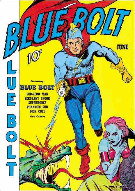
Blue Bolt #1 (June 1940), art by unidentified artist

As previously discussed, Joe Simon’s creation of the feature Blue Bolt occurred somewhat earlier than the cover date of Blue Bolt #1 would suggest. Joe supplied it to Funnies Inc. a shop run by Lloyd Jacquet that put together comic books for other publishers. Blue Bolt was just one of a number of features that Simon created for the shop. But apparently Jacquet and Novelty Press must have seen some special potential in Blue Bolt and used it as the title feature for a new comic book. Had that had been the intention all along it would be expected that Simon would do the cover art but since that was not the case we cannot assume he drew the cover. There are reasons to believe that Simon was not the cover artist and little to suggest he was. To my knowledge only the eyes of the Green Sorceress look like they might have been done by Simon. However many comic book artists found difficulty in getting eyes to sit properly on a face viewed from an angle. Otherwise none of the figures look like any other art that we can more confidently attribute to Joe. The Green Sorceress’ hair seems tamed in comparison to Simon’s depiction in the story. The dragon does not resemble the monsters in the story either. Blue Bolt’s cape lacks the distinct zigzag contour found in the story although Simon would abandon this device in future issues. Blue Bolt’s helmet includes a lightning bolt emblem that is missing from the story art. The gloves and boots have a three dimensional presence that Simon generally avoided and specifically did not use for Blue Bolt. Finally the composition is very untypical of Simon particularly the lack of any background elements causing Blue Bolt to float. It is hard to escape the conclusion that despite what some have claimed the cover art for Blue Bolt #1 was not done by Joe Simon.

Jacquet’s shop had a number of comic book artist which could have been called upon to draw the cover. Perhaps the most famous were Carl Burgos and Bill Everett but I think it can safely be said that the style of the cover art does not match either of these two artists.
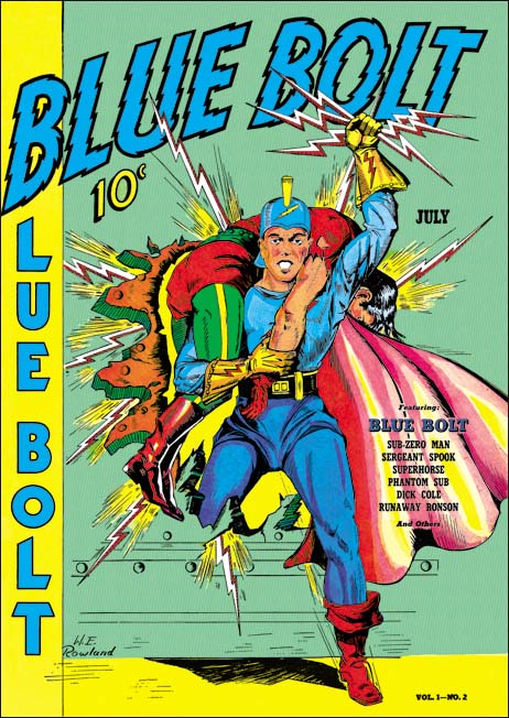

Blue Bolt #2 (July 1940), art by W. E. Rowland

Fortunately the next Blue Bolt cover was signed so there can be no question that it was drawn by William E. Rowland. The cover art for BB #2 shares some features with that for BB #1. In particular the more three dimensional aspects of the gloves and boots as well as the lightning bolt design on the helmet. I feel that the Blue Bolt’s face looks similar in the two covers. However Rowland goes even further in giving the gloves and boots a real physical presence. Further he has added details to the gloves that were missing from the BB #1 cover such as the lightning bolt and small circular shapes and lines that border the opening of the glove. While I would not rule out that Rowland was the cover artist for BB #1, I do not find the similarities strong enough to convince me that he was.
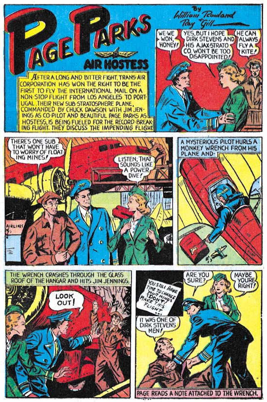

Blue Bolt #1 (June 1940) “Page Parks”, art by W. E. Rowland

The signature on the cover of BB #2 is particularly valuable because I doubt that Rowland would otherwise have been credited for the art. Apparently Rowland only worked on comic books for a few years (1939 to 1942) and even during that period he did not seem to do a lot of work. I have discussed one story by Rowland from Prize Comics #7 (December 1940) previously (Ted O’Neil). Frankly it was a rather unfair comparison of his take on the feature with Simon and Kirby’s. The purpose of the post was to highlight how radical Simon and Kirby’s work was compared to the work by more typical comic book artists even at this early stage in their career. Blue Bolt #1 also has a story drawn by Rowland and a scan of a page is provided above. Rowland is a good comic book artist, better than most contemporaries, but judging from the work I have seen so far it is hard to understand why he would have been selected to provide cover art. Whatever the basis for that decision it turned out to be a good one because Rowland’s cover art is rather nice and far superior to his story art.
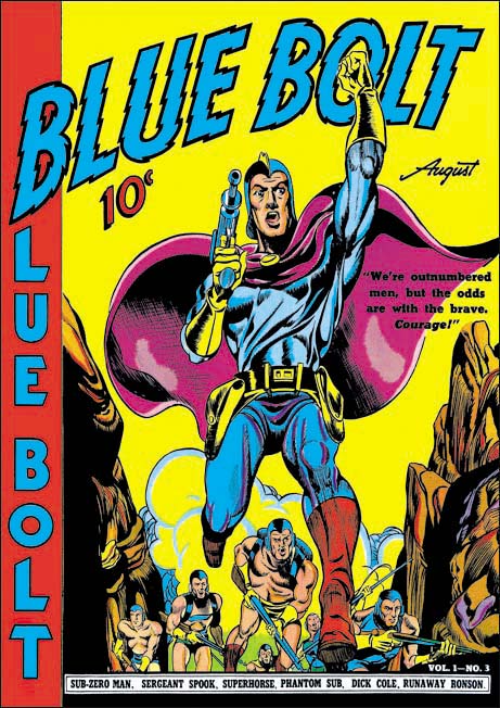

Blue Bolt #3 (August 1940), pencils and inks by Joe Simon

It was only with the third issue that Simon had his single chance to provide the cover art for Blue Bolt. Much could be said about the technical problems with the art. The cloth folds are a confusing mess and the perspective of the forward leg is not quite accurate. But these and others faults are nothing more than nick-picking that do not significantly distract from the cover’s impact. The figure of Blue Bolt was swiped from Alex Raymond’s Flash Gordon (see Art by Joe Simon, Chapter 4, Footnote) but Joe has infused the figure with excitement. Simon also uses a low viewing angle so that Blue Bolt can tower over his supporting soldiers. It is a effective depiction of an attaching force coming through some mountainous pass.

There was a time that some attributed this cover art to Jack Kirby but nowadays there is general agreement that Simon drew the cover. Perhaps the most convincing evidence that Kirby did not draw the figure is the somewhat problematic nature of the perspective of Blue Bolt’s leg, Kirby’s use of perspective was always very convincing. While it is now known that Kirby did sometimes use swipes I have never seen an example of Jack swiping from the same source more than once. However this twice use of Raymond’s Flash Gordon running figure would not be unusual for Simon.


Blue Bolt #5 (October 1940), art by W. E. Rowland

Blue Bolt did not appear on every cover of the comic that bore his name. The next appearance of Blue Bolt was for issue #5 and once again Rowland has the honors. While this cover shares some stylistic features with the one Rowland did for BB #2 there have been important advances as well. Blue Bolt’s glove and boots have an even more exaggerated three dimensional look. The figures have become more massive and muscular and the inking finer and more detailed. While Rowland did a good job on the cover for BB #2, this one is a masterpiece.
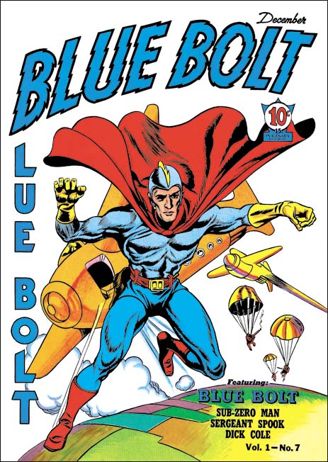

Blue Bolt #7 (December 1940), pencils by Jack Kirby, inks by Joe Simon

Issue #7 marked Blue Bolt’s final cover appearance during the Simon and Kirby run. It would be Jack Kirby’s only Blue Bolt cover. While not a bad cover it was not one of Jack’s finest either. I feel much of the blame comes from the action portrayed. Jumping out of a plane just does not have the impact of, for example, attempting to stop a bomb from exploding (as seen in the cover for Champion #10, August 1940). The rather unimpressive aircraft do not help either. I am not sure what they are meant to be since they lack propellers or jet engines. Rocket planes?

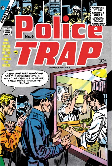
Police Trap #6

Police Trap #5 (July 1955) was the first issue published by Charlton. It appears to be composed largely of work that was already in the work at the time of the sudden failure of Simon and Kirby’s own publishing company, Mainline. It would expected most of that work would be used up and Police Trap #6 would consists of newly created work. All of the work on issue #6 was drawn by Jack Kirby. Previously Kirby’s involvement was largely limited to providing covers with the only Kirby story appearing in Police Trap #5. Jack’s greater presence can be explained as a means of offsetting recent financial loses. The cost of creating the Mainline comics was covered by Simon and Kirby to be paid back by a share of the profits. However with the sudden demise of Leader News Joe and Jack would not get the money to recover their publication costs. Their incomes from Prize Comics were based on a share of the profits but with all the negative public criticism against comic books those royalties were probably down as well. By providing all the art for Police Trap #6, Kirby probably hoped to decrease the production costs, increase sales (and therefore his share of the profits) but also be paid as the artist as well.


Police Trap #6 (July 1955), pencils by Jack Kirby

The cover of Police Trap #6 is another less than spectacular piece of art. But it is interesting as a rare example of Kirby swiping from another comic book artist, in this case Marvin Stein. This is not a close copy, Kirby did not need any help in how to draw figures. Rather it is the unusual idea that Kirby picked up, that of counterfeiter’s being candidly filmed by the police. I had previously written about this swipe (A Criminal Swipe) where I provided an image of the Stein cover that Kirby swiped. In that post I offered the possibility that it was actually Stein that swiped from Kirby and that this cover was an unused piece left over from Simon and Kirby’s earlier efforts in the crime genre from 1947 to 1951). However I now consider this unlikely as the art for the Police Trap #6 cover does not seem to match
the style used during the earlier period.


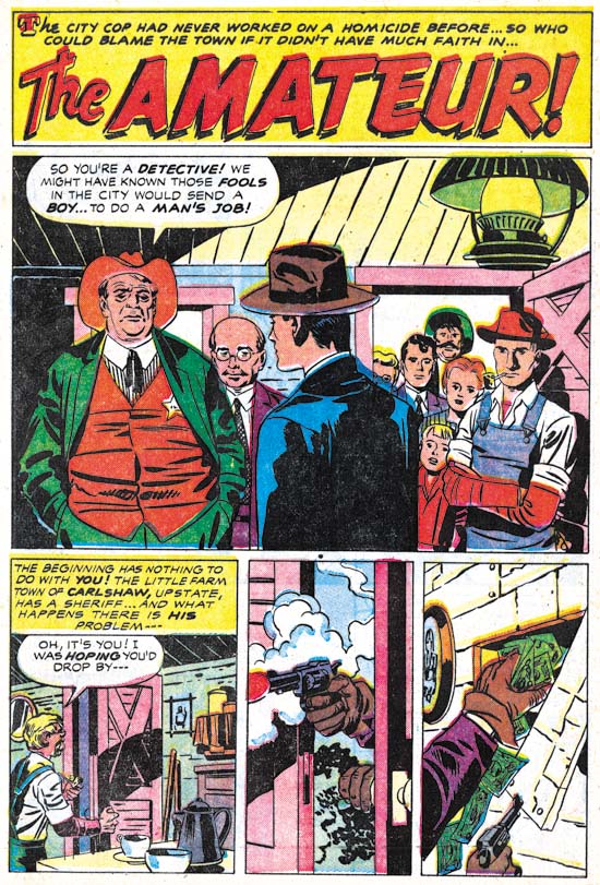
Police Trap #6 (July 1955) “The Amateur”, pencils by Jack Kirby, inks by Mort Meskin

As mentioned above, Jack Kirby drew all the art for this issue which makes Police Trap #6 a special comic. Needless to say the art is all well done. Kirby had a flair for graphically telling a story. Note the short sequence of story panels at the bottom of the splash page. It starts out typically enough but then proceeds to two panels with captions or speech balloons. Text was not required to explain the story and in fact the lack of text makes the panels even more effective.

Police Trap #6 is also special in that all the art was inked by the same artist. I’ll explain why I think this inker was Mort Meskin below where his hand is even more obvious but here I will discuss why I believe it was not either Simon or Kirby that did the inking. Normally that might not be too difficult to determine because both Jack and Joe were much better inkers than many of the other artists they used to ink Kirby’s pencils. Here, however, we have a great inking job. Not only that but it is done in what I describe as the Studio style. On this page (and others in this book) can be found shoulder blots, picket fence crosshatching and abstract arc shadows (see my Inking Glossary for an explanation of the terms I am using). But note that the shoulder blots are not done in a manner typical for Simon and Kirby. They are less abstract and more apt to be broken up into pieces. The most glaring example of this is found in the man in the blue suite. There are other suggestions that this was not inked by either Simon or Kirby. Note the simple eyebrows even in the more close-up views provided in the splash panel.

It is unclear whether some of the typical Studio style techniques were done by the inker or instead were added by either Kirby or Simon afterwards. For example the abstract arc shadow in the first story panel is done in a very typical style. My suspicion is that the original inker provided these touches as well as they are so well integrated with the surrounding artwork. If this is true it is another indication on how well acquainted the inker was with techniques previously used in the now defunct Simon and Kirby studio.


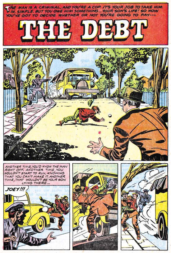
Police Trap #6 (July 1955) “The Debt”, pencils by Jack Kirby, inks by Mort Meskin Albistur

The story panels for the first page of “The Debt” follows the same pattern as seen in “The Amateur”. First an introduction panel that quickly places the reader into the action followed by two panels without text that show how the action unfolded. The big difference between the two stories is that while “The Amateur” has a typical splash the splash found in “The Debt” is actually a story panel as well. While collaborating with Simon, Kirby worked from scripts created by various writers but which he would then customarily rewrite. It is unclear how much of the published story was rewritten but there are often phrases that sound very much like Kirby. But who can say whether the original writer originated these unusual textless story sequences or that Kirby rewrote them into the script.


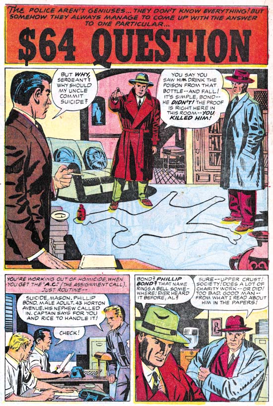
Police Trap #6 (July 1955) “The $64 Question”, pencils by Jack Kirby, inks by Mort Meskin

The $64,000 Question was a popular game show in the 50’s and even today you occasionally here someone use that term a colloquialism for a significant question. However that show first appeared on television in June 1955 much too late to have influenced this story (whose creation start around February of that year). However there was an earlier game show that was on the radio from 1950 to 1952 that was actually called the $64 Question. Although it was off the air when this story was created I am sure that was that show that formed the genesis of this story’s title.


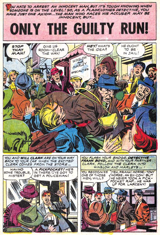
Police Trap #6 (July 1955) “Only The Guilty Run”, pencils by Jack Kirby, inks by Mort Meskin

All the stories in this issue were inked by the same artist. “Only The Guilty Run” is the story that most convincingly shows that this inker was Mort Meskin. Like all the other stories from this issue the inking was done in the Studio style. Most noticeable in the splash is his use of picket fence crosshatching. Of course other inkers used this technique most notably both Kirby and Simon. However Meskin executed picket fence crosshatching with an almost mechanical control compared to the more spontaneous use by Kirby or the more rougher brushwork by Simon. Observe how Meskin’s “rails” and “pickets” are almost consistent in width and the “rails” are placed to almost entirely contain the “pickets”. Other Meskin inking characteristics can be found in the simplified and often angular eyebrows particularly those of the escaping thief in the splash panel. Of course since credits were not provided inking attributions can never be given with absolute certainty but I am as confident as it is possible to be that this inking was by Mort Meskin.

While the art may convince me that Meskin was inking there Kirby pencils I am somewhat puzzled how this came about. While Mort had inked Jack’s work before, generally he was too busy penciling and inking his own work. There were exceptions to this most notably in Boys’ Ranch (1950 to 1951) and Captain 3-D (1953). However in 1954 he had started working for DC. Meskin still did some work for Simon and Kirby but this was largely limited to some covers and nowhere near his prolific output when the S&K studio was going strong. Yet here he is providing a lot of inking for a single issue (plus one Kirby story for the previous issue). Very perplexing.


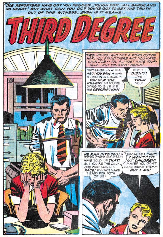
Police Trap #6 (July 1955) “Third Degree”, pencils by Jack Kirby, inks by Mort Meskin

Despite the Comic Code all the stories from this issue are really quite good but I have to admit that I find “Third Degree” the least satisfying. The interrogation of the housewife by the burly police officer seems a bit forced. Still that story and all the others in this issue leaves one with a desire for another all Kirby crime comic. Unfortunately it was not to be, at least for some years (see Jack Kirby’s “In the Days of the Mob”) and never again with Joe Simon.

P.S.
I have had a comment about why I believe this inker was Mort Meskin and not Marvin Stein. For readers who also wonder about this I suggest checking my previous posts Kirby Inkers, Mort Meskin and Kirby Inkers, Marvin Stein.

Police Trap #5

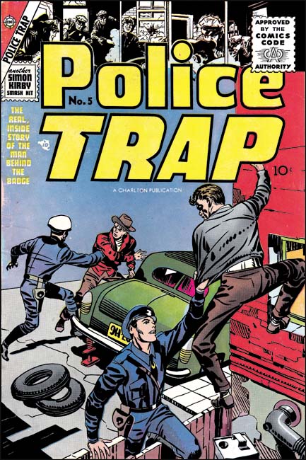
Police Trap and the other Mainline titles had been distributed by Leader News. During this period there was a renew public protest about the contents of comic books. The publisher that attracted the greatest amount of negative criticism was probably EC and some newsstands refused to accept their comics. Unfortunately Leader News also distributed EC and the boycott lead to their eventual failure. Without a distributor this meant the end of Simon and Kirby’s publishing company as well. But work had already begun on the art for the unpublished issues of the Mainline comics so Joe and Jack looked for a publisher willing to take on the titles. They made a deal Charlton and after an addition two month delay Police Trap #5 finally made it to the newsstands. This was the first issue of Police Traps to be submitted to the new Comic Code Authority although I doubt there was much of a problem with getting approval.


Police Trap #5 (July 1955), pencils and inks by Jack Kirby

Compared to previous issue, the cover was not all that great. I cannot think of a Simon and Kirby cover that I would describe as poor but obviously some were better than others and this one was one of their poorest. I suspect that with the failure of Mainline and the search for a new publisher, Simon and Kirby just did not give the cover art as much attention as they previously would have.


Police Trap #5 (July 1955) “The Gun”, pencils and inks by Bill Draut

Bill Draut had drawn stories for Police Trap #1 and #3 so his presence here comes as no surprise. Draut provides “The Gun” with his usual well crafted art. However coming after his really great work on “Tough Beat” (Police Trap #3) this story can seem to be a bit of a let down. Due to financial problems arising from the collapse of Mainline, Simon and Kirby were forced to close down their studio. It seems that Joe and Jack continued to work together for a time but limited or stopped employing other artists. “The Gun” was probably work already completed before Mainline’s sudden collapse. Simon and Kirby would use some further work by Draut in the coming months but not much. Draut would work for other publishers but with the collapse of the comic book industry it must have been a difficult time for him. I am sure he eventually looked back at his time with Simon and Kirby as the golden age of his career.


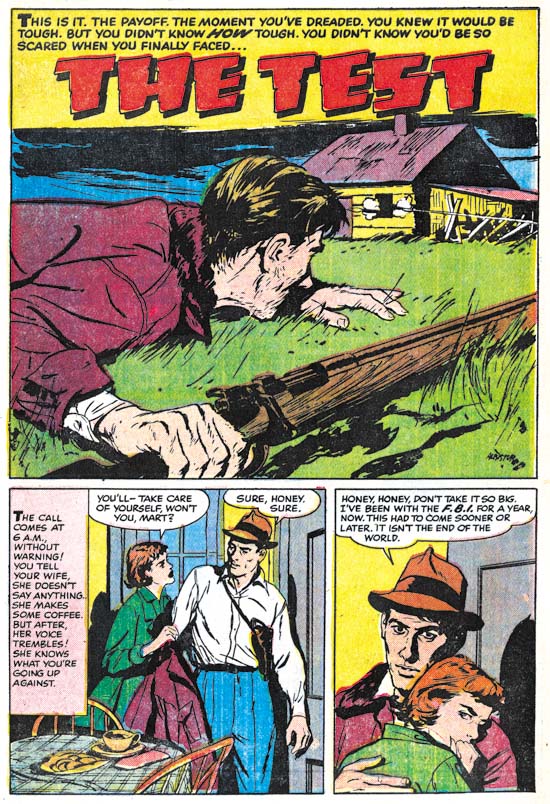
Police Trap #5 (July 1955) “The Test”, pencils and inks by Joaquin Albistur

“The Test” was another fine piece of work by Joaquin Albistur. Albistur only worked for Simon and Kirby for a limited period of time, a little over a year. Probably Joaquin also looked for work after the closing of the Simon and Kirby studio. I have seen some original art for a smaller publisher but I am not sure when it was done. Albistur may have found some work but it does not appear he found much. At some point he returned to his native country Argentina.


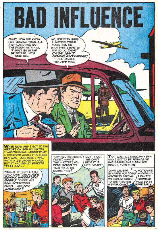
Police Trap #5 (July 1955) “Bad Influence”, art by an unidentified artist

I am not sure who the artist was that drew “Bad Influence”. I will not claim he was one of my favorite Simon and Kirby artists but he did a good job on this story.


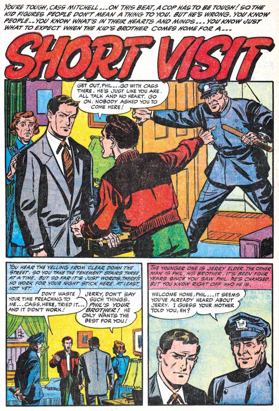
Police Trap #5 (July 1955) “Short Visit”, art by an unidentified artist

Another unidentified artist only in this case not nearly as talented as the one who did “Bad Influence”. Note the rather awkward pose of the policeman.


Police Trap #5 (July 1955) “Alibi?”, pencils by Jack Kirby, inks by Mort Meskin?

Up to now, Jack Kirby’s contribution to Police Trap was limited to the covers, one pinup (derived from an unused cover) and one splash panel. Was “Alibi” originally planned for issue #5 or was Jack filling in for working missing at the time of the collapse of Mainline? Who can say? But it is nice to see a Kirby working on a crime story again since the last one he did back in 1950. The tall vertical splash was rather unusual for Kirby and a reminder that Kirby was comfortable with any panel layout.

I am a little puzzled by the inking of this piece. Previously I have attributed the inking to Mort Meskin and there are parts that remind me of his work. Particularly the elderly woman in the second story panel. However there are other portions that do not look like Meskin’s brush for instance the sleeve of the older detective in the splash panel. During earlier periods I would explain this by the use of multiple artists sometimes used to ink Kirby’s art (describe by Joe Simon as an assembly line). With the bust up of the Simon and Kirby studio this now seems likely that only a single inker would be used (although either Simon or Kirby could be expected to do some touch up work). While I may hesitate to attribute the inking of this piece to Meskin, Mort was the inker for some other Kirby pencils that will be discussed when issue #6 is covered.

A Story too Incredible to be Real


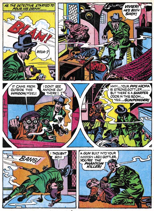
Headline #24 (May 1947) “A Phantom Pulls The Trigger” page 6, pencils and inks by Jack Kirby

They said it on the cover, “All True Famous Detective Cases”. Would Joe Simon and Jack Kirby say that if it was not true? But surely not all the stories in Headline Comics #24 could be true? Who would be credulous enough to believe the tale told in “A Phantom Pulls The Trigger”? A man going about the French countryside killing individuals for the sole reason of keeping the size of the population down? Whose philosophy comes from reading Thomas Malthus’ “Over-Population”? A man who avoids detection by using a gun installed inside his wooden leg? Who after being uncovered and arrested is allowed to keep his now disarmed wooden leg and has friends smuggle in a new gun and bullets? Who uses his re-armed wooden leg right before his execution with unintended results? Who could possibly believe such an incredible story to be true?

Except it was.

Well as true as any story told by Simon and Kirby who seemed to adhere to the philosophy of never letting the facts get in the way of a good story. But the basic facts portrayed in “A Phantom Pulls The Trigger” all appear to be true. There really was a man who went by the names of Herman Gottler and Raoul Croc as presented in the story but not included in the story were his other names Gottlieb Einhalter and Armande Giraud. His armed and deadly wooden leg was so devious that after he had been found in the vicinity of several murders it remained undetected even though he was carefully searched. He undoubtedly would have continued to evade the law for some time had not one of his victims lived long enough to report seeing smoke coming from the end of the wooden leg. After capture, Raoul was quite open about what he had done and why he did it. In fact he attracted a number of admirers. And yes the authorities really did allow him to keep his unarmed wooden leg which Raoul re-armed with the help of his friends. While seated waiting for the executioner’s sword, Raoul aimed his leg at one of his followers and set his pistol off. Only it seems the pistol’s muzzle had become blocked with mud and stone and therefore exploded instantly killing Raoul.

But how had Simon and Kirby come across this story? The events occurred in France during the early part of the 19th century so it was unlikely to have been a object of discussion in New York City during the mid 20th century. A Google search revealed a few possible French links (I cannot read French) but only a single English source. That source was “Howitt’s Journal of Literature and Popular Progress, Volume 1” by William Howitt and Mary Botham Howitt published in 1847 (the story told on pages 103 to 105 and 122 to 125). This does not seem to be likely reading material for either Joe or Jack. Perhaps Jack heard the story told in France while he was there as a soldier during World War II.

“A Phantom Pulls The Trigger” is special not only for its amazing story but also because it had one of the only two double page splashes for a crime comic (The Wide Angle Scream, It’s a Crime);

The Corrosive Influence of Pinball


New York City Major Fiorello La Guardia toppling a pinball machine (August 1938)

America has a long history of concerns about the corruption of youth (a concern that today seems greatly diminished but by no means absent). The anti-comic book crusade of Dr. Wertham and others that ultimately led to the creation of the Comic Code is one example of such a concern but it is by no means the only one. Another object of worry was the pinball machine. Pinball was not a harmless way to pass the time, at least not to the cultural powers of the day. It was, gasp, a form of gambling. Not only could you win free games, but winning clearly depended on nothing more than luck. So concerned were communities of the day that pinball machines were banned in many places across the country, including New York City.


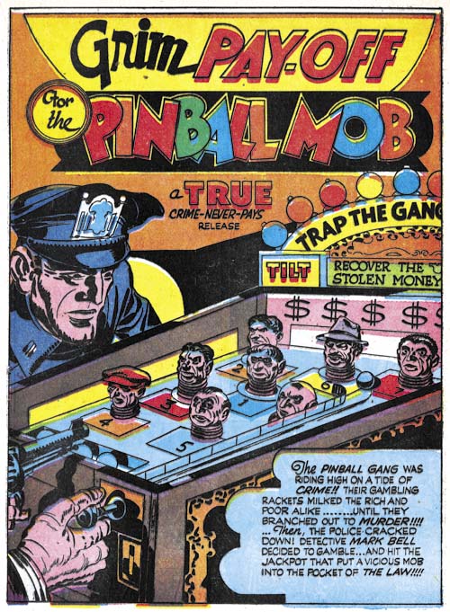
Headline #24 (May 1947) “Grim Pay-Off For The Pinball Mob”, pencils by Jack Kirby, inks by Joe Simon

I do not see how anyone can doubt the testimony of former major La Guardia about the dangers of pinball. I mean after all they named an airport after him! But if the reader still doubts the evil nature that pinball represented than I will appeal to even higher authorities, Joe Simon and Jack Kirby. They present their case through the mouth of a soda shop owner when a gang brings one of the machines into his store:

I said get that infernal thing out of my store! There’s a school across the street … I won’t have those kids losing their lunch money!!

Unfortunately the owner’s arguments are overruled by a thug’s fist. Simon and Kirby show that the gang is not limited to pushing pinball machines but they are also involved in running a gambling house. When the public objects to all the gambling a detective uses the pinball connection to trace the gang to their bigger operations. Thus Joe and Jack show us that the danger of pinball goes beyond the corruption of youth.

There is irony in Simon and Kirby’s voicing their concerns about pinball at the same time that many in the public were complaining about the danger comic books, and in particular crime comics, presented to the nation’s youth. Did they really see pinball as a corruptive danger? Or were they just trying to divert attention away from comic books?

Pinball games continued in spite of the ban imposed by many communities. New York lifted its pinball ban in 1976. The City Council did so largely because Roger Sharpe demonstrated that pinball required skill, not luck. He proved this playing a game where he announced that he would land the ball in the middle lane and proceeding to do just that. After that pinball flourished in New York. The pinball industry did quite well at the time driven by the digital age. But in the end home computers and video games brought about a severe decline in the pinball industry. I have not been able to find any company that is currently making pinball machines. With no more pinball games I guess we can say that they no longer present a danger to today’s youth.

Mort Meskin’s Dark Fighting Yank


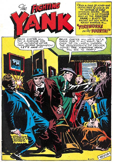
Fighting Yank #29 (August 1949) “Fireworks on the Fourth”, pencils and inks by Mort Meskin

Mort Meskin was the most important artist in the Simon and Kirby studio, second only to Jack. But he did important comic book art before and after his stay in Joe and Jack’s studio. Mort often inked his own work and he was a talented inker. Inking of Meskin’s pencils are generally fairly light. That is overall there are significantly more white or colored areas in a panel as compared to black ones. Now there are exceptions such as panels displaying night scenes. But look at the splash for “Fireworks on the Fourth”. Lots of black and since the actions occurs indoors there is no reason that so much blacks had to be used. To my eyes, the inking in “Fireworks on the Fourth” seems to flatten the image. This may not have been an accidental effect as Meskin’s comic book art often exhibited a narrow depth of field.

But let me digress. During the war years there was a flood of patriotic superheroes published in comic books. Of course all superheroes in American comics would be expected to be patriotic. By patriotic superheroes I am referring to those with a costume or a name that distinct patriotic overtones. With so many patriotic superheroes it must have been difficult to come up with an costume that was appropriate and original. Most had a costume based on the American flag with the most famous examples being MJL’s Shield as well as Simon and Kirby’s Captain America. But that was not the direction taken by Standards for their Fighting Yank. This hero had a costume based on the type of clothing used during the Revolutionary War. Not that the flag was neglected; it appeared on the Fighting Yank’s chest. I am not sure if the Fighting Yank was the first to use the Revolutionary War theme but in any case there were others as well. Since it really was not that spectacular of a costume one might think the Fighting Yank would have been one of the less successful patriotic heroes. But actually he did quite well lasting from November 1941 (Startling Comics #10) to August 1949. It really was a long run since most superheroes, patriotic or otherwise, did not last nearly as long. The last issue of Fighting Yank was #29, the very one with Meskin’s interesting inking.

The inking has a greater emphasis on black than normally used by Meskin I still feel that he did the inking. While cloth folds are blocky they still exhibit the long sweeping curves that Mort preferred. When inking such folds Meskin typically used multiple brush strokes which he sometimes overlapped. This inking technique is often revealed by looking at the ends of the cloth folds were sometimes the separate ends of the individual strokes are reveals. This can be seen here are for example inking of the man in the blue suit on the left side of the splash. In Steven Brower’s recent book on Mort Meskin (“From Shadow to Light”) Jerry Robinson remarked that to keep things interesting he and Mort would often varied how they created the art. I think that this inking technique is an example such a practice.


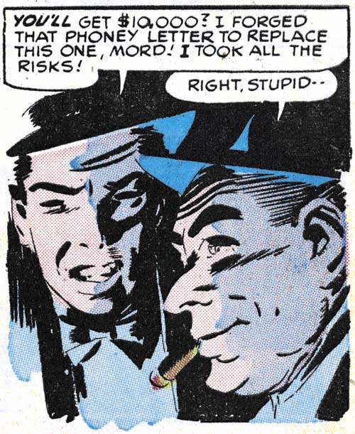
Fighting Yank #29 (August 1949) “Fireworks on the Fourth” page 3 panel 5, pencils and inks by Mort Meskin

Meskin put this new inking style to good use. In the panel shown above he uses a low light source to provide dramatic lighting. This is something he rarely did when he later worked for Simon and Kirby. While Mort’s inking is the basis for the image’s drama, the colorists use of a light violet shadow greatly enhances the effect. The use of two color tones on the face is uncommon in golden age comics. It is pretty rare, but not unknown, in Simon and Kirby interior art where generally colored areas are separated by the line art or isolated in white areas.


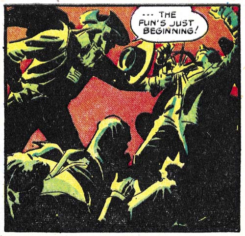
Fighting Yank #29 (August 1949) “Fireworks on the Fourth” page 7 panel 2, pencils and inks by Mort Meskin

The colorist did not limit his use of multi-tone coloring to simple shadows but he also often put them to dramatic effect for scenes meant to have low light levels. Certainly the most spectacular of these multi-tone panels is the one from page 3 that is shown above. The combination of an orange background and the yellow to green toned figures is just stunning. The combinations of Meskin’s great pencils and his unusual inking along with the colorist efforts combine to make this an unforgettable piece of comic book art. One might be tempted to credit such exceptional coloring to Meskin himself however other Standards comics should be checked for multi-tone coloring before such a conclusion is reached. Coloring of golden age comics was generally handled by the publisher and not the artist who did the original line art. Standard Comics may have had to fortune of using one of the more talented colorists in the business.

Not Just Any Crime


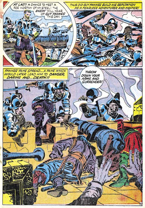
Headline #23 (March 1947) “Burned At The Stake” page 4, pencils and inks by Jack Kirby

Simon and Kirby tried to vary the type of crime that was portrayed in their stories. But of course they could write very different stories that deal with the same type of crime. So there are multiple gangster, western outlaw and other stories. But there was one crime category that Joe and Jack only dealt with once in their crime comics, treason. It probably should not be surprising that treason was so rarely featured in the stories. After all it is not what one normally comes to mind when you think of crime. What is truly odd is that it was not treason against the United States that Simon and Kirby wrote about but against England. For “Burned at the Stake” is about the failed attempt by Guy Fawkes and others to blow up the English King and his parliament. Perhaps the reason Simon and Kirby selected this story is that Guy Fawkes seems to have generated the greatest public reaction to a traitor. Sure everyone in America knows of Benedict Arnold but when was the last time he was hung in effigy? In England Guy Fawkes’ effigy has been hung and burned on November 5th for the last 400 years!

While Simon and Kirby’s version of the gunpowder plot is relatively accurate, it completely leaves out the religious background. There is no mention of the Protestant faith of England’s rulers or the difficulties faced by the Catholic minority. One might accept Simon and Kirby’s assertion that Fawkes went to Flanders to seek glory, but only religion would explain why he joined the Catholic Spanish side against the Protestant Dutch Republic. As Simon and Kirby present it, the leaders of the plot objections to King James I seems based on little more than personality. Also there appears to be no explanation for Guy Fawkes’ joining the plotters other than something akin to a lark. Some understanding of the religious issues is needed to make the whole story comprehensible but nowhere is that subject mentioned by Simon and Kirby.

Joe and Jack’s handling of Guy Fawkes is very out of place with the treatment typically reserved for traitors. Fawkes is by no means a sneaky or cowardly villain but an individual to be admired, even if reluctantly. When discovered by the King’s guards, Fawkes puts up a valiant but unsuccessful fight to avoid capture. Afterwards Guy refuses to reveal the names of his fellow conspirators even under extensive torture. The only glaring inconsistency is Fawkes’ gallows confession of guilt. Guy was said to have repented but since history is written by the winners one wonders how accurate testimony of that confession was. But this story is in a crime comic and American morality of that day required that “crime never pays” (which phrase Simon and Kirby conclude the story).

I have previously discussed the double page splash for this story (The Wide Angle Scream, It’s a Crime). Until recently Guy Fawkes has not occupied much of a place in the American conscious. That is not true for the English, I once worked with a lady originally from England who despite being Catholic took part in November 5 celebrations. However Americans were re-introduced to Fawkes through Alan Moore’s graphic novel “V for Vendetta” and the movie based on it.

A Simon and Kirby Valentine


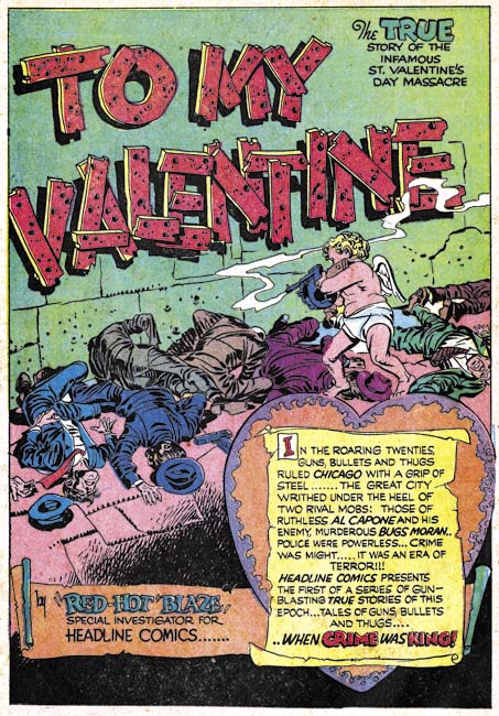
Headline #23 (March 1947) “To My Valentine”, pencils and inks by Jack Kirby

After the failure of Stuntman and Boy Explorers for Harvey Comics, Joe Simon and Jack Kirby began looking for a publisher that they could produce comics for. They eventually made a deal with Prize Comics where they converted the existing Headline Comics from a superhero to a crime title. The first crime issue was Headline #23 (March 1947) and it is packed with great stuff. Full of material all drawn by the dynamic Jack Kirby. The premise, at least initially, was that Headline would consist of true stories often presented by “Red Hot” Blaze. One of which was “To My Valentine” the story of the St. Valentine’s Day Massacre.

The story as presented by Simon and Kirby starts with a dramatic full page splash. Cupid with a machine gun having just finished mowing down a line of men. It seems at least one of them had a handgun so it can be presumed that they were criminals. Text presented as a scroll informs us about the war between two gangs one headed by Al Capone and the other Bugs Moran.

The first story page depicts a man discarding a Valentine Day card and then abusing the store’s proprietor when he asked to be paid for the damaged card. An odd start for a crime story, but then again Simon and Kirby were always very original in their story telling. This beginning indicates the story is taken place on Valentine’s Day and introduces the reader to the thug-like nature of the man.

On the next page the readers follows the man to his arrival to a group of gangsters as they prepare for some undisclosed criminal activity. Only they become interrupted by the appearance of some uniformed policeman. Or rather as is revealed in the last panel, as members of the “other mob” dressed up as cops.

Page four has the arrival of boss and massacre of the apprehended gangsters. Pretty dramatic stuff. But interestingly nowhere is either gang mentioned by name. The reader will learn later that the victims belonged to Bugs Moran gang but the name of the leader of this particular confrontation is never revealed. While some of the facts about the St. Valentine’s Day Massacre are well known the perpetrators have never been positively identified.

Page five introduces “Red Hot” Blaze as he bridges the story from the massacre to the arrival of a reported to interview a prison inmate. Only the reporter finds out that the inmate is out, not on bail but for a stroll. The reporter does not wait for the inmate’s return as he already has a great story for his newspaper. The reporter returns later to interview the prisoner only to be roughed up by the inmate right in front of the sheriff. When the reporter objects to the treatment he has received the sheriff responds he did not see anything. “Red Hot” Blaze describes the story as an example of the corruption in Chicago at that time. Still this sub-story seems only remotely related to the rest of the Valentine’s Day Massacre story. It takes up two pages, as much room as the massacre itself. Why did Simon and Kirby include it?

Page five ends with Bugs Moran hearing about a party the other gang was having and on the final page of the story we find Bug’s gang performing their own massacre at their rival’s party. This was supposed to have taken place at the Manning’s Hotel but a Google search fails to come up with any mention of Bug’s revenge.

“Red Hot” Blaze returns once again in the last two panels and in the final one says:

Just another thought cousins! … it isn’t hard to give crime another boost to a new heydey … Those who play ball with the black market boys and their like are only giving a new ‘go-signal to mob rule! Don/t encourage them … you’ll pay a higher price later!!!

Here Simon and Kirby reveal the story’s real theme and the explanation for the sub-story of the newspaper reporter from Chicago. “To My Valentine” is not just, or even primarily, about the gang war between Al Capone and Bugs Moran. Rather the story is concerned about the corruptive influence of organized crime and the dangers involved in supporting it. The years immediately following War World II were prosperous especially when compared to the pre-war depression period. But although many were now earning good incomes the country’s industry as a whole took some time to re-tool from the production of military goods. People had money but could not always spend it on the goods they wanted. Under such conditions a black market sprung up (or rather continued from the war years). Here Simon and Kirby are warning about the possible outcome of supporting the black market and allowing it to prosper.

The Eleventh Commandment

“Thou shall not desecrate art”. Okay maybe Moses did not forget to include the eleventh commandment on his tablets when he came down from the mount. And I will admit that most of the other commandments concerned more serious sins. Still alteration of art is truly morally wrong. This restriction may seem odd when it comes to comic books since that art often gets modified on its way through the publication process. However a point is reached when comic art is published (or not) and further modification should no longer be done. Some will say that when a person buys a piece of art he can do anything he wants with it. But the truth is no one really buys art, it is more like an extended lease. While the person may have possession of a piece of art, the expectation should be that someday, somehow, it will pass on to someone else. It is the owner’s duty and self interest to preserve the art for that eventual day.


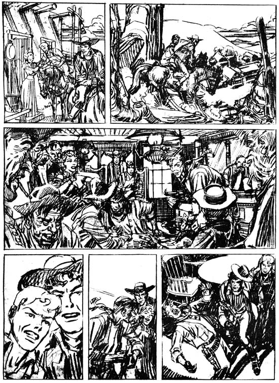
Unpublished page art by Jerry Robinson and Mort Meskin (as published in “History of Comics” volume 1, 1970)

James Steranko’s “History of Comics” is a great resource written by a man who is both a historian and practitioner of comic books. It was published in two tabloid size volumes and is long out of print. However issues appear at conventions and sources like eBay from time to time and are well worth the search. While profusely illustrated most of the images are small in size. There are a limited number of exceptions that take full advantage of the large dimensions of the books. One of the larger illustrations in volume 1 is the source for the image shown above of a page done in pencil by Jerry Robinson and Mort Meskin.

There are good reasons why Steranko gave this image such a prominent treatment. Both artists played important parts in the history of comics. Among the many contributions by Jerry Robinson is the work he did on Batman as a ghost artist for Bob Kane. Unfortunately Mort Meskin’s importance in the history of comics is largely forgotten today but is well understood by Steranko. Hopefully a forthcoming book on Meskin may help to change his current reputation. However Mort is not completely neglected for instance Ger Apeldoorn has provided some recent posts about some of his work (for example Tom Corbett Viewmaster, Real Crime and No Kid Stuff) and there is a list group devoted to him (Mort Meskin List). Besides Robinson and Meskin’s importance to the history there is the rarity of the art. Not a lot of original art for either artist has survived from early in their careers. While they shared a studio for some time they only collaborated for a relatively short period (less then two years) so examples of their joint work would be expected to be rarer still. Original art that was unpublished and left uninked are particularly rare. Last, but certainly not least of the reasons Steranko illustrated this particular page, is the quality of the art itself.

What was this unfinished page originally intended? Meskin did some marvelous work on his creation, the Vigilante, which started as a hero feature and ended up as a western. However Robinson was never associated with the Vigilante and the young man on this page of original art was clearly not the Vigilante’s sidekick Stuff the Chinatown Kid. This page of art can also be found on the Meskin web site where it is suggested it might have originally have been meant for Prize Comics Western. The period that Robinson and Meskin are known to have collaborated was from January 1948 to August 1949 (cover dates). Prize Comics was converted to Prize Comics Western with the May 1948 issue so it certainly was a possible destination for this piece. Robinson and Meskin were doing work for Simon and Kirby during this time and although I do not believe S&K produced Prize Comics Western they may have provided Jerry and Mort a connection to the editor of that title. But Robinson and Meskin’s work never be published in any issue of PCW and the solo Meskin would not appear in the title until 1956 1955. So while nothing rules out Prize Comics as the intended comic, there is little evidence to support that suggestion.

Considering the artists, it is not surprising what a wonderful page this is. The third panel is particularly marvelous. This may be the most complex panel these artists had ever done either together or individually. The panel is framed on each side by the cutoff close-ups of two smokers. A gambling game gone wrong takes up most of the panel with onlookers filling the rest. Every little portion of the panel is filled with interesting details. The only problem is where would the speech balloons go? Actually this seems to be a difficulty with much of the page with only the second and fifth panels seeming to have room for the speech balloons. The fourth panel particularly seems to call for a balloon with no place to put it. This all suggests another possibility for this page, it may have been nothing more then a portfolio piece used to show perspective publishers what the artists were capable of doing. However in the end we are left with little more then informed speculation as to the intended purpose of this unpublished art.


Unpublished page art by Jerry Robinson and Mort Meskin (recent scan)

The image in Steranko’s book is just marvelous. Pencils are difficult to reproduce (which is why art is inked for comic book publication) but the image in “History of Comics” is clear and easy to see. Considering this was done before personal computers and scanners that was quite an accomplishment. Above is a more recent scan of the same art. While it may not be as clear as the Steranko’s image it does show some subtleties that the published image did not. Even here the image has been enhanced as the original pencils are lighter.

I had previously wondered what method Robinson and Meskin used when they collaborated on art since the final result looks like an amalgamation of their two styles. At least some of the inking appeared to have been done by Mort so the simplest explanation would be that Robinson did the pencils and Meskin the inking. But is the simplest explanation actually correct? The best way to answer this question is to examine uninked art such as the page discussed here. Most of the figures on the page look like they were done by Meskin with the exception of the woman in the third panel who looks like she was drawn by Robinson. That assessment is based on the style of the art but notice that the woman is drawn slightly darker then the rest of the figures. Remember this image is an enhanced scan and the difference is even harder to detect on the original art. The panel is so intricate and fully realized that I doubt that Meskin had simply left the woman blank for Jerry to fill in. To me this all suggests that Mort first penciled the entire page and then Jerry came in and altered portions. Robinson may have worked on parts of the art other then the woman but they are now hard to distinguish. I am not suggesting that this was the creation sequence that Robinson and Meskin used in all cases but it does suggest that the reason for their amalgamated style was the passing of the pencils from one artist to the other.

It is interesting how fully developed the drawing is on this page. Not only are all outlines clearly indicated but the required spotting is shown as well. For example the shadows cast by the post sticking out of the top of the house in the first frame and the shadows on the underside of all the hats. Even the cloth folds have the sweeping parallel lines that are characteristic of Meskin’s inking. Previously I felt the inking of the Robinson and Meskin pieces had been done by Mort, but perhaps Jerry also did some inking that is now hard to detect because the inks closely followed the pencils.

By now the reader maybe impatiently proclaiming “but what about the bottom row of panels”? What indeed. Because of the Steranko illustration we know that this row was originally uninked. Did Jerry Robinson, still very much active today, come back and resume working on the page? Or did Mort Meskin return to it before his untimely death? Unhappily neither is the case. A good comparison between the inked version and the one found in the Steranko illustration shows many discrepancies. Hairlines were altered and cloth folds moved. Even the outlines were not closely followed. While it is not completely clear in Steranko’s illustration, the boy on the extreme right of the last panel is cast in shadow with just enough traces of light patches to indicate the shape of the figure. Apparently this was all beyond the questionable talents of the inker who covers it all in solid black. It is true that since the silver age of comics inkers are often expected to add their personal touches, but this particular inker’s alterations have done nothing but deaden the art. Since he did not follow the pencils closely one wonders why the inking was done directly on the original art and not over some copy? Once he had finished the bottom row the contrast between it and the two upper rows must have been painfully obvious even to this inker and he finally halted his destruction before any more damage was done and the page become worthless. The page is now a monument to the wisdom of the Eleventh Commandment. Frankly even if the inker had been more talented he should not have attempted inking the actual pencils. A modern inker has modern sensibilities and his art could not truly recreate the type of inking that would have been done on this page had Robinson and Meskin completed it.

A Date Without Romance

Most of the work that Simon and Kirby did for Hillman in 1947 was for previously existing titles. The sole exception was My Date. Despite its title, My Date was not a romance comic (as I discussed previously) instead it is teenage humor and in particular an Archie-clone. Archie first appeared as a backup feature in MLJ’s Pep Comics during the war while both Joe and Jack were in military service. Archie was so successful that MLJ’s superheroes were eventually dropped and the company’s name changed to Archie Comics. 1947 found Simon and Kirby looking for a work so it is not surprising that the popular Archie would lead them to suggest teenage humor title to Hillman. Although My Date was not a romance comic it clearly was directed at teenage girls. There would be a lot of dating in My Date but no romance.


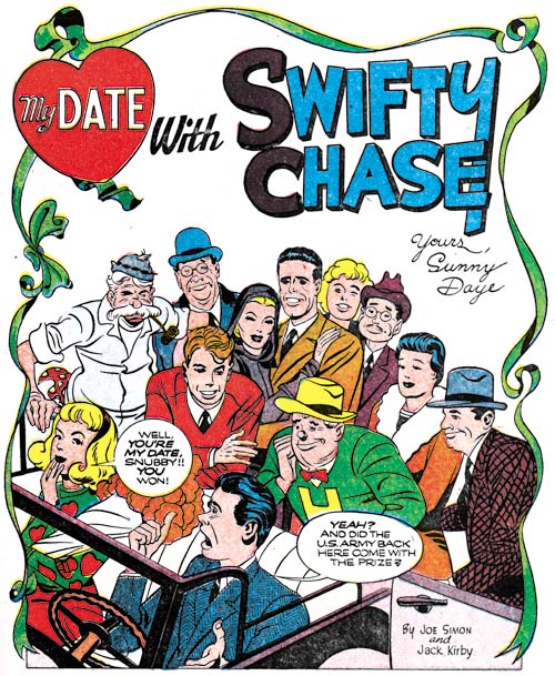
My Date #1 (July 1947) “My Date with Swifty Chase”, art by Jack Kirby

The first story in all the My Date issues would be by Simon and Kirby. Initially the feature centered on Swifty Chase a good hearted young inventor. Like Archie there is a love triangle but in this case the center of it is the beautiful Sunny Daye and Snubby Skeemer is Swifty’s rich and unscrupulous rival. The first story has quite a cast of characters as can be seen in the splash. Three of them were clearly meant for this story alone; Humphrey Hogart, his fiance actress Chandra Blake and B. O. his business manager (the three are shown in the center background of the splash). The rest seem to be meant to be re-occurring cast members. However issue #2 introduced a new character, House-Date Harry, who would quickly become the feature’s lead character while Swifty would be delegated to a supporting roll. This is the equivalent of Jughead pushing out Archie. The Swifty Chase feature would be Simon and Kirby’s only contribution to the title and only the last issue would have more then one Swifty or House-Date Harry story.

Kirby’s drawing for My Date is surprising good. I say surprising because Jack is most famous for his more realistic portrayals. Yet the Swifty Chase stories are filled with visually interesting characters all done in a more cartoony style then is typical for Kirby although not as cartoony as his work at the same time in Punch and Judy. I wish I can be as complimentary about the writing. The first story is really a masterpiece. Lots of action and funny turns of events. Having Humphrey Hobart in it also helped. Things changed with the introduction of House-Date Harry. The idea of the scheming but good hearted Harry would have been fine as one shot story line. With the recurring use of the House-Date Harry theme it becomes forced and not nearly so funny. I really cannot see Simon and Kirby being able to continue to make this feature interesting.

Incidentally, I once wrote that the first use of a pin-up by Simon and Kirby was for Boys’ Ranch. Well I was wrong. I forgot about the pin-up found in My Date #3. It depicts Harry’s new house-on-wheels. It was printed to be viewed by rotating the page but perhaps it was originally meant to be a double page pin-up.


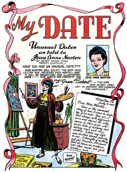
My Date #2 (September 1947) “My Date”, art by Dan Barry

Not only was there a feature “My Date with Swifty Chase” but there was also another simply titled “My Date”. Interestingly “My Date” uses the same ribbon border on the splash page that is found in “My Date with Swifty Chase”. The premise for the feature was the supposed true stories as told to Jean Anne Marten. But after reading these stories it is clear that they are fictional. The feature “My Date” was drawn by Dan Barry in issues #1 to #3 and by an unidentified artist in the final issue. At this time Barry was doing a bit of work for Hillman including Airboy and the Heap. Besides comic books, Dan would also do syndication work on Tarzan (1947 – 1948) and Flash Gordon (1951 – 1990). Joe Simon told me that Barry did work for him during the Mainline period. Originally I thought this was on Charlie Chan but when I showed Joe that art he said it was not done by Barry. So at this point I have no idea what work Dan Barry did for Mainline. Barry seems a good enough artist but I cannot get very excited about the work he did for My Date.


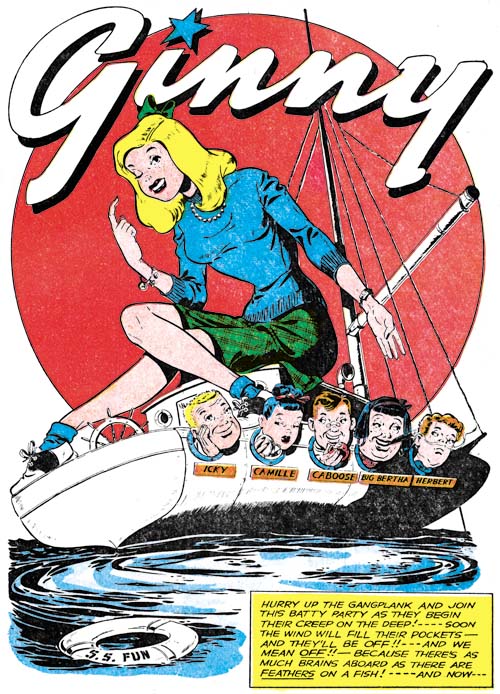
My Date #1 (July 1947) “Ginny”, art by unidentified artist

Another feature in My Date is “Ginny”. Nothing particularly outstanding about this feature, it was just another teenage group. The most unusual member was a cigar smoking girl with the name of Big Bertha. (Big Bertha was a heavy gun used by the Germans during World War 1). I have no idea who the artist was but it was the same one in all four issues. In terms of drawing skills this artist really was not more exceptional then other artists in My Date (of course excluding Kirby). What really distinguishes him is his use of panel layouts. These were much more imaginative then even those by Simon and Kirby in the “Swifty Chase” stories.


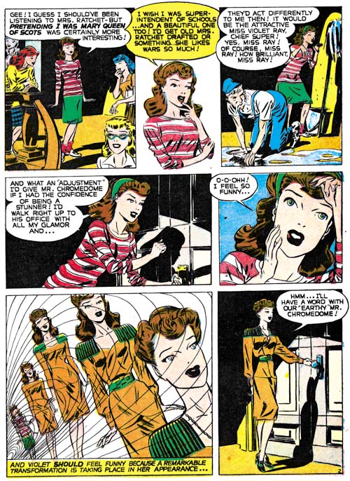
My Date #1 (July 1947) “Ultra Violet” page 2, art by Jerry Robinson? and George Roussos?

Perhaps the most unique feature in My Date was “Ultra Violet”. The lead character Violet has a very active imagination. But she is no Walter Mitty, her daydreams actually affect reality. In the sequence shown above, Violet transforms into a glamorous school superintendent (that sure sounds like an oxymoron). Her actions in that roll have repercussions even after she resumes her more ordinary existence. Another daydream reveals the truth behind a musical idol (he has false teeth and wears a toupee). I rather like the fact that no explanation is given as to how she is able to achieve such transformations.

The first Ultra Violet story is unsigned. When writing in this blog I prefer to record my current opinions even when they are very tentative and in need of further investigation. Such is the case here where I feel the art looks very much like that by Jerry Robinson. You can see some of Jerry’s work with Mort Meskin in a previous post. However the art is not so well done as to suggest that Jerry inked it himself, nor is the inking by Mort Meskin. If it is by Robinson, and that still is a big if, then it may have been inked by George Roussos.


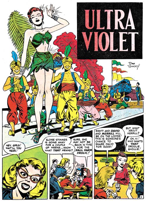
My Date #2 (September 1947) “Ultra Violet”, art by Dan Barry

The Ultra Violet features in My Date #2 and #3 were done by Dan Barry. Barry brought to the feature a more finished and elaborate style but I rather liked the original artist.


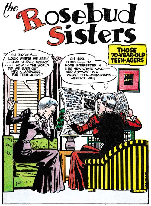
My Date #2 (September 1947) “The Rosebud Sisters”, art by Jack Keeler

My Date included stories that only appeared once. Was that intentional or were they tryouts that were judged to be unsuccessful? One unusual story was “The Rosebud Sisters”. Since the story is about a couple of elderly woman it seems very out of place in a comic devoted to teenage humor. The oddness of including this story was obvious even then since it was subtitled “Those 70-Year-Old Teen-Agers”. Fortunately the art was signed by Jack Keeler otherwise I never would have recognized it. Keeler had worked with Simon and Kirby previously having provided some 3 page Junior Genius stories for Stuntman. The Junior Genius was one of those humor strips with rather cartoony type of drawing. Keeler drew “The Rosebud Sisters” more realistically without completely loosing the cartoon-like effect.


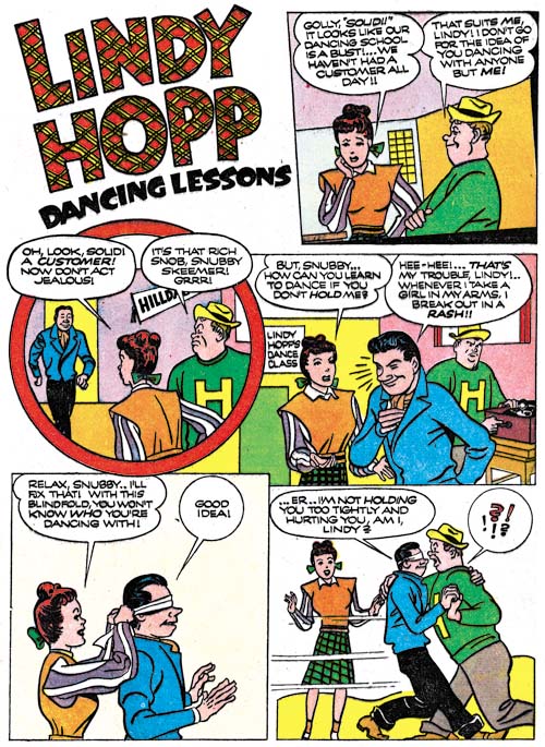
My Date #2 (September 1947) “Lindy Hopp Dancing Lessons”, art by unidentified artist

Another curious feature is “Lindy Hopp Dancing Lessons” from My Date #2. What is unusual about it is although it clearly was not drawn by either Jack Kirby or Joe Simon it includes two characters from “My Date with Swifty Chase”. The boy in the green sweater and yellow hat is clearly Bumpy although he is referred to as Soud. Snubby Skeemer is correctly named but in this strip he will not hold a girl because when he does he breaks out in a rash. This is hardly consistent with his portrayal in the Swifty Chase stories.


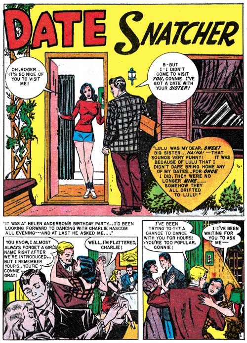
My Date #3 (November 1947) “Date Snatcher”, art by unidentified artist

While recognizing My Date was not a romance comic, some have called it a proto-romance. The idea being that it lead the way to the first true romance comic book, Young Romance. Personally I do not buy that argument since I feel the best prototype was just what Joe Simon claimed, the romance pulps. Almost all of My Date was teenage humor albeit primarily aimed at a young female readership. There is some justification for a label of proto-romance for a couple of stories in My Date. “Date Snatcher” (My Date #3) and “Genius, That’s What” (My Date #4) are decidedly not humor. They both deal with relations between the sexes. However there are no kisses or expressions of love although the lead character’s sister in “Date Snatcher” does get married. Like the humor stories, there is lots of dating but no romance. Still very little would have to be changed to make these true romance stories so proto-romance seems appropriate for these particular features.


My Date #4 (January 1948) “Genius, That’s What”, art by unidentified artist

I am undecided about just what level of involvement did Simon and Kirby have with My Date. I am sure the title was Joe and Jack’s brain-child. Although not belonging to the romance genre, My Date was clearly aimed at teenage girls which was the same audience intended for the romance comic that Simon and Kirby were proposing at this time. All the covers were by Kirby except the last one which was by Jerry Robinson and Mort Meskin but that one also depicted Swifty Chase, Sunny Daye and House-Date Harry. Further the first story in the comic was always by Simon and Kirby. In fact the only art that Simon and Kirby signed for Hillman was for My Date and the Western Fighters #1 cover. All that would suggest that My Date was produced by Joe Simon and Jack Kirby. But not everything in the comic supports that thesis. Usually any new Simon and Kirby title would feature a lot of work drawn by Jack but My Date would only have one Kirby story per issue (except for My Date #4). S&K would usually provide a feature with a story title while Hillman generally only used the feature’s name and My Date followed the Hillman format. Like Sherlock Holmes’s barking dog, what is most surprising is what is not present in My Date and that is Bill Draut. Draut played an important part in earlier the Stuntman and Boy Explorers comics and would again in Young Romance but he is completely absent from My Date. The only artist that worked with Joe and Jack previously was Jack Keeler and he only shows up once. I am not sure what to say about Dan Barry. Barry appeared in a number of Hillman titles in about the same time. Did Simon and Kirby introduce Dan to Hillman or was it the other way around? I am unfamiliar with the rest of the My Date artists and do not believe any of them did work for Simon and Kirby later. All in all there is a least a suggestion the Simon and Kirby did not have the full creative control over My Date that they obviously had with titles that they produced for Prize.