Category Archives: 2012/04

Harvey Horror: Black Cat Mystic #59

Nine months separated Black Cat Mystery #57 and Black Cat Mystic #58. Such a lengthy delay would make it difficult for the title to pick up a following of readers. That was bad enough but it would be a further year before Black Cat Mystic #59 hit the stands. What was Harvey thinking? The inking style used by Jack Kirby for BCM #59 does not match very well with his inking found in other publications from 1957 but it is a good match for the inking he did in BCM #58 (Jack Kirby’s Austere Inking, Chapter 8, More Harvey). The original art for one of the stories (“The Great Stone Face”) has a Comic Code approval stamp dated June 1956 which shows that the art was in fact created in 1956. Normally getting the Comic Code approval was the last step before getting ready for the printers which would suggest a planned publication date of October or November 1956. That is just the date that would be expected had Harvey not put the issue on hold. Again what was Harvey thinking? This is not a suggestion that Harvey made a poor decision (although that was true) but a real question on why the apparently sudden change in plans. Poor sales does not seem a likely explanation. Sales figures for BCM #58 would not have been available at the time the decision was made to hold back on BCM #59.
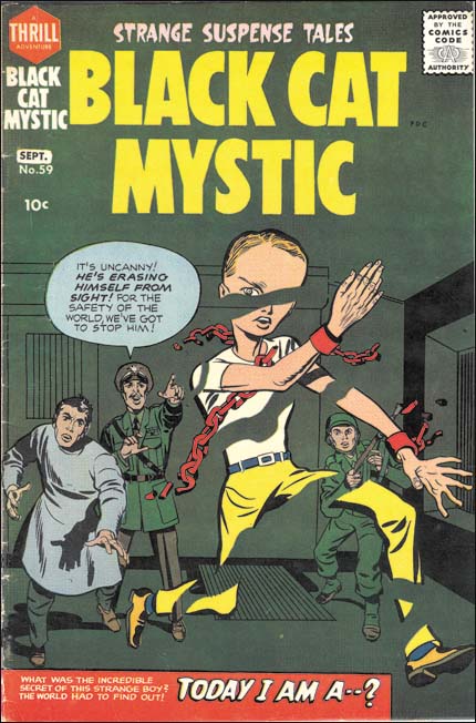

Black Cat Mystic #59 (September 1957), pencils and inks by Jack Kirby

The cover for BCM #59 shows a figure erasing himself away, a rather unusual image to say the least. The figure has six fingers per hand and a large head which indicate he is not truly human. That the figure was also chained indicates that he was considered a threat by the scientist and soldiers shown on the cover.
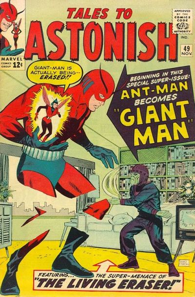

Tales to Astonish #49 (November 1963), pencils and inks by Don Heck (image from GCD)

While by no means identical a similar cover was created years later for Tales to Astonish #49 (November 1963). The cover artist was Don Heck but the story was drawn by Kirby and inked by Heck. Apparently the Living Eraser was for years used as an example of occasional failures by Lee and Kirby collaboration. While the Living Eraser was not up to the standards of comic book antagonists like Galactus he seems better than some of the other early creations such as Paste Pot Pete. At least the Living Eraser provided a memorable image.
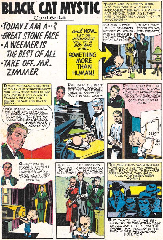

Black Cat Mystic #59 (September 1957) Introduction, pencils by Jack Kirby, inks by Joe Simon

A contents page was pretty much standard at Harvey when Simon began working there as an editor. But it appears to have been Joe that converted the page into an introduction page. This introduction would be a sort of a prequel to one of the stories in the comic. Joe would often try to draw the introduction in the same style as the artist who did the story (Joe Simon’s Turn At Imitating). Joe was good enough of a mimic that some experts still attribute these introduction to the story artist. Jack Kirby also did some introductions for Harvey (Bill Draut and His Imitator, Jack Kirby, Jack Kirby Swiping from Bill Draut, Kirby Imitating John Prentice and Kirby Imitating John Prentice Again). Previously I believed that Jack was imitating the story artist as well. However Kirby was a rather poor imitator and except for one swipe Jack was just being himself. I now realize it was Simon who was purposely inking of these pieces to made them look the story artist. But in the case of the Introduction for BCM #59 Kirby was the story artist and Joe inks the piece in his normal manner.
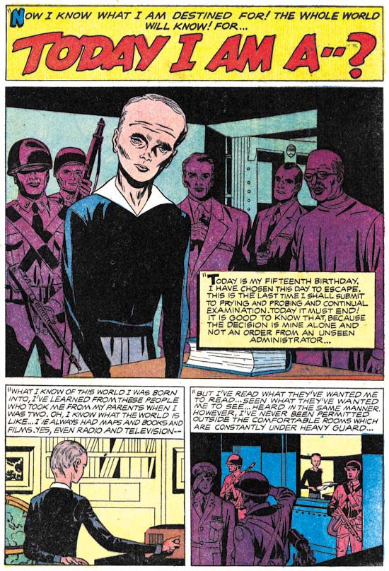

Black Cat Mystic #59 (September 1957) “Today I Am A…”, pencils by Jack Kirby, inks by Joe Simon

Jack Kirby is famous for his high action comic art. Understandably because he was so good at it. But Kirby was also master at building tension into a story and “Today I Am A…” is a great example of that. In the hands of a lesser artist this might have been a rather mundane story but Jack transforms it with his usual magic. “Today I am a man” is a bar mitzvah cliché that was probably lost to most of the young readers when this story first was published but it is a clever title for a story of an exceptional individual becoming of age.
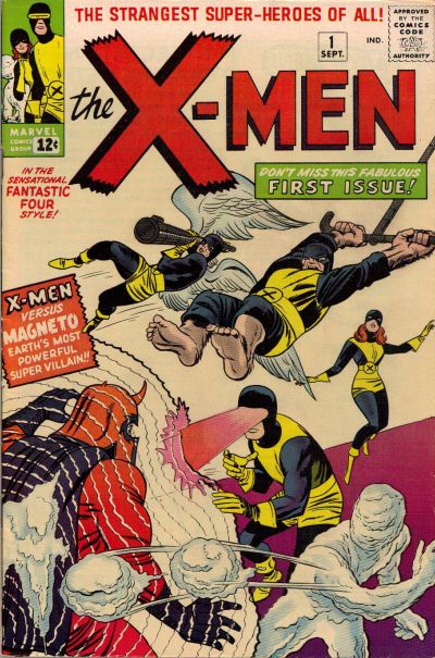

X-Men #1 (September 1963) “X-Men”, pencils by Jack Kirby, inks by Paul Reinman (image from GCD)

The Introduction and story “Today I Am A…” never mention the word mutant. However despite his physical and mental differences the main character Paul was born of normal parents. He was clearly meant to be a sudden and dramatic stage in the evolution of mankind. Normal humans fear and seek to confine him. I do not think I am out of line to suggest that in this story from BCM #59 we find the concepts that would eventually become Homo superior feared by the rest of humanity that would be the basis for the X-Men created by Stan Lee and Jack Kirby. Some fans object to provided creation credits to Lee and Kirby because of all the individual X-Men that were created by other artists. However it was Lee and Kirby that created the premise of mutants and public mistrust that is the foundation of this series right up to today.
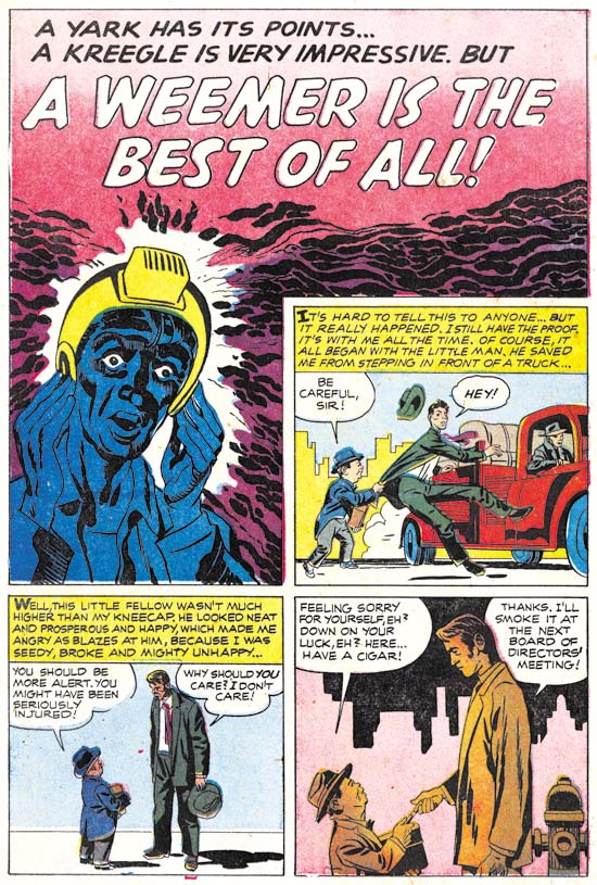

Black Cat Mystic #59 (September 1957) “A Weemer Is the Best of All”, pencils and inks by Jack Kirby

“A Weemer Is the Best of All” is a story in a more humorous vein. Not side-splitting humor but definitely a story not meant to be taken seriously. Humor was frequently a part of Simon and Kirby’s repertoire. Even action stories often had humorous parts to them.
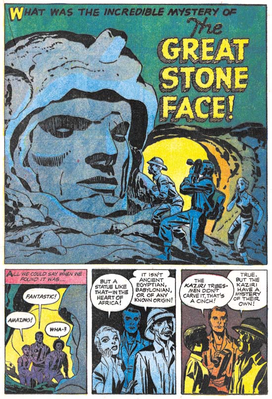

Black Cat Mystic #59 (September 1957) “The Great Stone Face”, pencils and inks by Jack Kirby

A monumental stone sculpture of unknown origin, an African tribe with technical skills, and a rifle slinging anthropologist. This is one of those stories so imaginative that one wonders where they came up with it. I can understand the anthropologist but where did the rest come from? Both Joe and Jack were science fiction fans and I suspect somewhere in the pulp magazines they read supplied the kernels that eventually formed into stories such as this one.
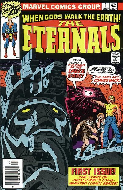

The Eternals #1 (July 1976), pencils by jack Kirby, inks by Frank Giacoia (image from GCD)

The theme of gigantic aliens residing on earth for immense periods of time for mysterious reasons is common to both “The Great Stone Face” and the Eternals (a title Kirby created for Marvel in 1976). Jack would often expand on story lines he worked on earlier in his career.


Black Cat Mystic #59 (September 1957) “Take Off, Mr. Zimmer”, pencils and inks by Jack Kirby

The ghost Mr. Zimmer was presented in BCM #58 and seems to have been planned as a recurring character. In BCM #58 Mr. Zimmer was presented in the first, featured, story. However in BCM #59 Mr. Zimmer became delegated to the final story in the book. While the title Black Cat Mystic would suggest the horror genre the contents were predominately science fiction. So perhaps Mr. Zimmer fall from grace was just a recognition that he was somewhat out of place in the direction the title had gone. But then again horror, although a rather mild version suitable for the Comic Code, would continue to play a roll in the title. In any case this would the last appearance of Mr. Zimmer.

Harvey Horror and Science Fiction: Black Cat Mystery #57

The break up of the Simon and Kirby studio, was not the end of Simon and Kirby collaborations. Even after Kirby began freelancing, Simon would still turn to Jack to help with comic book titles that he would work on. While Kirby contributed to these projects, particularly for the initial issues of a title, these were essentially Simon’s projects. Nonetheless I am sure that Jack had much creative freedom on the pieces he actually drew. I will begin examining, in some cases re-examining, these late collaborations beginning with Black Cat Mystery #57 (January 1956). There is some question as to exactly when the Simon and Kirby studio disbanded. In my opinion the latest date that can be assigned to the breakup would be August 1955 (cover date) when the final issues of the former Mainline titles were published by Charlton (Foxhole #6 and Police Trap #6). However is possible that some of the art to be discussed in this serial post could have been created before the studio breakup.


Black Cat Mystery #57 (January 1956), pencils and inks by Jack Kirby

The Black Cat series had undergone a number of title changes. Starting out as Black Cat based on a female superhero (#1, June 1946), then becoming Black Cat Western while presumably retaining the female hero (#16, March 1949), returning to Black Cat (#20, November 1949), switching to Black Cat Mystery and a horror genre (#30, August 1951), returning once again to Black Cat but retaining the horror content (#44, June 1953) before returning again to Black Cat Western without the horror and with the titled superhero (#54, February 1954). The last switch from horror content may have been prompted by all the adverse public criticism of genre which lead to the establishment of the Comic Code Authority. Black Cat Western #54 (February 1954) and #56 (October 1956) contain much reprint material from earlier issues according to the GCD. Black Cat Mystery #57 brought a returned to the old title and the horror genre although the horror was the mild form suitable for passing the strict Comic Code.

Jack Kirby only contribution to the issue #57 was the art for the cover. With Simon and Kirby there is always the possibility that a particular cover art could have been recycled from an earlier unused cover. However in the case of the cover for BCM #57, there are two reasons to believe that did not happen. The somewhat humorous aspect to the cover would have been out of place for Black Magic the only appropriate alternate source for this type of cover. Further the cover is based on a story found inside (see below). It is doubtful that the inside story was recycled because Black Magic was a pre-Code comic and therefore any story from it would have had difficulty getting Comic Code approval. I suspect that Kirby had not actually seen the interior story since that story had nothing to do with an underwater fish civilization.

The original art for this cover still exists and it would be interesting to see the date of the Comic Code Approval. While this cover was probably made for this issue it is still possible that the entire issue was put together some time previously.


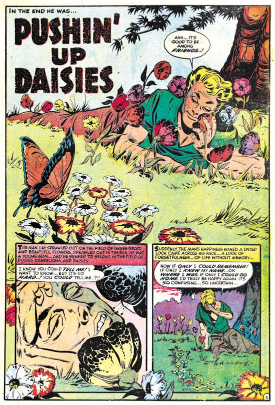
Black Cat Mystery #57 (January 1956) “Pushin’ Up Daisies”, pencils by Bob Powell

Although Bob Powell had occasionally done work for Simon and Kirby, he was largely a Harvey artist having provided much work to that company over many years. Earlier Harvey horror stories were too extreme to pass the Comic Code without modifications but there are no signs of changes so this was almost certainly a new piece created for this title.


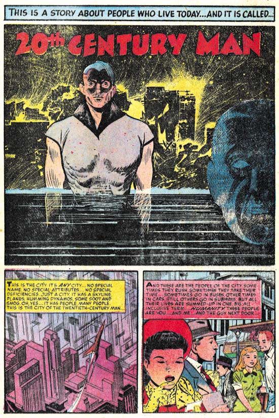
Black Cat Mystery #57 (January 1956) “20th Century Man”, pencils by John Giunta, inks by Manny Stallman?

John Giunta only did a few pieces of work for Simon and Kirby (see Art of Romance Chapter 9 and It’s A Crime Chapter 7). Giunta seems to have worked for a variety of publishers including a few pieces for Harvey. His style is a little dry for my tastes particularly for the crime or romance genre. However his style works very well for this particular story. I especially like the splash. The background with is jumbled silhouettes and scratchy and splashy inking is very effective. It is a little surprising to see such rough work for this artist but otherwise the inking looks like that found in some of his other work inked by Manny Stallman so I believe Stallman may have been the inker here as well.


Black Cat Mystery #57 (January 1956) “Underwater”, pencils by Howard Nostrand

Howard Nostrand is another artist that normally I cannot get too enthusiastic about. But the opening sequence for “Underwater” is just superb. Nostrand was a frequent contributor to Harvey Comics but as far as I know never previously worked for Simon and Kirby.


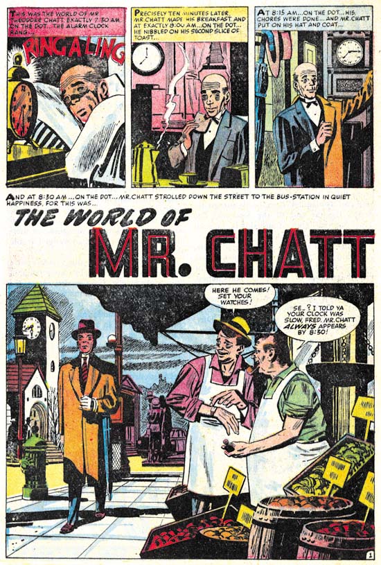
Black Cat Mystery #57 (January 1956) “The World of Mr. Chatt”, pencils by Mort Meskin

The final story, “The World of Mr. Chatt”, was drawn by a former Simon and Kirby regular (or what I sometimes refer to as one of the usual suspects) however Mort did very little work for Harvey. The only other Harvey piece that I am aware of was “Credit and Loss” from Chamber of Chills #24 (July 1954, a real masterpiece) but I have heard he did another earlier piece for Black Cat as well. Meskin was doing a lot of work for DC at this time. Many have criticized Mort’s DC work but in many ways he was still doing great art. But the emphasis of this late work was the almost cinematic approach that Meskin used to graphically tell a story. Mort’s careful control of pacing and view points was just masterful but unfortunately involved subtleties that many readers failed to notice or appreciate. “The World of Mr. Chatt” is a good example of Meskin’s late approach. Note the simple but effective opening sequence to the story. My main criticism of this particular work of art concerns the inking. I have not done a careful study but I suspect that Mort did not ink a lot of this later work and I am pretty certain he did not ink this piece. Again without careful inspection the inking reminds me of George Roussos.

I believe that Joe Simon was responsible for putting Black Cat Mystery #57 together although I have little evidence to back that up other than the cover that Jack Kirby provided. With the exception of Meskin, the artists used in this issue mostly seem to be drawn from Harvey’s talent pool. This is not too surprising as it suggests that the title had to be put together quickly. We shall see later that something similar happened with the first issue of Race for the Moon. The next issue would more clearly show the Simon and Kirby touch.

Hand of Fire: The Comics Art of Jack Kirby by Charles Hatfield

Hatfield devotes a chapter to discussing Kirby’s art and in particular his style. This section was of particular interest to me because it is by using aspects of an artist’s style, particularly seemingly insignificant ones, that an artist’s work can be identified. Much of the books’ discussion concerns applying, or rather attempting to apply, the theories of Charles Sander Peirce to Kirby’s work. I believe that Hatfield does a good job of describing Peirce’s theories, but then again since I was completely unfamiliar with them I cannot say how accurately they are presented. By his own admission applying Peirce’s theories on Kirby’s art is a difficult match but Hatfield feels that there is much to be learned from the attempt. It certainly provided me with an alternate way of looking at things which is the chief value in a book like “Hand of Fire”.

Hatfield also makes use of a definition of Will Eisner that “style results from the failure and frustration, from grappling with one’s own weaknesses as an artist and turning them to advantage”. While there is some truth in this, I feel it is only partial explanation of how an artist’s style is accomplished. Some aspects of an artist’s style may originate from his deficiencies, particularly earlier in a career. Kirby’s penchant for big ears during his first DC period comes to mind. But an artist style usually evolves over time and this generally is not due to any deterioration of his capabilities. Rather artist often go through a process of refining their work by filtering out what they consider unimportant aspects and emphasizing those of greater personal significance. Kirby’s style while working on the Fourth World books was, in my opinion, his best graphical efforts and this certainly not due to his failure to grapple with his weaknesses.

There is a chapter on the history and authorship of the Marvel Universe. It is a balance view which while emphasizing Kirby’s importance does not diminish or discredit Stan Lee’s contributions. I suspect Kirby Cultists will not be pleased but I was. Hatfield’s discussion of two common misapprehensions (that Marvel made superhero stories realistic and that the comics were created with a pre-planned continuity).

Included in the book is a lengthy analysis of Kirby’s work for DC, that what is commonly called the Fourth World. Hatfield obviously feels that this was the most important point of Kirby’s career. I admit that is an opinion that I do not share. But I still find his discussion about this work to be insightful and interesting. In fact the best that I have ever read.

“Hand of Fire” is not the type of book one would pick up to see great art. There is a small color section and some black and white illustrations scattered through the text. All the work shown was selected to match discussions in the text. So this is not a book to pick up just to see great Kirby art. But it is a great book if you want to enter into a discussion about Jack Kirby and his art. You may not agree with everything Hatfield writes, but you will understand why he takes the positions that he does and you may his ideas challenging.