I have noticed that Amazon has a entry for Titan’s “Joe Simon: The Man Behind the Comics: The Illustrated Autobiography of Joe Simon“. It is listed being released on April 19 at a list price of $24.95 but at $16.47 from Amazon. Amazon UK also lists the book but get this, there is already someone selling a used copy! That is absolutely impossible. Not only has the book not been printed, it has not even been put together yet.
Category Archives: 2010/06
David Wigransky for the Defense
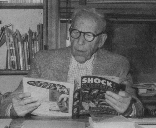
Frederic Wertham
The May 29, 1948 issue of the Saturday Review of Literature included an article “The Comics…Very Funny” by Dr. Fredric Wertham. Yes the very same Wertham whose 1954 book “The Seduction of the Innocent” initiated the events that crippled and nearly destroyed the comic book industry (The Real Reason for the Decline of Comics). The article was written in the same style used in his later book and likewise condemned the reading of comic books by children. Much of the article’s beginning is devoted to numerous descriptions of crimes perpetrated by children. As an example:
Think of the many recent violent crimes committed by young boys and girls. A twelve-year-old boy who kills his older sister; a thirteen-year-old burglar who operates with a shotgun; a seventeen-year-old boy who kills a thirteen-year-old boy a leaves a note signed “The Devil”…
The supposed links between the children’s’ crime and the reading of comics is provided in only a very few places but otherwise the connection between the crime and comics is largely ignored except for this rather surprising statement:
All these manifestations of brutality, cruelty, and violence and the manner in which they are committed–that is the folklore of the comic books.
In the article Wertham provided 17 points that he claimed supporters of comic books make and the arguments that can be made against them. For example:
7) That the children don’t imitate these stories. (But the increase of violence in juvenile delinquency has gone hand in hand with the increase in the distribution of comics books.)
(You can read the entire article at Seduction of the Innocent.org.)
“The Comics…Very Funny” certainly provide critics of comic books with useful ammunition. Frederic Wertham’s status as an authority and scientist carried much weight with the public. Wertham was effective in disarming his critics by pointing out that they were paid by comic book publishers. What was needed was someone independent from the comic book industry who could provide an articulate challenge to Wertham. Unexpectedly the most successful rebuttal was made by a 14 year old boy, David Wigransky.
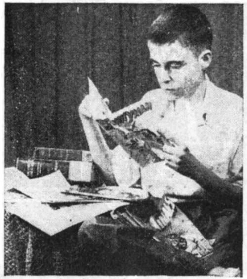
David Pace Wigransky
Wigransky’s defense of comic books was published in the July 24th issue of the Saturday Review of Literature, the same periodical that published Wertham’s article. Wigransky’s letter was published under the title “Cain Before Comics” but the biblical reference that seemed more appropriate was David and Goliath. On the face of it, it would seem unlikely that a boy could offer very much of an intellectual challenge to an authority figure like Wertham. However of the two, Wigransky’s is the much more thought out discussion. When I read Wertham’s “Seduction of the Innocent” I was greatly bothered why everyone from that time did not see through his badly argued and poorly supported attach on comic books. Well David Wigransky did see right through it.
Wigransky pointed out that violence proceeded the creation of comic books. Further that good upbringing and reading good books were not proof against the adoption of murderous behavior in the young. While there were numerous readers of comic books, there were comparatively few delinquents. Wigransky noted that Wertham’s strong antipathy to comic books colored his investigations and reports. David suspected, correctly in my opinion, that Wertham manipulated his children patients to provide the evidence against comics that he, Wertham, expected. That the crusade against comic books was actually not really new; 1896 saw a crusade against the syndication comic strip “The Yellow Kid”. Crime and violence were looked at by comic book readers as adventure and excitement, not a something to experience. Wigransky predicted that generation of comic book readers would in the end turn out all right.
My summation of Wigransky’s article hardly does it justice. The reader can find the entire letter reprinted in “Mr. Monster’s Comic Crypt” by Michael Gilbert (Alter Ego 90, December 2009).
David Wigransky did a fabulous job of defending comic books against Frederic Wertham’s critical article. Wertham’s response was to totally ignore him. Wigransky is not once mentioned in “Seduction of the Innocent” nor were his arguments every addressed by Wertham.
But not everyone ignored Wigransky’s defense. An editorial piece, probably written by Stan Lee, appeared in some Atlas Comics. The editorial not only mentions David Wigransky by name but includes quotes from his letter. Comic artists gratefully noted Wigransky as well. Alfred Andriola sent David the original art for a Kerry Drake strip titles “There’s your case against D.D.T., Mr. D.A.!”. The strip is dated December 26, 1947. It was signed “best wishes to David Wigransky from Kerry Drake and Alfred Andriola” (Cartoon Drawings: Swann Collection of Caricature and Cartoon).
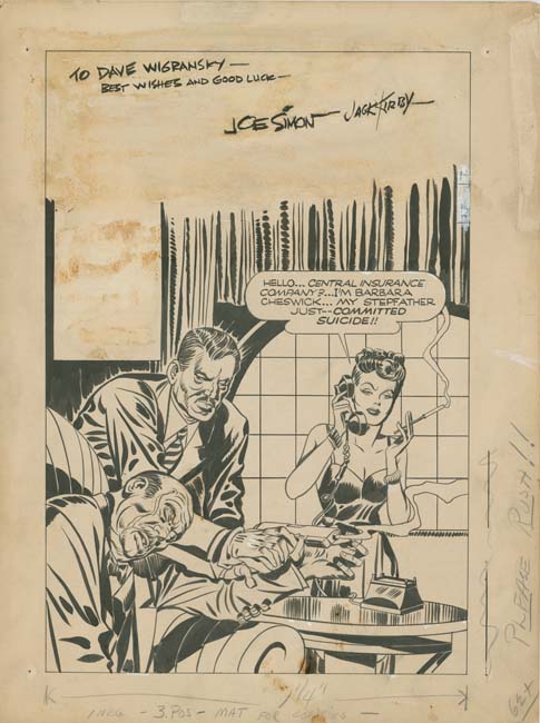
Headline #25 (July 1947), pencils by Jack Kirby, inks by Joe Simon, letters by Joe Simon?
More pertinent to this blog is that Joe Simon and Jack Kirby also recognized Wigransky’s contribution by presenting his with original art, the cover for Headline #25 (July 1947). The inscription was by Joe but Jack signed it as well. The cover is an early one from the start of Simon and Kirby’s work for Prize Comics after the war. Simon and Kirby had only produced two previous issues of Headline while Justice Traps the Guilty and Young Romance had yet to be launched. This cover was an apt choice to give to Wigransky considering that at this time it was the crime comics that were receiving the most negative criticism. Headline #25 was certainly the most graphic crime cover that Simon and Kirby had done to date. While there were some later covers that depicted dead or dying figures, this was the only one that showed the victim’s wound.
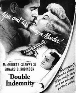
The cover featured the black humor that often accompanied Simon and Kirby’s crime covers. The female protagonist’s name was not random but was modeled on that of Barbara Stanwyck. Not that long previously Stanwyck had starred in “Double Indemnity” (released April 24, 1944). However in the movie it is Stanwyck’s husband that was murdered for the insurance, while for the cover it was the step-father.
Joe and Jack’s gift to David Wigransky was rather fortunate. Very little original art remains for Simon and Kirby’s early work on the crime genre. Today there is much more art for the earlier Stuntman and that only lasted two issues. The only other original art from Simon and Kirby’s early crime comics that I am aware of is one splash panel (“The Case of the Floating Corpse”, Headline #24, May 1947 that originally came from Joe Simon’s collection) and one unfinished cover (intended for Headline #44, November 1950 that had been kept by Jack Kirby).
The four corners of the original art for Headline #25 shows the imprint left by thumb tacks which can be seen even in the low resolution image I have provided. I like to think that they were used by Wigransky to fasten the art to his bedroom wall.
David Wigransky kept his interest in comic books at least for a couple of years. The December 1949 issue of Popular Mechanics includes an advertisement he ran looking for old comic books or original art. As an adult he wrote a book on the singer Al Jolson (“Jolsonography”, 1974). That rare work (a copy is being offered for $400) must have been published posthumously as David died in 1969 at what must have been about the age of 36.
Replacing Simon and Kirby, Chapter 3, They’re Back
In the previous chapter I covered the artist who did most of the Newsboy Legion stories while Joe Simon and Jack Kirby were off doing their military service. I had questionably attributed this work to Arturo or Louis Caseneuve based on comments made by Joe Simon. However I have now seen enough work attributed to these artists to doubt that they had anything to do with penciling all those Newsboy Legion stories. I also looked into a commenter’s suggestion that the artist might be Phil Bard and although I will completely rule that out I do not believe it is a correct attribution either. All I can say is that I am certain this artist was not Gil Kane. Whoever the replacement artist was his Newsboy run ended with Star Spangled #49 (October 1945).
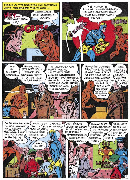
Star Spangled #50 (November 1945) “The Leopard Man Changes His Spots” page 11, art by unidentified artist
It was not Simon and Kirby that followed the replacement artist but yet another artist that I am unable to identify. Unfortunately he is not up to the standards of the S&K replacement artist let alone the real Simon and Kirby. Panel 2 of page 11 (see above) and the cover for KO #1 (October 1945) clearly share some sort of connection. The cover dates for the SS #50 and KO #1 are so close that is hard to believe one was swiped from the other unless that happened before publication. Perhaps there is an older Simon and Kirby work that both were based upon that has not yet been recognized. Oddly while no one seems to have credited “The Leopard Man Changes His Spots” as a work by Simon and Kirby some have attributed the KO #1 cover to Kirby. However there are so many things wrong with the KO #1 cover that a Kirby attribution can certainly be rejected (see Not Kirby: KO #1, KO #1 Returns and KO #1, Round Three).
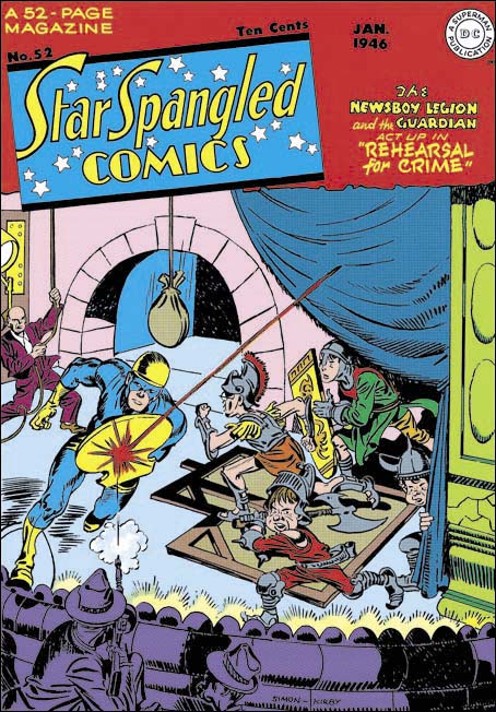
Star Spangled #52 (January 1946), pencils and inks by Jack Kirby
The covers for Star Spangled #44 (May 1945) to #47 (August 1945) were drawn by the replacement artist that I covered in my last chapter (Chapter 2, The Replacement). Jack Kirby drew the covers for Star Spangled #48 (September 1945) to #51 (December 1945) but the question is when were these done? Were they part of the inventory that Simon and Kirby created before they entered military service? Or were they done after Jack returned from Europe? Kirby could have drawn them even if he had not yet left the service. I am not going to try to answer that question at this time but I am certain that the cover for Star Spangled #52 (January 1946) was not part of the original inventory. Kirby not only penciled this cover he inked it as well. Such inking was a luxury that Kirby could not afford while busily building up the original inventory. So from this point on it can confidently be said that Kirby was back. It has a Simon and Kirby signature but I do not think Joe was out of the military yet. This was just Jack recognizing his partnership with Simon. Joe had done the same thing earlier on the cover for Boy Commandos #12 (Fall 1945) done while Joe was in the Coast Guards and Jack was still in Europe.
To my eyes this cover has a more advanced appearance compared to earlier covers. Much more like what would be seen in Stuntman; the first issue of which would appear a few months later. Even later Star Spangled covers were not quite as advanced probably because Jack did not ink them as well.
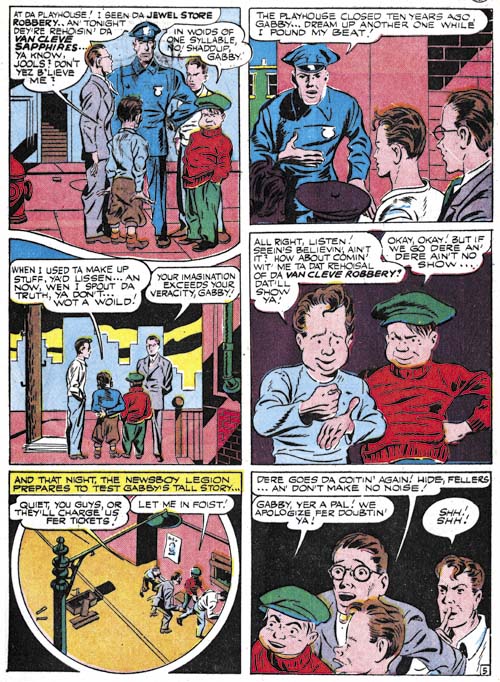
Star Spangled #52 (January 1946) “Rehearsal for Crime” page 5, art by Gil Kane?
Jack Kirby did the cover for Star Spangled #52 but he did not draw the “Rehearsal for Crime” story that appeared inside. Nor was this the artist who did art found in issues #50 and #51. The artist’s work reminds me a lot of the earlier work that Gil Kane did for the story in issue #30 (Chapter 1, The Newsboy Legion).
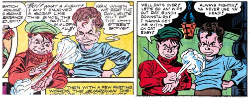
left Star Spangled #8 (May 1942) “Last Mile Alley” page 13 panel 2, pencils by Jack Kirby
right Star Spangled #30 (March 1944) “The Lady of Linden Lane” page 7 panel 5, art by Gil Kane?
Page 5 of “Rehearsal for Crime” was not the best page for showing that Gil Kane probably drew this story but I could not resist using it because of the fourth panel. It is a swipe that ultimately is derived from Simon and Kirby art from Star Spangled #8 (May 1942). But that was not the version that was actually swiped, it was the one Kane did for Star Spangled #30 (March 1944). Only now the figures of Gabby and Scrapper have been switched.
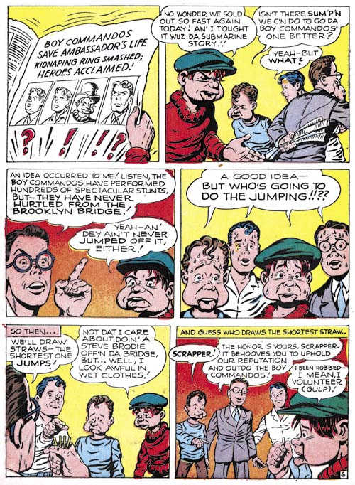
Star Spangled #60 (September 1946) “Steve Brodie the 2nd” page 6, art by unidentified artist
Jack Kirby would draw the stories for issues #53 to #59 (February to August 1946) and the covers up to Star Spangled #61 (October 1946) and that would end Simon and Kirby’s involvement in their Newsboy Legion. I doubt that Simon and Kirby every just walked away from work so I believe this was DC’s decision. Stuntman #1 is cover dated April so that timing is just right to suggest that Simon and Kirby were dropped because they had jumped ship to a competitor (Harvey Comics). While this might have been true I would not read too much into it because Joe and Jack continued to provide work for Boy Commandos for years to come. Without question DC was pretty mad about what Joe and Jack had done but just not mad enough to sabotage a popular title like Boy Commandos.
Simon and Kirby’s replacements would still strive to look like they were done by the masters but unfortunately these imitators were just not that successful. It seems that each issue had a different artist with perhaps the penciler for “Steve Brodie the 2nd” being the best.
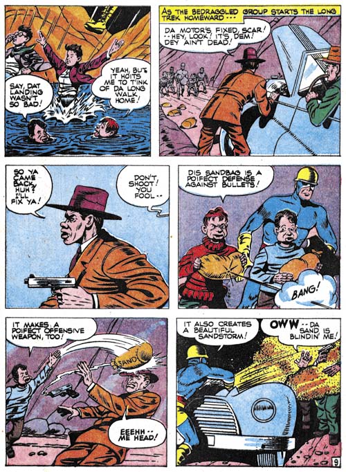
Star Spangled #61 (October 1946) “The Great Balloon Race” page 9, art by unidentified artist
I do not know, could there have been any purchasers who bought this comic with a Simon and Kirby cover who were not disappointed by the story inside?
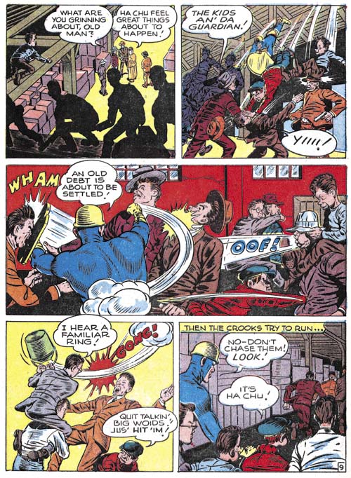
Star Spangled #63 (December 1946) “Code of the Newsstand” page 9, art by unidentified artist
I provide another example a Newsboy Legion artist from after Simon and Kirby had left a second time. Perhaps the reader can sense that my heart just is not into this work. It is not these artists are really that bad but coming after Simon and Kirby it is a bit of a let down. They did not even have the interesting and original qualities of the main replacement artist from the war years.
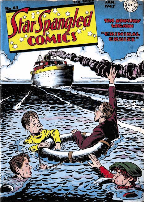
Star Spangled #64 (January 1947), art by unidentified artist
The cover for Star Spangled #64 (January 1947) shows a boat leaving the Newsboy Legion behind. Somehow it seems a fitting metaphor for the last issue of the Star Spangled that contained the Newsboy Legion. The next issue would feature Robin on the cover. Still the run lasted from April 1942 to January 1947. At 56 issues that is not bad at all. The demise of the Newsboy Legion seems to be part of DC’s decision to move away from the multitude of golden age features and concentrate on what they considered their core characters, Superman and Batman.
Art of Romance, Chapter 32, The Kirby Beat Goes On
(May – October 1956: Young Romance #83 – #84, Young Love #71 – #72, Young Brides #28 – #29)
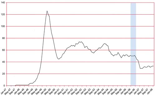
Number of Romance titles 1947 – 1958 (the period covered in this chapter is shaded in blue)
This is part of the period that saw the collapse of comic, the end of the golden age. While the number of romance titles has been steady the number of publishers of romance comics has been declining (The Real Reason for the Decline of Comics).
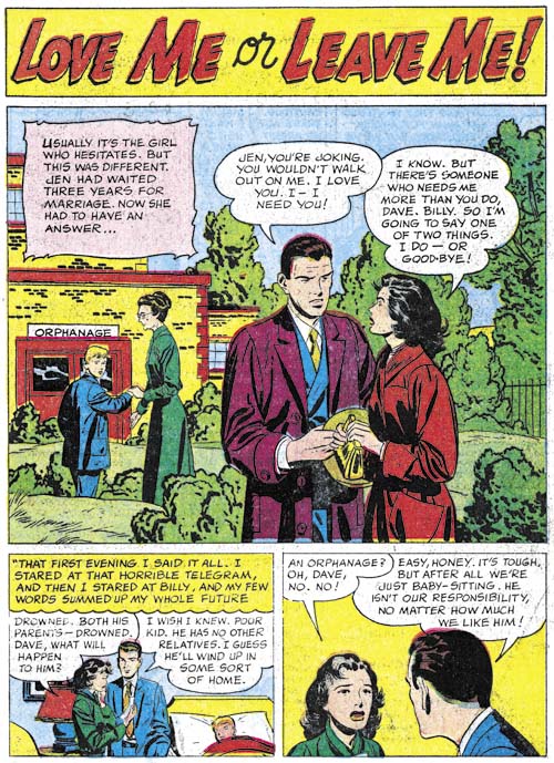
Young Love #71 (June 1956) “Love Me Or Leave Me”, pencils and inks by Bill Draut
Although I describe this period as being all Kirby romances, that is not completely accurate as other artists did appear. Of the six issues discussed in this chapter five were truly all Kirby while one (Young Love #71) was a more normal Simon and Kirby production. For YL #71 Kirby does the cover and one story but the three other stories were by other artists. It is odd that all the artists were placed in this one issue while Young Romance #83, which came out in the same month, was all Kirby. All of the artists for YL #71 had been used prior to this year but one only in a war genre title. Therefore it is uncertain whether this was left over inventory or not.
Bill Draut’s art has the somewhat cleaner look that his art showed in the last chapter. Clothing folds are smoother and more sweeping and not so blotchy as was his style previously. The GCD lists Bill in DC’s Tales of the Unexpected #2 (April 1956) so I wonder if this change is an attempt to change his style to one more acceptable to DC. If so it is the beginning of a change that would rob Draut’s art of much of what I admire and replace it with a style that was not that much appreciated by DC or any other publisher.
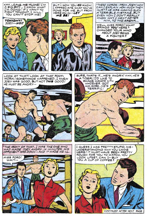
Young Love #71 (June 1956) “Birthday Present” page 3, pencils and inks? by Ann Brewster
“Birthday Present” would be Ann Brewster’s last work for Simon and Kirby. Joe and Jack only used her for the romance titles but this story does allow Ann to show how she can handle action. That she does so well with action should not come as a surprise because he she was doing superheroes earlier in her career (Ann Brewster, Not One of the Guys).
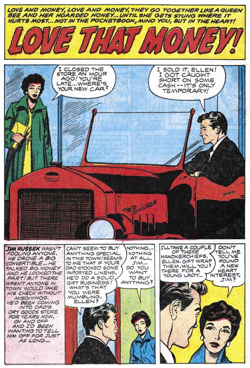
Young Love #71 (June 1956) “Love That Money”, pencils and inks? by Ted Galindo
This is Ted Galindo’s first appearance in the “Art of Romance” but he did work for Simon and Kirby in Foxhole (Foxhole #4, Enter the Comic Code). Frankly the art for Foxhole was not all that great so it comes as a surprise what a wonderful job Galindo would do in “Love That Money”. We will see even more impressive work by Ted when I cover him in “Criminal Artists”, my serial post on the post S&K Prize crime titles. For “Love That Money” Ted’s women are beautiful and elegant and he works in a more modern comic book art style. It is a shame that Simon and Kirby did not make more use of Galindo before this but perhaps they also were put off by the poorer job he did for Foxhole.
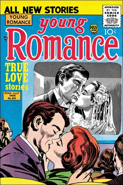
Young Romance #83 (June 1956), pencils by Jack Kirby and Joe Simon
There was one other exception to the otherwise all Kirby art for this chapter besides those found in Young Love #1 and that is the cover for Young Romance #83 (June 1956). Oh that certainly is Kirby’s pencils for the foreground figures but he did not do the figures projected on the screen. The black and white art looks like the work of Joe Simon. The screen was done using special art boards that provide several degrees of tone based on chemical applied to it. Years later these boards were used by Joe and the artists working for him for work on Sick. Joe still has some of these boards and once offered to show me how they worked. Unfortunately all the required chemicals that I could find had dried up.
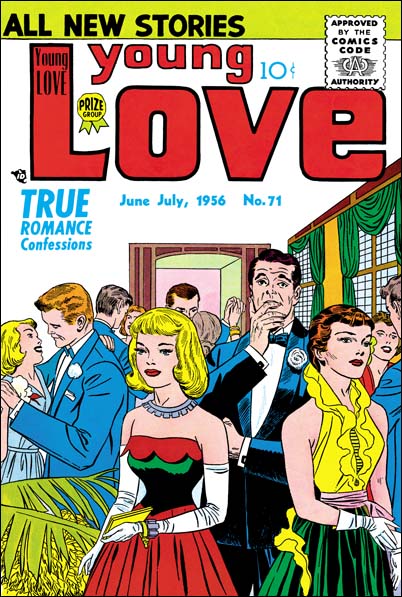
Young Love #71 (June 1956), pencils and inks by Jack Kirby
Young Love #71 provides a more typical example of a Prize romance cover than Young Romance #83. The inking for this cover was done in Austere inking style that Kirby worked in during this period (Jack Kirby’s Austere Inking). The ink lines are so fine that it would be reasonable to suggest that the work was done using a pen. However the original art is part of Joe Simon’s collection and a close examinations shows that it was done with a brush. While story art was usually done twice up (twice the size compared to as it would be published), generally the art for the Prize covers were done at about 1 1/2 size. But the truly twice up size of the original art for YL #71 allowed Kirby to achieve such fine lines with a brush.
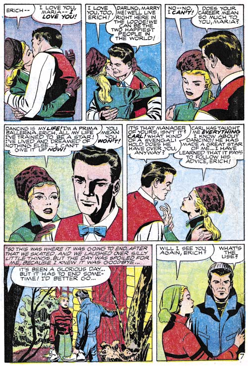
Young Romance #83 (June 1956) “Dancing Doll” page 7, pencils by Jack Kirby, inks by Jack Kirby and Marvin Stein?
I find Kirby inking Kirby to be particularly interesting and therefore want to provide a number of examples below. However much of the inking of Kirby’s pencils during this period was not done by Jack himself. I therefore think I would be remiss if I did not provide at least one example of Kirby inked by another artist. While the inking on “Dancing Doll” is rather nice it does have some characteristics that I believe exclude crediting it to Kirby. For instance, although it is hard to make out from the image I provide, the cheek of the main in panel 4 has some fine feathering that I have not seen Kirby use. Inking attributions during this period are particularly difficult. There are two leading candidates; Bill Draut and Marvin Stein. There are some examples that can be confidently attributed to each of them. But these are the exceptions and in most cases it is hard to tell if one of them inked it or some unidentified artist. “Dancing Doll is just such an example. However the way the inking is done around the mouth of the man in panel 4 suggests to me it might have been done by Marvin Stein.
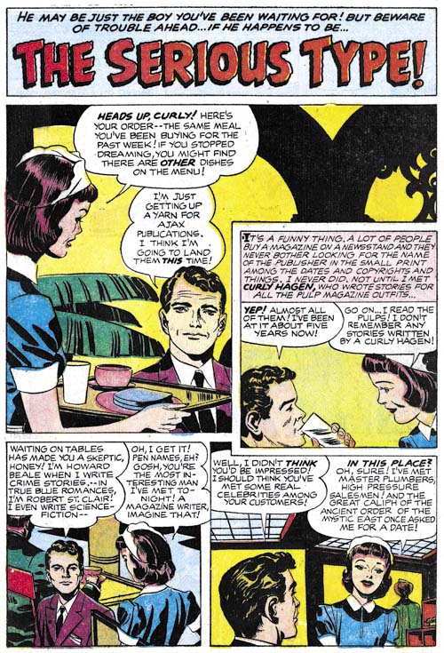
Young Romance #83 (June 1956) “The Serious Type”, pencils and inks by Jack Kirby
Some of the work from this period appears to be a combination of inking by Jack himself and some other artist. This is true for “The Serious Type” with the other inker questionably identified as Marvin Stein. However the work on the splash page appears to me to be inked by Kirby alone. Note the simple, spatulate forms that the clothing folds on the waitress in the splash and the shoulder blots throughout. Admittedly not the most exciting splash, even by standards of the romance genre, but still a well executed piece.
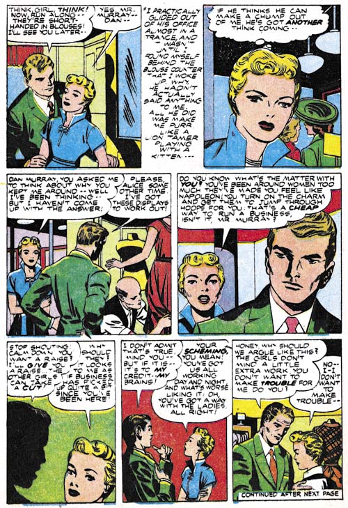
Young Brides #28 (May 1956) “Under New Management” page 4, pencils and inks by Jack Kirby
“Under New Management” is another jointly inked work and again by Kirby and possibly Stein. This seems to be a case of inkers working on particular pages; Kirby on pages 2 to 4 and 7 with Stein doing pages 1, 5 and 6. Besides the simply shaped clothing folds and shoulder blots there are also a couple of abstract arch shadows (panels 1 and 4). These are all typical of Kirby’s inking although Joe Simon used these techniques as well. I feel it fair to point out that I am a bit uncertain about whether Kirby inked the nose and eyebrows of the man in panel 4.
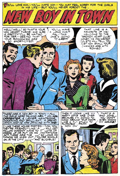
Young Brides #28 (May 1956) “New Boy In Town”, pencils and inks by Jack Kirby
I believe that all of the “New Boy In Town” was inked by Jack himself. Again while I cannot fault his drawing or inking it is not one of his more exciting splashes. The same theme is covered in a much more interesting manner on the cover.
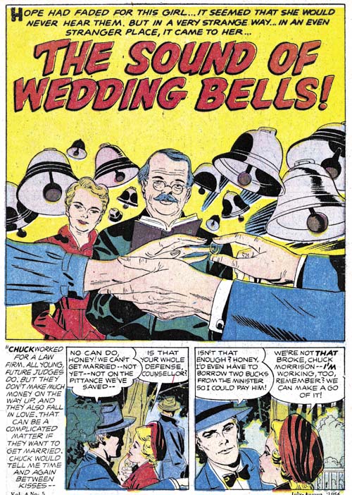
Young Brides #29 (July 1956) “The Sound Of Wedding Bells”, pencils and inks by Jack Kirby
Only the wedding couple’s hands are shown in the foreground. Behind their hands are the man presiding over the ceremony (a judge?) and a witness. The background is filled with clamoring bells announcing the festive occasion. This is certainly the most interesting romance splash Kirby has done during this period.
Still more all-Kirby romance comics to come in the next chapter of The Art of Romance.
Chapter 1, A New Genre (YR #1 – #4)
Chapter 2, Early Artists (YR #1 – #4)
Chapter 3, The Field No Longer Their’s Alone (YR #5 – #8)
Chapter 4, An Explosion of Romance (YR #9 – #12, YL #1 – #4)
Chapter 5, New Talent (YR #9 – 12, YL #1 – #4)
Chapter 6, Love on the Range (RWR #1 – #7, WL #1 – #6)
Chapter 7, More Love on the Range (RWR #1 – #7, WL #1 – #6)
Chapter 8, Kirby on the Range? (RWR #1 – #7, WL #1 – #6)
Chapter 9, More Romance (YR #13 – #16, YL #5 – #6)
Chapter 10, The Peak of the Love Glut (YR #17 – #20, YL #7 – #8)
Chapter 11, After the Glut (YR #21 – #23, YL #9 – #10)
Chapter 12, A Smaller Studio (YR #24 – #26, YL #12 – #14)
Chapter 13, Romance Bottoms Out (YR #27 – #29, YL #15 – #17)
Chapter 14, The Third Suspect (YR #30 – #32, YL #18 – #20)
Chapter 15, The Action of Romance (YR #33 – #35, YL #21 – #23)
Chapter 16, Someone Old and Someone New (YR #36 – #38, YL #24 – #26)
Chapter 17, The Assistant (YR #39 – #41, YL #27 – #29)
Chapter 18, Meskin Takes Over (YR #42 – #44, YL #30 – #32)
Chapter 19, More Artists (YR #45 – #47, YL #33 – #35)
Chapter 20, Romance Still Matters (YR #48 – #50, YL #36 – #38, YB #1)
Chapter 21, Roussos Messes Up (YR #51 – #53, YL #39 – #41, YB #2 – 3)
Chapter 22, He’s the Man (YR #54 – #56, YL #42 – #44, YB #4)
Chapter 23, New Ways of Doing Things (YR #57 – #59, YL #45 – #47, YB #5 – #6)
Chapter 24, A New Artist (YR #60 – #62, YL #48 – #50, YB #7 – #8)
Chapter 25, More New Faces (YR #63 – #65, YLe #51 – #53, YB #9 – #11)
Chapter 26, Goodbye Jack (YR #66 – #68, YL #54 – #56, YB #12 – #14)
Chapter 27, The Return of Mort (YR #69 – #71, YL #57 – #59, YB #15 – #17)
Chapter 28, A Glut of Artists (YR #72 – #74, YL #60 – #62, YB #18 & #19, IL #1 & #2)
Chapter 29, Trouble Begins (YR #75 – #77, YL #63 – #65, YB #20 – #22, IL #3 – #5)
Chapter 30, Transition (YR #78 – #80, YL #66 – #68, YBs #23 – #25, IL #6, ILY #7)
Chapter 30, Appendix (YB #23)
Chapter 31, Kirby, Kirby and More Kirby (YR #81 – #82, YL #69 – #70, YB #26 – #27)
Chapter 32, The Kirby Beat Goes On (YR #83 – #84, YL #71 – #72, YB #28 – #29)
Chapter 33, End of an Era (YR #85 – #87, YL #73, YB #30, AFL #1)
Chapter 34, A New Prize Title (YR #88 – #91, AFL #2 – #5, PL #1 – #2)
Chapter 35, Settling In ( YR #92 – #94, AFL #6 – #8, PL #3 – #5)
Appendix, J.O. Is Joe Orlando
Chapter 36, More Kirby (YR #95 – #97, AFL #9 – #11, PL #6 – #8)
Chapter 37, Some Surprises (YR #98 – #100, AFL #12 – #14, PL #9 – #11)
Chapter 38, All Things Must End (YR #101 – #103, AFL #15 – #17, PL #12 – #14)
Criminal Artists, Chapter 1, Marvin Stein
Introduction
It was always my intention to finish the serial post “It’s a Crime” by covering the Prize crime titles during the period when they were no longer produced by Simon and Kirby. My reluctance to continue may have been in part due to how inappropriate it seemed to review the material as a series of sequential time periods as I had been doing previously. Unlike what was seen in the Simon and Kirby produced crime titles, the later issues did not change that much over most of their runs. Much of the consistency of the crime comics was due to the presence of one single artist providing most of the covers and lead stories. So I have decided to end my original serial post and start a new one. In this one I will be covering the crime titles Headline and Justice Traps the Guilty from March 1951 to April 1958 (cover dates) but by devoting a separate chapter to different artists.
When Joe Simon and Jack Kirby started producing crime comics for Prize the stories were rather strong. Gun battles with lots of bullets and pools of blood were not uncommon. I do not believe they went as far as some publishers but still it was pretty violent stuff. At that same time there was a vocal oppositions to comics, particularly the crime ones. I am sure that it was because of this public criticism that Simon and Kirby began to tone down the violence. There were still gun shootouts but little if any blood. These less violent crime stories continued even after Simon and Kirby stopped producing the titles. I am sure this is why comic book fandom has pretty much forgotten about the later Headline and Justice Traps the Guilty comics. However I am not sure this is justified. The stories are well written and while the artists are not well known today many of them did really nice jobs. The most detracting thing I can say about them is that there are so many issues and as I said above they all looked pretty much the same. An analogy (which I am sure some readers will reject) can be found with Marvel monster stories. Good reads but I doubt anyone would read through them all without occasionally taking a break with some other genre.
Marvin Stein
The first artist for this serial post had to be, just had to be, Marvin Stein. The Prize crime titles were virtually defined by his presence. Marvin did all the non-photographic covers for Headline that were not done by Jack Kirby (issues #46 to #77, March 1951 to September 1956). This is almost true for Justice Traps the Guilty (issues #20 and #24 to #88, November 1950 and March 1951 to August 1957). Only the covers for the last 4 issues of JTTG were done by someone else. Similarly Stein generally provided the first (lead) story. Unfortunately I am still uncertain about identifying some of Stein’s earlier work. There are a few early lead stories that may or may not be attributable to Stein. There is at least two that were definitely not done by Marvin. But before long Stein would take over the lead story and keep it. Up until the end of Headline and to issue #89 of Justice Traps the Guilty. And while some other artist did the lead story for JTTG #90 he imitated Marvin Stein! Not only was Marvin the cover and lead artist, many issues had a second story by him as well. Even after he was no longer the lead artist, each JTTG would have a story done by Stein up to the very last issue (#92, April 1958).
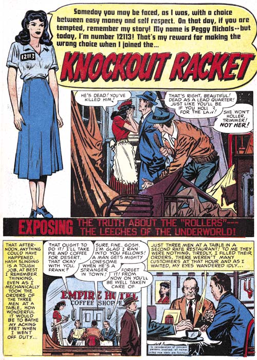
Justice Traps the Guilty #14 (February 1950) “Knockout Racket”, art by Marvin Stein?
The earliest work for Prize Comics signed by Marvin Stein was in JTTG #22 (January 1951). Although unsigned, the cover for JTTG #20 (November 1950) was almost certainly done by Stein as well. There are a number of earlier pieces whose attribution to Marvin becomes progressively more difficult and uncertain. One thing is clear is that Stein did not arrive at the Simon and Kirby studio with his mature style. “Knockout Racket” is the earliest lead story that I am comfortable to even questionably assign to Stein. But it is tentative; perhaps the only thing on the page shown above that I can point to that suggests Stein’s mature style are the eyes of the lady in splash. The first page shows a device often used by Simon and Kirby for their romance stories, the confessional splash. This is a format where a character in the splash introduces the story and where the speech balloon contains the title. All of Stein’s lead stories use a confessional splash while those other early lead stories by other artists did not. However I am not prepared to assign all lead stories with confessional splashes to Marvin.
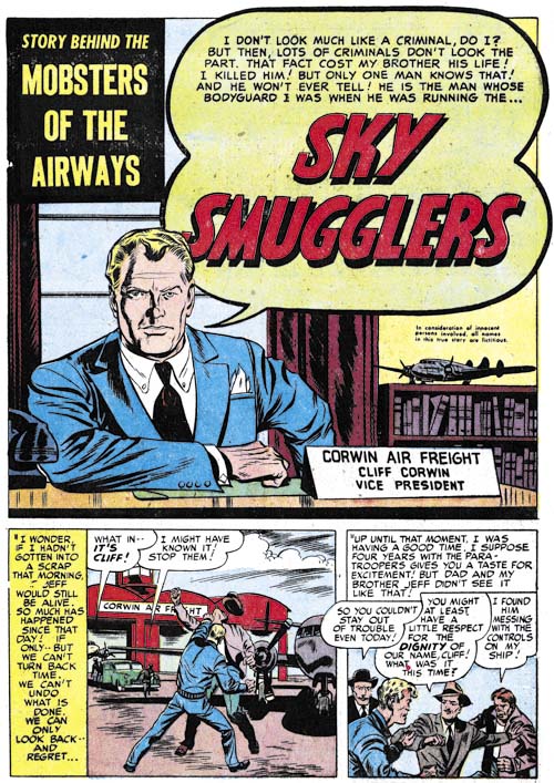
Justice Traps the Guilty #27 (June 1951) “Sky Smugglers”, art by Marvin Stein
Marvin Stein was still far from his mature style when he did “Sky Smugglers”. Although unsigned, as most of his crime stories were, there are enough examples of typical Stein traits to leave no doubt that this was his work. One trait in particular to note is the shadow that trails down the right side of the face for the man in the splash. Normally comic book artists draw shadows that originate from a single light source but in this face Stein is using two light sources; a prominent one from the front a little to our right and a secondary one further back and from the left. The shadow exists in the region not fully illuminated by either of these light sources. I refer to this type of shadow as a negative highlight. Marvin would use this technique often and in the future would even move the shadow towards the center of the face. Negative highlights are something I have not noticed used by Kirby or any other artist working for the studio. However this device was also used by Wally Wood from whom I suspect Stein picked it up.
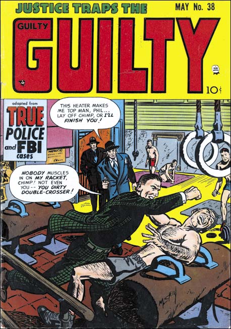
Justice Traps the Guilty #38 (May 1952), art by Marvin Stein
Stein had arrived at his mature style by 1952 and the cover for JTTG #38 is a good example of that style. Stein was comfortable with action but handled it in his own manner. His characters would throw a punch with a rather forward motion unlike the more rotational manner Kirby would use. While he lacked Kirby’s exaggerated perspective, Stein still had good command of perspective and used it well in establishing a point of view. He seemed to have picked up Kirby’s penchant for flat edged fingers. Stein developed a simplified drawing for more distant faces in a manner that was distinctly his own. Marvin inked with a rather blunt brush which can easily be mistaken for crude inking but is actually rather nuanced. Note the inking on the gymnasium equipment at the bottom center; Stein would often use this sort of rice kernel pattern for inking shadows.
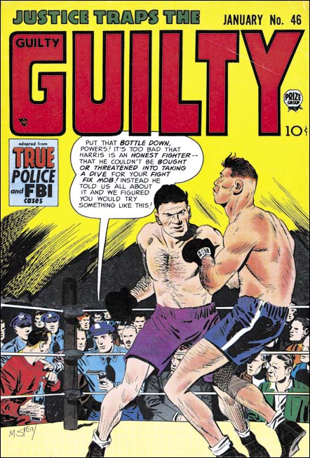
Justice Traps the Guilty #46 (January 1953), art by Marvin Stein
The romance, western and crime genre that Stein most often drew generally did not provide much opportunity to depict the human body. Examples such as this boxing scene show that Marvin could do a real good job. I do not know if he was working from some reference material but it still is a very respectable piece.
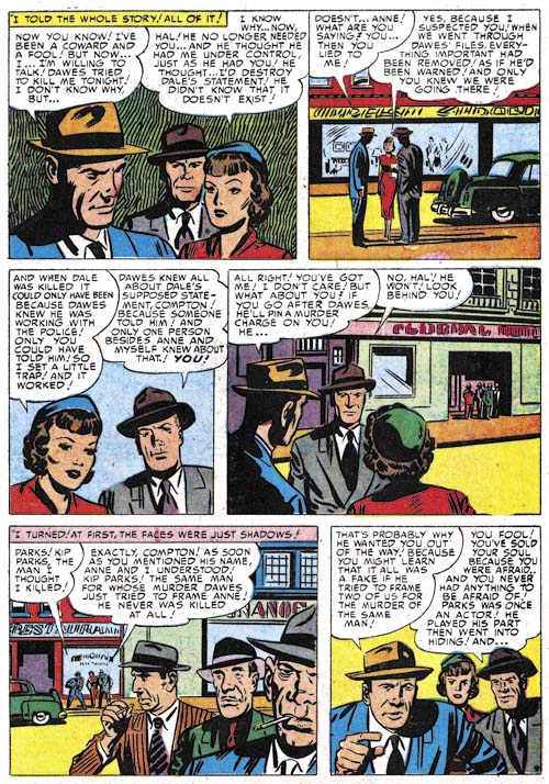
Justice Traps the Guilty #42 (September 1952) “Scandal Sheet Shakedown” page 9, art by Marvin Stein
Stein’s depiction of men improved more rapidly than that of his women. The lady in the first panel still retains some of the artificially arched eyebrows found in Stein’s earlier work. The same lady in panel 3 seems more realistic. It is just me or does she somewhat resemble Jack Kirby’s work? I think this is most likely a case of Kirby influencing Stein. Observe how Stein’s rather blunt brush still manages his characters with individuality and expressiveness. I particular like Marvin’s work on the three thugs in panel 5. Each has his own distinct personality.
Also note Stein’s manipulation of the point of view. Starting with a close-up to establish the main characters before moving to a more distance shot to place them on the street. Then another close-up is followed by what looks like yet one more but actually introduces a group of secondary characters in the background. Stein then makes a large jump in the viewpoint placing the thugs in the foreground and the main characters in the distant back. As we will see Marvin Stein very carefully controls viewpoint and pacing.
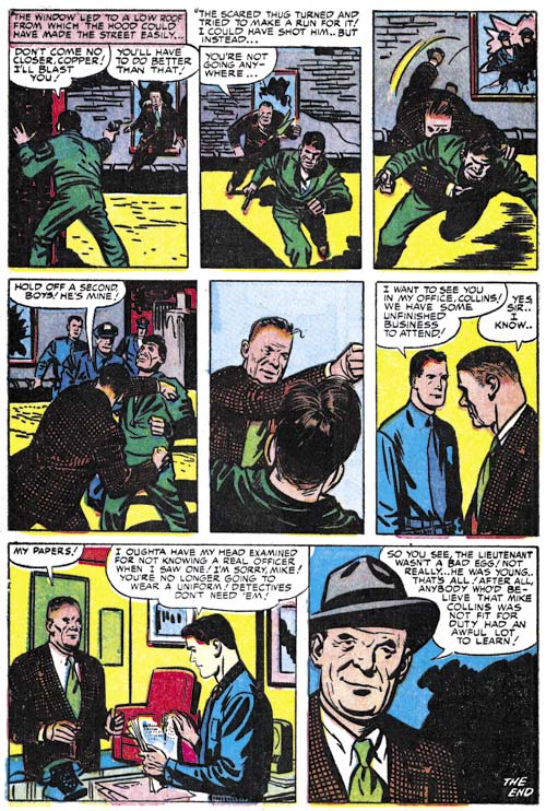
Justice Traps the Guilty #68 (November 1954) “Not Fit for Duty” page 6, art by Marvin Stein
I admit that I am searching for a word to use for describing a technique Stein frequently uses. For now I will use choreography for the way that Stein would sometimes arrange panels into a short time interval sequence, but I admit it is not the best term for my purpose. But note how in the first five panels shows the policeman’s capture of a thug. Not only does each panel only advance the time by a small amount but look how Marvin brings the action closer and closer to the reader.
I have mentioned Stein’s blunt brush but look how masterfully he has captured the older cop in the last panel!
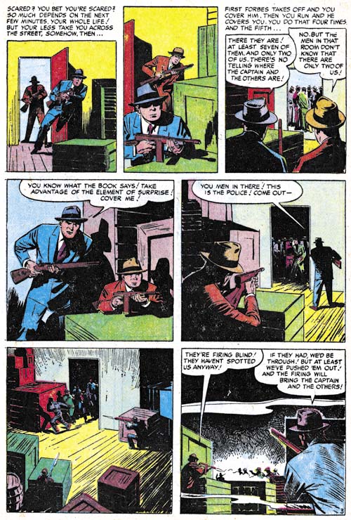
Justice Traps the Guilty #84 (December 1956) “Stakeout” page 3, art by Marvin Stein
Another choreographed sequence occupies the entire page although perhaps not as successful as the previous example. This might have been at least in part due to the Comic Code’s restriction on the depiction of violence. The more distant viewpoints may have satisfied the Comic Code but the also lessened the impact.
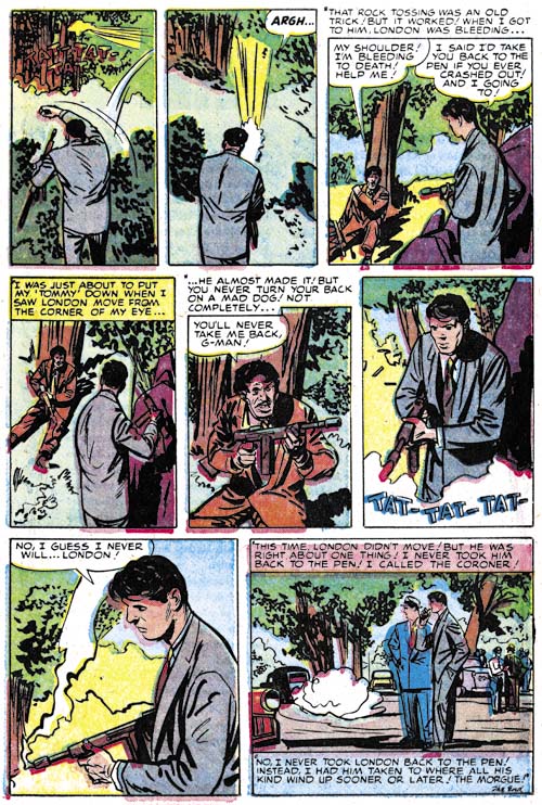
Justice Traps the Guilty #70 (January 1955) “Feud” page 8, art by Marvin Stein
Here is another choreographed sequence that is still successful despite the Comic Code. By keeping the thug outside of the viewpoint we do not actually see the results of the cop’s use of his machine gun but there can be little doubt about it’s effectiveness.
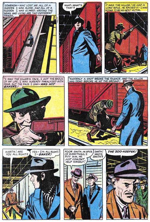
Justice Traps the Guilty #75 (June 1955) “Tragic Circle” page 7
A final example of a choreographed sequence by Stein. But again ruined by the Comic Code. Any child could see gun fights by gangsters or cowboys on the television and in the movies but for some reason the Comic Code had to protect them from seeing someone being struck by a bullet. Without the accompanying text the reader would be left perplexed by the killer’s sudden collapse.
Despite the Comic Code this is still a great page. Further it is a good example of the way Stein often used blacks to enhance the story. While not realistic in the technical sense of the word, the eye isolated in the killer’s shadowed half of the face seems appropriate as he takes aim (panel 4). Even the industrial ceiling adds interest to the images.
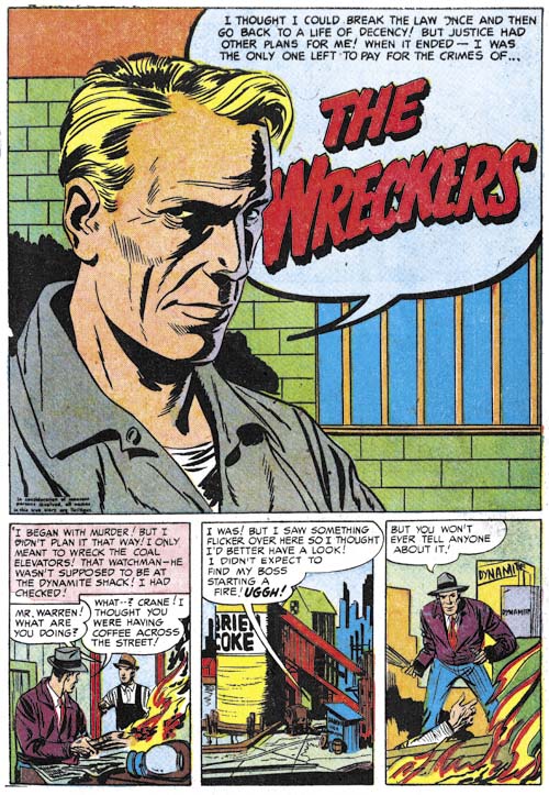
Justice Traps the Guilty #53 (v.6, n.11) August 1953 “The Wreckers”, art by Marvin Stein
Some of Stein’s more simpler splashes are actually very strong. Here we have nothing more than a talking head and a simple background. But the person’s clothing and the bars on the window indicate we are being addressed to by a prisoner. Once again Marvin is using a rather blunt brush but notice how masterly he handles the nuances that make this portrait so successful. Here also is an example of Stein’s use of a negative shadow. In fact much of the interest of this head shot is generated by this deceptively simple device. The colorist makes it even better by giving the farther portions of the face a purple color showing one of the two light sources as being more powerful than the other. Typically Marvin makes the depth of the head too shallow but far from detracting from the image this makes it all the more expressive. The lack of a good distinction between the eyebrow and the associated shadows is another of Stein’s mannerisms one that sometimes even appears when he inks Jack Kirby’s pencils.
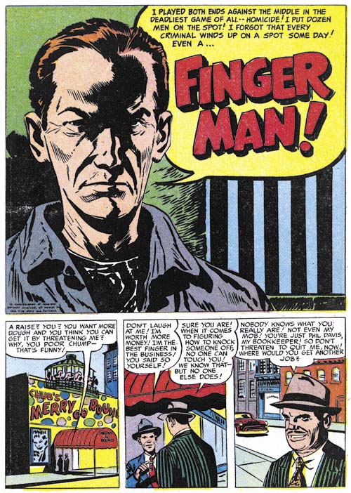
Headline #60 (July 1953) “Finger Man”, art by Marvin Stein
Here Marvin Stein provides an even more stripped down version of a prisoner in a confessional splash. The image may be simpler but with nothing lost in it’s impact. In fact I believe this is perhaps the best portrayal of a criminal by a comic book artists I have ever seen. The reader has no doubt that he is being addressed to by a hardened individual. An important contributor to the effect of this image is the strong negative highlights. No longer delegated to one side, here the shadow traces a path down the center of the face.
Before closing I should mention the influence of Jack Kirby on Marvin Stein. I am not that familiar with Stein’s earlier career but he seemed to have had 5 to 7 years experience when he arrived at the Simon and Kirby studio. Marvin was one of the few artists that actually worked in the studio (at least for a period) and the presence there of comic book greats Jack Kirby and Mort Meskin had to have made an impression on him. His artwork certainly seemed to blossom over a relatively short time. Kirby seemed to have the greatest influence on Stein. It does not seem an accident that Stein’s use of point of view, carefully sequenced panels, and action became so important to his art. These same qualities can be found in Kirby’s own work. However Stein is not a Kirby imitator; he developed his own drawing style and methods for graphically telling stories. Still from time to time some have claimed that Kirby provided layouts for some of Stein’s work. I even succumbed to that error (It’s a Crime, The Master and His Protégé). The problem with this claim of Kirby layouts is that Stein’s work consistently shows the same characteristics throughout his career. If Kirby was helping this would have to have been for everything Stein did including work done after the Simon and Kirby studio had broken up. In addition Stein’s art included elements for handling action was generally quite distinctive from Kirby’s. I think we can safely dismiss all claims of significant Kirby help except for his roll as a mentor.
Marvin Stein is one of those forgotten comic book artists. When remembered at all it is for his being one of Jack Kirby’s inkers. Partly this is because Marvin Stein’s work was largely for two titles for Prize, a small publisher (Headline and Justice Traps the Guilty). But Stein did work on other Prize titles and for other publishers as well including Atlas. I think another reasons for his neglect among comic fans was the distortions his figures often exhibit. From certain views his heads seem too shallow. When using a high viewpoint his heads have a distortion that is hard to describe but so typical of Stein. These distortions were not so visible in Marvin’s earlier work and seemed to become more pronounced over the years. But I do not considered academic accuracy a requirement for comic book art, quite the contrary. I have come to appreciate Stein’s distortions and the expressionistic quality they gave to his art. I will say that while Marvin’s drawing style worked well with the crime and western genre it seemed a poor match for romance stories. The final factor in the decline of Stein’s reputation was his inking. Stein’s inking looks deceptively simple. It certainly does not offer much for those that are fans of detailed and intricate art work. However I hope that some of the examples I have provided in this post will show that his brushwork was capable of great subtleties. While some have claimed Stein’s work looks rushed I think a more accurate description would be economical. Stein carefully provided the essentials for the story and left out that which he considered extraneous. It is an approach that I admire.

