Category Archives: 2008/09

The Art of Romance, Chapter 10, The Peak of the Love Glut

(January – April 1950: Young Romance #17 – #20, Young Love #7 – #8)


Number of Romance Titles 1947 – 1950 (the period covered in this chapter shaded in blue)

This chapter will cover the period from January to April 1950. This is the height of the love glut and the beginning of the decline in romance titles that followed. For Prize Comics the dropping of titles had not begun since the final issue of Real West Romances would come out in April. Young Romance had been and would remain a monthly. The presumably poor sales experienced by the western romance titles because of the glut was not shared by Prize’s standard love comics as Young Love became a monthly with the April issue. Frankly I am not clear what Simon and Kirby’s status was at this time with the crime titles Headline and Justice Traps the Guilty. At some point Joe and Jack seemed to have passed on the production of those titles to Prize Comics. A better understanding of exactly when that happened will hopefully be achieved as I advance further in my serial post It’s A Crime.

I have no explanation why in the last chapter Jack Kirby’s output dropped so much but now he returned to being the primary artist, at least by page count, with 6 stories and 71 pages (I am excluding illustrations for text features as they are minor works and may include recycled art.) Bill Draut, now again the second most used artist, actually had more stories but fewer pages (8 stories with 53 pages). The discrepancy is caused by the lead stories provided by Kirby have the highest page counts (13 to 15 pages). The two longest stories by artists other then Kirby were 10 and 9 pages while most were 8 pages long. As noted in the previous chapter Kirby would provide the lead story for Young Romance while Bill Draut would have the honor for Young Love. The general rule from now on will be Kirby more or less regularly providing a long lead story to Young Romance and this would be the only real distinction between the contents of Young Romance and Young Love where the lead story was generally done by other artists.

Other artists significantly trailed Kirby and Draut in page counts. The number of artists used in YR and YL drops, and the artists have been seen previously in either the standard or the western romance comics. As was true in the last chapter, Kirby did not supply layouts to any of the artists in this period. This was in contrast to the early issues where some of the less talented artists worked using Kirby layouts.
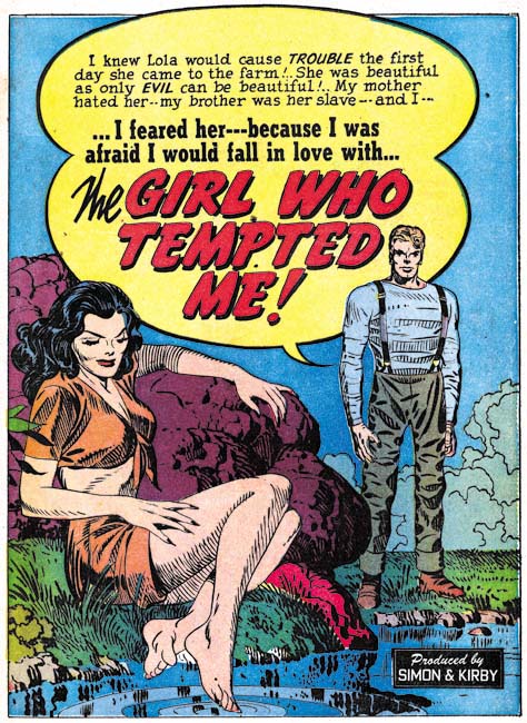

Young Romance #17 (January 1950) “The Girl Who Tempted Me”, art by Jack Kirby

Jack Kirby persists in providing exceptional splashes for his long lead stories. The use of a character introducing the story with the word balloon forming the title has become a trademark of Simon and Kirby romances. (As this splash layout will be repeatedly seen, I am going to refer to it as the confessional splash.) The very provocative splashes would be more risque then the actual story. These splashes are often very simple in composition but very effective nonetheless.
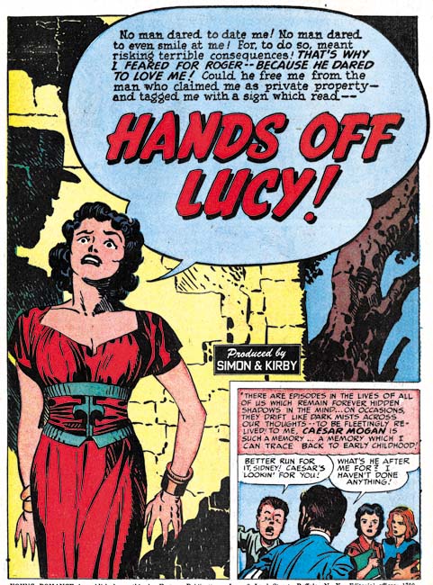

Young Romance #20 (April 1950) “Hands off Lucy”, art by Jack Kirby

Okay maybe I do not have much more to say about Kirby’s splashes, but they are so great (in my opinion) that I cannot resist including an image of another one.
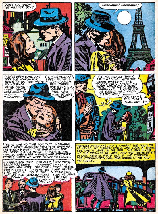

Young Romance #19 (March 1950) “That Kind of Girl” page 13, art by Jack Kirby

Of course comic books are not all about splashes, those were just the devices to entice a reader to buy the comic and read the story. Jack always considered himself as mainly a graphic story teller. Although today Kirby is primarily for his work on superheroes, he was exceptional in pretty much every genre that he worked on. Because of the unique nature of his romance stories, it is clear that Jack was not just illustrating someone else’s script. He must have been an active participant in the plotting and I am sure that he continued the long S&K tradition of changing the script as he saw fit. At this time Jack liked to give a special quality to his romance stories by adding something beyond just romance. I am not sure how the readers of Young Romance and Young Love at that time (overwhelmingly teenage girls) felt about Jack’s romances but I am convinced that if these stories were given a chance many of today’s more adult readers would find them interesting reading.

For the most part Jack has adopted a very standard page layout of three rows with two panels in each row. Kirby would occasionally depart from that pattern when the story called for it but that would be the exception. Gone were any uses of circular panels. Figures would not extend beyond a panel’s border although captions or speech balloons might. My description of Kirby’s layouts might make his work sound dry and uninspired but that is certainly not the case. Using a standard panel layout seems to allow Jack to concentrate on depicting the story. Further when the story called for an alteration in the panel layout it was then that much more effective. Kirby was a master of use of changing view points, the addition or removal of background, and even the careful accommodation of speech balloons as the above page amply shows. It was not just melodrama, it was great melodrama! (An honest appraiser would admit that was true of Kirby’s superhero work as well.)
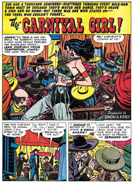

Young Love #7 (February 1950) “The Carnival Girl”, art by Bill Draut

Bill Draut’s position as the number two artist at this time was justified. He could fill a splash panel with a cast of characters each with their own distinctive personalities. Bill was no longer used as an artist in Headline or Justice Traps the Guilty, but this was not due to any problem in handling action since in his romance art he had no problems when action needed to be depicted. Perhaps of even greater importance for love comics, his women, while stylized, are attractive. All of these talents and more are shown in the above splash. Some of Draut’s stories start with a confessional splash even though they are not lead stories. Perhaps they were originally intended as lead stories but in the end placed elsewhere in the comic. Although I have seen this happen to Draut, I do not recall a Kirby confessional splash that was not the first story.
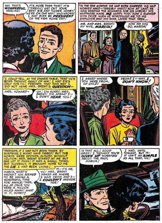

Young Love #8 (April 1950) “Every Man I Meet” page 4, art by Bill Draut

Like Kirby, Bill Draut generally kept to a standard six panel page layout. If anything he adhered to this layout even more then Jack. Bill would vary view points to keep the visuals interesting but he was not as cinematic as some other comic book artists. Draut graphically tells his story in a straight forward and understated manner. While the reader may not always be amazed by Draut’s art he will always find an entertaining and clear story.
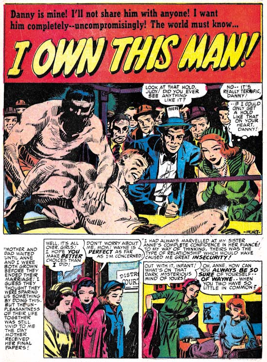

Young Romance #18 (February 1950) “I Own This Man”, art by Mort Meskin

Mort Meskin first solo work for Simon and Kirby appeared in the month before the time covered in this chapter. During this period Mort played no more important a roll then any of the other studio artists (excluding Kirby and Draut). He supplied 4 stories and 2 short features with a total of 32 pages of art. While his presence was not insignificant it was nothing like the prolific output that Mort would achieve in the future. Interestingly Mort was initially used only for the standard and western romance titles, his first crime work would be in the March issue of Headline. Perhaps Meskin’s artist block was not completely overcome by Joe’s strategy of placing random pencils marks so that Mort would not be faced with a blank page.

Meskin’s preference was for a first page; two thirds of which would be used for a splash panel leaving room for a single row of story panels. Most commonly it would have the layout seen in the image above. (Again, these splash page layouts are seen so often that providing them with a name seems a good idea; I will use square splash for those with the story panels arranged horizontally and vertical splash for when the story panels are arranged vertically.) While working in the Simon and Kirby studio Mort did his own inking. Generally this included spotting formed by long parallel, sometimes overlapping, groups of lines. Occasionally, as in “I Own This Man” Meskin would use picket fence crosshatching similar to that found in the Studio style. (For a more complete discussion of Mort Meskin’s inking technique see my post Kirby Inkers, Mort Meskin, for an explanation of the terms I am using to describe inking techniques see the Inking Glossary). My search of Meskin’s work prior to joining Simon and Kirby have so far failed to uncover any examples of the use of picket fence crosshatching so Mort may have adopted it up from Joe and Jack.
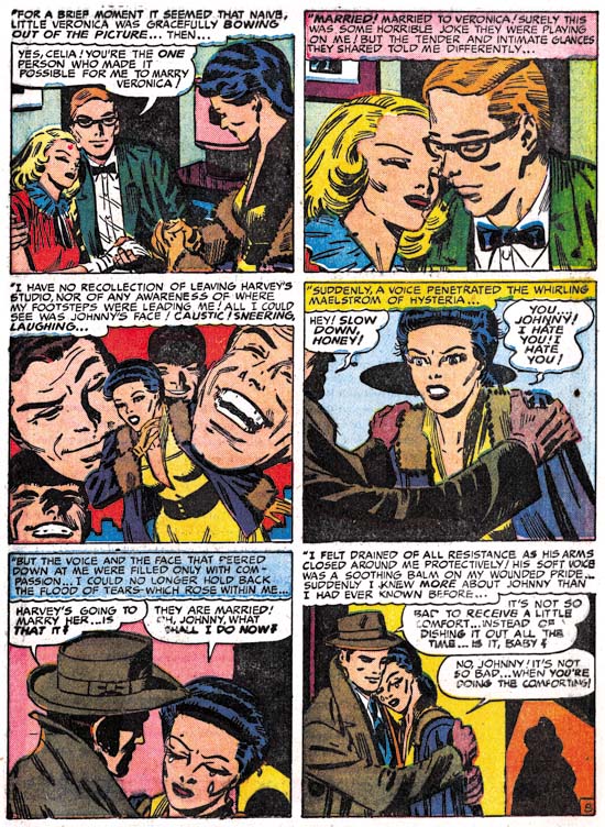

Young Love #8 (April 1950) “Danger, Soft Shoulder” page 8, art by Mort Meskin

Mort Meskin’s art was more subdued compared to his earlier hero genre comic art. Some of the more dramatic compositional devices would largely disappear. Techniques, such as the mass of floating heads used in the third panel of page 8 of “Danger, Soft Shoulder”, would now be the rare exception in Mort’s work. Instead, like Bill Draut, Meskin would concentrate more on graphically telling a story. Few other artists, if any, could do it better. Unfortunately for Mort Meskin’s current reputation, it is all too easy to overlook what he was doing. Also it should be admitted that Meskin’s art was not consistently at the same high level, perhaps a result from his push to achieve a high page production rate (with a corresponding income boost).
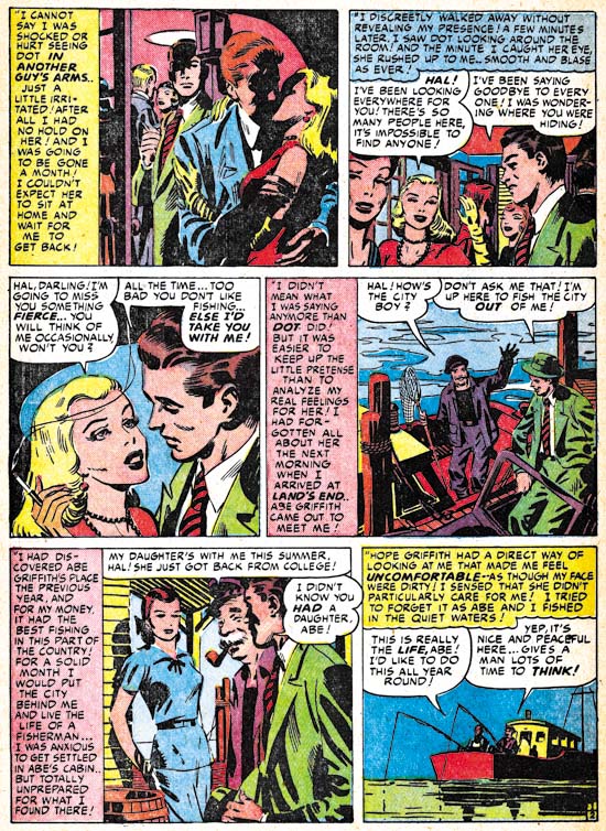

Young Romance #19 (March 1950) “The Fisherman’s Daughter” page 2, art by Mort Meskin

But it would be mistake to say that now Mort was only interested in telling a story. Mort was also a master at his use of blacks. The shadows found in the first panel of the page from “The Fisherman’s Daughter” shown above are very effective. Even when blacks are used in more limited amounts that are carefully placed to provide the most impact as can be seen elsewhere on the page and the fifth panel in particular. In a way though, Meskin’s use of whites and blacks was not separate aspect of his work. It was carefully used as one of Mort’s tools for advancing the story.

At this time Mort was also working primarily in the standard six panel page layout. But he would use other design techniques to add interest. Note the use of vertical caption boxes on the page shown above. Mort sets up a pattern of vertical captions for the left edge of the first and third panel rows, and the center of the second row. This while using horizontal captions in the second part of the first and third rows. It all provides a pattern that helps to pull the page together without being obtrusive.
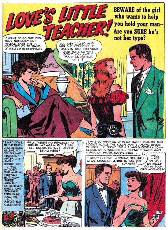

Young Romance #17 (January 1950) “Love’s Little Teacher”, art by Bruno Premiani?

I may not be able to truly show that this artist is Bruno Premiani but he is a great creator nonetheless. The splash here is unusual for him in that he provides a split scene. It is so well integrated that it is easy to overlook two separate views are presented. I have described Premiani’s women as attractive but not striking. But in the end to understand an artist’s style well enough to identify his work requires seeing enough examples. So as I continue with work on this serial post I will include further samples of the more important Simon and Kirby studio artists.
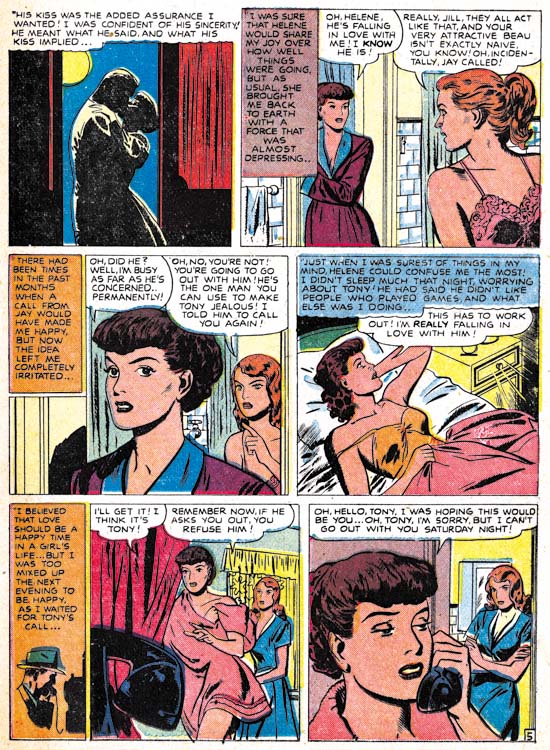

Young Romance #17 (January 1950) “Love’s Little Teacher” page 5, art by Bruno Premiani?

Bruno had an interesting drawing style but he was also, like most of S&K studio artists, adept at graphically telling a story. The page from “Love’s Little Teacher” opens with a couple’s kiss, usually more properly placed as the last panel on a page. But Premiani has other things in mind as he proceeded to show the protagonist following the advice of her cousin. Premiani indicates to the reader that the cousin is secretly scheming by the pose he provides her in the background of the final panel. Evidentially Bruno is not just following some formula but carefully brackets the cousin’s influence between the love scene in the first panel and the misguided rejection of a date in the last. I particularly like the fifth panel with the man shown calling in the caption box and the close-up of the telephone receiving the call in the actual panel. With Premiani’s careful arrangement of the towel on the leading lady, the depiction really is not very revealing but just seems so.
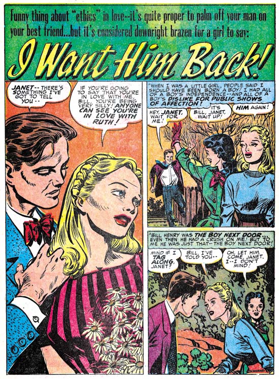

Young Romance #17 (January 1950) “I Want Him Back”, art by Leonard Starr

When I first entered the Simon and Kirby productions into my database I was not that familiar with Leonard Starr’s style and so it was largely stories with a signature that ended up attributed to him. Unfortunately this made Starr seem like a minor contributor since, like most Simon and Kirby studio artists, he did not sign all his art. With my current reviews and armed with a better understanding, I have been adding a number of unsigned stories as works that can be credited to Starr. I have long stressed the importance to the studio of three artists (the usual suspects: Draut, Meskin and Prentice) but there is also a second tier of artists who made an important contribution to Simon and Kirby productions but only for shorter periods of time. I would put Starr in this second tier along with artists like Premiani?, Severin, Donahue, Albistur and Brewster.

Leonard did 4 stories with 33 pages during this period. All were unsigned but with styles that are in complete agreement with contemporary signed work. Starr’s splashes were either the square or vertical layouts with, perhaps, a preference for the vertical format as seen above in “I Want Him Back”. It is the drawings of woman that I find the greatest help in identifying Starr’s work. They have an appearance that is almost frail with generous foreheads, small mouths, and narrow chins giving them a look I often describe as elfin.
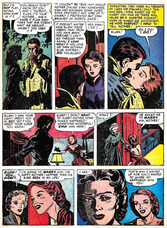

Young Romance #18 (February 1950) “Mother Tags Along” page 4, art by Leonard Starr

While I would not call Starr’s splashes spectacular they were well done. But it is his story art were Leonard really shines. Like some of the other studio artists, Starr would carefully vary the view point to keep the pages interesting and the story progressing. What makes Starr unique among the S&K studio artists at this time are his panel layouts. More then any of the other artists, Starr would break from the standard page layout of three rows with two panels per row. Instead Leonard preferred to introduced, when possible, a row of three panels with an extended height. Sometimes this was achieved by switching to a page layout of two rows with three panels per row. More frequently the greater height provided for one row would be compensated by decreasing the vertical dimensions of the remaining two rows. These panel layouts did more then provide interesting pages as Starr would use it to aid the story telling. Note how in the page from “Mother Tags Along” Leonard uses the narrow panels for the meeting of the two lovers physically bringing them close together while the more horizontal panels are used the woman’s discussion with her mother allowing the distance that is possible in these panels to suggest the emotional separation between them. No other studio artist at this time made such effective use of panel shapes although Mort Meskin would soon begin to use narrow panels as well.
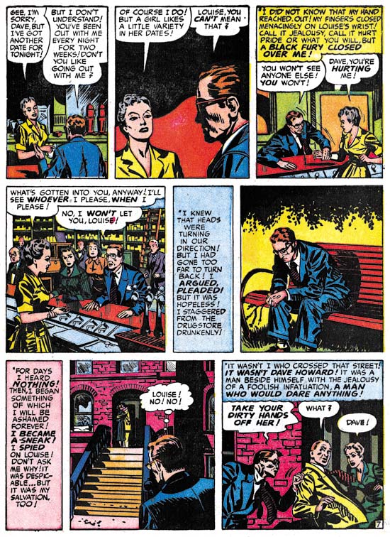

Young Love #7 (February 1950) “A Secret Affair” page 7, art by Vic Donahue

Vic Donahue’s contribution to the standard romances diminished in the previous chapter and this state continues here. There is a difference though; in Chapter 9 Vic work was restricted to the Nancy Hale feature which was 2 or 3 pages long. During this period the Nancy Hale feature was drawn by other artists. Instead Donahue would draw 1 story and 2 short features with a total of 10 pages which was well below artists like Meskin, Premiani? or Starr.

I have included the above story page to show that while Donahue was not as talented as some of the other studio artists; he was more varied in his panel layouts. I feel, however, that the handling of the story leaves a bit to be desired. For instance this page ends with one man’s confrontation with a rival. Since the last panel depicts such a critical moment the reader would expect the next page to show the result of this confrontation, perhaps even a fight. There was a fight of sorts, but at the start of the next page it is all over with the original man already defeated and on the ground! We really do not know anything about the scripts given to studio artists or how carefully they were expected to be followed, so I cannot say whether Donahue or the writer is responsible for this rather poor handling of what should have been a dramatic scene.
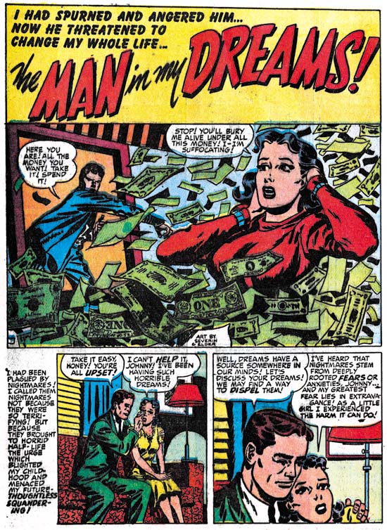

Young Love #8 (April 1950) “The Man in My Dreams”, art by John Severin and Jack Kirby

While Jack Kirby did not supply layouts for any of the artists during this period, there is at least one example of his assuming the roll of art editor. The man in the splash panel of “The Man in My Dreams” is clearly penciled by Kirby, and I believe inked as well. This is the second case of Kirby adding to or altering a splash by John Severin that I have seen (the other was in Chapter 7). If, as I believe, Kirby inked his part of the splash then most likely Kirby was correcting Severin’s finished art.

During this period Severin played a small roll in the standard romance titles. John only did 1 story and 3 features with a total of 8 pages. This is in sharp contrast to the amount of work Severin had done during this same time for the Prize western love titles.

Chapter 1, A New Genre (YR #1 – #4)
Chapter 2, Early Artists (YR #1 – #4)
Chapter 3, The Field No Longer Their’s Alone (YR #5 – #8)
Chapter 4, An Explosion of Romance (YR #9 – #12, YL #1 – #4)
Chapter 5, New Talent (YR #9 – 12, YL #1 – #4)
Chapter 6, Love on the Range (RWR #1 – #7, WL #1 – #6)
Chapter 7, More Love on the Range (RWR #1 – #7, WL #1 – #6)
Chapter 8, Kirby on the Range? (RWR #1 – #7, WL #1 – #6)
Chapter 9, More Romance (YR #13 – #16, YL #5 – #6)
Chapter 10, The Peak of the Love Glut (YR #17 – #20, YL #7 – #8)
Chapter 11, After the Glut (YR #21 – #23, YL #9 – #10)
Chapter 12, A Smaller Studio (YR #24 – #26, YL #12 – #14)
Chapter 13, Romance Bottoms Out (YR #27 – #29, YL #15 – #17)
Chapter 14, The Third Suspect (YR #30 – #32, YL #18 – #20)
Chapter 15, The Action of Romance (YR #33 – #35, YL #21 – #23)
Chapter 16, Someone Old and Someone New (YR #36 – #38, YL #24 – #26)
Chapter 17, The Assistant (YR #39 – #41, YL #27 – #29)
Chapter 18, Meskin Takes Over (YR #42 – #44, YL #30 – #32)
Chapter 19, More Artists (YR #45 – #47, YL #33 – #35)
Chapter 20, Romance Still Matters (YR #48 – #50, YL #36 – #38, YB #1)
Chapter 21, Roussos Messes Up (YR #51 – #53, YL #39 – #41, YB #2 – 3)
Chapter 22, He’s the Man (YR #54 – #56, YL #42 – #44, YB #4)
Chapter 23, New Ways of Doing Things (YR #57 – #59, YL #45 – #47, YB #5 – #6)
Chapter 24, A New Artist (YR #60 – #62, YL #48 – #50, YB #7 – #8)
Chapter 25, More New Faces (YR #63 – #65, YLe #51 – #53, YB #9 – #11)
Chapter 26, Goodbye Jack (YR #66 – #68, YL #54 – #56, YB #12 – #14)
Chapter 27, The Return of Mort (YR #69 – #71, YL #57 – #59, YB #15 – #17)
Chapter 28, A Glut of Artists (YR #72 – #74, YL #60 – #62, YB #18 & #19, IL #1 & #2)
Chapter 29, Trouble Begins (YR #75 – #77, YL #63 – #65, YB #20 – #22, IL #3 – #5)
Chapter 30, Transition (YR #78 – #80, YL #66 – #68, YBs #23 – #25, IL #6, ILY #7)
Chapter 30, Appendix (YB #23)
Chapter 31, Kirby, Kirby and More Kirby (YR #81 – #82, YL #69 – #70, YB #26 – #27)
Chapter 32, The Kirby Beat Goes On (YR #83 – #84, YL #71 – #72, YB #28 – #29)
Chapter 33, End of an Era (YR #85 – #87, YL #73, YB #30, AFL #1)
Chapter 34, A New Prize Title (YR #88 – #91, AFL #2 – #5, PL #1 – #2)
Chapter 35, Settling In ( YR #92 – #94, AFL #6 – #8, PL #3 – #5)
Appendix, J.O. Is Joe Orlando
Chapter 36, More Kirby (YR #95 – #97, AFL #9 – #11, PL #6 – #8)
Chapter 37, Some Surprises (YR #98 – #100, AFL #12 – #14, PL #9 – #11)
Chapter 38, All Things Must End (YR #101 – #103, AFL #15 – #17, PL #12 – #14)

A Leonard Starr Group at Yahoo

Last week I posted about the Mort Meskin group so now I would like to promote one for Leonard Starr. Starr has had a long and successful career and he is most famous for his syndication work for On Stage and Little Orphan Annie. Before that he was a comic book artist for a number of publishers as well as doing work for the Simon and Kirby studio. Presently my database has only 18 stories that Len did for Joe and Jack but since both of my ongoing serial posts, The Art of Romance and It’s A Crime, have entered the period that Starr is known to have worked for the studio I am sure that number will increase. While Leonard Starr may not have had a lengthy stay at the Simon and Kirby studio, he was an important contributor during that time.

Stan Lee Talking About Joe Simon

I mentioned Stan Lee’s statement about Joe Simon when I wrote about the 2008 New York Comic Con but I recently came across a short clip of it.

This was presented by YouTube user AstonishingTale’s. He also has a couple of other videos from the same Living Legends panel. One is a clip with Jerry Robinson and Stan Lee discussing the most creative individuals they ever meet. As much as I liked Lee’s choice, it was who Robinson praised that I really appreciated.


It’s A Crime, Chapter 8, The Chinese Detective

(Charlie Chan #1 – #5; June 1948 to February 1949)

During the period covered in last chapter of It’s A Crime, Simon and Kirby were also producing another title, Charlie Chan. This title was not a pure crime genre comic but instead was based on a successful movie character. Deriving a title from the movies was out of character with either Simon and Kirby or Prize Comics, neither of which would otherwise use such licensed material. In this case it was probably due to the fact that Joe and Jack’s lawyer, Fleagle, also represented the estate of Earl Derr Biggers, Charlie Chan’s creator. I last discussed this title in a post a little over two years ago (Charlie Chan & Carmine Infantino). I should warn the reader that while that post includes images that I will not be repeating here, some of my opinions have changed.

Charlie Chan #1
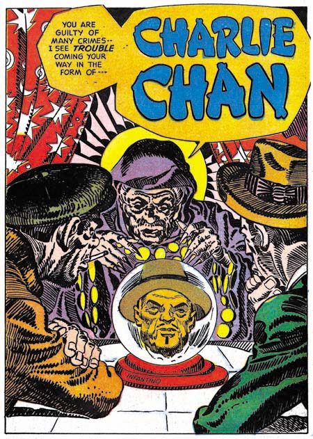
Charlie Chan #1 (June 1948) “Charlie Chan” by Carmine Infantino (signed)

In a Jim Amash interview (The Jack Kirby Collector #34) Carmine Infantino describes taking on the Charlie Chan job despite the fact that he was already getting enough work from higher paying DC. He did so for the sole reason that the job offered the opportunity of working along side of Jack Kirby and Mort Meskin. Carmine specifically says that he did not do any other work for Simon and Kirby and that he never inked Kirby’s pencils. Although there was a time that I thought these statements may not have been accurate, that was due to some confusion over work that I now believe was actually done by Warren Broderick. At this point my opinion is that Carmine did not do any work for Simon and Kirby outside of the Charlie Chan title. Most of the art that Infantino provided was for Charlie Chan feature, although he did draw some backup stories as well.
Two of the stories from the first issue of Charlie Chan (the one shown above and “Land Of The Leopard Men” that was included in my previous post) have splash pages inked in the Studio style. The inking for the above splash is particularly elaborate. Previously I felt that this inking was done by Carmine himself, but I no longer believe that. Instead I feel this inking was probably done by Joe Simon. Unfortunately some current book projects that I am working on preclude my having enough spare time for a careful examination of Joe’s inking until sometime in the future. (While this is regrettable for this blog, the results of the book projects should be appreciated by Simon and Kirby fans.) Without such a study my inking attribution must be considered very provisional, but I will say that these splashes were not inked by Jack Kirby.

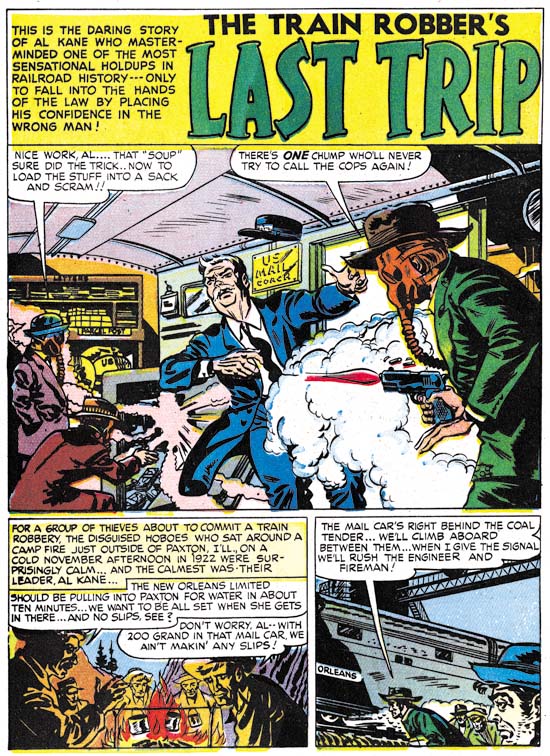
Charlie Chan #1 (June 1948) “The Train Robber’s Last Trip”, art by Carmine Infantino

Above is an image of the splash page to a non-Charlie Chan story by Infantino. It provides a good contrast to the Studio style inking previously shown. Carmine’s brushwork found in this page, and on many other story pages, is very different then what is seen in the Studio style splash pages. Of particularly note are the distinct methods of inking cloth folds. While it is conceivable that Studio style techniques such as picket fence crosshatching could be applied over earlier inking by Carmine, the different cloth fold inking suggests that is not the case. (see the Inking Glossary for explanations of the terms I use to describe inking techniques) Infantino’s inking of the Studio style splashes, if he did any at all, would have been limited to the outlines and not including any of the spotting.


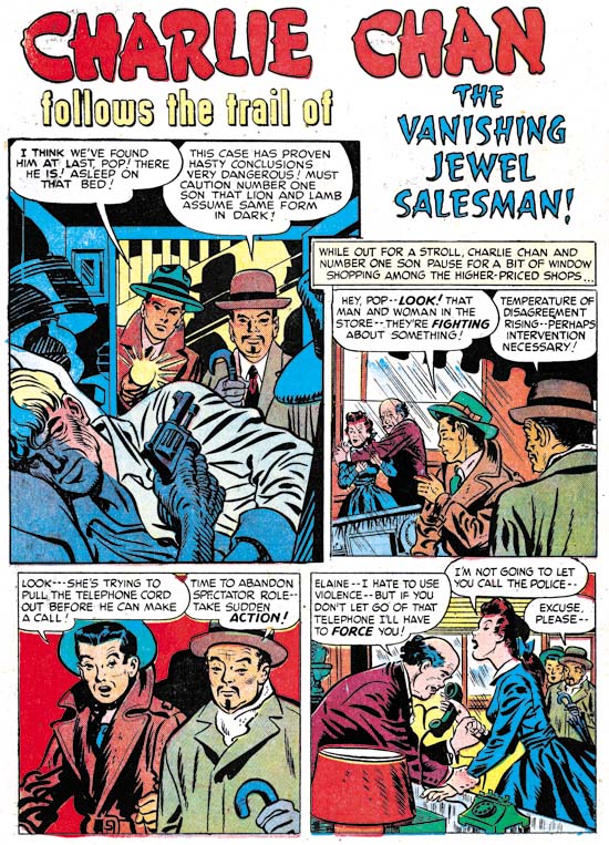
Charlie Chan #2 (August 1948) “The Vanishing Jewel Salesman”, art by Jack Kirby (first panel) and Carmine Infantino (all the rest)

Jack Kirby drew the covers for all five Prize issues of Charlie Chan but he did not provide anything for the interiors. That is with the sole exception of the splash panel for the page above. It almost seems inappropriate to describe this panel as a splash since it is barely larger then the story panels. However the splash panel provides a preview and does not belong to the story proper. The odd shape of the panel suggests that Jack provided his contribution after Carmine had already finished the story. Despite the diminished size and lack of any action, Kirby has made an interesting scene by depicting the crisis moment; Charlie Chan’s wisdom has once again deterred his number one son from a rash move but will it be enough to save them from an armed and very aware opponent? Kirby’s inking is very reminiscent of the much later Severe style but we have seen other earlier occasions when he adopted a simpler inking style when appropriate.


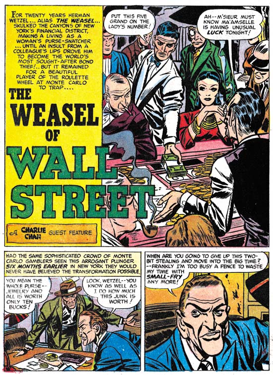
Charlie Chan #1 (June 1948) “The Weasel of Wall Street”, art by Bill Draut

Carmine Infantino provided four stories for issues #1 and #2. This left only a single backup story by another artist. For Charlie Chan #1 this story would be “The Weasel of Wall Street”, by Bill Draut. At this time Bill was the second only to Jack Kirby in terms of the amount of work used by the Simon and Kirby studio so his presence in Charlie Chan is not surprising. Bill Draut tends to get overlooked today. There maybe some justification for the neglect of some of his work after the Simon and Kirby studio closed. At that time Bill modified his style to conform more closely to the type of art popular during the silver age of comics. Unfortunately, in my opinion, he lost more then he gained. But while working for Simon and Kirby, Draut produced some fine material. Look at the cast of characters in this splash. Each is individualistically portrayed and each tells their own story. It was because of work like this and his dependable nature that Bill did so much work for Joe and Jack.


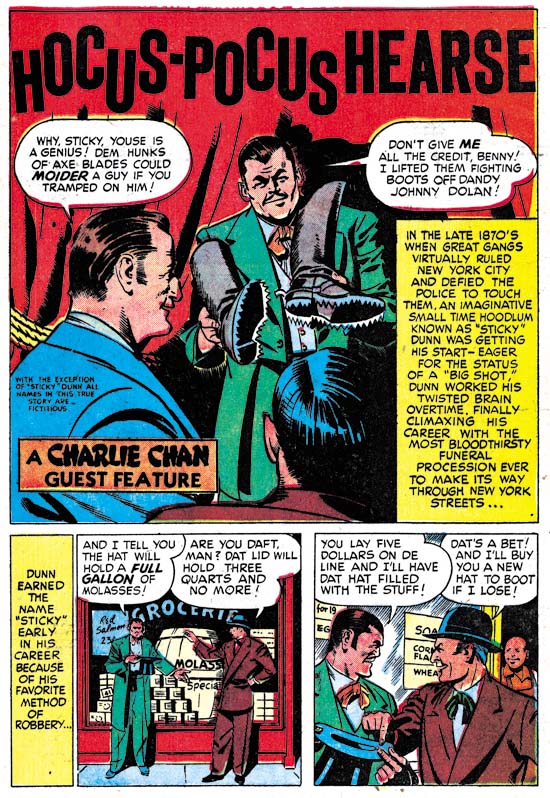
Charlie Chan #2 (August 1948) “Hocus-Pocus Hearse”, art by H. Colden?

While Bill Draut was not a surprising choice for a backup story in Charlie Chan #1, the artist for “Hocus-Pocus Hearse” for issue #2 was. I identified a single story by this artist in the last chapter of It’s A Crime. There maybe more of his work to be identified, but I am pretty sure that he was never supplied a significant amount of art for the Simon and Kirby studio. There is no reason, however, to believe that the these backup stories were commissioned specifically for use in Charlie Chan. Rather they were likely just selected from the crime stories being produced at that time and could just as easily have ended up going into Headline or Justice Traps the Guilty. However the appearance of this artist in Charlie Chan came about, he still was a good choice. This splash actually gives a better idea of his style then the one I used in the last chapter. Note the faces he draws are square and massive.


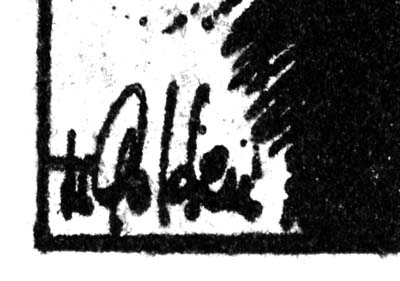
Charlie Chan #2 (August 1948) “Hocus-Pocus Hearse”, signature of H. Colden?

When I reviewed the splash for “Hocus-Pocus Hearse” for this post I immediately recognized the artist and quickly turned to the last panel of the story to see if it was signed. Sure enough there was the same signature, only this time isolated from the rest of the image. I can see that my suggestion of H. Colben was clearly wrong. That looks like an ‘O’ not a ‘C’ and a ‘d’ not a ‘b’. There is also another letter in there. But I still cannot make any sense out of it. Perhaps some reader might want to try to come up with a suggestion?

Charlie Chan #3
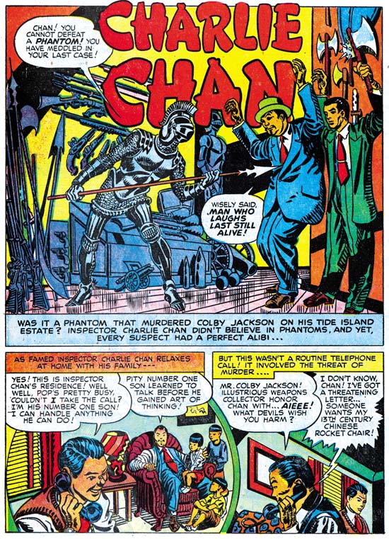
Charlie Chan #3 (October 1948) “Charlie Chan”, art by an unidentified artist

Carmine Infantino did all the Charlie Chan stories for the first four issues, except for an untitled story from issue #3. In this I differ from my previous posting on Charlie Chan because there I included the above splash page as an example of Infantino’s work. This particular page does not offer much for or against attributing the art to Carmine. The inking looks like Studio style inking but we have seen other splashes where that was done and that might mean nothing more then Infantino was not the inker.


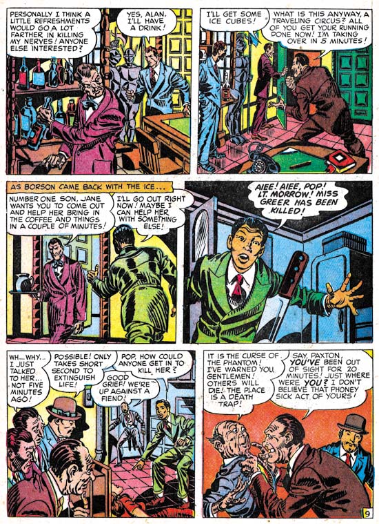
Charlie Chan #3 (October 1948) “Charlie Chan” page 9, art by an unidentified artist

So I have added an image of a story page. Interestingly the use of picket fence crosshatching continues throughout the story, something not seen in any of the work in Charlie Chan by Infantino. But again this could mean nothing more then someone else inking the work. What really sets this story apart is the style used for drawing the faces and the general means used in the graphical story telling. I have no idea who the artist was, other then he was not Infantino, but I wish I did. This was a very talented creator. This was, however, the only appearance of this artist in Charlie Chan.


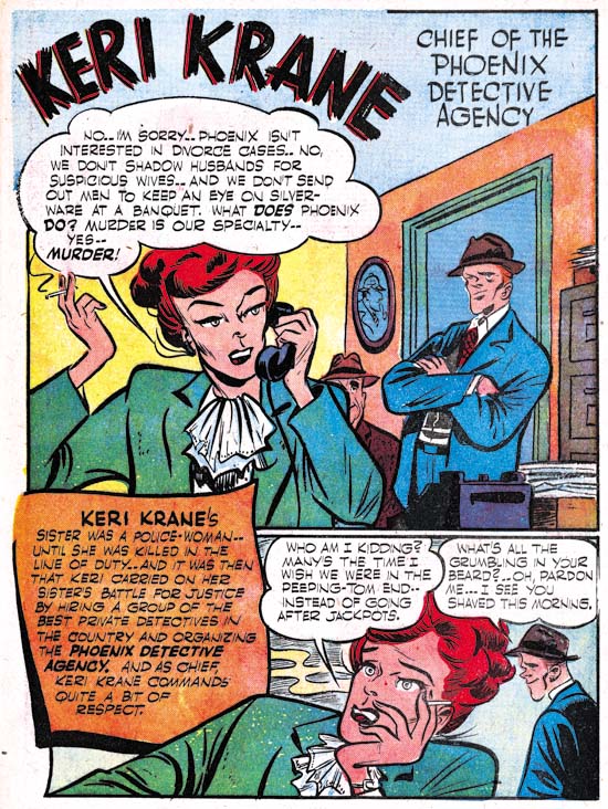
Charlie Chan #3 (October 1948) “Keri Krane”, art by Dick Briefer

Charlie Chan #3 introduced two new features. Well perhaps one was not truly a feature being more of a genre. Issue #3 had “Hilly Billy” and “Cassidy the Movie Cop” was used in CC #4. Both of these were humor stories apparently by the same artist. Gag cartoons were not that unusual in Simon and Kirby productions but usually they were limited to one, or at most two, pages. In these cases they are 4 and 5 pages long.

The other feature was “Keri Krane” about a female owner of a detective agency. At a glance this might be mistaken for another humor genre feature. While there are humorous elements, it is by no means a gag cartoon. What it is a unique blend of crime and humor unlike anything else that I have seen in a crime comic book. For those not lucky enough to have read this gem perhaps it can best be explained by comparison of another more famous feature by the same artist, Frankenstein. When Dick Briefer first started Frankenstein it was a true horror feature but at some point it was changed to a more humorous one. Briefer had developed one of the most unique drawing styles. His drawings are deceptively in their simplicity but capable of a wide range of expression. Briefer’s Frankenstein must have been successful because he had a long run on it from Prize Comics #7 (December 1940) to Frankenstein #17 (February 1949). Further Frankenstein was the only Prize title that survived the arrival of the Simon and Kirby team. Dick’s appearance in Charlie Chan Comics at this time maybe related to the approaching termination of the Frankenstein comic. Frankenstein Comics would resume, with Dick Briefer as artist, with issue #18 (March 1952) and run until issue #33 (November 1954) when it was one of the fatalities resulting from the newly introduced Comic Code.


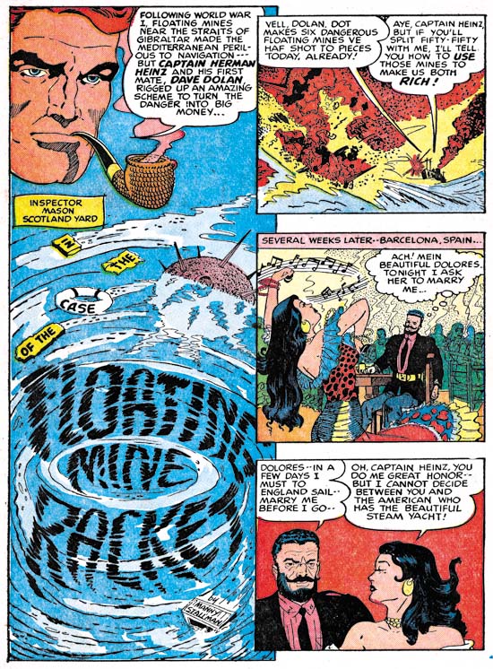
Charlie Chan #5 (February 1949) “Floating Mine Racket”, art by Manny Stallman?

The backup features used in Charlie Chan #3 and #4, including Briefer’s Keri Krane, were dropped for issue #5. A standard crime backup story was used to take their place, “Floating Mine Racket” by Manny Stallman. What a great splash this is. The use of floating debris and the whirlpool to form the title was undoubtedly inspired by similar compositions by Will Eisner for The Spirit. The layout with three story panels floating above and slightly overlapping the splash panel is unlike anything else seen in Simon and Kirby productions. The art has a quirky style to it that I find very appealing. There is only one problem, despite the signature this story was not done by Manny Stallman! Or at least not the same artist that signed other stories in Headline and JTTG as Manny Stallman. The style is so distinctively different that there can be no question in my mind about this. I do not know enough about Manny Stallman’s career to provide a certain answer to this enigma. I mentioned previously that Stallman’s S&K work had a style distinct from what he later did for Atlas. But “Floating Mine Racket” is even further removed from Stallman’s Atlas work. Stallman also did a couple of stories for Simon and Kirby with John Guinta. The inking of the Guinta stories seems to agree with most of the Stallman S&K work. The inking of “Floating Mine Racket” does not match the inking on the Guinta pieces. My current conclusion is that “Floating Mine Racket” was done by some artist doing ghost work for Stallman. As for the rest I will continue to credit them to Manny but there is still the possibility that he only did the inking over yet another ghost artist. This problem obviously needs further investigation.

Charlie Chan #5
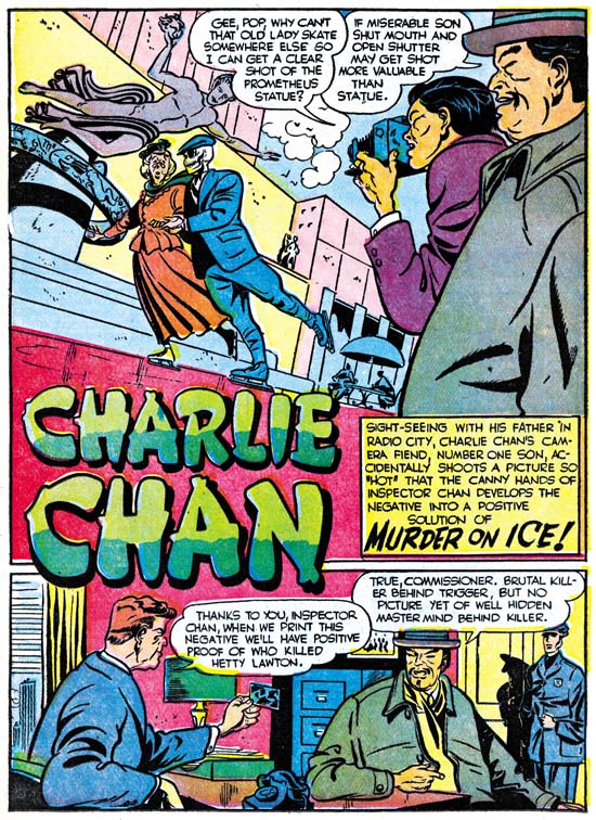
Charlie Chan #5 (February 1949) “Murder On Ice”, art by Dick Briefer

While working on Charlie Chan in the Simon and Kirby studio during the day, Infantino continued to draw for DC at night. It was a grueling schedule and it took its toll. Carmine did great work but the decline in quality from the first Charlie Chan issue until his last is obvious. In the end it was too much for him and Infantino called it quits. Carmine would only draw a single Charlie Chan story for the fifth issue, “The Fox of Paris”. The other three Charlie Chan stories would be taken over by Dick Briefer. The Briefer attribution may seem surprising because it is for his work on Frankenstein that he is best known. For Charlie Chan, Dick has adopted a relatively more realistic approach then what he had used for Frankenstein or Keri Krane. A yet even more realistic example of Briefer’s art can be seen with a page from Uncanny Tales #19 (April 1954) provided by Atlas Tales. Despite his more realistic drawing and the more serious nature of the feature, Briefer’s off-beat humor tends to insert itself into the Charlie Chan stories. What could be incongruous then a skeleton dressed in a suit skating with an old lady at the Rockefeller Center rink? The skeletal figure in the splash for “Murder on Ice” does not actually appear in the story, but presented with such a delightful piece of art, who cares?


Charlie Chan #5 (February 1949) “Murder On Ice” page 2, art by Dick Briefer

The splash page, as fine a work of art as it is, really does not provide the best example of why the Charlie Chan stories from issue #5 should be credited to Dick Briefer. It is to a story page where Briefer’s hand is most evident. Dick had a distinct tendency to provide heads with a triangular form as can be seen in the Keri Krane page whose image I had provided earlier. A similar, if not so exaggerated, shape can be found in the heads on the story page shown above. The Briefer’s style for Charlie Chan retains enough of caricaturistic traits as to make it very special. There is no real humor in this page but the drawing style gives it a particular appeal. Dick’s forte may have been humor, but as can be seen his graphic story telling was top notch.


Charlie Chan #5 (February 1949) “The Dude Ranch Hold-Up”, art by Dick Briefer

I also wanted to include an action page. Briefer shows he can handle action just as well he could humor. Dick Briefer’s Charlie Chan stories really are a testament to what a great artist he was. However Charlie Chan #5 would be the final Prize issue. Years later Simon and Kirby would sell the idea to Charlton. Actually these later Charlie Chan comics could more accurately be called Joe Simon productions as Jack Kirby’s contribution seems limited to creating the cover Charlie Chan #6 (June 1955), the first Charlton issue. Some have suggested that this cover might be left over material from the Prize run. The inking of that cover is done in a blunt manner typical of what is found toward the end of the Studio style. Even the drawing looks more typical of Kirby’s work from the mid 50’s. The cover includes the presence of Burmingham Brown; a character who never appeared in the Prize Charlie Chan comics but played a very visible part in the Charlton issues. I therefore confidently conclude that the cover for CC #6 was created specifically for the Charlton comic, perhaps initially as a presentation piece used for pitching the idea to Charlton. Most of the titles that Simon and Kirby did for Charlton were carryovers from their failed Mainline publishing line. The former Mainline titles each would only last for one or two issues with the exception of Foxhole where a third issue was produced without Simon and Kirby’s involvement. Surprisingly Charlie Chan, using all new material, would last longer for a total of four issues.

Chapter 1, Promoting Crime
Chapter 2, A Revitalized Title
Chapter 3, Competing Against Themselves
Chapter 4, Crime Gets Real
Chapter 5, Making a Commitment
Chapter 6, Forgotten Artists
Chapter 7, A Studio With Many Artists

Chapter 9, Not The Same
Chapter 10, The Master and His Protege
Chapter 11, The New Team

Mort Meskin Group at Yahoo

A new group has started on Mort Meskin. I have added on my sidebar but you can also follow this link. I have discussed Mort often in this blog, and I am sure I will so often in the future as well. Mort was perhaps the greatest talent of the Simon and Kirby studio, that is second to Jack. You could not tell it today as he is largely overlooked by comic fans. Perhaps this new group and an up in coming book on Meskin may start to change that. So if you are interested in discussing or learning more about Meskin why not join?

It’s A Crime, Chapter 7, A Studio With Many Artists

(Justice Traps the Guilty #6 – #8, Headline #33 – #34)

This chapter will cover the Prize crime comics from the period September 1948 until February 1949. Young Romance was also published throughout this period and the first Young Love issue would be cover dated February 1949. Charlie Chan, which featured covers by Jack Kirby and most stories by Carmine Infantino, was also published during this time interval. An important shift seems to have occurred between the material covered here and that from last chapter. Chapter 5 discussed 6 artists with attributions for all the stories. In this chapter there are 10 artists identified but 8 stories remain unattributed so the number of artists was actually higher. The change did not affect Jack Kirby very much, if at all. Jack remains the principal artist; providing all the covers and 6 stories for a total of 77 pages. Kirby supplied all the lead stories and even the illustrations for three text pieces. On the other hand, Bill Draut plays a much more minor roll rendering only 3 stories with 22 pages total. Warren Broderick would do more (4 stories with 30 pages, assuming my attributions are correct). Manny Stallman would tie Draut (3 stories with 22 pages).

There also seems to be a difference between the crime titles and Young Romance during this period. At the same time that Draut’s presence declined in the crime titles he and Kirby were still the main artists for Young Romance. Young Romance #7 (September 1948) to #9 (January 1949) would be drawn by Kirby and Draut alone. Young Romance #10 (March 1949) would also include just one story by artists other then Kirby or Draut (the team of Al Eadeh and John Belfi). This is very different from the multiple artists present in the crime titles. Eventually Simon and Kirby would stop producing crime comics; one of the reasons that I am doing this serial post is to try to determine more precisely when that happened. Simon and Kirby were certainly producing Headline and JTTG during the period covered in this chapter, but the drop of crime stories by Bill Draut may be symptomatic of a change to come.

Because of the number of artists, I am going to bypass some. One to be skipped will be Bill Draut. Draut’s work during this period is pretty much the same as seen previously. Another artist that will be neglected here will be A. C. Hollingsworth. “The Amazing 3 Sinister Salesmen” (JTTG #6, September 1948) will be the last signed work that Hollingsworth would do for Simon and Kirby. So far I have not seen an unsigned work by Alvin so I suspect that Hollingsworth total output for Simon and Kirby was an unremarkable four stories. A surprisingly low number for an artist that Joe Simon still remembers. Finally there are 8 stories that I have not determined an attribution. I presently believe that 4 or 5 different artists are present but I will discuss only one of them.


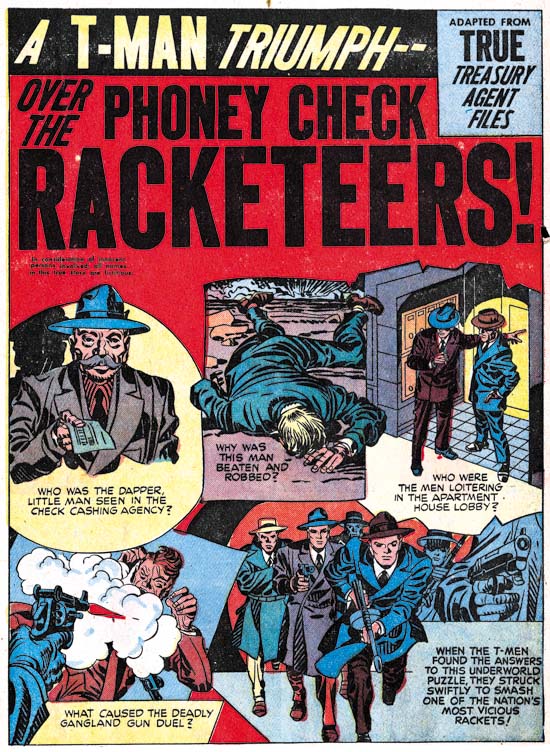
Justice Traps the Guilty #7 (November 1948) “Phony Check Racketeers”, art by Jack Kirby

Most of the lead stories continued to use the motif of a character introducing the story with the speech balloon forming the title. For “Phony Check Racketeers” Simon and Kirby deviated by giving the lead story a splash design they had not previously used for crime comics. The splash actually consists of five vignettes acting as the comic book equivalent of a movie trailer. Four panels ask questions that suggest some of the content of the story while the fifth indicates that the T-Men will find the answers and once again prove that crime does not pay. I do not recall any previous splash that consisted of little more then a series of preview panels but there is some similarity to this splash to one Captain America #9. In any case it is a layout that would rarely be used by Simon and Kirby for their splashes.


Justice Traps the Guilty #6 (September 1948) “The Capture of One-Eye”, splash panel by Jack Kirby, story panels by unidentified artist

I will repeat an observation that I made in my last chapter, Jack Kirby’s crime splashes just no longer have the impact that his early ones had. I find those that Jack was doing at this same time for romance comics much more interesting. However there are occasional exceptions. Kirby certainly provided an interesting splash for “The Capture of One-Eye”. The eye is also by Jack while the story panels, as well as the rest of the story, are by an artist I have not been able to identify. The layout, with its vertical splash and story panel arrangement, is one unusual for Jack. I see no sign of Kirby layouts in this story, so it is possible that the panel layout of the first page was selected by the story artist. But the vertical panel works so well with Jack’s composition that I rather inclined to believe that it was Kirby’s selection despite its otherwise rarity.


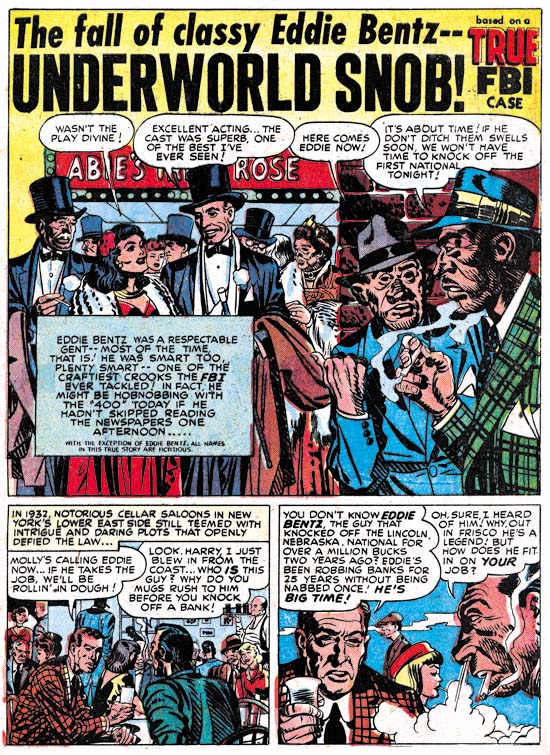
Justice Traps the Guilty #8 (January 1949) “Underworld Snob”, art by Jack Kirby and Warren Broderick

One Kirby crime story stands out from the rest of those of this period. The inker was so heavy handed that it is rather easy to overlook this as one of Kirby pencils. It is very similar to “Mother Said No” (Young Romance #7, September 1948 ). Originally I attributed that inking of that piece questionably to Carmine Infantino. In Chapter 5 I changed my mind and now credit Warren Broderick as the inker. I am now attributing the inking of “Underworld Snob” it Broderick as well. However Joe Simon has described inking of Kirby’s work in the Simon and Kirby studio as being like a production line with different artists helping out. I bring this up because I am not convinced that all the inking was all by Warren. The spotting was done in the typical Studio style inking. More typical then Broderick used when inking “A Gangster Dies” (Headline #31, August 1948) a piece where Warren did a good job of mimicking Kirby’s style.


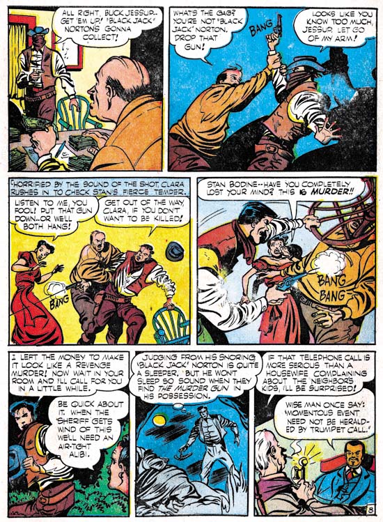
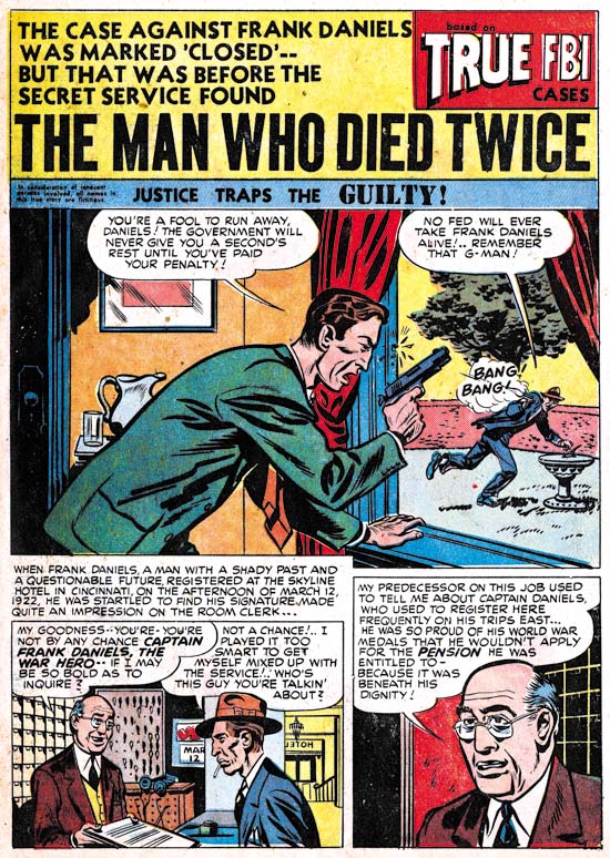
Justice Traps the Guilty #7 (November 1948) “The Man Who Died Twice”, art by Warren Broderick

There are four stories that I here credit to Warren Broderick, this is more then any other artist other then Kirby. But the catch is that I am not complete sure of the identification. The art is simpler then the examples of Broderick from last chapter. Further there is no danger in mistaking any of it for work by Jack Kirby. But the wild eyebrows that Broderick used occur here as well (although not on the example page shown above) and certain facial expressions are found in both groups. Perhaps Broderick is working with another artist; an arrangement that Warren once had with Harry Harrison.


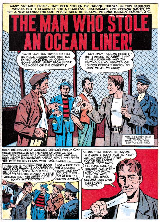
Headline #33 (December 1948) “The Man Who Stole an Ocean Liner”, art by Vic Donahue

“The Mystery of Room 712” (Headline #32, October 1948) was the first work by Vic Donahue for a Simon and Kirby production. Vic also did “The Man Who Stole an Ocean Liner” which I show above. Donahue uses a style that leans toward realism with some panels looking like they were based on photographs. Inking was done with a combination of brush and a pen. We will encounter Donahue in future chapters as well and Vic has already been discussed in the Art of Romance both for work in the western love comics and the more standard romance. As time went on Vic’s work showed less of the careful drawing and fine inking found in his earlier crime stories.


Justice Traps the Guilty #8 (January 1949) “End of a Blackmailer”, art by Manny Stallman

The biggest treat for me in this chapter is Manny Stallman. Stallman is a good graphic story teller with a style that tended toward caricature (or at least for his Simon and Kirby art). Realism is not necessarily a characteristic I look for in comic book art and I find Stallman’s style very appealing. Atlas Tales has a number of examples of his work, but all from a later period (1952 to 1957) and all unsigned. The style is different then Manny used for Simon and Kirby. So different that based on the Atlas material I doubt that I would have recognized Manny’s S&K work had it all been unsigned. But I gather Manny would often change his style. Mark Evanier has a marvelous obituary on Manny Stallman which includes comments by Gil Kane. Kane describes Manny’s inking as “very crude but it worked”. I am very impressed by Stallman’s inking. Not for any show of dexterity, but for the impact the inking provided. Particularly well done are his panels dominated by black such as the last one in the image above.


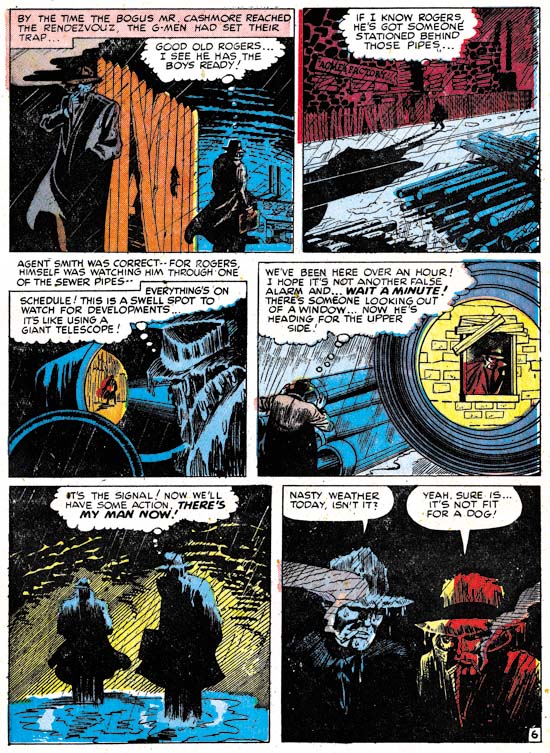
Headline #33 (December 1948) “Underworld Parasite” page 6, art by Manny Stallman

Although he did not seem to use predominately black panels in every story, there are a number of examples I could have selected. Perhaps page 6 “Underworld Parasite” is the best one. The drawing itself is not that exceptional, but the use of blacks makes this nighttime rendezvous very memorable.


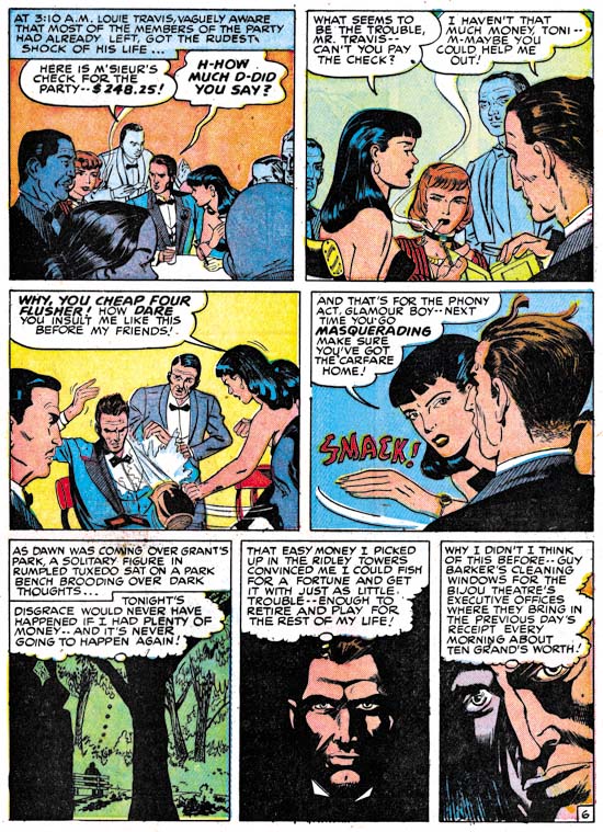
Headline #34 (February 1949) “Twenty Second Story Man” page 6, art by John Guinta and Manny Stallman

In my last installment of The Art of Romance I said I only knew of one work by the team of John Guinta and Manny Stallman for the S&K studio (“The Life of the Party”, Young Love #6, December 1949). I must not have checked my database because there was one other, “Twenty Second Story Man” shown above. (This time I double checked, these two are the only work by Guinta and Stallman in my database). I know little about John Guinta and a Google search did not provide much information. John Guinta’s pencils are distinctive; especially the eyebrows of woman, and it should not be hard to recognize unsigned work, if there is any, in the Simon and Kirby productions. It is interesting to compare Stallman’s inking of Guinta with that on his own pencils. Manny’s use of panels dominated by blacks shows up in “Twenty Second Story Man” as well.


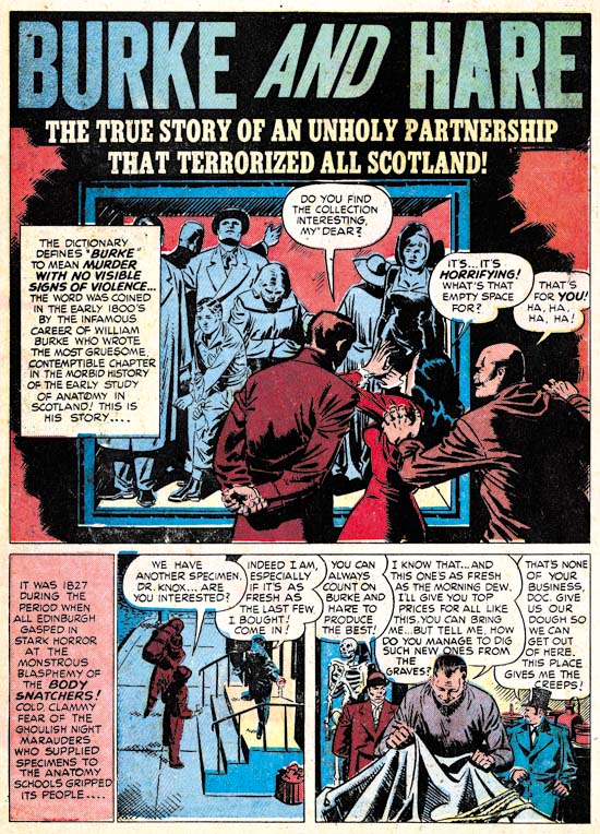
Justice Traps the Guilty #7 (November 1948) “Burke and Hare”, art by H. Colben?

I have included “Burke and Hare” because the artist’s signature is found in the last panel of the story. Unfortunately it is hard to make out the name but my best guess is H. Colben. That, however, does not help much because I have been able to find anything about an artist with that name so perhaps I have misread the signature. Colben is not the greatest of artists but he does have some distinctive features to his style and should be easy to determine whether he produced anything else for Simon and Kirby.


Headline #32 (October 1948) “The Clue of The Horoscope”, art by an unidentified artist

As I mentioned earlier, there are a number of stories that I have not been able to provide attributions. But there are a couple of stories, “Joe Slade, Wild West Jekyll And Hyde Desperado” (JTTG #8, January 1949) and “The Clue of the Horoscope”, by an artist I particularly wish I could identify. This artist uses what I would describe as a severe, sometimes even primitive, caricature style. As is seen often in Simon and Kirby productions, the splash panel shows aspects of the Studio style inking while the rest of the story is not. But there are other traits in the splash inking that deviates from the Studio style and agrees with the story inking. Most importantly the way some of the cloth folds are feathered is normally not an attribute of the Studio style. The picket fence crosshatching (see the Inking Glossary for an explanation of my inking terminology) has a hardness in its application that agrees with the inking found throughout the story. The best explanation for all this seems to be that the artist purposely adopted aspects of the Studio style so as to match better with other stories in the comic. It does seem that splash panels often are done in the Studio style.


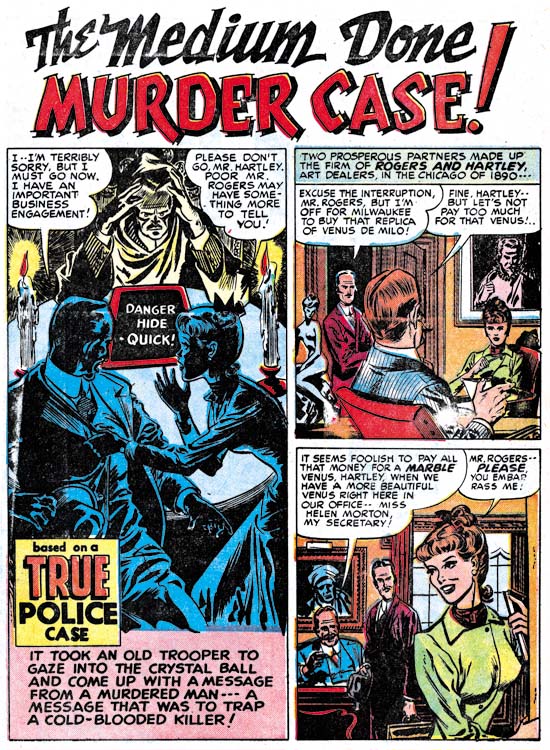
Headline #34 (February 1949) “The Medium Done Murder Case”, art by Leonard Starr

“The Medium Done Murder Case” is the earliest example of work by Leonard Starr for Simon and Kirby productions. It is unsigned but the style closely matches signed work by Starr. The women generally have an elfin look that is characteristic of Starr’s work for Simon and Kirby. Leonard would later produce a good amount of work for the western love titles (covered previously in The Art of Romance, Chapter 7) and some standard romance as well (The Art of Romance, Chapter 5). Starr signed much of his western love work but nothing in Simon and Kirby’s crime titles bears his signature. It will be interesting to see if further unsigned work can be found.

Chapter 1, Promoting Crime
Chapter 2, A Revitalized Title
Chapter 3, Competing Against Themselves
Chapter 4, Crime Gets Real
Chapter 5, Making a Commitment
Chapter 6, Forgotten Artists

Chapter 8, The Chinese Detective
Chapter 9, Not The Same
Chapter 10, The Master and His Protege
Chapter 11, The New Team

It’s A Crime, Chapter 6, Forgotten Artists

(Justice Traps the Guilty #3 – #5, Headline #29 – #31)

Jack Kirby remains the principal artist for the six crime issues discussed in this chapter. All 6 covers were drawn by Jack as well all the lead stories. Kirby’s did 10 stories with a total of 117 pages (including the covers). However Bill Draut now assumes a more important roll becoming the second principal artist. Bill supplied 11 stories, one more then Jack, but fewer pages (81 pages). The other three artists contributed much less then either Jack or Bill. The next most prolific (A. C. Hollingsworth) drew just 3 stories with 25 total pages.


Justice Traps the Guilty #4 (May 1948) “Queen of the Speed-Ball Mob”, art by Jack Kirby

The first story consistently uses the motif of a character introducing the story with the word balloon forming the title caption. I have noticed that when a story is being narrated, it is often by a woman. Almost certainly this was because male criminals generally have fatal endings (and therefore would not be able to tell their story) while females normally survive.


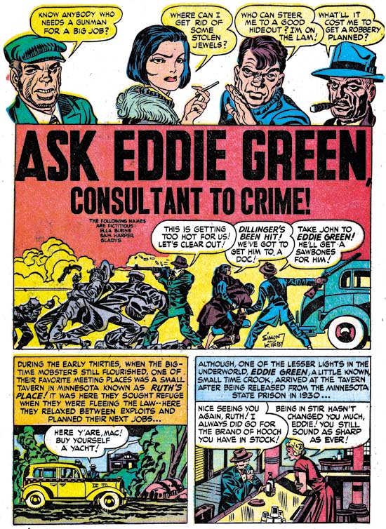
Justice Traps the Guilty #3 (March 1948) “Ask Eddie Green, Consultant to Crime”, art by Jack Kirby

A motif that would occur often in Kirby’s splashes at this time was having a cast of characters make a series of statements to introduce the story. Actually it was a return to an old technique as we have seen it as far back as in Captain America. When used in a splash covering two thirds of the page, this type of design did not leave much room but in “Ask Eddie Green” Jack makes effective use of what is available by supplying a small shoot out scene. The depth of field is so narrow that the results look like a frieze. Despite the small size everything is clear and the scene is filled with interest.


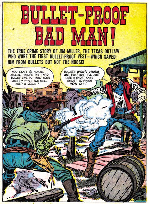
Headline #30 (June 1948) “Bullet-Proof Bad Man”, art by Jack Kirby

Perhaps it is just my tastes, but I feel that Kirby’s splashes are not as exciting as before. This may have been a result of Kirby’s declining use of full page splashes. Only 3 splashes out of his 10 stories received the full page treatment. “Bullet-Proof Bad Man” provides a typical Kirby dramatic shoot out. Well not so much as gun fight as one man has only drawn his knife although it turns out this is not as unwise as it seems. It is clear that the bullet has found its mark but note how Jack seems to downplay the actual hit. The story is about a gunfighter that uses a special vest to protect himself from bullets. However I have notice that Jack seems averse to showing the actually striking of a bullet even though that is a moment he often depicts. Generally Kirby hides the action in a cloud of gun smoke. When, because of layout, that is not possible, such as above, Kirby will simply not include any impact lines.


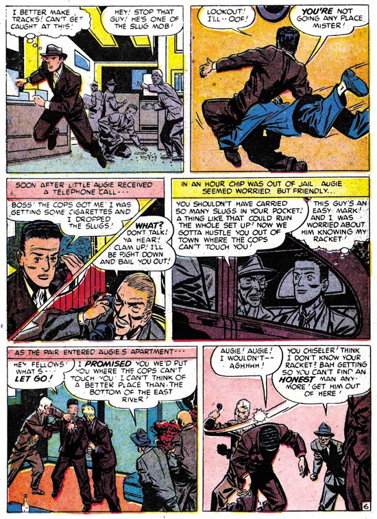
Justice Traps the Guilty #5 (July 1948) “A Fortune in Slugs” page 6, art by Bill Draut

Bill Draut did so much romance work for Simon and Kirby that it is nice to see his efforts for the crime genre. These comics gave Bill a chance to provide more action then he would normally use in romance comics. Draut was better at adding excitement then would be expected based on his work towards the end of his career. Here on one page we find a man running, being tackled and in the final panel bludgeoned with a blackjack. All of which Bill handled quite nicely. I particularly like his use of perspective in the second panel. Draut shows the tackler flying into the page whereas Kirby would have had the action coming out toward the reader, but otherwise it was well handled.


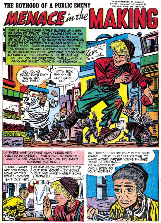
Headline #30 (June 1948) “Menace in the Making”, art by Bill Draut

Draut’s effective use of perspective is seen again in the splash for “Menace in the Making”. The low viewing angle allows the running figure to tower over all others without seeming to be unnatural. Action was not, however, the only outlet that Bill found in the crime genre. Crime stories allowed Draut to work, to extent that romance did not, in a more cartoony style. Note the caricature that Bill has provided the irate grocery man. Such interesting but fundamentally unrealistic depictions are found often in Bill Draut’s work in Headline and Justice Traps the Guilty but rarely in Young Romance or Young Love.


Justice Traps the Guilty #3 (March 1948) “My Strangest Crime Case”, art by Bill Draut

One story drawn by Bill Draut may not be exception as far as the art is concerned, but it is unusual in that the protagonist was a female private investigator. The story reads more like something from the hero genre then a true crime story. This is not the first time that Draut drew a story about a lady detective. In 1946 Draut worked on a feature called Calamity Jane originally for Boy Explorers Comics but when that title quickly failed (due to the comic glut after the war) subsequently published in Green Hornet Comics. It is likely that “My Strangest Crime Case” was left over material from that earlier effort that, with minor revisions such as to the detective’s name, was now put to use. The art style does seem to be a better match to Draut’s earlier work then to what he was doing at this time.


Headline #29 (April 1948) “The Night of the Freak Murder”, art by Jerry Robinson and Mort Meskin

The team of Jerry Robinson and Mort Meskin continue to appear in the crime issues covered by this chapter. The work is unsigned but the similarities to the signed works by Robinson and Meskin are numerous. “The Night of the Freak Murder” is unusual for Jerry and Mort in that it has a full page splash. Generally R&M’s splashes for Simon and Kirby productions are vertical with two story panels also arranged vertically. The composition is interesting in the way it plays off the grieving women with an almost mirror image of two detectives discussing the crime. The staircase might seem odd but it was introduced as part of a pattern that confines the eye in a circular composition. None of the other splashes that Robinson and Meskin supplied to Simon and Kirby were so well composed but as I said they did not normally use a full page splash.


Headline #29 (April 1948) “The Night of the Freak Murder” page 7, art by Jerry Robinson and Mort Meskin

As I mentioned in the previous chapter, I am not sure what Jerry Robinson’s contribution was because both the pencils and the art look very much like Meskin’s work. Mort was one of the best graphic story tellers and pages like the one above suggest why he had such an impact on artists like Steve Ditko. Here on this page the same diagonal is present in every panel. The page starts with close-up then switches to a distant show and then progressively comes closer. An increasing tension is formed by the combination of increased nearness, the diagonal design and off course the fear Meskin imparts to the criminal. Nothing really happens but the page is explosive nonetheless.


Justice Traps the Guilty #4 (May 1948) “Guilty Boys”, art by Jerry Robinson and Mort Meskin

Not all of Robinson and Meskin’s splashes were vertically oriented; here is another case where they deviated from that pattern. This is a standard two thirds splash page with two story panels arrayed on the bottom. Nothing unusual in the design itself but it does allow Jerry and Mort to provide a memorable splash. Although the image seems cluttered, everything serves a purpose. Debris and damaged items abound and a row of buildings in the background all combine to show that this is a location in some slum. But the shabbily dressed musical boys are not the Newsboy Legion and this is not Suicide Slums. Here Robinson and Meskin convert the boy gang genre into crime. They are not saints and in the end are more in need of rescue then providing it.


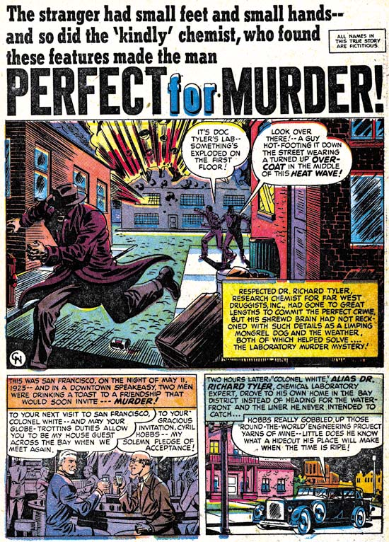
Headline #31 (August 1948) “Perfect for Murder”, art by Charles Nicholas

Only initials were used to sign “Perfect for Murder” (Headline #31, August 1948) but I am pretty certain it was Charles Nicholas. Originally Charles Nicholas was a house name used by Fox Comics for Blue Beetle stories. Over the years the work of many different artists appeared under that name, including Jack Kirby. However there were two individuals who continued to use the name outside of Fox and who claimed to be the creator of the Blue Beetle; Charles Wotjkowski and Chuck Cuidera. There is nothing I can add to that particular question here but it was the Wotjkowski version of Charles Nicholas who worked for Simon and Kirby at this time.


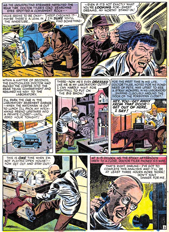
Headline #31 (August 1948) “Perfect for Murder” page 3, art by Charles Nicholas

While interesting, the splash page does not present a very good idea of Nicholas’ art so I have included an image of a story page as well. Nicholas does a good job drawing this story but he never achieved great success in his career as a comic book artist. Nicholas inked the art in a very individualistic style, as particularly seen in the form lines used in panels 6 and 7 and the swirling crosshatching in panel 7. (See my Inking Glossary for an explanation of my terms.) What is not found are any traits of the Studio style inking. While Nicholas is certainly a candidate for being one of Jack Kirby’s inkers, it is hard to understand how his name has become associated to the inking of particular pieces such as “Summer Song” (Young Romance #1, September 1947). “Perfect for Murder” was the only worked for Simon and Kirby signed or initialed by Charles Nicholas but other unsigned art by him surely remains to be identified.


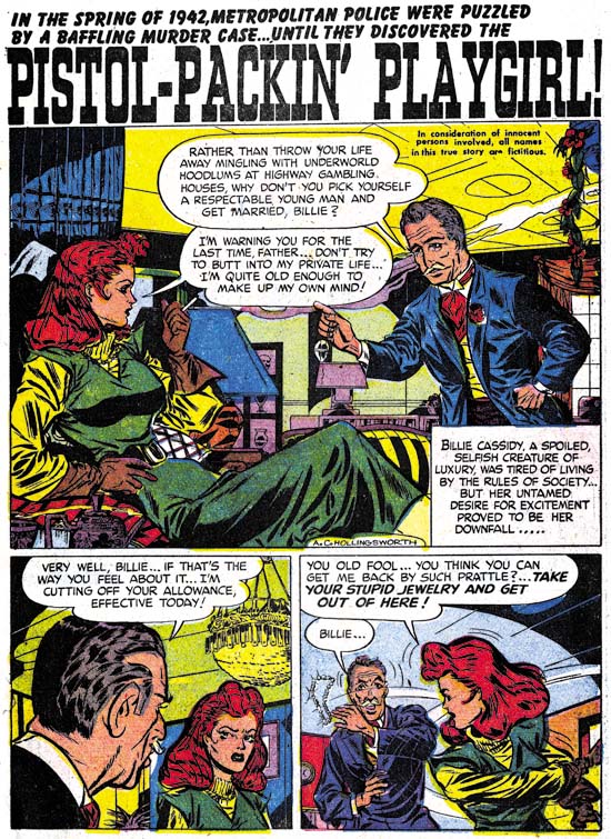
Headline #30 (June 1948) “Pistol-Packin’ Playgirl”, art by Alvin C. Hollingsworth

Another artist that shows up working for Simon and Kirby during this period is Alvin Carl Hollingsworth. A search of the Internet indicates that Hollingsworth was an African-American artist from New York who was born in 1928 and died in 2000. Previously he worked for Holyoke Publishing Company working on Catman. Hollingsworth was also a talented fine arts painter. Joe Simon remembers Alvin and has a high opinion of him. Joe remarked that he thought he was the only African-American working in comics at that time. This is not truly accurate since there was also Matt Baker who played an important part in the early history of comics. But Matt Baker never worked for Simon and Kirby and so Joe was not aware of him, or at least of his background.


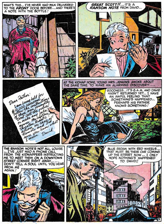
Justice Traps the Guilty #5 (July 1948) “Held For Ransom” page 5, art by Alvin C. Hollingsworth

Hollingsworth is another of those artists whose current reputation is much lower then warranted by his talent. This is largely because he left the comic book field in the late ’50s first for syndications strips and then the fine arts. It is a recurring pattern that I have noticed that comic book artists who did not take part in the superhero revival of the 60’s and later generally do not get much attention today. I have included a story page because it provides a better example of Alvin’s strengths. Note the use of varied and unusual viewing angles.


Headline #31 (August 1948) “A Gangster Dies”, art by Warren Broderick

The Jack Kirby Checklist includes “A Gangster Dies” among the art works by Kirby. This is a bit surprising because close to the center of the splash page is Warren Broderick’s signature. Before I sound too self righteous I should add that when working on this chapter I found I had listed this story in my database twice; once as done by Broderick and the second crediting it to Kirby. I have no idea how I made the mistake in my database, but it is easy to understand why anyone who failed to notice the signature might attribute this work to Jack. Warren has obviously made a careful study of Jack’s work and has adopted, at least for his work for the S&K studio, much of Kirby’s style. Warren was not, of course, as successfully as Jack himself and there are more then enough clues to properly attribute his work even without a signature. Note for instance how in the splash Broderick uses picket fence crosshatching where the rails are cloth folds. Besides simple lines, Kirby would use drop strings and wide lines for the rails but I do not recall him ever using cloth folds. Kirby would often make expressive eyebrows but Broderick’s versions were even more exaggerated.

This is the only signed work by Warren Broderick that I have found among Simon and Kirby productions. Frankly I have forgotten about it until I reviewed for this chapter. It turns out that we have seen some of Warren’s unsigned work previously. In just the last chapter I attributed “The Killer Thought He Was Satan” (Justice Traps the Guilty #2, January 1948) as Kirby layouts finished by an unidentified artist. A comparison between it and “A Gangster Dies” leaves little doubt that it also was by Broderick. In fact I no longer believe Kirby laid it out. Yes there are parts in both stories that look very much like Kirby but there are also parts that do not. Previously I failed to follow my own advice and only noted the similarities and neglected the differences. For instance there is a panel I provided from “The Killer Thought He Was Satan” that showed a boy being shot by the villain. While the scene and the boy in particular look very much like it was done by Jack, the artist shows the bullet actually striking the boy. That is something I have yet to find Kirby doing.

Another example of Broderick’s work was “Mother Said No” (Young Romance #7, September 1948) seen in Chapter 3 of the Art of Romance. There I attributed the pencils to Jack Kirby (correctly) and the inks questionably to Carmine Infantino. The primary reason for my earlier caution was that I was bothered by Carmine’s statement in an interview that he had never inked Kirby’s pencils. While in the work for Charlie Chan, Infantino was also providing expressive eyebrows some of the other brushwork found in “Mother Said No” is more like that in Broderick’s work. Although Broderick was very good at mimicking Kirby, I find the layouts in “Mother Said No” are much too consistently like Jack’s that I still believe that Kirby did the pencils.


Headline #31 (August 1948) “A Gangster Dies” page 3, art by Warren Broderick

Broderick could mimic Kirby quite well but occasionally, such as in the first panel shown above, the similarity to Kirby’s style is very striking. This was either due to Kirby stepping in his roll as art editor and fixing up the finished art or it was the result of a careful swipe by Broderick from some Kirby art. Without the original art it is hard to be sure but I suspect the latter explanation to be the case. Once again Broderick has drawn a scene where a man is clearly hit by a bullet, something that Kirby would hide in a cloud of gun smoke.


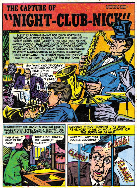
Justice Traps the Guilty #3 (March 1948) “The Capture of Night-Club Nick”, art by Warren Broderick

Broderick did not always so carefully mimic Jack Kirby’s style. In “The Capture of Night-Club Nick” Warren has abandoned the Studio style inking. Still the influence of Kirby is clearly discernable.

I have found little in my search for more information about Warren Broderick. I queried Joe Simon about him but he did not remember Warren at all. Joe does not remember all the artists who had worked for him over the many years, but in Broderick’s case this is surprising because the one thing I had found out was that he also was African-America. Joe was clear in his memory of A. C. Hollingsworth and that Hollingsworth was the only African-American to work for Simon and Kirby. How could Joe have failed to remember, even if not by name, one other African-American comic book artist? The answer maybe found in an interview given by comic artist, Harry Harrison:

After Wally and I broke up I was working mostly for Fawcett, and I had a friend by the name of Warren Broderick, who was also in school with me, doing my penciling. He was a black guy who didn’t want to get in there and push, didn’t want to face whitey in the office. We developed a nice clear style, no great shakes, but it worked.

This suggests that Broderick may have been reluctant to deal with Simon and Kirby directly and used someone, either an agent or another artist, as a go between. Joe may never have known about Warren’s ethnicity. The irony is that, considering their dealings with Hollingsworth, Joe and Jack probably would not have cared about Warren’s background, all that was important was that he could do the work.

The GCD only has three entries for pencils attributed to Broderick and three more for inking work. Atlas Tales has about a dozen works attributed to Warren. To that I can now add three further pencils and another inking job. Now that I have a small body of work to go by, I am sure I will find more work by Broderick as I continue to review Simon and Kirby productions. Warren Broderick is truly one of the forgotten comic book artists and it is rewarding to shed a little light on his career.

Chapter 1, Promoting Crime
Chapter 2, A Revitalized Title
Chapter 3, Competing Against Themselves
Chapter 4, Crime Gets Real
Chapter 5, Making a Commitment

Chapter 7, A Studio With Many Artists
Chapter 8, The Chinese Detective
Chapter 9, Not The Same
Chapter 10, The Master and His Protege
Chapter 11, The New Team