Category Archives: 2 Fox

Blue Bolt Covers


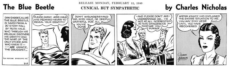
Blue Bolt #1 (June 1940), art by unidentified artist

As previously discussed, Joe Simon’s creation of the feature Blue Bolt occurred somewhat earlier than the cover date of Blue Bolt #1 would suggest. Joe supplied it to Funnies Inc. a shop run by Lloyd Jacquet that put together comic books for other publishers. Blue Bolt was just one of a number of features that Simon created for the shop. But apparently Jacquet and Novelty Press must have seen some special potential in Blue Bolt and used it as the title feature for a new comic book. Had that had been the intention all along it would be expected that Simon would do the cover art but since that was not the case we cannot assume he drew the cover. There are reasons to believe that Simon was not the cover artist and little to suggest he was. To my knowledge only the eyes of the Green Sorceress look like they might have been done by Simon. However many comic book artists found difficulty in getting eyes to sit properly on a face viewed from an angle. Otherwise none of the figures look like any other art that we can more confidently attribute to Joe. The Green Sorceress’ hair seems tamed in comparison to Simon’s depiction in the story. The dragon does not resemble the monsters in the story either. Blue Bolt’s cape lacks the distinct zigzag contour found in the story although Simon would abandon this device in future issues. Blue Bolt’s helmet includes a lightning bolt emblem that is missing from the story art. The gloves and boots have a three dimensional presence that Simon generally avoided and specifically did not use for Blue Bolt. Finally the composition is very untypical of Simon particularly the lack of any background elements causing Blue Bolt to float. It is hard to escape the conclusion that despite what some have claimed the cover art for Blue Bolt #1 was not done by Joe Simon.

Jacquet’s shop had a number of comic book artist which could have been called upon to draw the cover. Perhaps the most famous were Carl Burgos and Bill Everett but I think it can safely be said that the style of the cover art does not match either of these two artists.


Blue Bolt #2 (July 1940), art by W. E. Rowland

Fortunately the next Blue Bolt cover was signed so there can be no question that it was drawn by William E. Rowland. The cover art for BB #2 shares some features with that for BB #1. In particular the more three dimensional aspects of the gloves and boots as well as the lightning bolt design on the helmet. I feel that the Blue Bolt’s face looks similar in the two covers. However Rowland goes even further in giving the gloves and boots a real physical presence. Further he has added details to the gloves that were missing from the BB #1 cover such as the lightning bolt and small circular shapes and lines that border the opening of the glove. While I would not rule out that Rowland was the cover artist for BB #1, I do not find the similarities strong enough to convince me that he was.


Blue Bolt #1 (June 1940) “Page Parks”, art by W. E. Rowland

The signature on the cover of BB #2 is particularly valuable because I doubt that Rowland would otherwise have been credited for the art. Apparently Rowland only worked on comic books for a few years (1939 to 1942) and even during that period he did not seem to do a lot of work. I have discussed one story by Rowland from Prize Comics #7 (December 1940) previously (Ted O’Neil). Frankly it was a rather unfair comparison of his take on the feature with Simon and Kirby’s. The purpose of the post was to highlight how radical Simon and Kirby’s work was compared to the work by more typical comic book artists even at this early stage in their career. Blue Bolt #1 also has a story drawn by Rowland and a scan of a page is provided above. Rowland is a good comic book artist, better than most contemporaries, but judging from the work I have seen so far it is hard to understand why he would have been selected to provide cover art. Whatever the basis for that decision it turned out to be a good one because Rowland’s cover art is rather nice and far superior to his story art.


Blue Bolt #3 (August 1940), pencils and inks by Joe Simon

It was only with the third issue that Simon had his single chance to provide the cover art for Blue Bolt. Much could be said about the technical problems with the art. The cloth folds are a confusing mess and the perspective of the forward leg is not quite accurate. But these and others faults are nothing more than nick-picking that do not significantly distract from the cover’s impact. The figure of Blue Bolt was swiped from Alex Raymond’s Flash Gordon (see Art by Joe Simon, Chapter 4, Footnote) but Joe has infused the figure with excitement. Simon also uses a low viewing angle so that Blue Bolt can tower over his supporting soldiers. It is a effective depiction of an attaching force coming through some mountainous pass.

There was a time that some attributed this cover art to Jack Kirby but nowadays there is general agreement that Simon drew the cover. Perhaps the most convincing evidence that Kirby did not draw the figure is the somewhat problematic nature of the perspective of Blue Bolt’s leg, Kirby’s use of perspective was always very convincing. While it is now known that Kirby did sometimes use swipes I have never seen an example of Jack swiping from the same source more than once. However this twice use of Raymond’s Flash Gordon running figure would not be unusual for Simon.


Blue Bolt #5 (October 1940), art by W. E. Rowland

Blue Bolt did not appear on every cover of the comic that bore his name. The next appearance of Blue Bolt was for issue #5 and once again Rowland has the honors. While this cover shares some stylistic features with the one Rowland did for BB #2 there have been important advances as well. Blue Bolt’s glove and boots have an even more exaggerated three dimensional look. The figures have become more massive and muscular and the inking finer and more detailed. While Rowland did a good job on the cover for BB #2, this one is a masterpiece.


Blue Bolt #7 (December 1940), pencils by Jack Kirby, inks by Joe Simon

Issue #7 marked Blue Bolt’s final cover appearance during the Simon and Kirby run. It would be Jack Kirby’s only Blue Bolt cover. While not a bad cover it was not one of Jack’s finest either. I feel much of the blame comes from the action portrayed. Jumping out of a plane just does not have the impact of, for example, attempting to stop a bomb from exploding (as seen in the cover for Champion #10, August 1940). The rather unimpressive aircraft do not help either. I am not sure what they are meant to be since they lack propellers or jet engines. Rocket planes?

In the Beginning, Chapter #2, Blue Bolt #2

Blue Bolt #2


Blue Bolt #2 (July 1940) page 9, pencils and inks by Joe Simon

The story art for Blue Bolt #2 looks rather different from that from its predecessor. One reason for this is that (as mentioned in the previous chapter) the first issue was created earlier then the cover date would suggest. While Blue Bolt was drawn earlier it really was not that much earlier, probably just a matter of a few months. The difference between Simon’s art for the two stories show how rapidly he was adapting to working on comic books. The figure art has improved as well as what can be best described as his ability to graphically tell a story. There also appears to be a greater use of design. For example the interesting architecture in the first panel. Even better examples can be found in the long third panel. The wall is built with round stones giving an overall pattern to the background. Frankly this was not so successful as it gives the image a rather cluttered look. More effective are the chains which besides reflect on the imprisonment of Blue Bolt’s men add interest to the panel without disturbing what is important to the story. The chains are inked as silhouettes which removes them of the third dimension but emphasizes their function as a design element.


Blue Bolt #2 (July 1940) page 4, pencils and inks by Jack Kirby

The other reason that the art for Blue Bolt #2 looks so different from that in #1 is that some of it was created by Jack Kirby although only Joe Simon was given credit in the splash. In the future Kirby would be the primary penciller of Simon and Kirby productions but that was not the case here. Simon created 6 1/3 of the pages while Kirby only did 3 2/3 pages. Fractions are used in these counts because on the first page Joe did the splash while Jack did the story art. The precise tally is that Simon did pages 1 (splash only), 3 and 6 through 10 while Kirby did pages 1 (story only), 2, 4 and 5. Each artist inked his own pencils.

Note that Kirby introduces a foreground chain in the first splash-like panel but to very different effect. Here the chain is not so much a design element as a means of adding depth to the image. The chain is also carefully inked to provide it with a full dimensionality that is very different from the flat silhouettes that Simon used.


Blue Bolt #1, art by Joe Simon
Blue Bolt #2, page 10, panel 7, art by Joe Simon
Blue Bolt #2, page 1, panel 2, art by Jack Kirby

It is interesting to compare Simon’s artistic progress from Blue Bolt #1 to #2 as well as Kirby’s efforts from issue #2. I have chosen close-up of Dr. Bertoff to provide these comparisons. In BB #1 and much of BB #2 Simon portrays Dr. Bertoff as a rather “ratty” looking individual. A surprising unflattering depiction of a scientific genius. However Dr. Bertoff gets better treatment in some of Simon’s BB #2 art. Now part of this improvement can be credited to Joe’s rapid advancements as a comic book artist. However comparing Simon’s best depiction of Dr. Bertoff with that by Kirby suggests that Joe was also being influenced by Jack. Kirby was never very good at adopting other comic book artists styles but that was something that Simon was very adept at. During this time Joe was doing the cover art for the Fox Comics successfully mimicking Lou Fine. Now Joe was trying to copy Jack’s style. This was desirable because it would give stories produced by Simon and Kirby a unified look. At this early time Simon only achieved limited success at mimicking Kirby but he would greatly improve in the future.


Blue Bolt #2 (July 1940) page 3 panel 5, pencils and inks by Joe Simon

Kirby drew impressive machinery throughout his career. This can be seen even at this early stage in his career as for example the “electro-beam atom smasher” from the splash-like first panel of page 4 shown earlier. Jack did similarly impressive devices on every page of this Blue Bolt story that he drew. Machinery appeared on some of the pages that Simon did but generally more distant views less rich in details. Even in the few close-ups that Joe provided (such as the example from page 5 provided above) his versions were no match for Kirby’s more interesting depictions. It is not clear whether Kirby was given those pages to draw because they would contain such machinery or that Jack inserted such fantastic devices whenever he could.


Blue Bolt #2 (July 1940) story letters by unidentified letterer

From past work that Joe Simon and Jack Kirby did it might be expected that either they would letter the pages that they drew or the lettering would be done by one of them. But neither of these likely possibilities was the case. Both Joe and Jack had very distinctive lettering styles (see Early Lettering by Joe Simon and Jack Kirby as a Letterer). But nowhere in Blue Bolt #2 can be found the unique lettering such as Joe’s ‘W’ or Jack’s ‘U’. Instead the story has one rather remarkable ‘E’, shaped like a ‘C’ with a bisected with a short horizontal stroke. I have never seen either Joe or Jack use anything quite like it. Joe’s lettering would improve in years to come and some of his more eccentric traits would become more conservative. In particular his peculiar ‘W’ would become more standardized. So while it is possible that Joe might have temporarily stopped using his more unusual ‘W’ and adopted an equally unique ‘E’ the rest of the lettering still do not look like Simon’s. The BB #2 letters seem rather squat and blocking compared to Joe’s. The ‘R’ often exhibit a curved right leg however when Joe curved that same leg it he curved it in the opposite direction. As for Kirby not only does the Blue Bolt #2 lack Jack’s horseshoe shaped ‘U’ but the manner of writing ‘K’ is also different between the two. My conclusion is that just like Simon brought Jack in to help with the art, he brought in someone else to do the lettering.


Blue Bolt #2 (July 1940) splash letters by unidentified letterer

The lettering in the splash looks different from the story lettering. Of course much of this is due to the fact that the splash lettering is slanted while in the story the letters are all very vertical. But the splash lettering also looks less squat and uses a more standard form for the ‘E’ and ‘R’ letters. There is one exception found on the last panel on page 8 where the tilted splash lettering is used for a single word. The switch in lettering could have been done to put more emphasis on the word (nowhere in the story does the letterer use the common technique of employing bold lettering to provide emphasis). But it is also possible that the tilted lettering was added later to correct some problem with the original script or lettering. Without the original art it is hard to be sure. My suspicion is that all the lettering, including the splash, was done by one individual. The main piece of evidence to support this is the form of the letter ‘G’ common to both where there is a straight vertical or near vertical segment attached to the horizontal stroke.


Champion Comics #9 (July 1940) art by Joe Simon and Jack Kirby

Champion Comics #9 came out the same month as Blue Bolt #2. It featured cover art that should be credited to Joe Simon and Jack Kirby. As I mentioned in the previous chapter of this serial post (Blue Bolt #1) I suspect that the Champion #8 (June 1940) cover was the first joint work by Simon and Kirby but I admit not everyone may favor that opinion. Most agree that Champion #9 was a Simon and Kirby production. It appears that Kirby was involved in at least some, if not most, of the penciling. Some have pointed out the way the sole of the runner’s foot is turned to the viewer and have credited this as a Kirby trait. However both Joe and Jack would use this device in the future. As far as I know this is the earliest occurrence of the peculiar technique and therefore it cannot be used to distinguish between the two artists. For it to be used an earlier example would have to be found used by one but not the other artist and to date I have not seen one. While the figure art has a Kirby appearance it is not completely typical of Kirby. I attribute that to Simon’s involvement in the art. The form lines on the runner’s boots look like the work of Simon but much of the rest of the inking does not look like either Joe’s or Jack’s work. So I suspect a third artist may have been involved in the inking.

In the Beginning, Chapter #1, Blue Bolt #1

I have decided to do a serial post on the first ten issues of Blue Bolt (June 1940 to March 1941). It was during this feature that the Simon and Kirby collaboration first developed. There were other comics that Joe and Jack worked on during the start of their partnership but that work was done a piece here and a piece there. However Blue Bolt was a monthly feature allowing us to examine Simon and Kirby learning to work together. But I will use this opportunity to discuss some of the other early work that the two did together or individually during that period.

The first issue of Blue Bolt is cover dated June 1940*. At that time Simon was editor for Fox Comics having started in May. Jack Kirby was also working for Fox primarily on the Blue Beetle syndication strip. Kirby previous experience had also been in syndication strips (although some ended up published in comic books) but in May Jack did some comic book art for Fox as well as moonlighting elsewhere. It surely is no coincidence that Kirby provided stories for Fox during the same month that Simon began as editor. It is even possible that Joe encouraged or even helped Jack to find work moonlighting outside of Fox as that happened at the same time.

Joe Simon had spent about seven years working as a staff artist for newspapers before entering the comic book field. His earliest published comic books were “The Fantastic Thriller of the Walking Corpses” (the Fiery Mask story for Daring Mystery #1), “Solar Patrol” and cover for Silver Streak #2 and another cover for Keen Detective Funnies #17 all cover dated January 1940. However the publication dates for Joe’s early work did not reflect very well the order that the art was actually created. Simon’s earliest comic book work appears to have been the western “Ranch Dude” but that did not appear until Amazing Man #10 from March. Joe was supplying this early work to Funnies Incorporated a shop run by Lloyd Jacquet who apparently held on to some of the stories before finding a use for them. Something similar happened to the first Blue Bolt story but for a special reason. Although Simon supplied it with no more special thought than any of the other art he did, Jacquet recognized the potential for using it for launching a new comic book title. This was quite a coup especially for someone so new to the comic book industry as Joe was. It is uncertain when the art for first Blue Bolt story was actually created but judging from the style I would say it was quite early. Of course not as early as “Ranch Dude” but not too long afterwards.


Blue Bolt #1 (June 1940), art by an unidentified artist

Since Simon had no idea about Jacquet’s intentions of using the first Blue Bolt story as the main feature of a new title, he would not have supplied cover art with the story but of course theoretically Joe could have supplied it later. Some have credit Simon for the cover art but I disagree. The style does not seem quite right to me compared to work that Simon is known to have done at that time. Further the dragons in the story have beaks while the one from the cover has a mouth more like an alligator.


Blue Bolt #1 (June 1940), pencils, inks, script and lettering by Joe Simon

Joe Simon not only penciled the story but he inked and lettered it as well. I remember when the reprint books on Fletcher Hanks came out the introduction remarked that one of the things that made that artist special was that he did all penciling, inking and lettering the story himself. Actually that was not so unusual during the comic book industry’s earlier years. Joe provided all the art except coloring on most of his early works. That is not to say Simon was equally proficient in all aspects of the art. While unconventional and interesting, I would not describe Simon’s lettering as very good. Even today Joe feels his lettering never became truly professional. The lettering for Blue Bolt #1 is in his initial style, examples of which can be seen in my post Early Lettering by Joe Simon. Two aspects of the lettering that may seem unusual to modern readers are the use of borderless captions and the placing of some captions at the bottom of the panel. Joe was a fan of Hal Foster who used low and borderless captions in his Prince Valiant syndication strip.

The art itself is somewhat primitive. While Simon was an accomplished newspaper staff his previous work did not include sequential story telling. Further his newspaper work had been either realistic or cartoonish while comic books required something in between. So it is not surprising that Joe’s earlier art was a bit rough and the story a little weak. This was earlier in the history of comic books and the industry employed many artists whose work was not even as good as Simon’s initial efforts. We can be critical of Simon’s early work knowing what was to come but it should be remembered that the Blue Bolt character and the first story that went with it was good enough for a publisher to release a new title based on it. Something that never happened for most comic book artists and Joe’s time in the business then could be measured in months. Joe learned fast and by the time that Blue Bolt #1 was released he had already been doing covers for Fox Comics that in the past had been attributed to Lou Fine until his small signatures were found (Art by Joe Simon, Chapter 3, Working for the Fox). Even at this stage Simon was better than most comic book artists working in the industry.

One of characteristics of Joe’s early work was one that stayed with him throughout his career, his frequent use of swiping. Some of the swipes come from Prince Valiant (by Hal Foster), Flash Gordon (by Alex Raymond) and pulp art. There may have been other sources as well since some images occur multiple times in Simon’s art but the source of the swipes has not been identified. This topic has been discussed more thoroughly in the serial post Art by Joe Simon. Further discussion of Blue Bolt #1 can be found in Chapter 4, Transition.

Champion Comics #8 (June 1940) art by Joe Simon and Jack Kirby?

The covers that Simon did for Fox Comics were not the only art that came out the same month as Blue Bolt #1. I have long been puzzled by the correct attributions for the cover art of Champion Comics #8 (June 1940). The art has generally been credited to Joe Simon and in the past that had been my opinion as well. But Joe had certainly met Jack Kirby by this time. The background architecture uses an unusual and varied perspective that can be found in a number of the Fox covers that Simon did but does not occur in any of Kirby’s solo efforts. The figure art is different than that found on the covers that Joe did for Fox Comics. But that is not surprising because Joe was purposely mimicking Lou Fine for Fox in order to provide continuity with the earlier covers now that Fox was no longer using Eisner and Iger to produce the comic art. Not only would Simon not have to mimic Fine for the Champion #8 cover but since it was for a different publisher it would actually be undesirable to do so. Unfortunately there are no earlier cover art by Jack Kirby to compare with Champion #8. There is something Kirby-ish about the figure art but Joe could have picked that up having seen Jack’s work. Kirby would become famous for his slugfests but the hero’s advisory falls back from the punch in a rather stiff and awkward manner that seems hard to accept as something Jack would do even at this early stage in his career.

One rather intriguing aspect of this cover is the elaborate gun. Kirby had a long history of drawing interesting and elaborate machinery. A fanciful gun also appears in the splash for Cosmic Carson story for Science Comics #4 (May 1940, see Early Jack Kirby, Chapter 2, Working for Fox). It has been suggested that the gun from Champion #8 was swiped by Simon from that Cosmic Carson splash. However it is not a close copy and the two guns are quite different. Unlike Kirby, Simon does not have a history of drawing elaborate devices. We shall in future chapters that when machinery appears in Blue Bolt it is Jack, not Joe, that provides it. It is hard for me to accept that Kirby did not have something to do with gun from Champion #8. While I still give Joe Simon most of the credit for the Champion #8 cover I now feel Jack Kirby was involved in some capacity as well. This is important because if I am right than the cover for Champion #8 would be the earliest Simon and Kirby collaboration.
 
footnotes:

* Like most of my posts, I am going to be using cover dates. True calendar dates for the release of the comic would be about two months earlier and for the creation of the art five or six months earlier except in special cases like Blue Bolt #1 were the art was not used for some time.

Jack Kirby’s First Flight

Mystery Men #10
Mystery Men #10 (May 1940) Wing Turner, art by Jack Kirby

I recently posted on a couple of stories Simon and Kirby did for Prize Comics early in their collaboration (Ted O’Neil). Flying stories were not a big part of Simon and Kirby repertoire (but see The Milton Caniff Connection) and so I thought I would write about an earlier pilot story, Wing Turner from Mystery Men #10 (May 1940). I had previously written about this story (Early Jack Kirby, Chapter 2, Working for Fox) but my emphasis was on Kirby characterization and not on the flying. This Wing Turner story and another feature for Science Comics #4 were done at about the same time that Jack first met Joe Simon. Joe had just joined Fox as their first editor. Previously Fox Comics used Eisner and Iger to produce their comic books but that outfit was dropped and Simon was hired to set up a bullpen. It was a difficult task and one technique used was to advertise for Iger and Eisner artists that had previously worked on the comics (most signatures in the comics were aliases).

As I said, these two features from May were the only work the Jack did for Fox comic books. Kirby’s primary job at Fox was the Blue Beetle syndication strips the earliest of which was dated January 8. This may seem to greatly predate the two Fox comic book features but that is misleading because of the way the two publication forms released. Uncolored syndication strips were typically created about 4 to 6 weeks before publication but comic books were cover dated about two months later then their actually release date. Further for comic books it typically took a month or more to create the art, a month for the printer and a month for the distribution. This meant that the work on a comic book started 5 or 6 months before the cover date. Do the math and you will find that the Blue Beetle syndication strip was done about a month before the 2 comic book features. However there is a caveat to this calculation; the initial work for a previously unpublished syndication strip is often done even further weeks in advance to give it time to be marketed to different newspaper publishers. So Jack was already working at Fox when Joe arrived, if only for at least month or so.

Frankly most of the Fox artists, or at least the ones who provided work after Fox stopped using Eisner and Iger’s studio, are rather uninspiring. Even though Kirby had not yet reached his full potential, he still seemed a much better artist then anybody else that appeared in the Fox comics. Why only two features and why only when Joe Simon just started? Didn’t Joe not like Jack’s work? Well we can confidently say that Joe admired Jack’s art right from the start since he would very shortly have Kirby helping with Blue Bolt, a feature for another comic book publisher. Probably the problem was the Blue Beetle syndication strip that Kirby was working on. Victor Fox had managed to get the Blue Beetle on the radio and probably had high hopes to succeed with it as a syndication strip as well. At the time syndications trips were big money, assuming the strip was picked up by enough newspapers. So Victor Fox would likely have wanted Kirby to devote his time to the Blue Beetle strip. However Fox probably relented to Kirby doing comics as well for the May issues because it simply was not possible for Simon to find artists quick enough. Once the bullpen was set up it was back to Blue Beetle strip for Jack, or at least as far as Victor Fox was concerned. Kirby did not let that stop him because he had already started moonlighting for another comic book publisher.

The Simon and Kirby collaboration had not yet formed so Wing Turner was strictly a Jack Kirby piece. Even more so because Jack not only penciled it but also did the script, lettering and inking. Of course even at this point Jack was doing top rate art. Still the Wing Turner work is just not nearly as exciting as the Ted O’Neil stories done just 7 months later. Partly this was due to the different plots and the very short length of the Wing Turner story (3 pages), but part was that Jack’s just got better even in such a short period of time. Note the use of both close and more distant views. However, while we can see the pilot in the last panel we cannot see his face. This may have been more realistic, but the use of expressions in Ted O’Neil was one of the devices by which Kirby was able to add excitement to the aerial scenes.

Featured Cover, Mystery Men #10

Mystery Men #10
Mystery Men #10 (May 1940) by Joe Simon

I was pleasantly surprised by a gift I received not too long ago from my niece. It was a calendar with a pulp art theme. I had never mentioned to her any interest in pulp art. In fact it is area of Americana that I have not dealt with very much. Anyway the calendar had some great art and was much appreciated. Then while in a book store I spotted “Pulp Art” by Robert Lesser. Well I really have too many books and even with its great price I was reluctant to buy it. That was until I spotted the painting from The Mysterious Wu Fang (see image below). Then I could not resist it, after all now I could consider the book as part of my Simon and Kirby research.

Now there is are four years between these two publications. Did Joe pick up a copy at a used book store or had he kept a copy from when it first came out? Who can say, but there is little doubt that Joe liked the image.

But there was also an unexpected link. When I looked at caption to the illustration of this painting in Lesser’s book it said the original was from the Steranko collection. Seems like Jim and Joe have similar tastes.

The Mysterious Wu Fang
The Mysterious Wu Fang (March 1936) by Jerome Rozen from the book Pulp Art by Robert Lesser

Early Jack Kirby, Chapter 4, Enter Joe Simon

Blue Bolt #3
Blue Bolt #3 (August 1940) page 1

Jack Kirby met Joe Simon when the latter became art editor for Fox Comics. I find it interesting that Jack started doing actual comic book work (as opposed to syndication strips) at the same time as Joe’s first cover for Fox (May 1940). Perhaps it is just coincidence or perhaps Joe gave Jack some Fox features and may even had help Jack get work outside Fox (Crash Comics, see previous chapter). In any case it is clear that Joe quickly recognized Jack’s talent. Previously Joe had submitted a feature called Blue Bolt to Funnies Incorporated, a shop run by Lloyd Jaquet. Initially it was not used but later became the basis for a new comic title. Blue Bolt #1 came out with a cover date of June 1940. Joe did all the art for the first Blue Bolt story since it actually was done prior to his starting work at Fox. But for new issues of the comic, Joe got Jack to give him a hand. The feature in issues #2 and #3 are signed by just Joe Simon. However the art was done by both Joe and Jack, working on different pages. Jacks contribution for these issues was rather limited. For BB #2 Jack did pages 1 (except for the splash), 2, 4 and 5 while Joe did the rest of the 10 page story. For BB #3 Jack would do pages 1, 2 and 7. He may also have done page 5 but I am not sure of that.

Blue Bolt #5
Blue Bolt #5 (October 1940) page 1

By issue #4 Jack was doing all the penciling as he would do for all the remaining issues. With issue #5 for the first time we find credits as “Joe Simon and Jack Kirby”. It is only fair that Joe’s name comes first, after all he created the feature. Although Joe and Jack were now working together, I think it would be a mistake to consider them at this stage as equals. Simon was art editor at Fox and after that would have the same title at Timely. People were starting to recognize Kirby’s talent but Jack had yet to have a hit. In any case once established, Simon and Kirby would be the credit order for the rest of their time together.

Blue Bolt #7
Blue Bolt #7 (December 1940) by Jack Kirby and Joe Simon

One surprising thing about the Blue Bolt title was how few of the covers were done by Joe or Jack. Joe alone did the cover for Blue Bolt #3. The cover for BB #7 was a joint Simon and Kirby effort. The figure of the Blue Bolt was clearly done by Jack. But the flying ships and the earth do not look like Kirby’s work. Similar blimp-like ships (without the wings) can be found on Simon’s pages from Blue Bolt #2. So I believe Joe is responsible for the background art on this cover.

Blue Bolt #10
Blue Bolt #10 (March 1941)

Blue Bolt was a monthly so it provides excellant examples of Kirby’s art as it rapidly improves. It is fortunate that issues #2 to #10 have been reprinted by Verotik Publishing. The book is out of print but can be found on eBay from time to time at a resonable price. Early in the series Kirby’s fight scenes were as awkward as it was in the Blue Beetle syndication. But by Blue Bolt #10 Jack was providing exciting action. The last Simon and Kirby Blue Bolt, issue #10, came out in March, the same month as the first Captain America. But S&K could not have known about how successful Captain America would be when then stopped working on Blue Bolt. Rather I suspect that Joe and Jack were just getting better page rates at that time. Since Blue Bolt was still being handled by Funnies Inc. that shop would get their cut, leaving a lower page rate for S&K.

Champion Comics #9
Champion #9 (July 1940)

While at Fox Jack and Joe also collaborated on some covers for Champion Comics. Joe had previously done the cover for Champion #8. The cover for Champion #9 along with Blue Bolt #2 were the first Simon and Kirby joint efforts (cover dated August 1940). Champion #9 was also Jack’s first comic book cover. It was a good start, Jack’s depiction was already rather unique for the time. Still you can still see some of Joe Simon’s touch in the face of the hero. With the cover for Champion #10 we get all Kirby. Lots of action and exaggerated perspective.

Champion Comics #10
Champion #10 (August 1940)

Early Jack Kirby, Chapter 3, Moonlighting

Crash Comics #1
Crash Comics #1 (May 1940) The Solar Legion page 3

At the same time Jack Kirby drew his first comic book feature for Fox Comics he also created The Solar Legion for TEM Publishing. Jack did not sign this work, most likely he did not want to draw Victor Fox’s attention to his moonlighting. Work for The Solar Legion is a good match for what Jack did on Cosmic Carson, a good story, lots of action (particularly using spaceships), and good artwork. Kirby continues to use larger and irregularly sized panels. There seems to be a lot more emphasis on long distance views, often in exaggerated perspective, then Jack would use in his later years. The inking is the also the same, the spotting was mostly done to define form and does not play much part in the overall design.

Crash Comics #2
Crash Comics #2 (June 1940) The Solar Legion page 4

One thing Jack was able to do for the first time in The Solar Legion was to draw various monsters. Besides the giant worm in the image above, there was also giant serpent like creature.

Crash Comics #5
Crash Comics #5 (September 1940) The Solar Legion page 4 by unidentified artist

Jack would create Solar Legion stories for the first three issues. Although some sources attribute to Kirby the feature in Crash #4 and #5 this appears to be incorrect. You can see in the image above from issue #5 that the artist tried to imitate Kirby, however with very limited success.

Famous Funnies #74
Famous Funnies #74 (September 1940) Lightin’ and the Lone Rider

July finds the return of Lightin’ and the Lone Ride to Famous Funnies. You may remember that previous installments were, like all the other features in the comic, reprints of syndicate strips. Jack had completed one story line but the second one was neither finished or published. Now when Jack Kirby returns to the Lone Rider he starts an all new story. But this new installment is very different from the previous one. The most obvious is that the story made of three rows of panels. When the story is read it clearly was not made for syndication publication. The plot paces not one strip at a time, but rather one page at a time. This story was clearly made for publication in the comic book. The artwork is much more advance from the first appearance of Lightin’ and the Lone Rider. The Blue Beetle strip art is closest to this later Lone Rider. Particularly in the inking and the use large areas of blacks as part of the design or for depicting a character in silhouette. However the depiction of action it clearly more advance then in the Blue Beetle. This all suggests that the art was started while Jack was still at Fox Comics but not long before he left.

Famous Funnies #76
Famous Funnies #76 (November 1940) Lightin’ and the Lone Rider

Kirby introduces into the Lone Rider story a character type that he would return to, in one form or another, thoughout his career, a small bodied man with a big head. As in the Blue Beetle, Jack has orchestrated an interesting story that he never finished. Jack leaves us completely unclear where he was going, let alone how he would end it.

Early Jack Kirby, Chapter 2, Working for Fox

Blue Beetle (2/12/40)
The Blue Beetle (February 12, 1940)
Enlarged image

As some point Jack Kirby began working for Victor Fox, owner of Fox Comics. At Fox Kirby helped to bring to syndication a strip based on one of his comic book features, the Blue Beetle. Normally syndications strips are produced about a week before actual publication. However for a new strip a number of the daily strips would be made ahead of time so that they could be shown to perspective newspaper clients. So while the Blue Beetle strip debuted on January 8, 1940, Jack must have started working for Fox sometime well before that. Jack also did some actual comic book work for Fox that was cover dated as May. Unlike syndication strips, comic book production starts 5 to 6 months before the cover date. This means that Jack must have started at Fox at least by November or December 1939.

Blue Beetle (2/16/40)
The Blue Beetle (February 16, 1940)
Enlarged image

The Blue Beetle was the last syndication work that Jack did, that is until after the war. By this time he had make great progress in both his writing and his art. Jack keeps the story going well so that each daily strip is interesting and advances the storyline. No longer are there any awkward breaks in the pace like we saw in Lightning and the Lone Rider. The changes to his art were even more impressive, both in his ability to give cast members unique characterizations and in how Jack would compose each panel. However Jack’s handling of action was still rather awkward. Kirby did not stay at Fox Comics long enough to complete the story arc but what is there is fascinating reading. Unfortunately if you want to read the entire strip you cannot use “The Comic Strip Jack Kirby” by Greg Theakston that I mentioned in the last chapter. Although the book claims to have “the complete Blue Beetle” in fact one strip (February 23) is absent as it was replaced with a repeat of January 24. If you really want read the entire strip you have to get the CD version of “The Complete Jack Kirby Volume One 1917-1941” also by Theakston.

Mystery Men #10
Mystery Men #10 (May 1940) Wing Turner, page 3

As I mentioned above, Jack also did some comic book work for Fox which were cover dated May. These two Fox features and one for TEM Publications (covered in my next chapter) were Kirby’s first real comic book work. He must have found in liberating after the years of syndication work. Jack experimented with various sized and shaped panels. The panel layouts could become so complicated that at times he needed to add arrows to direct the reading sequence. One feature Jack worked on was Wing Turner. This was signed as Floyd Kelly, but Jack was not using this as an alias. Wing Turner had part of Mystery Men Comics throughout its run. Floyd Kelly was an alias, but it was one for the original artist for this feature. All subsequent artists who worked on this feature, including Jack, were in effect ghosting. Jack’s contribution to Wing Turner is only three pages long. Like a syndication artist, Jack does an interesting story with a great setup for the next month’s installment. But Jack did not return to this feature and another artist continued it, rather poorly. However the issue following that the artist drops the original story line completely.

Science #4
Science #4 (May 1940) Cosmic Carson, page 1

Jack also ghosted as Michael Griffith on Cosmic Carson. I have not seen the earlier installments of this feature, but I be willing to bet they were not as exciting as what Kirby presents. You can tell Jack loves his science fiction. He provides us with a beautiful space pirate, thought controlled “mekkanos”, and an evil giant Martian.

Science #4
Science #4 (May 1940) Cosmic Carson, page 6

Compared to the short Wing Turner, the eight pages for Cosmic Carson must have seemed a lot. But then again Jack preferred to use larger panels, 4 pages have only three panels on them. Jack did the inking for both of these Fox features. With the larger panels, compared to his previous syndication work, Jack was able to use more form spotting on his figures. But we do not find the effective use of large dark areas that Jack used in the Blue Beetle strips.

Besides Jack’s comic book debut, cover date May was also significant in that it marked the appearance of Joe Simon as a cover artist. This was not a coincidence. Previously Fox Comics were produced by the Eisner-Iger shop. But this business relation soured and Victor Fox started his own artist bullpen. Joe Simon was hired as editor and Jack got his chance to do comic book features. After May Kirby would do other comic book work, but not for Fox. This is rather odd as Jack’s work was well above that done be other Fox artists of this time period. When the Simon and Kirby collaboration began the work they produced was not for Fox Comics, I suspect Fox paid too poorly. But that is not a complete explanation because the S&K team up began in July. So what happened for June?

Both Greg Theakston (The Complete Jack Kirby, 1940-1941) and the Jack Kirby Checklist attribute the inking of the Space Smith feature for Fantastic Comics #10 (September 1940) to Jack. Frankly this attribution is rather astonishing to me. The inking in Fantastic #10 is so poor compared to Jack’s work at that time that it is hard to believe he could have been responsible. The splash page for Space Smith is a clear swipe from Kirby’s Cosmic Carson from Science #4 that I show above. To me it is obvious that the artist for Space Smith tried to swipe Kirby’s inking technique as well.

Featured Cover, Wonderworld #14

Wonderworld #14
Wonderworld Comics #14 (June 1940) by Joe Simon (signed)

What makes a great comic book cover? Well many will say you need an artist capable of drawing realistic figures. Others desire intricate details and finely rendered lines. All that is well and good but for me what is needed more then anything else is a great story teller. You need someone like Joe Simon. As editor for Fox Comics Joe drew sixteen covers. Not a lot of covers but in my opinion if Joe had left comics then, never partnered with Jack Kirby, those sixteen covers alone would have entered him into the select group of the greatest golden age artists. As can be seen in the cover I am featuring for this post, Joe’s anatomy was often inaccurate. The Flame’s rib cage is much too short. Joe also had problems with form. The woman’s right bosom appears rather ample. That makes it surprising to find that even with the dress torn her left breast appears rather flat. A woman’s hair is also very important, at least for a comic cover from the 40’s. But Simon has problems in presenting curls and flowing hair. If that was all Joe had going for him this cover would have been a failure.

With a searing blast the Flame stopped the raging doctor

That is what the blurb in the lower left corner tells us. But who needs the blurb, the picture tells us all that and more. Because it is red, the villain’s clothing might not seem to belong in a laboratory. But look at the pair of scissors (or forceps?) in a pocket clearly designed for them. Obviously this is some sort of medical scientist. Mind you this is not a mild manner researcher. His gaze is intent on the woman. With one hand he reaches for her while with the other he swings a weapon. She maybe conscious at this moment but he intends that she will not be for long. And what a weapon our mad scientist has, a skull that he swings with (can that really be?) the former victim’s own hair (I bet you did not know that the hair is the last thing to detach from a decaying skull?). A skeptic might question what use would the scientist have for a beautiful woman. However anyone raising such an issue obviously is unaware that attractive young women have a long history of providing the essential ingredient for many nefarious elixirs. Hey, the eye of a newt may have been good enough for for a witch of yesteryear, but not for a modern scientific antagonist. Things would look bleak for our damsel in distress if not for the sudden appearance of the hero. Even if you are not familiar with the Flame, you can feel assured that whatever the hero has shot at his foe’s forehead has got to be effective. Once again the Flame has saved the day.

Rescuing a woman from a mad scientist was a common subject for Simon Fox covers. I have previously posted Fantastic #7 and Wonderworld #13. For WC #14 Joe has whittled the theme down to its bare essentials. The background is nothing more then a blue field. We are only provided with a few pieces of scientific apparatus to indicate that the action is taking place in a laboratory. Most of the objects have been given shades of purple. Therefore the apparatus blends with the blue background so as not to distract from the figures done largely in red, yellow and green. The only exception is the gas canister on the right which balances off nicely with the yellow of the Flame’s uniform on the left. Above, under the comics title are just the outline drawing of the gun’s flame and more equipment. This was really a smart compromise. If fully colored the upper drawing would have distracted from the title. However if the lines had been eliminated the top would have been much too plain. Joe may or man not have done the color guide, but if he did not as editor he likely have provided guidance. In any case the total design is well done.

I do not know much about the origin of the Flame. But the story inside shows him appearing out of fire such as from a criminal’s match. In a few months Simon and Kirby would create a character call the Vision for Timely. The Vision would appear out of smoke. What a surprising coincidence!

Art by Joe Simon, Chapter 5, Side by Side

In the previous chapter I described the cover Champion #9 (July 1940) as the first joint work by Simon and Kirby. In the same month the two also worked on the title story for Blue Bolt #2. But their working method for Blue Bolt was different then the Champion #9 cover where Jack did the pencils and Joe did the inking. For Blue Bolt Joe and Jack would each work on different pages of the same story. This was probably an expedience that allowed a story to be completed in a shorter period of time. Working jointly on different pages would be a practice that Joe and Jack would use for a time before Kirby ended up doing nearly all the drawing.

Even Joe agrees that Jack was an exceptional artist. But it would be a mistake to attribute the good pages to Kirby and the poorer ones to Joe. Frankly I believe that this is an error that some experts have fallen into. Instead we should look for features that are characteristic of the particular artists. There are some devices that Kirby used often like a bad guy sailing through space from the hero’s punch, or the use of exaggerated perspective on a figure. Simon, or anyone else trying to copy Kirby, would include these but would not do it as successfully as Jack. Other Kirby traits, such as square fists or finger tips are all too easily copied and should not be relied upon. Finding Joe’s touch can be a bit more difficult. But there are some traits that crop up both in these pages and the work that Joe did before.

Blue Bolt #3
Blue Bolt #3 (June 1940) “The Green Sorceress Reforms” page 7 by Jack Kirby

Blue Bolt #3
Blue Bolt #3 (June 1940) “The Green Sorceress Reforms” page 6 by Joe Simon

With both Jack and Joe working on different pages of the same stories it is understandable that there would be adjustments made so that the final product would have a more uniform look. We do find Joe beginning to change his drawing style to be more like Jack’s. In Blue Bolt #1 Dr. Bertoff has a scruffy look but when Kirby drew him he had was more nobler. As we see in the above images from Blue Bolt #3 Joe began to draw the Doctor more like Jack did. What we do not see in these jointly drawn Blue Bolts is any attempt by Jack to adjust his style to conform more to that of Joe Simon.

Blue Bolt #3
Blue Bolt #3 (June 1940) “The Green Sorceress Reforms” page 10 by Joe Simon

In the previous chapter I mentioned page 10 as having a panel that seems to have been the source for the cover of issue #3. I also said that although Greg Theakston (The Complete Jack Kirby, 1917 – 1940) attribute this page to Kirby, I was not so sure. Now that that I look at it again I still believe that this page was penciled by Simon. But I say this not as a criticism of Greg, but as an example of the problems faced when trying give credit for these pages. Often there really is not enough distinctive traits on a single page to make a confident attribution. In this case I find the rock formations more like Joe did in Blue Bolt #1 then those by Jack. The eyes of the attaching soldiers seem to be in the classic angle style that Joe used.

Daring Mystery #6
Daring Mystery #6 (September 1940) “The Legion of the Doomed” page 5 by Jack Kirby

Daring Mystery #6
Daring Mystery #6 (September 1940) “The Legion of the Doomed” page 3 by Joe Simon

From the Fiery Mask story from Daring Mystery #6 we find further examples of Joe adjusting his work to appear more like Jack’s. However certain Simon traits such as the angular eye/eyebrow construction can still be seen. Look at the unmasked hero from panel 2 of page 5 by Jack and compare it with the version on panel 6 of Page 3. I believe this shows that Joe is starting to get pretty good at mimicking Jack. Of course it is possible that Jack did some work on a page otherwise done by Joe. In cases like this I do not know how to be certain.

Daring Mystery #6
Daring Mystery #6 (September 1940) “The Legion of the Doomed” page 4 by Joe Simon

Page 4 of Daring Mystery #6 is interesting as an example of how often Joe would use swipes. Scholar Stan Taylor has sent me some scans from Flash Gordon by Alex Raymond. From these it can clearly be seen that three of the four panels of this page have swipes from Raymond’s Flash Gordon. I posted one of them in my footnote to my last chapter. Because of the differences between the cover of Blue Bolt #3 and Raymond’s panel of Flash Gordon running, it might be unclear whether Joe really used it as the source. But the similarity between Raymond’s work and the running man on this page leaves no doubt that Joe used this particular Flash Gordon example for swiping. The scans provided by Stan show the same exact poses as those Joe did on this page. But in none of these cases does Joe copy the details from Raymond. For example Joe’s demon is just an ordinary man when done by Raymond. Although there are some examples in the Fiery Mask story from Daring Mystery #1 where Simon was particularly close to his Hal Foster source material, generally Joe simplifies and alters the original. There does not seem to be any attempt by Simon to make himself out to be another Hal Foster or Alex Raymond. Some are critical of any comic artist that uses swipes, I do not share that opinion in all cases. With Joe it only bothers me when his copying does not integrate properly, which unfortunately in these early years is sometimes the case.

Also of interest from page 4 of DM #6 is panel 5. This almost splash-like panel has a large floating mash with eyes. This is a varient of the floating heads that Joe Simon would use from time to time. As I have said before this sort of thing does not seem to be something that Jack favored.

Captain America #1
Captain America #1 (March 1941) page 7 by Jack Kirby

Captain America #1
Captain America #1 (March 1941) page 3 by Joe Simon

Generally in this blog I prefer to use images taken from the comics or from original art. Very little original art of Captain America by Simon and Kirby still exists. I suspect that no art from CA #1 has survived. But Joe has copies of the flats from the first Captain America issue. Flats were made from the original art without color with each flat showing the four pages laid out as they would be printed on one side of sheet of paper. They are the next best thing to the original art so I could not resist using them as my examples both Joe and Jack’s penciling from this comic classic.

Work on Captain America included the use of a number of assistants. Among the task that these extra hands provided was helping with the inking. This introduces even more variation to the look of the art above that caused by joint penciling work by Joe and Jack. Perhaps because of these new inker or maybe because Joe is better at mimicking Jack, but some of the Simon touches such as those angular eyes have disappeared. However there are other distinctive traits used by Simon. For instance look at Bucky in panel 3 of page 3 of the Sando and Omar story. Notice how his lower face projects, I think of it as a muzzle affect. This will sometimes be seen again in Joe’s work for children and occasionally women. But Jack does not give his children the same sort of muzzle.

Captain America #1
Captain America #1 (March 1941) “Introducing Captain America” page 1 by Jack Kirby and Joe Simon

Pretty much the entire origin story of Captain America was drawn by Kirby. But I feel that there is one exception, the large standing figure of Cap on the first page. I find the square-ish face and the pose in general to agree with Joe Simon’s style. Even the inking seems different from that of the rest of the story. But the figure of the running Bucky has all the Kirby touches.

Target #10
Target Comics #10 (November 1940) by Joe Simon

Although Joe may not have penciled any stories during the time period we are examining here, he did some covers. There was a time that many attributed the cover for Target #10 (November 1940) to Jack Kirby. Now I believe it is generally recognized that this cover was actually done by Joe Simon. Like a number of Simon and Kirby covers from this period, the central figure of the Target is more finely inked then the background figures. This cover illustrates a common practice that Joe often followed, distorting reality in order to better tell the story. Joe presents the Target further forward then the skylight he had just crashed through. This was undoubtedly done to make the hero the largest and most important figure of the cover. The criminals under attack are still towards the back where logically any bullets they shot would not be able to bounce off of the front of the Target’s chest as depicted. I admire these sort of pictorial distortions, too much adherence to realism and logic can detract from a comic book cover. Having said that, Target #10 is not among my favorite Simon covers. One problem I have with it was probably not Joe’s fault, the colorist used red for most of the broken skylight where it should have been white with purple streaks. This makes it more difficult to recognize that the Target has crashed through the skylight. A more serious problem is the rather distorted perspective to the room that detracts unnecessarily from the subject of the cover. But the major drawback is the hero seems posed more to offer himself as a target then to be attacking the villains.

Pocket Comics #1
Pocket Comics #1 (August 1941) by Joe Simon

The Target #10 was prior to Simon and Kirby’s work on Captain America. Several months after the start of Captain America Joe Simon began to provide some covers for Al Harvey’s new Pocket Comics (#1, #2 and #4). These covers are unsigned but Simon has stated that he did #1 among others. Although Pocket #1 is in a different style from earlier covers, once before we have seen Simon change styles and we will see him do it again in the future. The three covers are so similar to one another that there is little doubt that they were done by the same artist. The drawing of the face for the Spirit of 76 has the same square jaw as some of Simon’s previous work. Attribution of these covers to Joe Simon seems reasonable given the evidence we have.

For Pocket #1 (August 1941) Simon uses a small area very effectively. Satan, a villain with his own feature in the comic, towers over and threatens New York City. He is attached by an army, but their small size leaves little doubt that they will not be very effective. Indeed Satan’s attention is drawn to the approaching, and also oversized, patriotic hero the Spirit of ’76. As in other of Joe’s covers, size is used as an indication of importance and is not meant to be literal. The depiction of Satan owes more to previous covers by Joe (Silver Streak #2 and Wonderworld #13) then it does to the villain’s appearance in the story.

Pocket Comics #2
Pocket Comics #2 (September 1941) by Joe Simon

The cover for Pocket #2 follows the same formula as used in #1. A large Satan is attached by a diminutive and ineffective force (in this case a navy), while the oversized Spirit of ’76 comes to the rescue. Also included is another scene with an oversized Black Cat. This really is not a bad cover but when compared to its predecessor it looks inferior. Despite having more area to work with Simon’s drawing is simpler. The changes to Satan may make him more like the character in the story but they also unfortunately make him seem less threatening. Finally the Spirit of ’76 has a running pose that suggests he is not truly running toward Satan.

Pocket Comics #4
Pocket Comics #4 (January 1942) by Joe Simon

Joe’s contribution to the cover of the last issue of Pocket Comics is one of his masterpieces. On the face of it looks like Simon has turned to a realistic depiction for the Spirt of ’76 and the Black Cat. But has he really? The hero strikes down a foe, but how could that be since the Nazi is behind the Spirit of ’76 who is running forward? The Black Cat smashes through the bars of a window in the center of the room to prevent another Nazi from stabbing the patriotic hero in the back. But could the heroine entering in the middle of the room really be able to grab the arm of a foe towards the back? But Joe could not have told this story as effectively if he had adhered to a more realistic presentation. The inking, which I believe to be by Joe, is bold and assured. There is some crosshatching like the Fox covers, but most of the inking was done using a brush.

Simon and Kirby’s association with Timely, and Captain America in particular, would end and they would begin to work for DC. But there was a gap of a few months before S&K would appear in Adventure and Star Spangled. Coincidentally Al Harvey’s pocket sized comics books venture would fail at the same time because their small size made them too easily stolen. It would also take a few months before Harvey would return with normal sized comics. Some of the covers for the relaunched Harvey line will be the subject of my next chapter.

Art by Joe Simon, Chapter 4, Footnote

Art by Joe Simon, Chapter 6, Jon Henri