Category Archives: Robinson, Jerry

The Eleventh Commandment

“Thou shall not desecrate art”. Okay maybe Moses did not forget to include the eleventh commandment on his tablets when he came down from the mount. And I will admit that most of the other commandments concerned more serious sins. Still alteration of art is truly morally wrong. This restriction may seem odd when it comes to comic books since that art often gets modified on its way through the publication process. However a point is reached when comic art is published (or not) and further modification should no longer be done. Some will say that when a person buys a piece of art he can do anything he wants with it. But the truth is no one really buys art, it is more like an extended lease. While the person may have possession of a piece of art, the expectation should be that someday, somehow, it will pass on to someone else. It is the owner’s duty and self interest to preserve the art for that eventual day.
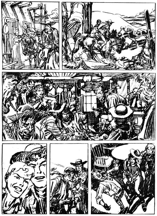

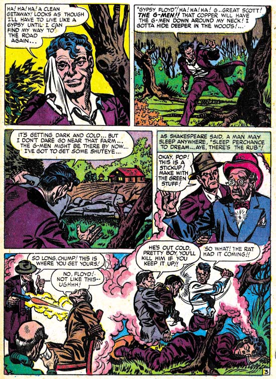
Unpublished page art by Jerry Robinson and Mort Meskin (as published in “History of Comics” volume 1, 1970)

James Steranko’s “History of Comics” is a great resource written by a man who is both a historian and practitioner of comic books. It was published in two tabloid size volumes and is long out of print. However issues appear at conventions and sources like eBay from time to time and are well worth the search. While profusely illustrated most of the images are small in size. There are a limited number of exceptions that take full advantage of the large dimensions of the books. One of the larger illustrations in volume 1 is the source for the image shown above of a page done in pencil by Jerry Robinson and Mort Meskin.

There are good reasons why Steranko gave this image such a prominent treatment. Both artists played important parts in the history of comics. Among the many contributions by Jerry Robinson is the work he did on Batman as a ghost artist for Bob Kane. Unfortunately Mort Meskin’s importance in the history of comics is largely forgotten today but is well understood by Steranko. Hopefully a forthcoming book on Meskin may help to change his current reputation. However Mort is not completely neglected for instance Ger Apeldoorn has provided some recent posts about some of his work (for example Tom Corbett Viewmaster, Real Crime and No Kid Stuff) and there is a list group devoted to him (Mort Meskin List). Besides Robinson and Meskin’s importance to the history there is the rarity of the art. Not a lot of original art for either artist has survived from early in their careers. While they shared a studio for some time they only collaborated for a relatively short period (less then two years) so examples of their joint work would be expected to be rarer still. Original art that was unpublished and left uninked are particularly rare. Last, but certainly not least of the reasons Steranko illustrated this particular page, is the quality of the art itself.

What was this unfinished page originally intended? Meskin did some marvelous work on his creation, the Vigilante, which started as a hero feature and ended up as a western. However Robinson was never associated with the Vigilante and the young man on this page of original art was clearly not the Vigilante’s sidekick Stuff the Chinatown Kid. This page of art can also be found on the Meskin web site where it is suggested it might have originally have been meant for Prize Comics Western. The period that Robinson and Meskin are known to have collaborated was from January 1948 to August 1949 (cover dates). Prize Comics was converted to Prize Comics Western with the May 1948 issue so it certainly was a possible destination for this piece. Robinson and Meskin were doing work for Simon and Kirby during this time and although I do not believe S&K produced Prize Comics Western they may have provided Jerry and Mort a connection to the editor of that title. But Robinson and Meskin’s work never be published in any issue of PCW and the solo Meskin would not appear in the title until 1956 1955. So while nothing rules out Prize Comics as the intended comic, there is little evidence to support that suggestion.

Considering the artists, it is not surprising what a wonderful page this is. The third panel is particularly marvelous. This may be the most complex panel these artists had ever done either together or individually. The panel is framed on each side by the cutoff close-ups of two smokers. A gambling game gone wrong takes up most of the panel with onlookers filling the rest. Every little portion of the panel is filled with interesting details. The only problem is where would the speech balloons go? Actually this seems to be a difficulty with much of the page with only the second and fifth panels seeming to have room for the speech balloons. The fourth panel particularly seems to call for a balloon with no place to put it. This all suggests another possibility for this page, it may have been nothing more then a portfolio piece used to show perspective publishers what the artists were capable of doing. However in the end we are left with little more then informed speculation as to the intended purpose of this unpublished art.


Unpublished page art by Jerry Robinson and Mort Meskin (recent scan)

The image in Steranko’s book is just marvelous. Pencils are difficult to reproduce (which is why art is inked for comic book publication) but the image in “History of Comics” is clear and easy to see. Considering this was done before personal computers and scanners that was quite an accomplishment. Above is a more recent scan of the same art. While it may not be as clear as the Steranko’s image it does show some subtleties that the published image did not. Even here the image has been enhanced as the original pencils are lighter.

I had previously wondered what method Robinson and Meskin used when they collaborated on art since the final result looks like an amalgamation of their two styles. At least some of the inking appeared to have been done by Mort so the simplest explanation would be that Robinson did the pencils and Meskin the inking. But is the simplest explanation actually correct? The best way to answer this question is to examine uninked art such as the page discussed here. Most of the figures on the page look like they were done by Meskin with the exception of the woman in the third panel who looks like she was drawn by Robinson. That assessment is based on the style of the art but notice that the woman is drawn slightly darker then the rest of the figures. Remember this image is an enhanced scan and the difference is even harder to detect on the original art. The panel is so intricate and fully realized that I doubt that Meskin had simply left the woman blank for Jerry to fill in. To me this all suggests that Mort first penciled the entire page and then Jerry came in and altered portions. Robinson may have worked on parts of the art other then the woman but they are now hard to distinguish. I am not suggesting that this was the creation sequence that Robinson and Meskin used in all cases but it does suggest that the reason for their amalgamated style was the passing of the pencils from one artist to the other.

It is interesting how fully developed the drawing is on this page. Not only are all outlines clearly indicated but the required spotting is shown as well. For example the shadows cast by the post sticking out of the top of the house in the first frame and the shadows on the underside of all the hats. Even the cloth folds have the sweeping parallel lines that are characteristic of Meskin’s inking. Previously I felt the inking of the Robinson and Meskin pieces had been done by Mort, but perhaps Jerry also did some inking that is now hard to detect because the inks closely followed the pencils.

By now the reader maybe impatiently proclaiming “but what about the bottom row of panels”? What indeed. Because of the Steranko illustration we know that this row was originally uninked. Did Jerry Robinson, still very much active today, come back and resume working on the page? Or did Mort Meskin return to it before his untimely death? Unhappily neither is the case. A good comparison between the inked version and the one found in the Steranko illustration shows many discrepancies. Hairlines were altered and cloth folds moved. Even the outlines were not closely followed. While it is not completely clear in Steranko’s illustration, the boy on the extreme right of the last panel is cast in shadow with just enough traces of light patches to indicate the shape of the figure. Apparently this was all beyond the questionable talents of the inker who covers it all in solid black. It is true that since the silver age of comics inkers are often expected to add their personal touches, but this particular inker’s alterations have done nothing but deaden the art. Since he did not follow the pencils closely one wonders why the inking was done directly on the original art and not over some copy? Once he had finished the bottom row the contrast between it and the two upper rows must have been painfully obvious even to this inker and he finally halted his destruction before any more damage was done and the page become worthless. The page is now a monument to the wisdom of the Eleventh Commandment. Frankly even if the inker had been more talented he should not have attempted inking the actual pencils. A modern inker has modern sensibilities and his art could not truly recreate the type of inking that would have been done on this page had Robinson and Meskin completed it.

Mort Meskin before Joining Simon and Kirby


Golden Lad #1 (July 1945) “The Heart of Gold”, art by Mort Meskin

Last week I provided some examples of early work by Mort Meskin. Now I would like to do the same for the period from after the war until Mort began working for Simon and Kirby. Actually I am being a little inaccurate by describing this period as post war. The war ended in Europe on May 8, 1945 and in Japan on August 15. The first issue of Golden Lad was cover dated July 1945. Because cover dates were usually advanced a couple of months from the actually released date, this issue probably hit the stands in May. Therefore the war was still ongoing when the art was created (which probably started in February). During most of the war Mort Meskin was doing work solely for National Comics. Mort would continue to provide work to DC while doing Golden Lad for Spark Publications.

Maybe it is just a question of luck as to which issues are available to me, but it seems to me that there was a decline over time in the quality of Meskin’s art for DC. However that decline only affected his DC work. While the Golden Lad character may not have been that great of a creation, the art Mort provided was first rate. The splash is particularly nice. Golden Lad rises dramatically from a cauldron of molten gold. The fire provides the only light for the scene giving the surrounded conquistadors with expressive shadows. But with their modern weaponry, they are not truly conquistadors. The heart of gold that provides Golden Lad with his powers was created during the time of the destruction of the Aztecs but Golden Lad fights modern criminals. The splash is a graphic amalgamation of the two concepts.


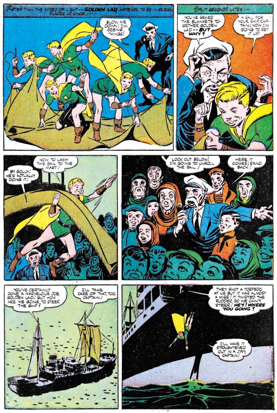
Golden Lad #2 (November 1945) “The Haven for All” page 5, art by Mort Meskin

I really cannot get very enthusiastic about Golden Lad himself. Like Superman, he is just too powerful to provide interesting stories. However Meskin did a good job on graphically depicting the story. The first panel shows the use of multiple images that Mort devised in Johnny Quick for indicating super fast action. The showing the unrolling of the sail might have seem the most obvious choice for panel 5 but Meskin’s depiction of the crowd’s reaction was probably more effective.


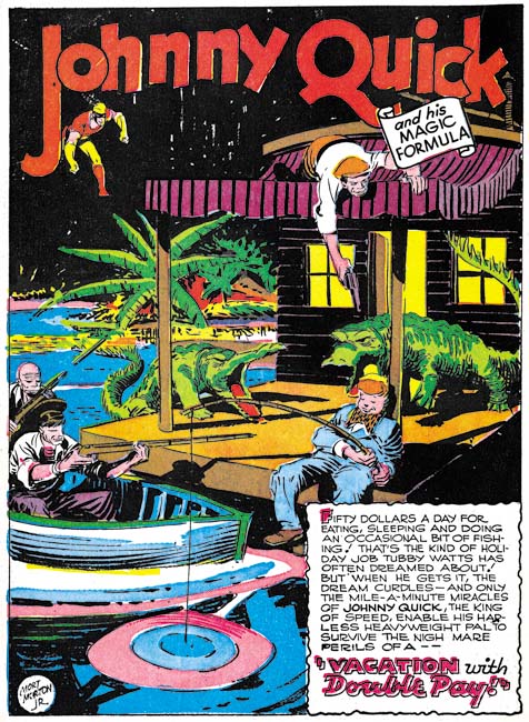
More Fun Comics #107 (January 1946) “Vacation with Double Pay”, art by Mort Meskin

As I said before, Mort’s art for the later DC work is not as impressive as his earlier stuff. This Johnny Quick splash is probably the best of the few I have available from his later DC work. Even here I do not find the approaching alligators truly threatening. What are they going to do, gum the fisherman to death? Some of this decline in quality maybe due to the inkers being used but perhaps Meskin was loosing interest after so many years. That he did such great art for Golden Lad shows that he had not lost his talent.


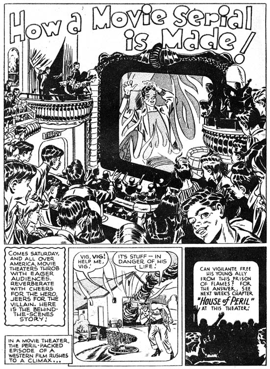
Real Fact Comics #10 (October 1947) “How a Movie Serial Is Made”, art by Mort Meskin

Meskin could do great work for DC as well, if it supplied enough of a new challenge. This scan of “How a Movie Serial Is Made” was provided by Ger Apeldoorn (Those Fabuleous Fifties). It certainly is an oddball feature. Meskin provides examples of how serial movies were created using his own character, the Vigilante. I particularly like the splash. While I am not old enough for movie serials, I do remember weekend matinees where there was a very similar response from the exclusively young audience.

Mort did other work during this period besides what he did for DC and Spark. This was the time that he did a couple pieces for Prize Comics (but this was not for Simon and Kirby). I will not be discussing the Prize stories here as I covered them recently in other posts (Treasure #10 and Treasure #12).


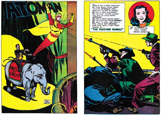
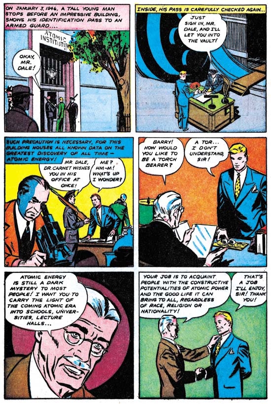
Atoman #2 (April 1946) “The Vanishing Vandals”, art by Jerry Robinson
Larger Image

Mort Meskin would later team up with Jerry Robinson. It would therefore be informative to provide examples of Jerry’s work. Much of what Robinson did previously was on Batman working for Bob Kane. This makes it difficult to come to a clear understanding as to what Robinson’s personal style really was. The one example I can supply was for Atoman, a title from Spark Publications, the same publisher that did Golden Lad. Here Jerry does an ingenious double page splash. The best location for a double page splash was the centerfold. Place one anywhere else and the two pages would have to be printed on separate sheets of paper. With the primitive printing of comics of those days there was little likelihood that the registration would work out properly in the finished comic book. Robinson’s wide splash is at the front of the comic but he avoids the registration problem by purposely including a gutter in the design that would separate the two image halves. He has not simply bisected the image; if you were to bring the two pages together they would not line up properly.


Atoman #2 (April 1946) “The Vanishing Vandals” page 3, art by Jerry Robinson

Here is an example of a story page from Atoman. But note the man in panel 5. He has to my eyes a distinctively Meskin look to him. There are a few other similar Meskin-like portrayals in the story as well. Was Mort giving Jerry a hand? Or was Robinson being influenced by Meskin and adopting some of his style? I do not have an answer but it is something to keep in mind when we examine joint efforts by Robinson and Meskin.


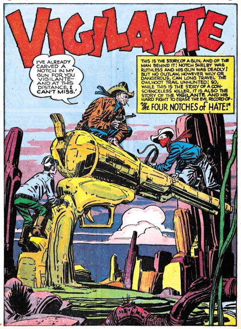
Western Comics #4 (July 1948) “The Four Notches of Hate”, art by Mort Meskin

In 1948 Meskin work for DC would be ending. Did Mort’s emotional problems have something to do with his end at DC? Or was it conflicts from working at National that provoked his emotional problems? The above splash from Western Comics #4 was among these final efforts. I am not sure how, but the Vigilante has somehow made the transition from a costume hero in the modern age to being a western genre hero.


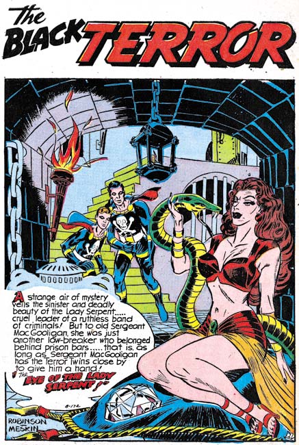
Black Terror #23 (June 1948) “The Eye of the Lady Serpent”, art by Jerry Robinson and Mort Meskin

Robinson and Meskin were only teamed up for a relatively short time, a little over a year. I may not be clear as to exactly what each of the two artists contributed to the joint efforts, but whatever it was it certainly was very successful. I find the art as exciting as Mort’s early work for DC.


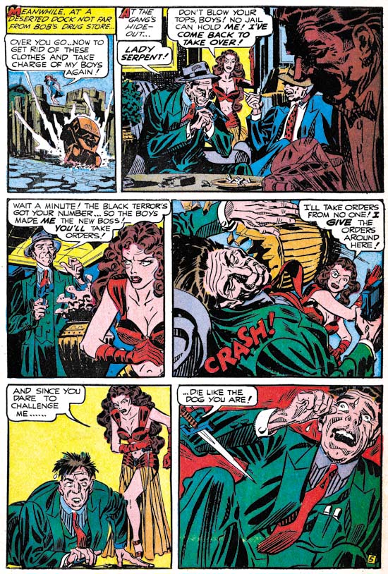
Black Terror #23 (June 1948) “The Eye of the Lady Serpent” page 5, art by Jerry Robinson and Mort Meskin

It was not just the splashes that Robinson and Meskin did so well, the story art is also first rate. Note the inking on this page as particularly seen in the last panel. The long sweeping parallel lines would later play an important part of Meskin’s inking style. Even more interesting is the presence of picket fence crosshatching (see the Inking Glossary for explanations of the terms I use to describe spotting techniques). Similar inking can be found for a piece that Jerry and Mort did for Simon and Kirby (Young Romance #5, May 1948). The inking looks like it was done by Meskin, but did he pick up the picket fence technique from Simon and Kirby or is there an earlier Robinson and Meskin example that I have not seen yet?


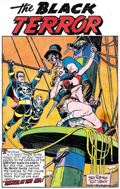
Black Terror #23 (June 1948) “Danger in the Air”, art by Jerry Robinson and Mort Meskin

Another great splash by Jerry Robinson and Mort Meskin. I might not have anything to say about it but how could I resist including it in this post?

I previously used a story page from this work to show the style Mort had adopted for depicting punches.


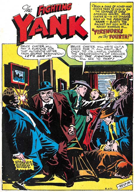
Fighting Yank #29 (August 1949) “Fireworks on the Fourth”, art by Mort Meskin

There may have been a relatively brief period between after the breakup of the Robinson and Meskin team where Mort was doing work by himself again but he had not yet started to work for Simon and Kirby. Fighting Yank #29 is signed by Meskin alone and Robinson does not appear anywhere in the comic. Mort’s first solo work for Simon and Kirby were cover dated December 1949 (Real West Romance #5 and Young Romance #16). Joe Simon has reported in The Comic Book Makers that initially Mort had an artist block. That Meskin was doing some solo work before joining Simon and Kirby may indicate that the artist block did not start until he actually began working for Joe and Jack. Perhaps intimidating presence of Jack Kirby had something to do with Mort’s artistic difficulties.

The “Fireworks on the Fourth” is inked in an interesting spotting technique. The blacks are grouped in a blocky fashion that to my eyes seems to flatten the image while providing it with interesting patterns. This is not the result of a bad printing; other stories by Meskin in the same issue are not inked in this manner.


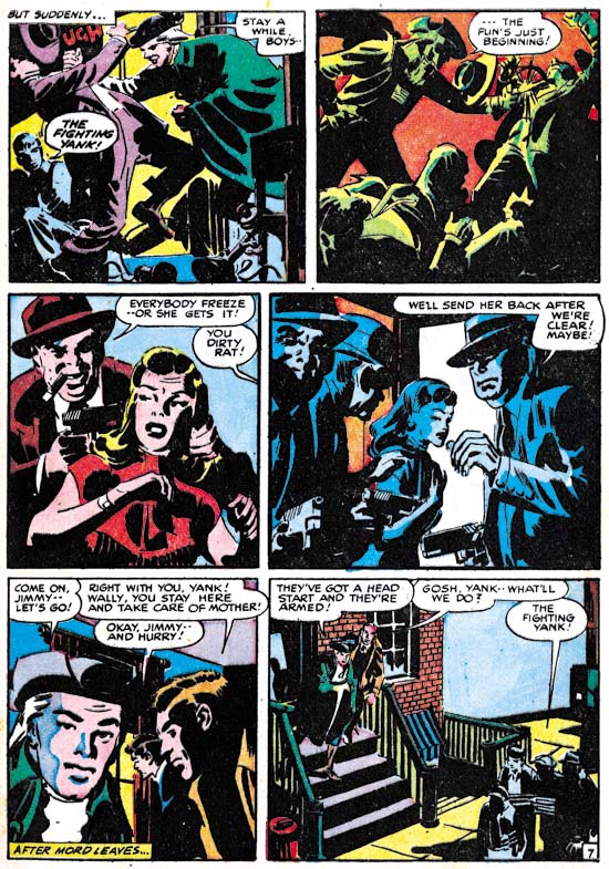
Fighting Yank #29 (August 1949) “Fireworks on the Fourth” page 7, art by Mort Meskin

The effects of this unusual inking can be best be seen in the story itself. While it is possible that this inking was done by another artist, I believe it was Mort’s own work. He would use a similar style of inking for a period later for some Simon and Kirby productions.

In a few months Mort Meskin would begin working for Simon and Kirby. Mort would become an important and prolific artist for Simon and Kirby productions. He did not, however, work exclusively for Joe and Jack. Meskin would also provide work for other Prize comics and occasionally other publishers as well.

It’s A Crime, Chapter 6, Forgotten Artists

(Justice Traps the Guilty #3 – #5, Headline #29 – #31)

Jack Kirby remains the principal artist for the six crime issues discussed in this chapter. All 6 covers were drawn by Jack as well all the lead stories. Kirby’s did 10 stories with a total of 117 pages (including the covers). However Bill Draut now assumes a more important roll becoming the second principal artist. Bill supplied 11 stories, one more then Jack, but fewer pages (81 pages). The other three artists contributed much less then either Jack or Bill. The next most prolific (A. C. Hollingsworth) drew just 3 stories with 25 total pages.


Justice Traps the Guilty #4 (May 1948) “Queen of the Speed-Ball Mob”, art by Jack Kirby

The first story consistently uses the motif of a character introducing the story with the word balloon forming the title caption. I have noticed that when a story is being narrated, it is often by a woman. Almost certainly this was because male criminals generally have fatal endings (and therefore would not be able to tell their story) while females normally survive.


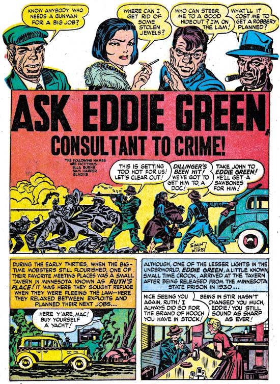
Justice Traps the Guilty #3 (March 1948) “Ask Eddie Green, Consultant to Crime”, art by Jack Kirby

A motif that would occur often in Kirby’s splashes at this time was having a cast of characters make a series of statements to introduce the story. Actually it was a return to an old technique as we have seen it as far back as in Captain America. When used in a splash covering two thirds of the page, this type of design did not leave much room but in “Ask Eddie Green” Jack makes effective use of what is available by supplying a small shoot out scene. The depth of field is so narrow that the results look like a frieze. Despite the small size everything is clear and the scene is filled with interest.


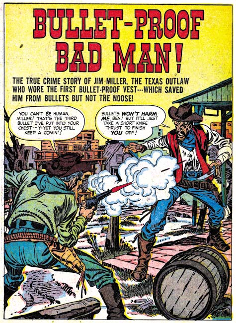
Headline #30 (June 1948) “Bullet-Proof Bad Man”, art by Jack Kirby

Perhaps it is just my tastes, but I feel that Kirby’s splashes are not as exciting as before. This may have been a result of Kirby’s declining use of full page splashes. Only 3 splashes out of his 10 stories received the full page treatment. “Bullet-Proof Bad Man” provides a typical Kirby dramatic shoot out. Well not so much as gun fight as one man has only drawn his knife although it turns out this is not as unwise as it seems. It is clear that the bullet has found its mark but note how Jack seems to downplay the actual hit. The story is about a gunfighter that uses a special vest to protect himself from bullets. However I have notice that Jack seems averse to showing the actually striking of a bullet even though that is a moment he often depicts. Generally Kirby hides the action in a cloud of gun smoke. When, because of layout, that is not possible, such as above, Kirby will simply not include any impact lines.


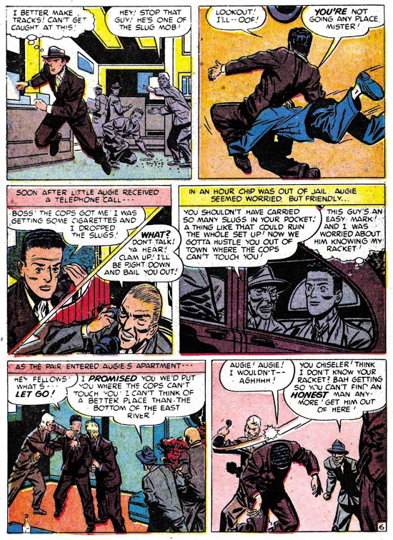
Justice Traps the Guilty #5 (July 1948) “A Fortune in Slugs” page 6, art by Bill Draut

Bill Draut did so much romance work for Simon and Kirby that it is nice to see his efforts for the crime genre. These comics gave Bill a chance to provide more action then he would normally use in romance comics. Draut was better at adding excitement then would be expected based on his work towards the end of his career. Here on one page we find a man running, being tackled and in the final panel bludgeoned with a blackjack. All of which Bill handled quite nicely. I particularly like his use of perspective in the second panel. Draut shows the tackler flying into the page whereas Kirby would have had the action coming out toward the reader, but otherwise it was well handled.


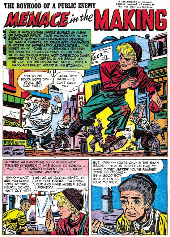
Headline #30 (June 1948) “Menace in the Making”, art by Bill Draut

Draut’s effective use of perspective is seen again in the splash for “Menace in the Making”. The low viewing angle allows the running figure to tower over all others without seeming to be unnatural. Action was not, however, the only outlet that Bill found in the crime genre. Crime stories allowed Draut to work, to extent that romance did not, in a more cartoony style. Note the caricature that Bill has provided the irate grocery man. Such interesting but fundamentally unrealistic depictions are found often in Bill Draut’s work in Headline and Justice Traps the Guilty but rarely in Young Romance or Young Love.


Justice Traps the Guilty #3 (March 1948) “My Strangest Crime Case”, art by Bill Draut

One story drawn by Bill Draut may not be exception as far as the art is concerned, but it is unusual in that the protagonist was a female private investigator. The story reads more like something from the hero genre then a true crime story. This is not the first time that Draut drew a story about a lady detective. In 1946 Draut worked on a feature called Calamity Jane originally for Boy Explorers Comics but when that title quickly failed (due to the comic glut after the war) subsequently published in Green Hornet Comics. It is likely that “My Strangest Crime Case” was left over material from that earlier effort that, with minor revisions such as to the detective’s name, was now put to use. The art style does seem to be a better match to Draut’s earlier work then to what he was doing at this time.


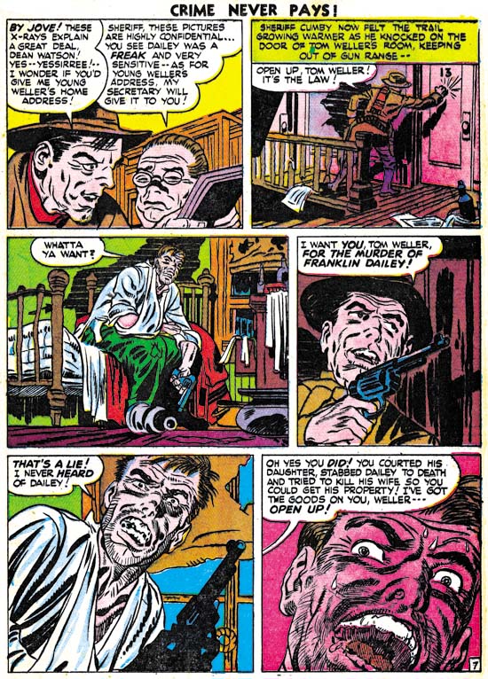
Headline #29 (April 1948) “The Night of the Freak Murder”, art by Jerry Robinson and Mort Meskin

The team of Jerry Robinson and Mort Meskin continue to appear in the crime issues covered by this chapter. The work is unsigned but the similarities to the signed works by Robinson and Meskin are numerous. “The Night of the Freak Murder” is unusual for Jerry and Mort in that it has a full page splash. Generally R&M’s splashes for Simon and Kirby productions are vertical with two story panels also arranged vertically. The composition is interesting in the way it plays off the grieving women with an almost mirror image of two detectives discussing the crime. The staircase might seem odd but it was introduced as part of a pattern that confines the eye in a circular composition. None of the other splashes that Robinson and Meskin supplied to Simon and Kirby were so well composed but as I said they did not normally use a full page splash.


Headline #29 (April 1948) “The Night of the Freak Murder” page 7, art by Jerry Robinson and Mort Meskin

As I mentioned in the previous chapter, I am not sure what Jerry Robinson’s contribution was because both the pencils and the art look very much like Meskin’s work. Mort was one of the best graphic story tellers and pages like the one above suggest why he had such an impact on artists like Steve Ditko. Here on this page the same diagonal is present in every panel. The page starts with close-up then switches to a distant show and then progressively comes closer. An increasing tension is formed by the combination of increased nearness, the diagonal design and off course the fear Meskin imparts to the criminal. Nothing really happens but the page is explosive nonetheless.


Justice Traps the Guilty #4 (May 1948) “Guilty Boys”, art by Jerry Robinson and Mort Meskin

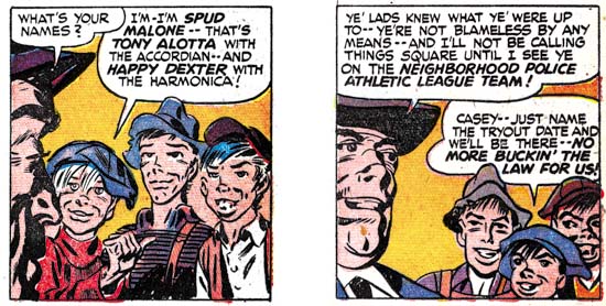
Not all of Robinson and Meskin’s splashes were vertically oriented; here is another case where they deviated from that pattern. This is a standard two thirds splash page with two story panels arrayed on the bottom. Nothing unusual in the design itself but it does allow Jerry and Mort to provide a memorable splash. Although the image seems cluttered, everything serves a purpose. Debris and damaged items abound and a row of buildings in the background all combine to show that this is a location in some slum. But the shabbily dressed musical boys are not the Newsboy Legion and this is not Suicide Slums. Here Robinson and Meskin convert the boy gang genre into crime. They are not saints and in the end are more in need of rescue then providing it.

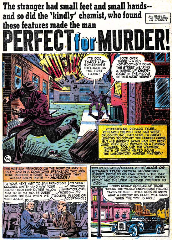
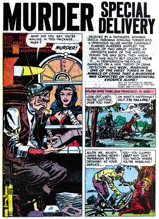
Headline #31 (August 1948) “Perfect for Murder”, art by Charles Nicholas

Only initials were used to sign “Perfect for Murder” (Headline #31, August 1948) but I am pretty certain it was Charles Nicholas. Originally Charles Nicholas was a house name used by Fox Comics for Blue Beetle stories. Over the years the work of many different artists appeared under that name, including Jack Kirby. However there were two individuals who continued to use the name outside of Fox and who claimed to be the creator of the Blue Beetle; Charles Wotjkowski and Chuck Cuidera. There is nothing I can add to that particular question here but it was the Wotjkowski version of Charles Nicholas who worked for Simon and Kirby at this time.


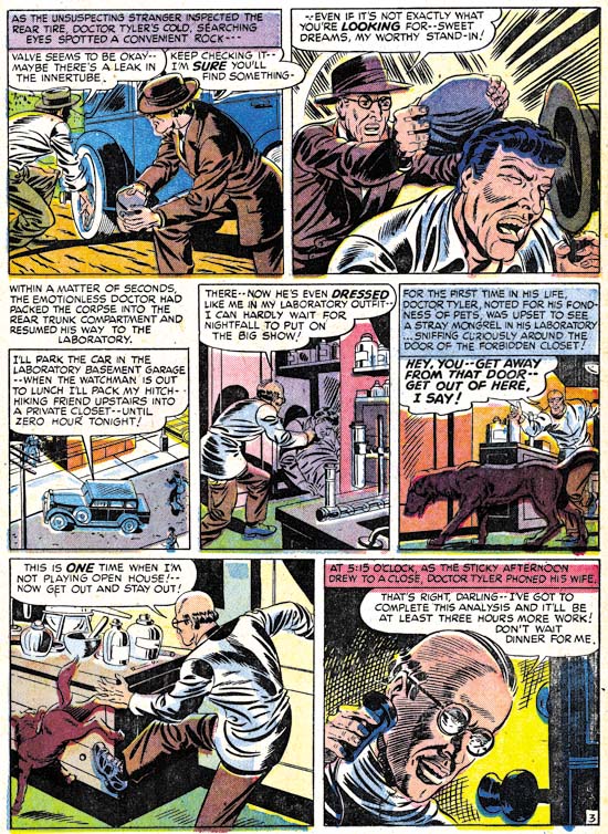
Headline #31 (August 1948) “Perfect for Murder” page 3, art by Charles Nicholas

While interesting, the splash page does not present a very good idea of Nicholas’ art so I have included an image of a story page as well. Nicholas does a good job drawing this story but he never achieved great success in his career as a comic book artist. Nicholas inked the art in a very individualistic style, as particularly seen in the form lines used in panels 6 and 7 and the swirling crosshatching in panel 7. (See my Inking Glossary for an explanation of my terms.) What is not found are any traits of the Studio style inking. While Nicholas is certainly a candidate for being one of Jack Kirby’s inkers, it is hard to understand how his name has become associated to the inking of particular pieces such as “Summer Song” (Young Romance #1, September 1947). “Perfect for Murder” was the only worked for Simon and Kirby signed or initialed by Charles Nicholas but other unsigned art by him surely remains to be identified.


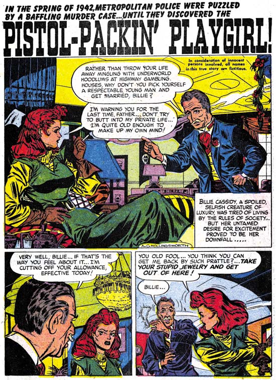
Headline #30 (June 1948) “Pistol-Packin’ Playgirl”, art by Alvin C. Hollingsworth

Another artist that shows up working for Simon and Kirby during this period is Alvin Carl Hollingsworth. A search of the Internet indicates that Hollingsworth was an African-American artist from New York who was born in 1928 and died in 2000. Previously he worked for Holyoke Publishing Company working on Catman. Hollingsworth was also a talented fine arts painter. Joe Simon remembers Alvin and has a high opinion of him. Joe remarked that he thought he was the only African-American working in comics at that time. This is not truly accurate since there was also Matt Baker who played an important part in the early history of comics. But Matt Baker never worked for Simon and Kirby and so Joe was not aware of him, or at least of his background.


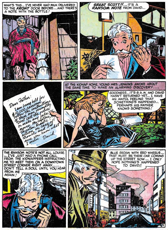
Justice Traps the Guilty #5 (July 1948) “Held For Ransom” page 5, art by Alvin C. Hollingsworth

Hollingsworth is another of those artists whose current reputation is much lower then warranted by his talent. This is largely because he left the comic book field in the late ’50s first for syndications strips and then the fine arts. It is a recurring pattern that I have noticed that comic book artists who did not take part in the superhero revival of the 60’s and later generally do not get much attention today. I have included a story page because it provides a better example of Alvin’s strengths. Note the use of varied and unusual viewing angles.


Headline #31 (August 1948) “A Gangster Dies”, art by Warren Broderick

The Jack Kirby Checklist includes “A Gangster Dies” among the art works by Kirby. This is a bit surprising because close to the center of the splash page is Warren Broderick’s signature. Before I sound too self righteous I should add that when working on this chapter I found I had listed this story in my database twice; once as done by Broderick and the second crediting it to Kirby. I have no idea how I made the mistake in my database, but it is easy to understand why anyone who failed to notice the signature might attribute this work to Jack. Warren has obviously made a careful study of Jack’s work and has adopted, at least for his work for the S&K studio, much of Kirby’s style. Warren was not, of course, as successfully as Jack himself and there are more then enough clues to properly attribute his work even without a signature. Note for instance how in the splash Broderick uses picket fence crosshatching where the rails are cloth folds. Besides simple lines, Kirby would use drop strings and wide lines for the rails but I do not recall him ever using cloth folds. Kirby would often make expressive eyebrows but Broderick’s versions were even more exaggerated.

This is the only signed work by Warren Broderick that I have found among Simon and Kirby productions. Frankly I have forgotten about it until I reviewed for this chapter. It turns out that we have seen some of Warren’s unsigned work previously. In just the last chapter I attributed “The Killer Thought He Was Satan” (Justice Traps the Guilty #2, January 1948) as Kirby layouts finished by an unidentified artist. A comparison between it and “A Gangster Dies” leaves little doubt that it also was by Broderick. In fact I no longer believe Kirby laid it out. Yes there are parts in both stories that look very much like Kirby but there are also parts that do not. Previously I failed to follow my own advice and only noted the similarities and neglected the differences. For instance there is a panel I provided from “The Killer Thought He Was Satan” that showed a boy being shot by the villain. While the scene and the boy in particular look very much like it was done by Jack, the artist shows the bullet actually striking the boy. That is something I have yet to find Kirby doing.

Another example of Broderick’s work was “Mother Said No” (Young Romance #7, September 1948) seen in Chapter 3 of the Art of Romance. There I attributed the pencils to Jack Kirby (correctly) and the inks questionably to Carmine Infantino. The primary reason for my earlier caution was that I was bothered by Carmine’s statement in an interview that he had never inked Kirby’s pencils. While in the work for Charlie Chan, Infantino was also providing expressive eyebrows some of the other brushwork found in “Mother Said No” is more like that in Broderick’s work. Although Broderick was very good at mimicking Kirby, I find the layouts in “Mother Said No” are much too consistently like Jack’s that I still believe that Kirby did the pencils.


Headline #31 (August 1948) “A Gangster Dies” page 3, art by Warren Broderick

Broderick could mimic Kirby quite well but occasionally, such as in the first panel shown above, the similarity to Kirby’s style is very striking. This was either due to Kirby stepping in his roll as art editor and fixing up the finished art or it was the result of a careful swipe by Broderick from some Kirby art. Without the original art it is hard to be sure but I suspect the latter explanation to be the case. Once again Broderick has drawn a scene where a man is clearly hit by a bullet, something that Kirby would hide in a cloud of gun smoke.


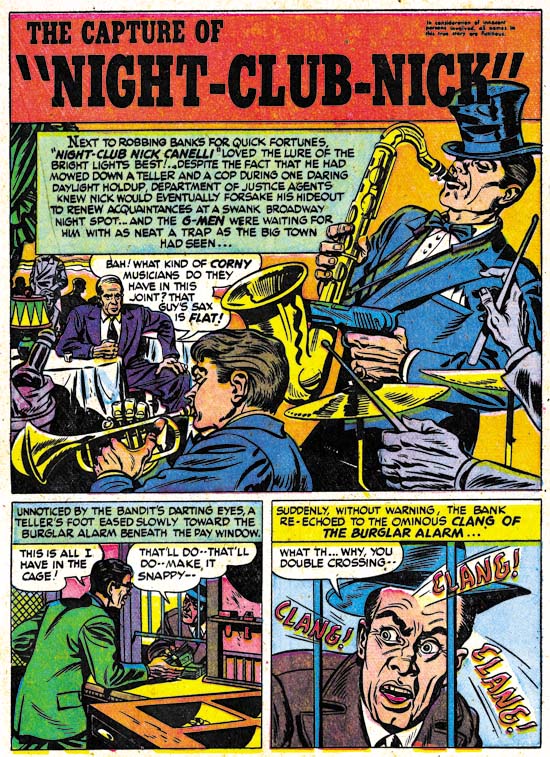
Justice Traps the Guilty #3 (March 1948) “The Capture of Night-Club Nick”, art by Warren Broderick

Broderick did not always so carefully mimic Jack Kirby’s style. In “The Capture of Night-Club Nick” Warren has abandoned the Studio style inking. Still the influence of Kirby is clearly discernable.

I have found little in my search for more information about Warren Broderick. I queried Joe Simon about him but he did not remember Warren at all. Joe does not remember all the artists who had worked for him over the many years, but in Broderick’s case this is surprising because the one thing I had found out was that he also was African-America. Joe was clear in his memory of A. C. Hollingsworth and that Hollingsworth was the only African-American to work for Simon and Kirby. How could Joe have failed to remember, even if not by name, one other African-American comic book artist? The answer maybe found in an interview given by comic artist, Harry Harrison:

After Wally and I broke up I was working mostly for Fawcett, and I had a friend by the name of Warren Broderick, who was also in school with me, doing my penciling. He was a black guy who didn’t want to get in there and push, didn’t want to face whitey in the office. We developed a nice clear style, no great shakes, but it worked.

This suggests that Broderick may have been reluctant to deal with Simon and Kirby directly and used someone, either an agent or another artist, as a go between. Joe may never have known about Warren’s ethnicity. The irony is that, considering their dealings with Hollingsworth, Joe and Jack probably would not have cared about Warren’s background, all that was important was that he could do the work.

The GCD only has three entries for pencils attributed to Broderick and three more for inking work. Atlas Tales has about a dozen works attributed to Warren. To that I can now add three further pencils and another inking job. Now that I have a small body of work to go by, I am sure I will find more work by Broderick as I continue to review Simon and Kirby productions. Warren Broderick is truly one of the forgotten comic book artists and it is rewarding to shed a little light on his career.

Chapter 1, Promoting Crime
Chapter 2, A Revitalized Title
Chapter 3, Competing Against Themselves
Chapter 4, Crime Gets Real
Chapter 5, Making a Commitment

Chapter 7, A Studio With Many Artists
Chapter 8, The Chinese Detective
Chapter 9, Not The Same
Chapter 10, The Master and His Protege
Chapter 11, The New Team

Jerry Robinson at the Jack Kirby Tribute Panel

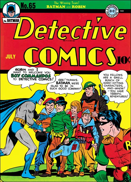
Detective Comics #65
Detective #65 (July 1942), art by Jack Kirby and Jerry Robinson

I mentioned in a previous post a review of the Jack Kirby Tribute Panel that Comic Book Resources has posted (written by Jim MacQuarrie).

At the very end of the article is found:

Jerry Robinson closed the panel by recalling his participation in one of the very few collaborations that Kirby did with anyone but Joe Simon. “The only time Jack collaborated with anyone but Simon on a cover was an issue of “Detective Comics” when the Boy Commandos joined the book. The cover showed Batman and the Boy Commandos shaking hands. I drew Batman and Jack drew the Commandos.”

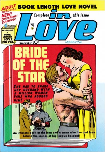
In Love #1
In Love #1 (September 1954), art by Jack Kirby and John Prentice

While of course Jerry is right about his contributions to the cover of Detective #65, he is not correct about being the only artist, other then Joe Simon, to collaborate on a cover with Jack Kirby. John Prentice, one of the usual suspects of the Simon and Kirby studio, also had that honor. Jack did the foreground couple while John did the two background figures.

Jerry Robinson and Joe Simon
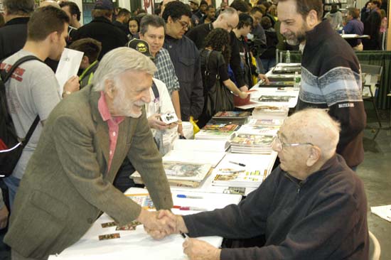
Jerry greeting Joe Simon at the Big Apple Con of 2006

Jerry Robinson and Joe Simon
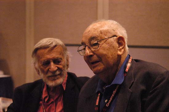
Jerry and Joe at New York ComicCon 2008

It’s A Crime, Chapter 5, Making a Commitment

(Headline #26 – #28, Justice Traps the Guilty #1 – #1)

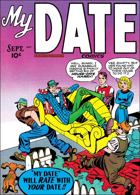
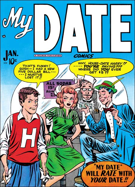
September 1947 (cover date) was the release of Simon and Kirby’s Young Romance. This marked a milestone for the creative duo. Previously Joe and Jack had not signed any of the work that they provided for publishers Prize or Hillman with the exception of Hillman’s My Date. Starting in September Simon and Kirby signatures would appear not only in Young Romance but in Headline Comics as well. Jack Kirby drew four stories of Headline #26 and three of those were signed. From this point on Simon and Kirby signatures would frequently be found on Kirby’s drawings for Prize Comics. Despite all the work that S&K provided to Hillman, in the end it was Prize that got Joe and Jack’s commitment. Right from the start the crime version of Headline was produced by Simon and Kirby while they never seem to have the same influence with Hillman. Surely whatever deal that Joe and Jack made with Prize must have reflected their greater control over Headline while at Hillman they had remained only marginally better then just work for hire. In the end Simon and Kirby were businessmen and it was all about the money. By early next year Simon and Kirby’s work for Hillman would end.

The crime version of Headline Comics must have been a very successful seller. After just the first four bimonthly issues Prize introduced a new crime title Justice Traps the Guilty. Simon and Kirby produced JTTG as well and there really was no difference in the contents between Headline and JTTG. Since both were bimonthly titles, effectively there would be a crime comic released by Prize each month. There must have been some difficulty because JTTG #2 should have been scheduled for December but was released in January instead; while Headline #28’s normal January release was pushed back to February.

Jack Kirby would still be the main contributor to Headline Comics and the new Justice Traps The Guilty. Jack drew 4 out of 6 stories for Headline #26 (September), but would only draw two stories each for issues #27 (November) and #28 (February). The first issue of Justice Traps the Guilty followed the Simon & Kirby’s modus operandi of starting a title with lots of Kirby; Jack penciled 6 out of the 8 stories. However with the second issue Jack returns to supplying a more modest 2 stories. Still no other artist appeared more often then Jack in these issues.


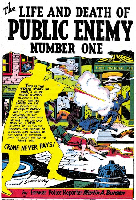
Headline #26 (September 1947) “The Life and Death of Public Enemy Number One”, art by Jack Kirby

The splash for “The Life and Death of Public Enemy Number One” uses a silhouette. There seemed to have been a flurry of the use of this device because we have seen it previously. However it would be pretty much dropped by Simon and Kirby and this may be its last use. While making the overall design of the splash more interesting, the use of silhouette diminished the impact as well.


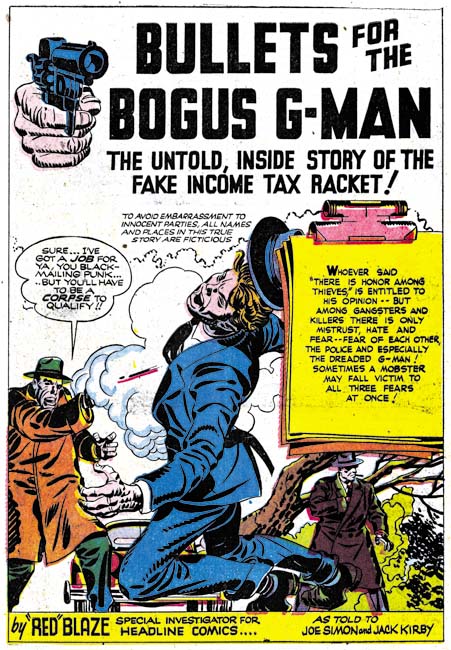
Headline #26 (September 1947) “Bullets for The Bogus G-Man”, art by Jack Kirby

Another device used by Simon and Kirby in the early Prize crime comics was having “Red” (or “Red-Hot”) Blaze introduce the stories. While I suspect that Simon and Kirby found it a useful idea when they were promoting the idea of crime comics to Prize and for the initial in-house advertisements, in the end it just took up story panels that would had been better served for telling the actual story. “Bullets for the Bogus G-Man” may have been the last use of “Red” Blaze and even there he is only mentioned in the caption at the bottom of the splash page and never makes an actual appearance in the story.


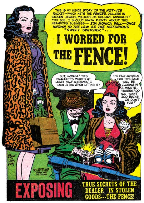
Headline #28 (February 1948) “I Worked For the Fence”, art by Jack Kirby

One motif Simon and Kirby sometimes used for the first story was adopted from previous use in Young Romance. That is having a character introducing the story and using the word balloon as the title caption. Simon and Kirby did not use this design technique as frequently in the crime titles as they would in Young Romance but it still was an effective part of their repertoire.


Headline #27 (November 1947) “Spirit Swindlers” page 7, art by Jack Kirby

I have remarked before that circular panels was largely limited to an occasional splash page for the work that Simon and Kirby did for Hillman. For the Prize issues discussed in this chapter, Joe and Jack continued to use circular panels. What was new is that while previously almost all the Prize comic stories used circular panels in Headline #26 to #28 and JTTG #1 and #2 about half of the stories did not use round panels at all. For the stories that still featured circular panels they are used in lower proportions. For Headline #23 to #25 ratios of rounded panels to all the panels was over 16% and in one story reached 20%. Remember for a story done in the standard 6 panels per page, this would work out to an average of a semi-circular panel for each page (although they rarely were distributed so evenly). For Headline #26 to #28 and JTTG #1 and #2, when rounded panels were used they were generally used in the range of 14% to 10%. This is only a small decrease, but it seems to be consistent. In one story (“The True Life Story of Alvin Karpis” it drops to 4%. The last issue covered in this chapter (Headline #28, February 1948) did not have any rounded panels.

I have also been trying to track the evolution of the inking techniques used. Previously in Headline drop strings and abstract arch shadows, typical Studio style mannerisms, had become commonly used. Picket fence crosshatching and shoulder blots were still rare and when found are not typical in execution. (See my Inking Glossary for explanations of the terms I use to describe these techniques). In the last chapter we saw those final typical Studio style techniques show up suddenly in the Hillman crime title. The same thing happened at Prize. The earliest typical picket fence brush work for Prize that I have noticed was in “Spirit Swindlers” (see above image, particularly panels 4 and 6. There seems to be no gradual conversion of previous simple crosshatching to picket fence crosshatching; picket fence just suddenly appears. The picket fence inking shows up elsewhere in the story as well. Not every story in the same issue, however, shows the use of this most distinctive inking. Also note the shoulder blot in panels 1 and 2.


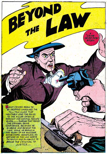
Headline #26 (September 1947) “Beyond the Law”, by unidentified artist

As mentioned above, Kirby drew 4 of the 6 stories for Headline #26. The other two stories (“Test of Death” and “Beyond the Law”) were done by the same artist. I have not been able to identify him but he also did “Murder’s Reward” and “Blind Man’s Death” from Headline #25. Ger Apeldoorn has suggested that it might be Bob McCarty. I am most familiar with McCarty’s work for S&K’s Mainline titles. The Mainline material does not resemble these four stories but that could be explained by the seven years separating the two groups of work. In any case the work in Headline #25 and #26 was done by a talented artist who played an important part in the early Headline issues. After issue #26 the artist stopped providing work to Simon and Kirby.


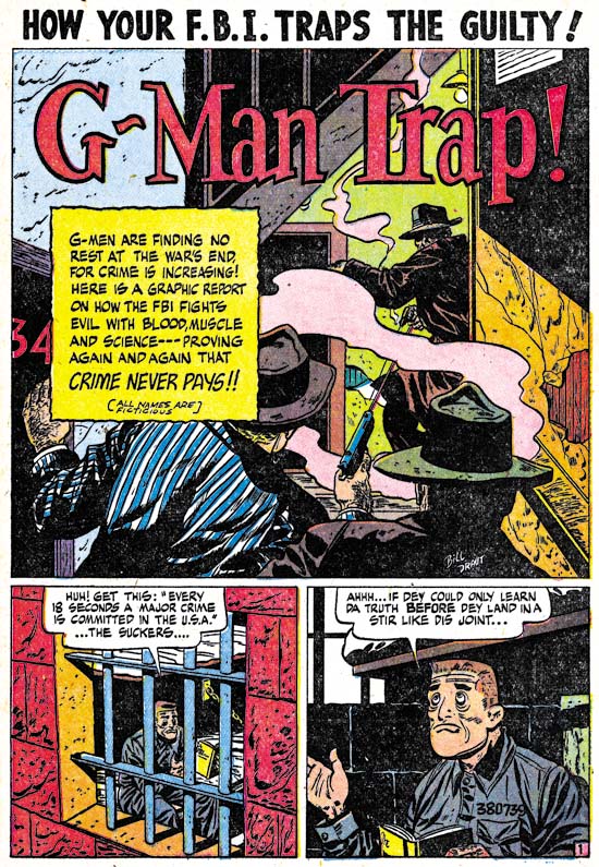
Justice Traps the Guilty #1 (October 1947) “G-Man Trap”, art by Bill Draut

After the mystery artist last appearance in Headline #26, his place as the most important supporting artist (after Kirby) was taken by Bill Draut. Draut’s first returned to the Simon and Kirby productions in Young Romance #1 (September 1947). From that point on Bill would be a mainstay of the S&K studio until its breakup. Draut would provide two stories each issue for Headline #27 and #28 as well as JTTG #1. In those issues Draut’s contributions of stories equal that of Jack Kirby. It is interesting to see Draut’s take on crime since so much of his output for the Simon and Kirby studio was for romance titles. Bill could be surprisingly effective with action and he also did some interesting splashes. The one for “G-Man Trap” is a good example. The use of diagonal elements makes the splash visually stimulating. However, the placement of the gun smoke and the odd pose of the shooter in the background really did not work well and diminishes what should have been an interesting confrontation. Still you have to admire Draut for the attempt made even if it was not completely successful.


Justice Traps the Guilty #1 (October 1947) “Try an FBI Test” page 2, art by Bill Draut

As I have mentioned a number of times in the past, I am convinced that Kirby did not supply layouts for Draut as some experts have suggested. Bill’s means of telling a story and his splash designs (such as the one from “G-Man Trap” shown earlier) are often different from Jack’s. There is one story, “Try an FBI Test”, that might suggest otherwise. Note the use of circular panels. These appear throughout the story and are the same form that Kirby uses. While this might suggest that Kirby did the layouts, I am not convinced. In “Try an FBI Test” the captions and word balloons frequently extend beyond the border of the circular panels which is unlike Kirby’s use where both captions and work balloons invariable are confined within the circular boundary. Nor was there any real change in the way the story is graphically told compared to other work by Draut. I believe Draut has just trying a layout technique that he previously observed Kirby using. Whatever the reason for the use of circular panels, it was a one time occurrence as I do not believe Bill would ever used it again.


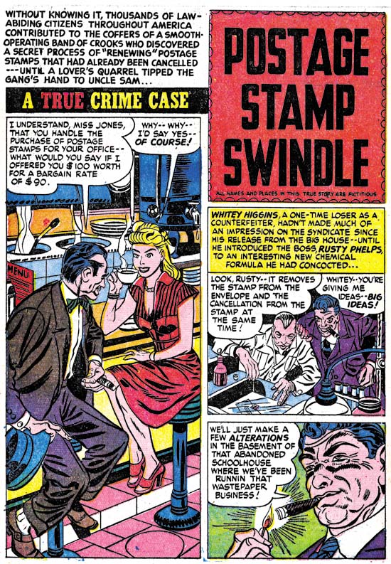
Headline #28 (February 1948) “Postage Stamp Swindle”, art by Jerry Robinson and Mort Meskin

Young Romance #3 (January 1948) saw the first appearance of the Jerry Robinson and Mort Meskin team working for the Simon and Kirby studio. “Postage Stamp Swindle” (Headline #28, February 1948) was the first crime work that they did for S&K. As a team, Robinson and Meskin would only work for Joe and Jack for about seven months and provide a total of ten pieces of work. Only two of the stories are signed but the unsigned work is very consistent with those bearing signatures. Jerry and Mort had a preference for splash pages with a vertically dominated splash panel with two story panels also vertically arranged. The first page of “Postage Stamp Swindle” exaggerates that motif by placing the title over the story panels in a caption shaped like a stamp. Otherwise the splash panel usually had the shape of an inverted ‘L’.

I have been assigning the pencils to Jerry and the inks to Mort. This was due to the order that their names appear in their signature. Further the inking does predominately look like Meskin’s. Recently I have been spending some time looking over some of Meskin’s work from 1946 and 1947. I find that the work Robinson and Meskin’s supplied for Simon and Kirby look very much like the early work that Mort did on his own. So much so that I wonder what Robinson’s contribution was? I am tempted to attribute all the early unsigned art for S&K as Meskin alone and only credit the last three stories, two of which are signed, to the Robinson and Meskin team. I have two reasons for not taking that course. One is the still great similarity of the signed and unsigned work. The second is Joe Simon’s story of when Mort came to work for the Simon and Kirby studio as described in his book “The Comic Book Makers”. Joe really makes it sound like that was the first time Mort had worked for them which would not be true if Meskin was solely responsible for the work from 1948.


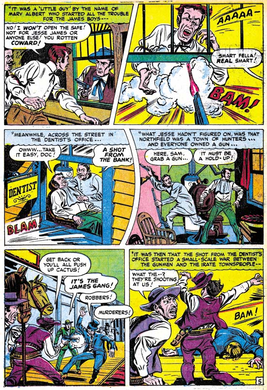
Headline #27 (November 1947) “The Guns of Jesse James” page 5, art by Jack Kirby and an unidentified artist

“The Guns of Jesse James” is one of those stories that at a glance were obviously done by some artist other than Jack Kirby; the drawing is just too crude. There are some places where the art, although still crude, looks like Jack’s style. The second panel in the page above is a good example. This story even uses rounded panels like those that Jack would use for some of his own stories. While it is possible that the artist was trying to mimic Kirby’s techniques, I think it more likely that he is working from rough layouts provided by Jack.


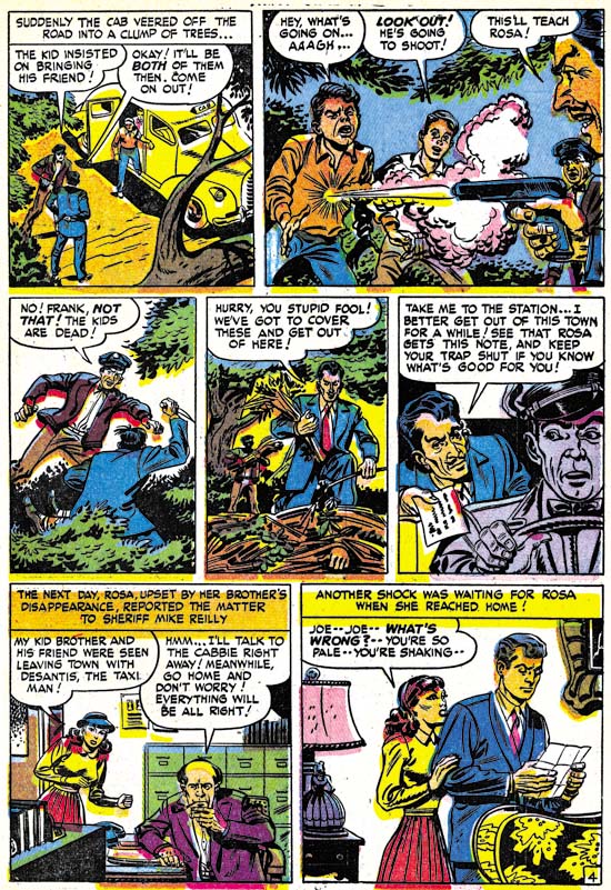
Justice Traps the Guilty #2 (January 1948) “The Killer Thought He Was Satan” page 4, art by an unidentified artist (Jack Kirby layouts?)

The possibility of rough Kirby layouts may also apply to “The Killer Thought He Was Satan”. Note in particular the second panel from page 4 shown above. In many ways the graphic story telling is even more like typical Kirby mannerisms then “The Guns of Jesse James”. Both of these stories come from a period where Kirby’s contributions had diminished and the use of layouts may have been an effort to filling the titles without using too much of Jack’s time.


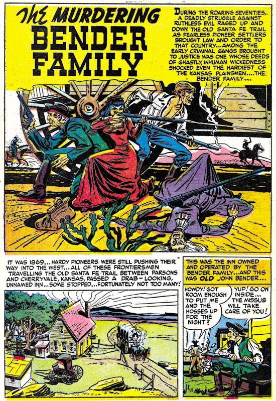
Justice Traps the Guilty #2 (January 1948) “The Murdering Bender Family”, art by an unidentified artist

As I precede in future chapters of this serial post I will certainly not try to cover every unidentified artist in these titles. While I would consider most, if not all, talented some were more deserving of recognition than others. Besides there will be too many artists that I have not identified yet. In these early issues of the crime titles, however, the number of artists appearing is much more limited. So I will close with the splash page of one of mystery artists. I sure wished more of them took advantage of Simon and Kirby’s willingness to allow artists to include their signatures.

Chapter 1, Promoting Crime
Chapter 2, A Revitalized Title
Chapter 3, Competing Against Themselves
Chapter 4, Crime Gets Real

Chapter 6, Forgotten Artists
Chapter 7, A Studio With Many Artists
Chapter 8, The Chinese Detective
Chapter 9, Not The Same
Chapter 10, The Master and His Protege
Chapter 11, The New Team

The Art of Romance, Chapter 3, The Field No Longer Their’s Alone

(Young Romance #5 – #8)

In this chapter I will be writing about the next four issues of Young Romance (#5 to #8). For the most part this set is a continuation of the earlier issues. The main artists were same; Jack Kirby, Bill Draut and the team of Jerry Robinson and Mort Meskin. A couple of minor artists that appeared in issues #1 and #2 do not reappear, but a new one would have a contribution which I will discuss in more detail below. Young Romance is still on a bimonthly schedule. This is surprising because by now S&K and Prize were surely aware that they had a hit. When the crime genre Headline (starting with issue #23, March 1947) was a success Simon and Kirby launched Justice Traps the Guilty for Prize seven months later. Yet after over a year they neither made Young Romance a monthly nor created another title. Other publishers had not failed to notice; based on “All the Romance Comics Ever Published (?)” romance titles began to appear published by Fox (My Life #4, September 1948), Timely (My Romance #1, September), and Fawcett (Sweethearts #68, October). Perhaps Prize along with Simon and Kirby were surprised at their own success and fearful that it was just a fad.
Young Romance #8
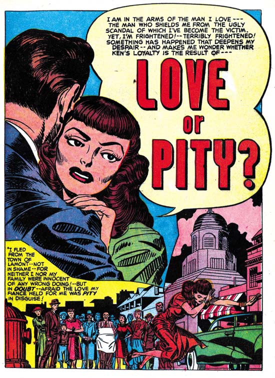
Young Romance #8 (November 1948) “Love or Pity”, art by Jack Kirby

Jack Kirby continued to be the most prominent artist for Young Romance. Kirby did nine out of the twenty stories in these four issues, or 97 out of 177 pages. It may have been even more since as I will discuss below a tenth story may also have been penciled by Jack. Kirby would continue to create the first story in the comic. This lead story would remain the longest story in the comic with thirteen or fourteen pages while other stories would have at most nine pages. The design of the lead story splash page would continue to have a character’s speech balloon used as the title caption. I particularly like the splash for “Love or Pity”. The design is done quite well with a close-up of a couple dominating the page and another section enacting a little scene like some sort of tableau. We have seen this emphasis in design for some of Simon and Kirby’s double page splashes, but it is also to be found in a number of the smaller splashes drawn by Kirby in Young Romance. In the depiction of the large couple we only get to see the face of the woman, the man’s face and his emotions remain a mystery. The woman arches her left eyebrow, looks askance and her hand’s placement on the man’s shoulder seems tentative. All this makes her appear apprehensive and her attempt to dispel her concerns by moving closer into the man’s embrace seems to have failed. From the title caption we learn why, she is uncertain about the man’s true feelings. Many have described Kirby’s woman as not being truly beautiful but it is a criticism I do not share. I find the woman in this splash attractive enough and, more importantly, very human. While some other artists might have been able to make the woman appear even more beautiful I do not know any that are able to invest them with the same sensitivity that Kirby has. Jack does not draw Barbie dolls but rather woman whose appearance reflects their personality and emotions. I find that makes Kirby’s woman truly beautiful indeed.

The second section of the splash depicts a crowd looking disapprovingly on as the woman runs away in shame. Jack has chosen a low viewing angle so that the woman towers over the background crowd giving drama to the scene. The woman’s pose is rather unusual; she looks more like she is tripping and about to fall. Not an inappropriate metaphor for her descent into scandal. The second section is well done but its impact suffers from its diminished size. Envision this section enlarged and expanded toward the right and you can imagine what a double page romance splash might have looked like had Simon and Kirby ever done one. It is too bad they never did.

Young Romance #6
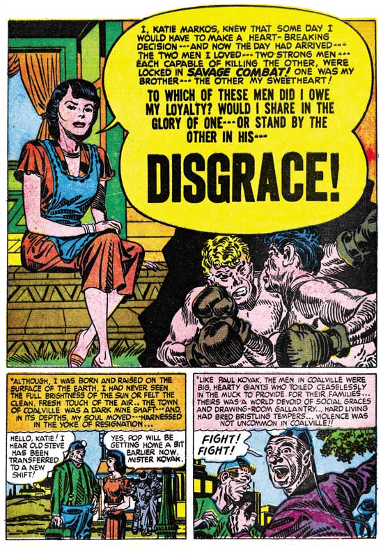
Young Romance #6 (July 1948) “Disgrace”, art by Jack Kirby

One change that seemed to have taken place from the earlier issues of Young Romance was that action no longer appeared quite as commonly in Jack Kirby’s romance stories. Not that action disappeared completely, it would always show up in more Kirby romance stories then it does in those by any of the other studio artists. “Disgrace” is a case in point. If I had to pick one Kirby romance story most likely to satisfy the general Kirby readership, this would be the one. The heroine feels trapped in a coal mining town which she detests for the violence its inhabitants so frequently adopt. Her brother has managed to escape the town but she is dismayed at his career as a prize fighter and his particularly brutal nature. She falls in love with a man only to discover that he also is a professional boxer. She cannot accept more violence in her life so she breaks it off. Later she finds to her horror that her brother and former love are scheduled to meet in the arena. Where does her loyalty lie, with her violent brother or the man she still loves? Jack Kirby is justly famous for his depiction of a punch and the fight in this story is a pure slugfest.
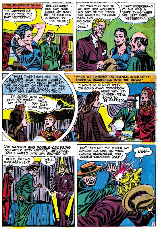
Young Romance #8
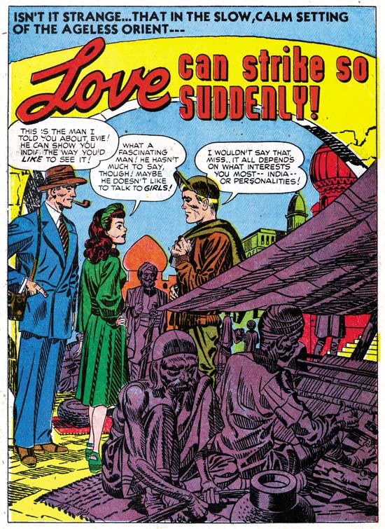
Young Romance #8 (November 1948) “Love Can Strike So Suddenly”, art by Jack Kirby

Kirby may have tuned down his use of action but he still looked for means to keep his stories exciting. One of his techniques was to make use of the exotic location of some of the stories. Had the splash of “Love Can Strike So Suddenly” depicted a normal local it would have seemed quite banal. All the main characters are just standing around. Even the dialog is not nearly dramatic enough to rescue this page. However by inserting his cast into a street in India, Jack has made this one of his memorable splashes. I am sure Kirby has swiped this from some source, perhaps National Geographic, but I am also certain that he has made his version far more interesting then the original. I have recently discussed this story; it is the source for a swipe used years later in Simon and Kirby’s own romance comic In Love.

Young Romance #7
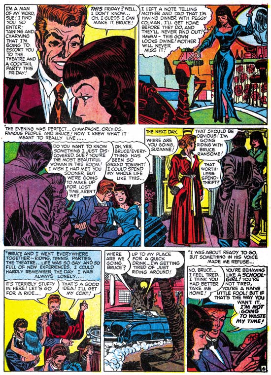
Young Romance #7 (September 1948) “Mother Said No” page 4, art by Jack Kirby and Carmine Infantino?

The Jack Kirby Checklist does not include “Mother Said No” among its listings of Kirby’s work. It is easy to understand why, the man in the first panel of the page imaged above does not look he was drawn by Jack. Or does he? Kirby often drew his men with wild eyebrows but these look excessive even for Jack. But how much of these exaggerated eyebrows were in the original drawing and how much were due to the inker’s interpretation of the pencils? The layouts throughout the story look like they were done by Jack. It is hard to be sure, but once the eyebrows are ignored a lot to the drawing looks like Kirby to me.

Charlie Chan #1
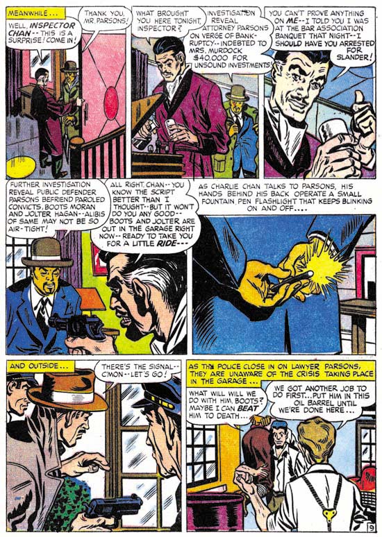
Charlie Chan #1 (June 1948) “The Hit and Run Murder Case” page 9, art by Carmine Infantino

Nearly identical men’s eyebrows seen in “Mother Said No” can also be found in work that Carmine Infantino did in Charlie Chan. Compare the man in the third panel of page nine of “The Hit and Run Murder Case” shown above to the one in the first panel of the page I previously presented from “Mother Said No”. Further examples of Infantino’s work for the Simon and Kirby studio can be found in an earlier post. While the details of the eyebrows seem to match in the two stories, the proportions used in drawing the faces do not. Nor are Carmine’s layouts in Charlie Chan similar to those found in “Mother Said No”. The inking for “Mother Said No” was done in the studio style which would normally suggest Jack or Joe’s involvement. However Carmine used the studio style inking in some parts of Charlie Chan, particularly the splashes. I really need to do a more thorough comparison, but some of the spotting in “Mother Said No” does not look like it was done by either Jack or Joe. My initial conclusion is that in “Mother Said No” Carmine was inking Jack’s pencils. If that is true what is not clear is whether Kirby’s pencils were not very tight, or if instead they were overwhelmed by Carmine’s inking. In either case I am presently inclined to consider this a joint piece with Jack as the primary artist.

There is a serious problem with the analysis that I presented above because of an interview of Carmine Infantino from The Jack Kirby Collector #34. In that interview Carmine clearly said that Charlie Chan was the only work he did for Simon and Kirby, and later added that he never inked Jack’s pencils. I really want to do a more careful analysis before I am ready to contest Infantino’s statements so for now I consider my conclusions as preliminary. Hopefully a re-examination of this issue will be the subject of another post in not too distant future.

Young Romance #6
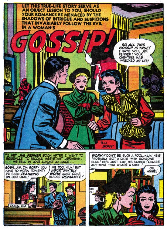
Young Romance #6 (July 1948) “Gossip”, art by Bill Draut

Kirby did not draw all the stories in YR #5 to #8; Bill Draut remained a significant contributor with seven stories out of twenty, or 52 pages out of 177. Bill’s art started to change. Gone were the splashes with an emphasis on design, I do not believe it would reappear in Draut’s work until 1954 for In Love. I suspect Joe Simon had a hand in laying out some of the earlier Draut splashes for Young Romance, but from this point on Draut would do it himself. The other change would be the appearance of more and more traits that would be typical of Draut. Note the brickwork for the fireplace in the “Gossip” splash. This is a Draut trademark that will reappear from time to time through his association with the Simon and Kirby studio. Another Draut trademark, which actually showed up before, is the brunette’s pose. Draut portrays a person’s anger by leaning the torso and thrusting the head forward, and sometimes having the person clench their fists. This is a pose not quite like any that I have seen Kirby use and it is one of the reasons that I do not believe Jack was providing layouts for Bill as some authorities have claimed.

Young Romance #5
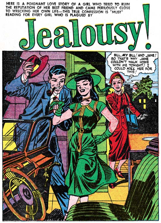
Young Romance #5 (May 1948) “Jealousy”, art by Jerry Robinson and Mort Meskin

The final two contributors to Young Romance #5 to #8 was the team of Jerry Robinson and Mort Meskin. I attribute three stories from issues #5 and #6 to Robinson and Meskin, one of which (“The Inferior Male”) was signed. The Jack Kirby Checklist credits the splash page of “Jealousy” to Jack Kirby as inked by Joe Simon. The expressive formality of the foreground couple is not typical of Kirby. Nor are the long and simple eyebrows usually found in Simon’s inking. The only thing that suggests Kirby/Simon to me is some of the Studio style inking such as the abstract arch at the top of the wall and the picket fence crosshatching on the lower part of the woman’s dress (see inking glossary). However the “Jealousy” splash presents cloth folds created by long, narrow sweeping brush strokes, this is exactly the inking technique used by Mort Meskin. Also note the man has a type of grin that is so typical for Mort. The eyebrows found in “Jealousy” may also be found in the Robinson and Meskin work found in these early issues of Young Romance. The unusual formal pose of the couple would not be surprising for Robinson and Meskin. The only problem with a Robinson and Meskin attribution for the “Jealousy” splash is the Studio style inking which is not found in other R&M art. I think the best explanation for this discrepancy is that either Simon or Kirby in their roll as art editor stepped in to touch up the splash. I feel the splash matches the art in the rest of the story and it all should be attributed to Jerry Robinson and Mort Meskin.

July marked the last month that Robinson and Meskin art would appear in Simon and Kirby productions. Mort Meskin would return by himself over a year later, after which he would be a frequent contributor until the end of the studio. This is all very hard to reconcile with Carmine Infantino’s TJKC #34 interview where he says that he accepted the Charlie Chan job for the experience he would get by working with Kirby and Meskin. Carmine even describes Mort as working right next to Jack. Carmine’s stay was from June 1948 until February 1949 (cover dates). This does overlap Robinson and Meskin’s period (January to July 1948) but is well before Meskin’s solo return in December of 1949. I just do not find it creditable that Mort was working in the studio at a time when he and Robinson were probably producing more work for other publishers then for S&K. Would Mort and Jerry have been working separately? Would the small amount of work for S&K justify Mort’s presence in the studio? I am afraid I have to conclude that Carmine’s memory has failed him; perhaps he has mixed up the time of his presence in the studio with that of his brother Jimmy who did work for S&K at the same time as Meskin.

Chapter 1, A New Genre (YR #1 – #4)
Chapter 2, Early Artists (YR #1 – #4)
Chapter 3, The Field No Longer Their’s Alone (YR #5 – #8)
Chapter 4, An Explosion of Romance (YR #9 – #12, YL #1 – #4)
Chapter 5, New Talent (YR #9 – 12, YL #1 – #4)
Chapter 6, Love on the Range (RWR #1 – #7, WL #1 – #6)
Chapter 7, More Love on the Range (RWR #1 – #7, WL #1 – #6)
Chapter 8, Kirby on the Range? (RWR #1 – #7, WL #1 – #6)
Chapter 9, More Romance (YR #13 – #16, YL #5 – #6)
Chapter 10, The Peak of the Love Glut (YR #17 – #20, YL #7 – #8)
Chapter 11, After the Glut (YR #21 – #23, YL #9 – #10)
Chapter 12, A Smaller Studio (YR #24 – #26, YL #12 – #14)
Chapter 13, Romance Bottoms Out (YR #27 – #29, YL #15 – #17)
Chapter 14, The Third Suspect (YR #30 – #32, YL #18 – #20)
Chapter 15, The Action of Romance (YR #33 – #35, YL #21 – #23)
Chapter 16, Someone Old and Someone New (YR #36 – #38, YL #24 – #26)
Chapter 17, The Assistant (YR #39 – #41, YL #27 – #29)
Chapter 18, Meskin Takes Over (YR #42 – #44, YL #30 – #32)
Chapter 19, More Artists (YR #45 – #47, YL #33 – #35)
Chapter 20, Romance Still Matters (YR #48 – #50, YL #36 – #38, YB #1)
Chapter 21, Roussos Messes Up (YR #51 – #53, YL #39 – #41, YB #2 – 3)
Chapter 22, He’s the Man (YR #54 – #56, YL #42 – #44, YB #4)
Chapter 23, New Ways of Doing Things (YR #57 – #59, YL #45 – #47, YB #5 – #6)
Chapter 24, A New Artist (YR #60 – #62, YL #48 – #50, YB #7 – #8)
Chapter 25, More New Faces (YR #63 – #65, YLe #51 – #53, YB #9 – #11)
Chapter 26, Goodbye Jack (YR #66 – #68, YL #54 – #56, YB #12 – #14)
Chapter 27, The Return of Mort (YR #69 – #71, YL #57 – #59, YB #15 – #17)
Chapter 28, A Glut of Artists (YR #72 – #74, YL #60 – #62, YB #18 & #19, IL #1 & #2)
Chapter 29, Trouble Begins (YR #75 – #77, YL #63 – #65, YB #20 – #22, IL #3 – #5)
Chapter 30, Transition (YR #78 – #80, YL #66 – #68, YBs #23 – #25, IL #6, ILY #7)
Chapter 30, Appendix (YB #23)
Chapter 31, Kirby, Kirby and More Kirby (YR #81 – #82, YL #69 – #70, YB #26 – #27)
Chapter 32, The Kirby Beat Goes On (YR #83 – #84, YL #71 – #72, YB #28 – #29)
Chapter 33, End of an Era (YR #85 – #87, YL #73, YB #30, AFL #1)
Chapter 34, A New Prize Title (YR #88 – #91, AFL #2 – #5, PL #1 – #2)
Chapter 35, Settling In ( YR #92 – #94, AFL #6 – #8, PL #3 – #5)
Appendix, J.O. Is Joe Orlando
Chapter 36, More Kirby (YR #95 – #97, AFL #9 – #11, PL #6 – #8)
Chapter 37, Some Surprises (YR #98 – #100, AFL #12 – #14, PL #9 – #11)
Chapter 38, All Things Must End (YR #101 – #103, AFL #15 – #17, PL #12 – #14)

The Art of Romance, Chapter 2, Early Artists

(Young Romance #1 – #4)

Young Romance #1
Young Romance #1 (September), art by Jack Kirby

Simon and Kirby had a pretty consistent modus operandi for developing a new title. Basically it called for Jack Kirby providing much, if not most, of the initial art. This M.O. was adhered to with Young Romance, for the first four issues Jack drew 10 of the 20 stories. Page production rates (the number of pages of art created in a month) at the time of the release were also very high. Joe Simon has stated that before they went around to various publishers, they had already created the art for the initial issues. That way if some unscrupulous publisher liked the idea but wanted to develop it themselves, Simon and Kirby would have a head start. Therefore the high page production rates are misleading because much of the art was actually done earlier. Even so the initial art for Young Romance was rushed. Not that Jack would sacrifice drawing quality, but the inking would initially be rather simple. S&K shop inking traits such as picket fence crosshatching (see the Inking Glossary) would find limited use. The resulting inks would be reminiscent of the Austere inking style from the late fifties which developed from a similar need for increased art production. Although the inking was simpler what was done was quite beautiful, so once again quality was not sacrificed.

Young Romance #1
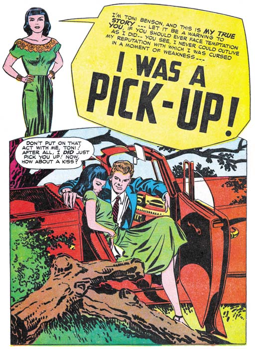
Young Romance #1 (September 1947) “I Was A Pick-Up”, art by Jack Kirby.

The drawing for the romance covers are generally not Jack Kirby’s finest work. Kirby’s forte was action, which was not the sort of thing appropriate for romance. Jack would compensate by using various compositional devices to keep the image visually interesting but this was not completely successful. Much of the impact these covers have is based not so much on the drawing itself as the melodrama that is being depicted. The less then graphically successful covers cannot be blamed entirely on romance genre not being conducive to Jack’s talents. Some of Kirby’s best efforts from the period can be found in romance splashes. The one for “I Was a Pick-Up”, shown above, is a great example. This splash is much more graphically interesting then the cover for the same issue. The compositions centers on the semi-reclining figure of woman. Her posture is deliberately provocative while at the same time projects her discomfort at her current predicament. Her pose is echoed in the foreground of bush and tree trunks with one of the fallen tree’s limbs repeating the lady’s bent legs. Part of the lady’s visual confinement is formed by the tree trunks, the rest is the by the arms of her not so gentleman companion and the door of the car. This composition seems so expressive and natural that is easy to overlook some logical inconsistencies. Why is the car door open? If it is for her eminent escape, why does the lady seem to lounge about as if reluctant to leave? I would say the whole point of this splash is to highlight the illogic of her situation. Part of her is fully aware that she should get out of the car but this is battled by the same temptation that lured her into becoming a “pick-up”. Although nothing explicit by today’s standards, this was steamy stuff indeed. Too proactive for a cover where it might attract the unwanted attentions of those critical of the idea of a romance comic book, but just right to attract the potential purchaser who was interested enough to open the book. Not every Kirby romance splash would be this good, but enough of them are to indicate that Kirby could do great pieces of stand alone romance art. His best romance work would just be a little too much for the cover.

Young Romance #1
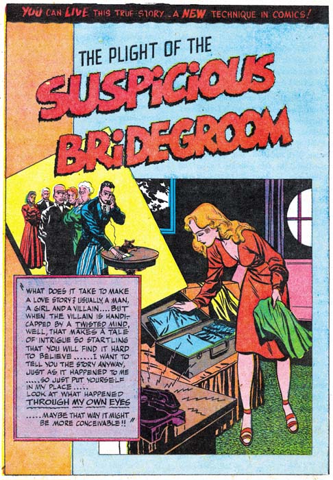
Young Romance #1 (September 1947) “Suspicious Bridegroom”, art by Bill Draut.

Kirby did not pencil all the art for the initial issues of Young Romance. Of the first 20 stories, Kirby did 10 while Bill Draut provided 7. Draut had met Joe Simon in Washington during the war and had accepted Joe’s invitation to join them in New York. Bill was a talented artist but had no previous comic book experience. Even so Draut did some nice work for Simon and Kirby in titles they developed for Harvey in 1946 (Boys Explorers and Stuntman). Although some work by Bill Draut was published after that, it was all stuff left over from that quickly scrapped S&K Harvey line. One wonders what Bill did between that attempt and his appearance in Young Romance over a year later. From YR #1 on until the closing of the studio, Bill Draut would be a consistent presence in Simon and Kirby productions.

Draut was relative new to comic book work, but that did not stop him from trying to be innovating. A good example is the splash page for “Suspicious Bridegroom” shown above. The layering of the caption box and two images over a bicolor background is very effective. Particularly with the way the panel for one of the images is skewed and casts a shadow. The woman is very attractive but seems directed more to appeal to a man then a teenage girl reader. It was not unusual for Bill to present “cheesy” images of woman in his earlier efforts in the romance genre.

Young Romance #1
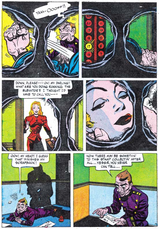
Young Romance #1 (September 1947) “Suspicious Bridegroom” page 7, art by Bill Draut.

Not all of Draut’s attempts at being innovation were successful. On the top of the splash page for “Suspicious Bridegroom” we find the declaration:

YOU CAN LIVE THIS TRUE STORY… A NEW TECHNIQUE IN COMICS!

The announced technique, showing up in much of the story, consists of providing the images as if view through someone’s eyes. Well that is what it was meant to be but actually it looks like a view from some sort of bizarre binoculars, what with the circular views surrounded by irregular folds (eyelids?) and numerous eyelashes. Frankly the technique is not very effective since it puts a severe limit on what can be shown in a panel. Worse yet it is actually kind of creepy and that casts a chilling effect on was meant to be a romantic scene in the fourth panel. Fortunately this innovation was not to be repeated in future work by Bill Draut or any other artist working for Simon and Kirby. Even though it was a failure, you still have to admire the daring of the attempt.

Young Romance #3
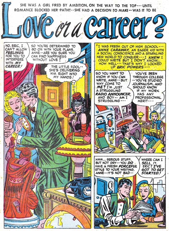
Young Romance #3 (January 1948) “Love or a Career?”, art by Jerry Robinson and Mort Meskin.

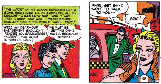
In YR #3 (“Love or a Career?”) and YR #4 (“I Love You, Frank Gerard”) are stories by another artists, or more correctly a pair of artists, Jerry Robinson and Mort Meskin. These two works are unsigned but in the same style as signed work done a few months later (see my post on the cover for My Date #4). I have not seen enough of either artist’s earlier work to be confident about how the two artists collaborated, but my suspicion is that most of the pencils were done by Robinson and Meskin did most of the inking. I am not sure how Simon and Kirby met Jerry Robinson, but Meskin was well known from the time that S&K worked for DC. There is a story of both Kirby and Meskin facing deadlines and ending up in the DC bullpen on adjacent drawing tables. Each was intent on getting their own jobs done while other artists gathered to watch two of the industries greatest and most prolific artists racing away. I have not come across any comments from Jack Kirby about Meskin, but Joe has repeatedly expressed his admiration for Mort’s work.

Now that I have introduced most of the artists from the first four issues of Young Romance, this seems to appropriate time to address a subject that I have avoided in the past, that is the question of Kirby layouts. This is a claim that many people have declared about work done by the various artists who worked for the Simon and Kirby studio. Unfortunately the use of Kirby layouts is not the only possible explanation for other artists doing Kirby-like work. Many admired Jack’s artistry so it is not surprising that they would imitate or even swipe from Kirby. From time to time Jack would also assume the job of art editor and fix up the work from other artists prior to publication (for example). One of the criteria I use to distinguish Kirby layouts from things like swipes and art editing is consistency throughout the story. Swiping and art editing will be limited to a few panels here or there, not to the entire story. But if Kirby is truly providing a layout it would be expected that he would do so for the entire story. As for distinguishing a Kirby layout from a Kirby imitator it is necessary to compare the work in question to the layouts found in contemporary Kirby stories. It is expected that Kirby would provide layouts similar to those of his own stories. While it is possible that Kirby might provide simpler layouts, it is not creditable that he would introduce techniques into a layout that he would not use himself.

Kirby uses an unusual layout for some of his splashes. It consists of a half splash along with a figure or just the head with a speech balloon that serves the place of title caption. The splash from “I Was a Pick-Up” shown earlier is an example of this layout. This layout is not used by any other artist in the first four issues. However it is not the only splash layout used by Kirby either. Careful examination shows that it is only used on for the first story in the comic. So although it is very distinctive layout, the fact that the other artists do not use it does not prove their stories were not done using Kirby layouts. Although I call this a Kirby layout I might be more accurate to ascribing it to Simon and Kirby. Both Joe and Jack have said that Joe did layouts for some covers and splashes. Did Joe consistently provide layouts? Was Joe providing layouts for Jack only early in their collaboration? At this point I do not have really firm answers for these questions. It does seem to me that many of the splashes and covers have emphasis on design found in work that Joe did prior to working with Jack and would continue to use after they broke up. However this fondness for certain types of designs disappears from Jacks work once he split from Joe. Therefore I am inclined to feel Joe provided some layout guidance to many of Jack’s covers and splashes. However nothing in the layout of Jack stories seem unique to his period of partnership with Joe, so I believe that the story layouts at this stage are Kirby’s alone.

As I previously mentioned, Bill Draut did some interesting designs for some of his splash pages in these early Young Romance issues. He used tilted panels in two of his splashes, a device that does not appear in any Kirby drawn splash from the same comics. Draut also would occasionally introduce a “sexy” or “cheesy” pose; this is something Jack was not seen to do. Bill Draut would develop his own way of telling a story which is only beginning to appear in these early romance works. Still the story layouts that he uses for these first issues of Young Romance only occasionally, if at all, remind one of Kirby. So I would conclude that there are no Kirby layouts under the Bill Draut pencils in the first four issues of Young Romance. Actually this is a conclusion that I have reached for all of Bill Draut’s work for S&K.

The opening splash panel is generally used to as a sort of comic book equivalent of a movie trailer. That is it provides a sort of condensation of what the story will be about. However the splash panel normally is not actually part of the story itself. Sometimes the entire first page is given over to the splash. Five splashes by Kirby and two by Draut from the first twenty stories are full page splashes. I am not sure that much can be deduced from the use of full page splashes, except perhaps that Kirby was more prone to use them then the other artists. Often the first page would be a combination of a splash panel and one or two story panels, and how they are laid out is informative. Kirby’s next most frequent first page arrangement, with three cases, places a single story panel in the lower right corner. That layout is not used by any of the other Young Romance artists. The other arrangement that Jack used was to restrict the splash panel to the top of the page, and provide two story panels below. This is the most common arrangement in the first four issues; Kirby did it twice, Draut five times and another artist also used it once, for a total of eight out of twenty stories. Another possible layout is for the splash panel to occupy the left while the two story panels are placed on the right. That arrangement was not used by either Kirby or Draut in the first YR comics but is used for both stories provided by Jerry Robinson and Mort Meskin. To me this strongly suggests that Jack did not provide layouts to Robinson and Meskin.

Young Romance #3
Young Romance #3 (January 1948) “Love or a Career?” page 7 panel 1, art by Jerry Robinson and Mort Meskin

As was the case with Bill Draut, the way that Robinson and Meskin present the story is not consistently like what Kirby did. One exception that might be made is provided in the above panel. Jack Kirby was justly famous for his use of exaggerated perspective. The way the man holds his hand out toward the view does remind one of Jack’s techniques. In my opinion Robinson and Meskin are not as successful in their effort as Kirby would have been, so I do not think this would be an example of Kirby stepping in as an art editor. Although Kirby did have a fondness for this sort of difficult perspective, he did not use it, or anything like it, in any of the stories that he drew for YR #1 through #4. If Jack did not use it for his own drawings, I do not think it would be likely that he would use it in layouts for other artists at that same time. Therefore I conclude that this panel is an example of Robinson and Meskin being influenced by Kirby and it is not based on Kirby layouts.

Young Romance #2
Young Romance #2 (November 1947) “Dangerous Romance”, by unidentified artist

Normally I do not associate the use of floating heads with Kirby’s covers or splashes. They were not used extensively by Kirby during the S&K period and became extremely rare after he left Joe. Simon on the other had used them on some of his covers done early in his career as well as after the split-up. Whether it is another suggestion that Joe may have been involved in laying out some of the splashes, or that Jack may have just adopted if for a period, but the use of floating heads becomes frequent in the initial Young Romance comics. Five out of ten Kirby splashes use floating heads; on the other hand this device is not used in any of the stories by Draut or Robinson and Meskin. This is another suggestion that Jack did not provide those artists with layouts. But the design technique does show up in the story “Dangerous Romance” in Young Romance #2. The story layout is similar to that Kirby would use for his own work, and this similarity is found throughout the story. The inking also seems to mimic S&K studio style. Note the abstract arc shadow in the splash, and something akin to should blots are sometimes used in the story (see the Inking Glossary for explanation of these terms). Even the penciling is reminiscent of Jack’s work. I do not believe this is an example of a heavy handed inker working over Kirby pencils. As far as I know no one has ever attributed the drawing of this story to Jack. So the conclusion I reach is that this is an example of an artist working from Kirby layouts and trying, not very successfully, to mimic Kirby as close as he was able. Unfortunately I have no idea who the artist was.

Young Romance #1
Young Romance #1 (September 1947) “Summer Song” page 6, art by Jack Kirby and an unidentified artist.

There was a time in the past that I did not believe “Summer Song” was penciled by Jack Kirby. I found that pages such as the one imaged above deviated in ways that could not be explained by some heavy handed inker. Christopher Harder (a fine S&K scholar) pointed out to me that the art seem to progress from very much like Kirby’s work in the beginning followed by work that looked less and less like Jack’s. You can see what he means be comparing the above image with another from early in the story that I provided last week in the first chapter of this serial post. I remained perplexed about the attribution of this story until one day Joe Simon showed me an article from a Marvel publication. I deeply regret not borrowing it, because I have not yet come across it again in Joe’s collection. It was an interview with an artist, I am sure it was either Joe Sinnott or John Romita. What I do remember clearly was one part where the artist describes approaching Simon and Kirby about a position they had open. The artist described the work as an in-betweener. He went on to say that Jack would draw the story pretty tightly to begin with and then get much looser and close it with some more tight pencils. The hired artist would then tighten up all in between pages and ink the whole thing. This would allow Jack to work more quickly and yet maintain some control over the final results. (Incidentally the artist interviewed said that S&K provided him with samples to work on to show how well he could do the work, but that he never followed through with it). When I read that interview I realized he was describing exactly what had been done in “Summer Song”. In fact when I reexamined the final page of the story it did look more Kirby-like then those done in the middle. It would not be accurate to call such an arrangement as Kirby layouts, Jack contribution was too much for that. Nor would it be correct to describe the other artists as just the inker, for he did much more then just ink Jack’s pencils. So I have decided to attribute the work to both artists. Unfortunately once again I have no idea who the second artist was. In The Complete Jack Kirby, Greg Theakston attributes the inking of this story to Charles Nicolas but gives no explanation how he came that that conclusion.

Chapter 1, A New Genre (YR #1 – #4)
Chapter 2, Early Artists (YR #1 – #4)
Chapter 3, The Field No Longer Their’s Alone (YR #5 – #8)
Chapter 4, An Explosion of Romance (YR #9 – #12, YL #1 – #4)
Chapter 5, New Talent (YR #9 – 12, YL #1 – #4)
Chapter 6, Love on the Range (RWR #1 – #7, WL #1 – #6)
Chapter 7, More Love on the Range (RWR #1 – #7, WL #1 – #6)
Chapter 8, Kirby on the Range? (RWR #1 – #7, WL #1 – #6)
Chapter 9, More Romance (YR #13 – #16, YL #5 – #6)
Chapter 10, The Peak of the Love Glut (YR #17 – #20, YL #7 – #8)
Chapter 11, After the Glut (YR #21 – #23, YL #9 – #10)
Chapter 12, A Smaller Studio (YR #24 – #26, YL #12 – #14)
Chapter 13, Romance Bottoms Out (YR #27 – #29, YL #15 – #17)
Chapter 14, The Third Suspect (YR #30 – #32, YL #18 – #20)
Chapter 15, The Action of Romance (YR #33 – #35, YL #21 – #23)
Chapter 16, Someone Old and Someone New (YR #36 – #38, YL #24 – #26)
Chapter 17, The Assistant (YR #39 – #41, YL #27 – #29)
Chapter 18, Meskin Takes Over (YR #42 – #44, YL #30 – #32)
Chapter 19, More Artists (YR #45 – #47, YL #33 – #35)
Chapter 20, Romance Still Matters (YR #48 – #50, YL #36 – #38, YB #1)
Chapter 21, Roussos Messes Up (YR #51 – #53, YL #39 – #41, YB #2 – 3)
Chapter 22, He’s the Man (YR #54 – #56, YL #42 – #44, YB #4)
Chapter 23, New Ways of Doing Things (YR #57 – #59, YL #45 – #47, YB #5 – #6)
Chapter 24, A New Artist (YR #60 – #62, YL #48 – #50, YB #7 – #8)
Chapter 25, More New Faces (YR #63 – #65, YLe #51 – #53, YB #9 – #11)
Chapter 26, Goodbye Jack (YR #66 – #68, YL #54 – #56, YB #12 – #14)
Chapter 27, The Return of Mort (YR #69 – #71, YL #57 – #59, YB #15 – #17)
Chapter 28, A Glut of Artists (YR #72 – #74, YL #60 – #62, YB #18 & #19, IL #1 & #2)
Chapter 29, Trouble Begins (YR #75 – #77, YL #63 – #65, YB #20 – #22, IL #3 – #5)
Chapter 30, Transition (YR #78 – #80, YL #66 – #68, YBs #23 – #25, IL #6, ILY #7)
Chapter 30, Appendix (YB #23)
Chapter 31, Kirby, Kirby and More Kirby (YR #81 – #82, YL #69 – #70, YB #26 – #27)
Chapter 32, The Kirby Beat Goes On (YR #83 – #84, YL #71 – #72, YB #28 – #29)
Chapter 33, End of an Era (YR #85 – #87, YL #73, YB #30, AFL #1)
Chapter 34, A New Prize Title (YR #88 – #91, AFL #2 – #5, PL #1 – #2)
Chapter 35, Settling In ( YR #92 – #94, AFL #6 – #8, PL #3 – #5)
Appendix, J.O. Is Joe Orlando
Chapter 36, More Kirby (YR #95 – #97, AFL #9 – #11, PL #6 – #8)
Chapter 37, Some Surprises (YR #98 – #100, AFL #12 – #14, PL #9 – #11)
Chapter 38, All Things Must End (YR #101 – #103, AFL #15 – #17, PL #12 – #14)

Not Kirby, My Date #4

My Date #2
My Date #2 (September 1947) art by Jack Kirby

My Date was a short-lived comic that Simon and Kirby produced for Hillman Publications in 1947. Perhaps mislead by the comics title, some today hold the belief that My Date was the first romance comic book. As I discussed in a post on this topic (The First Romance Comic) it is not a romance comic at all but rather Simon and Kirby’s take on teenage humor modeled on the popular Archie comics. For his contributions to the title Jack Kirby drew in a more cartoonish manner appropriate for the humor content. Jack’s altered penciling was not very drastic, it remains quite easy to identify his work. For instance, Kirby trademarks such as his exaggerated perspective can be found in the covers and stories that Jack provided.

My Date #4
My Date #4 (January 1948) art by Jerry Robinson and Mort Meskin

All four My Date covers have traditionally been attributed to Jack Kirby, as for example by the Jack Kirby Checklist. I have long felt, and I am not alone in this, that the cover for My Date #4 was done by someone else. Gone are Jack’s exaggerated perspective, replaced by a relatively shallow depth of field viewed straight on. The drawing for My Date #4 is cartoonier then in the previous My Date covers. House-Date Harry looks rather different on issue #4 then on the covers for #2 and #3, or from their story art as well. The same is true for Swifty who also shows up on My Date #1 and #2 covers.

Young Romance #3
Young Romance #3 (January 1948) “Love or a Career” page 5 panel 5 and page 7 panel 4, art by Jerry Robinson and Mort Meskin

Readers of my last post on the inking of Mort Meskin may have spotted the long close and narrow brush marks that are used on the My Date #4 cover to indicate the folds of the clothing. Not all of Meskin inking traits that I previously described are found, but I am nonetheless certain that Mort was the inker. This a bit surprising because at this time Meskin was still producing work mainly for DC and his first signed work for S&K studio would not appear for months later. Young Romance #3 has the same cover date as My Date #4 and in it is the story “Love or a Career”. Unfortunately this story is unsigned but Meskin’s inking is once again quite apparent. I will explain my full attribution of this art below when I discuss the first signed works. The art for “Love or a Career” is the closest match to the MD #4 cover that I have been able to find. Consideration has to be given for the more cartoony style used for the teenage humor comic, but see how close the female character is in the two panels I have selected from YR #3 compared to Sunny of MD #4, similarly shaped face, arching eyebrows, eyes and lips.

Justice Traps the Guilty #4
Justice Traps the Guilty #4 (May 1948) “Guilty Boys” page 1 panel 3 and page 5 panel 7, art by Jerry Robinson and Mort Meskin

Some months later art very similar to YR #3 appears in “Guilty Boys” from Justice Traps the Guilty #4. This is another unsigned piece with Meskin apparently doing the inking. This crime story was appropriately rendered more realistically then My Date #4 but similarities still show up. Note the comparable button noses of the boys to Swifty and to a lesser extent House-Date Harry on MD #4. The two boys on the right in the page 1 panel has a smiling cheek line similar to that of House-Date Harry.

Young Romance #6
Young Romance #6 (July 1948) “The Inferior Male” page 7 panel 3 and page 8 panel 4, art by Jerry Robinson and Mort Meskin (signed)

Going forward two months provides two stories that bear the dual signatures of Jerry Robinson and Mort Meskin. The usual assumption is that the first signature designates the penciler and the second the inker. But I know nothing about how the Robinson and Meskin team worked so this may not be a safe assumption. Still it does look like Meskin’s inking while at least some of the figure drawing and compositions do not appear to be his. I have posted about “The Inferior Male” twice before (here and here). The correspondence between the art in YR #6 and that in YR #3 and JTTG #4 is close enough that the same artists were probably responsible for all. As seen in the above panels the female still looks like a more realistically drawn version of Sunny from the MD #4 cover.

Justice Traps the Guilty #5
Justice Traps the Guilty #5 (July 1948)”Murder Special Delivery” page 3 panel 3 and page 4 panel 1, art by Jerry Robinson and Mort Meskin (signed)

Issue #5 of Justice Traps the Guilty also has the Robinson and Meskin signature. As might be expected there is great similarities with the YR #6 that came out in the same month. But this comparison is not perfect. In JTTG #5 the female leads start to take on the more stylized look that is typical of most of Meskin’s work for S&K. But the females have not adopted the more triangular face as done later by Mort so there still is a slight resemblance to Sunny from the MD #4 cover.

Real West Romances #5
Real West Romances #5 (December 1949) “Tenderfoot In Love” page 2 panel 4 and page 8 panel 7 art by Mort Meskin (signed)

Mort Meskin would not show up again in S&K productions for over a year. By cover date of December 1949 things had clearly changed for Mort, the work would only be signed by him with no indication of any Robinson involvement. Meskin was no longer providing art for DC and this marks the start of a productive and consistent relationship with Simon and Kirby. In Real West Romances #5 the woman is drawn actually less stylized then found in the Robinson and Meskin’s piece in JTTG #5. Although not typical of Mort’s later work, the female in RWM #5 is not a very good match for that on My Date #4 either. This is largely due to the introduction of cheek bones that makes the face depart from the more simple geometry found on MD #4. Other similarities can still be found between the RWM #5 and MD #4, as for instance the old man’s eyebrows and smiling cheek line in the right panel as compared to House-Date Harry on MD #4.

Young Romance #16
Young Romance #16 (December 1949) “His Engagement Ring” page 1 splash, art by Mort Meskin (signed)

Meskin also appears during the same month in Young Romance #16. Once again Mort’s woman are not as stylized as they soon would be. but gone are the cheek bones that Mort provided woman in RWR #5. A resemblance to Sunny of MD #4 can still be seen, especially in the lady on the right of the above splash panel.

It may be a little surprising that a S&K production would have a cover drawn by an artist other then Jack Kirby. The only other non-Kirby covers were also done by Meskin along with Bill Draut, John Prentice and Ann Brewster. Those were all Prize romance covers with cover dates of 1954 and 1955, a period when Jack and Joe were busy with Mainline, their self owned publishing company. The reason Simon and Kirby made an exception for My Date #4 is most likely the same. A few months previously Simon and Kirby had launched Young Romance with Prize comics. As typical for them, most of the initial art for Young Romance was drawn by Jack. They had more recently lauched Justice Traps the Guilty. Not only was this all a lot of work for Kirby, it also was work for which S&K would have a share in the profits. Their deal with Hillman was not as good and so My Date #4 would be the last comic Simon and Kirby produced for that publisher with the exception of a single Western cover (Western Fighters #1, April 1948).

Jerry Robinson, a Kirby collaborator

Detective #65
Detective #65 (July 1942) by Jack Kirby and Jerry Robinson

In my post of the S&K usual suspect John Prentice I provided a scan of In Love #1 which was jointly done by Kirby and Prentice. As I mentioned in that post, if we exclude work with Joe Simon and also unrelated inserts, there was only one other example of a cover where Kirby shared pencil duties with another artist. Here I am fulfilling my promise to post on that other example which was Detective #65. This cover of Batman and Robin meeting the Boy Commandos is unusual in that Jack has provided a more realistic rendition of the Commandos compared to how he normally did these characters. I do not understand why he thought this was necessary since Batman and Robin were done in a unrealistic, more cartoony, fashion and Jerry Robinson’s effort on this cover is no exception. Still the cover is a rather nice joint effort. Although Jerry started his career helping Bob Kane, at the time this cover was done he was working directly for DC.

Young Romance #6
Young Romance #6 (July 1948) “The Inferior Male” by Jerry Robinson and Mort Meskin (signed)

After the war when Joe and Jack were producing their own comics Robinson would do two stories for them. This work was done with Mort Meskin. I have already include a scan of one of these stories (Young Romance #6 July 1948) in my post on Mort but I include here another page from that story. Mort was a talented penciler with his own easily recognized style. But this YR story does not show much of that style so I believe it was primarily penciled by Jerry and inked by Mort. But the other story (Justice Traps the Guilty #5, July 1948) has all the signs of a work by Mort and so I believe Mort penciled while Jerry inked. Of course as with any collaboration such attributions probably greatly over simplify how the work was truly being done. However the work was divided it is pretty good stuff. But for whatever reasons the team of Robinson and Meskin went their separate ways. Jerry would go on to work on a syndication strip and work outside of the comic book industry for a few years. Mort would become a frequent artist for S&K productions and would actual work in the studio.

Justice Traps the Guilty #5
Justice Traps the Guilty #5 (July 1948) “Murder Special Delivery” by Jerry Robinson and Mort Meskin (signed)

Joe Simon attended the first New York Comic Con. While there he was greeted by Robinson. Later I commented to Joe how well Jerry looked. Joe said sure he looked good, he was still young. I guess it is all a matter of perspective. By the way that is Joe’s son Jim Simon behind Joe.

Jerry Robinson and Joe Simon
Jerry Robinson and Joe Simon (2006).

Jerry Robinson & Mort Meskin Checklist


Last update: 1/2/2012

Codes:
    s:  = signed
    a:  = signed with alias
    &:  = signed Simon and Kirby
    ?:  = questionable attribution
    r:  = reprint

Black Terror (Standard)
   s 23   June 1948   10p "The Eye of the Lady Serpent"
   s 23   June 1948   10p "Danger In The Air"
   s 24   Sept 1948    8p "The Revenge of Red Ann"
   s 24   Sept 1948    8p "The Lady Serpent Returns"
   s 25   Dec  1948    8p "The Girl Who Cleared Her Name"

Exciting (Standard)
   s 66   Mar  1949    9p "Grandpa Shows His Medals"

Fighting Yank (Standard)
     24   Mar  1949   10p "Larceny in the Lighthouse"
     25   Apr  1949   10p "The Crossroads of Crime"
     27   June 1949   10p "The Return of Fingers"
   s 27   June 1949    6p "Patriots on Parade"
   s 27   June 1949   10p "Taxi Terror"
   s 28   July 1949    7p "Swing Your Partner"
   s 29   Aug  1949   10p "Fight for Freedom"

Headline (Prize)
     28   (v.3, n4)  Feb  1948    7p "Postage Stamp Swindle"
     29   (v.3, n5)  Apr  1948    8p "The Night Of The Freak Murder"

Justice Traps the Guilty (Prize)
     4    (v.1, n4)  May  1948    9p "Guilty Boys"
   s 5    (v.1, n5)  July 1948    8p "Murder Special Delivery"

My Date (Hillman)
     4    Jan  1948       [cover]

Young Romance (Prize)
     3    (v.1, n3)  Jan  1948    8p "Love Or A Career"
     4    (v.1, n4)  Mar  1948    8p "I Love You Frank Gerard"
     5    (v.1, n5)  May  1948    7p "Jealousy"
     6    (v.1, n6)  July 1948    7p "The Love That Might Have Been"
   s 6    (v.1, n6)  July 1948    8p "The Inferior Male"