Category Archives: 2008/04

New York Comic Con, Joe Simon and Much More

The organizers of the New York Comic Con seemed to have learned some lessons from their previous shows which frankly had problems with crowd control. This year they had an indoor area for the waiting line and entry to the show was a lot quicker. I hope the organizers continue to make improvements but happily they seemed to have overcome the disasters of the earlier years. I was aiding Joe Simon on both Friday and Saturday; largely I just helping to get him to and from the show, others gave him a hand at his appearances. While I give the organizer’s praise for the improvements to the show in general, they are still sadly lacking in support for guests like Joe. Joe is healthy but at 94 not that strong. The distance between the VIP desk and the panel area was way too far. Joe is too proud to use a wheelchair so he did walk it but there really needs to be a better way to do it, perhaps some sort of go-cart. Leaving the show on the second day was difficult as well.

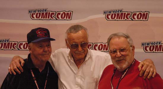
Joe was part of the amazing Legends Panel. What a roster; Murphy Anderson, Jerry Robinson, Stan Lee, Irwin Hansen, Ramona Fradon, the moderator and comic historian Michael Uslan, Dick Ayers, Joe Sinnott, Joe Simon and John Romita Sr. I took some pictures which I will include at the bottom of this post. Unfortunately it was mobbed and I was unable to get any of Ramona Fradon. With such a large panel there really were not a lot of questions that could be done in one hour. One question asked of each panelist was among the artists that they had worked with who were their own favorites. Of course with panelists such as these, Jack Kirby was brought up by a number of them. Jerry Robinson’s answer of Bill Finger got a good response from the audience, but what warmed my heart was his other choice, Mort Meskin. When the question got to John Romita he talked about how influential the first issue of Captain America was to him. After which Stan Lee took back the microphone and said how much that issue influenced him as well. Stan continued to say that he was there when Simon and Kirby were producing Captain America, he saw both Jack and Joe drawing Cap and he could not tell one’s art from the other. Further that Joe did not get the recognition that he deserved for all his contribution to the art and the writing.

On Saturday Joe spent an hour with Mark Evanier jointly signing Mark’s new book “Kirby the King of Comics”. I do not think I have mentioned that book previously on this list, largely because it had received such great publicity that I am sure most of my readers were already aware of it. It is an incredible book; the publisher Abrams did a great job reproducing the art and Mark’s biography nicely covers Jack’s long career. Of course all Kirby fans are really waiting for the more detailed biography that Mark has said should come out in a couple of years. Unfortunately he has been saying that for many years, we shall see. I only had about a minute at the end of the signing to tell him how great “Kirby the King of Comics” was and how much I enjoyed his other books like “Dr. Wertham Was Right”. Besides being the leading Kirby scholar, Mark is a wonderful writer. I was surprised that Mark recognized my name and that he had read my blog. He commented that he did not agree with everything I have said. My reply was something to the effect that it was to be expected. There was no time then to expand on that comment but I have written before in some of my posts that I do not expect everyone to concur with me. People will always disagree on methods and conclusions. But no matter how important the subject matter is to us, a different opinion is not a personal affront.

After the Abrams book signing arrangements were made to find a place in Artists Alley for Joe to do some more signings. Peter David agreed to make some room at his table for Joe. Peter David, how cool is that? Joe loves kids, so he gave Peter’s young daughter a signed copy of his letterhead (with all those characters that Joe has worked on over the years). Peter’s wife (sorry I forget her name) told her daughter that Joe was a real artist. I must admit chuckling over that comment. She explained that their daughter was aware that her father wrote comics but did not have occasion to see how the art came about. Since Joe’s appearance in Artists Alley had not been previously announced we were not crowded as badly as at the Abram’s booth. Joe still get a lot of attention anyway, it was just not as hectic and allowed more one on one.

Sunday included a Kirby panel moderated by Mark Evanier with Dick Ayers and Joe Sinnott. Attendance was a little low but it was very well received by those present. Great questions from Mark and great stories from the panelists. It was a moving experience just to be in a room with a bunch of Kirby fans. I wish it could be that start of a new tradition for the N.Y. Comic Con.

Also on Sunday was a showing of “The Legends Behind The Comic Books”, a documentary by Michael Uslan made in conjunction with an exhibition of comic art held last year at the Montclair Art Museum. The video opened up with various legendary artists saying that they never thought that comic book art would ever be considered important. They might not have thought so but that was not true of all comic artists. One artist (John Romita?) told a tale of a lunch at the Playboy Club in the ’60s where Jack Kirby predicted that comic book art would someday hang on the walls of museums. Nobody believed him.

On a personal note, I had my first opportunity to meet Jim Amash. Jim has done many great interviews over the years but his latest one of Joe Simon can be found in Alter Ego #76. Jim said that response generated by that interview was much greater then any of those he had done previously. I pointed out, as I have in this blog before, how well Jim managed to bring out the real Joe. Jim mused that perhaps that was because he and Joe were such good friends. Well I would not doubt that for a moment, but I think that Jim’s long time expertise on giving interviews had something to do with it as well.


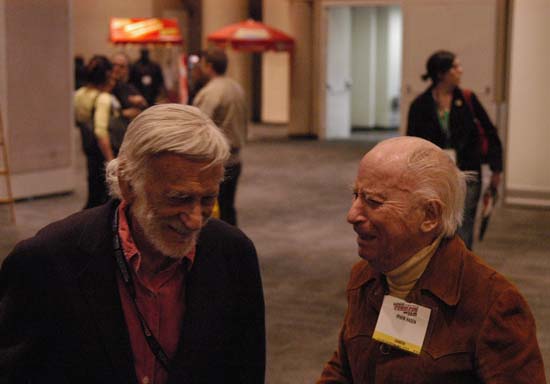
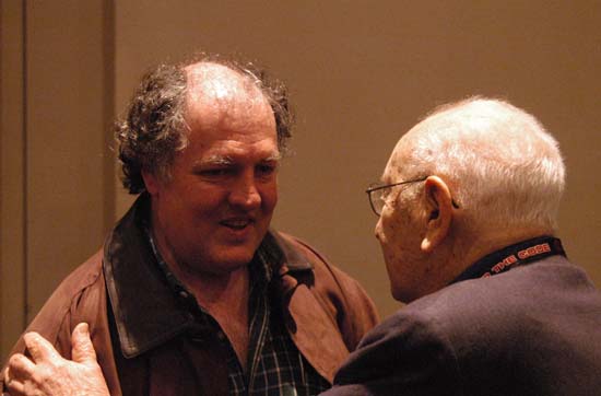
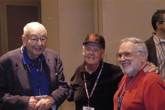
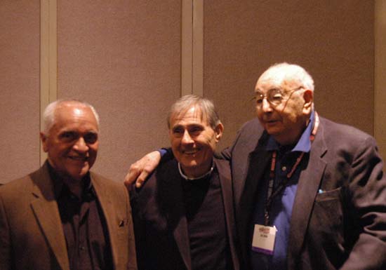
Ernie Colon, Sid Jacobson and Joe Simon while Joe was waiting for the panel. The three had previously worked together at Harvey Comics. Ernie and Sid are still active and their “The 9/11 Report: A Graphic Adaptation” was recently released.


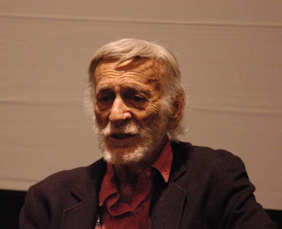
Jerry Robinson and Joe Simon having a discussion before going to the panel.


Jerry Robinson and Irwin Hansen on the way to the panel.


Mark Evanier greeting Joe Simon just before the panel started.


Joe Simon and Stan Lee also just before the panel started. I suspect that the panel was delayed by all the greetings between panelists. I did not care because I was having too much fun snapping pictures.

Joe Simon, Joe Sinnott and John Romita Sr.
Joe Simon, Joe Sinnott and John Romita. Sinnott and Romita never worked with Simon but they exchanged warm greetings nonetheless.


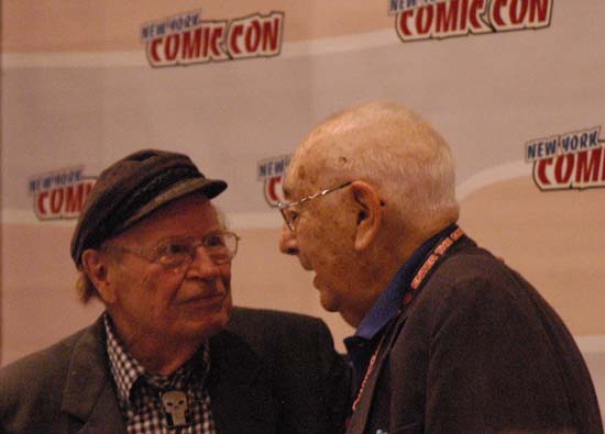
Dick Ayers and Joe Simon. I believe Dick said that he never worked for Simon and Kirby but in a way he worked for each separately.

Joe Sinnott, Stan Lee and John Romita Sr.
Joe Sinnott, Stan Lee and John Romita Sr. after the panel was over.


Jerry Robinson relaxing after the panel.


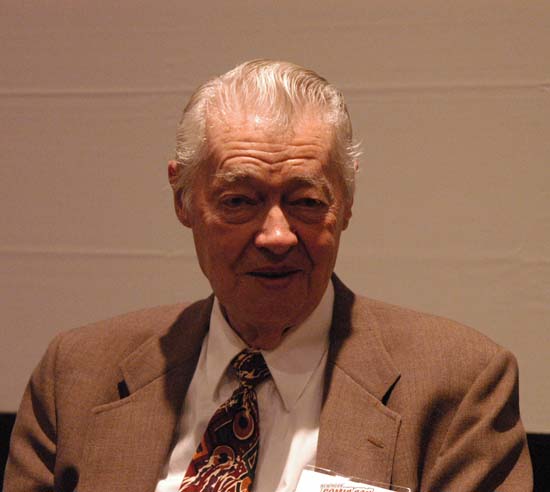
Murphy Anderson looking like a million bucks. Not the stereotypic image of someone from the comic book industry but still a great artist.

“The Ten-Cent Plague” by David Hajdu

I have just finished reading David Hajdu’s new book “The Ten-Cent Plague: The Great Comic-Book Scare and How It Changed America”. Hajdu is not a comic book historian; most of his previous writings have concerned music. I have always meant to read his “Positively 4th Street: The Lives and Times of Joan Baez, Bob Dylan, Mimi Baez Farina and Richard Farina” which as I remember got great reviews. I think I should correct myself, David may not have previously been a comic historian but he certainly is one now. This is a great book describing the rise and affect of the anti-comic book sentiment. Most comic fans awareness of this subject is limited to Dr. Wertham’s “Seduction of the Innocent” and the effect of the Comic Code but Hajdu probes much more deeply. I did notice a couple of small errors, for instance he mentions Bullseye and Western Scout as titles for Simon and Kirby’s Mainline Publications but Western Scout was used as a description for Bullseye and was never an independent title. As far as I can tell such errors are few and very minor, they never affect the subject of the book. The book has an appendix of comic artists who abandoned or were abandoned by the industry because of all the negative reaction and the drop in comic book sales that resulted. This list is impressively long and chilling in effect. In the serial post The Art of Romance I have already noted the presence in that list of some artists who had worked for Simon and Kirby.

I got a big kick out of some of the photographs in this book. One shows two young boys trading “bad” comics for “good” ones. The comic at the top of the pile held by one of the boys was “Justice Traps the Guilty”. Right next to that photo is another of a woman taping a small sign onto a store window identifying it as one that sells only “good” comics. You can see the comic book rack through the window and one of the titles being sold was “Fighting American”. Both titles were originally Simon and Kirby creations although they may not have been producing Justice Traps the Guilty at the time the photograph was taken. So Joe and Jack were both a corrupting and a beneficial influence on youngsters. Go figure.

I am sure that not only comic book fans will appreciate this book but certainly anyone interested in comics of the late ’40s and ’50s should read it. Is this book a one time entry by David Hajdu into the field of comic history? I hope not as he provides a great perspective on comics.

The Art of Romance, Chapter 5, New Talent

(Young Romance #9 – #12, Young Love #1 – #4)


Young Romance #12 (July 1949) “The Man I Kept on a String”, art by Bill Draut

As discussed in the previous chapter, Bill Draut became the most prolific contributor to the Simon and Kirby romance titles within the period from Young Romance #9 (January 1949) through Young Love #4 (August 1949). Bill’s importance is also shown by the fact that for the first time a couple feature stories would be done by someone other then Jack Kirby. However with one exception (“The Plumber and Me” from Young Love #1) Bill’s stories would not be as lengthy as Jack’s would sometimes be. This is true even when it was the featured story which so far Jack had always made the longest in the comic. This was the case with “The Man I Kept on a String” which despite being the feature story is just 8 pages long. Bill’s splash for this feature story continued to use the device of a word balloon for the introduction caption and title. Was Bill just told to do this or was he supplied a layout? I just do not have a good answer to that question. The layout of this splash is unusual in having four story panels in two rows with the splash panel assuming an inverted L shape. Since that arrangement is not found in any other splashes drawn either by Bill or Jack it does not provide any suggestion as to who laid it out. Also not found in other splashes is the use of the diminished statue of the one of the figures as a visual symbol of his status. Although at this time I cannot decide on who should be credited for laying out the splash, I find the rest of these stories, and the others that Bill did during this period, to be told in his own manner and therefore not based on layouts provided by Joe or Jack.


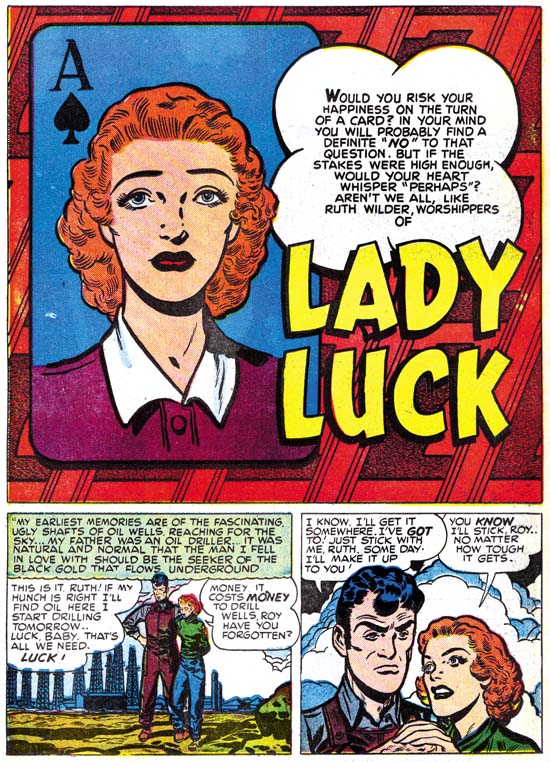
Young Love #1 (February 1949) “Lady Luck”, art by Bill Draut

Since Draut had such an outstanding presence during this period, I though I would include another example of his work. The splash has an interesting design using a card of an ace of spades as a visual link to the title and theme of “Lady Luck”. The background for the splash panel is very unusual and I have to admit I really cannot make out what it is supposed to represent. Most splashes by Draut do not have such an emphasis on design. Again I am undecided in splashes such as “Lady Luck”, where design is so important, whether the layout was supplied to Bill or not. Before leaving this story I would like to point out the way Bill presents the adoring Ruth in the last panel of the page. This particular upward gaze with the head slightly tilted was another of those trademarks of Bill Draut.

This period marks a change in Bill’s art work, although I am not certain what if anything can be made of it. The story “Shadows” (Young Romance #10 from March 1949) would be the last work for Simon and Kirby that Bill would sign. Previous his signatures appeared on a good fraction of his work but it would never again be used for anything else Bill did for S&K productions. I am only familiar with very little of Draut’s work after the Simon and Kirby studio closed but I have never seen a signature on any of it either.


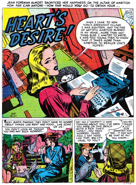
Young Romance #10 (March 1949) “Heart’s Desire”, art by Al Eadeh and John Belfi

Draut’s higher productivity during the period helped to offset Kirby’s declining presence but it was not enough to make up for it entirely. Especially since the team of Jerry Robinson and Mort Meskin were no longer contributing either. New artists, at least new for the Simon and Kirby studio, began to provide romance stories. The most important for this period may have been the team of Al Eadeh and John Belfi. Assuming I am correct in my attributions (only 2 of them were signed) Eadeh and Belfi provided 6 stories. The usual assumption in teams like this is that the first name of the signature is the penciler and the second the inker. It should be kept in mind that the division of labor was not always so complete, as for example with Robinson and Meskin where Meskin’s presence seems more then in just the inking. However Eadeh and Belfi divided up their work the same inking style was used even for the unsigned stories that I credit to them. Eadeh and Belfi’s art is not very distinctive but there are some features that help in identifying their work. Light haired woman have thin lines that do not suggest waves and curls very sensuously; often the lines of hair are almost straight even when doing a curl. The outlines for long hair vary in thickness along its length. Some men have distinctively shaped thick eyebrows.

The splash for “Heart’s Desire” has an interesting high and tilting viewpoint. This is not at all typical of their work for either splashes or the stories. I am not sure why they adopted this tilt in this case. It does allow the title and the woman’s confession to occupy the top of the panel leaving the rest with an unobstructed view. In any case it serves to make the image more interesting. I feel that the artists that did work for Simon and Kirby were usually the better ones in the business and that includes Eadeh and Belfi. They certain provided professionally done work and knew how to graphically tell a story. I do have to admit though that they really are not among my favorite S&K artists. Al Eadeh is probably best known for work he did for Timely/Atlas. John Belfi seemed to have worked for a number of outfits sometimes as penciler and other times as inker. Both Eadeh and Belfi are included in David Hajdu’s lengthy list in “The Ten-Cent Plague” of artists who did not continue working in comics “after the purge of the 1950s”.


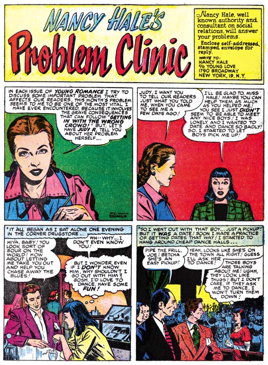
Young Love #2 (April 1949) “Nancy Hale’s Problem Clinic”, art by Vic Donahue

Another new artist for the S&K romance comics was Vic Donahue. During this period Vic would draw four of “Nancy Hale’s Problem Clinic” a short feature, usually 2 or 3 pages long, that appeared in both Young Romance and Young Love. Although Donahue was new to the romance titles his work had previously appeared in S&K crime comics starting with Headline #32 (October 1948). Vic would be associated with Simon and Kirby for a period of about three years but he never seemed to achieve much prominence in their productions. Sometimes Vic signed with his full name with a distinctive long line after the “Vic”, other times he would only use his first name but kept that long line. Donahue can best be recognized by his attractive but not overly beautiful woman. The slight tilt of Nancy Hale’s head in the first panel above shows up from time to time in Donahue’s women. It appears that, like most S&K studio artists, Vic generally did his own inking. Much attention was paid by Donahue in the rendering of hair. At times Vic used a pen to shadow an area with very straight fine lines as can be seen on Nancy Hale’s hand in the first panel of the image above. Donahue also occasionally used picket fence crosshatching or indicate shade by strong simple hatching with a brush. While both of those techniques are typical of the Studio style of inking, Vic did not use any other brush methods from that style.

There is one interesting exception to Vic Donahue as only an artist for the Nancy Hale feature during this period and that is the featured story for Young Love #4, “In Love with a Memory”. Jack Kirby penciled and inked the splash panel while Donahue drew and inked the bottom two panels as well as the rest of the story. The story matches Vic’s Nancy Hale work and does not seem to be based on Kirby layouts.


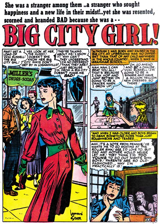
Young Romance #11 (May 1949) “Big City Girl”, art by Leonard Starr

A number of individuals did work for Simon and Kirby who would go on to become famous comic artists. I am not saying Joe and Jack discovered these artists but they did seem to recognized talent even during its early stages of emergence. One of these is certainly Leonard Starr. Leonard only appears in one story for the romance comics that I am covering in this post but was also appearing at this time in the western romances that I will be covering in a separate chapter. The first page for “Big City Girl” is laid out with a vertical splash with two story panels on the right side. This is not a splash page layout that Jack used at this time so once again I do not believe Joe or Jack did layouts for this story. Starr is good with his visual story telling and his woman are attractive but neither compares with what would come later when in 1957 when Starr create his syndication strip On Stage (later called Mary Perkins On Stage). That strip is currently being reprinted.


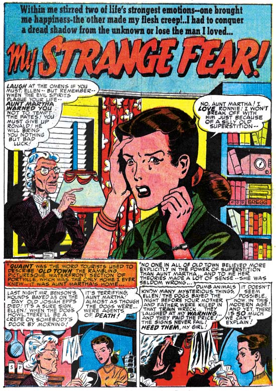
Young Love #4 (August 1949) “My Strange Fear”, art by George Gregg

An unexpected benefit of preparing for this blog post was the detecting of a signature that I had previously overlooked. There on a book spine of the splash for “My Strange Fear” is the name Gregg. I had already seen a similar signature on a story from Justice Traps the Guilty #17 (August 1950) “Best Seller” but I was never able to make out the correct spelling. The signature in “My Strange Fear” is very clear and I am certain that the artist must be George Gregg. Since this is a very recent discovery for me, I do not yet know how much a part Gregg will have in Simon and Kirby productions but since his other signed work is from a year after “My Strange Fear” there is a good chance more work will be found. Some of the eyebrows are very distinctive in “My Strange Fear” so it should not be hard to recognize George’s work even when a signature is lacking. Gregg is another of those artists found on Hajdu’s list of the ’50s purge victims.


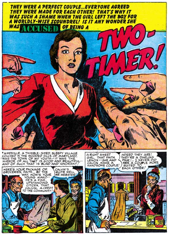
Young Love #4 (August 1949) “Two-Timer”, art by Bruno Premiani?

What can I say, sometimes I make mistakes. I had previously included “Two-Timer” in a post about John Prentice as the first work that he did for Simon and Kirby. At that time I recognized that the style was not typical of Prentice but felt that he had not yet matured into his final style. Later I came to realize that there was a body of work from August 1949 through October 1950 that was pretty consistent and distinct from John Prentice’s work which would not appear in Simon and Kirby productions until April 1951. Unfortunately none of the art by this earlier artist for Simon and Kirby was ever signed. Two stories by this artist were reprinted in “Real Love” where they were credited to Bruno Premiani. I do not know whether this was by Richard Howell, the editor of that book, or either Mark Evanier or Greg Theakston who are credited with supplying information. Nor do I know what formed the basis of that attribution. Because in cases such as this my motto is trust but verify, I have given some cursory examinations of some other comics attributed by Permiani, Tomahawk and Doom Patrol. Frankly nothing I saw convinced me that they were by the same artist. The material for DC is distinctly simpler, with much sparser inking, and the eyebrows of women are more arched. There are artists that adapt their style in relationship to the subject or genre they are working in and perhaps that is the case here. There is an excellent biography of Bruno Permiani which indicates that Bruno, born in Italy but had immigrated to Argentina, was in the U.S. during this time. For now I will be using the Premiani attribution but with a question mark to indicate my personal uncertainty.

Whether he is was truly Bruno Permiani or not, I have come to admire this studio artist greatly. Premiani only did work for Simon and Kirby for a little over a year but he contributes a fair amount of material (20 stories by my count). Bruno works in an illustrative style similar to that of John Prentice (hence my original confusion). The two can most easily be distinguished by their women; those by Prentice have a sophisticated beauty with slightly longer faces while Permiani’s women, although still attractive, are somewhat plainer with relatively straight eyebrows. Bruno had an ability to truly animate his subjects. Without using excessive poses or melodramatic rendering, Premiani’s people just seem to radiate their emotions.

I have not commented on every individual cover or story in this serial post; however I review everything for the titles belonging to a particular chapter. I try to remark on any of my attributions that might be different from credits supplied by other scholars, particularly the Jack Kirby Checklist. For those who are interested in my attributions of work not included in the serial post itself, I have added checklists for Young Romance and Young Love to the sidebar. I will be expanding these lists as new chapters The Art of Romance appear. I would prefer any comments about my attributions to be placed in the chapters of The Art of Romance where they are less likely to be overlooked.

Chapter 1, A New Genre (YR #1 – #4)
Chapter 2, Early Artists (YR #1 – #4)
Chapter 3, The Field No Longer Their’s Alone (YR #5 – #8)
Chapter 4, An Explosion of Romance (YR #9 – #12, YL #1 – #4)
Chapter 5, New Talent (YR #9 – 12, YL #1 – #4)
Chapter 6, Love on the Range (RWR #1 – #7, WL #1 – #6)
Chapter 7, More Love on the Range (RWR #1 – #7, WL #1 – #6)
Chapter 8, Kirby on the Range? (RWR #1 – #7, WL #1 – #6)
Chapter 9, More Romance (YR #13 – #16, YL #5 – #6)
Chapter 10, The Peak of the Love Glut (YR #17 – #20, YL #7 – #8)
Chapter 11, After the Glut (YR #21 – #23, YL #9 – #10)
Chapter 12, A Smaller Studio (YR #24 – #26, YL #12 – #14)
Chapter 13, Romance Bottoms Out (YR #27 – #29, YL #15 – #17)
Chapter 14, The Third Suspect (YR #30 – #32, YL #18 – #20)
Chapter 15, The Action of Romance (YR #33 – #35, YL #21 – #23)
Chapter 16, Someone Old and Someone New (YR #36 – #38, YL #24 – #26)
Chapter 17, The Assistant (YR #39 – #41, YL #27 – #29)
Chapter 18, Meskin Takes Over (YR #42 – #44, YL #30 – #32)
Chapter 19, More Artists (YR #45 – #47, YL #33 – #35)
Chapter 20, Romance Still Matters (YR #48 – #50, YL #36 – #38, YB #1)
Chapter 21, Roussos Messes Up (YR #51 – #53, YL #39 – #41, YB #2 – 3)
Chapter 22, He’s the Man (YR #54 – #56, YL #42 – #44, YB #4)
Chapter 23, New Ways of Doing Things (YR #57 – #59, YL #45 – #47, YB #5 – #6)
Chapter 24, A New Artist (YR #60 – #62, YL #48 – #50, YB #7 – #8)
Chapter 25, More New Faces (YR #63 – #65, YLe #51 – #53, YB #9 – #11)
Chapter 26, Goodbye Jack (YR #66 – #68, YL #54 – #56, YB #12 – #14)
Chapter 27, The Return of Mort (YR #69 – #71, YL #57 – #59, YB #15 – #17)
Chapter 28, A Glut of Artists (YR #72 – #74, YL #60 – #62, YB #18 & #19, IL #1 & #2)
Chapter 29, Trouble Begins (YR #75 – #77, YL #63 – #65, YB #20 – #22, IL #3 – #5)
Chapter 30, Transition (YR #78 – #80, YL #66 – #68, YBs #23 – #25, IL #6, ILY #7)
Chapter 30, Appendix (YB #23)
Chapter 31, Kirby, Kirby and More Kirby (YR #81 – #82, YL #69 – #70, YB #26 – #27)
Chapter 32, The Kirby Beat Goes On (YR #83 – #84, YL #71 – #72, YB #28 – #29)
Chapter 33, End of an Era (YR #85 – #87, YL #73, YB #30, AFL #1)
Chapter 34, A New Prize Title (YR #88 – #91, AFL #2 – #5, PL #1 – #2)
Chapter 35, Settling In ( YR #92 – #94, AFL #6 – #8, PL #3 – #5)
Appendix, J.O. Is Joe Orlando
Chapter 36, More Kirby (YR #95 – #97, AFL #9 – #11, PL #6 – #8)
Chapter 37, Some Surprises (YR #98 – #100, AFL #12 – #14, PL #9 – #11)
Chapter 38, All Things Must End (YR #101 – #103, AFL #15 – #17, PL #12 – #14)

Joe Simon’s Opinion on “Combat Photographer”

A couple of weeks ago in my post “More Obscure Simon and Kirby”, I presented “Combat Photographer” (Real Fact #2, May 1946) which I attributed to Joe Simon. Last week I was able to show Joe this piece to get his opinion. Although he did not remember doing it, Joe was certain that it was his own work. He was particularly convinced by the title design feeling that it was typical of his style. Joe also commented on the quality of the lettering, calling it second class, and wondered if he had done it himself. Personally I doubt that since the lettering does not match very well with examples that I am sure he lettered.

The Art of Romance, Chapter 4, An Explosion of Romance

(Young Romance #9 – #12, Young Love #1 – #4)

As I discussed in my previous chapter, other publishers did not fail to notice Prize’s success with Young Romance. Three competing romance titles had appeared with cover dates of September and October 1948. It is understandable that competitor publishers may not have fully understood what a gold mine Simon and Kirby had opened. Print runs of Young Romance were increased and with their deal S&K were getting a share of the profits. What was puzzling was the lack of response by Prize as well as Simon and Kirby for their own success as Young Romance continued to be a bimonthly. In February 1949, after about a year and a half of Young Romance, Simon and Kirby finally produced a new romance title, Young Love, which Prize also published. Both Young Romance and Young Love were initially bimonthlies but were released on an alternating schedule so a S&K romance would be available each month. The two titles shared similar contents without any distinguishing themes. Effectively S&K and Prize could have just as easily have made Young Romance a monthly. However having two bimonthly titles left open the possibility of future expansion by converting to monthly later. That was not the end of their plans, Simon and Kirby would also produce two new titles that combined the romance and western genre; Real West Romance (April 1949) and Western Love (July 1949). These later titles were true romances, but the western aspect gives them a distinguishing characteristic. Therefore I prefer to deal with the western romance titles sometime in the future in a separate chapter. In this and the following chapter I will write about the standard romance comics from Young Romance #9 (January 1949) until Young Love #4 (August 1949). The actual issues are Young Romance #9 to #12 and Young Love #1 to #4.

This period starts with just 4 publishers of romance and the same number of titles. By the end, that is cover date August 1949, there would be 12 publishers and 37 titles. Fox, one of the initial publishers after Prize, must have had a good response since by the end of this period they had 10 romance titles. Timely, another of the initial publishers had by August 6 love titles. Impressive as this is it was just the beginning of the rush to tap into the lucrative market opened by the romance genre. (Title information garnered from “All the Romance Comics Ever Published (?)” by Dan Stevenson.)

The artists that make the overwhelmingly greatest contribution to the Young Romance and Young Love in this period are the same ones from previous issues; Jack Kirby and Bill Draut. The real significant change is the proportion each of these two artists shared. Unlike before where Jack did the largest portion of the work, in this period Bill takes the lead. In the eight issues discussed here Kirby did 10 out of 44 stories and 112 pages out of 342. This compared to the 18 stories and 136 pages that Draut drew. The amount of art that Jack was producing for the crime genre titles had dropped during this period as well. The explanation was not for the artistic work that Kirby would provide to the new titles Real West Romance and Western Love as his contribution to those titles was relatively small. Adding these western romances to their other titles meant that Simon and Kirby were producing a lot of work. Joe Simon and others have said that Jack took an active part in the plotting of work done by all the studio artists. Perhaps plotting and other support activities were keeping Jack away from the drawing board more then before.
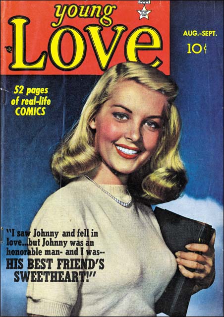

Young Love #4 (August 1949) photo cover of Joy Lansing

Not that Kirby lost his dominance in all artistic aspects during this period. Jack continued to be the chief supplier of the first story. This featured story generally was the longest with typically 10 to 14 pages compared to most of the other stories which often were 6 to 9 pages if not shorter. Occasionally art was included in the text stories that were required for lower postal rates. This was done 4 times with Jack supplying the art for 3 of those occasions. Most importantly Kirby continued to be the cover artist. All cover art was done by Jack but with one occasion there was a small insert added to the Kirby cover was lifted from a splash page penciled by Bill Draut. The big change came with Young Love #2 which saw the first use of a photograph as the cover for a Prize romance title. Nothing is provided that identifies the model for the cover but it does look like a head shot of some actress. The next two issues used photos of Joy Lansing described in one comic as a “Hal Roach Television Starlet” and in the other as a “MGM Starlet”. This is the beginning of a run of photographic covers for Young Love, but Young Romance would not follow suit until after the period under discussion.
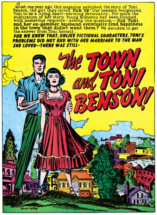

Young Romance #11 (May 1949) “The Town and Toni Benson”, art by Jack Kirby

While all the stories are good reads it is Kirby’s feature stories that seemed the most dramatic and explored the more interesting themes. In a rare example of continuity in romance comics “The Town and Toni Benson” returns to the same couple who were the subjects of “I Was a Pick-Up” the featured story from Young Romance #1. The majority of romance stories are about the start of a romance. Those that cover later periods in the relationship usually have a love lost and regained theme. In “The Town and Toni Benson” Jack explores the drama of a woman who married for love and not for money. In this story we see the couple’s struggle as they start their new life. Most of Simon and Kirby’s teenage readers would be more interested in the other themes I mentioned but I sure wish stories like this one would had been done more often.

In the issues that I cover in this post I continue to find some of Kirby’s best stand alone art work not on the covers but in the splash pages of the featured stories. The one for “The Town and Toni Benson” is a particular favorite. This may seem surprising because this is one of Simon and Kirby’s simplest splashes. There is no action and it lacks the melodrama found in many other romance art by Simon and Kirby, but it crystallizes the story’s theme. Toni stands erect, shoulders square, legs apart, as if braced to take on whatever the world may throw at her. Although her husband’s hands seem to offer support, it is Toni who projects the most courageous defiance. The breeze that ruffles Toni’s hair and shifts her dress is the only true action found in this splash. The town that embodies the difficulties that they will face together lies literally at their feet. The Studio Style inking, bold yet sensitive, provides just the right touch.
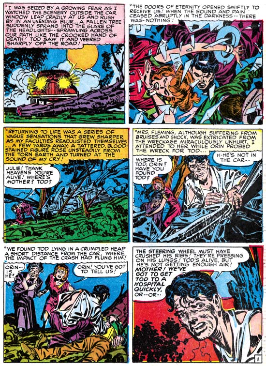

Young Romance #10 (March 1949) “Mama’s Boy” page 11, art by Jack Kirby

As I mentioned in a previous chapter Jack had a number of techniques to add interest to his romance work to compensate for the missing action that is such an essential aspect of the other comic genre. Methods like varying the “camera” angle or placing foreground objects in front of the primary characters. These various techniques show up in Kirby’s crime work as well but seem to play a more important part for the romance stories. Action, in its varied forms, is still inserted into romance stories by Jack as attested by the above image from “Mama’s Boy”. However note how the greatest action, the crash scene, is found in the second panel. The action is not the subject of this page but just the introduction. Here the drama resides in the injury that one an occupant of the car sustains. Although we see the slumped form of the hurt man it is from the fearful countenance of his disheveled friend in the last panel that we truly learn the seriousness state of the accident victim. This is another example of Kirby showing what a master he was even outside of the type of story telling that he is normally famous for. Further it is not just this page, the next one depicting the man performing an emergency operation out in the field with primitive tools. Again the drama is in the actors and we do not see the gory details of what is actually being done. This is years before the Comic Code, it is only Simon and Kirby’s own good taste that censors what we see. In my opinion, the story is all the better for the way it is handled.
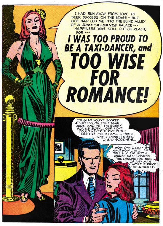

Young Love #2 (April 1949) “Too Wise for Romance”, art by Jack Kirby

Some have criticized Kirby’s females as not being very beautiful. While it is true that the harden yet sultry woman in “Too Wise for Romance” is no Barbie doll, surely she is beautiful in her own way? With hands on her hips and a plunging neckline she certainly projects an alluring image. It is obvious that Kirby has not studied classical sculpture but he still understands the importance of properly indicating the form of the flexed leg under the flowing dress. This is not as easy as Kirby makes it look as many others who have studied ancient Greek art have failed to pull it off so well. Once again Jack has created a very specific personality and not a generic beauty, but this is a romance story so do not be surprised that the sexy but formidable exterior hides a warm heart.

Like almost all feature story splashes this one uses a word balloon to provide the introduction and title. The single panel found in the corner has the appearance of a story panel but actually it is part of the splash. The true start of the story on the next page has a very different beginning.

The inking of this splash is as good an example of the Studio Style that could possibly be found. Picket fence crosshatching, drop strings, abstract arches and shoulder blots all play prominent parts on this page (see my Inking Glossary for an explanation of these terms). It is another one of those splashes that I find so much more effective then Jack’s own romance covers. This is a general observation that suggests that Joe and Jack purposely kept the more provocative art inside the cover where it would not attract as much unwanted attention from those who were foes, not fans, of comic books.
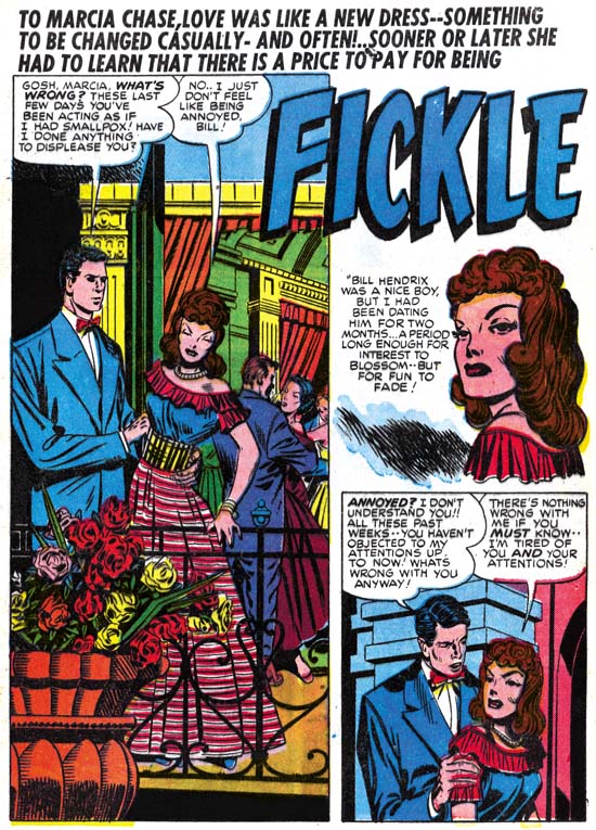

Young Love #1 (February 1949) “Fickle”, pencils by Jack Kirby

As in previous chapters of this serial post, I have found some stories that do not so perfectly match other contributions by Jack Kirby. “Fickle” is included in the Jack Kirby Checklist so here deviation from more typical Kirby work is not too great. But note the narrow clothing folds that dominate on the splash page shown above. Although we have seen narrow folds in some of the images I provided above (all of which I believe were inked by Kirby himself) they are used when the image calls for them. Otherwise clothing folds are generally indicated by picket fence crosshatching or simple spatulate and frond shapes. Elsewhere in “Fickle” can be found all the inking mannerisms typical of the Studio Style but still the long narrow clothing folds persist. Jack did not ink this page but the artist who did was very comfortable with the Studio Style. The inker may also have altered the man on this page, note how the head seems too small for his body.
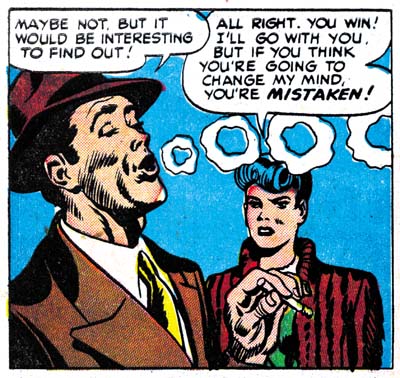

Young Romance #9 (January 1949) “The Easy Life” page 6 panel 1, art by Jack Kirby and Joe Simon

While “Fickle” was recognized as a Kirby work by the Jack Kirby Checklist, “The Easy Life” was not. It is not hard to understand why as most of the art in this story does not have so obvious a Kirby touch as compared to those I have discussed and illustrated above. There are some parts where there can be little doubt about Jack’s contribution. Perhaps the most convincing is the smoker in the panel from page 6 shown above. The woman sharing the panel is not so certainly a work by Jack. As I commented in a previous chapter there are a number of explanations for this state of affairs. I think we can discount an artist simply swiping from Kirby; the smoker is much too good to be just that. That still leaves other possible explanations; an artist working from Kirby layouts, the effects of an inker on Kirby pencils, or Jack in his roll as art editor fixing up another artist’s work. The way to choose between these options rests in the examination of the entire store, not just individual panels.
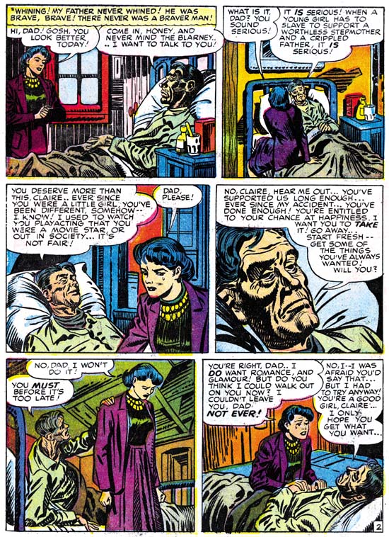

Young Romance #9 (January 1949) “The Easy Life” page 2, art by Jack Kirby and Joe Simon

Unfortunately it is inappropriate, perhaps even illegal, in a blog like this to provide images for the entire story. All I can say is that I believe the layouts used throughout are in good agreement with the page I present above. The graphic story telling methods found seem consistently like those used by Kirby. Therefore I believe we can exclude the Kirby as art editor explanation. The story is so uniform throughout that it does not appear to be an “in betweener” work (where Kirby would lay out a story for another artist starting with tight pencils, providing little more then roughs through most of the story and then tightening up again at the end). It comes down to a judgment call, one that others might disagree, but I find the art looks enough like Kirby’s that I accept this as his pencils inked by another artist. The inking is interesting because it is done quite well in the Studio Style. Trademarks of that style such as picket fence crosshatching, drop strings, abstract arch shadows and shoulder blots are used. Of all the art in the story it is the main character Claire that looks the least like Kirby’s work. I find the drawing of Claire in panel 3 of the above page to particularly resemble work done by Joe Simon. I believe Joe has “corrected” Kirby’s main character in order to make her more beautiful. Simon did the same thing in the DC reprints of Black Magic from the ’70s. This is another of those cases where a simple designation of the penciler and inker really does not adequately describe what was going on. (Lately I keep encountering issues related to Joe Simon’s inking so I clearly have to address that subject soon.)

Jack Kirby was not the only artist in these particular romance comics nor is he the only subject of interest for this blog. Besides Bill Draut’s greater presence there are a few other artists that make their first appearance in a Simon and Kirby comic. They will be the subject of next week’s Chapter 5 of The Art of Romance.

Chapter 1, A New Genre (YR #1 – #4)
Chapter 2, Early Artists (YR #1 – #4)
Chapter 3, The Field No Longer Their’s Alone (YR #5 – #8)
Chapter 4, An Explosion of Romance (YR #9 – #12, YL #1 – #4)
Chapter 5, New Talent (YR #9 – 12, YL #1 – #4)
Chapter 6, Love on the Range (RWR #1 – #7, WL #1 – #6)
Chapter 7, More Love on the Range (RWR #1 – #7, WL #1 – #6)
Chapter 8, Kirby on the Range? (RWR #1 – #7, WL #1 – #6)
Chapter 9, More Romance (YR #13 – #16, YL #5 – #6)
Chapter 10, The Peak of the Love Glut (YR #17 – #20, YL #7 – #8)
Chapter 11, After the Glut (YR #21 – #23, YL #9 – #10)
Chapter 12, A Smaller Studio (YR #24 – #26, YL #12 – #14)
Chapter 13, Romance Bottoms Out (YR #27 – #29, YL #15 – #17)
Chapter 14, The Third Suspect (YR #30 – #32, YL #18 – #20)
Chapter 15, The Action of Romance (YR #33 – #35, YL #21 – #23)
Chapter 16, Someone Old and Someone New (YR #36 – #38, YL #24 – #26)
Chapter 17, The Assistant (YR #39 – #41, YL #27 – #29)
Chapter 18, Meskin Takes Over (YR #42 – #44, YL #30 – #32)
Chapter 19, More Artists (YR #45 – #47, YL #33 – #35)
Chapter 20, Romance Still Matters (YR #48 – #50, YL #36 – #38, YB #1)
Chapter 21, Roussos Messes Up (YR #51 – #53, YL #39 – #41, YB #2 – 3)
Chapter 22, He’s the Man (YR #54 – #56, YL #42 – #44, YB #4)
Chapter 23, New Ways of Doing Things (YR #57 – #59, YL #45 – #47, YB #5 – #6)
Chapter 24, A New Artist (YR #60 – #62, YL #48 – #50, YB #7 – #8)
Chapter 25, More New Faces (YR #63 – #65, YLe #51 – #53, YB #9 – #11)
Chapter 26, Goodbye Jack (YR #66 – #68, YL #54 – #56, YB #12 – #14)
Chapter 27, The Return of Mort (YR #69 – #71, YL #57 – #59, YB #15 – #17)
Chapter 28, A Glut of Artists (YR #72 – #74, YL #60 – #62, YB #18 & #19, IL #1 & #2)
Chapter 29, Trouble Begins (YR #75 – #77, YL #63 – #65, YB #20 – #22, IL #3 – #5)
Chapter 30, Transition (YR #78 – #80, YL #66 – #68, YBs #23 – #25, IL #6, ILY #7)
Chapter 30, Appendix (YB #23)
Chapter 31, Kirby, Kirby and More Kirby (YR #81 – #82, YL #69 – #70, YB #26 – #27)
Chapter 32, The Kirby Beat Goes On (YR #83 – #84, YL #71 – #72, YB #28 – #29)
Chapter 33, End of an Era (YR #85 – #87, YL #73, YB #30, AFL #1)
Chapter 34, A New Prize Title (YR #88 – #91, AFL #2 – #5, PL #1 – #2)
Chapter 35, Settling In ( YR #92 – #94, AFL #6 – #8, PL #3 – #5)
Appendix, J.O. Is Joe Orlando
Chapter 36, More Kirby (YR #95 – #97, AFL #9 – #11, PL #6 – #8)
Chapter 37, Some Surprises (YR #98 – #100, AFL #12 – #14, PL #9 – #11)
Chapter 38, All Things Must End (YR #101 – #103, AFL #15 – #17, PL #12 – #14)
An Unexpected Simon and Kirby Ashcan


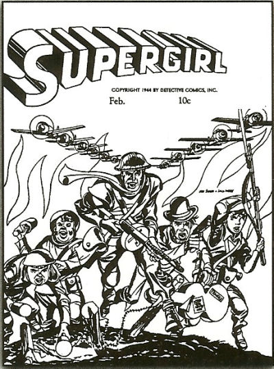
Supergirl (ashcan) (February, with 1944 copyright) (image from the GCD)

I was perusing a list of works attributed to Joe Simon in the GCD database when I spotted something very odd, a Supergirl ashcan by Simon and Kirby. Of course Simon and Kirby did not really do a Supergirl cover, DC staff just used a copy of the S&K art of the cover for Boy Commandos #1 (Winter 1942/1943) and added above it the Supergirl title. The DC staff produced ashcans so that they could copyright the title and so prevent any other publisher from using it. Ashcans can be produced quickly as they are not subject to the months required to publish an actual comic book. It would be unfortunate, to say the least, to published a new title only to have competitor come out earlier with a book with the same title. DC did something similar previously when they made an ashcan for Boy Commandos. I am bothered by some of the details in this particular case. Basically why Supergirl at this time and why use this particular piece of Simon and Kirby art?

Supergirl would not have a debut until Action Comics #252 (May 1959) that is not for about 15 years later. Granted the copyright would still be valid but it does seem an unreasonable long delay. The answer may not be when Supergirl would be first published but when Superboy was. Superboy first appeared in More Fun Comics #101 (January 1945). With Superman and now Superboy, it did not take much of a stretch in imagination DC’s part that perhaps they should protect other variations as well. Well a search of GCD reveals that an ashcan had already been made for Superwoman (copyright 1941 but with a January 1942 cover date). Therefore making one for Supergirl as well seems a reasonable precaution. Simon and Kirby later did something similar when they created Stuntman. Stuntman #2 has an inside cover advertising the coming of Stuntboy and Stuntgirl. Although unpublished Stuntman art still exists none of it includes either Stuntboy or Stuntgirl. Joe Simon has said that he does not remember creating these variations either. But the ad includes copyright and pending trademarks so in all probability Simon and Kirby were just trying to protect what they hoped would be a successful new title.

The Supergirl ashcan cover date provides only the month (February) while the copyright notice gives only the year (1944). Now it may seem obvious to just combine the two for a February 1944 date as GCD has done in their listing. This is not unreasonable but it would indicate that planning for Superboy was done for quite a few months before it was actually release. However if we follow the example given by the Superwoman ashcan and provide a cover date for the Supergirl ashcan as February 1945 we have one very close in agreement with Superboy’s release (January 1945). The means of choosing between the two possibilities would be the actual contents of the ashcan as it would be expected that the most current stories would be used. Unfortunately the interior is not indexed in the GCD listing. Oddly the notes that I toke when I first came across the Supergirl ashcan listing was that there was an unconfirmed report that the contents were from Action #80 (January 1945). If that turns out to be true then the February 1945 would be the correct cover date for the Supergirl ashcan.

My second puzzle was why a cover for Boy Commandos #1 was used for the Supergirl ashcan. It is not that I expect Supergirl to appear on the cover. DC was insuring their copyrights and not planning to actually produce a Supergirl comic at that time. The ashcan for Superwoman had unrelated cover art as well. For me the question is why the cover art for the Supergirl ashcan was not something more current. The Boy Commandos #1 was cover dated Winter 1942/1943. Even if we accept the earlier February 1944 as the cover date for the Supergirl ashcan that still means the art used was about a year old. The only explanation I can hazard, with absolutely nothing to back it up, is that perhaps a foreign edition of Boys Commandos had more recently been prepared. DC did occasionally prepare foreign comics (to be printed in the country it would be released in) and these often were done some time after the initial U.S. release. However I have no idea if DC was doing this during the war or whether Boy Commandos had received that treatment.

One final note, in this blog I try to respect the copyrights of others. After all I am asking everyone to respect not only my rights, but most importantly those of Joe Simon who has generously allows me to include images from his personal collection. Joe’s collection and my own, augmented occasionally by helpful individuals, are generally sufficient to provide enough examples to use in the posts for this blog. But there are rare exceptions where the GCD has images that I otherwise do not have access to. So some time ago I contacted GCD and ask if it would be okay to occasionally use their images (giving them the proper credit). So I would like to thank the GCD (Grand Comic-Book Database) for giving me permission to do so.

Black Rider’s Final Ride


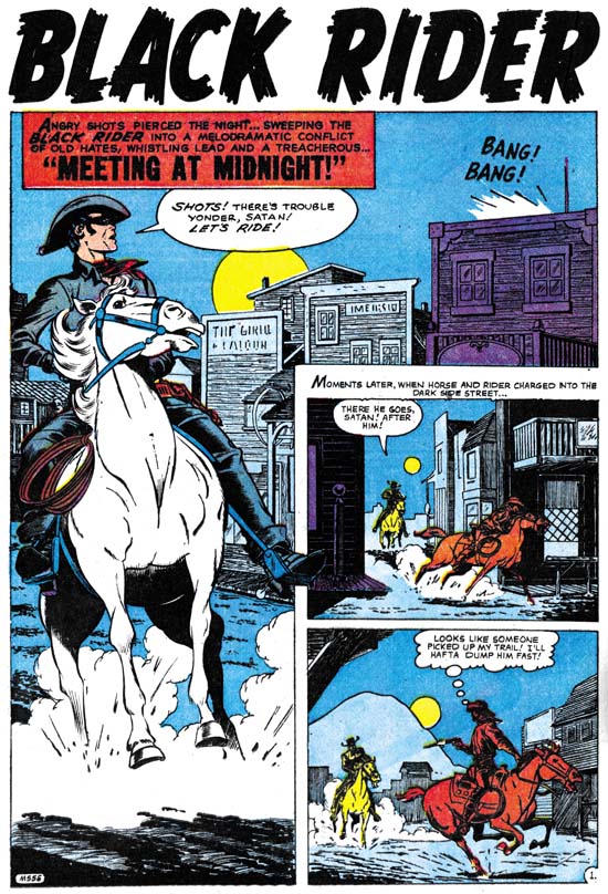
Kid Colt Outlaw #86 (September 1959) “Meeting at Midnight”, art by Jack Kirby

“Meeting at Midnight” is the last Kirby Black Rider story to be published, and the last one that I have occasion to post about as well. The job number (M-556) indicates that the story was likely to have been done prior to the Atlas Implosion. The existence of two other Kirby Black Rider stories (“Trouble in Leadville” and “The Raiders Strike“) that also have ‘M’ job numbers suggest that all were originally intended for an unpublished Black Rider Rides Again #2, a casualty of the Implosion.

The story opens with the Black Rider arriving in town as shots are fired. He finds the shooter but looses him in the pursuit. Changing back to his identity as the town doctor he treats a man who claims to have been wounded while cleaning his gun. Suspicious, Doc reverts back to the Black Rider and observes his patient providing money to another; the wounded man is being blackmailed. The two men arrange for another meeting the next night. Back in his public identity, the Doc slips his patient a sedative and goes as the Black Rider to the appointment with the blackmailer. A gun fight ensues and, while trying to escape, the blackmailer falls to his death.

The plots of this and the other Black Rider stories are so repetitive that this feature is not one I care for very much. That repetition is so unlike Jack’s writing style that I seriously doubt whether he made any substantial contribution to the plotting or the writing. One of the reasons for my interest in Kirby’s pre-Implosion art for Atlas is the amount of control Jack seemed to have on some of that work. Unfortunately for “Meeting at Midnight” not only was Jack not the writer, he was not the inker either. I personally cannot say who the inked this story, Atlas inkers are a subject I know next to nothing about. The Jack Kirby Checklist credits Bill Everett as the inker, while Atlas Tales and the GCD attribute it to George Klein.

The drawing of all the Kirby Black Rider stories, excepting “Meeting at Midnight”, is very stylized with elongated figures or limbs. A similar style can be found in another western that Jack both penciled and inked “No Man Can Outdraw Him” (posted on here and here). The stories from Black Rider Rides Again #1 and “No Man Can Outdraw Him” were inked by Kirby in a manner that I think works quite well with the stylized drawing giving the final art an expressionistic look. The inker(s) of “The Raiders Strike” and “Trouble in Leadville” adopted a different, more intricate, inking but otherwise remaining faithful to Kirby’s pencils. I find that this results in figures that look freakish. The figures in “Meeting at Midnight” do not look so stylized and I think this was the result of the inker adjusting Kirby’s pencils. As I said I am no scholar of Atlas comics, but I will hazard an observation that the art for “Meeting at Midnight” looks closer to Kirby’s later Atlas/Marvel westerns. Perhaps the inking was not done at the time of the Implosion but only when it was decided that this story would be published in the Kid Colt Outlaw title.

More Obscure Simon and Kirby

Simon and Kirby’s new titles Stuntman (April 1946) and Boy Explorers (May) were published by their old friend Al Harvey. The decision to jump ship from DC was purely business but Liebowitz complained about not getting a chance to bid for their services. It was a decision that Joe and Jack would regret as the new titles were quickly cancelled, victims of a comic glut that followed the end of paper rationing. Jack and Joe would continue to do work for DC for their old feature Boy Commandos, but Sandman was cancelled (last S&K was Adventure #102 February 1946) and the Newsboy Legion would only last a short while longer (last S&K was Star Spangled #61 October 1946). Before this not everyone at DC was happy with how Simon and Kirby made their comics, now their critics had more ammunition to use against them. Even in the difficult times that followed, DC was either not approached or not interested in renewing their previous relationship with S&K. Because the art for comics is done months before it would be finally released it is not clear whether the work for Real Fact #2 (May) was done before or after DC found out about Simon and Kirby’s deal with Harvey.

Real Fact #2
Real Fact #2 (May 1946) “A World of Thinking Robots”, art by Jack Kirby

In the second issue of Real Fact, Jack Kirby returns to provide another short graphic article predicting the future. The prescient abilities of the scripter, whoever that was, was both good and poor at the same time. Robots are shown performing four tasks; as factory workers, secretaries, sport contestants, and house cleaners. The first two predictions can be said to becoming true today, the third is a qualified success, while the last is in its infancy at best. Robots are often encountered in a factory setting; some automobile assembly lines are famous examples. Modern software can take vocal dictation and produce pretty accurately typed text. While presently there are no robots playing football or any other human sport there are robotic tournaments that attract a small but devoted following. A robot house keeper would seem the most desirable of all but so far there has been only limited success. The one I know of is a robot that wanders around vacuuming the floor. This all sound like pretty successful predictions, except that a humanoid shaped robot is not used for any of the current examples. There are humanoid robots but so far they have not been used for any of those tasks nor is there any reason to believe they ever will be. The human form is a generalist approach; pretty good for many diverse tasks but not perfect for any. Why settle for a general factory worker when you can design more efficient one for specific tasks? As far the second part of the prediction, the idea of “thinking robots”, presently there are no Artificial Intelligent programs that come anywhere near to be described as thinking. Further those advances in the field of AI have not had much impact on robotics.

Artistically there really is not much to say about this piece. Once again I cannot help but feel that Jack would do more exciting machinery much later in his career. The inking is adequate but perhaps not too impressive. At this time I just cannot say whether this is Jack’s inking or not.

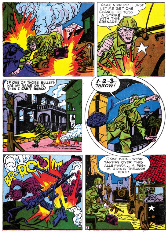
During my examination of Real Fact #2 in preparation for this post I kept being impressed by how the art for “Combat Photographer” resembled Joe Simon’s work. Initially I dismissed it as just a coincidence. As far as I know nobody has attributed this piece to Simon and while he was teamed up with Kirby, Joe did little penciling himself. Nonetheless upon repeated examinations I kept finding more things to suggest Joe Simon’s hand until I ended up convincing myself that this was his. Still I am bothered about this attribution because most new discoveries of examples of Simon’s art have often in the end been shown not to be by Joe. Perhaps I should have held off on reporting this case until further investigation and upon getting Joe’s own opinion. However in this blog I prefer to present my latest opinions which sometimes change over time. If I come to decide I have made a mistake I will post on that as well. In the mean time let me try to describe what leads me to credit this story to Joe as well as well as what evidence that does not fit so well with that attribution.

Real Fact #2
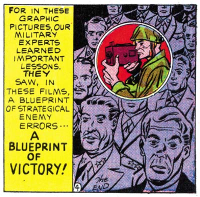
Real Fact #2 (May 1946) “Combat Photographer” page 4 panel 6, art by Joe Simon

I find the manner of drawing figures matches quite well with Joe Simon BC (Before Kirby, a term that Joe uses that I find mildly humorous because of the way it reverses the normal manner of Kirby fans changing ‘C’ to ‘K’ as for example Kirby Kolor). There are examples to be found in Silver Streak #2, Target Comics #1 and #2, Daring Mystery #2, and Amazing Man #10. Note in particular how in panel 2 of page 3 (image below) the eyes and eyebrows are joined in a single angular shape; this is a typical early mannerism of Joe’s. There are also some similarities to be found in more recent work by Joe in Boys Commandos #12 and Adventure is My Career. The greatest similarity of the work closest in date to “Combat Photographer” is perhaps the cover for 48 Famous Americans (1947), but some may not find that convincing because that cover is often misattributed to Jack Kirby. At the time that Real Fact #2 was done Joe was penciling Duke of Broadway, Vagabond Prince and Kid Adonis for Harvey. For the most part those Harvey features have a somewhat different style but note the similarity of the final panel from the Real Fact #2 story (image above) with that style. There is a parallel to be found with the double page splash from Boy Explorers #1 which also combines two styles; one with a more earlier flavor and the other that predominates in Joe’s work for those Harvey features.

Real Fact #2
Real Fact #2 (May 1946) “Combat Photographer” page 3, art by Joe Simon

I am not sure whether circular panels were picked up by Jack or Joe first. It was a layout technique that both artists used in their work for Harvey. There is a perfectly good example of a circular panel on page 3 (see above). The device of extending a figure outside the panel border was typical of previous Simon and Kirby but pretty much dropped after the war. The circular panel from this story has figures that extend only slightly beyond the frame. Joe has adopted some mannerisms that seem to appear first in pencils by Kirby. Note for instance the square fist in the second panel. Another example is found in the man running in the third panel that has the sole of his foot turned toward the viewer.

Not everything about “Combat Photographer” favors attributing it to Joe Simon. My chief concern is that it is Joe’s early work that shows the greatest similarity. Part of what suggests the Simon BK work is simplicity in drawing that does not compare exactly with what Joe was doing at the same time for Harvey. Logically you would expect the greatest similarity would be among the work produced concurrently. The inking agrees with the pencils in being very simple, almost primitive. I have not done a close comparison with Simon’s inking (I will review Simon’s inking someday, I promise) but I am not convinced the brushwork here is by Joe. The layouts for “Combat Photographer” predominately uses distance shots while Joe’s Harvey work is much more varied in viewpoints. I do not consider any of this fatal to my crediting Simon for this art, but I do not want to ignore them either.

Initially I was also concerned about the odd placement of the page numbers, which is on the left side of a panel. This is very untypical for Simon and Kirby. The last panel of the story has a little “the end” written in a manner that does not look like anything I have seen from S&K. However further examination revealed that both of these features are found in other stories in Real Fact. They therefore are derived from the editor or the letterer and have no bearing on the question of the attribution of this art.

Real Fact #9
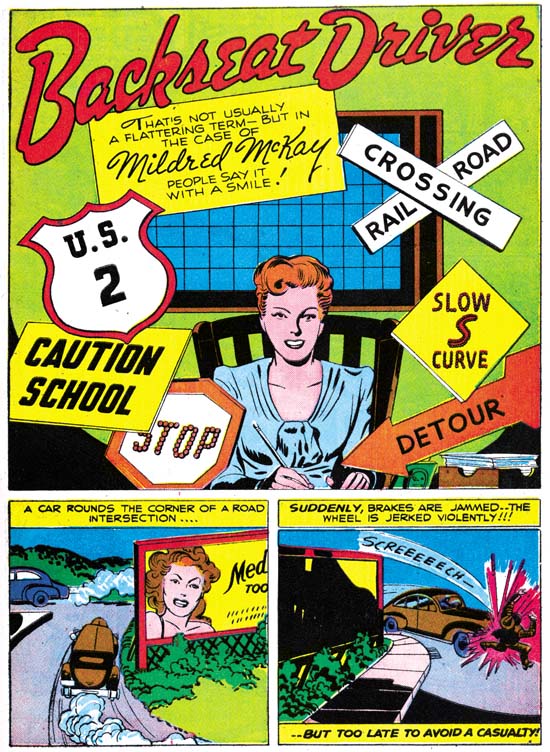
Real Fact #9 (July 1947) “Backseat Driver”, art by Jack Kirby

The next time Simon and Kirby appeared in a Real Fact was a little over a year later. That they appeared then is surprising because by this time they had already launched their version of crime genre and must have been preparing for their soon to be released romance comics. However I have never heard of Simon and Kirby turning away any work and who can tell how long DC kept this piece as inventory before using it. The story is about a lady who distressed by the number of automobile accidents decides to open a driver school. If you excuse the pun, it might not sound like a very good vehicle for Kirby’s talents but actually Jack manages to make it very interesting. On the opening page Kirby shows a pedestrian being hit by a car, only to show on the next page that the victim was literally a dummy. Other examples of actual or near accidents provide further action. For those panels that could be described as talking heads, Jack is already showing the use of varying viewpoints and distances, and the placing of main focus behind a foreground of objects or lesser important people. These visual techniques would play a big part in Kirby’s romance art where standard actions were not always appropriate. I would not call “Backseat Driver” a masterpiece but it is far from being a failure.

The art that Simon and Kirby did at that time for their crime comics was inked in the classic Studio Style with picket fence crosshatching, drop strings and abstract arches (see the Inking Glossary for explanations of these terms). Few of these inking techniques are found in “Backseat Driver”. The splash shows clothing folds that are simple spatulate shapes often attached to a thin line almost like they are leaves on a stem. The entire splash has an overall light look because of the limited use of blacks. When blacks are used they tend to flood an area. Those who have read my serial post Jack Kirby’s Austere Inking may recognize this as an excellent description of that style, this despite the fact that the Severe Style would not show up until about nine years later. However as I reported last week, Picture News #1 also has portions that could be described as a Proto-Severe Style. Not everything in this splash is fully reminiscent of the Severe Style. Some of the spatulate clothing folds are offset a little from the narrow lines. The spotting on the woman’s right breast has a feathering more typical of style used on earlier DC work. I believe the splash was inked by Jack himself but the two panels below just do not offer enough to provide a convincing inking attribution. The other three pages share with the splash an overall lightness and simplicity in the inking. However the inking does not appear as sensitive and the clothing folds do not match the manner found in the splash. I am not ready to provide inking credits for those pages but I do not think it was Kirby. It is among the other three pages that can be found some drop strings and shoulder blots.

Before Simon and Kirby crime and romance comics the duo had tried their hands in a number of categories not typically associated with them. Besides the supposedly true stories done for Picture News and Real Fact, Joe and Jack also tried teenage humor (My Date Comics and Pipsy) and kiddy humor (Lockjaw and Earl the Rich Rabbit for Punch and Judy). None of these were successful but they do show that Simon and Kirby were talented enough to give them a good try.