Category Archives: Speaking Of Art

Speaking of Art, Secondary Artists

Joe Simon had accumulated a rather large collection of art. Not surprisingly many were works that he created over his long career starting when he was a staff artist for a newspaper. Also as might be expected there are a fair number of works drawn by Joe’s long time collaborator, Jack Kirby. However that does not mean, as I suspect some people believe, that Kirby material dominates the collection. Rather much of Joe’s art collection consists of work by a variety of lesser known artists. I thought I would discuss just a few of them selected for various reasons.


Police Trap #3 (January 1955) “Tough Beat”, pencils and inks by Bill Draut

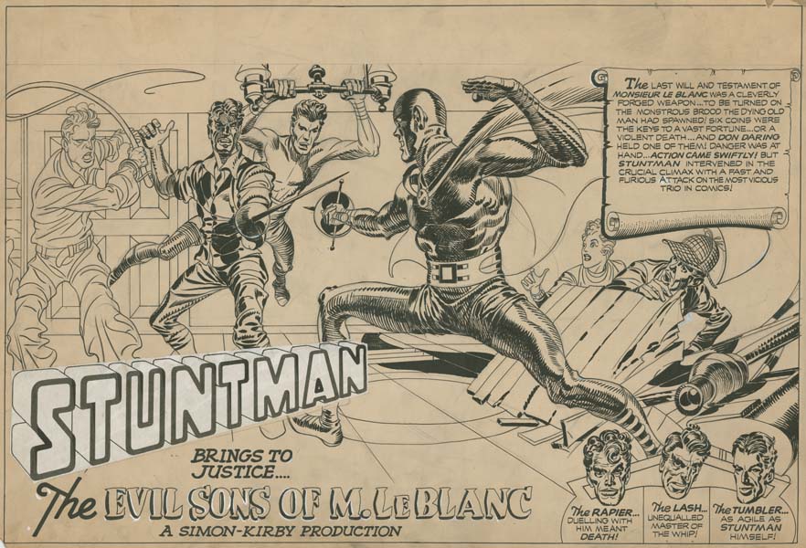
Long time readers of this blog are by now quite aware that Simon and Kirby were not just a great artistic team but also produced comic books that included work by a large assortment of artists. I have spent much time trying to identify the various artists who worked for Joe and Jack with some, but by no means complete, success. However any reader can correctly attribute the artist for a large majority of Simon and Kirby productions if they can learn to spot three particular artists. I have been fond of calling the three artists the usual suspects. Foremost among the usual suspects was Bill Draut who had a long history of working for Joe and Jack. While Draut contributed a lot of art to S&K productions, Simon’s collection only has work by Bill from three periods; from right after the war at the time S&K were producing Stuntman and Boy Explorers for Harvey Comics, from S&K own publishing company Mainline Comics, and from the 60’s when Harvey briefly tried to cash in the renewed interest in superheroes. The reason for the rather limited periods found in Joe’s collection is that Joe’s collected primarily from work on hand when a projects terminated or art he recovered years later from Harvey, Archie and DC.

Joe’s collection has a fair amount of work created by Bill Draut and the example I provide is from Police Trap a Mainline comic book. Although Draut did a lot of romance work (as did all the Simon and Kirby artists) he could be quite adept at depicting action as can be seen in the lower splash panel. What a great assortment of characters. Note the way Draut depicts the bricks in the background building; inked as simple rectangular black shapes obviously executed without the use of a straight edge and forming small isolated groups. This manner of drawing bricks was quite typical of Draut.

It is hard to tell from the low resolution image that I have provided, but the discoloration at the top of the page is not due to some odd staining but rather the yellowing of tracing paper that has been attached to the illustration board. Bill did this as a time saving device. The final panel of the last page of the story is the same street scene differently inked to suggest another time of day. Rather than redraw the same scene, Draut put tracing paper over the final panel and inked directly on the tracing paper. When finished he just attached the results to the top of the first page.


Chamber of Chills #24 (July 1954) “Credit and Loss”, pencils and inks by Mort Meskin

Simon’s collection does not include many examples of original art by the second of the usual suspects, Mort Meskin. This is not because Joe did not like Mort’s art. Quite the contrary as shown by the fact that Joe had gathered together flats* for many of Meskin’s splash pages. This was something that Simon had done for Mort and no other artist. But the absence of Meskin original art was due to the fact that Mort did not work for Simon and Kirby during the Stuntman period and did little work during the Mainline period except for some covers (where apparently Meskin kept the original art). The one good example of Meskin original art that Joe had was not created for Simon and Kirby but for Harvey Comics. I suspect that Joe had retrieved it from the Harvey inventory some years later. It was fortunate that Simon had done so because it is, in my opinion, the finest comic book work that Meskin had ever done since the war. Great control of the story telling through devices like use of the viewpoint, marvelous drawing and superb inking.

OrigArtPrentice3
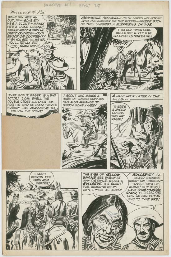
Bullseye #1 (August 1954) “Bullseye, the Man”, pencils and inks by John Prentice

John Prentice is the final of the three usual suspects. Prentice started working for Simon and Kirby even later then Mort Meskin. Joe’s collection had some examples of Prentice’s art but perhaps the most interesting is the art he did for Bullseye. There was a time that many claimed that Kirby provided layouts for the artists that worked for Simon and Kirby. One of the primary methods that I have used to investigate that claim was the way different artists used panel shapes. From that I feel quite confident that as a rule Kirby did not provide layouts for the other artists. But there are exceptions to that rule and Bullseye maybe one of them. I am not saying that Kirby provided complete layouts for Prentice’s Bullseye work but did appear to do so for at least some parts.

Unfortunately when Simon and Kirby wanted to retell the origin story for Bullseye #3 rather than redraw it Joe simply cut desired panels out of the earlier original art and pasted them together. Because of this it is not unusual to see original art from the first issue of Bullseye missing a panel or two.


Bullseye #3 (December 1954) “The Adventures of Sheriff Shorty”, pencils and inks by Leonard Starr

Joe’s collection not only included art by the three usual suspects but other artists as well. Leonard Starr is much better known for his work on the syndication strip Mary Perkins On Stage but he also had a long career as a comic book artists included occasional work for Simon and Kirby. The example I select comes from Bullseye #3. As it was published the story appears to be unsigned but careful examination of the original art shows otherwise. The vertically oriented signature appears the bottom left edge of the splash panel. Or rather half the signature is there as the panel border now cuts through it. But enough remains to show that it is in facts Starr’s autograph.


Foxhole #3 (February 1955) “The Face”, pencils and inks by Joaquin Albistur

Some artists that worked for Simon and Kirby are pretty much unknown entities for today’s fans. Jo Albistur only worked for Joe and Jack for a little over a year but produced a fair amount of art during that time. But Albistur did very little comic book art for any other publisher and only a small number of his original art have ever appeared on the market. The gimmick used for Foxhole was that the stories were created by actual war veterans. Because Albistur was from Argentina and had not served in the U. S. military, he was not suitable to receive any credit in Foxhole. But when credit was provided in Foxhole it was not always just for the graphic artists for instance writer Jack Oleck also occasionally received Foxhole credits. For “The Face” credit is given to Jack Kirby. Now Kirby certainly was a war veteran but he neither drew nor laid out this story. Further (and I may get in trouble among certain fans) I am convinced he did not write this story either. However it is known that Jack provided plots to some of the script writers that Simon and Kirby employed and perhaps it was in that capacity that this story is credited to him.


Chamber of Chills #24 (July 1954) “Grim Years”, pencils? and inks? by Manny Stallman

The Simon collection includes work by Manny Stallman. I attribute the work to Stallman with some trepidation. Stallman provided signed work for Simon and Kirby productions but when that art is carefully examined it becomes obvious that four different artists did the penciling (It’s A Crime Chapter 7, Chapter 8 and Chapter 9). Apparently Stallman was using ghost artists to pencil the work that he would then ink and often sign as his own. The work by Stallman from Joe’s collection was not created for Simon and Kirby but rather for Harvey Comics. Unfortunately it was unsigned and the pencils done in yet another style so the attribution is very provisional. But whoever penciled and inked the work the final results are rather nice.

Artists like the ones discussed in this post do not get much recognition these days. That is a shame because they really were talented artists. Now I do not want sound disdainful of contemporary artists because there is a lot of great comic book work being produced today. But let us face it, not all of them are superstars. But I am sadden that original art by secondary contemporary artists sell for much, much more than that by earlier artists. That despite the fact that relatively little of the work of the older artists has survived. It is obvious that most of today’s fans really have little interest in older original comic book art. If the reader is a collector of original art that does not share this low opinion of older work, keep an eye on the upcoming Heritage auctions as I am sure some great deals can be made.

* flats – Proofs of the line art printed on sheets in the same way finished comic book would be.

Speaking of Art, Joe Simon’s Hector Protector

Hector Protector was dressed all in green;
Hector Protector was sent to the Queen.
The Queen did not like him,
Nor more did the King;
So Hector Protector was sent back again.

This, Like so many other nursery rhymes, may seem like nonsensical verse. One theory is that Hector Protector was based on a Richard, Duke of York from 15th century England. I really cannot say how true that theory is but I can say that Joe Simon was aware of the nursery rhyme and based some of his advertisement work on Hector Protector. Joe once told me that he also called the character something like Forester Bill but whenever I found a name applied to the character it was always Hector Protector.

I had previously briefly discussed Hector Protector (Joe Simon’s Career in Advertising) where I provided some examples of layouts that Joe made in preparation for publication. The work Joe did was for Mechanics National Bank which I believe was located in New Jersey. I have never actually seen the published results but that is not too surprising because it would likely have been used as advertisements in small regional newspapers.

All the finished Hector Protector art was executed in color. This despite the fact that all the layouts I have seen made for black and white publications. At the time Joe had his own stat camera so that it was easy for him to prepare art for black and white publications but and color work had to be handled by others.

For the most part, Joe did not apply text to the actual artwork presumably as this allowed for repeated use of an image with different text. The art would be used to advertise a bank so it is not hard to imagine what sort of text might be applied to art like the one shown above. I am sure it would promote getting loans from Mechanics National Bank.

A chipmunk with all the nuts he saved was another natural image for use in a bank advertisement.

Others are a little harder to deduce what the accompanying text might be like. All the Hector Protector images share a similar sense of humor. Not sarcastic as Joe might use for Sick magazine but similar in other respects.

Perhaps my favorite of the Hector Protector art although I wonder if younger viewers would know about rabbit ear antennas. I am not sure if the Captain America image is was part of the original creation or added later. Today Marvel would not tolerate such a usage. I remember them successfully suing a restaurant from either Ireland or England that called itself Captain America. But Marvel was not so such a financial juggernaut when Joe was creating this art (probably in the 70’s) and the advertisement would have been very regional and therefore not likely to attract the attention of the Manhattan located comic book publisher.

New York Times Advertisement Section (November 27, 1966) by Joe Simon

It is a little bit out of place among the Hector Protector art, but I have one last example of Joe Simon’s advertisement work. This was the cover to an advertisement section of the New York Times. Joe used to have a framed example of the actual publication hanging up in his apartment but I do not believe I ever got a chance to scan the published version. However it was printed in color and except for the yellowing of the paper was a good match to the original art.

Speaking of Art, Simon and Kirby’s “Remember the Alamo”

Simon and Kirby were a brand name during the golden age of comics. Their fame began with their creation of Captain America and continued for many years. There are a number of reasons that Simon and Kirby work was so admired and influential but they can be summed up by saying Joe and Jack produced great comics. One thing that often made Simon and Kirby comics so distinctive was their fantastic double page spreads. Not that every comic produced by Simon and Kirby included a double page splash but those spreads were created throughout their years of collaboration (and Kirby would continue to do them form many years after). Nor were Simon and Kirby the first to create double page splashes. The Ka-Zar story by Ben Thompson from Marvel Mystery Comics #11 (September 1940) is the earliest that I am aware off. Joe Simon was the editor of Timely comics at that time so he was certainly knew of the Ka-Zar splash which may have prompted him along with Jack to produce more exciting double page splashes in Captain America Comics.


Boys’ Ranch #6 (August 1951) “Remember the Alamo”, pencils and inks by Jack Kirby
Enlarged View

It would be hard for me to pick the very best double page splash that Simon and Kirby ever produced. But that does not mean that they were all equally good. I personally would include “Remember the Alamo” among the choice few of the best Simon and Kirby wide spreads. The pencils are first rate, the inking superb and it has a well designed composition. The only drawback is that the original art is a bit confusing because mass of fighting figures. However Jack drew with the knowledge that the final work would be colored which totally clarified the published image.

The art is laid out in two tiers with the largest fighting figure and Clay Duncan forming the center axis. While the figures in the upper tier are spread out across the top, those in the bottom occupy the center. The bottom left is filled by text which is balanced on the right by a relatively empty scene with a darkened sky.


Boys’ Ranch #6 (August 1951) “Remember the Alamo”, pencils and inks by Jack Kirby (close-up of the top left)

The left side of the fighting scene is dominated by the Mexican soldiers while the more informal Texas militia fill most of the right. But this is not an absolute division because combating figures from both sides are found throughout the top. Kirby preferred his fighting as up close and personal, so while many figures hold pistols or rifles few of them seem to be actually ready to be fired. Instead the combatants brandish swords or knives or just grapple with one another.


Boys’ Ranch #6 (August 1951) “Remember the Alamo”, pencils and inks by Jack Kirby (close-up of the top right)

The right side includes a frontier man about to strike a Mexican soldier with his rifle. A similar pose would be used for the cover of Western Tales #32 (see Happy Birthday Jack Kirby and Chapter 4 of The End of Simon & Kirby although in the later I incorrectly attributed the art to Joe Simon, the correct credit is pencils by Jack Kirby and inks by Mort Meskin).


Boys’ Ranch #6 (August 1951) “Remember the Alamo”, pencils and inks by Jack Kirby (close-up of the top center)

Another Texan visual dominates the center of the upper field. His head bandages and his clothing tattered he has seized a Mexican’s rifle while preparing to finish off his foe with a knife. As I said Kirby liked his battles up close and personal. The inking for the entire piece is just marvelous but the center area provides a showcase of a Jack’s energetic brush. Yes all the drop strings and picket fence crosshatching (see my Glossary) serve a purpose of providing form to the figures but the brush strokes are so bold that they also take on an abstract life full of its own rhythms and movement.


Boys’ Ranch #6 (August 1951) “Remember the Alamo”, pencils and inks by Jack Kirby (close-up of the bottom center)

All the action depicted on the top of the splash is shown to be the imaginary viewing of a tale told by Clay Duncan in the bottom of the splash. The rest of the Boys’ Ranch crew listen with rapt attention. What boy from the 50’s would not day dream of being part of that scene.

While Simon and Kirby did a number of double page splashes few have previously entered the hands of private collectors. The only one I am aware of is shown on that great web site What If Kirby. That may be about to change as Heritage will be auctioning off much of Joe Simon’s former collection in the coming months starting with an auction on November 15 and 16. Among other great art, the first auction will include double page splashes from what would have been Stuntman #3, Adventures of the Fly #1 and #2 and the “Remember the Alamo” splash (see Heritage’s art by Simon and Kirby).

Speaking of Art, The Other Jack


Sick #23 (September 1963), art by Jack Davis (original art)

Joe Simon had a large art collection. It might be expected that most of it would consists of work that Joe did himself or were drawn by Jack Kirby as part of their long collaboration. While Joe owned a fair amount of art drawn by Kirby it still amounts to a small fraction of the total collection. Over his career Simon worked with a lot of artists and work by many of them were in his collection. One that Joe particularly liked was Jack Davis. Joe would say that Jack Davis was as great an artist in his specialty as Jack Kirby was in his. Davis was probably most famous for his covers for Mad magazine but he did cover art for other satirical magazines as well with Joe Simon’s Sick being one of them. Joe’s collection has a number of the Sick covers that Davis creates, all of them quite wonderful.


Smokey the Bear poster

Sick was a knock-off of Mad and featured the same irreverent humor. Public icons were frequently subjected to a humor that many adults of the day would find objectionable. Of course that was the whole point. When I was young Smokey the Bear advertisements were quite common but he has since been retired. Although a bear, he had a friendly face not like the toothy bear with an evil grin found on the cover of Sick #23. There he was accompanied by Huckleberry Fink. Huckleberry Fink was the mascot for Sick while Alfred E. Neuman had the same role for Mad.


Sick #23 (September 1963), art by Jack Davis (back of the original art)

The back of original comic book art sometimes has interesting art but that found on the back of the art for Sick #23 seems something special. It appears to be an uncompleted cover art for a humor magazine. The size pretty much matches the image that was actually used for the Sick #23 cover and there is ample room at the top for the magazine title. The barroom scene includes three wonderfully characterized figures. It is really quite nice but to be honest I do not understand what is supposed to be the point. Perhaps that is why the art was abandoned. Typically the humor of a cover by Jack Davis is quickly comprehended without the need for thought balloons or any text. That quality is lacking for this unfinished art and is probably the reason the work was suddenly terminated. But there was no reason to waste the cost of the paper so the opposite side was used to create the more successful cover art.

The Wide Angle Scream, The Unpublished Stuntman

Some years ago I wrote a serial post called the Wide Angle Scream  where I discussed the various Simon and Kirby double page splashes that were published over the years. I did include one Stuntman double page splash that had not been published (Terror Island) but there were two others that I did not discuss. Actually it is a not quite accurate to say these wide splashes had not been published as they were included in Joe and Jim Simon’s “Comic Book Makers” (colored, I believe, by Greg Theakston) and more recently in “The Simon and Kirby Library: Superheroes” (colored by yours truly). At the time I did not have scans of the original art and “Terror Island” was the only spread that I had a reduced size copy of. Now I would like to return to these unpublished Stuntman splashes as a crossover with my serial post Speaking of Art.


Stuntman Comics #3 (intended) “Terror Island”, pencils and inks by Jack Kirby
Enlarged view

As mentioned above, I had discussed the splash for “Terror Island” previous but a few comments about the original art seem appropriate. This splash is missing a heading at the top of the page. One probably was present as there appear to be stains left by rubber cement. The Stuntman logo is a recent addition as the original also fell off. But most noticeable about the original art is the damage found along the margins of the illustration board. In Joe Simon’s autobiography “My Life In Comics” he writes:

The spreads had been kept in the attic where they suffered decay at the hands of the weather and damage at the paws (and teeth) of marauding squirrels.

While I am sure that this original art, and the splashes for “Jungle Lord” and “The Evil Sons of M. LeBlanc” spent some period in an attic, I doubt that the damage that they show was due to squirrels as I found no sign of marks from teeth or claws. Rather I believe that the heated conditions frequently found in attics has left the illustration boards brittle. Comic book collectors are familiar with the brittle pages sometimes found in golden age comics caused by the presence of acid in the newsprint paper. The illustration boards that Simon and Kirby used probably did not have as much acid as found in comic book newsprint but there seems to be enough that these art boards typically yellow with age. In the case of the Stuntman original art the heat has accelerated the detrimental effect of the acid making the boards brittle. Most of the damage occurs at the corners which would be expected since that is where the boards are most likely to hit up against more unforgiving objects. The boards are not actively crumbling but must be handled with care.

I should also mention the Stuntman Comics issue number I have assigned these pieces to. Simon and Kirby only used double page splashes in the centerfold of the comics. That way there would be no problems aligning pages properly with the rather primitive publishing methods used for comic books of the day. Only two issues of Stuntman ever reached the newsstands. A third issue was mailed to subscribers but it was much reduced in size and contents. Most importantly the third issue did not use a wide splash. The three unpublished Stuntman wide splashes would have appeared in Stuntman Comics issues #3, #4 and #5 if not for the unfortunate sudden cancellation of the title. I have assigned the different splashes to the intended issues based on completeness of the art. The splashes for “Terror Island” and “Jungle Lord” were both completed. However on “Terror Island” has story art at least some of which was completely inked while the story art for “Jungle Lord” on received outline inking without any spotting. As we will see the inking of the splash for “The Evil Sons of M. LeBlanc” was never finished and therefore it was worked on last.


Stuntman Comics #4 (intended) “Jungle Lord”, pencils and inks by Jack Kirby
Enlarged view

Like “Terror Island” the inking of “Jungle Lord” appears to have been completed. Only a small area in the lower right corner seems to have only received outline inking. The board is stained in this area so it seems that originally a square piece of paper or stat covered the area until it was lost when the rubber cement failed. The Stuntman logo is a new addition to replace the original which also seems to have become detached.

Previous Stuntman double page splashes had been visually complex but in “Jungle Lord” Simon and Kirby have distilled it to the essentials. Or as essential as could be expected with five main characters. A dramatic fight scene between Stuntman and a gorilla is balanced with a humorous scene of a skinny individual in a Tarzan suite carrying off a similarly clad Sandra Sylvan while below the ironically named Don Daring bridges the two. While visually complex would be done in the future (“Social Night in Town” and “Remember the Alamo”) simpler designs like this one would dominate.


Stuntman Comics #4 (intended) “Jungle Lord” close-up, pencils and inks by Jack Kirby

All the unpublished Stuntman double page splashes had terrific inking, not surprising since Jack was doing his own spotting. But in my opinion “Jungle Lord” has the best inking of the three. Jack used his blunt brush in a free but controlled manner that is just marvelous to behold.


Stuntman Comics #5 (intended) “The Evil Sons of M. LeBlanc”, pencils and inks by Jack Kirby
Enlarged View

Clearly Kirby was working on “The Evil Sons of M. LeBlanc” when Simon and Kirby received the news that Stuntman had been cancelled. Three of the figures appear to be fully inked, one (the Tumbler) may be almost but not quite completed (mainly work is lacking on his left forearm) and two only have outline inking. Stuntman figures large, probably the largest figure in a splash that Kirby ever drew during the period he partnered with Simon.


Stuntman Comics #5 (intended) “The Evil Sons of M. LeBlanc” close-up of Lash, pencils and inks by Jack Kirby

Standard inking procedure for Simon and Kirby was to first provide simple line inking. Because Kirby’s pencils were pretty tight this task could be assigned to a less talented artist. It is interesting to compare the lined inked Lash with an unfinished Boys Explorer page that did not progress beyond the line inking (Jack Kirby’s Austere Inking). The lines found in the Boys Explorer page show little variation in width almost as if they were made from wire. On the other hand the lines used to construct Lash show variation in thickness line as compared to line and also along the length of a line. The difference is not great but it does suggest a more talented hand did the line inking for the Stuntman #5 splash. Although it is hard to be certain, but I believe that on this splash Jack did the line inking himself.


Stuntman Comics #5 (intended) “The Evil Sons of M. LeBlanc” close-up of Stuntman, pencils and inks by Jack Kirby

The figure of Stuntman is almost certainly complete, it is hard to imagine how anymore spotting could be applied without having a detrimental effect. While the spotting does not have quite the bravura brushwork as found in the “Jungle Lord” splash it can still take the breath away.

Speaking of Art, True Kirby Kolors

A number of years ago I wrote about my skepticism about the many fans who believe they can identify numerous works that Jack Kirby supposedly colored (Kirby Kolor, A Kirby Myth). But Kirby did sometimes color work as for instance some of his later presentation pieces done to promote some of his many ideas. Jack also colored some of the original art he had (see What If Kirby for a scan of a Kirby colored double page splash from Boys’ Ranch #4). Oddly Kirby colored some original art that he did not draw most notably a couple of covers by John Severin (True Kirby Kolors and Joe Simon Too).


Bullseye #5 (April 1955) “Tough Little Varmint”, original art with involvement by Mort Meskin?, coloring by Jack Kirby

Kirby also colored another artist’s work. In this case the determination of who the original artist was is somewhat problematical. Parts of the art looks similar to work by Mort Meskin. My latest thought is that Mort was actually involved in the work but I am uncertain as to exactly what that involvement was. The inking does not appear to have been by Mort, or by his most frequent inker George Roussos. While some of the pencils look like Mort’s work (although perhaps modified somewhat by the inker) there are some other parts that do not. My current guess is that “Tough Little Varmint” was a group effort but that Meskin was part of that group.


Bullseye #5 (April 1955) “Tough Little Varmint”, art with involvement by Mort Meskin?

The coloring of the original art was not part of the typical process used in producing a comic book. Normally color guides were made using silver prints taken photographically from the original art. A comparison of the current state of the original art and the published comic book shows they are quite different. The type of coloring shown on the original art would not have been suitable for the comic books of the day. Generally speaking comic book interior art was printed with a limited set of colors as flat areas of color without any gradations. Earlier comic books sometimes included simple gradation of a background color but that technique had been largely given up by the time Bullseye #5 was published. Complicated tonal effects such as exhibited in Kirby’s coloring would not have been attempted for the interior of a comic book.

The original art for the splash page is from Joe Simon’s collection. It may seem odd that I am attributing the coloring to Jack Kirby for a piece in Joe’s collection. There is an explanation how this came about but for now let it suffice that this piece had been in Kirby’s possession for many years after the breakup of the Simon and Kirby studio and was only returned to Joe relatively late but while Jack was still alive.


Bullseye #5 (April 1955) “Tough Little Varmint” page 2, original art with involvement by Mort Meskin?, coloring by Jack Kirby (image provided by Steven Brower)

It seems odd that Jack colored the splash page for “Tough Little Varmint” but odder still that he colored the second page as well. This page had remained in the Kirby estate until fairly recently. Simon’s collection includes the original art for the rest of this story but none of it was colored. Most of the coloring that Jack did on original art seems to have been for display purposes. But I doubt that was the reason that he colored two pages from “Tough Little Varmint”. Not that there is anything wrong with the art but with all the art that Kirby had there was much more material available that would be much more suitable for hanging up in his house.


Bullseye #5 (April 1955) “Tough Little Varmint”, original art with involvement by Mort Meskin?, coloring by Jack Kirby

The coloring was applied quickly but with control. Most of it appears to be done using dyes. Dyes are convenient since they are not opaque and therefore would not obscure the original inking. However dyes can fade with age particularly when exposed to light without proper protection. The colors on these two pages seem quite fresh so I suspect that neither of them were displayed for any significant length of time. Most of the coloring is rather interesting. but I have to admit that I find the bluish shadow effect on the man from the second story panel rather unnerving.

Speaking of Art, Young Love #66


Young Love #66 unused cover (August 1955), pencils by Joe Simon and Jack Kirby, inks by Bill Draut? and Jack Kirby

Joe Simon’s collection includes the original art for an unused cover. I do not believe that this cover art has every been made public before and once again I have permission from the Simon estate to do so here. Although subsequently crossed out, the notation in the upper left indicates it was initially intended for Young Love #66. This work was created during a difficult period for Simon and Kirby. Joe and Jack had launched their own publishing company, Mainline, with Bullseye #1 (cover date July 1954). But Mainline quickly became in trouble as its distributor, Leading News, entered into its own difficulties. By the time of Young Love #66 the former Mainline titles would be published by Charlton, notorious for their low payment to their artistic creators.

While previously Jack Kirby had provided the pencils for almost all the cover art for the titles that Simon and Kirby produced, his contributions during the Mainline and subsequent period was very limited. In particular the covers for the Prize romance titles were done by other artists such as Bill Draut, Mort Meskin, John Prentice and Bob McCarty. Joe Simon’s drawing of any comic book art was even more limited. Basically Joe and done no actual pencils since the Stuntman and Boy Explorers titles failed in 1946 except for 48 Famous Americans (a J.C. Penny giveaway from 1947). So Joe and Jack’s involvement in this cover is quite unusual.


Young Love #66 unused cover (August 1955), pencils by Joe Simon, inks by Bill Draut?

The art is a bit of an construction on the illustration board that Simon and Kirby preferred. Only the foreground young couple were executed on the original illustration board. They were penciled by Joe Simon however the inking does not appear to be his. I am not certain but the brushwork looks like it was done by Bill Draut. The final results does look like a cross between the styles of the two artists.


Young Love #66 unused cover (August 1955)

Another layer was added to the illustration board; a larger piece on the left side and a smaller one on the right together covering the former background. Unfortunately the larger piece has been almost completely covered up and cannot be examined. The smaller piece was also covered up but the glue (probably rubber cement) has subsequently failed. That is the part that is shown above. Regrettably it does not seem sufficient for determining of an attribution and I would not want to hazarded a guess.


Young Love #66 unused cover (August 1955)

The third layer is also in two parts; a larger left piece and a smaller right that pretty much match the shape and size of the underlying pieces. However they two pieces are of different paper. The right piece seems to have been tracing paper with white-out applied to make it more opaque. The art work consists of little of a couple of pencil lines depicting drapery.


Young Love #66 unused cover (August 1955), pencils and inks by Jack Kirby

The more substantial third layer from the left side was drawn and inked by Jack Kirby. Kirby is well known, and rightly so, for his action drawing but here we have as simple yet warm portrayal as one could hope to find.

It is simply no longer possible to determine what the background was for the initial work on the illustration board. A small area of white-out remains that covers some inking indicates that there was some sort of background. What little can be seen of the second layer suggests a poorly constructed fence, perhaps a street scene from a poor neighborhood. The final layer has hanging drapery, maybe a wedding chapel.


Young Love #66 (August 1955), pencils and inks by Mort Meskin

The back of the original art has two Comic Code Authority Approval Stamps; one dated March 2, 1955 and the other March 8. But note that both are approval stamps and  therefore the rework was not due to any rejection from the Comic Code. The changes appear to be an effort to improve the cover but in the end they decided to use a cover created by Mort Meskin. While I find the Simon and Kirby cover interesting I believe it was the correct decision. The Meskin cover is just a wonderful one with the contrast between the casually dressed teenager and the fancifully attired couple that she is daydreaming about.

Speaking of Art, Jack Kirby’s True Life Divorce


True Life Divorce, layout and lettering by Jack Kirby

One of the more unusual pieces from Joe Simon’s collection can be easily over-looked. A simple photo-layout with some very light writing in pencil. It is only when the writing is actually read that it becomes apparent that this is a rather odd piece indeed. True Life Divorce seems a rather bizarre title or subject for a comic book. I had known about Jack Kirby’s art from the 70’s for this title, or by its alternate name True Divorce Cases. But since this piece was in Joe’s collection I wondered if it was for some earlier proposal that Joe had some involvement with. When I ask him about this piece of art Joe had a little story to tell. Considering the sometimes negative reaction of a small side comment I made recently, I will decline to repeat a story that some fervent Kirby fans might take offence to. But suffice it to say that Joe had nothing to do with the creation of this piece and that it was the work of Kirby from the 70’s.


True Life Divorce, layout and lettering by Jack Kirby

While I enjoy movies, I cannot claim to be very knowledgeable about them or the actors who appeared in them. Although I cannot identify the individuals in these photographs, with one notable exception, I believe they all were movie stars. Perhaps some of my readers can help me out. The paper for this particular image has yellowed and although it cannot be made out in the image I provide it has been screened for publication. Most likely it was taken from a movie magazine many of which were printed on newsprint paper which generally yellows with age.


True Life Divorce, layout and lettering by Jack Kirby

The second image is actually two. The upper left corner was cut from the same image that appears above and has similarly yellowed with age. The rest is an unscreened silverprint probably originally created by some Hollywood movie company. By the 70’s such photographs would have been done in color. I think the original for this would have been done in the 50’s or early 60’s.


True Life Divorce, layout and lettering by Jack Kirby

I am certain that is Gregory Peck in the final image but I will not hazard a guess on the identification of the lady. Let us be practical, the use of movie stars in a comic book would never have happened. No publisher would take the risk of using such images without reaching some type of compensation for the actors. And any such compensation would have unnecessarily diminished any possible profits of a new title. Yes I know about Don Rickles but that was for an established title. Further the True Life Divorce actors would only appear on this introductory page and not in any of the stories. Of course these problems were never really of any importance as no publisher of the time would seriously consider releasing a comic book with stories about divorce. Kirby was trying to come up with ideas to find new audiences since the size of the comic book readership was in decline. We should commend Kirby for even realizing that something had to be done even if all his suggestions were not always the best.

You can read some more abut True Life Divorce in an article that John Morrow wrote for the Jack Kirby Collector #23. While I am not as enthusiastic about Kirby’s stories as Morrow is, I agree with him that there has been a great improvement in the art. Kirby’s female characters from the 60’s all look alike. Actually I should not say Kirby’s women as this really trait was not restricted to him but was characteristic of most comic book artists at that time. I think of it as the Barbie effect where most women looked the same save for changes in the hair and clothing. It is refreshing to see Kirby return to a more individualistic portrayal of the female lead characters.

Speaking of Art, Jack Kirby’s “The Face On Mars”


Race For The Moon #2 (September 1958) “The Face On Mars”, pencils by Jack Kirby, inks by Al Williamson

This is another group of pieces from the late Joe Simon’s collection. Joe was really fond of the inking that was done on these and other Kirby pencils from Race For The Moon and Blast-Off titles. I have discussed this work recently and why I believe it was inked by Al Williamson (Kirby Inkers, Al Williamson). In the interview Williamson gave for the Jack Kirby Collector #15 he says he did about four or five stories, although I think he may have done a little more than that. One of his statements from the interview:

TJKC: I was just reading some of those Race For The Moons. There’s some beautiful stuff there.

AL: Well, he did a beautiful job. Some of it was redrawn by somebody there, I guess because it didn’t pass the Comics Code or something. There’s parts that I didn’t ink, because it’s not my drawing or Jack’s drawing. Somebody went over it and changed some things, like a monster or something to make it more pleasing to the eye, which bothered the hell outta me. I never really thought I did him justice, though. The drawing is there, because it’s Jack Kirby’s drawing, but I just traced what he penciled.

Once again I have to disagree with Williamson. I have examined all the original art in question with the exception of one story (“The Long, Long Years” from RFTM #3) and none of the art has been altered, at least not after inking. And Williamson is wrong about having “just traced what he penciled”. It is true that Williamson followed Kirby’s pencils very accurately and I am sure Jack’s pencils were very tight. But the spotting was all Williamson’s. Not that I believe Al ignored Jack’s directions. It was Kirby’s practice at that time to just provide the outlines indicate everything else with simple lines. The rest was up to the inker to provide and in the case of Williamson’s inking with spectacular results.


Race For The Moon #2 (September 1958) “The Face On Mars”, pencils by Jack Kirby, inks by Al Williamson

The inking is detailed but not at all dry. A lot of it was done using a pen, in fact the splash panel was done almost entirely in pen. The low resolution image of the art that I provide just cannot give it justice. So above I also give a close-up to show the care taken in the pen work. Perhaps the reader noticed the small ink dots scattered around the image. It is not unusual to find small ink drops on original comic book art although usually not as densely as here. So the reader could be forgiven if they assumed that was what was happening here. However these dots are all the same size and are not found either in the gutters between the panels or inside areas of crosshatching. The dots are another example of the care Williamson took in inking Kirby’s pencils. This work was done early in Al’s career but by this time he certainly should have been aware of the limitations of the primitive printing that was used in the publication of comic books of his day. Williamson knew, or should have known, that much of his efforts would be lost in the final published results.


Race For The Moon #2 (September 1958) “The Face On Mars” page 3, pencils by Jack Kirby, inks by Al Williamson

Pen was used for the inking throughout the story but unlike the splash panel the pen work was augmented with much user of the brush. Clearly Williamson was as proficient with the brush as he was with the pen. The inking is precise and flawless but nonetheless retains a fresh and lively quality. There is no use of white-out or any other corrective measures on any of the pages of this story. That is except for the white-out applied to page identification in the upper left corner on all the pages. Apparently there was second thoughts about what comic book this work would actually appear in. It is possible to read through the white-out and surprisingly the original use was identical to the final use right down to the page number.

An “F5” has been added to the page identification by another hand. This is the flat number that the page belongs to. Comic books were printed on four sheets of paper with four art pages on each side of the sheet. After printing the sheets would be folded and trimmed. Because of this process the sheet was not organized in a simple sequential order and the flat number added was an aid to insure the art was placed on the proper sheet. Another notation from the production process is the pencil number 500 found at the bottom of the page. This was an instruction to reduce the art size to exactly one half. The splash page had the number 496 for a reduction that was close but not exactly one half. It has been years since I last used a stat camera but I believe that this would indicate a slightly greater reduction in size than the other pages.


Race For The Moon #2 (September 1958) “The Face On Mars” panel 6 page 4, pencils by Jack Kirby, inks by Al Williamson

Williamson liked to leave out the panel borders for some of the art. Apparently the art was already lettered with panel borders before the art reached him for inking. Not a problem because it was two ply paper, that is there was another usable surface right below the original one. So Williamson was able to use a razor to carefully cut along side the panel borders and then peal them off. Although faint, the reader should be able to see the cut marks on the close up above.


Race For The Moon #2 (September 1958) “The Face On Mars” back of the original art for page 5

The back of much of the art used in Race For The Moon and Blast-Off was used by the inker to prepare his brush. Or at least that is what I interpret the streaky inking such as seen on the back of page 5 shown above. A similar marking, although much less extensive, was found on the back of one of the pages of a Fly story that Williamson drew about a year later (Speaking of Art, Al Williamson’s Fly). With one exception such markings only appear on the back of pages that I believe were inked by Williamson.

The Comic Code Authority approval stamp is dated December 18, 1957. The approval stamp was only applied to finished art ready for publication which means that date was the latest the original art could have been created. Normally the work would be published shortly later. Cover dates are not the date of publication, but rather the date the comic could be removed from the racks. The approval date for Williamson’s work for Adventure of the Fly #2 was a short three months earlier than the cover date. Art for Race For The Moon #1 was approved about four and a half months before the cover date. But for “The Face On Mars” the approval stamp is dated October 24, 1957, over nine months before the cover date. I do not claim that everything by Simon and Kirby could have been a financial success but Harvey’s habit of holding up publication of some of their work did not help.


Race For The Moon #2 (September 1958) “The Face On Mars” close-up of the back of the original art for page 5

The back of page 5 also has a pencil sketch. I provide a close-up above that has been adjusted in Photoshop to provide greater contrast. Cracked was a clone of the popular Mad magazine. Mad had a lot of copy-cats but only two had any real success, Cracked and Sick. The double border in the sketch matches design of the early issues of Cracked. The logo in the sketch matches the one found on issues #1 to #9 (March 1958 to May 1959). I have no idea what the image is supposed to represent but it does not match any found on the nine initial published issues. But an even bigger mystery is why there should be a sketch of a Cracked layout at all. As far as I know none of the parties involved in the creation of this piece (Jack Kirby, Al Williamson and Joe Simon) had any relationship to Cracked magazine.

Speaking of Art, Marvin Stein


Justice Traps the Guilty #28 (July 1951), pencils and inks by Marvin Stein

In this post about original art I will discuss a cover by Marvin Stein. Stein was one of the few artists who actually worked in the Simon and Kirby studio. Stein is not well known in current comic book fandom but for a long period of time he was the lead artist in Price Comics crime titles, Headline and Justice Traps the Guilty. Except for a few covers done by Jack Kirby and some others based on photographs, Marvin did all the covers for Headline issues #46 to #77 (March 1951 to September 1956) and for Justice Traps the Guilty #24 to #88 (March 1951 to August 1957). For more information on this topic see Criminal Artists, Marvin Stein.

The cover that I post about this time is from relatively early in his work on crime comic books. While the paste-ups are original, they are not the originals for this particular cover, rather they are from issue #38. Rubber cement was often used for attaching paste-ups because it was inexpensive, quick and convenient. Unfortunately there were negative consequences in the long term to this use of rubber cement. Sometimes the chemicals in the rubber cement would stain what they were attaching. Often with time the rubber cement would become brittle and loose its adhesive qualities causing attachments to fall off. It would take years before either of these detrimental qualities took effect. At the time the long term survival of original comic book art had no importance as it was considered worthless once it had fulfilled its role in the production of the published comic book. In this case the original paste-ups fell off and were re-attached to the wrong comic book art.

There is a reason I picked this particular cover art to discuss which I will return to below. Before that I wanted to explore the use of white-out. White-out was applied by comic book artists to correct defects created during the inking of a piece. Inking errors could not be simply erased but could be covered up with white-out. As for instance an erratic brush stroke. That seems to be the case for the white-out applied in the speech balloons and the frame lines on the right.


Justice Traps the Guilty #28 (July 1951) close-up, pencils and inks by Marvin Stein

A similar explanation could be used to explain the white-up on the printing wheel. Some of the corrected inking can still be seen under the white-out. Even in this close-up it may be difficult to make out that much of the inking on the right side of the wheel has been done over white-out. This is revealed by numerous small cracks in the inking. Such hair-line cracks often appear when ink is applied on white-out that has not completely dried. While this does appear to be a correction further examples suggest that it was not do to poor control of the actual ink brush.


Justice Traps the Guilty #28 (July 1951) close-up, pencils and inks by Marvin Stein

One of the corrections to the frame can be seen in this close-up. While the white-out is too opaque to clearly see what has been hidden there still remains some parts that have not been covered up to suggest that horizontal brushwork had extended beyond the frame and needed to be corrected. Well perhaps not needed because the frame lines were normally trimmed off in the published comic book. There is also white-out applied need the head. Here the ghost of the covered inking can still be observed, at least in part. While the outline has been narrowed slightly it is hard to understand why Stein thought this necessary. Perhaps the true reason for this particular white-out are in areas too opaque to be revealed.


Justice Traps the Guilty #28 (July 1951) close-up, pencils and inks by Marvin Stein

Here Marvin has used white-out to correct a leg. In this case the white-out was used very shortly after the original inking as some of the ink was still wet enough to mix with the white-out, turning it grey. Enough of the original inking is still visible under the white-out to suggest the boot had much thicker outlines.

Note that the penciling can still be seen. Normally these would be erased after the inking was completed but in this case if any erasing was done it was done poorly. This is actually fortunate as it allows a glimpse into the original penciling. It appears that the original pencils were little more than a layout that Stein did not follow closely when inking.


Justice Traps the Guilty #28 (July 1951) close-up, pencils and inks by Marvin Stein

Once again Stein has applied white-out to inking that is still moist enough to cause it to turn grey. Either that or Marvin used the same ink brush to apply the white-out without getting it thoroughly clean first. This does not appear to be a case of Stein narrowing an outline. Instead the effect was to redraw the buttocks and lower back, flattening the buttock a bit and adding curve to the lower back.


Justice Traps the Guilty #28 (July 1951) close-up, pencils and inks by Marvin Stein

The correction shown in the above image is different from the rest. This was not a change in outline but of the spotting. Apparently Stein felt the original spotting was too dark and needed to be lightened up. Today one might wonder if Stein was being a bit much of a perfectionist but he obviously had an idea of what the art should look like and was willing to spend extra time to achieve that end.

Marvin Stein’s pencils were rather loose, without details. Stein did the detail work in the actual inking. That being the case, any corrections would have to be done using white-out. Marvin would become quite good at this approach and maybe someday I will post on one of his later covers. But for now that while the use of white-out does not disappear it seems to become less frequently required. Also Stein would switch to a blue pencil for doing the initial penciling. There were other comic book artists that also did most of their work in the inking stage. Usually such artists become overly concerned in providing detailed inking to the detriment of the art. Joe Maneely is an example who used this approached whose fine detailing resulted, in my opinion, in rather dry art. Marvin Stein never allowed himself get lost in details and his art, particularly for the crime genre, is fresh and full of impact.


Justice Traps the Guilty #28 (July 1951), by Marvin Stein (back of the original art)

The real reason I picked this particular cover to write about is what appears on the back of the original art.


Justice Traps the Guilty #28 (July 1951), by Marvin Stein (close-up of the back of the original art)

Normally what appears on the back of original art, if there is anything at all, is very limited in size and effort. But this piece is rather large and carefully worked out. It was done entirely in ink without any trace of pencils. The humor in this work is obvious. What is not so clear is why Stein did it at all. All this effort done for no more than some personal reason. But it is fortunate that he did because it provides a side of Stein’s character that was not revealed in the work he did in comic books.


Simon and Kirby studio Left to right: Joe Genalo, Joe Simon, Jack Kirby, Mort Meskin, Jimmy Infantino and Ben Oda. Caricatures (probably drawn by Joe Simon) of Marvin Stein and Jimmy Infantino.

While it is hard to be sure, I believe this might be a caricatures of Mort Meskin, another artist who worked in the Simon and Kirby studio. Note Meskin’s receding hair, suspenders and bow tie.