Category Archives: 2008/05

It’s Official, Titan to Publish Simon & Kirby

It’s Official, Titan to Publish Simon & Kirby

Yes it is official:

Titan Publishing Group Ltd. has announced the acquisition of worldwide rights to a range of books celebrating the work of Golden Age comics legend, Joe Simon, co-creator of Captain America. Throughout his career, Simon pioneered every aspect of the industry, from writing to art, editing to publishing. He ran a studio that employed some of the industry’s most talented artists, including the famed Jack Kirby. He was the first editor in chief of the company that became Marvel Comics, and ultimately played a pivotal role in comics’ transcendence to an American art form.

Scheduled for spring 2009 is Joe Simon: The Man Behind The Comics, an in-depth illustrated autobiography written by Simon himself, taking readers on an illustrated journey through the life and career of this seminal figure in comics history. From his beginnings in newspaper cartooning through the birth of the comics medium, military service during World War II, the Kefauver hearings and beyond, this volume reveals the man and his work.

Further volumes will celebrate the collaborative efforts of Joe Simon with Jack Kirby. The Best Of Simon & Kirby, a deluxe hardcover edition, explores the duo’s acclaimed proliferation of work in all genres, including superheroes, horror, detective fiction, westerns, and the first of the romance comics. The Simon & Kirby Superheroes delves into the duo’s work that set the standard for costumed characters through heroes such as Blue Bolt, Fighting American, Stuntman, and the Fly.

Compiled with unprecedented access to rare archive material and exclusive contributions from Joe Simon, these are the only editions authorized by both Joe Simon and the estate of Jack Kirby, marking the beginning of a line of publishing that will offer an unprecedented look at the Dream Team of Golden Age comics.

Let me emphasize that last paragraph, both Joe Simon and the Jack Kirby estate will financially benefit from these books.

On a more personal note this is the culmination of the dream I have had for some years. And yes I will be involved in this project. It will undoubtedly mean a lot of work for me. Hopefully I can do it while also continuing my regular posting to this blog.

Boys’ Ranch, Simon and Kirby’s Most Successful Failure, Part 2

Boys’ Ranch can conveniently be separated into two groups. The first three issues featured work by Kirby (with one exception), had three stories per issue, and the stories were longer. For the final issues there is much less use of Kirby, only two stories per issue, and shorter stories. Actually each final issue had a single story, but broken into two chapters. It was part of the Simon and Kirby modus operandi to make heavy use of Kirby’s talents in the early issues of a new title and afterwards make more frequent use of other artists. For Boys’ Ranch the change seems much more dramatic then in other titles. The last three issues are good, but they are not the masterpieces that the earlier issues were.


Boys’ Ranch #4 (April 1951) “The Bugle Blows At Bloody Knife”, pencils by Jack Kirby inks by Mort Meskin

In the last three issues of Boys’ Ranch there is only one story completely penciled by Kirby, “The Bugle Blows at Bloody Knife”. However Mort Meskin does all the inking for this story other then the splash page (which looks like Kirby’s inking to me). Both “The Bugle Blows at Bloody Knife” and “I’ll Fight You for Lucy” are good references for Mort Meskins’s use of the Studio style of inking. For his own work Mort generally did not so fully use the Studio inking style and so his thorough adoption of it in Boys’ Ranch provided a more uniform appearance throughout the title. Mort’s inking is very distinctive and he was careful not to overwhelm Kirby’s pencils. Kirby characteristics such as his eyebrows are generally maintained. The two stories also provide good examples of the differences between Kirby’s way of graphically telling a story and that used by Meskin.


Boys’ Ranch #4 (April 1951) “Fight To the Finish”, art by Jack Kirby

Although Jack contributed less work for the title, care was taken for putting his efforts where they would be of the most use. One way this was done was having Jack pencil the splash page even for stories illustrated by others. With the exception of “I’ll Fight You for Lucy”, every splash in the Boys’ Ranch comics was drawn by Kirby and they are all full page splashes. What splash pages these are. “Fight to the Finish” is certainly among the best. It is a pure Kirby battle, up close and personal. To thrust the viewer into the action, Kirby creates a foreground showing only parts of some fighters. This is the same technique Jack used with a horse as seen in last weeks post and the Bullseye #7 double page splash. Here Kirby presents contrasting arms and heads. The antagonists are clearly identified by the officer sword versus tomahawk above, and below the soldier sporting a Calvary hat confronting an Indian warrior with suitable head apparel. The colorist wisely blocked the foreground elements in the same purple color. The background provides an only slightly better view of other contestants. Among some soldiers, we find Clay, Dandy and Wabash. Perhaps Angel had to be left out because even the truncated cast limited the number of Indians that could be included.


Boys’ Ranch #4 (April 1951) “How Cowboys Say It”, art by Marvin Stein

If Jack Kirby was used less in the final Boys’ Ranch issues the natural question then becomes who did the art? The Jack Kirby Checklist lists these stories as having a “Mort Meskin assist”. Well as we have seen Mort Meskin was involved with Boys’ Ranch so he certainly is a candidate to consider. The Marvel reprint volume lists the books creators as Jack Kirby, Joe Simon, Mort Meskin and Marvin Stein. So should we add Marvin Stein as a possible contributor? The earliest date that my database has for Stein is for Headline #40 (March 1950, “The Case Of Joe Andrews”). But I am not very confident of that attribution as it is unsigned and has only a passing resemblance to work by Marvin. The earliest dates for work more securely attributed to Stein would be the cover for Justice Traps the Guilty #20 (November 1950, unsigned) and “Brute Force” from JTTG #22 (January 1951, signed). These dates indicate that Marvin Stein was certainly available for work on the last issues of Boys’ Ranch. “How Cowboys Say It” was one of those single page contributions to the Boys’ Ranch title. In the panel for “Quirly” we find a cowboy viewed from above and to the side. This view along with the distinctive manner of handling the eyes and eyebrows indicates to me that this certainly was done by Marvin Stein. The inking was done in a manner typical of Stein’s work. Note the rather blunt brushwork and its often scribbly nature. Marvin did not adopt many features of the Studio style when inking his own pencils and this page from Boys’ Ranch #4 is no exception.


Boys’ Ranch #4 (April 1951) “Fight To the Finish” page 3, art by Mort Meskin? and unidentified artist

In my opinion, the story art for “Fight to the Finish” has only a passing resemblance to work by Jack Kirby. Take a look at panel 4 from page 3 (shown above). The horse’s front is angled in an opposite direction to its rider and posterior. I do not recall Kirby ever having drawn such an odd arrangement. In the first panel Dandy and Angel look much shorter as compared to Clay Duncan then either Jack Kirby or Mort Meskin drew them (although Wabash seems about right). The eyebrows, particularly in the second and third panels, have some of the angular nature typical for Mort Meskin. There are some aspects of the Studio style however the inking as a whole looks much too sloppy for Meskin.


Boys’ Ranch #5 (June 1951) “Bandits, Bullets and Wild Wild Women” page 4, art by Mort Meskin? and unidentified artist

A similar situation is found in “Bandits, Bullets and Wild Wild Women” from Boys’ Ranch #5. Once again some of the eyebrows resemble Meskin’s mannerism. There are more techniques typical of the Studio style but it is still a rather sloppy performance not at all typical for Meskin. However I have seen Marvin Stein use the same coarse picket fence as evident on the back of Wee Willie Wheehawken. Most of the drawing is rather crude but look at Willie in the fourth panel. Willie is really nicely penciled and even the inking is not badly handled. The comparison of Willie’s portrait with how crudely the rest of the page was done suggests that there may be more then one hand working on this story.


Boys’ Ranch #5 (June 1951) “Last Mail to Red Fork” page 4, art by Mort Meskin? and unidentified artist

Much of what was said previously can be applied to “Last Mail to Red Fork” as well. There is one spotting techniques that shows up more on this page then previous examples. Many of the cloth folds are constructed by multiple overlapping brushstrokes creating long narrow folds. This is a typical Meskin inking technique but its actual use here seems too poorly handled for Mort. Of particular interest is the punch thrown by Clay in the fourth panel. This is not at all the way Kirby would have done it so again I do not believe Jack even supplied the layouts. With Kirby the whole body responds when being hit with a fist, not just the head and arms as in this panel. Clay’s swing and Drapo’s response does look like Meskin’s style to me (see the page from Black Terror #23 from my last weeks post).


Boys’ Ranch #5 (June 1951) “Last Mail to Red Fork” page 6, art by Mort Meskin? and unidentified artist

One final example is from “Last Mail to Red Fork”. Here Mr. Larson from panel 4 distinctly looks like Meskin’s work and is much more carefully inked then most of the story.

So let me summarize my findings for “Fight To the Finish” (BR #4), “Last Mail To Red Fork” (BR #5), and “Bandits, Bullets and Wild Wild Women” (BR #5). In all cases the splash pages were by Jack Kirby, but he otherwise did not have any significant contributions to the art, not even providing layouts. Some of the fight scenes are done in a distinct manner that looks like the work of Mort Meskin. Mort’s touch is also apparent in some of the eyebrows. So I would say the pencils were done by Mort Meskin. Although some of the inking is done in a manner similar to Meskin’s technique on a whole it just seems too sloppy to have been Mort’s. However the inker does seem to have been following the Meskin’s directions. Could these stories have been inked by Marvin Stein? I really cannot say because Stein did not seem to use the Studio style for his own work and so I have little to compare these Boys’ Ranch inking with. So for the moment I am going to leave the question of inking attributions unresolved. But was the second artist just an inker or did he make a contribution to the drawing as well? My current inclination is to provide joint credits.


Boys’ Ranch #6 (August 1951) “Teeth for The Iron Horse” page 3, art by Jack Kirby and unidentified artist

The stories from Boys’ Ranch #6 have a much more Kirby feel to the layouts. In the page from “Teeth for the Iron Horse” shown above the discussion between Clay and Palomino in the first two panels is done in a manner that is very typical for Kirby. There seems to be a progression of art that looks the most like Kirby’s at the beginning of the story grading into work less typical for Jack. I usual take this as a sign that an artist was doing “in between” work. That is Kirby would supply a layout that would be tighter in the beginning and then getting rougher. In cases such as this I give joint credits. The inking, while still somewhat clumsy, is handled better then that found in “Fight To The Finish” (BR #4), “Last Mail To Red Fork” (BR #5), or “Bandits, Bullets And Wild Wild Women” (BR #5). The eyebrows still have the distinct Meskin angularity to them.


Boys’ Ranch #6 (August 1951) “Happy Boy Carries the Ball” page 2, art by Jack Kirby and unidentified artist

The page above from “Happy Boy Carries the Ball” has in my opinion a much more Kirby feel to it. This is particularly noticeable in gentleman in panel 5. The layout of the entire page is much more like Kirby’s then the other stories reviewed earlier. I suspect that as in “Teeth for the Iron Horse”, Kirby may have been supplying layouts that were tighter in some places then in others. I do have some reservations. The ending page of the story is really not done were well; it is not always clear what is happening. This would be very unusual for Jack as he was above all else an excellent graphic story teller. So either this work was edited with some panels removed, or the ending was not based on Kirby layouts. The original art for this story is still in Joe Simon’s collection. That is all but the last page and so cannot resolve this question. All and all, I think that joint credits should be used here as well even if I cannot say for certain who the second artist was.


Boys’ Ranch #2 (December 1950) illustration from “Jack McGregor’s Bluff”,
Boys’ Ranch #4 (April 1951) illustration from “Killer Stallion”, art for both by Jack Kirby (these illustrations were not included in Marvel’s reprint volume)

Even with the decline in the last three issues, Boys’ Ranch certainly was one of Simon and Kirby’s greatest creations. Stories were given enough length to fully develop. Some stories had themes that normally never showed up in comics. Pinups were used to an extent that would never be repeated by Simon and Kirby. With such great pinups, splashes and stories you can tell Joe and Jack gave Boys’ Ranch their all. It failed. There is no getting around it. No paper glut or a failing distributor can be used to explain it away. No matter how highly esteemed Boys’ Ranch may be today, it only lasted six issues. Having been given a year to catch on, apparently sales were too low to warrant its continuation. It was Simon and Kirby’s greatest failure.

Boys’ Ranch, Simon and Kirby’s Most Successful Failure, Part 1

I have long held off discussing Boys’ Ranch since with so much written about that title I feared I would have little new to add. Today Boys’ Ranch is probably one of the most popular Simon and Kirby post-war creations. There is good reason for this modern esteem as the title has much to commend it; action, humor and lots of Kirby. Nothing has done more to keep the Simon and Kirby brand name alive as Marvel’s Boys’ Ranch and Fighting American reprint volumes. Although published in 1992 these volumes are still readily available in the resale market at reasonable prices. Of the two, the Boys’ Ranch volume most accurately reflects the original published comic books. Harvey’s reprinting of Boys’ Ranch stories occurred prior to the establishment of the Comic Code and so the art and stories did not suffer from censorial abuse. I have examined the comics and the Marvel reprint side by side and so far the only changes I have detected were a very few coloring alterations. Unfortunately Harvey reprinted Fighting American during the Comic Code’s reign and the Marvel volume makes use of Harvey’s reprinted version. Mark Evanier’s “Jack Kirby, King of Comics” provides an example from the Fighting American of the removal of an ice pick from one panel leaving an attack without a weapon. All is not completely well for the Marvel reprint volume as a few pages of general interest fillers have been dropped. These single page graphic articles were not drawn by Kirby so many readers will not have lost much. The more hardcore Kirby fans will regret the absence of the text stories some of which had included illustrations by Jack.


Boys’ Ranch #2 (December 1950) pinup, art by Jack Kirby

I have not completely ignored Boys’ Ranch in the Simon and Kirby Blog. Recently I have included the double page pinups from this title in a couple of chapters of my serial post “The Wide Angle Scream” (here and here). The use of pinups, both single and double page, was something new for Simon and Kirby. Each issue of Boys’ Ranch would have a single page pinup at the beginning of the book along with the centerfold pinup. Such extensive use of pinups would not be repeated in any other Simon and Kirby production. The pinups are not only numerous, they are also consistently of high quality. I would be hard pressed to pick the best one. I do want to provide an example and so choose one that provides the best portrait of the main cast of characters. Boys’ Ranch is not just a western, it is also belongs to the boy gang genre so favored by Simon and Kirby. There are significant parallels between the Boys’ Ranch gang and say the Newsboy Legion. Most S&K gangs have one adult member to act as a type of guardian. Clay Duncan does that part and although he lacks a secret identity he does have his own unique origin. One constant in S&K boy gangs is a handsome character that the readers can relate to; in Boys’ Ranch this is Dandy. There is always a gang member to take on the humorous aspects. Often this individual has some regional identification. This role is taken by Wabash who plays a southern hillbilly. The other two main characters are unusual members of this particular gang. Wee Willie Weehawken (I guess New Jersey seemed to be out west to New Yorkers Joe and Jack) was different in being a second humorous member and in being an adult although otherwise treated as another gang member. The most unique member of them all was Angel. Most Simon and Kirby kid gangs included one intellectual but I guess Simon and Kirby felt that such a character would be out of place out west. Instead Angle is sharp shooter with a bit of a temper. The 50s were a time with great emphasis on conformity and Angel’s long hair was definitely a distinction. Not included in the splash was another cast character, Palomino. Her place at Boys’ Ranch was often obscured but she would play important rolls. One was to help shape Clay’s image. Her obvious love for Clay was used to promote him as a hero figure. This also allowed Clay to be disinclined to actively return her affections thereby showing to his young readership that he as a real man’s man (at least by the criteria of youthful readers at that time). When Clay and the boys would go off to some adventure Clay would pointed tell Palomino that she could not come as it was too dangerous for girls. She would reluctantly agree only to following them anyway and save the day at some critical point. Action heroines were not unheard of but generally not used by Simon and Kirby whose women normally play the roll of victims. Palomino is a refreshing exception. Another minor player in Boys’ Ranch is the diminutive and silent Indian, Happy Boy.


Boys’ Ranch #2 (December 1950) “Lead Will Fly At Sunset”, art by Jack Kirby

Not only did Boys’ Ranch include exceptional pinups, the splash pages are among the best that Jack Kirby did and that is saying a lot. Most of them are full page splashes filled with excitement. However the most unusual splash that Kirby did, not just for Boys’ Ranch but for any Simon and Kirby production, was certainly the one for “Lead Will Fly at Sunset”. Not only does it have no action, it does not even have any characters at all. That is Boys’ Ranch we see below from a distance but there is only the caption to confirm that. What we are provided with is nothing more then a landscape. Well that is a little misleading as this was drawn by Jack Kirby who shows here that he can embody a landscape with interest as well. Partly this is due to the unusual perspective Jack has depicted. In the foreground a steep trail descends to a panoramic vista. The nearby terrain is so rugged that only a few twisted trees have managed to cling to the rocks. With the extensive view it is easy to overlook the most significant inhabitant, a coyote on our left descending via the trail.


Boys’ Ranch #1 (October 1950) “The Man Who Hated Boys” page 14, art by Jack Kirby

When Simon and Kirby created Captain America their origin story was only 8 pages long. Only one other Captain America story from the first issue was shorter while the rest were substantially longer. The Red Skull story had twice as many pages as the origin story. The origin was clearly something to get over with as quickly as possible so as to get into the adventures. With the work that Simon and Kirby did for DC and Harvey (Stuntman and Boy Explorers) the origin story was a much more successful story by itself. None of the other Joe and Jack’s origin stories compares with what they did for Boys’ Ranch. It is not just that “The Man Who Hated Boys” is 17 pages long, it is also how S&K weaved the story. Unlike the first Newsboy Legion story, the members of the boy gang are not introduced as a unit. The reader is first shown Dandy and Wabash meeting while Clay Duncan and Angel make their appearances later. All the character introductions are all mixed in with typical Simon and Kirby action. As for example page 14 shown above. Previously Clay, Dandy and Wabash had been pinned down by Indians. At the start of this page we find Angle arriving on horse back with some other reinforcements. Other creators might be satisfied with having the arriving party drive off the Indians, but not Simon and Kirby. We find in the last panel the fight has become the way Kirby preferred, up close and personal. Let me digress for a moment to point out how in the first panel only the mouth and knee of the closest horse is depicted. Kirby would use the same device years later in Bullseye #7 (August 1955). “The Man Who Hated Boys” was a justifiably lengthy introduction but even it does not present all the cast of characters. “Meet Wee Willie Weehawken” would introduce that character and other stories would bring in Palomino and Happy Boy. There would also be a separate origin story for Clay Duncan. Never before had Simon and Kirby invested so much in the backgrounds for the characters of a feature. I am sure this is one of the characteristics that make Boys’ Ranch so appealing for today’s reader.


Boys’ Ranch #3 (February 1951) “Mother Delilah”, art by Jack Kirby

If a poll was conducted on what was the best Simon and Kirby story ever, I have little doubt that “Mother Delilah” would be chosen by a wide margin. It certainly deserves such a distinction. Jack Kirby’s pencils are superb and the inking is consistently both sensitive and powerful. The writing is just exceptional and was given plenty of space to fully accomplish its plot and theme (at 20 pages it is the longest Boys’ Ranch story). The theme, well it is literally biblical in nature. The characters and their motivations have a complexity that is rarely seen in comic books even today.


Boys’ Ranch #3 (February 1951) “Mother Delilah” page 7, art by Jack Kirby

Clay’s rejection of the advances of the saloon girl Delilah leads her to a vow of vengeance. It is through Angel that Delilah seeks to get her revenge. Angel, the story’s main protagonist, is shown to be more then a sharp-shooter with a temper. His bravado is depicted as hiding a longing for a family he has long lost. Even at this level “Mother Delilah” offers more then most comic book stories. However the story goes on to show Delilah as torn between here need to strike back at Clay Duncan and her horror at what this was leading her to do to Angel.


Boys’ Ranch #3 (February 1951) “Mother Delilah” page 2, art by Jack Kirby

Angel and Delilah could have been enough for the story, but the writer choose to include some other cast members as well. There is one, Curley Yager, whose own villainy acts as a foil to that shown by Delilah. Who is the most evil? Curley who, without any thought, treats anyone weaker then himself as a target for his assaults? Or Delilah who realizes the evil she will inflict on Angel but proceeds anyway? Delilah’s self-sacrifice at the story’s end provides the answer as she receives a redemption that Curley could never achieve.

My favorite character plays a minor part in the plot but is of great importance to the story nonetheless; it is Virgil Underwood. His name suggests the classics of Imperial Rome but the part he plays is that of the chorus from Greek tragedy. He is always there to reflect on the action of others.


Boys’ Ranch #3 (February 1951) “Mother Delilah” page 15, art by Jack Kirby

Jack Kirby always thought of himself as primarily a story teller. For many fans his greatest works were the many brawls that he staged. It is true that Kirby was the master of the action sequence. However what amazes me time and time again is how Kirby could handle other types of story lines. Angel, shorn of both hair and pistols, encounters a crowd previously fearful of his sharp-shooter talents. The treatment he receives initially is meant more to humiliate him then to cause bodily harm. Yet before the harassment of Angel goes even further it is suddenly terminated. At first all that is seen are firing guns but that panel is followed by one showing the quick departure of the mob and the arrival of Wabash, Dandy and Clay. The page ends with Dandy and Wabash in the foreground with their backs to the shattered Angel and the comforting Clay. Dandy and Wabash mean to avoid Angel loosing more face then he all ready has, while sheltering him from the views of others, including the readers. It is a very poignant end to the sequence. Who, other then Jack Kirby, ever presented pages like this one?


Boys’ Ranch #3 (February 1951) “I’ll Fight You for Lucy”, art by Mort Meskin

For some few exceptions, the first three issues of Boys’ Ranch is all Kirby art. One departure is the single pages about western subjects. These are pages such as how to make moccasins, how to spin a rope or how to ride a horse. Some art dealers claim these were done by Mort Meskin using Kirby layouts. I agree that Meskin did many of them but I doubt very much Jack had anything to do with it. The art for all of them is rather stiff and I suspect are based on some photographs or illustrations. There is also a short section in Boys’ Ranch #1, “Introducing the Kid Cowboys”, that was clearly drawn and inked by Mort Meskin. The most important exception to the all Kirby nature of issues 1 to 3 is “I’ll Fight You for Lucy”. This story is usually credited as Kirby pencils and Meskin inks. There is no question that Meskin did the inking, but I find the layouts and pencils all look like Mort’s work. It is interesting that this is the only Boys’ Ranch story that does not begin with a full page splash. The splash panel is also unusual in how the characters are all placed together in a compact group on the left side. This would have been an unusually arrangement for Kirby who usually composed his figures to spread out and occupy all available space.


Boys’ Ranch #3 (February 1951) “I’ll Fight You for Lucy” page 5, art by Mort Meskin

Perhaps the most convincing evidence that this story was not drawn or even laid out by Jack Kirby is the fight scenes. Kirby was justly famous for his slug-fests but the fight from “I’ll Fight You for Lucy” (see above) does not show Jack’s characteristic style. For the later part of his career Mort Meskin did not draw much hero genre comics and so did not do many fight scenes. There are some brawls in the unpublished Captain 3-D #2 story but unfortunately the one image I used in my post about that story is not the best match for the fight from “I’ll Fight You for Lucy”. Better comparisons can be found by turning to work that Mort did earlier. Compare the Boys’ Ranch page with a page from Black Terror #23 (see below) by the team of Jerry Robinson and Mort Meskin. Usually when comic art has two signatures the first often indicates the penciler and the last the inker. The division of labor used by Robinson and Meskin seems to have been more complicated. (As, of course, it was for Simon and Kirby)


Black Terror #23 (June 1948) “Danger In The Air” page 3, art by Jerry Robinson and Mort Meskin

The modus operandi for Simon and Kirby seems to have been to heavily use Kirby in the initial issues for a title and afterwards have other artists do more of the work. This was the case for Boys’ Ranch where the final three issues use Kirby in some interesting variations. That will be the subject of next weeks post.

Joe Simon and Timely Detective Magazines


Amazing Detective Cases vol. 1 no. 7 (November 1941) unidentified artist

Joe Simon was working as a freelance editor for Fox Comics for only a three month period before he left to take a position with Timely, still on a freelance basis. Some scholars have described Joe’s job at Timely as a General Editor but in his recent interview (Jim Amash, Alter Ego #76) Joe described it as Art Editor. Those that prefer to call Joe a General Editor usually give the Art Editor title to Jack Kirby. As far as I can tell the allocation of titles has been solely based on the testimony of either Joe Simon or Jack Kirby. Personally I suspect that at the time job titles held no real significance for Martin Goodman the only thing that mattered was the work to be done.

The work that generally holds the interest for most was for the comic books. Unfortunately none of the comics provide credits for the editorial personnel. Kirby did most of the drawing during the Timely period but Joe did some as well either alone or with Jack. But who did the drawing is not the issue here. One interesting suggestion comes from the splash to a Captain Daring story from Daring Mystery #7 (April 1941). The drawing for the story was all by Jack except for the figure of Captain Daring in the splash. That substitution is not what would be expected if Jack was the Art Editor. Otherwise I have not seen any evidence to help in this question about editorial attributions. This record stands in sharp contrast to Simon and Kirby’s post-war collaboration where a good number of examples of Kirby altering another artist’s work have been found along with some by Simon as well.

Comic books were not the only publications produced by Timely at this time. Pulps still played an important part of the company’s income. However so far I have found no help from the pulps about editorial functions either. Kirby does provide much of the art used to illustrate pulp stories but Simon and other artists show up as well. No editorial credits are provided. Joe has said (Alter Ego #76 interview) that he was not an editor for the pulps, he only put them together.

Although the artistic contributions to Timely’s comic books and pulps has been well known for some time, another of the publisher’s products, magazines, has generally been overlooked. Fortunately Kirby scholar and sleuth Tom Morehouse has been actively investigating Timely magazines. A number of magazine illustrations by Jack Kirby that Morehouse uncovered were included in the back of Greg Theakston’s “The Comic Strip Jack Kirby” Recently Tom has kindly loaned me some copies of Timely magazines with examples by other artists. Simon has described these magazines as “flats” which are “glossy magazines without the gloss”.


Complete Detective Cases vol. 3 no. 5 (September 1941)

The Timely periodicals under consideration are all detective magazines; Amazing Detective Cases, Complete Detective Cases and National Detective Cases. Amazing Detectives Case is listed as being published by Crime Files Inc. while Complete Detective Cases and National Detective Cases are said to be by Postal Publications Inc. However this is nothing more then the use of multiple company names by publishers of that day. It is not clear why Timely and other publishers did this but since it was such a common practice there must have been some benefit. These detective magazines are filled with supposedly true stories about various criminals. Stories of murder and other lurid crimes predominate throughout. A look at the covers reveals another important aspect of the magazines appeal. The five covers I borrowed all show images (four using photographs and one a painting) of a woman, generally bound. The recurring characteristic of these covers seems to be the showing of as much legs and cleavage as possible. Frequently words like sex and lust are prominently displayed on the cover. At the time these magazines would not have been considered respectable, but where they thought to be pornographic? I do not know about 1941, but in January 1958 issues of Complete Detective Cases and Amazing Detective Cases were list as prohibited on the grounds of that they were indecent or obscene as covered by the Censorship of Publications Act.

As with the pulps, most of the art used in the detective magazines was by Jack Kirby with other artists providing less numerous contributions. What is of particular interest is that the contents pages of all the magazines examined so far consistently list Joe Simon as the Art Director. (In his Alter Ego #76 interview Joe says the editor was named Levi but the content pages list him as Robert E. Levee. But who knows perhaps, as was so common in those days, the editor was trying to use a name that was less obviously Jewish.) The dates of the magazines known to include Simon credits as Art Director range from November 1940 through July 1941. As not all of the Timely detective magazines have been examined and Joe’s employment at Timely covered a greater period, further Timely detective magazines listing Simon as Art Director will undoubtedly be found.

The Timely detective magazines included extensive use of black and white photographs throughout the interior. This meant that better printing presses were used then those for the interiors of either comic books or pulps. Art generated for the magazines did not have to be the inked pencils used for comics nor the stipple boards frequently used for pulp illustrations. Instead the art was generally ink washes but some may have been done with an air brush. Pretty much any technique that an artist might desire to use could be accommodated except the use of color. Some of the photographs appear to have been retouched with an air brush. Sometimes this was done to improve an inferior photograph. The photographs looked like they were obtained from a variety of sources both professional (police files) and amateur. In other cases an air brush was used to add features that were not originally in the photo. For example firing blasts from gun barrels or flames of a fire (see the Complete Detective vol. 3 no. 5 cover shown above). I do not know whether Simon did the various photograph alterations himself but he certainly was capable of it. Joe’s previous years as a newspaper staff artist included a lot of photograph retouching with an air brush.


Complete Detective Cases vol. 3 no. 5 (September 1941) “Night Hides a Bloody Score” Artilio Sinegra (signed)

As Art Director, Joe Simon was also involved with the layouts used in the magazines. In his previous job as a newspaper staff artist, Simon had very likely been called to do paste-ups. However I doubt that the work he did for the newspapers had the unusual layouts found in these Timely detective magazines. In the magazines photographs were combined in unusual manners and art work would sometimes be mixed in. The first two pages for “Night Hides a Bloody Score” shown above is a good example. The art was signed by Artilio Sinegra, an artist I have not found any information on. I doubt that Sinegra had anything to do with the design of the spread. In this example circular photos were included on the right page so as to correspond to the form of the bowling ball. The legs of the dead man on the left page first underlie then intrude over the title. The body on the left forms a diagonal that is counter balanced by that formed by the skeletal arm, bowling ball, title and pins. This emphasis on design is characteristic of some of the comic book work particularly the double page splashes from Captain America. (See the chapters about Captain America #6, #7, #8, #9, and #10 of my serial post the Wide Angle Scream) Such designs are present throughout the detective magazines I have seen, even when other artists were used or in layouts consisting solely of photographs. I conclude that whether or not he did the actual paste-ups, Joe Simon was responsible for the designs. Only one of the magazines that Tom loaned to me was from early during Joe’s time as Art Director but it does suggest that perhaps Joe started out with simpler designs and progressively got more inventive. These Timely magazines may provide the means of showing Joe acquiring his skills at layout that he would use throughout the rest of his career.


Complete Detective Cases vol. 3 no. 5 (September 1941) “The Devil Strikes a Match” Artilio Sinegra (signed)

Photographs were the primary sources used for the introduction to a story and illustrations generally played a more minor roll. However in some cases the introduction was only artwork. “The Devil Strikes a Match” has an ink wash by Artilio Sinegra. Since I have never come across his name as a comic book artist, perhaps he only did illustrations. The two signed works by Sinegra that I have provided above are the only ones that I can safely attribute to him.


Complete Detective Cases vol. 3 no. 2 (March 1941) “The Mask Man of the Middle West”, art by Al Avison

Tom Morehouse has provided me with information for 15 Timely detective magazines. In this group there are a total of 30 illustrations that are either signed or can be attributed with reasonable certainty. There are a number of incidental graphic additions that just are not sufficient to even provide a guess as to the creator. The majority (19) of the illustrations were done by Jack Kirby. The next most prolific artist was Al Avison who I credit with 5 certain and 2 possible illustrations. The example I provide above is perhaps the best one. I like Avison’s work but his early stuff tended to be a little crude and his talent only really blossomed after Simon and Kirby left Timely. In this case he has created a great composition. The low angle provides an interesting view and I am sure Martin Goodman appreciated the lengthy legs as well. A similar importance placed on attractive legs can be found in another Al Avison illustration (“I Watched Him Love and Kill”, v. 1 no. 7, November 1941).


Amazing Detective Cases vol. 1 no. 7 (November 1941) “Man Who Framed Himself”, art by Al Avison (signed)

Unfortunately the rest of his illustration work was not nearly so well done. I thought I should include at least one other Avison illustration to give a more balanced view of his work in the Timely detective magazines. Even though it shares the same theme of an armed safe robbery it is not anywhere nearly as interesting as “The Mask Man of the Middle West”.


Complete Detective Cases vol. 3 no. 6 (November 1941) “Detroit’s Zombi”, art by Al Avison?

The art with the unusual witch-like creature for “Detroit’s Zombi” is unsigned. I cannot say precisely why, but it looks like Avison’s work to me. There is some similarity to the crude bat with one on a cover that Al did for Speed Comics #15 (November 1941) but both are nothing more then primitive silhouettes so I would not want to make too much of that similarity. The witch has a striking resemblance to the one of the Simon and Kirby wide splash for Captain America #8 (November 1941). The Kirby touch is clear in the Cap splash but he certainly did not draw the illustration for “Detroit’s Zombi”. However I am sure Kirby’s witch was the model that, shall we say, inspired Avison’s version. Incidentally the image of the young girl is one of those retouched photographs I mentioned before. In this case the photo has been so heavily work on with an air brush that it now blurs the distinction between photography and painting.


Complete Detective Cases vol. 3 no. 2 (March 1941) “Cop Killer on the Loose”, art by Joe Simon (signed)

Among the 30 illustrations that have so far been inventoried there are two by Joe Simon. Joe had experience at doing ink wash illustrations during his time as a newspaper staff artist. His brush work is truly confident as he combines detailed work (such as in the figures) with more sketchy rendition (particularly the background walls). The way Joe handles round stones in the wall is very reminiscent of some of his comic book work, for instance the cover for Weird Comics #3 (June 1940) or the Fiery Mask story “The Strange Case of the Bloodless Corpses” (Human Torch #2(1) Fall, 1940). Both Joe and Jack showed in these magazine illustrations a willingness to use bold brush strokes that is prescient for the work that they would do after the war.

I would like to extend my thanks to scholar Tom Morehouse for sharing these Timely detective magazines with me and allowing me to use them in this blog.

“Love on the Racks” the Most Important Book of Comics Ever

Okay there is a lot of hyperbole in my title. But think about it, at their height one out of four comic titles on the racks was a romance comic. Romance comics lasted about 30 years not counting a couple of failed retry attempts. Yes some types of comics were more enduring, but most were not. There were long periods when more romance titles out then those for superheroes. I have previously discussed how during his time in partnership with Joe Simon, Jack Kirby drew more pages of romance then all other genre combined. Today one can find numerous books covering different aspects of comic history, yet “Love on the Racks, A History of American Romance Comics” by Michelle Nolan is the first to provide an overview for the romance genre. It was worth the wait.

For me personally, this book came out just in time. In it I found the answers to a couple of puzzles concerning the subject of my next chapter of the serial post “The Art of Romance”. Because their romance titles were so important to Simon and Kirby I have spent much time studying them. However Prize and Mainline were really small publishers and this book provides a welcome overview of the other publishers of romance and their comics. Despite what you might think, romance comics were not all the same.

Nolan does an excellent job of reporting on her subject. Not only are we provided with reviews of some of the romance titles but Nolan also gives data to help show the ups and downs of love comics. The data she uses is very revealing but I must admit that it was sometimes hard to keep track of it all. I believe it would have been better had Nolan provided some graphs. In fact spurned on by what I read, I have done just that. Using Dan Stevenson’s list “All the Romance Comics Ever Published (?)” as a primary source I have graphed romance titles over their history and the results are very useful. It is all covered in “Love on the Racks” but the graphs make it more easily grasped. I will be making use of these graphs in my future posts.

I did find one minor error; Young Romance did not go monthly with issue #9 as Nolan reports rather that happened nine months later with Young Romance #14. It was not so much an error but the author expressed being perplexed about Prize replacing Young Love with their new All For Love in 1956/57 and then in 1959/60 switching All For Love back to Young Love as well as changing Personal Love to Going Steady. As I covered in chapter 9 of my serial post “The End of Simon and Kirby” Prize was undoubtedly having money problems in 1956. Prize’s contract with Simon and Kirby meant they shared the profits with those creators. One way to save money was to cut Joe and Jack out, but the contract probably prevented them from just removing them from Young Love. So Prize did the next best thing and cancelled Young Love and replaced it with a new title, All For Love. They probably got cold feet about doing the same thing to their flagship love title Young Romance. I also discussed how Mike Bleier, one of the owners for Prize, died and Teddy Epstein asked Joe Simon to take the lines over. Joe probably felt, correctly, that Young Love was a better title then All For Love as was Going Steady compared to Personal Love. In the end even Going Steady was not good enough but Young Love would go on to become the last romance comic book even outlasting Young Romance.

I suspect many comic book historians may not consider romance comics as having much importance in relationship to their main areas of interest, usually superheroes. Well think again. Chapter 5, “The Love Glut” should be required reading for any comic fan with an interest in such companies as Fox or Timely/Atlas. As Nolan shows the over zealous entry into love comics by some publishers had disastrously results. I remember some time ago there was much speculation on a Timely/Atlas list as to what happened to that company in 1950. Nolan’s Love Glut is pure smoking gun. The money Victor Fox lost during this period was almost certainly the reason that he went bankrupt a half a year later.

Hyperbole aside, this book is probably not of interest to everyone. But I strongly suggest any comic book historian with an interest focused on some particular publisher should certainly read this book.

The Beginnings of the Newsboy Legion


Star Spangled #9 (June 1942), art by Jack Kirby

Simon and Kirby’s initial work for DC was to revitalize an existing feature called Sandman. In the following month they would debut their own creation, The Newsboy Legion (Star Spangled #7, April 1942). Jim Harper was a rookie cop assigned to patrol Suicide Slum. Further he assumes the roll of the Guardian to fight criminals without having to adhere to the restrictions of the law. Harper is also a guardian of another kind; he is a sort of custodian to four street urchins, the Newsboy Legion. The boy gang was a genre that S&K would use a number of times, although not always with a superhero thrown into the mix. A similar combination appeared in another Simon and Kirby creation the Young Allies, only in that feature the superheroes Toro and Bucky were part of the actual gang. Because the cover date for the first Young Allies was Summer, the Newsboy Legion may have actually been published before Joe and Jack’s earlier creation. The combination of superhero and boy gang worked quite well. Suicide Slum provided the Newsboy Legion with plenty of opportunities to get into trouble leading to their eventual rescue by the Guardian. Thus the boys play the roll of side-kicks without the improbability of a superhero partnering with a young boy in his dangerous fight against crime. Another refreshing difference found in the Newsboy Legion concerned Jim Harper’s secret identity as the Guardian. The Newsboys’ suspicions about the Guardian’s true identity would become a running gag for the feature.


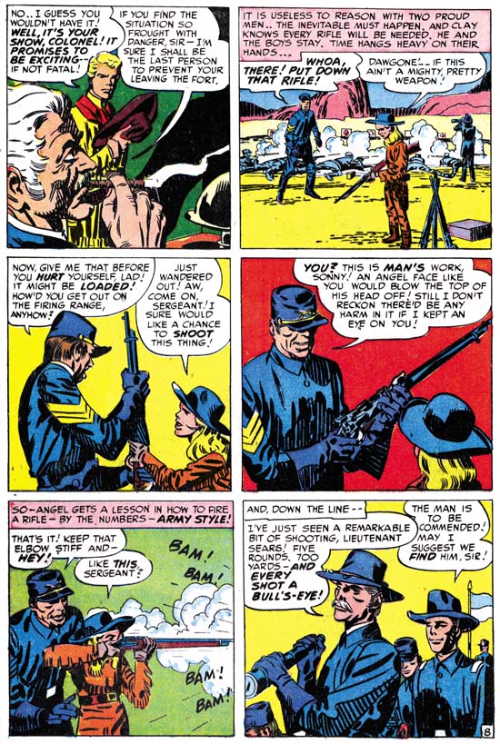
Star Spangled #8 (May 1942) “Last Mile Alley” page 9, art by Jack Kirby

Joe and Jack probably initially did their DC work pretty much by themselves. Any scripts that the DC editors provided must have either been ignored or highly altered. This can be seen by the fact that Simon and Kirby’s work at DC reads pretty much like their work from both before and after. As for art assistants, their former ones were left behind at Timely to take over the art for Captain America Comics and its offshoots. Simon and Kirby would eventually acquire new ones, but initially it was probably just the two of them. This allowed the team to quickly forge a distinctly unique art style. Part of it was derived from their previous work at Timely. In Captain America Kirby had already mastered his handling of action and exaggerated perspective. These continued in Simon and Kirby’s DC work and beyond. Also continued from Captain America was the device of extending figures beyond the panel borders. Circular or semicircular panels would play an important part in DC layouts as they had previously. (I love how the example page I provide above has four semicircular panels yet even more circles were introduced by the spinning wheel and the window in the first two panels.) Retained, at least initially, was a page layout typically of eight panels arranged in four rows. One layout technique that was immediately discarded was the use the more irregular panel borders frequently found in their Timely work.


Star Spangled #9 (June 1942) “The Rookie Takes the Rap” page 13, art by Jack Kirby

Kirby was the master of the fight scene and the Newsboy Legion provided plenty of opportunities for Jack to display his talent. I particularly like the sequence found in the end of “The Rookie Takes the Rap” showed above. Jack increases the number of panels per row to three to get in as much fighting as possible. He has also removed all background features that could distract from the Guardian’s confrontation with his opponent. It is not truly a fight because the crook does not stand a chance against the Guardian’s fury. I love the way Kirby has added flying bricks, but as the fight takes place inside a room I have no idea where they came from.


Star Spangled #10 (July 1942) “Kings for a Day” page 11, art by Jack Kirby

Jack Kirby knew how to make things exciting. Take the sequence from “Kings for a Day” shown above. It starts with the Guardian amidst a cityscape. Jack’s unusual use of shadows provides the scene with an eerie quality. As the Guardian ascends, Jack uses perspective to dramatize the action. Views of the background indicate how high the Guardian has climbed. The tower, his final objective, is shown with rapidly narrowing perspective showing he has far more height to obtain. This is followed by tilted views emphasizing the precarious nature of his pursuit. The last panel reveals the object of the Guardian’s heroic efforts while ironically one of the bad guys denigrates the Guardian. This is yet another reminder that Kirby knew how to infuse the story with excitement even in parts where there really was not much going on.


Star Spangled #12 (July 1942) “Prevue of Peril” page 2, art by Jack Kirby

Simon and Kirby switched their typical page from 4 to 3 rows. I had previously observed the same thing in their Sandman stories. In Sandman the transition seemed gradual stretching over several issues. For the Newsboy legion is seems much more abrupt; prior to #12 layouts are predominately four row pages, while subsequent issues are overwhelmingly three row layout,. The larger panels allowed Simon and Kirby to provide greater impact. While I believe that the layout change substantially improved the stories, I question whether that was the true aim. With the war on, both Joe and Jack expected that they would have to enter military service. Knowing this Simon and Kirby began to produce as much work as possible so that DC could use it while they were off serving their country. A larger image provided by the three row panel layout required less fine detailing, therefore less time to draw and ink, and thus aided getting more work done.


Star Spangled #7 (April 1942) page 1, art by Jack Kirby

The inking style that Simon and Kirby adopted after leaving Timely provided much of what made Simon and Kirby art look so unique. I used to I refer to this as their DC style but I fear that might give the impression that Simon and Kirby were adopting DC’s manner of inking and nothing could be further from the truth. So I think I will call it S&K’s Sculptural style since their use of form lines to create negative highlights for suggesting shape is a technique many sculptors have used when drawing. (See my Inking Glossary for explanations for explanations for some of the terms I will use in this post.) Aspects of this style can be seen in parts of Simon and Kirby’s Timely work. Perhaps the use of a number of assistants for the inking prevented the Timely art from more uniformly presenting this style. In any case starting with their work for DC and the covers they were also doing at this time for Al Harvey, Simon and Kirby inking would have two prominent characteristics; Caniff style cloth folds and bold form lines. Neither of these inking techniques was unique to Simon and Kirby but the boldness of the brush strokes were. The splash for the untitled origin story of the Newsboy Legion shown above is a good example of the early use of the Sculptural style. Take particular notice of the simple oval cloth folds that can be found in this splash particularly on Tommy’s lower legs. Not only are they simple in shape but they seem very flat without bending with the underlying shape. This type of clothing folds can be found not only in Sculptural style inking, but with the post-war Studio style as well and finally forming an important characteristic of Kirby’s Severe style of inking. I think this is an indication that Jack did at least some of the spotting for the origin story splash. Also note the course crosshatching on the buildings in the background. DC management would derogatorily designate this as “hay” and S&K’s use of this inking method would be the recurring cause of friction.

The Sculptural style can be distinguished from the Studio style by its greater dependence on form lines but also by the general lack of some of the latter’s typical inking methods such as picket fence crosshatching, drop strings, shoulder blots, and abstract arch shadows. However predecessors for some of the Studio style inking techniques may be found in the Sculptural style. In the origin splash Jim Harper’s shoulders have what almost look like shoulder blots although narrower in shape then the true shoulder blots of the Studio style. Big Word’s shoulders show that these proto-shoulder blots are actually overlapping form lines differing only in location from the form lines found throughout the splash.


Star Spangled #11 (August 1942) “Paradise Prison” page 5, art by Jack Kirby

The second panel of page 8 of “paradise Prison” provides another example of a proto-shoulder blot. Once again the shoulders have narrow blots. the shoulder inking does give an appearance of being made from overlapping form lines although not as distinctly the case as those for example on the villain’s arm. Note the unusual appearance of Superman as presented as part of a movie. It marks one of the few Simon and Kirby nods of recognition to their publisher’s flagship character. I cannot help but wonder if Superman’s awkward pose was deliberate.


Star Spangled #8 (May 1942) “Last Mile Alley” page 10, art by Jack Kirby

Picket fence crosshatching is another inking method typical of the Studio style. Yet again examples that could be described as proto-picket fence show up in the inking of DC stories. The Guardian’s back in panel 5 of “Last Mile Alley” shown above is a case in point. The rails however are used to clearly indicate the form which is not typically the case with true picket fence brush work. Also part of the proto-picket fence is not delimited by a rail but a series of form lines instead. Not only is the proto-picket fence distinguishable in manner from the Studio style technique it is also only very infrequently used in the Sculptural style of inking.


Star Spangled #7 (April 1942) <untitled> page 5, art by Jack Kirby

Another staple of the Studio style is the abstract arch shadow. I normally use the term abstract arch shadow to describe cases where a shadow was delimited on both sides with an arc. However Simon and Kirby also frequently used shadows with only one arc. The use of single arc shadows inking appears in the DC style as well as can be seen in panels 1 and 3 from the fifth page of the origin story shown above. Such shadows can be termed abstract as well because there often is no clear explanation for their shape. Unexplained shadows were used by Simon and Kirby as a design tool to make a scene more visually interesting. Note the decided abstract shadows, without any arcs, in the sixth panel. That abstract shadows are more frequently arced was due to S&K’s use of oval and semi-circular forms as a compositional device. Such touches might be easily overlooked but they are important part of Simon and Kirby’s successful imagery.


Star Spangled #11 (August 1942) “Paradise Prison” page 8, art by Jack Kirby

I do not want to leave the reader with the idea that during S&K’s tenure at DC all manifestations of otherwise Studio inking methods were done in atypical manners. That may be true of shoulder blots and picket fence crosshatching but it is certainly not true of abstract arch shadows. The arch shadow in the last panel of page 8 of “Paradise Prison” is perfectly indistinguishable from abstract arches that appeared after the war. While the manner of execution of abstract arches may be the same between the two periods their frequency is not. Abstract arch shadows show up often in Studio style art but are rare with DC style inking. The example I provided above was the earliest that I spotted among the Newsboy Legion art.


Star Spangled #17 (February 1943) “The Rafferty Mob” page 1, art by Jack Kirby

I use the term Sculptural inking style for much of the inking done by Simon and Kirby during the war but it was by no means a static approach to inking. That should not be surprising because Simon and Kirby’s art was always evolving. The form lines found in the splash from Star Spangled #7 (April 1942, shown earlier in the post) would become bolder over time as exemplified by the splash from Star Spangled #17 (February 1943). I am not convinced that “The Rafferty Mob” splash was inked by Kirby but the inking still matches the Sculptural style.


Star Spangled #12 (July 1942) “Prevue of Peril” page 1, art by Jack Kirby

I wanted to close this post on the earlier Newsboy Legion art with a splash selected solely because it is so neat. Simon and Kirby occasionally include recognizable people in their comics. In this case the Hollywood personalities played no part in the story that followed but who cares? Starting from the top and going clockwise we find Carmen Miranda, Bing Crosby, Bob Hope, an unidentified actress, Errol Flynn, Hedy Lamarr (fortunately Scrapper calls out her name or I probably would not have identified her), Mickey Rooney, and Clark Gable. I sometimes wonder if that unidentified red head might be Lucille Ball but would all the B movies she was in before her television success make her a recognizable figure at that time?

Kirby Five-Oh

One of my biggest treats from the 2008 New York Comic Con was being able to pick up a copy of The Jack Kirby Collector #50, titled “Kirby Five-Oh”. TwoMorrows wanted to make something special for their fiftieth issue of their flagship title and they have succeeded. The Jack Kirby Collector has been an oversized magazine for some time but this one is thick as well. And it ain’t just fluff! There are page after page of just fantastic Kirby art including a great color section. The 50 theme rules with chapters such as the 50 greatest Kirby covers, the 50 greatest Kirby stories and the 50 greatest Kirby creations (I do not have the issue in front of me as I write this so I am probably forgetting some). I would highly recommend the purchase of this volume but I suspect most of my readers regularly pick up The Jack Kirby Collector anyway.

In the past I have occasional given help to The Jack Kirby Collector as well as to their other great publication, Roy Thomas’ Alter Ego. For the Kirby Five-Oh I was able to provide more then I have ever been able before. I hope my readers will be indulging as I take pride in my contribution which, although only a small part of that issue, was large compared to my previous efforts. I was able to do this because of a project I once did. Back in 1998 I decided to restore the line art for all the published covers that Kirby or Simon drew during their partnership. It was a pretty bold decision since that meant a lot of covers and only a small fraction of which were available to me at the time I started. I wanted to restore the line art because color printers then were expensive and not very good while black and white laser printers were available and could do an excellent job. I certainly could not afford to chemically bleach the covers, the standard technique for that type of restoration in those days. I had some experience with Photoshop and decided to see what I could devise to digitally bleach cover scans. I did come up with a process that worked reasonably well but still required a lot of work of clean up (digital bleaching can never do quite as good a job as the chemical version). Between tracking down comics or scans of the covers, and all the work in Photoshop, it was not until about 2003 that I completed my project. My research since then has shown I made a few mistakes but it is still an undertaking that I am very proud of. Because of copyrights issues, publication of my efforts was never a realistic consideration nor could I legally sell copies of the volumes I did hand make. Some of my restorations appeared in the latest reprint of Joe Simon and Jim Simon’s “The Comic Book Makers”. However all but one (Captain America #7) were much reduced images. John Morrow, who knew about my project, asked if I could supply some images for his chapter on the 50 best Kirby covers. The result was that all the covers in that particular chapter of Kirby Five-Oh from Captain America #1 up to Foxhole, and Race to the Moon as well, are all my restorations from my project. My restoration for Star Spangled #9 shows up later in the magazine and they did a clever alteration of my Adventure #84 for the volume’s introduction. The images for the 50 best Kirby covers are presented four to a page but since the Jack Kirby Collector is an oversized publication that is a pretty good size. It is really great to see some of my restorations actually in print.

(added later)
In the comments Ger suggested that I provide a link the Yahoo group where I discussed more fully my techniques for restoring comic scans. I do not discuss such things here as there really is not much interest in such esoteric knowledge. The group is Digitizing Comics but it is a very dormant group. Membership is required but since I am the moderator that will be no problem. Those interested in trying my methods would need a scanner and Photoshop. My posts can be found in the Archives and I would happily answer any questions there.

The Wide Angle Scream, Almost an Afterthought


Win A Prize #1 (February 1955) pinup, art by Jack Kirby
Enlarged view

Pinups, both single and double paged, played an important part of Boys’ Ranch (October 1950 to August 1951) but they did not appear at all in Black Magic which also started in October 1950. Nor did they appear in either Strange World of Your Dreams (August 1952 to March 1953) or Fighting American (April 1954 to April 1955). Pinups did play a marginal roll in some other titles. A single page pinup, “Desk Sergeant”, appeared in Police Trap #2 (November 1954) and a double page spread was used in Bullseye (discussed below). There is also the pinup from Win A Prize #1. While printed on a single page, its horizontal format leaves little doubt that originally the Win A Prize splash was meant to be a double page centerfold. Joe Simon has said that initially this pinup was to have been used in Captain America #11 but Joe and Jack’s sudden exit meant that issue was done by other artists. If Joe’s story is true, this pinup underwent modification before it was finally used. Of course Captain America would have had to have been removed. Sikorsky was just beginning their efforts in building helicopters while Simon and Kirby were working on Captain America and helicopters would not play a significant part in the military until after World War II. The helicopter in this pinup has a USAF marking, but the Air Force was not an independent military unit until after the war. At the bottom center of the splash is what looks very much like a television camera crew. While televisions were created before the war they did not really come into use until the late’40s.

The pinup’s theme of a modern day Gulliver is an interesting twist, particularly in using a futuristic spaceman as the giant. There are a score of little soldiers and civilians scattered about each involved in the individual tasks. The image presents a number of questions. Since no nearby rocket or flying saucer is shown, where did the spaceman come from? Although lying prone with eyes closed, the spaceman appears uninjured. With all the tanks and guns aimed at him the suggestion is that he still is alive. If that is so why are all the soldiers crawling over the spaceman even though he is not tied down or restrained in any way? There does not appear to be much in the way of ropes or cable, so what is the soldiers’ intention? Of course such unanswered question was the whole point as Uncle Giveaway is offering prizes for short stories based on this pinup. I wonder if it is too late to enter?


Bullseye #7 (August 1955) “The Stolen Rain God”, art by Jack Kirby
Enlarged view

During the final period of the Simon and Kirby studio, the only double page splash to actually get printed as such appeared in Bullseye. Oddly it was in the final issue published by Charlton. It is hard to believe that Joe and Jack thought this splash would help save the title. Having Charlton’s print the former Mainline comics looks more an attempt to get some money for art that Joe and Jack could no longer afford to publish themselves due to problems with their distributor. Charlton was notorious for their low pay so I am sure they did not offer much to Simon and Kirby, but it was better then nothing. If by some miracle they sold well enough to warrant continuation, so much the better. But for the most part Charlton used up the final art and cancelled the titles. Foxhole was extended for a single issue produced by Charlton artists with Joe and Jack probably having nothing to do with it. The postal permit for In Love was transferred to Charlton’s new romance title I Love You, which, although having a Kirby drawn cover for its initial issue, was again filled with story art probably created by Charlton artists. I suspect that careful investigation of other Charlton comics will reveal the transfer of the postal permit from the other former Mainline titles Police Trap and Bullseye as well. The only Simon and Kirby title that Charlton ran with for a few issues was not a Mainline title at all. It was Charlie Chan, a title previously licensed to Prize some years before. It was more of a Joe Simon production with Jack Kirby only providing the cover art for the first Charlton issue (#6 June 1955). Joe would help put it together for Charlton until it too was cancelled with issue #9 (December 1955). So I believe the wide splash in Bullseye #7 came too late to be considered a serious attempt to bolster sales of the Bullseye title. I cannot help but wonder if when the breakup of the Simon and Kirby studio was clearly possible, if it had not happened already, whether the presence of this splash was brought on by a nostalgic memory of Simon and Kirby’s use of the centerfold splash in their first big hit, Captain America.

Jack has drawn a good splash. It is just that after so many marvelous double page spreads in the past it is hard for me to get too enthusiastic about this one. It is a well balanced composition with the prominent Indian chief on our left offset by the plateau and title on the right. The chief certainly presents an impressive figure what with his large headdress (could that really be expected to stay on during the charge?) and ornate apparel. The horse cut off on our left showing only a mouth and knee makes the viewer really feel that he is at the head of the line of charging warriors. The colorist wisely blocked out the smaller figures in simple colors otherwise the foreground figures would have been lost among a patchwork of colors. This allowed the small figure of Bullseye on our right to still stand out. The most unusually aspect of this splash, unique among Simon and Kirby wide angle screams, was that it is actually an oversize story panel. We find Bullseye racing in front of the attacking Indians as he tries to prevent the unfolding tragedy that the war will certainly bring. It is a very risking thing for Bullseye to do since his racing across Indian line could easily make him the victim of friendly fire. The two smaller panels on the bottom provide an explanation on Bullseye’s objective.

The splash for “The Stolen Rain God” was the last double page art for a Simon and Kirby production. Even though the studio and their partnership was over, Kirby always seemed willing to give Simon a hand whenever Joe tried to launch new comics. One such effort included the wide angle screams that will be the subject of the next chapter of my serial post.