Category Archives: 2008/07

It’s A Crime, Chapter 2, A Revitalized Title

(Headline #23 – #25)

In chapter 1 I described Prize’s comics in 1946 as tired. With the arrival of Simon and Kirby things would never be the same for that company. Their effect on Headline is obvious. With issue #23 (March 1947), the title made a sudden transition from an anthology with an emphasis on the hero genre into a crime comic. That was significant, but more important was Simon and Kirby’s effect on the entire Prize comic line. Treasure Comics #10 (December 1946), the same issue that ran the first promotional S&K crime story, would be the last bimonthly for that title. Issue #12 (Fall 1947) would be the last Treasure Comics issued. In September 1947 Simon and Kirby would introduce a new title and another genre with Young Romance. The crime version of Headline must have been a success because Simon and Kirby and Prize would start Justice Traps the Guilty in October. Wonderland, Prize’s comic of funny stories for the younger readers, would end with issue #8 (December 1947). Prize Comics, the last of Prize’s hero anthologies, would become Prize Comics Western with issue #69 (May 1948). I have no reason to believe Simon and Kirby had any direct involvement with the switch of Prize Comics to the western genre. However once Simon and Kirby showed the value of publishing the more modern comics it would not have taken a genius to come up with the idea of publishing another of those popular genre. The only one of Prize’s original titles that was unaffected was Frankenstein. In a little over a year Prize went from having a tired comic line to a more modern one. Simon and Kirby would not produce every title that Prize would publish from this point on but they would dominate the company’s output and even have influence on titles other then their own. Prize would never become a big publisher but it is clear that Simon and Kirby generated a lot of income for the company and I cannot help but doubt that the publisher would have survived much longer without their arrival.

The attribution question for the first two issues of the crime version of Headline is simple, it is Jack Kirby. It was part of Simon and Kirby’s modus operandi to start a new title with Jack penciling much, if not most, of the art. However these two issues take it to an unusual extreme in not just most but all of the art is by Kirby. Such exclusion is not part of the Simon and Kirby MO. The starting issues for Young Romance, Justice Traps the Guilty, and Boys’ Ranch would all include some work by other artists. All Kirby issues would not appear again until Fighting American (1954) and the even more exceptional case of the Young Romance, Young Love and Young Bride comics of 1956. Surely the explanation for the all Kirby Headline issues was that it was a consequence of the failure of the Stuntman and Boy Explorers titles of 1946. With the sudden termination of those titles Simon and Kirby had both the time to produce stories and the need to generate money. It was only when Joe and Jack were once again regularly producing comics that they had both the need and the ability to bring other artists into their projects.


Headline #23 (March 1947) “The Last Bloody Days of Babyface Nelson”, art by Jack Kirby

The first page of Headline would exemplify the Simon and Kirby approach to crime, at least in its beginning. There in the spotlight is Baby Face Nelson standing with his smoking machine gun over two victims. Baby Face Nelson, whose name was actually Lester Gillis, was a real person and at one time was Public Enemy Number One. The story that Simon and Kirby provide is a true one, or at least as true as any made by the entertainment media. We are told of a chance encounter on a country road of one car that included Baby Face Nelson and John Chase with another car occupied by two federal agents. In the ensuing gun fight the two agents were killed and Baby Face mortally wounded only to die later. At the end of the story we find Chase behind bars. Missing from S&K’s account are Helen Gillis, Baby Face’s wife, who was also present. Also missing was a previous encounter with another vehicle with federal agents. But the gist of the story was all there and dramatically portrayed. By today’s standards, the story is very moralistic. Baby Face Nelson is not presented in a favorable light and while his end had a certain courage it was above all shown to be the act of a brutal nature. The persistent theme of all the Simon and Kirby crime stories is shown in large letters at the bottom of the splash page, “Crime Does Not Pay”. In light of all this it is surprising that critics of crime comics at the time could not see this and would instead insist that these stories glorified the criminals.


Headline #23 (March 1947) “To My Valentine”, art by Jack Kirby

“To My Valentine” is another example of a great splash and a story based a real event. The machine gun toting cupid is a nice touch. The truth of the story as presented is debatable as no one was ever convicted of the gangland murder. Sometime later there was a gang member under custody who claimed to have taken part. However there seem to be some conflicts in his testimony as compared with that of other witnesses present on the scene (but not viewing the actually killing). In this splash there is no question about the brutal nature of the death of the gang members. What with their contorted posses and obvious bullet holes in the wall. But note the lack of bullet holes or blood on the actual victims. This is typical for Kirby who was actually restrained in his portrayal of violence. Jack would on occasion include blood in a crime scene but no where near to the amounts that could logically be expected.


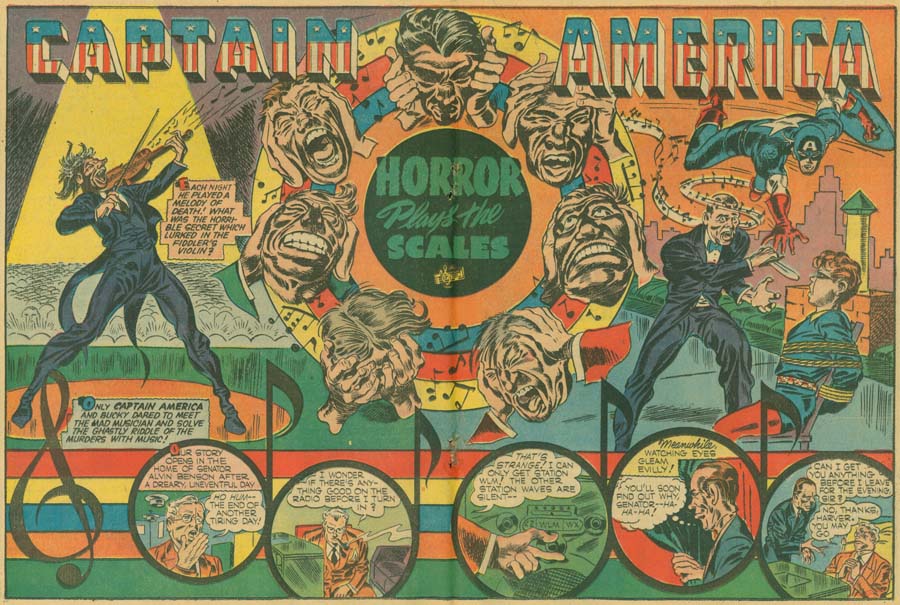
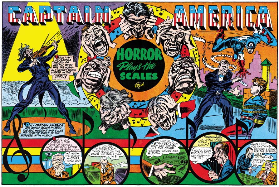
Headline #24 (May 1947) “Murder on A Wave Length”, art by Jack Kirby

A lot of the splashes by Kirby for the crime genre are just masterpieces. Even though we have a good view of both the gun and the victim Kirby hides the effect of the bullet behind of a screen of gun smoke. The dramatic effect of this splash is based on the victims grimace of pain and not on the depiction of any gruesome details. The story theme of the connection of a radio broadcast to a crime is an old one for Simon and Kirby having been used in a Captain America story in 1942. Note the presence of an abstract arch shadow on the side of the radio set (see my Inking Glossary for an explanation for the inking terms I use ).


Headline #25 (July 1947) “Death Takes a Honeymoon”, art by Jack Kirby

The Simon and Kirby art for these issues of Headline made was pretty much the same as used in the promotional pieces discussed in the last chapter. Figures do not extend beyond the panel borders; a motif that S&K used frequently during their years with Timely and DC and occasionally for Stuntman and Boy Explorers as well. Page layouts still include the frequent use of non-rectangular panels. For example in “You Can’t Forget a Killer” (Headline #24) circular and semi-circular examples comprise 18% of the story panels. This is the same level of semi-circular panels as found in Stuntman. (Remember that if the all pages were the standard 6 panels with 17% there would on average be a semi-circular panel on each page). While this level of the use of semi-circular panels is typical of all the stories in Headline #23 and #24, there is a change in Headline #25. “Pay Up or Die” is the only Kirby story in Headline #25 that continues to use semi-circular panels (20%), such panels are completely absent from the other three Kirby stories.

The inking still is done in what I call the Sculptural style with some of the hallmarks of the Studio style (picket fence crosshatching and shoulder blots) are rarely found and when used it was generally not done in the soon to be typical manner. However drop strings, another characteristic feature of the Studio style, begins to become common in use. It was not abundantly used in the first crime issue of Headline but by the third it can be quite commonly and distinctively used as for example in the splash page shown above. Abstract arch shadows, another Studio style technique, also were beginning to become more frequent.


Headline #25 (July 1947) “Prophet of Death”, art by Bob Powell

For Headline #25 I can only provide the credits for one of the artists other then Kirby. “Prophet of Death” is signed, but Bob Powell’s style is so distinctive that his work in this story would have been easily recognized anyway. I am a great admirer of Powell’s work, although I am mostly familiar with the romance stories he did for Harvey Comics. Powell’s style is different from that of Kirby’s and although he is not as great an artist as Jack (who was?) he was still immensely talented. I find it ironic that here he is working for Jack and yet he is quite free to render this story in his own unique manner. Years later when he would work for Marvel, in response to Stan Lee’s desire to do art the Kirby way, Powell altered his style. In my opinion the results was most unfortunate and Bob’s late work is but a shadow of his former art.

Bob Powell was said to have done some work for Fox Comics. Perhaps Simon and Kirby first met Powell there. However I have not recognized Powell’s work in the Fox comics issued during the time Joe Simon was an editor. Most likely Bob came to Joe and Jack’s notice during the time that Simon and Kirby were first producing Stuntman and Boy Explorers for Harvey Comics. After the war Bob Powell had his own studio and Harvey was one of his important customers. Considering Powell’s obvious talent, his presence in this early Simon and Kirby production is perfectly understandable. What is surprising is that this would be the only work he did for the Simon and Kirby studio. I have no idea why that should be since Powell did not work exclusively for Harvey. After the break up of the S&K studio, there would be a number of occasions where Bob would work for Joe Simon.


Headline #25 (July 1947) “Blind Man’s Death”, art by unidentified artist

There is one other artist in Headline #25 who I have not been able to identify. Interestingly he provided two stories. This is particularly regrettable in this case because he really is an excellent artist. What a great splash page. The exaggerated perspective is not at all the way Jack Kirby would have handled it but it is very effective nonetheless. You can really feel the blind man’s predicament as he stumbles while knowing he is in danger. The murderer’s pose is very effective as well.


Headline #25 (July 1947) “Murder’s Reward” page 6, art by unidentified artist

Frankly I am not as impressed with the splash page this artist did for “Murder’s Reward”. But his talents were not limited to splash art but extended to graphic story telling as well. Again the artist presents action in a way different from Jack Kirby but he it still is very effective.

When doing these examinations I am always on the lookout for indications of whether Kirby provided layouts for the artists (a claim some have made). Often the layout of just the panels is enough to decide the issue. Both Kirby and this unidentified artist use semi-circular panels but the manner of their use differs. Kirby’s semi-circular panels are generally as large the standard panels. This artist uses circular panels that largely are about 3/4 the height of the standard panels and he then uses area above, or less commonly below, the round panel for a speech balloon or caption. (While the round panel in the page above has some of these characteristics, it is not typical of the artist’s method).

Like the promotional pieces I discussed in my last chapter, none of the Simon and Kirby pieces for Headline #23 to #25 were signed. With 3 covers and 16 stories (19 if you include the promotional stories) this is highly uncharacteristic for Joe and Jack. Why were the normally self-promoting Simon and Kirby circumspect about their contributions to Feature Publications? The answer is not hard to find because in the same month that Headline #23 was released by Prize Comics, Simon and Kirby’s work would also appear in Clue Comics, a crime genre comic by another publisher, Hillman. Simon and Kirby had no problems with working for different publishers at the same time but knew that it was best not to be too obvious about it. The Simon and Kirby work for Clue will be the subject of my next chapter.

Chapter 1, Promoting Crime

Chapter 3, Competing Against Themselves
Chapter 4, Crime Gets Real
Chapter 5, Making a Commitment
Chapter 6, Forgotten Artists
Chapter 7, A Studio With Many Artists
Chapter 8, The Chinese Detective
Chapter 9, Not The Same
Chapter 10, The Master and His Protege
Chapter 11, The New Team

Recreation Vs. Restoration, How Should Reprints Be Done?

Not long ago Daniel Best wrote a post on his blog about art recreations used in Marvel Masterworks (Original Art Stories: Marvel Masterworks Non-Original Artists). The gist of his comments was that he objected to Marvel’s use of recreated art in the Masterwork volumes. Mike Kelleher who does work for Marvel reprints posted a reply on the Marvel Masterworks Fan Site. The ensuing thread is typical of the sort of thing to be found in lists. It ranges from insightful discussion to meaningless name calling.

I have to give Mike Kelleher credit; he is open about what he has done. Apparently he felt quite justified in recreating art in some cases:

Marvel never gave me any instructions on how to recreate art. There is no way anyone could have known I redrew some of the pages on paper first before reconstructing them. My first 6-12 months of art recreation was done digitally, I then read an article somewhere ( might have been here but I don’t recall ) about how artists used to, and still do, literally redraw the pages for reprint purposes. Since I wasn’t happy with the results I was getting digitally, I decided to try drawing them (contrary to recent comments I am an accomplished, although unknown, artist :-). I’m still getting the feeling that some people are trying to attach sinister motives to this process, but there really are none.

He has an interesting post in the thread showing various stages in one of his reconstructions. Of particular interest to me was this statement:

Because Masterworks line art is printed 100% black just like the original comics, we need to digitally transform this image so that there is no grey. This is problem 1. There is no setting that will fill in the areas where the ink was light or dropped out completely. After playing with the adjustments for a few minutes I have decided that this is the best result I can get…

This explains the source of many of Marvel’s problems. Restricting the black plate to just line art was common in the original comics but is not typical of modern printing methods. In my opinion Marvels use of this technique in their reprints unnecessarily complicates the restoration process. With the level of correction that must be done the final results can be anything from a restoration to a recreation, depending on the person doing the work.

I found another of Mike Kelleher’s comments interesting:

Final points– All reconstructed artwork ( and most done from scans of stats and original art ) have some level of redrawn lines. Reality. Period.

This simply is wrong but I understand now why he believes it to be true. It is all back to that 100% black plate. Use a modern separation and you just cannot beat reproductions based on original art (assuming the original art is complete). I know original art is not always available so this is not a suggestion that Marvel take that approach.

In a previous thread on the same Marvel Masterworks Fan Site I learned from another that micro filch were used as the source for some of the golden age reprints. These micro filch were made many years ago but still occasionally show up in places like eBay. Their quality is fine for casual reading but as a source for reprints they leave much to be desired. Any reprint based on micro filch would almost certainly end up being a very poor recreation.


Treasure Comics #10 (December 1946), art by Jack Kirby

Years ago I decided digitally restore the line art for every Simon and Kirby cover. Even then I could not afford to chemically bleach the original comics. So I developed a method to remove the color using Photoshop. I must add that I am sure others have also figured how to do this on their own. Digitally bleaching is not as successful as with the use of chemicals so there was still a lot of work needed to clean up the final results.


Captain America #7 (October 1941), art by Jack Kirby (original scan)
Larger view

I did finish the project but in the end I came away with two basic realizations. One was this method required too much work. The second was that color really should be a part of the restoration process. I did not like Marvel reprints and felt there was a better and more accurate way of doing things. So once again I figured a process using Photoshop to do restoration. And yes I am sure others figured it out themselves as well. Usually I only post at least partially restored images in this blog, but now I will made an exception. The above image is an actually scan from a comic just as it came from my scanner. Below can be found my restoration based on that very scan. I was so pleased with my method that I once started a group (Digitizing Comic Books ). In that group I posted an explanation of some of my techniques. Well I do not think many got what I was trying to do so I never went past the basics. I am the moderator so there will be no problems if anyone wants to become a member. It is pretty much a dormant group but the archive still has my posts.

Captain America #7
Captain America #7 (October 1941), art by Jack Kirby (restored)
Larger view

Is Marvel being dishonest by presenting recreations in a reprint volume? My original reaction was yes. Some on the thread have said that this was all well known facts. That it was not hidden in either Marvel interviews or posting on lists. I do not feel that is true discloser as not everyone reads those interviews or reads all comic book lists. So I pulled out my Marvel Masterwork volume of Daring Mystery. There in the table of contents they credit those who did the color and art “reconstruction”. Yes reconstruction is their word. My dictionary provides this definition of the word reconstruct:

“1) to construct again; rebuild; make over. 2) to build up, from remaining parts and other evidence, an image of what something was in its original and complete form”.

Well I feel the first definition is certainly valid for what Marvel has been doing (though not the second since the final result is nothing like the original form). So yes Marvel is being honest. I should have been more careful when buying these volumes because here reconstruct is another word for recreate.

There are those who honestly like Marvel’s approach and think the Masterwork volumes are the correct way to do reprints. They would not spend their money on what they would describe as just scans. There are also those who really are only interested in the characters and have little concern for studying the original artists and inkers. For all of them these Marvel Masterworks are a good deal. There are others who never did like what the glossy pages and flat colors of the Masterworks. There are also some who truly admire the earlier artists and want to see their art and not some recreation by a modern artist. For those the Masterworks just do not have the same value. I fall in this second category and I will be getting rid of the volumes I have and will not buy any more.

Goodbye Creig Flessel

During my visit with Joe Simon today we got the news of the passing of Creig Flessel. It saddened us both. Joe reminisced about Creig and George Tuska being part of his crew. Joe commented that they both were beautiful people. The three lived close to one another at that time. It is a period of Joe’s career that I have not studied sufficiently and so have not posted on yet. Not because it is less important then the rest of his career, but just because there is so many parts of his life that need to be studied.

I can recall a number of occasions during previous visits where Joe would pull out a copy of some commission piece that Creig had done recently. He never could get over how beautiful Creig’s work still was (nor could I).

Mark Evanier has a nice obituary for Creig Flessel. Ger Apeldoorn’s blog has a couple of posts with nice examples of Flessel’s commission work and other oddities.

One of Joe’s last comments before I left was “I am not ready to check in yet, I just ordered a couple of boxes of cigars”. In that case Joe, keep ordering those cigars.

It’s a Crime, Chapter 1, Promoting Crime

(Treasure #10, Prize Comics #63, Frankenstein #7)

Feature Publications, more commonly known as Prize Comics but also as Crestwood, was a relatively small company in 1946. There were five titles in their comic line all of which were bimonthlies; Frankenstein, Headline, Prize, Treasure and Wonderland. It was not just that Prize had a limited number of comic titles; Hillman for example had even fewer. Feature’s problem was more about what they were offering. Wonderland had funny stories aimed at the younger comic book readers but did not have any outstanding features. Treasure was a more general anthology again without any features that were likely to excite readers in 1946. Prize and Headline were also anthologies with an emphasis on the hero genre. Unfortunately in 1946 the popularity of superheroes was on a distinct decline. This could even be seen in Prize’s offering. During the war Yank and Doodle had been young patriotic heroes while the Owl was more of a standard crime fighting costumed hero. Yet by 1946 the two had been combined into a single feature. It was an awkward match to say the least. The only title Feature had that set them apart from other comic publishers was Frankenstein. It probably was not a great success otherwise it would not have remained a bimonthly. With the exception of Frankenstein, the best description of Prize’s comics would be tired.


Treasure #10 (December 1946) “The Treasure Keeper”, art by Dan Barry

Blame for Prize’s humdrum nature does not rest with its artists. Some talented individuals at least occasionally appeared in their comics. We have encountered Dan Barry before when I discussed My Date. The Treasure Keeper was an ongoing feature in Treasure Comics. Unfortunately I do not have access to any other issues but I do not believe Barry was always the artist. Here Barry illustrates the story a successful Russian violinist fall after his anti-Czarist efforts are discovered by the authorities. Dan does a good job with the story, or at least as good as can be expected with the script.


Treasure #10 (December 1946) “Know Your America”, art by Mort Meskin

In 1946 Mort Meskin was doing work for a number of different publishers. Was his appearance in Treasure #10 unique or are there other works by Mort to be found in early Prize comics? Meskin was certainly in good form with his contribution to this issue of Treasure. “Know Your America” was another ongoing feature. I suspect its historic nature probably did not generate a lot of reader enthusiasm even in those patriotic days following the war. Meskin manages to add excitement to what really was a rather dry script. The story page I present above is by no means unique. Note how Meskin puts action into a sequence which is really nothing more then the report to the governor about the public’s rejection of the stamp act (about 10 years prior to the revolutionary war). Mort’s command of perspective, something he is not normally known for, is clear in his depiction of the hand extending to the viewer in the third panel.


Treasure #10 (December 1946) “Tomorrow’s Murder”, art by Jack Kirby

The final story in Treasury #10 was something new for Treasure, or for any Feature comic. It was “Tomorrow’s Murder” by Simon and Kirby. New because it was the first Simon and Kirby piece to be published by Feature since a few pre-war stories. But more importantly new because it was Prize’s first true crime genre work. The crime genre itself was certainly not new as Bob Wood and Charles Biro created Crime Does Not Pay for publisher Lev Gleason in 1942. At that time Simon and Kirby may have been too busy with their entrance into the armed service to notice Wood and Biro’s new genre but after the war they could hardly have missed it. When their post-war titles, Stuntman and Boy Explorers, failed and Joe and Jack were looking for something to keep their collaboration going one of the categories they turned their attention to was the successful crime genre. Just a few months after the failure of their Harvey line (Stuntman #3 with cover date October 1946 was released as miniature comic to subscribers only) Simon and Kirby had manage to sell the crime genre concept to Prize.

“Tomorrow’s Murder” also introduced Red-Hot Blaze. Blaze was supposed to be a sort of investigative reported for Headline Comics. The results of his investigations would then be drawn up as a comic story. The splash presents the enactment of the crime as if it was being rendered on a drawing board. In the story panel we get to see the artist. The comic artist’s curly hair indicates that this was not meant to literally be a self-portrait of Jack Kirby. There was no reason to be since the comic book reading public would not have any idea what Jack looked like. Nor was “Tomorrow’s Murder” signed. However the ever present cigar shows that in Jack’s mind there truly was a connection between the real and fictional comic artist.


Treasure #10 (December 1946) house advertisement, art by Jack Kirby

The end of the “Tomorrow’s Murder” story only occupied the top with the house ad shown above taking up the rest of the page. Clearly Simon and Kirby had not just sold Prize on a single crime story, Joe and Jack had convinced them to publish a comic devoted to the genre. Headline would no longer be a general anthology. Of the titles currently being published by Prize, Headline had the most appropriately named for a crime comic. By retaining the original title name, I am sure Prize hoped that they might keep some of the former readers as well. The advertisement indicated that the switch to crime would happen in the January issue. Things did not work out as originally planned as Headline #23 would be cover dated March. When Headline #23 was finally released its cover was not the mock-up issue depicted in the house ad either. The one shown in the ad would actually be used for Headline #24.


Prize Comics #63 (March 1947) “Romania’s Strangest Killer”, art by Jack Kirby

The same month that Headline #23 was released a Simon and Kirby crime story also appeared in Prize Comics #63. In “Romania’s Strangest Killer” the placement of the splash panel at the bottom of the first page is rather unique. Of course the story panels at the top of the page are not truly part of the story. It is actually just an introduction using the theme of Red-Hot Blaze being an investigator for Headline Comics. Only this time it is a Headline editor who makes an appearance not the artist. The splash panel is very powerful showing a murdered victim in the foreground, another hanging in the mid-ground and the perpetrator exiting in the back. Part of the title is enclosed with an outline of a hatchet. It is a great design but we shall see that a lot of the Simon and Kirby crime splashes are masterpieces.

Just as with “Tomorrow’s Murder”, the last page of “Romania’s Strangest Killer” includes the same house advertisement. Well not quite the same since the text referring to the release and issue dates have been removed. Not, however, completely because although small and blurred the January – February cover date can still be made out on the small mock-up cover.


Frankenstein #7 (May, 1947) “Justice Finds A Cop Killer”, art by Jack Kirby

Two months after the actual release of the first crime version of Headline a crime story appeared in yet another Prize title. In 1946 Frankenstein as portrayed by Dick Briefer was not truly monster stories but rather belonged to the humor genre. The Simon and Kirby story “Justice Finds a Cop Killer” seems very much out of place. It is once again a Red-Hot Blaze story with the curly haired and cigar smoking artist making a reappearance. Although not a particularly impressive design the splash panel is still very dramatic largely due to Kirby’s famous exaggerated perspective. The falling policeman is so dramatic that it is easy to overlook the fact that the gun and bullet trace do not actually seem to be aimed properly.

“Justice Finds a Cop Killer” concludes with the same house ad. More specifically the dateless version that appeared in Prize Comics #63. Despite the late date (as the second crime version of Headline had appeared in this same month) the presence of the crime story in Frankenstein was part of the same promotion campaign. The only Prize comic not to receive this treatment would be Wonderland. That title was much too directed at a very young readership for a crime story to be at all appropriate or productive.

The art for these promotional stories was typical for the crime genre work that Simon and Kirby would do. Most important was the dramatic action that was Jack Kirby’s trademark. There would be a slightly greater emphasis on realism as compared to Kirby’s Stuntman and Boy Explorers but the art would otherwise very much like S&K’s previous efforts for Harvey. One hallmark of Simon and Kirby’s art for Timely and DC had been the extending parts of figures beyond the panel borders. This technique could still be found in Stuntman and Boy Explorers but not nearly as commonly as the earlier work. It would disappear completely in the crime work.

Another prominent trait of Simon and Kirby’s work for Timely and DC was the use of unusual panel shapes. Among panels with the normal straight edge others would trace a zigzag pattern. Circular or sub-circular panels would also be used in places. This use of non-rectangular panels would be continued in Stuntman and Boy Explorers. For instance “Curtain Call for Death” from Stuntman #2 (June 1946) 16% of the panels were circular or sub-circular. The number may seem small but had all the pages had the typical 6 panels (however S&K never adopted such a regimented layout) that would mean on average there was a rounded panel on each page. The promotional crime stories maintained a similar level of rounded panels. In “Tomorrow’s Murder” and “Romania’s Strangest Killer” 14% of the panels were circular or sub-circular while in “Justice Finds a Cop Killer” the ratio was 16%.

The inking was in the bold manner of what I have called the Sculptural style due to its emphasis on what I refer to as form lines that are not shadows but are used to give a sense of volume to shapes (see my Inking Glossary for explanations of my terms). The Sculptural style was previously used for the Simon and Kirby work done for DC (as for example in the Newsboy Legion stories). The use of this inking style was continued after the war. However Simon and Kirby art was never static and was always evolving. The Sculptural style used for Stuntman and Boy Explorers made use of even bolder brushwork. The individual brush marks stand out and while still indicating shadows or form they take on an expressive roll of their own. This bolder manner of the Sculptural style would be used in the early S&K crime art as well. Absent for the most part are techniques like picket fence crosshatching, drop strings, shoulder blots and abstract arch shadows. Such techniques do make rare appearances but even then are usually not done in the manner typical of the soon to appear Studio style.

Joe and Jack were heavily into self promotion. Much of the comic book art that they created was provided with a Simon and Kirby signature. The operative word is “much” as not every work they did was signed. None of the three promotional pieces I discussed above had a signature. Normally with such a small group I would not make much about that fact but as we shall see the absence of a signature was not limited to these pieces alone.

Again and again, while working on my serial post “The Art of Romance” I found myself referring to the Headline and Justice Traps the Guilty for help in questions about attributions. This is not surprising because artists that worked for the Simon and Kirby studio normally were expected to be able to handle work from any genre. I have decided that it would be beneficial to review the Simon and Kirby crime material so this will be the first of another serial post. It will not have as many chapters as “The Art of Romance” because as we will see Simon and Kirby’s involvement with the crime genre only lasted a few years.

Chapter 2, A Revitalized Title
Chapter 3, Competing Against Themselves
Chapter 4, Crime Gets Real
Chapter 5, Making a Commitment
Chapter 6, Forgotten Artists
Chapter 7, A Studio With Many Artists
Chapter 8, The Chinese Detective
Chapter 9, Not The Same
Chapter 10, The Master and His Protege
Chapter 11, The New Team

A Date Without Romance

Most of the work that Simon and Kirby did for Hillman in 1947 was for previously existing titles. The sole exception was My Date. Despite its title, My Date was not a romance comic (as I discussed previously) instead it is teenage humor and in particular an Archie-clone. Archie first appeared as a backup feature in MLJ’s Pep Comics during the war while both Joe and Jack were in military service. Archie was so successful that MLJ’s superheroes were eventually dropped and the company’s name changed to Archie Comics. 1947 found Simon and Kirby looking for a work so it is not surprising that the popular Archie would lead them to suggest teenage humor title to Hillman. Although My Date was not a romance comic it clearly was directed at teenage girls. There would be a lot of dating in My Date but no romance.


My Date #1 (July 1947) “My Date with Swifty Chase”, art by Jack Kirby

The first story in all the My Date issues would be by Simon and Kirby. Initially the feature centered on Swifty Chase a good hearted young inventor. Like Archie there is a love triangle but in this case the center of it is the beautiful Sunny Daye and Snubby Skeemer is Swifty’s rich and unscrupulous rival. The first story has quite a cast of characters as can be seen in the splash. Three of them were clearly meant for this story alone; Humphrey Hogart, his fiance actress Chandra Blake and B. O. his business manager (the three are shown in the center background of the splash). The rest seem to be meant to be re-occurring cast members. However issue #2 introduced a new character, House-Date Harry, who would quickly become the feature’s lead character while Swifty would be delegated to a supporting roll. This is the equivalent of Jughead pushing out Archie. The Swifty Chase feature would be Simon and Kirby’s only contribution to the title and only the last issue would have more then one Swifty or House-Date Harry story.

Kirby’s drawing for My Date is surprising good. I say surprising because Jack is most famous for his more realistic portrayals. Yet the Swifty Chase stories are filled with visually interesting characters all done in a more cartoony style then is typical for Kirby although not as cartoony as his work at the same time in Punch and Judy. I wish I can be as complimentary about the writing. The first story is really a masterpiece. Lots of action and funny turns of events. Having Humphrey Hobart in it also helped. Things changed with the introduction of House-Date Harry. The idea of the scheming but good hearted Harry would have been fine as one shot story line. With the recurring use of the House-Date Harry theme it becomes forced and not nearly so funny. I really cannot see Simon and Kirby being able to continue to make this feature interesting.

Incidentally, I once wrote that the first use of a pin-up by Simon and Kirby was for Boys’ Ranch. Well I was wrong. I forgot about the pin-up found in My Date #3. It depicts Harry’s new house-on-wheels. It was printed to be viewed by rotating the page but perhaps it was originally meant to be a double page pin-up.


My Date #2 (September 1947) “My Date”, art by Dan Barry

Not only was there a feature “My Date with Swifty Chase” but there was also another simply titled “My Date”. Interestingly “My Date” uses the same ribbon border on the splash page that is found in “My Date with Swifty Chase”. The premise for the feature was the supposed true stories as told to Jean Anne Marten. But after reading these stories it is clear that they are fictional. The feature “My Date” was drawn by Dan Barry in issues #1 to #3 and by an unidentified artist in the final issue. At this time Barry was doing a bit of work for Hillman including Airboy and the Heap. Besides comic books, Dan would also do syndication work on Tarzan (1947 – 1948) and Flash Gordon (1951 – 1990). Joe Simon told me that Barry did work for him during the Mainline period. Originally I thought this was on Charlie Chan but when I showed Joe that art he said it was not done by Barry. So at this point I have no idea what work Dan Barry did for Mainline. Barry seems a good enough artist but I cannot get very excited about the work he did for My Date.


My Date #1 (July 1947) “Ginny”, art by unidentified artist

Another feature in My Date is “Ginny”. Nothing particularly outstanding about this feature, it was just another teenage group. The most unusual member was a cigar smoking girl with the name of Big Bertha. (Big Bertha was a heavy gun used by the Germans during World War 1). I have no idea who the artist was but it was the same one in all four issues. In terms of drawing skills this artist really was not more exceptional then other artists in My Date (of course excluding Kirby). What really distinguishes him is his use of panel layouts. These were much more imaginative then even those by Simon and Kirby in the “Swifty Chase” stories.


My Date #1 (July 1947) “Ultra Violet” page 2, art by Jerry Robinson? and George Roussos?

Perhaps the most unique feature in My Date was “Ultra Violet”. The lead character Violet has a very active imagination. But she is no Walter Mitty, her daydreams actually affect reality. In the sequence shown above, Violet transforms into a glamorous school superintendent (that sure sounds like an oxymoron). Her actions in that roll have repercussions even after she resumes her more ordinary existence. Another daydream reveals the truth behind a musical idol (he has false teeth and wears a toupee). I rather like the fact that no explanation is given as to how she is able to achieve such transformations.

The first Ultra Violet story is unsigned. When writing in this blog I prefer to record my current opinions even when they are very tentative and in need of further investigation. Such is the case here where I feel the art looks very much like that by Jerry Robinson. You can see some of Jerry’s work with Mort Meskin in a previous post. However the art is not so well done as to suggest that Jerry inked it himself, nor is the inking by Mort Meskin. If it is by Robinson, and that still is a big if, then it may have been inked by George Roussos.


My Date #2 (September 1947) “Ultra Violet”, art by Dan Barry

The Ultra Violet features in My Date #2 and #3 were done by Dan Barry. Barry brought to the feature a more finished and elaborate style but I rather liked the original artist.


My Date #2 (September 1947) “The Rosebud Sisters”, art by Jack Keeler

My Date included stories that only appeared once. Was that intentional or were they tryouts that were judged to be unsuccessful? One unusual story was “The Rosebud Sisters”. Since the story is about a couple of elderly woman it seems very out of place in a comic devoted to teenage humor. The oddness of including this story was obvious even then since it was subtitled “Those 70-Year-Old Teen-Agers”. Fortunately the art was signed by Jack Keeler otherwise I never would have recognized it. Keeler had worked with Simon and Kirby previously having provided some 3 page Junior Genius stories for Stuntman. The Junior Genius was one of those humor strips with rather cartoony type of drawing. Keeler drew “The Rosebud Sisters” more realistically without completely loosing the cartoon-like effect.


My Date #2 (September 1947) “Lindy Hopp Dancing Lessons”, art by unidentified artist

Another curious feature is “Lindy Hopp Dancing Lessons” from My Date #2. What is unusual about it is although it clearly was not drawn by either Jack Kirby or Joe Simon it includes two characters from “My Date with Swifty Chase”. The boy in the green sweater and yellow hat is clearly Bumpy although he is referred to as Soud. Snubby Skeemer is correctly named but in this strip he will not hold a girl because when he does he breaks out in a rash. This is hardly consistent with his portrayal in the Swifty Chase stories.


My Date #3 (November 1947) “Date Snatcher”, art by unidentified artist

While recognizing My Date was not a romance comic, some have called it a proto-romance. The idea being that it lead the way to the first true romance comic book, Young Romance. Personally I do not buy that argument since I feel the best prototype was just what Joe Simon claimed, the romance pulps. Almost all of My Date was teenage humor albeit primarily aimed at a young female readership. There is some justification for a label of proto-romance for a couple of stories in My Date. “Date Snatcher” (My Date #3) and “Genius, That’s What” (My Date #4) are decidedly not humor. They both deal with relations between the sexes. However there are no kisses or expressions of love although the lead character’s sister in “Date Snatcher” does get married. Like the humor stories, there is lots of dating but no romance. Still very little would have to be changed to make these true romance stories so proto-romance seems appropriate for these particular features.


My Date #4 (January 1948) “Genius, That’s What”, art by unidentified artist

I am undecided about just what level of involvement did Simon and Kirby have with My Date. I am sure the title was Joe and Jack’s brain-child. Although not belonging to the romance genre, My Date was clearly aimed at teenage girls which was the same audience intended for the romance comic that Simon and Kirby were proposing at this time. All the covers were by Kirby except the last one which was by Jerry Robinson and Mort Meskin but that one also depicted Swifty Chase, Sunny Daye and House-Date Harry. Further the first story in the comic was always by Simon and Kirby. In fact the only art that Simon and Kirby signed for Hillman was for My Date and the Western Fighters #1 cover. All that would suggest that My Date was produced by Joe Simon and Jack Kirby. But not everything in the comic supports that thesis. Usually any new Simon and Kirby title would feature a lot of work drawn by Jack but My Date would only have one Kirby story per issue (except for My Date #4). S&K would usually provide a feature with a story title while Hillman generally only used the feature’s name and My Date followed the Hillman format. Like Sherlock Holmes’s barking dog, what is most surprising is what is not present in My Date and that is Bill Draut. Draut played an important part in earlier the Stuntman and Boy Explorers comics and would again in Young Romance but he is completely absent from My Date. The only artist that worked with Joe and Jack previously was Jack Keeler and he only shows up once. I am not sure what to say about Dan Barry. Barry appeared in a number of Hillman titles in about the same time. Did Simon and Kirby introduce Dan to Hillman or was it the other way around? I am unfamiliar with the rest of the My Date artists and do not believe any of them did work for Simon and Kirby later. All in all there is a least a suggestion the Simon and Kirby did not have the full creative control over My Date that they obviously had with titles that they produced for Prize.

Simon and Kirby Take On Kiddy Comics

After the failure of Stuntman and Boy Explorers (published by Harvey Comics) by October 1946 (cover date) Simon and Kirby had to look elsewhere to keep their partnership going. DC was not really much of an option. Simon and Kirby had pretty much burned that bridge behind them when they made the deal with Harvey. Yes they still contributed to Boy Commandos, but Sandman had been cancelled months before and the Newsboy Legion would be a few months later. Joe and Jack would eventually do work largely for two publishers, Hillman and Prize. On the face of what S&K initially produced one might predict that Hillman would be the primary source of future work. While Simon and Kirby produced a crime title for Prize (Headline) they supplied a wide variety of genre to Hillman; crime (Clue and Real Clue Crime Stories), adventure (Flying Fool in Airboy), teenage humor (My Date), and most surprising kiddy humor (Punch and Judy). Furry animal stories seem such an unlikely product for Joe and Jack. However I doubt that Simon and Kirby felt there was any genre they could not do better then most other creators.

Punch and Judy volume 1 number 4
Punch and Judy vol. 1 no. 4 (Fall 1945) “How to Make Your Own Puppets”, art by an unidentified artist

According to the Jack Kirby Checklist, the first time Kirby drew something for Hillman was for Punch and Judy in the fall of 1945. If true it would have been one of the earliest things that Jack did after the war. The earliest other post-war work was the cover for Adventure #100 (October 1945, and no I do not believe this was done before Kirby went into the Army) so the date for the early Punch and Judy piece is just possible. At this point Joe Simon was still in the Coast Guard and so any work that Jack did was done without Joe’s help. The last time I wrote about this early Punch and Judy piece I was undecided about how correct the attribution to Kirby was. Since then I come to believe that “How to Make Your Own Puppets” should be excluded from work by Kirby. The timing seems wrong. It does not seem reasonable that immediately after returning to civilian life that Jack would seek out and find a company that he had never work for previously. Instead it would have made more sense to return to DC since at that point he still had a good relationship with that company. Yes I know Kirby did work for another company Lafayette Street Corp. (Picture News #1, January 1946, “You Can’t Loose A Faithful Dog”) but that had a cover date of months later. The inking for “How to Make Your Own Puppets” was not by Kirby. And last, but certainly not least, the drawing does appear to have any distinctive Kirby traits. Now it is true that the subject matter is not typical for Jack Kirby and therefore there is less to compare with it. But it is easy to recognize Kirby’s hand in some similar work for newspapers that Kirby did early in his career as well as the later work for Punch and Judy. So the absence of Kirby traits in “How to Make Your Own Puppets” is not a good sign.


Punch and Judy volume 2, number 9 (April 1947) “Rover the Rascal”, art by Jack Kirby

So if we exclude “How to Make Your Own Puppets”, the earliest work that Simon and Kirby did for Hillman was “King of the Bank Robbers” (Clue volume 2, number 1, March 1947). The next month Joe and Jack did another crime story and their first contribution to Hillman’s Punch and Judy Comics. Punch and Judy obviously catered to a younger reader then S&K normally dealt with. The feature story was about a about a wooden puppet that was very much alive, in other words a Pinocchio clone. Other stories included talking animals. Art was very simple consisting of little more then outlines. S&K first art for Punch and Judy was “Rover the Rascal”. This was a single page humor using a humanized dog family. I am not sure whether this was the first appearance of “Rover the Rascal” but it would not appear again. The line art was a simple as that found in the rest of the comic. The humor was of the slap-stick variety, something that Kirby gravitated towards. Probably the only exceptional thing about this piece was the use of a circular panel. That was a device that was very abundantly used from Captain America to Stuntman, but in the near future would become less common. All in all “Rover the Rascal” was not a very successful piece, but it was not a failure either. It was a beginning. For the rest of the year each issue of Punch and Judy what have at least one piece by Simon and Kirby and often two.


Punch and Judy volume 3, number 2 (December 1947) “Earl the Rich Rabbit”, art by Jack Kirby

One of the stories that Simon and Kirby would do for Punch and Judy was not their own creation. “Earl the Rich Rabbit” had appeared previously. I am not sure when it was created but the GCD has an entry for it for February 1947 issue (volume2, number 7). The Wikipedia says that Tony DiPreta drew it, but it is not clear if he was the creator or even when he worked on Earl. Jack Kirby did “Earl the Rich Rabbit” three times (June, October and December 1947). As generally was the case for Punch and Judy, the art for “Earl the Rich Rabbit” was very simplistic. Little more then outlines. Even so Kirby’s personal drawing style can often be recognized. There is little in the way of spotting but the spotting that was used was often drop strings (see the Inking Glossary for an explanation of inking terms). Considering their situation it is unlikely that Simon and Kirby had any studio assistants at the time. So it is likely that the inking was done by either Jack or Joe. There is little to go on, but what little there is looks like Jack’s spotting. The outline inking is just too simple to hazard a guess. The humor is often the slap-stick that Jack preferred. The “Earl the Rich Rabbit” stories that Simon and Kirby did were nicely done and funny in places. But I cannot help but feel that Joe and Jack’s hearts were not really into it. Since it was an ongoing feature I suspect that Simon and Kirby were not given any leeway to make the type of changes that would get their creative juices flowing.


Punch and Judy volume 2, number 10 (May 1947) “Lockjaw the Alligator”, art by Jack Kirby

Simon and Kirby’s most frequent contribution to Punch and Judy was “Lockjaw the Alligator” which appeared on four occasions. Lockjaw was a S&K creation and forms an interesting contrast to “Earl the Rich Rabbit”. The art is much more substantial in Lockjaw as compared to Earl. Although still simple relative to work by Simon and Kirby in other genre, the drawing is more detailed and the inking more substantial then the other funny animal stories. Drop strings are much more evident but there are no signs of techniques such as picket fence crosshatching. Most important is that forms are given a much more three dimensional shape. As I wrote before the inking was probably done by either Joe or Jack. In the case of the above splash I suspect it was Kirby doing the spotting.


Punch and Judy volume 3, number 1 (October 1947) “Lockjaw Goes To College” page 4, art by Jack Kirby

The humor is predominately slap-stick and can get pretty ridiculous. This is not a negative criticism because you can hardly expect talking animal stories to be serious (that only changed in recent years). Lockjaw really can be a lot of fun. I could not resist including one of my favorite pages. The image of an alligator on a college date is pretty ludicrous. Lockjaw’s cloths always looked funny but never more so then this tux. The dance sequence continues onto the next page where it goes to rather extremes, but it is panel 5 that is one of my favorite pieces of Simon and Kirby humor art.

The inking of the cloth folds does not look like Kirby’s which normally would have more elongated oval (spatulate) shapes. Also the placement of the folds does not look typical for Jack. So this story was most likely inked by Joe Simon.


Punch and Judy volume 2, number 12 (July 1947) “The Mystery Crooner”, art by Jack Kirby

Simon and Kirby had one other creation used in Punch and Judy; Toby and His Band. Toby had only one appearance but the fact that it was provided with both a feature name and a story title (not done for any of the other Simon and Kirby stories in Punch and Judy) suggests a hope for it to be a continuing feature. Toby was not a funny animal story but rather belong to the teenage humor genre. The surprise is not that Simon and Kirby would try teenage humor (after all Archie was a big success) but that they would try it twice for the same publisher. My Date was a not the proto-romance that some have tried to make it but rather another teenage humor comic. The fact that the first issue of My Date and the Toby and His Band story were both released in the same month suggests that Toby may originally have been conceived for My Date.

Toby also has a more then passing resemblance to another Simon and Kirby story: “Pipsy” from Laugh #24 (September 1947) published by Archie. Only a slight change in hair style would be required to morph Toby into Pipsy. Doreen, the leading lady from “Pipsy”, even has the same ribbon in her hair as Jill does in the splash for Toby and His Band. Since “Pipsy” was published just a couple months after “The Mystery Crooner” if it was not recycled art it was at least a recycled concept.

Although Simon and Kirby started out doing a greater variety of work for Hillman then for Prize by the end of the year things were very different. It was Prize that agreed to publish Joe and Jack’s Young Romance in September. The conversion of Headline into a crime comic by S&K must have been very successful as the first Justice Traps the Guilty was released in October. The deal that Simon and Kirby made with Prize must have been very attractive, particularly the sharing of the profits for the highly successful Young Romance. Simon and Kirby’s last crime work for Hillman would appear in September, the last Fly Fool and the last work for Punch and Judy would be in December, and My Date would end in January 1948. The last Hillman work would be a cover for Western Fighters #1 (April 1948). Left over inventory?