Category Archives: 2007/11

Kirby Inkers, Mort Meskin

Jack Kirby had a lot of different inkers throughout his long and productive career. During the time of Jack’s collaboration with Joe Simon, most of his inkers were also artists that worked for the S&K studio. Mort Meskin, for one, had a extended and fruitful association with Simon and Kirby. The earliest S&K production that included a Meskin signature was “The Inferior Male” from Young Romance #6 (July 1948) (see previous posts here and here). That particular piece was also signed by Jerry Robinson, the usual assumption is that the first signature (in this case Robinson) was the penciler and the second (Meskin) was the inker. Here support is found in that at least some of the pencils do not appear to by Mort, while the inking is typical of his work that follows. The first work to be signed by Meskin alone came over a year later with “His Engagement Ring” (Young Romance #16, December 1949). There is an even earlier work then both of these that Meskin at least participated in (“Love Or A Career” in Young Romance #3 January 1948). To be honest I am holding back some information that I want to be the subject of my next week’s post. Although Mort’s earlier work for Simon and Kirby was sporadic, from 1950 on he became the most prolific of the studio artists. During this time Meskin’s output may have even exceeded Jack Kirby’s.

Young Romance #18
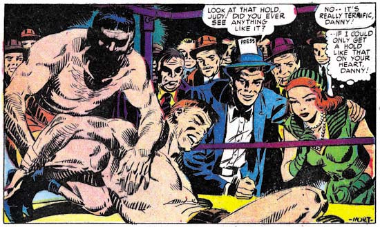
Young Romance #18 (February 1950) “I Own This Man”, pencils and inks by Mort Meskin

I provide above a splash by Meskin from early in his association with Simon and Kirby. It gives examples of a number of Mort’s spotting techniques. Mort’s most common brush method, actually used much more frequently than apparent in this splash, is to describe clothing folds by using two or more narrow brush lines in close or overlapping paths. These can be found in the pressman’s blue jacket. Note how what the original individual brush strokes are sometimes revealed at the ends of the folds. Another Mort inking style was to often distinctly outline shadows. Once again this splash does not provide the best examples but two of them are present one near the center of the wrestling mat while the other is near Mort’s signature. The wrestlers give Meskin the opportunity to do some real nice simple hatching. The lines vary from thin to quite bold. Often one and occasionally two lines are used to delimit a hatching area. This type of brushing technique is very reminiscent of the S&K Studio style picket fence work. (See the inking glossary for an explanation of my inking terms such as simple hatching and picket fence). I do not know enough about Meskin’s prior inking to say whether this is typical of his work at the time or if this shows he was influenced by the Studio style. The dark spot on the reporter’s right shoulder are suggestive of the Studio style’s shoulder blot. That is misleading as Mort always seems to use these in a way to suggest realistic shadows while in the Studio style they generally appear on both shoulders without any natural explanation.

Young Romance #37
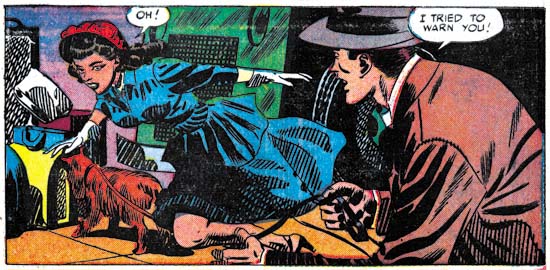
Young Romance #37 (September 1951) “Just to be Near Him” page 2 panel 1, pencils and inks by Mort Meskin

Although it maybe debatable whether my first image represents true Studio style brushwork, later work can certainly be called that. In the above image the pickets of the picket fence inking have become bold and the rails more consistently applied. Mort would sometimes also use standard crosshatching, as seen on our far left and on the lower part of the woman’s dress. When doing so, he would frequently place the crossing lines at an acute angle so that the white spaces are elongated.

Young Romance #29
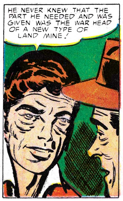
Young Romance #29 (January 1951) “Diagnosis: Love” page 5 panel 3, pencils and inks by Mort Meskin

The above panel provides a better example of Meskin’s penchant for outlining shadows. That the boldly brushed dark spot on the center man’s jacket is a shadow can be seen by the presence of the profile of a nose. Mort would occasionally have a dark shadow trace a path down one side of a figure, such as the man on our left.

Justice Traps the Guilty #56
Justice Traps the Guilty #56 (November 1953) “G-Man Payoff” page 5 panel 6, pencils and inks by Mort Meskin

When artists both draw and ink their own work the two art stages will sometimes reinforce one another. That is what I believe happened with the eyebrows that Mort gave his men. These eyebrows are inked with a method similar to how Meskin handled clothing folds, two or three narrow overlapping brush strokes would trace the path of the eyebrow. This resulted in eyebrows that were wide, simple and made somewhat angular turns. As we will see below, Mort became so entrenched in inking eyebrows this way that it could affected how he inked Kirby’s pencils.

The above panel also shows how Meskin would sometimes fill in part of a blank background with crosshatching. As is generally the case, here his lines meet at an acute angle, not at right angles some other inkers prefer.

Young Romance #30
Young Romance #30 (February 1951) “My Lord and Master” page 3 panel 1, pencils and inks by Mort Meskin

Sometimes Mort will use his brushwork to create a side of a figure that is both a narrow shadow and a wide outline. This does not show up often, but is very distinctive when it does. I am sure further study of Meskin’s abundant output will show other inking techniques that while not common can be useful in determining attributions.

Young Love #68
Young Love #68 (December 1955), pencils and inks by Mort Meskin

Covers are important for the sale of a comic and the higher quality paper allows a superior printing. Therefore artists take more care in the creating artwork for covers. However the S&K studio artists usually did not get a chance to provide cover art, Jack Kirby would do all cover art when a photograph was not used. But when Simon and Kirby launched their own publication company, Mainline, Jack was so busy that for a year the covers for the Prize romance titles would be done by other artists, including Mort Meskin. On none of his romance covers would Mort use picket fence patterns or any of the other traits of S&K Studio style inking. For the spotting on Young Love #68 Mort relied mostly on his use of narrow brush strokes. Note how on YL #68 the back of the man’s jacket and pants has that narrow shadow or wide outline that we saw before.

Mort Meskin was such a prolific artist that the possibility of the use of assistants has to be considered. In preparation for writing this post I reviewed a lot of Mort’s work from 1950 to 1956, there is so much work that I did not have the time to review it all. This review confirmed my previous conviction, Mort had little if any assistance in inking his art. Almost all the spotting looked like it was done by the same hand.

Some of Meskin’s inking techniques are not limited to him alone. The use of narrow, often overlapping brush strokes can also be found in stories by George Roussos as well. This is not too surprising since Mort and George worked together in the late 40’s. The narrow brush strokes were not the only think George picked up from Mort, a lot of his penciling was clearly influenced by Meskin as well. Nonetheless Roussos did not adopt all Mort’s inking techniques so the two can be distinguished. However a discussion about Roussos will have to await another post. I will say that I have yet to find an example of Roussos inking Kirby (that is until the Silver Age).

Boys’ Ranch #4
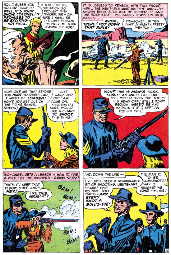
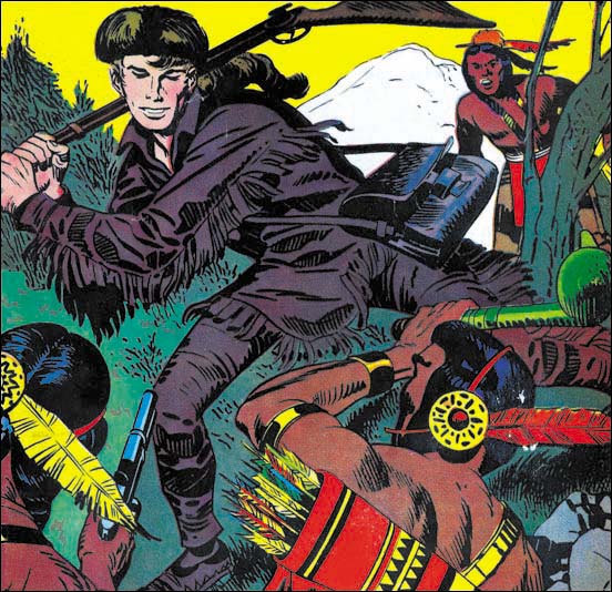
Boys’ Ranch #4 (April 1951) “The Bugle Blows at Bloody Knife” page 8, pencils by Jack Kirby, inks by Mort Meskin

The Jack Kirby Checklist attributes most of the inking in the classic Boys’ Ranch to Joe Simon. Actually it is not hard to recognize Mort Meskin’s inking in much, if not most, of it, particularly after the first couple of issues. The biggest difficulty I faced with choosing an example of Mort inking Kirby from Boys’ Ranch was that I believe Mort was the penciler for at least some of the work in that title that has generally been credited to Jack. But the drawing in “The Bugle Blows at Bloody Knife” looks so much like Kirby’s that I am confident that he was the penciler. I am equally as confident that Meskin did the inking. Note the narrow clothing folds in panels 3, 4, 5 and 6. See how the shadows have a strong outline, most obvious in panel 4, but can even be found on the officer’s forehead in panel 1. The back of the soldier in panel 3 could be described as either a narrow shadow or wide outline. The eyebrows in panel 1 and 6 are simple with angular turns. All of these are typical Meskin traits.

Police Trap #6
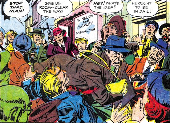
Police Trap #6 (September 1955) “Only the Guilty Run”, page 1, pencils by Jack Kirby, inks by Mort Meskin

The two gun carrying detectives in the background are so typical of Jack Kirby that he must have been the penciler. At a glance the inking appears typical S&K Studio style. But note how the clothing folds are long and narrow. The final giveaway is the thief’s eyebrows are simple with angular turns. There is little doubt that this is another example of Meskin inking Kirby.

Western Tales #32
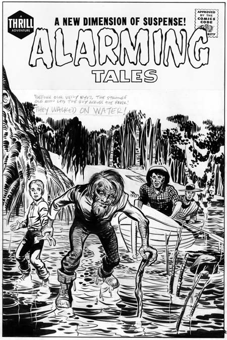
Western Tales #32 (March 1956), pencils by Jack Kirby, inks by Mort Meskin

My final image is the cover of Western Tales #32. This work was not included in the Jack Kirby Checklist. The last time I posted on it I attributed both the pencils and inks to Joe Simon. The fact that it was not Kirby’s inking and the stiffness of the Indians (especially the one in the right foreground) suggested to me that Joe might be responsible. After all Simon has shown himself to be excellent at mimicking Kirby. However Crockett’s pose seems more dynamic then what Joe has ever done without using swipes, and it was just the sort of thing that Jack was so good at. Perhaps the awkward pose of the Indian on the right was due to the limited area left over from Davy’s figure. As for the inking it simply is not Kirby’s work. Note the long and narrow clothing folds, Davy’s angular eyebrows, and the way his back is outlined by a narrow shadow. None of these are Kirby traits but all are characteristic of Mort Meskin’s inking. This magnificently inked cover shows that Mort had complete mastery of the S&K Studio style. Mort’s brushwork has the same sort of bold confidence that Jack and Joe also possessed. Although it may not be a reliable enough trait to rely on in determining attributions, Meskin’s brush does seem a little more mechanical then either Simon’s or Kirby’s.

A few months after Western Tales #32 Meskin would stop providing work to Simon and Kirby. If the GCD is correct, Mort had actually returned to working for DC a couple of years earlier. Now having left S&K, DC would become Mort’s main source of income until he abandoned the comic book industry. Meskin’s final DC period overlaps Jack Kirby’s time there, however none of Kirby’s DC work that I have seen was inked by Mort.

I have not made a thorough examination of Jack Kirby’s work for the purpose of determining what ones were inked by Mort Meskin. I want to hold off on that effort until I review some more S&K artist/inkers. So far the only other one I have posted on was Marvin Stein.

Alternate Versions of the Alarming Tales #3 Cover

Alarming Tales #3
Alarming Tales #3 (January 1958) restored art, by Joe Simon

A recurring theme in my posts is how well Joe Simon could mimic Jack Kirby. This has resulted in a number of pieces that Joe did becoming attributed to Jack. Do not get me wrong, the overwhelming number of the items in the Jack Kirby Checklist are correctly attributed. Still there are a small number of entrees that are wrong and it is important to try to correct those mistakes. I would like to say that my study of Joe Simon’s art has enabled me to spot all the attribution errors that others have made. I would like to say that but it would not be completely true. A case in point is the cover for Alarming Tales #3. I provide an image of the restored line art to this cover above, a color version can be seen in a previous post.

In the past I have followed the Jack Kirby Checklist in saying Kirby did this cover. Not everyone agreed, for one sharp eyed Nick Caputo demurred. I was not completely satisfied with the Kirby attribution because I knew of the existence of another version of the cover art. It seemed to me that a comparison of the two would probably resolve the credit issue. As I hope to show in this post, that has turned out to be the case.Alarming Tales #3
Unused original art for Alarming Tales #3, by Jack Kirby.

I provide an image of the unused version above. A note of caution when comparing the two versions. The unused one is original art and therefore has not been subjected to the blurring and loss of details that are the results of the printing process, all of which the published version has been subjected to. Also the title on the original art is a recent addition. The presence of penciled text indicates the decision to come up with new cover art was made before title stats would have been applied to the original.The derivation of the final cover from the unpublished version is obvious, both have the same cast of characters in about the same positions. The greatest difference is the backgrounds. Not only has the background been completely changed, it has been pushed much further back in the released cover. A closer examination reveals that the people are not identical. The size of the old man has been increased while the relative size of the boy and, even more so, the men in the boat has been reduced. The old man’s head has been enlarged and the position of his left arm has been shifted. The details of all figures have been changed. Curiously the boy’s pants have been given a stripe like those worn by the USPS mail carriers. My original suspicion that reworked stats of the first cover were used to construct the final state was incorrect.I think most readers will agree with me that the original art is more beautiful then the final cover. So why spend the time and effort to replace it? The answer to this riddle is that the purpose of a comic book cover is to entice a viewer to purchase it. To do so it must stand out from the rest of the comics on the rack. The problem with the original version is that the old man is overwhelmed by the background. By simplifying and pushing the other elements back, the old man and his feat of walking on water becomes more obvious and dramatic. It is a question of design taking priority over artistry.

Alarming Tales #3
Close-up of the old man by Jack Kirby and the Joe Simon rendition.

Because the compositions of the two versions are so similar, we must look at the details in order to arrive at the correct attributions. Although not a standard part of Kirby’s repertoire, the old man of the first state seems to be not only his pencils but his inking as well. There are subtleties that his copyist is unable or unwilling to capture. Some of the alterations do seem on purpose, in the final state the old man has been made older and more frail. In doing so the published version has lost the quiet dignity and resolve that the original old man possessed.

Alarming Tales #3
Close-up of the young boy by Jack Kirby and the Joe Simon version

Personally I do not find much in the final state of the old man to suggest who was responsible. For an answer to that question I turn to a close-up of the young boy. Once again the original version seems to have Kirby’s touch all over it. Some of Jack’s style has been preserved in the published interpretation but purposeful alterations have been made as well. Frankly in Kirby’s hands the boy has been given a somewhat dim witted response to his predicament. The copyist on the other hand has widen the boys eyes, raised his eyebrows and furrowed his forehead. All this gives the boy a more intelligent and surprised reaction to being lead by the old man over water. It is the boy’s eyebrows that convince me that the copyist is Joe Simon. Similar eyebrows crop up often in Joe’s work going back as far as the cover for Champ #19 (June 1942) .

The men in the boat are typical Kirby creations. Unfortunately it is hard to compare the two versions because in the published one they have been reduced in size and their finer features lost by the reproduction process.

I mentioned above that I believe Jack Kirby inked his own pencils for the unused Alarming Tales #1 cover. That is not surprising because AT #1 is a comic where Jack did most of the work, including the inking. When I previously discussed the inking in AT #1 I found some of it similar to the standard Studio style while others were closer to the Austere style. On a whole I felt the material was transitional between those two Kirby inking methods. The inking style exhibited on the unused cover is a bit of an anomaly. It is true that the bow of the boat exhibits what looks like typical picket fence brushwork (see the Inking Glossary). It should be noted that it is unusual for the rails of a picket fence inking to depict literal objects like it does here with the bow edges. A better example of typical Kirby brushwork can be found in the folds of the boy’s shirt. They exhibit the tendency to be flatter then the underlying form that was common for Kirby at this time. The form lines on the tree on the left side of the image also look like Jack’s. But other inking methods used are very unusual for Jack, in particular the form lines on the old man’s pants. I do not recall Kirby ever doing something like that before.

Also unusual about the inking is the abundant use of white-out. Although Kirby was a bold inker his control was so great that he usually had to make few adjustments with white-out. Actually some of the white-out on the unused cover were not mistakes at all. Many of the trees in the background and some of the branches in the water were actually created by white-out. The old man’s hair was done by a combination of standard inking and the use of white-out. But mistakes were corrected, for instance the edges of the drooping fronds left of center on the top were worked over. Some earth lines in the background and a water stain on the upper part of the boat were removed. I am not sure what to make of Jack removing the bottom of the boy’s shoes. Perhaps it was done to indicate that he the lacked the old man’s confidence and so could not tread as lightly over the water surface? A most surprising correction is found in the depiction of the water, much of what now looks white has abundant use of white out. The white-out does not completely hide the underlying inking and judging from their faint markings the water surface was originally much darker.

Despite all the features that are not usually found in Jack Kirby’s inking, I find the combination of boldness and control so characteristic of his work that I am pretty confident to credit him with the inking. The published cover shows Joe Simon equally bold with his use of the brush but without the same nuance of control exhibited by Kirby. It is interesting that Joe made the water surface very dark, just the thing that Jack spent so much effort to remove from his own version.

I love comparing different artists’ versions of the same subject. It is not a question of trying to determine who the better artist is. What I find interesting are the different decisions each artist made and what the reasons for those decisions were.

The Early Sandman

Adventure Comics #72<
Adventure #72 (March 1942) “Riddle Of The Slave Market”, art by Jack Kirby

Joe Simon has said that when, along with Jack, he arrived at DC their first jobs was ghosting for others. In the past Joe had shown he could be pretty good at mimicking comic artists, some of his Fox covers have been attributed to Lou Fine by comic book experts despite the presence of Joe’s signature. Joe and Jack both worked on a Captain Marvel special which on a whole is a pretty good job of ghosting. However careful attention reveals Jack’s touch on the Captain Marvel job despite the simplicity of the art work. So far no one has identified any of the ghosting jobs that Simon and Kirby did for DC. The first Simon and Kirby piece that we do know about was a Sandman story that appeared in Adventure Comics #72 (March 1942). No question of ghosting here, Simon and Kirby not only signed the piece they infused it with the exciting art and dynamic story telling that characterized all their creations. The only thing is Sandman was not their creation, not even the version with the new purple and yellow costume and a young sidekick named Sandy. This updated Sandman started a couple of issues before. Unfortunately I have never had the opportunity to examine those two pre-S&K issues. Simon and Kirby may not have changed the costumes, but I suspect a fuller comparison would reveal other modifications.

At this point Joe and Jack were pretty comfortable with what it took to make an interesting comic. One reason for the ease that Simon and Kirby seem to have in taking over someone else’s title was its similarity to their previous gig, Captain America. Both titles had a hero whose powers, while exceptional, would not be considered unnatural. Both included a young sidekick so that, as Joe would describe it, the hero would have someone to talk to. Finally neither hero would use weapons such as a gun. Sandman and Sandy did carry what looked like a pistol but actually was what they called a wirepoon, used to attach a wire so that the heroes could easily ascend buildings, it was never fired at their foes. It should be noted that S&K would not adhere to these traits throughout their career. Most S&K heroes do not have what one would normally describe as super-powers, but there are certainly enough exceptions. I would say most S&K heroes did not have a sidekick, but again there are enough young partners to made this a weak generalization. As we saw in Manhunter Joe and Jack could come up with sidekick stand-ins if they felt the need. Perhaps the strongest S&K trait was the hero’s lack of firearms. Only two heroes had a firearm, Night Fighter (intended for their own company Mainline) and the Fly (whose costume seems based on Night Fighter and so probably inherited the gun from that source). Since Night Fighter was never published we do not know if it was a true gun, it could have been another wirepoon to help, along with special suction boots, scale buildings. The Fly had no need for a wirepoon (he could fly) and so it was his buzz gun (used to stun his advisories). Of course I am excluding the cross-genre Bulls-Eye, although it may properly be considered part of the hero genre, a western without guns, well that would just be silly.

Captain America was not a perfect prototype for how Simon and Kirby would do Sandman. The most important difference was that since Captain America was a patriotic hero most of his opponents were spies. Without a patriotic costume, Sandman would have to have other foes. That was not a serious problem because crime was the staple of comic book and Joe and Jack would show themselves quite capable of supplying a steady stream of colorful lawbreakers. The thing that gave Simon and Kirby the greatest difficulty was non-iconic nature of Sandman. Ideally comic superheroes are meant to be iconic figures, or avatars, the embodiment of a quality or theme. The original Sandman had a pistol that released a sleeping gas and so Sandman was a very apt name. With the sleeping gas discarded and its pistol replaced with a wirepoon, the name Sandman lost its original significance. Simon and Kirby tried to make up for this lost in a number of ways. One was a bit of a poem that they would often use, usually either at the start or end of a story:

There is no land beyond the law
Where tyrants rule with unshakeable power,
It’s a dreame from which the Evil wake
Too face their fate … their terrifying hour

I wish I knew more about this unusual poem. Was it used previously by Sandman’s earlier creators, or did Simon and Kirby introduce it? More importantly what was the origin of this rhyme? The obsolete spelling of the word dreame suggests it may come from English literature. Then again it may just be the work of a very clever comic book writer. I suspect the former but I have not been able to uncover the source.

Adventure Comics #79
Adventure #79 (October 1942) “Footprints in the Sands of Time” page 2, art by Jack Kirby

Another justification for the name Sandman was the concept that the criminals were so frightened Sandman that he would haunt their dreams. A nightmares of the Sandman had by a crook was depicted in Adventure #79 (see image above). In “A Drama in Dreams” (Adventure #81, December 1942) an actor has taken the place of Sandman’s alter ego, Wesley Dodds. His deception was not perfect until he talks in his sleep:

Wesly: You can’t pin anything on me! Help! The Sandman … Don’t let him get me!

Sandy: Why — only criminals have dreams like that — but not Wes Dodds.

Dreams and sleep play other small parts in Sandman stories. In “The Lady and the Champ” (Adventure #83, February 1943) sleeping with a piece of wedding cake under the pillow apparently results in two strangers dreaming of each other. In “The Man Who Couldn’t Sleep” (Adventure #80, November 1942) a rich man’s insomnia leads him to a life of crime. Other sleep references can be found, such as Sandman commenting on their fighting crime at night while others are asleep. Sandman may not have had any special powers, but that did stop S&K from including the sleep theme into their stories in an attempt to justify their hero’s name.

Just as Sandman and Sandy did not have an real superpowers, neither did their opponents. Most would be have nothing special about them above their criminal behavior. That really was not a problem because Joe and Jack knew how to make a story exciting. Sometimes S&K would suggest their villains had powers which by the end of the story would be shown to be illusionary. In the “The Villain from Valhalla” (Adventure #75, June 1942) we are presented with the god Thor whose leads a Viking raid against New York City. Even the character’s thought balloons lead us to believe he is truly Thor, as a car approaches the treasure laden Thor he thinks:

HMMMMM. A QUEER CHARIOT THAT! .. BUT “MJOLNAR” CAN OVERCOME IT!

But in the end he turns out to be nothing more then “a clever and brutal killer” named “Fairy Tales” Fenton. His metallurgy expertise provides his gang with bullet proof clothing. The destructive hammer

AN ELECTRICAL MASTERPIECE! IT CAN SEND ENOUGH VOLTAGE INTO THE STRONGEST STEEL TO BLOW IT TO PIECES

Adventure Comics #84
Adventure #84 (March 1943) “Crime Carnival” page 1, art by Jack Kirby

Another faker was the carnival magician in “The Miracle Maker” (Adventure #78, September 1942). His magic tricks were used to hide his criminal acts. Sandman and Sandy are not fooled and catch him at his tricks. Simon and Kirby seem to have a propensity for using carnivals as a source of criminals. Previously at Timely they had done “Case #2: Sando and Omar” (Captain America #1, March 1941) and “Captain America and the Ringmaster Of Death” (Captain America #5, August 1941). “Crime Carnival” became a prime example for Sandman. Why carnivals? I suspect it has to do with the fact that the readers would be familiar with the world of circus performers and freaks. It was populated with people who could have abilities beyond those of normal people, yet be familiar enough that the readers would not wonder how they got those powers. Provided that S&K did not go too far, which they never seemed to do. When Strecho reaches through the bars to grab the money bags from a bank desk, is his arm length truly increasing, or is he just taking advantage of his thin but tall frame? From the angle that Kirby draws it is hard to be sure.

The only villain in the earlier Sandman stories that is shown receiving powers that he did not originally have was in “The Man Who Knew All the Answers” (Adventure #74, May 1942). Here we find a scientist using a device to generate vibrations that develop his unused brain cells.

KNOWLEDGE! VAST KNOWLEDGE! … I CAN FEEL IT POURING ….. INTO MY BRAIN ….. OPENENING .. UNLOCKING THE NATURAL … AND SUPERNATURAL!

Afterwards when encountering the janitor he questions him about getting a new job. The janitor is shocked, he has told nobody about it. Deductions like a super-Sherlock or ESP? No explanation is given and for the rest of the story the only power he exhibits is great intelligence.

Adventure Comics #75
Adventure #75 (June 1942) “The villain from Valhalla” page 1, art by Jack Kirby

In my opinion it was with the work that Simon and Kirby did for DC (as well as the Harvey covers) that they forged their unique art style. The key ingredient that had previously been missing was their special bold inking style. There had been occasional hints of it in the Captain America Comics, but S&K would consistently use it from this point on. I suspect that the larger crew at Timely was the reason that it did not evolve at that time. At least initially at DC all of the art was produced by Jack and Joe which facilitated the developing of their inking style. Still this is not the Studio inking style I wrote about in my serial post on Jack Kirby’s Austere Inking. There are things that look like abstract arcs (see the Inking Glossary ) but they black area never seems to form a band with both the upper and lower boundaries tracing an arc, something often seen in the typical Studio style. Crosshatching sometimes is reminiscent of picket fence brushwork as for example on the torso of Thor in the above splash page. But the pickets are thin and slanted at an angle while the rails are actually further crosshatching.

Other changes occurred in the art from what was done on Captain America. The more extreme irregular panel shapes had been abandoned. Round and irregularly shaped panels would still be common, but ones with a multiple zigzagging border would no longer be used. The most important change would be the panel layout. The predominant format on Captain America had the panels laid out in four rows and two columns. The same layout was initially continued when Simon and Kirby worked at DC. But beginning with Adventure #78 (September 1942) three rows and two columns began to be the most common layout. The transition was not sudden or complete, there are a number of stories that have both layouts. But eventually four rows would become rare and most variations would be having some rows with three panels.

Adventure Comics #75
Adventure #75 (June 1942) “The villain from Valhalla” page 8, art by Jack Kirby

I cannot finishes discussing the earlier Sandman comics without writing about one of my favorite splashes, the one from “The Villain from Valhalla”. In a previous encounter with Thor and his Viking horde, Sandman and the police had been soundly defeated with Sandy hospitalized. Now they are determined to even the score. Most Simon and Kirby splashes were limited to the first page, but this fight required the an entire story page. Besides Thor’s hammer we find the villains armed with a spear and a battle ax. Yet the good guys face this solely with their fists, none of the police draw their guns. The composition is Kirby’s comic book equivalent of Jackson Pollack. Most of the page is a tangle of arms and bodies where extra viewing time is required to reveal what is going on. Jack is not even content to leave the skyline with the Chrysler building alone, surmounting it with a rope swinging Viking. Jack’s confidence in the impact of the splash is so great that he is throws in a piece of his personal humor, a policeman’s powerful slug sends a Viking’s helmet on an upward trajectory. Frankly the caption

THEN BEGINS THE STRANGEST BATTLE NEW YORK HAS EVER WITNESSED!

seems superfluous and Sandman’s battle cry

THIS IS FOR SANDY!

was all that was needed.

Green Hornet #8, Another Harvey Cover

Green Hornet #8
Green Hornet #8 (August 1942), art by Joe Simon

When I started this blog, one of my projects was to review the covers that Al Avison, Joe Simon and Jack Kirby did for early Harvey comics. I love cover art and these early Harvey covers have some of the best work that Simon and Kirby did during that period. Unfortunately these are rare comics and generally in poor shape making restoration difficult. During the first eight months of my bloggin I was able to post on twenty Harvey covers, but a few remained to be restored and reviewed. Speed #23 presents some formidable restoration challenges. Every so often I take a look at it, however so far I just have not felt ready to take in on. I would love to write a better review of Champ #22, but I do not have a good enough of a scan to do a proper restoration. That was also the problem with Green Hornet #8, at least up to now. Now after a year, I am finally able to add another chapter to my writing on the Harvey covers.

Harvey covers can be divided into two time groups. The first were for the pocket sized comics that Al Harvey first published. The cover art was drawn by Al Avison or Joe Simon. Jack Kirby did not do any of them despite the fact that all three were involved with creating Captain America comics at that same time. Coincidentally the pocket sized Harvey comics ended at the same time as Simon and Kirby’s termination at Timely. This was followed by a gap of a few months and then Harvey started publication again, this time using the standard comic book size. Avison no longer supplied any covers, he was probably too busy doing Captain America for Timely now that Simon and Kirby were gone. Simon would draw some Harvey covers, but most were done by Jack Kirby. Oddly Joe Simon was responsible for three covers done in one short period of time; Champ #22 and Speed #22 (September) and Green Hornet #8 (August). Green Hornet was a bimonthly. Although Joe had done Champ #19 and Speed #19 (both June) in a Kirby style, the later trio of covers did not seem to reflect much influence from Jack.

It would appear that for Green Hornet #8 Joe resorted to the use of swiping that was so prevalent in the start of his comic book career. I cannot supply the source, but I am sure the witch was swiped from someplace. The captive young lady has a Will Eisner look to me. The Spirit had been published as a newspaper insert for some time so Joe was certainly aware of it. However my search through the DC archive editions has failed to reveal any possible sources for the lady on Simon’s cover. The Green Hornet’s two opponents look like Simon creations. Note their similarity of their checks and jowls with that found in the Hitler from Speed #21 (August), the smaller villain from Champ #19 (June), and the sketch of Hitler in a Zoot suit. Yes Joe used swipes for this cover, as he so often did, yet he has created a very original composition.

The cover tells a story, as just about all Joe Simon covers do. A lady is held captive, terrified of the future revealed in a crystal ball by a truly gruesome witch. But the background shows the Green Hornet arriving to the rescue. But our hero must be careful to negotiate the obstacles separating himself from the damsel in distress, a pit at his feet and a chain stretching across his path. As we follow the Green Hornet’s eyes we find it is no ordinary chain as it ends with a collar on what is the not quite human equivalent of a guard dog. A very effective guard indeed as shown by his blood stained knife. The guard is intent on preventing the Green Hornet from interfering while his diminutive companion’s concentration remains on fulfilling the crystal ball’s prediction of the woman’s fate.

Simon makes effective use of props to heighten the drama. A drip covered candle provides an eerie touch to the scene, it is a device that Simon and Kirby would introduce often for such an effect. A spot light seems come from someplace low off our field of vision. It is a very selective spot light indeed, no shadows are cast by the legs of the two subhuman figures. However shadows are cast by the hand held knife, the chain and the Green Hornet himself. All the shadows that would provide drama to the scene, as always realism is not as important as telling the story. The spot light also aids the composition, diagonally dividing the two darker fields occupied by the villains. The captive is not in the spot light but is highlighted by it, visually connecting her to the hero. It may not have anything to do with Joe, but the colorist use of a green dress also effectively links the damsel with the hero.

Joe Simon may not have been as talented a penciler as Jack Kirby, and some will say that he depended too much on the use of swipes. When it came to laying out a cover and making it tell a story, few at the time were his equal. Green Hornet #8 was truly a thrilling cover. But Joe was not content with just drama, he also included humor, albeit a dark humor. There is a similar touch of black humor in Joe’s cover for Champ #19. Here Simon scatters cob webs about the place as part of the effort to give a dungy look to the scene. How many artists would then turn around and attach webbing from the staff to the witch herself? My favorite piece of humor in this piece is how the beastly guard leads his small partner by the hand, as if he is taking part in a “take your child to work” day. This type of humor is an early manifestation that would fully blossom when Joe was editor of Sick magazine.

In order to the receive lower mailing costs for literature, comic books had to include a text story. Often not much effort seemed to be given to this story, as a young comic book reader I never read them. Harvey comics had an interesting approach to the text stories, as some of their covers declared:

READ the THRILLING Story behind the COVER — INSIDE —

What is interesting about the text story for Green Hornet #8 is not what it adds to the understanding of the cover, rather how it deviates. In the story the lady is held captive in a building across the street from the offices where the Green Hornet’s alter ego works as a newspaper reporter. Nothing in the story suggests that woman was held in the sort of dungeon that the cover portrays. Rather the story describes her place of confinement as a small room adorn to look like a fortune telling shop. In the story there is a fortune teller whose crystal ball reveals a fatal future for the beautiful captive, but without an indication that the soothsayer was an ugly witch. The short tale includes two “toughs” without giving the impression that they were almost subhuman. Neither is described in the story as small as the one shown on the cover depiction. Nor does the story mention the use of knives by the toughs. I find it hard to believe that an author presented with a copy of this exotic cover art would have written this more mundane story. More likely Joe Simon received the finished story and, realizing that the cover would have to be more exciting if it was going to sell the comic, spiced it up.

Another Pre-Implosion Atlas Kirby

Quick Trigger Western #16
Quick Trigger Western #16 (February 1957) “The Vengeance Of Growling Bear” page 2 pencils by Jack Kirby

A peace treaty with the Indians threatens the business of gun dealing. To prevent the unwanted peace, the dealers dress up as Indians and raid the community, leaving death and destruction in their path. The Indian leader, Growling Bear, uncovers the truth. His reputation is enough that when the gun dealers realize that he is on to them, their plot unravels before war is resumed.

I must confess I am a bit underwhelmed by this story. Jack’s pencils are good in comparison to other Atlas artists, but then again I have a low opinion of much of the art done at the time for Atlas. In comparison to the rest of Kirby’s oeuvre, this story art is one of his lesser efforts. Nothing particularly wrong, just not as exciting as most of what Kirby did. The writing does not help either. Again it is not that the writing is bad, just that not very exciting either.

One of the reasons that I find Jack’s pre-Implosion work for Atlas so fascinating is the level of control that he appeared to have. Even so Jack did not seem to consistently have full creative leeway. That seems to have been the case here. Unlike many pre-Implosion pieces, the inking was not by Jack, but it may have been inked under his direction. Most of the brushwork is fine and lacking Kirby’s style. But look at the second panel of page 2 (image above), the horse’s leg on our far right has a bold use of a row of dashes. This technique does not occur elsewhere in the story but is part of Kirby’s brush vocabulary (see the similar drop string in the inking glossary). It would appear that Kirby reviewed and touched up the primary inker’s efforts. The writing does not seem to be Jack’s either. The plot, where white men masquerade as Indians, was used previously by Simon and Kirby. So Kirby may have had a hand in the plotting. Then again I remember that plot from some old movies (although I cannot recall which ones) so perhaps it was just a common theme. In any case general plots are easily picked up by other writers and therefore are a poor use in determining attributions.

Now with “The Vengeance Of Growling Bear” I have had a chance to review all Kirby’s work that Atlas published before the Implosion. This consists of 20 stories. Jack did the inking for 16 of them, an impressive proportion. Because credits were not provided, determining the writer is a particular risky business. None the less the writing for 15 of the stories suggest to me that Kirby may have been involved. This amount of creative control by Kirby is in stark contrast to post-Implosion. I know some disagree with me, but I find no examples of post-Implosion writing by Kirby, that is until late in his career. As far as I know, Kirby did not do any inking after the Implosion either until the cover for Fantasy Masterpieces #4 in 1966. Nick Caputo has suggested that Kirby inked some other later covers, but I have not seen this evidence yet.

Battleground #14 (November 1956)
“Mine Field” Kirby inks
Astonishing #56 (December 1956)
“Afraid to Dream” Kirby inks and writing
Strange Tales of the Unusual #7 (December 1956)
“Poker Face” Kirby inks
Yellow Claw #2 (December 1956)
“Concentratet On Chaos” Kirby inks and writing
“The Mystery Of Cabin 361” Kirby inks and writing
“The Yellow Claw” Kirby inks and writing
“Temu-jai, The Golden Goliath” Kirby inks and writing
Quick Trigger Western #16 (February 1957)
“The Vengeance of Growling Bear” Kirby inks and writing
Yellow Claw #3 (February 1957)
“The Microscopic Army” Kirby inks and writing
“UFO, The Lighting Man” Kirby inks and writing
“The Yellow Claw Captured” Kirby inks and writing
“Sleeping City” Kirby inks and writing
Yellow Claw #4 (April 1957)
“The Living Shadows” Kirby writing
“The Screemies” Kirby writing
“Five Million Sleepwalkers” Kirby writing
“The Yellow Claw and the Thought Master” Kirby writing
Black Rider Rides Again #1 (September 1957)
“Legend Of The Black Rider” Kirby inks
“Duel At Dawn” Kirby inks
“Treachery At Hangman’s Bridge” Kirby inks
Two-Gun Western #12 (September 1957)
“No Man Can Outdraw Him” Kirby inks and writing

Job numbers indicate that there are three works that may have actually been done before the Implosion but not published until afterwards. These appear to have intended for the never released Black Rider Rides Again #2. I have not seen two of them, but the one I have seen was was not inked by Jack, and I doubt if he wrote it either.

Gunsmoke Western #47 (July 1958)
“Trouble In Leadville”
Gunsmoke Western #51 (March 1959)
“The Raiders Strike”
Kid Colt Outlaw #86 (September 1959)
“Meeting At Midnight”