Category Archives: Infantino, Carmine

The Captain Aero Connections

There was no true connection between the team of Simon and Kirby and Captain Aero Comics. Captain Aero was just one of a number of wartime publications (lasting from December 1941 until August 1946). Holyoke is usually said to be the publisher for this comic but the indicia from later issues list Continental Magazines. This may be nothing more then the use of an alternative name, a common practice at the time, but irregularities in the issue numbering (there are no issues #18, 19 or 20) suggests that the title may have truly had a change in publishers. The connection referred to in the title concerns some of the artists whose work appeared both in Captain Aero as well as in various Simon and Kirby productions. There is nothing particularly surprising about this as both were small outfits getting work from an assortment of comic book artists. I am sure that careful examinations of other smaller publications would reveal artists that had also worked for Simon and Kirby. Because Captain Aero comes from an earlier period it nicely shows how extensive these artists’ style had evolved. Had these works been unsigned, I doubt that I would have identified any of the artists.


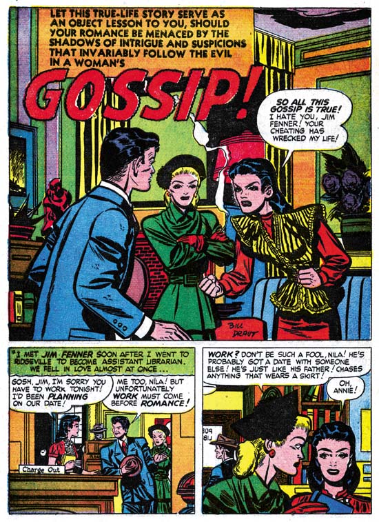
Captain Aero #7 (July 1942) “Devil Dogs Commandos”, art by Louis Golden?

The first artist from Captain Aero with a Simon and Kirby connection has been somewhat of an enigma. His two known S&K works were signed on the last page but the signature has been difficult to decipher. The handwriting of the signature found on the splash panel of “Devil Dogs Commandos” is the same but a little clearer. The initial is either an ‘L’ or a ‘T’ or an amalgamation of both. The first letter of the last name looks like a ‘G’ so my current reading of the name is L. or T. Golden. There is an artist named Louis Golden listed at Atlas Tales as having contributed to Mystic #10. The Who’s Who of American Comics cites Golden as having worked for Holyoke in 1942-43 on Blue Beetle, Enchanted Woods and Monkey Fencer. Captain Aero #7 has not been indexed yet in the GCD but one of the few works that the CGD lists for Louis Golden is from Veri Best Sure Fire Comics #1 listed as a reprint form an unspecified Captain Aero issue. The title in Sure Fire #1 (“Commandos of the Devil Dogs”) is just a slight rewording from the title found in Captain Aero #7 as to leave little doubt that they are the same story. While I have not seen any of the work these various Internet sites attribute to Louis Golden this information is favorable enough that I am now tentatively identifying him as the artist in question. Golden did not do much work for Simon and Kirby but it is still nice to be able to provide a name for that work.

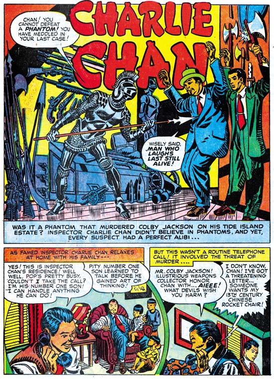
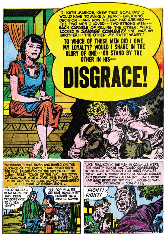
Fortunately the signature is very distinctive because the artist’s style here is so different from his work for Simon and Kirby (Justice Traps the Guilty #7 and Charlie Chan #1). There is no sign of the massive, square faces that is such a distinctive feature in his later work. While I admire the art he did for S&K, I find this Captain Aero piece to be rather crude.


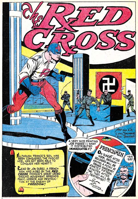
Captain Aero #9 (November 1942) “The Red Cross”, art by Charles Nicholas & Sol Brodsky

Charles Nicholas has been credited with being the creator of the Blue Beetle, but which Charles Nicholas is this one found in Captain Aero? Is this the artist otherwise known as Charles Wotjkowski who worked for Simon and Kirby after the war? I am not positive but the style suggests it is. Actually the work for Captain Aero (two stories and one cover all of the Red Cross feature) seems more professional then his S&K crime story (Headline #31). Perhaps that is due to the inking by Sol Brodsky, a talented artist in his own right who did the pencils for another piece in Captain Aero.


Captain Aero v. 4 n. 3 (#17) (October 1944) “First Jap Killer”, art by Manny Stallman

Will the real Manny Stallman please stand up? Well that was how I felt after examining three distinct styles from stories of the late ’40s and ’50s all of which were signed as Manny Stallman (Chapter 7 and Chapter 8 of It’s A Crime, and Atlas Tales). The Captain Aero pieces signed by Stallman could be considered a fourth style. However, in this case that is not particularly surprising because a common theme of this post is how much the work of these artists changed over the years.


Captain Aero #21 (December 1944) “Next Door to Death” page 2, art by Manny Stallman

In his art for Captain Aero, Manny drew eyes with an almond shape; little indication of the tear ducts and the upper and lower eyelids having curves that are almost mirror images. Despite a separation of over 10 years, similar eyes are found in the work that Stallman did for Atlas in the ’50s. In contrast, Almond shaped eyes are not found in any of the work done for Simon and Kirby. Further investigations will need to be made, but I am beginning to suspect that ghost artists were used for all the work that Stallman submitted to Simon and Kirby.


Captain Aero #21 (December 1944) “Red Cross” page 2, art by John Giunta

John Giunta appears in the same issues of Captain Aero as Manny Stallman. The team of Giunta and Stallman signed also two works for Simon and Kirby (Chapter 9 of The Art of Romance, and Chapter 7 of It’s A Crime). Mark Evanier’s in his obituary for Manny Stallman states that Stallman and Giunta teamed up on a number of occasions. Even though there are no jointly signed works in Captain Aero, their mutual presence does suggest the connection between the two artists extended at least back into 1944. John did a couple of Mighty Mite stories for Captain Aero but that feature called for a cartoon style that makes it difficult to compare with his Simon and Kirby art. Such comparisons are not easy even with his “Red Cross” story, however the eyebrows are rendered in a rather distinctive manner that has some correspondence to those drawn in Giunta’s S&K work.


Captain Aero #23 (August 1945) “Blimp Blitz”, art by Al Hollingsworth

The African American comic artist, Alvin C. Hollingsworth, only worked for Simon and Kirby for a short time (It’s A Crime Chapter 6 and Chapter 7) but left a lasting impression on Joe Simon who remembers him to this day. It is not the talented Hollingsworth that we saw in the art produced for Joe and Jack, but a much more primitive, earlier version. Still, it is nice work.


Captain Aero #25 (February 1946) “The Wail of the Whaler” page 4, art by George Gregg

George Gregg’s Captain Aero work is cruder then what he did for Simon and Kirby (Chapter 5, Chapter 7, and Chapter 9 of The Art of Romance) but, at least on this page, more fun. I just love the multiple images of the fist in the first panel, which certainly is not how Jack Kirby would portray a slug fest! The art on a whole is more unrefined then the admittedly still not very sophisticated form of his Simon and Kirby work. Frankly, I prefer this more primitive but energetic version of George Gregg.


Captain Aero #26 (August 1946) “Adventure in the Air”, art by George Gregg

Did George Gregg undergo a prodigious advancement since the last issue? The Gregg’s art in Captain Aero #26 is much more realistic then issue #25. Actually the art may have been done months apart since about six months separate the two issues. Captain Aero #26, however, was the final issue so there is a good possibility that its publication was delayed and that the art was actually done much earlier. Whatever the reason, “Adventure in the Air” sports a more realistic style.


Captain Aero #23 (August 1945) “Interceptor Command”, art by Carmine Infantino

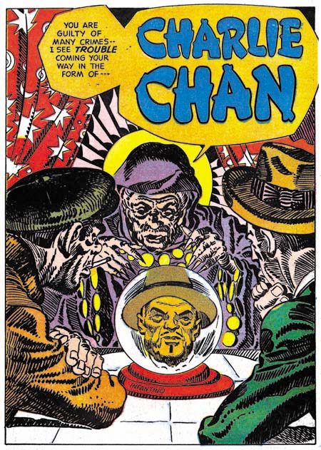
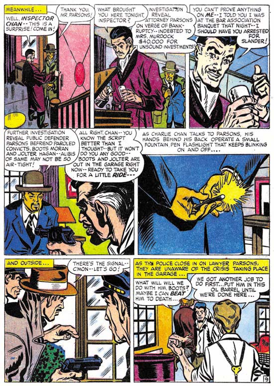
We have seen Carmine Infantino’s work not only for Simon and Kirby’s Charlie Chan (It’s A Crime, Chapter 8) but earlier for Hillman’s comics. Simon and Kirby were just freelance artists for Hillman and not producing the comics, so Carmine was not working for Joe and Jack at that time. Infantino was about 20 years old when he did “Interceptor Command”. That may seem young but Carmine first published work was done when he was about 16 years old and still in high school. The splash shown above looks like the work of a mature artist; nicely composed with solid inking. I like it better then what Carmine did for Hillman a couple of years later and inked by Bernard Sachs. However the splash is misleading as the story art is much sketchier.


Captain Aero #26 (August 1946) “The Sinister Surgery Incident”, art by Carmine Infantino

A better idea of Infantino’s story art can be seen in the bottom panels of the splash for “The Sinister Surgery Incident”. While it has its interesting points, the art is somewhat sketchy. More then the art itself, I am impressed with the amount of progress that it indicates Infantino made over the years. Once again I suspect that a good study of the evolution of Carmine Infantino’s art over his life would be highly rewarding. Unfortunately it is a study that requires much more then my current resources and so it is a study I do not think I could ever attempt.

I plan to return to my ongoing serial posts, The Art of Romance and It’s A Crime, in a few weeks. But it was never my intention for those serial posts to monopolize the Simon and Kirby blog. Still it has been rewarding, at least for me, to concentrate on them (I only wish I had started It’s A Crime earlier and kept the two serials synchronized). In the mean time I want to explore a little of the earlier work by Simon and Kirby studio artists. Having here touched on examples of various studio artists found in Captain Aero, next week I plan to have a short post on a few earlier works by Leonard Starr and the week after that a longer one on early Mort Meskin with a little Jerry Robinson thrown in.

It’s A Crime, Chapter 8, The Chinese Detective

(Charlie Chan #1 – #5; June 1948 to February 1949)

During the period covered in last chapter of It’s A Crime, Simon and Kirby were also producing another title, Charlie Chan. This title was not a pure crime genre comic but instead was based on a successful movie character. Deriving a title from the movies was out of character with either Simon and Kirby or Prize Comics, neither of which would otherwise use such licensed material. In this case it was probably due to the fact that Joe and Jack’s lawyer, Fleagle, also represented the estate of Earl Derr Biggers, Charlie Chan’s creator. I last discussed this title in a post a little over two years ago (Charlie Chan & Carmine Infantino). I should warn the reader that while that post includes images that I will not be repeating here, some of my opinions have changed.

Charlie Chan #1
Charlie Chan #1 (June 1948) “Charlie Chan” by Carmine Infantino (signed)

In a Jim Amash interview (The Jack Kirby Collector #34) Carmine Infantino describes taking on the Charlie Chan job despite the fact that he was already getting enough work from higher paying DC. He did so for the sole reason that the job offered the opportunity of working along side of Jack Kirby and Mort Meskin. Carmine specifically says that he did not do any other work for Simon and Kirby and that he never inked Kirby’s pencils. Although there was a time that I thought these statements may not have been accurate, that was due to some confusion over work that I now believe was actually done by Warren Broderick. At this point my opinion is that Carmine did not do any work for Simon and Kirby outside of the Charlie Chan title. Most of the art that Infantino provided was for Charlie Chan feature, although he did draw some backup stories as well.

Two of the stories from the first issue of Charlie Chan (the one shown above and “Land Of The Leopard Men” that was included in my previous post) have splash pages inked in the Studio style. The inking for the above splash is particularly elaborate. Previously I felt that this inking was done by Carmine himself, but I no longer believe that. Instead I feel this inking was probably done by Joe Simon. Unfortunately some current book projects that I am working on preclude my having enough spare time for a careful examination of Joe’s inking until sometime in the future. (While this is regrettable for this blog, the results of the book projects should be appreciated by Simon and Kirby fans.) Without such a study my inking attribution must be considered very provisional, but I will say that these splashes were not inked by Jack Kirby.


Charlie Chan #1 (June 1948) “The Train Robber’s Last Trip”, art by Carmine Infantino

Above is an image of the splash page to a non-Charlie Chan story by Infantino. It provides a good contrast to the Studio style inking previously shown. Carmine’s brushwork found in this page, and on many other story pages, is very different then what is seen in the Studio style splash pages. Of particularly note are the distinct methods of inking cloth folds. While it is conceivable that Studio style techniques such as picket fence crosshatching could be applied over earlier inking by Carmine, the different cloth fold inking suggests that is not the case. (see the Inking Glossary for explanations of the terms I use to describe inking techniques) Infantino’s inking of the Studio style splashes, if he did any at all, would have been limited to the outlines and not including any of the spotting.


Charlie Chan #2 (August 1948) “The Vanishing Jewel Salesman”, art by Jack Kirby (first panel) and Carmine Infantino (all the rest)

Jack Kirby drew the covers for all five Prize issues of Charlie Chan but he did not provide anything for the interiors. That is with the sole exception of the splash panel for the page above. It almost seems inappropriate to describe this panel as a splash since it is barely larger then the story panels. However the splash panel provides a preview and does not belong to the story proper. The odd shape of the panel suggests that Jack provided his contribution after Carmine had already finished the story. Despite the diminished size and lack of any action, Kirby has made an interesting scene by depicting the crisis moment; Charlie Chan’s wisdom has once again deterred his number one son from a rash move but will it be enough to save them from an armed and very aware opponent? Kirby’s inking is very reminiscent of the much later Severe style but we have seen other earlier occasions when he adopted a simpler inking style when appropriate.


Charlie Chan #1 (June 1948) “The Weasel of Wall Street”, art by Bill Draut

Carmine Infantino provided four stories for issues #1 and #2. This left only a single backup story by another artist. For Charlie Chan #1 this story would be “The Weasel of Wall Street”, by Bill Draut. At this time Bill was the second only to Jack Kirby in terms of the amount of work used by the Simon and Kirby studio so his presence in Charlie Chan is not surprising. Bill Draut tends to get overlooked today. There maybe some justification for the neglect of some of his work after the Simon and Kirby studio closed. At that time Bill modified his style to conform more closely to the type of art popular during the silver age of comics. Unfortunately, in my opinion, he lost more then he gained. But while working for Simon and Kirby, Draut produced some fine material. Look at the cast of characters in this splash. Each is individualistically portrayed and each tells their own story. It was because of work like this and his dependable nature that Bill did so much work for Joe and Jack.


Charlie Chan #2 (August 1948) “Hocus-Pocus Hearse”, art by H. Colden?

While Bill Draut was not a surprising choice for a backup story in Charlie Chan #1, the artist for “Hocus-Pocus Hearse” for issue #2 was. I identified a single story by this artist in the last chapter of It’s A Crime. There maybe more of his work to be identified, but I am pretty sure that he was never supplied a significant amount of art for the Simon and Kirby studio. There is no reason, however, to believe that the these backup stories were commissioned specifically for use in Charlie Chan. Rather they were likely just selected from the crime stories being produced at that time and could just as easily have ended up going into Headline or Justice Traps the Guilty. However the appearance of this artist in Charlie Chan came about, he still was a good choice. This splash actually gives a better idea of his style then the one I used in the last chapter. Note the faces he draws are square and massive.


Charlie Chan #2 (August 1948) “Hocus-Pocus Hearse”, signature of H. Colden?

When I reviewed the splash for “Hocus-Pocus Hearse” for this post I immediately recognized the artist and quickly turned to the last panel of the story to see if it was signed. Sure enough there was the same signature, only this time isolated from the rest of the image. I can see that my suggestion of H. Colben was clearly wrong. That looks like an ‘O’ not a ‘C’ and a ‘d’ not a ‘b’. There is also another letter in there. But I still cannot make any sense out of it. Perhaps some reader might want to try to come up with a suggestion?

Charlie Chan #3
Charlie Chan #3 (October 1948) “Charlie Chan”, art by an unidentified artist

Carmine Infantino did all the Charlie Chan stories for the first four issues, except for an untitled story from issue #3. In this I differ from my previous posting on Charlie Chan because there I included the above splash page as an example of Infantino’s work. This particular page does not offer much for or against attributing the art to Carmine. The inking looks like Studio style inking but we have seen other splashes where that was done and that might mean nothing more then Infantino was not the inker.


Charlie Chan #3 (October 1948) “Charlie Chan” page 9, art by an unidentified artist

So I have added an image of a story page. Interestingly the use of picket fence crosshatching continues throughout the story, something not seen in any of the work in Charlie Chan by Infantino. But again this could mean nothing more then someone else inking the work. What really sets this story apart is the style used for drawing the faces and the general means used in the graphical story telling. I have no idea who the artist was, other then he was not Infantino, but I wish I did. This was a very talented creator. This was, however, the only appearance of this artist in Charlie Chan.


Charlie Chan #3 (October 1948) “Keri Krane”, art by Dick Briefer

Charlie Chan #3 introduced two new features. Well perhaps one was not truly a feature being more of a genre. Issue #3 had “Hilly Billy” and “Cassidy the Movie Cop” was used in CC #4. Both of these were humor stories apparently by the same artist. Gag cartoons were not that unusual in Simon and Kirby productions but usually they were limited to one, or at most two, pages. In these cases they are 4 and 5 pages long.

The other feature was “Keri Krane” about a female owner of a detective agency. At a glance this might be mistaken for another humor genre feature. While there are humorous elements, it is by no means a gag cartoon. What it is a unique blend of crime and humor unlike anything else that I have seen in a crime comic book. For those not lucky enough to have read this gem perhaps it can best be explained by comparison of another more famous feature by the same artist, Frankenstein. When Dick Briefer first started Frankenstein it was a true horror feature but at some point it was changed to a more humorous one. Briefer had developed one of the most unique drawing styles. His drawings are deceptively in their simplicity but capable of a wide range of expression. Briefer’s Frankenstein must have been successful because he had a long run on it from Prize Comics #7 (December 1940) to Frankenstein #17 (February 1949). Further Frankenstein was the only Prize title that survived the arrival of the Simon and Kirby team. Dick’s appearance in Charlie Chan Comics at this time maybe related to the approaching termination of the Frankenstein comic. Frankenstein Comics would resume, with Dick Briefer as artist, with issue #18 (March 1952) and run until issue #33 (November 1954) when it was one of the fatalities resulting from the newly introduced Comic Code.


Charlie Chan #5 (February 1949) “Floating Mine Racket”, art by Manny Stallman?

The backup features used in Charlie Chan #3 and #4, including Briefer’s Keri Krane, were dropped for issue #5. A standard crime backup story was used to take their place, “Floating Mine Racket” by Manny Stallman. What a great splash this is. The use of floating debris and the whirlpool to form the title was undoubtedly inspired by similar compositions by Will Eisner for The Spirit. The layout with three story panels floating above and slightly overlapping the splash panel is unlike anything else seen in Simon and Kirby productions. The art has a quirky style to it that I find very appealing. There is only one problem, despite the signature this story was not done by Manny Stallman! Or at least not the same artist that signed other stories in Headline and JTTG as Manny Stallman. The style is so distinctively different that there can be no question in my mind about this. I do not know enough about Manny Stallman’s career to provide a certain answer to this enigma. I mentioned previously that Stallman’s S&K work had a style distinct from what he later did for Atlas. But “Floating Mine Racket” is even further removed from Stallman’s Atlas work. Stallman also did a couple of stories for Simon and Kirby with John Guinta. The inking of the Guinta stories seems to agree with most of the Stallman S&K work. The inking of “Floating Mine Racket” does not match the inking on the Guinta pieces. My current conclusion is that “Floating Mine Racket” was done by some artist doing ghost work for Stallman. As for the rest I will continue to credit them to Manny but there is still the possibility that he only did the inking over yet another ghost artist. This problem obviously needs further investigation.

Charlie Chan #5
Charlie Chan #5 (February 1949) “Murder On Ice”, art by Dick Briefer

While working on Charlie Chan in the Simon and Kirby studio during the day, Infantino continued to draw for DC at night. It was a grueling schedule and it took its toll. Carmine did great work but the decline in quality from the first Charlie Chan issue until his last is obvious. In the end it was too much for him and Infantino called it quits. Carmine would only draw a single Charlie Chan story for the fifth issue, “The Fox of Paris”. The other three Charlie Chan stories would be taken over by Dick Briefer. The Briefer attribution may seem surprising because it is for his work on Frankenstein that he is best known. For Charlie Chan, Dick has adopted a relatively more realistic approach then what he had used for Frankenstein or Keri Krane. A yet even more realistic example of Briefer’s art can be seen with a page from Uncanny Tales #19 (April 1954) provided by Atlas Tales. Despite his more realistic drawing and the more serious nature of the feature, Briefer’s off-beat humor tends to insert itself into the Charlie Chan stories. What could be incongruous then a skeleton dressed in a suit skating with an old lady at the Rockefeller Center rink? The skeletal figure in the splash for “Murder on Ice” does not actually appear in the story, but presented with such a delightful piece of art, who cares?


Charlie Chan #5 (February 1949) “Murder On Ice” page 2, art by Dick Briefer

The splash page, as fine a work of art as it is, really does not provide the best example of why the Charlie Chan stories from issue #5 should be credited to Dick Briefer. It is to a story page where Briefer’s hand is most evident. Dick had a distinct tendency to provide heads with a triangular form as can be seen in the Keri Krane page whose image I had provided earlier. A similar, if not so exaggerated, shape can be found in the heads on the story page shown above. The Briefer’s style for Charlie Chan retains enough of caricaturistic traits as to make it very special. There is no real humor in this page but the drawing style gives it a particular appeal. Dick’s forte may have been humor, but as can be seen his graphic story telling was top notch.


Charlie Chan #5 (February 1949) “The Dude Ranch Hold-Up”, art by Dick Briefer

I also wanted to include an action page. Briefer shows he can handle action just as well he could humor. Dick Briefer’s Charlie Chan stories really are a testament to what a great artist he was. However Charlie Chan #5 would be the final Prize issue. Years later Simon and Kirby would sell the idea to Charlton. Actually these later Charlie Chan comics could more accurately be called Joe Simon productions as Jack Kirby’s contribution seems limited to creating the cover Charlie Chan #6 (June 1955), the first Charlton issue. Some have suggested that this cover might be left over material from the Prize run. The inking of that cover is done in a blunt manner typical of what is found toward the end of the Studio style. Even the drawing looks more typical of Kirby’s work from the mid 50’s. The cover includes the presence of Burmingham Brown; a character who never appeared in the Prize Charlie Chan comics but played a very visible part in the Charlton issues. I therefore confidently conclude that the cover for CC #6 was created specifically for the Charlton comic, perhaps initially as a presentation piece used for pitching the idea to Charlton. Most of the titles that Simon and Kirby did for Charlton were carryovers from their failed Mainline publishing line. The former Mainline titles each would only last for one or two issues with the exception of Foxhole where a third issue was produced without Simon and Kirby’s involvement. Surprisingly Charlie Chan, using all new material, would last longer for a total of four issues.

Chapter 1, Promoting Crime
Chapter 2, A Revitalized Title
Chapter 3, Competing Against Themselves
Chapter 4, Crime Gets Real
Chapter 5, Making a Commitment
Chapter 6, Forgotten Artists
Chapter 7, A Studio With Many Artists

Chapter 9, Not The Same
Chapter 10, The Master and His Protege
Chapter 11, The New Team

It’s A Crime, Chapter 3, Competing Against Themselves

(Clue Comics vol. 2 num. 1 – 3)

The same month that the first crime version of Prize Comic’s Headline was released, Simon and Kirby also appeared in Hillman’s Clue Comics (v. 2, n. 1, March 1947). Over the rest of the year Joe and Jack would do a wide variety of work for Hillman Publications; a Caniff style adventure (“The Flying Fool” in Airboy Comics), funny animals (“Lockjaw the Alligator” and “Earl the Rich Rabbit” in Punch and Judy Comics), teenage humor (My Date Comics) and crime (Clue Comics and Real Clue Crime Comics).

Clue Comics had started out in January 1943 as a hero genre anthology. The covers featured the costumed hero, the Boy King, and the interior included features such as Nightmare and Micro Face. It must not have been very successful because it began as a monthly, switched to a being a bimonthly with issue #4 and then quarterly with issue #8 before being put on hold after issue #9 (Winter 1944). Hillman rebooted Clue Comics after the war (cover date October 1946) and introduced Gun Master as the cover feature. Gun Master gave a more crime genre feel to Clue Comics but it remained as essentially a hero anthology with Nightmare and Micro Face continuing to be included. The revamped Clue must have been successful because it started as a bimonthly but switch to being a monthly with the March 1947 issue.


Clue Comics (volume 2, number 2, April 1947), art by Dan Barry

Since the Gun Master did not wear a costume or have any super-powers, the covers for Clue very much had a crime genre feel to them. This can particularly be seen in the cover for the April issue shown above. This cover drew its inspiration from the more graphically brutal covers that some crime comics then used. The depiction of torture by electric iron certainly appeals to the more prurient tastes and goes way beyond what artists like Simon and Kirby would ever produce. The April cover is a bit exploitive and misleading as it does not represent the type of stories actually included in the comic book. Hillman would not repeat such a graphic depiction again for any cover of Clue Comics or the later Real Clue Crime Comics.


Clue Comics (volume 2, number 1, March 1947) “Gun Master”

With the March and April issues, Gun Master played an even greater roll for Clue Comics as there were now two Gun Master stories in each issue. If Gun Master’s uncannily accurate ability with a pistol were not enough to convince one that he really belongs in the hero genre then perhaps the Council of Elders will. They were mysterious robed figures who directed the Gun Master. Not the sort of story device expected to be used in a typical crime story.

I do not know who the artist was for the above splash, but despite the complete lack of any real action he has managed in any case to make it interesting. Much of the effect of the splash is due to the low viewing angle and unnatural but effective perspective. From such a low view point the sides of the buildings and lamp post should converge towards the top but diverge instead, giving the scene an other-world appearance. The architectural details enhance the strangeness of the scene which I suspect is meant to be in Europe. Perhaps the weakest element of the splash is the upper of the two dead men. The way he is prompt up on his elbows seems unstable and unexpected for a corpse.


Clue Comics (volume 2, number 1, March 1947) “Iron Lady”

A new feature, “Iron Lady”, was added to Clue Comics that both gave the comic a more crime comic feel while actually making the title untypical for that genre. “Iron Lady” was a feature about a female villain. Such an anti-hero theme had been used previously (such as The Claw) and female lead characters were also not that unusual but I am not sure if the combination had ever been done before. Her use of special gloves that gave her great strength shows once more that this really is not a crime story. Iron Lady’s appearance in Clue Comics is not her debut as I believe she appeared previously in Airboy Comics.


Clue Comics (volume 2, number 2, April 1947) “Nightmare”

The revamped Clue Comic still retained some of its older features. Nightmare appeared in the March and April issues while Micro Face showed up in the May release. Judging solely by the covers of the early issues of Clue Comics, Nightmare originally had a young sidekick who somewhere along the line had been dropped. This hero appears from the smoke of a cigar which is reminiscent of the Flame from Fox Comics or Simon and Kirby’s Vision for Timely. Micro Face has a peculiar face gear that almost looks like a welder’s mask. These two costume heroes certainly work against the crime genre look that the revamped Clue seemed to be striving for.


Clue Comics (volume 2, number 1, March 1947) “King of the Bank Robbers”, art by Jack Kirby

The Simon and Kirby’s contribution to the March 1947 issue of Clue was unabashedly crime genre. It was supposedly a true story and considering it was a period piece it probably was based on some real life criminal. No special powers here, just the career of a colorful criminal and his eventual downfall. Despite its short term attractions, in the end crime does not pay. The use of an oversized figure in the above splash is unusual for Jack Kirby particularly when doing crime comics. I tend to believe that when such oversized figures were used it was based in part on a Simon layout as oversized figures played a part in Joe’s art both before and after working with Jack.


Clue Comics (volume 2, number 2, April 1947) “On Stage for Murder”, art by Jack Kirby

There was only a single Simon and Kirby piece in the March issue but their presence increased as they did two stories for the April issue and three for May. The art work done in the Clue Comics seems to be indistinguishable from that appearing concurrently in Prize’s Headline. This includes the type of inking done. In the previous chapters I have described this as part of the Sculptural style. Actually the use of style names is for convenience as inking used by Simon and Kirby was continually evolving and there really were no distinct breaks in the type of inking used. To lump it all together would mean to ignore the real changes that were made, but to divide the inking too finely into different periods would just confuse the issue. As I have been reviewing the art for this and the serial post “The Art of Romance” I have been coming to the realization that although during this period Simon and Kirby have not adopted all the characteristics of the coming Studio style of inking, they also were no longer working in quite the same manner as they had used during the war. In particular there was less emphasis on what I call form lines (see my Inking Glossary for explanation of my terms). These form lines were previously very dominantly used and were the reason I gave the name to the inking the Sculptural style. I am not going to try to answer this issue now but I am still interested in how the Studio style came into being. As with the art done for Headline, that for Clue Comics does not include the common use of picket fence crosshatching or shoulder blots. However as previously seen in Headline, abstract shadow arches, another technique of the Studio style, begins to appear more frequently. A good example is the splash shown above. Another Studio style technique is the use of drop strings and that mannerism also begins to become more common.


Clue Comics (volume 2, number 3, May 1947) “Flowers for Roma”, art by Jack Kirby

Although the art used for Clue and Headline comics is pretty much the same the panel layouts are not. In my previous chapters on the crime art that Simon and Kirby produced for Prize Comics I noted that circular and semi-circular panels were used at just about the same level as previously in Stuntman and Boy Explorers. On an average this would work out to be about one round panel for every story page. The round panels are completely absent on any of the story pages that Joe and Jack did for Clue. There are two occurrences of circular panels in Clue and they both are restricted to the splash page. The circular panels on the splash page are truly story panels and so must still be considered, but even so there is a clear distinction between the panel layouts for Headline and Clue. I am just not sure what to make of that distinction.


Clue Comics (volume 2, number 2, April 1947) “The Short, Dangerous Life of Packy Smith”, art by Jack Kirby

Simon and Kirby’s contribution to Clue Comics was not limited to “true” crime stories. They also had a chance to work on Gun Master as well. Because it was the key feature for Clue Comics it is not surprising that Joe and Jack did not make any serious changes to Gun Master. Gun Master remained an uncanny marksman who continued to receive his direction from the robed Council of Elders. However Simon and Kirby did make one innovation, they tried to provide the feature with a continuing story line while previously all the Gun Master stories had been stand alone units. What Simon and Kirby did was to introduce Packy Smith a man born with “element X” in his body and as the result doomed to an early death. If that were not bad enough it turns out that element X could be used to turn Packy into a human bomb. This results into a manhunt for Packy by not only Gun Master but by the criminal element as well. In the April issue the story ends with Packy Smith disappearance after haven taken a nose dive off a bridge. In the May issue Simon and Kirby continue the tale revealing that Packy had survived the plunge. Even the ending for the second tale was clearly not meant to be the finish as not only does Packy get away again but Gun Master has obtained the phone number to the criminal mastermind behind the manhunt. Unfortunately although Gun Master would make some further appearances, Simon and Kirby never returned to the feature to continue the story. Clearly Joe and Jack were not simply following someone else’s script.


Clue Comics (volume 2, number 2, April 1947) “The Finger Man”, art by Carmine Infantino and Bernard Sachs

As previously discussed there were a number of continuing features in Clue Comics. Simon and Kirby would produce most of the remaining “true” crime stories, but not all. “The Finger Man” is one such example. Fortunately it is signed otherwise I am not sure I would have recognized Infantino’s work. Besides his silver age comics I am most familiar with the Charlie Chan Comics that Carmine drew for Simon and Kirby in 1948 and early 1949. Despite the fact that Charlie Chan was done only a little over a year later, the style Carmine used was very different then the one shown here in “The Finger Man”. It would seem that Infantino adopted a Kirby influenced style just for the work on Charlie Chan. Carmine is an excellent artist and it would be interesting how his style evolved over the years. Unfortunately Infantino only worked for Simon and Kirby that once and so my knowledge of his art is otherwise limited to occasional pieces such as this. In “The Finger Man” Carmine is inked by Bernard Sachs. Sachs was a commonly used inker at Hillman at this time and he also did some pencil work.

Like the initial Headline art that Simon and Kirby did for Prize, the duo did not provide signatures on any of the work they did on Clue. The only work for Hillman that they signed was for My Date and a single cover for Western Fighters. As I mentioned in the last chapter it was very untypical for Simon and Kirby to leave out their signature on so much work. My Date was probably their idea and nothing like it was being produced at Prize so it is not surprising that they would sign work in that title. Otherwise Joe and Jack probably did not want to make it too obvious that they were providing work for two different publishers at the same time.

My conclusion after reviewing the material is that the drifting of Clue Comics into a more truly crime comic had little, if anything, to do with Simon and Kirby. But S&K’s influence on the title seemed to increase as time went on. The May issue of Clue Comics (v. 2, n 4) was the last before the title was renamed into Real Clue Crime Comics. This was more then just a name change but that will be covered in my next chapter.

Chapter 1, Promoting Crime
Chapter 2, A Revitalized Title

Chapter 4, Crime Gets Real
Chapter 5, Making a Commitment
Chapter 6, Forgotten Artists
Chapter 7, A Studio With Many Artists
Chapter 8, The Chinese Detective
Chapter 9, Not The Same
Chapter 10, The Master and His Protege
Chapter 11, The New Team

The Art of Romance, Chapter 3, The Field No Longer Their’s Alone

(Young Romance #5 – #8)

In this chapter I will be writing about the next four issues of Young Romance (#5 to #8). For the most part this set is a continuation of the earlier issues. The main artists were same; Jack Kirby, Bill Draut and the team of Jerry Robinson and Mort Meskin. A couple of minor artists that appeared in issues #1 and #2 do not reappear, but a new one would have a contribution which I will discuss in more detail below. Young Romance is still on a bimonthly schedule. This is surprising because by now S&K and Prize were surely aware that they had a hit. When the crime genre Headline (starting with issue #23, March 1947) was a success Simon and Kirby launched Justice Traps the Guilty for Prize seven months later. Yet after over a year they neither made Young Romance a monthly nor created another title. Other publishers had not failed to notice; based on “All the Romance Comics Ever Published (?)” romance titles began to appear published by Fox (My Life #4, September 1948), Timely (My Romance #1, September), and Fawcett (Sweethearts #68, October). Perhaps Prize along with Simon and Kirby were surprised at their own success and fearful that it was just a fad.

Young Romance #8
Young Romance #8 (November 1948) “Love or Pity”, art by Jack Kirby

Jack Kirby continued to be the most prominent artist for Young Romance. Kirby did nine out of the twenty stories in these four issues, or 97 out of 177 pages. It may have been even more since as I will discuss below a tenth story may also have been penciled by Jack. Kirby would continue to create the first story in the comic. This lead story would remain the longest story in the comic with thirteen or fourteen pages while other stories would have at most nine pages. The design of the lead story splash page would continue to have a character’s speech balloon used as the title caption. I particularly like the splash for “Love or Pity”. The design is done quite well with a close-up of a couple dominating the page and another section enacting a little scene like some sort of tableau. We have seen this emphasis in design for some of Simon and Kirby’s double page splashes, but it is also to be found in a number of the smaller splashes drawn by Kirby in Young Romance. In the depiction of the large couple we only get to see the face of the woman, the man’s face and his emotions remain a mystery. The woman arches her left eyebrow, looks askance and her hand’s placement on the man’s shoulder seems tentative. All this makes her appear apprehensive and her attempt to dispel her concerns by moving closer into the man’s embrace seems to have failed. From the title caption we learn why, she is uncertain about the man’s true feelings. Many have described Kirby’s woman as not being truly beautiful but it is a criticism I do not share. I find the woman in this splash attractive enough and, more importantly, very human. While some other artists might have been able to make the woman appear even more beautiful I do not know any that are able to invest them with the same sensitivity that Kirby has. Jack does not draw Barbie dolls but rather woman whose appearance reflects their personality and emotions. I find that makes Kirby’s woman truly beautiful indeed.

The second section of the splash depicts a crowd looking disapprovingly on as the woman runs away in shame. Jack has chosen a low viewing angle so that the woman towers over the background crowd giving drama to the scene. The woman’s pose is rather unusual; she looks more like she is tripping and about to fall. Not an inappropriate metaphor for her descent into scandal. The second section is well done but its impact suffers from its diminished size. Envision this section enlarged and expanded toward the right and you can imagine what a double page romance splash might have looked like had Simon and Kirby ever done one. It is too bad they never did.

Young Romance #6
Young Romance #6 (July 1948) “Disgrace”, art by Jack Kirby

One change that seemed to have taken place from the earlier issues of Young Romance was that action no longer appeared quite as commonly in Jack Kirby’s romance stories. Not that action disappeared completely, it would always show up in more Kirby romance stories then it does in those by any of the other studio artists. “Disgrace” is a case in point. If I had to pick one Kirby romance story most likely to satisfy the general Kirby readership, this would be the one. The heroine feels trapped in a coal mining town which she detests for the violence its inhabitants so frequently adopt. Her brother has managed to escape the town but she is dismayed at his career as a prize fighter and his particularly brutal nature. She falls in love with a man only to discover that he also is a professional boxer. She cannot accept more violence in her life so she breaks it off. Later she finds to her horror that her brother and former love are scheduled to meet in the arena. Where does her loyalty lie, with her violent brother or the man she still loves? Jack Kirby is justly famous for his depiction of a punch and the fight in this story is a pure slugfest.

Young Romance #8
Young Romance #8 (November 1948) “Love Can Strike So Suddenly”, art by Jack Kirby

Kirby may have tuned down his use of action but he still looked for means to keep his stories exciting. One of his techniques was to make use of the exotic location of some of the stories. Had the splash of “Love Can Strike So Suddenly” depicted a normal local it would have seemed quite banal. All the main characters are just standing around. Even the dialog is not nearly dramatic enough to rescue this page. However by inserting his cast into a street in India, Jack has made this one of his memorable splashes. I am sure Kirby has swiped this from some source, perhaps National Geographic, but I am also certain that he has made his version far more interesting then the original. I have recently discussed this story; it is the source for a swipe used years later in Simon and Kirby’s own romance comic In Love.

Young Romance #7
Young Romance #7 (September 1948) “Mother Said No” page 4, art by Jack Kirby and Carmine Infantino?

The Jack Kirby Checklist does not include “Mother Said No” among its listings of Kirby’s work. It is easy to understand why, the man in the first panel of the page imaged above does not look he was drawn by Jack. Or does he? Kirby often drew his men with wild eyebrows but these look excessive even for Jack. But how much of these exaggerated eyebrows were in the original drawing and how much were due to the inker’s interpretation of the pencils? The layouts throughout the story look like they were done by Jack. It is hard to be sure, but once the eyebrows are ignored a lot to the drawing looks like Kirby to me.

Charlie Chan #1
Charlie Chan #1 (June 1948) “The Hit and Run Murder Case” page 9, art by Carmine Infantino

Nearly identical men’s eyebrows seen in “Mother Said No” can also be found in work that Carmine Infantino did in Charlie Chan. Compare the man in the third panel of page nine of “The Hit and Run Murder Case” shown above to the one in the first panel of the page I previously presented from “Mother Said No”. Further examples of Infantino’s work for the Simon and Kirby studio can be found in an earlier post. While the details of the eyebrows seem to match in the two stories, the proportions used in drawing the faces do not. Nor are Carmine’s layouts in Charlie Chan similar to those found in “Mother Said No”. The inking for “Mother Said No” was done in the studio style which would normally suggest Jack or Joe’s involvement. However Carmine used the studio style inking in some parts of Charlie Chan, particularly the splashes. I really need to do a more thorough comparison, but some of the spotting in “Mother Said No” does not look like it was done by either Jack or Joe. My initial conclusion is that in “Mother Said No” Carmine was inking Jack’s pencils. If that is true what is not clear is whether Kirby’s pencils were not very tight, or if instead they were overwhelmed by Carmine’s inking. In either case I am presently inclined to consider this a joint piece with Jack as the primary artist.

There is a serious problem with the analysis that I presented above because of an interview of Carmine Infantino from The Jack Kirby Collector #34. In that interview Carmine clearly said that Charlie Chan was the only work he did for Simon and Kirby, and later added that he never inked Jack’s pencils. I really want to do a more careful analysis before I am ready to contest Infantino’s statements so for now I consider my conclusions as preliminary. Hopefully a re-examination of this issue will be the subject of another post in not too distant future.

Young Romance #6
Young Romance #6 (July 1948) “Gossip”, art by Bill Draut

Kirby did not draw all the stories in YR #5 to #8; Bill Draut remained a significant contributor with seven stories out of twenty, or 52 pages out of 177. Bill’s art started to change. Gone were the splashes with an emphasis on design, I do not believe it would reappear in Draut’s work until 1954 for In Love. I suspect Joe Simon had a hand in laying out some of the earlier Draut splashes for Young Romance, but from this point on Draut would do it himself. The other change would be the appearance of more and more traits that would be typical of Draut. Note the brickwork for the fireplace in the “Gossip” splash. This is a Draut trademark that will reappear from time to time through his association with the Simon and Kirby studio. Another Draut trademark, which actually showed up before, is the brunette’s pose. Draut portrays a person’s anger by leaning the torso and thrusting the head forward, and sometimes having the person clench their fists. This is a pose not quite like any that I have seen Kirby use and it is one of the reasons that I do not believe Jack was providing layouts for Bill as some authorities have claimed.

Young Romance #5
Young Romance #5 (May 1948) “Jealousy”, art by Jerry Robinson and Mort Meskin

The final two contributors to Young Romance #5 to #8 was the team of Jerry Robinson and Mort Meskin. I attribute three stories from issues #5 and #6 to Robinson and Meskin, one of which (“The Inferior Male”) was signed. The Jack Kirby Checklist credits the splash page of “Jealousy” to Jack Kirby as inked by Joe Simon. The expressive formality of the foreground couple is not typical of Kirby. Nor are the long and simple eyebrows usually found in Simon’s inking. The only thing that suggests Kirby/Simon to me is some of the Studio style inking such as the abstract arch at the top of the wall and the picket fence crosshatching on the lower part of the woman’s dress (see inking glossary). However the “Jealousy” splash presents cloth folds created by long, narrow sweeping brush strokes, this is exactly the inking technique used by Mort Meskin. Also note the man has a type of grin that is so typical for Mort. The eyebrows found in “Jealousy” may also be found in the Robinson and Meskin work found in these early issues of Young Romance. The unusual formal pose of the couple would not be surprising for Robinson and Meskin. The only problem with a Robinson and Meskin attribution for the “Jealousy” splash is the Studio style inking which is not found in other R&M art. I think the best explanation for this discrepancy is that either Simon or Kirby in their roll as art editor stepped in to touch up the splash. I feel the splash matches the art in the rest of the story and it all should be attributed to Jerry Robinson and Mort Meskin.

July marked the last month that Robinson and Meskin art would appear in Simon and Kirby productions. Mort Meskin would return by himself over a year later, after which he would be a frequent contributor until the end of the studio. This is all very hard to reconcile with Carmine Infantino’s TJKC #34 interview where he says that he accepted the Charlie Chan job for the experience he would get by working with Kirby and Meskin. Carmine even describes Mort as working right next to Jack. Carmine’s stay was from June 1948 until February 1949 (cover dates). This does overlap Robinson and Meskin’s period (January to July 1948) but is well before Meskin’s solo return in December of 1949. I just do not find it creditable that Mort was working in the studio at a time when he and Robinson were probably producing more work for other publishers then for S&K. Would Mort and Jerry have been working separately? Would the small amount of work for S&K justify Mort’s presence in the studio? I am afraid I have to conclude that Carmine’s memory has failed him; perhaps he has mixed up the time of his presence in the studio with that of his brother Jimmy who did work for S&K at the same time as Meskin.

Chapter 1, A New Genre (YR #1 – #4)
Chapter 2, Early Artists (YR #1 – #4)
Chapter 3, The Field No Longer Their’s Alone (YR #5 – #8)
Chapter 4, An Explosion of Romance (YR #9 – #12, YL #1 – #4)
Chapter 5, New Talent (YR #9 – 12, YL #1 – #4)
Chapter 6, Love on the Range (RWR #1 – #7, WL #1 – #6)
Chapter 7, More Love on the Range (RWR #1 – #7, WL #1 – #6)
Chapter 8, Kirby on the Range? (RWR #1 – #7, WL #1 – #6)
Chapter 9, More Romance (YR #13 – #16, YL #5 – #6)
Chapter 10, The Peak of the Love Glut (YR #17 – #20, YL #7 – #8)
Chapter 11, After the Glut (YR #21 – #23, YL #9 – #10)
Chapter 12, A Smaller Studio (YR #24 – #26, YL #12 – #14)
Chapter 13, Romance Bottoms Out (YR #27 – #29, YL #15 – #17)
Chapter 14, The Third Suspect (YR #30 – #32, YL #18 – #20)
Chapter 15, The Action of Romance (YR #33 – #35, YL #21 – #23)
Chapter 16, Someone Old and Someone New (YR #36 – #38, YL #24 – #26)
Chapter 17, The Assistant (YR #39 – #41, YL #27 – #29)
Chapter 18, Meskin Takes Over (YR #42 – #44, YL #30 – #32)
Chapter 19, More Artists (YR #45 – #47, YL #33 – #35)
Chapter 20, Romance Still Matters (YR #48 – #50, YL #36 – #38, YB #1)
Chapter 21, Roussos Messes Up (YR #51 – #53, YL #39 – #41, YB #2 – 3)
Chapter 22, He’s the Man (YR #54 – #56, YL #42 – #44, YB #4)
Chapter 23, New Ways of Doing Things (YR #57 – #59, YL #45 – #47, YB #5 – #6)
Chapter 24, A New Artist (YR #60 – #62, YL #48 – #50, YB #7 – #8)
Chapter 25, More New Faces (YR #63 – #65, YLe #51 – #53, YB #9 – #11)
Chapter 26, Goodbye Jack (YR #66 – #68, YL #54 – #56, YB #12 – #14)
Chapter 27, The Return of Mort (YR #69 – #71, YL #57 – #59, YB #15 – #17)
Chapter 28, A Glut of Artists (YR #72 – #74, YL #60 – #62, YB #18 & #19, IL #1 & #2)
Chapter 29, Trouble Begins (YR #75 – #77, YL #63 – #65, YB #20 – #22, IL #3 – #5)
Chapter 30, Transition (YR #78 – #80, YL #66 – #68, YBs #23 – #25, IL #6, ILY #7)
Chapter 30, Appendix (YB #23)
Chapter 31, Kirby, Kirby and More Kirby (YR #81 – #82, YL #69 – #70, YB #26 – #27)
Chapter 32, The Kirby Beat Goes On (YR #83 – #84, YL #71 – #72, YB #28 – #29)
Chapter 33, End of an Era (YR #85 – #87, YL #73, YB #30, AFL #1)
Chapter 34, A New Prize Title (YR #88 – #91, AFL #2 – #5, PL #1 – #2)
Chapter 35, Settling In ( YR #92 – #94, AFL #6 – #8, PL #3 – #5)
Appendix, J.O. Is Joe Orlando
Chapter 36, More Kirby (YR #95 – #97, AFL #9 – #11, PL #6 – #8)
Chapter 37, Some Surprises (YR #98 – #100, AFL #12 – #14, PL #9 – #11)
Chapter 38, All Things Must End (YR #101 – #103, AFL #15 – #17, PL #12 – #14)

Charlie Chan & Carmine Infantino

Charlie Chan #1
Charlie Chan #1 (June 1948) “Charlie Chan” by Carmine Infantino (signed)

It occurs to me that I have done so many posts about forgotten artists that some might think that all the artists who worked for Simon and Kirby have fallen into that sad lot. That certainly was not what happened to Carmine Infantino. Carmine went on to have an important part of the Silver Age of comics and afterwards. There is so much history available on Infantino that I am not even going to try to summarize it here. Instead I am going to discuss the short period of time that he worked for S&K.

In Jack Kirby Collector #34 Jim Amash does an interview with Carmine where talks about his experiences with Joe Simon and Jack Kirby. Before starting his career Carmine was obviously a fanboy since he and Frank Giacoia paid a visit to Joe and Jack’s studio during the period that S&K were providing work for DC. Years later when Joe approached Carmine about doing some work for them, Carmine’s initial reaction was to decline because DC was already keeping him quite busy and that company’s rates were higher. But when Carmine thought about it he felt he could not miss the chance to work with Jack Kirby and Mort Meskin.

The comic that Joe was asking Carmine to do was Charlie Chan. This title was a bit unusual for Simon and Kirby. At this time they were producing their own creations but earlier in their career they had also worked on other people’s creations. But Charlie Chan was obviously not theirs nor was it an already ongoing feature. Since Charlie Chan was another’s creation, royalties would have to be paid. Although Charlie Chan movies were popular, I do not think they were such big sellers that a successful comic was assured. So why this decision to produce a Charlie Chan comic? Well the answer lies in a lawyer that S&K used by the name of Fleagle (who Joe refers to as the Legal Eagle). It turns out that Fleagle also represented the interests of the estate of Earl Derr Biggers. I guess Fleagle must have been pretty pursuasive.

Charlie Chan #4
Charlie Chan #4 (December 1948) by Jack Kirby

Despite what the Jack Kirby Checklist says, Jack did not supply any of the interior art for Charlie Chan. But Kirby did pencil all the covers for the Prize run. These are all great jobs by Jack. As typical for Simon and Kirby covers that provide an entire story in just one scene. Unfortunately for an unwary buyer the story was not one of those found inside the comic.

Charlie Chan #1
Charlie Chan #1 (June 1948) “Land of the Leopard Men” by Carmine Infantino (signed)

Although the Kirby covers were obviously an enticement the reader really should not have been disappointed because Carmine Infantino did a really first rate job. Infantino would do all of the Charlie Chan features for the first four issues. He could also do a couple of the backup features, but most were done by other artists. Bill Draut did one (CC #1 “The Weasel Of Wall Street”) and Manny Stallman did another (CC #5 “Floating Mine Racket”). I have not identified most of the other artists who worked on backup features. In the first issue two of the Charlie Chan stories have full page splashes. These splashes are inked in the S&K shop style, which is probably why some have attributed them to Kirby. But they are signed by Infantino and a careful examination shows that they really are not done in Jack’s pencil style but are fully in agreement with Carmine’s drawing. The inking of the story itself is not in the shop style although because Carmine was working in the S&k studio he may have gotten assistance there also.

Charlie Chan #2
Charlie Chan #2 (August 1948) “Number One Trouble” by Carmine Infantino

After the first issue Carmine’s splash size seem to get progressively smaller and the S&K shop style inking disappears. But that is okay because Infantino is also a great story teller. I particularly like the sequence (see above) showing Charlie Chan and his number one son escaping from bondage. Carmine draws his characters as full with emotions. He makes eyebrows that are even wilder then those by Jack Kirby. Like any good detective, Charlie Chan depends on his wits. But Infantino handles what action there is quite well. I gather that in the future Infantino would abandon some of the stylization shown in these Charlie Chan stories, but not he would not loose his talent. This is still a relatively young Carmine Infantino, learning from masters like Jack Kirby and Mort Meskin and polishing his craft as he becomes a master himself.

Charlie Chan #3
Charlie Chan #3 (October 1948) “The Mystery Of The Phantom Killer” by Carmine Infantino

As is my usual custom I have provided a checklist. But with Carmine the limitations of my checklist are glaring. I simply am not in the position to provide information on his extensive work while his efforts for S&K was very limited. Carmine has said that he only drew Charlie Chan and nothing for the other S&K titles. So far my searches in Simon and Kirby productions confirms his statement. As I said Carmine did all the Charlie Chan stories for the first four issues. But the art for the Chan stories in the fifth issue appear different. The faces in frontal view are more triangular. Infantino’s work appears more realistic then those from this last Prize issue. Therefore I attribute much of the work from CC #5 to an unidentified artist. But Carmine did do one backup story ” The Fox Of Paris “. In Amash’s interview Carmine says that although he worked on Charlie Chan in the S&K studio he continued to do work for DC at night. This grueling work load eventually took its toll and Carmine had to give up on Charlie Chan.

Charlie Chan #5
Charlie Chan #5 (February 1949) “Murder On Ice” by unidentified artist

Carmine never worked for Simon and Kirby again. But eventually both Joe and Jack would end up working for Infantino. Kirby fans often are very critical of Carmine’s dealings with Jack in the early 70’s but personally I think such criticism is unwarranted. Infantino’s relationship with Joe does not seem to have been clouded with any similar issues and they remain good friends to this day.

Carmine Infantino Checklist


Last update: 9/19/2008

Codes:
    s:  = script
    l:  = layout
    p:  = pencils
    i:  = inks
  name  = signed
 <name> = signed with an alias
 {name} = signed as Simon & Kirby
 [name] = unsigned attribution


Airboy (Hillman)
          (v.4, n5)  June 1947    8p "Rackman"
   s      (v.4, n8)  Sept 1947   10p "Rackman"

Charlie Chan (Prize)
   s 1    June 1948   10p "The Hit And Run Murder Case"
   s 1    June 1948   10p "Charlie Chan"
   s 1    June 1948   10p "Land Of The Leopard Men"
     1    June 1948    5p "The Train Robber's Last Trip"
     2    Aug  1948   13p "Number One Trouble"
     2    Aug  1948    9p "The Vanishing Jewel Salesman"
     2    Aug  1948    8p "Murder On The Midway"
     2    Aug  1948    7p "The Toledo Terror"
     3    Oct  1948   10p "The Secret Of The Smuggled Silk"
   s 3    Oct  1948   11p "The Mystery Of The Phantom Killer"
     4    Dec  1948   10p "The Burial-At-Sea Murder Mystery"
     4    Dec  1948   10p "The Model Murder Case"
     4    Dec  1948    9p "The Case Of The Missing Planet"
     5    Feb  1949    5p "The Fox Of Paris"

Clue (Hillman)
   s      (v.2, n2)  Apr  1947    8p "The Finger Man"