Category Archives: 2006/10

The Amazing New Comicscope

Comicscope
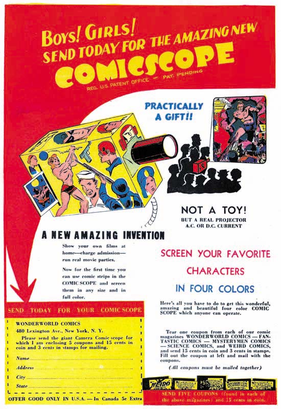
Comicscope Advertisement on the back of Wonderworld #13 (May 1940)

Not a toy, but a real projector! Show your own films at home – charge admission. Now for the first time you can use comic strips in the Comicscope and screen them in any size and in full color.

In the above ad, the Comicscope was used to promote Fox comics. Sending in the coupons from 5 Fox comics, along with 15 cents and 3 cents in stamps would get you this marvelous invention. Add it up and the total cost would be 68 cents, and that includes being able to read the comics. Later the Comicscope would be sold for 25 cents plus 3 cents in stamps. How could anyone possible sell a real projector for 28 cents? Sure this was back in the early 40’s and 28 cents was worth a lot more. But comic books were printed on the cheapest paper using the crudest printing process and they could be bought for 10 cents.
Comicscope
Comicscope

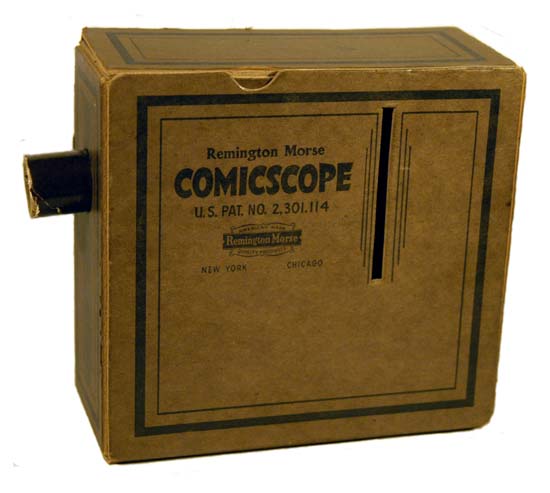
Well if nothing else Comicscope is a marvel in cost saving design. It is little more then a cardboard box, a cardboard tube and a cheap simple lens. There is a hole in the bottom so that a light can be used but I suspect that the light was not actually supplied. The Comicscope had slots on the side through which a comic strip could be inserted. The slot is a little under 3.25 inches high, just enough room for one panel row from a comic book. Forget about splashes or covers. The “screen them in any size” of the ad refers to the projected image, not the source material. Even the size of the projection is misleading. The projected image is not very bright, the Comicscope could only be used in a very dark room. The image size is adjusted by the distance of the Comicscope from the “screen”. The lens tube is moved in or out to achieve proper focus. However the larger the projected image the lower the relative brightness. No matter how dark the room, light leakage from the Comicscope itself would make larger projections difficult to see. To make it even worse, the device reverses the image. In order to get the correct vertical orientation you have to slide the comic strip in upside down. But that fixes what side is up, but not what is left or right. All text comes out backwards. But you would have a hard time reading text anyway. Only a circular image is projected and that covers only part of a standard size comic book panel.

I doubt that anyone would get away with selling such a product today, despite the cheap cost. I say that not only because of the poor quality of the final projection but because of the safety hazard. It would seem to me that putting a light bulb in a closely confining cardboard box is a receipt for a fire. The material is rather denser then typical cardboard but I have got to believe it is still flammable.
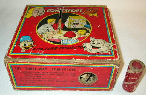
Comicscope
Comicscope with cartoon characters

Comicscopes seem to come up for sale from time to time. Most that I have seen are plain like the the first photograph I provided. But there are some with printed cartoon characters on the side. They are all cartoon type and funny animals. None are superheroes like shown in the advertisements from the early 40’s.

So who made this wonder? Well the box has on it Remington Morse (“American Made, Quality Products”). It provides no address but says New York and Chicago. The flap provides the further information that Remington Morse was a division of Hamilton Ross Industries. A quick google search for Remington Morse does not provide much. There was a Remington Morse in Chicago that made some 78 records. As for Hamilton Ross Industries I have come across references to toy sewing machines and a real electric hand grinder.

The original ad states that the Comicscope has been registered and is patent pending. The earliest ad I have seen is May 1940, but that may not mean much since I have limited access to early Fox Comics. I have seen an August 1939 issue of Wonderworld #4 which does not advertise Comicscope. We will see below that the date of the introductory of the Comicscope is important so I would greatly appreciate it if anyone could tell me about the appearance, or lack thereof, of Comicscope in Fox Comics before May 1940. The Comicscope I first illustrated does have a patent, No. 2,301,114. Through the marvels of the Internet you can actually see this patent.

But the image provided is somewhat small so you may need a large monitor to read it. The patent was filed March 20, 1940 and actually issued on November 3, 1942. Comic cover dates are advanced two months so the ad I showed above came out about the same time as the patent filing. So it may in fact be the earliest ad for Comicscope. The patent says that Victor S. Fox (New York) and Robert W. Farrell (Bronx) are the assignors and “by mesne assignments, to said Farrell”. Don’t you just love lawyerese? Such an elegantly incomprehensible language! I think what they are saying is that Fox and Farrell took out the patent but that Farrell was going to be the one that actually used the patent and have it manufactured.

Victor S. Fox was from England and previously had been a stockbroker. He was indicted for mail fraud and related activities on November 27, 1929. The outcome of this is not known. In a story that is now a legend, Fox was an accountant for the company that became DC Comics. Seeing how well Action Comics was doing, Victor launched his own company which, with his usual immodesty, he named Fox Comics. Gerard Jones in “Men of Tomorrow” says that this legend is actually false. After all these years who can say one way or the other what is legend or history? We can say say with more confidence that Victor went to Eisner & Iger studio and asked them to create another Superman. They developed Wonderman and DC Comics quickly sued. Eisner & Iger refused to take the blame so Fox started his own bullpen and hired Joe Simon as editor. Joe only stayed about three months before moving on to Timely. A move that Joe says was not taken kindly by Fox. I previously posted on the connection of Comicscope to the early copying of Captain Freedom from Captain America. The use of Captain America in an ad for the Comicscope was surely meant to be parting shot at Joe by Fox and Farrell. With Captain America’s great success, Timely probably would not allow Cap’s continued use in these ads.

Less is known about Robert Farrell. Joe Simon has described him as Victor Fox’s right hand man. Bob ran the operation when Victor was out of the office. According to Joe in his book “The Comic Book Makers” the Comicscope was Bob Farrell’s product but never made a profit. However an Comicscope ad from 1942 declares that 63,458 had been sold. That is a lot of Comicscopes to have been sold without a profit, and I believe they continued to be sold into the 50’s. Surely the makers of such a fine product would not exaggerate about the sales!
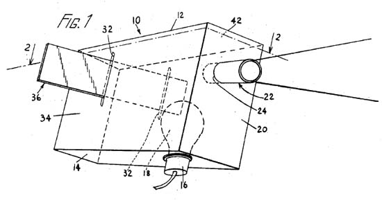
Comicscope
Comicscope 3D diagram from the patent.

The patent for Comicscope includes the above diagram. The electric bulb provides the light for the comic strip which the lens projects. The reason for the low light level of the projected image is that the light source shines onto, not through, the source image. The hole in the bottom of the box for the light is just big enough for the neck of a standard bulb. Further the box is just wide enough for the that bulb. The bulb had to be screwed into the socket from within the box.
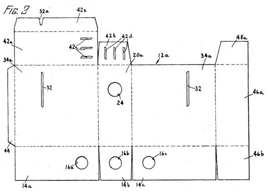
Comicscope
Comicscope plane view (before folding) from the patent

The patent statement starts off describing the construction of the box from a single flat blank of cardboard or sheet metal. Actually I believe the use of sheet metal would be unrealistic as the metal would become too hot from the lamp. The patent says the box would be easily constructed, “can be readily assembled by children”. However it appears the Comicscope was always sold assembled and never flat.
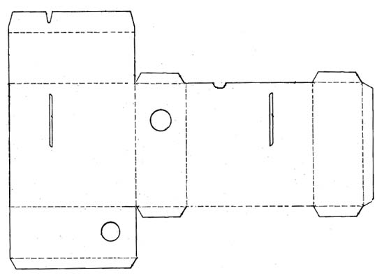
Comicscope
Comicscope plane view (before folding) as actually manufactured by Remington Morse.

The original patent shows some unusual features. In the figure 42c and 42d denote slots cut into the top. When the box was folded up the set of slots from the two flaps were meant to line up to provide a way for heat to be exhausted. But actually it would be hard to keep the manufacturing of the box accurate enough to line up the slots properly in order to accomplish their purpose. Even if they did succeed to align, the slots would not only let out heat but also light from the bulb immediately below. Because the projected image is so dim, this light leakage would be very undesirable. These slots were eliminated in all the Comicscopes that I have seen. A similar problem appears for the holes 16a, 16b and 16c. After folding these holes are meant to line up well enough for inserting the neck of the light bulb. But such alignment of three parts seems unlikely and in the final product two of the flaps are greatly shortened so only a single hole is use.

The lens assembly is made by placing the lens into a cardboard tube. Two further cardboard tubes are just smaller then the first so as to fit very snuggly inside. These two smaller tubes are inserted from both sides thereby holding the lens in place.

Halfway through the second page of the design there is the statement: “Having thus describe our invention, what we claim and desire to secure by Letters Patent is:”. Five detailed paragraphs follow that seem to repeat the same statement in slightly different forms. I am not a lawyer but I suspect they wanted to insure that it was not just the exact design they wanted patented. Remember that the actually manufactured Comicscope did not follow the patent exactly. What seemed more important to Fox and Farrell was having an optical projector that used an opaque image lighted by a light bulb. That there would be slots in the side for inserting and moving the source image. They seemed concerned about protecting the use of the device.
Junior's Television
Junior’s Television

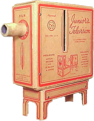
Above is an image of device that seems much rarer then the Comicscope. But when you look at the top box and the lens assembly there can be no doubt that there is a close relationship between Junior’s Television and the Comicscope. Mike Schultz provides a webpage on Junior’s Television. On the box there is an address which does not include a postal zone code and to Mike suggests a date before 1943. Postal zone codes were used in the US between 1943 and 1963 after which zip codes were used. Mike further goes on to guess that a date of about 1939-40 “to capitalize on the publicity that TV generated at the New York’s World Fair”. But with the lack of firm evidence all that can be said for certain is that it appears two practically identical devices both came out in the early 40’s.

There is a web page in Tomorrow’s Heroes that shows a comic book ad for Junior’s Television. The image is a bit fuzzy by it includes two addresses. One seems to be the same address as on Mike Shultz’s box, only this time using a different name (Enterprises Unlimited) and with the postal zone code. Besides the box and stand of the image above the ad says it comes with a carrying case, a television screen, an electric cord and a light socket. Much more then it would seem is provided by Comicscope, but for a heftier price tag of $2.98. Again it is fuzzy, but the ad appears to indicate that the patent is pending while the box itself only says trade marked. The trade mark protects on the name Junior’s Television and not the device. If Enterprises Unlimited had approval to use Fox and Farrell’s patent it would say so.

So we have Comicscope and Junior’s Television coming out at about the same time. Obviously one is copying the other. I doubt very much that either Fox or Farrell actually did the Comicscope design themselves. But that does not mean they copied Junior’s Television. They could have come up with the idea and had one of their artists draw up the plans. I have got to say that Junior’s TV seems like a well thought out assembly while Comicscope is just the essential box and lens. But we need better dating for both devices before we can guess who stole from who.

Kirby Or Not, Young Romance #85

Young Romance #85
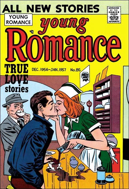
Young Romance #85 (December 1956) by Jack Kirby

I have renamed this topic from “Not Kirby” to “Kirby Or Not”. The title was fine originally since most of my post were about entries in the Jack Kirby Checklist that attributed work to Jack that was actually done by other artists. But lately I have delt with some work actually done by Kirby that was not included in the Checklist. The greatest majority of errors in the Checklist are those that falsely attribute work to Jack, but there are some of the opposite mistakes. I believe this imbalance is due to the fact that most experts look for “signs” of Kirby but fail to look for indications typical of other artists. Jack Kirby was much respected among artists and influenced their work either directly (swiping), indirectly (model), or all the grades between. Since experts are not always carefully watching for indications of other artist “fingerprints”, the tendency will be to err on the side of falsely attributing work to Kirby.

This particular cover comes toward the end of the Simon and Kirby collaboration. Previously they had tried to launch their own comic publishing company called Mainline. During the Mainline period Jack stopped penciling anything for the Prize romance comics, although I believe S&K still produced these comics. I suspect the business effort involved in Mainline was more then Joe could handle and so required Jack’s involvement also. Artists like Ann Brewster, Joe Albistur and John Prentice would take the place in these romance comics of the missing Kirby. But when Mainline finally failed Jack returned to doing work for Prize romances with a vengeance. For about a year Kirby would do pretty much all the art for Young Romance, Young Love and Young Brides. Such all Kirby comics were pretty unusual and had only occurred once before when S&K turned Headline into a crime genre comic. In the case of Headline all Kirby comics were done because Joe and Jack were trying to start up their studio after a previous failed attempt (Stuntman and Boy Explorers Comics). Once Headline was shown to be successful S&K began to use other artists. The late all Kirby romances was probably a similar attempt to restore the studio after the Mainline failure. If so it was not successful and Jack would begin doing freelance work for DC and Atlas.

I do not know why the Checklist missed attributing this cover to Jack. It seems a pretty obvious Kirby to me. I am not sure who did the inking but it was not the greatest job. The poor inking does have the affect of hiding Jack’s more subtle penciling. But the elderly man appears to be one of Kirby’s stock background characters.

Although not the best romance cover that Jack penciled I am still rather fond of it. It is pretty obvious that the humor was supposed to be the waitress so intent on the kiss that she fails to stop pouring the coffee. But for me the real humor is the old man. I love the way he stuffs his face with the piece of bread as he observes the couple.

Lone Shark!

I saw an unusual post today in one of my favorite blogs Pharyngula by PZ Myers. (A warning to those religious, the Pharyngula blog is largely about evolution and atheism). In it PZ talks about a comic book called Action. What interests him about this comic is the depiction of a giant squid. PZ has a fondness for squid and other cephalopods. (Actually so do I and I am proud of the fact that a fossil cephalopod was named after me, Nostoceras mendryki Cobban). As a biologist Meyers credits the demise of this comic book not to the graphic violence, but to the inaccuracies inflicted by the artist (actually I am sure this suggestion was done tongue in cheek).

The source PZ Meyer used was something in scans_daily (In this case I must warn readers about the graphic violence). Action started in 1976 but only lasted 21 months. Apparently one feature from Action called Hook Jaw had a man eating shark as the protagonist. Hook Jaw was obviously inspired by the Jaws movies. Although I warned the this stuff was pretty violent, I find it does not affect me very much. Frankly I find the depictions so unrealistic that they seem silly. In one panel body parts go flying even before the sharks mouth full closes. Some might credit the demise of Action as due to criticism they received about the violence, I believe it was more likely due to the poor writing and drawing. It just tries too hard to be gruesome.

Black Magic #33
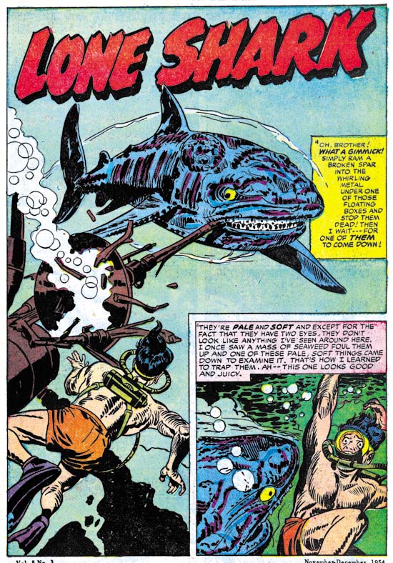
Black Magic #33 (November 1954) “Lone Shark” by Jack Kirby

But the idea of a killer shark as a protagonist was certainly not new. Simon and Kirby had provided just such a story back in 1954. Actually S&K even went further by providing the shark with intelligence so that with thought balloons we can read the story from his viewpoint. This particular shark was unique, atomic radiation had caused it to develop a tumor. But the growth was not cancer it was actually a second mind! Hence the shark’s intelligence. The idea that some sort of mutation can provide an immediate evolutionary leap was a concept some scientists shared about the time this story came out. Some referred to such a mutate as a hopeful monster. Today the belief in hopeful monsters has been pretty much discredited in evolutionary science. But hey this is a comic book so the heck with the objections of PZ Meyer and other biologists.

Black Magic was a Simon and Kirby production, at least up to this point. Joe and Jack were not interested in the sort of gruesome stories that someone like Bill Gaines would produce. In fact this story was not so much as a chiller as a black comedy. Read the opening page, it really is funny. The whole story is filled with similar humor. Of course there is a final unexpected twist but I hate to give any spoilers. This story is one of my favorites and certainly deserves to be reprinted some day.

After issue #33 Black Magic would be discontinued for a few years. We can only guess why this happened. My belief is that Black Magic found itself in an unfortunate position. Although I find the stories very well done, it cannot be denied that some of the comic book readers preferred horror stories that were stronger and more gruesome. So Black Magic probably lost some of its readership to the publications of Bill Gaines and others. At the same time (adult) public sentiment was rising against comics. Bill Gaines and his horror comics acted like lightning rods attracting much criticism. Black Magic became associated in the minds of many adults with the more extreme fares. In response some newsstands began to refuse to sell certain comic genre, horror in particular. Eventually a comic code would be created and the more extreme comics would cease to exist. But that was too late for Black Magic, at least until it resumed in 1958.

Black Magic #33
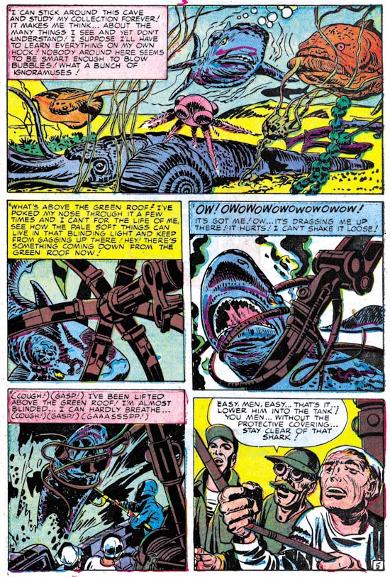
Black Magic #33 (November 1954) “Lone Shark” by Jack Kirby

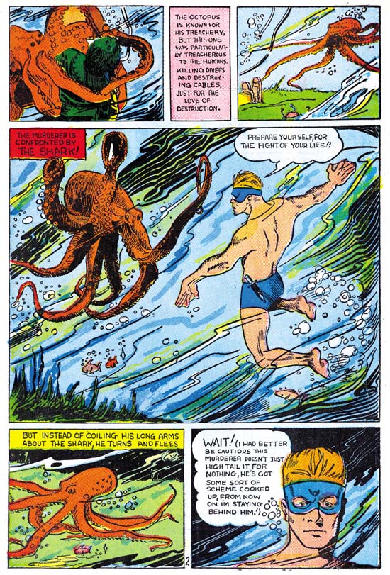
Jack even included in this story another extinct cephalopod. But I was really hoping for a more exciting use of a cephalopod by Jack Kirby. At the moment I cannot think of one. So I will close with one with a tenuous link to Simon and Kirby. At the start of his career, before Joe Simon teamed up with Jack, he did some work for the agency Funnies Incorporated. I previously posted on what have been Joe’s first comic book work which eventually appeared in Amazing Man Comics #10. In the same comic there is a feature called The Shark by Lew Glanz. I guess it was attempt by Funnies Inc. to duplicate the success they had with Bill Everett’s Submariner. In there story is a page with a great octopus, another cephalopod. It shows the confrontation of the Shark with the killer beast. Unfortunately Glanz ruins it all by having the octopus turning coward and fleeing. The whole story is filled with similar build ups with disappointing conclusions.

Amazing Man #10
Amazing Man #10 (March 1940) “The Shark” by Lew Glanz

Alternate Takes, The Thirteenth Floor

Black Magic #11
Black Magic #11 (April 1952) by Jack Kirby

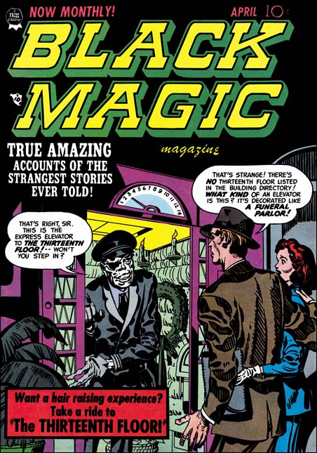
For this cover Jack Kirby provides an interesting combination, an elevator made out as a funeral parlor. The operator is even stranger with a white complexion, an eye patch and (despite the gloves he is wearing) skeletal hands. The man is taken aback by it all, but it the woman who is most surprised and seems to be drawing back. The old fashion floor indicator shows them on the third, but the operator invites them to a ride to the thirteenth floor. Do you really think the couple will take him up on it? Although imaginative this is not one of Kirby’s better efforts. The elevator operator is meant to be spooky, but he comes off more like one of those friendly old men you would sometimes meet years ago when many elevators did not run automatically.

Black Magic #11
Black Magic #11 (April 1952) “The Thirteenth Floor” by John Prentice

John Prentice did so much romance work for the S&K studio that it is easy to mistakenly believe his talents were limited to that genre. John also had done some fine work for Black Magic (he would further go on to a very successful run of the syndication detective strip Rip Carter). A story like “The Thirteenth Floor” actually would suit his talents more then Kirby’s. In this story we are not presented with any unnatural demons. The devils can only be distinguished by their red complexion and angular eyebrows. This “humanization” of the characters is a necessary part of the story. Nor is there much in the way of action. This is much more of a talking heads kind of story about a man planning suicide who takes the stairs to the thirteenth floor but finds himself in an eerie waiting room. The “people” running the operation do not know what to do with him since he is not in their records. Eventually the man convinces them to let him return back and they direct him to an exit door. But when the man uses the door he wakes up in an elevator and his former life.

Black Magic #11
Black Magic #11 (April 1952) “The Thirteenth Floor” by John Prentice

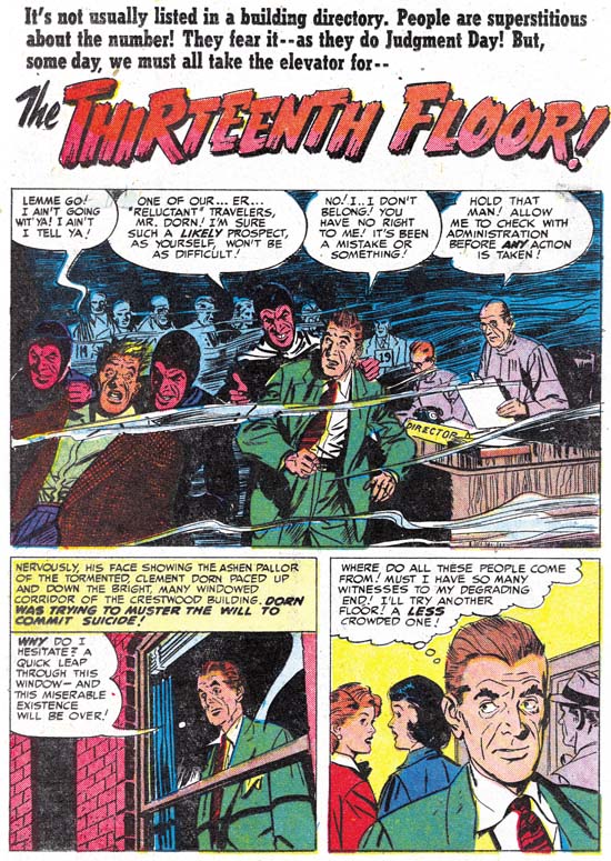
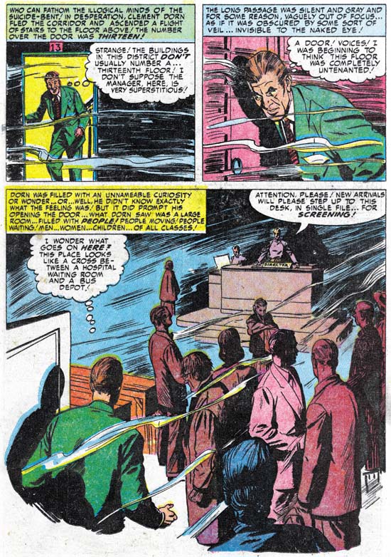
The splash panel that John provides is little more then a double panel. Prentice provides a scene from the waiting room. The splash illustrates one of the few action events from the story, when the devils escort away a very reluctant individual. It is hard to image a splash more unlike the cover that Kirby provided for the same story. John did some great splashes, but this is not one of them. On the second page John provides a story panel much larger then the splash. The large story panel is even more unlike what one would expect had Jack done the story. The scene is very mundane with just a group of shadowing figures standing around and a director at his desk in the background. Although seemingly mundane, John’s careful use of shadows and a few wispy lines make the whole panel rather unnatural. This pivotal panel sets up the mode from which the rest of the story develops. John was much more effective with this large story panel then he was with the splash.

It seems odd that the cover emphasizes the use of an elevator to go to the thirteenth floor but in the story the man walks up a staircase to reach it. From this it might be implied that Kirby had no idea what the story was really about. But the text in the title of the story also refers to the elevator. This makes it seem more likely that S&K was well aware of the story. But the story did not seem to have anything in it that suited Jack’s strengths. Therefore this became one of the minority of covers where Jack just made something up. Because the story is so far removed from Kirby’s vision it is hard to believe Jack had much to do with it. This work seems to contradict the claim made by some that Jack Kirby did the layouts for the stories done by artists working for the S&K studio. It is rare to see Kirby do such a small splash panel. But I have never seen Jack do anything like the large panel on the second page. Like Bill Draut and Mort Meskin, John Prentice was much too talented a comic book artist to require layouts by Jack. Further Joe and Jack were much to savvy business wise to spend time doing work that was not needed by the artist they would have draw the story.

Black Magic #6 (DC)
Black Magic #6 DC (November 1974) by unidentified artist

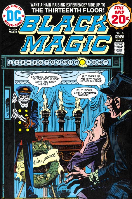
DC ran a series of Black Magic reprint comics produced with the help of Joe Simon. The covers for these reprints were generally new interpretations of original Kirby covers. I do not know who this particular artist was but it is hard to believe that anyone thought that this was an improvement. I would say that this cover is more goofy then scary. There are covers that I call goofy as a complement, but this is not one of them. Even though Kirby’s BM #11 is not a favorite of mine it is so much better then this one that I will forego any comparison. I am also a critic of the art in these DC Black Magic reprints. Generally I find the reprints look like wood cuts, loosing much of the effects of splendid inking of the originals. However the job done on the reprinting of “The Thirteenth Floor” actually came out rather well.

New Joe Simon and Jack Kirby books

During my last visit to Joe Simon he showed me a new book. The book is on Joe and it is one of six books from the series “Comic Book Creators”. Also included in the series is one on Jack Kirby, which I did not see. I checked it out in Amazon where they have all six titles listed:
John Buscema
Jack Kirby
Joe Simon
Stan Lee
Joe Sinnott
John Romita, Sr.

Amazon lists them all as $16.46 each. But before you start ordering them there are a few things you should know. First the series is actually meant for children! So do not expect any to find any deep insights or unusual historical information. Still in the book on Joe there are some nice photos but I do not know if any of them did not appear in Joe and Jim Simon’s “The Comic Book Makers”. Next they are rather thin books, not surprising considering who they are meant for. The other thing is I am not sure that they have actually been released yet. Amazon list them as such but the book Joe showed me had a 2007 publication date.

Considering the line up, you have to suspect some connection with Marvel. I think children books like this are a great idea. I suspect the real market is not the children but rather the parents. Still it can be hoped that it might introduce comic books to a younger generation.

Ann Brewster Meets Frankenstein

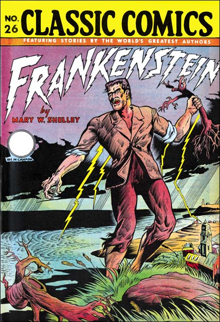
Classic Comics #26
Classic Comics #26 “Frankenstein”

No this is not a post about one of the many “Frankenstein Meets XXX” movies (one my favorite was “Frankenstein Meets Godzilla”). Ann Brewster was one of the many talented artists that worked for Simon and Kirby. Brewster did a single piece for S&K in 1949 and then a number of stories from April to November 1955. That later period was during the time Jack was not doing Prize romances so he could concentrate on the work for Mainline, the publishing company that Joe and Jack had started up. There is a single piece with a cover date of June 1956 but this might have been a story left over from the Ann’s 1955 period.

This comic was first published with a date of December 1946. But the scans I provide are from a second printing. However if Overstreet is correct the art was not changed between the two printings. I have seen places on the web where Ann was credited for the cover art. The cover is unsigned so I cannot confirm that. Inside on the title page the illustration is credited to Robert Hayward Webb and Ann Brewster. Does that mean Ann was mainly the inker? Or did they share penciling? Some of the woman look like they were done by Ann. I am not saying Ann did the woman and Robert the men. It is just that I am more familiar with Ann’s romance work where her woman were more distinctive.

When I was going to school I was aware of the Classic Illustrated comics. There were also a company that sold what we referred to as “crib notes”. I did not use either because my teachers were aware of them also. They were always trying to catch people using these shortcuts but asking questions about things were not in the comics or crib notes. Heaven help the student that based his book report on a movie. Movies were (and often still are) so different from the books that teachers had no trouble in finding out any such sloppy cheaters. The truth is I always enjoyed reading. I may have hated writing book reports, but I never had any problems with the reading part (except perhaps for Moby Dick).

I remember reading Frankenstein in school (but I am not sure if it was for a book report or not). Nor am I sure if I have read it since. I remember enough to say that none of the movies were very close to the book, even more recent ones that claim to tell the “true” tale. But my memory is not good enough to be sure that how close this Classic Comic’s version was, but it seems accurate to me. Certainly some of the parts seem very in tuned to the works of a romantic writer. Victor Frankenstein enjoys a walk in the rain. Lightning plays its part in establishing the mode (but was not used in the actual creation of the monster). And the climax occurs in the icy far north. The story was adapted for this comic by Ruth A. Roche who I think did a good job. But going from a book to another media is always a perilous effort. I prefer to read the original book or stories that were made for comics to begin with.

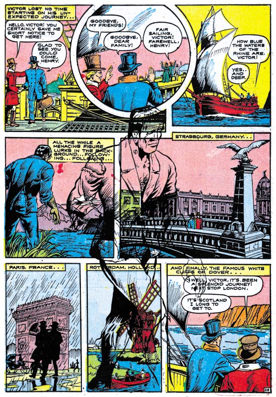
Classic Comics #26
“Frankenstein” by Robert Hayward Webb and Ann Brewster

Although not a masterpiece, I find the art well done. I do find it a little amusing that the monster seems to have been influenced by the early Frankenstein movies. Take a look at how he seems to have a flat top to his head. The panels do not adhere to a simple grid and the scenery plays an important part. I particularly like the page whose image I provide above. Victor has agreed to make a mate for the monster who in return promises to leave and trouble his creator no more. For reasons that I am not at all clear on, Victor leaves his home on the continent (Germany ?) for Scotland. The monster follows Victor unseen to insure his creator keeps his promise. The comic artists have provided a ghost image of the traveling monster that overlaps most of the panels. However this page does have a snafu, the colorist obviously did not read what he was working on because in the last panel he gives an orange color to the white cliffs of Dover!

Alternate Takes, Adventure #79

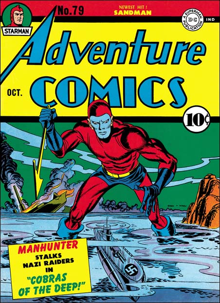
Adventure #79
Adventure #79 (October 1942) by Jack Kirby

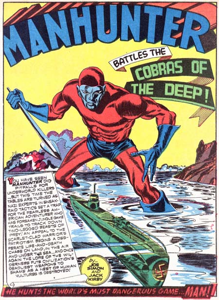
I have featured this cover before but this time I thought it might be interesting to compare it with the splash page, both drawn by Jack Kirby. Usually when I do an Alternate Takes post I compare Jack with another artist. But this splash is so similar to the cover that it makes you wonder, could both have been cover proposals? Perhaps not since the splash version would have gone too far into the section for the comic title. This was not a problem with the splash, especially since the feature title was arched. I find the splash more dramatic. With the slight counter tilt to the head Manhunter looks intent in hunt of the Nazi submarine. The bent knees make is seem that once he finds the right time Manhunter will lunge for the kill.

Adventure #79
Adventure #79 (October 1942) “Cobras of the Deep” by Jack Kirby

The Art of Joe Simon, Appendix 7, The Spirit #12

The Spirit #12
The Spirit #12 (1963) by Joe Simon

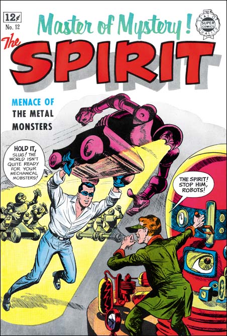
Super Comics published reprints of comic stories. Producers of comics that had fallen on hard times could sell the plates to Isreal Waldman at what I am sure was a low price. In the “The Comic Book Makers” Joe Simon describes selling Mainline titles to Waldman and the buyer’s concern with just getting the plates and his lack of interest in the copyrights. That must have also been true with whatever deal Eisner made since Will always kept the copyrights to the Spirit (except for a period where he did his wartime military service).

Although the contents of Super Comics were reprints the covers were new. I have to admit when I saw this cover in Joe’s book I thought Simon was taking liberties with the Spirit character. The Spirit attacking a mad scientist and his robots seem to me to be a little out of character for Eisner’s feature. But the comic does have such a story inside. I guess I have been biased by my reading of DC reprints of the Spirit. By the way these are absolutely the best books of comic reprints that have ever been produced. DC is doing a fantastic job, I just wish more archives were done that way. Most unfortunately still continue to use glossy paper and overly bright colors. However the Spirit Archives have not reached the final years. I know Wally Wood ghosted for Will on some Spirit adventures in space. So I suppose that this story is also a late one with a story line different from the earlier years that I am familiar with from reading the archives. Anyway Joe did take some liberties, there is no fight scene in the story quite like the one on the cover. I love the way Joe has turned the robot eyes into headlamps that provide a spotlight on the Spirit. Also Joe changes the arm stumps of the robots in the story to more manlike hands which gives them a much more menacing affect. I am less thrilled with the visor Joe has provided the villain with. And what is the significance of the large eye on the instrument’s CRT?

The Spirit #12
The Spirit #12 (1963) by Will Eisner

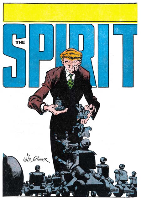
This post is not only a post of an example of some solo work by Joe, it is also an Alternate Take post, only this time with Simon not Kirby as the cover artist. But the splash page for the story was probably originally a cover for the newspaper comic book insert. Will Eisner was the master when it came to cover/splash designs. He was always changing the logo and often provided designs the integrated the logo with the art. Although this splash is more of a composition then a design it is still wonderfully done. The empty background brings all attention to the figure of the villain dropping his army of robots. A low viewpoint allows the robot formations to still seem threatening despite their small size. Notice how most of the figure is in shadow, this allows the falling robots to really standout. While Joe gave an exciting fight scene, Will was more subtle and using just visual effects provided a threat. I am no scholar on Will Eisner, for instance I have trouble distinguishing some of the ghosting Lou Fine did on the Spirit during the war from Will’s art. Still this splash looks very much like Eisner’s work to me.

The Spirit #12
The Spirit #12 (1963) by unidentified artist

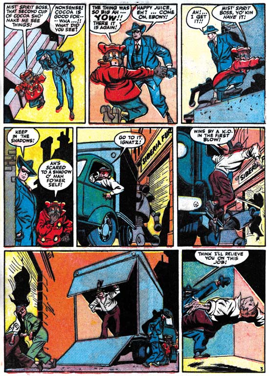
Although I am convince Will Eisner was responsible for the splash, the rest of the story looks like someone else was ghosting for Will.

Art by Joe Simon, Appendix 5, Harvey Hits #12

Art by Joe Simon, Chapter 1, In The Beginning

Alternate Takes, A Curse on You!

Black Magic #3
Black Magic #3 February 1950) by Jack Kirby

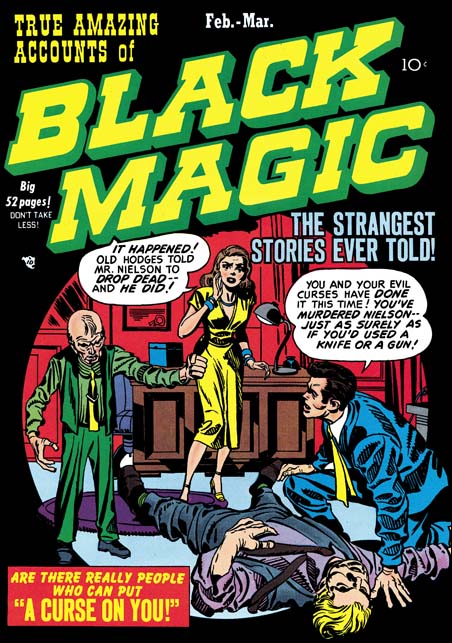
As I mentioned previously, Jack Kirby would often draw a cover based on a story done by another artist. This is not unexpected because Simon and Kirby produced comics. They came up with the plots, had writers provide the scripts, made alterations to the writing, farmed the work out to various artists to draw, made corrections to the art that was returned, and provided the publisher with a complete comic. All of that activity was paid for by S&K, they would then get a share in the profits. The only work that they did not finance was the coloring. But although the colorist was paid by the publisher, a photograph shows one working in the studio. Having all this control S&K were well aware what would be in a particular comic. Some of these artists were very talented but Jack would earned the title “the King” for a reason. S&K were well aware Jack’s importance to the sales. The cover was also vital for attracting the comic buyer so Jack would end up providing pretty much all the covers for S&K productions with the exception of photo covers. Sometimes Jack would draw a cover for a story that he also drew but often it was for a story based on another artist.

This is the case of the cover for Black Magic #3 (February 1950). The goal for a S&K cover seemed to be to provide a summation of an entire story in just one scene without of course giving the ending. Both Joe and Jack were just so good at that. Although BM #3 was obviously drawn by Jack, who can say exactly what Joe’s contribution was. However their collaboration worked, what was produced were cover masterpieces the likes of which were never seen again after their breakup. We may not know exactly how the man died on the cover to BM #3, but there is little doubt who was responsible. The sight of the frail little man shaking his fist over the body is just chilling. The other characters provide the information needed as well as the appropriate reactions. The scene is enclosed in a circular field. Well perhaps enclosed is not completely accurate because the characters and the rug interrupt the circle at various points. The use of this design technique dates back to one of Joe Simon’s first covers, Keen Detective #17 (January 1940). Black was often used as a background color for Black Magic and it is particularly effective when used with the circular field here in BM #3.

Black Magic #3
Black Magic #3 February 1950) “A Curse on You” by Mort Meskin (signed)

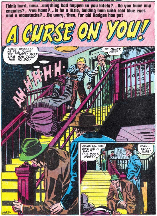
Mort Meskin seems the perfect artist for a story like this. Jack was great but action was he forte. Mort was able to develop a story very effectively and “A Curse on You” is no exception. This is the 50’s and S&K are not Bill Gaines so you know that in the end that little man from the cover will get his just desserts. Some have unfavorably compared Black Magic to the more extreme horror comics of the time. But the use of excessive violence or gruesome depictions were never an interest for Joe and Jack. The stories in Black Magic are very much the same as Simon and Kirby did for titles in other genre. It is hard to understand how someone can praise Simon and Kirby but condemn Black Magic.

Usually the splash panel served a purpose similar to that of the cover, it tries to visually grab the reader’s interest for the story that follows. Mort’s splash panel is rather unusual in that it is also very much part of the story. Here we are provided with the details of how the cover’s victim met his demise. The cast of characters is not quite the same, Jack had replaced the boy with the woman who plays a different part in the story.

A number of people have made the claim that Jack provided layouts for even artists like Meskin. It is really hard to believe in this case. I am sure Kirby would never had shown a man falling down a staircase like this. He would have shown the man with the face in horror and the arms stretching to the reader as the figure almost flies through the air. Mort provides a more literal version of a man who trips and ends up helplessly heels over head. Kirby’s version would be more exciting visually but Mort’s sets up the story better. These sort of differences are also found throughout the story.

The Wide Angle Scream, Stuntman #2

Stuntman #2
Stuntman #2 (June 1946) “House of Madness”
Enlarged view

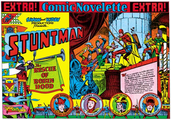
When I finished up the posts of the Captain America double page splashes I said that Simon and Kirby would not repeat those sort of designs. Well I lied. Stuntman #2 has the same sort of emphasis of design over composition seen in the Cap spreads. It is interesting to compare this splash with one from the Boy Commandos with a similar medieval theme.

I have hoped that my discussions on the design elements would make it clear what the distinction was between design and composition, at least as I use the terms. Composition is how a scene is arranged, that is in comics how the figures and non-figurative elements are arranged and how they direct the eye. Design is how disjoint parts, the text and different images, are arranged on the page. For instance in the image on the right side of Stuntman #2 is composed with the attacking knights starting on the lower left and rising as the eye goes toward the right until it meets the pivotal Stuntman and finally the defended Don Darling and Sandra Sylvan. The composition does not end there as the large candlestick brings the eye down, and (although not really part of the scene) the cast of characters bring the eye back to the start of the image. Actually that is just a condensed description. Notice the use of arcs (the curtains, shadows, the stonework for the pillar and the doorway) along the top and how they are used to highlight certain figures. Particularly effective is Stuntman’s placement in front of the pillar, despite the fact that he is closely surrounded by other figures this placement makes him standout. This is a marvelous composition and Kirby’s penciling is just fantastic.

But the right hand scene is just part of the page and that is why I said earlier that the design was more important then the composition in Stuntman #2. Like most of the Cap double splashes, here we find a three part layout. Starting on the left is the title section, followed on the right by the enactment and below with the cast of characters. The title compartment depicts an archery contest. On the left a series of colorful pendants almost hide a figure blowing a horn. The competition between four archers is arranged along the bottom. The archers are alternated with their targets, the backs of which provide the cast of characters. The rest of the title section scene is left bare so that the Simon and Kirby credits, the Stuntman title and the story title are prominently shown. The story title is nicely placed on the drape hanging from the horn, a similar device was used in the Boy Commandos spread. An interesting touch is how the introduction text is placed on a wall in the enactment section and how the text is lined up to fit the perspective of this wall.

Except for the left edge of the enactment compartment, the whole splash is nicely integrated. I find this a much more successful effort then that for Stuntman #1. It is really a shame that this title fell victim to the post-war comic glut. There are three unpublished double page splashes for Stuntman. Unfortunately I do not have any scans for them right now but perhaps I will get a chance to pick up something from Joe Simon.