Category Archives: Meskin, Mort

Speaking of Art, True Kirby Kolors

A number of years ago I wrote about my skepticism about the many fans who believe they can identify numerous works that Jack Kirby supposedly colored (Kirby Kolor, A Kirby Myth). But Kirby did sometimes color work as for instance some of his later presentation pieces done to promote some of his many ideas. Jack also colored some of the original art he had (see What If Kirby for a scan of a Kirby colored double page splash from Boys’ Ranch #4). Oddly Kirby colored some original art that he did not draw most notably a couple of covers by John Severin (True Kirby Kolors and Joe Simon Too).


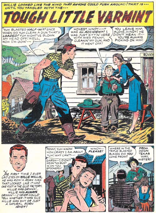
Bullseye #5 (April 1955) “Tough Little Varmint”, original art with involvement by Mort Meskin?, coloring by Jack Kirby

Kirby also colored another artist’s work. In this case the determination of who the original artist was is somewhat problematical. Parts of the art looks similar to work by Mort Meskin. My latest thought is that Mort was actually involved in the work but I am uncertain as to exactly what that involvement was. The inking does not appear to have been by Mort, or by his most frequent inker George Roussos. While some of the pencils look like Mort’s work (although perhaps modified somewhat by the inker) there are some other parts that do not. My current guess is that “Tough Little Varmint” was a group effort but that Meskin was part of that group.


Bullseye #5 (April 1955) “Tough Little Varmint”, art with involvement by Mort Meskin?

The coloring of the original art was not part of the typical process used in producing a comic book. Normally color guides were made using silver prints taken photographically from the original art. A comparison of the current state of the original art and the published comic book shows they are quite different. The type of coloring shown on the original art would not have been suitable for the comic books of the day. Generally speaking comic book interior art was printed with a limited set of colors as flat areas of color without any gradations. Earlier comic books sometimes included simple gradation of a background color but that technique had been largely given up by the time Bullseye #5 was published. Complicated tonal effects such as exhibited in Kirby’s coloring would not have been attempted for the interior of a comic book.

The original art for the splash page is from Joe Simon’s collection. It may seem odd that I am attributing the coloring to Jack Kirby for a piece in Joe’s collection. There is an explanation how this came about but for now let it suffice that this piece had been in Kirby’s possession for many years after the breakup of the Simon and Kirby studio and was only returned to Joe relatively late but while Jack was still alive.


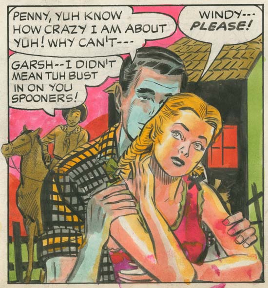
Bullseye #5 (April 1955) “Tough Little Varmint” page 2, original art with involvement by Mort Meskin?, coloring by Jack Kirby (image provided by Steven Brower)

It seems odd that Jack colored the splash page for “Tough Little Varmint” but odder still that he colored the second page as well. This page had remained in the Kirby estate until fairly recently. Simon’s collection includes the original art for the rest of this story but none of it was colored. Most of the coloring that Jack did on original art seems to have been for display purposes. But I doubt that was the reason that he colored two pages from “Tough Little Varmint”. Not that there is anything wrong with the art but with all the art that Kirby had there was much more material available that would be much more suitable for hanging up in his house.


Bullseye #5 (April 1955) “Tough Little Varmint”, original art with involvement by Mort Meskin?, coloring by Jack Kirby

The coloring was applied quickly but with control. Most of it appears to be done using dyes. Dyes are convenient since they are not opaque and therefore would not obscure the original inking. However dyes can fade with age particularly when exposed to light without proper protection. The colors on these two pages seem quite fresh so I suspect that neither of them were displayed for any significant length of time. Most of the coloring is rather interesting. but I have to admit that I find the bluish shadow effect on the man from the second story panel rather unnerving.

Harvey Horror and Science Fiction: Black Cat Mystery #57

The break up of the Simon and Kirby studio, was not the end of Simon and Kirby collaborations. Even after Kirby began freelancing, Simon would still turn to Jack to help with comic book titles that he would work on. While Kirby contributed to these projects, particularly for the initial issues of a title, these were essentially Simon’s projects. Nonetheless I am sure that Jack had much creative freedom on the pieces he actually drew. I will begin examining, in some cases re-examining, these late collaborations beginning with Black Cat Mystery #57 (January 1956). There is some question as to exactly when the Simon and Kirby studio disbanded. In my opinion the latest date that can be assigned to the breakup would be August 1955 (cover date) when the final issues of the former Mainline titles were published by Charlton (Foxhole #6 and Police Trap #6). However is possible that some of the art to be discussed in this serial post could have been created before the studio breakup.


Black Cat Mystery #57 (January 1956), pencils and inks by Jack Kirby

The Black Cat series had undergone a number of title changes. Starting out as Black Cat based on a female superhero (#1, June 1946), then becoming Black Cat Western while presumably retaining the female hero (#16, March 1949), returning to Black Cat (#20, November 1949), switching to Black Cat Mystery and a horror genre (#30, August 1951), returning once again to Black Cat but retaining the horror content (#44, June 1953) before returning again to Black Cat Western without the horror and with the titled superhero (#54, February 1954). The last switch from horror content may have been prompted by all the adverse public criticism of genre which lead to the establishment of the Comic Code Authority. Black Cat Western #54 (February 1954) and #56 (October 1956) contain much reprint material from earlier issues according to the GCD. Black Cat Mystery #57 brought a returned to the old title and the horror genre although the horror was the mild form suitable for passing the strict Comic Code.

Jack Kirby only contribution to the issue #57 was the art for the cover. With Simon and Kirby there is always the possibility that a particular cover art could have been recycled from an earlier unused cover. However in the case of the cover for BCM #57, there are two reasons to believe that did not happen. The somewhat humorous aspect to the cover would have been out of place for Black Magic the only appropriate alternate source for this type of cover. Further the cover is based on a story found inside (see below). It is doubtful that the inside story was recycled because Black Magic was a pre-Code comic and therefore any story from it would have had difficulty getting Comic Code approval. I suspect that Kirby had not actually seen the interior story since that story had nothing to do with an underwater fish civilization.

The original art for this cover still exists and it would be interesting to see the date of the Comic Code Approval. While this cover was probably made for this issue it is still possible that the entire issue was put together some time previously.


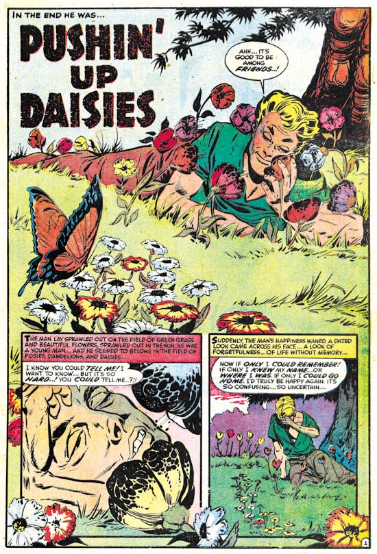
Black Cat Mystery #57 (January 1956) “Pushin’ Up Daisies”, pencils by Bob Powell

Although Bob Powell had occasionally done work for Simon and Kirby, he was largely a Harvey artist having provided much work to that company over many years. Earlier Harvey horror stories were too extreme to pass the Comic Code without modifications but there are no signs of changes so this was almost certainly a new piece created for this title.


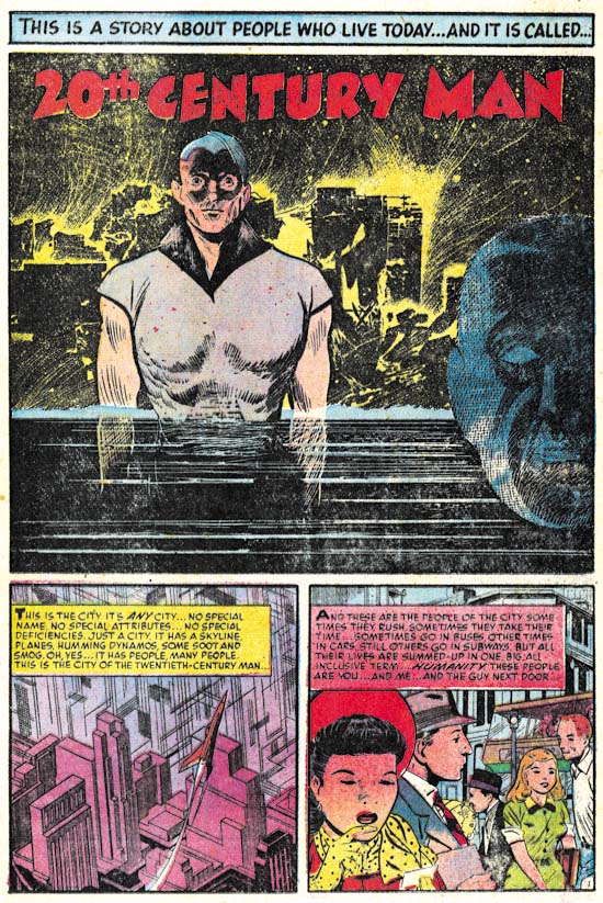
Black Cat Mystery #57 (January 1956) “20th Century Man”, pencils by John Giunta, inks by Manny Stallman?

John Giunta only did a few pieces of work for Simon and Kirby (see Art of Romance Chapter 9 and It’s A Crime Chapter 7). Giunta seems to have worked for a variety of publishers including a few pieces for Harvey. His style is a little dry for my tastes particularly for the crime or romance genre. However his style works very well for this particular story. I especially like the splash. The background with is jumbled silhouettes and scratchy and splashy inking is very effective. It is a little surprising to see such rough work for this artist but otherwise the inking looks like that found in some of his other work inked by Manny Stallman so I believe Stallman may have been the inker here as well.


Black Cat Mystery #57 (January 1956) “Underwater”, pencils by Howard Nostrand

Howard Nostrand is another artist that normally I cannot get too enthusiastic about. But the opening sequence for “Underwater” is just superb. Nostrand was a frequent contributor to Harvey Comics but as far as I know never previously worked for Simon and Kirby.


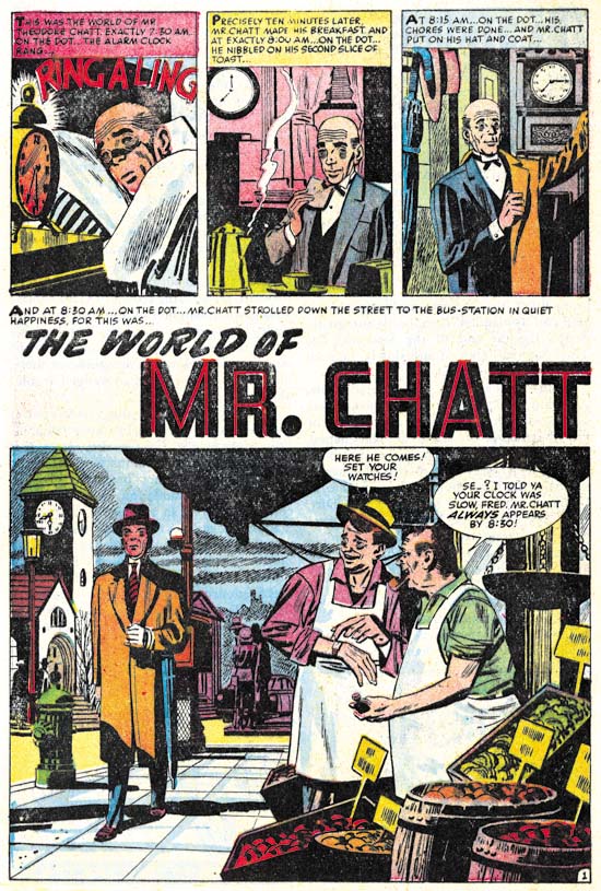
Black Cat Mystery #57 (January 1956) “The World of Mr. Chatt”, pencils by Mort Meskin

The final story, “The World of Mr. Chatt”, was drawn by a former Simon and Kirby regular (or what I sometimes refer to as one of the usual suspects) however Mort did very little work for Harvey. The only other Harvey piece that I am aware of was “Credit and Loss” from Chamber of Chills #24 (July 1954, a real masterpiece) but I have heard he did another earlier piece for Black Cat as well. Meskin was doing a lot of work for DC at this time. Many have criticized Mort’s DC work but in many ways he was still doing great art. But the emphasis of this late work was the almost cinematic approach that Meskin used to graphically tell a story. Mort’s careful control of pacing and view points was just masterful but unfortunately involved subtleties that many readers failed to notice or appreciate. “The World of Mr. Chatt” is a good example of Meskin’s late approach. Note the simple but effective opening sequence to the story. My main criticism of this particular work of art concerns the inking. I have not done a careful study but I suspect that Mort did not ink a lot of this later work and I am pretty certain he did not ink this piece. Again without careful inspection the inking reminds me of George Roussos.

I believe that Joe Simon was responsible for putting Black Cat Mystery #57 together although I have little evidence to back that up other than the cover that Jack Kirby provided. With the exception of Meskin, the artists used in this issue mostly seem to be drawn from Harvey’s talent pool. This is not too surprising as it suggests that the title had to be put together quickly. We shall see later that something similar happened with the first issue of Race for the Moon. The next issue would more clearly show the Simon and Kirby touch.

Police Trap #6

Police Trap #5 (July 1955) was the first issue published by Charlton. It appears to be composed largely of work that was already in the work at the time of the sudden failure of Simon and Kirby’s own publishing company, Mainline. It would expected most of that work would be used up and Police Trap #6 would consists of newly created work. All of the work on issue #6 was drawn by Jack Kirby. Previously Kirby’s involvement was largely limited to providing covers with the only Kirby story appearing in Police Trap #5. Jack’s greater presence can be explained as a means of offsetting recent financial loses. The cost of creating the Mainline comics was covered by Simon and Kirby to be paid back by a share of the profits. However with the sudden demise of Leader News Joe and Jack would not get the money to recover their publication costs. Their incomes from Prize Comics were based on a share of the profits but with all the negative public criticism against comic books those royalties were probably down as well. By providing all the art for Police Trap #6, Kirby probably hoped to decrease the production costs, increase sales (and therefore his share of the profits) but also be paid as the artist as well.


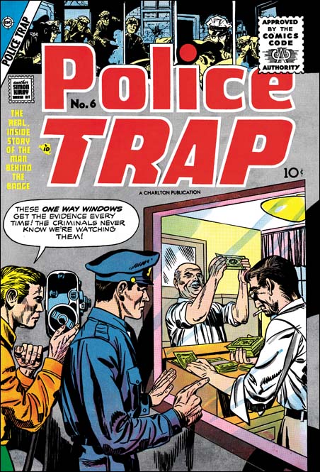
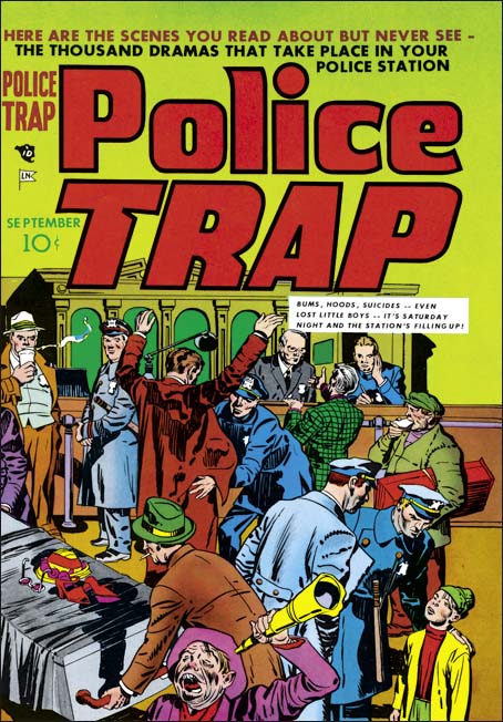
Police Trap #6 (July 1955), pencils by Jack Kirby

The cover of Police Trap #6 is another less than spectacular piece of art. But it is interesting as a rare example of Kirby swiping from another comic book artist, in this case Marvin Stein. This is not a close copy, Kirby did not need any help in how to draw figures. Rather it is the unusual idea that Kirby picked up, that of counterfeiter’s being candidly filmed by the police. I had previously written about this swipe (A Criminal Swipe) where I provided an image of the Stein cover that Kirby swiped. In that post I offered the possibility that it was actually Stein that swiped from Kirby and that this cover was an unused piece left over from Simon and Kirby’s earlier efforts in the crime genre from 1947 to 1951). However I now consider this unlikely as the art for the Police Trap #6 cover does not seem to match
the style used during the earlier period.


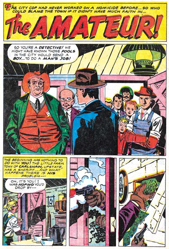
Police Trap #6 (July 1955) “The Amateur”, pencils by Jack Kirby, inks by Mort Meskin

As mentioned above, Jack Kirby drew all the art for this issue which makes Police Trap #6 a special comic. Needless to say the art is all well done. Kirby had a flair for graphically telling a story. Note the short sequence of story panels at the bottom of the splash page. It starts out typically enough but then proceeds to two panels with captions or speech balloons. Text was not required to explain the story and in fact the lack of text makes the panels even more effective.

Police Trap #6 is also special in that all the art was inked by the same artist. I’ll explain why I think this inker was Mort Meskin below where his hand is even more obvious but here I will discuss why I believe it was not either Simon or Kirby that did the inking. Normally that might not be too difficult to determine because both Jack and Joe were much better inkers than many of the other artists they used to ink Kirby’s pencils. Here, however, we have a great inking job. Not only that but it is done in what I describe as the Studio style. On this page (and others in this book) can be found shoulder blots, picket fence crosshatching and abstract arc shadows (see my Inking Glossary for an explanation of the terms I am using). But note that the shoulder blots are not done in a manner typical for Simon and Kirby. They are less abstract and more apt to be broken up into pieces. The most glaring example of this is found in the man in the blue suite. There are other suggestions that this was not inked by either Simon or Kirby. Note the simple eyebrows even in the more close-up views provided in the splash panel.

It is unclear whether some of the typical Studio style techniques were done by the inker or instead were added by either Kirby or Simon afterwards. For example the abstract arc shadow in the first story panel is done in a very typical style. My suspicion is that the original inker provided these touches as well as they are so well integrated with the surrounding artwork. If this is true it is another indication on how well acquainted the inker was with techniques previously used in the now defunct Simon and Kirby studio.


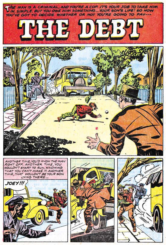
Police Trap #6 (July 1955) “The Debt”, pencils by Jack Kirby, inks by Mort Meskin Albistur

The story panels for the first page of “The Debt” follows the same pattern as seen in “The Amateur”. First an introduction panel that quickly places the reader into the action followed by two panels without text that show how the action unfolded. The big difference between the two stories is that while “The Amateur” has a typical splash the splash found in “The Debt” is actually a story panel as well. While collaborating with Simon, Kirby worked from scripts created by various writers but which he would then customarily rewrite. It is unclear how much of the published story was rewritten but there are often phrases that sound very much like Kirby. But who can say whether the original writer originated these unusual textless story sequences or that Kirby rewrote them into the script.


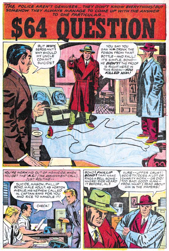
Police Trap #6 (July 1955) “The $64 Question”, pencils by Jack Kirby, inks by Mort Meskin

The $64,000 Question was a popular game show in the 50’s and even today you occasionally here someone use that term a colloquialism for a significant question. However that show first appeared on television in June 1955 much too late to have influenced this story (whose creation start around February of that year). However there was an earlier game show that was on the radio from 1950 to 1952 that was actually called the $64 Question. Although it was off the air when this story was created I am sure that was that show that formed the genesis of this story’s title.


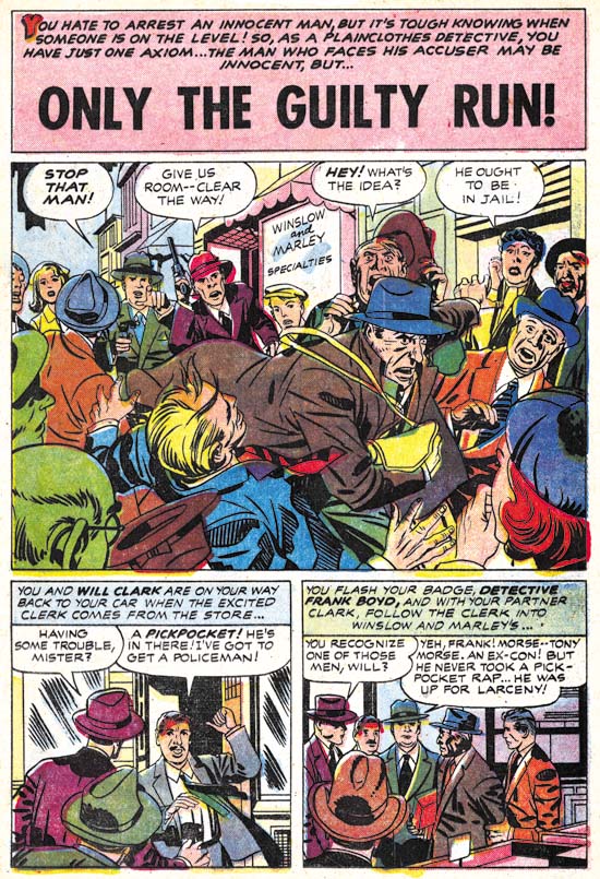
Police Trap #6 (July 1955) “Only The Guilty Run”, pencils by Jack Kirby, inks by Mort Meskin

All the stories in this issue were inked by the same artist. “Only The Guilty Run” is the story that most convincingly shows that this inker was Mort Meskin. Like all the other stories from this issue the inking was done in the Studio style. Most noticeable in the splash is his use of picket fence crosshatching. Of course other inkers used this technique most notably both Kirby and Simon. However Meskin executed picket fence crosshatching with an almost mechanical control compared to the more spontaneous use by Kirby or the more rougher brushwork by Simon. Observe how Meskin’s “rails” and “pickets” are almost consistent in width and the “rails” are placed to almost entirely contain the “pickets”. Other Meskin inking characteristics can be found in the simplified and often angular eyebrows particularly those of the escaping thief in the splash panel. Of course since credits were not provided inking attributions can never be given with absolute certainty but I am as confident as it is possible to be that this inking was by Mort Meskin.

While the art may convince me that Meskin was inking there Kirby pencils I am somewhat puzzled how this came about. While Mort had inked Jack’s work before, generally he was too busy penciling and inking his own work. There were exceptions to this most notably in Boys’ Ranch (1950 to 1951) and Captain 3-D (1953). However in 1954 he had started working for DC. Meskin still did some work for Simon and Kirby but this was largely limited to some covers and nowhere near his prolific output when the S&K studio was going strong. Yet here he is providing a lot of inking for a single issue (plus one Kirby story for the previous issue). Very perplexing.


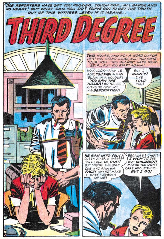
Police Trap #6 (July 1955) “Third Degree”, pencils by Jack Kirby, inks by Mort Meskin

Despite the Comic Code all the stories from this issue are really quite good but I have to admit that I find “Third Degree” the least satisfying. The interrogation of the housewife by the burly police officer seems a bit forced. Still that story and all the others in this issue leaves one with a desire for another all Kirby crime comic. Unfortunately it was not to be, at least for some years (see Jack Kirby’s “In the Days of the Mob”) and never again with Joe Simon.

P.S.
I have had a comment about why I believe this inker was Mort Meskin and not Marvin Stein. For readers who also wonder about this I suggest checking my previous posts Kirby Inkers, Mort Meskin and Kirby Inkers, Marvin Stein.

Police Trap #1, Title for the Heroes


Police Trap #1 (September 1954), pencils and inks by Jack Kirby

Crime comics received a lot of undesirable attention during their heyday. It is generally acknowledged now that this criticism was pretty much unwarranted but at that time it accepted by most of the public. One criticism was that crime comics glorified the criminals. Again any modern reader would see that this clearly was not the case, at least for the great majority of crime comics and especially for those that had been produced by Simon and Kirby. But Joe and Jack were well aware of this criticism and so when they launched their own publishing company, Mainline, they included a title Police Trap where the focus was not on the criminals but rather on the police.


Police Trap #1 (September 1954) “The Capture”, pencils and inks by Mort Meskin

Mort Meskin was one of the “usual suspects” of artists that contributed frequently to Simon and Kirby productions. He not only arrived in the studio in time to provide art for some of the crime comics produced by Simon and Kirby but he also continued to supply art for the titles even after they were no longer put together by Joe and Jack (Criminal Artists, Mort Meskin). However this would be the only piece that Mort drew for Police Trap. In fact Meskin typically prolific output seems to have decreased greatly at about this time. He would continue to supply work for the Prize romances but very little for any of the Mainline titles.


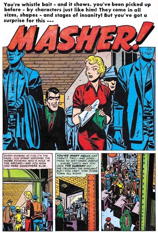
Police Trap #1 (September 1954) “Masher”, pencils and inks by Bill Draut

“Usual suspect” Bill Draut drew and inked “Masher”. Draut is most famous for his romance art but he does a fine job on this story. This is probably the most unusual story of this issue and certainly my favorite. The main protagonist is a female police officer. On a personal note my great grandmother was one of the earliest female detective of the New York Police Department. Unfortunately I know very little about her career but among other things she was used as a decoy. She was not very tall but when it came time to apprehend someone she would hold on to them so tightly that the suspects would be unable to escape before her backup arrived to secure the arrest.


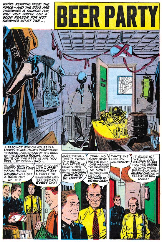
Police Trap #1 (September 1954) “Beer Party”, pencils and inks by John Prentice

John Prentice was also a regular contributor to Simon and Kirby productions which means this issue of Police Trap has all the usual suspects. Prentice first work for Joe and Jack appeared in a May 1951 issue of Young Love and he continued to provide art up until the end of the Simon and Kirby studio. John was used primarily for romance comics but he did provide some art for Black Magic. Unfortunately Simon and Kirby were no longer producing crime titles at the time of Prentice’s first appearance but John did so some really nice work in the crime genre prior to that. So “Beer Party” marks a much appreciated return of Prentice to crime. With some nicely handled action and such beautiful art, what is not to like? I particularly love the splash panel. Nobody appears in the splash but it still is a marvelous portrait. Missing plaster and cracked walls show how run down the police station has become. If anything the minimal decorations seem make the room even more depressing. The title captions talks about a shindig but obviously this was going to be a rather small affair. But could you image having a beer party inside a police station today?


Police Trap #1 (September 1954) “The Grafter”, art by unidentified artist

At this time Simon and Kirby were producing four Mainline and four Prize titles. Most of the titles were bimonthlies except for Young Romance and Young Love which were monthly. I suspect producing these titles and running Mainline required a lot of effort for both Joe and Jack. The amount of art that Kirby penciled seems to have dropped and his only contribution to this Police Trap issue was the cover. Further artists new to Simon and Kirby productions make their appearance. One such artist provided the art for “The Grafter”. I cannot claim to be very excited about art but he did an adequate job.


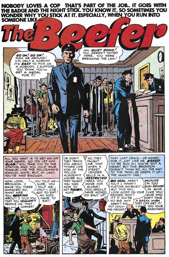
Police Trap #1 (September 1954) “The Beefer”, pencils and inks by Joaquin Albistur

I have recently discussed the part that “The Beefer” played in relationship to the pinup used in Police Trap #2 (The Police Trap Pinup). This story and two others that appeared in Young Romance and Young Love marked the first appearance of Joaquin Albistur in the Simon and Kirby studio. Most of the artist that appeared during this period made rather limited contributions to Simon and Kirby productions but Albistur would provide much work for the relatively short period that he was employed by Joe and Jack (13 months).

Mort Meskin and Ancient Greek Culture

Often when people discuss culture they are referring to things like the fine arts, classical music, opera and other “superior” arts. While culture encompasses all those things it includes much more. Art forms such as popular music and even comic books are part of our culture. All humans have a culture of some form. But do not ask me for a definition of what the term means as no one has been able to provide an accurate one. Since having a culture is so characteristic of humans many have tried to define it in such a way as to exclude it from animals. However they have been completely unsuccessful. Animals like the chimpanzee have a culture, albeit of a somewhat primitive nature. I may not be able to provide a definition of culture but teaching and learning are important features in the transmission of culture.


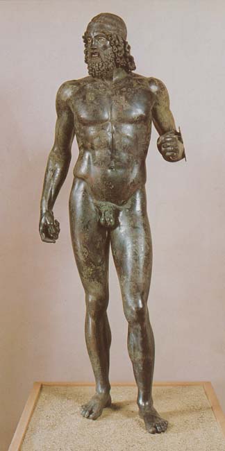
One of the Riace Bronzes (created about 460 – 420 BC)

Our culture, all others as well, is descended from the culture of previous generations. However culture is not only passed on it evolves as well. Certain cultures from the past have had great influence on us while others have been forgotten. One culture that had great importance to ours despite the great separation in time is that of the classical Greeks. Politics is part of culture and it was in ancient Greece where democracy was first born. The influence of the classical Greeks can be found in the visual arts as well despite the separation of about 2500 years. The classical Greeks developed an art based idealistic but realistic portrayal of the human figure. Their cities were filled with such art for both political and religious purposes (although at the time there was not much of a distinction between the two). The figures were idealized not only in form but in the emotion portrayed as well. The figures have a calm, almost serene, disposition and extremes in emotions or motion were generally avoided.


Pergamon Alter (2nd century BC)

About the time of Alexander the Great, classical Greek art evolved into what is usually referred to as Hellenistic art. Unusual subjects and posses became common. The human figure no longer adhered to the classical standards and became more expressive. Pathos became more often depicted in art.

While cultures often developed from particular regions, their continued existence was by no means limited to that of some ethnical group. Eventually the ancient Greeks succumbed to the military might of Imperial Rome. But this did not mean the end to the centuries long tradition of Greek art. The Roman world recognized the importance of Greece and added portions of it to its own culture. This was a backhanded compliment because many of Greek’s art treasures were looted and sent to Rome. The Riace bronze statue illustrated above were found off the coast of Italy was most likely loot from Greece aboard a ship that sank on its final voyage.

In time the mighty Roman Empire also declined and Europe entered into a period often called the Dark Ages. Much of the ancient culture was lost. Surviving bronze statues were melted down to make weapons. Ancient marbles were feed to kilns to produce lime. Painting were generally too fragile to withstand the passage of time. Much of the ancient literature was also lost however some was copied and saved especially outside of Europe by the Islamic cultures. Among the preserved literature included descriptions of ancient art. For instance this one from Pliny the Elder’s Natural History:

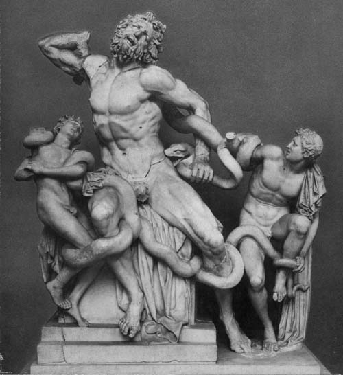
There are many whose fame is not preserved. In some cases the glory of the finest works is obscured by the number of artists, since no one of them can monopolize the credit, nor can the names of more than one be handed down. This is the case with the Laocoon, which stands in the palace of the Emperor Titus, a work to be preferred to all that the arts of painting and sculpture have produced. Out of one block of stone the consummate artists, Hagesandros, Polydorus and Athenodoros of Rhodes made, after careful planning, Laocoon and his sons, and the snakes marvelously entwined about them.

Ancient descriptions such as these were more a reminder of how much had been lost and not very useful in understanding what the art really looked like. The story of Laocoon and his sons the sculpture depicted was based a story from the Trojan Wars. Laocoon was a Trojan priest who tried to warn his fellow Trojans to “beware of Greeks bearing gifts”. The gods sent a serpent to kill him and his two sons. (On a side note, Pliny the Elder died while trying to investigate the eruption of Mount Vesuvius during which Pompeii and other nearby communities were entombed).


Laocoon (about 40 to 20 BC) by Hagesandros, Polydorus and Athenodoros

Time passed and Europe eventually started to recover from the Dark Ages. This period has been referred to the Renaissance, the rebirth. Progress in the arts came from new discoveries but also by rediscovering the ancient cultures of Rome and Greece. Unearthed ancient sculpture were treated as treasures and carefully studied. The Laocoon sculpture described by Pliny was rediscovered on January 14, 1506. This was a sensation with artists and scholars because the statue was immediately identified as the one written about by Pliny. One of the artists who visited the excavation on the very first day of the discovery was Michelangelo, one of the foremost artists of the Renaissance.

As originally found the sculpture was missing Laocoon’s right arm. There arose a dispute on how the sculpture should be restored. Today it would almost certainly be left as found but in those days missing parts would often be fabricated so that the sculpture would appear unblemished. Michelangelo declared that the missing arm was originally bent. However there was a bitter rivalry between Michelangelo and another sculptor by the name of Bandinelli. Now I suspect that most of my readers are familiar with the name of Michelangelo but do not feel bad if you do not recollect Bandinelli. Both may have been well known in their day but today Bandinelli is generally known only by art historians. Bandinelli declared that the Laocoon’s arm should be restored straight. Surprisingly it was Bandinelli’s interpretation that was used for the restoration. Michelangelo had spent time dissecting corpses to develop a thorough understanding of human anatomy so you would think that what he said would have carried more weight. But Michelangelo had more commissions than he could handle (actually more than he could every finish) so perhaps he simply was too buy to assist in the restoration of the Laocoon sculpture. But Michelangelo would posthumously have the last laugh. Sometime about 1963 the original arm from the Laocoon sculpture was rediscovered and just as Michelangelo had predicted it was bent. The image of the Laocoon that I provided above has the original arm reattached.


Sketch of Laocoon by Michelangelo (1530)

The Laocoon and some other rediscovered Hellenistic sculptures had an immense affect on the art of Michelangelo. The importance of the Laocoon can be seen in the Medici Chapel in Florence. I do not mean the architecture and sculptures that Michelangelo executed for the Medici Chapel although that connection seems pretty clear to me as well. To explain I first have to tell a short story. The Medici were the effective rulers of Florence. However the Medici were not loved by all and a revolt occurred which drove them out of Florence. Despite the fact that the Medici had previously been Michelangelo’s patrons the artist joined the rebellion. However in the end the revolt failed and Michelangelo was a wanted man whose life would almost certainly have been lost had he been captured. In 1530 he hid out to escape his enemies in a passage below the Medici Chapel. To pass the time Michelangelo drew on the walls of his hideout. They are wonderful sketches that relate to his work on the Medici Chapel and Sistine Chapel ceiling. There is even what appears to be a self portrait. You can read more about Michelangelo’s graffiti in a wonderful web page by the Moscow Florentine Society. The presence of the underground chamber was not well advertised when I visited Florence years ago and I had to get permission to see it. My time alone in the room was one of my most moving experience of my visit to Florence and perhaps of my life. All of Michelangelo’s sketches there appear to have based on his own art save one, a portrait of Laocoon. The Laocoon sculpture was so important to Michelangelo that twenty four years after it’s rediscovery the artist would capture it accurately during what he thought at the time could be his lasts days on earth. (Michelangelo was eventually pardoned and lived a long and productive life.)


Sketch of one of Laocoon’s Sons by Peter Paul Rubens (sometime between 1602 and 1608)

The effect of the Laocoon continued after Michelangelo as well. It was an important influenced on Baroque art and its leading artist, Peter Paul Rubens. The ancient sculpture was less important to the art periods that followed but it was never forgotten. At least by those who studied art history.


Action Comics #80 (January 1945) “The Pillage of the Parthenon”, pencils by Mort Meskin.

One of those who had not forgotten about the ancient Laocoon piece of art was Mort Meskin. Mort did a magnificent rendition of it in the splash for the Vigilante story “The Pillage of the Parthenon”. The Greek sculpture does not appear elsewhere and the story has only a tenuous connection to the Parthenon or any other aspect of ancient Greek culture. That Meskin would depict the Laocoon in a piece of comic book art expected to be read by juveniles would certainly have been for his own satisfaction. He could not expect his audience to recognize it. I suspect the only piece of ancient art that has achieved the status of an icon with the general public is the Venus de Milo.


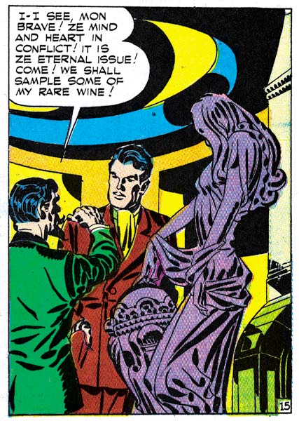
Real Clue Crime Stories v. 2 no. 6 (August 1947) “Get Me the Golden Gun” page 15 panel 4, pencils and inks by Jack Kirby

A contrast can be made between Meskin and another great comic book artist, Jack Kirby. Kirby included sculpture in some of his comic book work. But while Kirby’s depictions of sculpture are quite interesting and well done they are completely derived from his own imagination. It is clear that unlike Meskin, Kirby had not spent much time studying art history and the ancient Greek culture.

Sources:

  • Bieber, Margarete “Laocoon, The Influence of the Group Since its Rediscovery” 1967
  • “Due Bronzi da Riace” 1985
  • Saflund, Gosta “The Polyphemus and Scylla Groups at Sperlonga” 1972
  • Schmidt, Evamaria “The Great Alter of Pergamon”, 1962

Mort Meskin’s Dark Fighting Yank


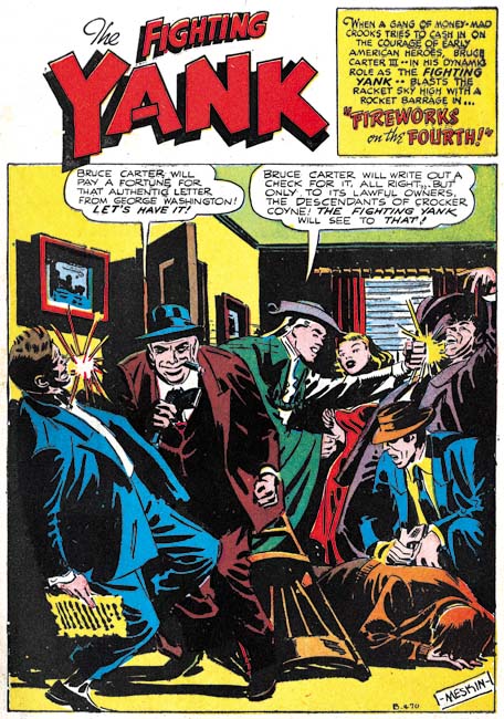
Fighting Yank #29 (August 1949) “Fireworks on the Fourth”, pencils and inks by Mort Meskin

Mort Meskin was the most important artist in the Simon and Kirby studio, second only to Jack. But he did important comic book art before and after his stay in Joe and Jack’s studio. Mort often inked his own work and he was a talented inker. Inking of Meskin’s pencils are generally fairly light. That is overall there are significantly more white or colored areas in a panel as compared to black ones. Now there are exceptions such as panels displaying night scenes. But look at the splash for “Fireworks on the Fourth”. Lots of black and since the actions occurs indoors there is no reason that so much blacks had to be used. To my eyes, the inking in “Fireworks on the Fourth” seems to flatten the image. This may not have been an accidental effect as Meskin’s comic book art often exhibited a narrow depth of field.

But let me digress. During the war years there was a flood of patriotic superheroes published in comic books. Of course all superheroes in American comics would be expected to be patriotic. By patriotic superheroes I am referring to those with a costume or a name that distinct patriotic overtones. With so many patriotic superheroes it must have been difficult to come up with an costume that was appropriate and original. Most had a costume based on the American flag with the most famous examples being MJL’s Shield as well as Simon and Kirby’s Captain America. But that was not the direction taken by Standards for their Fighting Yank. This hero had a costume based on the type of clothing used during the Revolutionary War. Not that the flag was neglected; it appeared on the Fighting Yank’s chest. I am not sure if the Fighting Yank was the first to use the Revolutionary War theme but in any case there were others as well. Since it really was not that spectacular of a costume one might think the Fighting Yank would have been one of the less successful patriotic heroes. But actually he did quite well lasting from November 1941 (Startling Comics #10) to August 1949. It really was a long run since most superheroes, patriotic or otherwise, did not last nearly as long. The last issue of Fighting Yank was #29, the very one with Meskin’s interesting inking.

The inking has a greater emphasis on black than normally used by Meskin I still feel that he did the inking. While cloth folds are blocky they still exhibit the long sweeping curves that Mort preferred. When inking such folds Meskin typically used multiple brush strokes which he sometimes overlapped. This inking technique is often revealed by looking at the ends of the cloth folds were sometimes the separate ends of the individual strokes are reveals. This can be seen here are for example inking of the man in the blue suit on the left side of the splash. In Steven Brower’s recent book on Mort Meskin (“From Shadow to Light”) Jerry Robinson remarked that to keep things interesting he and Mort would often varied how they created the art. I think that this inking technique is an example such a practice.


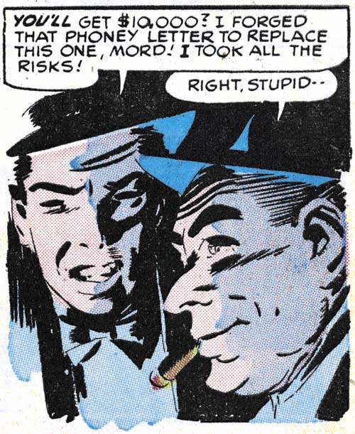
Fighting Yank #29 (August 1949) “Fireworks on the Fourth” page 3 panel 5, pencils and inks by Mort Meskin

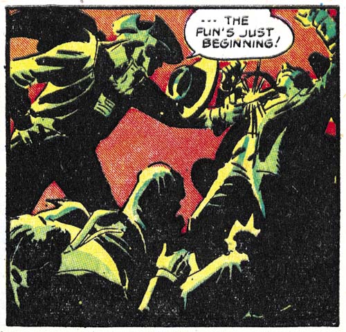
Meskin put this new inking style to good use. In the panel shown above he uses a low light source to provide dramatic lighting. This is something he rarely did when he later worked for Simon and Kirby. While Mort’s inking is the basis for the image’s drama, the colorists use of a light violet shadow greatly enhances the effect. The use of two color tones on the face is uncommon in golden age comics. It is pretty rare, but not unknown, in Simon and Kirby interior art where generally colored areas are separated by the line art or isolated in white areas.


Fighting Yank #29 (August 1949) “Fireworks on the Fourth” page 7 panel 2, pencils and inks by Mort Meskin

The colorist did not limit his use of multi-tone coloring to simple shadows but he also often put them to dramatic effect for scenes meant to have low light levels. Certainly the most spectacular of these multi-tone panels is the one from page 3 that is shown above. The combination of an orange background and the yellow to green toned figures is just stunning. The combinations of Meskin’s great pencils and his unusual inking along with the colorist efforts combine to make this an unforgettable piece of comic book art. One might be tempted to credit such exceptional coloring to Meskin himself however other Standards comics should be checked for multi-tone coloring before such a conclusion is reached. Coloring of golden age comics was generally handled by the publisher and not the artist who did the original line art. Standard Comics may have had to fortune of using one of the more talented colorists in the business.

“From Shadow to Light”, an Ode to Mort Meskin

I have previously posted an announcement for this book with a comment on how important a volume I believed it would be. Of course I had not yet seen the book at that time so now that I have the question now is did Steven Brower succeed in doing justice to a great artist like Mort Meskin? The answer is a resounding YES!

This is a large book, the paper size is 9 by 12 inches. In my opinion this is a perfect format for a project like this. Scans of printed comic books have been enlarged for better viewing and the size works nicely with the reproductions of original art. And there are a lot of both spanning Meskin’s entire career. It starts with some work that Mort did in high school. While not very exciting compared to what would follow, it still is great to see the initial efforts. I could detail all the reproductions that follow but I fear that such a list would prove too tedious while the actual art is certainly not that. But I cannot resist mentioning some of my personal favorites such as some great Vigilante splashes, amazing work for the Fighting Yank (working with Jerry Robinson), terrific Golden Lad covers and some truly beautiful romance covers for Prize Comics. While those are my favorites, what is presented is actually much fuller and thoroughly representative. It is not just isolated pages of art. While a marvelous artist, Mort Meskin was also a consummate graphic story teller. “From Shadow to Light” has a Golden Lad and a crime story; both complete and never before published.

Mort Meskin was an artist’s artist. Brower has brought together comments from some of the creators who acknowledge how important Meskin was to them personally. Artists such as Steve Ditko, Joe Kubert, Alex Toth and Mort’s sometime partner Jerry Robinson. These are not just your usual commentary, they provide discussions of Meskin’s actual working methods. I found these very revealing and they answered some questions that have been nagging me for years. Particularly the commentary by Robinson. Jerry was Mort’s collaborator on a lot of comic books. I have often wondered exactly how they worked with each other, what rolls each played. Well Robinson answers that directly. I have also wondered why so much of Meskin’s comic book art is still exists as un-inked pencils. Very surprising since at least some of it, such as a couple of pages from Treasure #12 that are reproduced in this book, had been published. Again Robinson provides the answer.

Anyone who has followed this blog should know I am a big Mort Meskin fan. He did a lot of work for Simon and Kirby and therefore appears frequently in my posts. I have even written about Mort’s prior career (Early Mort Meskin and Mort Meskin before Joining Simon and Kirby). But the Internet is not the best format for viewing Meskin’s art. You really need a book for that and Steven Brower’s “From Shadow to Light” is that book. You do not want to miss this book.

Criminal Artists, Chapter 2, Mort Meskin

This is the second of my post of the various artists who worked in the Prize crime titles Headline and Justice Traps the Guilty after they were no longer produced by Simon and Kirby. In the previous chapter I wrote about Marvin Stein who was the dominant artist for these crime titles. Now I will review the crime art by Mort Meskin, the second most used artist. Meskin provide art from 1950 to 1955 and while he does not appear in every issue from that timeline he does appear in most. Mort is one of the forgotten masters of the comic book art form. Hopefully Steven Brower’s upcoming book, “From Shadow to Light: The Life and Art of Mort Meskin”, may help to correct this undeserved neglect.

There are a number of reasons to explain Meskin’s neglect by today’s fans. Perhaps the most pressing is the current emphasis on superheroes. Meskin did some great superhero work but it was older work on heroes that no longer play much of a part in modern comics; the Vigilante and Johnny Quick. The original comics are very expensive and little of Meskin’s war time work have been reprinted. Most of today’s fans have never had much of a chance to see Mort’s superhero work. The only superhero work that Meskin penciled for Simon and Kirby was on Captain 3-D and that was never published (Captain 3-D #2 ). Most of Meskin’s art done in the 50’s was for romance. The romance genre is probably the most underrated one for today’s fans. This unfortunate because Mort really showed his skills as a graphic story teller. Those skills, however, were still evident in his work for the Prize crime titles with the additional benefit or more action and drama.

Headline #43
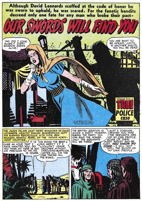
Headline #43 (September 1950), “Our Swords Will Find You”, art by Mort Meskin

Mort Meskin had initially provided work for the Prize crime titles in 1948 but that was in collaboration with Jerry Robinson. Meskin returned to the Simon and Kirby studio by himself in 1950 at which time Simon and Kirby were still producing the crime titles. By this time Simon and Kirby had toned down the violence in the crime titles to a level that would continue even after they stopped producing the titles. Even though the stories lacked the violence found in crime comics by other publishers, they still are enjoyable to read.

It appears that Meskin did most of the inking of his own pencils for the Prize crime comics (I think this is true for the romance titles as well). In the earlier issues Mort’s inks give the art an overall dark look. Not surprisingly this works out particularly well for night scenes such as in the splash for “Our Swords Will Find You”. Years before the first stalker movies, Meskin provides all the essential elements. A beautiful girl alone in the night pursued by a mysterious knife holding figure which in this case is scene only through the shadow he casts on the wall.

Justice Traps the Guilty #28
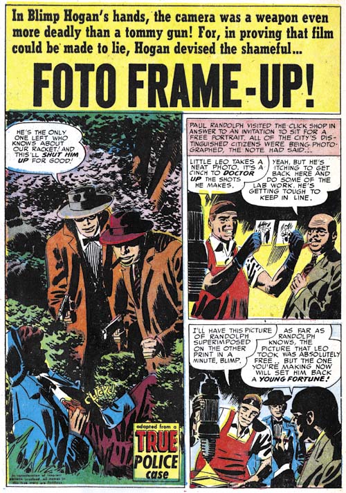
Justice Traps the Guilty #28 (July 1951), “Foto Frame-Up”, art by Mort Meskin

Another example of the darker inking initially used by Meskin for his crime stories. Even though the clothing folds are thick and dark, it can still be seen that they were constructed from long sweeping but narrow brush strokes. This is typical of Meskin inking. However it should be used with caution for inking attribution because unlike Jack Kirby, Mort would include spotting in his pencils. In this case it is accompanied by some other typical Meskin inking techniques. For instance note the way that the shadow on the man’s shoulder has a distinct border strip and is not completed filled with ink but rather formed by thick black strokes separated with narrow spaces.

Here Meskin uses a vertical splash; a format that he seemed particularly fond of. Still most of the time Mort uses a horizontal 2/3 page splash like most of the artists did in Headline and Justice Traps the Guilty. Full page splashes did not appear in the Prize crime comics after Simon and Kirby stopped producing them.

Justice Traps the Guilty #57
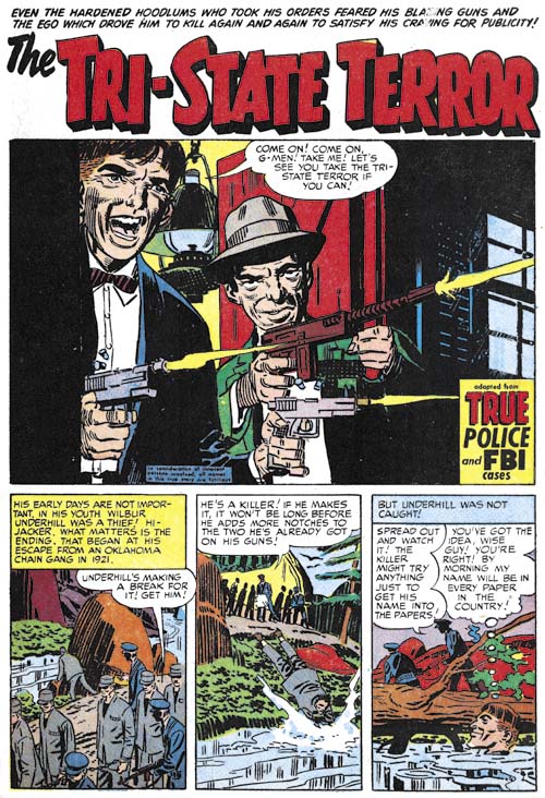
Justice Traps the Guilty #57 (December 1953), “The Tri-State Terror”, art by Mort Meskin

“The Tri-State Terror” is perhaps one of Meskin’s finest splashes from the crime titles. The G-Men are not shown but hopefully are sheltered from the blistering attach by the two criminals. The near distance view highlights the defiance of the one hood and the casual determination of the other. These two seem determined not to be taken. Our focus is concentrated by the careful use of blacks.

Justice Traps the Guilty #39
Justice Traps the Guilty #39 (June 1952), “Terror”, art by Mort Meskin

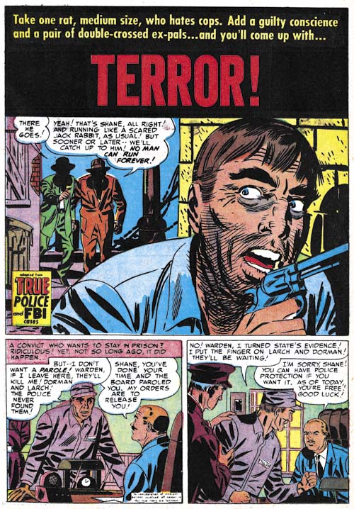
Close-ups did not play as important part of Mort Meskin’s art as they did for artists such as Marvin Stein. Still he did make effective use of this device from time to time. This splash is a good example. This close-up of a fleeing man may seem more stylized than some other artists but it still is a gripping portrait of a man filled with fear. Hiding the faces of his pursuers in shadow makes them mysterious and heightens the effect.

Justice Traps the Guilty #54
Justice Traps the Guilty #54 (September 1953), “Fatal Mistake” page 3, art by Mort Meskin

The page I selected from “Fatal Mistake” provides another example of Meskin’s use of a close-up. I particularly like the sequence for the top row of panels. Mort goes from a more distant shot, to just the upper body, and then finally just the face while simultaneously rotating the view point. This all plays into the story line that starts with a declaration of reluctance by the loan officer, to a admittedly unfavorable offer and finally to blatant arm twisting. Thus both the art and the writing are increasingly revealing the character of the loan officer.

Justice Traps the Guilty #41
Justice Traps the Guilty #41 (August 1952), “No Place To Hide” page 6, art by Mort Meskin

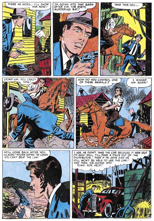
Crime stories are very different from ones about superheroes but at least they provide more opportunities for the use of action than the romance genre. Mort does not do the sort of choreography (for lack of a appropriate term) that Marvin Stein used but he does make careful use a shifting viewpoints. Note how the pursuer appears in the foreground in the first panel, switches to the criminal in the third, only to have the rolls repeated switch in the fourth, fifth and sixth panels. The distance between the two varies as the sequence proceeds as well; starting with a greater separation, working up the close confrontation in panel four then the separation between the two increases again until panel six.

Headline #72
Headline #72 (July 1955), “My Beat” page 2, art by Mort Meskin

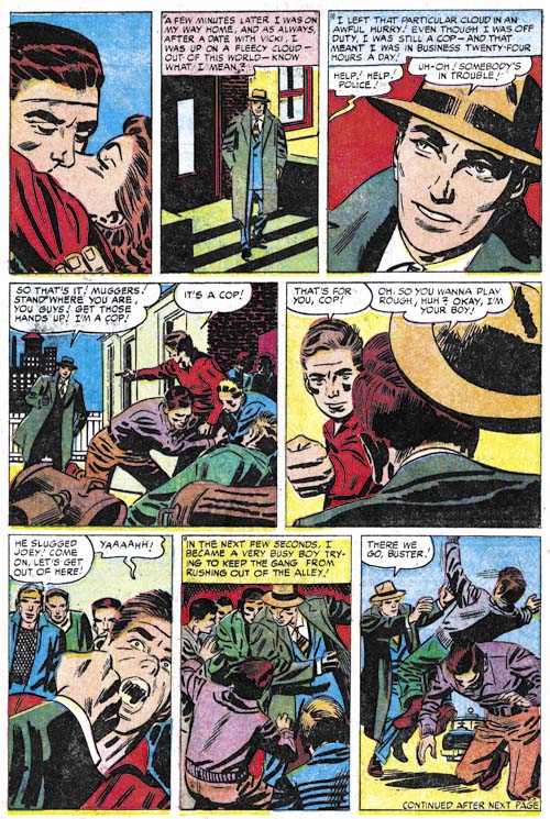
Another action sequence starting with a panel that would have been right at home in Young Romance. Note how once again the foreground/background relation between the cop and the muggers keeps alternating with the exception of the final panel. Also how the viewing distance goes from a more distant one, to two close-ups than moves back again. Meskin handles the action so well that I am sure most readers did not notice a logical inconsistency. After showing the cop’s hat flying off his head in panel five, how did it manage to return to being firmly attached in the last two panels? The lose of the hat in panel five is required to show the strength of the impact of the youth’s fist but is a required part of the cop’s “costume” allowing him to be easily identified in the group shots in panels six and seven. What is required for the clear graphical presentation of the story sometimes outweighs the needs of logic.

Justice Traps the Guilty #56
Justice Traps the Guilty #56 (November 1953), “Side-Liner” page 5, art by Mort Meskin

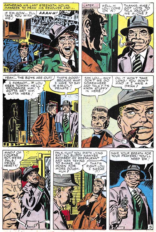
I cannot resist providing another example of Meskin’s graphical story telling talent. Meskin draws in a very stylized manner that perhaps causes many of today’s comic book fans to overlook his other skills. But other artists did notice and were influenced by Meskin. Steve Ditko is probably the most famous of those paid close attention to Mort Meskin.

Justice Traps the Guilty #62
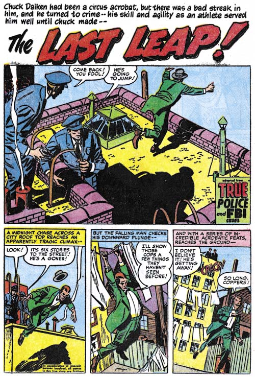
Justice Traps the Guilty #62 (May 1954), “The Last Leap”, art by Mort Meskin

There seemed to have been a move of some sorts in Simon and Kirby productions of 1953 to modify the splash from its tradition roll as the equivalent of a movie trailer. Instead the splash would actually become part of the story. This only lasted about a year in Simon and Kirby comics but this device would turn up from time to time afterwards even in comics not produced by S&K. Was this an artist’s choice or something dictated by the writer? Unfortunately we have no scripts for Prize comics from this period and I do not care to guess at the answer. Still Meskin makes effective use of the device. The splash panel is certainly a classic but the page is made even better by the subsequent panels. What a exciting start of a story! Note the tilted view in the final two panels. I am not sure when Meskin started to regularly use this device but it became an important element in his story telling technique in his later years.

Justice Traps the Guilty #72
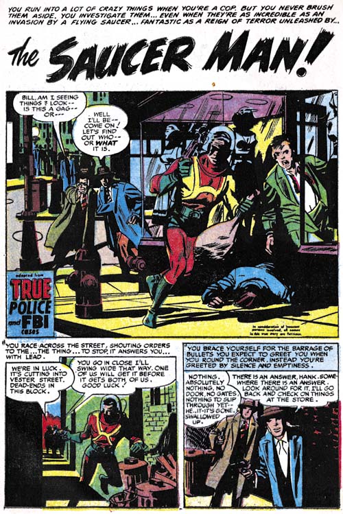
Justice Traps the Guilty #72 (March 1955), “The Saucer Man”, art by Mort Meskin

As mentioned above, after the war Mort Meskin did not have many occasions to draw superhero stories. Features like “The Saucer Man” provide some hints about what such superhero stories might have looked like. Although from late in his career, in this story Mort has reverted to the darker inking style that predominated his earlier work.

Justice Traps the Guilty #45
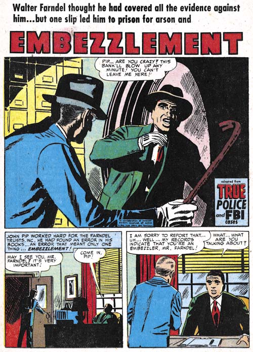
Justice Traps the Guilty #45 (December 1952), “Embezzlement”, pencils by Mort Meskin, inks by George Roussos

As a rule an artist has an advantage when inking his own pencils. Still examples of Meskin inking Jack Kirby (Kirby Inkers, Mort Meskin ) show that Mort was a talented inker. Meskin generally inked his own work in the 50’s but there were occasional exceptions. In most cases where the inking was not done by Meskin it was George Roussos who did it. Frankly I am not a fan of Roussos’s inking. I feel it is a little too sloppy. However George’s use of full blacks were often quite nice as in the splash for “Embezzlement”.

Art of Romance, Chapter 33, End of an Era

(November 1956 – April 1957: Young Romance #85 – #87, Young Love #73, Young Brides #30, All For Love #1)

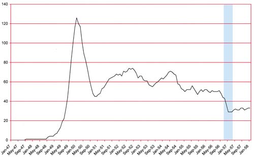
Number of Romance titles 1947 - 1958
Number of Romance titles 1947 – 1958 (the period covered in this chapter is shaded in blue)

We now come to the end of the all Kirby Price romance comics and transition into a new and significantly different period of Prize Comics. Young Brides #30 (November 1956) and Young Romance #85 (December 1956) qualify as all-Kirby comics but only half of Young Love #73 (December 1956) was drawn by Kirby with the rest of the art done by Bill Draut. Unfortunately the comic book crash had finally caught up to Prize Comics. Young Love #73 and Young Brides #30 would be the final issues of those two titles although Young Love would be resurrected in 1960. At the point of cancellation Prize Comics would only be publishing three titles; Young Romance, Justice Traps the Guilty and Prize Comics Western. Since all were bi-monthlies this was a rather small line-up even for such a small company.

Starting with issue #86, Young Romance was a very changed title. The annual postal statements still listed Joe Simon and Jack Kirby as the editors but whatever working arrangement the two had it clearly was not the same as before. Kirby had started doing freelance work for DC and Atlas while Simon was doing some editorial work for Harvey Comics. Most, but not all, issues would include art drawn by Jack Kirby. Previously cover art was typically done by Kirby alone but now most covers would be done by other artists. The biggest change that came over the title was the largely complete absence of the earlier S&K Studio artists. Artists who previously played prominent rolls in the title such as Bill Draut, Mort Meskin, John Prentice and Bob McCarty would never again appear in Young Romance. The fact that some of these artists would show up in Prize romance titles not edited by Simon and Kirby suggests that there may have been some hard feelings between the artists and their former employers.

The change in Prize Comics was not a complete retreat but rather a reorganization. In April 1957 Prize came out with a new romance title, All For Love. It may seem strange to cancel two romance titles only to start up a new one. The answer is suggested by the Postal Statements which list Joe Genalo as the editor for All For Love. Prize not only wanted a new title, they particularly did not want Simon and Kirby to produce it.

Young Romance #85
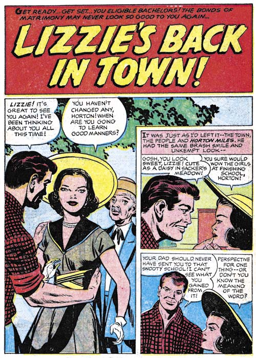
Young Romance #85 (December 1956) “Lizzie’s Back In Town”, pencils by Jack Kirby

As I mentioned earlier, YR #85 was one of the issues that was drawn entirely by Jack Kirby. While the story art was often first rate, the splashes frequently left something to be desired. At least compared to the work Kirby had done in earlier years. The splash for “Lizzie’s Back In Town” is a good example of this. There is nothing wrong with the splash and granted it was probably a challenge to instill interest into some standing figures, but it was just this sort of romance splash that earlier Kirby was so good at. I suspect Kirby was just trying to do too much romance art in too little time. Some interesting splashes will be found in the future issues when Jack had returned to a more measured output of romance stories.

Young Romance #86
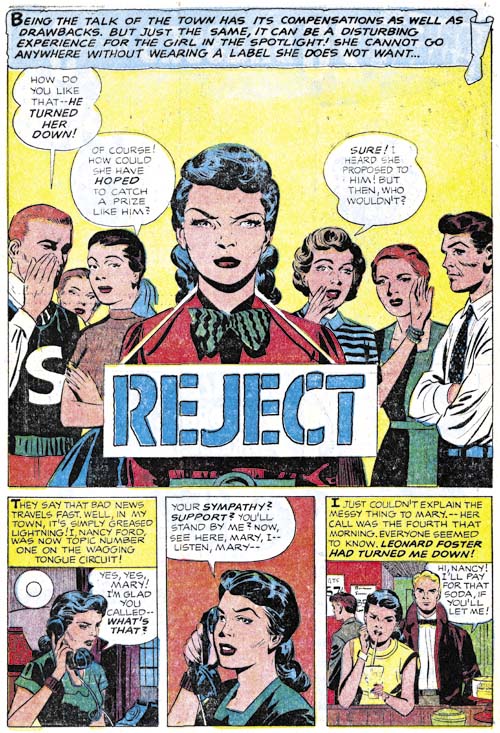
Young Romance #86 (February 1957) “Reject”, pencils by Jack Kirby

There are exceptions to lackluster splashes. I certainly like the one for “Reject”. This is not because of the subject matter because once again all there is are some standing figures. Nor is it the how well the art was handled; I suspect the original pencils were much better than what was left after the inker got finished with it. I think what appeals to me is the characterizations of the players; the stern central figure and the gossipers in the background. I also like the way the title of the story is placed on a placard worn by the lady.

Young Brides #30
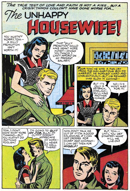
Young Brides #30 (November 1956) “The Unhappy Housewife”, pencils by Jack Kirby

There seems to have been one inker used for all the works penciled by Kirby during this period and a good portion of the art from the all-Kirby romance issues. In the past I had considered it likely that the inker was Marvin Stein. I have heard others advance Bill Draut and Joe Simon as candidates. During the review for this chapter I have come to the conclusion that I am just not sure who he was. In some places it looks like Bill Draut, other Marvin Stein or even Joe Simon. But I also feel it is quite possible that it was someone else entirely.

One interesting feature of the inking of the splash for “The Unhappy Housewife” is the presence of picket fence crosshatching (Inking Glossary). This technique was once a staple of the inking of Kirby pencils during much of the Simon and Kirby collaboration. Part of what I refer to as the Studio style inking. Picket fence crosshatching appears on some of the covers from this period but is largely absent in the stories.

Young Romance #85
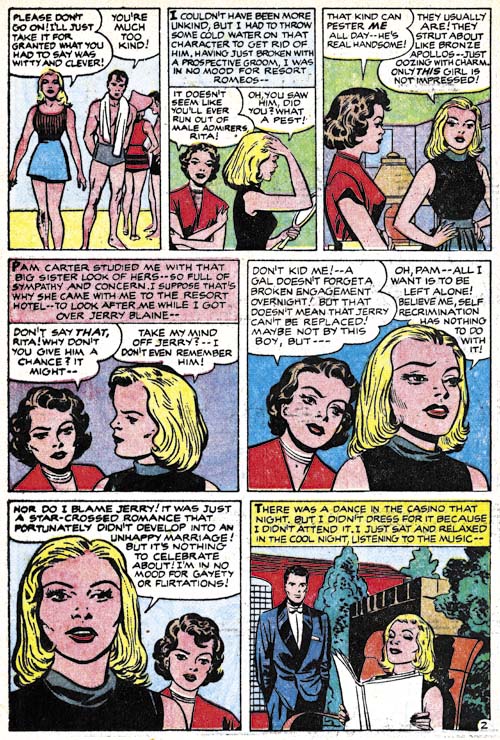
Young Romance #85 (December 1956) “Resort Romeo” page 2, pencils by Jack Kirby

The inking of eyebrows during this period were often done in a simplified but exaggerated manner. The women in panel 5 of the page shown above is a good example. There is some resemblance between these eyebrows and those used by Bill Draut which is the main reason to suggest Draut was the inker for these Kirby pencils. Unfortunately I cannot find any other evidence to support crediting Draut as Kirby’s inker during this period. But I will return to this subject below.

Young Romance #87
Young Romance #87 (April 1957) “Rock n’ Roll Sweetheart” page 4, pencils by Jack Kirby

Note the inking of the man’s face in the last panel from page 4 of “Rock n’ Roll Sweetheart”. The black shadow down one side of the face is what I refer to as negative highlights. I have never seen Bill Draut use negative highlights but Marvin Stein did and his looked very much like this example. Because the inking evidence does not consistantly suggest one inker, I have decided to no longer attribute the inking to Marvin Stein and for now leave it as an open question.

Young Love #73
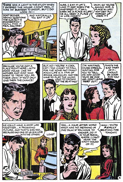
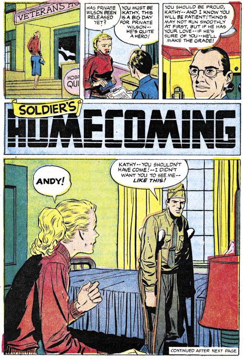
Young Love #73 (December 1956) “Soldier’s Homecoming”, pencils and inks by Bill Draut

Bill Draut provided two of the four stories from the final issue of Young Love. The style is similar to that he was using just prior to the start of the all-Kirby run. However even that was somewhat different from his earlier work. This is most notably seen in the clothing folds which earlier had been somewhat splotchy but now where cleaner and more streamlined.

Young Romance #86
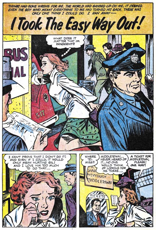
Young Romance #86 (February 1957) “I Took The Easy Way Out”, art by unidentified artist

The first issue (YR #87) of Young Romance after the cancellation of Young Love and Young Brides had only a single Kirby story. Oddly the other three stories were all done by the same artist. He is not a bad artist, but I do not believe I have seen him in a Simon and Kirby production before. It is a puzzle why he suddenly achieved such dominance in this romance title.

All For Love #1
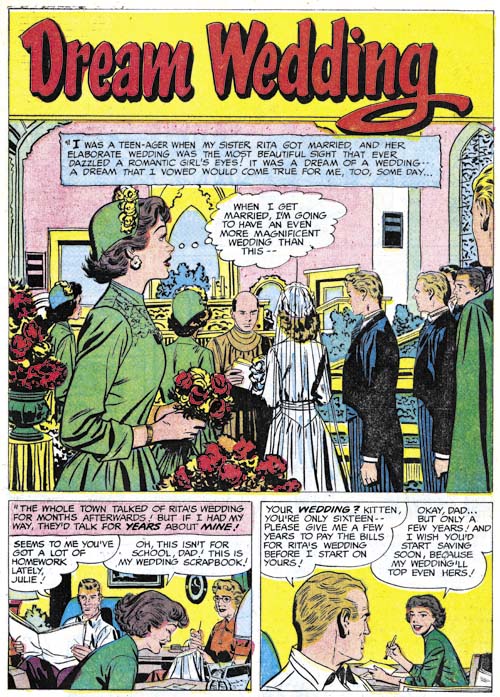
All For Love #1 (April 1957) “Dream Wedding”, art by Bill Draut

As mentioned above, the new Prize romance title All For Love, was not produced by Simon and Kirby. One of the things I will be looking for in future chapters of the Art of Romance was whether the same artists would appear in Young Romance and the Prize titles that were not produced by Simon and Kirby. One artist that shows up in the first issue is Bill Draut. Not only does Draut provide a story but he did the cover art as well. Here Bill is working in the same style we saw Young Romance #86 (February 1957).

Bill had also been appearing in some of the Harvey romance titles at this time which I believe were edited by Joe Simon. But it is unclear whether these were new stories or reprints of older material. In any case work by Draut for Harvey would end at this same time. Draut would not work with Joe Simon on comics until 1966. Bill did work on Sick but right now I am not sure when that was.

All For Love #1
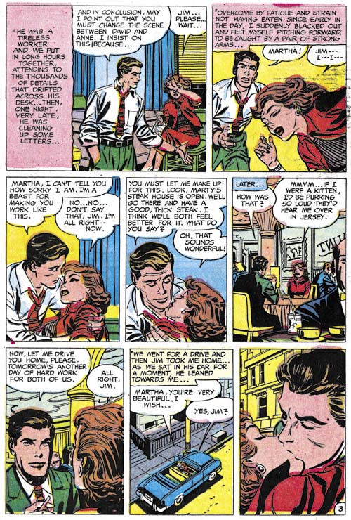
All For Love #1 (April 1957) “Hollow Triumph” page 3, art by Mort Meskin?

There are two stories in All For Love #1 that I am somewhat uncertain about. I some ways “Hollow Triumph” reminds me of the work of Mort Meskin. The way the eyebrows are inked might suggest Bill Draut but the story lacks any of Draut’s mannerisms of graphically telling the story, in particular the body language depicted and how the use of view points. Meskin is a better fit in just these graphic qualities. However if this was drawn by Mort I am certain it was not inked by him. Some of the inking reminds me of the unidentified inker for Kirby that I discussed above.

All For Love #1
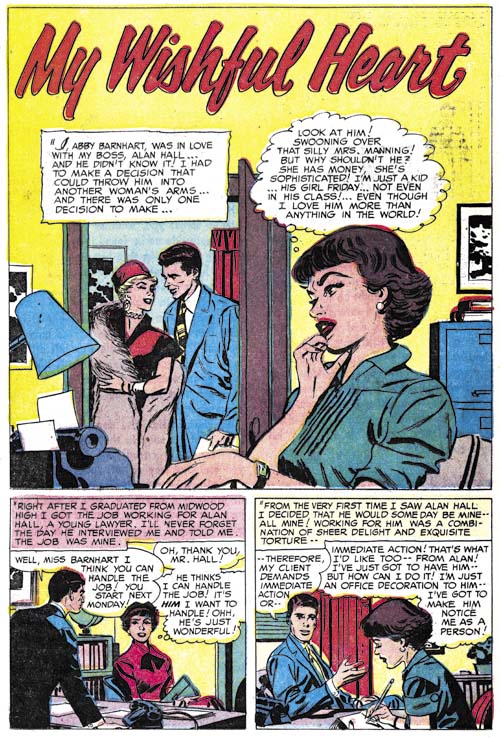
All For Love #1 (April 1957) “My Wishful Heart”, art by Bill Draut?

“My Wishful Heart” is the other story that I questionably attribute to Mort Meskin. Although not identical to “Hollow Triumph” it is close enough to suggest it was done by the same artist.

All For Love #1
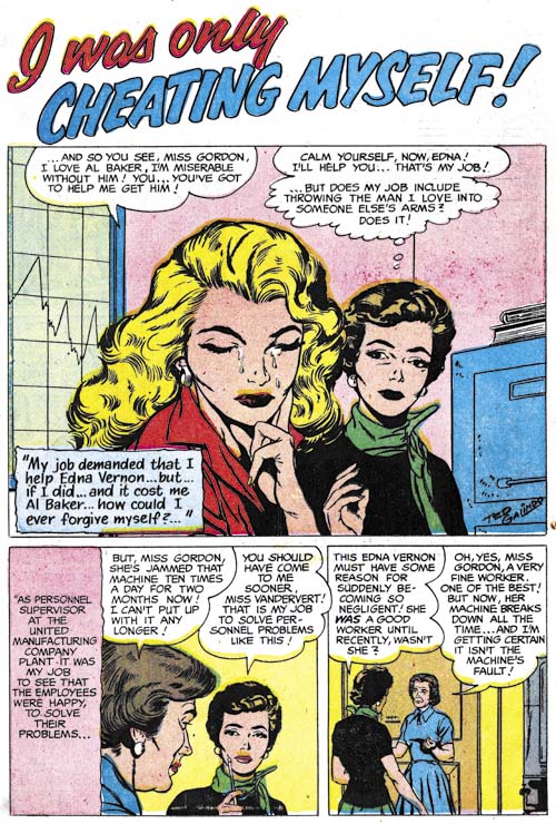
All For Love #1 (April 1957) “I Was Only Cheating Myself”, art by Ted Galindo

The only other romance artist from this period that I can identify other than Jack Kirby, Bill Draut and possibly Mort Meskin was Ted Galindo. Ted does a real nice job on his romance stories. His women are attractive and his art style more modern than most of the artists that I have discussed so far. Galindo’s use of changing viewpoints keeps his stories graphically interesting. we will be seeing more of his work

We are now coming into the final period covered by the Art of Romance. It was always my intention to take this serial post up to 1960. However I am really uncertain how many chapters remain. Frankly overall I find the Prize romance titles from this point on the least interesting of the series. If not for the presence of Jack Kirby I might be tempted to cover it in some future serial post. But there is some really great Kirby art, much of it inked by Jack himself. Plus some other interesting artists appeared from time to time.

Chapter 1, A New Genre (YR #1 – #4)
Chapter 2, Early Artists (YR #1 – #4)
Chapter 3, The Field No Longer Their’s Alone (YR #5 – #8)
Chapter 4, An Explosion of Romance (YR #9 – #12, YL #1 – #4)
Chapter 5, New Talent (YR #9 – 12, YL #1 – #4)
Chapter 6, Love on the Range (RWR #1 – #7, WL #1 – #6)
Chapter 7, More Love on the Range (RWR #1 – #7, WL #1 – #6)
Chapter 8, Kirby on the Range? (RWR #1 – #7, WL #1 – #6)
Chapter 9, More Romance (YR #13 – #16, YL #5 – #6)
Chapter 10, The Peak of the Love Glut (YR #17 – #20, YL #7 – #8)
Chapter 11, After the Glut (YR #21 – #23, YL #9 – #10)
Chapter 12, A Smaller Studio (YR #24 – #26, YL #12 – #14)
Chapter 13, Romance Bottoms Out (YR #27 – #29, YL #15 – #17)
Chapter 14, The Third Suspect (YR #30 – #32, YL #18 – #20)
Chapter 15, The Action of Romance (YR #33 – #35, YL #21 – #23)
Chapter 16, Someone Old and Someone New (YR #36 – #38, YL #24 – #26)
Chapter 17, The Assistant (YR #39 – #41, YL #27 – #29)
Chapter 18, Meskin Takes Over (YR #42 – #44, YL #30 – #32)
Chapter 19, More Artists (YR #45 – #47, YL #33 – #35)
Chapter 20, Romance Still Matters (YR #48 – #50, YL #36 – #38, YB #1)
Chapter 21, Roussos Messes Up (YR #51 – #53, YL #39 – #41, YB #2 – 3)
Chapter 22, He’s the Man (YR #54 – #56, YL #42 – #44, YB #4)
Chapter 23, New Ways of Doing Things (YR #57 – #59, YL #45 – #47, YB #5 – #6)
Chapter 24, A New Artist (YR #60 – #62, YL #48 – #50, YB #7 – #8)
Chapter 25, More New Faces (YR #63 – #65, YLe #51 – #53, YB #9 – #11)
Chapter 26, Goodbye Jack (YR #66 – #68, YL #54 – #56, YB #12 – #14)
Chapter 27, The Return of Mort (YR #69 – #71, YL #57 – #59, YB #15 – #17)
Chapter 28, A Glut of Artists (YR #72 – #74, YL #60 – #62, YB #18 & #19, IL #1 & #2)
Chapter 29, Trouble Begins (YR #75 – #77, YL #63 – #65, YB #20 – #22, IL #3 – #5)
Chapter 30, Transition (YR #78 – #80, YL #66 – #68, YBs #23 – #25, IL #6, ILY #7)
Chapter 30, Appendix (YB #23)
Chapter 31, Kirby, Kirby and More Kirby (YR #81 – #82, YL #69 – #70, YB #26 – #27)
Chapter 32, The Kirby Beat Goes On (YR #83 – #84, YL #71 – #72, YB #28 – #29)
Chapter 33, End of an Era (YR #85 – #87, YL #73, YB #30, AFL #1)
Chapter 34, A New Prize Title (YR #88 – #91, AFL #2 – #5, PL #1 – #2)
Chapter 35, Settling In ( YR #92 – #94, AFL #6 – #8, PL #3 – #5)
Appendix, J.O. Is Joe Orlando
Chapter 36, More Kirby (YR #95 – #97, AFL #9 – #11, PL #6 – #8)
Chapter 37, Some Surprises (YR #98 – #100, AFL #12 – #14, PL #9 – #11)
Chapter 38, All Things Must End (YR #101 – #103, AFL #15 – #17, PL #12 – #14)

Art of Romance, Chapter 30, Transition

(July – December 1955: Young Romance #78 – #80, Young Love #66 – #68, Young Brides #23 – #25, In Love #6, I Love You #7)
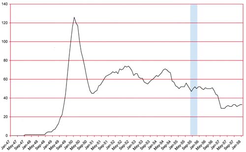
Number of Romance titles 1947 - 1958
Number of Romance titles 1947 – 1958 (the period covered in this chapter is shaded in blue)

This continued to be troubling times for comic book publishers. Although the graph of the number of romance titles shows a relatively flat period, in fact the number of publishers of romance comics continued to decline (The Real Reason for the Decline of Comics). Simon and Kirby’s publishing venture (Mainline) ended in the period covered in the last chapter (Chapter 29) but they had transferred their titles to Charlton for publication. Even that did not save the Simon and Kirby titles for long. The Mainline romance title, In Love, ended at Charlton with issue #6 (July 1955).

There was an important change in the rostrum of artists supplying work for the Simon and Kirby romance comics, Jack Kirby was back providing art for the Prize love titles. During the period covered in this chapter Kirby would draw 47 pages of art followed by Joanquin Albistur (33 pages); Bill Draut (29 pages); Mort Meskin (16 pages); Bob McCarty, Ann Brewster and Marvin Stein were all tied (13 pages); Bill Benulis (7 pages); and John Prentice, Al Gordon and Lazurus (6 pages each). There were still a lot of relatively new and unidentified artists (58 pages). Kirby had returned to being the primary artists after a period of relative inactivity. However Kirby’s return came toward the end of this period but before that return the things were pretty much like it was during the last chapter.
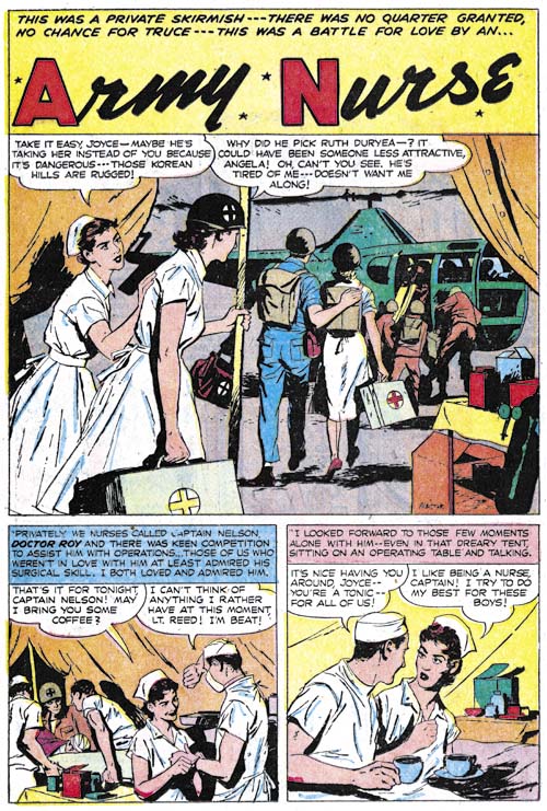
Young Romance #78
Young Romance #78 (August 1955) “Army Nurse”, art by Joaquin Albistur

As noted above, Jo Albistur was the second most productive artists during this period. Albistur worked for Simon and Kirby for a little over a single year but during that time he was an important contributor to both Prize and Mainline titles and even appeared in Win A Prize (Charlton). However Albistur was never used for Black Magic, probably because that was not his strongest forte. Apparently Jo did a little work for another comic publisher (which I find much too dry) and appeared in Humorama as well (but too risque to be shown in this blog). Despite his short appearance, Jo Albistur is one of my favorite artist that worked for Simon and Kirby. He would last appear in Young Romance #79 (October 1955).
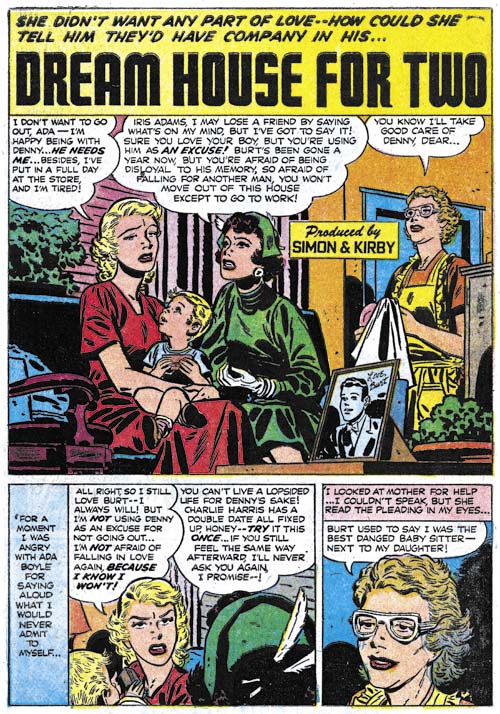
Young Romance #78
Young Romance #78 (August 1955) “Dream House for Two”, art by Bill Draut

Bill Draut could be described as the work horse for the Simon and Kirby studio. More than any other artists, Bill consistently produced a significant amount of art for all Simon and Kirby productions. He was also the longest running artist working for the studio having started on some features used in Stuntman and Boy Explorers titles that Joe and Jack launched after returning from military service. Draut met Joe Simon in Washington DC when both were still in the service (Bill in the Marines and Joe in the Coast Guard). It was Joe who convinced Bill to try working as a comic book artist. As far as I know the only other publisher that Draut worked for up to now was Harvey Comics. I do not know if Bill independently met Al Harvey or whether this connections was through Joe as well. Unlike the other artists in this post, we will see a little more work by Bill but not for a few chapters.
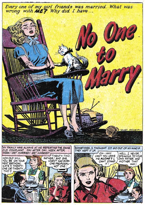
Young Love #68
Young Love #68 (December 1955) “No One To Marry”, pencils by Mort Meskin

Mort Meskin did not work for as long as Bill Draut but he certainly created more art than anyone other than Kirby and there were periods that he even out produced Jack. Mort has been a very over looked artist. This is partly because his work during the war has largely not be reprinted. Further during much of the fifties he was over shadowed by Kirby. Jack was THE best comic book artist but that does not mean all other artists are not worthy of recognition. The work that Meskin is most well know for was for DC horror titles during the late 50’s. Mort tried to adapt his art to look more like the DC studio style making that perhaps his lest artistically successful period. I intend to include in this serial post Prize romance titles not produced by Joe and Jack so we will see a little more work by Meskin. But Mort would never again work for Simon and Kirby.
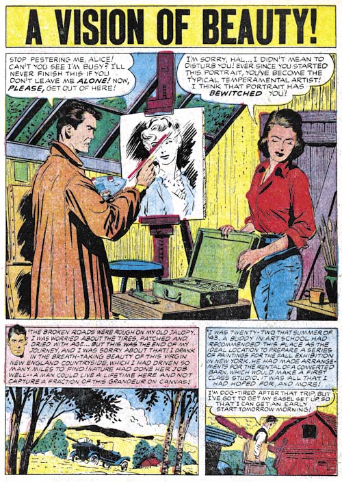
Young Romance #79
Young Romance #79 (October 1955) “A Vision of Beauty”, art by John Prentice

John Prentice was the last of what I refer to as the usual suspects (along with Draut and Meskin). While he would appear in some Harvey titles that I believe were edited by Joe Simon, he also would not be used in any more Simon and Kirby productions nor in any of the other Prize romance titles. He would do a little work for DC but unlike Draut and Meskin, his later career was actually quite successful. Prentice was called upon to take over the Rip Kirby syndication strip after the untimely death of Alex Raymond. I cannot think of an artist better suited to this task. I am not saying Prentice was as good an artist as Raymond but John was so influenced by Alex that he was able to take the strip over without a too obvious style change. I am a great admirer of the work Prentice did for Joe and Jack but I believe his work on Rip Kirby was even greater. Unfortunately I doubt we will see Prentice’s Rip Kirby reprinted (at least in my life time) but I do intend to post about it someday.
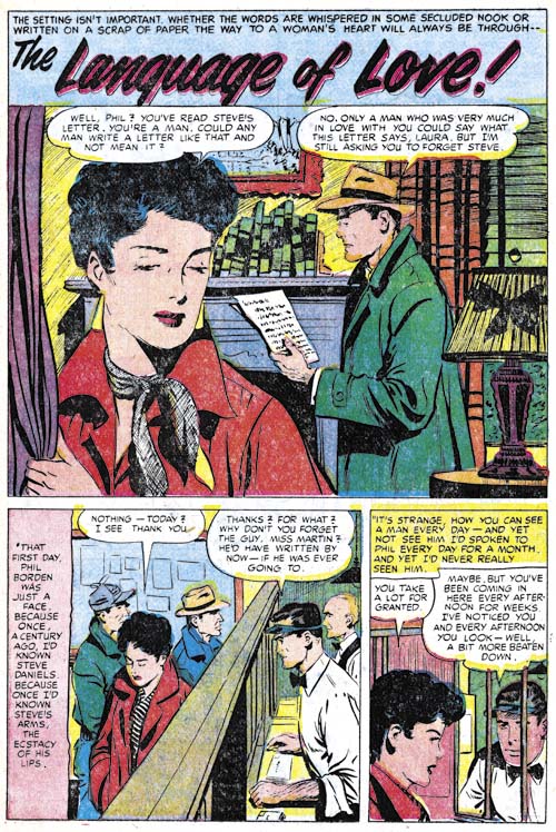
Young Love #68
Young Love #68 (December 1955) “Language of Love”, art by Bob McCarty

Bob McCarty appeared often enough in Simon and Kirby productions that perhaps I should also include him in the “usual suspects. I have to admit that for sometime I credited work by McCarty from 1954 and 1955 to John Prentice. For some reason McCarty’s style changed to one more like Prentice’s at this time. This maybe nothing more than their being mutually influenced by Alex Raymond’s Rip Kirby strip. However the resemblance on occasion is so close that a more personal connection is possible.
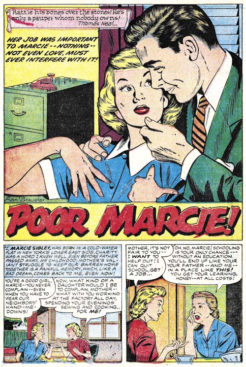
Young Romance #79
Young Romance #79 (October 1955) “Poor Marcie”, art by Ann Brewster

This is at least the second time that Ann Brewster had worked for Joe and Jack although the first time seemed to have been limited to a single piece (Chapter 9). As far as I know she is the only female artist that ever worked for Simon and Kirby but then again there were not many women in the comic book field. Brewster’s talents was recognized by Joe and Jack because she was one of the few artists to be used for Prize romance covers. I am not sure whether this resulted in any financial gain for Ann as her covers were created from stats made from her splashes. That it was the splashes that were the source is shown by the “original” of the cover for Young Romance #79 that is part of Joe Simon’s collection.
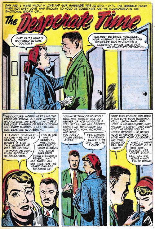
Young Love #67
Young Love #67 (October 1955) “The Desperate Time”, art by Marvin Stein

With all the influx of new and returning artists during this last year it is surprising that it did not include more work by Marvin Stein. But Marvin does show up in a couple of stories late in 1955. Frankly I was not enthusiastic about much of Stein’s romance work although he had gotten better just before he stopped regularly providing work to Joe and Jack in 1952 (Chapter 16). Marvin returns as a much improved artist from the experience he accumulated as the lead artist for Headline and Justice Traps the Guilty (during the period when these titles were not produced by Simon and Kirby). The women that Stein would now draw were attractive and natural looking. While his drawing and inking has greatly improved Marvin still lacks the ability or inclination to depict intimacy; a serious failing in the romance genre. I am not overly enthusiastic about his romance art I find his work in the crime genre to be exceptional (I will be covering this in a future post).
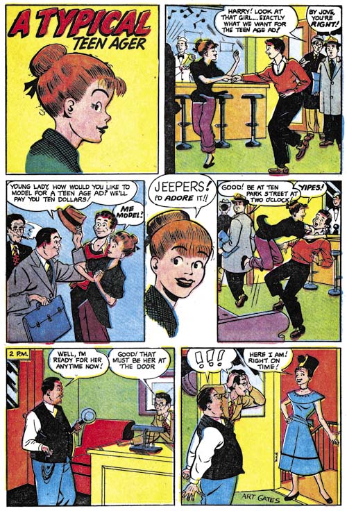
In Love #6
In Love #6 (July 1955) “A Typical Teen Ager”, art by Art Gates

Art Gates has often been included in recent chapters of the Art of Romance however they were examples of his more realistic style. But I thought I would include one of his gag strips from In Love. Although as we have seen Gates did more realistic comic book art my impression is that he received more work doing gag features. But whatever the style Gates seemed to specialize in short one or two page features.
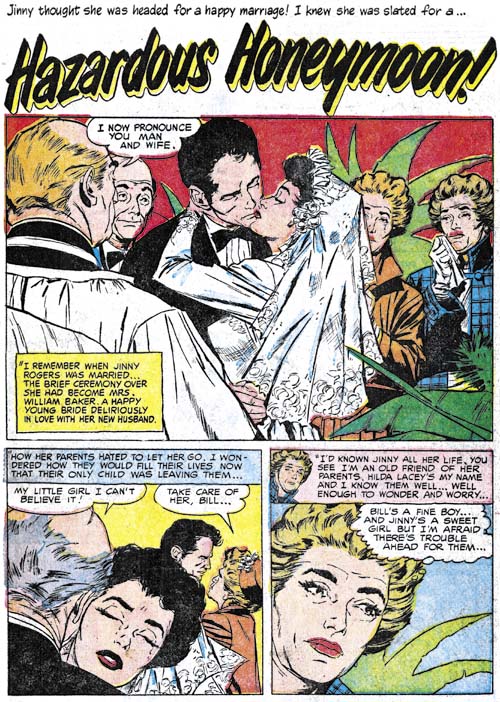
Young Love #67
Young Love #67 (October 1955) “Hazardous Honeymoon”, art by Bill Benulis

While I cannot identify a number of the studio artists from this period there are some that I believe I can and so I will include some examples. “Hazardous Honeymoon” is unsigned but I still believe it was done by Benulis. Benulis style has a more modern look compared to most artists working for the S&K studio but he did not do a lot of work for Joe and Jack.
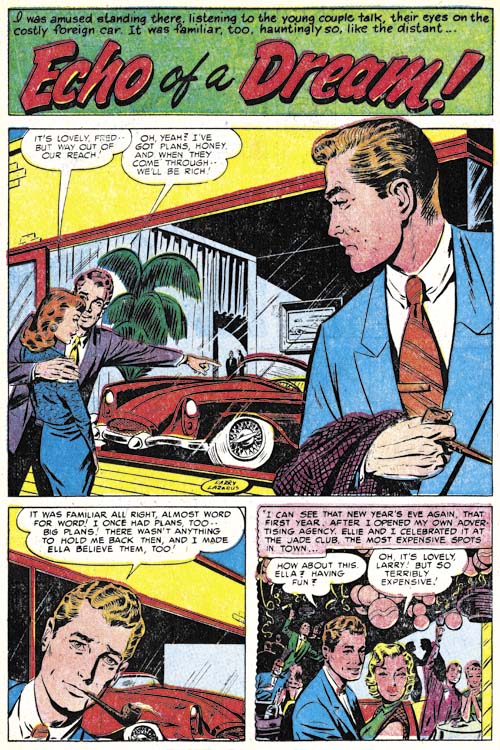
Young Love #68
Young Love #68 (December 1955) “Echo of a Dream”, art by Harry Lazarus

I admit I might not have included “Echo of a Dream” in this chapter had it been unsigned. This is the only piece that I know of that Lazarus did for Simon and Kirby but he also did a story for Justice Traps the Guilty about the same time.
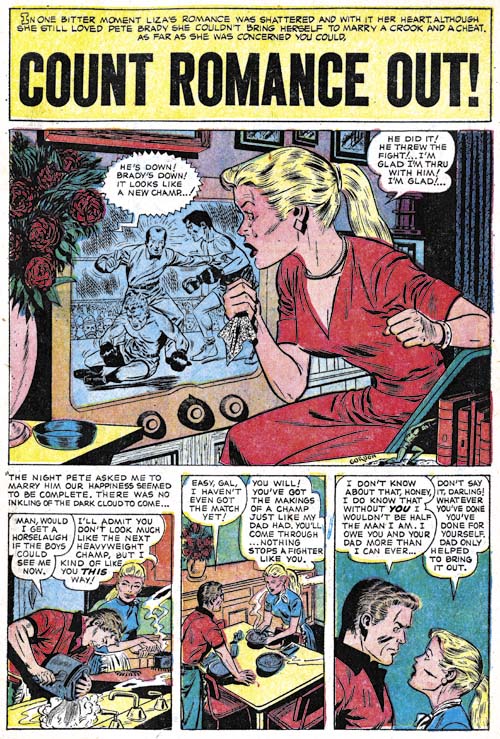
Young Brides #24
Young Brides #24 (September 1955) “Count Romance Out”, art by Al Gordon

Al Gordon is another artist who I might not have provided an example image for had he not signed the work. I do not want to give the impression that I thinks he or any of the unidentified artists are not competent it is just that in most case I cannot get to excited about them either. Gordon also do some work for Bullseye.
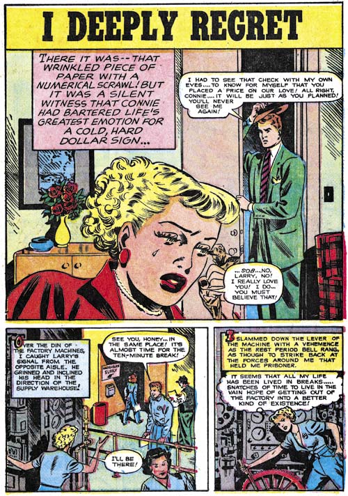
In Love #6
In Love #6 (July 1955) “I Deeply Regret”, art by unidentified artist

The period covered by this chapter does not seem to have much art purchased from other failing publishers. Such art picked up from failing romance titles seemed to be a significant feature of the comics covered in the previous two chapters. So far the only one I recognized for this chapter was “I Deeply Regret”. The lettering does not seemed to have been done by Ben Oda who was still the only letterer that Simon and Kirby used. That the lettering was not Oda’s is particularly obvious in the caption found in the splash. The floating captions with the unusual large first letter are also rather unique. I suspect with some searching it should be possible to identify the original source for this story.
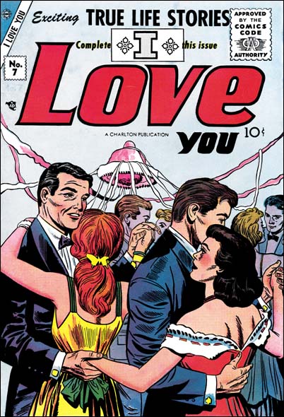

I Love You #7 (September 1955), pencils by Jack Kirby

I wonder whether it was ever Charlton’s intention to continue to publish Simon and Kirby’s former Mainline titles? Perhaps they only wanted to pick up some finished art cheap and get the second class mailing licenses. Whatever their original plans were, Charlton replaced In Love with a new title, I Love You. Since the I Love You issue number picked up from where In Love left off it certainly was using In Love’s mailing license. There was even a cover by Jack Kirby, although not one of his best efforts. The interior art was done by different artists from those previously used by the Simon and Kirby studio. I presume they are all artists that had been working for Charlton. I Love You would become a long running Charlton romance title.
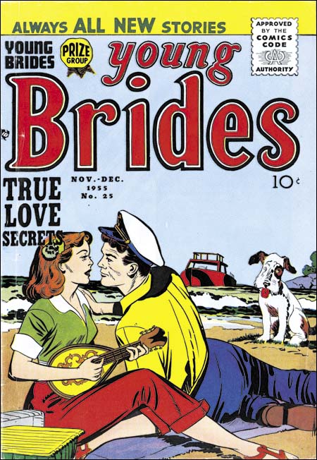
Young Brides #25
Young Brides #25 (November 1955), art by Joe Simon?

The contents of Young Brides #25 was very distinctive for reasons that I will discuss below but even the cover is rather unique. For most of the period covered in this chapter the covers were created by a small group of studio artists (Bill Draut, Mort Meskin and Ann Brewster). This was also true during the period covered in the previous two chapters except the list of artists also included John Prentice and Bob McCarty. The cover for Young Brides #25 was distinctive because it was one of two covers that clearly was not done by any of the previous cover artists. The inker for the cover included the use of picket fence crosshatching (Inking Glossary) which suggests the possibility that Jack Kirby may have been involved. Picket fence crosshatching was one of the techniques of the studio style that typically was used on Kirby’s pencils. I will not completely rule out Kirby having penciled the two figures but I am do not find them convincing examples of his drawing style either. However the dog in the background strongly reminds me of Joe Simon’s work and so I am questionably crediting this cover to him. If true this is one of the few covers that Joe did during the Simon and Kirby collaboration.
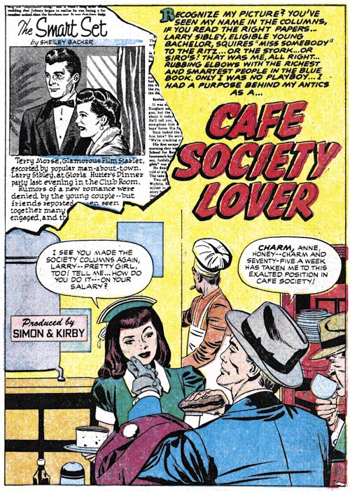
Young Brides #25
Young Brides #25 (November 1955) “Cafe Society Lover, pencils by Jack Kirby

Young Romance #79 (October 1955) included a short piece (“Problem Clinic”) by Jack Kirby. The piece itself is not all that good; perhaps spoiled by poor inking (I have questionably credited the inking to Marvin Stein). However it marked the return of Kirby to the Prize romance titles from which he has been completely absent for about a year.

Jack Kirby next appeared in Young Brides #25 (November 1955). But this issue was odd because it contained three full stories drawn by Jack; an unusually high number. These stories are all much better than his “Problem Clinic” from last month’s Young Romance #79. Perhaps this is due to a better inking job. While I cannot rule out Jack providing some touch-ups, the spotting does not appear to have been done by Kirby.
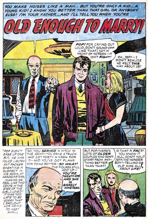
Young Romance #80
Young Romance #80 (December 1955) “Old Enough to Marry”, pencils by Jack Kirby

Young Love #68 and Young Romance #80 both came out in December 1953. YL #68 was very much the same as most of the issues discussed in this chapter; a Meskin cover and story art by Meskin, Draut, McCarty, Stein and Lazurus. YR #80 was something entirely different; not only did Jack draw the cover he also penciled every story.

A short comment about the splash for “Old Enough to Marry”. At a glance it might appear that Jack has returned to the old confessional splash layout where a character introduces the story with his speech balloon containing the title. But the older man’s speech is actually part of the story. Other studio artists had stopped using the story splash format. If he was aware of that, Kirby was undeterred and with good reason. Jack may not have been doing much romance art during the previous year but he certainly has not lost his touch.

I will close this chapter with a good news, bad news section. The bad news first. Simon and Kirby productions will never be the same. One of the fundamental themes of this blog is that Simon and Kirby productions are not just Jack drawing and Joe inking. What Simon and Kirby did was much, much more. They put together entire contents and the studio artists they employed played an important part in provided those comics with varied and interesting content. While we will see some of this artists again under special circumstances and different venues, the absence of so many artists from future Simon and Kirby productions begs for an explanation. I can offer two possibilities. The first is that future Simon and Kirby productions, which were all romance work, seems to have been done on the cheap. The artists used in the future were on a whole not of the same caliber as those previously used. Lower pay made working for Simon and Kirby not as attractive as it was previously. The second explanation for the missing studio artists was the sudden termination of any work for 1956. The entire comic industry was collapsing and this included the Simon and Kirby studio. I do not know precisely when the actual studio closed but I believe it had done so by the end of 1955. If not then certainly by the end of 1956 when Jack Kirby had begun doing freelance work for DC and Atlas. It must have been a shock for the studio artists that the work offered by Simon and Kirby came to a sudden end. Joe Simon has said that all the artists were paid and I believe him but I wonder if the cash flow problems may have meant that for some the payment was delayed. In any case I suspect the sudden end of it all left many of the artists with hard feelings.

Now the good news. Not only will Simon and Kirby productions will never be the same but for the next year they are going to be unlike anything that was done before. The Prize romance titles will for the most part be drawn by Kirby alone. Such all, or near all, Kirby titles have happened in the past but under special circumstances. For instance the early issues of Boys’ Ranch and Fighting American were almost entirely by Kirby. It was part of the Simon and Kirby modus operandi that Jack would dominate the initial issues of a new title. But the Prize romance titles were hardly new; Young Romance had been running for over 8 years. Such a long stretch of all Kirby comics was completely unprecedented. Not only do we get a lot of Kirby but he was in great form; Jack came back to romance work revitalized. We will even get to see numerous examples of Kirby inking his own pencils. This is more unusual than many Kirby fans think. In the past the studio provided assistants and inking was done like a production line with different hands performing different chores. when a piece is said to be inked by Kirby even in this blog what this really means is that Jack provided the finishing touches. Now that the studio was gone Jack got less assistance and he did more of the inking himself. He also developed an inking style that was quicker but still pleasing. I have previously written about this style (Jack Kirby’s Austere Inking) and happily I now will get a chance to show some more. I am sure that the next few chapters of the Art of Romance will please Kirby fans.

Chapter 1, A New Genre (YR #1 – #4)
Chapter 2, Early Artists (YR #1 – #4)
Chapter 3, The Field No Longer Their’s Alone (YR #5 – #8)
Chapter 4, An Explosion of Romance (YR #9 – #12, YL #1 – #4)
Chapter 5, New Talent (YR #9 – 12, YL #1 – #4)
Chapter 6, Love on the Range (RWR #1 – #7, WL #1 – #6)
Chapter 7, More Love on the Range (RWR #1 – #7, WL #1 – #6)
Chapter 8, Kirby on the Range? (RWR #1 – #7, WL #1 – #6)
Chapter 9, More Romance (YR #13 – #16, YL #5 – #6)
Chapter 10, The Peak of the Love Glut (YR #17 – #20, YL #7 – #8)
Chapter 11, After the Glut (YR #21 – #23, YL #9 – #10)
Chapter 12, A Smaller Studio (YR #24 – #26, YL #12 – #14)
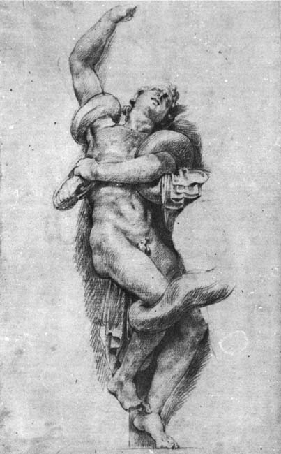
Chapter 13, Romance Bottoms Out (YR #27 – #29, YL #15 – #17)
Chapter 14, The Third Suspect (YR #30 – #32, YL #18 – #20)
Chapter 15, The Action of Romance (YR #33 – #35, YL #21 – #23)
Chapter 16, Someone Old and Someone New (YR #36 – #38, YL #24 – #26)
Chapter 17, The Assistant (YR #39 – #41, YL #27 – #29)
Chapter 18, Meskin Takes Over (YR #42 – #44, YL #30 – #32)
Chapter 19, More Artists (YR #45 – #47, YL #33 – #35)
Chapter 20, Romance Still Matters (YR #48 – #50, YL #36 – #38, YB #1)
Chapter 21, Roussos Messes Up (YR #51 – #53, YL #39 – #41, YB #2 – 3)
Chapter 22, He’s the Man (YR #54 – #56, YL #42 – #44, YB #4)
Chapter 23, New Ways of Doing Things (YR #57 – #59, YL #45 – #47, YB #5 – #6)
Chapter 24, A New Artist (YR #60 – #62, YL #48 – #50, YB #7 – #8)
Chapter 25, More New Faces (YR #63 – #65, YLe #51 – #53, YB #9 – #11)
Chapter 26, Goodbye Jack (YR #66 – #68, YL #54 – #56, YB #12 – #14)
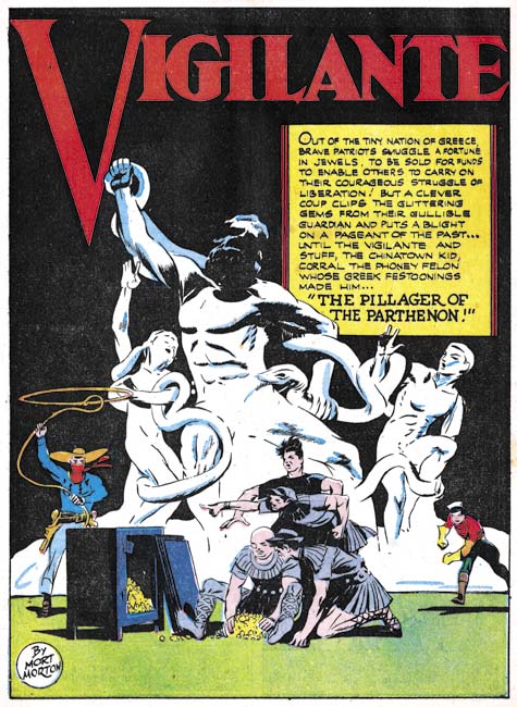
Chapter 27, The Return of Mort (YR #69 – #71, YL #57 – #59, YB #15 – #17)
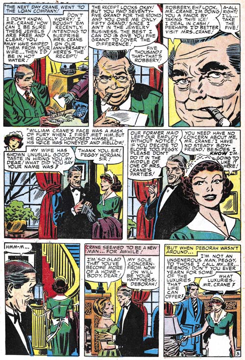
Chapter 28, A Glut of Artists (YR #72 – #74, YL #60 – #62, YB #18 & #19, IL #1 & #2)
Chapter 29, Trouble Begins (YR #75 – #77, YL #63 – #65, YB #20 – #22, IL #3 – #5)
Chapter 30, Transition (YR #78 – #80, YL #66 – #68, YBs #23 – #25, IL #6, ILY #7)
Chapter 30, Appendix (YB #23)
Chapter 31, Kirby, Kirby and More Kirby (YR #81 – #82, YL #69 – #70, YB #26 – #27)
Chapter 32, The Kirby Beat Goes On (YR #83 – #84, YL #71 – #72, YB #28 – #29)
Chapter 33, End of an Era (YR #85 – #87, YL #73, YB #30, AFL #1)
Chapter 34, A New Prize Title (YR #88 – #91, AFL #2 – #5, PL #1 – #2)
Chapter 35, Settling In ( YR #92 – #94, AFL #6 – #8, PL #3 – #5)
Appendix, J.O. Is Joe Orlando
Chapter 36, More Kirby (YR #95 – #97, AFL #9 – #11, PL #6 – #8)
Chapter 37, Some Surprises (YR #98 – #100, AFL #12 – #14, PL #9 – #11)
Chapter 38, All Things Must End (YR #101 – #103, AFL #15 – #17, PL #12 – #14)