Next week I hope to do the final chapter of my serial blog, Early Jack Kirby. But if that does not work out I should be able to get my first of a set of posts on Foxhole. Who knows maybe I’ll have both done?
Category Archives: 2007/01
Featured Cover, Adventure Comics #95
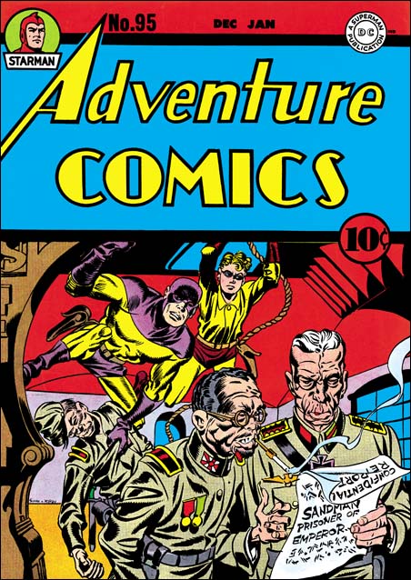
Adventure Comics #95 (December 1944) by Jack Kirby
It was late in the war and both Jack Kirby and Joe Simon were performing their military service. Nonetheless the cover for Adventure #95 was clearly penciled by Jack. Earlier while working for DC and knowing that they would be called to duty, Simon and Kirby had backlogged art for DC to publish while they were gone. It is an indication of the importance that S&K gave toward covers that the stories they provided for Adventure Comics ran out months ago (the last in April 1944) while they still left enough covers to last a few more months to come (the last would be for April 1945).
Jack was under a lot of pressure to produce his art quickly before entering the service. However you could not tell it by looking at this cover. The cover was both beautifully composed and drawn. I use the term ‘beautifully’ to describe the manner of execution not the subject matter. One would hardly use that term to describe either the Japanese or the German officer. Today such depictions would not be considered politically correct. During World War II what was considered correct was politically something very different. Germany and Japan were our mortal enemies and as such their appearance were meant to reflect their “brutal nature”. Certainly Kirby has captured that quality in this cover. In order to be truly patriotic it was not enough to depict the enemy negatively, one also had to make fun of him and show the superiority of Americans. The Japanese officer smugly shows his German counterpart an announcement of the capture of Sandman. But of course this was obviously all part of Sandman’s plan because there he is with Sandy ready to pounce on the as yet clueless pair.
That this scene was supposed to be taken place in Japan can be shown by the soldier that Sandman has so quietly subdued. Another clue is the woodwork on our left. I am no more a student of Japanese architecture then apparently Jack Kirby was. But I strongly suspect you would find nothing like this woodwork in Japan. Even so the unusual nature of this wooden frame was meant to suggest the orient and therefore Japan and not America or even Germany. As if their appearances alone are not enough to label the officers as foreign, Jack provides a monocle for the German and cigarette holder for the Japanese. I find it interesting that the same symbol, in this case the cigarette holder, was used to identify someone as foreign and at the same time be such an important part of the image of that American icon, President Franklin D. Roosevelt.
Genesis of a Cover, Captain America #105
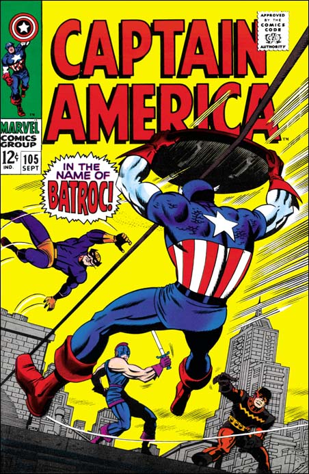
Captain America #105 (September 1968) by Jack Kirby, John Romita and Dan Adkins?
Usually I confine myself in this blog to the time of Simon and Kirby’s collaboration. Occasionally I venture outside that period, for example in a series of posts I once did on Kirby margin notes. Generally I leave the Kirby’s more recent work to the Jack Kirby Blog where Bob does such a great job with it. But I thought it might be fun to discuss the silver age cover to Captain America #105 (September 1968) and some of its influences back to the beginning of the golden age of comics.
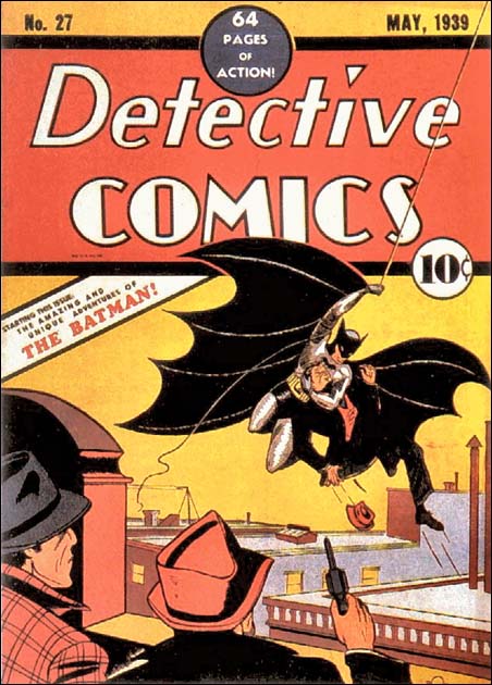
Detective Comics #27 (May 1939) by Bob Kane
You can really go back to the dawn of the golden age of comics and find the motif of a hero arriving via a rope. Heck that is how Batman made his first appearance on the cover for Detective Comics #27. Such use of a rope is a natural for any hero who lacks the power of flight. Of course this sort of transportation can only have a restricted use. It would really be stretching the limits of believability for a hero to travel great distances like a city version of Tarzan. Some early heroes overcome that difficulty by having a gun that could shoot out the wire to swing on. That has always seemed a rather crude technique. It was only years later that Steve Ditko would give Spiderman a more elegant solution to this problem.
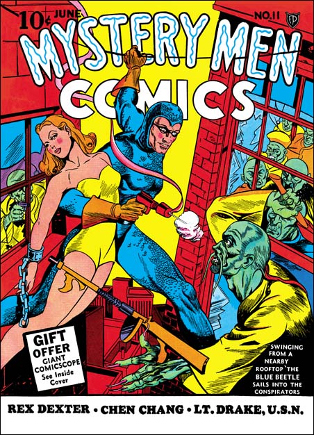
Mystery Men Comics #11 (June 1940) by Joe Simon
Even looking for a more immediate influence on Jack Kirby will take us pretty much into the early part of the golden age. Joe Simon’s cover to Mystery Men #11 was done while he was editor at Fox Comics. At that same time Kirby was also there doing the Blue Beetle syndication strip. Joe’s cover has the Blue Beetle using a rope or wire for moving between buildings. Our hero has exited one building just in time to avoid an adversary. However his destination seems if anything even more perilously filled with enemies. I presume the Blue Beetle is using something like a telephone wire that connects the two buildings, that may seem more realistic then a rope that just happens to be conveniently available. Unfortunately it does make it harder to understand how the hero manages to use the wire. With one arm being used to both hold the swooning woman and fire a gun, the Blue Beetle has only one arm to move along the support. It would seem a rather daunting challenge, but then again that what heroes are for.
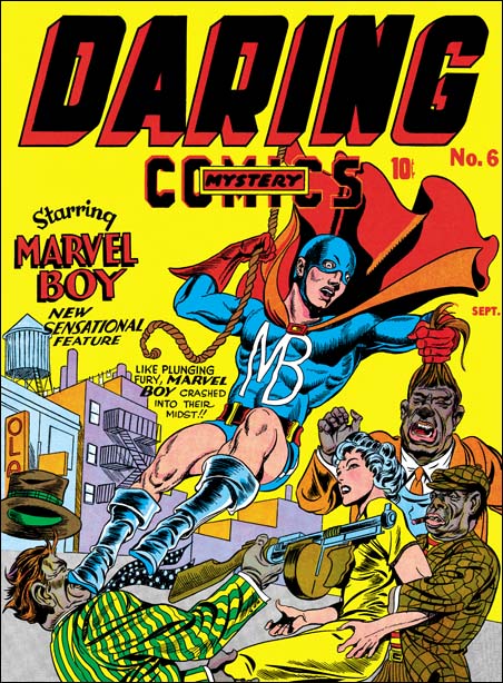
Daring Mystery #6 (September 1940) by Jack Kirby
I presume Jack Kirby liked the idea of the hero using a rope or wire to aid transportation. But he may have been uncomfortable with Joe’s solution of a wire already attached to the source and destination. Certainly rope swinging was both faster and more dramatic then going hand over hand. I believe that the cover for Daring Mystery #6 might have been Jack’s first use of a rope swinging hero.
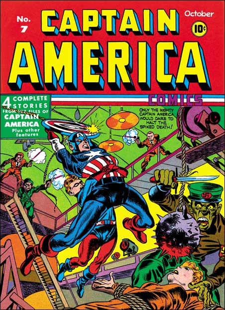
Captain America Comics #7 (October 1941) by Jack Kirby
Not that terribly long after Daring Mystery #6 Jack would return to a swinging hero with the cover of Captain America #7. But what a difference a year can make. Cap’s pose, with his arched body and legs spread wide, is a little surprising but there is no denying the rope swinging brings high drama to the cover. Since Cap is taking his sidekick along and not some “helpless female” the hero’s hands are both free to hold the rope while Bucky clings in turn to Cap. Captain America does have one problem that heroes like Batman and Marvel Boy did not share. Generally Cap makes great use of his shield for things such as protection against bullets. Here with rope swinging it just seems to get in the way.
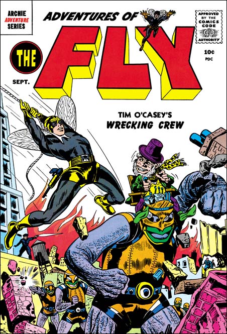
Adventures of the Fly #2 (September 1959) by Joe Simon and another?
I do not think that Kirby used rope swinging that often but it was one of his “tools” that he would pull out and use from time to time. It is hard to be sure about what Joe Simon may have brought to the creation of a particular Simon and Kirby piece. Did Joe provide layouts for the cover for Captain America #7? I will not suggest an answer to that question here. I will say that Joe seems very attached to Captain America’s pose for that cover. It turns up again years later in the cover for Adventures of the Fly #2. Some have attributed this cover to Jack but I am certain that the figure of the Fly was actually done by Joe.
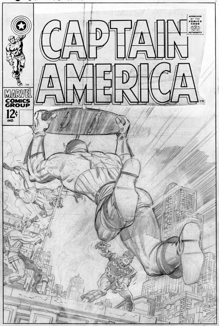
Unused pencils for Captain America #105 by Jack Kirby and Jim Steranko
I am sure that most, no make that all, of my readers know that Jack Kirby would return to drawing Captain America this time collaborating with Stan Lee. Jack would do some exciting covers for Marvel Comics. Sometimes Stan, as the editor, would request changes to a cover. Perhaps because I am such a Kirby fanboy, I generally do not understand what Stan found so objectionable. This was the fate for Kirby’s pencils for Captain America #105 cover . I will discuss what was done to the pencil version and by whom below. First let us discuss Jack’s return to the rope motif.
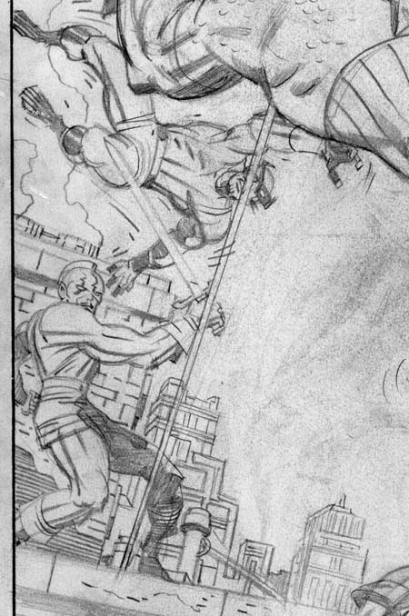
Unused pencils for Captain America #105 Batroc and the Swordsman by Jack Kirby
Yes Jack has once again has the hero travel via a rope but it is not by means of swinging. Instead Kirby has returned to using an attached rope essentially like Joe Simon had used for Mystery Men #11 so many years previously. However Kirby overcame both the awkward questions of how to travel on such a rope and what to do with Cap’s shield. No longer is the shield an impediment but is now the means by which Cap can quickly slide along the rope! This is one of the solutions that only seems obvious once it has been done.
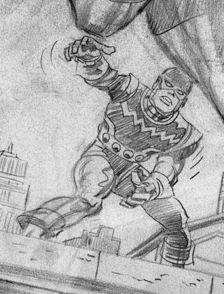
Unused pencils for Captain America #105 The Living Laser by Jack Kirby
This was one of those cases mentioned above, where Stan had some problems with Jack’s take on the Cap #105 cover. The good news is that this led to Jack’s pencils never being inked. The bad news is the pencil version of the cover as it exists today is not all by Kirby. Basically everything other then the figure of Captain America is pure Kirby, untouched by any other hand.
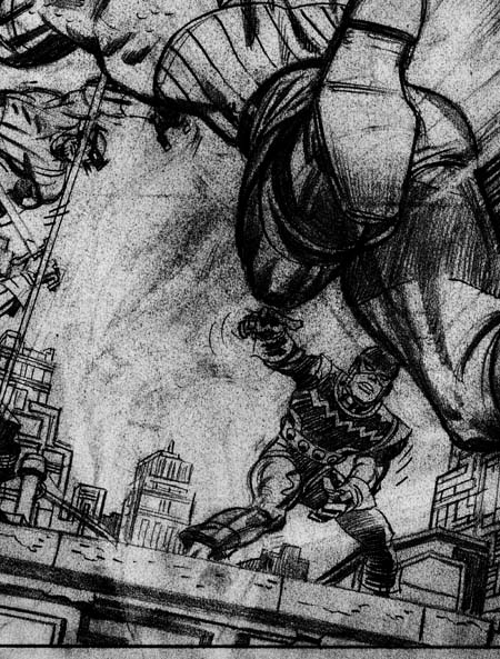
Unused pencils for Captain America #105 by Jack Kirby and Jim Steranko with Photoshop adjustments
Cap was modified both by penciling over what was already there, as well as erasing some of Jack’s pencils and adding new ones. Unfortunately there really is nothing that can be done to restore the pencils to the way Jack did it. Instead I have adjusted the scan using Photoshop. While this causes most of the image to deteriorate it helps brings out parts of the drawing that had been erased. Unfortunately it may still be hard to make out but it is the best that I can do. The important point is that Cap’s left leg was flexed and occupied the section that on the pencil version is now open sky.
When Stan was dissatisfied with Kirby efforts on this cover he turned to Jim Steranko to make corrections. Now I am a great admirer of Steranko. Even so I still shudder every time I think of Jim erasing Kirby’s pencils. After removing Jack’s version of Cap’s left leg Jim added his own. Presumable to make the whole figure uniform and to make some small adjustments, Steranko also penciled over the rest of the figure. Although I said the background was pure Kirby when Jim re-positioned the leg an area of the building previously covered by that leg had to be added. Jim kept to Jack’s type of architecture. The only difference that can be detected is that Jim’s pencils are slightly lighter then those by Jack. It is Steranko’s alterations to Kirby’s cover that is the state of the pencil version that exists today.
Lee still was not happy with the Kirby/Steranko version of the cover. But now things get complicated. There exists two rough sketches on tracing paper. Someone has written in blue pencil the names John Romita on one and Dan Adkins on the other. Which came first? To decide this I used Occam’s razor, “all things being equal, the simplest solution is the best one”. The paper used was chosen because it would allow desired portions to be traced. The order I provide here gives the fewest changes to each step keeping particular attention to what tracing was done. Without any claim that this is absolutely correct, I am fairly confident in the sequence I provide here.
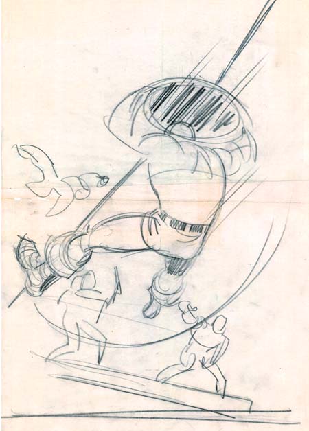
Captain America #105 rough on tracing paper by Dan Adkins?
The Adkins sketch is the most rough one. So much so that I suspect we are just going to have to take the attribution on faith alone. Adkins has redrawn Captain America, swinging his legs around so that they are away from the viewer. In doing so, Adkins has shifted the center of the image to our left. Although done very crudely, the Swordsman, the Living Laser and the building the stand on were traced as one piece. Batroc was also probably traced but so roughly that it is hard to be certain. In any case Batroc’s position was shifted up and toward our left relative to his two companions.
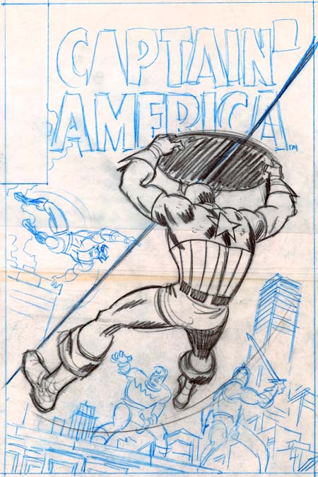
Captain America #105 rough on tracing paper by John Romita?
Now John Romita (senior) worked on it. Romita traced in regular pencil Cap’s torso from Adkins. He followed Adkins closely for the left elbow, the left side of the left forearm, the left side of the torso, the upper right shoulder area, the belt, the shorts and the right thigh. The upper edge of the shield is pretty close to Adkins placement. Romita lowered Cap’s left leg, moved the right lower leg to the right, and moved Cap’s right forearm out a bit. As can be seen, Romita tightened up the entire figure. (Here I must confess that I have not closely studied Romita’s work so I am counting on the silver age scholars among my readers to express their opinion on whether this attribution to John Romita is accurate.) Captain America is pretty close to the published version. With Cap’s new pose, clearly something had to be done about the background. Using blue pencil Romita has traced portions of Kirby’s architecture but shifting their locations. John did redraw the tall building on the right making it more angular relative to the horizon. Cap’s foes have also been trace from Kirby’s pencils. Batroc was moved a little bit higher then even Adkin’s placement. Romita switched the relative locations of the Swordsman and the Living Laser. I suspect that was done because he felt that the Swordsman would otherwise be too crowded. Batroc and the Living Laser adhere pretty close to Kirby’s pencil. The upper half of the Swordsman was traced while the pose for the lower body was altered.
At this point work must have begun on regular Strathmore paper, I am sure they would not want to end up inking on tracing paper. But further alterations were made from Romita’s rough. As I said previously the figure of Cap on the finished cover is pretty close to Romita’s drawing. The main differences are that both lower legs were made a little longer and the forearms placed a little further out. The lower rope follows both Dan’s and John’s path closely. But the upper portion is more faithful to Dan’s, leaving at the same place on Cap’s shield but angling a little more sharply. The rest of the background was rearrange once again, using Kirby’s pencils to trace from. Batroc’s position shifted down compared to Romita’s placement and his final placement is closest to that indicated by Adkins. The Swordsman and the Living Laser switch positions once again.
In the end on the published cover the buildings details follow Kirby, Cap’s foes are close traces from Jack, Cap himself is close to Romita’s drawing, and the overall background compositions is closest (but by no means matches) Adkins’ sketch. Of course the whole idea of using the shield to slide down a rope was Kirby’s. The Jack Kirby Checklist attributes the Cap #105 cover to “Kirby/Romita/Adkins” which sounds like an accurate description to me.
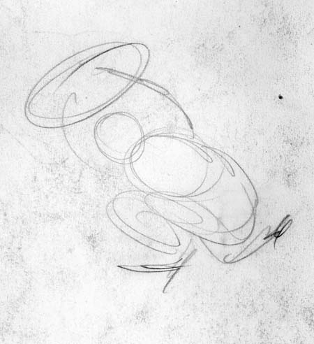
Sketch on back of pencils for the cover for Captain America #105 by unidentified artist
If that was not complicated enough, on the back of the Kirby/Steranko pencils is a small sketch. What part did it play in creation of the cover for Cap #105? I do not have a clue, but I will say I do not believe that this was done by Jack. I have never seen any evidence of Jack using crude sketches such as this one. Even in some work stopped at the very early stages Kirby had better placed lines and none of this pencil swirling.
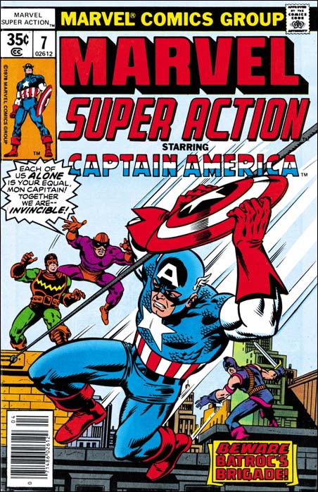
Marvel Super Action #7 (April 1978) by Mike Zeck
But that still is not the end of the story. Years later Mike Zeck did the cover for Marvel Super Action #7. Is it a homage to Kirby/Romita/Adkins or a swipe? You can make your own decision. What do I think? I think I have written a long enough post as it is.
The Genesis of a Captain America Cover
If things go as I plan, next week I will have a post on a silver age Captain America cover. I will be tracing the influences on this cover back to the early days of the golden age of comics, before Captain America was even created. Also discussed will be the various artists that were involved in the creation and/or destruction of the final cover. Included will be some images of some rough work that I do not believe has ever been published. So see stay tuned.
Featured Cover, Fighting American #3

Fighting American #3 (August 1954) by Jack Kirby
In a comment recently, Mike made a request for post on Fighting American. Well it happens that I just finished restoring the cover to Fighting American #3. The first two issues of FA were pretty much the standard action hero format. Fighting America and Speedboy were Simon and Kirby’s remake of their own patriotic heroes Captain America and Bucky. Atlas Comics had recently brought out a cold war version of Captain America along with the Human Torch and Sub-Mariner. However the times had changed and despite Joe McCarthy, or perhaps because of him, the public did not consider the Communists as quite the same threat as the Nazis. Atlas Comic’s Captain America did not last long but Simon and Kirby adjusted to the times. With issue #3, Fighting American adopted a more humorous approach. Yes the Commies were still the villains, but nobody was meant to take Poison Ivan and Hotsky Trotski seriously.
Featured Story, The Vision from Marvel Mystery #25
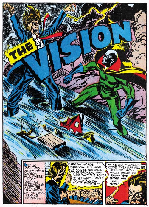
Marvel Mystery Comics #25 (November 1941) The Vision, page 1 by Jack Kirby
Professor Enric Zagnar is the leading authority of metaphysics in the country. But he is forced to resign because of his predictions that man will one day be able to control the forces of nature. He retreats from the town vowing revenge and dedicates himself to uncovering the secrets that would make his predictions come true. A short while later a storm hits the town. This is no ordinary storm but one with much fury and persistence. Smoke from a lightning strike of a tree allows the Vision to enter to save the people of the town. He directs the townsmen to climb the nearby mountain in order avoid the flood that forms. But before the people can reach the top a blast from dynamite prevents them from going further. It is Zagner at the peak, relishing his revenge. Zagner urges the storm on using a spell that he reads from a book entitled “Black Magic”. The Vision proceeds to climb in an attempt to stop Zagner. Seeing the Vision, Zagner in turn rolls down a large boulder and when that is unsuccessful throws more dynamite. Despite all this the Vision reaches the top and a fight with Zagnar ensues. Though a dirty trick Zagnar defeats the Vision. Just when he is about to deliver the coup de grace with a large rock, Zagnar gets hit by a bolt of lightning from his own storm! The Vision recovers and reads out the counter spell from the Black Magic book to end the storm and save the day.
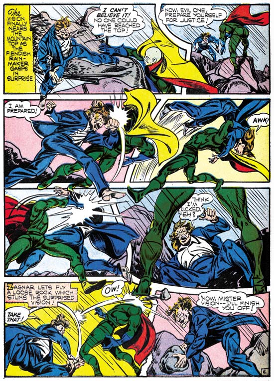
Marvel Mystery Comics #25 (November 1941) The Vision, page 6 by Jack Kirby
As with the Vision story from Marvel Mystery #24 this splash page makes use of over sized figures. Note the small houses being washed away by the rushing water. I really like the way the title separates the Vision from his foe. The only fault I find with this exciting splash, and it is a minor one, is the “pinning” of the “The” in the title. It seems so unnecessary for this splash. Further it really fails as trompe l’oeil. Not only does the pin not look realistic but also the sharp end is visible so how is the title “pinned” down?
The title of the book that Zagnar uses, Black Magic, is a common enough term. Still it seems interesting that of all the possible titles that Simon and Kirby could have chosen they picked one that they would use again for a comic book that they would launch about nine years later.
The Vision is an unusual hero for a comic book. Comic book art depends on the visual image to provide an indication of the character. Heroes are handsome, heroines beautiful and villains ugly. Although the hero, the Vision is anything but handsome. Of course what Simon and Kirby are doing is to use the Visions unnatural appearance as an indication that he is not of this world. I was just simplifying things when I said villains are ugly, a good comic book artist will go well beyond just making the foe ugly. With his name, Enric Zagnar, is marked as different. Although foreign sounding the origin of the name was probably purposely left ambiguous. Notice that in the first two story panels at the bottom Kirby provides Zagnar with what was then considered long hair. Such hair length was the mark of an intellectual and appropriate for the then Professor Zagnar. In the first panel Zagnar looks fairly normal (but there are those big ears that Kirby would often draw with heads viewed from the back). The next panel provides a glimpse of Zagnar’s already disturbed personality heightened by being partly cut off with the panel edges. The splash panel provides what Zagnar will look like when he becomes at the end of his transformation. You do not need the eyes or the grotesque mouth, the hair alone reveals that Zagnar has gone way past the edge of sanity.
A Small Readership
Well I did not get much response from Delurker Week. Unfortunately there are a number of projects that I want to do with not enough time to do them all. With such a small readership it is hard for me to justify spending as much time on this blog as I have in the past. So I will be posting on a less frequent schedule. I believe my next post will be sometime next weekend.
I would like to thank those who did leave a comment for Delurker Week. Frankly your kind words are the main reason I am continuing this blog at all.
David suggested posting on how I do my comic art restorations. I do all my work in Photoshop. But I do not want to get more detailed then that here. Not because I want to keep my technique secret but because I know from previous experience that there really is not much interest in such technical information. If anyone really does want to know more I suggest joining the Digitizing Comic Books group. It is pretty much an inactive group but I posted there on the basics of my color adjustment method. So you can go through the archives and check the photo section for images that were attached to my posts (Yahoo does not archive images). If you have further questions you can ask them there (I am the moderator).
Delurking Week
It has taken me by surprise. I have read on some of the blogs I visit that it is Delurking Week. But boy is it welcome news.
Seriously I know that the Simon and Kirby Blog has a narrow focus. I never expected it to be a popular blog. Nor have I ever thought I would get many comments. Frankly I do not leave comments on most of the blogs I read. But still there are times that I wonder if anyone out there really cares.
So this is your chance to step up and provide me with some encouragement. To all readers, please leave a comment to this post. I really don’t care what you say. Just say “hello” if you cannot think of anything else. But please, please, please leave a comment here. Then if you like, return to your lurking.
P.S. Don’t be surprise if your post does not appear right away. It quite likely will get caught by my Spam filter. You would probably be amazed about how much Spam this site gets. But I go through it all daily to accept valid comments. Generally once a commenter gets accepted they never get stopped by the filter again.
ADDITIONAL NOTE:
Since most of the blogs that I read have not picked up on Delurking Week I just want to make sure no one makes the mistake of thinking that I am just kidding. Two blogs that I read that have joined this movement are Pharyngula and Afarensis. If you go through their comments you will find I stopped lurking long enough to say I enjoyed their blog. As can be expected, not all bloggers are looking to Delurking Week to provide the same thing but I am sure we are all looking for some sort of approval. What I want to do is take this opportunity to see how many people care about my blog. Frankly if a reader does not care enough about the Simon and Kirby Blog to to say “Hello” then as far as I am concern they simply do not care. After all it does not cost anything, I do not believe you have to leave your real name, your email address will not get published or put on any lists and I would prefer if you do not put anything in the “Website” entry (so I do not mistake you for spam).
Featured Story, The Vision from Marvel Mystery #24
In my serial post on “Early Jack Kirby” I commented that I regretted that I only had a few scans of The Vision from Marvel Mystery Comics. I find those that I have very enjoyable provided that to do not let some of the logical inconsistencies bother you. I believe the only way to enjoy any superhero story is to not take them too seriously. Actually I rather enjoy the inconsistencies.
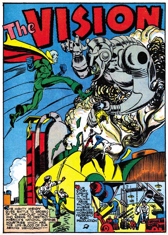
Marvel Mystery Comics #24 (October 1941) The Vision by Jack Kirby page 1
The Vision lives in another dimension, entering and exiting this one through smoke. The sole purpose of his visits to Earth seems to be fight evil, which despite the war going on in Europe and Asia, somehow only occurs in America. In this story his foe is someone the Vision is already familiar with. It is Grosso from the war-dust world who has a similar mode of transportation as the Vision only instead of smoke uses metal dust. Grosso comes from a world that relishes war and he has decided that our dust free world would be a suitable place for his people to live and easy to conquer. Grosso method is to enter a weapon factory via the metal dust they produce and destroy it. The Vision soon detects the presence of Grosso’s evil and enters into battle with him. Grosso does seem to have some advantages. One is that he is able to control how fully he is in this dimension. When Grosso is only partly in our world the Vision is unable to touch him. Grosso is also able to use metal dust as a weapon or even a poison.
But the biggest difficulty that the Vision faces is that he does not know where Grosso is going to attach next. The Vision puts on a hood and some glasses as a disguise and gets hired at the largest factory expecting that Grosso will turn up. He tells his employer that he hides his face because it was disfigured when a factory was destroyed by Grosso. The ability of the Vision to appear as a normal mortal that was seen in the first Vision story now seems gone. Also surprising is that nobody seems to make any comment about the disguised Vision’s green hands. Of course in the end the Vision soundly defeats Grosso. It would even appear that Grosso was killed, but we all know how often a good villain stays dead.
This Vision story came out toward the end of Simon and Kirby’s stay at Timely and it shows. Included are lots of irregularly shaped panels, figures that extend beyond the panel edges, running figures with legs stretch out to an unrealistic degree, and square fists. The splash page is particularly effective. Note how over large the figures of the Vision and Grosso are. Such use of over sized figures was not typical for Kirby through most of his career. On the other hand Joe Simon did use large figures from time to time both before teaming up with Jack and after their split. Covers create by Simon and Kirby at Timely never used this motif but over sized figures occur often in their Timely splashes.
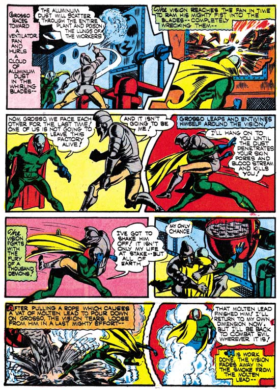
Marvel Mystery Comics #24 (October 1941) The Vision by Jack Kirby page 7
Check out the dialog from the third panel on page eight.
Vision: Now, Grosso, we face each other for the last time! One of us is not going to leave this factory alive!
Grosso: And it isn’t going to be me!
I have to admit I had to read it several times before I could convince myself that they got it right. It reminds me very much of the script in another story that Jack drew about years later from Tales of Suspense #92
on last panel of page 9
Cap: Okay mister, I’m ready for you! So let’s wrap it up. Only one of us is gonna walk out of here under his own steam…
on first panel of next page
Cap: and it won’t be me!
In this case comes out wrong no matter how many times you read it. Because the story was done by the Marvel method it is not clear whether this snafu should be blamed on Jack Kirby or Stan Lee. Despite the fact that the Vision and Cap stories were done about 20 years apart, the similarity between these two scripts make me suspect that it was Jack who came up with Cap’s goof-up.
Boy Commandos Ashcan
Recently on the Kirby List scholar Stan Taylor queried about a Boy Commandos ashcan that appears in the GCD. I am not sure what the proper Internet etiquette is so I do not want to link directly to GCD’s image of this ashcan. So to get the most out of what I will write here, it would be best to make a new window and following my link to GCD and search for Boy Commandos. You will end up with 3 results, one of which is clearly marked ashcan. Although the GCD lists two ashcans (1 and nn) an image is only provided for #1.
Ashcans are used by comic publishers to secure the copyrights to a comic book title. I have heard some people say it is to get the trademark, but I believe you have to register trademarks not secure them by publishing them. But I am not a lawyer so I could be wrong. Anyway only a few copies of a particular ashcan would be made and none would be sold. Generally existing artwork would be used, and the inside story might not even match the cover. Ashcans are typically black and white, without color. I have never had the opportunity to closely examine an old ashcan but since Xerox did not exist during the golden age I suspect the are made from stats. If so they could not have taken long to make, in fact they were probably made using whatever stats that were available on hand. Once an ashcan comic served its purpose the copies could be discarded, hence the name ashcan.
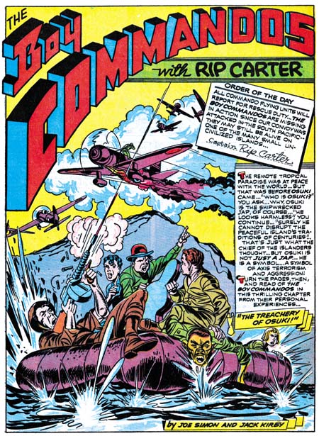
Detective Comics #68 (October 1942) by Jack Kirby
The Boy Commandos ashcan is dated Sept./Oct. and there is a copyright below for 1942. Notice that there is no trademark indication so at least in this case copyright seems to be the purpose. Stan’s original question was had the art for this ashcan cover been published before? By a coincidence I had recently borrowed Joe Simon’s copy of Detective Comics #68 for scanning and could verify that the cover was the same as the splash page for the Boy Commandos story in that book. There are some differences, mostly in all the paste-ups. The main difference in the artwork is a group of planes that appear at the top of the splash page show up on the center right on the ashcan cover, and one of the planes was left out in the ashcan version. The splash page appears to be the original because you can still see on the ashcan an abrupt stop to some smoke where the left edge of one of the paste-ups had been. The planes where moved because they would have been covered by the title of the ashcan. Some smoke lines were also added on the ashcan in a manner very different then what was done on the rest of the art.
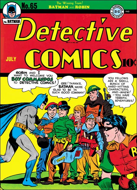
Detective Comics #65 (July 1942) by Jack Kirby and Jerry Robinson
My original reaction to this ashcan was that DC was just trying to cover their basis and protect copyrights in case they ever decided to actual publish a Boy commando comic. I thought that it was probably too early for DC to realize that the Boy Commandos were a hit. The Boy Commandos were introduced in Detective Comics #64 (June 1942). They were a backup story to a comic whose principal feature was Batman. Judging from the date and art of this ashcan it was made only four or five months after the first Boy Commandos story. That means that when the ashcan was made the first story had only been out on the newsstands a month or two. I did not think that would be enough time for DC to realize that it was successful enough to warrant its own magazine.
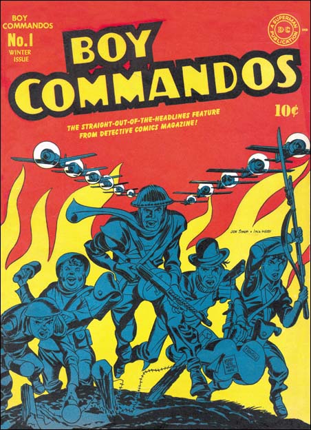
Boy Commandos #1 (Winter 1942) by Jack Kirby
What convinced me that my original impression was wrong was the logo. The ashcan cover does not use the same logo as the splash page. I have not seen all the early Boy Commando stories but all that I have seen use the same logo. The logo for the ashcan is instead the logo that would be used on the actual covers for Boy Commandos Comics. I do not think DC would have gone through the trouble to make a proper logo for the comic if they did not think they were actually going to create a book to use it on. Even in the short time the Boy commandos had been out there must have been some sort of response that convinced DC that the feature deserved its own title. Joe Simon has always said that Boy Commandos was a top seller. Sandman and the Newsboy Legion, other Simon and Kirby features for DC, never got their own titles.

