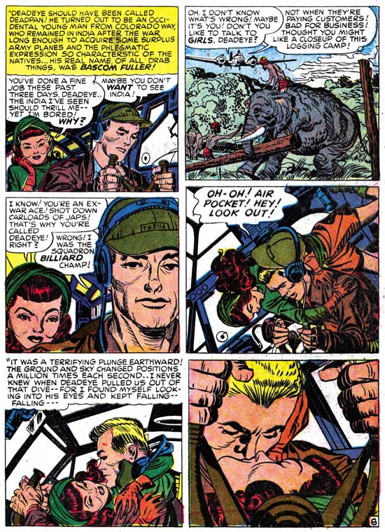
Young Romance #8 (November 1948) “Love Can Strike So Suddenly”, art by Jack Kirby
Jack Kirby’s take on romance always seemed to have more of an emphasis on action then most other comic book artists. The above sequence from an early Young Romance is a great example of this. The dramatic plunge of the airplane after hitting an air pocket literally lands a seemingly indifferent lady onto the lap of a reluctant man. The analogy of the airplane’s occupants fall and their falling in love is presented by both the images and accompanying text. It took chance to supply the action needed to overcome the barriers each had placed before their true feelings. This sequence may have played a small part in the overall story but it was pivotal. It was also the quintessence of Kirby’s vision of romance.

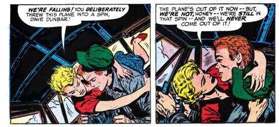
In Love #2 (October 1954) “Marilyn’s Men” page 14 panels 5 and 6, art by Bill Draut

In Love #2 (October 1954) “Marilyn’s Men” page 15 panel 1, art by Bill Draut
Kirby’s predilection for action in romance stories stayed with him. Although most of the story “Marilyn’s Men” from In Love #2 was drawn by Bill Draut, I believe that much of the plotting and at least some of the scripting came from Jack. Therefore I feel that the occurrence of essentially the same three panels from Young Romance #8 was not Draut trying to pull something over on his bosses, instead Bill was just following Simon and Kirby’s direction. The premise was similar between the two stories, both involved a plane flight where the relationship between the man and woman changes during the trip. There are significant differences between the two stories as well. In YR it is an accident that breaks down the resistance of both parties, whereas with In Love the pilot’s maneuver is purposeful, showing that it was only Marilyn’s reluctance to love that had to be overcome.
Draut’s swipe is not a close copy of Kirby’s art. Most of the deviation in the art can be attributed to differences in the two stories. Unlike most of the female characters in S&K romances, Marilyn had relatively short hair. Undoubtedly this was visual shorthand for her success as a businesswoman. Unfortunately Marilyn’s shorter hair could not provide the same affect to the first panel where she first is lifted out of her seat. Draut does what he can but Kirby’s heroine had more hair to add drama with. In Kirby’s story the heroine is seated behind the pilot while Marilyn is on his side. Jack therefore can show more of the lady as she goes from her seat to the pilot’s lap. Draut must provide a more foreshortened view and even rotated the pilot in relation to the cabin so that in the end the visual logic of the first scene breaks down. In the second panel Draut has everything under control. In fact here Draut improves on Kirby’s composition by having Marilyn ending up gazing into the pilot’s face, while Kirby left her looking to the side. There is one logical peculiarity in Draut’s presentation. In the first panel Marilyn’s left arm is already on the pilot’s shoulder while his hat is just beginning to come off his head. Yet in the second panel Marilyn’s left hand holds the hat down. How did that transition happen? Jack provides the answer by using the pilot’s headset to constrain the hat’s travel. The final panel, the dramatic view of the kiss, is very similar between the two versions, but by no means identical. The pilot’s face is typical Draut and not a close copy of Kirby’s version. Bill has also added some shadows of the window frames to add even more drama to the scene. While Kirby has good control over the unusual perspective, in Draut’s rendition where is Marilyn’s nose? It does not seem possible to trace its position without violating the man’s facial structure.

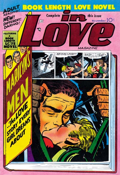
In Love #2 (October 1954) art by Bill Draut
Jack was a master at visual storytelling so it comes as no surprise that the dramatic kiss occupies the last panel of his page. In “Marilyn’s Men” the kiss has been placed on the first panel of the page following the other two scenes. This greatly diminishes the impact of the story line. This may not have been Draut’s fault, the layout of the page suggests that the kiss panel was placed there afterwards. Perhaps editing was required to reduce the page count. That it was known then what the proper layout for this sequence was is shown in the cover where not only is the kiss the last panel, but it has also been enlarged.
The three panel sequence from Young Romance #8 hardly stands out as the most memorable panels from Kirby’s early romance work. Even so someone remembered and then used them as a reference for a comic done almost six years later.

