(October – December 1951: Black Magic #7 – #8)
During the period covered in this chapter, along with the bimonthly Black Magic, Simon and Kirby were producing two monthly romance titles (Young Romance and Young Love). Not the largest work load for the prolific duo but apparently all the titles were doing well. Since Simon and Kirby received a share of the profits, sales volume was more important then the number of titles produced.
As was true with the concurrent romance titles (Chapter 17 of The Art of Romance), Jack Kirby was producing less then his normal amount of pages of art work. In BM #7 and #8, Jack would do the two covers and a single 8 page story. It was Mort Meskin who was the most prolific artist providing 23 pages for these two issues. Even John Prentice and Marvin Stein produced more pages then Kirby (both with 12 pages each). Bill Draut would provide a single 7 pages story. That was the complete artist line-up for BM #7 and #8; just the regular studio artists of that time. This is another of those chapters where I have been able to identify all the artists who worked on these issues.
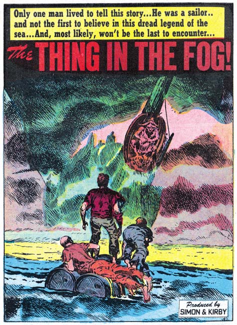
Black Magic #7 (October 1951) “The Thing in The Fog”, art by Jack Kirby
The full page splash for Jack Kirby’s single story, “The Thing in the Fog”, is quite unusual for the artist. Typically Kirby focuses on the human elements of a picture but here all we see are the backs of three individuals on a make shift raft. The center of attention is the approaching ship and even it is mostly lost in the fog with only the masthead distinctly delimitated. The depiction of fog would normally be expected to be billowing cloud shapes but instead the mists are rendered by a complex of strong crosshatching. The whole effect is one of eerie mystery and impending doom. It may be an unusual splash for Kirby but still one of his greater pieces of art.
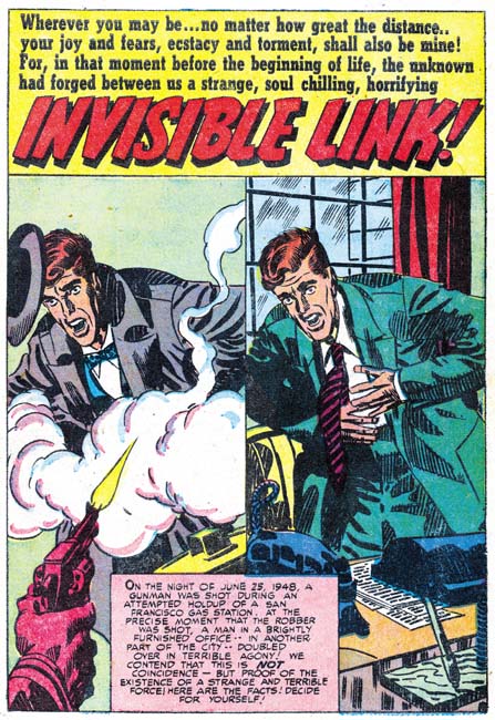
Black Magic #8 (December 1951) “Invisible Link”, art by Mort Meskin
Meskin’s splash for “Invisible Link” consists of a repeated image although with different clothing and surroundings. Today the artist would probably simply draw one, make a copy and work on the copy to produce the second image. But at this time there were no cheap copiers and so a stat would have to be made. This not only meant added costs but added delay as well. Instead Mort simply redrew the figure. By quickly going back and forth between the two images you can verify the differences between the mouth, nose and other details. The use of a double image is a simple device but one that captures the essence of the story.
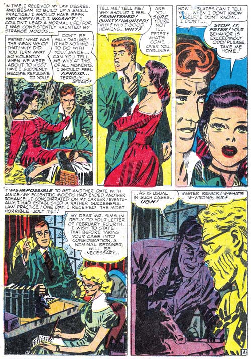
Black Magic #8 (December 1951) “Invisible Link” page 4, art by Mort Meskin
I have previously remarked that Meskin would sometimes adopt the tall narrow panels that earlier were used by Leonard Starr. In Mort’s case this typically meant dividing the page into two rows each with 3 panels. Above I provide a page with a slightly different approach. The height of the bottom row has been reduced giving even more vertical dimension to the narrow panels of the top row. To make up for the loss of height, the bottom row only has two panels. These tall narrow panel layouts are normally not found in the works by Jack Kirby during this period and that is another of the recurring indications that Kirby was not providing layouts to Mort as some people have claimed. Further it suggests that whatever script was provided to Meskin it either did not completely detail out the art on the page, or if it did Mort felt free to deviate from the directions.
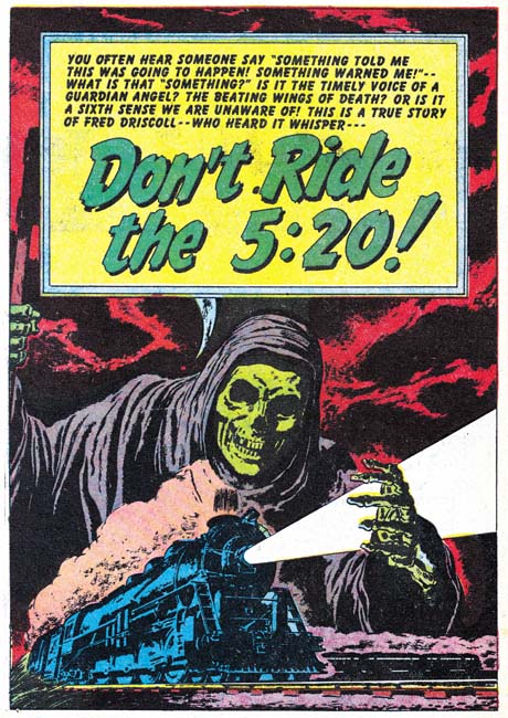
Black Magic #7 (October 1951) “Don’t Ride the 5:20”, art by Bill Draut
A skeletal cloaked figure of death looms over a speeding train in this full page splash by Bill Draut. Of course none of these elements are found among Bill’s romance art so it is by depictions of people in the story that allows this work to be safely attributed to him. The detailing of the drawing of the train indicates it was based on a photographic image. But the sharpness, so untypical for Draut, suggests that rather being swiped from a photograph that perhaps the picture was literally glued down on the board and then inked over to provide the desired effect. If true this would be an unusual occurrence at this time although years later Simon would often build up a cover using stats.
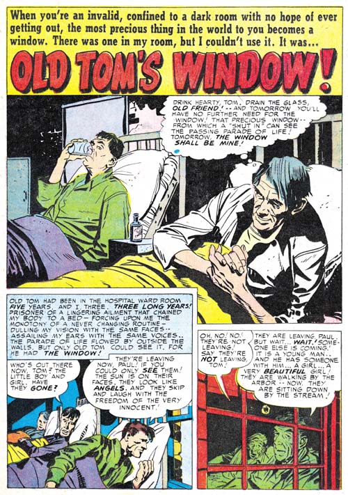
Black Magic #7 (October 1951) “Old Tom’s Window”, art by John Prentice
It is not unusual for Jack Kirby to assume the role of art editor and make alterations to the work submitted by artists employed by the studio. Normally this is for less talented artists and I do not recall ever seeing Jack fix up the work of Bill Draut or Mort Meskin. I consider John Prentice as in the same talented class with Draut and Meskin which is why I am surprised to see Kirby art editor’s hand at work in some of art submitted by Prentice when he first appeared in Simon and Kirby productions. Compare the first story panel for “Old Tom’s Window with the rest of the page and you will note subtle but important differences. The figures in panel one are simpler and lack the craggy feel found in the splash and the second panel and which is typical of Prentice’s depictions of men. Also observe the difference in brush techniques. Those in the first story panel include picket fence crosshatching, drop strings and abstract arch shadows (see my Inking Glossary for explanations of these terms) that are typical of the Studio Style inking. The brush work is blunt but nuanced and was almost certainly done by Kirby. The inking on the rest of the page lacks these elements and is typical of Prentice’s approach. It is hard for me to understand why Jack felt compelled to work on this panel since the depiction of the men in hospital beds is really not that different from those done by Prentice on the rest of the page. Perhaps it was not so much Jack correcting John as providing him with guidance about how to do the story. If that was true it was with this single panel as the rest of the story is laid out in Prentice’s characterizing manner.
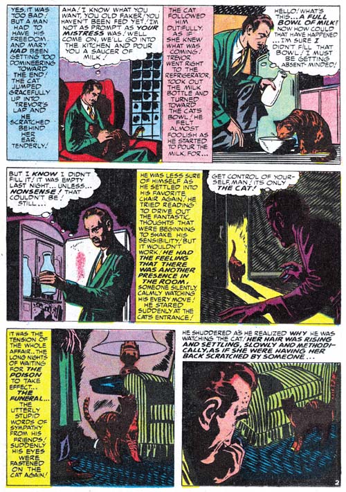
Black Magic #7 (October 1951) “No One Human” page 2, art by Marvin Stein
By this time as I mentioned in The Art of Romance (chapter 16), Marvin Stein’s art was beginning to show some significant improvements from his earlier more crude style but has not quite reached his more mature style. I credit much of Stein’s improvement to his close study of Kirby’s art either through close observation while working in the same studio or perhaps by actually inking Jack’s work (although I have not yet verified Stein’s inking of Kirby at this early date). Marvin’s inking has particularly improved from his early version to this one. Normally I prefer to present a splash, but in the case of “No One Human” it is difficult to recognize Stein’s hand in the first page. Instead I show page 2 where the man in panel 3 is very close to Stein’s mature art style. Note Marvin’s frequent angular crosshatching. While this is not generally found in Stein’s work it plays a prominent part of this story but I have to admit I find it rather distracting. Also observe the vertically oriented captions. Kirby would only occasionally use vertical captions so this is an indication that this story was not based on Kirby layouts. Interestingly vertical captions are often used by Mort Meskin who also occasionally uses similar angular crosshatching. I find it hard to believe that Meskin would be supplying Stein with layouts and even harder to accept that Mort would be inking Marvin’s pencils so I suspect that Stein was also carefully studying Meskin’s work as well.
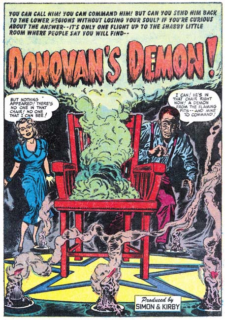
Black Magic #8 (December 1951) “Donovan’s Demon”, art by Jack Kirby and Marvin Stein
I have discussed the splash for “Donovan’s Demons” in the past (Summoning Demons). The only modifications of my previous views is that I know come to credit the artist for the story as Marvin Stein. But to quickly review, while the man appears to have been drawn and inked by Stein, the woman is clearly the work of Jack Kirby. Both are background elements with the most important part of the splash being the chair, candles and star pattern on the floor. The candles are good matches for those done by Kirby found elsewhere. Chairs do not normally play such a prominent part in Kirby’s art so it is difficult to make a comparison. However the perspective on the chair is so well done and since this sort of dramatic perspective played such an important art I believe Jack did the chair as well. It is not that unusual to find a Kirby figure in a splash otherwise done by another studio artist but it is odd to see a single figure by another artist in a splash otherwise done by Kirby. Perhaps this was done so that there would be some continuity between the splash and the rest of the story art.
The Little Shop of Horrors, Chapter 1 (#1 – 3), Expanding Their Fields
The Little Shop of Horrors, Chapter 2 (#4 – 6), Up and Running
The Little Shop of Horrors, Chapter 4 (#9 – 11), Another Hit
The Little Shop of Horrors, Chapter 5 (#12 – 14), New Faces
The Little Shop of Horrors, Chapter 6 (#15 – 17), Mix Bag
The Little Shop of Horrors, Chapter 7 (#18 – 20), Kirby Returns
The Little Shop of Horrors, Chapter 8 (#21 – 23), The Gang’s All Here
The Little Shop of Horrors, Chapter 9 (#24 – 26), The Party’s Ovetr
The Little Shop of Horrors, Chapter 10 (#27 – 29), A Special Visitor
The Little Shop of Horrors, Chapter 11 (#30 – 33), The End

