Category Archives: Assorted

An Unused Silver Spider script by Jack Oleck

Joe Simon has a typical New York apartment; that is one that in most areas of the country would be considered rather small. Despite that fact Joe has managed to accumulate an amazing amount of material. I am constantly surprised with what I find and the latest gem is a Silver Spider script “The Menace from One Million B.C.”.

In “The Comic Book Makers” Joe Simon has described the creation of the Silver Spider:

In 1953, a year before the devastating Senate investigation into comics, I was visited by C.C. Beck, the artist behind the success of Captain Marvel. Beck told me that he owned the Ukulele Bar & Grill in Miami, Florida, and while tending the bar, often thought about doing another superhero. He offered to “take a crack” at the business again, if I would come up with an idea for a new character and a script.

Jack Oleck, my brother-in-law, who had been the number one scriptwriter for Simon and Kirby since the early days of Young Romance, had time on his hands. Oleck always had time, even if he turned out a script seven days a week. As always, he was anxious to join in a new venture.

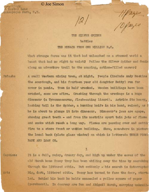
It was a good thing that I came across this script because as can be seen in the image of the first sheet the script is badly suffering from the affects of time. All pages are badly yellowed and quite fragile. The first page has suffered a bit but it was the last preserved page that has been damaged the most. The original last page of the script is no longer present; I cannot say if it was detached not too long after the script was written, got separate from the other pages and may yet be found in Joe’s collection, or has been completely crumbled and is now lost forever. With “The Menace from One Million B.C.” was yet another Jack Oleck script in similar condition. That script was for “His Brother’s Keeper” which was published by Atlas and therefore was not done for Simon and Kirby. I originally wrote about a xerox of the first page of the script (The Astonishing Jack Oleck) but now that I have the complete original version I may revisit the subject.

The original script was 22 pages long but as I said above it is now missing the last page. The story is however complete because the bottom of script page 21:

Large chart of the monster (as per attached sketch). Occupies all off

As can be seen from the first page the actual comic story was first planned to be 11 pages long and then modified to down to 10 pages. I am uncertain what the 121 written at the top meant but a similar notation is found on the “His Brother’s Keeper” script. I wonder if it was a reference to the fee to charge for the script. If it was Jack would have been charging $11 a page (before the page count change). The preserved script appears to be a carbon copy. I am not sure if that explains Jack’s tendency to type slightly off the page but I am pretty sure it is why on one page the last line is almost entirely below the lower margin. Besides the notations at the top of the first page there are numerous corrections and modifications done in pen. The ink is brown in color but I understand that is a common transformation over time (if I remember correctly it is due to iron particles in the ink that literally rust with age). The modifications begin on page five of the intended comic and extend throughout the rest of the story. These modifications were made to change the story from 11 to 10 pages. Many of the changes are simple alteration of the panel numbering other changes are more extensive alterations of the script.

The plot involves a search for a lost gold mine, gun tooting villains, and a flame breathing dinosaur. Needless to say it is a story with a lot of action. It is however a story for young readers very much along the lines of Captain Marvel. The device of a young boy transforming into an adult superhero is shared with Captain Marvel. Although C.C. Beck is closely associated with the big red cheese, Simon and Kirby had also produced an early Captain Marvel comic book. The genie, particularly as portrayed in the Silver Spider, is unlike anything used in Simon and Kirby productions. The 1953 date that Joe provides for the genesis of the Silver Spider makes sense since the use of machine guns and dynamite as weapons indicate that this script was written before the Comic Code after which such violence was strictly forbidden.

One thing to notice is the complete absence of Jack Kirby in what Joe writes about the Silver Spider. This seems credible, because if Jack had been involved he would have done the art for the origin story as he did for all Simon and Kirby creations. But since this was a favor for C.C. Beck he would do the art (The End of Simon & Kirby, Chapter 10). Simon’s contribution seemed to be coming up with the idea with Beck, working on the logo, providing the contact with Oleck, and taking the package to Harvey Comics. In the end Harvey decided not to publish the new superhero. C.C. Beck’s art lingered in the Harvey storeroom until Joe retrieved it to provide the basis of the Fly for Archie Comics. Was the script for “The Menace from One Million B.C.” also retrieved or had it remained in Jack Oleck’s possession to go on to Joe along with the script for “His Brother’s Keeper” when Oleck passed away? In any case “The Menace from One Million B.C.” was probably too whimsical a story to be recycled into the Fly and so remained unused.

Tiger 21

Joe Simon’s personal collection includes two large illustration boards of an unfinished syndication proposal, Tiger 21. The art on each board is composed of a long title section (empty on one of them) and three rows of panels each row nominally with four panels. They therefore were intended for use in the Sunday comics section. The work was never completed; the outlines for the panels, captions and word balloons were all inked and the lettering finished however all the pencils remain uninked. In the upper left corner of each board, outside of the actually art area, are the numbers 1 and 4 which represent the individual page numbers.

This posting is by no means the first report of Simon and Kirby’s Tiger 21. John Morrow wrote an article about them in The Jack Kirby Collector #15 (April 1997). Morrow discussed six pages but the illustrations he provides indicate that he worked with copies, probably stats, of the original art. However the copies were made the process had difficulty in reproducing the pencils. John provides an outline of the story which I will not repeat here. If interested you read it in Google Books. Basically Tiger 21 is science fiction about adventures in space. There was also a concept presentation piece for Tiger 21 that was included in Kirby Unleashed and Volume 2 of the Jack Kirby Treasury has a full page reproduction (page 5), again apparently from a second generation copy, of the original art.

Simon and Kirby were apt to recycle syndication proposals into comic books. I previously discussed the work they did in turning the strip “Inky” into “Artist Loves Model” published in In Love #3 (December 1954). Joe and Jack also transformed a Tiger 21 story (not one of those reported in TJKC #15) into “Homecoming: Year 3000” for Fighting American #4 (October 1954). The Fighting American only appears at the start and the end while the rest of the story is given over to Tiger 21’s Starman Zero.


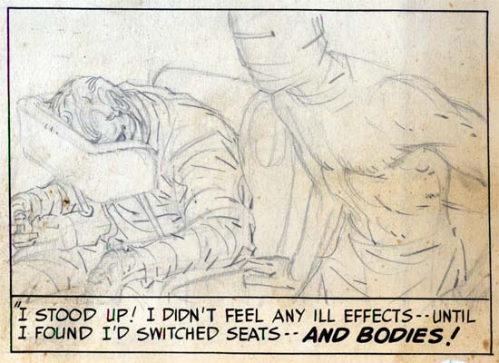
Tiger 21, page 1, panel 11, art by Jack Kirby

Starman’s appearance in Fighting American was somewhat apt as the two shared a similar origin. Both involved the use of a machine to transfer the mind from one body to another. In Fighting American it was the mind from a frail body into that of his recently deceased brother. For Starman Zero it was into a synthetic body much more durable then that of a human.


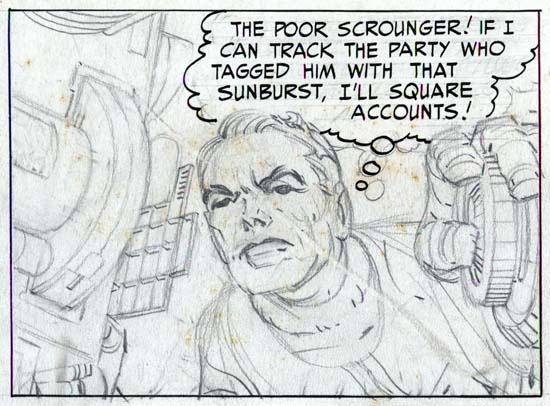
Tiger 21, page 4, panel 3, art by Jack Kirby

The artwork is quite well done in tight pencils which can be very light in certain areas. As was his practice during this period, Jack provided only lines with nothing to indicate how the spotting should be done. Cloth folds were indicated by simple lines and it was up to the inker on how to interpret them. Shadows and inking techniques were all left to the inker as well.


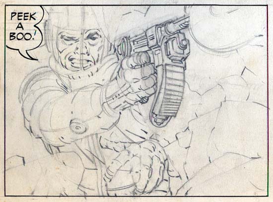
Tiger 21, page 4, panel 9, art by Jack Kirby

The pencils are very bold with lots of effective use of exaggerated perspectives. The best comparison that can be made is art that Kirby did toward the end of the Simon and Kirby studio for titles like Foxhole. This would suggest a dating to the mid ’50s. This is at odds with John Morrow’s article which assigned Tiger 21 to the late ’40s. The best way to resolve this issue would be the lettering. Howard Ferguson was Simon and Kirby’s first letterer while later this job was done by Ben Oda. I must admit I have not done a careful study of the lettering but that for Tiger 21 seems to match that used for Stuntman and Boy Explorers which were presumably done by Ferguson. Based just on a casual examination and therefore quite possibly in error, it seems to me that the switch of Ferguson lettering to that by Oda seemed to occur in early 1950. Therefore, admittedly with much uncertainty, a late 40’s date seems the most likely.

Although in his article John Morrow wrote that the title of the newspaper strip was Starman Zero, the first art page clearly shows it was actually Tiger 21. The oddly named title refers to a distant star that, in the strip, is reachable via something called the time jump. Tiger 21 was also the name of a television science fiction show that Kirby proposed to NBC in the early ’50s. For the television version, Tiger 21 was the name of the hero’s space ship. NBC eventually picked up another show instead called “Man In Space” that starred William Landigan.

Art by Joe Simon, Chapter 10, A History Lesson

I would now like to discuss another piece of work where I find so much that indicates that it was drawn by Joe Simon that I just do not understand why so many still credit it to Jack Kirby. Some explain the lack of Kirby touches as due to his discomfort with portraiture. I wonder why they do not have second thoughts about this explanation? In the recent Jack Kirby Collector #46 there are some portrait examples that Jack did later along with the photographs from which they were based. Typical Kirby touches, such as in his eyebrows are easily seen. Further “48 Famous Americans” includes story panels where Jack should have been very much at ease. Given this evidence it is difficult to accept the alleged Kirby portrait discomfort as a valid explanation.

During my visits to Joe I am really interested in hearing what Joe has to say and I am not concerned about convincing him of my opinions. I therefore never expressed to Joe my belief that he was responsible for this comic. However at one point Joe stated an interest in what Jack Kirby stuff had been reprinted recently. During one visit I brought some newer Kirby reprint books. Joe did not have much to say about any of it until he came across one with some pages from “48 Famous Americans”. At that point he exclaimed with exasperation “But I did all of that, Jack had nothing to do with it”. Despite his reputation, I have not found Joe as someone who always claims credit. I have provided Joe with a lot of restored Simon and Kirby material but only occasionally does Joe say he penciled a particular piece. I offer Joe’s statement as evidence, not proof. But I feel the art itself provides all that is needed to credit Joe Simon with this work.

48 Famous Americans
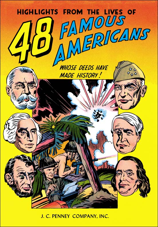
48 Famous Americans (1947) by Joe Simon

Look closely at the reporter in the foxhole. To me he looks like he was done by Simon, particularly the eyes. The use of floating heads is something we have seen from Joe before. In fact I am really at a loss to point to any Kirby like features on the cover.

48 Famous Americans, Thomas A. Edison
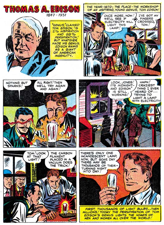
48 Famous Americans (1947) “Thomas A. Edison” by Joe Simon

One of the benefits to doing serial posts like this one is that it gives me a chance review work that I may not have looked at for some time. I have always felt that Joe was the penciler for 48 Famous Americans. But when I reexamined the comic again for this post I was surprised about how many more indications of Simon’s touch I could find. For instance I remarked in Chapter 5 that while working together with Jack Kirby on Captain America, Joe’s discontinued his use of combining the eyebrow and the eye into a single angular formation. Well this comic shows that statement to have not been completely correct. Here Joe frequently returns to the use of angular eyes as can be seen in panels 2, 3 and 5 of the Thomas A. Edison page. In my last chapter I remarked that Joe seemed to have a tendency to draw the hero with a long face only during the time that he worked on the Duke of Broadway, the Vagabond Prince and Kid Adonis (1946). Well in the 48 Famous Americans the long square face shows up occasionally as for example in the last Edison panel.

48 Famous Americans, George Washington Carver
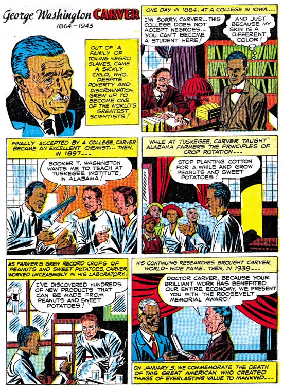
48 Famous Americans (1947) “George Washington Carver” by Joe Simon

George Washington Carver is another page with typical Simon features. The angular eyes show up in panels 2 and 4, the long face with a square jaw in panel 3. Although I did not have a chance to post an image of it, the skewed eyes found in the first page of the Fiery Mask story of Daring Mystery #6 (September 1940) also occurs in the first, Carver portrait panel.

48 Famous Americans, Jack Dempsey
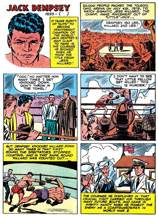
48 Famous Americans (1947) “Jack Dempsey” by Joe Simon

We can only guess who made the choices as to which 48 Americans to include in this giveaway comic. I am sure the company that paid for this comic had something to say about including James Cash Penney. Sport figures do not play a big part in those selected. If famous sport people were going to be used, I can understand the selection of Lou (Henry Louis) Gehrig. But was Jack Dempsey really that obvious of a choice? Was it a coincidence that Joe Simon served in the Coast Guard during the war and, as shown in panel 6, Jack Dempsey did also?

I think Joe did a good job presenting the various short histories. I paricularly like Joe’s knockout punch in panel 5. But although I enjoy Joe’s story telling I often feel that Jack Kirby would have done it differently. Jack had a special affection for socko punches and did them in way that no other artist seemed able to duplicate. I like Joe’s falling Willard but I am also sure Jack would have done it very differently.

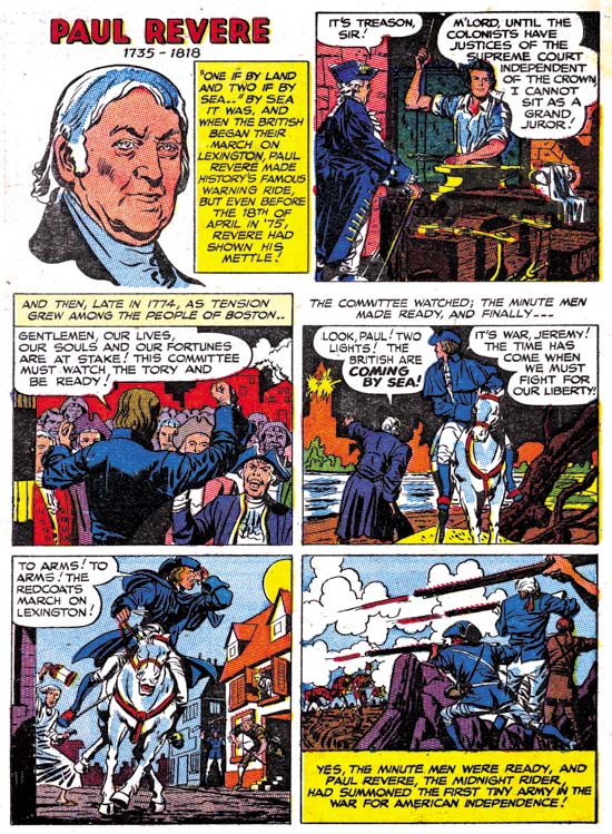
48 Famous Americans, Paul Revere
48 Famous Americans (1947) “Paul Revere” by Joe Simon

The Paul Revere page is another one that should have presented opportunities for Kirby, had he been the penciler, to provide his unique touch. But for the most part I do not find Kirby’s fingerprints here. The riding Revere of panel 5 is done really nicely, but not at all like the covers for Bullseye #2 or #4 or Boys’ Ranch #6. The only thing that reminds me of Kirby on this page, or for that matter one of the few in the entire comic, is the figure of the man with the lantern in panel 5. Frankly that is not too distinctive and I find a lot more Simon touches such as in panel 3.

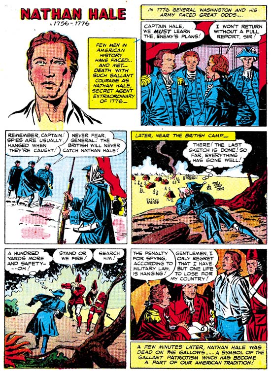
48 Famous Americans, Nathan Hale
48 Famous Americans (1947) “Nathan Hale” by Joe Simon

I thought I would provide yet another page, Nathan Hale, which I would have thought would have provided Jack Kirby the chance to add his own personal vision, that is had he actually been the artist. But again although I find drawing that looks like it was done by Joe Simon, I do not find examples that indicate Jack’s involvement.

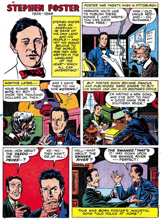
48 Famous Americans, Stephen Foster
48 Famous Americans (1947) “Stephen Foster” by Joe Simon

The socko punches are not the only Kirby trademark. Jack was also fond of expressive eyebrows. As I mentioned at the start of this post examples of Jack’s portraits provided by The Jack Kirby Collector show these Kirby eyebrows. But in 48 Famous Americans I do not find these special eyebrows. The only example I found was that of the man on the right in panel 5 of the Foster page. But I got to say this is hardly a convincing example of Kirby eyebrow. Another Kirby trait is his exaggerated perspective. One of his famous use of this occurs in depicting a hand pointing. It is one of those drawing techniques that other artists do not seem able to duplicate. The pointing hand for of the man in panel 5 is simply not drawn the way Jack would have done it.

When I choose images for this blog I try to select scans that provide good examples of whatever point I am trying to make. So yes I did go through 48 Famous Americans looking for pages that looked the most like they were done by Joe Simon. But I also included pages that should have provided subjects that I would have expected Jack to shine in. But in all these Kirby favorable scenes what I find reminds me more of Joe Simon. I also looked for pages that I thought look the most like possible Kirby efforts. I did find some, besides the ones I mentioned above look at the old man in panels 2 and 3 of the Foster page. I am not saying these examples were drawn by Kirby, only that they look like they could have. Frankly considering Joe’s often use of swiping I would have expected even more Kirby-ish drawing then I actually found. To repeat what I said at the start of this chapter, I find the 48 Famous Americans to looks so consistently like the effort of Joe Simon that I really do not understand why so many people attribute it to Jack Kirby.

Art by Joe Simon, Chapter 9, American Royalty

Art by Joe Simon, Chapter 11, The Party Is Over