Category Archives: Wide Angle Scream

The Wide Angle Scream, The Unpublished Stuntman

Some years ago I wrote a serial post called the Wide Angle Scream  where I discussed the various Simon and Kirby double page splashes that were published over the years. I did include one Stuntman double page splash that had not been published (Terror Island) but there were two others that I did not discuss. Actually it is a not quite accurate to say these wide splashes had not been published as they were included in Joe and Jim Simon’s “Comic Book Makers” (colored, I believe, by Greg Theakston) and more recently in “The Simon and Kirby Library: Superheroes” (colored by yours truly). At the time I did not have scans of the original art and “Terror Island” was the only spread that I had a reduced size copy of. Now I would like to return to these unpublished Stuntman splashes as a crossover with my serial post Speaking of Art.


Stuntman Comics #3 (intended) “Terror Island”, pencils and inks by Jack Kirby
Enlarged view

As mentioned above, I had discussed the splash for “Terror Island” previous but a few comments about the original art seem appropriate. This splash is missing a heading at the top of the page. One probably was present as there appear to be stains left by rubber cement. The Stuntman logo is a recent addition as the original also fell off. But most noticeable about the original art is the damage found along the margins of the illustration board. In Joe Simon’s autobiography “My Life In Comics” he writes:

The spreads had been kept in the attic where they suffered decay at the hands of the weather and damage at the paws (and teeth) of marauding squirrels.

While I am sure that this original art, and the splashes for “Jungle Lord” and “The Evil Sons of M. LeBlanc” spent some period in an attic, I doubt that the damage that they show was due to squirrels as I found no sign of marks from teeth or claws. Rather I believe that the heated conditions frequently found in attics has left the illustration boards brittle. Comic book collectors are familiar with the brittle pages sometimes found in golden age comics caused by the presence of acid in the newsprint paper. The illustration boards that Simon and Kirby used probably did not have as much acid as found in comic book newsprint but there seems to be enough that these art boards typically yellow with age. In the case of the Stuntman original art the heat has accelerated the detrimental effect of the acid making the boards brittle. Most of the damage occurs at the corners which would be expected since that is where the boards are most likely to hit up against more unforgiving objects. The boards are not actively crumbling but must be handled with care.

I should also mention the Stuntman Comics issue number I have assigned these pieces to. Simon and Kirby only used double page splashes in the centerfold of the comics. That way there would be no problems aligning pages properly with the rather primitive publishing methods used for comic books of the day. Only two issues of Stuntman ever reached the newsstands. A third issue was mailed to subscribers but it was much reduced in size and contents. Most importantly the third issue did not use a wide splash. The three unpublished Stuntman wide splashes would have appeared in Stuntman Comics issues #3, #4 and #5 if not for the unfortunate sudden cancellation of the title. I have assigned the different splashes to the intended issues based on completeness of the art. The splashes for “Terror Island” and “Jungle Lord” were both completed. However on “Terror Island” has story art at least some of which was completely inked while the story art for “Jungle Lord” on received outline inking without any spotting. As we will see the inking of the splash for “The Evil Sons of M. LeBlanc” was never finished and therefore it was worked on last.
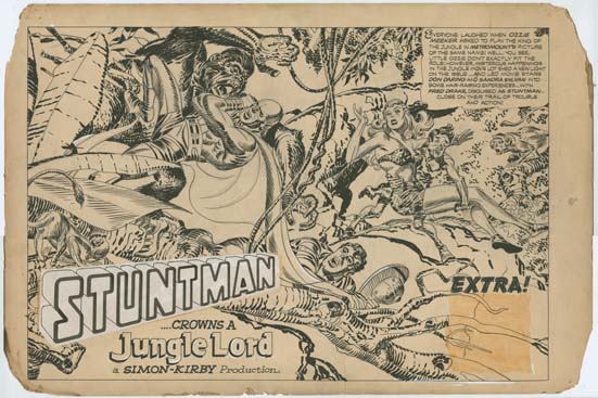

Stuntman Comics #4 (intended) “Jungle Lord”, pencils and inks by Jack Kirby
Enlarged view

Like “Terror Island” the inking of “Jungle Lord” appears to have been completed. Only a small area in the lower right corner seems to have only received outline inking. The board is stained in this area so it seems that originally a square piece of paper or stat covered the area until it was lost when the rubber cement failed. The Stuntman logo is a new addition to replace the original which also seems to have become detached.

Previous Stuntman double page splashes had been visually complex but in “Jungle Lord” Simon and Kirby have distilled it to the essentials. Or as essential as could be expected with five main characters. A dramatic fight scene between Stuntman and a gorilla is balanced with a humorous scene of a skinny individual in a Tarzan suite carrying off a similarly clad Sandra Sylvan while below the ironically named Don Daring bridges the two. While visually complex would be done in the future (“Social Night in Town” and “Remember the Alamo”) simpler designs like this one would dominate.
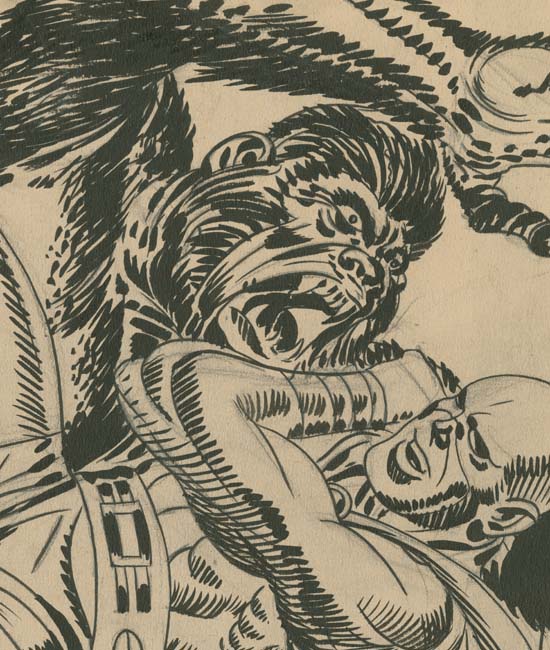

Stuntman Comics #4 (intended) “Jungle Lord” close-up, pencils and inks by Jack Kirby

All the unpublished Stuntman double page splashes had terrific inking, not surprising since Jack was doing his own spotting. But in my opinion “Jungle Lord” has the best inking of the three. Jack used his blunt brush in a free but controlled manner that is just marvelous to behold.
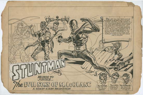

Stuntman Comics #5 (intended) “The Evil Sons of M. LeBlanc”, pencils and inks by Jack Kirby
Enlarged View

Clearly Kirby was working on “The Evil Sons of M. LeBlanc” when Simon and Kirby received the news that Stuntman had been cancelled. Three of the figures appear to be fully inked, one (the Tumbler) may be almost but not quite completed (mainly work is lacking on his left forearm) and two only have outline inking. Stuntman figures large, probably the largest figure in a splash that Kirby ever drew during the period he partnered with Simon.
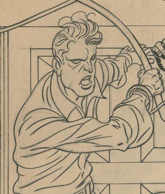

Stuntman Comics #5 (intended) “The Evil Sons of M. LeBlanc” close-up of Lash, pencils and inks by Jack Kirby

Standard inking procedure for Simon and Kirby was to first provide simple line inking. Because Kirby’s pencils were pretty tight this task could be assigned to a less talented artist. It is interesting to compare the lined inked Lash with an unfinished Boys Explorer page that did not progress beyond the line inking (Jack Kirby’s Austere Inking). The lines found in the Boys Explorer page show little variation in width almost as if they were made from wire. On the other hand the lines used to construct Lash show variation in thickness line as compared to line and also along the length of a line. The difference is not great but it does suggest a more talented hand did the line inking for the Stuntman #5 splash. Although it is hard to be certain, but I believe that on this splash Jack did the line inking himself.
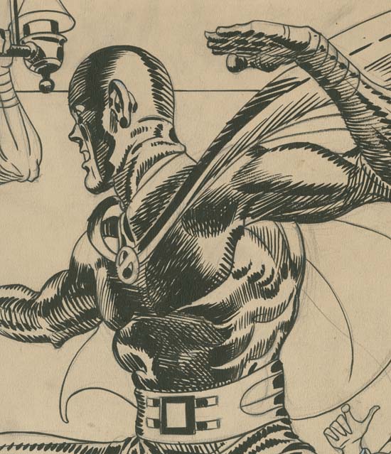

Stuntman Comics #5 (intended) “The Evil Sons of M. LeBlanc” close-up of Stuntman, pencils and inks by Jack Kirby

The figure of Stuntman is almost certainly complete, it is hard to imagine how anymore spotting could be applied without having a detrimental effect. While the spotting does not have quite the bravura brushwork as found in the “Jungle Lord” splash it can still take the breath away.

The Wide Angle Scream, What Was Old Is New Again

Sometime after the demise of Mainline, Simon and Kirby’s attempt at becoming publishers, Joe and Jack’s partnership broke up. Jack returned to being a freelance artist but whenever Joe had some comic to produce Jack would always give a hand, at least for the initial issues. In 1959 Archie Comics asked Joe Simon to produce a couple of superhero comic titles for them. For one of the new titles Joe decided to resurrect an old proposal. Years before Simon along with the artist C. C. Beck and the writer Jack Oleck had created Silver Spider. Oleck wrote some scripts and Beck drew the origin story and it was proposed to Harvey Comics but was then rejected. Joe retrieved the original art and at least one script (which he still has) from Harvey but decided, probably because of the previous rejection, the hero should be changed from the Silver Spider into the Fly. Simon asked his former partner, Jack Kirby, to draw the art for the first issue using the C. C. Beck art as the basis for the origin story. (What happened to the C. C. Beck art is a tale that I will not repeat here, suffice it to say that through no fault of Jack’s the Beck art was never returned to Joe. All Simon has now are large photocopies of the original art. You can see some images of the Silver Spider in Chapter 10 of The End of Simon and Kirby) Kirby was also apt to turn to old ideas and so he based the Fly’s costume on an unused Simon and Kirby creation, the Night Fighter. (It is not pertinent to the theme of this post, but this was not the end of the recycling of the Silver Spider as years later it played a part in the creation of Marvel’s Spider-Man.)


Adventures of the Fly #1 (August 1959) “Come Into My Parlor”, art by Jack Kirby
Enlarged view

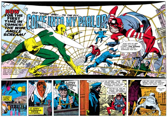
The centerfold of the first issue of The Adventures of the Fly featured a double page splash with the declaration:

NOW FOR THE FIRST TIME IN COMICS: THE WIDE ANGLE SCREAM

This is of course where I have derived the name for this serial post about the Simon and Kirby wide splashes. Since Joe and Jack have been using double page spreads since Captain America #6 (September 1941), this issue of the Fly was hardly the first time for the use of this dramatic opening for a story. But in 1959 comic book readers were young and unlikely to know about the earlier comics.

The Fly splash pages are divided into two sections, the splash proper and the start of the story. At the top and bottom of the splash are two parabolic shaped borders making the image wider at the sides then in the center. The background buildings on the two sides of the splash tilt in different directions. All of this was to give the feeling of a wide angle presentation. But this was all just suggestive as a true wide angle lens would not distort the scene in these manners.

The two adversaries face off from opposites sides of the splash. The Fly seems quite at home on the Spider Spry’s web while it is the criminal cohorts of the Spider that seem to be most encumbered. The scale of the figures makes no literal sense. No realistic perspective would cause the rest of the criminals to be so much smaller then either the Fly or the Spider. The size difference is not due to any problem Kirby had with rendering perspective; he was the master of the illusion of space. Rather Jack has reverted to a pre-Renaissance technique, actually common to a great number of art cultures, were size indicates importance.

Not Jack’s best splash but still superior then most artists of the day could have produced. Some have said this was inked by Kirby but I cannot see Jack’s hand in any of the inking of these Archie comics. I doubt Joe Simon did the inking on the splash either.

Adventures of the Fly #1
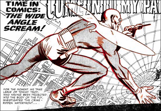
Overlay of the figure of the Fly from the cover (red) and the splash (black)

The cover for the first issue of the Fly is basically the same scene as this splash with the composition altered for the vertically oriented space. As I have shown previously, the cover is based on the splash and not the other way around. (See The Fly, A Case Study of Swiping, for further details.) First a stat was made of the splash and then cutup and reorganized for the cover. Then someone, most likely Simon, touched up some of the inking. It was all well done because cover is every bit as good a designed as the splash.

The Wide Angle Scream, Almost an Afterthought


Win A Prize #1 (February 1955) pinup, art by Jack Kirby
Enlarged view

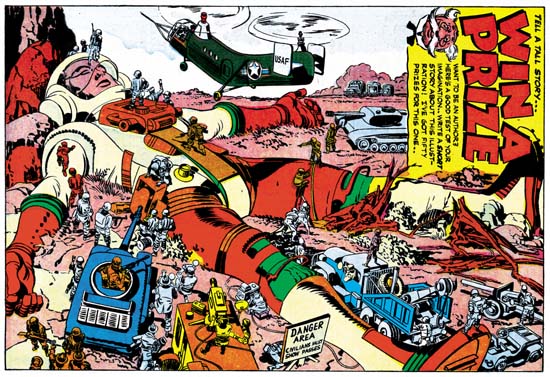
Pinups, both single and double paged, played an important part of Boys’ Ranch (October 1950 to August 1951) but they did not appear at all in Black Magic which also started in October 1950. Nor did they appear in either Strange World of Your Dreams (August 1952 to March 1953) or Fighting American (April 1954 to April 1955). Pinups did play a marginal roll in some other titles. A single page pinup, “Desk Sergeant”, appeared in Police Trap #2 (November 1954) and a double page spread was used in Bullseye (discussed below). There is also the pinup from Win A Prize #1. While printed on a single page, its horizontal format leaves little doubt that originally the Win A Prize splash was meant to be a double page centerfold. Joe Simon has said that initially this pinup was to have been used in Captain America #11 but Joe and Jack’s sudden exit meant that issue was done by other artists. If Joe’s story is true, this pinup underwent modification before it was finally used. Of course Captain America would have had to have been removed. Sikorsky was just beginning their efforts in building helicopters while Simon and Kirby were working on Captain America and helicopters would not play a significant part in the military until after World War II. The helicopter in this pinup has a USAF marking, but the Air Force was not an independent military unit until after the war. At the bottom center of the splash is what looks very much like a television camera crew. While televisions were created before the war they did not really come into use until the late’40s.

The pinup’s theme of a modern day Gulliver is an interesting twist, particularly in using a futuristic spaceman as the giant. There are a score of little soldiers and civilians scattered about each involved in the individual tasks. The image presents a number of questions. Since no nearby rocket or flying saucer is shown, where did the spaceman come from? Although lying prone with eyes closed, the spaceman appears uninjured. With all the tanks and guns aimed at him the suggestion is that he still is alive. If that is so why are all the soldiers crawling over the spaceman even though he is not tied down or restrained in any way? There does not appear to be much in the way of ropes or cable, so what is the soldiers’ intention? Of course such unanswered question was the whole point as Uncle Giveaway is offering prizes for short stories based on this pinup. I wonder if it is too late to enter?


Bullseye #7 (August 1955) “The Stolen Rain God”, art by Jack Kirby
Enlarged view

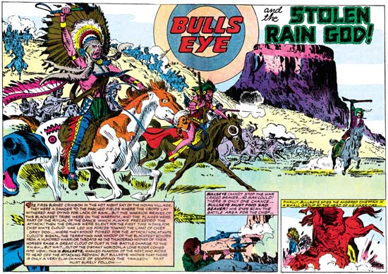
During the final period of the Simon and Kirby studio, the only double page splash to actually get printed as such appeared in Bullseye. Oddly it was in the final issue published by Charlton. It is hard to believe that Joe and Jack thought this splash would help save the title. Having Charlton’s print the former Mainline comics looks more an attempt to get some money for art that Joe and Jack could no longer afford to publish themselves due to problems with their distributor. Charlton was notorious for their low pay so I am sure they did not offer much to Simon and Kirby, but it was better then nothing. If by some miracle they sold well enough to warrant continuation, so much the better. But for the most part Charlton used up the final art and cancelled the titles. Foxhole was extended for a single issue produced by Charlton artists with Joe and Jack probably having nothing to do with it. The postal permit for In Love was transferred to Charlton’s new romance title I Love You, which, although having a Kirby drawn cover for its initial issue, was again filled with story art probably created by Charlton artists. I suspect that careful investigation of other Charlton comics will reveal the transfer of the postal permit from the other former Mainline titles Police Trap and Bullseye as well. The only Simon and Kirby title that Charlton ran with for a few issues was not a Mainline title at all. It was Charlie Chan, a title previously licensed to Prize some years before. It was more of a Joe Simon production with Jack Kirby only providing the cover art for the first Charlton issue (#6 June 1955). Joe would help put it together for Charlton until it too was cancelled with issue #9 (December 1955). So I believe the wide splash in Bullseye #7 came too late to be considered a serious attempt to bolster sales of the Bullseye title. I cannot help but wonder if when the breakup of the Simon and Kirby studio was clearly possible, if it had not happened already, whether the presence of this splash was brought on by a nostalgic memory of Simon and Kirby’s use of the centerfold splash in their first big hit, Captain America.

Jack has drawn a good splash. It is just that after so many marvelous double page spreads in the past it is hard for me to get too enthusiastic about this one. It is a well balanced composition with the prominent Indian chief on our left offset by the plateau and title on the right. The chief certainly presents an impressive figure what with his large headdress (could that really be expected to stay on during the charge?) and ornate apparel. The horse cut off on our left showing only a mouth and knee makes the viewer really feel that he is at the head of the line of charging warriors. The colorist wisely blocked out the smaller figures in simple colors otherwise the foreground figures would have been lost among a patchwork of colors. This allowed the small figure of Bullseye on our right to still stand out. The most unusually aspect of this splash, unique among Simon and Kirby wide angle screams, was that it is actually an oversize story panel. We find Bullseye racing in front of the attacking Indians as he tries to prevent the unfolding tragedy that the war will certainly bring. It is a very risking thing for Bullseye to do since his racing across Indian line could easily make him the victim of friendly fire. The two smaller panels on the bottom provide an explanation on Bullseye’s objective.

The splash for “The Stolen Rain God” was the last double page art for a Simon and Kirby production. Even though the studio and their partnership was over, Kirby always seemed willing to give Simon a hand whenever Joe tried to launch new comics. One such effort included the wide angle screams that will be the subject of the next chapter of my serial post.

The Wide Angle Scream, More Pinups

Boys� Ranch #4
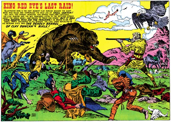
Boys’ Ranch #4 (April 1951) “King Red Eye’s Last Raid” art by Jack Kirby
Larger image

A rampaging grizzly bear, escaping horses, a kicking mule, and the scrambling youngsters of Boys’ Ranch make this image one of chaos. That is except for the firm figure of Clay Duncan as he calmly aims his rifle to make the most of his shot, probably the only one that he will manage to get off. Although the scene is supposed to be chaotic, the composition is anything but that. The mule, boys and Duncan form a broad ‘U’ shape with the bear occupying the center. Each element that forms that ‘U’ directs our attention toward the grizzly. The bald eagle might seem out of place in the portrayed scene. We would not expect the eagle to have been sleeping among the crew and there certainly would seem to be enough Americana in the picture without it. But its does serve the purpose of balancing off the caption on the opposite side of the splash. All in all a carefully composed image not at all like the true chaos found in last month’s splash “Social Night In Town” but every bit as great a piece of art.

Before I continue, I would like to offer a little digression. In 1972 I lived for a short time in Denver. One weekend I went out into the front range of the Rockies to collect fossils. The weather was dry and my original plans were to roll out the sleeping bag and spend the night under the stars. However the area I was in was cattle country and there were absolutely no trees. I found that the cattle liked to visit my car so that they could use it to rub against. I did not relish the possibility of one of them stepping on me while I slept, so I spent the night in the backseat of the car. When I returned to Denver I heard on the radio that a bear had killed some cattle only a few miles from where I was. I felt that I was pretty lucky since the cattle congregating around my car could have easily attracted the bear and had I been outside he may have found me a much easier prey. After a few weeks of killing cattle the bear was finally shot, he was the largest bear killed in Colorado in over 25 years.

Boys� Ranch #5
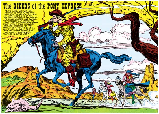
Boys’ Ranch #5 (June 1951) “The Riders of the Pony Express” art by Jack Kirby
Larger image

The Pony Express rider runs his horse at full speed as he tries to escape some attacking Indians. The horse seems frantic but the rider appears almost casual with his rifle held over his shoulder. A trail of smoke exits from the gun barrel showing that the rider has already fired it once and will surely do so again if necessary. There is no question about the unpleasant intent of the Indians but the Pony Express rider seems in control of the situation. The Indians are not trailing behind the rider so they appear to have been trying to cut him off. It makes for an interesting composition with the farthest Indian almost at the center with nearer natives placed increasingly towards our right with the Pony Express rider bring the movement back towards the left. That is not the only way the eye is directed, an overhanging rock formation and some tree branches form an oval with all the riders. The caption rests comfortably on the right portion of the rocky arch. It is truly amazing the variations that are found in these wide pinups, each have their unique composition.

Boys� Ranch #6
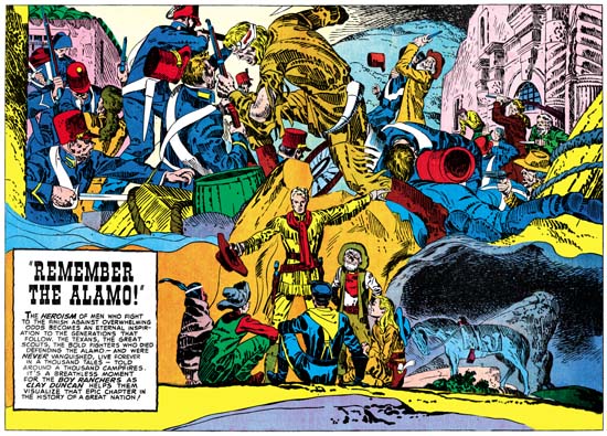
Boys’ Ranch #6 (August 1951) “Remember the Alamo” art by Jack Kirby
Larger image

Clay Duncan enthralls his friends while spending the night out in the prairie with tales of the heroics of the defenders of the Alamo. The lower half of the splash depicts the cast of the Boys’ Ranch while the upper half portrays a dramatic battle. What a battle it is, fully in the Kirby tradition. Gun play takes a decidedly second place to hand to hand combat. This is not an all-over composition like we saw in “Social Night in Town”. A large figure occupies the center separating a left portion of large, mostly Mexican, figures from a right field where the large fallen Mexican figures reveal smaller fighters and a building behind. It would almost seem that the Texans were winning the battle! The only Texan that appears to be in immediate trouble is one in the right background who holds his hands to his face. Of course the Texan success could only be true for a relatively short time before they would succumb to the overwhelming numbers of their opponents. The hard struggle they have had up to this point is suggested by the head bandage and torn costume of our central fighter. He, and two others, one on each side, are obviously frontiersmen. I am tempted to identify the center figure as Jim Bowie because of the large knife he welds, mostly out of the frame. Also tempting would be to identify the wearer of a coon-skin hat as Davy Crockett except that there are two of them. Note how the one on the right brandishes his rifle in the same matter that Crockett does on the cover to Western Tales #32 (March 1956). The central figure’s outfit visually links him to the similarly garbed Clay Duncan below but more importantly suggests a common heroic nature. What a shift from the drama above to the quiet scene below. The members of the Boys’ Ranch are bunched up in the center with backdrops of rock formations and night sky. A lone horse is seen on our right compositionally balancing the caption that appears on the opposite side of the splash. The horse should be unsaddled for the night but a shoe horn and stirrups can be seen but not the rest of the saddle. It is the sort of thing I would expect from Jack, but not from Joe who rode a horse in the Coast Guard. It is however a minor and easy to overlook flaw.

Often the inspiration for Simon and Kirby creations can be found in cinema of the period. Jack and Joe were both of the age that they likely saw the movie “Heroes of the Alamo” but that was released in 1937 and thus does not explain the appearance of the Alamo theme at this particular time. Alamo movies and TV shows became more popular a few years later starting with “The Man from the Alamo” (1953), then “The Last Command” (1955), “Davy Crockett at the Alamo” (1955), “The First Texan” (1956) and pretty much ending with “The Spirit of the Alamo” (1960). The “Davy Crockett at the Alamo” is particularly important as it was part of the made for TV series that Disney produced about Davy Crockett that started a craze among young boys. Afterwards the Alamo largely disappeared from popular culture. At least part of this can be blamed on a shift in social attitudes; one of the freedoms the Texan’s were fighting for was the right to own slaves. Another attempt at the theme was done in 2004 with the film “The Alamo” but it did not achieve much success.

It would not be possible for me to overemphasize what a successful piece of art I think “Remember the Alamo” is. The combination of the action and quiet scenes was done so well it is easy to overlook how unnatural it really should have been. It is arguably the best of the double page pinups from the Boys’ Ranch titles and one of Simon and Kirby’s greatest creations. With the end of the Boys’ Ranch title wide pinups or splashes would disappear from S&K publications for the next few years. For Simon and Kirby it was a relatively quiet period with only one new title, Strange World of Your Dreams in 1952. This was followed by a flurry of new comics starting with Captain 3D (December 1953). The wide format’s small part of the activity will be covered in the next chapter.

The Wide Angle Scream, The Pinup

Towards the end of 1950 Simon and Kirby had some hit titles all published by Prize. For the crime genre there were Headline and Justice Traps the Guilty. Having two titles in the same genre is always a sign of a success. More important would be the Young Romance and Young Love titles for the romance genre that Joe and Jack started. However Simon and Kirby were not ones to just sit back and milk past achievements, they were always trying to produce new titles. October of 1950 would see the release of two new S&K productions. For Prize again they would release their first in the horror genre, Black Magic. That title would run for about five years and would be joined in 1952 by Strange World of Your Dreams, again an indication of success. Simon and Kirby would also release in October Boys’ Ranch, only it would be published by Harvey Comics. Boys’ Ranch is considered by many fans as one of Simon and Kirby’s greatest creations. Unfortunately it was not so well received at the time and the title only lasted six issues.

Boys’ Ranch may not have been as big a success as Joe and Jack had hoped, but it was not for lack of trying. S&K used in Boys’ Ranch some things that they had never tried before, among which were pinups. I am not sure where the idea for the pinups came but Simon and Kirby put it to good use. Each issue of Boys’ Ranch contained both introductory and centerfold pinups. Pinups are unlike splash pages since without any attachment to a story a pinup can be a self sufficient entity. In this respect they are much more like cover art except the image need not be crowded by a prominent title. As stand-alone pieces of art, The Boys’ Ranch pinups represent some of the finest work that Simon and Kirby did. With the expanse that the double page provides, the centerfold pinups are particularly effective.

Boys� Ranch #1
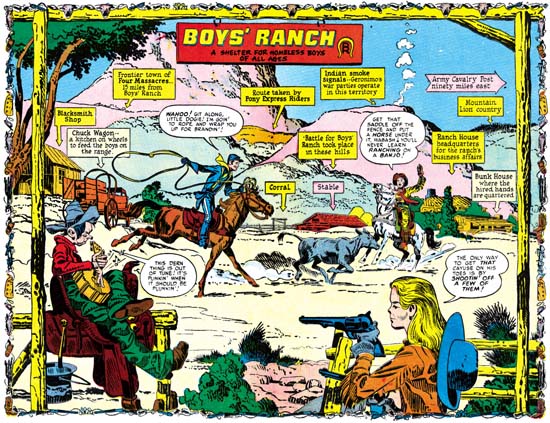
Boys’ Ranch #1 (October 1950) “Boys’ Ranch”, art by Jack Kirby
Larger image

The centerfold for the first issue introduces the cast and the locale. We find Tommy learning how to lasso cattle while Wabash loafs with his guitar. Angel threatens to use his marksmanship to get Wabash moving. Three sides of the image are framed with rough timber with the title hanging from the top post. The complete circumference is edged with cattle skulls, pistols and other western paraphernalia reminiscent of the bottom edge of the wide splash from Captain America #8 (November 1941). This emphasis on design, unusual in the Boys’ Ranch splashes, does not save this particular centerfold. The more distant view used is not Jack Kirby’s forte for he generally does better when he thrusts his cast into the foreground. There are lots of assorted details provided, many requiring explanations from captions, but just not enough interest to hold our attention long. This is a rare example, in my opinion, of a Kirby double page piece of art that does not come up to his usual high standards.

Boys� Ranch #2
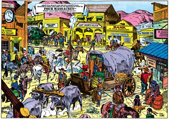
Boys’ Ranch #2 (December 1950) “Four Massacres”, art by Jack Kirby
Larger image

Another more distant view but this time Kirby makes it more interesting by providing more to look at. It is a crowded image but because this is in a comic book and a reader would tend to view it from left to right there should have been no difficulty in finding the Boys’ Ranch characters on the far left as they enter the town. I will leave it up to my readers to ferret out all the details. This splash is filled with individuals and groups all telling their own little stories, no need for captions to explain it all. Whatever the reasons for the short comings of the wide pinup from Boys’ Ranch #1, Jack is now clearly getting into the control of this new format.

Boys� Ranch #3
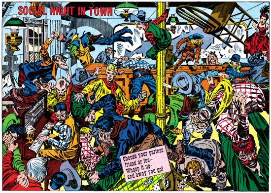
Boys’ Ranch #3 (February 1951) “Social Night in Town”, art by Jack Kirby
Larger image

With “Social Night in Town” Jack Kirby is in top form; this is certainly one of his classic drawings. This is Kirby at his best, a slugfest up close and personal. I like to think of this sort of composition as Kirby’s comic book equivalent of Jackson Pollock. There is no true focus to the image as it is an all over drawing with every portion as important as any other. Jack’s mastery of exaggerated perspective allows him to make this look easy but I honestly cannot think of another comic artist who could come close to providing such an exciting fight scene. Kirby has done this sort of thing before in for example “The Villain from Valhalla” in Adventure Comics #75 (June 1942), but the wide format allows a treatment just not possible on a single page. It would sound much too dry to describe all the details but I cannot help point out Wabash clinging in relative safety high on the near center post enjoying watching all the proceedings. Relative is the operative word because note the knife sticking in the post below him and the chair flying high on the right. The theme of cowboy’s letting off steam in a bar fight may not have been a cliche in 1950 but it soon would be. Comic books could do it in a way that television or movies simple could not match no matter how hard they tried. Not that their directors would likely have noticed Kirby’s work in 1950, but they should have.

As wonderful as “Social Night in Town” is, the best was yet to come. Unfortunately that will have to be covered in the next chapter.

The Wide Angle Scream, It’s a Crime

With the early demise of the Stuntman and Boy Explorer titles, Simon and Kirby’s next important project would be crime anthologies. Perhaps mindful that during the comic book glut it was previously existing titles that made it into the newsstand racks, Prize Comic’s Headline would be converted into a crime genre comic with issue #23 (March 1947). All the art for Headline issues #23 and #24 would be penciled by Jack Kirby, a feat that would not be repeated again until late in 1955. Most likely Simon and Kirby followed the same procedure that Joe reported as being used when launching romance comics; that is preparing the initial issues ahead of time before striking a deal with a publisher. The other thing unique about these first two crime issues of Headline was they both included double page splashes.

Headline #23
Headline #23 (March 1947) “Burned at the Stake”, art by Jack Kirby
Larger Image

Although the last published double page splashes by Simon and Kirby were designed with two or more sections, we previously saw that enactment section had taken over in three unpublished Stuntman wide splashes. This approach was continued here in “Burned at the Stake”. There is a heading across the top, the story title, an introductory caption and a round panel portrait, but these sections are all subservient to the enactment. We find four armored and armed soldiers approaching a single individual at the top of some stairs. This composition is not just happenstance. Like other Western languages, English is read from left to right and readers have become accustomed to viewing even illustrations in this direction. Placing something higher on the page also provides it with prominence. Thus in this case the eye follows the advancing soldiers from down on the left, upwards and toward the right, until it reaches the main character of the story, Guy Fawkes. Essentially the same composition was found in the enactment section for “The Rescue of Robin Hood“.  Only in this case the center of attention was not a hero as Stuntman was. Did the man mean to set off the explosives and if so would the soldiers be in time to prevent him? The double page splash was not meant to answer those questions. Quite the contrary, leaving them unanswered would hopefully entice the viewer to buy the comic book.

Headline #24
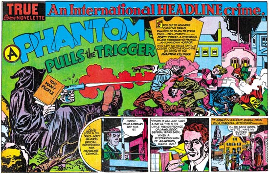
Headline #24 (May 1947) “A Phantom Pulls the Trigger”, art by Jack Kirby
Larger Image

“A Phantom Pulls the Trigger” might mistakenly be considered to be composed contrary to the normal left to right reading. It is true that the primary focus would seem to be the hooded figure on the left, the opposite of the expected location. In this case however the viewer’s progress from left to right is meant to indicate the progress of time, from the action of the firing of the pistol on the left to the affect of the killing of the people on the right. Kirby has countered the diminishing affect of placing the most important figure on the left by increasing his visual size. It is unclear whether the hooded figure is truly meant to be larger then his victims or if he is just closer to the viewer.

A section devoted to the start of the story makes a come back after last being used for the double page splash in Captain America #10 (January 1942). That this strip of panels is not an afterthought can be clearly seen by the way the hooded figure props his feet up on story panels and how the victims are firmly standing or lying upon it.

Simon and Kirby would discontinue using double page splashes in their crime genre comics. In my opinion this was not because crime did not lend itself to exciting wide splashes. I find the double page splashes from Headline #23 and #24 to be very effective and Kirby would pencil a number of single page splashes that could have benefited from a wider format. The problem I believe was due to an inherent weakness in use of the double page splash. For proper printing a wide splash must be placed as the centerfold page. With such a location the splash might be overlooked by a potential customer and thus loose its importance for inducing the purchase of the comic. But that was nothing new; it was a problem from when it was first introduced. What may have been more important was how the double page splashed affected the organization of the comic. Having a wide splash meant that a story had to start at on a particular page in the middle of the comic. This also placed restrictions on the page length for preceding stories as well. Organization of a comic book was simply easier without the wide splash. Now that Simon and Kirby was busy producing Headline and would soon be starting Young Romance, the double page splash may have been considered more trouble then it was worth. It would be a number of years before S&K would return to the wide splash, which is a shame because they did it better then anyone else. However in a few years Joe and Jack would put the centerfold to another good use. But that is a story for the next chapter.

The Wide Angle Scream, American Royalty

I have decided to resurrect this old serial post. I originally started it when I had then begun to restore S&K’s double page splashes. I wanted the restoration to be on the same level that I do for covers. However that required an awful lot of effort since these splashes have twice the area of the covers and the printing quality is much inferior. Eventually the amount of work proved too excessive and other restoration projects became more important. I feel that the subject matter of the serial post is too important and should not be completely abandoned. So I return to the subject although in the future the quality of the restorations will not be quite so high. Since it has now been over a year since my last chapter, I thought I should provide a very broad summary of the previous posts.

Simon and Kirby’s use of a double page splash began with Captain America #6 (September 1941). The five Cap double page splashes had a strong emphasis on design (#6#7#8#9, and #10). The splashes would consist of three sections. One section common to all was what I called the enactment; it is a scene or tableau but is not part of the actual story. The second section is also common to all Captain America wide splashes; it consists of panels for the true start of the story. Although the third section is present in all of these splashes what it comprises of is not consistent, it can be a cast of characters, floating heads or a sort of comic book equivalent of movie trailers.

During the period that Simon and Kirby worked for DC they only produced one double page splash, that was for Boy Commandos #2 (Spring 1943). Here once again the splash was made in three sections. The enactment is present but it consists of a larger number of individuals then ever attempted in Captain America. Some organization is achieved by deploying them around the glass case containing a sleeping beauty, but even so there is so much chaos that it takes some time to sort out all that is taking place. There is also a cast of character sections. Unlike the Cap wide splashes there is no start of the story; instead the third section is given over to a large introductory text.

After returning from the war, Simon and Kirby launched Stuntman and Boy Explorers that were published by Harvey Comics. A wide splash was used with Stuntman. Only two were published but Jack had made worked on three others. The first one (Stuntman #1, April 1946, “The House of Madness”) used an unusual design, effectively two enactments laid out as large panels separated by a sweeping gutter. The second (Stuntman #2, June 1946, “The Rescue of Robin Hood”) reverted to a more standard tri-part design with sections for the title, enactment and cast of characters. Although the exposition is pretty much isolated from the rest of the splash, the title and cast of characters are nicely integrated. I also posted on one of the unpublished wide splash ( “Terror Island”). For the first time Kirby provides just one section, an enactment. There is a title, an introduction and even a floating head of the Panda, but these are subservient to the large enactment and do not achieve the status of their own section.

Because of copyright issues I do not consider it appropriate to reproduce the other two double wide Stuntman splashes. They can be found in Joe Simon’s book “The Comic Book Makers”. Both are further variations of a single large enactment section found in “Terror Island”. In one (“Jungle Lord”) Jack presents a smaller cast as compared to that for “Terror Island”. The enactment takes place in the tree tops where we find Stuntman battling a gorilla in the foreground while in the back Don Daring clings to a tree and a jungle boy makes off with Sandra Sylvan. Since the cast is smaller in the “Jungle Lord” splash as compared to “Terror Island” the action can be brought closer to the reader with dramatic results. The inking of the final wide splash (“The Evil Sons of M. LeBlanc”) was never completed, so it clearly was the last one worked on. This is another single section with Stuntman confronting three opponents. I find that the plain room in “The Evil Sons of M. LeBlanc” as compared to all the foliage of “Jungle Lord” brings greater focus and excitement to the depiction.

The Stuntman period is interesting because it marked the only time during his collaboration with Kirby that Simon did a significant stint at drawing. Early in his association with Jack, the two would draw different pages from the same story. Initially this seemed to be the working method for Captain America but quickly Jack took over all the drawing choirs for the S&K partnership. With the exception of some work done while in the Coast Guard, Joe did not seem to contribute much penciling to what was produced by S&K during the war. But while Kirby was penciling Stuntman and Boy Explorers Joe would pencil three backup features; the Duke of Broadway, the Vagabond Prince and Kid Adonis. Despite what some experts have said, these were drawn entirely by Joe except for a few small parts that Jack altered in his role as an art editor. Joe has said that Harvey kept track of the mail and that the Duke of Broadway got a better reader response then Stuntman. This was likely to be during the period after the original titles had been cancelled and Harvey was printing the unused work in comics such as Green Hornet. After the Harvey Stuntman/Boy Explorers period and until the breakup of the Simon and Kirby team, Joe’s penciling contributions would be uncommon (48 Famous Americans for J. C. Penny and “Deadly Doolittle” for Fighting American).

Boy Explorers #1
Boys Explorers #1 (May 1946) “His Highness the Duke of Broadway”, art by Joe Simon
Larger image

Joe only did one double wide splash for his Harvey features (“His Highness the Duke of Broadway” from Boy Explorers #1, May 1946). It is actually surprising that he did any considering the short lives of these titles (due to a comic book glut) and the fact that his stories are all back-up features. Like the one from Stuntman #1 a month before, this double page splash is comprised of two sections. Not that use of the same number of sections makes these two splashes truly similar. While that from Stuntman #1 is unusual in being composed of two enactments, the splash for the Duke feature is made of two familiar sections, an enactment on our left and a cast of characters on the right. The cast of characters consists of both full figures and floating heads accompanied by short captions that provide their names and a short description. At ten in number it was quite an ambitious cast, Joe obviously wanted a lot of supporting characters so as to provide the potential for much variation in his stories (unfortunately there would only be five). In this splash much of the cast are floating in front of the cityscape. Even those that are attached to the ground seem unnaturally placed because of the way they block the small avenue (surprisingly small since it is meant to be either Broadway or 42nd Street). The cityscape itself is carefully drawn so to provide an interesting background but subtlety rendered so that the cast would still stand out.

Such a large number of cast members required the use of half the splash. But this was the cast for the feature, only some of them would show up in this particular story. With such a large assemblage on the right side Joe needed something on the left to balance. His solution was to present most of the cast together solidly placed on the sidewalk. While this was a satisfactory solution as far as the composition was concerned, frankly it is not very exciting. Joe would do much better and more innovating designs for some of the regular splashes for his features. Still this double wide splash shows an emphasis on design that would disappear from the later ones by Kirby for Stuntman.

Stylistically the drawing for the splash differs from what Joe did in the story itself. Click Collins and Legal Louie are exceptions as they seem to better match what was done for the story. It still looks to me that it was penciled by Simon, only it is closer to what Joe had done previously and to what he would again do later in his career. Nothing on the splash refers to what will be found in the story. Everything is very generic, describing the feature as a whole and not this particular story. All this makes me suspect that Joe did the splash some time before as a presentation piece for the pitch he made to Harvey. Joe was not one to let all that effort to create this splash go to waste, so he appended it to the first story.

The Wide Angle Scream, “Terror Island”

Stuntman
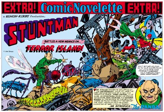
Stuntman #3 (unpublished) “Terror Island”
Enlarged view

Joe Simon and Jack Kirby must have had high expectations for their creation, Stuntman. There exist three double page splashes that were never published, at least not as regular Simon and Kirby productions. Since S&K always placed their wide splashes in the centerfold, this meant that they had already started working for up to Stuntman issue #5. That is until the post-war comic book glut caused the early demise of their new comic books. Joe still has the three splash pages and with their double size art they are really marvelous to behold. However when reduced to the size necessary for use on the Internet they can be difficult to appreciate. Therefore I hope my readers will understand that I felt it necessary to provide my own coloring for use in this blog. I would have like to have used the color version that Joe did for his book “The Comic Book Makers” but so far I have not found it in his collection. The “extra!” strip on the top, the “a Simon-Kirby Production” and the Stuntman title are missing from the art and I provided them from other wide splashes. Glue marks clearly indicated that the “extra!” strip is was present, or something like it. However I did not scan the original art (it is much too large) and the source of the image does not indicate the placement for the “production” (if it was even present) or the title.

Because two of the double splashes are completely inked I am not absolutely sure which was originally meant for Stuntman #3. I choose “Terror Island” to post on first. However this choice was not completely arbitrary. As mentioned above “Terror Island” clearly had an “extra!” along the top a feature that it shares with the double wide splashes for Stuntman #1 and #2. The other completely inked splash did not have this “extra!” strip, the lack of which it shares with the unfinished Stuntman double splash.

Mao Tse-tung“Terror Island” introduces a new antagonist, the Panda. Of course Stuntman had faced various opponents in his previous stories but they all were rather generic. None of the earlier villains really stood out and it is clear that none were ever meant to reappear in future Stuntman stories. The Panda seems special and I believe was Simon and Kirby’s first attempt to create Stuntman’s nemesis, the equivalent of the Red Skull for Captain America. Basing a villain on a panda may seem an odd choice, after all what could be more cute and cuddly then a panda, at least in the mind of the public. Sure Jack draws the Panda to look as vicious as possible without loosing his panda look. But the real source for this character is not the bear, but China’s leader Mao Tse-tung (nowadays his name is normally transcribed as Zedong). Today with all the world companies scrambling to get a share of the Chinese market it is easy to forget at that time communist China was a very closed society. As China’s leader and his with description of the U.S. as a “paper tiger” Mao was considered a special menace. Still it is not at all clear whether the Panda really could fulfill the role Joe and Jack were casting him for.
The art for this wide splash marked a new approach. All previous double splashes were actually composed of various different sections. But for the “Terror Island” splash no similar attempt was really made. It is true that there is some introductory text and a round panel portraying the Panda, but this hardly compares to the cast of characters often provided in older double splashes. Yes it is also true that space has been left in the upper left for the titles, but no art is associate with these titles. What we are presented with for the first time is an enactment that dominates the entire splash. But what a scene! It sprawls across the pages from the lower left to the upper right. It is just the sort of chaos that we have seen before in the Boy Commandos wide splash. There is some control over the composition. The Panda and his attacking bug army occupy the left page. All are advancing toward the right where we find Stuntman, Sandra Sylvan and Don Daring amid a mass of falling wreckage. Although the uncolored ink art might be a bit confusing, I am sure Jack (who did the penciling) knew how much the final coloring would help to make it understandable. This splash is one of those that Jack could just let his imagination run wild. Previously when discussing the cover for Adventure #98 I had mentioned how Jack was often inaccurate when drawing animals but nonetheless was very successful in giving them a certain life. This splash provides and example of what I meant. A biologist would shudder and the giant bugs Kirby presents us with. Some of the inaccuracies can be explained by the needs of the subject. The wasp like insect that the Panda is mounted on could never fly with its wings in their present location. But if that beast’s wings were in the correct position the Panda could not mount it. But other errors have no artistic excuse. The legs of the insects and the spider are attached in the most bizarre places. If Jack used a biology book for a reference he obviously did not make any attempt to follow it closely. Regardless of these “errors” these giant bugs have a very menacing life to them.

My personal preferences is for the earlier wide splashes with their greater emphasis on design. But there is just no denying the shear brilliance that radiates from these post war double splashes. When you look at the original art for the “Terror Island” splash there are no signs of hesitation or rework. Jack seemed to have it all figured out in his mind before he put it on the illustration board. But with such a complicated drawing how was he able to do that? It just astonishes me.

The Wide Angle Scream, Stuntman #2

Stuntman #2
Stuntman #2 (June 1946) “House of Madness”
Enlarged view

When I finished up the posts of the Captain America double page splashes I said that Simon and Kirby would not repeat those sort of designs. Well I lied. Stuntman #2 has the same sort of emphasis of design over composition seen in the Cap spreads. It is interesting to compare this splash with one from the Boy Commandos with a similar medieval theme.

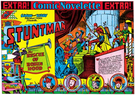
I have hoped that my discussions on the design elements would make it clear what the distinction was between design and composition, at least as I use the terms. Composition is how a scene is arranged, that is in comics how the figures and non-figurative elements are arranged and how they direct the eye. Design is how disjoint parts, the text and different images, are arranged on the page. For instance in the image on the right side of Stuntman #2 is composed with the attacking knights starting on the lower left and rising as the eye goes toward the right until it meets the pivotal Stuntman and finally the defended Don Darling and Sandra Sylvan. The composition does not end there as the large candlestick brings the eye down, and (although not really part of the scene) the cast of characters bring the eye back to the start of the image. Actually that is just a condensed description. Notice the use of arcs (the curtains, shadows, the stonework for the pillar and the doorway) along the top and how they are used to highlight certain figures. Particularly effective is Stuntman’s placement in front of the pillar, despite the fact that he is closely surrounded by other figures this placement makes him standout. This is a marvelous composition and Kirby’s penciling is just fantastic.

But the right hand scene is just part of the page and that is why I said earlier that the design was more important then the composition in Stuntman #2. Like most of the Cap double splashes, here we find a three part layout. Starting on the left is the title section, followed on the right by the enactment and below with the cast of characters. The title compartment depicts an archery contest. On the left a series of colorful pendants almost hide a figure blowing a horn. The competition between four archers is arranged along the bottom. The archers are alternated with their targets, the backs of which provide the cast of characters. The rest of the title section scene is left bare so that the Simon and Kirby credits, the Stuntman title and the story title are prominently shown. The story title is nicely placed on the drape hanging from the horn, a similar device was used in the Boy Commandos spread. An interesting touch is how the introduction text is placed on a wall in the enactment section and how the text is lined up to fit the perspective of this wall.

Except for the left edge of the enactment compartment, the whole splash is nicely integrated. I find this a much more successful effort then that for Stuntman #1. It is really a shame that this title fell victim to the post-war comic glut. There are three unpublished double page splashes for Stuntman. Unfortunately I do not have any scans for them right now but perhaps I will get a chance to pick up something from Joe Simon.

The Wide Angle Scream, Stuntman #1

Stuntman #1
Stuntman #1 (April 1946) “House of Madness”
Enlarged view

When Joe Simon rejoined Jack Kirby after the war rather then just return to working for DC the two decided to produce their own comic books. They turned to Joe’s old friend Al Harvey to do the publication for Stuntman and Boy Explorers Comics. Now they had complete control over the contents and did not have to deal with DC’s editors. Wishing to recreate the success they enjoyed with Captain America S&K returned to the use of the double page splash in Stuntman.

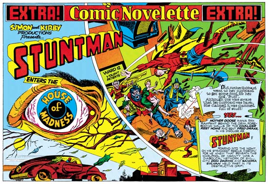
The first Stuntman wide splash, “House of Madness” was published three years after the Boy Commandos splash. But the Stuntman Splash does not continue with the type of layout used in the Boy Commandos. Nor does Stuntman look back at the approach for double wide splashes found in Captain America. Instead we find Simon and Kirby using an entirely new design approach. In Stuntman we find two sections separated by a sweeping gutter, as if the splash was composed of two large irregularly shaped story panels.

The left panel starts at the top with the declaration that this is a Simon and Kirby production of Stuntman. The story title, “House of Madness” is embedded in the iris of a large bloodshot floating eye. Proceeding down we see that the eye appears to be some sort of projection by a beam emanating from a building complex on the lower right of the panel. As if in response to this signal, a car races in from the left. It is hard to be sure who the driver is but the red head and blue “collar” suggest it might be Stuntman at the wheel.

The right panel shows a scene of typical Kirby composition. Perhaps composition is not the best term, because Jack laid out his figures more with the intent of covering the area and not as much concern about unifying the movement. We find Stuntman in the midst of a leap. He has just physically burst into the room, the pieces of wood debris are falling with him. It might seem that if you project his flight Stuntman would miss the crowd shown below. But Simon and Kirby splashes (and covers also) should not be taken so literally. Had S&K tried to present a more “correct” representation we would have been presented with the soles of Stuntman’s feet and would not have been able to see his face. No, we can be sure that Stuntman is truly about to attack the crowd below. His opponents include a bearded giant holding Don Darling and Sandra Sylvan easily under each arm. Also appearing is a modern day Icarus about to take flight, a gun firing dwarf and a witch. A sign makes it clear that these characters are both crazy and dangerous.

Including in the panel is text written on what appears to be a scroll like piece of paper. From this text we are provided with the information that it really is Stuntman in the car racing toward a mental hospital to save his friends from the danger of an insane but evil group.

I have mixed feelings about this particular splash. On the one hand it is an interesting idea to use two enactments to introduce the story. However you really need to read the text in the second panel to realize what the first panel is meant to depict. Further there is really little to visually connect the two panels. All there is is the text banner along the top and the partial overlapping by the Stuntman title. Otherwise the panels provide very different views and compositions. This two scene design for a wide splash would not be repeated.