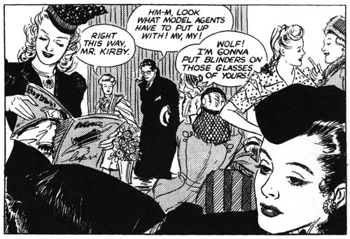
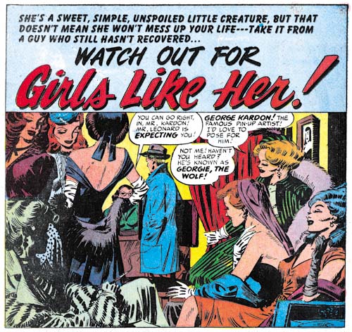
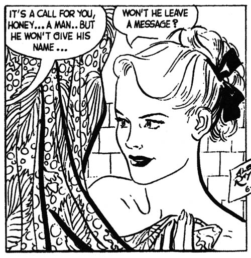
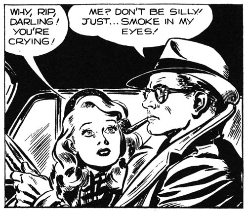
(February 1954 – April 1954: Young Romance #66 – #68, Young Love #54 – #56, Young Brides #12 – #14)
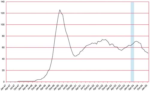
Number of Romance Titles 1947 – 1954 (the period covered in this chapter is shaded in blue)
Simon and Kirby started using photographic covers for their romance comics in April 1949. There were short periods when they reverted back to graphic covers but beginning in May 1951 for Young Romance and July 1951 for Young Love all the romance covers used photographs. Now after three years they suddenly switched back to drawn covers; Young Brides #13 (March 1954) would be their last photographic cover. Why the switch? Unfortunately I do not have a clue.
An even bigger surprise was that Jack Kirby would not draw any of these romance covers. Up to this point there was only one comic produced by Simon and Kirby with a cover drawn by another artist (My Date #4, September 1947, drawn by Mort Meskin and Jerry Robinson). Other artists will be provided covers for the Prize romances for some time. The artists that appeared on the covers were the same ones that dominated the interiors; for the most part that would be Bill Draut, Mort Meskin and John Prentice.
For approximately the last year Kirby was producing much more of the Prize romance art then any other artist. That was not particularly surprising because that was typical for the Simon and Kirby studio. However there had been a period when Mort Meskin produced most of the love art. Now once again Kirby’s output dropped. The line up for the period covered in this chapter is Bob McCarty (50 pages), John Prentice (49 pages), Bill Draut (44 pages), Mort Meskin (37 pages) and Jack Kirby (25 pages) with some very minor contributions by some other artists. Not only was there a dramatic drop in Kirby contribution he did not appear in any of the April issues and would not again for some time to come.
A Simon and Kirby production without Kirby art is a rare thing. A run of Simon and Kirby comics without Kirby was simply unprecedented. And make no mistake these are Simon and Kirby comics. As we will see the same artist will provide work for these Kirby-lacking issues that had been used previously. Further the first interior page would continue to use the cartouche declaring it “A Simon and Kirby Production”. While I do not have an explanation for the switch to photographic covers, I do believe I can provide a good reason for Kirby’s absence. Simon and Kirby would launch a new Prize title Fighting American in April (cover date). Even more significant the first Mainline comic, Bullseye, would appear in July. With Mainline Simon and Kirby would become publishers themselves. Most of the Fighting American art was drawn by Jack but he his contributions to the Mainline titles (Bullseye, In Love, Police Trap and Foxhole) would be relatively low. Many people believe that Kirby did the art while Simon handled the business but the reality is that both Jack and Joe did whatever had to be done to get the comics out. I am sure some of these more mundane but essential business needs kept Kirby from the drawing board.
One thing that did not change about the Prize romance titles was the story format. With just a couple exceptions the features start with a story splash (a splash that is actually part of the story) or no splash at all. Full page splashes continue to be missing.
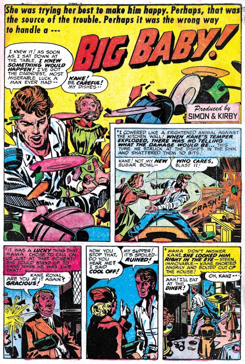
Young Brides #12 (February 1954) “Big Baby”, art by Jack Kirby
I thought I would present Kirby’s farewell (at least for now) from the Prize romance comics with a bang. Jack always had a tendency to introduce action into his romance stories. Kirby is also famous for his fights were everything goes flying. Well this is not fight but the only things not rushing through the air are the irate husband and his frightened wife. One of the things that attract me to Simon and Kirby romance comics, besides the great art, is how well they reflect the times. It is a view of 50’s culture as if it was an ant stuck in a piece of amber. The husband’s uncontrolled temper is portrayed as the title says, a “Big Baby”. But today he would just be considered (quite rightly) as abusive. However Simon and Kirby were well aware of the danger in the husbands rage as he learns his lesson when his temper turns on some pet birds. The wife says “these were only birds, tomorrow it might be human beings”.
Note the odd panel shape that Kirby uses for the splash. At this time it was actually one that he preferred but not often used by the other studio artists. The upper right corner might be a “dead zone” but Jack manages to create a diagonal in the lower portion of the splash that connects it to the right side. The second panel hardly seems to intrude at all.
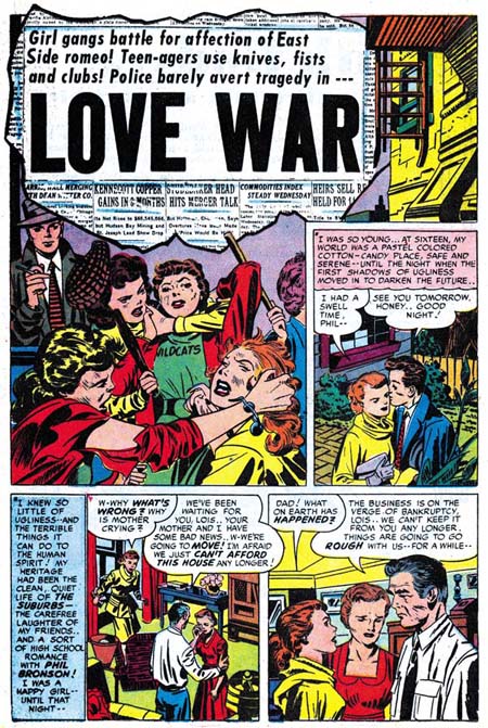
Young Love #55 (March 1954) “Love War”, art by Jack Kirby
Another action splash by Jack Kirby. Note the same odd panel shape although this time Kirby did not successfully connect the upper right with the rest of the image. This is also one of the few true splashes from the period covered by this chapter. The fight scene does not lead into the story but serves the more tradition purpose of providing a preview. And what an unusual story this is. Usually when Jack inserts violence into a romance story it is the men who fight but in “Love War” we get lots of female on female violence.
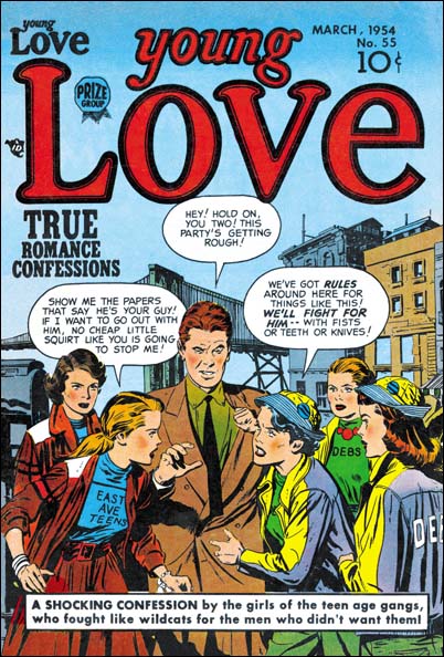
Young Love #55 (March 1954), art by John Prentice
As mentioned above, the cover art was not provided by Kirby. Of the five drawn covers from March and April three of them illustrated a story from the interior. For the Young Love #55 cover John Prentice’s drawing is based on the story that Kirby did, “Love War”. Simon and Kirby always kept the more controversial images inside and this is no exceptions. Still Prentice makes it quite clear where his scene is heading for. As the man says “this party’s getting rough”.
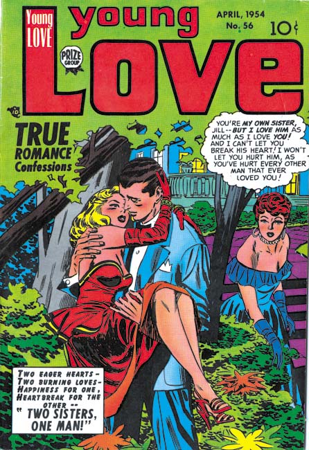
Young Love #56 (April 1954), art by Mort Meskin
One of the covers (Young Romance #67) is unrelated to any story within. The same could be said for Meskin’s cover for Young Love #56. It is clear that was not the original intent as the depicted scene clearly relates to the title provided in the caption, “Two Sisters, One Man”. However a story with that title not only does not appear inside it would never be published by Simon and Kirby. Further none of the April issues had a story involving a sibling love triangle. Whatever happened to “Two Sisters, One Man”?
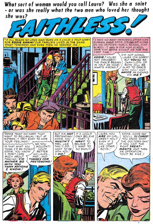
Young Brides #14 (April 1954) “Faithless”, art by Mort Meskin
Don’t get me wrong, I like Meskin’s romance work. But I do regret that Mort never did any more action packed stories like those he drew during the war, features like the Vigilante and Johnny Quick. It is not much of a splash, perhaps it should not be called a splash at all, but it shows that the old Mort still had what it took to do action. Just a couple of running kids but probably better then anybody actually doing superheroes at this time except, of course, for Jack Kirby.
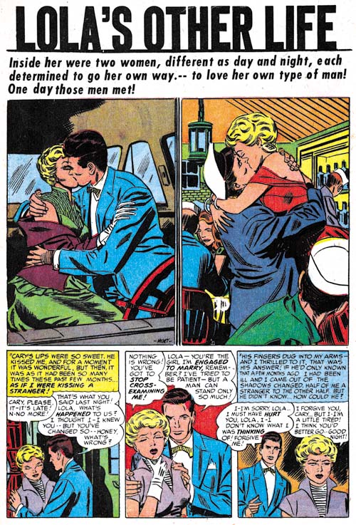
Young Love #56 (April 1954) “Lola’s Other Life”, art by Mort Meskin
For various reasons I guess I am going to provide a bit more of Meskin’s work then usual but he is such a great artist anyway. The story’s protagonist, Lola, lives a double life which Meskin highlights with his splash. Remember this is a period where most features start with a story splash so this was a bit of a deviation.
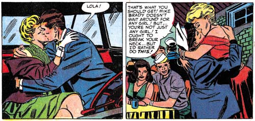
Young Love #56 (April 1954) “Lola’s Other Life”
left panel from page 2,
right panel from page 3, art by Mort Meskin
While the splash is interesting in itself, but the real reason I want to post about this story is that Mort repeats the splash posses in the story as well. Can an artist be said to swipe from himself? But look closely at the positions of things like the arms and the reader will see that these are in fact redrawn and not just stats. While the use of stats would be common in work that Joe Simon did years later, I have not been able to find any examples from the Simon and Kirby collaboration up to this point in time. Stats were added expense and had to be sent out of the studio to be made. It was easier and quicker to just draw the art. The one important exception was the stats used for cover titles. Even then the stats were generally removed from old cover art and recycled onto new ones.
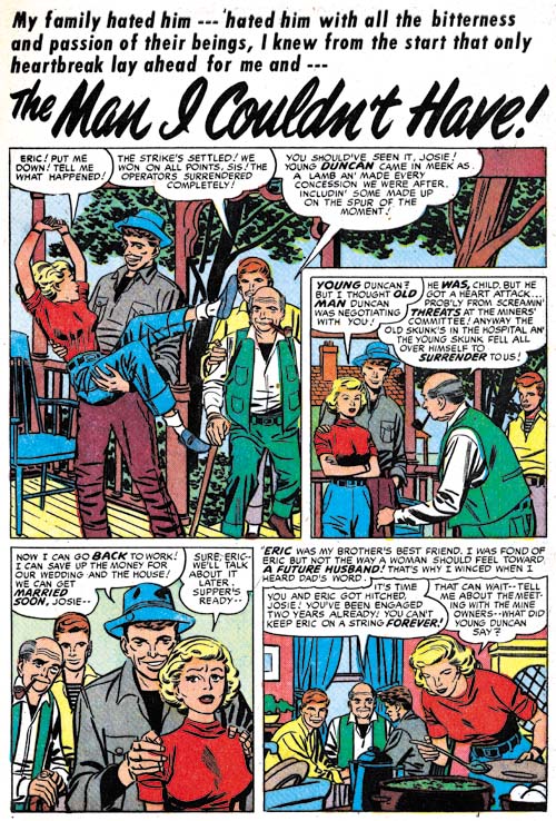
Young Romance #68 (April 1954) “The Man I Couldn’t Have”, art by Mort Meskin
Another great Meskin splash but note that here he uses the same inverted ‘L’ shaped splash that Kirby prefers. Unfortunately he does not really pull it off since the upper right corner does not visually connect with the rest of the splash. Probably the only reason Mort used this panel shape was the room it provided for the speech balloons.
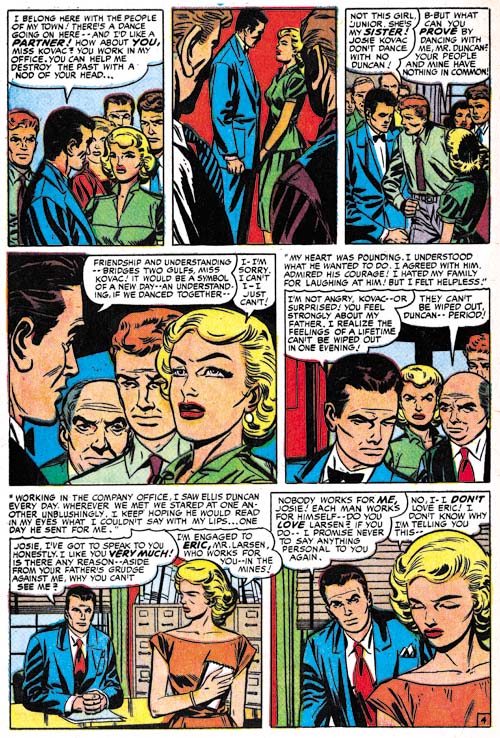
Young Romance #68 (April 1954) “The Man I Couldn’t Have” page 4, pencils by Mort Meskin
The first two pages of “The Man I Couldn’t Have” looked like they were inked by Meskin himself. But not the rest of the story. I have no idea who this inker is but his inking certainly has given Meskin’s pencils a rather unique look. While I prefer Meskin’s own inking, this unknown inker is rather interesting and much better then George Roussos inks. Page 3 has a more intermediate look to the inking. I think this was done on purpose to make the switch in�distinct styles less jarring to the reader.
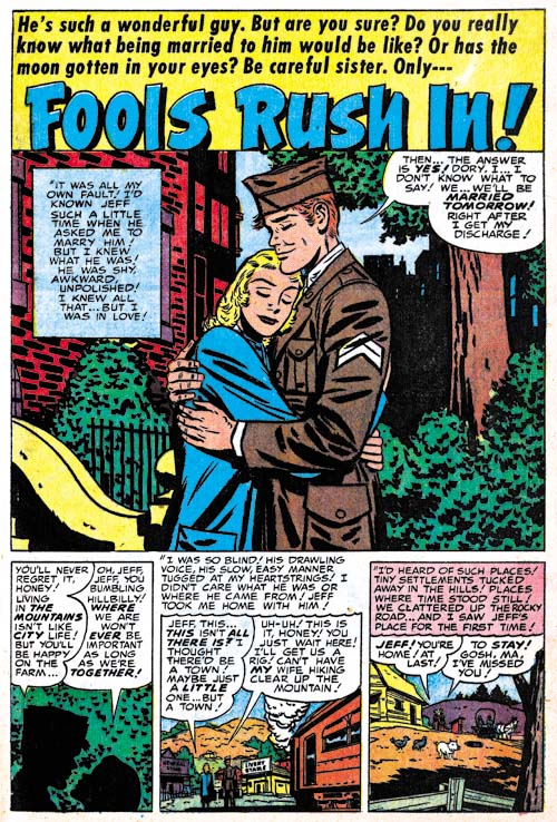
Young Romance #66 (February 1954) “Fools Rush In”, art by Bill Draut
While “Fools Rush In” has story splash so prevalent in the more recent Prize romance comics, Draut was able to provide a more standard size splash. While I find the story splashes and splash-less stories interesting, I must admit to missing the more traditional splashes. There seem to be more deviations to the type of splashes used during the period covered in this chapter. Perhaps this is a hint that Simon and Kirby are moving away from their more recent approach.
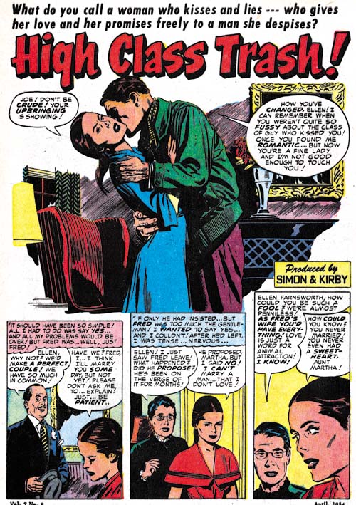
Young Romance #68 (April 1954) “High Class Trash”, art by John Prentice
Even Prentice gets a chance to provide a tradition splash. Recently he had been mainly doing splash-less stories. This is another of the borderless splashes that John did from time to time. It is a simple device but I think it gives his art a special touch.
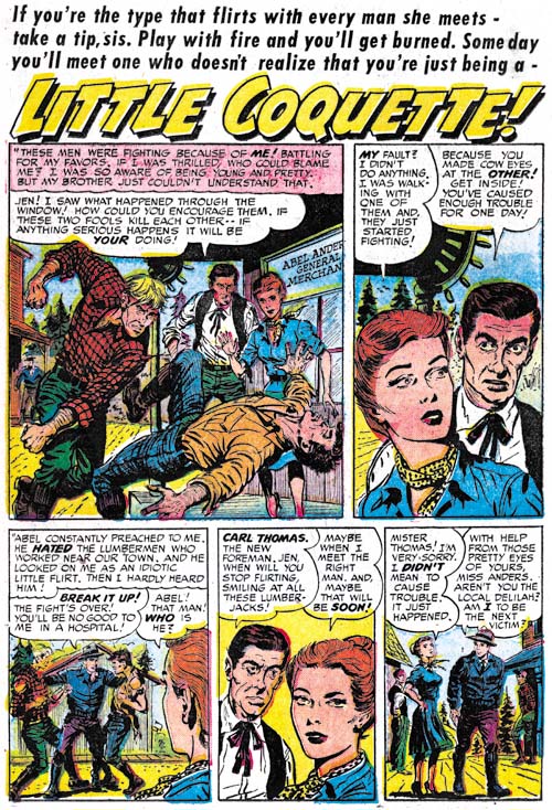
Young Brides #13 (March 1954) “Little Coquette”, art by Bob McCarty
Bob McCarty gets a chance to provide some action in his splash. McCarty’s art provide an interesting and effective fight scene. Not the way Kirby would have done it but I think it is rather successful.
Bob supplies cover art for Young Romance #68 which is based on the “High Class Trash” story that Prentice did for that issue. This would be one of the few exceptions of a Prize romance cover done from this period by an artist other then Draut, Meskin or Prentice.
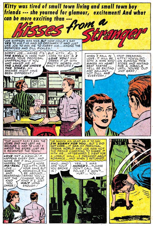
Young Love #54 (February 1954) “Kisses For a Stranger”, art by Vic Donahue?
There are a few stories done by other artists most of which I cannot identify. I think I can attribute “Kisses for a Stranger” to Vic Donahue. Donahue last appeared in Young Love #13 (September 1950) so he has been missing for some time. While this does look like Donahue’s work it seems a rather poor piece of art considering the quality of work Vic was doing four years ago. Perhaps Donahue was just doing a rush job.
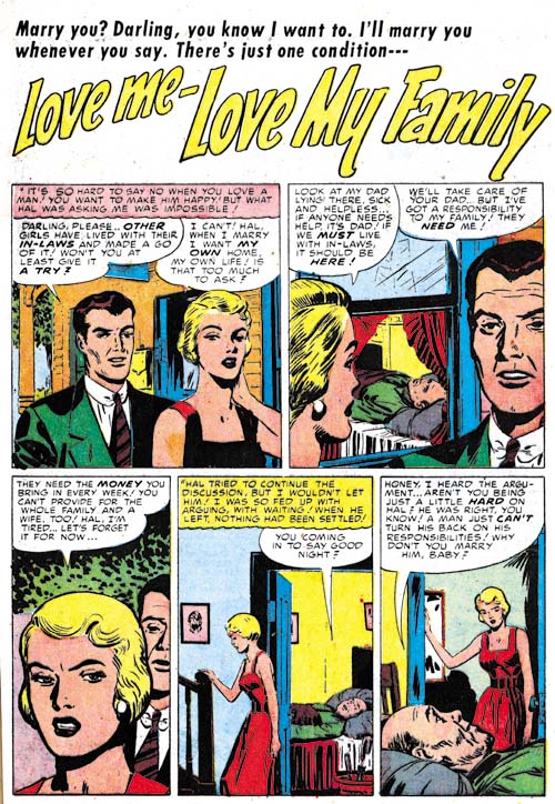
Young Love #54 (February 1954) “Love Me, Love My Family”, art by unidentified artist
Usually I only include examples of the unidentified artists if they were sufficiently talented. Unfortunately “Love Me, Love My Family” does not fall into the more talented category. But look at the inking. A blunt brush and shoulder blots are not typical inking techniques for most artists. While not all the inking in the story is done in this manner it does show up in places. I believe this story was touched up, in this case by Joe Simon.
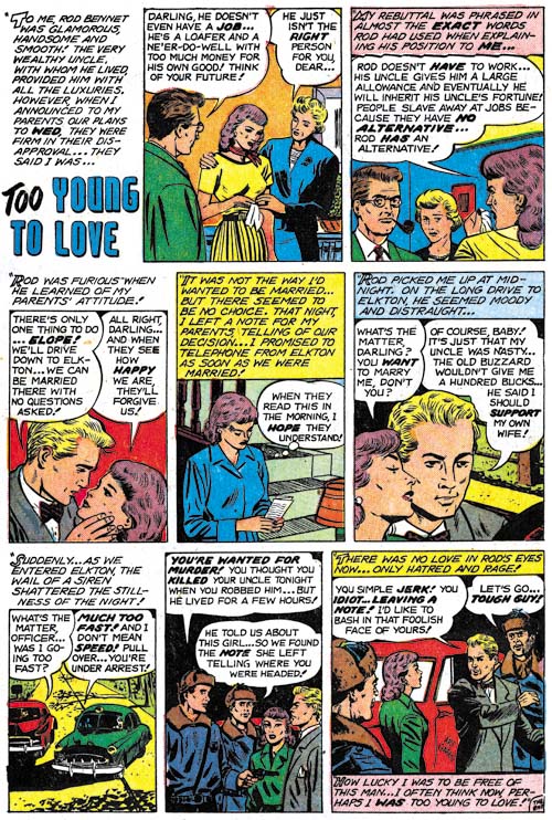
Young Love #56 (April 1954) “Too Young To Love”, art by Art Gates
Single page features were often done by less talented artists who were probably studio assistants. However now one artist would appear that specialized in these often overlooked stories. Art Gates not only did typical comic art but also gag strips. Fortunately he often signed his work but in the last panel.
Chapter 1, A New Genre (YR #1 – #4)
Chapter 2, Early Artists (YR #1 – #4)
Chapter 3, The Field No Longer Their’s Alone (YR #5 – #8)
Chapter 4, An Explosion of Romance (YR #9 – #12, YL #1 – #4)
Chapter 5, New Talent (YR #9 – 12, YL #1 – #4)
Chapter 6, Love on the Range (RWR #1 – #7, WL #1 – #6)
Chapter 7, More Love on the Range (RWR #1 – #7, WL #1 – #6)
Chapter 8, Kirby on the Range? (RWR #1 – #7, WL #1 – #6)
Chapter 9, More Romance (YR #13 – #16, YL #5 – #6)
Chapter 10, The Peak of the Love Glut (YR #17 – #20, YL #7 – #8)
Chapter 11, After the Glut (YR #21 – #23, YL #9 – #10)
Chapter 12, A Smaller Studio (YR #24 – #26, YL #12 – #14)
Chapter 13, Romance Bottoms Out (YR #27 – #29, YL #15 – #17)
Chapter 14, The Third Suspect (YR #30 – #32, YL #18 – #20)
Chapter 15, The Action of Romance (YR #33 – #35, YL #21 – #23)
Chapter 16, Someone Old and Someone New (YR #36 – #38, YL #24 – #26)
Chapter 17, The Assistant (YR #39 – #41, YL #27 – #29)
Chapter 18, Meskin Takes Over (YR #42 – #44, YL #30 – #32)
Chapter 19, More Artists (YR #45 – #47, YL #33 – #35)
Chapter 20, Romance Still Matters (YR #48 – #50, YL #36 – #38, YB #1)
Chapter 21, Roussos Messes Up (YR #51 – #53, YL #39 – #41, YB #2 – 3)
Chapter 22, He’s the Man (YR #54 – #56, YL #42 – #44, YB #4)
Chapter 23, New Ways of Doing Things (YR #57 – #59, YL #45 – #47, YB #5 – #6)
Chapter 24, A New Artist (YR #60 – #62, YL #48 – #50, YB #7 – #8)
Chapter 25, More New Faces (YR #63 – #65, YLe #51 – #53, YB #9 – #11)
Chapter 26, Goodbye Jack (YR #66 – #68, YL #54 – #56, YB #12 – #14)
Chapter 27, The Return of Mort (YR #69 – #71, YL #57 – #59, YB #15 – #17)
Chapter 28, A Glut of Artists (YR #72 – #74, YL #60 – #62, YB #18 & #19, IL #1 & #2)
Chapter 29, Trouble Begins (YR #75 – #77, YL #63 – #65, YB #20 – #22, IL #3 – #5)
Chapter 30, Transition (YR #78 – #80, YL #66 – #68, YBs #23 – #25, IL #6, ILY #7)
Chapter 30, Appendix (YB #23)
Chapter 31, Kirby, Kirby and More Kirby (YR #81 – #82, YL #69 – #70, YB #26 – #27)
Chapter 32, The Kirby Beat Goes On (YR #83 – #84, YL #71 – #72, YB #28 – #29)
Chapter 33, End of an Era (YR #85 – #87, YL #73, YB #30, AFL #1)
Chapter 34, A New Prize Title (YR #88 – #91, AFL #2 – #5, PL #1 – #2)
Chapter 35, Settling In ( YR #92 – #94, AFL #6 – #8, PL #3 – #5)
Appendix, J.O. Is Joe Orlando
Chapter 36, More Kirby (YR #95 – #97, AFL #9 – #11, PL #6 – #8)
Chapter 37, Some Surprises (YR #98 – #100, AFL #12 – #14, PL #9 – #11)
Chapter 38, All Things Must End (YR #101 – #103, AFL #15 – #17, PL #12 – #14)


