Category Archives: 2006/11

Featured Cover, Fighting American #1

Fighting American #1
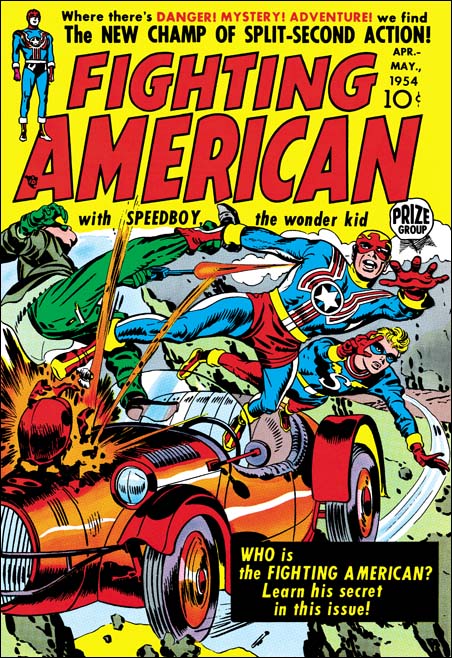
Fighting American #1 (April 1954) by Jack Kirby

It is easy to see why one of the entries for my recent Best Simon and Kirby Cover contest was Fighting American #1. The cover shows a race car flying off a cliff. It that was not bad enough the engine is exploding. Fighting American and Speedboy leap to safety with Fighting American pulling along another man by his leg. Surprising the man shoots a gun at his would be rescuer. This scene takes up pretty much every inch of the cover below the comic title. I cannot see how Simon and Kirby could possibly have added more excitement to the cover. The art was done when, in my opinion, Joe and Jack were at their peak. Just look at the exaggerated perspective that Kirby uses, it is amazing. No doubt about it this is one great piece of cover art.

Fighting American was obviously Joe and Jack showing how Captain America should be done. They had created Cap in 1941 but only did the first 10 issues, less then one year of work. Timely continued to produce Captain America without S&K up to issue #74 (October 1949) which was re-titled as Captain America Weird Tales. Timely must have known that they were about to end the title because the single Cap story showed the definitive end of their long time nemesis, the Red Skull. I say definitive because although the Red Skull had been shown supposedly killed before this time the story shows him in hell. There was a Captain America Weird Tales #75 (February 1950) but Cap did not actually appear on the cover or in any story.

Coincidentally the demise of Timely’s patriotic hero marked the period of the rise of Joe McCarthy. McCarthy lead a crusade against all the communists that he said had infiltrated the U.S. government. McCarthy’s “investigations” can best be described as a modern day witch hunt. But that was not so obvious to Americans at the time as can be shown by the fact that a Gallup poll taken in January 1954 showed McCarthy had a 50% approval rating. It is only a guess, but perhaps all of McCarthy’s talk about Communist infiltration brought back to the Atlas company thoughts of their previous success with their superheroes. After all if their hero line was was so financially successful fighting the Nazi’s during the war, perhaps it might occur again using the same heroes to fight the Communists. Whether that was thinking or not, Atlas re-launched the Human Torch, Sub-Mariner and Captain America in Young Men #24 (December 1953). It takes three to four months to produce a comic and so the earliest cover date following YM #24 appearance would be March or April 1954. April is exactly the date that appears on the cover of Fighting American #1. The timing is too perfect, could Joe and Jack saw that their old creation had reappeared? This could have prompted them to rush their own patriotic hero out hoping to take part in the superhero revival.
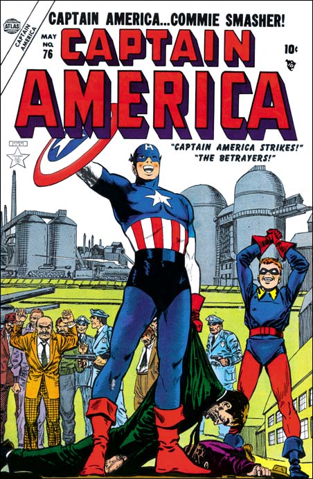
Captain America #76
Captain America #76 (May 1954)

But Joe McCarthy’s rise did not go unopposed. On March 8, 1954 Edward R. Murrow did a segment of “See It Now” critical of McCarthy and his tactics. On June 9 during one of his Senate investigation meetings Joseph Welch addressed McCarthy with the line “Have you sense of decency, sir, at long last?” On June 10 Senator Flanders introduced a resolution to condemn Joe McCarthy. On December 9 1954 the condemnation of McCarthy was passed by the Senate. At this point Joe McCarthy had been pretty much discarded on the rubbish pile of history where he belonged. I do not suggest that McCarthy’s downfall had any affect on the Atlas superhero revival attempt. No I think that the termination of this revival with Human Torch #38 (July 1954) can be blamed on the fact that they were really poor comics. (Sub-Mariner Comics continue until issue #41 dated October 1955 due to a hope of a movie deal). But although I do not think McCarthy’s fall affected Atlas much, it may have had an affect on Fighting American. That title had started out as exciting superhero fare but by issue #3 (August 1954) had turned to humor. The timing is just right for Joe and Jack to begin to see what McCarthy was really about and to change their comic accordingly.

Before closing this post I would like to comment on the artist for the cover of Captain America #76 shown above. Both the GCD and AtlasTales attribute it to John Romita. John Romita did do a lot of the art for Captain America during this revival attempt. For instance he signed the covers for Captain America #77 and #78. Although unsigned, some of the art inside Cap #76 appears to be by Romita. But I find it hard to believe that John was the artist for the cover, Captain America just looks like he was done by a different hand. In an interview of John Romita by Roy Thomas from Alter Ego (volume 3 #9) both seem to indicate that they do not believe the cover for #76 was by Romita either. However the suggestion that John makes in the interview that it may have been done by Carl Burgos or Joe Maneely seems even less creditable. Unfortunately I do not know enough about Atlas artists to suggest an alternative. In the interview John mentions that Stan Lee often had art rework done by whatever artist had stopped by at the office at that time. John particularly suggests that Cap’s smile on issue #76 might be an example of that. But perhaps for Cap #76 the rework was much more extensive.

Featured Cover, Captain America #1

Captain America #1
Captain America #1 (March 1941)

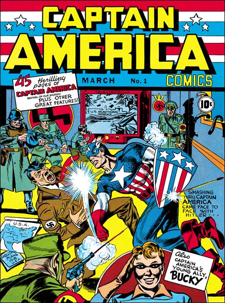
When I recently ran my Simon and Kirby cover contest I was curious about what some fans considered their favorite cover. There are many possible covers by Simon and Kirby that could be candidates, they put much effort into their covers. There are few S&K covers that I would consider poor works and even in those cases they are often better then covers by many of their contemporaries. One cover I fully expected to be selected was Captain America #1. Cap #1 is truly one of the icons of comic book covers. Whenever I talk about Joe Simon to those of my friends with no interest in comic books I tell them that he was one of the co-creators of Captain America. I doubt that they could name more then a handful of comic book characters but they always recognize Cap. Comic books as we know them today have a long history. But there are few comic heroes that extend throughout much of this history, fewer still if we exclude those with significant costume changes. Captain America was only missing for a fraction of comic book history. Last, but not least, is the presence of Hitler on the cover. Adolf shows up on a number of war time covers but I doubt that any are as famous as this cover and it was done about a year before the U.S. entered the war. Yes I think we can certainly say that the cover for Captain America #1 is an icon.

But aside from it being an icon, is Cap #1 really a great piece of comic book art? I have to admit when I first asked myself this question not only was I unsure, I did not even know how to go about finding the answer.

One place to start is to examine how well the cover tells a story. I realize others may disagree, but for me this is generally an important criteria. Covers of a lot of famous characters just standing around as if posing for a camera just do not do anything for me. Comic books tell stories and I expect the covers to do so also. Well the story told by Cap #1 cover is pretty clear. The bent bars in the window on our right indicate where Cap forced his way into the room. At great risk to himself, Cap rushes forward to deliver one of Kirby’s famous punches to the villain (easily recognized as Adolf Hitler). Although the U.S. was not officially at war with Germany it is clear that Hitler had already strike out against us. Not only are there invasion plans on the left, but in the rear we find a television showing the destruction of a U.S. ammunition plant. There is a blurb that declares

Smashing thru Captain America came face to face with Hitler

Frankly this blurb is really superfluous, it tells us nothing that the image does not already provide. S&K would provide better blurbs in the future and eventually would often leave them out. So I conclude based on the story telling criteria that the cover for Captain America #1 is completely successful.

Another approach to judging the Cap #1 cover would be to compare it with other iconic covers. As a hero Captain America may have played an important part in the history of comic books, but he pales beside Superman and Batman. But when you compare the cover for Cap #1 with Action #1 or Detective #27, well there is no comparison. The covers for Action #1 and Detective #27 may be icons, but artistically they do not even come close to Cap #1. So from comparing icons with icons I again conclude that this cover is deserving of praise.

Well Hitler plays a prominent part of this cover, but how does Cap #1 compare with other comics that depicted Hitler? I cannot claim to have made an exhaustive search for covers to use for comparison, but I certainly have not found any other Hitler cover that I like better. Dial B For Blog has made a more thorough examination and has reached the same conclusion. Not part of his list is the cover to Captain America #2 but I included an image in a recent post. Although both have Hitler and are done by the S&K, issue #1 seems much better then #2. It is not hard to understand why, after all it is much more satisfying to see Adolf getting punched then just being surprised. So Captain America #1 cover does well when compared to other Hitler covers.

Looking at Captain America #1 from various viewpoints I have ended up concluding that this really was a great cover. Although being an icon has made it more difficult for me to evaluate this cover, that does not mean I consider it a negative aspect. Quite the contrary I believe that with its iconic status added to its artistic merits the cover for Captain America #1 is truly one of the greatest covers that Simon and Kirby have produced.

There is one aspect about Captain America #1 that I have not explored in this post. That is the part it played in the history of Kirby’s early artistic development. I have touched on early work by Jack Kirby in my serial post on the Art of Joe Simon here and here. But early Kirby is a subject that deserves a more thorough examination and is one that I plan to make the subject of a serial post in the near future.

Featured Story, “Unfit To Manage” by Bill Draut

True Bride-To-Be Romances
True Bride-To-Be Romances #18 (June 1956)
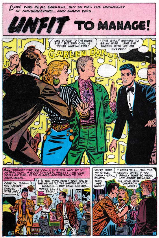
“Unfit to Manage” by Bill Draut

In 1956 Jack Kirby was doing pretty much all the artwork for the Prize romance comics. This was after the failure of the Simon and Kirby publishing company called Mainline. It seems that Joe Simon was doing some editorial work for Harvey Comics. Jack provided some covers but does not appear to have done much else for Harvey. Although I believe Joe was the editor, I think it would be a mistake to consider these Harvey romances as Simon and Kirby productions. Some of the artists had been doing work for these comics before Joe was editor. Also the format of the stories did not change with Joe’s arrival. But two regulars for Simon and Kirby productions, Bill Draut and John Prentice, started to provide material for the Harvey romances. I presume this helped these artists to makeup for the loss of work from the Prize romances since Kirby was now doing all of that. For reasons that can only be guessed at Mort Meskin, another S&K regular, never made the transition to Harvey.

I must admit I generally prefer the S&K produced romances over the Harvey comics. The Harveys tend to be done to a formula while the S&K productions are more variable. But there are some real gems in the Harvey romances and it probably is not a coincidence that these tend to occur with Simon as editor and Draut or Prentice as artist. “Unfit to Manage” is one of those small masterpieces.

Bill Draut is one of those artists that nowadays tends to be overlooked. Part of the problem was that much of Bill’s work was for the romance comics, a now pretty much extinct genre. Further most of Bill’s work was for Simon and Kirby productions. This meant that he was overshadowed by Jack Kirby (weren’t most artists?). Some of Bill’s work has even been attributed to Jack (here, and here). Finally after S&K, Draut went to DC where his art seemed to suffer. I suspect he was trying to adapt his drawing to be more like the DC house style. Although I am not very familiar with this period it seems to me that Bill lost some of his best features without gaining enough in his newer manner.

The panel layout for the first page of “Unfit to Manage” is one very typical of Harvey romances. But the splash panel itself is a real gem. The background is a field of floating musical notes and the words “Garden Dance”. The “Garden Dance” might suggest a banner but otherwise the background is abstract. This sort of suggestive rather then depicted background was a device rarely used in S&K productions and probably never by Kirby. Here it is very effective for Draut and there is little doubt that we are in some dance. An especially good touch are the characters that Bill presents almost like they are some sort of frieze. Starting from the left we find a young man so engrossed in his dance that he is oblivious to the unfolding drama. What a dancer he is with his left leg brought up high and his head thrust back. Next is is partner who has already stopped dancing and looks surprised to our right. The next character is what I am sure was meant to be a hipster. Was the somewhat comical figure he presents due to our modern eyes or was it apparent when the comic was published? Look at that wild shirt and the incredibly short but wide tie that reads “U 4 Me”. Our hipster asserts his right to be the woman’s next dance partner. Our eyes are continued to be directed to our right by his turn of the head. Our direction to the right is finally halted by an angry man looking in the opposite direction. He declares himself the woman’s husband and denies others any dancing privileges. Although limited to half a page, this splash panel does everything you could expect of it. It is visually interesting, the composition controls what we see and when we see it, and that with a few short sentences provides a summary for the story to entice the potential purchaser.

In the story we find a popular and fun loving young woman. Surprising she falls in love with a young man who acts older then his years. The woman does try to be a dutiful wife and then mother, but still enjoys going out. The husband reluctantly indulges her until he looses his job. Unable to support their nice house and the life style his wife enjoys, the man wants to move. The wife refuses to go along and the man leaves with the child and divorce court follows. The lady finally recognizes what she is about to loose and convinces the man to try again before the divorce becomes final. It is a well written story. The overall story of couple meet, couple have problems and couple reunite at end is a standard for romance comics. Keep in mind other that genre at that time such as superhero comics followed their own predictable overall formulas. But “Unfit to Manage” has enough variations within that story outline to make it rather different from most romance comic book stories.

I am unable to read these older romance stories without reflecting how much different the world that they project is from our present one. Actually that is one of the things I enjoy about these romance comics. In “Unfit to Manage” the woman is presented in a bad light while the man comes off rather lightly. This despite the fact that in one scene the woman reaches for her child who the man grabs and raises out of her reach. I am sure that such a use of a baby as pawn in the battle between a couple continues today, but most of the public would consider it unacceptable behavior. The divorce court is interesting because the judge clearly is taking the man’s side and is about to award him custody. But it is not at all clear that the woman’s action were truly so negligent as to justify such an action. Of course a comparison between now and then was not original a goal for such a story. But that does not mean it cannot or should not be one for us today.

The Contest Is Over

I have already emailed congratulations to the winners of my Featured Cover Contest. Not all the prizes were claimed, but hey that means nobody was disappointed. It was an interesting assortment of favorite covers and all were excellent choices (although there was one that surprised me). Only one of the winning covers has been used in my blog in the past. I think I will skip listing the covers here and instead do individual posts on each in the coming weeks.

Simon and Kirby Cover Contest

Tomorrow, Wednesday, is the last day for the Simon and Kirby Cover Contest. Remember, it costs you nothing to possibly win a print of a restored Simon and Kirby cover (or Simon solo cover). For details see this post.

Featured Cover, Foxhole #3

Foxhole #3
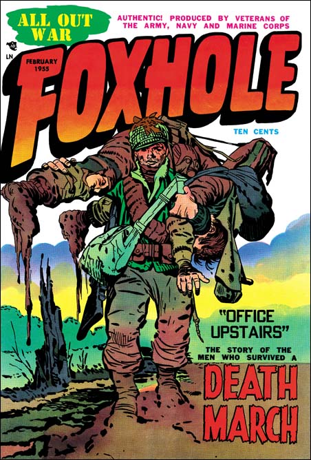
Foxhole #3 (February 1955) by Jack Kirby

I love the Kirby list, but sometimes Kirby fans just get carried away. Even the most unsubstantiated claims become accepted fact. Not too many years ago the concept of Kirby Kolors burst into the list. This was the idea that Jack created the color guides for many Simon and Kirby comic work. Not only did Jack do color guides, but experts could tell which ones he did. Never mind that no evidence was ever presented to back up this amazing claim. Never mind that color credits was never given in any of the Simon and Kirby productions. Fans and experts seem to vie with one another in spotting Kirby Kolors. When asked how they did it, the best you would get was talk about years spent examining S&K comics and Jack’s frequent use of “salmon” as a color. If the start of this craze was not bad enough, it soon went to ridiculous extremes. Some were even call some Kirby Atlas/Marvel work as Kirby Kolors! This was at a time when Jack was a freelancer providing pencils for someone else to ink. Yet some fans believed Jack sent in his pencils, it was inked by some other artist, and copies then sent back to Jack to make color guides. Did they think Kirby was being paid the low rates that colorist received at that time, or that Marvel was willing to pay him the same rates for penciling and coloring? I have no idea what these fans were thinking. If that was not bad enough someone asserted that a Bullseye story reprinted by Super Comics in the 60’s was a Kirby Kolor! It was colored differently then when first printed by Simon and Kirby. So if it was Kirby Kolor that meant Jack did them later for Super Comics at a time he was busy with Stan Lee creating the Marvel Universe.

If the comics do not provide credits, what do we know about colorists who work on Simon and Kirby productions? Well one thing is that Joe Simon has said that they did not do the coloring work, that was done by the publisher. This statement may be a little misleading. There is at least one photograph showing a colorist at work in the Simon and Kirby studio (working on a Prize Western cover). When I asked Joe about this, he said that the colorist worked for the publisher. Even though the colorist was not being paid for by S&K, it made sense for him to work in the studio. I am sure under that sort of arrangement Joe or Jack would provide guidance on how the coloring should be done. But it is not believable that Jack would do coloring when he was not getting paid for it. Joe and Jack were too much of businessmen to do that.

Joe still has some color guides for work done after the Simon and Kirby studio breakup. When I asked him if he did the coloring he replied that he might do an occasional color guide for a cover, but never for the stories. Do we have any reason to believe that Jack thought more highly of coloring then Joe did?

By now I am sure you are wondering what has all this talk about Kirby Kolor have to do with the cover for Foxhole #3 Well I do believe that for most of the comics that Simon and Kirby produced the coloring was at least the financial responsibility of the publisher. But for a short period Joe and Jack had their own publishing company called Mainline. Obviously for Mainline they must have been responsible for having the coloring done. That by itself does not mean that Joe or Jack personally did it, but it does raise the possibility. I find it suggestive that so many of the Mainline comic covers have exceptional coloring. I have previously posted on Foxhole #2 and Foxhole #4 covers both of which have unusual and very powerful coloring. With its watercolor effect Foxhole #3 is another example of unusual coloring. Some of the other Mainline titles may not have such extraordinary coloring, but they are all extremely well done. It may not be safe to provide an attribution based solely on quality, but it does make one wonder whether Joe or Jack could have been directly involved in some of this coloring. Although I accept this possibility that does not mean I accept Kirby Kolors. I can think of no way judge between Joe or Jack as the source. Joe has always been a fine colorist. I have seen less of Jack’s efforts in color but all were nicely done. I am not sure how anyone could take any of this work done so late in their careers and use it for attribution of work done during the 50’s for comic books.

Coloring is not the only thing that makes Foxhole #3 a superb piece of art. The inking is just fantastic. The inking for the Mainline covers, and this one in particular, is probably the best Simon and Kirby have ever produced. Bold and assured, but also sensitive. Spotting varied from very sparse in sections to areas of carefully orchestrated lines and dots. However large areas of black are avoided. The composition is nice and takes full advantage of the cover. Even the placing of the blurb in the lower right was carefully handled and balanced with the tree stump on the left.

The blurb announces a story called “Office Upstairs” about the “Death March” while the cover shows a soldier carrying one of his comrades. The reference is to the Bataan Death March. At the start of the war the U.S. army in the Philippines was forced to surrender to the Japanese. The Americans were poorly feed and treated badly. Executions were common, for instance any soldier found to possess Japanese souvenirs was summarily killed. The U.S. soldiers, who were malnourished, were forced to march to a camp 100 miles away. Any prisoner who could not keep up, was executed. The treatment of the Americans was no better when they were interred in the camp. After the war the Japanese general who ordered the march was tried and executed as a war criminal. But the Japanese government has never apologized for their abuse of their prisoners of war.

Foxhole #3
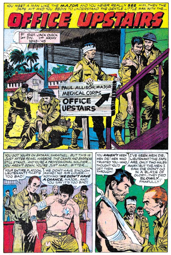
Foxhole #3, “Office Upstairs” by Bob McCarty

A story about the Death March and the prison camp is not something you would expect in a comic book which at that time was aimed at young readers. But the story “Office Upstairs” is a small masterpiece. The “hook” for the Foxhole title was that it was produced by veterans. This story has a box saying that it was by Jack Oleck. Jack was Simon and Kirby’s main writer and Joe’s brother-in-law. Since writing credits were not generally given in S&K productions, these Foxhole issues are real treasures. Although there is no credit for the art it appears to be the work of Bob McCarty. Bob generally did not sign his work for S&K, but because he was a veteran Foxhole gives him credit in some other stories.

Foxhole #3
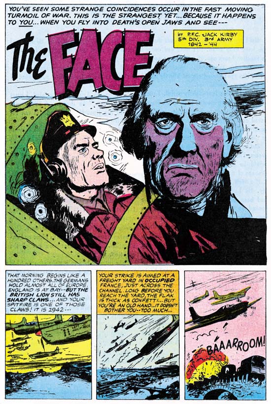
Foxhole #3, “The Face” by John Prentice

This issue provides yet another writing credit, this time by Jack Kirby. Another gem of a story. This time it was drawn by John Prentice, one of my usual suspects (artists who did frequent work for Simon and Kirby). John did some other work in the Foxhole series but surprisingly never was given credit. This is surprising because not only was Prentice a veteran, he was at Pearl Harbor when the Japanese attacked.

UPDATE (2/18/07): My attribution here of “The Face” to John Prentice is incorrect. The proper identification of the artist is Joe Albistur.

Simon and Kirby Cover Contest

Imagine throwing a party and no one came. That is sort of how my Simon and Kirby Cover Contest is progressing. Very few people have entered their favorite Simon and Kirby cover to try to win a color printed signed by Joe Simon. Although I am a bit surprise at the underwhelming response it really does not bother me. I am used to a rather small audience. And I am sure those who have entered will be pleased. Unless there is a flood of late entries (you have until Wednesday to enter) the odds of winning approach near certainty. If you are interested in entering, see my previous post to learn what you have to do, it will cost you nothing.

The Human Torch #2

I do not think I will surprise anyone by observing that the early Timely comics are high price items, particularly the key issues. There are probably very few, if any, comic book collectors who can afford to purchase complete runs of early Timely comics. That is why I am grateful that Marvel has reprinted some of them in their Marvel Masterworks Golden Age series. I would like my readers to always keep this in mind as I write some negative criticism on one of these books, The Human Torch Volume 1.

Human Torch #2
The Human Torch #2 (Fall 1940) “The Strange Case of the Bloodless Corpses” by Joe Simon

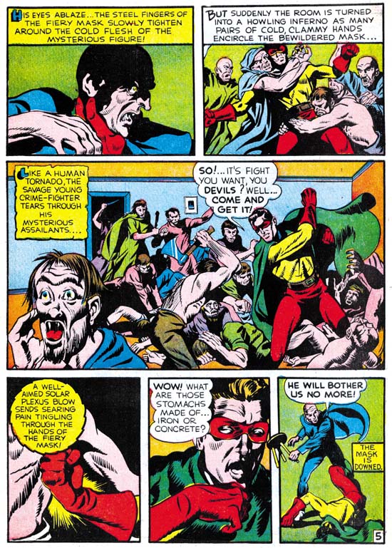
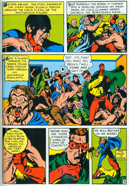
I have recently been able to scan a coverless but not too beat-up copy of Human Torch #2. That is actually the first issue for that title as it took over the numbering from the defunct Red Raven Comics #1. Seeing the original comic was a revelation. In Chapter 2, “Before Kirby” of my serial post on The Art of Joe Simon I discussed the Fiery Mask story by Joe Simon. I included an image of page 5 scanned from the Masterwork book. You can see the image I used below. I have since replaced it with a scan from the original comic, which you can see above. Take the time to compare the two images. Even with the relatively low resolution that is needed to include in this blog page it should be pretty obvious the difference in quality. The reprint version looks rather blurry. Because of the glossy paper used and the modern printing technology this cannot be blamed on the printing. Rather it looks like it was re-inked with an insensitive hand. Joe did a much better job inking this story then you could tell from the reprint.

Hunan Torch #2
The Human Torch #2 (Fall 1940) same page as above as reprinted in Marvel Masterworks.

Simon’s story was not the only story to be adversely affected by the poor art restoration. Actually all the features in this comic look so much better in the original. Colors in Golden Age comics just can not compare with what modern presses can produced. Yet the colors in this reprint are actually inferior to the original.

Hunan Torch #2
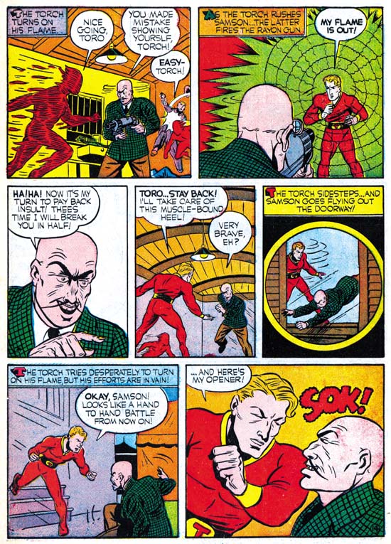
The Human Torch #2 (Fall 1940) “Introducing Toro, The Flaming Torch Kid” by Carl Burgos

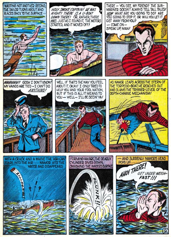
I could not resist including an image by Carl Burgos. Not because it shows how much better the original art was, since the reprint’s job on this page was better then most. I include it because it is such an great example of Carl’s excellence at telling the story. His progressing from the entrance of the Human Torch, the weapon removing his flame, the villain issuing his threat to the now disarmed hero, and ending with the Torch showing what he can do with his intelligence and courage. The only problem I have with this page is the awkward use of the circular panel. In a few months Simon and Kirby would show the right way to use this device.

Hunan Torch #2
The Human Torch #2 (Fall 1940) “Sub-Mariner Crashes New York Again” by Bill Everett
Enlarged Image

Sometimes the differences between a masterpiece and a more routine piece of art is actually very small. When I originally read Everett’s Sub-Mariner story in the Masterwork volume I was not very impressed. Do not get me wrong, you could tell Everett was doing a great story telling job. But the art itself did not do much for me. In my opinion none of the stories in this comic suffered as much as Everett’s from the reprint. The reprint inking was not any worst in Sub-Mariner but it completely masks what a masterpiece this story really is. Even the image I provide above does not do it justice, but I hope you can get a better idea from the enlarged image.

I am not able to compare the reprint with the original for the other issues in the Masterpiece volume. But it sure looks like they suffer from the same problems. I want to repeat what I said above, that even in the current somewhat poor restoration this Masterwork volume is a welcome addition to a fan’s library. But it is a shame that Marvel missed a chance to provide a volume that could have been absolutely amazing.

Featured Cover, Strange World of Your Dreams #2

Strange World of Your Dreams #1
Strange World of Your Dreams #1 (August 1952)

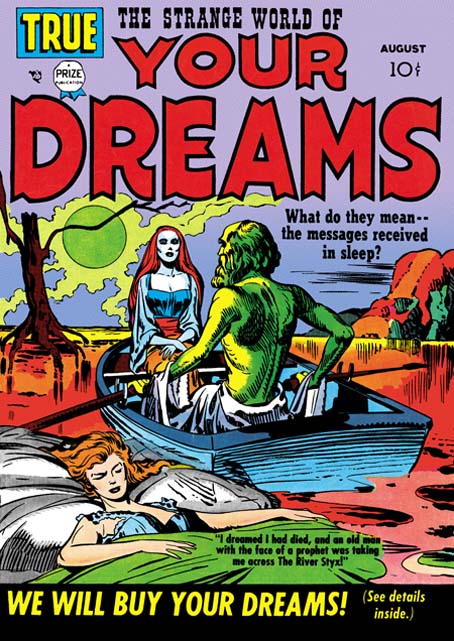
I had a brief discussion with someone at the Big Apple Con yesterday. He mentioned a Kirby cover of a woman in a rowboat and suggested a name of the comic. Neither the comic name or the image rang any bells with me at first. Then I thought perhaps he was thinking of Strange World of Your Dreams #1. I suggested he visit my blog because I had posted on SWYD and thought I had included the cover for issue #1. When I finally got around to check it turned out I that in the post I had used SWYD #3 instead. So in case the gentleman decides to check my blog out here is the cover for SWYD #1.

As I said I have already posted on Strange World of Your Dreams. This title is as unusual as its name but unfortunately the comics themselves are a bit expensive. For anyone with a more limited budget who is curious about this title you might want to check out DC’s Black Magic #8 and #9 which reprint a few stories:

  • BM #8 “The Girl In The Grave” (from SWYD #2)
  • BM #8 “Send Us Your Dreams” (from SWYD #2)
  • BM #9 “The Woman In The Tower” (from SWYD #3)

These were published in 1975 and can still be found at a reasonable fee at comic conventions and eBay. As I have said before, I have mixed feelings about DC’s Black Magic. On the one hand it is great that some of these stories were reprinted. But unfortunately the artwork restoration looses some of the special inking quality of the original comics and gives them a sort of woodcut look. The three SWYD stories that were reprinted are good selections. “The Woman In The Tower” is not only the best in the original series, it is also one of Simon and Kirby’s most unusual stories ever.

Comic Book Creator, Joe Simon

Comic Book Creators, Joe Simon

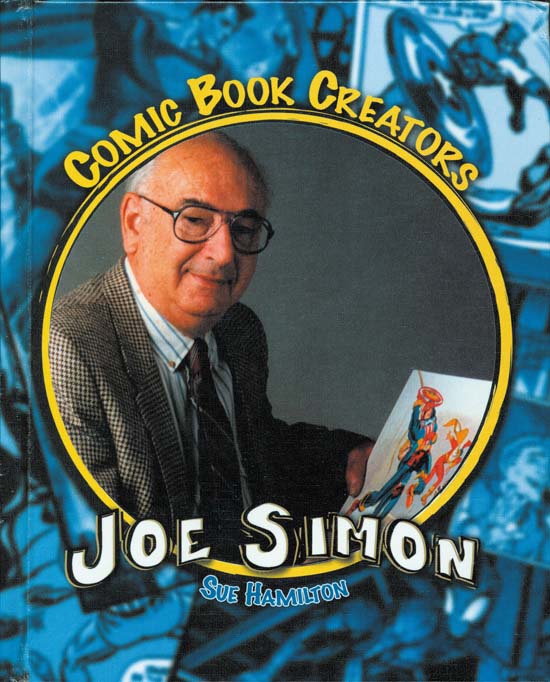
I recieved a copy of “Comic Book Creators, Joe Simon” by Sue Hamilton. I mentioned this book in an earlier post. It is of six books on different comic book artists. The others are Jack Kirby, Stan Lee, John Buscema, John Romita and Joe Sinnott. I am told that these books are meant for “accelerated readers”. I believe this means that thy are expected to be young but advanced readers for their age (perhaps 10 to 12 years old).

This is a thin book, 32 pages including index and glossary. It outlines Joe’s career from its start until today. Much of this history is covered by “The Comic Book Makers” by Joe Simon and Jim Simon. Actually I am sure Joe’s book was the source of the biography presented by Sue Hamilton. So I do not think there is any historical information that adult reader would get from this book that they would not be found (with a good deal more) in “The Comic Book Makers”. There are a number of excellant photographs. Again most of these photos can be found in Joe’s book. But the printing for Hamilton’s book is really excellant and the resulting quality of the photos is much better then those in “The Comic Book Makers”. There are some that have not appeared in print before. My favorite is one of a 16 year old Joe Simon drawing a portrait.

I did get a chance to examine the other five volumes in this series. Their quality and content matches that of the Simon volume. Fans of the other artists might consider buying their volumes for the photographs alone. I intend to pick up the Jack Kirby and Stan Lee volumes.