Category Archives: 2007/06

Kirby Inkers, Marvin Stein

I have written about Kirby inking Kirby, but what about Jack’s other inkers? Scholars of the Silver Age have it comparatively easy, many of Jack’s inkers are actually given credit. This provides a head start even in those cases where no inking credits are given. But in the Simon and Kirby years no inking credits were ever provided. Fortunately most S&K studio artists inked their own work. Therefore examining the work by the studio artists can give insight into what to look for in order to determine if they also were Kirby’s inkers.

I am going to start with Marvin Stein. What I am going to say about Marvin is pretty preliminary. I really have not studied Stein as an artist as much as I have other who had worked for Simon and Kirby. This is probably because I have mixed feelings about Marvin’s art. On the positive side Stein was often good at depicting action. However some of his drawing seems a bit crude.

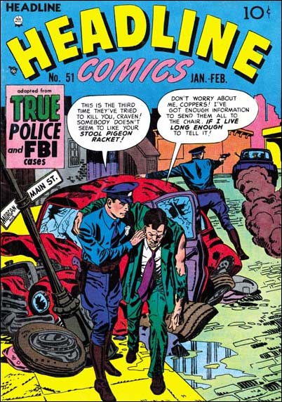
Marvin Stein starts showing up in Simon and Kirby productions in 1951. Not long after his appearance there seems to have been a change in the production of Headline and Justice Traps the Guilty, two crime titles that S&K had created. Well actually Headline had existed before S&K but was not a more general anthology, it was S&K who converted the title to crime. The postal statement for Headline #46 (March 1951) lists Nevin Fiddler as the editor. About that time the artists for both crime titles changed and Jack Kirby work would no longer appear. Marvin Stein would become a prominent part in the new Prize crime issues. Stein did almost all the covers and usually the first story. It was not that unusual for Stein to provide a second story as well.


Headline #51 (Jan 1952) art by Marvin Stein

There is a photograph that indicates that Marvin worked at the Simon and Kirby studio at one time. Certainly he was greatly influenced by Jack Kirby, particularly in the portrayal of action. But Stein did not pick up any of the typical S&K studio inking. Missing from Marvin’s own work are things like picket fence brush work, abstract arch shadows or shoulder blots (see the inking glossary). Stein did occasionally use something like drop strings.

Justice Traps the Guilty #88
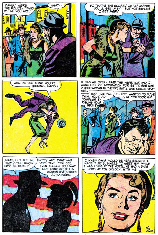
Justice Traps The Guilty #88 (August 1957) “The Spoilers” page 7, art by Marvin Stein

The above image is a typical page of Stein pencils and inking. Marvin’s brushwork tended to be rather blunt. This can be very apparent when the faces are of a smaller size, as for instance in panels 1, 2 and 4. A blunt brush work can even be seen in closer faces as in the criminal in panel 4. Stein often would use very broad cloth folds that seem slightly bent at about the middle of their length as seen on the man in the foreground in the first panel. Cloth folds often have ends that stop abruptly at a right angle (as in the first panel) or a slight angle (there are a couple examples on the man in the second panel). Form and shingle lines are often quite robust. Although not apparent in the image above, Marvin would sometimes make long and simple eyebrows. These eyebrows can resemble those by Bill Draut.

Justice Traps the Guilty #91
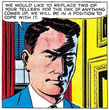
Justice Traps the Guilty #91 (February 1958) “Power Failure” page 4 panel 5, art by Marvin Stein

Occasionally Marvin would like to depict faces with a sort of negative highlight, as in the image above. This is done with diagonal brush work and like so much of Stein’s inking in a rather crude manner.

Young Romance #93
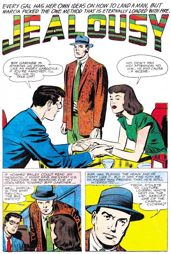
Young Romance #93 (April 1958) “Jealousy”, pencils by Jack Kirby, inks by Marvin Stein

Among Jack Kirby’s late Prize romance art is one story, “Jealousy”, where the spotting for the facial features is rather blunt. The facial inking looks so much like Marvin Stein’s that I am certain he was Jack’s inker. Note the final panel where the man’s right eyebrow is extended into a crease above the nose. This is a characteristic often seen in Stein’s own art, for instance panel 3 from the Justice Traps the Guilty #88 page I showed earlier. Surprisingly the spotting other then for the faces in this story seems more carefully done then is typical for Stein.

This blunt treatment of facial features does not seem to occur in inking for any other of Kirby’s work for Prize. But otherwise similar spotting can be found in the inking of a number of Kirby stories. Could it be that Marvin Stein used greater care when inking for Kirby then he did on his own work? Depending on the answer to that question, Stein could have been a frequent inker of Kirby or a rare one.

Showcase #6
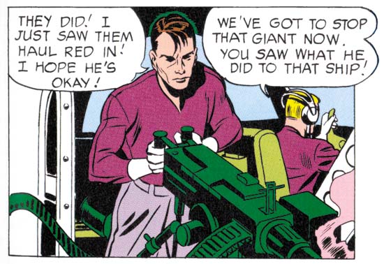
Showcase #6 (February 1957) “The Secrets of the Sorcerer’s Box”, page 6, panel 3, pencils by Jack Kirby, inks by Marvin Stein (from DC Archive edition)

When I wrote the DC chapter to “Jack Kirby Austere Inking” I was hampered by my limited access to the work. I am still not ready for a more thorough evaluation of Jack’s DC period but I have gone back over it with Marvin Stein fresh in my mind. Previous I attributed the inking to the initial Challengers of the Unknown stories to Jack. With my latest review I find a number of examples of inking that look like Stein’s work. Take a look at the face in the panel image I provide above, it has Stein’s blunt brushwork style. Also note that a couple of the cloth folds have the slightly off right angle ends that Stein prefers. There is still inking in the first two Showcase issues that look like Kirby’s brush. The red giant in “Dragon Seed” from Showcase #6 seem much better done then I have every seen Stein do. Also the second page from Showcase #7 with its scenes of the Challenger members doing various daring deeds. The problem is that Stein’s blunt brushwork is rather similar to Jack’s Austere style. I now suspect that most of the inking for Showcase #6 and 7 was actually done by Stein with Kirby doing the more difficult parts and perhaps touching up Marvin’s work as well.

Challengers of the Unknown #3
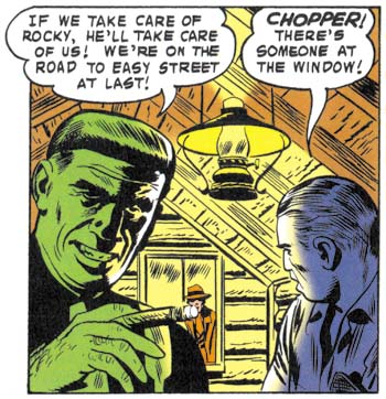
Challengers of the Unknown #3 (August 1958) “The Menace of the Invincible Challenger”, page 10, panel 2, pencils by Jack Kirby, inks by Marvin Stein (from DC Archive edition)

Marvin Stein did some of the inking for later Challenger stories also. The image above from COTU #3 has the same shadow highlights we saw before from Stein’s crime work. But these later inking differ from Showcase #6 and #7 in that Jack Kirby does not seem to have taken a hand in any of the spotting.

I have added a checklist for Marvin Stein, which like all my checklists are works in progress. However a checklist of Stein’s inking Kirby will have to wait, at least until I have reviewed some of the other Kirby inkers.

Rewrite!

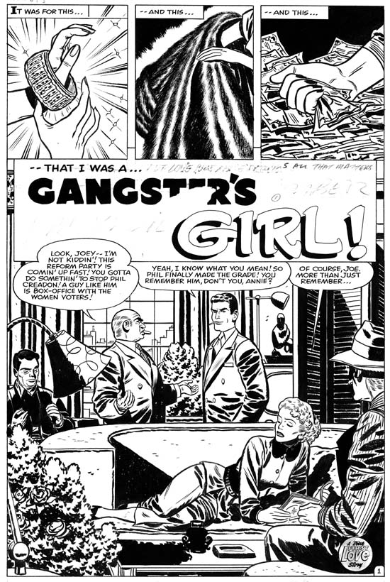
First Love #69
Gangster’s Girl” original art by Bill Draut published in First Love #69 (October 1956) as “Remember, I’m Your Girl”

We are on location for the filming of a television drama. Suddenly someone taps the director on his shoulder and hands him a cell phone. We cannot make out the conversation but it is obvious the the director is very unhappy. He gives the phone back to his assistant and then calls out “Get the author, we have to do a rewrite”.

Well I do not know how often this sort of thing happens but I have heard of various movies under going a series of rewriting of the script. In the comic book industry of the 50’s such rewrites were very unusual. Sure a word here or there would be changed or some art editing performed, but generally the story was published as it was originally scripted. With a product that was sold for ten cents and with smaller print runs, care was taken to avoid waste when producing the comic. The most frequent reason for comic book rewrites resulted when a title was cancelled. Because the art was created well before publication, a cancelled title would often result art in various stages of work including some that was fully complete. Such art might have to be rewritten in order to publish it in some other title. But baring recycled art, it was unusual for a comic book story to be extensively rewritten.

Not too long ago I posted on a Bill Draut story “Remember, I’m Your Girl”. Shortly after my blogging on it some of my readers pointed out to me that the art for the story was up for sale on eBay. However the image on the eBay listing showed the story title was “Gangster’s Girl”. I was intrigue and although I felt the art was not the best that Bill Draut had done, I put in what turned out to be the winning bid.

Also included with the art that I received was the text paste-ups that had come off or been removed. I did not think much about the paste-ups at the time because I thought they would just be the text as it was finally published. Later I would find I was wrong. Like most of the art for S&K productions, there was little on the margins except for a few production instructions. However you could tell that that was not always the case because an eraser had been used on the margins. So I scanned the art and did some processing in Photoshop. This allowed me to bring out some of the erased pencils. I also did some work to bring out the color blue because some blue pencil markings had also been erased. Armed with the original art, the paste-ups and enhanced scans I could do an analysis as if I was some sort of comic book archeologist. I can now outline the steps in the process of converting the story from the original “Gangster’s Girl” to “Remember, I’m Your Girl”.

The Photoshop enhancements did bring out some erased pencils that probably date from the when the art was first produced. Inside some of the captions and balloons there can be seen some of the text in pencil. It was standard for the S&K shop to have all the text placed on the art before the final lettering was done. I am not clear on whether the penciling of the text was done before the art was penciled, or if it was done by the penciler or the letterer. Also from the original state of the art, each page had in pencil the story title on the upper left and Bill Draut’s address on the upper right margin. The handwriting seems the same for the two, and I suspect that it was Bill’s but I have nothing to compare it with.

The original art no longer has any of the paste-ups still attached. This meant that the original story could be read in full. The only exception was that one word balloon had been inked over. But by viewing the art at an angle the pencils show up and it was possible to read the original text.

The story is a love triangle between Joe (a gangster), Annie (the love interest) and Phil (former friend). Phil’s running for election on a clean up campaign is a clear threat to Joe. Joe asks Annie to get close to Phil in order to find weaknesses, overcoming her reluctance with expensive presents. Annie stages a meeting with Phil and a romance ensues. Phil looses the election but Annie says she will stay with him. During a confrontation between Joe and Phil, Joe shows Annie one of his presents, a mink coat. Enticed by Joe’s rich presents, Annie decides to stay with Joe.

That is right, in the end the gangster gets the girl. This has got to be the most unusual story from a romance comic that I have ever read. Not only that, it is probably the best. My story outline does not give it justice, in particularly how Annie’s weakness is portrayed. But this story was published in 1956. Who in their right mind would think that this story could get Comic Code approval? I do not know how to explain this lapse. Perhaps it was actually produced before the Comic Code but had somehow never been used.

Well someone realized that the story would have to be altered if it was to be published. So the first rewrite was performed. That is right, there were actually three versions of the story. For the second story Joe became a big businessman. All the details of the second story cannot be reconstructed. It is not clear whether Joe still uses expensive gifts to get Annie to spy on Phil, or if instead the final version of the plot was used. Fortunately the end can be reconstructed and surprising Joe still gets Annie in the end. Only it is not the expensive gifts that changes her mind, it is the fact that she detects that Phil does not trust her enough to reject those gifts. The confrontation has made Joe realize his own failings, he decides to marry Annie and changes his ways.
First Love #69
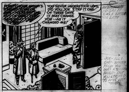
Page 4 editing changes for the first rewrite from the Photoshop enhanced scans.

A lot of text had to be changed in the rewrite. First a pencil was scribbled over whatever was going to be replaced. Then the new version was written in pencil generally in the margins but for small changes it might be done nearer. The above image of the Photoshop enhanced image shows an example from page 4. In the lower right is the new text for the second balloon:

JOE – ALL I EVER WANTED FROM YOU WAS A TENDER WORD. BUT YOU SEEMED TO HAVE LOST THEM.

This rewrite was only used for the second story, the third story reverted back to the original script. That is why the pencils scribbling over the second balloon are lighter then those for the first balloon. The second balloon scribbling was erased and are hardly visible on the art without Photoshop adjustment.
First Love #69
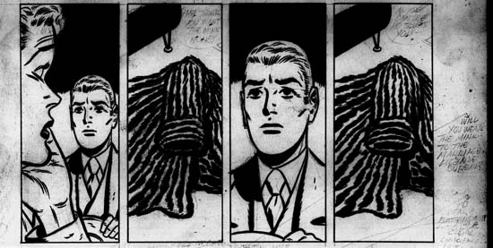
Page 5 from the Photoshoped enhanced scans.

The final page had a very effective series of panels showing Annie trying to make her final choice. In all versions of the story this appears to have been without any text. But the enhanced scans show that for a time word balloons were considered. The one in the second panels says:

PHIL THINKS YOU WANT THE MINK HONEY

The last has:

ANYONE CAN SEE HE TRUSTS YOU —

Since both statements deal with trust I believe these changes were considered for the second version of the story where Phil’s lack of trust causes Annie to choose Joe. But thankfully this version did not make it into the second story and was never inked. This set of panel “speaks much loader” without the use of any words.

The margin rewrites look to me to be in Joe Simon’s hand writing. But to be sure I will be showing them to Joe on my next visit to see what he thinks.
First Love #69
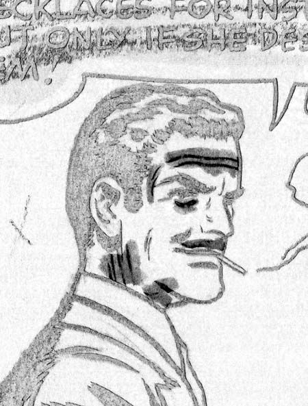
Close-up from page 2 filtered for blue.

The rewrite was done in a way that not much art had to be altered. A classic technique used to change art is the use of whiteout. Here there is not a lot of use of whiteout in the art. You can tell that some whiteout was used by Draut because the inking over it is his. That particular whiteout use had nothing to do with the rewrite. Whiteout was also used on Joe’s face and this does seem related to the rewrite because it was not re-inked. Of course the whiteout obscures the art that has been changed but the filtering for blue in Photoshop sometimes allows us to see through the whiteout. As can be seen in the example above Joe originally had wrinkles, jowls and a mustache. As a powerful gangster Joe was older because the appeal he had for Annie was based solely on his money. The whiteout changes were done to make him younger.
First Love #69
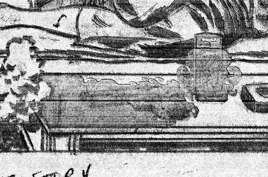
Close-up from bottom of page 1 filtered for blue.

When I examined the art I found a couple of spots that were inked by another artist. For example in the foreground of the splash panel there is a table with a funny shadow and an unusual vase-like object. By looking at an angle at the art I could see the original pencils. Unfortunately I cannot scan at an angle but I found that further manipulation of the blue filtered scan sometimes brings out the pencils to a certain degree. In the image above you can see that the shadow hides a gun laying on the table and that the vase-like object was originally a glass. Drinking and the use of guns is appropriate for a gangster, but not for a business man, even a shady one. The Comic Code was very sensitive to anything that might “corrupt” the morals of the young readers. Similar re-inking hides guns a couple other places in the story.
First Love #69
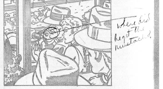
Close-up from page 3 filtered for blue

With the art changes made and the altered scripts pasted into their proper places, the second version of the story was ready to go. The next individual to work on the story used blue pencil to indicate certain changes. ‘X’s were placed in the margins at certain spots and other editing marks were made. These marks are all somewhat cryptic because for the most part they are not accompanied with any remarks. This blue penciling was done after the first rewrite because in some places it extends over the paste-ups. Once it even indicated a change to be made on a paste-up. Interestingly not all the changes indicated by the blue pencils were ever made. One is shown in the image above. There a circle was made around Joe connecting to a comment

where did he get the mustache?

Sure enough this was the one place that whiteout had not been used to remove Joe’s original mustache. But for some reason this was never corrected.
First Love #69
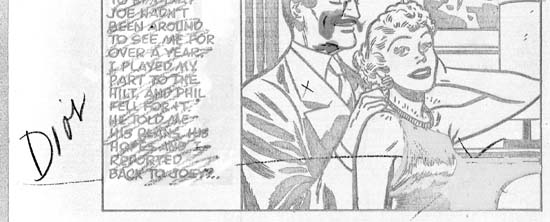
Close-up from page 3 filtered for blue.

On the third page the art had a blue pencil notation leading to an area with an ‘X’ (see above image). Again looking at an angle I could make out the original pencils. In this case the pencils showed a part of Annie’s anatomy that, let us just say, normally would not be visible with her dress on. I have heard of artists fooling around like that but I think we can be pretty confident that this was not included in the inked version and therefore was not the problem. But there is an indication that perhaps Annie was shown more busty then desirable for the Comic Code. Rather then whiting it out and re-inking, the area was just filled with black so that Annie’s profile was no longer distinguishable.

The way the blue pencil was used leads me to believe that the art had been presented to someone at Harvey for approval. In his book, “The Comic Book Makers”, Joe describes presenting Silver Spider to Leon Harvey, so perhaps Leon was responsible for the blue pencils in “Remember, I’m Your Girl”. In any case I suspect all the blue ‘X’s indicated that the second version of the story had not gone far enough. This resulted in the second rewrite.

In the third and final version of the story Joe becomes Annie’s brother and now became a shady politician. Of course all mention of a romantic connection or marriage between the two had to be removed. I am not sure what type of person Annie was in the second version, but in the final she is clearly given a more moral character. Although she accepts gifts from Joe she refuses to arrange to spy on Phil. But fate intervenes with an accidental meeting between Annie and Phil after which the story continues pretty much as before. However in the final confrontation Annie goes off with Phil leaving Joe all alone.

The same person who did the first rewrite did the second one as well. And the same technique of writing the altered version in the margins was used. Some of these new notes were done over erased portions of previous notations. This not only made it impossible to read large portions of the earlier versions, but some portions of the latest are hard to make out as well.
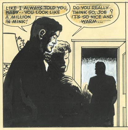
First Love #69
Page 5 final art panel from a normal scan of the original art.

Most of the art changes were done with the first rewrite. An exception is the art for the last panel was dramatically changed for the last version. The two foreground figures are now shown largely as silhouettes. However a careful examination of the inking shows that this was not always the case, some of the original spotting can be made out on the original (but not in the image I supply). The doorway was also modified. Whiteout has been used to cover up a dark background that original extended much further down the doorway. The background figure is a silhouette as well, but I wonder if it was originally. Regrettably it is not possible to detect any original spotting or pencils. These changes were made because in the last version of the story Phil, not Joe, gets the girl. The making of the foreground figures as silhouettes was done because originally Annie was wearing her mink coat. The change in the background was done to change the original looser Phil into Joe, a silhouette being easier to do then a full re-inking.

The story ends with a vertical caption. Because all the different versions of the story had unique endings, this caption was changed for each of the rewrites. Fortunately when the second rewrite was done the paste-up from the first rewrite was peeled off, flipped over and reused. Therefore all versions of the final caption have been preserved. These are the endings in the order that they were written.

OKAY… SO I SOLD MYSELF… CHEAP! I LOVED PHIL… BUT I LOVED JOEY’S MONEY MORE! SO WHAT? LOVE ISN’T THE MOST IMPORTANT THING IN THE WORLD IS IT? BUT I WONDER WHY SOMETIMES, IN THE NIGHT I CRY…

PHIL HAD MADE UP MY MIND FOR ME– EXPECTING ME TO TAKE JOE’S MINK COAT. HE HAD EVERY SHINING QUALITY– EXCEPT TRUST! I WAS GLAD I CHOOSE JOE. HE KEPT HIS PROMISE. HE LEARNED TO BE TENDER!

JOE WAS ALONE, NOW– WITHOUT FRIENDS OR FAMILY! THE FUTURE WAS UP TO HIM– HE COULD WALK TO HIS DOOM DOWN THE SIDE STREETS OF SHADY POLITICS OR WALK INTO THE SUNLIGHT WITH HIS HEAD HIGH– AS I HAD!

The story line for the last two versions are not nearly as good as the first. That is just the nature what had to be done to alter the story so that it could get Comic Code approval. When you keep that in mind, the rewrites are impressive particularly since they required only limited changes to the art.
A New Book, The Marvel Vault

During a visit with Joe Simon, I had the pleasure of looking at an advance copy of a new book called “The Marvel Vault: A Museum-in-a-book With Rare Collectables from the World of Marvel” by Roy Thomas and Peter Sanderson. Here is a link to it in Amazon. They list it as available on October 8, 2007. It is an unusual book, to say the least. It is hardcover but is more like a spiral notebook then a regular book. Some plastic pages are included among the regular paper ones. These plastic pages have pouches that include reproductions of various items. I did not look at them all but one group that I did look through were a pile of reproduction of golden age sketches. I cannot say I care for the paper they were printed on, it is much too brown for my taste. But the printing quality and the sketches themselves are just marvelous (pun intended). I remember great stuff by Bill Everett and Carl Burgos, perhaps other artists were represented as well.

The book covers Marvel’s entire history, including the Timely and Atlas periods. So of course there is a lot of Jack Kirby. Joe Simon is in it as well in what is my favorite photograph of him. It shows Joe at his drawing board, talking on the phone and smoking a cigar. (I guess I better add something for in the spirit of full disclosure, I digitally restored the photograph and the books gives me credit along with Joe for supplying it.)

I only spent about five minutes looking at it so I am not able to provide an in depth review. Or to comment about the accuracy of the history the book provides. But I did see a lot of interesting stuff and I heartedly recommend anybody interested in history of comic books to check it out when it is released.

The Fly, A Case Study of Swiping

“Swipe” is a rather unusual term which in my dictionary is defined as a slang for to steal or pilfer. It has also found use in discussions about comic books as a term for copying. Considering its original slang usage it is not surprising that the word has a very derogatory association in comics. Other art studies, including the fine arts, do not use the term. That is not to say that activities equivalent to swiping do not occur, it is that more neutral words are used to describe those activities. The word swipe is so entrenched in the discussions about comic book art that I that I continue to use it. But I do not share the disapproval that most have who use this term. Swiping was common in comic book arts, actually in all the arts. Even Jack Kirby has been shown to swipe.

The first four issues of the Adventures of the Fly provides some good examples of various types of swiping that could be done. Some call this a Simon and Kirby title, but it seems to me that Simon was really the driving force. Joe brought together artists other then Jack to work on the books. In fact Jack’s involvement was less then what some people thought because of the use of swipes.

Adventures of the Fly #1
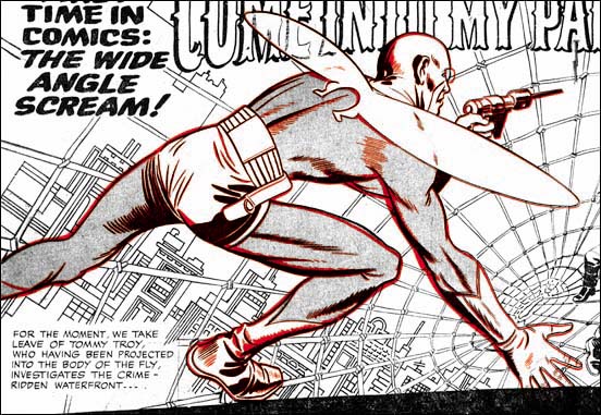
Adventures of the Fly #1 (August 1959) pencils by Jack Kirby (splash art in black, cover art line art in red)

The four Fly covers only provide an interesting assortment of Joe’s working method. The cover for issue #1 is not really a swipe. Included in the story art that Jack did for the Fly #1 was a double page splash. The cover is basically parts taken from the splash and rearranged somewhat to fit the narrower proportions of the cover. It is possible to overlay the line art of the Fly from the cover and the splash with good accuracy. That is not to say you get perfect alignment between the two. In the overlay image I provide above I was as careful as possible in adjusting the size and angle of the images. I was able to get good agreement between the two in the area of the Fly’s head and foot. But look closely at his right hand and you will see they deviate slightly. Actually this is to be expected considering the various equipment used. I have often overlaid original art or proofs of line art over the published cover and have never seen one that could be perfectly aligned in all parts. The alignment in this case is especially good so I have little doubt that stats taken of the splash was used to assemble the cover. Since some of the fine spotting lines are present in both the cover and the splash the stat was taken after the splash had been inked. The cover had to be prepared at about the same time as the rest of the comic, so I believe Joe had the stats made of the splash made while assembling the book. Later the printer for Archie did stats of the entire comic in preparation for publication. In this case the small difference in alignment was due to different stat cameras being used.

Adventures of the Fly #1
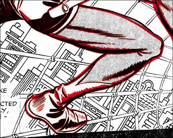
Adventures of the Fly #1 (August 1959) pencils by Jack Kirby (splash art in black, cover art line art in red)

Even though some of the fine spotting aligns well, changes were made. For instance some new spotting was added in the shoulder region. Also the outlines were strengthen, often significantly, is some areas. This was not simply a retracing of the outline. By shifting the wider ink lines the form would be exaggerated in some places and subdued in others. There are two areas where the newly inked lines deviated significantly. One is the upper line for the right thigh as it approaches the knee. The cover version is more tapered while the splash has more of a bulge. The other change made was to the Fly’s goggles which were made more prominent on the cover.

I cannot prove it, but this entire process used to create the cover suggests to me that it was done by Joe Simon. When you consider how wide the splash was compared to the cover it is amazing how well the cover composition works. As for the inking alterations that is the sort of thing I have seen Joe often do today. When he wants to make a reduced copy of some art where the original is too large for his copier Joe copies it in pieces and then reassembles reduced sized parts. This often leaves lines where the parts were joined which Joe will retouch. But frequently he also proceeds to retouch the art on the copy as well. This is what I believed happened to the cover. For me most of the changes made greatly improved the art. The one exception is the tapering to the upper thigh. I feel the bulging in the splash is more appropriately as it makes it seem that the Fly is about to spring into action. If I am right that Joe re-inked the cover, then I doubt that he was the inker for the splash or the rest of the story.
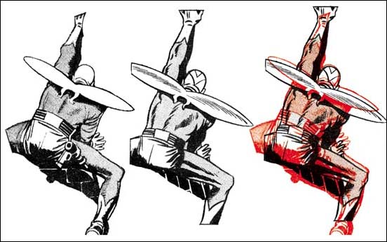
SwipeFly2Cap7.jpg
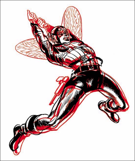
Overlay of figures from Adventures of the Fly #2 (September 1959) in red and Captain America #7 (October 1941) in black.

Many have recognized the fact that the swinging Fly on the cover of issue #2 was swiped from the cover of Captain America #7 (October 1941). When I produced the above overlay I found that a good alignment simply could not be done. So I aligned the top of the heads and an approximation of the figures left foot. This provided pretty good alignment for the torso. I will not provide a line by line description of the differences, there just are too many. Cap and the Fly figures are dissimilar both at the small and the large scales. As an example of a large scale note how the Fly’s right leg is further forward then Cap’s. For the other scale compare the figures’ right (as drawn this would also be the lower) outline to the torso. For one thing Cap had an indent to delimit the shoulder that is completely absent of the Fly. Of special interest is the figures’ left thigh. Cap’s has a distinct bulge to the upper part leading into a comparatively thinner region just above the knee. On the other hand the Fly’s thigh is more evenly tapered. This is the same sort of alteration that had been made to the cover of Adventures of the Fly #1, an indication that both may have been done by the same artist. With all the differences between the swipe and the source it is clear to me that the Fly for the cover was not done using a stat or any other mechanical copying device. However in my opinion there are way too many similarities for the Fly #2 to be based on just a remembrance of the Cap #7 cover. No the Fly figure was done by freehand copied from the Cap #7 cover. Joe has since used the pose on a number of occasions, although not as far as I know for a published comic. So once again I attribute this work for this to Joe Simon.

Adventures of the Fly #3 &  Black Hood #9
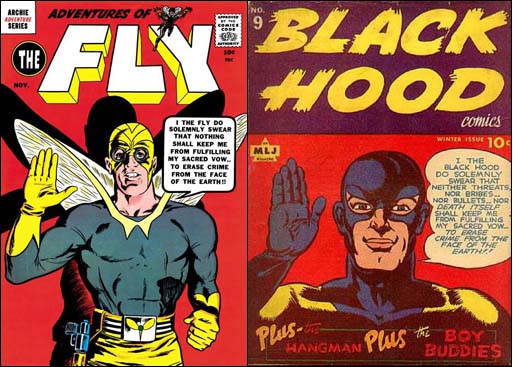
Adventures of the Fly #3 (November 1959) art by Joe Simon and Black Hood #9 (Winter 1943) [the Black Hood #9 image is from the Grand Comic Book Database (GCD)]

When I previously wrote about the cover for the Adventures of the Fly #3 Scotty Moore left a comment pointing out the similarity to the cover for Black Hood #9. Not only is the pose pretty much the same but both take an almost identical oath. It is hard to believe that the relationship between the two is just a coincidence. Particularly since Black Hood title had been published by the same company as the Fly. Although the pose and concept was swiped I would hardly call the Fly a close copy. Joe once told me he did this cover using himself in a mirror as model. This does sound right because the art does look like Joe’s work.

SwipeFly4Ad88.jpg
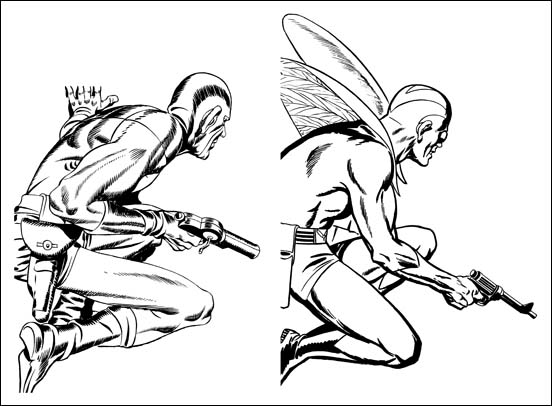
Figures from Adventure Comic #88 (October 1943) art by Jack Kirby and Adventures of the Fly #4 (January 1960) art by Joe Simon

This is another example where the figure of the Fly was obviously a swipe, in this case from Sandman on the cover of Adventure Comic #88. I provide a side-by-side image of the two figures because overlaying them would just be confusing. It can easily be seen that the Fly is not a close copy of the Sandman. Things like the positions of the limbs, details of the anatomy, and the size of the ear all have been changed. Clearly the Fly was freely drawn with the Sandman source used only as a casual reference. Both were originally shown peering through a window but Sandman had been shown squatting on flat ground while the Fly was on a slanted roof. The change in the nature of the foundation probably had a lot to do with some of the changes made.

SwipeFlyWindow.jpg
Left figure from Adventures of the Fly #1, “Come Into My Parlor” page 4 panel 1 art by Jack Kirby.
Center figure from Adventures of the Fly #4, “Duped By The Dazzler” page 5 panel 4 (rotated and flipped)
The two overlaid where red is the Kirby figure.

The Fly comics swiping is not limited to the covers. The examples I have chosen from story art both show the Fly clinging to a building wall just outside of a window. However to place them in the same pose I had to rotate the one from Fly #4 and then make a mirror image (that is flipping the image so left becomes right and visa versa). I provide an overlay of the two but it is impossible to get them to properly align. The side-by-side versions give a better idea as to what the problem is. The limb and torso proportions dramatically differ between the two. Even small details such as the angle taken by the right hand fingers in relation to the legs is not the same.

There can be no doubt that the one from Fly #4 was a freehand drawing. But who actually drew the swipe? Well although the pose was swiped from Kirby, the artist articulates the muscles very differently then Kirby did. The same way of handling the figure’s form is found in all the other drawing of the Fly from the same story and these other Fly appearances do not seem to be swiped. I have little doubt that the swiper is the same as the story artist.

There are other swipes in the first four issues of the Fly as well as in the companion book The Double Life of Private Strong. Further more then one artist was used to draw these stories and all the swipes seem to be off of Jack Kirby. Kirby was greatly admired by other comic book artists so all the artists for the Fly and the Shield used Kirby as a source to swipe. Well that seems highly unlikely, there should be a more reasonable explanation. Joe Simon has said that he provided artists with layouts. Now Joe did not say what titles he did that on but his collection still includes a layout for the Fly that Carl Burgos did. I suspect that the layouts Joe provided for the artists already included the swipes. The layouts may have been as rough as the Burgos example so Joe may also have provided copies of the Kirby source for the artist to complete the swipe from.

Jack Kirby’s Take At Imitating Bob Powell

Hi-School Romance #55
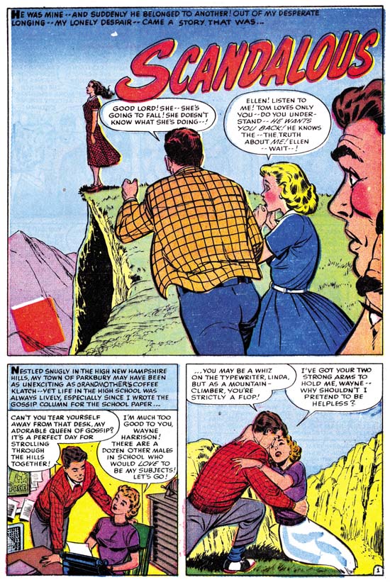
Hi-School Romance #55 (September 1956) “Scandalous” page 1, art by Bob Powell

A relationship starts between two high school students, Tom and Linda. Apparently Tom’s interest in Linda was not too strong because he begins seeing another girl, Ellen. Linda finds out about this and in an article for the school’s newspaper reports about her relationship with and love of Tom. When Ellen reads and finds that she has unknowingly come between the two, she breaks off with Tom. Tom confronts Linda and declares his love of Ellen. Realizing that Tom and Linda are meant for each other, Linda regrets what she has done. Tom and Linda go off to find Ellen and after a long search find her at the edge of a cliff. Distraught about breaking with Tom, Ellen has decided she cannot go on. Linda calls out to she regrets what she has done and Tom only loves her (Ellen). The couple re-unite for a happy ending.

This has got to be about the worse love story I have ever read. Histrionics rules all. It is bad enough that everyone’s emotions are overblown, they seem to switch to the complete opposite at a moments notice. The thing is I can imagine a young girl might actually enjoy reading this story. But for an adult male reading it fifty years later it is just painful. It is so bad that not even Bob Powell’s art can save it.

Hi-School Romance #55
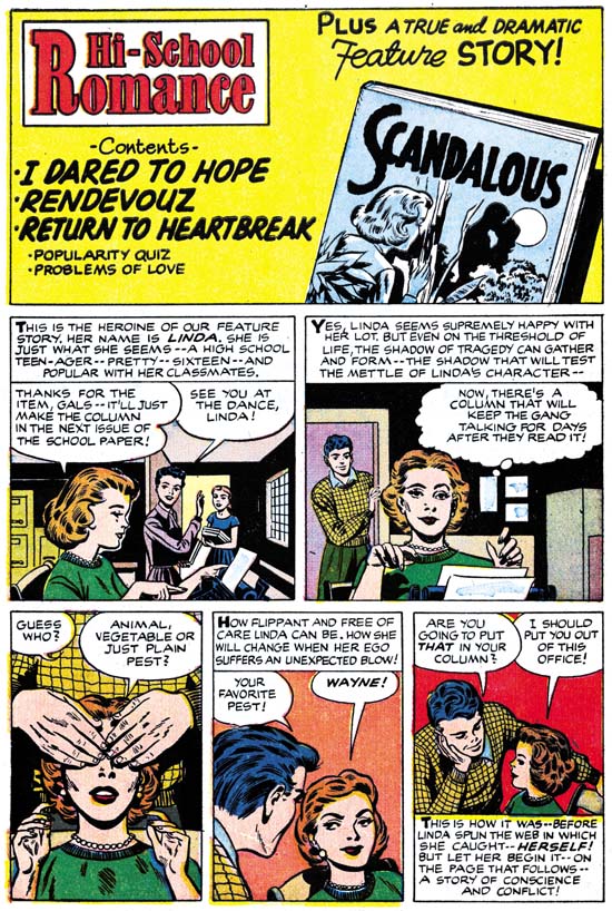
Hi-School Romance #55 (September 1956) content page, art by Jack Kirby

It seems that the harder Jack tries to imitate another artist, the more his own personal touches disappear. Not just the expected facial features but his layouts as well. Well for the contents of HSR #55 Jack hardly tried to imitate Bob Powell at all. That explains why this shows the most Kirby traits of any of the contents that I have examined so far. It is certainly the most interesting of the introduction stories. Not only is the art rather nice but the script is pretty good as well. I suspect that Jack added his own input to the writing, the exchange in the last panel seems pure Kirby to me.

Jack Kirby’s Austere Inking, A Checklist and a Glossary

While writing the serial post “Jack Kirby’s Austere Inking” I was pretty confident about all the examples of Jack’s inking that I provided unless I specifically commented otherwise. That does not mean that I am as confident with all my attributions of Kirby’s inking. None the less I have started a Kirby inking Kirby checklist. This checklist has also been added to my sidebar. Like all my checklists, it is a work in progress. Actually since I have only recently begun to be systematic about recording the inking attributions in my database the inking checklists maybe subject to even more alterations then the rest.

Anyone who dilegently compares my inking attributions to those in the Jack Kirby Checklist will find a number of disagreements. This is to be expected as inking credits were never provided during the time of Simon and Kirby’s collaboration. Further it is clear that during this time more then one inker worked on Jack’s pencils. With multiple inkers and no documentation I think I can safely say that there will never be a Kirby inker checklist that all Simon and Kirby scholars will completely agree with. Still not all is hopeless and there is much to be gained by providing those inking attributions that we can.

I have also added to the pages sidebar a glossary for the terms that I use to describe different brush techniques. I look upon such terms only as an imperfect aid in discussions. Neither Jack Kirby nor any of his inkers followed a strickly regimented approach. There will always be spotting that does not quite fit any available term. Providing a new term for every variation would soon result in so many discriptors that nobody would be able to remember them all.

Jack Kirby’s Austere Inking, Chapter 1, Introduction
Jack Kirby’s Austere Inking, Chapter 2, Mainline
Jack Kirby’s Austere Inking, Chapter 3, A Lot of Romance
Jack Kirby’s Austere Inking, Chapter 4, Prize Covers
Jack Kirby’s Austere Inking, Chapter 5, Harvey
Jack Kirby’s Austere Inking, Chapter 6, Atlas
Jack Kirby’s Austere Inking, Chapter 7, DC
Jack Kirby’s Austere Inking, Chapter 8, More Harvey
Jack Kirby’s Austere Inking, Chapter 9, More Prize

other post with Kirby inking Kirby:

Strange Tale Indeed
Battleground, Jack Kirby’s Return to Atlas
Captain 3D

Joe Simon’s Turn At Imitating

All the Harvey content with introduction stories that I have posted on so far have been drawn by Jack Kirby with Joe Simon’s involvement limited to supplying a splash panel. But that was not the only formula used for creating Harvey content pages.

Hi-School Romance #56
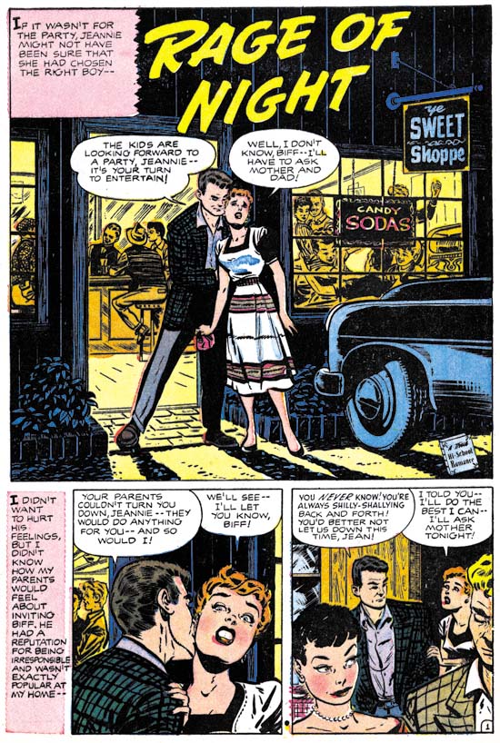
Hi-School Romance #56 (October 1956) “Rage of Night” page 1, art by Bob Powell

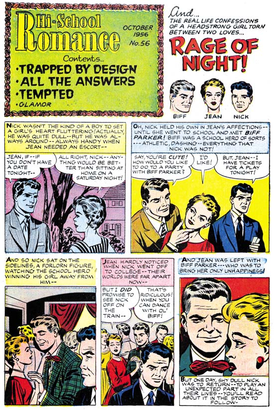
Jean’s parents did not approve of her boyfriend Biff. Biff convinces Jean to have a party at her house. Her parents will not be home and would not permit a party that included Biff without their supervision. Jean tells Biff that he cannot come to the party. Nick was a friend who went away to college but is back in town. Biff arrives at the party despite not being invited. Trouble begins which Nick helps to stop. Jean then realizes her true feeling for Nick.

Generally when I discuss Harvey romance stories I write about Bill Draut or John Prentice. After all these two artists did a lot of work for Simon and Kirby and that in turn is the subject of this blog. The truth of the matter is that most of the Harvey romance artists are not worth writing much about anyway. However Bob Powell does not deserve the same neglect. Bob was a talented artist with, at least during his earlier career, his own unique style. Unfortunately I believe he was one of the artists whose stay at Marvel had deleterious affect. Stan Lee asked his artists to use Kirby as a model of what Marvel wanted. These were not young artists just starting their careers. Rather they, like Bob Powell, had a proven track record and their own style. In trying to please Stan, Powell and others ended up surrendering too much of their own uniqueness while not gaining sufficiently from their attempts to apply Kirby’s methods.

Hi-School Romance #56
Hi-School Romance #56 (October 1956) content page, art by Joe Simon

Often it is not easy to make attributions for the Harvey content pages. That is with the exception that it is pretty easy to see that that the artist for the feature story did not do the introduction story. This introduction has a number of layouts very similar to Kirby’s. In particular the second panel with Jean and Biff in the foreground and Nick forlornly looking on in the background. But the drawing itself just does not seem Kirby to me. Now why that is may be hard to explain. It requires you to mentally delete traits that are imitations of Bob Powell. When I do this what I am left with does not look as much as Kirby’s work then the examples I previously provided for Harvey contents. What I see, once I look past the Powell imitations, remind me of Joe Simon. In this particular case there really is no reason to expect that Joe was trying to copy Kirby since Powell was really the artist to imitate. But I suspect that Simon had so often imitated or inked Jack that he just adopted some of Jack’s mannerisms. I believe the Kirby layouts we see in this contents are all second hand via Joe Simon.

Hi-School Romance #56
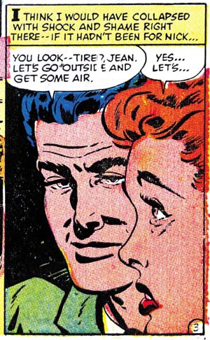
Hi-School Romance #56 (October 1956) “Rage of Night” panel 7 of page 3, art by Bob Powell

But not all the layouts look like Kirby’s. The last panel in particular would be unusual for Jack, or Joe for that matter. Jean is shown in a close profile with her chin and the back of her head cut off by the panel border. Despite Biff being behind Jean he is still brought forward. The pair of heads take up almost all of the panel. I do not think I have ever seen Jack or Joe do anything like this. But a search through the rest of Powell’s story shows that it was clearly swiped from panel 7 of page 3. Now we have already seen a Kirby swipe in a Harvey introduction story, still this sort of thing is more characteristic of Joe.

Jack Kirby’s Austere Inking, Chapter 9, More Prize

I last discussed Kirby inking for Prize in Chapter 3 (stories) and Chapter 4 (covers). Both chapters only covered 1956 with the first appearance of the Austere inking style. During that year Kirby was doing almost all the penciling for all three Prize romance titles (Young Romance, Young Love and Young Brides). At the end of 1956 Prize comics had a shake up; Young Love and Young Brides were cancelled. Young Romance remained and a new title, All For Love appeared. Simon and Kirby continued to be listed as the editors for Young Romance but All For Love was edited by Joe Genalo. Young Romance was just not the same comic. Gone were such stalwarts of the S&K studio such as Bill Draut, Mort Meskin or John Prentice. Most of the artists that did appear in YR were simply not as talented. This leads me to the conclusion that the pay scale for art had dropped and YR could not attract the same skill level.

Normally I would be picking up with Prize where I left off, that is with 1957. Although Jack provided art for Young Romance during 1957 he did not ink his own work that year. Kirby resumed inking some of his work for YR early in 1958. At this point in time Jack was no longer inking what he did for Atlas, at least as far as the work I have looked at. What inking by Jack for DC that we have examined (unfortunately an inadequate number) was done in the Austere manner, with or without pen spotting. Jack’s last job for Harvey with his own inks (Alarming Tales #3) was done just before he had resumed inking some of his Prize art. That particular piece was done in typical Austere style with some pen spotting.
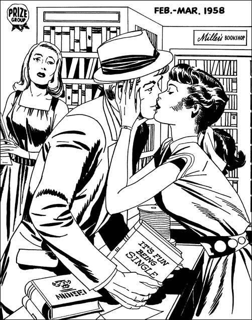
Young Romance #92
Young Romance #92 (February 1958) pencils and inks by Jack Kirby

Considering the date it not surprising to find this cover as inked in the Austere manner. An overall lightness and simple cloth folds that cluster at the shoulder and the elbow. There is one hold over from the older Studio style, the drop sting near the man’s elbow. That drop string is however made from individual drops overlapping one another to produce a sort of toothed line. This sort of brush work has been observed in other Austere inking as the preferred drop string rendition. There is one type of spotting that should be noted. It has a long history of use but I have not given note of it in my previous chapters. I think of it as shingle lines; the use of parallel lines where each is offset slightly from the others. Good examples can be found on the dress of the woman on our right. In this case I want to point out the two sets of shingle spotting just above her waste. What is special about them is that they were done using a pen. All other spotting on the page was done using a brush although some of the simple folds are done with a pen as well. Still there is nothing like the pen work we have seen on some of Jack’s inking for DC or Atlas.

Young Romance #92
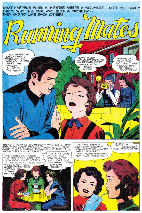
Young Romance #92 (February 1958) “Running Mates” page 1, pencils and inks by Jack Kirby

This story from the same issue is also done in the Austere manner. Is that a shoulder blot on the young man or a special feature to his shirt? I am not sure but it is certainly unusual. The man in the splash provides a better example then the cover of simple folds inked with a pen. It would appear that Kirby (or assistant) inked the outlines and folds with a pen. Those that Jack wanted to augment would be gone over with a brush. Kirby would sometimes skip brushing over some lines and so leave the penned lined unchanged.

Generally Jack would use simple spatulate shapes for some of the cloth folds. But not always as sometimes longer and narrower folds are called for as in this splash. However other pages from this story provide examples of simple spatulate folds.

Young Romance #92
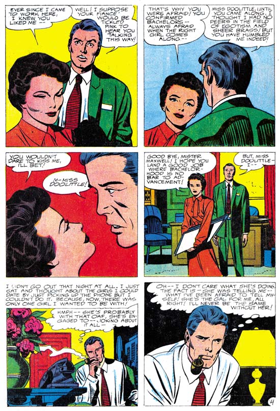
Young Romance #92 (February 1958) “The Happy Bachelor” page 4, pencils by Jack Kirby, inks by unidentified artist

I can understand some mistaking the inker for this story to be Jack himself. There are things that resemble shoulder blots. Here however they seem restricted to one side and denote a shadow. There are also some brush work that look like picket fences. I am less bothered about that lower rails are not provided then by the form of the pickets in the second panel. These pickets are bowed as well as having ends that are narrower then the middle parts. These are traits I have not found in Kirby. Of course picket fences were abandoned when the full Austere style was adopted. The thing that really bothers me about this inking are the very narrow and long folds such as found in the last panel. We saw examples of narrow folds in “Running Mates” but that story also included panels with typical spatulate shaped folds. The rest of the pages in “The Happy Bachelor” continue with the same sharp folds.

Young Romance #95
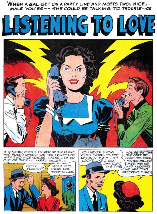
Young Romance #95 (August 1958) “Listening To Love” page 1, pencils and inks by Jack Kirby

Another good example of Kirby’s Austere inking. Spatulate shapes for folds, some folds left as simple penned lines, some black areas flooded with ink, and negative folds on the lady’s arms. One unusual feature is the use of pen crosshatching to make a transition from the upper black area to the lower light zone. I have not commented about this before but one of the unique characteristics of these late Prize version of the Austere inking is how rarely a pen is used for any spotting. But we know Jack’s inking for DC at this time has examples similar examples of pen use so we should not be too surprise of the pen use here.

Young Romance #97
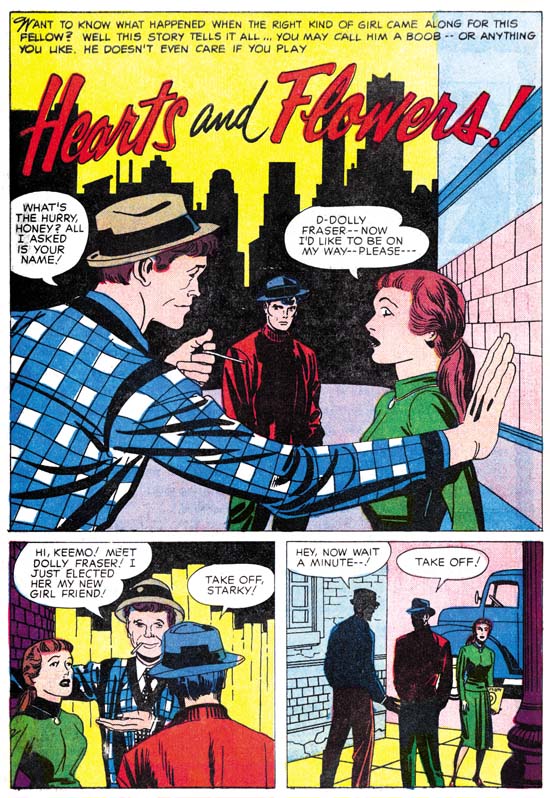
Young Romance #97 (December 1958) “Hearts And Flowers” page 1, pencils and inks by Jack Kirby

Note how abstract Kirby has become in features such as the eyes. Jack has even done away with fingernails on the man in the splash panel. The way that Jack inks seems to have affected his drawing as well.

Young Romance #97
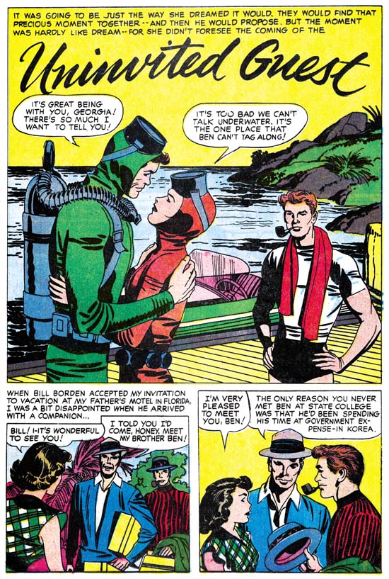
Young Romance #97 (December 1958) “Uninvited Guest” page 1, pencils and inks by Jack Kirby

At this point there is not a lot to add in terms of the Austere style. So I just want to provide some further examples from Young Romance. But do note in all these images how Jack’s Austere brushwork almost looks like it was done without a brush. This was not always true. For example in the Studio style Kirby would often make use of dry brush, where the brush does not have much ink so that as it goes across the paper the ink is left in discontinuous streaks and spots. You pretty much never see dry brush in the Austere style. You also see a limited use of the brush tip in the Austere style. You will see it in some of the long and sharp cloth folds. But most other brushwork looks like the ink was poured on. I am not sure whether Jack was using a blunt brush for much of the work or using techniques like the Chinese painters used where they “hide” the tip by starting a stroke in one direction for a short distance before reversing back over itself.

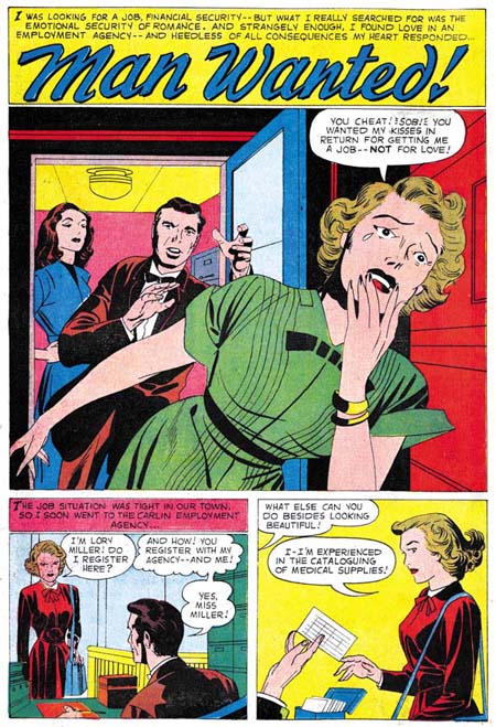
Young Romance #99
Young Romance #99 (April 1959) “Man Wanted” page 1, pencils and inks by Jack Kirby

Another example of the stylized eyes and eyelids that Kirby was doing during his Austere period.

I realize Kirby was famous for all the action he used for his superhero genre work. But look what a dynamic splash this is! Neither punches nor incredible superpowers but still an exciting page.

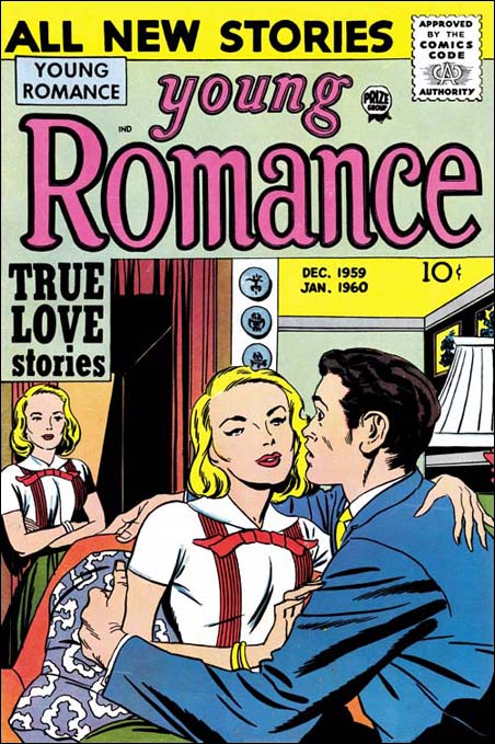
Young Romance #103
Young Romance #103 (December 1959) pencils and inks by Jack Kirby

Jack was no longer inking his own Atlas work since early 1957. The last inking for Harvey was early 1958. His last DC work was in June of 1959. So the work Jack did for Young Romance was the last that he would more or less regularly ink. Kirby did a great inking jobs right up to the end of 1959.

Young Romance #103
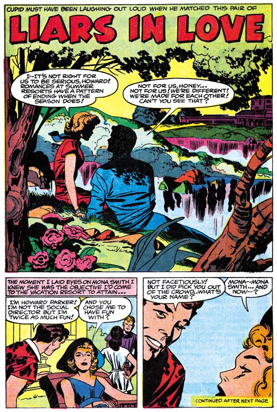
Young Romance #103 (December 1959) “Liars In Love” page 1, pencils and inks by Jack Kirby

Although I name Jack’s “late” inking style Austere that should not interpreted that all Jack’s inking at that time was simple and light. More effort would be used if the occasion called for it. This splash is a case in point. But even with all the spotting done you still get the overall feel of something done simpler then with the S&K Studio style.

EPILOG

One of the things that originally drew me to Simon and Kirby’s art was their Studio inking style. Bold yet sensitive. However Kirby would discard some of the things that made the Style so bold, in particularly picket fence brush work, when he evolved the Studio into the Austere style. Despite the loss of so much of what I love, the later inking is every bit as beautiful in its own way. It was no accident that the Austere style came into being during 1956. That was the year that Jack was doing pretty much all the art for the three Prize romance titles. With all that work it is not surprising that Jack would look for ways to speed up the process of producing his art. Many artists when faced with difficult schedules will cut corners to the determent of their final product. Not Jack Kirby. Jack did not just discard time consuming brush work, he modified what the inking he continued to use to make up for what he discarded. The Austere style may have been quicker, but Jack would not let his art deteriorate to achieve that.
This is the final chapter to this serial post. Next week I will provide a checklist of Kirby inking Kirby for the period I have delt with in “Jack Kirby’s Austere Inking”. Also a glossary of the inking terminology I have used. Of course since this post dealt with the final years of the Simon and Kirby collaboration, there is a lot more to be said about Kirby’s inking in previous years. But I am not ready to tackle that yet. Before then I want to discuss some of the other inkers of Kirby’s pencils. If you want to spot Jack’s inking you have to understand how other artists would ink. I will not be posting on that right away but look forward to (or dread) it in the future.

Jack Kirby’s Austere Inking, Chapter 1, Introduction
Jack Kirby’s Austere Inking, Chapter 2, Mainline
Jack Kirby’s Austere Inking, Chapter 3, A Lot of Romance
Jack Kirby’s Austere Inking, Chapter 4, Prize Covers
Jack Kirby’s Austere Inking, Chapter 5, Harvey
Jack Kirby’s Austere Inking, Chapter 6, Atlas
Jack Kirby’s Austere Inking, Chapter 7, DC
Jack Kirby’s Austere Inking, Chapter 8, More Harvey

Jack Kirby’s Austere Inking, A Checklist and a Glossary

other post with Kirby inking Kirby:

Strange Tale Indeed
Battleground, Jack Kirby’s Return to Atlas
Captain 3D