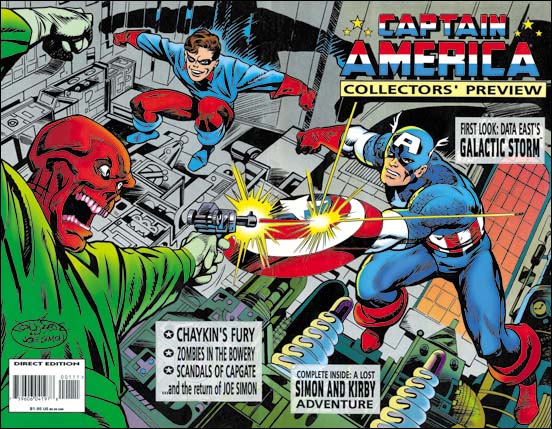
Captain America Collectors’ Preview (March 1995)
by John Byrne and Joe Simon
Larger Image
In 1995 Marvel was going to do one of their periodic changes of direction for Captain America. So they produced a Collectors’ Preview. Although it included a reprint of a Simon and Kirby Cap story from All Winners #1, the Preview was not a comic book. Rather it was a comic book size magazine. That time was a good point in the relationship between Marvel Comics and Joe Simon. Joe’s first attempt at challenging the ownership of Captain America had been settled years before and his next copyright fight was years into the future. So the Preview announced “the return of Joe Simon”. Inside was a nice article showing Joe doing cover recreations for all the Captain America covers produced by Simon and Kirby for Timely. The photos are of Joe at work in his own apartment, the same one he still lives in. You might get the impression from the photographs of spacious living conditions. But I can tell you it is a typical New York apartment which I suspect most Americans would consider rather cramped. Joe’s stat camera did not help. A stat camera is a rather large device that once found common use in the publishing industry. In the days before copier machines (let alone scanners) stat cameras were used to cheaply reduce comic art to the actual publication size. In 1995 Joe was using it to blow up old comic covers. Eventually Joe got rid of this outdated camera and he now uses copiers. You would think this would help provide more room but Joe has three different copier/printers, each one having some preferred characteristic. Lately he has purchased a fourth but I have no idea where he is going to put it without loosing one from his collection.
Since in 1995 Marvel’s relationship with Simon was good and John Byrne was perhaps their hottest artist someone came up with the idea of John drawing the Collectors’ Preview cover and having Joe ink it. Despite my title to this post, it was not a real collaboration. John and Joe never met, nor did they even talk over the telephone. Joe was sent the pencils, he did a tracing and inked on that. The original pencil was sent back to Byrne. Joe had this to say about this job.
Inking John Byrne was easy. For Jack Kirby you had to developed your own way of inking. But with Bryne everything was already there.
During the Simon and Kirby years of collaboration Jack would provide tight pencils but without any of the spotting. On the other hand Byrne had not only provided tight pencils but also had indicated all the spotting. Actually in later years while working for Marvel where Kirby was providing pencils alone he also began to indicate spotting as well for the inker.
The Byrne and Simon art for the Collectors’ Preview was a wrap-around cover. The wrap-around was one format that Simon and Kirby never did. In fact the whole idea would have been ridiculous during the Silver Age or earlier. During those years comics were sold on racks and the whole purpose of covers were to attract a potential buyer’s attention. For that purpose anything on the back would be a complete waste of money. It would take the rise of a collector’s market before wrap-around covers would become more common. One might be tempted to compare such a cover format to the double page splash that Simon and Kirby did so well. But the wide splash worked as a story introduction a function that certainly does not fit the Preview cover as there was no Red Skull story inside. A better comparison would be to the double page pin-ups that S&K made for comics like Boys’ Ranch. I will not be doing a detailed comparison of the Preview cover with S&K wide pin-ups. It just would not be fair since there really is no comparison. After all there is a reason that this is the Simon and Kirby blog, not the John Byrne blog. Still John did a nice piece with lots of excitement. The composition is well done with the arms of the various characters visually linked into an oval. My biggest complaint is there is too much text cluttering the art. John seems to have designed the cover with the placing of the title in mind. But the rest of the text appears to be unplanned for. I suspect the clutter was not John’s fault.


