Category Archives: 4 DC (early)

Replacing Simon and Kirby, Chapter 4, Sandman

Sometime ago I posted about the artists that replaced Joe Simon and Jack Kirby during the period that both were performing military service. (Replacing Simon and Kirby, Chapter 1, Chapter 2 and Chapter 3). My previous postings concerned the Newsboy Legion but here I am going to discuss Sandman. Unfortunately the reader will be at a greater disadvantage compared to previous chapters. While DC’s Newsboy Legion archives included work done by other artists, the Simon and Kirby Sandman Archive was limited to just Joe and Jack (at least that was DC’s intention).

To refresh the reader’s memory, while working for DC Joe and Jack realized that they would soon have to leave to perform their military duty. So they worked hard at creating an inventory that could be used while they were gone. Simon and Kirby were able to provide quite a bit of inventory but eventually it ran out.
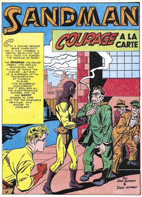

Adventure #91 (April 1944) “Courage a la Carte”, pencils by Jack Kirby

The Sandman covers and adventures that appeared before issue #91 were done by Simon and Kirby. While the splash for “Courage a la Carte” was not Joe and Jack’s finest job, I am confident that Kirby did the pencils. The most obvious give-a-way is the thug at on the right of the splash. I have no idea who the inker was but obviously it was neither Joe nor Jack. Like I said this was not their finest effort but their inventoried work often was not quite as nice as their less rushed efforts.
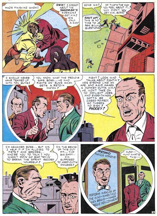

Adventure #91 (April 1944) “Courage a la Carte” page 3, pencils by Gil Kane?

But what followed the splash to “Courage a la Carte” looks pretty crude, much cruder than would be expected even for the inventory work. For good reason because it was not penciled by either Jack or Joe. Kane would have been very young at the time and even he admitted that his efforts at the time were rather poor. The attribution of this art to Gil Kane is not based on the art itself, instead I base this attribution on a statement that Gil made

I got a “Newsboy Legion” job to do by myself (like I had done the rest of them except they didn’t fix it up or do the splash),

So far “Courage a la Carte” and “The Lady of Linden Lane” (Star Spangled #30, March 1944) are the only stories for DC that I have seen with a Kirby splash for a story otherwise done by another artist (although I have not studied the Boy Commandos stories yet). Since the circumstances matches Gil’s remarks, I have tentatively credit him for these pieces. The two Kane stories were published at about the same time (while I use March as the cover date for Adventure #91, that title was actually a bimonthly) but were likely to have been done earlier and inventoried like the rest of Simon and Kirby’s work.

Unlike most of the Sandman art that I cover in this chapter, “Courage a la Carte” was one of the stories included in DC’s Simon and Kirby Sandman Archives. It is also listed in the Jack Kirby Checklist. But as I said above, Kirby only drew the splash.
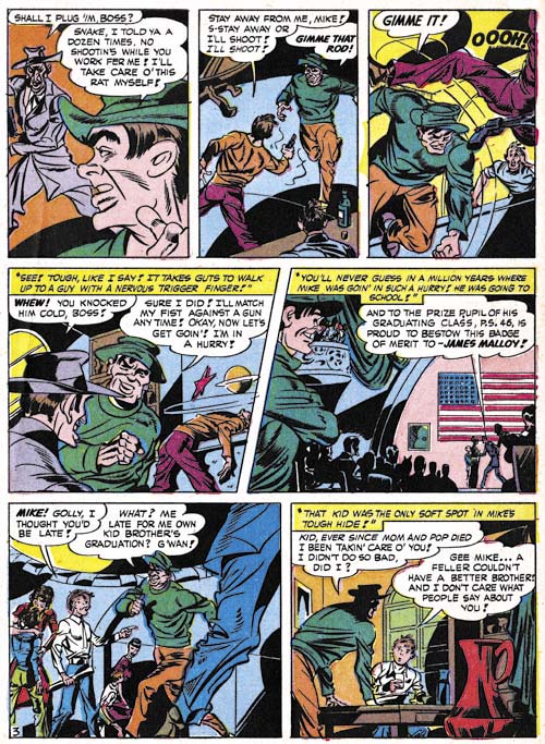

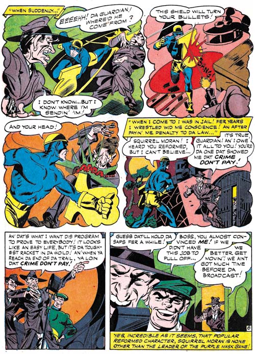
Adventure #92 (June 1944) “Tough Guy” page 3, pencils by unidentified artist

After Kane, work on Sandman was done by another artist, the same one who followed Gil on the Newsboy Legion. Earlier I had misidentified this artist as Kane but the timeline simply will not support that. Kane entered military service in April or May 1944 but work by this artist appeared until October 1945. Joe Simon suggested that this might be the Cazeneuve brothers, but I have seen enough of their work to discount them. Other suggestions have been made but I have not found them convincing either.

The work by this artist is nothing like that for Simon and Kirby but it would be a mistake to discount him. I find his art to be interesting and original. The quality varies from story to story but I have now come to believe that much of that was due to the various inkers used on his pencils.
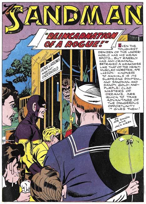

Adventure #94 (October 1944) “Reincarnation of a Rogue”, pencils by unidentified artist

The same replacement artists discussed above worked on a number of Sandman stories. The stories were still credited to Simon and Kirby but were any of their fans really fooled? I really enjoy much of his story art but find most of his splashes not all that interesting. I include above one of the better examples of his splashes.


Adventure #95 (December 1944) “The Riddle of the Rembrandt”, pencils by unidentified artist

The main replacement for Simon and Kirby had an uninterrupted run for the Newsboy Legion (Star Spangled #31 to #49, April 1944 to October 1945). But he only did three issues of the bimonthly Sandman (Adventure #92 to #94, June to October 1944) before another artist was used. Like most of the replacement artists, I really have no idea who did “The Riddle of the Rembrandt” but his talent is pretty obvious.
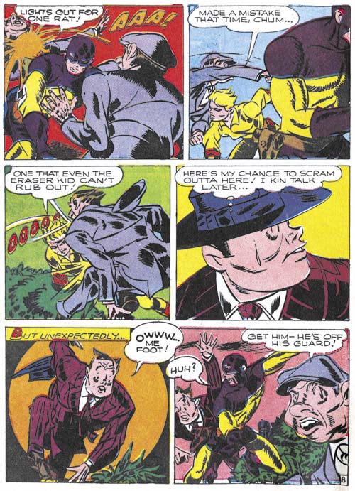

Adventure #97 (April 1945) “No Curtains for Cupid”, pencils by unidentified artist

The main replacement Simon and Kirby replacement returned after a single issue absence. “No Curtains for Cupid” looks rather different from the other examples I provided above. I still feel they were done by the same penciler but in my opinion much of the apparent differences can be assigned to the wide range of inkers used. Regardless of the inker, the art retains a unique style.
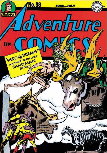

Adventure #98 (June 1945), pencils by unidentified artist

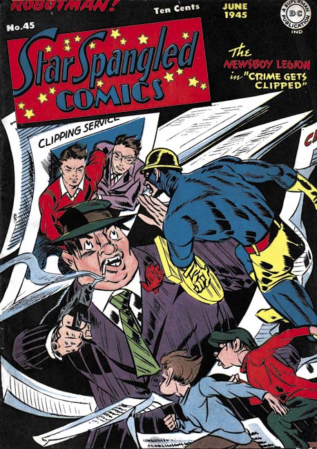
The cover to Adventure #98 was previously discussed on this blog (Not Kirby, Adventure #98). In that post I recounted a number of reasons why I felt the cover was not done by Jack Kirby but the most important of them was the manner that the caveman’s right forearm was drawn. Kirby’s anatomy was not accurate but he always made kept a solid underlying form. The form of the caveman’s forearm is broken in a manner that Jack never did. To all the reasons I previously presented I can now add another. a mirror image of the caveman figure (in more modern clothing) is also found twice on the cover of Star Spangled #45 (June 1945, Replacing Simon and Kirby, Chapter 2). This is much too much use of the same image to credit to Jack. Swiping is a much more obvious explanation.

The main replacement artist would also provide the work for Adventure #99. This means with the exception of a single issue (Adventure #95) the main replacement artist would draw Adventure #92 to #99; June 1944 to August 1945. This matches pretty well with his uninterrupted run for the Newsboy Legion.
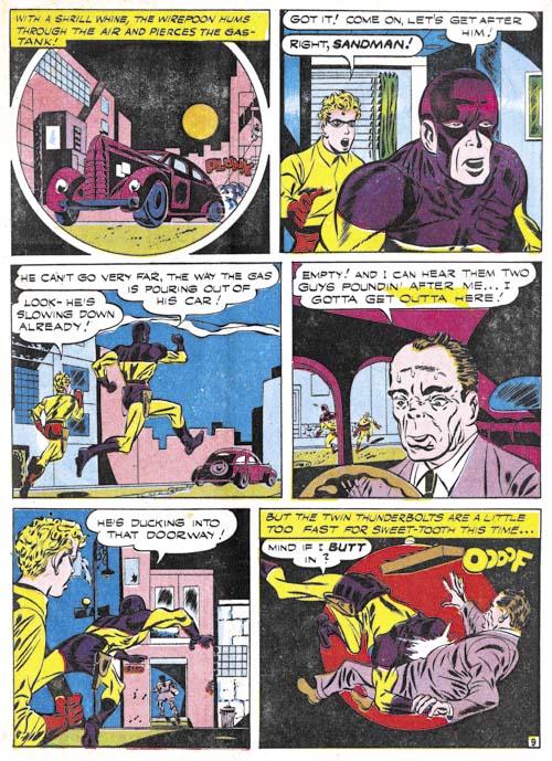

Adventure #100 (October 1945) “Sweets For Swag” page 9, pencils by unidentified artist

Jack Kirby returns to Adventure Comics with issue #100. However Kirby only provided the cover while the interior Sandman story was done by a rather inferior penciler. The primitive art for “Sweets for Swag” remind me of the work that I am now attributing to Gil Kane. In fact the main replacement artist run for the Newsboy Legion was also followed by what looks like the same artist in Star Spangled #52 (January 1946, Chapter 2). In Chapter 2 I had questionably credited it to Gil Kane but I am having second thoughts. Gil would have been entering the armed forces at the time this art was created so it seem unlikely he would have drawn it. This story is another one that was mistakenly attributed to Kirby in the DC Simon and Kirby Sandman Archives and the Jack Kirby Checklist.
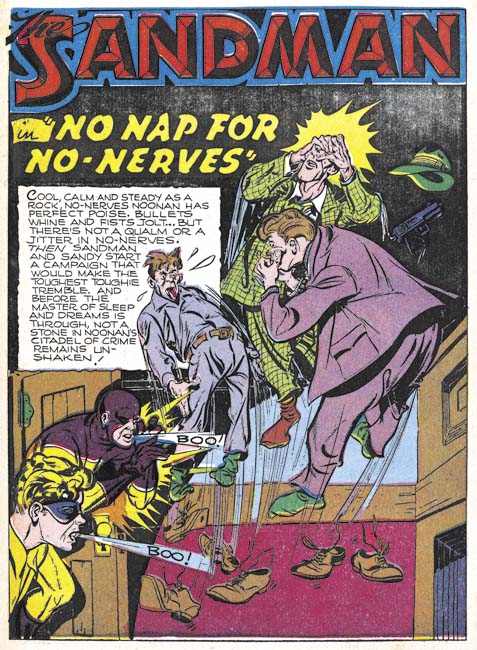

Adventure #101 (December 1945) “No Nap for No-Nerves”, pencils by unidentified artist

Once again Kirby provides a cover for Adventure #101 (December 1945) but did not draw the interior story. The artist who did do “No Nap for No-Nerves” did a good job although I got to say that in his splash Sandy and the Sandman appear to be blowing the thugs away and not scaring them out of their shoes.
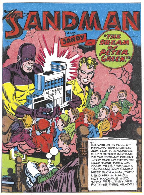

Adventure #102 (February 1946) “The Dream Of Peter Green”, pencils by Jack Kirby

With Adventure #102 Kirby is finally back to drawing both the cover and the story art. Sandman was back in safe hands and all was once again good with the world. Or that would have been the case if this was not the last Adventure issue to include the Sandman and Sandy. Yes the Sandman was replaced with Superboy and Kirby would not appear in the title again until 1958 when, without Simon, he drew Green Arrow. A convenient explanation for the sudden demise of Sandman so shortly after Kirby’s return would by that it was a reprisal to Simon and Kirby going to a competitor, Harvey Comics, to publish their Stuntman and Boy Explorers. While that would make an interesting story the timing just does not work. While Adventure #103 and Stuntman #1 would both come out in April, DC would have to have made the decision to change directions with Adventure before they were likely to have found out about Simon and Kirby’s defection.

While Simon and Kirby were away, the two titles followed a similar timeline.

  • March/April 1944 – Kirby drawn splash, rest of story by Gil Kane?
  • April/June 1944 – First story by the main replacement artist
  • June 1945 – First cover by the main replacement artist
  • August 1945 – Last story by the main replacement artist
  • September/October 1945 – First cover by the returned Kirby
  • February 1946 – First story by the returned Kirby

There remains one other feature to be considered, the Boy Commandos.

Replacing Simon and Kirby, Chapter 2, The Replacement

As I mentioned in the last chapter to this serial post, most of the replacement art for Simon and Kirby’s Newsboy Legion seems to have been created by one artist. There does appear to be one basic style for all the story art from Star Spangled Comics issues #31 to #49 (April 1944 to October 1945). As we will see the quality of the material varies greatly but this could just be due to how much time was spent on it. Certainly a few of the stories look quite rushed. Still the idiosyncratic nature of even the poorer examples makes the art rather fascinating.

Previously I used to credit this work to Gil Kane but as I discussed in the last chapter there is good evidence that is not true. Presently I am going with Joe Simon suggestion that this work was done by either Arturo or Louis Cazeneuve. But I do not have any independent evidence to back this up. I have seen other work that has been credited to these two brothers but it was done in a very different style. This does not necessarily refute Simon’s suggestion but it does not provide support either. So I am going to credit it questionably to either Arturo or Louis Cazeneuve. That however is a bit much to include in my discussions so there I will just refer to him as the replacement artist.

Star Spangled #32
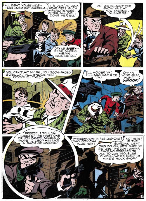
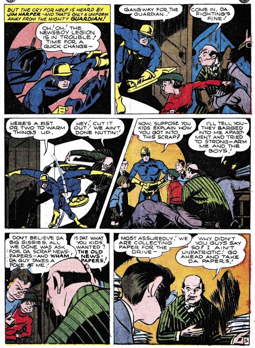
Star Spangled #32 (May 1944) “The Good Samaritans” page 8, art by Arturo or Louis Cazeneuve?

Almost all the stories that the replacement artist did had in the splash panel a cartouche with Simon and Kirby credits. However the art style seems so different from Simon and Kirby’s that it is hard to believe that any of their fans were fooled. Still the replacement artist did use a number of techniques that were popular with Simon and Kirby. Arching shadows, circular panels, figures extending past the panel border are all taken from the Simon and Kirby repertoire and adopted by the replacement artist.

Star Spangled #35
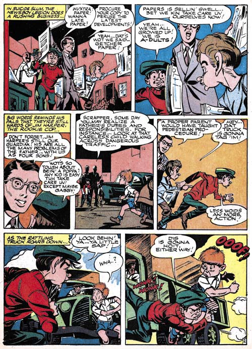
Star Spangled #35 (August 1944) “The Proud Poppas” page 2, art by Arturo or Louis Cazeneuve?

I have to admit that I have not read most of the Newsboy Legion stories drawn by the replacement artist. Therefore I will not try to answer interesting question of whether Simon and Kirby left scripts or synopsis for stories that they did not get around to drawing. But I will say that these stories are full of action and fight scenes.

Star Spangled #36
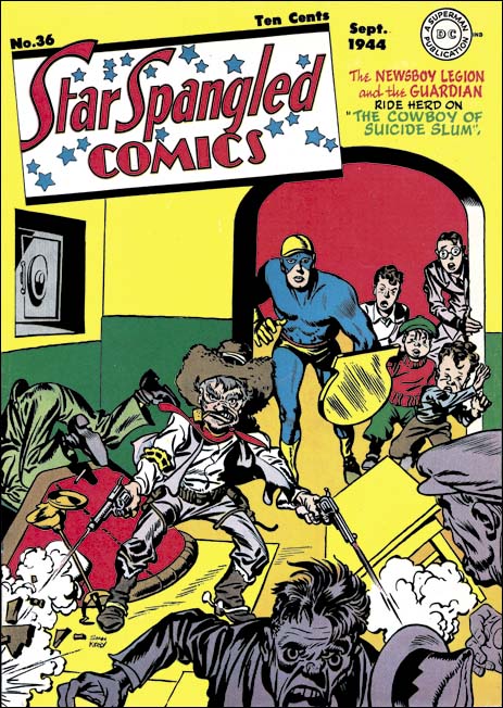
Star Spangled #36 (September 1944), pencils by Jack Kirby

The story art that Simon and Kirby had inventoried ran out before the cover art did. Therefore many of the replacement artist’s Newsboy Legion stories are in a comic sporting a Simon and Kirby cover.

Star Spangled #36
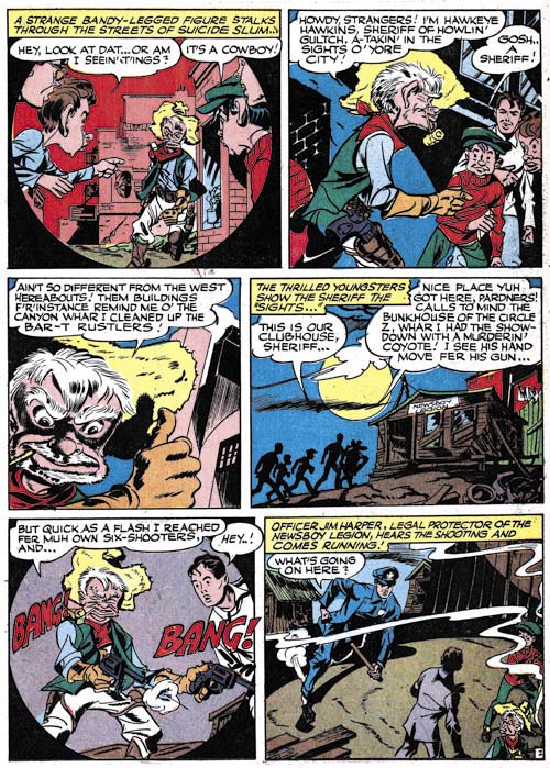
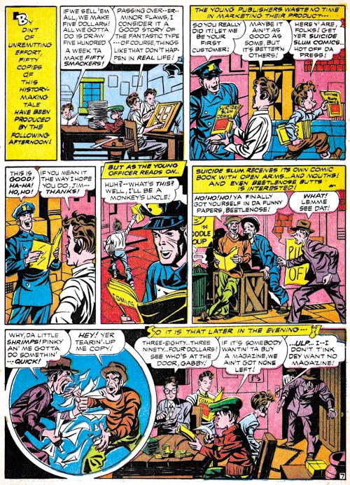
Star Spangled #36 (September 1944) “The Cowboy of Suicide Slum” page 2, art by Arturo or Louis Cazeneuve?

In most cases where there is a Kirby drawn cover the replacement artist’s story is based on the cover. Note how similar the cowboy from the story is to the one from the cover.

Star Spangled #40
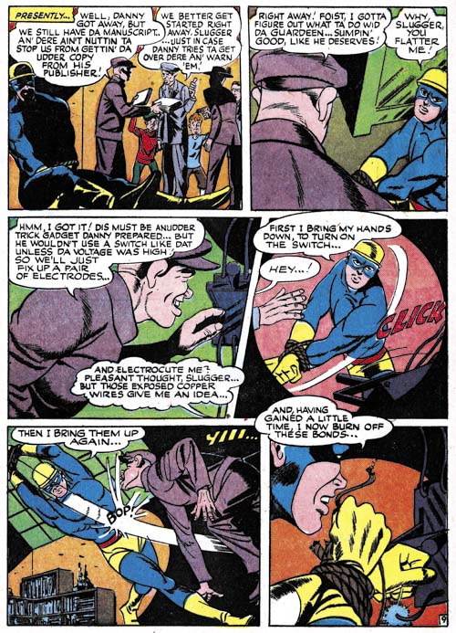
Star Spangled #40 (January 1945) “Farewell to Crime” page 9, art by Arturo or Louis Cazeneuve?

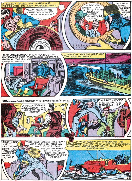
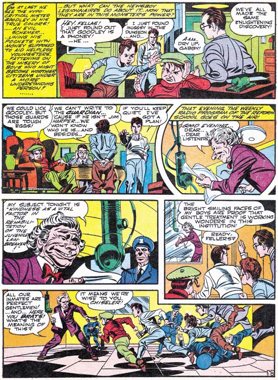
The replacement artist picked up some of Simon and Kirby’s techniques but he also exhibited some interesting traits of his own. While Kirby was great at handling different points of view, I find the replacement artist had his own way of handling viewpoint. On page 9 he starts with a very low angle with the Guardian in the front but the actual focus on the characters in the background. He then switches the viewpoint to a close-up of one of the criminals with the Guardian seen over his shoulders. A close-up of just the criminal is next followed by a view almost entirely of the Guardian. Although panel 5 has an interesting low angle view the way it leads the eye towards the left makes it the weakest panel on the page. The page ends with another close-up of the Guardian as he proceeds to free himself of his bounds.

Star Spangled #45
Star Spangled #45 (June 1945), art by Arturo or Louis Cazeneuve?

Observant readers may have noticed that I have deviated from my usual practice by not providing any examples of the splash page. This rather deliberate because as much as I admire this artist I do not find him very accomplished when it comes to splash panels. His best splashes are rather weak and his worst ones completely forgettable.

While the replacement artist did the cover for Star Spangled #32 (shown in the last chapter of this serial post), DC returned to using Simon and Kirby covers that they had inventoried before they left to fulfill their military service. Eventually the inventory was emptied and the replacement artists began to provide the covers as well. Consider how poor his splashes were, it comes as a surprise how effective the replacement artist covers were. Initially this lead me to consider that perhaps he was supplied with rough cover layouts to work from. However his layouts seem so novel that in the end I accept the designs as being done by the replacement artist himself.

Star Spangled #49
Star Spangled #49 (October 1945) “One Ounce to Victory”, art by Arturo or Louis Cazeneuve?

Star Spangled Comics covers drawn by Jack Kirby returned with issue #48 (September 1945). I will discuss these Kirby covers in the next chapter. The story art continued to be supplied by the replacement artist. But not for long, Star Spangled #49 (October 1945) would contain the replacement artist’s last Newsboy Legion story.

While I have referred to this artist as the replacement artist, in fact he was not the only artist to work on the Newsboy Legion before Kirby returned. This will be covered in my next chapter.

Replacing Simon and Kirby, Chapter 1, The Newsboy Legion

While Simon and Kirby were working for DC they knew that at some time they both would be entering military service. To prepare for this the two went into hyper drive and started generating an inventory for DC to use while they were gone. This was very successful and Simon and Kirby covers and stories appeared long after Joe and Jack were working for Uncle Sam. But the inventory was not large enough to last until Simon and Kirby were back from helping to protect our country. By early 1944 (cover dates) there were no more Simon and Kirby story art left.

The question of Simon and Kirby’s replacement came back to my attention recently while reading DC’s Simon and Kirby Sandman archive. There were two stories in it that were listed as being done by Joe and Jack but to me looked like they were actually by some other artist (“Courage a la Carte”, Adventure #91, April 1944 and “Sweets for Swag”, Adventure #100, October 1945). The issue came up again when I recently obtained a copy of DC’s Simon and Kirby Newsboy Legion archive. For the Newsboy Legion volume, DC decided to include material that clearly was not drawn by Simon and Kirby. The replacement artist for most of the Newsboy Legion was credited in the DC volume as Gil Kane. It is an attribution that I have used previously as well. However when I talked with Joe Simon about this he insisted that Gil Kane was not the artist and suggested that it was the brothers Arturo and Luis Cazeneuve.

Simon and Kirby’s replacements was a subject that I have always meant to investigate a little further. This will be the start of another serial post. It will be a bit more erratic than most of my serial posts because I am not going to do this in a strictly chronological order. Instead I will begin with several chapters examining the Newsboy Legion, then look at Sandman and finally cover the Boy Commandos.
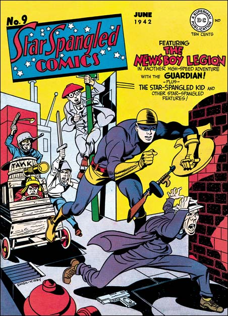
Star Spangled #29
Star Spangled #29 (February 1944) “Cabbages and Comics”, pencils by Jack Kirby

I will start with the Newsboy Legion because the work covered in this chapter can all be found in DC’s recent archive volume. Thus the reader will be able to view more examples than I can provide in this blog. The first story I will remark on is what I believe to be the last published complete Newsboy Legion story by Simon and Kirby before they went off into military service. Because of the push to create inventory and the use of other hands in the inking, the art by this time was not quite as good as early in the Newsboy Legion run. But even poorer quality Simon and Kirby art is still much better than what most other artists were doing. And while many artists might try to imitate Kirby’s dynamic art they were unable to keep it up page after page. In short I have no doubt that this story is in fact a Simon and Kirby production.

The Jack Kirby Collector (issue #21) published an interview with Gil Kane. Two of Kane’s answers are particularly pertinent to this discussion:

TJKC: What were your job duties with S&K?

Gil: Mine was penciling. I would try to turn out a job every week or so. [They were] 12-page stories. I was copying-tracing-Jack’s work.

TJKC: What happened when Simon & Kirby went into the service? What happened to you?

Gil: I got a “Newsboy Legion” job to do by myself (like I had done the rest of them except they didn’t fix it up or do the splash), but when I walked through the door with the finished job, they said, “You’re fired.” They didn’t even look at the work. I really was lousy and I was out! At that point, I was about seventeen and I worked for Continental Comics for a guy named Temmerson. (I penciled and Carmine Infantino inked.) But that only lasted until I went into the Army.

There are a couple of really significant points in Gil’s short answers. Kane describes having previously done work that Simon and Kirby fixed up or provided the splash. Now it is possible that Gil Kane had something to do with earlier stories such as “Cabbages and Comics” but if so it was only in a minor capacity. Kane may have done things like help with the inking but I am sure that Kirby was the penciler.

Star Spangled #30
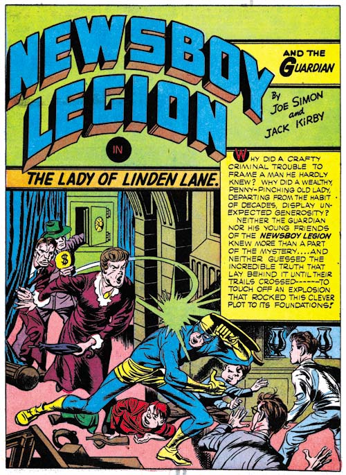
Star Spangled #30 (March 1944) “The Lady of Linden Lane”, pencils by Jack Kirby

There is no sign of Gil Kane, or any other artist other than Simon and Kirby, in the splash for “The Lady of Linden Lane” (Star Spangled #30, March 1944). It is a great splash with plenty of action and a little bit of humor with the normally fearless Guardian trying to duck from the blows of an elderly lady. The hoods in the background are a typical Simon and Kirby feature. This was inventoried material and so perhaps was executed in a hurry, but it still is great comic book art. Joe entered the Coast Guards before Jack went into military service so some of the inventory art may have been done by Kirby without Simon. However there is no reason to believe that DC published the inventoried art in the same order that Joe and Jack produced it. Nor are there any signs that I can find that distinguish this story from others there were done by both Simon and Kirby.

Star Spangled #30
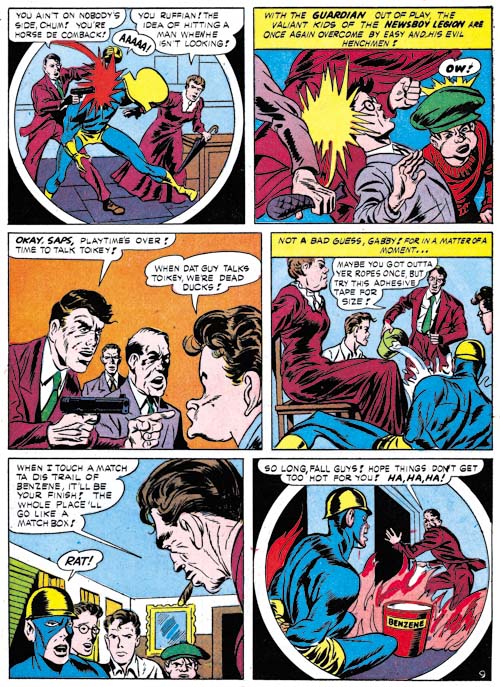
Star Spangled #30 (March 1944) “The Lady of Linden Lane” page 9, art by Gil Kane?

While the splash for “The Lady of Linden Lane” is work that can be attributed convincingly to Simon and Kirby, the rest of the story is not. The art is crude and stilted. There are parts that really do look like Kirby’s pencils but they appear to be swipes. For instance the cigar smoker in panel 5 of page 9 (shown above) is shown in the type of perspective that Kirby favored however it appears to be based on Guardian from the cover of Star Spangled #26 (November 1943).

Star Spangled #8 and #30
left Star Spangled #8 (May 1942) “Last Mile Alley” page 13 panel 2, pencils by Jack Kirby
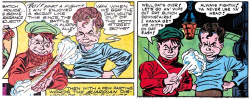
right Star Spangled #30 (March 1944) “The Lady of Linden Lane” page 7 panel 5, art by Gil Kane?

An even more obvious swipe can be found in the figures of Snapper and Gabby shown above. Unlike my previous example this is a close swipe showing only minor alterations. Kirby did swipe on occasion but one thing I have never seen him do was swipe from himself. Jack did have some favorite poses that he often repeated but they are always done with such variation that it seems clear that he is not copying any previous drawing. Simon did swipe from Kirby, in fact rather often. But Joe was a good artist in his own right and his art is much better than this crudely drawn story. Further I can detect none of Simon’s drawing style in “The Lady of Linden Lane”. While I am not familiar enough with the work of Arturo or Luis Cazeneuve to confidently spot their work, what I have seen is much better than these crude drawings. The combination of a Kirby drawn splash with story done by another artist fits very well the interview reply that Kane gave. Add to that the use of swipes and Kane’s admitted poor artistry (he was 16 at the time). So assuming that there is at least some truth to his statements I am questionably attributing the story art for “The Lady of Linden Lane” to Gil Kane. The one problem with this attribution is that there is only one Newsboy Legion story that fits this description while Kane statement suggests he did multiple works in this fashion.

Star Spangled #31
Star Spangled #31 (April 1944) “Questions, Please” page 6, art by unidentified artist

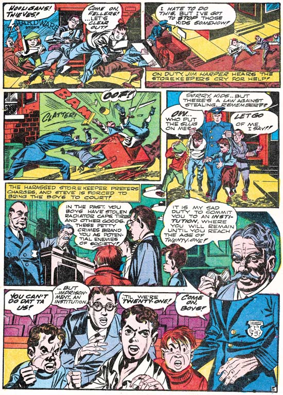
The next issue of Star Spangled Comics had a very different Newsboy Legion story. No clear sign of Simon and Kirby here, neither in the splash or the story art. Nor is this the same artist that produced the story art from “The Lady of Linden Lane” I must admit that I have slighted this artist in the past. His more “cartoony” approach gives the impression that he could be considered an “anti-Simon & Kirby”. But it would be a mistake to dismiss this artist. Put aside any comparisons to Joe and Jack and I am sure the reader will see this is a rather interesting and talented artist. Sure his faces and figures are exaggerated but they are full of life. He makes good use of varying the point of view. He seems to purposely distort background scenery giving it an almost cubist look. This artist may be rather bizarre but he is definitely not boring. I will cover this artist in more detail in the next chapter of this serial post.

But who is this artist? In the past I, and at least some others, have thought this was Gil Kane. Now I attributing “The Lady of Linden Lane” to Gil Kane but is there any other reason to reject Kane as the replacement artist for “Questions, Please” and other Newsboy Legion stories? Actually there is. Gil Kane went into the army shortly after his 18th birthday and he spent 19 months in service. Since he was born on April 6, 1926 that would mean he was in the army sometime about April or May 1944. However, as we will see in the next chapter, this replacement artist would provide work up to Star Spangled #49 (October 1945). This is well into the time that Kane was doing military service. Unlike Simon and Kirby, I doubt that DC would consider the replacement artist important enough to provide an inventory of works to use while he was gone. So it can be said with good confidence that Gil Kane was not the primary Simon and Kirby replacement artist.

But what about Joe Simon’s suggestion of the Cazeneuve brothers? I prefer to put off trying to answer that question until the next chapter where I will review more of the primary replacement artist’s Newsboy Legion work.

Joe Simon, Some Comics from the Coast Guard

Simon and Kirby was a brand name that helped sell comics. So it comes to no surprise that although the Boys Commandos story (“Brooklyn Botches the Bakas”) from World’s Finest Comics #20 (Winter 1945) was signed Simon and Kirby they had nothing to do with it. All inventory that Joe and Jack provided DC before entering military service had since been used up. But that did not stop DC; they just added Simon and Kirby’s names to stories actually drawn by other artists. Like I said, Simon and Kirby’s names sold comics.

World's Finest #20
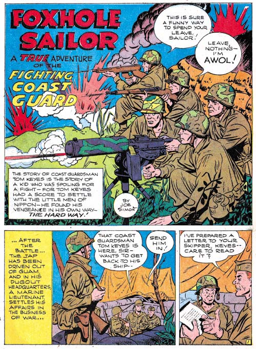
World’s Finest #20 (Winter 1945) “Foxhole Soldier”, art by Joe Simon

While neither creator contributed to the Boy Commandos story, the next story in World’s Finest #20 was penciled, and probably inked, by Joe Simon. There is no question that this piece was by Joe. It is in his distinctive style with no attempt at mimicking another artist (Joe’s imitations of Jack Kirby and Lou Fine have fooled experts). And if that were not enough it is even signed by Joe. Such a solo signature is unique during the period of the Simon and Kirby collaboration. Even the cover and short story that Joe did for Boy Commandos #12 (Fall 1945) were signed Simon and Kirby despite the fact that Jack was still in the army and certainly had nothing to do with them (Art by Joe Simon, Chapter 8, Off to War). For “Foxhole Soldier” I would guess that only used his signature to please his superiors since Simon was still in the Coast Guard when this story was created. Both the BC #12 and WF #20 pieces were clearly done as Coast Guard promotion.

The next issue of World’s Finest (#21, March 1946) featured a Boy Commandos story (“Brooklyn and Columbus Discover America”) actually drawn by the recently returned Jack Kirby. What a difference that made. However Joe was still in the Coast Guards and was not there to help. Very unfortunate because the inking to the Boy Commandos feature was atrocious.

World's Finest #21
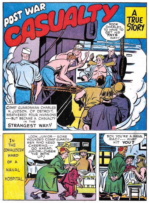
World’s Finest #21 (March 1946) “Post War Casualty”, art by Joe Simon

While Joe was not on hand to help Jack with the Boy Commandos story, World’s Finest #21 had another story (“Post War Casualty”) penciled and inked by Simon. This story is unsigned but Joe’s style is easily detected. The job seems a little more rushed then “Foxhole Soldier”. The elderly lady shown in the first two story panels bears a remarkable resemblance to Apple Annie from the Duke of Broadway feature that Joe drew latter a couple months later (The Wide Angle Scream, American Royalty).

I had earlier reported about another short piece drawn by Simon, “Combat Photographer” from Real Fact #2, May 1946 (More Obscure Simon and Kirby). In that case there was no Coast Guard connection and the piece was published the same time Simon and Kirby’s Stuntman and Boy Explorers Comics. “Combat Photographer” indicates that Joe did some work for DC after returning from his stint in the Coast Guard.

I was unaware of Joe Simon’s two World’s Finest features until I recently saw them in a post on the Marvel Masterworks forum. In it Steven Utley remarked that Simon and Kirby’s Manhunter stories would make a rather thin archive volume if DC decided to publish them. Steven suggested that it thickened up a little bit more by including other assorted Simon and Kirby pieces. It could be fleshed out even a little bit more if DC were to include some pieces by Kirby alone, in particular his retro Manhunter from the 70’s. The complete list for such a volume would be:

Manhunter, Adventure Comics #s 73-80, 76 pages
“Coast Guard Reconnaissance,” Boy Commandos # 12, 3 pages
“Foxhole Sailor,” World’s Finest Comics #s 20, 3 pages
“Post War Casualty,” World’s Finest Comics # 21, 3 pages
“Pirate or Patriot,” Real Fact Comics # 1, 4 pages
Just Imagine, “The Rocket Lanes of Tomorrow,” Real Fact Comics # 1, 2 pages
Just Imagine, “A World of Thinking Machines,” Real Fact Comics # 2, 2 pages
Just Imagine, “Combat Photographer,” Real Fact Comics # 2, 4 pages
“Backseat Driver,” Real Fact Comics # 9, 4 pages
“Space Ships of the Past”, Showcase #15, 2 pages
Manhunter, First Issue Special #5, 19 pages

For a total of 122 pages. I think it is a great idea since some of these pieces would probably not otherwise be reprinted.

Jerry Robinson at the Jack Kirby Tribute Panel

Detective Comics #65
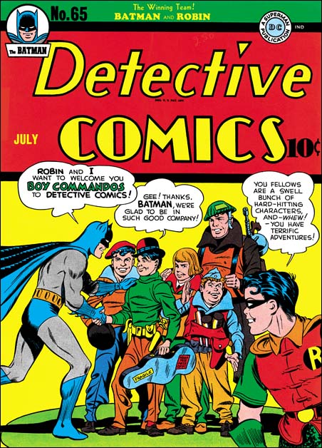
Detective #65 (July 1942), art by Jack Kirby and Jerry Robinson

I mentioned in a previous post a review of the Jack Kirby Tribute Panel that Comic Book Resources has posted (written by Jim MacQuarrie).

At the very end of the article is found:

Jerry Robinson closed the panel by recalling his participation in one of the very few collaborations that Kirby did with anyone but Joe Simon. “The only time Jack collaborated with anyone but Simon on a cover was an issue of “Detective Comics” when the Boy Commandos joined the book. The cover showed Batman and the Boy Commandos shaking hands. I drew Batman and Jack drew the Commandos.”

In Love #1
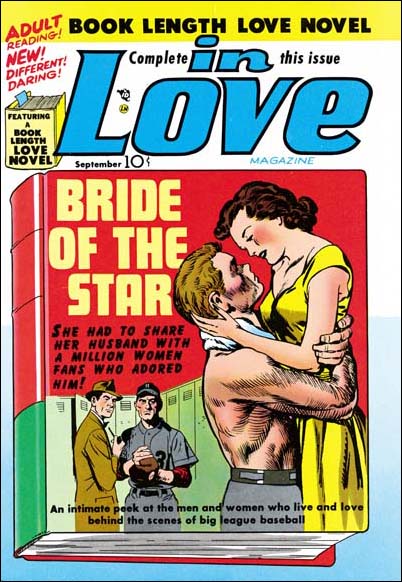
In Love #1 (September 1954), art by Jack Kirby and John Prentice

While of course Jerry is right about his contributions to the cover of Detective #65, he is not correct about being the only artist, other then Joe Simon, to collaborate on a cover with Jack Kirby. John Prentice, one of the usual suspects of the Simon and Kirby studio, also had that honor. Jack did the foreground couple while John did the two background figures.

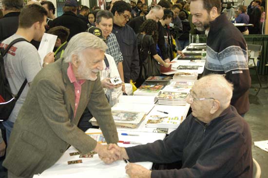
Jerry Robinson and Joe Simon
Jerry greeting Joe Simon at the Big Apple Con of 2006

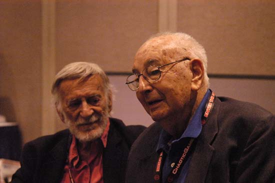
Jerry Robinson and Joe Simon
Jerry and Joe at New York ComicCon 2008

The Beginnings of the Newsboy Legion


Star Spangled #9 (June 1942), art by Jack Kirby

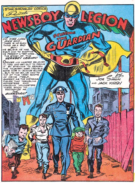
Simon and Kirby’s initial work for DC was to revitalize an existing feature called Sandman. In the following month they would debut their own creation, The Newsboy Legion (Star Spangled #7, April 1942). Jim Harper was a rookie cop assigned to patrol Suicide Slum. Further he assumes the roll of the Guardian to fight criminals without having to adhere to the restrictions of the law. Harper is also a guardian of another kind; he is a sort of custodian to four street urchins, the Newsboy Legion. The boy gang was a genre that S&K would use a number of times, although not always with a superhero thrown into the mix. A similar combination appeared in another Simon and Kirby creation the Young Allies, only in that feature the superheroes Toro and Bucky were part of the actual gang. Because the cover date for the first Young Allies was Summer, the Newsboy Legion may have actually been published before Joe and Jack’s earlier creation. The combination of superhero and boy gang worked quite well. Suicide Slum provided the Newsboy Legion with plenty of opportunities to get into trouble leading to their eventual rescue by the Guardian. Thus the boys play the roll of side-kicks without the improbability of a superhero partnering with a young boy in his dangerous fight against crime. Another refreshing difference found in the Newsboy Legion concerned Jim Harper’s secret identity as the Guardian. The Newsboys’ suspicions about the Guardian’s true identity would become a running gag for the feature.


Star Spangled #8 (May 1942) “Last Mile Alley” page 9, art by Jack Kirby

Joe and Jack probably initially did their DC work pretty much by themselves. Any scripts that the DC editors provided must have either been ignored or highly altered. This can be seen by the fact that Simon and Kirby’s work at DC reads pretty much like their work from both before and after. As for art assistants, their former ones were left behind at Timely to take over the art for Captain America Comics and its offshoots. Simon and Kirby would eventually acquire new ones, but initially it was probably just the two of them. This allowed the team to quickly forge a distinctly unique art style. Part of it was derived from their previous work at Timely. In Captain America Kirby had already mastered his handling of action and exaggerated perspective. These continued in Simon and Kirby’s DC work and beyond. Also continued from Captain America was the device of extending figures beyond the panel borders. Circular or semicircular panels would play an important part in DC layouts as they had previously. (I love how the example page I provide above has four semicircular panels yet even more circles were introduced by the spinning wheel and the window in the first two panels.) Retained, at least initially, was a page layout typically of eight panels arranged in four rows. One layout technique that was immediately discarded was the use the more irregular panel borders frequently found in their Timely work.


Star Spangled #9 (June 1942) “The Rookie Takes the Rap” page 13, art by Jack Kirby

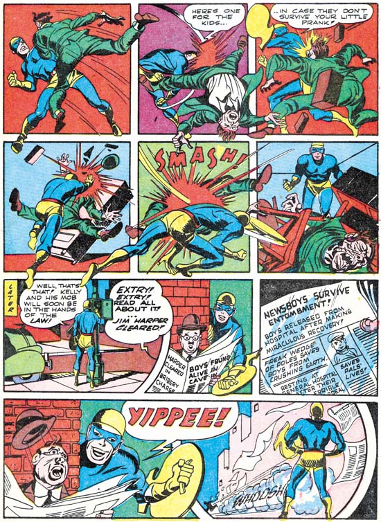
Kirby was the master of the fight scene and the Newsboy Legion provided plenty of opportunities for Jack to display his talent. I particularly like the sequence found in the end of “The Rookie Takes the Rap” showed above. Jack increases the number of panels per row to three to get in as much fighting as possible. He has also removed all background features that could distract from the Guardian’s confrontation with his opponent. It is not truly a fight because the crook does not stand a chance against the Guardian’s fury. I love the way Kirby has added flying bricks, but as the fight takes place inside a room I have no idea where they came from.


Star Spangled #10 (July 1942) “Kings for a Day” page 11, art by Jack Kirby

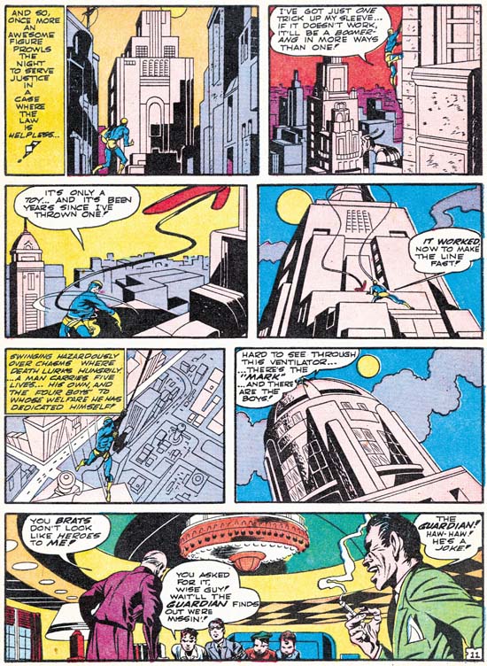
Jack Kirby knew how to make things exciting. Take the sequence from “Kings for a Day” shown above. It starts with the Guardian amidst a cityscape. Jack’s unusual use of shadows provides the scene with an eerie quality. As the Guardian ascends, Jack uses perspective to dramatize the action. Views of the background indicate how high the Guardian has climbed. The tower, his final objective, is shown with rapidly narrowing perspective showing he has far more height to obtain. This is followed by tilted views emphasizing the precarious nature of his pursuit. The last panel reveals the object of the Guardian’s heroic efforts while ironically one of the bad guys denigrates the Guardian. This is yet another reminder that Kirby knew how to infuse the story with excitement even in parts where there really was not much going on.


Star Spangled #12 (July 1942) “Prevue of Peril” page 2, art by Jack Kirby

Simon and Kirby switched their typical page from 4 to 3 rows. I had previously observed the same thing in their Sandman stories. In Sandman the transition seemed gradual stretching over several issues. For the Newsboy legion is seems much more abrupt; prior to #12 layouts are predominately four row pages, while subsequent issues are overwhelmingly three row layout,. The larger panels allowed Simon and Kirby to provide greater impact. While I believe that the layout change substantially improved the stories, I question whether that was the true aim. With the war on, both Joe and Jack expected that they would have to enter military service. Knowing this Simon and Kirby began to produce as much work as possible so that DC could use it while they were off serving their country. A larger image provided by the three row panel layout required less fine detailing, therefore less time to draw and ink, and thus aided getting more work done.


Star Spangled #7 (April 1942) page 1, art by Jack Kirby

The inking style that Simon and Kirby adopted after leaving Timely provided much of what made Simon and Kirby art look so unique. I used to I refer to this as their DC style but I fear that might give the impression that Simon and Kirby were adopting DC’s manner of inking and nothing could be further from the truth. So I think I will call it S&K’s Sculptural style since their use of form lines to create negative highlights for suggesting shape is a technique many sculptors have used when drawing. (See my Inking Glossary for explanations for explanations for some of the terms I will use in this post.) Aspects of this style can be seen in parts of Simon and Kirby’s Timely work. Perhaps the use of a number of assistants for the inking prevented the Timely art from more uniformly presenting this style. In any case starting with their work for DC and the covers they were also doing at this time for Al Harvey, Simon and Kirby inking would have two prominent characteristics; Caniff style cloth folds and bold form lines. Neither of these inking techniques was unique to Simon and Kirby but the boldness of the brush strokes were. The splash for the untitled origin story of the Newsboy Legion shown above is a good example of the early use of the Sculptural style. Take particular notice of the simple oval cloth folds that can be found in this splash particularly on Tommy’s lower legs. Not only are they simple in shape but they seem very flat without bending with the underlying shape. This type of clothing folds can be found not only in Sculptural style inking, but with the post-war Studio style as well and finally forming an important characteristic of Kirby’s Severe style of inking. I think this is an indication that Jack did at least some of the spotting for the origin story splash. Also note the course crosshatching on the buildings in the background. DC management would derogatorily designate this as “hay” and S&K’s use of this inking method would be the recurring cause of friction.

The Sculptural style can be distinguished from the Studio style by its greater dependence on form lines but also by the general lack of some of the latter’s typical inking methods such as picket fence crosshatching, drop strings, shoulder blots, and abstract arch shadows. However predecessors for some of the Studio style inking techniques may be found in the Sculptural style. In the origin splash Jim Harper’s shoulders have what almost look like shoulder blots although narrower in shape then the true shoulder blots of the Studio style. Big Word’s shoulders show that these proto-shoulder blots are actually overlapping form lines differing only in location from the form lines found throughout the splash.


Star Spangled #11 (August 1942) “Paradise Prison” page 5, art by Jack Kirby

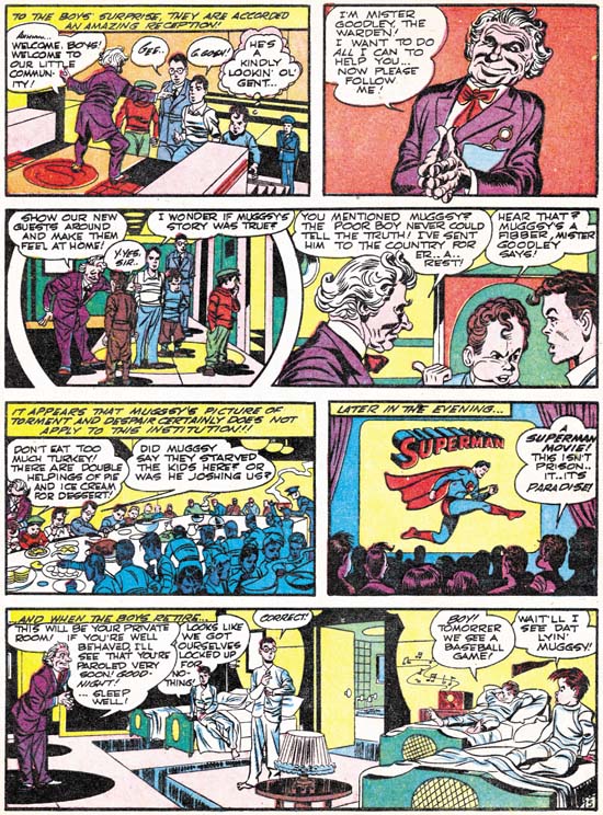
The second panel of page 8 of “paradise Prison” provides another example of a proto-shoulder blot. Once again the shoulders have narrow blots. the shoulder inking does give an appearance of being made from overlapping form lines although not as distinctly the case as those for example on the villain’s arm. Note the unusual appearance of Superman as presented as part of a movie. It marks one of the few Simon and Kirby nods of recognition to their publisher’s flagship character. I cannot help but wonder if Superman’s awkward pose was deliberate.


Star Spangled #8 (May 1942) “Last Mile Alley” page 10, art by Jack Kirby

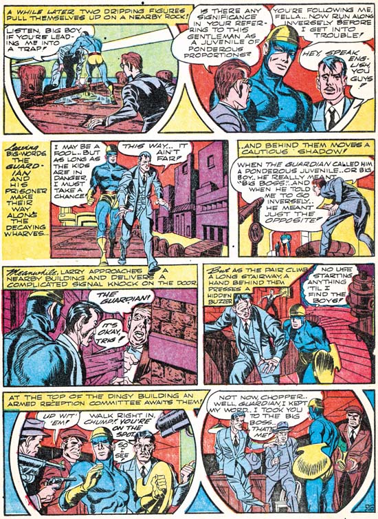
Picket fence crosshatching is another inking method typical of the Studio style. Yet again examples that could be described as proto-picket fence show up in the inking of DC stories. The Guardian’s back in panel 5 of “Last Mile Alley” shown above is a case in point. The rails however are used to clearly indicate the form which is not typically the case with true picket fence brush work. Also part of the proto-picket fence is not delimited by a rail but a series of form lines instead. Not only is the proto-picket fence distinguishable in manner from the Studio style technique it is also only very infrequently used in the Sculptural style of inking.


Star Spangled #7 (April 1942) <untitled> page 5, art by Jack Kirby

Another staple of the Studio style is the abstract arch shadow. I normally use the term abstract arch shadow to describe cases where a shadow was delimited on both sides with an arc. However Simon and Kirby also frequently used shadows with only one arc. The use of single arc shadows inking appears in the DC style as well as can be seen in panels 1 and 3 from the fifth page of the origin story shown above. Such shadows can be termed abstract as well because there often is no clear explanation for their shape. Unexplained shadows were used by Simon and Kirby as a design tool to make a scene more visually interesting. Note the decided abstract shadows, without any arcs, in the sixth panel. That abstract shadows are more frequently arced was due to S&K’s use of oval and semi-circular forms as a compositional device. Such touches might be easily overlooked but they are important part of Simon and Kirby’s successful imagery.


Star Spangled #11 (August 1942) “Paradise Prison” page 8, art by Jack Kirby

I do not want to leave the reader with the idea that during S&K’s tenure at DC all manifestations of otherwise Studio inking methods were done in atypical manners. That may be true of shoulder blots and picket fence crosshatching but it is certainly not true of abstract arch shadows. The arch shadow in the last panel of page 8 of “Paradise Prison” is perfectly indistinguishable from abstract arches that appeared after the war. While the manner of execution of abstract arches may be the same between the two periods their frequency is not. Abstract arch shadows show up often in Studio style art but are rare with DC style inking. The example I provided above was the earliest that I spotted among the Newsboy Legion art.


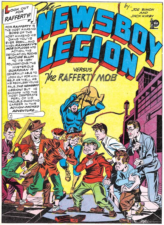
Star Spangled #17 (February 1943) “The Rafferty Mob” page 1, art by Jack Kirby

I use the term Sculptural inking style for much of the inking done by Simon and Kirby during the war but it was by no means a static approach to inking. That should not be surprising because Simon and Kirby’s art was always evolving. The form lines found in the splash from Star Spangled #7 (April 1942, shown earlier in the post) would become bolder over time as exemplified by the splash from Star Spangled #17 (February 1943). I am not convinced that “The Rafferty Mob” splash was inked by Kirby but the inking still matches the Sculptural style.


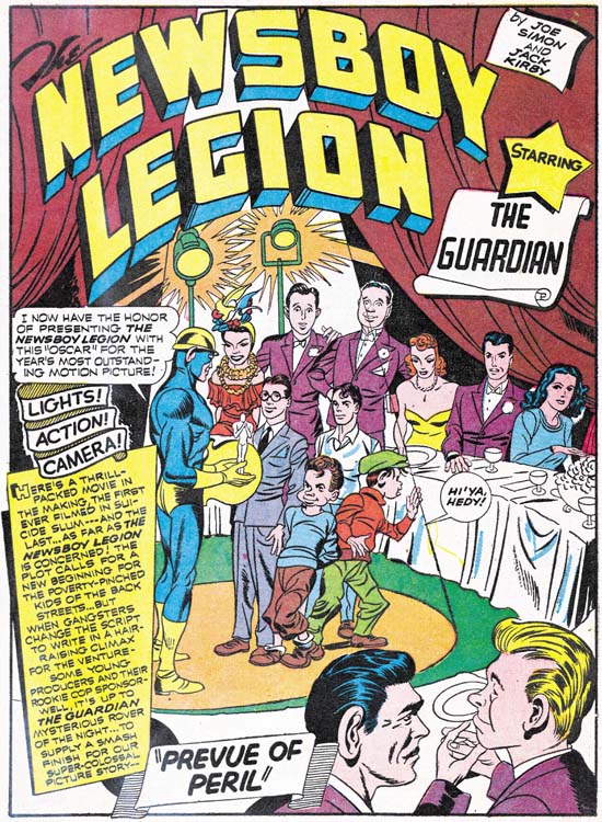
Star Spangled #12 (July 1942) “Prevue of Peril” page 1, art by Jack Kirby

I wanted to close this post on the earlier Newsboy Legion art with a splash selected solely because it is so neat. Simon and Kirby occasionally include recognizable people in their comics. In this case the Hollywood personalities played no part in the story that followed but who cares? Starting from the top and going clockwise we find Carmen Miranda, Bing Crosby, Bob Hope, an unidentified actress, Errol Flynn, Hedy Lamarr (fortunately Scrapper calls out her name or I probably would not have identified her), Mickey Rooney, and Clark Gable. I sometimes wonder if that unidentified red head might be Lucille Ball but would all the B movies she was in before her television success make her a recognizable figure at that time?

Joe Simon’s Opinion on “Combat Photographer”

A couple of weeks ago in my post “More Obscure Simon and Kirby”, I presented “Combat Photographer” (Real Fact #2, May 1946) which I attributed to Joe Simon. Last week I was able to show Joe this piece to get his opinion. Although he did not remember doing it, Joe was certain that it was his own work. He was particularly convinced by the title design feeling that it was typical of his style. Joe also commented on the quality of the lettering, calling it second class, and wondered if he had done it himself. Personally I doubt that since the lettering does not match very well with examples that I am sure he lettered.

An Unexpected Simon and Kirby Ashcan


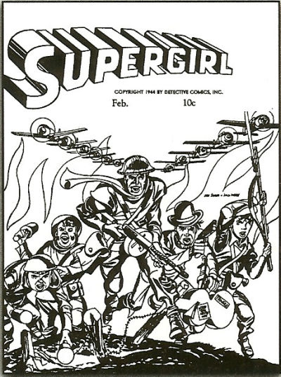
Supergirl (ashcan) (February, with 1944 copyright) (image from the GCD)

I was perusing a list of works attributed to Joe Simon in the GCD database when I spotted something very odd, a Supergirl ashcan by Simon and Kirby. Of course Simon and Kirby did not really do a Supergirl cover, DC staff just used a copy of the S&K art of the cover for Boy Commandos #1 (Winter 1942/1943) and added above it the Supergirl title. The DC staff produced ashcans so that they could copyright the title and so prevent any other publisher from using it. Ashcans can be produced quickly as they are not subject to the months required to publish an actual comic book. It would be unfortunate, to say the least, to published a new title only to have competitor come out earlier with a book with the same title. DC did something similar previously when they made an ashcan for Boy Commandos. I am bothered by some of the details in this particular case. Basically why Supergirl at this time and why use this particular piece of Simon and Kirby art?
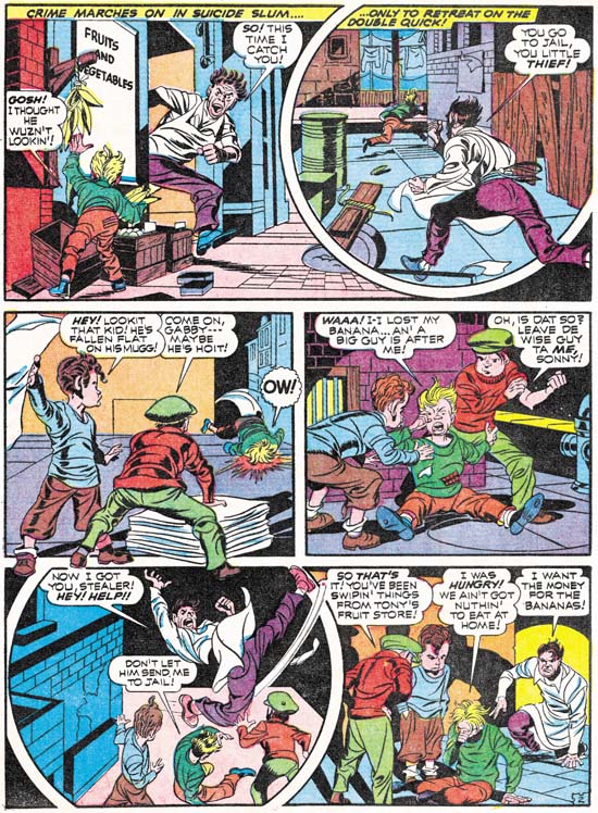
Supergirl would not have a debut until Action Comics #252 (May 1959) that is not for about 15 years later. Granted the copyright would still be valid but it does seem an unreasonable long delay. The answer may not be when Supergirl would be first published but when Superboy was. Superboy first appeared in More Fun Comics #101 (January 1945). With Superman and now Superboy, it did not take much of a stretch in imagination DC’s part that perhaps they should protect other variations as well. Well a search of GCD reveals that an ashcan had already been made for Superwoman (copyright 1941 but with a January 1942 cover date). Therefore making one for Supergirl as well seems a reasonable precaution. Simon and Kirby later did something similar when they created Stuntman. Stuntman #2 has an inside cover advertising the coming of Stuntboy and Stuntgirl. Although unpublished Stuntman art still exists none of it includes either Stuntboy or Stuntgirl. Joe Simon has said that he does not remember creating these variations either. But the ad includes copyright and pending trademarks so in all probability Simon and Kirby were just trying to protect what they hoped would be a successful new title.
The Supergirl ashcan cover date provides only the month (February) while the copyright notice gives only the year (1944). Now it may seem obvious to just combine the two for a February 1944 date as GCD has done in their listing. This is not unreasonable but it would indicate that planning for Superboy was done for quite a few months before it was actually release. However if we follow the example given by the Superwoman ashcan and provide a cover date for the Supergirl ashcan as February 1945 we have one very close in agreement with Superboy’s release (January 1945). The means of choosing between the two possibilities would be the actual contents of the ashcan as it would be expected that the most current stories would be used. Unfortunately the interior is not indexed in the GCD listing. Oddly the notes that I toke when I first came across the Supergirl ashcan listing was that there was an unconfirmed report that the contents were from Action #80 (January 1945). If that turns out to be true then the February 1945 would be the correct cover date for the Supergirl ashcan.

My second puzzle was why a cover for Boy Commandos #1 was used for the Supergirl ashcan. It is not that I expect Supergirl to appear on the cover. DC was insuring their copyrights and not planning to actually produce a Supergirl comic at that time. The ashcan for Superwoman had unrelated cover art as well. For me the question is why the cover art for the Supergirl ashcan was not something more current. The Boy Commandos #1 was cover dated Winter 1942/1943. Even if we accept the earlier February 1944 as the cover date for the Supergirl ashcan that still means the art used was about a year old. The only explanation I can hazard, with absolutely nothing to back it up, is that perhaps a foreign edition of Boys Commandos had more recently been prepared. DC did occasionally prepare foreign comics (to be printed in the country it would be released in) and these often were done some time after the initial U.S. release. However I have no idea if DC was doing this during the war or whether Boy Commandos had received that treatment.

One final note, in this blog I try to respect the copyrights of others. After all I am asking everyone to respect not only my rights, but most importantly those of Joe Simon who has generously allows me to include images from his personal collection. Joe’s collection and my own, augmented occasionally by helpful individuals, are generally sufficient to provide enough examples to use in the posts for this blog. But there are rare exceptions where the GCD has images that I otherwise do not have access to. So some time ago I contacted GCD and ask if it would be okay to occasionally use their images (giving them the proper credit). So I would like to thank the GCD (Grand Comic-Book Database) for giving me permission to do so.

More Obscure Simon and Kirby

Simon and Kirby’s new titles Stuntman (April 1946) and Boy Explorers (May) were published by their old friend Al Harvey. The decision to jump ship from DC was purely business but Liebowitz complained about not getting a chance to bid for their services. It was a decision that Joe and Jack would regret as the new titles were quickly cancelled, victims of a comic glut that followed the end of paper rationing. Jack and Joe would continue to do work for DC for their old feature Boy Commandos, but Sandman was cancelled (last S&K was Adventure #102 February 1946) and the Newsboy Legion would only last a short while longer (last S&K was Star Spangled #61 October 1946). Before this not everyone at DC was happy with how Simon and Kirby made their comics, now their critics had more ammunition to use against them. Even in the difficult times that followed, DC was either not approached or not interested in renewing their previous relationship with S&K. Because the art for comics is done months before it would be finally released it is not clear whether the work for Real Fact #2 (May) was done before or after DC found out about Simon and Kirby’s deal with Harvey.

Real Fact #2
Real Fact #2 (May 1946) “A World of Thinking Robots”, art by Jack Kirby

In the second issue of Real Fact, Jack Kirby returns to provide another short graphic article predicting the future. The prescient abilities of the scripter, whoever that was, was both good and poor at the same time. Robots are shown performing four tasks; as factory workers, secretaries, sport contestants, and house cleaners. The first two predictions can be said to becoming true today, the third is a qualified success, while the last is in its infancy at best. Robots are often encountered in a factory setting; some automobile assembly lines are famous examples. Modern software can take vocal dictation and produce pretty accurately typed text. While presently there are no robots playing football or any other human sport there are robotic tournaments that attract a small but devoted following. A robot house keeper would seem the most desirable of all but so far there has been only limited success. The one I know of is a robot that wanders around vacuuming the floor. This all sound like pretty successful predictions, except that a humanoid shaped robot is not used for any of the current examples. There are humanoid robots but so far they have not been used for any of those tasks nor is there any reason to believe they ever will be. The human form is a generalist approach; pretty good for many diverse tasks but not perfect for any. Why settle for a general factory worker when you can design more efficient one for specific tasks? As far the second part of the prediction, the idea of “thinking robots”, presently there are no Artificial Intelligent programs that come anywhere near to be described as thinking. Further those advances in the field of AI have not had much impact on robotics.

Artistically there really is not much to say about this piece. Once again I cannot help but feel that Jack would do more exciting machinery much later in his career. The inking is adequate but perhaps not too impressive. At this time I just cannot say whether this is Jack’s inking or not.

During my examination of Real Fact #2 in preparation for this post I kept being impressed by how the art for “Combat Photographer” resembled Joe Simon’s work. Initially I dismissed it as just a coincidence. As far as I know nobody has attributed this piece to Simon and while he was teamed up with Kirby, Joe did little penciling himself. Nonetheless upon repeated examinations I kept finding more things to suggest Joe Simon’s hand until I ended up convincing myself that this was his. Still I am bothered about this attribution because most new discoveries of examples of Simon’s art have often in the end been shown not to be by Joe. Perhaps I should have held off on reporting this case until further investigation and upon getting Joe’s own opinion. However in this blog I prefer to present my latest opinions which sometimes change over time. If I come to decide I have made a mistake I will post on that as well. In the mean time let me try to describe what leads me to credit this story to Joe as well as well as what evidence that does not fit so well with that attribution.

Real Fact #2
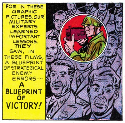
Real Fact #2 (May 1946) “Combat Photographer” page 4 panel 6, art by Joe Simon

I find the manner of drawing figures matches quite well with Joe Simon BC (Before Kirby, a term that Joe uses that I find mildly humorous because of the way it reverses the normal manner of Kirby fans changing ‘C’ to ‘K’ as for example Kirby Kolor). There are examples to be found in Silver Streak #2, Target Comics #1 and #2, Daring Mystery #2, and Amazing Man #10. Note in particular how in panel 2 of page 3 (image below) the eyes and eyebrows are joined in a single angular shape; this is a typical early mannerism of Joe’s. There are also some similarities to be found in more recent work by Joe in Boys Commandos #12 and Adventure is My Career. The greatest similarity of the work closest in date to “Combat Photographer” is perhaps the cover for 48 Famous Americans (1947), but some may not find that convincing because that cover is often misattributed to Jack Kirby. At the time that Real Fact #2 was done Joe was penciling Duke of Broadway, Vagabond Prince and Kid Adonis for Harvey. For the most part those Harvey features have a somewhat different style but note the similarity of the final panel from the Real Fact #2 story (image above) with that style. There is a parallel to be found with the double page splash from Boy Explorers #1 which also combines two styles; one with a more earlier flavor and the other that predominates in Joe’s work for those Harvey features.

Real Fact #2
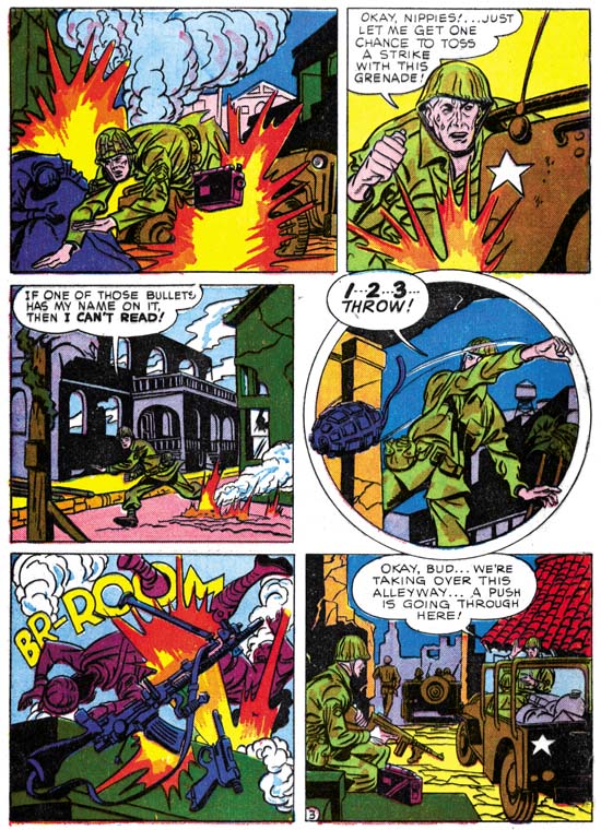
Real Fact #2 (May 1946) “Combat Photographer” page 3, art by Joe Simon

I am not sure whether circular panels were picked up by Jack or Joe first. It was a layout technique that both artists used in their work for Harvey. There is a perfectly good example of a circular panel on page 3 (see above). The device of extending a figure outside the panel border was typical of previous Simon and Kirby but pretty much dropped after the war. The circular panel from this story has figures that extend only slightly beyond the frame. Joe has adopted some mannerisms that seem to appear first in pencils by Kirby. Note for instance the square fist in the second panel. Another example is found in the man running in the third panel that has the sole of his foot turned toward the viewer.

Not everything about “Combat Photographer” favors attributing it to Joe Simon. My chief concern is that it is Joe’s early work that shows the greatest similarity. Part of what suggests the Simon BK work is simplicity in drawing that does not compare exactly with what Joe was doing at the same time for Harvey. Logically you would expect the greatest similarity would be among the work produced concurrently. The inking agrees with the pencils in being very simple, almost primitive. I have not done a close comparison with Simon’s inking (I will review Simon’s inking someday, I promise) but I am not convinced the brushwork here is by Joe. The layouts for “Combat Photographer” predominately uses distance shots while Joe’s Harvey work is much more varied in viewpoints. I do not consider any of this fatal to my crediting Simon for this art, but I do not want to ignore them either.

Initially I was also concerned about the odd placement of the page numbers, which is on the left side of a panel. This is very untypical for Simon and Kirby. The last panel of the story has a little “the end” written in a manner that does not look like anything I have seen from S&K. However further examination revealed that both of these features are found in other stories in Real Fact. They therefore are derived from the editor or the letterer and have no bearing on the question of the attribution of this art.

Real Fact #9
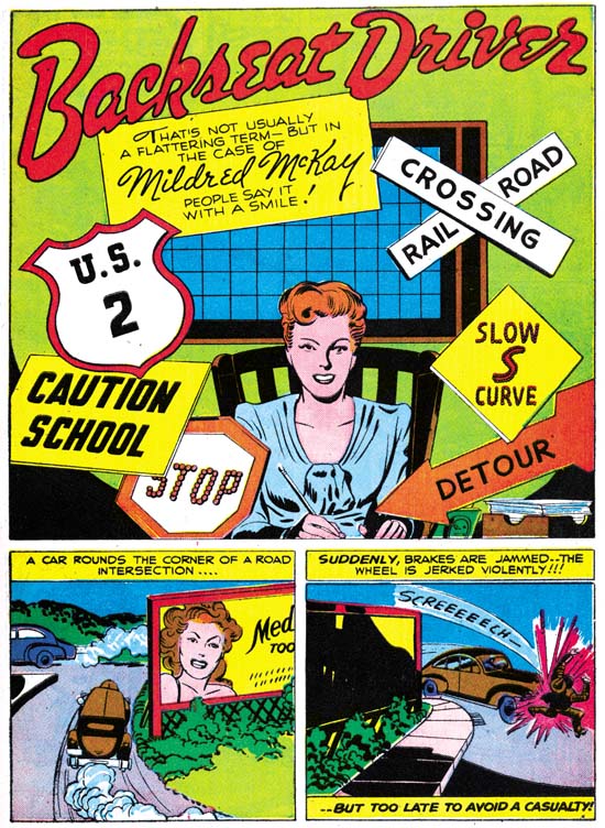
Real Fact #9 (July 1947) “Backseat Driver”, art by Jack Kirby

The next time Simon and Kirby appeared in a Real Fact was a little over a year later. That they appeared then is surprising because by this time they had already launched their version of crime genre and must have been preparing for their soon to be released romance comics. However I have never heard of Simon and Kirby turning away any work and who can tell how long DC kept this piece as inventory before using it. The story is about a lady who distressed by the number of automobile accidents decides to open a driver school. If you excuse the pun, it might not sound like a very good vehicle for Kirby’s talents but actually Jack manages to make it very interesting. On the opening page Kirby shows a pedestrian being hit by a car, only to show on the next page that the victim was literally a dummy. Other examples of actual or near accidents provide further action. For those panels that could be described as talking heads, Jack is already showing the use of varying viewpoints and distances, and the placing of main focus behind a foreground of objects or lesser important people. These visual techniques would play a big part in Kirby’s romance art where standard actions were not always appropriate. I would not call “Backseat Driver” a masterpiece but it is far from being a failure.

The art that Simon and Kirby did at that time for their crime comics was inked in the classic Studio Style with picket fence crosshatching, drop strings and abstract arches (see the Inking Glossary for explanations of these terms). Few of these inking techniques are found in “Backseat Driver”. The splash shows clothing folds that are simple spatulate shapes often attached to a thin line almost like they are leaves on a stem. The entire splash has an overall light look because of the limited use of blacks. When blacks are used they tend to flood an area. Those who have read my serial post Jack Kirby’s Austere Inking may recognize this as an excellent description of that style, this despite the fact that the Severe Style would not show up until about nine years later. However as I reported last week, Picture News #1 also has portions that could be described as a Proto-Severe Style. Not everything in this splash is fully reminiscent of the Severe Style. Some of the spatulate clothing folds are offset a little from the narrow lines. The spotting on the woman’s right breast has a feathering more typical of style used on earlier DC work. I believe the splash was inked by Jack himself but the two panels below just do not offer enough to provide a convincing inking attribution. The other three pages share with the splash an overall lightness and simplicity in the inking. However the inking does not appear as sensitive and the clothing folds do not match the manner found in the splash. I am not ready to provide inking credits for those pages but I do not think it was Kirby. It is among the other three pages that can be found some drop strings and shoulder blots.

Before Simon and Kirby crime and romance comics the duo had tried their hands in a number of categories not typically associated with them. Besides the supposedly true stories done for Picture News and Real Fact, Joe and Jack also tried teenage humor (My Date Comics and Pipsy) and kiddy humor (Lockjaw and Earl the Rich Rabbit for Punch and Judy). None of these were successful but they do show that Simon and Kirby were talented enough to give them a good try.

Some Obscure Simon and Kirby

Jack Kirby was released from military service earlier then Joe Simon. Jack returned to providing work for DC features such as Sandman and the Newsboy Legion. I do not know the date for Jack’s release from service but the comics provide some clues. Simon and Kirby had previously worked hard to provide DC with material to use while they were away. However it was not quite sufficient and other artists would be used to continue their features. This is most clearly seen in the covers for Adventure Comics. Adventure #98 (June 1945) and #99 (August) have covers that are clearly not by Jack while Adventure #100 (October) has a Kirby cover. Covers can be created with little delay especially by an artist like Jack, but stories require a script (even if Kirby would often pretty much redo it). The earliest post-war Kirby DC stories to appear were in Adventure #102 and Star Spangled #53 (both February 1946). That suggests that there was a gap of a few months where Jack was not getting much income other then whatever royalties that DC was providing.

Picture News #1
Picture News #1 (January 1946) “You Can’t Loose A Faithful Dog” page 4, art by Jack Kirby

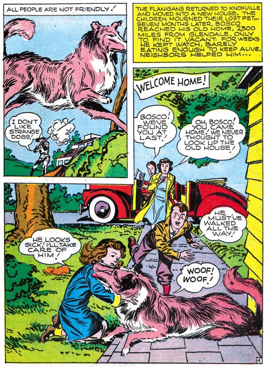
The desire to produce some extra income may explain why Kirby’s earliest post-war interior art was provided for Lafayette Street Corporation’s comic Picture News. It is a short four page story about a dog that escapes while being transported to his owners’ new home and then travels 2300 miles back to their previous house. It is not much of a story. It starts with a two thirds of a page splash, but that is just a map showing the distance the dog traveled and does not offer much as a showcase for Jack’s talent. The next two pages use four panels to a page. This was a format that Jack had used for a time at the very start of his comic book career but had later largely abandoned for first eight and then later six panel pages. During that time Kirby might revert to four panels when he wanted provide more details. Sadly that is not the case for this story where often the art looks like it could have worked just as well in smaller panels. The best page is the last where Jack provides a splash like ending. The story is such that it seems Jack adhered closely to someone else’s script. Perhaps without Joe around he did not feel confident enough to modify it. Or perhaps Kirby just could not see what could be done to improve it while remaining faithful to the true story that it was supposed to be based on. Kirby inked the art himself and normally that should have assured superior results. The inking style is a simplified version as that previously used at DC. As such it could be called a Proto-Severe Style. For example note how in the final splash-like panel the boy’s clothing folds have the simple form typically found in Kirby’s Severe Style. However also see how the spotting on the little girl’s dress which is more similar to that from S&K’s DC period. Despite the fact that the art is all by Jack, neither the drawing nor the inking truly rescues this piece. “You Can’t Loose a Faithful Dog” may have an historical interest as an example of Jack without Joe, but it is otherwise a rare example of an all too forgettable work by Kirby. Even a genius does not always produce great art.

Real Fact #1
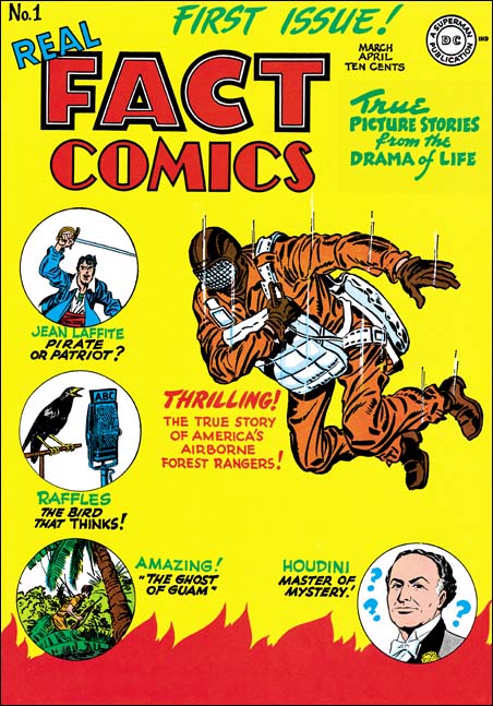
Real Fact #1 (March 1946) art by Jack Kirby (parachutist and Jean Laffite)

Although I believe that the story in Picture News #1 was done by Jack before Joe had returned, I doubt if that was true with Real Fact #1 (for DC). Stuntman #1 would come out just one month later and Joe was certainly involved with that. The need to recuperate financially after his military service probably explains Jack’s involvement in Real Fact as well. For the cover Jack did the parachutist and the image of Jean Laffite, the other images was by other artists. It may not be a masterpiece, but the simple figure of the airborne forest ranger is surprisingly effective. Not much action but Jack portrays the moment before the jumper pulls his release pin and just the thought of the soon to be billowing parachute adds a little bit of excitement. The inking is Jack’s as well in a style similar to earlier DC works. Here Kirby’s spotting does succeed in adding to the image’s impact; Jack did a beautiful inking job.

Real Fact #1
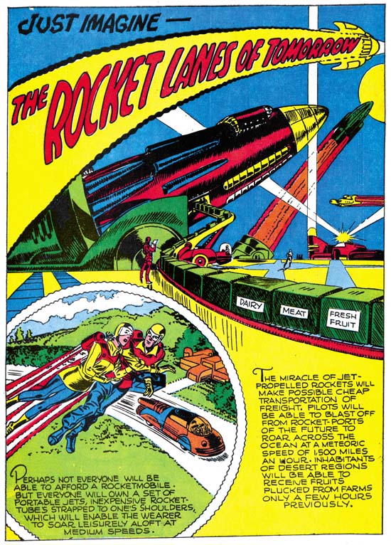
Real Fact #1 (March 1946) “The Rocket Lanes Of Tomorrow”, art by Jack Kirby

I wonder if the original readers of this comic appreciated the irony of a piece like “The Rocket Lanes of Tomorrow” appearing in a book called Real Fact? Still it provided an opportunity for Kirby to return to the realm of science fiction. Unfortunately it is not very exciting stuff, but perhaps I am just comparing it with the fantastic machines that Jack created much later. Judging largely by the cloth folds of the flying couple, the inking appears to be Jack’s. The next page has some men in space suits inked in a manner very similar to how Kirby handled similar costumes at the start of his comic book career.

Real Fact #1
Real Fact #1 (March 1946) “Pirate Or Patriot?”, art by Jack Kirby

At this point readers maybe wondering what happen to Jack, the works presented so far in this post just do not seem to have the typical Kirby impact. Well “Pirate or Patriot?” shows that Kirby had not lost his touch. Although a short four pages, this story provides the type of excitement that would appear in Simon and Kirby’s crime comics a year later. No qualifications about Kirby’s art here, it is all first rate stuff. Look at that splash panel, the composition was exciting enough when it was used for the cover of Daring Mystery #8 (January 1942) but Kirby has improved upon it. By providing a low viewpoint, so low that all the feet are at eye level, the advancing force seems more heroic. The perspective also allows the figure of Jack Laffite to be larger then his companions without seeming unnatural. Jack inked the piece himself and he did a superb job. Some of the clothing folds have the simple forms that would later appear in the Severe Style. Another page provides an early appearance of an abstract arch (see Inking Glossary for an explanation for inking terms used here). There are no signs yet of picket fence crosshatching or drop strings. For the most part the spotting is closest to what is found in prior works for DC. I doubt that we will ever see a DC Archive for Real Fact Comics, but “Pirate or Patriot?” certainly deserves to be rescued from obscurity.

Simon and Kirby would do a couple of other pieces for Real Fact Comics which I will discuss next week.