Category Archives: 2012/08

Happy Birthday Jack Kirby!


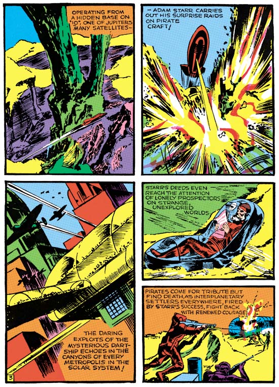
Crash Comics #1 (May 1940) “Solar Legion” page 3, pencils, inks and letters by Jack Kirby

Tuesday, August 28, is Jack Kirby’s birthday. In his honor I include a page from Titan’s up-coming Simon and Kirby Library: Science Fiction. Although at this point Jack probably had already met Joe, I believe his work on the first three appearances of the “Solar Legion” was a solo affair. If this is true, then it is as pure a Kirby as can be found. Kirby pencils, inks, letters and probably writing. I know a number of fans credit Kirby with writing during the Simon and Kirby period but all surviving evidence indicates that is not quite true. Simon and Kirby employed script writers but would alter what they received. Thus it would be more accurate to say Kirby would re-write scripts that he drew as opposed to being the original writer. But during the early days of comic books, artists often wrote what they drew. The rather unique “Solar Legion” stories seems the writing of Jack himself.

This birthday is particularly special as one of Jack’s granddaughters has made an appeal, see Join the Kirby4Heroes campaign for details and a link to her appeal.

Speaking of Art, Marvin Stein


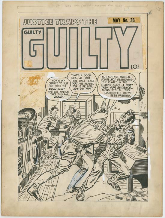
Justice Traps the Guilty #28 (July 1951), pencils and inks by Marvin Stein

In this post about original art I will discuss a cover by Marvin Stein. Stein was one of the few artists who actually worked in the Simon and Kirby studio. Stein is not well known in current comic book fandom but for a long period of time he was the lead artist in Price Comics crime titles, Headline and Justice Traps the Guilty. Except for a few covers done by Jack Kirby and some others based on photographs, Marvin did all the covers for Headline issues #46 to #77 (March 1951 to September 1956) and for Justice Traps the Guilty #24 to #88 (March 1951 to August 1957). For more information on this topic see Criminal Artists, Marvin Stein.

The cover that I post about this time is from relatively early in his work on crime comic books. While the paste-ups are original, they are not the originals for this particular cover, rather they are from issue #38. Rubber cement was often used for attaching paste-ups because it was inexpensive, quick and convenient. Unfortunately there were negative consequences in the long term to this use of rubber cement. Sometimes the chemicals in the rubber cement would stain what they were attaching. Often with time the rubber cement would become brittle and loose its adhesive qualities causing attachments to fall off. It would take years before either of these detrimental qualities took effect. At the time the long term survival of original comic book art had no importance as it was considered worthless once it had fulfilled its role in the production of the published comic book. In this case the original paste-ups fell off and were re-attached to the wrong comic book art.

There is a reason I picked this particular cover art to discuss which I will return to below. Before that I wanted to explore the use of white-out. White-out was applied by comic book artists to correct defects created during the inking of a piece. Inking errors could not be simply erased but could be covered up with white-out. As for instance an erratic brush stroke. That seems to be the case for the white-out applied in the speech balloons and the frame lines on the right.
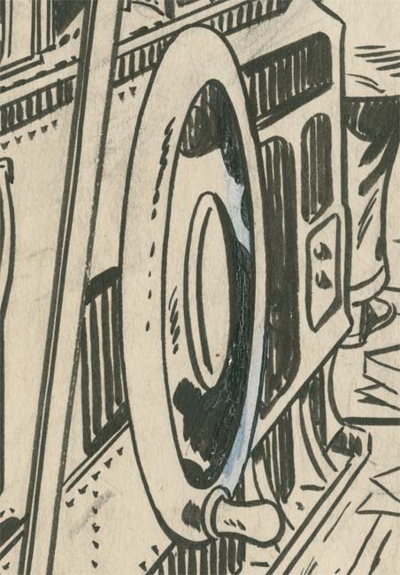

Justice Traps the Guilty #28 (July 1951) close-up, pencils and inks by Marvin Stein

A similar explanation could be used to explain the white-up on the printing wheel. Some of the corrected inking can still be seen under the white-out. Even in this close-up it may be difficult to make out that much of the inking on the right side of the wheel has been done over white-out. This is revealed by numerous small cracks in the inking. Such hair-line cracks often appear when ink is applied on white-out that has not completely dried. While this does appear to be a correction further examples suggest that it was not do to poor control of the actual ink brush.
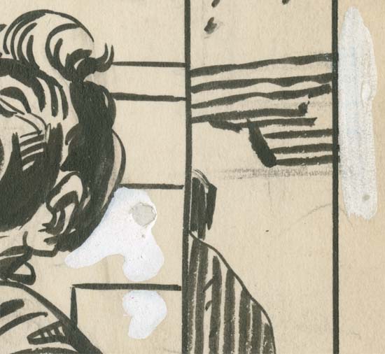

Justice Traps the Guilty #28 (July 1951) close-up, pencils and inks by Marvin Stein

One of the corrections to the frame can be seen in this close-up. While the white-out is too opaque to clearly see what has been hidden there still remains some parts that have not been covered up to suggest that horizontal brushwork had extended beyond the frame and needed to be corrected. Well perhaps not needed because the frame lines were normally trimmed off in the published comic book. There is also white-out applied need the head. Here the ghost of the covered inking can still be observed, at least in part. While the outline has been narrowed slightly it is hard to understand why Stein thought this necessary. Perhaps the true reason for this particular white-out are in areas too opaque to be revealed.
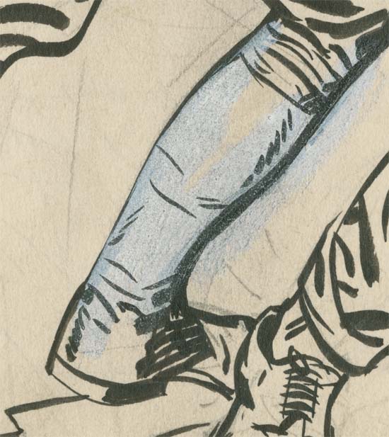

Justice Traps the Guilty #28 (July 1951) close-up, pencils and inks by Marvin Stein

Here Marvin has used white-out to correct a leg. In this case the white-out was used very shortly after the original inking as some of the ink was still wet enough to mix with the white-out, turning it grey. Enough of the original inking is still visible under the white-out to suggest the boot had much thicker outlines.

Note that the penciling can still be seen. Normally these would be erased after the inking was completed but in this case if any erasing was done it was done poorly. This is actually fortunate as it allows a glimpse into the original penciling. It appears that the original pencils were little more than a layout that Stein did not follow closely when inking.
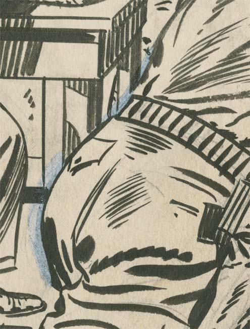

Justice Traps the Guilty #28 (July 1951) close-up, pencils and inks by Marvin Stein

Once again Stein has applied white-out to inking that is still moist enough to cause it to turn grey. Either that or Marvin used the same ink brush to apply the white-out without getting it thoroughly clean first. This does not appear to be a case of Stein narrowing an outline. Instead the effect was to redraw the buttocks and lower back, flattening the buttock a bit and adding curve to the lower back.
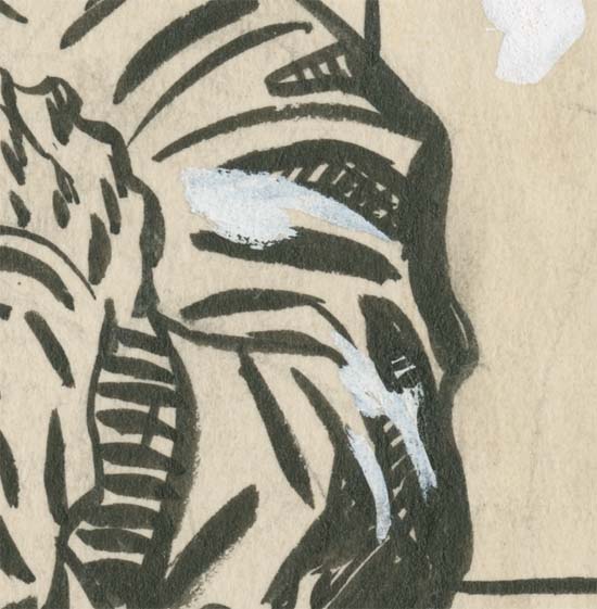

Justice Traps the Guilty #28 (July 1951) close-up, pencils and inks by Marvin Stein

The correction shown in the above image is different from the rest. This was not a change in outline but of the spotting. Apparently Stein felt the original spotting was too dark and needed to be lightened up. Today one might wonder if Stein was being a bit much of a perfectionist but he obviously had an idea of what the art should look like and was willing to spend extra time to achieve that end.

Marvin Stein’s pencils were rather loose, without details. Stein did the detail work in the actual inking. That being the case, any corrections would have to be done using white-out. Marvin would become quite good at this approach and maybe someday I will post on one of his later covers. But for now that while the use of white-out does not disappear it seems to become less frequently required. Also Stein would switch to a blue pencil for doing the initial penciling. There were other comic book artists that also did most of their work in the inking stage. Usually such artists become overly concerned in providing detailed inking to the detriment of the art. Joe Maneely is an example who used this approached whose fine detailing resulted, in my opinion, in rather dry art. Marvin Stein never allowed himself get lost in details and his art, particularly for the crime genre, is fresh and full of impact.
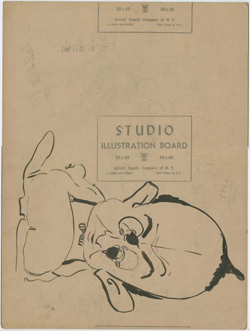

Justice Traps the Guilty #28 (July 1951), by Marvin Stein (back of the original art)

The real reason I picked this particular cover to write about is what appears on the back of the original art.
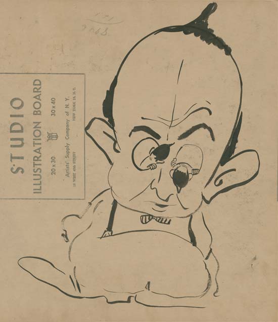

Justice Traps the Guilty #28 (July 1951), by Marvin Stein (close-up of the back of the original art)

Normally what appears on the back of original art, if there is anything at all, is very limited in size and effort. But this piece is rather large and carefully worked out. It was done entirely in ink without any trace of pencils. The humor in this work is obvious. What is not so clear is why Stein did it at all. All this effort done for no more than some personal reason. But it is fortunate that he did because it provides a side of Stein’s character that was not revealed in the work he did in comic books.
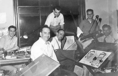

Simon and Kirby studio Left to right: Joe Genalo, Joe Simon, Jack Kirby, Mort Meskin, Jimmy Infantino and Ben Oda. Caricatures (probably drawn by Joe Simon) of Marvin Stein and Jimmy Infantino.

While it is hard to be sure, I believe this might be a caricatures of Mort Meskin, another artist who worked in the Simon and Kirby studio. Note Meskin’s receding hair, suspenders and bow tie.
The Puzzling Simon and Kirby Artist

The Simon and Kirby studio employed a number of artists whose identity has not been determined. So it might seem odd to spend much time writing about just on of them. I have written before about the artist that I will discuss here but he has such a puzzling combination of traits that I want to collect in one place what little I known. (previously in Art of Romance, Chapter 4 and Chapter 8, and What? Who?)


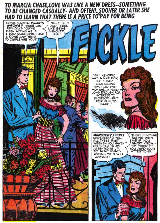
Young Love #1 (February 1949) “Fickle”, pencils by Jack Kirby and inking by an unidentified artist

The earliest piece of work that I believe this artist had a hand in appears in “Fickle” from Young Love #1 (February 1949). The man in the splash panel and second story panel is long and lanky with a small head. This is perhaps the most distinguishing feature of this unidentified artist. Although somewhat stylized, the woman in the first story panel looks very much like she was drawn by Jack Kirby. In fact the entire story consistently looks like Kirby’s work although tall lanky figures appear in different places. There is little doubt that Kirby did the pencils and the unidentified artists was in this case an inker. The quality of the inking in the story is quite variable and so I suspect more than on artist had a hand in the inking. This was after all the unusual practice in the Simon and Kirby studio, at least when it came to work drawn by Jack. For the most part the inking was done in what I describe as studio style inking with such techniques as picket fence crosshatching and abstract arc shadows (Inking Glossary). It does seem that some of the parts that show the tall lanky figures display much less of these techniques.

Many months will pass before the next piece that I attribute to the unidentified artist. That is not to say that he did no more work. Having contributed to the inking of one Kirby piece I suspect he may have help ink others as well. That other inking work just has not yet been identified.


Real West Romances #4 (October 1949) “The Perfect Cowboy”, pencils by Jack Kirby and inking by an unidentified artist

The tall and lanky figure appears once again in “The Perfect Cowboy” from Real West Romances #4 (October 1949). That style is best shown in the splash page but I have chosen a page that portrays a number of this artist’s style. Even so the lanky figure can be seen in panels 1 and 3. The story is inked in the studio style but it exhibits some rather unusual twists to that style. The artist uses picket fence crosshatching in the woman’s hair as can be seen in the last two panels of the page. This gives the hair a rather unusual look and is something I have never seen another artist do. Actually this seems to have been a bit of an experiment by this artist and is one that he did not repeat. Another unusual inking technique is the use of simple crosshatching in the some of the dust clouds such as seen in the third panel. I have never seen another Simon and Kirby artist do that but if this also was an experimental inking technique it was one that the inker was happy with and would use again.

Many of the faces seem somewhat simplified particularly in the way the eyebrows are depicted which is rather like Meskin’s approach. The woman’s eyes often seem to be at a bit of an angle with one another in a manner similar to that used by Marvin Stein. I hasten to add that neither Meskin nor Stein drew lanky figures or used simple crosshatching in dust clouds. While some of the faces may look a little like the work of Meskin or Stein, others look very much like the work of Kirby. In fact the entire story is laid out in manner so typical of Kirby that I have little doubt that Kirby did the pencils for this story and our unidentified artist did the inking. Unlike “Fickle” the inking is consistent throughout the story and I am confident that it was largely the inking by one hand. Frankly I suspect the original pencils were rather nice but the inker’s heavy hand has pretty much overwhelmed Kirby’s pencils.


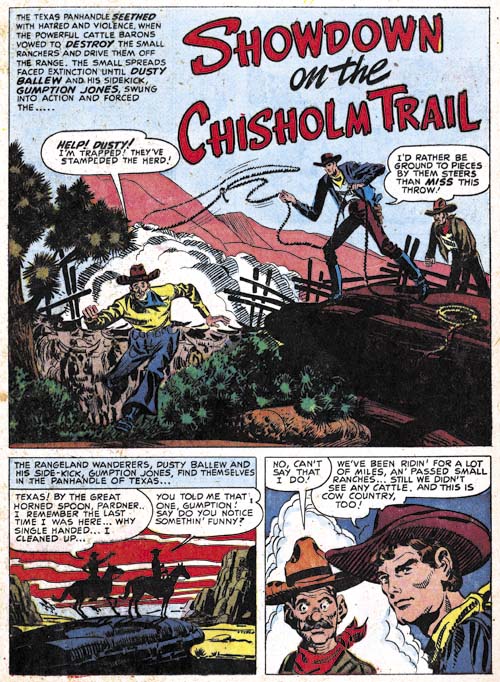
Prize Comics Western #78 (November 1949) “Showdown on the Chisholm Trail” pencils and inks by an unidentified artist

This artist next appears in “Showdown on the Chisholm Trail” from Prize Comics Western #78 (November 1949). The splash provides an excellent example of this artist trademark tall and lanky figures. There are certain panels in the story that seem to look a little like Kirby’s work and others that suggest Mort Meskin. However the great majority of the art seems distinct from either Kirby or Meskin so I feel pretty certain that these are this artists own pencils. Those parts similar to Kirby or Meskin are probably due to swiping.

For the most part this story is inked in the studio style. While the inking has its own unique traits it does resemble Meskin’s inking when that artist inked Kirby pencils. The unidentified artist inked eyebrows very much like Meskin and this may be one of the reason that the art has such a Meskin look to it. Once again we find simple crosshatching applied to dust clouds such as seen in the splash panel above. I have not found any other artist in the Simon and Kirby studio who did this.


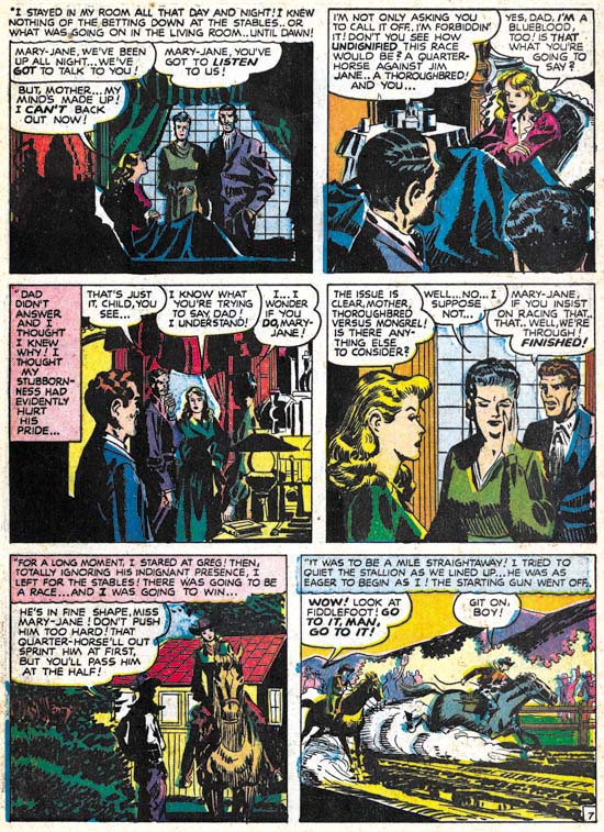
Western Love #3 (November 1949) “The Blue Blood and the Bum” page 7, pencils and inks by an unidentified artist

Another story by this artist, “The Blue Blood and the Bum”, was published in the same month. It appeared in Western Love a title that combined the romance and western genre. As such it makes for easy comparison to “Showdown on the Chisholm Trail”. Some of the same traits appear such as tall and lanky figures, simple cross hatching in dust clouds and simple Meskin-like eyebrows. There does appears that the inking has less of an emphasis on the studio style. The story on a whole seems to mimic less the style of Kirby or Meskin.


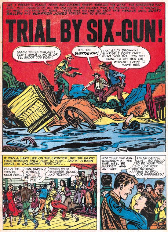
Prize Comics Western #80 (January 1950) “Trial by Six-Gun”, art by two unidentified artists

The final example that I have found for this mystery artist is found in “Trial by Six-Gun” from Prize Comics Western #80 (January 1950). The tall and lanky figures found in the splash panel seem a perfect match for the work of this unidentified artist. However the rest of the story, including the two panels below the splash, look very different from this artist’s work. Two months seem much too short a time to effect such a transformation and so I am sure this is the work of another artist. How such a combination came about will probably remain one of those minor mysteries.

These five stories are all that I could find by this artists despite much searching. I will admit that it is quite possible that he did some inking of Kirby pencils that I did not spot. I guess my main interest in this artist was to come to understand exactly what was his contribution to “The Perfect Cowboy”. A comparison of that story to the others has convinced me that “The Perfect Cowboy” was penciled by Jack Kirby and owes its unusual look to the overwhelming effects of the unidentified artist’s inking.

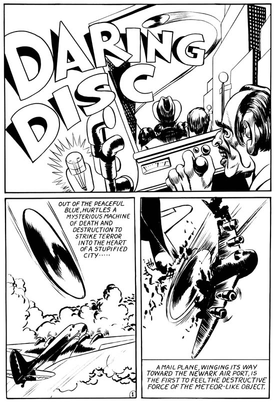
Daring Disc


Daring Disk, pencils by Jack Kirby

Occasionally a title would be cancelled leaving Simon and Kirby with some unused art. Even then Joe and Jack would often rework the art so as not to waste the effort that went into it. In one case the work for the Fighting American #8 that was cancelled by Prize Comics in 1955 ended up being used in the comic published by Harvey in 1966. Because of the recycling there is only a limited amount of Simon and Kirby work that avoided publication until the more recent rise of reprint books. For most of the art that escaped being used there is ample evidence for what it was originally intended. All this makes the story Daring Disc is so unusual. It is a very early Simon and Kirby art that originally never got published and for which there is no firm evidence as to what title it was meant for and therefore exactly when it was created.

The art style is such that we can be pretty certain it was done early in the Simon and Kirby collaboration. But I would like to examine the evidence that the work provides that might narrow down when it was created.

I do not believe the inking helps much. It does not look to me like the inking that Kirby did on his own pencils in stories such as the Solar Legion that Jack did for Crash Comics (#1 to 3, May – July 1940). But Kirby was variable in the inking of his very early work (see A Brief Pause, Another Brief Pause and It Ain’t Soup ) so it hard to be sure whether this is his inking or not. It might have been inked by Joe Simon or someone else but that would hardly help in narrowing the time period.


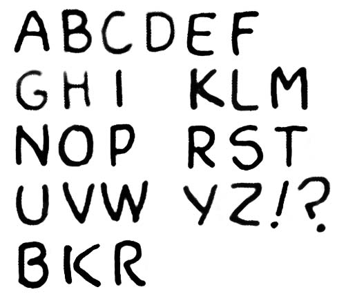
“Daring Disk”, letters by an unidentified letterer

I believe better information can be obtained by the lettering. This is not a very professional letterer (many were not during those early days of comic books). His lettering can easily be distinguished from that by Jack Kirby, Joe Simon or Howard Ferguson, the most frequently used letterers for Simon and Kirby work from the early 40’s (see Chapter 5 of In the Beginning for examples of all three). This trio did most of the most of the lettering during the initial Simon and Kirby collaboration. Joe and Jack most frequently in the earliest period and Howard predominantly later. However other letterers were common during the period from July to September 1940. Sometimes another letterer was used later for example in the Vision story from Marvel Mystery Comics #17 but by then Kirby’s pencils were done in a style that does not match that found in Daring Disk and therefore can be discounted. So based on the use of an non-typical letterer and the art style July to September 1940 seems to be the most likely date* for Daring Disk.


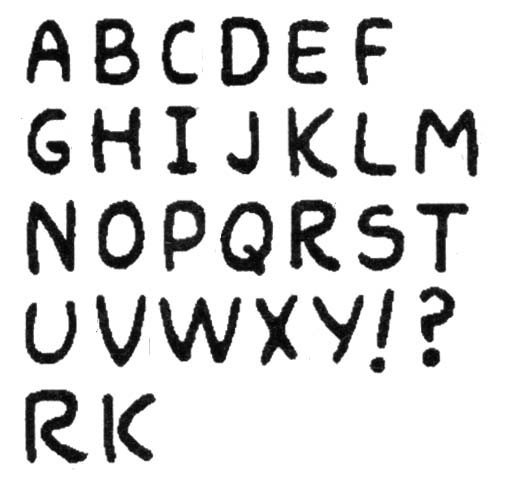
Marvel Mystery #10 (August 1940) “The Human Torch”, letters by an unidentified letterer (from Marvel Masterworks)

While I cannot identify the letterer of Daring Disc his work looks very much like that found in the Human Torch story from Marvel Mystery #10 (August 1940). The lettering examples I provide for both the Daring Disk and MM #10 were derived from the speech balloons while the same type of lettering is found in the captions only it is slanted in both pieces. Further drop capitals** were not used in either work. Simon was the Timely editor so it is likely that he would have known and could supply work to the letterer from MM #10. MM #10 August cover date matches the July to September dates that I suggested above.

These is one other piece of evidence to consider the title of the piece. Why Daring Disc? Horrible Disc, Terrible Disc or something of that nature would seem more appropriate. But perhaps it was called Daring because it was meant for Daring Comics. A similar use of Daring in the title was used for Captain Daring by Jack Kirby (Daring Mysteries #6, September 1940). Simon’s work appeared in the early issues of Daring Mystery but Kirby’s first appeared in Daring Mystery #6 (September 1940) and later in DM #7 (April 1941) and #8 (January 1942). But again Kirby’s art had developed by DM #7 into a style that I do not think matches Daring Disk.

Granted this is not the greatest evidence but it seems the best available. so based largely on the use of a letterer other than Simon, Kirby or Ferguson I would suggest Daring Disk would cover date from July to September 1940. The particular letterer used and the title are even less firm evidence but they agree with those dates as well.

footnotes:

* These are cover dates, calendar dates would put the creation of the art 5 or 6 months early; January to April 1940.

** Drop capitals is the term I use for enlarged and sometimes shadowed first letter of the captions.

Speaking of Art, Al Williamson’s Fly

This is the start of a new topic for the Simon and Kirby blog where I will write about original comic book art. This will not be a serial post where I would explore a subject over a number of posts. Instead each post will stand by itself with only the common theme of original art connecting them. There will be no order in what I write about and I will pick the particular subject as my mood suits me. Some of the pieces will be from my personal collection but most will be from the much more extensive collection that belonged to Joe Simon. I do that with the permission of the Joe Simon estate.

It is clear that many people, even comic book fans, really do not “get” original comic book art. But there is something very special about the original art as compared to the published comic books. It is not that the printing of the comic books was so bad (although that is certainly true) or that original art is unique while thousands of copies of a comic book may exist (but true again). What is truly special about the art is that it reveals the hand of the creators in ways that are simply not possible from the printed comic. There are nuances in things like inking that completely get lost in the production process. There are changes in the art that many people would consider blemishes but instead provide insight into the creative process. I remember a story about Joe Sinnott erasing margin notes because he thought it distracted from the art. Some original art have subject to extensive cleaning processes to remove all blemishes. I am sure this was done in an attempt to increase the value of the piece but to me it actually has quite the opposite effect. What may seem blemishes to some has an aesthetic quality for me. While aesthetics play an important roll in the value of original art, they have historical value as well.

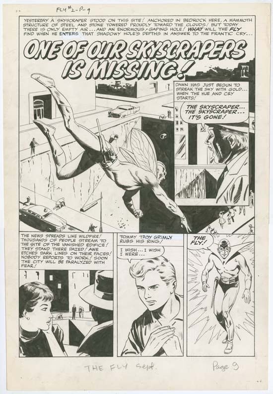
Before writing about the original art for “One Of Our Skyscrapers Is Missing” by Al Williamson I would like to discuss a story that Joe Simon use to tell. Here it is as presented in his autobiography Joe Simon, My Life In Comics where he is talking about the Harvey Comics title Race For The Moon:

When I proposed the title, Jack welcomed the work. I wrote most of the stories, although Dick Wood, Dave Wood and Eddie Herron contributed some scripts. Because Kirby was penciling some of them, I was able to sign up three of the best inkers in the business. Reed Crandall, Angelo Torres, and Al Williamson, each of them a brilliant artist in his own right, all wanted to work with Jack. In addition to inking Jack’s pencils, they got to illustrate some stories on their own.

Although in his book Joe describes this story as concerning Race For The Moon, I remember Joe telling me that he heard about the story from something Williamson said. Williamson gave an interview for Jack Kirby Collector #15 where he discusses his work on Race For The Moon. I have written about Williamson’s comments in an recent post (Kirby Inkers, Al Williamson) but the what is important here is Williamson does not relate this story when talking about Race For The Moon. But in another part of the interview:

TJKC: You did a solo story for The Fly #2. How’d you get that job?

AL: I was asked by the editor, and he gave me a five-pager to do. I’d never done superhero stuff before, and I sat down and did this Jack Kirby-type character they wanted me to do. I penciled it and took it in, and the editor had a fit. “Aahh, you’re a lousy artist. This is no good.” I had to do the first two pages over again, and he paid me $45 for five pages of work. And when it came out, the only thing he’d changed was the splash, and he’d copied it from Jack. I was really pissed off. So dear old Angelo Torres gets a call from this guy, and he says, “I gave Williamson a job, and he’s a lousy artist, he can’t draw. I want you to do this four-page Fly story for me.” So Angelo went up and said, “Sure, I’ll do it.” Then he came over to the house and said, “Listen, Al. This guy said you can’t draw, you’re a lousy artist, and he wants me to do this four-page superhero thing, so I thought maybe I’d let you pencil it.” (laughter) So I did! I penciled the four pages, and gave it to Angelo, and he took it up. The editor looked at it and said, “See, this is great! You’re better than Williamson!” (laughter) So Angelo inked it, and the guy never knew I penciled it.

Clearly this is the same story but it concerns work for Adventures of the Fly #2. Williamson does not name the editor but it was Simon who put together the first four issues of Adventures of the Fly and he alone chose the artists and assigned the work.


Adventures of the Fly #2 (September 1959) “One Of Our Skyscrapers Is Missing”, pencils by Al Williamson

In Williamson’s version of this tale he drew two stories for the issue. One that Joe was unhappy with and another drawn without Simon’s knowledge of his involvement. Williamson claims that Simon changed the splash of the first story but the rest was printed with no alterations. Williamson’s drawing style is very distinctive and there is no need for the original art to say with certainty that Williamson only drew one story for any issue of Adventures of the Fly. The drawing style alone would suggest that the splash for the story was pure Williamson. But the original art does conclusively shows that no changes were made to any of the art for this story, including the splash shown above. Any such changes would have to use white-out or other editing tools that would be completely obvious in the original art.

I have to say that I am rather dubious about another aspect of Williamson’s story, that Joe did not like his art. Simon used Al for inking Kirby pencils and for doing his own pencils for a number of Harvey comics for which Joe was the editor. While it is possible that Simon’s opinion changed just a couple of years later it would have to change again. When I knew him, Joe was a great admirer of Williamson’s art.

I suspect that the writing at the bottom of the page (present on the other pages as well) is a later addition. Usually the art was identified in ink in the upper left. In this case “FLY #2-P-9”, page 9 of issue 2 of Adventures of the Fly. It would remain on the proofs made when the art was shot for productions but could easily be removed before final printing. Occasionally someone forgot to remove them or did a poor job at it and they can be seen in part or whole in the printed comic books. This notation was done in ink to insure that it was still present when the initial stats were made. Pencils were problematic when photo imaging the original art to stats since they were not dark enough to insure a good image but too dark to be sure that they did not show up at all. Which is why pencils were erased after the inking was completed. While pencils notations like that at the bottom could easily be removed during the production process, they are redundant and do not serve any purpose.


Adventures of the Fly #2 (September 1959) “One Of Our Skyscrapers Is Missing” the back of page 2

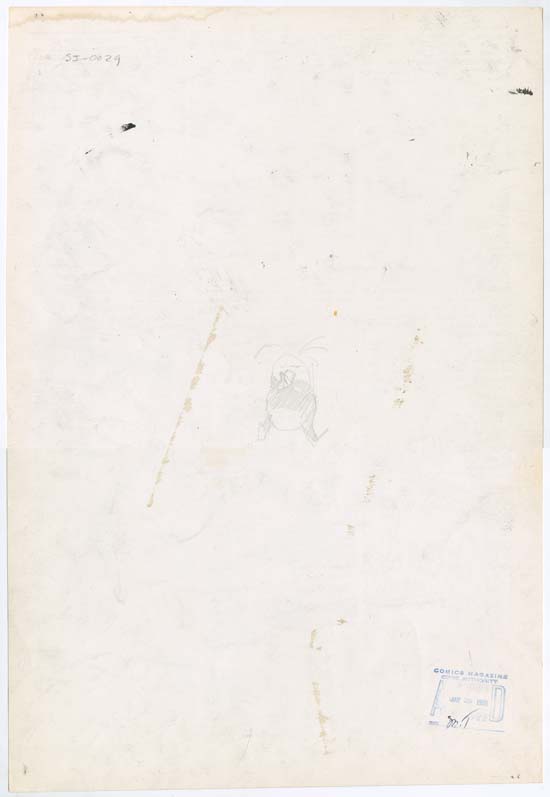
Sometimes rather interesting things can be found on the back of comic book art. However in the case of this story the back of the pages are pretty much unadorned. The only exception is page 2 which is shown above. An explanation is in order about the writing in pencil that reads SI-0029. This is the Simon Inventory number, and yes I am to blame. I did the inventory for Joe’s collection and it was a difficult task. Joe had over 1500 pages of original comic book art (not including many production proofs). I needed a way to keep track of it while the inventory was being created. So I assigned inventory numbers that I placed on the back usually near an edge and always in an area without anything significant. I suspect that for page 2 I placed the inventory number further from the edge because of the water stain. Inventory numbers were assigned as I inventoried the piece and have no significance other than order that I encountered them while working. There was one exception in that I generally assigned inventory numbers for original art to numbers less than 1000 and used the higher numbers for things like proofs. I also assigned the same inventory number to all pages belonging to the same story. This helped me in getting the collection better organized as originally pages to a story were often scattered about in different places.

Note the two small black irregular patches. I believe these to be due to the inker preparing his brush. Similar markings, although much more extensive, can be found on the back of other pages that I believed Williamson inked. However these two small marks are the only examples found on the back of this story or any other one that Joe had from the Adventures of the Fly title.


Adventures of the Fly #2 (September 1959) “One Of Our Skyscrapers Is Missing” close-up of the back of page 2

One thing that is common to backs of all the original art for this story, and indeed of most original art from the period, was the Comic Code approval stamp. Today the stamp is of use because it provides a terminal date for the creation of the art. Art could have started earlier, and even inventoried for a period of time, but the stamp was only applied to completed art ready for publication. Thus this art was finished no later than May 29, 1959. The same date appears for the approval stamp for “Marco’s Eyes”, “Tim O’Casey’s Wrecking Crew”, “The Master of Junk-Ri-La” and some of the fillers from the same issue. Comic book cover dates were used by the publisher to indicate when to take the issue off the stands and sent back to the distributor. When converting the cover date to the date the art was created I usually subtract five or six months. Two months for the time on the stands, one month for distribution, one month for printing and one month or more to create the art. From that scheme I would expect the approval stamp to be four months before the cover date. But it is just an estimate as there was much variations in the publication of comic books. For Adventures of the Fly #2 the stamp appears to be closer to three months before the cover date.

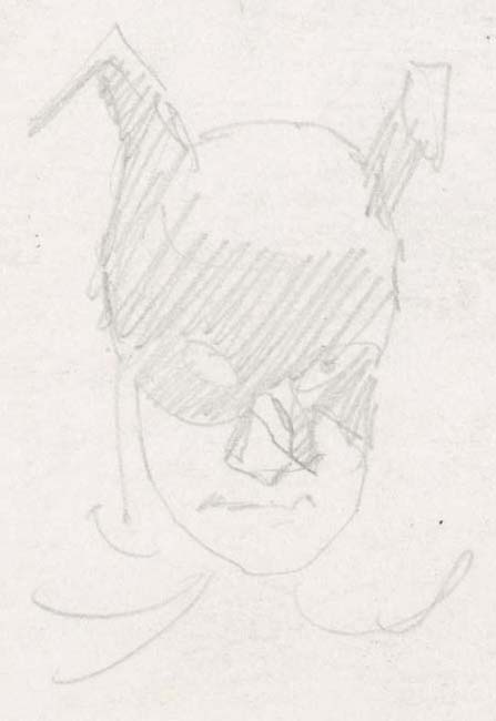
Adventures of the Fly #2 (September 1959) “One Of Our Skyscrapers Is Missing” close-up from back of page 2 of a Batman sketch by Al Williamson

The back of page 2 has one other feature that might be a little hard to make out in the full page image but when enlarged and rotated 180 degrees turns out to be a sketch of Batman. Obviously Batman would not appear in a Harvey comic book so it maybe nothing more than a doodle or a drawing done to demonstrate some point.