Tag Archives: Draut

Art of Romance, Chapter 21, Roussos Messes Up

(November 1952 – January 1953: Young Romance #51 – #53, Young Love #39 – #41, Young Brides #2 – 3)
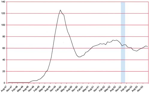
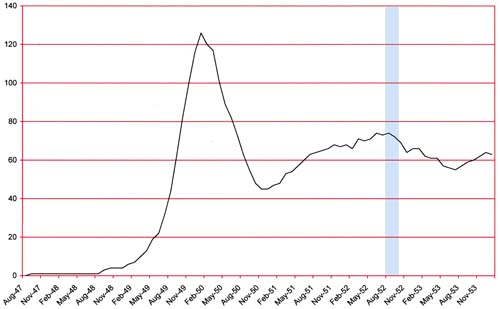
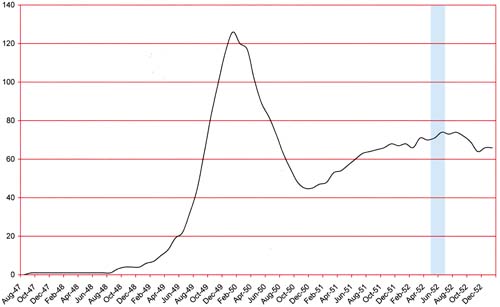
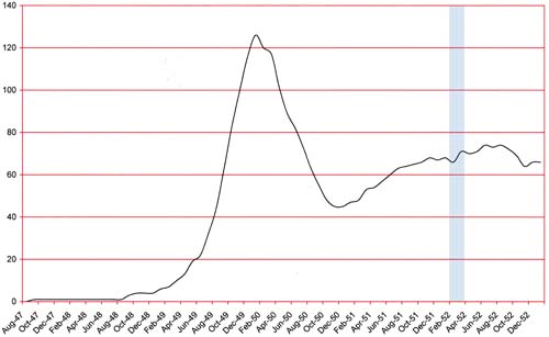
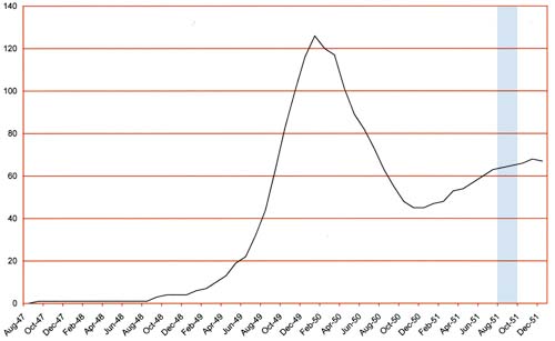
Number of Romance Titles 1947 - 1954
Number of Romance Titles 1947 – 1954 (the period covered in this chapter is shaded in blue)

In the last chapter the most prolific romance artist was Bill Draut. This was somewhat of a fluke because Draut held that position only for a short time and Mort Meskin would once again regain the top position by producing 77 pages of art. However this time Mort would achieve such high page counts not by his efforts alone. Some of Mort’s art covered here was inked by George Roussos. Exactly how much is not clear as there are some works I just have not been able to decide about the inker.

Jack Kirby picks up second place with 42 pages but other artists are not far behind him. It has been some time since Jack was the dominant artist. The other two usual suspects take the next positions; Bill Draut (36 pages) and John Prentice (34 pages). Bill Walton does a surprising, for him that is, 22 pages. The other artist (George Roussos, Al Eadeh(?) and Bob McCarty(?)) provide only a small number of art pages.
Young Romance #53
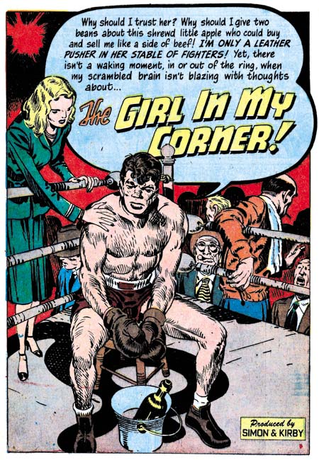
Young Romance #53 (January 1953) “That Girl in My Corner”, art by Jack Kirby

Jack Kirby may not have been as prominent a presence as he once was but he still did some incredible art. The confessional splash for “That Girl in My Corner” is a great example. What a moving figure the fighter presents; perhaps a little tired and haggard but by no means defeated. His girl presents the least interesting character of the splash but check out all the on-lookers. The background figures may not have played an important place in the splash but they are just the sort of added spice that provides the proper atmosphere.
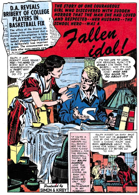
Young Love #40
Young Love #40 (December 1952) “Fallen Idol”, art by Jack Kirby

There was a time when the first, or featured, story almost always used a confessional splash. That has changed in recent months. Of the eight comics reviewed here only one of the featured stories has a confessional splash. That is not to say that the first splash did not always get good treatment. In fact I had a hard time choosing between two of Kirby’s splashes to present here; they both were so good.
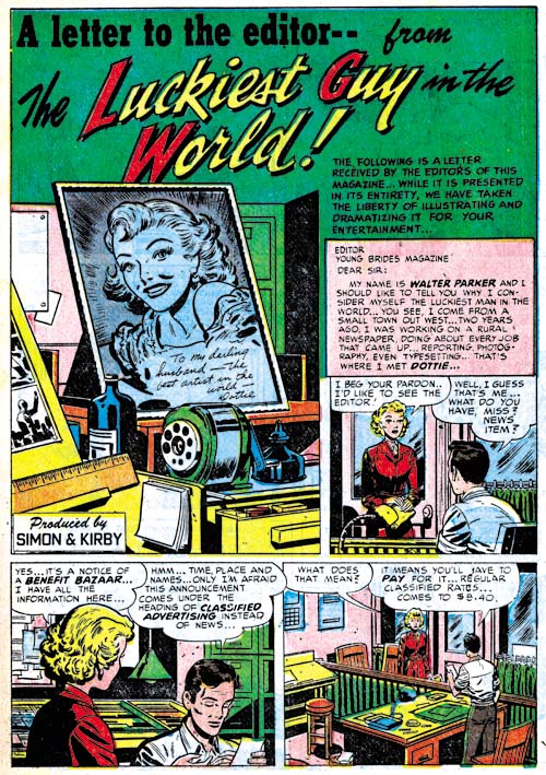
Young Brides #2
Young Brides #2 (November 1952) “The Luckiest Guy in the World”, art by Bill Draut

Another of the changes occurring to the Prize romance titles is that previously if Kirby appeared in an issue he would most likely do the feature story. This was no longer the case; Jack only did three of the eight featured stories. Three of the other featured stories were done by Bill Draut. Another change was the splash for the featured story did not always take up a full page. While in the earlier romance issues the featured story seemed chosen from the start, now more and more it seems like it was indistinguishable from any of the other stories.

At a quick glance the cluttered desk top could belong to anyone. The story is about a newspaper artist but look what is on the drawing board cut off by the left edge. Looks like comic book art to me.
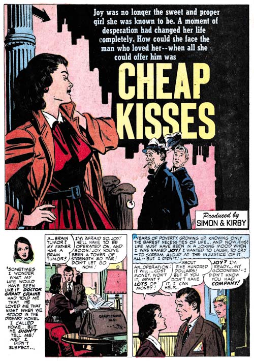
Young Romance #51
Young Romance #51 (November 1952) “Cheap Kisses”, art by John Prentice

One practice remained, the teaser. I wonder if the teenage girl readers understood the suggestion of prostitution that John Prentice’s splash provides, but I am sure any adult viewer would. Perhaps this was done on purpose to entice an adult to purchase the comic expected a lurid story. But any adult that did buy the comic was certainly doomed to disappointment. In this case the real crime that the girl did was theft.
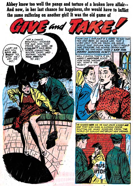
Young Brides #2
Young Brides #2 (November 1952) “Give And Take”, art by John Prentice

John Prentice would sometimes abandon a splash border. It is a technique that allows the story to stand out from the others. The theme of a man preventing a woman from suicide is one that he would draw again years later for Harvey Comics (“Paid in Full” was discussed in Kirby Imitating John Prentice). Interestingly Prentice left out the border for the splash for the Harvey story as well.
Young Romance #53
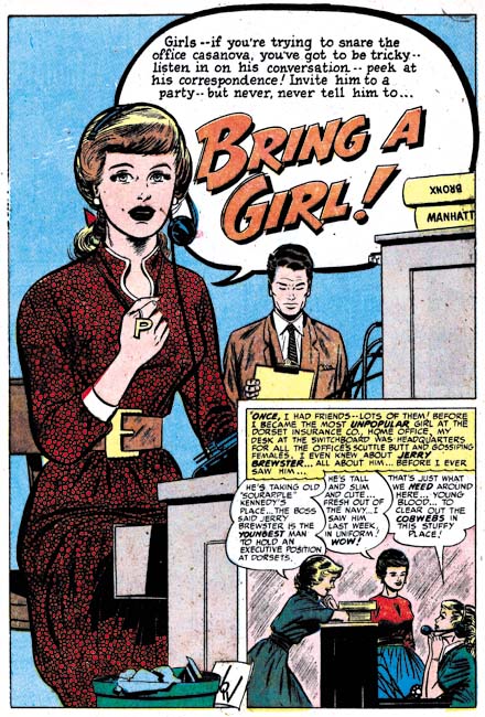
Young Romance #53 (January 1953) “Bring a Girl”, art by Bill Walton

The confessional splash is not always limited to the feature story. I believe the confessional splash for “Bring a Girl” is the only one that Bill Walton did. It is also Walton’s only full page splash for Simon and Kirby. Its uniqueness suggests that this story may originally have been intended for the feature story but got replaced by Kirby’s “Girl in My Corner” which in my opinion was a good choice. Still it is the best splash that Walton would do for Simon and Kirby. So nice that I also suspect that Walton was provided a layout, most likely by Joe Simon.
Young Love #39
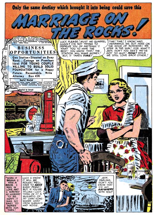
Young Love #39 (November 1952) “Marriage on the Rocks”, pencils by Mort Meskin

Some of the art by Mort Meskin for this period have been inked by a brush technique I do not remember seeing in his art before. The technique is call a split brush where by the brush is manipulated to form multiple tips. With this technique it is possible to ink parallel lines with one stroke. In the inking of “Marriage on the Rocks” this can best be seen as short strokes on the man’s shoulder. Meskin has a preference for spotting with parallel lines but in the past did them with separate brush strokes. I cannot make up my mind if this is Mort just experimenting with the split brush technique or if it indicates that another artist did the inking.
Young Love #41
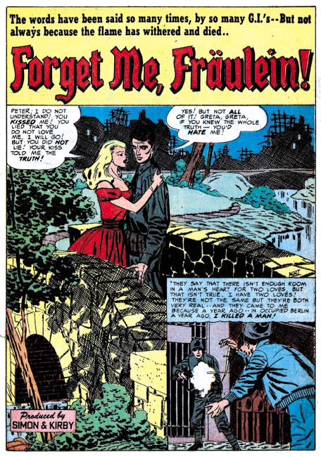
Young Love #41 (January 1953) “Forget Me, Fraulein”, pencils by Mort Meskin, inks by George Roussos

According to the Jack Kirby Checklist, “forget Me, Fraulein” was penciled by Jack Kirby and inked by Mort Meskin. The biggest problem with that is there on the right edge just above the story panel is Meskin’s signature.
Young Love #41
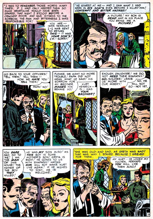
Young Love #41 (January 1953) “Forget Me, Fraulein” page 3, pencils by Mort Meskin, and inks by George Roussos

I am sure that some will still say that Kirby did the layouts, but it is clear to me that Mort was not working from layouts supplied by Jack. That is not to say Kirby did not influence Meskin, Mort had been working along side of Jack for three years and had picked up some things. The easiest clue that these are not Kirby layouts, now that it has been pointed out in a previous comment by Steven Brower (Little Shop of Horrors, Chapter 5), is the narrow depth of field. Most of the men look much more like Meskin’s than those drawn by Kirby. However there is something to the men that is a little off from typical Meskin and the Fraulein looks nothing like Mort’s.

A clue as to why this story seems so odd is found in the picket fence crosshatching (see Inking Glossary) found in panel 3. This Studio style inking technique is found nowhere else in this story. While the picket fence crosshatching does not recur elsewhere in two panels at the bottom of page 6 there can be found Kirby’s blunt inking brush. One of these panels has a man obviously drawn by Kirby. Apparently Kirby has taken on his roll as art editor and provided numerous touchups to the art.

It is unusual to find Kirby doing any corrections on Meskin’s art and never before have the corrections been so extensive. The reason becomes clear when the inking is examined more closely. Particularly revealing are the manner the cloth folds are spotted. They are not inking with the sweeping parallel brush strokes that Meskin typically uses but rather by the somewhat splotchy method employed by George Roussos.

So what has happened was that Roussos inked Meskin’s pencils in a manner very typically for George, that is to say rather poorly. Since this was going to be used for the all important feature story, Kirby had to do a surprisingly large number of touchups. In the end the story is a mixture of a majority of pieces that look like they were penciled by Meskin, a surprisingly number of parts that look like Kirby’s work and in even a few places part that look like they were drawn by Roussos. George did a great job of inking Mort’s art when both were working for DC but here in the Simon and Kirby studio Roussos just seems to do little more than mess up Meskin’s pencils.
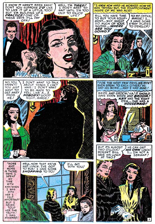
Young Brides #3
Young Brides #3 (January 1953) “Bride and Broom” page 5, pencils by Mort Meskin, inks by George Roussos

When writing about the differences between Mort Meskin’s inking and that of George Roussos I have been pointing out their different manner of spotting the cloth folds. While that is usually the easiest means that can be used to determine the correct inking credits, it is not the only why the two inkers are distinct. Both inkers have a fondness for crosshatching but Mort generally only uses it if fill up blank backgrounds while George will sometimes use it on such things as figures as shown by the woman in the first panel from the page shown above. Note how the crosshatching is fine and done at approximately right angles. That is not the manner that Meskin uses for the rare occasions that he does crosshatch a figure as for example in story he later did for Harvey (see Horrible Meskin). There the crosshatching is not so fine and the angle between the lines is much more oblique.
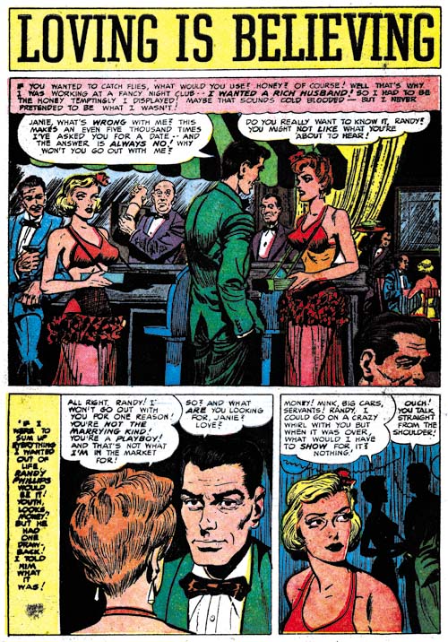
Young Love #41
Young Love #41 (January 1953) “Loving Is Believing”, art by Bob McCarty(?)

I have previously remarked about the large eyes drawn by the artist that I am questionably calling Bob McCarty. Unfortunately the images that I provided were not the best ones to show that feature so I am glad to finally be able to provide a good example, “Loving is Believing”.

Also not how the splash panel is actually the first panel of the story as well. This is not a technique that I have had occasion to comment on before. While this may be the first use of the way of presenting a story, now that it has been introduced we will be seeing it again.
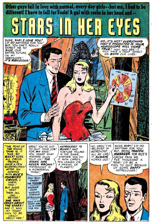
Young Romance #53
Young Romance #53 (January 1953) “Stars In Her Eyes”, art by Al Eadeh(?)

I will close with another specimen of work by Al Eadeh(?). I have not discussed this artist work in detail because I really feel his style, particularly the way he does eyes, is so distinctive that he can easily be recognized. Now all I have to do is find something with this style that he signed.

Chapter 1, A New Genre (YR #1 – #4)
Chapter 2, Early Artists (YR #1 – #4)
Chapter 3, The Field No Longer Their’s Alone (YR #5 – #8)
Chapter 4, An Explosion of Romance (YR #9 – #12, YL #1 – #4)
Chapter 5, New Talent (YR #9 – 12, YL #1 – #4)
Chapter 6, Love on the Range (RWR #1 – #7, WL #1 – #6)
Chapter 7, More Love on the Range (RWR #1 – #7, WL #1 – #6)
Chapter 8, Kirby on the Range? (RWR #1 – #7, WL #1 – #6)
Chapter 9, More Romance (YR #13 – #16, YL #5 – #6)
Chapter 10, The Peak of the Love Glut (YR #17 – #20, YL #7 – #8)
Chapter 11, After the Glut (YR #21 – #23, YL #9 – #10)
Chapter 12, A Smaller Studio (YR #24 – #26, YL #12 – #14)
Chapter 13, Romance Bottoms Out (YR #27 – #29, YL #15 – #17)
Chapter 14, The Third Suspect (YR #30 – #32, YL #18 – #20)
Chapter 15, The Action of Romance (YR #33 – #35, YL #21 – #23)
Chapter 16, Someone Old and Someone New (YR #36 – #38, YL #24 – #26)
Chapter 17, The Assistant (YR #39 – #41, YL #27 – #29)
Chapter 18, Meskin Takes Over (YR #42 – #44, YL #30 – #32)
Chapter 19, More Artists (YR #45 – #47, YL #33 – #35)
Chapter 20, Romance Still Matters (YR #48 – #50, YL #36 – #38, YB #1)
Chapter 21, Roussos Messes Up (YR #51 – #53, YL #39 – #41, YB #2 – 3)
Chapter 22, He’s the Man (YR #54 – #56, YL #42 – #44, YB #4)
Chapter 23, New Ways of Doing Things (YR #57 – #59, YL #45 – #47, YB #5 – #6)
Chapter 24, A New Artist (YR #60 – #62, YL #48 – #50, YB #7 – #8)
Chapter 25, More New Faces (YR #63 – #65, YLe #51 – #53, YB #9 – #11)
Chapter 26, Goodbye Jack (YR #66 – #68, YL #54 – #56, YB #12 – #14)
Chapter 27, The Return of Mort (YR #69 – #71, YL #57 – #59, YB #15 – #17)
Chapter 28, A Glut of Artists (YR #72 – #74, YL #60 – #62, YB #18 & #19, IL #1 & #2)
Chapter 29, Trouble Begins (YR #75 – #77, YL #63 – #65, YB #20 – #22, IL #3 – #5)
Chapter 30, Transition (YR #78 – #80, YL #66 – #68, YBs #23 – #25, IL #6, ILY #7)
Chapter 30, Appendix (YB #23)
Chapter 31, Kirby, Kirby and More Kirby (YR #81 – #82, YL #69 – #70, YB #26 – #27)
Chapter 32, The Kirby Beat Goes On (YR #83 – #84, YL #71 – #72, YB #28 – #29)
Chapter 33, End of an Era (YR #85 – #87, YL #73, YB #30, AFL #1)
Chapter 34, A New Prize Title (YR #88 – #91, AFL #2 – #5, PL #1 – #2)
Chapter 35, Settling In ( YR #92 – #94, AFL #6 – #8, PL #3 – #5)
Appendix, J.O. Is Joe Orlando
Chapter 36, More Kirby (YR #95 – #97, AFL #9 – #11, PL #6 – #8)
Chapter 37, Some Surprises (YR #98 – #100, AFL #12 – #14, PL #9 – #11)
Chapter 38, All Things Must End (YR #101 – #103, AFL #15 – #17, PL #12 – #14)

Little Shop of Horrors, Chapter 6, Mix Bag

(August – October 1952, Black Magic #15 – #17)

I normally like to start the chapters of my recent serial posts with a discussion about the amount that of the various artists contributed to the issues. Usually just a few artists, sometimes even just one, predominate. But in the Black Magic issues covered in this chapter a much more evenly distributed situation occurred. The ranking is George Roussos (19 pages), Jack Kirby (18 pages), Bob McCarty(?) (15 pages), Bill Draut (14 pages), Mort Meskin (13 pages), Bill Walton (7 pages) and Al Eadeh(?) (7 pages). While during the same period in the romance titles, Jack Kirby provided very little art, in the horror genre he takes second place. Kirby has not held that position for in any genre for some time.

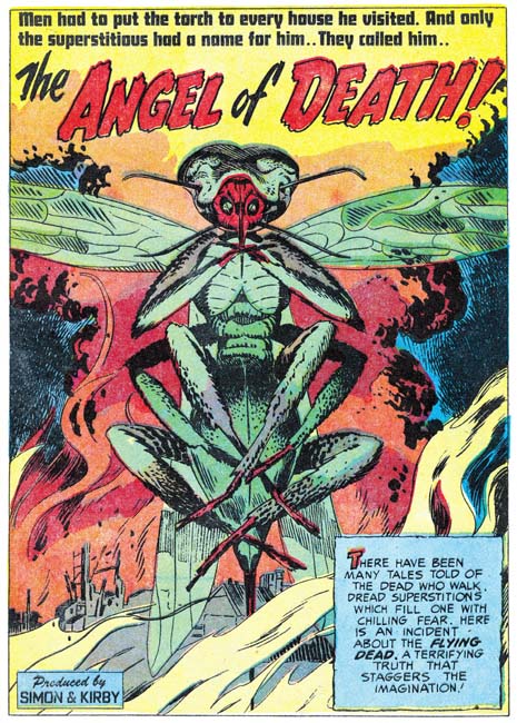
Black Magic #15
Black Magic #15 (August 1952) “The Angel of Death”, pencils by Jack Kirby

Jack Kirby’s human anatomy really was not very accurate, but his animal anatomy bordered on the fantastic. In the splash for “The Angel of Death” there appears to be a gigantic insect, but insects have six legs, not eight. Nor do any of an insect’s legs emerge from the final body segment as Kirby depicts. Despite these sorts of inaccuracies that would have caused Kirby to fail any biology class his animal creations have a special life. Even before reading the story it is certain that we would not want to meet this particular angel.

Black Magic #17
Black Magic #17 (October 1952) “Freak” panel 1, page 2, pencils by Jack Kirby, inks by George Roussos

One story in the issues covered in this chapter stands out from all the rests, but not the bests of reasons. Even though “Freak” is the featured story it frankly is a mess. The art is clearly the worse of any in these issues. Why than would it be listed in the Jack Kirby Checklist? Well actually for good reasons. Note the panel shown above. While it seems very poorly inked it clearly looks like Jack’s work. This panel, from the start of the story, is probably the most obviously one showing Kirby’s hand . However even on pages not so easily attributed to Jack the graphical story telling, the particular cinematic approach used, are his alone.

Black Magic #17
Black Magic #17 (October 1952) “Freak” page 4, pencils by Jack Kirby, inks by George Roussos

The Jack Kirby Checklist attributes the inking of this story to Mort Meskin; however the spotting is nothing like his. This can most easily be seen by the way the cloth folds are inked. Mort typically builds them up with a number of close parallel brush strokes that may overlap but usually can be detected at the ends. The cloth folds in “Freak” are nothing like that. When Mort inks Kirby pencils he usually adopts the Studio style inking. However picket fence crosshatching, drop strings or any of the other Studio style spotting techniques (see Inking Glossary) are completely absent in this story. The only reason that I can see to credit Meskin with the inking is that some of the faces have a Meskin look to them.

While Meskin is a poor match for the spotting found in “Freak” there is another artist whose inking is an exact match, George Roussos. George does cloth folds in exactly the same manner when inking his own stories. Many of the faces have a light source coming up from below. While that technique was occasionally used by other inkers, it is a common technique of Roussos.

George Roussos had a long history of inking Meskin and Meskin-like faces appear in his work from time to time. This may mean nothing more then the large influence Mort had on George’s art. On the other hand it may mean that Mort touched up parts of the story. In any case Roussos clearly did almost all the spotting for “Freaks”.

While I have attributed the pencils to Kirby this maybe another of those occasions where Jack provided nothing more than just layouts. The fact that the most Kirby-like portions are at the beginning of the story suggests that might be true. Whatever the type of pencils provided Roussos has clearly botched the job. Not only does the final result really do not do justice to Kirby, the art is actually much inferior to Roussos own work. So much for the theory that Kirby’s pencils were so good that they made a poor inker look good.

Black Magic #15
Black Magic #15 (August 1952) “The Promised Land”, art by Mort Meskin

Mort Meskin penciled two Black magic stories during this period. One, “The Promised Land”, is a nicely drawn and inked work very much up to Meskin’s high standards. There is no reason to go into detail about this work, it very much matches most of Mort’s other Black Magic efforts. While Meskin did good romance art he does seem to particularly shine in the horror genre.

Black Magic #17
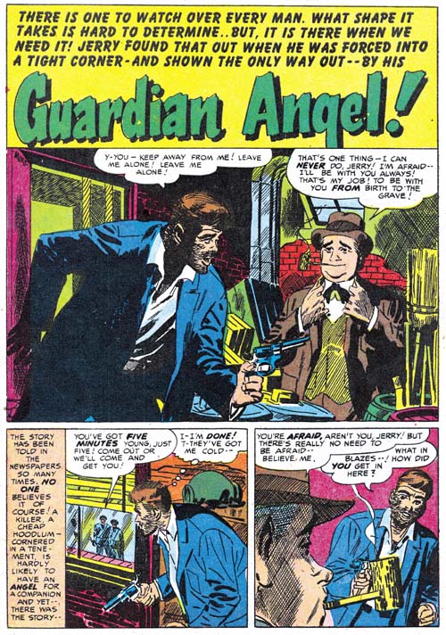
Black Magic #17 (October 1952) “Guardian Angel”, pencils by Mort Meskin, inks by George Roussos

I wish I could be as complementary about Meskin’s other contribution, “Guardian Angel”. There is a simple explanation for the disparity between the two Meskin stories from this period, “Guardian Angel” was not inked my Mort. In the chapter from The Art of Romance that covers this same period (Chapter 20) I remarked that there were some Meskin pieces that I felt were inked by George Roussos. Well Roussos’s hand is even clearer in “Guardian Angel”. This is again easiest detected by an examination of the cloth folds. They are not constructed by parallel lines as Meskin would have done but done in the same splotchy manner typical of Roussos. It would seem that having a piece inked by Roussos had unfortunate consequences at this point in time although “Guardian Angel” came off much better than “Freak”.

Black Magic #17
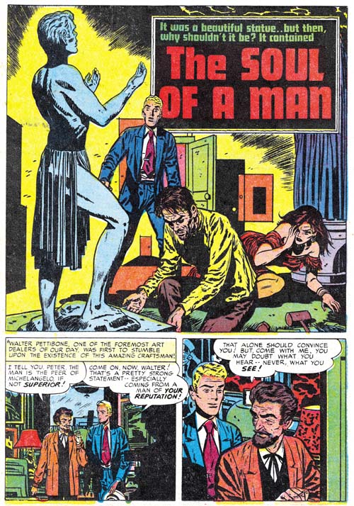
Black Magic #17 (October 1952) “The Soul of a Man”, art by Bill Draut

I never want to make it seem like Bill Draut was not doing anything worth while. His “The Soul of a Man” is particularly memorable because it includes a man physically abusing and then savagely killing a woman. Simon and Kirby were still willing to include such strong material but in a few years the Comic Code would completely eliminate such stories.

Black Magic #15
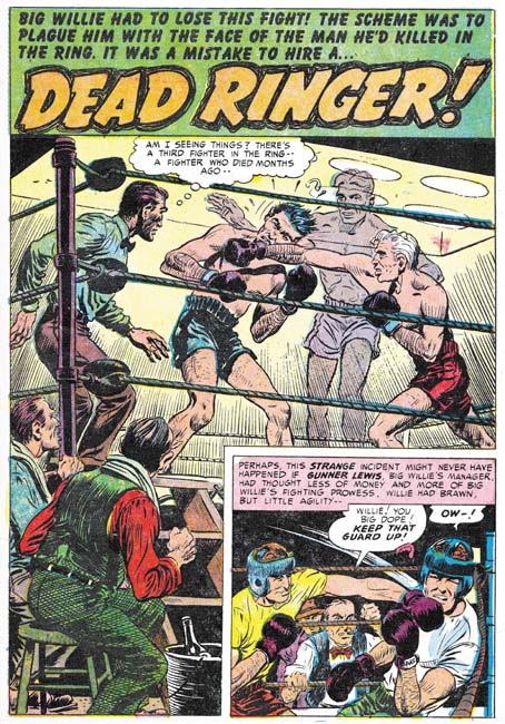
Black Magic #15 (August 1952) “Dead Ringer”, art by Bob McCarty(?)

Bob McCarty(?) has some nice work as well. No chance that Kirby provided any layouts for “Dead Ringer” because Jack certainly would not have depicted a punch like this one.

Black Magic #16
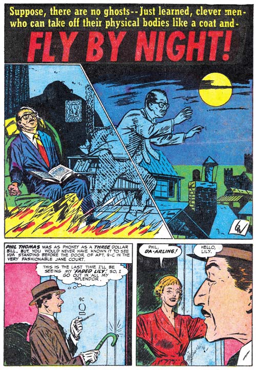
Black Magic #16 (September 1952) “Fly By Night”, art by Bill Walton

Bill Walton is not among my favorite Simon and Kirby artists but he does a nice job on the splash for “Fly by Night”. The unusual inking works quite well with the image of astral projection.

Black Magic #16
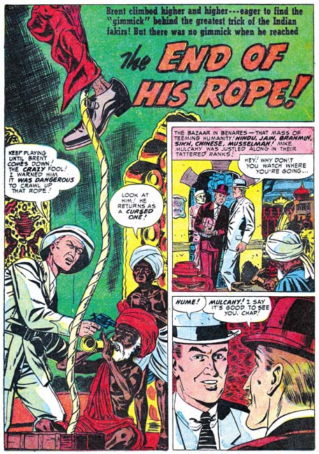
Black Magic #16 (September 1952) “The End of His Rope”, art by Al Eadeh(?)

Like Walton, Al Eadeh(?) only provides a single story. He is another artist that I am not overly fond of although he certainly competent enough.

The Little Shop of Horrors, Chapter 1 (#1 – 3), Expanding Their Fields
The Little Shop of Horrors, Chapter 2 (#4 – 6), Up and Running
The Little Shop of Horrors, Chapter 3 (#7 – 8), The Same Old Gang
The Little Shop of Horrors, Chapter 4 (#9 – 11), Another Hit
The Little Shop of Horrors, Chapter 5 (#12 – 14), New Faces

The Little Shop of Horrors, Chapter 7 (#18 – 20), Kirby Returns
The Little Shop of Horrors, Chapter 8 (#21 – 23), The Gang’s All Here
The Little Shop of Horrors, Chapter 9 (#24 – 26), The Party’s Ovetr
The Little Shop of Horrors, Chapter 10 (#27 – 29), A Special Visitor
The Little Shop of Horrors, Chapter 11 (#30 – 33), The End

Art of Romance, Chapter 20, Romance Still Matters

(August 1952 – October 1952: Young Romance #48 – #50, Young Love #36 – #38, Young Brides #1)

Number of Romance Titles 1947 - 1954
Number of Romance Titles 1947 – 1954 (the period covered in this chapter is shaded in blue)

Simon and Kirby not only created the romance genre of comics, they also made quite a bit of money from it quite well. Their agreement with Prize Comics gave Joe and Jack a share in profits but it also required them to cover all the costs of producing the art. If sales for the love comics were not sufficient, Simon and Kirby could actually loose money. However there are two indications from the period covered in this chapter that indicate that the Prize romance titles were doing quite well. One is that Young Romance reached its 50th issue. Of course there is nothing really special about the number 50 (as compared to 49 or 51) but it does make a convenient benchmark for how successful the title Young Romance was. Most of the titles created and produced by Simon and Kirby did not last past 7 issues. Young Romance, Young Love and Black Magic are among the exceptions. Justice Traps the Guilty was another title created by Joe and Jack but they did not actual produce it over most of the title’s run.

There is a second indication on how successful the Prize romance comics were. Simon and Kirby titles were typically started as bimonthlies. You can tell if a title was doing well because either it would become a monthly or a spin-off title would be made. Apparently the S&K love comics were doing well but Young Romance and Young Love were both monthly so the only option was to introduce another title, Young Brides. Young Brides would also follow Simon and Kirby’s modus operandi and begin as a bimonthly. As far as I can tell there was no difference between the contents of any of the three love comics except that Kirby would appear more often in the flagship title, Young Romance (although during the period covered in this chapter Kirby would not appear in Young Romance at all). By the way, Young Brides is another of those successful titles that would last well beyond 7 issues.

As the reader can see on the chart shown above, the new title Young Brides was released at a relative peak in the number of romance titles published. I use the tracking of the number of romance titles over time as a means of deducing the popularity of romance comics and even as an indicator for comics in general (The Real Reason for the Decline of Comics). I still do not have an adequate explanation for this relative peak and the decline that followed. Was it similar to the romance glut where publishers grew overconfident and ended up with more romance titles than the market could bear? Or was there some external factor such as the rise in criticism of comic books in some sectors of the public? Like I said, I really do not know but it does not appear that starting a new love title at this time was a poor business decision because Young Brides would go monthly a year later which is a sure sign that sales where very good even with three romance titles.

Surprisingly the most prolific artist for these seven issues was Bill Draut (59 pages). Bill is a consistent presence in Simon and Kirby productions but he is generally overshadowed by either Jack Kirby or Mort Meskin in terms of quantity. Meskin was still prolific supplying 51 pages. Other artist provided significantly less; John Prentice (29 pages), Al Eadeh(?) (24 pages), and a surprising fifth place for Jack Kirby (23 pages). Other artists (Bill Walton, Bob McCarty(?) and George Roussos would supply only single stories.

Young Love #36
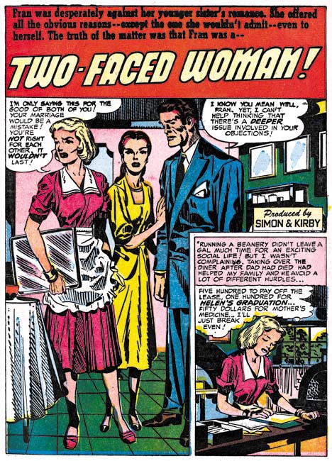
Young Love #36 (August 1952) “Two-Faced Woman”, pencils by Jack Kirby

Another indication about the more reduced roll that Jack Kirby has been taking in the romance titles is that he only did one of the seven lead stories. The lead story typically starts with a confessional splash; one where one of the characters introduces the story to the reader and their speech balloon becomes the title. The confessional splash was very effective and it seems strange that Kirby did not go with it for the splash used in “Two-Faced Woman”. Frankly this splash while technically well executed just does not have much impact. The verbal exchange just does not seem to match the splash well. However the inking was by Kirby and is quite superb.

Young Brides #1
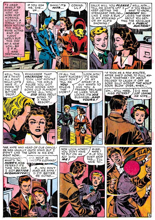
Young Brides #1 (September 1952) “Surprise, Surprise” page 5, pencils by Jack Kirby

More than any of the other studio artists, Kirby always liked to add a little action to his romances. Slaps did not play a big part in Simon and Kirby productions but check out that last panel. In movies the man slapped would often hardly flinch, but this lady certainly put some muscle behind it.

Young Romance #48
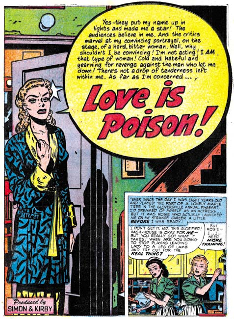
Young Romance #48 (August 1952) “Love Is Poison”, art by Bill Draut

Kirby may not have used the confessional splash but it would appear with other artists. Bill Draut made some particularly good use of that splash format. In “Love is Poison” even without reading her speech we can tell she is a bitter woman. The star on the door behind her shows she is an actress but the peeling paint above her indicates that she is not appearing in a big time movie or Broadway show. Draut was second only to Kirby among the studio artists in providing such emotional portrayals.

Young Romance #50
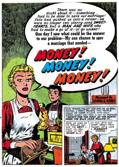
Young Romance #50 (October 1952) “Money, Money, Money”, art by Bill Draut

Draut did four of the seven lead stories and some of his splashes are so good that I wanted to include another example. The splash for “Money, Money, Money” may not have quite the impact of “Love Is Poison” but I love his portrayal of the grocery boy waiting to be paid (somehow I do not think he will get much of a tip). The inking of the upper part of the page is rather unusual for Bill.

Young Love #36
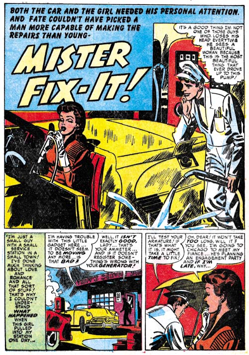
Young Love #36 (August 1952) “Mister Fix-It”, art by Mort Meskin

Mort Meskin may not have drawn splashes with the emotional impact found in those by Kirby or Draut, but he was great at humor. The gas station attendant feels that he is calm and collected while he unknowingly misses the gas cap and pours the fuel on the ground. Mort did these humorous splashes so well it is small wonder that he seem to do more of them than any other studio artist.

Young Love #38
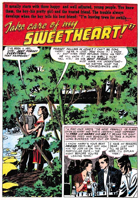
Young Love #38 (October 1952) “Take Care of My Sweetheart”, pencils by Mort Meskin, inks by George Roussos?

Although I generally do not make a point of it, Mort Meskin did his own inking while working for Simon and Kirby. I say this based on an examination of the work itself and it was verified recently by a comment that Joe Simon made to me. Meskin was very productive and sometimes I feel that some of his worked suffered because of that. However some of the work in this period seems particularly poorly inked, as for example “Take Care of My Sweetheart”. This is unfortunate because the composition for the splash is rather nice. But the inking does seem rushed and the end results rather crude.

Young Romance #49
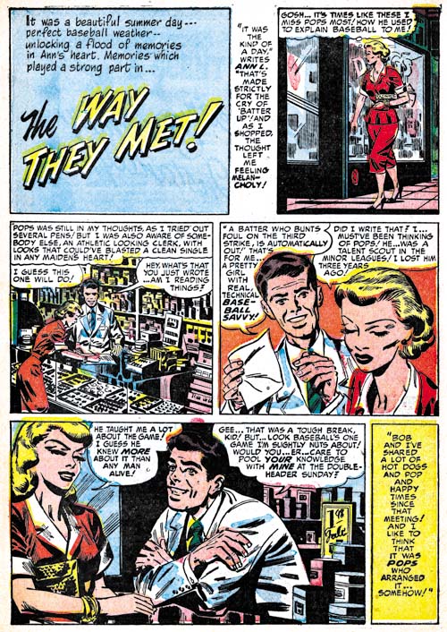
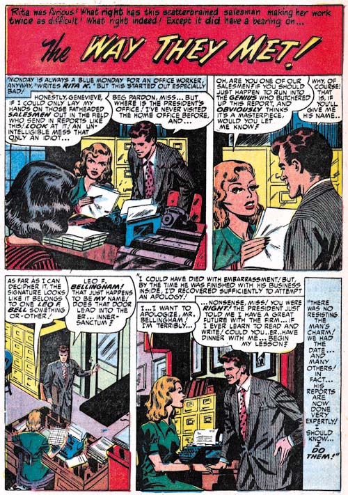
Young Romance #49 (September 1952) “The Way They Met”, pencils by Mort Meskin, inks by George Roussos?

“The Way They Met” from YR #49 is another example of uncharacteristically poor inking on a work penciled by Mort. Normally the cloth folds made from a series of narrow parallel lines are an indication that Meskin did the inking so I might attribute it all to a particularly rushed job. However while the faces have Meskin’s classic grin they also have a resemblance to those drawn by George Roussos. So I suspect what is going on is that Roussos is helping with the inking. Unlike Kirby, Meskin at least sometimes indicated the spotting in his pencils (The Eleventh Commandment) which may explain why Roussos adopted some inking techniques not found when inking his own pencils.

Young Romance #49
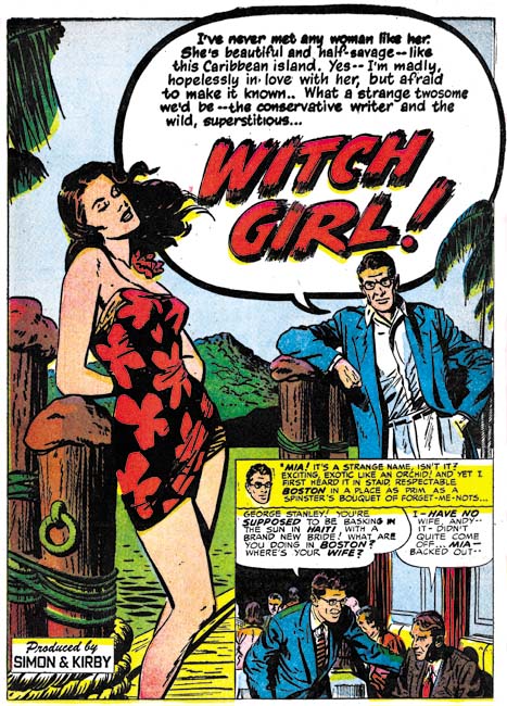
Young Romance #49 (September 1952) “Witch Girl”, art by John Prentice

The two lead features not drawn by either Draut or Kirby were done by Prentice. This is a clear sign that Simon and Kirby valued his contribution and I think with good reason. While I like the art that Kirby, Draut and Meskin were providing I think Prentice was just what was needed to provide the titles with a healthy mix of styles. “Witch Girl” uses the almost standard confessional format (John’s other lead feature, “Jay’s Protege”, does not). While Prentice might not quite have Kirby’s or Draut’s talent for the portraying of emotions, he certainly could draw beautiful women. Prentice was greatly influenced by Alex Raymond and the male character looks like Rip Kirby. This is ironic because Prentice would take over the strip after Raymond’s untimely death in 1956.

Young Love #37
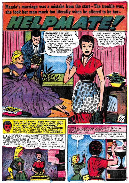
Young Love #37 (September 1952) “Helpmate”, art by Bill Walton

There is a single story, “Helpmate” signed with just initials. Even if the art style was not clue enough, a comparison of those initials with Bill Walton’s signature in stories like “Say the Magic Words” (Black Magic #12, Chapter 5 of the Little Shop of Horrors) show them to be identical. Walton did work for a number of different comic publishers at the same time. He would not play a big part in Simon and Kirby productions but he would appear on and off for a couple of years.

Young Romance #48
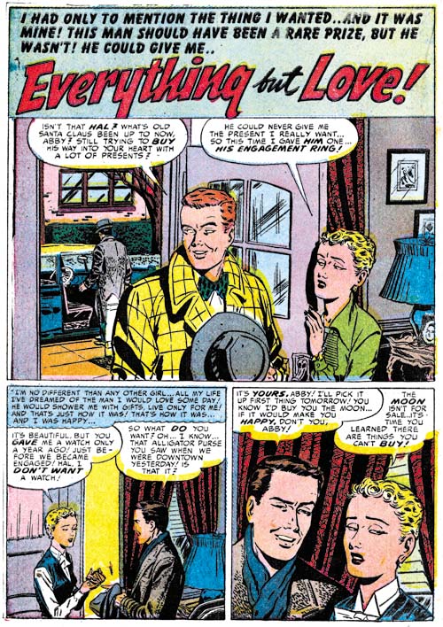
Young Romance #48 (August 1952) “Everything but Love”, art by Al Eadeh(?)

I provide another example of work that I questionably attribute to Al Eadeh. The way the artists draws eyes, particularly for women, is so distinctive that it should be relatively easy to determine if this work really was done by Eadeh once I have managed to compare it with signed work for another publisher from this period.

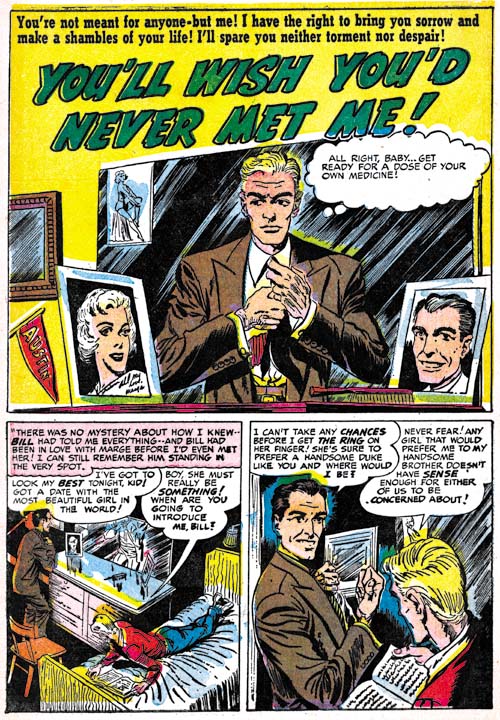
Young Romance #49
Young Romance #49 (September 1952) “You’ll Wish You’d Never Met Me”, art by Bob McCarty(?)

My problem with resolving the attribution of this work to Bob McCarty (or not) is different than with the case of Al Eadeh(?). There is some work for Foxhole that can safely be attributed to McCarty. It is just a matter of seeing whether traits that make this work like distinct from the Foxhole work change with time or remain constant. The most distinctive difference is the large eyes used in these earlier pieces as can be seen in the above page.

Chapter 1, A New Genre (YR #1 – #4)
Chapter 2, Early Artists (YR #1 – #4)
Chapter 3, The Field No Longer Their’s Alone (YR #5 – #8)
Chapter 4, An Explosion of Romance (YR #9 – #12, YL #1 – #4)
Chapter 5, New Talent (YR #9 – 12, YL #1 – #4)
Chapter 6, Love on the Range (RWR #1 – #7, WL #1 – #6)
Chapter 7, More Love on the Range (RWR #1 – #7, WL #1 – #6)
Chapter 8, Kirby on the Range? (RWR #1 – #7, WL #1 – #6)
Chapter 9, More Romance (YR #13 – #16, YL #5 – #6)
Chapter 10, The Peak of the Love Glut (YR #17 – #20, YL #7 – #8)
Chapter 11, After the Glut (YR #21 – #23, YL #9 – #10)
Chapter 12, A Smaller Studio (YR #24 – #26, YL #12 – #14)
Chapter 13, Romance Bottoms Out (YR #27 – #29, YL #15 – #17)
Chapter 14, The Third Suspect (YR #30 – #32, YL #18 – #20)
Chapter 15, The Action of Romance (YR #33 – #35, YL #21 – #23)
Chapter 16, Someone Old and Someone New (YR #36 – #38, YL #24 – #26)
Chapter 17, The Assistant (YR #39 – #41, YL #27 – #29)
Chapter 18, Meskin Takes Over (YR #42 – #44, YL #30 – #32)
Chapter 19, More Artists (YR #45 – #47, YL #33 – #35)
Chapter 20, Romance Still Matters (YR #48 – #50, YL #36 – #38, YB #1)
Chapter 21, Roussos Messes Up (YR #51 – #53, YL #39 – #41, YB #2 – 3)
Chapter 22, He’s the Man (YR #54 – #56, YL #42 – #44, YB #4)
Chapter 23, New Ways of Doing Things (YR #57 – #59, YL #45 – #47, YB #5 – #6)
Chapter 24, A New Artist (YR #60 – #62, YL #48 – #50, YB #7 – #8)
Chapter 25, More New Faces (YR #63 – #65, YLe #51 – #53, YB #9 – #11)
Chapter 26, Goodbye Jack (YR #66 – #68, YL #54 – #56, YB #12 – #14)
Chapter 27, The Return of Mort (YR #69 – #71, YL #57 – #59, YB #15 – #17)
Chapter 28, A Glut of Artists (YR #72 – #74, YL #60 – #62, YB #18 & #19, IL #1 & #2)
Chapter 29, Trouble Begins (YR #75 – #77, YL #63 – #65, YB #20 – #22, IL #3 – #5)
Chapter 30, Transition (YR #78 – #80, YL #66 – #68, YBs #23 – #25, IL #6, ILY #7)
Chapter 30, Appendix (YB #23)
Chapter 31, Kirby, Kirby and More Kirby (YR #81 – #82, YL #69 – #70, YB #26 – #27)
Chapter 32, The Kirby Beat Goes On (YR #83 – #84, YL #71 – #72, YB #28 – #29)
Chapter 33, End of an Era (YR #85 – #87, YL #73, YB #30, AFL #1)
Chapter 34, A New Prize Title (YR #88 – #91, AFL #2 – #5, PL #1 – #2)
Chapter 35, Settling In ( YR #92 – #94, AFL #6 – #8, PL #3 – #5)
Appendix, J.O. Is Joe Orlando
Chapter 36, More Kirby (YR #95 – #97, AFL #9 – #11, PL #6 – #8)
Chapter 37, Some Surprises (YR #98 – #100, AFL #12 – #14, PL #9 – #11)
Chapter 38, All Things Must End (YR #101 – #103, AFL #15 – #17, PL #12 – #14)
Little Shop of Horrors, Chapter 5, New Faces

(May – July 1952, Black Magic #12 – #14)

As in Chapter 19 of The Art of Romance, Mort Meskin was the most productive artist for Black Magic drawing a total of 30 pages. Bill Draut was particularly active and draw 21 pages. The third and fourth places was held by an artists new to the studio; Bill Walton with 14 pages and Bob McCarty(?) with 10. Jack Kirby takes a surprising fifth place having provided only 9 pages. Kirby was the only artist who drew covers for Black Magic so three of those pages were covers with the remaining 6 pages from a single story. However we shall see Jack had a hand in other aspects of the title. Still it is a continuing mystery why Kirby, renown for his fast drawing, was so unproductive lately and especially during the period covered in this chapter. The rest of the art was provided by three artists each providing a single piece; George Roussos (4 pages), Al Eadeh(?) (2 pages) and 3 pages by an unidentified artist who used J. G. as initials.

Unfortunately John Prentice does not appear in any of the Black Magic issues covered in this chapter. Simon and Kirby did not use Prentice in Black Magic as much as some of the other studio artists. This certainly was not because Prentice was poor at the horror genre. Not only do I think he did a good job in Black Magic but he was clearly better than some of the artists that were used. I suspect the bias had more to do with how well Prentice did in the love titles that S&K preferred to assign him romance work.

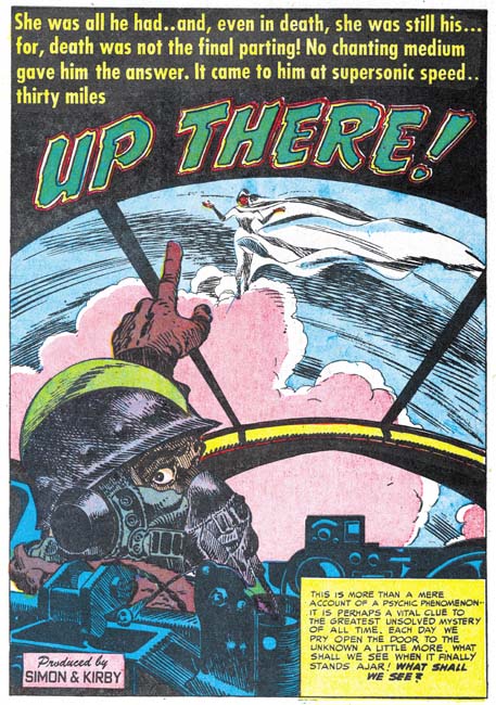
Black Magic #13
Black Magic #13 (June 1952) “Up There”, art by Jack Kirby

I always want to include at least one Kirby story in all my serial posts, but this time there is only one to choose from. Still it is a great story and was recently included in Titan’s “Best of Simon and Kirby”. Of course picking the best from Simon and Kirby’s repertoire is always a difficult decision since they did so much great stuff in all genres.

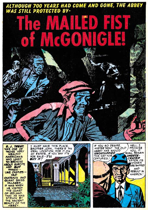
Black Magic #14
Black Magic #14 (July 1952) “The Mailed Fist of McGonigle”, art by George Rossous

I am sure I have said this before, but George Roussos is not among my favorite Simon and Kirby studio artists. His artwork is a bit too crude for my tastes. With that said I often find his use of blacks very interesting especially when he uses them in a splash such as in Black Magic #14 (July 1952) “The Mailed Fist of McGonigle”. Perhaps the greatest weakness in this particular splash is that it is easy to overlook the running figure in the background as an empty suite of armor.

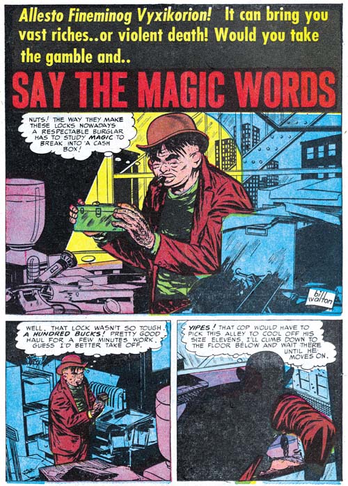
Black Magic #12
Black Magic #12 (May 1952) “Say the Magic Words”, art by Bill Walton

When I wrote Chapter 19 of the Art of Romance there was one story whose artist I could not identified but felt looked very familiar. Had I reviewed the work in this chapter of the Little Shop of Horrors I would have been known immediately who it was since both Black Magic stories by Bill Walton are signed. Fortunately all was not lost as sharp eyed Ger Apeldoorn recognized the correct attribution right away. Bill has a tendency to shorten the height of his faces and in his three quarter views to place the eyes at an angle. Walton will be making regular appearances in Simon and Kirby productions for a while so there will be amply opportunities to see examples of this work.

Black Magic #13
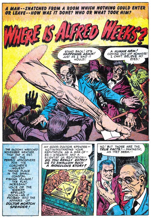
Black Magic #13 (June 1952) “Where is Alfred Weeks?”, art by Bob McCarty(?)

The June issue of Black Magic provides the first appearance of another artist that will regularly show up in Simon and Kirby productions for a time. The problem is he never signs his work and the only reason I have questionably attribute the art to Bob McCarty is because of some similarities to that artist works from 1954 (McCarty also did not sign his work but Foxhole was the only Simon and Kirby comic that provides some of the credits). However there are some differences between the art that might mean that they were not done by the same artist or that his art had evolved. One of the most distinctive features of the art in “Where is Alfred Weeks” as compared to McCarty’s art in Foxhole is the use of oversized eyes (not particularly obvious in the image I supply above). I will continue to questionably attribute this work to McCarty but I hope that I will resolve this issue, at least to my own satisfaction, as I proceed with these serial posts.

Black Magic #13
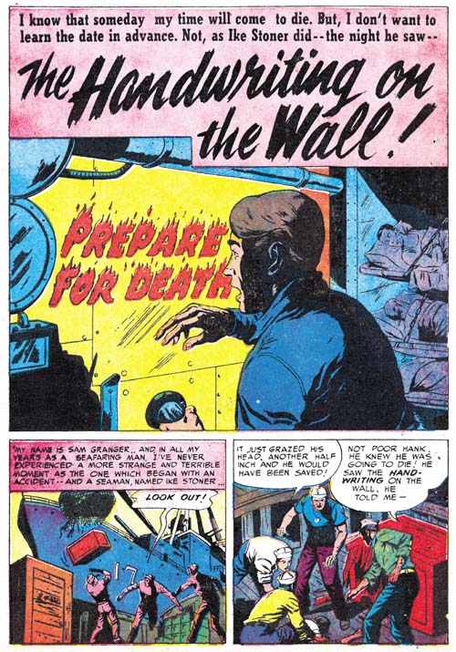
Black Magic #13 (June 1952) “The Handwriting on the Wall”, art by J. G.

“The Handwriting on the Wall” is an unsigned piece but there are some similarities to a story from Black Magic issue Black Magic #9 (“The Man in the Judge’s Chair”) that signed “J. G.”.

Black Magic #13
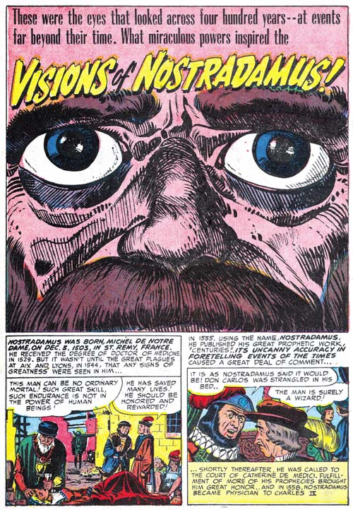
Black Magic #13 (June 1952) “Visions Of Nostradamus”, art by Jack Kirby and Al Eadeh(?)

One story, “Visions Of Nostradamus”, is by an artist that I originally thought might be Al Eadeh but I have not yet done my homework and found a contemporary signed piece by the artist to resolve the issue so I will continue to use a question mark. Ger Apeldoorn, who is much more familiar with Atlas where Eadeh also worked, seems more confident about the attribution. Eadeh(?) is a competent artist but nothing in his work that I have seen suggest the artistic talent shown in the splash. Of course that is not an acceptable reason to question whether he drew the splash (even poorer artists sometimes create a masterpiece) but the brushwork does not look like his either but does look like inking by Jack Kirby. The rather oversize eyes might seem incongruous for Kirby but similarly sized eyes appeared in a Kirby splash from Young Love #25 (September 1951, Chapter 16 of the Art of Romance).

Black Magic #13
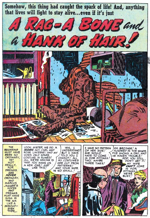
Black Magic #13 (June 1952) “A Rag, a Bone and a Hank of Hair”, art by Jack Kirby and Mort Meskin

Mort Meskin’s style is very different from Kirby’s and normally there is no problem in distinguishing the two. The story for “A Rag, A Bone And A Hank Of Hair” is obviously penciled and inked by Mort and in the past I assumed he did the splash as well. But since there are no figures in the splash, or at least human figures, this was really nothing more than an assumption. But during my review for this post I noticed the arcing of the two shadows on the wall. These are not true abstract arches but they still are a typical feature of the Studio Style inking. Now Meskin was excellent at Studio Style inking but he used that approach when inking Kirby’s pencils and generally not when inking his own work. Then I notice the inking of the oversized rag doll. The brushwork on the dummy is done with a rather blunt brush that is more typical of Kirby than Meskin. There is also a brush technique that I have not discussed before nor included in my Inking Glossary but nonetheless is an often found method used by Kirby (perhaps Joe Simon as well). Notice the simple hatching found on the lower part of the dummy’s arm (somewhat obscured by a white piece of paper). They form a shadow that is a sequence of arcs; what I think of as a scalloped edge shadow. Much of the brushwork in the splash has the sort of loose control that Kirby was so great with, but not all of the inking. The crosshatching on the cupboard is more mechanically arranged than typical of Jack but often found in Mort’s inking as can be seen in the two story panels on the bottom of the page. Also the inking of the pillow in the foreground looks more typical of Meskin particularly where closely spaced nearly parallel brushstrokes are used.

Black Magic #13
Black Magic #13 (June 1952) “A Rag, a Bone and a Hank of Hair” page 5, art by Mort Meskin

I include a story page as well so Meskin’s method of inking the large rag doll can be seen as well. Notice the brushwork is not as blunt, there are more uses of parallel ink lines, and there are no scalloped edge shadows. Even the hair is inked rather differently than Jack’s splash.

The reader might have noticed that while I have recognized Kirby’s inking, I have not said anything about the drawing. Unfortunately there is little to go on as the dummy is drawn in the same manner in the splash and the story. This might suggest that Meskin drew both but the cover is also based on this story and provides a similarly drawn dummy and there is no question that Kirby drew the cover. The only thing I can point out about the splash is the use of perspective; somehow it seems more consistent with Jack’s work than Mort’s. I fully realize that this is a very vague and subjective description but it is all I have to offer at this time. I do not know if I have convinced anyone else, but I have convinced myself that Jack was largely responsible for the splash panel.

Black Magic #12
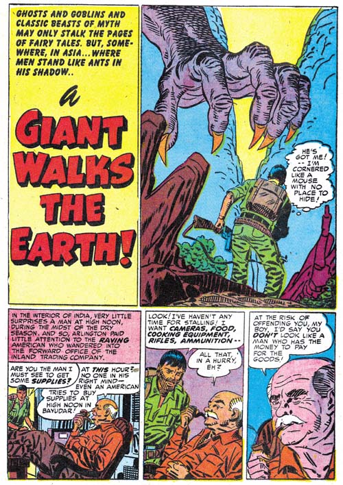
Black Magic #12 (May 1952) “A Giant Walks the Earth”, pencils by Jack Kirby, inks by Mort Meskin and Jack Kirby

Kirby drawn splashes in stories otherwise drawn by other artists are not the norm but are not that unusual either. They are rare enough that I can include all the cases I find in my serial posts. But Kirby splashes are common enough that many chapters (but not all) have examples. However it seems out of the ordinary to find so many Kirby splashes in just three issues because “A Giant Walks the Earth” appears to be another case. Again Kirby’s hand is easiest to spot in the inking. The folds on the human’s pants are typical of Jack’s brushwork; they have simple abstract shapes with no signs of the brush tip. The inking on the giant hand is done with a blunt brush more typical of Jack’s than it is of Mort’s inking. There is crosshatching on the giants forearm but note how less mechanical it is compared to the examples found in “A Rag, a Bone and a Hank of Hair”. However the inking of the foreground rocks all looks like it was done by Meskin. In fact there are some rocks in the story that are inking exactly the same manner.

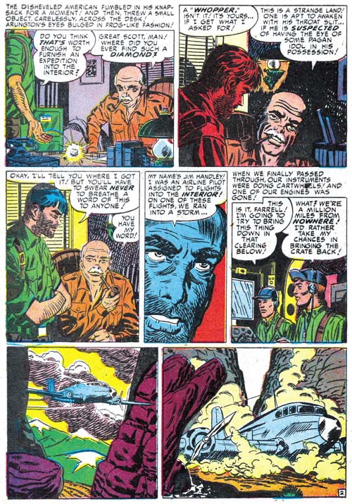
Mort also clearly inked the story panels of the first page. This provides a good comparison of the two artist’s approach to inking cloth folds. At a glance they may appear the same but instead of the almost puddle like look found in Kirby’s inking, Meskin constructs folds using parallel lines with no attempt to hide the tip of the brush.

Black Magic #12
Black Magic #12 (May 1952) “A Giant Walks the Earth” page 2, art by Mort Meskin

Even though Mort is clearly inking the story panels on the splash page the art does not look like his. I provide an image of the second page so that two can be compared. The difference between the two is most obvious in the older man. So if Meskin did not draw the story panels from the first page, who did? I believe Kirby drew these as well. The end result may not look like typical Kirby art because Meskin appears to have inked them with a heavy hand. Normally Mort was quite a good inker of Kirby’s pencils and not so heavy handed but I believe in this case Mort purposely inked the first story panels this way so that they would blend better with the rest of the story.

Black Magic #13
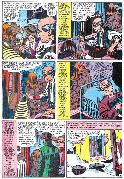
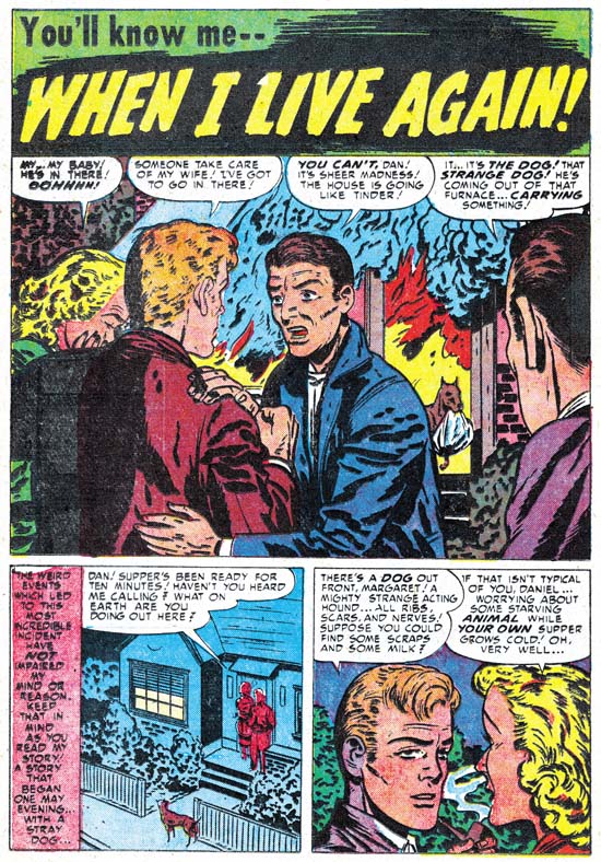
Black Magic #13 (June 1952) “When I Live Again”, art by Bill Draut

One of Bill Draut’s contributions was “When I Live Again”. Bill does his usual competent job but to be honest I doubt that I would have mentioned it because there is nothing truly unique about it. However when I reviewed I quickly realized that the plot was very familiar. So much so that I did some searching and sure enough found a similar story in Alarming Tales #1 (September 1957, “Logan’s Life”). It is more than similar stories; they were the same plot only the six pages of “When I Live Again” had been reduced to a mere two for “Logan’s Life”. According to every source I have ever seen the art for “Logan’s Life” has always unquestionably been attributed to Jack Kirby.

Black Magic #13 and Alarming Tales #1
Left Black Magic #13 (June 1952) “When I Live Again”
Right Alarming Tales #1 (September 1957) “Logan’s Life”

The text was re-written but the art for the story in AT #1 has clearly been swiped from Draut’s from BM #13. Of course the art was not a close copy; no one is likely to mistake the AT #1 story as done by Draut. But most of the panels in the AT #1 story were obviously based on panels for BM #13.

Black Magic #13 and Alarming Tales #1
Left Black Magic #13 (June 1952) “When I Live Again”
Right Alarming Tales #1 (September 1957) “Logan’s Life”

In fact every panel in “Logan’s Life” from AT #1 was based on one from BM #13 although as can be seen in the above images it is not always so obvious since not only has the panel been recomposed but the people portrayed are sometimes changed as well. These changes might seem superfluous but in fact the in each case the alterations made the alterations the particular panel from Draut’s layout to one like Kirby would use. In the end entire story is a convincing example of Kirby’s art. Of course it must have been convincing because as I said in the past everybody has credit Kirby with the pencils to his story.

Last week I wrote about the Red Raven cover and the Hal Foster panel it was swiped from. I have since searched through all my sources and it would seem that most who were unaware of the swipe attributed the cover to Kirby alone while all those who knew of the swipe credited to Joe Simon either alone or in combination with Jack. (There were a few who gave joint credits to all the art by Simon and Kirby.) I still attribute the Red Raven cover to Jack but in the case of “Logan’s Life” I have changed my mind and now believe it is by Simon. I had detected Joe’s hand in this story but I had previously decided it was due to the Simon being the inker. Now I realize he penciled “Logan’s Life” as well. I base this conclusion not on the fact that the story was swiped but because the similarity to another story Joe swiped for Fighting American (Jumping the Shark). The Fighting American story was swiped from a Kirby drawn Manhunter story so it may not be surprising that everybody had previously attributed it to Jack. But the source for “Logan’s Life” was by Draut and this shows how convincing a job Joe could do at mimicking Jack. Something that should always be kept in mind when trying to determine attributions for work by Simon and Kirby.

The Little Shop of Horrors, Chapter 4, Another Hit

The Little Shop of Horrors, Chapter 6, Mixed Bag

Art of Romance, Chapter 19, More Artists

(May 1952 – July 1952: Young Romance #45 – #47, Young Love #33 – #35)

Number of Romance Titles 1947 - 1953Number of Romance Titles 1947 – 1953 (the period covered in this chapter is shaded in blue)

Simon and Kirby were now producing 3 monthly titles (Young Romance, Young Love and Black Magic). Black Magic had recently become a monthly (chapter 4 of Little Shop of Horrors) a certain indication that the title was a commercial success. There is also reason to be sure that the two romance titles were also still popular for a reason that will be discussed in the next chapter of this serial post.

Mort Meskin’s output for the period covered in this chapter has dropped significantly from the amazing 104 pages that he supplied for the duration covered in chapter 18. Still with 59 pages, Mort was by far the most productive artist working for Simon and Kirby at this time. The second and third most productive artists were Bill Draut (37 pages) and John Prentice (33 pages). Surprisingly Jack Kirby only takes the fourth position (24 pages of art), beating out only the more minor artists used. Meskin’s decreased output was largely made up by the use of at least four other artists.

Young Romance #45
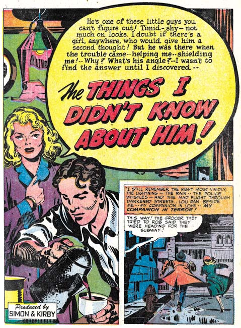
Young Romance #45 (May 1952) “The Things I Didn’t Know about Him”, art by Jack Kirby

There really is nothing to distinguish Young Romance comic from Young Love. The two titles ran the same type of stories using the same mix of artists. The only exception was that there was a distinct tendency for Jack’s art to appear in the flagship title Young Romance rather then in Young Love. During this period Kirby only drew three romance stories and they all appeared in Young Romance. Jack also typically did the lead story when he appeared in one of the romance title. But not always as for example YR #47 where Kirby did a backup story.

Young Romance #47
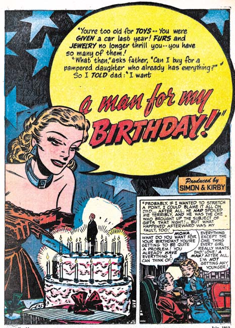
Young Romance #47 (June 1952) “A Man for My Birthday”, art by Bill Draut

While Mort Meskin supplied most of the romance art during this period, it was to Bill Draut that Simon and Kirby generally turned when Jack was not going to draw the lead feature. For this period Bill did 3 lead stories compared to 2 by Jack (with the remaining one done by John Prentice). The splash for the lead story was second only to the cover for grabbing the potential buyer’s attention. Other genre could turn to action to capture the viewer’s interest but that really was not appropriate for romance. Among the studio artists, Bill was second only to Kirby in providing the splash with visual clues and nuanced emotions that took the place of action.

“A Man for My Birthday” is listed in the Jack Kirby Checklist as drawn by Kirby and inked by Draut. Without doubt this is in error and Bill Draut did both pencils and inks.

Young Love #35
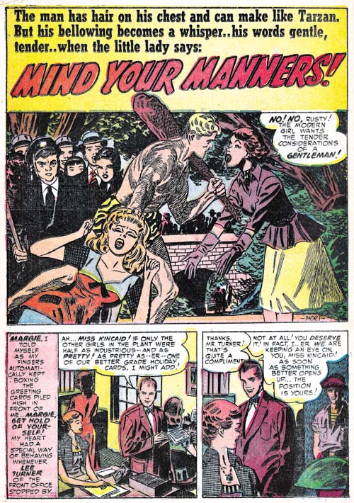
Young Love #35 (July 1952) “Mind Your Manners”, art by Mort Meskin

I like to include at least one image by each of the major artists in my post for this series and I could not resist this one by Mort Meskin. It still is not clear to me whether the studio artists were just following directions from the scripts or did they devise their own compositions. I will return to this subject below, but here I would like to say that I have noticed that humor shows up in splashes by Meskin more often then any other artist with “Mind Your Manners” as a great example.

Young Romance #47
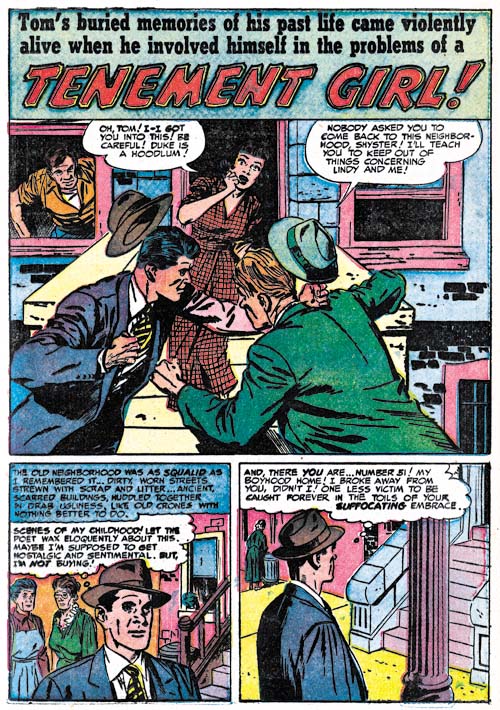
Young Romance #47 (June 1952) “Tenement Girl”, art by John Prentice

Action is not an often a component of romance comics, that is except for those by Kirby. Still it does show up in Simon and Kirby productions from time to time. I wanted to provide another example of a fight scene by John Prentice. Of course Jack Kirby was a master at the slugfest, but his fight scenes were done quite differently from the one in “Tenement Girl” leaving little doubt that John was not working from a Kirby layout.

Young Love #35
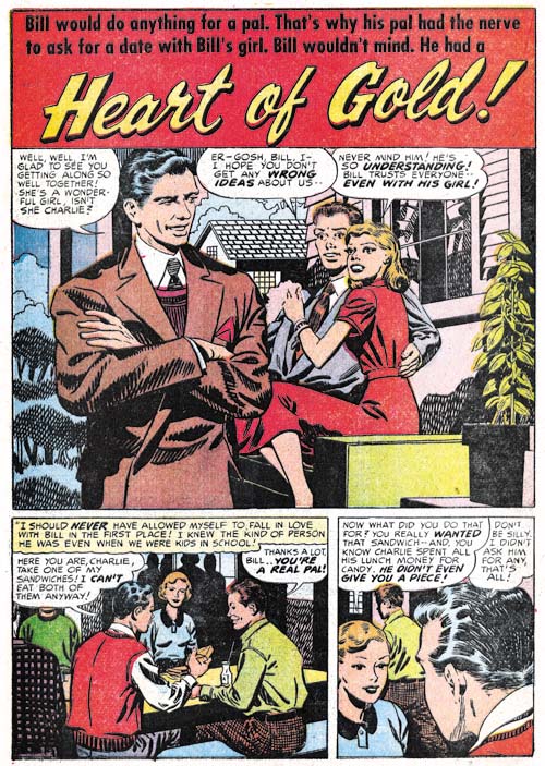
Young Love #35 (July 1952) “Heart of Gold”, art by George Roussos

While George Roussos did some substantial work for Black Magic he was generally relegated to short pieces in the romance titles. Frankly this is understandable because George’s art tended to be a bit crude which worked well with the horror genre but detracted from love stories. However Roussos would occasionally get a more substantial romance piece with “Heart of Gold” the only work for this period that was greater then 2 pages. This story is the best romance work that Roussos has done so far and is actually quite nice. Perhaps George was getting a helping hand from Meskin, some of the faces look in part like Mort’s. I believe the primary reason for the improved appearance of the art is the use of a sparser inking. There is an exception to the lighter inking and that is for the man in the foreground of the splash. Note the shoulder blots and the use of picket fence crosshatching (Inking Glossary). These inking mannerisms are usually not found in worked in Roussos inking but they are typical Studio Style techniques. I suspect Joe Simon has stepped in improve the splash. But the rest of the splash seems to be inked by Roussos. Note particularly the inking of the background trees, a mannerism I do not believe I have ever seen in the Studio Style.

Young Romance #46
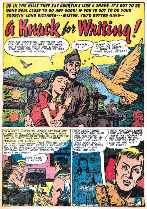
Young Romance #46 (June 1952) “A Knack for Writing”, art by unidentified artist

There are 4 features, two of which are full stories, done by the same artist in the period covered by this chapter. This amounts to 17 pages of art; not a lot of work but enough to be a significant contribution. Further this artist had a story in Young Love #32 which was covered in the previous chapter. So it would really be nice to be able to identify who the artist was but unfortunately I have not much headway. One possibility is that this work was done by Al Eadeh, an artist that also did some work for Simon and Kirby back in 1949. At Ger Apeldoorn’s suggestion I have look at some scans of the artist’s work in Atlas Tales but either the image resolution was too low or the subject matter too different so that I was unable to come to any conclusions.

Young Romance #46
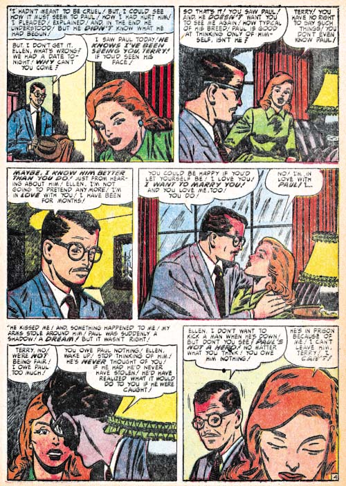
Young Romance #46 (June 1952) “This Is My Punishment”, art by unidentified artist

Another artist that appears at this time is represented by a single work. I provide a story page because I felt that the splash did not adequately represent his style. I have to say there is something very familiar about this style but I am unable to say why.

Added 8/28/09: In the comments Ger Apeldoorn suggested Bill Walton and without doubt he is correct.

Young Love #33
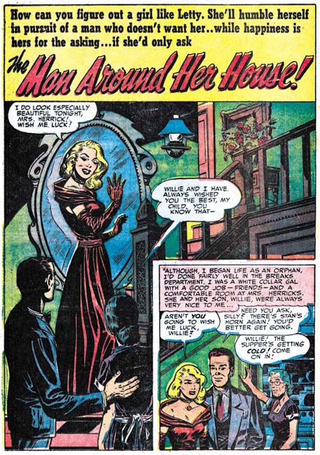
Young Love #33 (May 1952) “The Man around Her Home”, art by John Severin?

“The Man around Her Home” also has a familiar look to it but in this case I can say why. Some of the men (but not all) look like they were done by John Severin. There are differences between the art in this Young Love story and the work Severin was then doing in Prize Comics Western. Perhaps this was just the effect of a different genre or inker. Severin has not appeared in a Simon and Kirby production since November 1950 but he was very active in Prize Comics Western.

Young Love #33
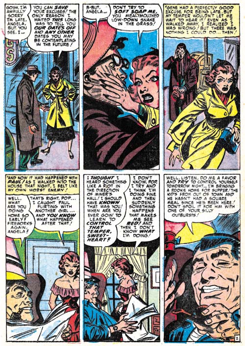
Young Love #33 (May 1952) “Temper, Temper” page 2, art by Ross Andru

Ross Andru, who provided a single story for Young Love #26 (October 1951), returns to do two more features. While Andru was a talented artist who did excellent romance art he only did occasional work for Simon and Kirby. We will see him again, under different circumstances, in 1954.

I have chosen a story page for an example of Andru’s work because it has the unusually panel layout of 2 rows with 3 panels per row resulting in tall and narrow panels. Among Simon and Kirby productions this layout was first seen to be used by Leonard Starr in romance work from 1949 and 1950. More recently it has shown up in work by first Mort Meskin and, then George Roussos, and now Ross Andru.

There is a reason I am particularly interested in this panel layout other then the chance it provides to compare how different artists work with such narrow panels. When I began studying Simon and Kirby one of the declarations that some Kirby experts made was the Jack supplied layouts for other artists. However when I examined the various artists’ graphical story telling techniques with those used by Kirby I found little to support that supposition. Unfortunately such comparisons are very subjective and there were always others who disagreed with my observations. But panel layouts are more cut and dry and difficult to dispute. So when a particular panel arrangement appears in different artists but not in the work drawn by Jack himself, it is pretty good evidence that Kirby did not do the layouts. After all you would expect that Kirby would use the same type of panel arrangements for his own work as well as any layouts he supplied.

But Kirby was not the only boss in the studio, there was Joe Simon as well. Joe has often said that he provided layouts to artists. This is well documented with later comics such as the Fly for Archie (where Joe’s collection includes some layouts that Joe Burgos did (Carl Burgos does the Fly) but that does not necessarily mean that it was true throughout Joe’s career. Unfortunately it is not possible to compare the layouts of Joe’s own drawing with that by other studio artists because Joe had not done any published art since the “48 Famous Americans” one shot for J. C. Penny in 1947. Now, however, we have seen this unusual panel layout first appear in work by Meskin, shortly followed by Roussos and now Andru. While it seems reasonable Meskin could have picked up the layout himself and Roussos copied it from him, I find it harder to accept that Andru, who did not actually work in the studio, independently picked up the panel arrangement. So I am now considering the possibility that it was Joe that started to use it in layouts supplied to other artists. This is by no means a “slam dunk”, just something I will be considering as I continue working on this serial post.

As I said above, Simon provided layouts to artist later in his career. The layout that Joe had Burgos do were very rough sketches including rough balloons. Joe used a somewhat different layout technique for Sick. There Simon provided the artist with inked panel borders and finished lettered balloons but without even sketches for the art. Either of these techniques could have been used during the Prize year (assuming Joe was in fact supplying layouts).

Chapter 1, A New Genre (YR #1 – #4)
Chapter 2, Early Artists (YR #1 – #4)
Chapter 3, The Field No Longer Their’s Alone (YR #5 – #8)
Chapter 4, An Explosion of Romance (YR #9 – #12, YL #1 – #4)
Chapter 5, New Talent (YR #9 – 12, YL #1 – #4)
Chapter 6, Love on the Range (RWR #1 – #7, WL #1 – #6)
Chapter 7, More Love on the Range (RWR #1 – #7, WL #1 – #6)
Chapter 8, Kirby on the Range? (RWR #1 – #7, WL #1 – #6)
Chapter 9, More Romance (YR #13 – #16, YL #5 – #6)
Chapter 10, The Peak of the Love Glut (YR #17 – #20, YL #7 – #8)
Chapter 11, After the Glut (YR #21 – #23, YL #9 – #10)
Chapter 12, A Smaller Studio (YR #24 – #26, YL #12 – #14)
Chapter 13, Romance Bottoms Out (YR #27 – #29, YL #15 – #17)
Chapter 14, The Third Suspect (YR #30 – #32, YL #18 – #20)
Chapter 15, The Action of Romance (YR #33 – #35, YL #21 – #23)
Chapter 16, Someone Old and Someone New (YR #36 – #38, YL #24 – #26)
Chapter 17, The Assistant (YR #39 – #41, YL #27 – #29)
Chapter 18, Meskin Takes Over (YR #42 – #44, YL #30 – #32)
Chapter 19, More Artists (YR #45 – #47, YL #33 – #35)
Chapter 20, Romance Still Matters (YR #48 – #50, YL #36 – #38, YB #1)
Chapter 21, Roussos Messes Up (YR #51 – #53, YL #39 – #41, YB #2 – 3)
Chapter 22, He’s the Man (YR #54 – #56, YL #42 – #44, YB #4)
Chapter 23, New Ways of Doing Things (YR #57 – #59, YL #45 – #47, YB #5 – #6)
Chapter 24, A New Artist (YR #60 – #62, YL #48 – #50, YB #7 – #8)
Chapter 25, More New Faces (YR #63 – #65, YLe #51 – #53, YB #9 – #11)
Chapter 26, Goodbye Jack (YR #66 – #68, YL #54 – #56, YB #12 – #14)
Chapter 27, The Return of Mort (YR #69 – #71, YL #57 – #59, YB #15 – #17)
Chapter 28, A Glut of Artists (YR #72 – #74, YL #60 – #62, YB #18 & #19, IL #1 & #2)
Chapter 29, Trouble Begins (YR #75 – #77, YL #63 – #65, YB #20 – #22, IL #3 – #5)
Chapter 30, Transition (YR #78 – #80, YL #66 – #68, YBs #23 – #25, IL #6, ILY #7)
Chapter 30, Appendix (YB #23)
Chapter 31, Kirby, Kirby and More Kirby (YR #81 – #82, YL #69 – #70, YB #26 – #27)
Chapter 32, The Kirby Beat Goes On (YR #83 – #84, YL #71 – #72, YB #28 – #29)
Chapter 33, End of an Era (YR #85 – #87, YL #73, YB #30, AFL #1)
Chapter 34, A New Prize Title (YR #88 – #91, AFL #2 – #5, PL #1 – #2)
Chapter 35, Settling In ( YR #92 – #94, AFL #6 – #8, PL #3 – #5)
Appendix, J.O. Is Joe Orlando
Chapter 36, More Kirby (YR #95 – #97, AFL #9 – #11, PL #6 – #8)
Chapter 37, Some Surprises (YR #98 – #100, AFL #12 – #14, PL #9 – #11)
Chapter 38, All Things Must End (YR #101 – #103, AFL #15 – #17, PL #12 – #14)
Little Shop of Horrors, Chapter 4, Another Hit

(February – April 1952, Black Magic #9 – #11)

I cannot supply sales figures so I have to look for other indications for how popular Simon and Kirby titles were. Fortunately Simon and Kirby had a modus operandi when it came to releasing new titles (actually it may have been the publishers who were responsible). New titles were released as bimonthlies but if after a period the titles sales seemed to warrant it the title could become a monthly or a new title of the same genre would be created. Black Magic had been a bimonthly for 16 months when it was converted to a monthly. Thus we can safely conclude that sales of Black Magic were good at least at this point in time.

As was true with the concurrent romance titles (Chapter 18 of The Art of Romance), Jack Kirby was producing less then his normal amount of pages of art with most of the work being done by Mort Meskin. In one respect Kirby still was the most important artist in that he did all the covers and the lead story for the two issues (#10 and #11) of the three covered in this chapter. But in terms of number of pages of art, Jack did only 18 pages as compared to the 34 pages done by Mort. After Mort and Jack come George Roussos (14 pages) and John Prentice (13 pages). Four other artists only supplied a single story; Marvin Stein (8 pages), Bill Draut (7 pages) and two unidentified artists (4 and 5 pages).

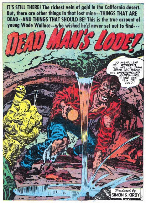
Black Magic #10

Black Magic #10 (March 1952) “Dead Man’s Lode”, art by Jack Kirby

While Kirby may not have done as much art as he had a year or so ago, what he produced was still top rate stuff. The splash for “Dead Man’s Lode” is a particularly engaging image. Not much in it just a man struggling through a tunnel and a hand beckoning him on. But of course such a simplistic description hardly does justice to what Jack drew. Kirby often brought interest into what for another artist might have been a banal scene. Here the drama is supplied by the man’s torn clothing, stooped posture and rugged features. I particularly like the way the pouring water divides the composition and how streaks of brushwork both suggest the optical distortions as well as the flow of the water.

Black Magic #11

Black Magic #11 (April 1952) “Drop Me Of At the Cemetery” page 4, art by Mort Meskin

I could not resist providing another example of Mort’s use of tall narrow panels. Leonard Starr used them earlier then Meskin, and used the quite well I might add. But Mort’s use of narrow panels was very remarkable. I must admit as I review Mort’s work in Black Magic and the romance titles I cannot help but feel Meskin was more at home with the horror genre. You pretty much never see in Mort’s romance work such a well worked out close-up as in panel 2 but they are not very rare in Black Magic.

Black Magic #11

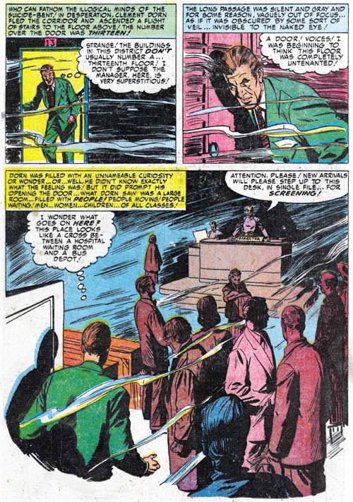
Black Magic #11 (April 1952) “The Thirteenth Floor” page 2, art by John Prentice

John Prentice did a lot of romance work for Simon and Kirby so it is easy to overlook his contributions in other genre. I find his art in Black Magic quite satisfying. I have previously discussed “The Thirteenth Floor” (Alternate Takes, The Thirteenth Floor) and will not repeat it here other then to note that use of a splash-like story panel is unusual for Prentice. Despite what I feel is the high quality of his Black Magic work, John did not produce many stories for the title. Another Prentice story would not appear in Black Magic until 9 months later.

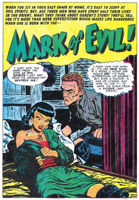
Black Magic #9

Black Magic #9 (February 1952) “Mark of Evil”, art by Bill Draut

A ruthless but beautiful Chinese pirate; what’s not to like despite being a somewhat predictable story. Draut seemed to relish the change of pace afforded by Black Magic from his frequent romance work.

Black Magic #9

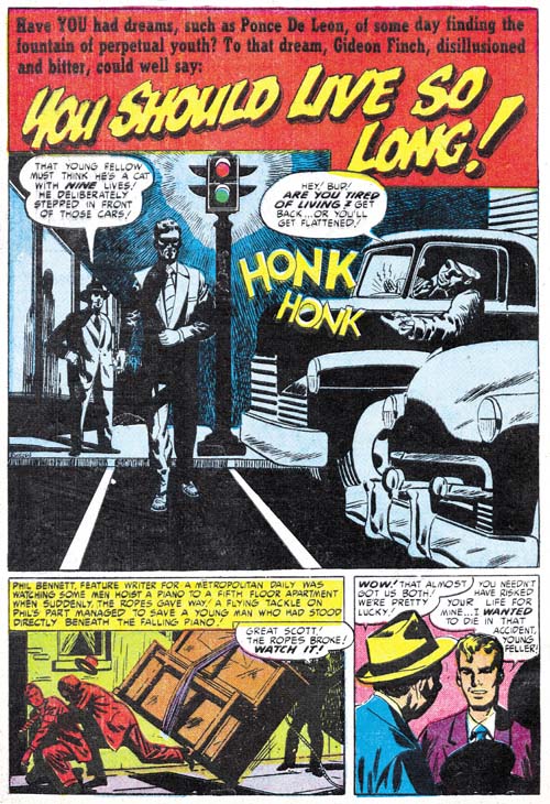
Black Magic #9 (February 1952) “You Should Live So Long”, art by George Roussos

George Roussos appeared to get a greater portion of work for Black Magic as compared to the romance titles. Frankly he is not as talented as some of the other studio artists. His work has a certain crudeness that while quite acceptable in the horror genre detracts that from his romance art. Presumably that is why he is more often seen in Black Magic. Despite my criticism of his art, in at least on respect Roussos is quite effective and that is in his use of blacks. The splash panel for “You Should Live So Long” is a good example of George’s interesting use of shadows.

Black Magic #11

Black Magic #11 (April 1952) “Through All Eternity” page 2, art by George Roussos

I recently wrote about a story that while signed by Roussos looked like it was based on layouts provided by Mort Meskin (Art of Romance, Chapter 18). One of the things I noted in that story (“The Great Indoors”) was the use of tall narrow panels that Meskin was fond of using at that time. Well “Through All Eternity” also has a page with similar panels and so the question arises whether Mort did layouts for this story as well. While some of the faces in “The Great Indoors” looked distinctly like they were drawn by Meskin, I find no such overt Meskin drawing in “Through Al Eternity”. Further while three of the panels (4 to 6) of page 2 look like Meskin could have laid them out, the composition of the upper three panels seems inferior to Mort’s typical efforts. On a whole I am included to say that these are not Meskin layouts and Roussos was just trying to pick up some of Mort’s techniques.

Black Magic #10

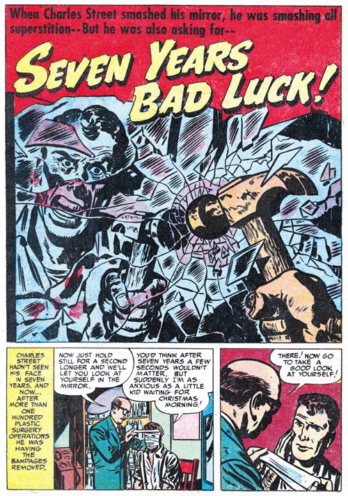
Black Magic #10 (March 1952) “Seven Years Bad Luck”, art by Marvin Stein

My database has 6 Black Magic stories drawn by Marvin Stein but they are all from the second run of the title (1957 – 1958). “Seven Years Bad Luck” is unsigned but there are quite enough examples of typical Stein drawing style, such as the man on the right in the last panel, that it can confidentially be attributed to Marvin. By this time Stein was only occasionally providing work for Simon and Kirby productions but he was very active in Prize crime titles (Headline and Justice Traps the Guilty) having in fact become the primary artist. Stein also made appearances in Prize Comics Western although not nearly as often. Marvin had developed a style very suited for the crime and western genre, and he puts it to good effect in this Black Magic tale as well.

Black Magic #9

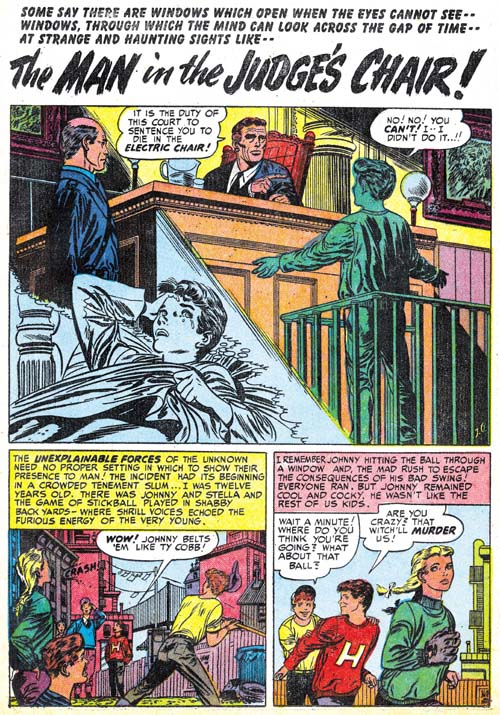
Black Magic #9 (February 1952) “The Man in the Judge’s Chair”, art by J. G.

There are two mystery artists in the Black Magic issues covered in this chapter. One particularly tantalizing one is the one who did “The Man in the Judge’s Chair”. I say that not because of the art, which is good but not great, but because it is signed with just initials (J. G.). I have a small list of candidates with those initials who worked during this period:

  • Joe Gagliardi
  • Joe Gallagher
  • Jim Gary
  • Joe Gevanter
  • Joe Giella
  • John Guinta
  • Jerry Grandenetti
  • Joe Greene

I am completely unfamiliar with four of them and so I will have to do more research. John Guinta did some work for Simon and Kirby in 1949 (chapter 9 of Art of Romance and chapter 7 of It’s A Crime) but unless his style has changed considerably he was not the artist. Jerry Grandenetti worked with Joe Simon in the 70’s and his comic book career actually goes back far enough. I have not seen much of Grandenetti’s early work and will not rule him out entirely but I do not think he is a good match either. My database shows Joe Gevanter as the artist for a story in Prize Comics Western #104 (March 1954) but I now question that attribution. The piece is signed Gevanter and Severin and that order usually means Gevanter was the penciller and Severin the inker but it seems odd that Severin would ink another artist work when he generally did not ink his own pencils. Further the drawing style is so close to Severin’s that either John’s inking completely overwhelmed Joe’s pencils or in fact Gevanter was the inker to Severin pencils. Currently I accept the latter deduction and I have found no indications that Gevanter penciled any other comic book so I do not consider him the artist of “The Man in the Judge’s Chair”.

Black Magic #11

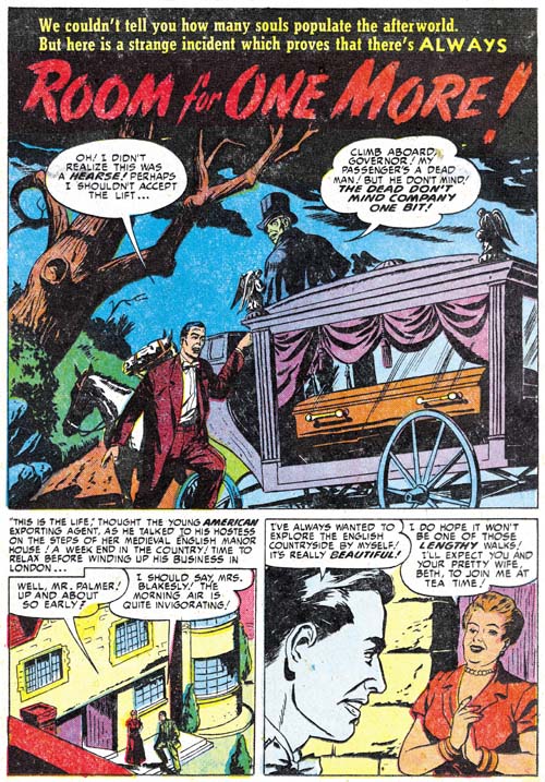
Black Magic #11 (April 1952) “Room for One More”, art by unidentified artist

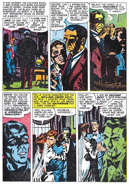
The other unattributed story is “Room for One More”. Again the art really is neither bad nor great but it would be nice to know who drew it. Unfortunately at this time I cannot even offer a suggestion.

The Little Shop of Horrors, Chapter 1 (#1 – 3), Expanding Their Fields
The Little Shop of Horrors, Chapter 2 (#4 – 6), Up and Running
The Little Shop of Horrors, Chapter 3 (#7 – 8), The Same Old Gang

The Little Shop of Horrors, Chapter 5 (#12 – 14), New Faces
The Little Shop of Horrors, Chapter 6 (#15 – 17), Mix Bag
The Little Shop of Horrors, Chapter 7 (#18 – 20), Kirby Returns
The Little Shop of Horrors, Chapter 8 (#21 – 23), The Gang’s All Here
The Little Shop of Horrors, Chapter 9 (#24 – 26), The Party’s Ovetr
The Little Shop of Horrors, Chapter 10 (#27 – 29), A Special Visitor
The Little Shop of Horrors, Chapter 11 (#30 – 33), The End

Art of Romance, Chapter 18, Meskin Takes Over

(February 1952 – April 1952: Young Romance #42 – #44, Young Love #30 – #32)

Number of Romance Titles 1947 - 1953
Number of Romance Titles 1947 – 1953 (the period covered in this chapter is shaded in blue)

There has not been much change in what the Simon and Kirby studio was producing which were two monthly romance titles and one bimonthly horror all for Prize Comics. I believe all three titles were doing well but I will leave off explaining what is behind my belief until Chapter 20 of The Art of Romance and Chapter 4 of The Little Shop of Horrors.

Mort Meskin provided an astonishing 105 pages of art for the period covered in this chapter. This was much more then what Kirby drew (37 pages). To provide perspective Kirby only drew one more page then Bill Draut (36 pages) an artists not known for his speed. At this point Meskin has been the primary romance artist for about a year. You have to go back 3 years to find a period when Kirby produced more pages then Meskin did in these three months. The pool of other studio artists used during this period is rather small; John Prentice (27 pages), George Roussos (13 pages) and an unidentified artist (6 pages).

Young Romance #44
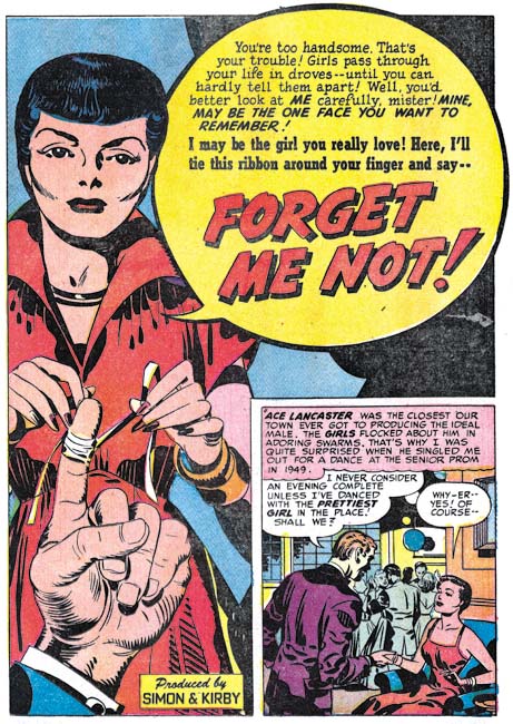
Young Romance #44 (April 1952) “Forget Me Not”, art by Jack Kirby

Kirby was the artists for the lead story for YR #42, #43 and #44 as well as YL #31. He continues to use the confessional splash where someone introduces the story to the reader and their speech balloon is also the title. The splash for “Forget Me Not” is perhaps the best of the Kirby splashes for this chapter.

Young Love #30
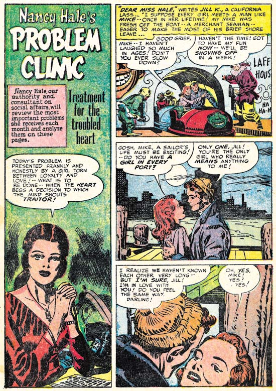
Young Love #30 (February 1952) “Problem Clinic”, art by Jack Kirby and George Roussos

Kirby has been known to provide a splash page for a story otherwise drawn by another artist. But it is unusual to find another artist doing the splash for a Kirby story. I find it particularly surprising that the artist would be George Roussos. The “Problem Clinic” is a standard Nancy Hale feature but this particular one is different from the others. The large vertical splash is not found in other Nancy Hale and is also not a typical splash format for Kirby. Normally “Problem Clinic” starts with Nancy Hale introducing the story, but not in this case. All this makes me suspect that the story was not originally meant to be a Nancy Hale “Problem Clinic” but was re-edited to become one.

Young Romance #44
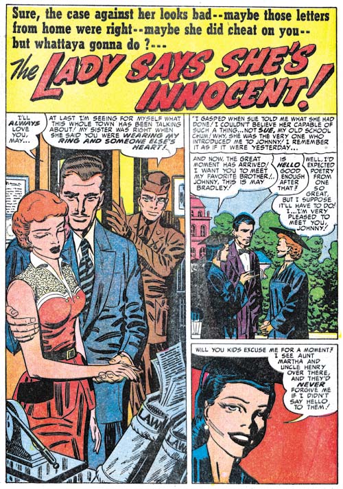
Young Romance #44 (April 1952) “The Lady Says She’s Innocent”, art by Mort Meskin

While I commonly find phrases in romance stories drawn by Jack Kirby that suggest that he was at least modifying the scripts I normally do not find such phrases in the work of other studio artists. This not to say that Jack did not contribute to the writing of stories for other artists, some writers have reported that Kirby would help provide the writers with plots. But Jack did not seem to re-write the scripts the writers returned unless he was going to draw the story. However the splash for “The Lady Says She’s Innocent” might be an exception. The last line of the soldier “you were wearing my ring and someone else’s heart” sounds so like Kirby to me. Even the whole concept of a person entering the room to verbally disrupt the proceedings is one typically found in Jack’s art. Unusually Kirby did not alter Mort Meskin’s art as he sometimes did with other artists. However I suspect that is what happened here. The composition suggests that there always was a figure on the right side of the splash. Perhaps Kirby was not happy with it, removed the old figure and added a layout and text for the balloon. With other artists Kirby would just have proceeded to draw and ink the figure but since Meskin worked in the studio Jack just left it to Mort to finish it up.

Young Romance #43
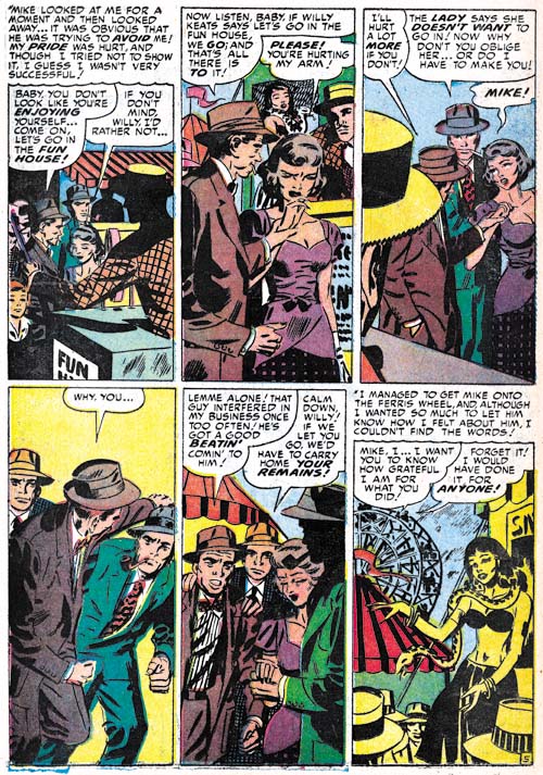
Young Romance #43 (March 1952) “Gentlemen Prefer Ladies” page 5, art by Mort Meskin

As I have previously mentioned, Meskin has seemed to pick up the use of tall narrow panels for some pages in a story. I find the above page from “Gentlemen Prefer Ladies” particularly effective both in how well Mort uses the narrow panels and for the cinematic approach to presenting the story. Mort likes to provide the man of his stories with a pipe as a suggestion of their sophistication. I love how this pipe is prominently displayed even in fight scenes.

Young Love #32
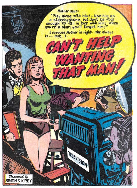
Young Love #32 (April 1952) “Can’t Help Wanting That Man”, art by Bill Draut

Despite the fact that Meskin was providing more pages of art then anyone else, it was Bill Draut that was used for those lead stories not done by Kirby during this period. Draut was not as good an artist as Kirby (who was?) but he still did an excellent job on the confessional splashes. The one for “Can’t Help Wanting That Man” provides a complete story. The struggling starlet torn between ambition and desire is venting her dilemma on a busy television studio while here love interests looks on. It is everything a splash should be, particularly for the all important first story of the comic.

Young Love #30
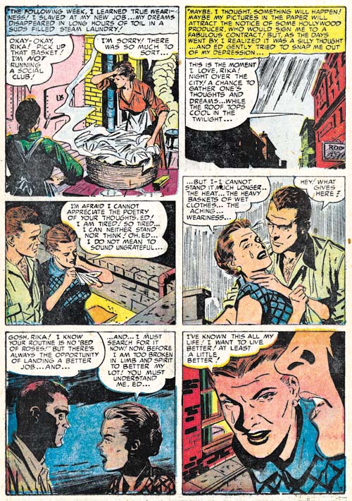
Young Love #30 (February 1952) “Learn to Love” page 5, art by John Prentice

John Prentice had his own way of graphically telling a story and I provide an example above. The way he works up to the dramatic close-up in the last panel is quite good. I do have some qualms about panel 4. The simple hatching used for the sky unfortunately inappropriately suggests rain. It is not Prentice’s fault but the handkerchief that the lady holds has suddenly become the same color as the man’s shirt making it all a bit more confusing then it really would have been. Note the way the brickwork is handled in the last panel. The use of scattered groups of black bricks done in rough brushwork is often seen in Bill Draut’s work.

Young Romance #43
Young Romance #43 (March 1952) “The Way They Met”, art by George Roussos

George Roussos drew 6 features during this period and except for one they were all 1 or 2 page long. It is easy to see why; Roussos really was not that great of a romance artist, at least at this time.

Young Love #31
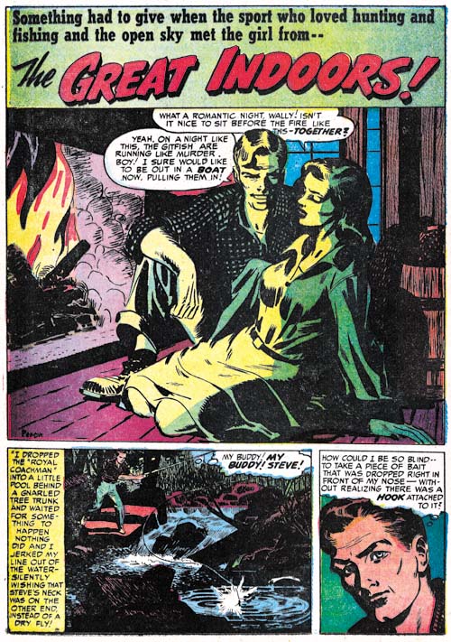
Young Love #31 (March 1952) “The Great Indoors”, art by Mort Meskin and George Roussos

Like most of the comic book industry at that time, Simon and Kirby did not normally provide credits for the artists that worked for on their productions. However they always allowed, perhaps even encouraged, artists to sign their work. So I always pay attention to the signatures because they provide the means to learn how to identify the various artists. The signature for “The Great Indoors” is a bit hard to make out but I thought it might have said Persius. It was the only story by Persius in my database and I could never uncover any further information or work by that artist. That is how it stood for a long time but my work for The Art of Romance has really tuned me in to the style used by George Roussos and when I saw the last panel of the splash page I immediately recognized it as his work. There are some parts, such as the man in the splash panel, that look like Mort Meskin’s style but initially I just attributed that to the large influence Meskin had on Roussos. When I closely looked at the signature again, I thought it actually read Roussos. Hey what can I say? Both the signature and the printing were poor.

Young Love #31
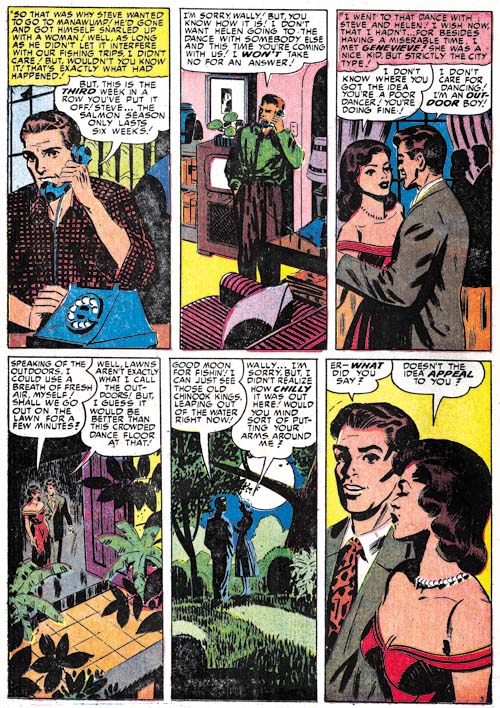
Young Love #31 (March 1952) “The Great Indoors” page 3, art by Mort Meskin and George Roussos

Going through the story I came across page 3 and saw the tall narrow panels. This is not a panel layout that I have seen Roussos use but it is one that Mort Meskin often turned to (see above). Then it all made sense. “The Great Indoors” was laid out by Meskin and finished and inked by Roussos. I have seen Jack Kirby do this with some less talented artists but this is the first example I have found of Meskin doing it. Roussos was one of Meskin’s inkers for work done previously at DC. I often find him listed as the inker for Meskin’s S&K work as well but I have not seen any evidence of that. Further Joe Simon has told me that Meskin inked his own work. “The Great Indoors” gives an indication of what Roussos inking Meskin have looked like at this time.

Young Love #32
Young Love #32 (April 1952) “Three Day Pass” page 3, art by unidentified artist

There is one artist I have not been able to identify but he only did a single piece, “Three Day Pass”. I find some resemblance to the work by Al Eadeh (Art of Romance, Chapters 5 and Chapter 7). Eadeh worked for Simon and Kirby back in 1949 and if “Three Day Pass” is by Al then his work has evolved a bit. Unfortunately I have no interim Eadeh pieces to compare it with, so for now I am just leaving it as unidentified.

Chapter 1, A New Genre (YR #1 – #4)
Chapter 2, Early Artists (YR #1 – #4)
Chapter 3, The Field No Longer Their’s Alone (YR #5 – #8)
Chapter 4, An Explosion of Romance (YR #9 – #12, YL #1 – #4)
Chapter 5, New Talent (YR #9 – 12, YL #1 – #4)
Chapter 6, Love on the Range (RWR #1 – #7, WL #1 – #6)
Chapter 7, More Love on the Range (RWR #1 – #7, WL #1 – #6)
Chapter 8, Kirby on the Range? (RWR #1 – #7, WL #1 – #6)
Chapter 9, More Romance (YR #13 – #16, YL #5 – #6)
Chapter 10, The Peak of the Love Glut (YR #17 – #20, YL #7 – #8)
Chapter 11, After the Glut (YR #21 – #23, YL #9 – #10)
Chapter 12, A Smaller Studio (YR #24 – #26, YL #12 – #14)
Chapter 13, Romance Bottoms Out (YR #27 – #29, YL #15 – #17)
Chapter 14, The Third Suspect (YR #30 – #32, YL #18 – #20)
Chapter 15, The Action of Romance (YR #33 – #35, YL #21 – #23)
Chapter 16, Someone Old and Someone New (YR #36 – #38, YL #24 – #26)
Chapter 17, The Assistant (YR #39 – #41, YL #27 – #29)
Chapter 18, Meskin Takes Over (YR #42 – #44, YL #30 – #32)
Chapter 19, More Artists (YR #45 – #47, YL #33 – #35)
Chapter 20, Romance Still Matters (YR #48 – #50, YL #36 – #38, YB #1)
Chapter 21, Roussos Messes Up (YR #51 – #53, YL #39 – #41, YB #2 – 3)
Chapter 22, He’s the Man (YR #54 – #56, YL #42 – #44, YB #4)
Chapter 23, New Ways of Doing Things (YR #57 – #59, YL #45 – #47, YB #5 – #6)
Chapter 24, A New Artist (YR #60 – #62, YL #48 – #50, YB #7 – #8)
Chapter 25, More New Faces (YR #63 – #65, YLe #51 – #53, YB #9 – #11)
Chapter 26, Goodbye Jack (YR #66 – #68, YL #54 – #56, YB #12 – #14)
Chapter 27, The Return of Mort (YR #69 – #71, YL #57 – #59, YB #15 – #17)
Chapter 28, A Glut of Artists (YR #72 – #74, YL #60 – #62, YB #18 & #19, IL #1 & #2)
Chapter 29, Trouble Begins (YR #75 – #77, YL #63 – #65, YB #20 – #22, IL #3 – #5)
Chapter 30, Transition (YR #78 – #80, YL #66 – #68, YBs #23 – #25, IL #6, ILY #7)
Chapter 30, Appendix (YB #23)
Chapter 31, Kirby, Kirby and More Kirby (YR #81 – #82, YL #69 – #70, YB #26 – #27)
Chapter 32, The Kirby Beat Goes On (YR #83 – #84, YL #71 – #72, YB #28 – #29)
Chapter 33, End of an Era (YR #85 – #87, YL #73, YB #30, AFL #1)
Chapter 34, A New Prize Title (YR #88 – #91, AFL #2 – #5, PL #1 – #2)
Chapter 35, Settling In ( YR #92 – #94, AFL #6 – #8, PL #3 – #5)
Appendix, J.O. Is Joe Orlando
Chapter 36, More Kirby (YR #95 – #97, AFL #9 – #11, PL #6 – #8)
Chapter 37, Some Surprises (YR #98 – #100, AFL #12 – #14, PL #9 – #11)
Chapter 38, All Things Must End (YR #101 – #103, AFL #15 – #17, PL #12 – #14)
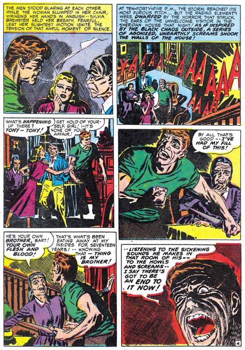
Little Shop of Horrors, Chapter 3, The Same Old Gang

(October – December 1951: Black Magic #7 – #8)

During the period covered in this chapter, along with the bimonthly Black Magic, Simon and Kirby were producing two monthly romance titles (Young Romance and Young Love). Not the largest work load for the prolific duo but apparently all the titles were doing well. Since Simon and Kirby received a share of the profits, sales volume was more important then the number of titles produced.

As was true with the concurrent romance titles (Chapter 17 of The Art of Romance), Jack Kirby was producing less then his normal amount of pages of art work. In BM #7 and #8, Jack would do the two covers and a single 8 page story. It was Mort Meskin who was the most prolific artist providing 23 pages for these two issues. Even John Prentice and Marvin Stein produced more pages then Kirby (both with 12 pages each). Bill Draut would provide a single 7 pages story. That was the complete artist line-up for BM #7 and #8; just the regular studio artists of that time. This is another of those chapters where I have been able to identify all the artists who worked on these issues.

Black Magic #7
Black Magic #7 (October 1951) “The Thing in The Fog”, art by Jack Kirby

The full page splash for Jack Kirby’s single story, “The Thing in the Fog”, is quite unusual for the artist. Typically Kirby focuses on the human elements of a picture but here all we see are the backs of three individuals on a make shift raft. The center of attention is the approaching ship and even it is mostly lost in the fog with only the masthead distinctly delimitated. The depiction of fog would normally be expected to be billowing cloud shapes but instead the mists are rendered by a complex of strong crosshatching. The whole effect is one of eerie mystery and impending doom. It may be an unusual splash for Kirby but still one of his greater pieces of art.

Black Magic #8
Black Magic #8 (December 1951) “Invisible Link”, art by Mort Meskin

Meskin’s splash for “Invisible Link” consists of a repeated image although with different clothing and surroundings. Today the artist would probably simply draw one, make a copy and work on the copy to produce the second image. But at this time there were no cheap copiers and so a stat would have to be made. This not only meant added costs but added delay as well. Instead Mort simply redrew the figure. By quickly going back and forth between the two images you can verify the differences between the mouth, nose and other details. The use of a double image is a simple device but one that captures the essence of the story.

Black Magic #8
Black Magic #8 (December 1951) “Invisible Link” page 4, art by Mort Meskin

I have previously remarked that Meskin would sometimes adopt the tall narrow panels that earlier were used by Leonard Starr. In Mort’s case this typically meant dividing the page into two rows each with 3 panels. Above I provide a page with a slightly different approach. The height of the bottom row has been reduced giving even more vertical dimension to the narrow panels of the top row. To make up for the loss of height, the bottom row only has two panels. These tall narrow panel layouts are normally not found in the works by Jack Kirby during this period and that is another of the recurring indications that Kirby was not providing layouts to Mort as some people have claimed. Further it suggests that whatever script was provided to Meskin it either did not completely detail out the art on the page, or if it did Mort felt free to deviate from the directions.

Black Magic #7
Black Magic #7 (October 1951) “Don’t Ride the 5:20”, art by Bill Draut

A skeletal cloaked figure of death looms over a speeding train in this full page splash by Bill Draut. Of course none of these elements are found among Bill’s romance art so it is by depictions of people in the story that allows this work to be safely attributed to him. The detailing of the drawing of the train indicates it was based on a photographic image. But the sharpness, so untypical for Draut, suggests that rather being swiped from a photograph that perhaps the picture was literally glued down on the board and then inked over to provide the desired effect. If true this would be an unusual occurrence at this time although years later Simon would often build up a cover using stats.

Black Magic #7
Black Magic #7 (October 1951) “Old Tom’s Window”, art by John Prentice

It is not unusual for Jack Kirby to assume the role of art editor and make alterations to the work submitted by artists employed by the studio. Normally this is for less talented artists and I do not recall ever seeing Jack fix up the work of Bill Draut or Mort Meskin. I consider John Prentice as in the same talented class with Draut and Meskin which is why I am surprised to see Kirby art editor’s hand at work in some of art submitted by Prentice when he first appeared in Simon and Kirby productions. Compare the first story panel for “Old Tom’s Window with the rest of the page and you will note subtle but important differences. The figures in panel one are simpler and lack the craggy feel found in the splash and the second panel and which is typical of Prentice’s depictions of men. Also observe the difference in brush techniques. Those in the first story panel include picket fence crosshatching, drop strings and abstract arch shadows (see my Inking Glossary for explanations of these terms) that are typical of the Studio Style inking. The brush work is blunt but nuanced and was almost certainly done by Kirby. The inking on the rest of the page lacks these elements and is typical of Prentice’s approach. It is hard for me to understand why Jack felt compelled to work on this panel since the depiction of the men in hospital beds is really not that different from those done by Prentice on the rest of the page. Perhaps it was not so much Jack correcting John as providing him with guidance about how to do the story. If that was true it was with this single panel as the rest of the story is laid out in Prentice’s characterizing manner.

Black Magic #7
Black Magic #7 (October 1951) “No One Human” page 2, art by Marvin Stein

By this time as I mentioned in The Art of Romance (chapter 16), Marvin Stein’s art was beginning to show some significant improvements from his earlier more crude style but has not quite reached his more mature style. I credit much of Stein’s improvement to his close study of Kirby’s art either through close observation while working in the same studio or perhaps by actually inking Jack’s work (although I have not yet verified Stein’s inking of Kirby at this early date). Marvin’s inking has particularly improved from his early version to this one. Normally I prefer to present a splash, but in the case of “No One Human” it is difficult to recognize Stein’s hand in the first page. Instead I show page 2 where the man in panel 3 is very close to Stein’s mature art style. Note Marvin’s frequent angular crosshatching. While this is not generally found in Stein’s work it plays a prominent part of this story but I have to admit I find it rather distracting. Also observe the vertically oriented captions. Kirby would only occasionally use vertical captions so this is an indication that this story was not based on Kirby layouts. Interestingly vertical captions are often used by Mort Meskin who also occasionally uses similar angular crosshatching. I find it hard to believe that Meskin would be supplying Stein with layouts and even harder to accept that Mort would be inking Marvin’s pencils so I suspect that Stein was also carefully studying Meskin’s work as well.

Black Magic #8
Black Magic #8 (December 1951) “Donovan’s Demon”, art by Jack Kirby and Marvin Stein

I have discussed the splash for “Donovan’s Demons” in the past (Summoning Demons). The only modifications of my previous views is that I know come to credit the artist for the story as Marvin Stein. But to quickly review, while the man appears to have been drawn and inked by Stein, the woman is clearly the work of Jack Kirby. Both are background elements with the most important part of the splash being the chair, candles and star pattern on the floor. The candles are good matches for those done by Kirby found elsewhere. Chairs do not normally play such a prominent part in Kirby’s art so it is difficult to make a comparison. However the perspective on the chair is so well done and since this sort of dramatic perspective played such an important art I believe Jack did the chair as well. It is not that unusual to find a Kirby figure in a splash otherwise done by another studio artist but it is odd to see a single figure by another artist in a splash otherwise done by Kirby. Perhaps this was done so that there would be some continuity between the splash and the rest of the story art.

The Little Shop of Horrors, Chapter 1 (#1 – 3), Expanding Their Fields
The Little Shop of Horrors, Chapter 2 (#4 – 6), Up and Running

The Little Shop of Horrors, Chapter 4 (#9 – 11), Another Hit
The Little Shop of Horrors, Chapter 5 (#12 – 14), New Faces
The Little Shop of Horrors, Chapter 6 (#15 – 17), Mix Bag
The Little Shop of Horrors, Chapter 7 (#18 – 20), Kirby Returns
The Little Shop of Horrors, Chapter 8 (#21 – 23), The Gang’s All Here
The Little Shop of Horrors, Chapter 9 (#24 – 26), The Party’s Ovetr
The Little Shop of Horrors, Chapter 10 (#27 – 29), A Special Visitor
The Little Shop of Horrors, Chapter 11 (#30 – 33), The End

Art of Romance, Chapter 16, Someone Old and Someone New

(August 1951 – October 1951: Young Romance #36 – #38, Young Love #24 – #26)


Number of Romance Titles 1947 – 1952 (the period covered in this chapter is shaded in blue)

Despite the fact that today many fans point to Boys’ Ranch as one of Simon and Kirby best efforts it was at the time a commercial failure. The last issue of Boys’ Ranch would have an August cover date. After that Joe and Jack would only be working on the two monthly romance titles and the bimonthly Black Magic all of them for Prize Comics. Young Romance entered its fourth year and I believe both romance titles were still selling very well.

Jack Kirby is legendary for the amount of work he could produce. While there were periods during the Simon and Kirby collaboration that support that legend there are other times that do not. In the previous chapter Meskin replaced Kirby as the most productive studio artist. During the period covered in this chapter Meskin has maintained the first place position but now Bill Draut has replaced Jack for the second place. For the romance titles Meskin produced 64, Draut 49, and Kirby 45 pages. Adding the work for Black Magic only increases the disparity (Meskin 78, Draut 67 and Kirby 60 pages). Mort Meskin was famous for his productivity but Bill Draut was not. The difference is all the more striking when it is considered that Meskin and Draut were doing all there own inking while Kirby was not.

Another indication of Jack’s decreased involvement in the art from this period is that Bill Draut did the lead story for Young Romance #36. While it was not unusual for the first story of Young Love to be done by artists other then Kirby, Young Romance was the flagship title and up to now Jack almost always provided the lead story. The single previous exception was for YR #12 (July 1949) and Draut was the feature artist on that occasion as well.

I cannot offer any explanation for Kirby’s decreased page production. If his time was occupied with trying to develop something new it did not come to fruition. But it must be remembered that Jack was a boss and his income depended on the how good sales were for the S&K titles not on how many pages of art he drew. His decreased output could be due to nothing more then attention to some personal issues.

Most of the rest of the romance work was done by two artists; John Prentice with 25 pages and Marvin Stein with 24 pages. Three other artists supplied single stories. Two of them will be discussed below and the third has not been identified but only provided a single page.


Young Romance #38 (October 1951) “Family Trouble”, art by Jack Kirby

While his page count has dropped the quality of Jack Kirby’s work had not suffered. He still drew great splashes and his stories were still unique compared to other studio artists (suggesting that Jack was rewriting the scripts while he was drawing them). This uniqueness was often the result of placing more action into the story, something that Kirby excelled at. But as I have pointed out before, Jack also excelled at comic book art that did not rely on action. His romance splash panels are often examples of this. The splash for “Family Trouble” uses the confessional format that is so typical of Kirby’s lead stories. The word balloon that introduces the story provides the plot of young lovers facing family disapproval but does not explain the basis of their problem other then age. Kirby presents the couple passing through a gate carrying their luggage presumable off to start their new life together. The sign on the entrance indicates they are leaving the servant’s quarters and therefore theirs is a romance that breaks the class boundary between the rich and their servants. The man seems calmed but resolved while the woman seems more resolute. At a glance this splash is nothing more the two standing figures but Jack embodies an entire story in it. Of course the viewer is expected to be enticed to read the story to get the full explanation.


Young Love #25 (September 1951) “My Old Flame”, art by Jack Kirby

Kirby’s splashes are almost always interesting but occasionally they are quite unique. Given Joe Simon’s long history of innovative designs I suspect he provided layouts for many of Jack’s covers and splashes but even if that is true it still took a genius like Kirby to make them work so well. Here while riding a train a man pauses from reading his book to reflect on a past relationship. Normally the splash would be expected to show a head shot or half figure of the former love object. Instead we are provided with just a close-up of a set of eyes seeming arising behind the man; a compositional device that is much more effective in capturing the man’s mood.


Young Romance #36 (August 1951) “Yesterday’s Romance”, art by Bill Draut

“Yesterday’s Romance” was the lead story for YR #36 that Bill did instead of Jack. It is an unusual story for any romance title because it main characters are all in their advanced years. Draut does a good job of capturing the offbeat nature of the story in his splash. The odd thing about this piece is that usually the lead story used the confessional format where the protagonist’s speech balloon tells what the story is about and provides the title. Bill has used that confessional splash before so he was aware of Simon and Kirby’s preference for using that splash format for the lead story.


Young Romance #36 (August 1951) “Married In Haste”, art by Bill Draut

While “Yesterday’s Romance” failed to make use of the confessional splash it appears in the same issue in “Married in Haste”. This suggests that “Married in Haste” was originally meant to be the lead story but its place was taken by “Yesterday’s Romance” after the art was completed. Bill does a good job with the confessional splash and as any good splash it succeeds in its roll as the story’s preview. It may not be fair but it is constructive to compare the splash for “Married in Haste” with Kirby’s “Family Trouble” (shown above). Both do well at having the splash background support the story needed although it is not clear how much of this was the result of the artist and how much came from the writer. I describe the comparison as unfair because Kirby is such a great artist the comparison will tend to make Draut’s work poorer then the excellent art it really is. But the comparison is useful because it highlights the nuanced emotions Kirby gives his characters compared to the more static ones that Draut provides. While Kirby is justly famous for the exciting action the work he did for romance pushed him to be equally adept at portraying more subtle emotions.


Young Love #24 (August 1951) “Native Wedding”, art by Mort Meskin

The splash for Meskin’s “Native Wedding” is reminiscent of the one Bruno Premiani did some time ago for YR #10 (June 1950, see chapter 11 of The Art of Romance). One obvious difference is that Meskin is uncharacteristic in his use of busy brushwork found throughout the splash. Normally this would result in the image loosing focus but somehow Mort pulls it off. Mort also takes care to make the camp fire scene occur at night providing the nearby faces shadowed from below as appropriate for the position of the fire. The dancer’s back is also appropriately shadowed.


Young Love #26 (October 1951) “Let’s Keep It Gay” page 5, art by Mort Meskin

For a couple of pages of “Let’s Keep It Gay” Meskin adopts and 2 rows by 3 columns panel layout. This results in tall narrow panels that Mort put to good use especially in the second panel of page 5. This panel layout was one that previously Leonard Starr was fond of using so one wonders if perhaps Meskin picked it up from him. Starr also used a 3 rows by 3 panel layout where he would decrease the height of two rows so that the remaining row would have similarly tall panels. Starr’s modified 3 by 3 panel layout did not seem to be one the Meskin picked up on.

I particularly like how the bottom row starts with the couple in the foreground and a TV studio as the background, then Mort comes in for a close-up without the studio background, before ending by once again pushing the couple into the background of the studio. Careful manipulation of point of view was an important aspect of Meskin’s art during this period providing his stories with what could be described as a cinematic approach.


Young Romance #38 (October 1951) “One Tragic Mistake”, art by John Prentice

John Prentice has become a regular presence in Simon and Kirby productions, especially the romance comics. In the last chapter I provided an example where Prentice seemed to be adopting some of the Studio Style inking techniques. Although it was possible it could have been Joe or Jack touching up John’s work the picket fence crosshatching (see my Inking Glossary for explanations of some of my inking terminology) my opinion was and still is that it was the work of John himself. For the splash page of “One Tragic Mistake” we find a more typical Prentice inking. Note in particular his method of doing cloth folds. They are not the spatulate or oval shape typical of Kirby but tend to be long with roughly parallel edges and with a more or less flat and sometimes slanted ends. John also has a fondness for long sweeping cloth folds. Note the inking of the man’s shoulder. At a glance this might be mistaken for a Studio Style shoulder blot but see how it appears on only one of the shoulders and is clearly integrated with the shadow on the side of the face. With Joe or Jack I am never sure if shoulder blots were meant to indicate shadows or the turn of the form but Prentice always seems quite clear with his intent.


Young Romance #38 (October 1951) “One Tragic Mistake” page 8, art by John Prentice

While the splash page to this story looks like typical Prentice inking other pages seem to be a combination of his own inking techniques and the Studio Style. Most of the cloth folds are done in Prentice’s typical brush work but note the abstract arch shadows (panels 1, 2 and 4), picket fence crosshatching (panels 3 and 4) and shoulder blot (panel 6). Only drop strings appear to be missing. Panel 6 truly has shoulder blots because they appear on both shoulders while a shadow would only be appropriate foe the man’s right side. While I am not certain that the picket fence crosshatching was not by John, the abstract arches are so untypical for Prentice that I believe this is Joe or Jack stepping to do some touching up.


Young Love #24 (August 1951) “Don’t Tell On Me” page 2, art by John Prentice

A page from another Prentice story from the same period provides a more typical example of Prentice inking. Again note the cloth folds some of which are long and sweeping and few could be called oval or spatulate in shape. There are some arching shadows that might suggest the Studio Style. But the round shape in the first panel is not abstract at all but is clearly meant to be the moon. The arc of the left side of the second panel is meant to be the entrance to an arched hallway. The shadow on the right side seems to be the light of the window falling on the darken exterior. Almost all applications of large areas of ink appear to be intended as realistic shadows. There is some picket fence crosshatching that again does not look typical of the brush work of either Kirby or Simon. However note the picket fence crosshatching of the last panel. The pure black area on the man’s left shoulder seems an appropriate shadow but then the picket fence crosshatching on the opposite side does not. Since I have found both Simon and Kirby touching up other artists works distinguishing between their efforts and that of the original artists adopting Studio Style techniques can be a difficult conundrum. In John Prentice’s case I am still undecided. The distinction becomes important when trying to detect Prentice’s hand in the inking of work by Jack Kirby. Some have suggested that John was the inker for some of Kirby’s art and he certainly is a candidate for that type of work.


Young Love #24 (August 1951) “Left At the Alter”, art by Marvin Stein

Previously I have had mixed feelings about Marvin Stein and in particular felt his romance art was little more then adequate. Even in the last chapter I noted his presence and gave an example image but did not provide more detailed examination. However Marvin had been working hard at improving his art and although signs of improvement have been noted before now his efforts really seems to bare fruit during this period. Marvin developed a style for his crime and western work that owed much to what he learned from Jack Kirby. For that more action oriented art Stein also developed an inking style that was blunt but well controlled; a style very suitable for the genre it was used on. Neither the pencil nor inking style would be very appropriate for romance work so instead Marvin used a more refined style for both. Not only was the bold inking brush restrained but Marvin sometimes used a pen to create crosshatching. His figure drawing has improved but he still retains one of his earlier trademark tendencies to give his woman eyes that are set at an angle with each other.


Young Love #25 (September 1951) “Alice Finds Her Wonderland”, art by Marvin Stein

The splash for “Alice Finds Her Wonderland” is so special I could not resist including it. The Alice in Wonderland cast was probable requested by the script writer although the wonderland that Alice desires in the story did not include these delightful characters. Having seen much of Marvin Steins work in the romance, crime, western and horror genres it is quite a pleasure to see him so successful at a more cartoon-like drawing.


Young Romance #36 (August 1951) “Just Good Friends”, art by Vic Donahue

Vic Donahue has not made an appearance in a Simon and Kirby production for almost a year (last seen in YL #13, September 1950, see Chapter 11 of The Art of Romance). Even then I remarked that his art had been improving. Apparently that improvement has progressed so far that I almost did not recognize him in “Just Good Friends”. Even though this piece is unsigned enough of Vic’s mannerisms remain to credit Vic with this story such as the tilt he often gives the heads of females or the way he occasionally reverts to fine pen work often as simple hatching. Vic also appeared in this same month in Black Magic #6 (Chapter 2 of the Little Shop of Horrors) in a signed piece but I have to admit I did not find that work particularly appealing.


Young Love #26 (October 1951) “Polly Wants a Boy Friend”, art by Ross Andru

I am always impressed by the number of talented comic book artists that had worked for Simon and Kirby at one time or another. Some like Bill Draut, Mort Meskin and John Prentice did extended stays. Others like Leonard Starr and John Severin worked for more limited durations but provided their share of work during that time. Yet others made brief appearances and only did a few pieces for instance Bernie Krigstein and Steve Ditko. Ross Andru belongs in the last category.

I must admit that I am not that knowledgeable about Ross Andru’s history. Most fans are probably familiar with him for the work he did many years later on Amazing Spider-Man. Andru was clearly an enterprising individual who formed his own company on three occasions. The earliest was in 1951 when he and Mike Esposito created MR Publications. I am not clear exactly what the nature of this company was. Some have said it was a comic publishing company in which case Andru and Esposito were three years ahead of Simon and Kirby’s Mainline (although Al Harvey was much earlier then them all). However I have been unable to determine what comic titles they published. If MR Publications was actually producing comic books for another publisher to release then Simon and Kirby had been doing that for years (and Will Eisner doing it still earlier). MR Publications was short lived and it would be interesting to determine the timing of that company or its demise and the appearance of Andru’s in Simon and Kirby productions.

“Polly Wants a Boy Friend” is typical romance work by Andru. The sort of wistful expression with tilted head of the woman in the center of the splash panel can be found in some signed pieces from a few years later. The man in the last panel of the page was also a dead giveaway of Andru’s style. Although unsigned I have not doubt about the correct attribution of this story. My database indicates Ross will appear in a couple more Simon and Kirby romances in the near future and again under different circumstances in 1954. Considering that Andru’s earlier pieces for Joe and Jack are unsigned there is also the possibility I will find more as my reviews progress.

Chapter 1, A New Genre (YR #1 – #4)
Chapter 2, Early Artists (YR #1 – #4)
Chapter 3, The Field No Longer Their’s Alone (YR #5 – #8)
Chapter 4, An Explosion of Romance (YR #9 – #12, YL #1 – #4)
Chapter 5, New Talent (YR #9 – 12, YL #1 – #4)
Chapter 6, Love on the Range (RWR #1 – #7, WL #1 – #6)
Chapter 7, More Love on the Range (RWR #1 – #7, WL #1 – #6)
Chapter 8, Kirby on the Range? (RWR #1 – #7, WL #1 – #6)
Chapter 9, More Romance (YR #13 – #16, YL #5 – #6)
Chapter 10, The Peak of the Love Glut (YR #17 – #20, YL #7 – #8)
Chapter 11, After the Glut (YR #21 – #23, YL #9 – #10)
Chapter 12, A Smaller Studio (YR #24 – #26, YL #12 – #14)
Chapter 13, Romance Bottoms Out (YR #27 – #29, YL #15 – #17)
Chapter 14, The Third Suspect (YR #30 – #32, YL #18 – #20)
Chapter 15, The Action of Romance (YR #33 – #35, YL #21 – #23)
Chapter 16, Someone Old and Someone New (YR #36 – #38, YL #24 – #26)
Chapter 17, The Assistant (YR #39 – #41, YL #27 – #29)
Chapter 18, Meskin Takes Over (YR #42 – #44, YL #30 – #32)
Chapter 19, More Artists (YR #45 – #47, YL #33 – #35)
Chapter 20, Romance Still Matters (YR #48 – #50, YL #36 – #38, YB #1)
Chapter 21, Roussos Messes Up (YR #51 – #53, YL #39 – #41, YB #2 – 3)
Chapter 22, He’s the Man (YR #54 – #56, YL #42 – #44, YB #4)
Chapter 23, New Ways of Doing Things (YR #57 – #59, YL #45 – #47, YB #5 – #6)
Chapter 24, A New Artist (YR #60 – #62, YL #48 – #50, YB #7 – #8)
Chapter 25, More New Faces (YR #63 – #65, YLe #51 – #53, YB #9 – #11)
Chapter 26, Goodbye Jack (YR #66 – #68, YL #54 – #56, YB #12 – #14)
Chapter 27, The Return of Mort (YR #69 – #71, YL #57 – #59, YB #15 – #17)
Chapter 28, A Glut of Artists (YR #72 – #74, YL #60 – #62, YB #18 & #19, IL #1 & #2)
Chapter 29, Trouble Begins (YR #75 – #77, YL #63 – #65, YB #20 – #22, IL #3 – #5)
Chapter 30, Transition (YR #78 – #80, YL #66 – #68, YBs #23 – #25, IL #6, ILY #7)
Chapter 30, Appendix (YB #23)
Chapter 31, Kirby, Kirby and More Kirby (YR #81 – #82, YL #69 – #70, YB #26 – #27)
Chapter 32, The Kirby Beat Goes On (YR #83 – #84, YL #71 – #72, YB #28 – #29)
Chapter 33, End of an Era (YR #85 – #87, YL #73, YB #30, AFL #1)
Chapter 34, A New Prize Title (YR #88 – #91, AFL #2 – #5, PL #1 – #2)
Chapter 35, Settling In ( YR #92 – #94, AFL #6 – #8, PL #3 – #5)
Appendix, J.O. Is Joe Orlando
Chapter 36, More Kirby (YR #95 – #97, AFL #9 – #11, PL #6 – #8)
Chapter 37, Some Surprises (YR #98 – #100, AFL #12 – #14, PL #9 – #11)
Chapter 38, All Things Must End (YR #101 – #103, AFL #15 – #17, PL #12 – #14)
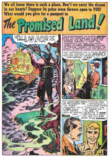
Little Shop of Horrors, Chapter 2, Up and Running

(April to August 1951, Black Magic #4 – #6)

Black Magic #4 to #6 were released during the same period as Boys’ Ranch #4 to #6 (for Harvey Comics). Both titles were bimonthlies which mean that the greatest amount of work produced by the Simon and Kirby studio was for Young Romance and Young Love both of which were monthlies. This is not at all unusual for while Simon and Kirby are most famous for their superheroes most of the work they did during their collaboration was for love comics.

The period discussed in this chapter roughly corresponds with chapter 15 of my serial post The Art of Romance.

While Jack Kirby did all the covers for Black Magic (as he would throughout the first run) in terms of the number of pages drawn he was not the primary artist for Black Magic like he was in the earlier issues. That honors now went to Mort Meskin who did 37 pages compared to Jack’s 17 pages. Even Bill Draut with 18 pages of art did more then Kirby. But even Bill was not the second most prolific artist in the issues covered; surprisingly that would go to the newcomer George Roussos who did 20 pages. Vic Donahue who has been absent from Simon and Kirby productions for some months does a single 5 page story. John Prentice is new to the studio and only provides a single 7 page story. Two stories remain without attributions but one of them is a single page feature.


Black Magic #4 (April 1951) “Voodoo on Tenth Avenue”, art by Jack Kirby

Kirby has scaled back on his splash for his only large piece for Black Magic. Still even with half a page Jack could get a lot of impact. It is amazing how Kirby has managed to make the woman both beautiful and evil; no haggard witch here is just a cold and angry heart. What a text book example of the use of abstract arch shadows (see my Inking Glossary). I count 6 of them in this small splash.


Black Magic #5 (June 1951) “The World of Spirits”, art by Jack Kirby

While Kirby’s other contribution to Black Magic #4 to #6 were very short pieces one of them, “The World of Spirits” is not to be neglected. It is a small masterpiece. It is one of those cases where Jack, so famous for his action, has managed to make exciting art out of nothing more then talking heads. Part of what makes a page like the one shown above so vital is how Kirby changes the expressions in every panel. Since the characters are all past their youth Jack can push his already exaggerated eyebrows to much advantage. The inking is also superb. I am not one to automatically attribute good inking jobs to Kirby but the way the spotting is done on the white shirt in the splash and the use of bold cloth folds make me believe that at least much of the spotting was done by Jack himself. A lot of the times these very short pieces just did not seem to get the same attention from the various studio artists as they gave to the more substantial stories. But not Kirby; some of his greatest masterpieces are short stories such as this one.


Black Magic #4 (April 1951) “The Dead Don’t Really Die”, art by Mort Meskin

I am afraid I am giving short shift to Mort Meskin by only including one example despite the fact that he produced far more work then any other artist. This certainly does not reflect on the quality of the work that Mort was producing; Meskin’s Black Magic work is among the best that he ever did. I admit that Mort did some great work for DC after leaving the Simon and Kirby studio but that unfortunately was done under the severely detrimental effects of Comic Code censoring.

I have selected this particular splash page because of its unusual design. Not that the half page splash is so visually different but the fact that the splash panel is actually the first story panel. Typically splash panels are used as the comic book equivalent of a movie trailer; they provide a sort of a synopsis of the story to entice the reader. I do not remember a story splash panel being used in any prior Simon and Kirby production. The use of this device in “The Dead Don’t Really Die” is still pretty much an isolated case but it would become very typical of Simon and Kirby romance comics in the future.


Black Magic #4 (April 1951) “The Jonah”, art by Bill Draut

Black Magic seems to have given Bill Draut the confidence to draw the type of characters that had all but disappeared from his romance work. You normally would not see something like the sailor with the white hat in Bill’s love stories at this time. The splash panel is also something not to be seen in a romance work. How seedy can you get? Beat up trash cans, littered bottles and yeah I am sure that man in the background is just asking directions from the woman. Note the building on our right; the way the bricks are roughly inked as solid black is a mannerism often used by Draut.


Black Magic #5 (June 1951) “Justice for the Dead”, art by John Prentice

I am not sure why but John Prentice did not seem to do as much work for Black Magic as compared to what he did for the romance titles. It certainly is not because he did a poor job on them; quite the contrary. “Justice for the Dead” is a typical Black Magic piece but with a crime slant that shows that John would have made a great crime comic book artist. He had previously worked for Hillman so perhaps he had done some drawing in that genre there. The GCD lists Prentice as also having worked in Gang Busters and Mr. District Attorney for DC but I have not yet verified that. Years later John would do some work for Simon and Kirby’s Police Trap and later yet take over the syndication detective strip Rip Kirby. My knowledge of John Prentice work outside of the Simon and Kirby studio is sadly incomplete but I am working on rectifying that defect.


Black Magic #5 (June 1951) “The Face from The Future”, art by George Roussos

BM #3 (February) marked the earliest appearance of pencils by George Roussos in a Simon and Kirby production. Despite having two stories in that BM #5 and one in the next issue, it is odd that Roussos has not yet appeared in either Young Romance or Young Love. Since George did a lot of inking and was well known to Joe and Jack there is the possibility that he has help with inking Kirby’s work prior to this but I have seen nothing that confirms that conjecture. That Simon and Kirby both knew Roussos is indicated by a sketches both did for him in 1942 (Joe did Hitler in a zoot suite (Poking Fun at Hitler) and Jack did the Boy Commands (A Belated Happy Birthday to Jack Kirby). George also knew Mort Meskin and had inked some of Mort’s work for DC (Early Mort Meskin).

As often happens in Simon and Kirby productions, George Roussos’ splash for “The Face from the Future” uses some inking technique that seemed borrowed from the Studio Style inking. In this case we find picket fence crosshatching (Inking Glossary) on the hooded figure and a rounded shadow in the upper right corner. However it is clearly Roussos doing the inking and not Joe or Jack touching it up. While there is classical picket fence crosshatching on the right ghostly figure it changes as it proceeds to the left and becomes an inking technique not found in the Studio Style. There the shadow is built with short strokes that initially look like the pickets from the picket fence crosshatching but without the rails. The rounded shadow in the upper corner has a ragged edge that again is not typical of the way it usually is done in the Studio Style.


Black Magic #6 (August 1951) “The Girl the Earth Ate Up”, art by George Roussos

George does such a great job on the splash for “The Girl the Earth Ate Up” I could not resist including it. Do not get me wrong Roussos pencils and inking are on the crude side but his use of blacks makes it really work.


Black Magic #6 (August 1951) “A Wolf That Hummed a Nursery Rhyme”, art by Vic Donahue

Vic Donahue has not been appearing in Simon and Kirby productions for a while and this is the only work that I have assigned to him for 1951. It is an odd story and it allows Vic to draw the type of characters that would not have been appropriate for romance work. Even so I just cannot get enthusiastic about Donahue’s effort. Vic was one of the lesser talents in the Simon and Kirby studio and now that all three of the usual suspects (Bill Draut, Mort Meskin and John Prentice) are present Donahue will rarely appear again if at all (my database has no more entries for him after this one).
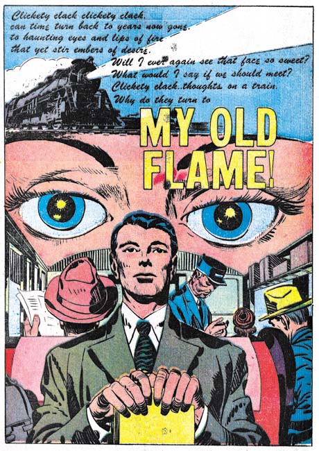

Black Magic #5 (June 1951) “Follow Me”, art by unidentified artist
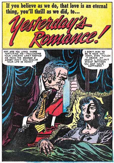
There is one Black Magic artist from this period that I have not been able to identify but he does a nice job on “Follow Me”. Good characterization, excellent inking and good graphic story telling.

The Little Shop of Horrors, Chapter 1 (#1 – 3), Expanding Their Fields

The Little Shop of Horrors, Chapter 3 (#7 – 8), The Same Old Gang
The Little Shop of Horrors, Chapter 4 (#9 – 11), Another Hit
The Little Shop of Horrors, Chapter 5 (#12 – 14), New Faces
The Little Shop of Horrors, Chapter 6 (#15 – 17), Mix Bag
The Little Shop of Horrors, Chapter 7 (#18 – 20), Kirby Returns
The Little Shop of Horrors, Chapter 8 (#21 – 23), The Gang’s All Here
The Little Shop of Horrors, Chapter 9 (#24 – 26), The Party’s Ovetr
The Little Shop of Horrors, Chapter 10 (#27 – 29), A Special Visitor
The Little Shop of Horrors, Chapter 11 (#30 – 33), The End