
I missed Jack’s birthday again! Well better late then never. I could go on and on about how much great stuff Kirby did, but then that is what most of this blog is about. So Happy Belated Birthday Jack!

I missed Jack’s birthday again! Well better late then never. I could go on and on about how much great stuff Kirby did, but then that is what most of this blog is about. So Happy Belated Birthday Jack!
(Young Romance #13 – #16, Young Love #5 – #6)

Chart of the number of romance titles from September 1947 to December 1950 with the period covered in this chapter marked in blue.
My discussions of Young Romance and Young Love were left off in Chapter 5 after which I then spent the next three chapters on Simon and Kirby’s two western romances titles Real West Romance and Western Love. Returning to Simon and Kirby’s purer romance titles, Young Romance was starting its third year. Previously Young Romance and the newer Young Love were both bimonthlies on an alternating schedule so that one would appear on the stands each month. With the Young Romance #13 issue (September 1949) that title would now become a monthly. The house ad announcing this new schedule declared there were three and a half million readers. An exaggeration? Perhaps, but this was the golden age of comics and readerships were much larger then found today. Taking Young Romance to monthly schedule clearly indicates that Prize was doing quite well with that title. Since the deal with Prize provided Simon and Kirby with a percentage of the sales, the creative duo were receiving great financial benefits. There was competition, however, as September 1949 was well into the start of the love glut.

Young Romance #15 (November 1949) “Back Door Love”, art by Jack Kirby
For whatever reason, Jack Kirby was not that prolific during the period covered in this chapter (September to December 1949). The covers for YR and YL were all photographs and so Jack would not be providing any covers. Kirby would supply a single story for YR #13 to #15, two for YR #16, and none for YL #5 or #6. His diminished presence in YR and YL was also true for the other Simon and Kirby titles (Headline, Justice Traps the Guilty, Real West Romance and Western Love). While Jack may not have been his usual prolific self he still was an important contributor to the two romance titles. Kirby would provide the lead story for Young Romance and while these stories may not have been as long as some from the past they still had the highest page count compared to any others in the same issue. So while there were two artists that provided more stories then Jack only one of them actually drew more pages. For the record Jack did 5 stories and 58 pages for the 6 issues. Unlike the case found in previous chapters of “The Art of Romance”, or even “Its A Crime”, I conclude that Kirby did not provide layouts to any of the other artists in these issues.
Jack provided great splashes for all the lead stories for YR #13 to #16. All made use of the motif of a character introducing the story with the word balloon forming the title. All lead stories were meant to suggest provocative themes as can be seen by their titles alone (“Sailor’s Girl”, “Runaway Bride”, “Back Door Love” and “Dance Hall Pick-Up”). Today they might seem tame but in the late ’40s they would be considered risque. I have chosen two of them as examples not only because they are the best but also because of their contrasting nature. The splash for “Back Door Love” shows a couple on one side, a large word balloon/title, and three overlapping panels crowded into another corner. The panels are not the beginning of the story, but rather provide examples of the shameful love and its emotional price the woman has to pay. The couple was inked in the standard Studio style with abundant picket fence crosshatching and drop strings (see my Inking Glossary for explanations of my terms to describe inking techniques). This was overlaid with much relatively fine simple and more complicated crosshatching; techniques not commonly found in Simon and Kirby art. The inking is meant to provide the couple with a nighttime setting which is enhanced by the colorist blocking them out in a light blue. While the woman’s face turned to the viewer (I do not understand why many do not find Kirby’s woman beautiful) the man’s remains concealed in the shadows; all in keeping with the mystery of their relationship. Not much in the way of action, but one of Kirby’s more interesting splashes nonetheless. However there is a “but”; while some like comic art with a lot of detail work, I generally do not. I find all the crosshatching in this splash gives the figures a hard edge, almost like they were carved out of stone and are not flesh and blood. A small detraction from what was otherwise a masterpiece.

Young Romance #16 (December 1949) “Dance Hall Pickup”, art by Jack Kirby
Shame was the theme for the splash of “Dance Hall Pickup” as well, but its similarity to the “Back Door Love” splash pretty much ends there. This time it is the man’s turn to be found in a shameful relationship. Nothing mysterious here, everything is in full lighting. The woman’s low cut dress, fake flowers on her belt, costume jewelry, and false eyelashes clearly mark her as the type of woman a gentleman would be uncomfortable with bringing home to meet his mother. Of course the story will reveal that the somewhat trashy appearance of the woman really hides a warm and loving heart. The inking for this splash is truly a text book example of Studio style inking. It has all the typical hallmarks; lots of picket fence crosshatching and drop strings along with an abstract arch shadow and shoulder blots for the man. No fastidious brushwork here, each stroke is boldly marked; straddling the boundary between working with others for indicating the shadows and maintaining an independent existence. Most fans are attracted to his action scenes but for me this is Kirby at his best; telling a complete story with just some simple gestures and some abstract marks.
I cannot leave this splash without pointing out the hanging curtain in the top corner. It serves no logical purpose. The windows in the back are complete bare, so why is that drapery hanging from the ceiling in the middle of a dance floor in front of a pillar? It is a mistake to look at Kirby art, or any comic book art, as if it was an attempt at rendering a truly realistic image. Elements are added for their suggestive power and how they provide visual interest. The hanging curtain is a motif that Jack will use often.

Young Romance #16 (December 1949) “The Wolves of the City”, art by Bill Draut
The largest contributor to YR #13 – #16 and YL #5 and #6 was Bill Draut. Bill did twice as many stories compared to Kirby (10 vs. 5) and 10 more pages (68 vs. 58). Bill’s strength was his clear visual story telling and his effective use of body language. The simplicity of faces drawn by Bill did not lend itself to a wide range of emotions. Perhaps that is why Draut was very careful in the poses he provided his characters. Upturn faces could portray admiration or wonderment. Thrusting the head forward and providing clenched fists would reveal a person’s anger. In the splash for “The Wolves of the City” you do not need to read the story to realize how demure and proper the lady on our right is. Hands folded on her lap and eyes cast down tell it all. Her friend has her hand on her hip, the way her head pushed forward, and even the way she holds her cigarette shows she has a harsh and sharp personality. Despite the similar profiles, she presents quite a contrast to the mother figure from the second story panel.

Young Love #6 (December 1949) “For Handsome Men Only”, art by Bruno Premiani?
The third most prolific artist for the issues cover in this chapter was possibly Bruno Premiani. I say possibly because none of the work this artist did for Simon and Kirby was signed and none of it compares well with work done for DC that has been credited to Premiani. Either the attribution of this work to Premiani is wrong or he adopted a different style for romance compared to his superhero comic book art. Whoever the artist is, and for now I continue to refer to him as Premiani, he was one of the more talented individuals to have worked for Joe and Jack. Bruno first showed up in Young Love #4 (August 1949) and would provide work to the S&K studio until December 1950). During that period of a little over a year, Simon and Kirby would include about 25 stories by Premiani. For the issues covered in this chapter, Bruno did 6 stores (one more then Kirby) for a total of 48 pages (much less then Jack’s 58 pages). One of the stories supplied by Bruno was even used for the all importing lead story (the “For Handsome Men Only” shown above). It is easy to see why Premiani was used so often. Although his woman are perhaps a little plainer then some other studio artists, they (and the men as well) seem to radiate an emotional energy. Like Draut, Premiani could make effective use of body language as well. The hands on the hip and face in profile as superficially similar to Draut’s pose in “The Wolves of the City”. But by pulling the head back and thrusting one leg forward, Bruno makes his protagonist much more alluring. In the second panel the lady ostensibly uses her hand to keep her scarf in place but the gesture is actually part of a physical withdrawal from a disappointing blind date.

Young Romance #14 (October 1949) “Nancy Hale’s Problem Clinic” page 2, art by Vic Donahue
There were a number of other artists who contributed to these issues of YR and YL but nowhere nearly as much as Draut, Kirby or Premiani. One was Vic Donahue who we have seen in previous chapters of “The Art of Romance” both for the standard romance as well as the western love titles. Vic’s work for the issues covered her has diminished and is restricted to three “Nancy Hale’s Problem Clinic” features. These are all short work of 2 or 3 pages long. There is no more I can add to my previous discussions of Donahue; his woman are attractive and Vic often provided them with a tilt to the head. Vic was careful in the inking of hair and he sometimes filled shadows with fine simple hatching. Aspects of the Studio style inking also show up in his work. The page above shows drop strings (panel 1 and 3), shoulder blots (panel 3), an abstract arch shadow (panel 6) and picket fence crosshatching (panels 4, 6 and 7). I am still undecided whether this was Joe or Jack stepping in as art editor to strengthen up the work. Alternatively is may have been Vic adopting portions of the Studio style. Joe Simon has described the inking of Kirby’s pencils as being like a factory line involving many different inkers. Although I cannot point to any specific work by Kirby that Donahue could have inked, as one of the more minor but still talented artists continually employed by S&K Vic certainly was a candidate to help in inking.

Young Love #5 (October 1949) “For Sale: One Dream”, art by Al Eadeh and John Belfi?
Another minor contributor, or rather an artist team, that we have seen before was Al Eadeh and John Belfi. The work is unsigned and my attribution provisionally, but I believe Eadeh and Belfi did “For Sale: One Dream”. While talented, Eadeh and Belfi were still among the lesser lights of the S&K studio.

Young Love #5 (October 1949) “The Love I Didn’t Want”, art by George Gregg
Signatures found in three comics (Young Love #4 and Justice Traps the Guilty #17 and 19) have allowed me to identify one of Simon and Kirby’s studio artists, George Gregg. Since then I have spotted an unsigned work in Western Love #1 and here I can add two more. Even without a signature, Gregg’s style still stands out. His art has a sort of stylized cartoony edge to it and frankly a touch of primitivism. Gregg’s often provides his characters with distinctive, but varied eyebrows. The leading ladies frequently have a pinched look to their faces. While “The Love I Didn’t Want” is no masterpiece, it is still nice to be able to assign a name to some of work produced by the Simon and Kirby studio.
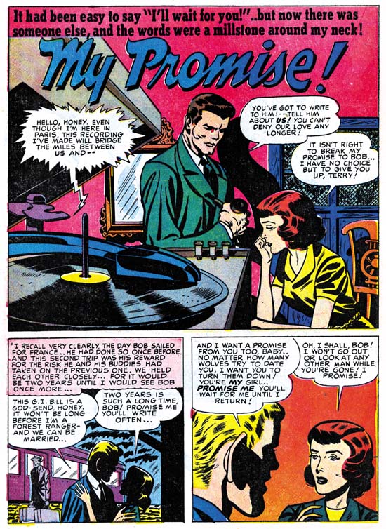
Young Love #6 (December 1949) “My Promise”, art by George Gregg with help from Jack Kirby in splash panel
“My Promise” is another unsigned work by George Gregg. The Jack Kirby Checklist includes the splash as being done by Kirby. While it is true man was clearly done by Jack, the rest of the splash and the story panels were by Gregg alone. This is another example of Kirby acting as art editor stepping in to help the all important splash. I believe the man in the splash was inked by Jack as well, but he is deliberately working in a simpler manner to blend in better with Gregg’s inking. Careful examination, however, will show that Jack’s brush has a subtlety that was beyond Gregg’s capabilities. The over sized ear in the second story panel was a mannerism that Kirby often fell into, particularly on work done before he went into military service (for Timely and DC). This suggests that Gregg may have been using old Simon and Kirby comics as source material for swiping.
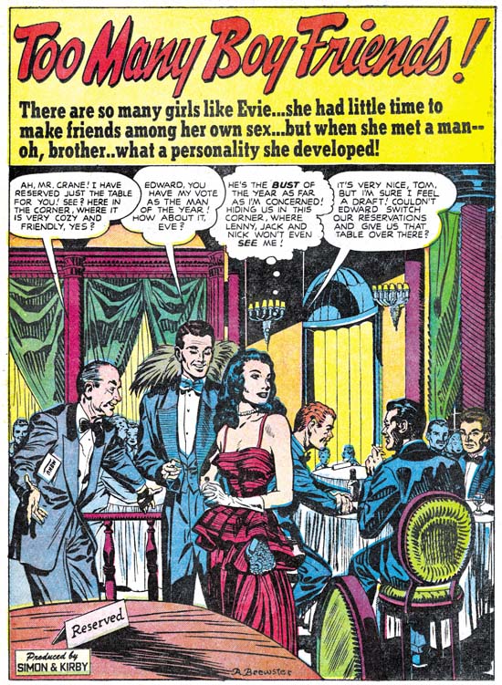
Young Love #5 (October 1949) “Too Many Boy Friends”, art by Ann Brewster
New to Simon and Kirby production is the artist Ann Brewster. S&K must have like her work because they used her first submission, “Too Many Boy Friends”, as the lead story for Young Love #5. I am not sure that “first” is the proper description. I do not believe there were any earlier works for Simon and Kirby but I am unaware of any other works by Ann from this period either. In 1955 Ann would provide a number of stories for the Prize romance titles during the time when Joe and Jack were trying to get their own publishing company, Mainline, going.
When I previously discussed this splash, I thought that this might have been delivered as pencils and inked in the S&K studio. That conclusion was largely due to the presence of Studio style inking throughout the story. However, I no longer hold that viewpoint. There appears to be at least two inkers involved. One, Ann herself, working with a fine brush and another inker, probably Joe or Jack) working with a broader, more loaded, brush. The Studio style inking was probably added later to strengthen the art.

Young Love #6 (December 1949) “The Life of the Party”, art by John Guinta and Manny Stallman
Another new team to appear was John Guinta and Manny Stallman. Fortunately the work is signed because I am completely unfamiliar with John Guinta’s work. Manny Stallman has done his own penciling for Simon and Kirby primarily in the crime titles (not yet covered by my serial post “It’s A Crime”) but also in Western Love #1 (July 1949). “The Life of the Party” is the only story that I know that they did for S&K but perhaps more will show up.
The art for Guinta and Stallman’s “The Life of the Party” is good, but I am particularly impressed by the splash panel. It actually is two splash panels as neither of the top panels belong to the story proper. Floating heads are not used often by Simon and Kirby but they do occur. However I do not recall any of theirs approaching the avalanche of heads as produced here by Guinta and Stallman. I particularly like the way they spill from the right panel into the left with the gutter bisecting two heads. While I attribute most of this to work to John and Manny, I wonder about the single head at the center bottom of the panel. It is the only head without hair and the uppermost contour looks decidedly unnatural; almost as if it was cut from some other work. I cannot help but wonder if that one head was actually done by Jack Kirby. Perhaps, though, this is due to the inking with its aspects of Studio style. This was probably done by either Joe or Jack as most of the story is inked in a different style. Again the presence of places with Studio style inking in the story probably is due to Joe or Jack stepping in to strengthen the art.

Young Romance #16 (December 1949) “His Engagement Ring”, art by Mort Meskin
Young Romance #16 marked the return of an important artist Mort Meskin. Perhaps return is not the proper word as a little over a year ago he had appeared teamed up with Jerry Robinson. In the same month of December 1949 Mort also appeared in Real West Romance #5. Joe Simon has described in his book “The Comic Book Makers” the difficulties Meskin faced overcoming the artist’s equivalent of the writer’s block. However once this problem was passed, Mort became the most prolific of the Simon and Kirby studio artists. There were periods when he out produced Jack Kirby (no small feat) despite the fact that Mort would do all his own inking while Kirby often was inked by others. During his career, Mort was much admired by many of his fellow artists including Jerry Robinson, Joe Simon and Steve Ditko. Unfortunately today he is largely overlooked among comic book fans failing even to be voted into the Will Eisner Awards’ Hall of Fame. Partly this is due to the stylized drawing that Meskin adopted. Also a lot of his later work was done for Simon and Kirby romance titles; a genre not much appreciated among today’s fans. Perhaps the most important reason was that Meskin dropped out of comics in the late ’50s and afterwards avoided any contact with fans. However Mort was one of the best graphic story tellers from the golden age of comics. Meskin’s skill in presenting a story is easy to overlook due to the unobtrusive methods he used. Probably the only thing I can say against Meskin as an artist was that his work sometimes suffered from his efforts to produce lots of work.
The splash page for “His Engagement Ring” uses a layout that Meskin typically preferred; two thirds of the page for the splash panel with two or three story panels at the bottom of the page. It is a common layout used by many artists but different from the layout most frequently used when teamed up with Robinson which had a vertical splash panel with two story panels on the right side of the page.
The December issue of Young Romance was released just a few months prior to the peak of the love glut. The rise in the number of romance titles in such a short period was nothing short of dramatic. The decline following the peak was almost as rapid when publishers found that there just was not enough room on comic racks for all the new titles.
Chapter 1, A New Genre (YR #1 – #4)
Chapter 2, Early Artists (YR #1 – #4)
Chapter 3, The Field No Longer Their’s Alone (YR #5 – #8)
Chapter 4, An Explosion of Romance (YR #9 – #12, YL #1 – #4)
Chapter 5, New Talent (YR #9 – 12, YL #1 – #4)
Chapter 6, Love on the Range (RWR #1 – #7, WL #1 – #6)
Chapter 7, More Love on the Range (RWR #1 – #7, WL #1 – #6)
Chapter 8, Kirby on the Range? (RWR #1 – #7, WL #1 – #6)
Chapter 9, More Romance (YR #13 – #16, YL #5 – #6)
Chapter 10, The Peak of the Love Glut (YR #17 – #20, YL #7 – #8)
Chapter 11, After the Glut (YR #21 – #23, YL #9 – #10)
Chapter 12, A Smaller Studio (YR #24 – #26, YL #12 – #14)
Chapter 13, Romance Bottoms Out (YR #27 – #29, YL #15 – #17)
Chapter 14, The Third Suspect (YR #30 – #32, YL #18 – #20)
Chapter 15, The Action of Romance (YR #33 – #35, YL #21 – #23)
Chapter 16, Someone Old and Someone New (YR #36 – #38, YL #24 – #26)
Chapter 17, The Assistant (YR #39 – #41, YL #27 – #29)
Chapter 18, Meskin Takes Over (YR #42 – #44, YL #30 – #32)
Chapter 19, More Artists (YR #45 – #47, YL #33 – #35)
Chapter 20, Romance Still Matters (YR #48 – #50, YL #36 – #38, YB #1)
Chapter 21, Roussos Messes Up (YR #51 – #53, YL #39 – #41, YB #2 – 3)
Chapter 22, He’s the Man (YR #54 – #56, YL #42 – #44, YB #4)
Chapter 23, New Ways of Doing Things (YR #57 – #59, YL #45 – #47, YB #5 – #6)
Chapter 24, A New Artist (YR #60 – #62, YL #48 – #50, YB #7 – #8)
Chapter 25, More New Faces (YR #63 – #65, YLe #51 – #53, YB #9 – #11)
Chapter 26, Goodbye Jack (YR #66 – #68, YL #54 – #56, YB #12 – #14)
Chapter 27, The Return of Mort (YR #69 – #71, YL #57 – #59, YB #15 – #17)
Chapter 28, A Glut of Artists (YR #72 – #74, YL #60 – #62, YB #18 & #19, IL #1 & #2)
Chapter 29, Trouble Begins (YR #75 – #77, YL #63 – #65, YB #20 – #22, IL #3 – #5)
Chapter 30, Transition (YR #78 – #80, YL #66 – #68, YBs #23 – #25, IL #6, ILY #7)
Chapter 30, Appendix (YB #23)
Chapter 31, Kirby, Kirby and More Kirby (YR #81 – #82, YL #69 – #70, YB #26 – #27)
Chapter 32, The Kirby Beat Goes On (YR #83 – #84, YL #71 – #72, YB #28 – #29)
Chapter 33, End of an Era (YR #85 – #87, YL #73, YB #30, AFL #1)
Chapter 34, A New Prize Title (YR #88 – #91, AFL #2 – #5, PL #1 – #2)
Chapter 35, Settling In ( YR #92 – #94, AFL #6 – #8, PL #3 – #5)
Appendix, J.O. Is Joe Orlando
Chapter 36, More Kirby (YR #95 – #97, AFL #9 – #11, PL #6 – #8)
Chapter 37, Some Surprises (YR #98 – #100, AFL #12 – #14, PL #9 – #11)
Chapter 38, All Things Must End (YR #101 – #103, AFL #15 – #17, PL #12 – #14)
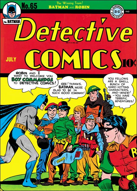
Detective #65 (July 1942), art by Jack Kirby and Jerry Robinson
I mentioned in a previous post a review of the Jack Kirby Tribute Panel that Comic Book Resources has posted (written by Jim MacQuarrie).
At the very end of the article is found:
Jerry Robinson closed the panel by recalling his participation in one of the very few collaborations that Kirby did with anyone but Joe Simon. “The only time Jack collaborated with anyone but Simon on a cover was an issue of “Detective Comics” when the Boy Commandos joined the book. The cover showed Batman and the Boy Commandos shaking hands. I drew Batman and Jack drew the Commandos.”
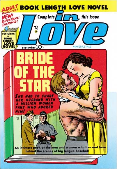
In Love #1 (September 1954), art by Jack Kirby and John Prentice
While of course Jerry is right about his contributions to the cover of Detective #65, he is not correct about being the only artist, other then Joe Simon, to collaborate on a cover with Jack Kirby. John Prentice, one of the usual suspects of the Simon and Kirby studio, also had that honor. Jack did the foreground couple while John did the two background figures.
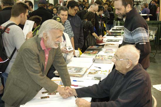
Jerry greeting Joe Simon at the Big Apple Con of 2006
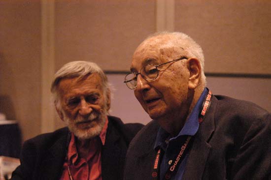
Jerry and Joe at New York ComicCon 2008
(Headline #26 – #28, Justice Traps the Guilty #1 – #1)
September 1947 (cover date) was the release of Simon and Kirby’s Young Romance. This marked a milestone for the creative duo. Previously Joe and Jack had not signed any of the work that they provided for publishers Prize or Hillman with the exception of Hillman’s My Date. Starting in September Simon and Kirby signatures would appear not only in Young Romance but in Headline Comics as well. Jack Kirby drew four stories of Headline #26 and three of those were signed. From this point on Simon and Kirby signatures would frequently be found on Kirby’s drawings for Prize Comics. Despite all the work that S&K provided to Hillman, in the end it was Prize that got Joe and Jack’s commitment. Right from the start the crime version of Headline was produced by Simon and Kirby while they never seem to have the same influence with Hillman. Surely whatever deal that Joe and Jack made with Prize must have reflected their greater control over Headline while at Hillman they had remained only marginally better then just work for hire. In the end Simon and Kirby were businessmen and it was all about the money. By early next year Simon and Kirby’s work for Hillman would end.
The crime version of Headline Comics must have been a very successful seller. After just the first four bimonthly issues Prize introduced a new crime title Justice Traps the Guilty. Simon and Kirby produced JTTG as well and there really was no difference in the contents between Headline and JTTG. Since both were bimonthly titles, effectively there would be a crime comic released by Prize each month. There must have been some difficulty because JTTG #2 should have been scheduled for December but was released in January instead; while Headline #28’s normal January release was pushed back to February.
Jack Kirby would still be the main contributor to Headline Comics and the new Justice Traps The Guilty. Jack drew 4 out of 6 stories for Headline #26 (September), but would only draw two stories each for issues #27 (November) and #28 (February). The first issue of Justice Traps the Guilty followed the Simon & Kirby’s modus operandi of starting a title with lots of Kirby; Jack penciled 6 out of the 8 stories. However with the second issue Jack returns to supplying a more modest 2 stories. Still no other artist appeared more often then Jack in these issues.

Headline #26 (September 1947) “The Life and Death of Public Enemy Number One”, art by Jack Kirby
The splash for “The Life and Death of Public Enemy Number One” uses a silhouette. There seemed to have been a flurry of the use of this device because we have seen it previously. However it would be pretty much dropped by Simon and Kirby and this may be its last use. While making the overall design of the splash more interesting, the use of silhouette diminished the impact as well.

Headline #26 (September 1947) “Bullets for The Bogus G-Man”, art by Jack Kirby
Another device used by Simon and Kirby in the early Prize crime comics was having “Red” (or “Red-Hot”) Blaze introduce the stories. While I suspect that Simon and Kirby found it a useful idea when they were promoting the idea of crime comics to Prize and for the initial in-house advertisements, in the end it just took up story panels that would had been better served for telling the actual story. “Bullets for the Bogus G-Man” may have been the last use of “Red” Blaze and even there he is only mentioned in the caption at the bottom of the splash page and never makes an actual appearance in the story.

Headline #28 (February 1948) “I Worked For the Fence”, art by Jack Kirby
One motif Simon and Kirby sometimes used for the first story was adopted from previous use in Young Romance. That is having a character introducing the story and using the word balloon as the title caption. Simon and Kirby did not use this design technique as frequently in the crime titles as they would in Young Romance but it still was an effective part of their repertoire.

Headline #27 (November 1947) “Spirit Swindlers” page 7, art by Jack Kirby
I have remarked before that circular panels was largely limited to an occasional splash page for the work that Simon and Kirby did for Hillman. For the Prize issues discussed in this chapter, Joe and Jack continued to use circular panels. What was new is that while previously almost all the Prize comic stories used circular panels in Headline #26 to #28 and JTTG #1 and #2 about half of the stories did not use round panels at all. For the stories that still featured circular panels they are used in lower proportions. For Headline #23 to #25 ratios of rounded panels to all the panels was over 16% and in one story reached 20%. Remember for a story done in the standard 6 panels per page, this would work out to an average of a semi-circular panel for each page (although they rarely were distributed so evenly). For Headline #26 to #28 and JTTG #1 and #2, when rounded panels were used they were generally used in the range of 14% to 10%. This is only a small decrease, but it seems to be consistent. In one story (“The True Life Story of Alvin Karpis” it drops to 4%. The last issue covered in this chapter (Headline #28, February 1948) did not have any rounded panels.
I have also been trying to track the evolution of the inking techniques used. Previously in Headline drop strings and abstract arch shadows, typical Studio style mannerisms, had become commonly used. Picket fence crosshatching and shoulder blots were still rare and when found are not typical in execution. (See my Inking Glossary for explanations of the terms I use to describe these techniques). In the last chapter we saw those final typical Studio style techniques show up suddenly in the Hillman crime title. The same thing happened at Prize. The earliest typical picket fence brush work for Prize that I have noticed was in “Spirit Swindlers” (see above image, particularly panels 4 and 6. There seems to be no gradual conversion of previous simple crosshatching to picket fence crosshatching; picket fence just suddenly appears. The picket fence inking shows up elsewhere in the story as well. Not every story in the same issue, however, shows the use of this most distinctive inking. Also note the shoulder blot in panels 1 and 2.

Headline #26 (September 1947) “Beyond the Law”, by unidentified artist
As mentioned above, Kirby drew 4 of the 6 stories for Headline #26. The other two stories (“Test of Death” and “Beyond the Law”) were done by the same artist. I have not been able to identify him but he also did “Murder’s Reward” and “Blind Man’s Death” from Headline #25. Ger Apeldoorn has suggested that it might be Bob McCarty. I am most familiar with McCarty’s work for S&K’s Mainline titles. The Mainline material does not resemble these four stories but that could be explained by the seven years separating the two groups of work. In any case the work in Headline #25 and #26 was done by a talented artist who played an important part in the early Headline issues. After issue #26 the artist stopped providing work to Simon and Kirby.

Justice Traps the Guilty #1 (October 1947) “G-Man Trap”, art by Bill Draut
After the mystery artist last appearance in Headline #26, his place as the most important supporting artist (after Kirby) was taken by Bill Draut. Draut’s first returned to the Simon and Kirby productions in Young Romance #1 (September 1947). From that point on Bill would be a mainstay of the S&K studio until its breakup. Draut would provide two stories each issue for Headline #27 and #28 as well as JTTG #1. In those issues Draut’s contributions of stories equal that of Jack Kirby. It is interesting to see Draut’s take on crime since so much of his output for the Simon and Kirby studio was for romance titles. Bill could be surprisingly effective with action and he also did some interesting splashes. The one for “G-Man Trap” is a good example. The use of diagonal elements makes the splash visually stimulating. However, the placement of the gun smoke and the odd pose of the shooter in the background really did not work well and diminishes what should have been an interesting confrontation. Still you have to admire Draut for the attempt made even if it was not completely successful.

Justice Traps the Guilty #1 (October 1947) “Try an FBI Test” page 2, art by Bill Draut
As I have mentioned a number of times in the past, I am convinced that Kirby did not supply layouts for Draut as some experts have suggested. Bill’s means of telling a story and his splash designs (such as the one from “G-Man Trap” shown earlier) are often different from Jack’s. There is one story, “Try an FBI Test”, that might suggest otherwise. Note the use of circular panels. These appear throughout the story and are the same form that Kirby uses. While this might suggest that Kirby did the layouts, I am not convinced. In “Try an FBI Test” the captions and word balloons frequently extend beyond the border of the circular panels which is unlike Kirby’s use where both captions and work balloons invariable are confined within the circular boundary. Nor was there any real change in the way the story is graphically told compared to other work by Draut. I believe Draut has just trying a layout technique that he previously observed Kirby using. Whatever the reason for the use of circular panels, it was a one time occurrence as I do not believe Bill would ever used it again.

Headline #28 (February 1948) “Postage Stamp Swindle”, art by Jerry Robinson and Mort Meskin
Young Romance #3 (January 1948) saw the first appearance of the Jerry Robinson and Mort Meskin team working for the Simon and Kirby studio. “Postage Stamp Swindle” (Headline #28, February 1948) was the first crime work that they did for S&K. As a team, Robinson and Meskin would only work for Joe and Jack for about seven months and provide a total of ten pieces of work. Only two of the stories are signed but the unsigned work is very consistent with those bearing signatures. Jerry and Mort had a preference for splash pages with a vertically dominated splash panel with two story panels also vertically arranged. The first page of “Postage Stamp Swindle” exaggerates that motif by placing the title over the story panels in a caption shaped like a stamp. Otherwise the splash panel usually had the shape of an inverted ‘L’.
I have been assigning the pencils to Jerry and the inks to Mort. This was due to the order that their names appear in their signature. Further the inking does predominately look like Meskin’s. Recently I have been spending some time looking over some of Meskin’s work from 1946 and 1947. I find that the work Robinson and Meskin’s supplied for Simon and Kirby look very much like the early work that Mort did on his own. So much so that I wonder what Robinson’s contribution was? I am tempted to attribute all the early unsigned art for S&K as Meskin alone and only credit the last three stories, two of which are signed, to the Robinson and Meskin team. I have two reasons for not taking that course. One is the still great similarity of the signed and unsigned work. The second is Joe Simon’s story of when Mort came to work for the Simon and Kirby studio as described in his book “The Comic Book Makers”. Joe really makes it sound like that was the first time Mort had worked for them which would not be true if Meskin was solely responsible for the work from 1948.

Headline #27 (November 1947) “The Guns of Jesse James” page 5, art by Jack Kirby and an unidentified artist
“The Guns of Jesse James” is one of those stories that at a glance were obviously done by some artist other than Jack Kirby; the drawing is just too crude. There are some places where the art, although still crude, looks like Jack’s style. The second panel in the page above is a good example. This story even uses rounded panels like those that Jack would use for some of his own stories. While it is possible that the artist was trying to mimic Kirby’s techniques, I think it more likely that he is working from rough layouts provided by Jack.

Justice Traps the Guilty #2 (January 1948) “The Killer Thought He Was Satan” page 4, art by an unidentified artist (Jack Kirby layouts?)
The possibility of rough Kirby layouts may also apply to “The Killer Thought He Was Satan”. Note in particular the second panel from page 4 shown above. In many ways the graphic story telling is even more like typical Kirby mannerisms then “The Guns of Jesse James”. Both of these stories come from a period where Kirby’s contributions had diminished and the use of layouts may have been an effort to filling the titles without using too much of Jack’s time.

Justice Traps the Guilty #2 (January 1948) “The Murdering Bender Family”, art by an unidentified artist
As I precede in future chapters of this serial post I will certainly not try to cover every unidentified artist in these titles. While I would consider most, if not all, talented some were more deserving of recognition than others. Besides there will be too many artists that I have not identified yet. In these early issues of the crime titles, however, the number of artists appearing is much more limited. So I will close with the splash page of one of mystery artists. I sure wished more of them took advantage of Simon and Kirby’s willingness to allow artists to include their signatures.
Chapter 1, Promoting Crime
Chapter 2, A Revitalized Title
Chapter 3, Competing Against Themselves
Chapter 4, Crime Gets Real
Chapter 6, Forgotten Artists
Chapter 7, A Studio With Many Artists
Chapter 8, The Chinese Detective
Chapter 9, Not The Same
Chapter 10, The Master and His Protege
Chapter 11, The New Team
Comic Book Resources has a commentary on the Jack Kirby Tribute Panel from the most recent San Diego Comic-Con International. Of greatest interest to this blog was an announcement made:
After discussing his recent book, “Kirby: King of Comics,” which he said was doing phenomenally well, Evanier turned the mic over to his publisher, Charlie Kochman from Harry N. Abrams Co., who announced that Joe Simon is opening his archives and Abrams will publish “The Art of the Simon & Kirby Studio” in Spring 2010. The large-format book will have oversize pages, with faithful reproductions scanned from the original art boards.
I am really happy to be able to finally post this. Abrams is one of the largest publishers of art books (if not the largest). The job they did on “Kirby: King of Comics” was just fantastic. I do not believe that any publisher has previously devoted a large book to original comic book art. I cannot begin to describe how excited I am about this project.
“Fredric Wertham and the Critique of Mass Culture” by Bart Beaty (2005) is out of print but still easily found in the used book market. I do not remember where I heard of this book before, but I understood it was a defense of Fredric Wertham’s “Seduction of the Innocent”. By the time I finished reading that book I simply could not understand how anybody took Wertham’s seriously. So I proceeded to read Beaty’s book with much interest.
Beaty had a specific audience in mind when he wrote “Fredric Wertham and the Critique of Mass Culture” but it was not comic book fans. Rather it was for the field of media studies. I fully admit I know nothing about media studies but Beaty provides enough background material that I had no trouble understanding what he is writing about. According to Beaty media studies has two basic approaches to perform their investigations; surveys and laboratory studies. Wertham’s method of using clinical studies occupied neither of these methodologies. Consequently Wertham and “Seduction of the Innocent” has been ignored by those involved in the media field. On page 5 of the introduction Beaty quotes Joseph Klapper (“The Effects of Mass Communications”, 1960):
Wertham is not generally regarded, however, as having substantiated his very extreme views. Thrasher (1949), for example is typical of the critics in pointing out that Wertham provides no description of his samples of comic books or of human cases, apparently deals only with a small and highly deviant minority of both, provides no description of his case study techniques, uses no control groups, and, in short, provides no acceptable scientific evidence for his ascription of comic book influence.
(I have added the emphasis to the word “apparently”). Beaty’s comment about Klapper’s statement was (page 5):
While the substantive disagreement between Frederic M. Thrasher and Wertham on the nature and quality of Wertham’s proof cited by Klapper will be addressed specifically in Chapter 4, of greater importance at this point is the use of the term apparently in reference to “Seduction of the Innocent”. It suggests that Klapper had not read Wertham’s text and used Thrashers’s denunciation of it as the basis of his opinion.
I think Beaty has completely misread Klapper. If Klapper truly had not read SOTI then I would expect the word “apparently” to be associated with Wertham and thereby cover all the following items. Instead “apparently” is found in the middle of a list of comments indicating that it is “deals only with a small and highly deviant minority of both” that is apparent. In SOTI Wertham only gave a cursory description of where his subjects (the children) of his clinical studies came from. From my reading of SOTI I had concluded that it was not a balanced sample but it is hard to be sure given what little information Wertham provides and so the use of the word “apparently” is appropriate. The same can be said of Wertham’s study of the comics themselves. I do not know if in fact Klapper had read SOTI, but nothing in his statement convinces me he has not. More importantly Beaty’s misreading had led him to ignore concerns raised about Wertham’s data.
Beaty reviews a number of his opponents who were critical about Wertham’s data. For example according to Beaty Norbert Muhlen wrote (page 153):
…despite the lack of reliable data as to their circulation and influence on youthful minds…
But Beaty was more interested in comparing Muhlen’s politics with that of Wertham and does not discuss Muhlen’s questioning of Wertham’s data. This seems to be a recurring pattern throughout Beaty’s book. A number of Wertham’s critics had voiced reservations about the validity of Wertham’s data but Beaty repeatedly does not address the issue. In his introduction Beaty promised that “the nature and quality of Wertham’s proof … will be addressed specifically in Chapter 4.” Chapter 4 does include a careful review of SOTI but in fact Beaty does not show that Wertham’s data was scientifically valid.
Beaty provides some historical background in this book both on Wertham. This information was particular interesting as it answered some questions that arose from my reading of SOTI. Since the Comic Code Authority was established after Wertham’s book was published I had wondered how Wertham felt about it. As I suspected Wertham was not very pleased with the Comic Code. Towards the end of SOTI, Wertham had some favorable things to say about the then new media television. In Wertham’s view there were some deficiencies but he blamed that on the influence of comic books. Knowing that even after the Comic Code violence on television did not substantially decrease, I originally suspected that Wertham would end up critical of TV as well. Sure enough Beaty confirms this and Wertham even wrote a book condemning television that was never published. When I completed my reading of SOTI I felt that Wertham’s book was so obviously flawed and poorly written that I was amazed that people were taken in by him. I knew that the book received lots of publicity and reviews but I could not help but wonder whether anybody had actually read it. Well according to Beaty, Wertham’s agent reported that despite lots of good reviews sales were low. The agent surmised that most people felt that they already knew the contents and did not need to read it.
The conclusion of this book is rather surprising. A conclusion should take what has been discussed in the book (perhaps even summarize it) and reach some general observations. What is not expected are discussions that extend beyond the subject matter presented previously in the book. Unfortunately the admirable objective writing of the rest of the book is abandoned in the conclusion. Criticism of Wertham by comic book fans was not discussed previously but occupies much of the conclusion. It is not just that I disagree with many of his observations found there, it is that they are not as thoroughly discussed nor as well argued as the rest of the book. As I remarked earlier, comic fans were not the intended audience for this book and much of what Beaty writes consists of little more then attacks. For example this comment by Beaty (page 197):
In what is possibly the most horrendously inappropriate overstatement ever made on this subject, comic book writer Mark Evanier has called Wertham “the Joseph Mengele of funnybooks”.
Evanier remark was from “Wertham Was Right” a book collecting essays most of which were originally written for The Comic Book Buyer’s Guide. All the essays have an element of humor to them and it is hard to believe that any reader could miss that. I am sure that Evanier does not seriously believe that Wertham’s misdeeds were truly the equivalent of Dr Mengele’s. More importantly I also believe that Beaty was wrong to describe this as “the most horrendously inappropriate overstatement”. That dubious distinction surely belongs to the following:
What in a few words is the essential ethical teaching of crime comics for children? I find it well and accurately summarized in this brief quotation:
It is not a question of right, but of winning. Close your heart against compassion. Brutality does it. The stronger is in the right. Greatest hardness. Follow your opponent till he is crushed.
These words were the instructions given on August 22, 1939, by a superman in his home in Berchtesgaden to his generals, to serve as guiding lines for the treatment of the population in the impending war on Poland.
This was written by Wertham in SOTI (pages 95 – 96) and was clearly made without a trace of humor. Apparently Bart Beaty had no problem with Wertham’s statement as it is never mentioned in his book.
For me, and it would seem for those in media studies, the greatest difficulty in repairing Wertham’s image centers on questions about his data. Unless it can be shown that Wertham’s use of clinical studies was sound in both theory and practice, there have been no reason to accept his conclusions let alone act on them. That Beaty realized this is shown by his statement (page 136):
To make the argument that action against comic books was necessary, however, Wertham necessarily had to demonstrate that they were, like the tubercle bacilli, a harmful factor and not simply a scapegoat.
Beaty’s primary means of attempting to do this is the review of previous commentary by Wertham and his critics. The problem with this approach is that if the original discussions ended with the general neglect of Wertham’s “Seduction of the Innocent” why should a new review, however well presented, come to any other conclusion? Beaty also gives much significance to the fact that Wertham’s critics never provided scientific evidence to disprove Wertham. This is an argument that Wertham also makes in SOTI. Both Wertham and Beaty have got this wrong, the onus is on Wertham to scientifically prove his position, which he never did. At most, Wertham and his critics were equally unscientific and there is no reason to accept any of their arguments as persuasive. In the conclusion, Beaty remarks that comic fans are just not qualified to evaluate whether Wertham’s data is scientific. This is wrong on two accounts. Many, including myself, as laypeople, could easily be fooled into accepting, as scientific, evidence that an expert could equally easily dismiss. That does not, however, imply that we laypeople are unable to recognize the absence of scientific data. But even if it is assumed that laypeople are not qualified, not all Wertham’s critics would be described as laypeople. Beaty’s own account in this book provides a number of critics who concluded that Wertham had not presented scientific evidence. Beaty has failed to shown them wrong. Wertham never presented his studies in a scientific journal or publication so the data was never subjected to any peer review. Under these conditions how could Wertham’s analysis possibly be called scientific?
I do not believe it is necessary that I agree with an author in order to find a book rewarding. Provide a well thought out argument along with a good presentation and I will be pleased even if unconvinced. Beaty certainly has done that throughout this book with the exception of the conclusion. While I found “Fredric Wertham and the Critique of Mass Culture” very engaging I believe Bart Beaty completely failed in his objective of repairing Wertham’s image. There seems no justification for accepting “Seduction of the Innocent” as a useful resource. Therefore Fredric Wertham’s book should remain discredited and nothing more then a cautionary footnote to history.

Treasure Comics #12 (Fall 1947), art by Dan Barry
In a recent post I included a brief discussion of Mort Meskin’s contribution to Treasure Comics #10 (December 1946) published by Prize Comics (It’s a Crime, Chapter 1, Promoting Crime). Mort’s piece was for a historical feature called “Know Your America”. I wondered at the time whether Meskin had provided other work for Prize. The answer to my question is yes for I have found that Mort also did the “Know Your America” feature for Treasure Comics #12 (Fall 1947). At this point Simon and Kirby were already producing Headline and Young Romance for Prize but I see nothing in Treasure Comics #12 to suggest that Joe and Jack had anything to do with it. I do not believe any of the artists from TC #12 would do work for the Simon and Kirby studio. That is excluding Dan Barry whose future roll for Simon and Kirby I still have not worked out. Dan Barry’s cover has nothing to do with the theme of this post but it is so nice I could not resist including an image of it. (Who else ever did a man lassoing a black leopard from the back of an elephant (the circus version of a rodeo)?

Treasure Comics #12 (Fall 1947) “Know Your America” page 5, art by Mort Meskin
This time Mort depicts events from the start of the Revolutionary War. The subject provides much more in the way of action then Meskin had in the story he did previously in Treasure Comics #10. Even with what should have been better material I cannot help but feel that Meskin just was not as successful as in his earlier effort. The close-up shots were not always done as well, although there are exceptions such as the first panel in the page shown above. I feel the greatest problem came from the distant shots that included groups of people. The individual actions portrayed seem to be overwhelmed by the settings. Still even an inferior work by Meskin is superior to the best efforts of most of his contemporaries.

Treasure Comics #12 (Fall 1947) “Know Your America”, art by Mort Meskin
There is a bit of a mystery connected with the art for this particular story. The Meskin family has two pages of uninked pencils from the first two pages of the same story. Unfortunately I cannot provide a link directly to the particular pieces but only to the home of the Meskin site provided by the family. Following the Original Comic Art link and then select the third thumbnail from the left in the top row. The page on the left is the same as the splash that I provide above. There are no significant differences between the penciled versus the published versions. The biggest alteration is the leaves of some of the trees. Why did Mort abandon the Meskin family page only to carefully repeat it for the published version? Or was the inking done on tracing paper or through the use of a light box? If so why? It is a conundrum for which I have no solution to offer.

Treasure Comics #8 (August 1946) “Know Your America”, art by Frank Frazetta
Since Mort Meskin did the “Know Your America” feature for TC #10 and #12 it is possible that he did the feature for TC #11 as well. But what about prior issues? It can now be said that Meskin did not do “Know Your America” for TC #8 as that was signed by another artist, Frank Frazetta. I am certain that there would a lot of people, including myself, who would not have identified Frazetta as the artist had this story been unsigned. It is a fascinating piece from early in Frank’s career. It is hard to believe it is the same artist who only a few years later would produce very polished comic book art.
(Real Clue Crime Comics vol. 2 num. 4 – 7, vol. 4 num. 4)
With Hillman’s June 1947 issue, Clue Comics became Real Clue Crime Stories. It was not just a cosmetic name change, the contents changed as well. Real Clue became a true crime comic. No longer would costume heroes Nightmare or Micro Face make any appearances. The feature Iron Lady, which was not a pure crime genre, would not appear again until three issues later (September). Most importantly the star feature, Gun Master, would no longer be the first story and would only appear once in each issue. In my opinion Simon and Kirby had little influence on Clue Comics; Hillman was already moving the title to give it a more crime genre feel. In essence though, Clue remained a hero genre book. I cannot help conclude Simon and Kirby had much to do with the change to Real Clue. Joe and Jack stories for Clue had showed how effective a purer version of the crime genre could be. Simon and Kirby would dominate the newly titled comic and for the first time provide all the covers.

Real Clue Crime Stories vol. 2, num. 4 (June 1947) “Whistle-Stop Murder”, story and art by Dan Barry
Gun Master may have been pushed out of the leading feature spot but it was not completely abandoned as an important part of the new Real Clue. For the first three issues of Real Clue, Gun Master would place as the last story in the comic. Even more significant the stories would be, at 15 pages, the longest story in the comic. In an uncommon move the first Gun Master story, “Whistle-Stop Murder”, credits both the story and art to Dan Barry. In the early days of the history of comic books it was not at all unusual for the artist to do all aspects of the story. But that soon gave way to an industrial like division of labor with the penciler working from a script written by someone else. Examples like Dan Barry’s “Whistle-Stop Murder” became rather rare. Barry is an excellent artist but this shows he was a talented writer as well. I do not know if it was his idea or he was working from some directive, but Barry made an important change to Gun Master. No longer would the mysterious Councils of Elders appear and now Gun Master would get involved in a case through the simple expediency of a call for help from the authorities. Gun Master had now pretty much dropped all the trappings of the hero genre. This change may explain why although Simon and Kirby did further Gun Master stories (I was in error when I said in the last chapter that they would not) they never returned to the Packy Smith story arc. Mastermind criminals and explosive element X while fine in the hero genre, just had no place in the more typical crime stories that Gun Master would now appear in.

Real Clue Crime Stories vol. 2, num. 7 (September 1947) “The Boy Who Would Be King”, art by Bernard Sachs
For whatever reason, in the fourth issue of Real Clue the Gun Master ending feature was replaced by an Iron Lady story. No changes were made to Iron Lady so her feature seems a little out of place in Real Clue’s emphasis on a purer variety of crime stories. The artist was Bernard Sachs who we saw in the last chapter as an inker for a Carmine Infantino story. Sachs would ink a number of different artists for Hillman Publications but here he is acting as penciler.

Real Clue Crime Stories vol. 2, num. 4 (June 1947) “The Trail Of The Gun-Loving Killer”, art by Jack Kirby
The splash for “The Trail Of The Gun-Loving Killer” has a multitude of guns. Those on the table are particularly well handled even though some of the guns are laying on top one another. There is only one gun on the table that does not seem quite correct. On the other hand I have no idea how the rifles and other weaponry on the right are being held up. There is one rifle that seems leaning on something, but it is a story panel that visually holds it up. Simon and Kirby continued in Real Clue to exclude rounded panels from their story art and the above splash page is the only one from that title to have a semicircular panel. The drawing style adopted for Simon and Kirby crime stories remains in use. In reality the style is not so much adapted for crime as it also appears in The Flying Fool feature for Airboy. The inking style remains the same as seen previously in Clue Comics. Some of the traits for the Studio style are found such as drop strings and, as seen in the splash above, abstract arch shadows (see my Inking Glossary for explanation of the inking terms I use). The criminal has something akin to a shoulder blot but note how it seems made from overlapping form lines. This is an approach seen much earlier in work done for DC such as the Newsboy Legion.

Real Clue Crime Stories vol. 2, num. 4 (June 1947) “The Trail Of The Gun-Loving Killer” page 7 panel 4, art by Jack Kirby
Shoulder blots typical of the Studio style appear in the same story. This one panel has shoulder blots, drop strings and an abstract arch shadow; the only key Studio style technique missing is picket fence crosshatching.

Real Clue Crime Stories vol. 2, num. 5 (July 1947) “Wyatt Earp’s Bluff”, art by Jack Kirby
The shadow on the figures whose back is turned to us is not a typical Studio style shoulder blot, but those of his two opponents certainly are. At this time shoulder blots seemed to be used either to depict a shadow (as in the splash above) or to provide some form to the shoulder (in which case the blot would be narrower). Later Simon and Kirby would use of shoulder blots more abstractly; shoulder blots would appear without a hat to suggest a shadow or without providing a real sense of form. Again we find drop strings and abstract shadow arches in this splash. But no picket fence crosshatching. Simon and Kirby did make more frequent use of simple hatching as here in the center man’s hat and waist. At times the parallel lines would butt up against a line or row of drop strings so as to begin to resemble typical picket fence brushwork.
Simon and Kirby never produced a pure western genre comic. Boys’ Ranch was a combination of western and boy gang genre while Bullseye brought together the western and hero categories. The western romance comics were more romances then western. It is stories like “Wyatt Earp’s Bluff” in the crime comics that provides an idea of how Simon and Kirby would have handled a western comic. Too bad they never did, it would have been great. But then again S&K were great at just about every genre they tried their hand in.
The splash page has a compositional device that Simon and Kirby had made use of before; a low view point combined with a symmetrical placement of figures. The low viewing angle allows the central figure to tower above the others without seeming to look unnatural. The whole arrangement results in a triangular formation, a classic compositional device in the fine arts. For other examples of this type of layout see the covers for Daring Mystery #8 and Boy Commandos #1. In this splash however the central figure has his back turned to the reader thereby adding an element of mystery to the image’s tension.

Real Clue Crime Stories vol. 2, num. 6 (August 1947) “Get Me The Golden Gun” page 12 panel 4, art by Jack Kirby
“Get Me the Golden Gun” from the August issue provides the earliest example of true picket fence crosshatching in the Hillman comics. When it does show up the picket fence brushwork is completely typical of the Studio style. The pickets are thick bold brushstrokes and they are associated with well defined rails. It would seem that the typical picket fence crosshatch did not evolve from the simple crosshatching but was just suddenly picked up. Perhaps when we return to Headline we may learn something more. The picket fence technique would be used in other panels in this story but not many of them. Further other stories from the same issue and the next one would not use this type of brushwork. After trying the new technique, it seemed that Simon and Kirby were not yet committed to it.

Real Clue Crime Stories vol. 2, num. 6 (August 1947) “Get Me The Golden Gun” page 12 panel 4, art by Jack Kirby
Jack Kirby considered himself primarily a story artist. Yes he did great covers and splashes but they were not as important to him as the story. I am sure at least some of the credit for the great splashes and covers goes to Joe Simon who Jack would later describe as a master at cover layouts. By this point in Jack’s career I seriously doubt that Joe did any story layouts for him. So when I see a panel like the one shown above I have to believe the credit goes to Jack. It is the final panel of the Gun Master story. The page uses a 4 panel layout and so the panel is larger then Kirby generally used. Even so it only covers a quarter of the page but the design gives it as much an impact of any splash or cover.
I simply cannot be sure what the pattern on the ceiling is meant to be. I presume is some sort of dome but it seems so oddly done. But that is my rational mind talking, as a design element is makes complete sense; in fact is crucial. The swirl it provides a bridge between the word balloon and the figures. Echoes of this swirl are found throughout the room; which if anything seems even more irrational then ceiling. Are those recesses in the background? How would that cornice on our right edge have connected to the ceiling? How could the round shape of the room in the background meet the rectangular shape of the cornice? What is that thing in our lower right corner? I do not know the answers to any of those questions but the bold curvilinear patterns visually connect all of these elements of the room and keep the eye constantly moving.
The foreground sculpture does not truly share the room’s pattern but has its own instead. The spotting on the figurine is bold but not when compared to the background. Still the spotting of the sculpture provides a life of its own giving the eye much to explore. I am a great admirer of how well Kirby handled the figure under the clothing. There is no doubt that the figurine’s leg nearest the view is flexed while the other leg is represented as holding the weight yet both legs are hidden by the flowing dress. The classical Greek sculptors figured out how to do this but while many fine artists have studied classical art there were few that could do it well. Kirby consistently makes it look easy even though as far as I can tell he never studies classical Greek sculpture.
The background room and the foreground statue provide busy surfaces to look at and therefore normally would be expected to dominate the image. However the simpler and more stable spotting provided to the two men actually attracts the eye and gives them an importance that overcomes their diminished size. The whole panel is a tour de force.

Real Clue Crime Stories vol. 2, num. 4 (June 1947) “Dandy John Dolan”, art by unidentified artist
Simon and Kirby provided a lot of the art for the early issues of Real Clue. Besides the cover the duo would contribute 3 to 4 stories. But other artists make their appearances as well. Unfortunately I have no idea who drew “Dandy John Dolan”. He did other work for Real Clue and really is an excellent artist. Compositionally the splash for “Dandy John Dolan” is a good job but I have to admit what the seated figure is supposed to represent. He obviously is meant to be the same person ascending the gallows, but as he does not seem to be telling the story, what other function was he meant for?

Real Clue Crime Stories vol. 2, num. 5 (July 1947) “The Car Barn Gang”, art by unidentified artist
“The Car Barn Gang” is another work by an obviously talented individual that I am unable to identify. Another of those splashes that action is not always required for a good piece of comic art. In this case much of the interest comes from careful depiction of a dilapidated neighborhood. But another reason I like this splash had nothing to with the artist’s original intention. The dapper gang members that have taken over the neighborhood are an amusing comparison to the clothing that a modern day gang-banger would wear while in the hood.

Real Clue Crime Stories vol. 2, num. 6 (August 1947) “Brain-Man of Crime”, art by Robert Fujitani
One artist who makes his appearance in Real Clue is Robert Fujitani (who sometimes signed his work as B. Fuje). My primary interest is the Simon and Kirby studio but by no means does that mean that I do not admire artists who did not work for Joe and Jack. Certainly what little I have seen of Fujitani’s work impresses me a good deal. Overall what strikes me about the artists appearing in Clue and Real Clue, and that includes those I have not identified, is that they do not appear to have worked elsewhere for Simon and Kirby (except perhaps much later Dan Barry would). Keep in mind that S&K were producing Headline at the same time and would also create Young Romance in September. This suggests that despite the large influence that Simon and Kirby may have exerted on Real Clue Crime Stories, they really were not actually producing it.
Simon and Kirby would only work on four issues of Real Clue with the last cover dated September 1947. Other work for Hillman would end as well in the next few months. This suggests that although Hillman represented a good opportunity for well needed income to keep the Simon and Kirby collaboration going, it was not all that rewarding in the long run. The agreements Joe and Jack struck with Prize Comics were clearly much better financially and provided plenty of work. Having finally escaped the difficulties caused by the collapse of the Stuntman and Boy Explorer titles, Simon and Kirby would now build up their comic production studio.

Real Clue Crime Stories vol. 4, num. 4 (June 1949) “Captain Thayer’s War”, by an unidentified artist.
Normally with Simon and Kirby’s exit my discussion of Real Clue Crime Comics would end. Frankly with a single exception I have no access to any further issues. The Hillman titles deserve a good examination, but unfortunately I am not the one able to do it. However The Jack Kirby Checklist includes “Captain Thayer’s War” from the June 1949 issue as being inked, but not penciled, by Jack Kirby. As I have said before I would love to see how Jack would ink another artist’s work. However on close examination I do not find any of these inking attributions convincing and “Captain Thayer’s War” is no exception. I certainly understand how this mistake was made as the story is inked in the Studio style. Picket fence crosshatching and drop strings, hallmarks of the Studio style, are found in abundance. There are no true abstract arch shadows, but there are some rounded shadows of the type that S&K often used such as the one on the seat in the back. The only common feature of the Studio style that is missing is shoulder blots. However there are other inking manners that do not match those used by Jack Kirby. It is a little hard to make out in the image I have provided, but the shadow on the hat of the man on our right is made from five broad lines with rounded ends. I have never seen Jack use that inking technique. Nor have I ever seen an example by Kirby like the shadow of the hat in the second panel. Similar disparities occur throughout the story. I am convinced that this was not inked by Kirby, or Simon either for that matter. Do not let the cartoony style of the drawing mislead, the penciling of this story mimics Kirby’s style as well. The artist obviously has made a careful study of Simon and Kirby’s work. In cases like this one must not just look at the similarities between inking styles but also study the differences.
Chapter 1, Promoting Crime
Chapter 2, A Revitalized Title
Chapter 3, Competing Against Themselves
Chapter 5, Making a Commitment
Chapter 6, Forgotten Artists
Chapter 7, A Studio With Many Artists
Chapter 8, The Chinese Detective
Chapter 9, Not The Same
Chapter 10, The Master and His Protege
Chapter 11, The New Team
Dear Marvel Comics:
Yesterday I received the latest Marvel Masterworks book, Golden Age Captain America. Thank you, Marvel. The book is wonderful, beautifully crafted, something to be proud of if it winds up in one’s collection.
I read the first chapter of the introduction by Gerard Jones.
Gerard, you are full of shit. You have already compromised your integrity by making statements and asking questions that you have no answers to. Why bring them up at all? The fly-by-nights were taking every advantage of the creators and that has been well documented in the past. You might have examined your statements but nobody ever asked me or Mr. Kirby if we had any papers or documents to confirm.
Marvel is a big boy now. You should grow up. Learn to check your sources before you shoot off the hip.
So, I make another friend. At this stage, why should I care?
Joe Simon
Postscript from Harry Mendryk: When I was leaving, Joe came with me to check his mail. As we waited for the elevator he commented: “After 90 you’ve earned the right to say someone is full of shit.”
Further postscript from Harry Mendryk: Gerard Jones wrote about the early history of Timely and Captain America. He included the story that Joe wrote about in his book The Comic Book Makers that Goodman had made a deal with Simon and Kirby to share the royalties from Captain America but when he did not live up to that agreement Joe and Jack left for DC. Jones also wrote that Goodman’s story was that after Captain America’s success Simon and Kirby broke their deal to go to DC for more money. Jones also wrote that since all the documentary evidence has been destroyed there was no way of knowing whose story is correct. However Gerard Jones never contacted either Joe Simon or the Kirby estate to verify that statement.
added on 8/4/08: There are responses from both Gerard Jones and Joes Simon in a more recent post.
It is not much, but Titan has a little announcement about their Simon and Kirby books on their web site.