Category Archives: 6 Mainline

Police Trap #6

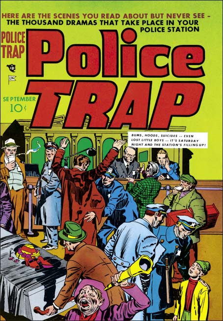
Police Trap #5 (July 1955) was the first issue published by Charlton. It appears to be composed largely of work that was already in the work at the time of the sudden failure of Simon and Kirby’s own publishing company, Mainline. It would expected most of that work would be used up and Police Trap #6 would consists of newly created work. All of the work on issue #6 was drawn by Jack Kirby. Previously Kirby’s involvement was largely limited to providing covers with the only Kirby story appearing in Police Trap #5. Jack’s greater presence can be explained as a means of offsetting recent financial loses. The cost of creating the Mainline comics was covered by Simon and Kirby to be paid back by a share of the profits. However with the sudden demise of Leader News Joe and Jack would not get the money to recover their publication costs. Their incomes from Prize Comics were based on a share of the profits but with all the negative public criticism against comic books those royalties were probably down as well. By providing all the art for Police Trap #6, Kirby probably hoped to decrease the production costs, increase sales (and therefore his share of the profits) but also be paid as the artist as well.
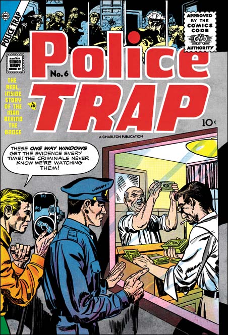

Police Trap #6 (July 1955), pencils by Jack Kirby

The cover of Police Trap #6 is another less than spectacular piece of art. But it is interesting as a rare example of Kirby swiping from another comic book artist, in this case Marvin Stein. This is not a close copy, Kirby did not need any help in how to draw figures. Rather it is the unusual idea that Kirby picked up, that of counterfeiter’s being candidly filmed by the police. I had previously written about this swipe (A Criminal Swipe) where I provided an image of the Stein cover that Kirby swiped. In that post I offered the possibility that it was actually Stein that swiped from Kirby and that this cover was an unused piece left over from Simon and Kirby’s earlier efforts in the crime genre from 1947 to 1951). However I now consider this unlikely as the art for the Police Trap #6 cover does not seem to match
the style used during the earlier period.
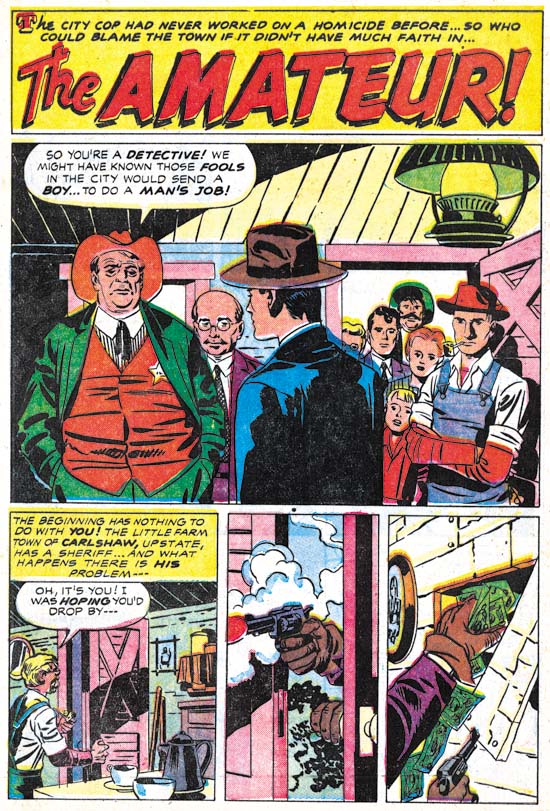

Police Trap #6 (July 1955) “The Amateur”, pencils by Jack Kirby, inks by Mort Meskin

As mentioned above, Jack Kirby drew all the art for this issue which makes Police Trap #6 a special comic. Needless to say the art is all well done. Kirby had a flair for graphically telling a story. Note the short sequence of story panels at the bottom of the splash page. It starts out typically enough but then proceeds to two panels with captions or speech balloons. Text was not required to explain the story and in fact the lack of text makes the panels even more effective.

Police Trap #6 is also special in that all the art was inked by the same artist. I’ll explain why I think this inker was Mort Meskin below where his hand is even more obvious but here I will discuss why I believe it was not either Simon or Kirby that did the inking. Normally that might not be too difficult to determine because both Jack and Joe were much better inkers than many of the other artists they used to ink Kirby’s pencils. Here, however, we have a great inking job. Not only that but it is done in what I describe as the Studio style. On this page (and others in this book) can be found shoulder blots, picket fence crosshatching and abstract arc shadows (see my Inking Glossary for an explanation of the terms I am using). But note that the shoulder blots are not done in a manner typical for Simon and Kirby. They are less abstract and more apt to be broken up into pieces. The most glaring example of this is found in the man in the blue suite. There are other suggestions that this was not inked by either Simon or Kirby. Note the simple eyebrows even in the more close-up views provided in the splash panel.

It is unclear whether some of the typical Studio style techniques were done by the inker or instead were added by either Kirby or Simon afterwards. For example the abstract arc shadow in the first story panel is done in a very typical style. My suspicion is that the original inker provided these touches as well as they are so well integrated with the surrounding artwork. If this is true it is another indication on how well acquainted the inker was with techniques previously used in the now defunct Simon and Kirby studio.
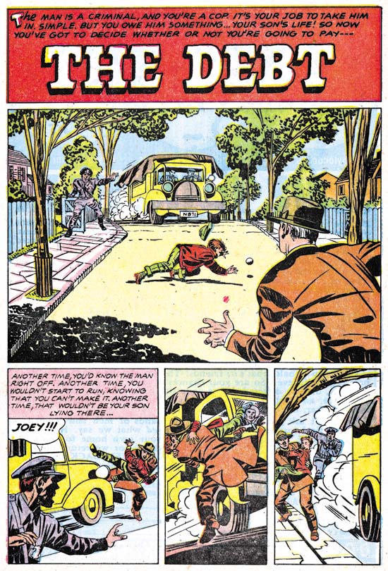

Police Trap #6 (July 1955) “The Debt”, pencils by Jack Kirby, inks by Mort Meskin Albistur

The story panels for the first page of “The Debt” follows the same pattern as seen in “The Amateur”. First an introduction panel that quickly places the reader into the action followed by two panels without text that show how the action unfolded. The big difference between the two stories is that while “The Amateur” has a typical splash the splash found in “The Debt” is actually a story panel as well. While collaborating with Simon, Kirby worked from scripts created by various writers but which he would then customarily rewrite. It is unclear how much of the published story was rewritten but there are often phrases that sound very much like Kirby. But who can say whether the original writer originated these unusual textless story sequences or that Kirby rewrote them into the script.
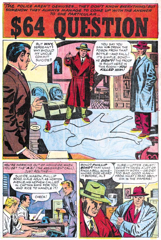

Police Trap #6 (July 1955) “The $64 Question”, pencils by Jack Kirby, inks by Mort Meskin

The $64,000 Question was a popular game show in the 50’s and even today you occasionally here someone use that term a colloquialism for a significant question. However that show first appeared on television in June 1955 much too late to have influenced this story (whose creation start around February of that year). However there was an earlier game show that was on the radio from 1950 to 1952 that was actually called the $64 Question. Although it was off the air when this story was created I am sure that was that show that formed the genesis of this story’s title.
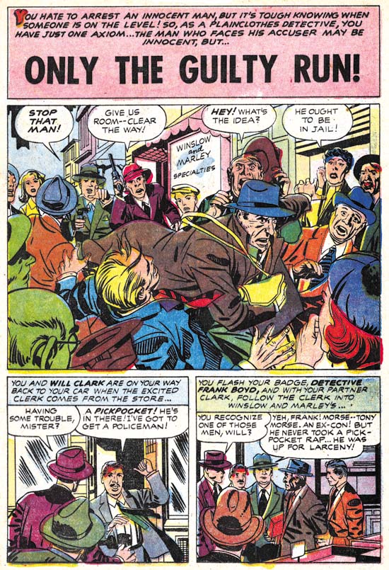

Police Trap #6 (July 1955) “Only The Guilty Run”, pencils by Jack Kirby, inks by Mort Meskin

All the stories in this issue were inked by the same artist. “Only The Guilty Run” is the story that most convincingly shows that this inker was Mort Meskin. Like all the other stories from this issue the inking was done in the Studio style. Most noticeable in the splash is his use of picket fence crosshatching. Of course other inkers used this technique most notably both Kirby and Simon. However Meskin executed picket fence crosshatching with an almost mechanical control compared to the more spontaneous use by Kirby or the more rougher brushwork by Simon. Observe how Meskin’s “rails” and “pickets” are almost consistent in width and the “rails” are placed to almost entirely contain the “pickets”. Other Meskin inking characteristics can be found in the simplified and often angular eyebrows particularly those of the escaping thief in the splash panel. Of course since credits were not provided inking attributions can never be given with absolute certainty but I am as confident as it is possible to be that this inking was by Mort Meskin.

While the art may convince me that Meskin was inking there Kirby pencils I am somewhat puzzled how this came about. While Mort had inked Jack’s work before, generally he was too busy penciling and inking his own work. There were exceptions to this most notably in Boys’ Ranch (1950 to 1951) and Captain 3-D (1953). However in 1954 he had started working for DC. Meskin still did some work for Simon and Kirby but this was largely limited to some covers and nowhere near his prolific output when the S&K studio was going strong. Yet here he is providing a lot of inking for a single issue (plus one Kirby story for the previous issue). Very perplexing.
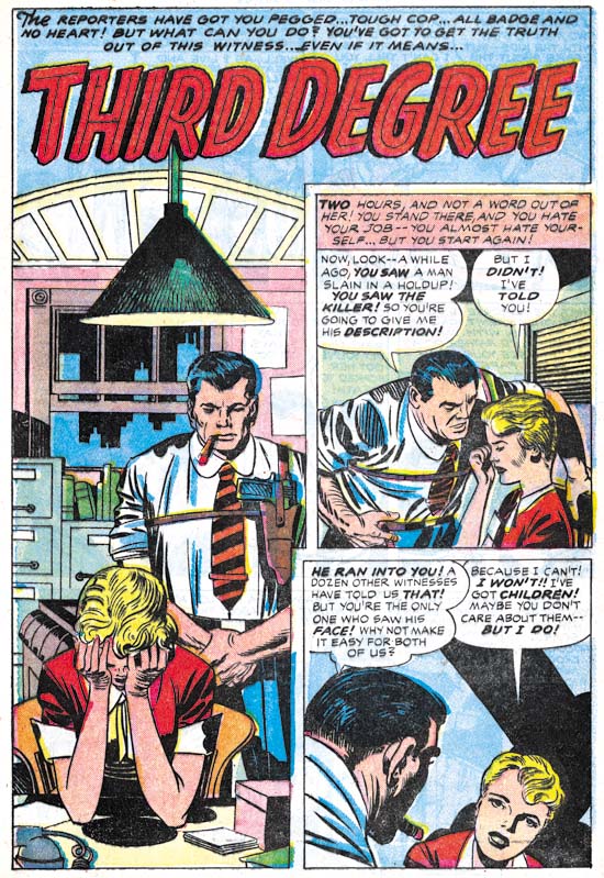

Police Trap #6 (July 1955) “Third Degree”, pencils by Jack Kirby, inks by Mort Meskin

Despite the Comic Code all the stories from this issue are really quite good but I have to admit that I find “Third Degree” the least satisfying. The interrogation of the housewife by the burly police officer seems a bit forced. Still that story and all the others in this issue leaves one with a desire for another all Kirby crime comic. Unfortunately it was not to be, at least for some years (see Jack Kirby’s “In the Days of the Mob”) and never again with Joe Simon.

P.S.
I have had a comment about why I believe this inker was Mort Meskin and not Marvin Stein. For readers who also wonder about this I suggest checking my previous posts Kirby Inkers, Mort Meskin and Kirby Inkers, Marvin Stein.

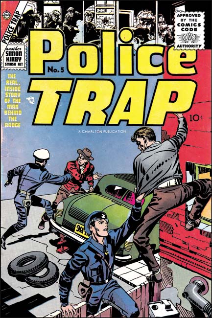
Police Trap #5

Police Trap and the other Mainline titles had been distributed by Leader News. During this period there was a renew public protest about the contents of comic books. The publisher that attracted the greatest amount of negative criticism was probably EC and some newsstands refused to accept their comics. Unfortunately Leader News also distributed EC and the boycott lead to their eventual failure. Without a distributor this meant the end of Simon and Kirby’s publishing company as well. But work had already begun on the art for the unpublished issues of the Mainline comics so Joe and Jack looked for a publisher willing to take on the titles. They made a deal Charlton and after an addition two month delay Police Trap #5 finally made it to the newsstands. This was the first issue of Police Traps to be submitted to the new Comic Code Authority although I doubt there was much of a problem with getting approval.


Police Trap #5 (July 1955), pencils and inks by Jack Kirby

Compared to previous issue, the cover was not all that great. I cannot think of a Simon and Kirby cover that I would describe as poor but obviously some were better than others and this one was one of their poorest. I suspect that with the failure of Mainline and the search for a new publisher, Simon and Kirby just did not give the cover art as much attention as they previously would have.


Police Trap #5 (July 1955) “The Gun”, pencils and inks by Bill Draut

Bill Draut had drawn stories for Police Trap #1 and #3 so his presence here comes as no surprise. Draut provides “The Gun” with his usual well crafted art. However coming after his really great work on “Tough Beat” (Police Trap #3) this story can seem to be a bit of a let down. Due to financial problems arising from the collapse of Mainline, Simon and Kirby were forced to close down their studio. It seems that Joe and Jack continued to work together for a time but limited or stopped employing other artists. “The Gun” was probably work already completed before Mainline’s sudden collapse. Simon and Kirby would use some further work by Draut in the coming months but not much. Draut would work for other publishers but with the collapse of the comic book industry it must have been a difficult time for him. I am sure he eventually looked back at his time with Simon and Kirby as the golden age of his career.


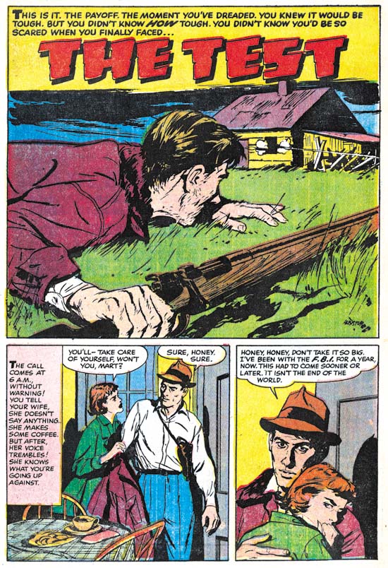
Police Trap #5 (July 1955) “The Test”, pencils and inks by Joaquin Albistur

“The Test” was another fine piece of work by Joaquin Albistur. Albistur only worked for Simon and Kirby for a limited period of time, a little over a year. Probably Joaquin also looked for work after the closing of the Simon and Kirby studio. I have seen some original art for a smaller publisher but I am not sure when it was done. Albistur may have found some work but it does not appear he found much. At some point he returned to his native country Argentina.


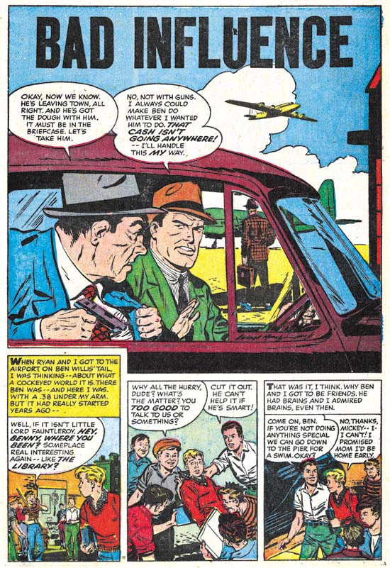
Police Trap #5 (July 1955) “Bad Influence”, art by an unidentified artist

I am not sure who the artist was that drew “Bad Influence”. I will not claim he was one of my favorite Simon and Kirby artists but he did a good job on this story.


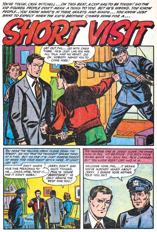
Police Trap #5 (July 1955) “Short Visit”, art by an unidentified artist

Another unidentified artist only in this case not nearly as talented as the one who did “Bad Influence”. Note the rather awkward pose of the policeman.


Police Trap #5 (July 1955) “Alibi?”, pencils by Jack Kirby, inks by Mort Meskin?

Up to now, Jack Kirby’s contribution to Police Trap was limited to the covers, one pinup (derived from an unused cover) and one splash panel. Was “Alibi” originally planned for issue #5 or was Jack filling in for working missing at the time of the collapse of Mainline? Who can say? But it is nice to see a Kirby working on a crime story again since the last one he did back in 1950. The tall vertical splash was rather unusual for Kirby and a reminder that Kirby was comfortable with any panel layout.

I am a little puzzled by the inking of this piece. Previously I have attributed the inking to Mort Meskin and there are parts that remind me of his work. Particularly the elderly woman in the second story panel. However there are other portions that do not look like Meskin’s brush for instance the sleeve of the older detective in the splash panel. During earlier periods I would explain this by the use of multiple artists sometimes used to ink Kirby’s art (describe by Joe Simon as an assembly line). With the bust up of the Simon and Kirby studio this now seems likely that only a single inker would be used (although either Simon or Kirby could be expected to do some touch up work). While I may hesitate to attribute the inking of this piece to Meskin, Mort was the inker for some other Kirby pencils that will be discussed when issue #6 is covered.

Police Trap #4


Police Trap #4 March 1955), pencils and inks by Jack Kirby

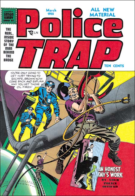
Another dramatic cover by Jack Kirby but the subject matter (setting oil fires) is not a typical crime. The pose of the fugitive is similar to that used on the cover of Captain America #7 (October 1941). The cover includes a little insert for a story drawn by Jo Albistur (to be discussed below). Such use of inserts is not typical of Simon and Kirby covers but was done on occassion (for instance on Young Romance #12, July 1949). Interestingly the covers refer to the story as “An Honest Day’s Work” although in the interior the story is titled “All in a Day’s Work”.

This cover and In Love #4, which came out in the same month, were the first Mainline titles to have a stamp declaring “another Simon Kirby smash hit”. Simon and Kirby were not mentioned in any of the previously released issues and they did not sign any of the art. Such anonimity, quite unusual for the typcially self promotors, was probably an attempt to minimize conflicts with Prize Comics for whom Simon and Kirby continued to produce titles. However Police Trap #4 and In Love #4 included postal statements listing Joe and Jack as the editors so the gig was now up in any case. The choice of a stamp may have been suggested by the coming Comic Code whose stamp of approval would first appear on the next issue.


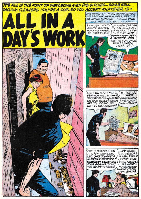
Police Trap #4 March 1955) “All In A Day’s Work”, pencils and inks by Joaquin Albistur

Joanquin Albistur supplied the feature story for this issue, “All In A Day’s Work”. There are a number of features that I find attractive in Albistur’s style all of which are found in this particular story. I particularly like Jo’s careful use of body language and gesture as in the panel with the policeman shaking the newspaper and his brother’s use of the pillow to drown out his lecture. But what really makes this story unique Albistur handling of the skyscraper views. The rendering of the brickwork would normally be overdone but in this case adds much to the effect of the dissy perspectives.


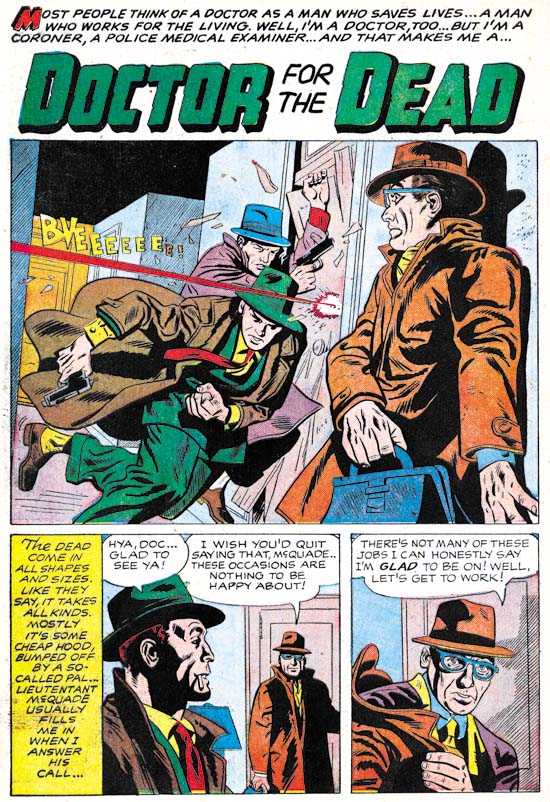
Police Trap #4 March 1955) “Doctor For The Dead”, pencils by an unidentified artist

I may not have identified the artist for “Doctor For The Dead” but that does not mean he did not do a nice job. There are some aspects of the lettering that look unusual for a Simon and Kirby production. For instance the colored ‘M’ that starts the title caption or the scripted ‘T’ from the story caption. Perhaps this is another piece that was picked up from a failed comic book publisher.


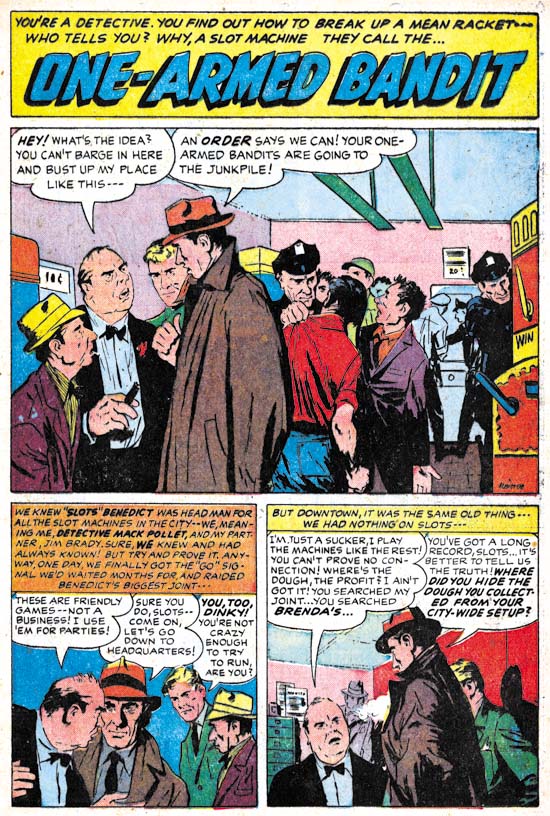
Police Trap #4 March 1955) “One-Armed Bandit”, pencils and inks by Joaquin Albistur

Joaquin Albistur is back as the artist for another story, “One-Armed Bandit”. The splash panel is a great example of why I like this artist so much. The confrontation between a detective and two hoods is all placed on the left side of the panel. You do not need to read the word balloons to determine which of the two criminals is the boss man. The background hardly deserves that term because the figures there are only slightly smaller than the foreground characters. Each person in the splash has their own distinct personality with the exception of the two cops.


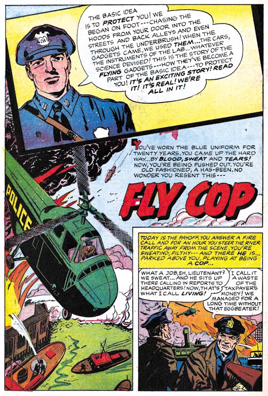
Police Trap #4 March 1955) “Fly Cop”, pencils by an unidentified artist and Jack Kirby

Another unidentified artist provides almost all the art for “Fly Cop”. But there in the insert at the top of the splash page is a contribution by Jack Kirby. Jack often played the role as art director in the Simon and Kirby studio adding and sometime correcting the art drawn by others. Most of the time when this was done Kirby would add something to make the splash page a bit more interesting. Usually Jack would ink these additions himself suggesting that these were last minute alterations. I believe the original art for this page still exists and it would be interesting to see if it shows signs of alterations or whether Kirby’s contribution was planned from the start.

Police Trap #3


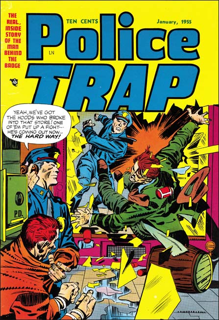
Police Trap #3 (January 1955), pencils and inks by Jack Kirby

The cover for Police Trap #3 departed from the more serene covers used for the first two issues. Instead PT #3 was a typically well done Kirby slugfest. Such dramatic punches were often found in Simon and Kirby stories but rarely appeared on the crime covers. I can think of only one other case (Headline #45, January 1951) and that one was not nearly as nicely done as this cover. There was another cover considered for issue #3 but in the end never used. The alternative cover featured some motorcycle policeman and while a good cover it was not nearly as dramatic as this one.


Police Trap #3 (January 1955), “Hick Cop”, art by W. E. Hargis

It is always nice when an artist signs his work. Otherwise it becomes difficult to determine attributions since credits were not usually provided. There was also another signed S&K production piece by William Hargis (Young Love #62, October 1954, “Too Darned Innocent” ). I really need to do some careful comparison with some of the other unattributed pieces from this period as it is likely there exists some unsigned pieces by Hargis as well. Still it appears that Hargis only worked for Joe and Jack during a short period. Most of his work at this time seemed to have been for Quality Comics.

A number of artists appeared for a short time in Simon and Kirby productions from this period. Most were not that impressive but Hargis was an exception. He graphically tells the story well and has a pleasing drawing style. Hargis uses details to provide insight into his characters. I love the way that the sheriff has a hole in the sole of his shoe in the first story panel.


Police Trap #3 (January 1955), “The Mountie”, pencils and inks by Joaquin Albistur

Albistur is one of my favorite S&K artists from this period. “The Mountie” is a typical example of his talent. The mounted policemen have disappeared from most American cities but still have a presence, although diminished, in New York City. I have not seen any in the last few months but I would regularly hear them go down my street. It is not at all clear to me whether horses are an effective police tool but they certainly make for great public relations. Whenever I see them they always attract photographers and animal lovers.


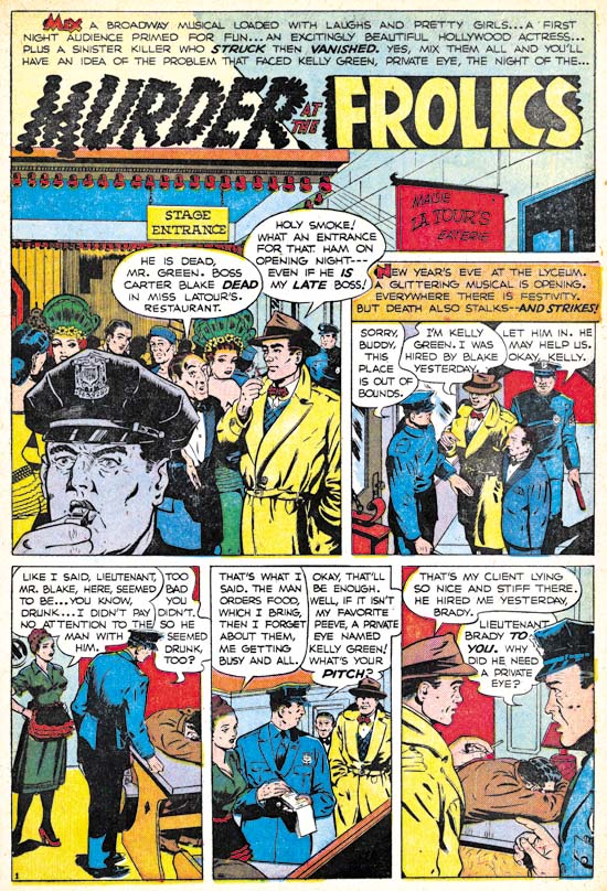
Police Trap #3 (January 1955), “Murder At The Frolics”, art by an unidentified artist

AS I have said, there were a number of artists that worked a short time for Joe and Jack during this period. Of course I wish I could identify them all but for academic reasons as frankly many were little more than adequate. The biggest problem with this particular artist is that his figures tend to be a bit stiff as, for instance, in the last panel of this page.


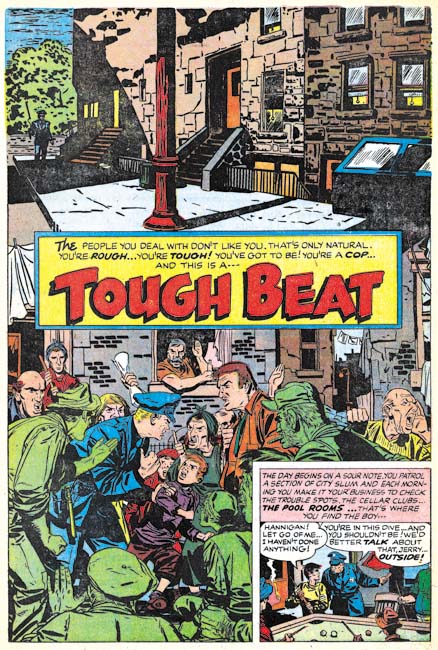
Police Trap #3 (January 1955), “Tough Beat”, pencils and inks by Bill Draut

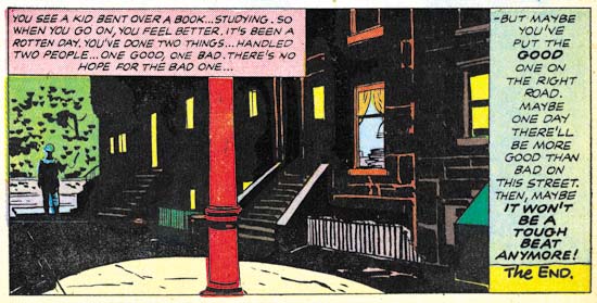
I really like Bill Draut’s art, at least while he worked for Simon and Kirby. But this particular splash page has got to be one of my favorites. Generally Bill did not do full page splashes and in a way this is not one either. What Draut has done was combine two splashes separated by the title caption. The top shows a deserted neighborhood with only a single policeman in the background. Very simple but lovingly handled with great attention to the tenement buildings. The bottom seems pure chaos but actually is not. Helped by nice work by the colorist, the lower splash focuses on the confrontation between a cop and some locals seemingly concerning some youth the policeman has apprehended. Bill has provided an interesting and varied crowd. The juxtaposition of the quiet and noisy street scenes makes the page all that more interesting.


Police Trap #3 (January 1955), “Tough Beat” last panel of page 6, pencils and inks by Bill Draut

I have seen the original art for “Tough Beat” and the upper portion of the splash page, the quiet street scene, was inked on tracing paper. I found this puzzling until I noticed the last panel of the story was the same street scene with different inking. Apparently Draut placed the tracing paper over the final panel and used it as a guide for working on the upper part of the splash page. Faster than manually copying the art onto the actual illustration board while the use of tracing paper would be undetectable in the final printed version.

Police Trap #2


Police Trap #2 (November 1954), pencils and inks by Jack Kirby

A cover similar in concept to that used for the first issue. This time the muster room is portrayed:

This is where the officers relax, unbutton their jackets, have their shoes shined, smoke, bull session, rough-house, write reports, and just ease up after a hard day on the beat…

But would we really expect a muster room to have a shoe shine stand or a drunk sleeping it off? But perhaps the most unusual feature of this cover is one easy to overlook. Look carefully at the third policeman from our left, he is African American. Race did not play an important part of Simon and Kirby productions. When other races were depicted, most often it was Asians but otherwise Simon and Kirby comics were almost uniformly populated by whites. African Americans were generally invisible as they were in many popular media of the day. One glaring exception was Whitewash from the Young Allies a Simon and Kirby creation for Timely Comics. However stereotypical and (to modern eyes) objectionable characters like Whitewash were not part of Simon and Kirby productions that preceded or followed Young Allies. Further Whitewash seems to be delegated small rolls in the splashes from Young Allies that were actually drawn by Jack Kirby (Young Allies and the L Word). This suggests that the presence of Whitewash in Young Allies was not due to Simon and Kirby idea but dictated by someone else. As for the Police Trap #2 cover it is not at all obvious that the policeman was drawn by Jack Kirby as an African American but rather it was the colorist who made him so. Unlike their other comics where the coloring was the responsibility of the publisher, Simon and Kirby were the actual publisher of Police Trap and therefore they were responsible at some level for the coloring. I do not know if Joe or Jack actually colored this cover but minimally they assigned the colorist and approved the results.


Police Trap #2 (November 1954) “The Hoodlum”, pencils and inks by John Prentice

“Usual suspects” Bill Draut and Mort Meskin are absent from the second issue of Police Trap but it does contain the third of the regular Simon and Kirby artists, John Prentice. John does his typical excellent job on the art. Perhaps my only criticism is that he has made the two policemen too similar in appearance. At times I find it difficult to determine who is being represented as for example the last panel of this page.


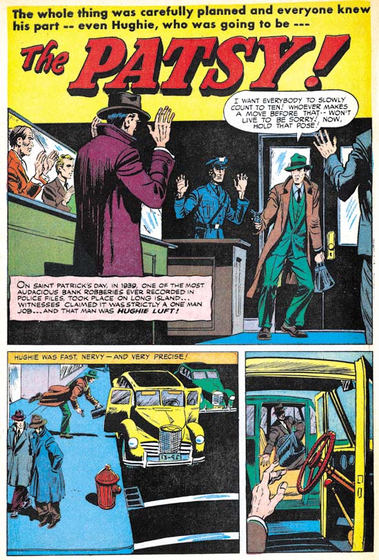
Police Trap #2 (November 1954) “The Patsy”, art by unidentified artist

In the past I have never come up with even a guess on who did the art for “The Patsy”. But on reviewing it now I find parts, just parts, that remind me of Bob McCarty. For instance the man on the extreme left of the splash panel. But there are other parts that seem so untypical for McCarty such as the unusual perspectives found the last two panels on the same page. I am unable to make sense of this combination of aspects that look like McCarty and those that do not so I continue to leave the attribution as unidentified.


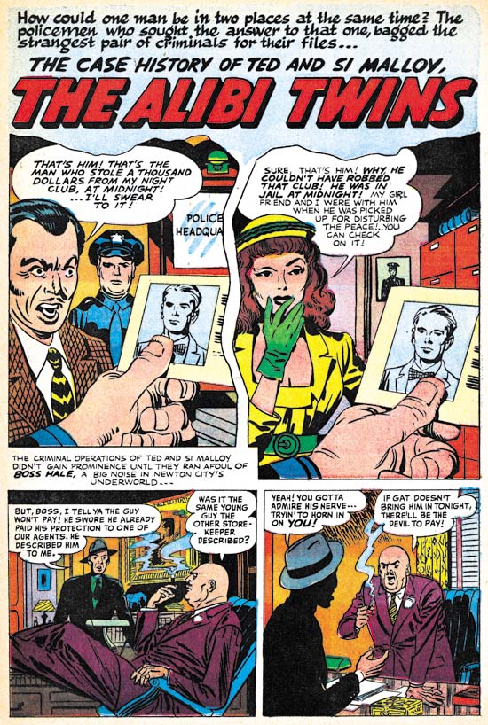
Police Trap #2 (November 1954) “The Alibi Twins”, two panel splash penciled and inks by Jack Kirby, rest of the story by unidentified artist

Except for the covers and one pinup, Jack Kirby did not supply much art for Police Trap until the latter issues. But obviously Jack was still playing his normal roll as untitled art director. Here Kirby provides the first two panels, effectively combining to form a splash, for a story otherwise executed by another unidentified artist. While the vast majority of the stories in Simon and Kirby productions were completely drawn by one artist, it was not that unusual for Kirby to provide the splash either.

The story artist is another of those that appeared only briefly in Simon and Kirby productions of this period. Note the rather bizarre inking in the last panel. The man is completely blacked out except for the hat and his hands. This story is a little longer (9 pages) than most found in Police Trap which were usually 4 to 6 pages long. Further the focus of the story is on the criminal, not the police as was normally the case for this title. Add the unusual lettering in some places (in particular the use of a script for the first letter of captions) and this suggests that the piece may not have been commissioned by Simon and Kirby but instead picked up from some failing comic book publisher.


Police Trap #2 (November 1954) “Desk Sergeant”, pencils and inks by Jack Kirby

I have recently discussed “Desk Sergeant” (The Police Trap Pinup) so will skip commenting on it here.


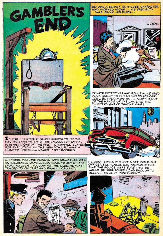
Police Trap #2 (November 1954) “Gambler’s End”, art by unidentified artist

A short two page piece by an unidentified artist. Unusual use of the first letter of some of the captions (for instance the bold ‘I’ in the splash caption) suggests that this story may also have been picked up from some failed comic book publisher.


Police Trap #2 (November 1954) “Police Trap”, art by unidentified artist

Another short two page piece by an unidentified artist. A lot of talking heads. A better artist might have been able to carry it off but this one is too stiff and the result is a rather uninteresting story. I have detected nothing unusual about the lettering so this piece might have been commissioned by Simon and Kirby.


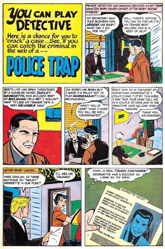
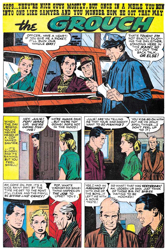
Police Trap #2 (November 1954) “The Grouch”, pencils and inks by John Prentice

Prentice opens and closes this issue of Police Trap. Actually he is the artist who really carries this issue what with a rather minimal contribution by Jack Kirby and none by Bill Draut or Mort Meskin. All the other artists are just nothing more than adequate. So in effect Prentice pretty much carries this issue.
Police Trap #1, Title for the Heroes


Police Trap #1 (September 1954), pencils and inks by Jack Kirby

Crime comics received a lot of undesirable attention during their heyday. It is generally acknowledged now that this criticism was pretty much unwarranted but at that time it accepted by most of the public. One criticism was that crime comics glorified the criminals. Again any modern reader would see that this clearly was not the case, at least for the great majority of crime comics and especially for those that had been produced by Simon and Kirby. But Joe and Jack were well aware of this criticism and so when they launched their own publishing company, Mainline, they included a title Police Trap where the focus was not on the criminals but rather on the police.


Police Trap #1 (September 1954) “The Capture”, pencils and inks by Mort Meskin

Mort Meskin was one of the “usual suspects” of artists that contributed frequently to Simon and Kirby productions. He not only arrived in the studio in time to provide art for some of the crime comics produced by Simon and Kirby but he also continued to supply art for the titles even after they were no longer put together by Joe and Jack (Criminal Artists, Mort Meskin). However this would be the only piece that Mort drew for Police Trap. In fact Meskin typically prolific output seems to have decreased greatly at about this time. He would continue to supply work for the Prize romances but very little for any of the Mainline titles.


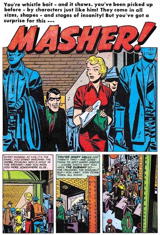
Police Trap #1 (September 1954) “Masher”, pencils and inks by Bill Draut

“Usual suspect” Bill Draut drew and inked “Masher”. Draut is most famous for his romance art but he does a fine job on this story. This is probably the most unusual story of this issue and certainly my favorite. The main protagonist is a female police officer. On a personal note my great grandmother was one of the earliest female detective of the New York Police Department. Unfortunately I know very little about her career but among other things she was used as a decoy. She was not very tall but when it came time to apprehend someone she would hold on to them so tightly that the suspects would be unable to escape before her backup arrived to secure the arrest.


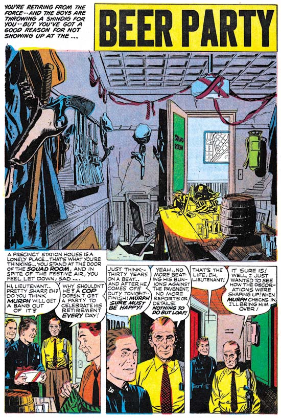
Police Trap #1 (September 1954) “Beer Party”, pencils and inks by John Prentice

John Prentice was also a regular contributor to Simon and Kirby productions which means this issue of Police Trap has all the usual suspects. Prentice first work for Joe and Jack appeared in a May 1951 issue of Young Love and he continued to provide art up until the end of the Simon and Kirby studio. John was used primarily for romance comics but he did provide some art for Black Magic. Unfortunately Simon and Kirby were no longer producing crime titles at the time of Prentice’s first appearance but John did so some really nice work in the crime genre prior to that. So “Beer Party” marks a much appreciated return of Prentice to crime. With some nicely handled action and such beautiful art, what is not to like? I particularly love the splash panel. Nobody appears in the splash but it still is a marvelous portrait. Missing plaster and cracked walls show how run down the police station has become. If anything the minimal decorations seem make the room even more depressing. The title captions talks about a shindig but obviously this was going to be a rather small affair. But could you image having a beer party inside a police station today?


Police Trap #1 (September 1954) “The Grafter”, art by unidentified artist

At this time Simon and Kirby were producing four Mainline and four Prize titles. Most of the titles were bimonthlies except for Young Romance and Young Love which were monthly. I suspect producing these titles and running Mainline required a lot of effort for both Joe and Jack. The amount of art that Kirby penciled seems to have dropped and his only contribution to this Police Trap issue was the cover. Further artists new to Simon and Kirby productions make their appearance. One such artist provided the art for “The Grafter”. I cannot claim to be very excited about art but he did an adequate job.


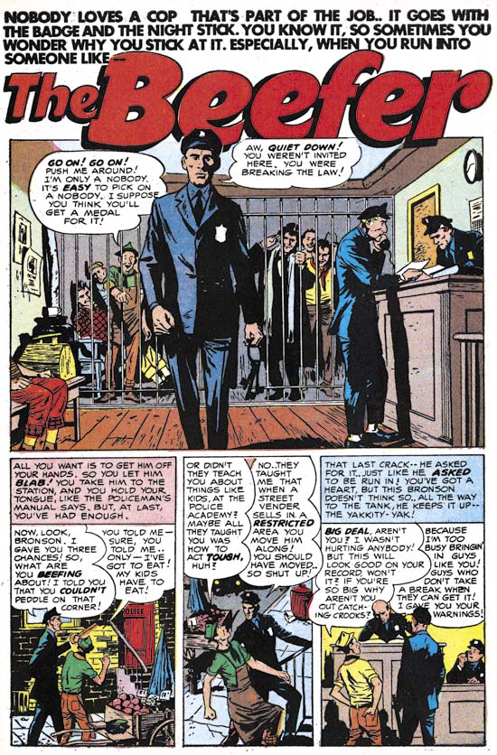
Police Trap #1 (September 1954) “The Beefer”, pencils and inks by Joaquin Albistur

I have recently discussed the part that “The Beefer” played in relationship to the pinup used in Police Trap #2 (The Police Trap Pinup). This story and two others that appeared in Young Romance and Young Love marked the first appearance of Joaquin Albistur in the Simon and Kirby studio. Most of the artist that appeared during this period made rather limited contributions to Simon and Kirby productions but Albistur would provide much work for the relatively short period that he was employed by Joe and Jack (13 months).

The Police Trap Pinup

For the most part pinups did not play an imported role in the Simon and Kirby repertoire. The most import exception was Boys’ Ranch where double page and inside cover pinups were present in each issue. Other than those from Boys’ Ranch there were only two other pinups that I can think of. One appeared in Win A Prize #1 (February 1955). I have discussed that one previously (The Wide Angle Scream, Almost an Afterthought). While I would not dismiss out of hand Joe’s explanation that the piece was originally meant for Captain America #11, there are a number of details that suggest a later date. Therefore the genesis behind that piece of art remains an unresolved issue.


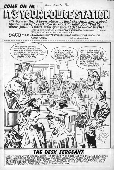
Police Trap #2 (November 1954) “It’s Your Police Station”, pencils and inks by Jack Kirby

The other Simon and Kirby pinup appeared in Police Trap #2 (November 1954). It is a great pinup with a marvelous cast of characters. Each person depicted in the foreground was given a distinct personality. A complete story is presented in this single panel with the added touch of Simon and Kirby humor. Kirby not only drew the art but did the inking as well. I believe it is one of the relatively few pieces that Jack also did the outline inking, a job normally assigned to others.

The top caption declares this is the first of series of Police Trap pinups of various police officers. However no further pinups were ever placed in the subsequent issues. Nor were pinups found in any other Mainline titles (Win A Prize was published by Charlton). The natural question is why this one?


Police Trap #1 (September 1954) “The Beefer”, pencils and inks by Joaquin Albistur

The explanation can be found in the first issue of Police Trap. That issue contains the story “The Beefer” with art by Jo Albistur. Albistur was from Argentina and seems only to have worked in the United States for brief period. His time working for Simon and Kirby lasted a little over a year but it was very productive period for him. Frankly I am unimpressed by some of the art I have seen that he did for other comic book publishers but he is one of may favorite Simon and Kirby artists. “The Beefer” opens with constant complaining of an arrested street peddler. Kirby would often create a cover based on a story from the same issue but illustrated by another artist. The similarity between “It’s Your Police Station” and “The Beefer” indicates that is what happened here and this pinup was originally intended as the cover for Police Trap #1.


Police Trap #2 (November 1954) “It’s Your Police Station”, pencils and inks by Jack Kirby, original art

The original art for this pinup still exists. It is very unusual for work by Simon and Kirby in that art was constructed from three pieces. The top caption, the art, and the bottom caption are on different illustration boards taped together on the back. In the future Joe Simon would frequently construct art from various separate sources but up to this point such techniques were rarely used. The explanation in this case is that since the art was initially meant for a cover the original top probably had the comic book title. Probably as an expediency this was just cut off. Since Joe and Jack often recycled their work this title may have been used for some other cover. The original art for some of the Police Trap covers still exist and it would be It would be interesting to see if any of them were constructed from two pieces of illustration board. The original bottom of the art was probably not sufficient for the desired caption so it was trimmed as well.


Police Trap #1 (September 1954) “The Beefer”, pencils and inks by Jack Kirby

The Police Trap #1 cover that was published in place of “It’s Your Police Station” is certainly a fine piece of Simon and Kirby art. The portrayed scene shows a multitude of characters each carefully handled. The caption actually seems a little superfluous since the art is all that seems to be needed to tells the individual stories. Yes, this is cover art at its very best. That is not to say that the art for “It’s Your Police Station” was any bit inferior. The most distinct disadvantage for the pinup had was that it was very specific to a single story, “The Beefer”. While Simon and Kirby often took that approach to a cover, they undoubtedly considered that the new comic should be launched with a cover that reflected on the theme of the title and not a particular story. With all the criticism cast at crime comics, Simon and Kirby wanted to emphasize that the police were subject of this new comic not the criminals. This police centric theme is superbly provided by the published cover.

Bullseye #7, This is the End


Bullseye #7 (August 1955), pencils and inks by Jack Kirby

The bulls-eye pattern returns to the cover image for Bullseye #7. The overlapping figures creates an interesting design where the background figures are carefully framed by the foreground ones. It is always little more than guesswork when trying to credit who did what in the Simon and Kirby collaboration, in this case I suspect that Jack did the layout since this sort of careful arrangement of figures was often found in the work he produced later when working without Joe. While it is an interesting composition, it is not at all clear what is being depicted. All three individuals appear to be aiming their arrows at different targets, so it does not appear to be a shooting contest. Bullseye’s smile would be out of place for a combat usage. In any case why would a cavalry soldier be using a bow and arrow? While Simon and Kirby covers generally can be decoded to reveal a story, the cover for Bullseye #7 seems meant to be nothing more than an compelling image.


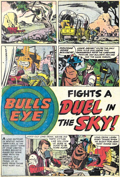
Bullseye #7 (August 1955) “Duel in the Sky”, pencils and inks by Jack Kirby

The first story, “Duel in the Sky”, has an unusual opening; no splash panel and the title occurs below two panel tiers and above another story panel. Kirby has used splash-less stories before but this one is special. The first three panels have no text and show nothing more than Bullseye’s alter-ego traveling over a western landscape. Simon and Kirby usually try to fill their stories with as much as possible so allocating the three panels used in this introduction is quite special. Obviously the introduction was considered worth it but perhaps the splash was sacrificed to make room for it (it is the only Bullseye story without a splash). This introduction shows Bullseye returning to Dead Center, his birthplace, to visit his friend Long Drink. Normally Bullseye traveled about; only in one other story (“The Ghosts of Dead Center”, Bullseye #3) does Bullseye visit Dead Center. This sort of reference to his past was unusual at that time where continuity was pretty much neglected in comic books.

Kirby always had a penchant for technology so I suspect it was his idea to include balloons in this story. The use of such a technology at that period is not unrealistic. During the civil war an attempt was made to use hot air balloons for observation. Unfortunately the balloons became a target and at least one was shot down. In any case the balloons adds interest to another Simon and Kirby masterpiece. It does not hurt either that the story ends with another fantastic Kirby fight.
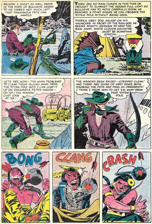

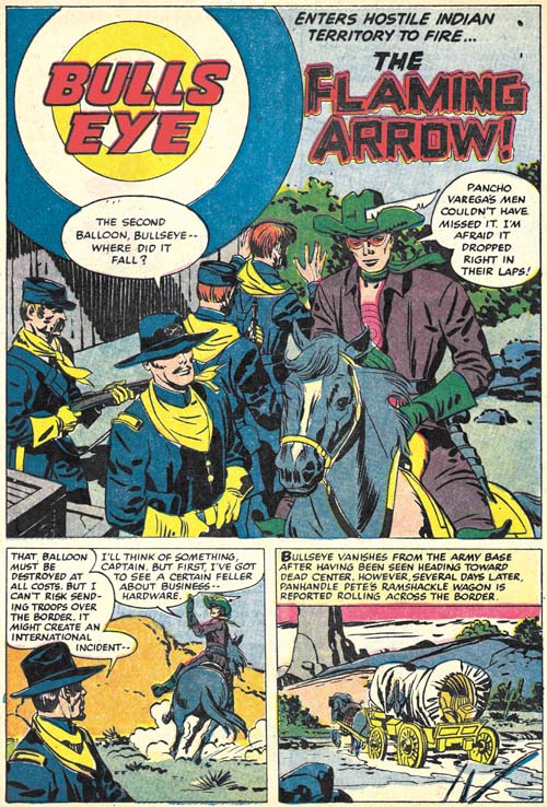
Bullseye #7 (August 1955) “The Flaming Arrow”, pencils and inks by Jack Kirby

While “Duel in the Sky” has a perfectly acceptable ending, “The Flaming Arrow” picks up from there with Bullseye going off to prevent an errant balloon from falling into the hands of Mexican bandits. It is a short but rather nice piece that ends with Bullseye returning to visit Long Drink once again, the last page being a bookend to the first page of “Duel in the Sky”. In fact the same three panels, with slightly different cropping, that showed Bullseye traveling show up again.


Bullseye #7 (August 1955) “The Stolen Rain God” page 5, pencils and inks by Jack Kirby

The next and what would turn out to be the final Bullseye story, “The Stolen Rain God” opens with a double page splash. I have discussed this piece of art previously in my yet to be completed serial post (The Wide Angle Scream, Almost an Afterthought). Simon and Kirby had a long history of the use of these wide splashes but there were only two created during the Mainline/Charlton period and this was the only one actually published on two pages (the other from Win A Prize #1 was rotated and printed on a single page, see the previous link).

Since I have already posted on the splash page, here I include an image of page 5. It serves as a reminder that while action was the key component of many Simon and Kirby productions, and Bullseye in particular, humor also played an important roll. The very physical humor found in the last three panels is very typical of Kirby.


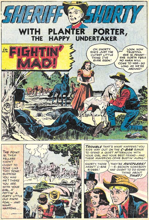
Bullseye #7 (August 1955) “Fightin’ Mad”, pencils by Jack Kirby, inks by Joe Simon?

This issues ends with a Sheriff Shorty feature drawn by Kirby. This makes Bullseye #7 the only issue from that title entirely drawn by Jack. Normally this would make issue #7 a very special comic. The Sheriff Shorty story is special alright but for the wrong reason. It is a rare example of a clunker drawn by Kirby. The action scenes are uncharacteristically poorly executed and this cannot be blamed on the inker. Further the humor does not quite work. Hey everybody can have a bad day.

None of the Mainline titles lasted very long at Charlton, they were usually terminated after two issues (except for Foxhole which lasted for a third issue but that last issue appears to have been produced by Charlton without any involvement from Simon and Kirby). Bullseye was not an exception and issue #7 would be the last. In my opinion, all the Mainline titles were special but for Kirby fans Bullseye would be the most important. None of the other Mainline titles has anywhere near as much of Kirby drawn material. The only comic from this period that does was Fighting American. Which makes it especially unfortunate that Bullseye has never been reprinted. With the resurgence of interest in Kirby, hopefully that will change in the not too distant future.

Bullseye #6, The Missing Tomahawks


Bullseye #6 (May 1955) “Tomahawks For Two” page 7, pencils by Jack Kirby, inks by Joe Simon and Jack Kirby

Sometimes I miss the most obvious observations. Fortunately often one of my readers sets me straight. Shortly after putting up my Bullseye #6 post I got an email from Charles R. Rutledge:

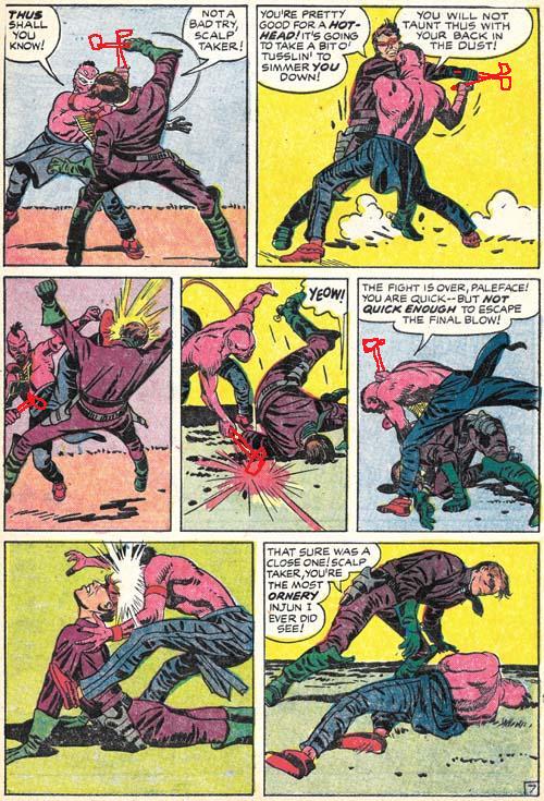
Just out of curiosity, did the Comics Code make S&K remove the Tomahawks from the hands of the fighters? They’re fairly obviously blocking and hitting with things that aren’t there. It’s especially evident in panel four of page seven. Look at the Indian’s hand and follow it to where an object, presumably a tomahawk would be hitting the ground as Bullseye rolls out of the way. See my hastily scribbled tomahawks below. Also, one would expect tomahawks on the splash page of a story called tomahawks for two and Bullseye’s upraised hand does look as if it might have been drawn.

His tomahawks may be hastily scribbled but they made his point completely obvious. I have never seen the original art but I have absolutely no doubt that it would show white-out in those areas. The Comic Code was recently introduced, for Bullseye first appearing on issue #5. Either “Tomahawks for Two” was drawn before the Code was enforced or Joe and Jack had felt that the fight scene was not too violent even with the tomahawks. After all children could see that sort of thing on television at the time. But the Comic Code was rather excessive when it came to the use of weapons so the tomahawks had to go.

Nice work and thanks Charles.

Bullseye #6, The Composition


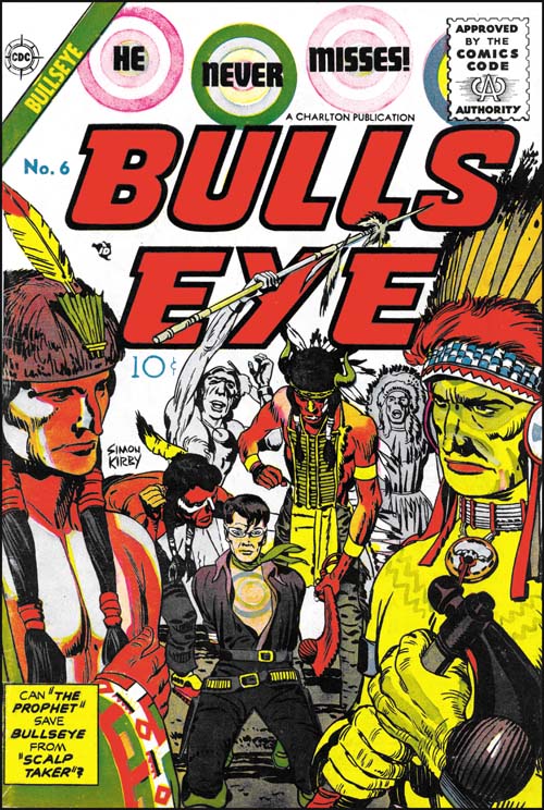
Bullseye #6 (May 1955), pencils by Jack Kirby, inks by Joe Simon and Jack Kirby

Among other things, Simon and Kirby are today celebrated for all the successful creations. Most comic book artists were fortunate if they had one popular creation while Simon and Kirby multiple successes (Captain America, the Newsboy Legion, the Boy Commandos and the romance genre are perhaps their most significant). But not every Simon and Kirby creation received favorable recognition. While today many consider Boys’ Ranch as Joe and Jack’s finest creation, in its day it just did not sell well enough to avoid an early cancellation. It is unclear how successful Mainline, the Simon and Kirby owned publishing company, would have been with Bullseye or any of their titles as Joe and Jack were doubly unfortunate in their timing. One problem was that under the pressure of public criticism the entire comic book industry had started to crash. The other difficulty was the economic difficulties that plagued  Mainline’s distributor, Leader News. The second problem was not unrelated to the first as Leader News depended greatly on the revenues from EC, a comic publisher particularly attached by critics. When Leader News folded so did Mainline. Simon and Kirby then turned to Charlton to publish the former Mainline titles. Joe has said that Charlton offered them the best deal but with the collapsing comic publishing industry there probably were not many alternatives. Because of the amount of time required to print and distribute a comic book, the art for Bullseye #6 was probably already finished before Mainline had actually failed. The fact that Bullseye #6 was released by Charlton on its normal scheduled time indicates that Simon and Kirby spent little time looking for a replacement publisher for their Mainline titles.

The cover for issue #6 was the least successful of the Bullseye series. Unlike all the others issues, the bulls-eye pattern plays a part in the design of the title but not the actual image. What is presented is little more than an illustration from the interior story. Only from the cartouche would the reader understand the significant of the two foreground figures. It does have the distinction of being one of the only two cover art of the Mainline/Charlton titles that bares a Simon and Kirby signature (Foxhole #5 was the other).


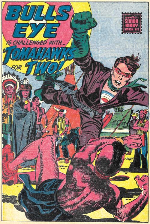
Bullseye #6 (May 1955) “Tomahawks For Two”, pencils by Jack Kirby, inks by Joe Simon and Jack Kirby

“Tomahawks for Two” is the start of the most ambitious story that Simon and Kirby did for Bullseye. With a total of twenty pages divided up into four sections, it is a much longer Bullseye story than any other. Actually it is longer than most Simon and Kirby stories created after the war. I use the term sections, because although they are essentially chapters, they are not actually called such.

It is not just the length that is special, the story is probably the most unusual Bullseye tale as well. Two Indian brothers, twins actually, one of who is peaceful (called the Prophet) and another a warrior (named Scalp Hunter). Bullseye saves the Prophet but later ends up in a hand to hand combat with Scalp Taker.


Bullseye #6 (May 1955) “Tomahawks For Two” page 7, pencils by Jack Kirby, inks by Joe Simon and Jack Kirby

I could not resist including the fight scene. Kirby was unequaled when it came to choreographing such fights and this is one of his best. In this case he deviates from the 3 by 3 panel layout that he typically used for such battles. Although this is not a grid layout, there is enough symmetry that the reader’s attention is not drawn away from what really matters. As usually Jack has also minimized the background so as not to distract from the fight.


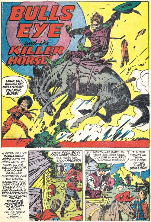
Bullseye #6 (May 1955) “Bulls-Eye And The Killer Horse”, pencils and inks by Jack Kirby

In an unusual and untypical manner, Simon and Kirby turn away from the tale of the two Indian brothers and now tell one about a boy and his love of a wild stallion. It is quite possible that this story was originally a stand-alone feature that was retrofitted into the Indian brothers story. If so its last panel was reworked to include a distant Indian observer and a caption that ties the scout to the next chapter of the story.


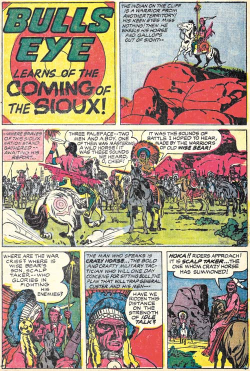
Bullseye #6 (May 1955) “The Coming of the Sioux”, pencils by Jack Kirby, inks by Joe Simon and Jack Kirby

This story picks up with the scout seen in the last panel of the previous chapter. Next we see Bullseye and the family from the “Killer Horse” story being interrupted at their dinner. This is followed by plenty of action and a rousing battle between two Indian tribes. I really do not want to provide too many details for fear of spoiling it for those who have not read it yet. But it is perhaps the most complicated plot ever used by Simon and Kirby and it ends with the death of one of the two Indian brothers.

While “The Coming of the Sioux” has a true ending, Joe and Jack follow it with a short coda, “The Man Who Lived Twice”. This piece in a way mirrors the beginning of “Tomahawks for Two” that initiated the story arc. Here we find the fate of the surviving Indian brother. Again I do not want to go into any spoilers but this story arc is one of the best that Simon and Kirby ever presented. Kirby’s art is in really top form as well. Bullseye #6 is a forgotten Simon and Kirby masterpiece.


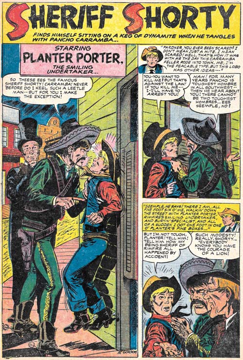
Bullseye #6 (May 1955) “Sheriff Shorty”, art by Al Gordon

Bullseye #6 marks the return of Sheriff Shorty, a feature first introduced in Bullseye #3. This time the artist was Al Gordon, whom I am not at all familiar with. Gordon’s depiction of the characters follows those from Bullseye #3 so closely that some have attributed that story to Al as well. However as we have seen (Bullseye #3, Here’s Kirby) the origin story was drawn by Leonard Starr. While Gordon is not as good an artist as Starr, he still does a respectable job on this short (four page) piece.