Category Archives: Assorted

Kirby Inkers, Mort Meskin

Jack Kirby had a lot of different inkers throughout his long and productive career. During the time of Jack’s collaboration with Joe Simon, most of his inkers were also artists that worked for the S&K studio. Mort Meskin, for one, had a extended and fruitful association with Simon and Kirby. The earliest S&K production that included a Meskin signature was “The Inferior Male” from Young Romance #6 (July 1948) (see previous posts here and here). That particular piece was also signed by Jerry Robinson, the usual assumption is that the first signature (in this case Robinson) was the penciler and the second (Meskin) was the inker. Here support is found in that at least some of the pencils do not appear to by Mort, while the inking is typical of his work that follows. The first work to be signed by Meskin alone came over a year later with “His Engagement Ring” (Young Romance #16, December 1949). There is an even earlier work then both of these that Meskin at least participated in (“Love Or A Career” in Young Romance #3 January 1948). To be honest I am holding back some information that I want to be the subject of my next week’s post. Although Mort’s earlier work for Simon and Kirby was sporadic, from 1950 on he became the most prolific of the studio artists. During this time Meskin’s output may have even exceeded Jack Kirby’s.
Young Romance #18
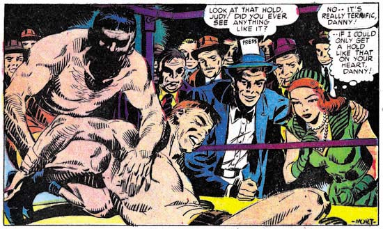
Young Romance #18 (February 1950) “I Own This Man”, pencils and inks by Mort Meskin

I provide above a splash by Meskin from early in his association with Simon and Kirby. It gives examples of a number of Mort’s spotting techniques. Mort’s most common brush method, actually used much more frequently than apparent in this splash, is to describe clothing folds by using two or more narrow brush lines in close or overlapping paths. These can be found in the pressman’s blue jacket. Note how what the original individual brush strokes are sometimes revealed at the ends of the folds. Another Mort inking style was to often distinctly outline shadows. Once again this splash does not provide the best examples but two of them are present one near the center of the wrestling mat while the other is near Mort’s signature. The wrestlers give Meskin the opportunity to do some real nice simple hatching. The lines vary from thin to quite bold. Often one and occasionally two lines are used to delimit a hatching area. This type of brushing technique is very reminiscent of the S&K Studio style picket fence work. (See the inking glossary for an explanation of my inking terms such as simple hatching and picket fence). I do not know enough about Meskin’s prior inking to say whether this is typical of his work at the time or if this shows he was influenced by the Studio style. The dark spot on the reporter’s right shoulder are suggestive of the Studio style’s shoulder blot. That is misleading as Mort always seems to use these in a way to suggest realistic shadows while in the Studio style they generally appear on both shoulders without any natural explanation.
Young Romance #37
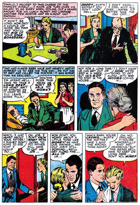
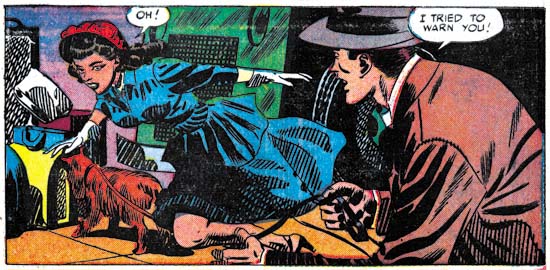
Young Romance #37 (September 1951) “Just to be Near Him” page 2 panel 1, pencils and inks by Mort Meskin

Although it maybe debatable whether my first image represents true Studio style brushwork, later work can certainly be called that. In the above image the pickets of the picket fence inking have become bold and the rails more consistently applied. Mort would sometimes also use standard crosshatching, as seen on our far left and on the lower part of the woman’s dress. When doing so, he would frequently place the crossing lines at an acute angle so that the white spaces are elongated.

Young Romance #29
Young Romance #29 (January 1951) “Diagnosis: Love” page 5 panel 3, pencils and inks by Mort Meskin

The above panel provides a better example of Meskin’s penchant for outlining shadows. That the boldly brushed dark spot on the center man’s jacket is a shadow can be seen by the presence of the profile of a nose. Mort would occasionally have a dark shadow trace a path down one side of a figure, such as the man on our left.
Justice Traps the Guilty #56
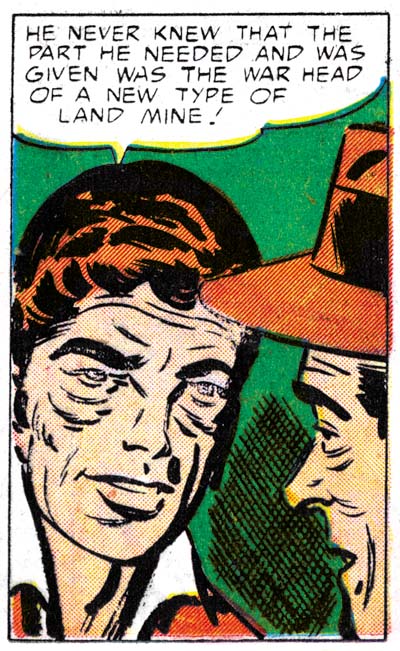
Justice Traps the Guilty #56 (November 1953) “G-Man Payoff” page 5 panel 6, pencils and inks by Mort Meskin

When artists both draw and ink their own work the two art stages will sometimes reinforce one another. That is what I believe happened with the eyebrows that Mort gave his men. These eyebrows are inked with a method similar to how Meskin handled clothing folds, two or three narrow overlapping brush strokes would trace the path of the eyebrow. This resulted in eyebrows that were wide, simple and made somewhat angular turns. As we will see below, Mort became so entrenched in inking eyebrows this way that it could affected how he inked Kirby’s pencils.

The above panel also shows how Meskin would sometimes fill in part of a blank background with crosshatching. As is generally the case, here his lines meet at an acute angle, not at right angles some other inkers prefer.

Young Romance #30
Young Romance #30 (February 1951) “My Lord and Master” page 3 panel 1, pencils and inks by Mort Meskin

Sometimes Mort will use his brushwork to create a side of a figure that is both a narrow shadow and a wide outline. This does not show up often, but is very distinctive when it does. I am sure further study of Meskin’s abundant output will show other inking techniques that while not common can be useful in determining attributions.

Young Love #68
Young Love #68 (December 1955), pencils and inks by Mort Meskin

Covers are important for the sale of a comic and the higher quality paper allows a superior printing. Therefore artists take more care in the creating artwork for covers. However the S&K studio artists usually did not get a chance to provide cover art, Jack Kirby would do all cover art when a photograph was not used. But when Simon and Kirby launched their own publication company, Mainline, Jack was so busy that for a year the covers for the Prize romance titles would be done by other artists, including Mort Meskin. On none of his romance covers would Mort use picket fence patterns or any of the other traits of S&K Studio style inking. For the spotting on Young Love #68 Mort relied mostly on his use of narrow brush strokes. Note how on YL #68 the back of the man’s jacket and pants has that narrow shadow or wide outline that we saw before.

Mort Meskin was such a prolific artist that the possibility of the use of assistants has to be considered. In preparation for writing this post I reviewed a lot of Mort’s work from 1950 to 1956, there is so much work that I did not have the time to review it all. This review confirmed my previous conviction, Mort had little if any assistance in inking his art. Almost all the spotting looked like it was done by the same hand.

Some of Meskin’s inking techniques are not limited to him alone. The use of narrow, often overlapping brush strokes can also be found in stories by George Roussos as well. This is not too surprising since Mort and George worked together in the late 40’s. The narrow brush strokes were not the only think George picked up from Mort, a lot of his penciling was clearly influenced by Meskin as well. Nonetheless Roussos did not adopt all Mort’s inking techniques so the two can be distinguished. However a discussion about Roussos will have to await another post. I will say that I have yet to find an example of Roussos inking Kirby (that is until the Silver Age).
Boys’ Ranch #4
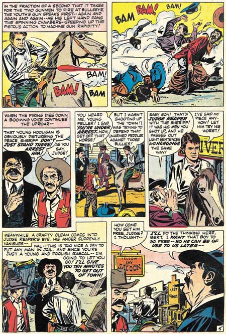
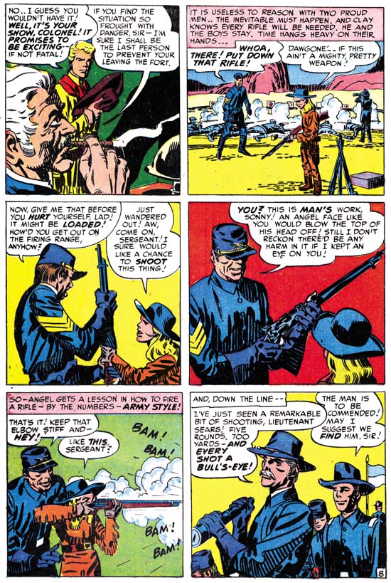
Boys’ Ranch #4 (April 1951) “The Bugle Blows at Bloody Knife” page 8, pencils by Jack Kirby, inks by Mort Meskin

The Jack Kirby Checklist attributes most of the inking in the classic Boys’ Ranch to Joe Simon. Actually it is not hard to recognize Mort Meskin’s inking in much, if not most, of it, particularly after the first couple of issues. The biggest difficulty I faced with choosing an example of Mort inking Kirby from Boys’ Ranch was that I believe Mort was the penciler for at least some of the work in that title that has generally been credited to Jack. But the drawing in “The Bugle Blows at Bloody Knife” looks so much like Kirby’s that I am confident that he was the penciler. I am equally as confident that Meskin did the inking. Note the narrow clothing folds in panels 3, 4, 5 and 6. See how the shadows have a strong outline, most obvious in panel 4, but can even be found on the officer’s forehead in panel 1. The back of the soldier in panel 3 could be described as either a narrow shadow or wide outline. The eyebrows in panel 1 and 6 are simple with angular turns. All of these are typical Meskin traits.
Police Trap #6
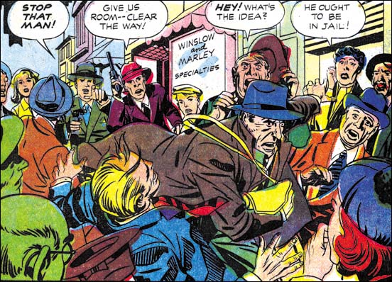
Police Trap #6 (September 1955) “Only the Guilty Run”, page 1, pencils by Jack Kirby, inks by Mort Meskin

The two gun carrying detectives in the background are so typical of Jack Kirby that he must have been the penciler. At a glance the inking appears typical S&K Studio style. But note how the clothing folds are long and narrow. The final giveaway is the thief’s eyebrows are simple with angular turns. There is little doubt that this is another example of Meskin inking Kirby.
Western Tales #32
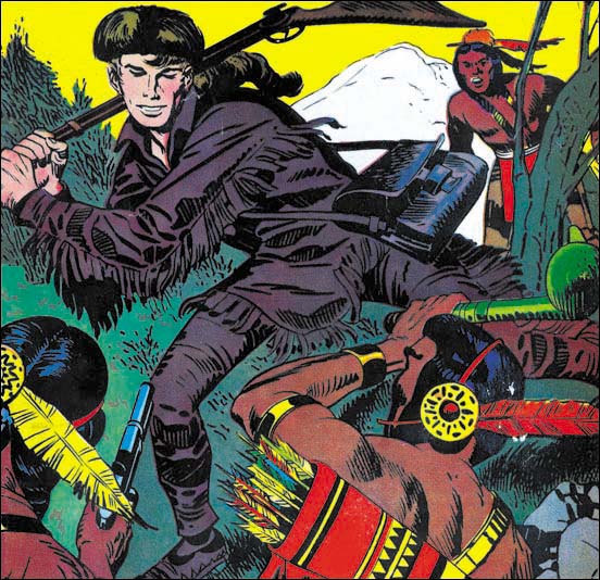
Western Tales #32 (March 1956), pencils by Jack Kirby, inks by Mort Meskin

My final image is the cover of Western Tales #32. This work was not included in the Jack Kirby Checklist. The last time I posted on it I attributed both the pencils and inks to Joe Simon. The fact that it was not Kirby’s inking and the stiffness of the Indians (especially the one in the right foreground) suggested to me that Joe might be responsible. After all Simon has shown himself to be excellent at mimicking Kirby. However Crockett’s pose seems more dynamic then what Joe has ever done without using swipes, and it was just the sort of thing that Jack was so good at. Perhaps the awkward pose of the Indian on the right was due to the limited area left over from Davy’s figure. As for the inking it simply is not Kirby’s work. Note the long and narrow clothing folds, Davy’s angular eyebrows, and the way his back is outlined by a narrow shadow. None of these are Kirby traits but all are characteristic of Mort Meskin’s inking. This magnificently inked cover shows that Mort had complete mastery of the S&K Studio style. Mort’s brushwork has the same sort of bold confidence that Jack and Joe also possessed. Although it may not be a reliable enough trait to rely on in determining attributions, Meskin’s brush does seem a little more mechanical then either Simon’s or Kirby’s.

A few months after Western Tales #32 Meskin would stop providing work to Simon and Kirby. If the GCD is correct, Mort had actually returned to working for DC a couple of years earlier. Now having left S&K, DC would become Mort’s main source of income until he abandoned the comic book industry. Meskin’s final DC period overlaps Jack Kirby’s time there, however none of Kirby’s DC work that I have seen was inked by Mort.

I have not made a thorough examination of Jack Kirby’s work for the purpose of determining what ones were inked by Mort Meskin. I want to hold off on that effort until I review some more S&K artist/inkers. So far the only other one I have posted on was Marvin Stein.

Night Fighter, an Abandoned Superhero

In Love #1
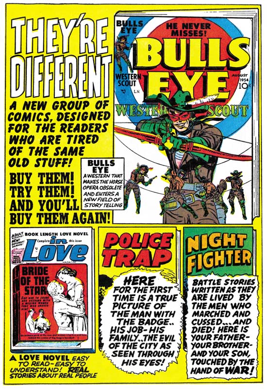
Mainline Advertisement from In Love #1 (September 1954)

Simon and Kirby launched their own comic publishing company, Mainline, with Bullseye (August 1954). The first issue of Bullseye ran an advertisement for the next issue, but no mention of other titles. For the next month, September, two additional titles were released, Police Trap and In Love. Like Bullseye, Police Trap ran an ad for the second issue. However inside In Love was an advertisement for all the Mainline titles. It was a diverse lineup including western, crime, romance and war comics. At this point only the Foxhole had not been released. But it is clear from the description that S&K had already decided on the theme for their war title:

BATTLE STORIES WRITTEN AS THEY ARE LIVED BY THE MEN WHO MARCHED AND CUSSED…AND DIED! HERE IS YOUR FATHER – YOUR BROTHER – AND YOUR SON, TOUCHED BY THE HAND OF WAR!

Right above the blurb the comics title is given and it is Night Fighter instead of Foxhole. Night Fighter just does not make sense as a title for a war comic. There is nothing in the blurb to suggest the comic would only be about nighttime battles.

Night Fighter
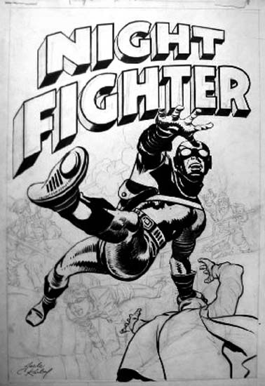
Night Fighter, unpublished cover

Night Fighter was also the title used for a superhero proposal that Simon and Kirby came up with. The original art is known for two covers. The one whose image I show above was created by altering an unused Fighting American cover. This and the other Night Fighter cover can also be seen in Greg Theakston’s Jack Kirby Treasury volume 2. Both covers show a hero with special equipment, boots that allow him to walk on walls and goggles that permit him to see in the dark.

But the use of name Night Fighter in the Mainline advertisement and for the unused superhero is not a coincidence. Compare the logo from the unused Night Fighter covers with the one in the In Love advertisement. There is no question, both are the same design. The most reasonable explanation is that the superhero Night Fighter was originally planned as part of the Mainline lineup and was included in the first state of the In Love ad. Before In Love #1 was sent to the printers Simon and Kirby decided to replace the superhero entry of the Mainline comics with one from the war genre. They replaced the blurb in the advertisement with one appropriate for the new war title. Somehow S&K never got around to changing the title from Night Fighter in the ad. Perhaps they had not yet decided what to call the war comic and simply forgot to correct it in the advertisement by the time they decided to name it Foxhole.

Why did Simon and Kirby decide to drop the superhero Night Fighter from their lineup? With the part that Jack played in the creation of the Marvel universe as well as all the superheroes Simon and Kirby worked on during the war, it is easy to conclude that superheroes were important for the S&K team. However during the years after the war until the breakup of the studio superheroes only played a small part of the comics that Simon and Kirby produced. Stuntman and the Red Demon quickly failed during the comic book blot that followed the war. Captain 3D had an even shorter life when 3D comics turned out to just be a fad. Simon & Kirby had created Fighting American for Prize Comics just before starting Mainline. Fighting American #1 has a cover date of April which would indicate a calendar date for its release as February. In Love #1 with a cover date of September would have gone to the printers at a calendar date of May. Since their deal with Prize was to share the profits, it is possible S&K may have known the sales return for FA #1 in May and perhaps these were not as good as hoped. The only problem with this scenario is that when In Love #1 was sent to the printers it would be expected that some work may have already begun for the next month’s titles. Yet all the art that seems to remain for Night Fighter are the two unused covers. So it is hard to be sure whether or not sales figures for Fighting American affected the decision not to launch Night Fighter. Whether influence by sales figures for Fighting American or not, Simon and Kirby apparently decided the time was not right for launching a new superhero. Perhaps if Mainline had been a success they might have later expanded their line to include Night Fighter.

Jack Kirby’s Austere Inking, Chapter 2, Mainline

In my last chapter I described the penciling and inking stages that the art went through in the Simon and Kirby studio. Now I would like to provide some examples of the S&K studio style of inking from when they were creating comics for Mainline, their own publishing company. This is the inking style from which Kirby’s Austere Style developed. Artistically, Simon and Kirby were at their peak. Jack’s penciling was bold and assured. Spotting, particularly when done by Kirby, had both nuanced and muscle. The development of the S&K shop style was probably greatly influenced by the poor printing processes used for comics at the time. Fine inking techniques such as the standard crosshatching could look great on the original art. Yet when these same fine inking was printed it often fail to fully print leaving the area unnaturally light. Or it might fill with ink resulting in large black splotches. But it would have to be a truly bad printing to completely ruin S&K shop inking.

Because I want to describe the evolution of Jack’s Austere Style, I want to provide examples that I believe Jack did the spotting. The rub is that there is not a single Simon and Kirby piece of art that provides credits identifying the inker. It is hard enough to recognize individual hands involved in the inking, how do you go about applying actual names to these hands? I have asked people who provide inking attributions for the S&K period how they got around this difficulty, but I have never received a good answer. One person seriously suggested using intuition!

Well here is my solution to this naming problem. In my last chapter I summarized why I believe Jack was the actual inker for the Austere Style. Working my way backwards from that style to earlier inking works I then picked out works that looked like they were done by the same hand. If I am correct to attribute the Austere Style to Jack, then I am probably also correct about the earlier work. I realize that my readers may not yet have a good idea of what the Austere Style is like but hopefully they will be the end of this serial post.

Bullseye #3
Bullseye #3 (December 1954) from “Devil Bird” page 5, pencils and inks by Jack Kirby

One spotting technique frequently used in the S&K studio style is what I refer to as picket fence pattern. Two lines following a roughly (sometimes very roughly) parallel tract are connected by a series of more or less evenly spaced lines. The upper arm of the rifle holder in the image above shows what I mean. This inking technique is not too common outside of the S&K studio. But I have seen other artist use it as for example Will Eisner. Its use in the S&K studio style is unusual in the thickness of the lines used for the pickets.

Bullseye #3
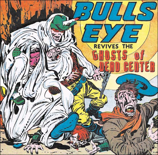
Bullseye #3 (December 1954) from “Ghosts of Dead Center” page 1, pencils and inks by Jack Kirby

A row of short dashes, or as I like to refer to them as a string of drops, is common in the studio inking. The size of the drops often varies along the string. As the size varies they occasionally become more like short lines then drops. Sometimes the string of drops is placed on top of a simple line and sometimes not. The Bullseye splash (see above image) provides good examples of some of these variations.

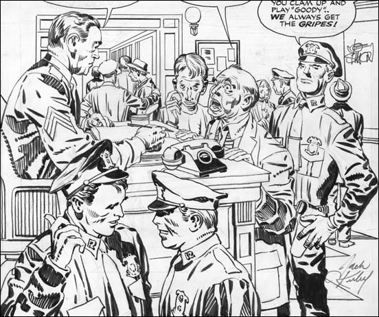
Police Trap #2
Police Trap #2 (November 1954) “Desk Sergeant” from the original art, pencils and inks by Jack Kirby

I wanted to provide another example of the studio style and its use of the techniques I have been describing. Generally inking was more elaborate when done for a cover or a full page splash. The inking for “Desk Sergeant” is, in my opinion, particularly nice. I just love the way the inking provides bold statements in the use of picket fence and drop strings brush work while still being very sensitive to facial features. Although I have been describing some of the brush patterns used in the S&K studio style it is important to remember that these were not restricted techniques. Note how some of the picket fences have one rail that is not a line but rather a drop string.

In my last chapter I provided an example of outline inking done with very uniform lines as if made by bending a wire. These simple lines could later be modified by adding thickness in parts. The outlines in “Desk Sergeant” are very variable but this was probably done that way right from the start. Note the sleeve in the area of the wrist in the man on our lower left. The outline disappears for short distances. Because there is no whiteout used, we can be sure this reflects the original state of the outline. The outline work so matches the rest of the inking that I believe Jack did both line and spot inking in this splash.

Police Trap #4
Police Trap #4 (March 1955) cover pencils and inks by Jack Kirby

Picket fence and drop strings are not always used especially in the case of panel art. They are most effective when used on a large image such as a cover or a close-up in story art. Otherwise more simple inking patterns are used. The folds in clothing are variations of simple patterns. Many of the smaller folds are recorded as simple spatulate shapes. With an increase in size and length they assume a shape like the frond of a palm leaf. Or the spatulate form can be increased in size without lengthening to become a sort of rounded rectangle. The spatulate and frond shapes often bend slightly to suggest the form of the underlying figure. The above image from the cover for Police Trap #4 gives some good examples of spatulates, fronds and rectoids as well as showing how they morph into one another.

The Police Trap #4 cover also shows a technique that had become more frequent. This is the careful placement of a number of rectoids near one another leaving only small strips of white between. This is used to suggest the clothing folds in areas of shadow. The lower right leg of the man handing from the hock is a good example of this which I call negative folds.

Win A Prize #1
Win A Prize #1 (February 1955) from “That Giveaway Guy” page 2, pencils and inks by Jack Kirby

The above image of a close up from Win A Prize #1 provides further examples of both picket fences and drop strings. The shoulders of man on our left features another spotting technique which I think of as a collar blot. I “get” the picket fence and drop string, they are means of suggesting grays in a black and white world of pure ink. Similarly the spatulate and frond shapes are used to suggest the shadows cast be folds in the clothes. But I am not clear at just what the collar blot is meant to portray. Unlike the other brush methods, I have only seen the collar blot used in S&K productions. I refer to it as a blot, but actually it is not at all unusually for the shape to be formed by ink strips that are kind of like the pickets only wider leaving very narrow white strips in between.

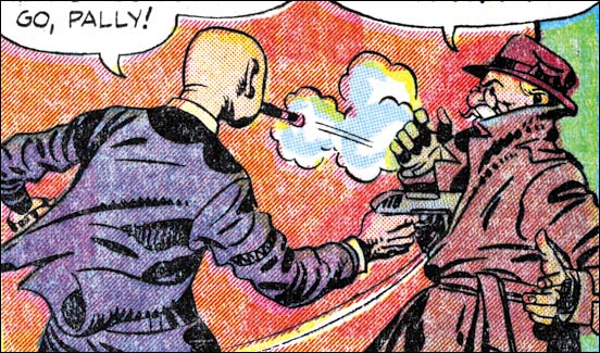
Police Trap #6
Police Trap #6 (September 1955) from “Only The Guilty Run” page 1, pencils by Jack Kirby and inks by Mort Meskin

All the examples that I have provided above are ones that I believe that Kirby did at least the spot inking. But I do not want to leave the impression that this inking style was used by Jack alone. I refer to it as the S&K studio style because it was used by other inkers as well when working on Kirby pencils. The image I provide above is from a half page splash panel. The pencils look like Kirby’s and I do not mean just the layouts. Even the fine details have Jack’s “fingerprints”. Look at the pointing hand of the of the man that yells “stop that man”. Although the faces look like they were drawn by Kirby they also suggest Mort Meskin, particularly the face of the running thief. I am sure Mort did the outline inking.

But what about the spot inking? A close examination of the spotting convinces me that it was not done by Kirby. The picket fence seems very meticulous while Jack’s usually has a more spontaneous feel. Some of the clothing folds are narrower then Jack would use for the same length. Also look at the use of negative folds on the left arm of the guy with the blue jacket. It is the same type of handling that the leg from the Police Trap #4 cover shown earlier. It is hard to put into words, but the “Only The Guilty Run” version does seems more mechanical and less convincing then those done by Kirby.

Having come to the conclusion that the spot inking was not done by Kirby I end up with that same problem of applying a name to that inking hand. I do not feel that this is the place to explore this matter nor have I conducted my own careful check. I will say that currently I suspect that the spotting was done by Mesking as well. The actual attribution of the spotter is not that important for this post. The point I am trying to make now with “Only The Guilty Run” is that the S&K studio style was not used solely by Jack.

Police Trap #6 was the last of the Simon and Kirby Mainline titles to be published. All the studio style of inking from this period is pretty consistent. This style continued afterwards, as for instance Western Tales #31 (October 1955) and #32 (March 1956). However starting in 1956 works appear where the inking style began to be change. This will be the subject of my next chapter.

Jack Kirby’s Austere Inking, Chapter 1, Introduction

Jack Kirby’s Austere Inking, Chapter 3, A Lot of Romance
Jack Kirby’s Austere Inking, Chapter 4, Prize Covers
Jack Kirby’s Austere Inking, Chapter 5, Harvey
Jack Kirby’s Austere Inking, Chapter 6, Atlas
Jack Kirby’s Austere Inking, Chapter 7, DC
Jack Kirby’s Austere Inking, Chapter 8, More Harvey
Jack Kirby’s Austere Inking, Chapter 9, More Prize
Jack Kirby’s Austere Inking, A Checklist and a Glossary

other post with Kirby inking Kirby:

Strange Tale Indeed
Battleground, Jack Kirby’s Return to Atlas
Captain 3D

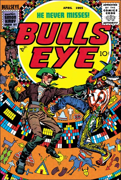
Featured Cover, Bullseye #5

Bullseye #5
Bullseye #5 (April 1955)

This is another selection made by a participant of my recent Featured Cover Contest as their favorite Simon and Kirby cover. I had provided an image of it before in my serial post The End of Simon and Kirby but it is such a great cover that it warrants repeating. When discussing Boys’ Ranch #4 (see my previous post) I said that all the covers for that title were so good that I would be hard pressed to pick my favorite. Well S&K did a good job on the Bullseye covers but there is no doubt in my mind that issue #5 is the best.

In the origin story we learn that Bullseye got his name not just because of his skill with weapons but because of a target pattern that an Indian foe had branded onto his chest. All but one cover (#6) featured this target pattern prominently as part of the design of the cover. But for issue #5 S&K took it even further by turning the pattern into an Indian theme, as if it was some sort of flattened decorated teepee. Then added to this was one of the dramatic hand-to-hand combats that Jack had ever drawn. Clearly this unique cover is one of Simon and Kirby’s greatest masterpieces.

Boys’ Ranch and the Fighting American were probably the most obvious Simon and Kirby titles to reprint. But beyond a doubt Bullseye is a title that deserves the same honor. An interesting hero, great stories and lots of Kirby. Unfortunately it has not received the treatment that Marvel gave the other mentioned titles. But hey, I have not given up hope that some publisher will recognize what a classic Bullseye was.

Featured Cover, Fighting American #1

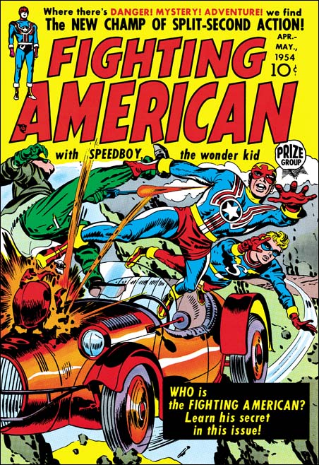
Fighting American #1
Fighting American #1 (April 1954) by Jack Kirby

It is easy to see why one of the entries for my recent Best Simon and Kirby Cover contest was Fighting American #1. The cover shows a race car flying off a cliff. It that was not bad enough the engine is exploding. Fighting American and Speedboy leap to safety with Fighting American pulling along another man by his leg. Surprising the man shoots a gun at his would be rescuer. This scene takes up pretty much every inch of the cover below the comic title. I cannot see how Simon and Kirby could possibly have added more excitement to the cover. The art was done when, in my opinion, Joe and Jack were at their peak. Just look at the exaggerated perspective that Kirby uses, it is amazing. No doubt about it this is one great piece of cover art.

Fighting American was obviously Joe and Jack showing how Captain America should be done. They had created Cap in 1941 but only did the first 10 issues, less then one year of work. Timely continued to produce Captain America without S&K up to issue #74 (October 1949) which was re-titled as Captain America Weird Tales. Timely must have known that they were about to end the title because the single Cap story showed the definitive end of their long time nemesis, the Red Skull. I say definitive because although the Red Skull had been shown supposedly killed before this time the story shows him in hell. There was a Captain America Weird Tales #75 (February 1950) but Cap did not actually appear on the cover or in any story.

Coincidentally the demise of Timely’s patriotic hero marked the period of the rise of Joe McCarthy. McCarthy lead a crusade against all the communists that he said had infiltrated the U.S. government. McCarthy’s “investigations” can best be described as a modern day witch hunt. But that was not so obvious to Americans at the time as can be shown by the fact that a Gallup poll taken in January 1954 showed McCarthy had a 50% approval rating. It is only a guess, but perhaps all of McCarthy’s talk about Communist infiltration brought back to the Atlas company thoughts of their previous success with their superheroes. After all if their hero line was was so financially successful fighting the Nazi’s during the war, perhaps it might occur again using the same heroes to fight the Communists. Whether that was thinking or not, Atlas re-launched the Human Torch, Sub-Mariner and Captain America in Young Men #24 (December 1953). It takes three to four months to produce a comic and so the earliest cover date following YM #24 appearance would be March or April 1954. April is exactly the date that appears on the cover of Fighting American #1. The timing is too perfect, could Joe and Jack saw that their old creation had reappeared? This could have prompted them to rush their own patriotic hero out hoping to take part in the superhero revival.

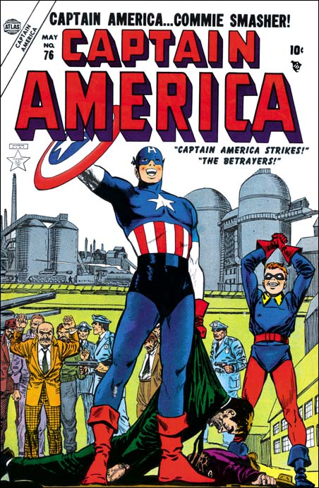
Captain America #76
Captain America #76 (May 1954)

But Joe McCarthy’s rise did not go unopposed. On March 8, 1954 Edward R. Murrow did a segment of “See It Now” critical of McCarthy and his tactics. On June 9 during one of his Senate investigation meetings Joseph Welch addressed McCarthy with the line “Have you sense of decency, sir, at long last?” On June 10 Senator Flanders introduced a resolution to condemn Joe McCarthy. On December 9 1954 the condemnation of McCarthy was passed by the Senate. At this point Joe McCarthy had been pretty much discarded on the rubbish pile of history where he belonged. I do not suggest that McCarthy’s downfall had any affect on the Atlas superhero revival attempt. No I think that the termination of this revival with Human Torch #38 (July 1954) can be blamed on the fact that they were really poor comics. (Sub-Mariner Comics continue until issue #41 dated October 1955 due to a hope of a movie deal). But although I do not think McCarthy’s fall affected Atlas much, it may have had an affect on Fighting American. That title had started out as exciting superhero fare but by issue #3 (August 1954) had turned to humor. The timing is just right for Joe and Jack to begin to see what McCarthy was really about and to change their comic accordingly.

Before closing this post I would like to comment on the artist for the cover of Captain America #76 shown above. Both the GCD and AtlasTales attribute it to John Romita. John Romita did do a lot of the art for Captain America during this revival attempt. For instance he signed the covers for Captain America #77 and #78. Although unsigned, some of the art inside Cap #76 appears to be by Romita. But I find it hard to believe that John was the artist for the cover, Captain America just looks like he was done by a different hand. In an interview of John Romita by Roy Thomas from Alter Ego (volume 3 #9) both seem to indicate that they do not believe the cover for #76 was by Romita either. However the suggestion that John makes in the interview that it may have been done by Carl Burgos or Joe Maneely seems even less creditable. Unfortunately I do not know enough about Atlas artists to suggest an alternative. In the interview John mentions that Stan Lee often had art rework done by whatever artist had stopped by at the office at that time. John particularly suggests that Cap’s smile on issue #76 might be an example of that. But perhaps for Cap #76 the rework was much more extensive.

Featured Cover, Treasure #10

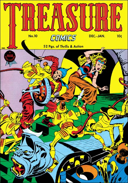
Treasure Comics #10
Treasure Comics #10 (December 1946) by Jack Kirby

I come across lists all the time; the top 100 artists, the 100 most important comic books, and so on. All listed in a nicely hierarchy with one selected as the best. I do not know how people are able to make such lists. What criteria does one use to rank one artist as #100 and another as #101 (and so be excluded from the list)? Even the selection of the best can be wroth with difficulties. Should the best comic book artist be based on who did the best work or who had the most influence on the comic books of today? It should come as no surprise who I think is the artist that did the best comic book art. Subtle hint, look at the title of this blog. However if it is influence that counts then I might wonder if Will Eisner may be more appropriate. While not denying Jack Kirby’s tremendous influence on pretty much the entire history of comics, Eisner’s graphic novels launched a whole new genre, one that has even made it into the N.Y. Times Book Review.

But even if I try to adopt a subjective viewpoint I do not find myself in an easier position. My favorite painting varies from day to day. My response to a piece of art depends as much as my mood as with the work of art. But ask me what my favorite Simon and Kirby cover is and most days I would say Treasure #10. This is a rather oddball cover for S&K. Treasure #10 comes not long after the failure of Stuntman and Boy Explorers. The publisher was Prize, Joe and Jack had done some work for them early in their career (Prize Comics #7, 8 and 9; December 1940 to February 1941). In March 1947 Simon and Kirby would launch for Prize the crime genre version of Headline Comics. Treasure #10 was used to introduce the new version of Headline. It includes a crime story (“Tomorrow’s Murder”), the earliest Simon and Kirby crime genre piece. There is an advertisement at the end of the story announcing the “bigger and better” Headline. It includes a copy for the cover for Headline #23. Both the ad and the illustrated comic indicate a January-February cover date. Headline #23 was actually cover dated March-April. Further the cover illustrated in the ad was really used for Headline #24.

Treasure Comics appeared to once have an Arabian Knight feature, it is listed on the cover for Treasure #7. However there is no such feature, or anything like the cover, in TC #10. The GCD shows Treasure #6 and #7 covers (April and June) with an Arabian theme signed by H. C. Kiefer. I am not familiar with Kiefer’s work and it would be easy to dismiss him as a inferior artist compared to Jack Kirby. But such comparisons are really unfair and uninformative. The cover for TC #7 may be a bit crude and the demons looking more goofy then threatening. But TC #6 is a rather nice cover with lots of action and a good composition. Both TC #6 and #7 covers show shields with similarities with that used by Jack for TC #10. Further TC #7 adds an unusual point to the turban, a trait shared with TC #10. This suggests that Kirby used Kiefer’s covers as a jumping off point.

What a cover Jack provides! An Arabian Knight seeks to escape with a beautiful princess. Well perhaps she may not really be a princess, but her exotic diadem suggest she is more then just a beautiful woman. The pair are faced with a swarm of adversaries intent on preventing their escape. Not your usual adversaries but a group of yellow bodied, red tailed monkeys. Not what you normally would think of as much of a challenge to our hero. But these monkeys are armed with exotic weapons and quite energetic in their attack. These are scary monkeys indeed. But not your normal scary monkeys, these wear exotic clothing and rather weird hats (how do those hats stay on?). Judging from the sculpted banister I would suspect there is a whole population of these monkeys that our desperate pair must somehow evade.

Take a look at the monkey with the knife in the center of the picture, look carefully at his feet. The big toe is on the outside of the foot contrary to what is found in either monkeys or men. I used to think that this was done by Kirby on purpose to give them an even more exotic look. But during restoring the cover I noticed that the toe is on the correct side of the foot for the two monkeys on the left. So now I guess it is just another of those errors that Kirby is so famous for.

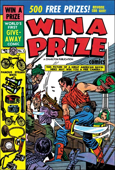
Win A Prize #1
Win A Prize #1 (February 1955)

Simon and Kirby did not do many of this sort of swashbuckler covers. Win A Prize #1 comes to mind as one other. (I wrote about the Win A Prize comic before during my serial post on The End of Simon and Kirby). But Jack was a master of action art and seemed to create such covers almost effortlessly.

A Criminal Swipe

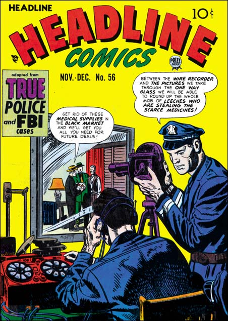
Headline #56
Headline #56 (November 1952) by Marvin Stein (signed)

In 1952 Marvin Stein provided a cover for Headline. I have not said much about Stein yet in this blog. For now let me say that a 1949 photograph from the Jack Kirby Collector #25 shows him in the S&K studio. Marvin’s work also shows up in some of the studio productions from around that time and it has been reported that he did inking work for S&K. It has also been said that he was a great admirer of Jack Kirby.

Initially the crime comics Headline and Justice Traps the Guilty were Simon and Kirby productions and they are listed as editors. Kirby drawn stories were frequent in these comics. All drawn covers (as opposed to the photographic covers) were done by Jack. Early in 1951 this changed. Nevin Fiddler was listed as the editor and Kirby no longer supply work for these crime titles. Marvin Stein now becomes a conspicuous artist for the crime titles. In fact Marvin draws just about all the covers and provides stories for most issues. A photo of the S&K studio of about 1951 or 1952 does not show Meskin. I conclude from all of this that S&K no longer produced the crime titles and that Marvin Stein was mostly providing work for the new editor, Nevin Fiddler.

The Headline #56 covers is signed by Marvin Stein and is in his style so there can be little question that he was the artist. The inking on the policeman whose back is turned to the viewer is reminiscent of S&K studio inking. But the rest of the cover’s inking is not particularly like that done by S&K shop. Nor does the composition seem very like covers produced by Simon and Kirby. The subject of the police using a one-way mirror to trap criminals is, as far as I know, pretty unique for crime comics of the time. The cover does not correspond to any of the interior stories.

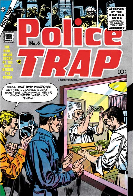
Police Trap #6
Police Trap #6 (September 1955) by Jack Kirby

In late 1955 Charlton would publish the final issues of titles originally done by Mainline, Simon and Kirby’s own short lived publication company. One of them, Police Tray #6, appears to be a swipe from the Headline #56 cover by Stein. Police Trap #6 was one of Jack’s poorer efforts but he still seems responsible for the pencils. The inking has signs of S&K shop inking, particularly the abstract arc shadows. Hopefully by now most Kirby fans realize that Jack would swipe from time to time. His sources for the swipes were generally from photographs, paintings or illustrations. At this point in his career it was unusual for him to swipe from other comic book artists particularly from someone like Marvin Stein. Police Trap #6 only shares the unusually concept with Headline #56. The composition differs in important ways between the two, mostly due Jack’s policemen being given less of the cover and his criminals brought much more forward. Still it is surprising that Jack would the same unusual subject.
I see no reason to “defend Kirby’s honor”. Unlike some, I have no problems with swiping, as long as the swiper creates something with his own individual touch. It could be said that Jack has certainly done that with Police Trap #6. While not denying the possibility that this is another example of a Kirby swipe, I would like to offer another possible scenario. The covers published by Mainline seem much better then when the titles were done by Charlton. For whatever reasons S&K did not seem to put into the Charlton issues the same effort that they had previously done. If they were trying to do a rush job or cut corners it is very possible that they might turned to previously unused material. Perhaps the PT #6 cover might originally been made for Headline or Guilty but abandoned then because it was not quite good enough. It that is true then Marvin Stein could easily have seen it when he was working in the studio and used the idea a few years later. It would not be the only Stein swipe from Kirby. This is just a thought and I am not convinced one way or the other.

Joe Albistur, another forgotten comic book artist

PT #1 The Beefer
Police Trap #1 (September 1954) “The Beefer” by Joe Albistur

I mentioned Joe Albistur briefly in Chapter 3 of my “End of Simon and Kirby” serial post. Joe is another of those forgotten comic book artists. Web searches have provided nothing in the way of real biographical information. To make matters worse, some have misread his signature and refer to him as Al Bistur. It is easy for me to resist the temptation to look down my nose at those who got his name wrong. Honest mistakes made in the study of comic book history deserve correction not criticism. Besides I have to include myself among those who have made that particular mistake.

I asked Joe Simon about Albistur. Although Simon said he felt he should remember the name, and even corrected my pronunciation, he could remember nothing about him. In a way this is not surprising. Simon worked with a lot of artists over the years and Albistur worked for the S&K studio for only a short period of time. But it was that critical time during the Mainline period. Albistur first appeared in Police Trap #1 (September 1954) and last showed in Young Romance (October 1955). During his stay with S&K Joe produced 21 stories; 6 for Police Trap, 1 for Win A Prize and 14 for the Prize romance titles (see checklist). His appearance in these particular comics, but none of the other Prize titles, is one of the reasons I am convinced that Simon and Kirby were still producing the Prize romance titles at the same time they were publishing their own comics under Mainline.

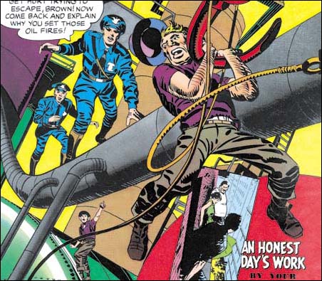
PT #4 All In A Day's Work
Police Trap #4 (March 1955) “All In A Day’s Work” by Joe Albistur

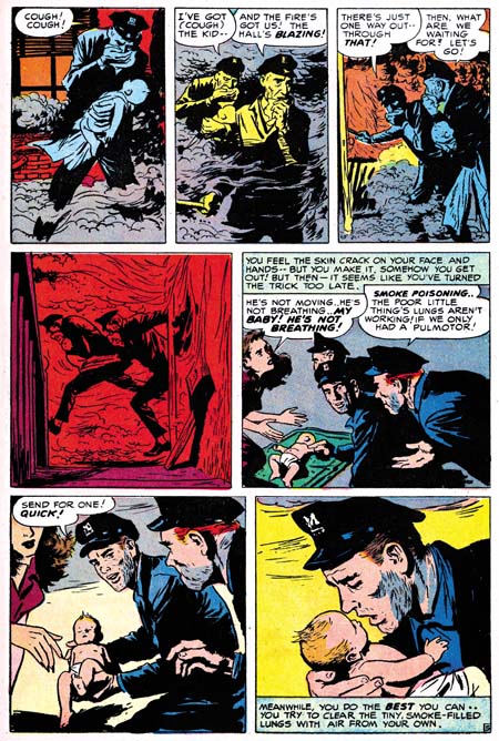
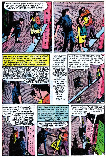
Joe Albistur shows up in S&K productions with a fully developed style, he must have worked in comics elsewhere before this. Joe does a good job in the mild type of crime genre that is supplied by Police Trap. Albistur illustrates the story well and seems comfortable with the action sequences. He excels in presenting a story in unusual situations; on the ledge of a building where a cop tries to talk someone out of suicide, or in burning building rescuing a baby. Kirby is said to have provided layouts for S&K freelancers, but the way Albistur does these stories I doubt it is true in his case.

WP #2 The Handsome Brute
Win A Prize #2 (April 1955) “The Handsome Brute” by Joe Albistur

In Win A Prize #2 Joe’s contribution is a science fiction piece. Here again Albistur shows his story telling ability. But it also shows his weakness. When it comes to the part the alien reveals himself, Joe does not seem to know how to visualize him and so casts the face in shadow. Somewhat of a letdown. Of course it may have been difficult working for Jack Kirby, who is a master at this sort of thing. Black Magic had already been cancelled and Win A Prize never went past the second issue, so we never get a chance to see Albistur try his hand at this sort of thing again.

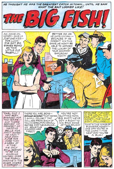
YR #77 The Big Fish
Young Romance #77 (June 1955) “The Big Fish” by Joe Albistur

It was in the romance genre that Joe Albistur did most of his work for S&K, filling in for the absent Jack Kirby. Albistur seems an odd match for the romance comics. His women do not have the clear beauty of Bill Draut, nor the sophistication of John Prentice, nor are they stylized like Mort Meskin’s. I am lost for words on how to describe Joe’s women. The best I can do is say that they have a sort of roughness that gives them an earthy look. But we do not need to accept the quality standards of a teenage girl from the 50’s. I am not sure they would have liked Joe Albistur’s work that much, but I do. Joe used some interesting composition devices, like having a panel edge cut off much of the face of the leading woman. Albistur also had an eye for gestures, like the pin ball wizard stretching his fingers. Although Joe’s women may not have a typical comic book beauty, they are done in an easily recognized style. I have little interest in a style for style sake. But I do admire an artist who develops a unique style as a way of expressing his own personal voice. That is a quality that Joe Albistur shared with the best of the S&K artists.

When Jack Kirby returned to providing work for the Prize romances he would begin to do pretty much the entire comic. Therefore Joe Albistur disappears from the Prize romance titles. Unlike Bill Draut and John Prentice, he does not show up in the Harvey romances. I suspect his work was not a good match for the Harvey house style of those romances. I have not seen any of Albistur’s post S&K work, but he does come up a few times in a search of the internet. It appears he did work for Gilberton in 1961 working in the Classics Illustrated and the World Around Us titles. In 1973 and 1974 Joe shows up in the DC titles Forbidden Tales of Dark Mansion and the House of Secrets.

Joe Albistur was not as flashy as some of the more popular artists, you know someone like Jack Kirby. But at least in the work he did for S&K, he was not a run of the mill artist either. Albistur had talent and his own unique voice. He may not have been a superstar but he does not deserve the anonymity that he has fallen into.

The End of Simon & Kirby, Chapter 3, Unlikely Port In The Storm

Bullseye #5
Bullseye #5 (April 1955) by Jack Kirby. It and Foxhole #4 were the last Mainline comics.

Previously in the end of Simon and Kirby I discussed the rise of anti-comic book sentiments and the ill timed launched of S&K’s Mainline comics. A number of publishers seemed to be having problems, including Prize for which Simon and Kirby produced some titles. In the end Mailine failed with the last comics dated April 1955.

Win A Prize #1
Win A Prize #1 (February 1955) by Jack Kirby

Two months before the last Mainline comic, Joe and Jack launched a new title Win A Prize published by Charlton. Charlton was notorious for their low page rates. There can be a couple of explanations for this choice of publisher. One explanation is that part of the idea behind Win A Prize was the giving away of prizes. The cover announces “500 free prizes, anyone can win”, and Joe Simon insists that they really did give away prizes. For a small company like Mainline this could be a problem. Not only the cost of the merchandise but the logistics of sending the prizes to the winners. But Charlton had a vertical company structure, they did everything from producing the comics, printing them and doing the distribution. They probably were the ideal outfit to handle this sort of thing. Well except for the problem of being cheap.

The second explanation for making a deal with Charlton to publish Win A Prize is that Joe and Jack might have already known that Mainline was in trouble. With decrease profits from the comics they produced for Prize, S&K may not have had enough cash to finance the launch of another title. The Mainline comics were distributed by Leader News and that company may already have seem like a poor choice. Charlton may not have paid much, but Simon and Kirby may have been desperate at this point.

Win A Prize was unique for Simon and Kirby. They had produced anthologies before but they were always genre specific. They did crime, horror and romance, but Win A Prize with just a general anthology. That sort of thing was common during the war, but I suspect it was unusual in the mid 50’s. Here is a rundown of the stories to show the sort of mix it was.

Win A Prize #1
“The Emissary” by Jack Kirby (science fiction)
“The Tragic Clown” (drama)
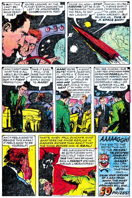
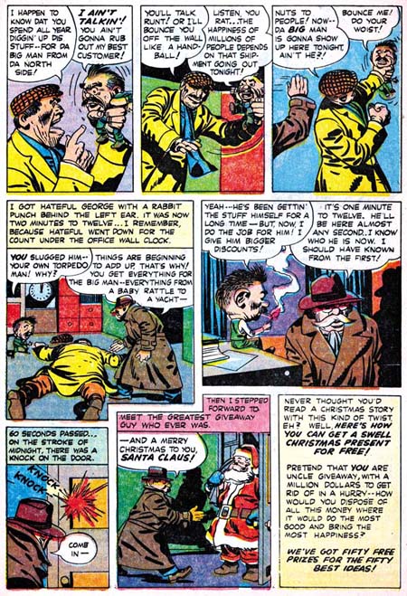
“That Giveaway Guy” by Jack Kirby (humor)
“Telltale Heart” (horror, adaptation of story by Edgar Allan Poe)
“War Diary” (war)

WP #1 That Giveaway Guy
Win A Prize #1, “That Giveaway Guy” by Jack Kirby

Win A Prize #2
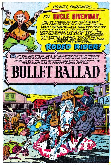
“Bullet Ballad” by Bill Draut (western)
“Sir Cashby Of Moneyvault” by Jack Kirby (humor)
“Torpedoed” (war)
“The Handsome Brute” by Joe Albistur (science fiction)
“The Bull” (sports)

WP #2 Bullet Ballad
Win A Prize #2, Uncle Giveaway by Jack Kirby and “Bullet Ballad” by Bill Draut

They are all relative short stories, the longest is 7 pages. We have seen Bill Draut before, but also included is Joe Albistur. Joe was a relatively recent artist to work for S&K, he first appeared in Police Trap #1 (September 1954). He also did a number of romance stories taking up some of the slack left by Kirby then absent from the Prize romances. All the Win A Prize stories are really nice and I promise to highlight some of them in the future. Although I rather like Win A Prize, it did not last long, ending with issue #2 in April 1955, the same month that Mainline ended. The “hook” really wasn’t the contents, it was the prizes. With all the logistical problems these prizes brought I am sure Charlton wanted to see really good sales really quick. When they failed to materialize, the title was cancelled.

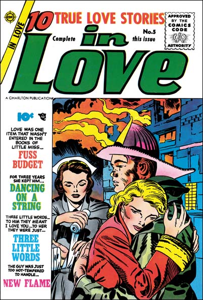
In Love #5
In Love #5 (May 1955) by Jack Kirby

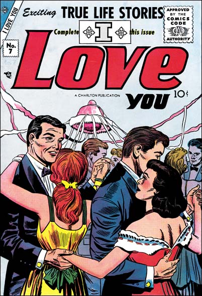
In May 1955, one month after the last Mainline comics, In Love #5 would be published by Charlton. Charlton would soon print the rest of the former Mainline titles; Bullseye, Police Trap and Foxhole. But these former Mainline comics would only last a couple of issue each, the last (Police Trap #6) is dated September. But their termination may not have just been due to poor sales. I think the these Charlton issues were made using material already completed or in progress when Mainline abruptly ended. It would be better for S&K that they get low payment for this artwork from Charlton, then get nothing at all. In September Charlton would change the title of “In Love” to “I Love You”. I Love You #7 has a (rather weak) Kirby cover but the contents do not look like they were produced by Simon and Kirby. I think Charlton was just reusing the volume number, a not uncommon technique to save postal registration fees. Charlton probably assembled the contents and Simon and Kirby only supplied the cover. I Love You turned out to have a run of 115 issues for Charlton ending in December 1976.

I Love You #7
I Love You #7 (July 1955) by Jack Kirby

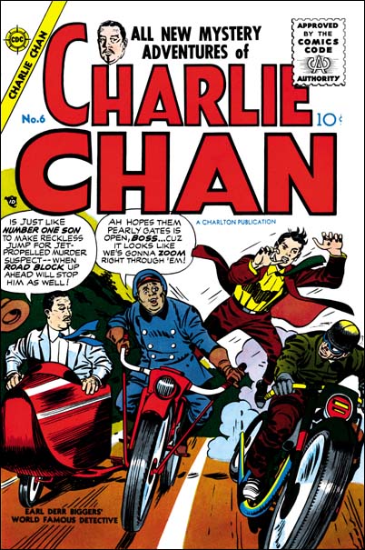
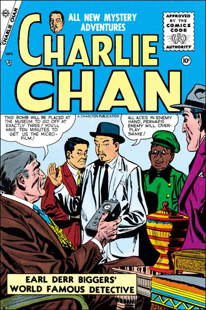
At the same time as Charlton was publishing the remnants of the Mainline comics, they also started to publish Charlie Chan. This was a title that Simon and Kirby originally produced for Prize. Under Prize Charlie Chan lasted 5 issues with the last one dated February 1949. In the original series Jack Kirby penciled all the covers but did not do any of the contents. In the first Charlton issue we again find Jack providing the cover but none of the contents. But I don’t believe that this cover is just unused material from the Prize run. First the inking style is more like the late shop style then what was used during the Prize version of Charlie Chan. Second, originally the Charlie Chan covers were static with the “number one son” getting ready to spring into action. On the Charlton cover the son is in the middle of jumping from one motorcycle to another. This sort of emphasis on action is more in tune with later Simon and Kirby covers. And lastly #6 cover includes Burmingham Brown. This stereotype sidekick did not appear on the Prize covers or contents but would appear on the cover to Charlie Chan #7 and #9. Although Kirby did not do any other pencils for the Charlton Charlie Chan, Simon and Kirby did produce those comics. Issue #7 has the stamp that announces “another Simon and Kirby smash hit” that was used on the late Mainline titles. Joe Simon still has color proofs to all the Charlton covers. Charlie Chan is unique for Simon and Kirby’s work with Charlton in that it lasted a full 4 issues ending in March 1956. Regardless of whether they started with unused Prize artwork, clearly S&K also produced some new material for Charlton.

Charlie Chan #6
Charlie Chan #6 (June 1955) by Jack Kirby

Charlie Chan #9
Charlie Chan #9 (December 1955) by unknown artist

Chapter 2, Problems in the Industry

Chapter 4, A Friend Provides a Helping Hand

John Prentice, usual suspect #3

John Prentice was the last of the usual suspects (artists that worked frequently for the S&K studio for an extended period of time). John served in the Navy during the war, in fact he was at Pearl Harbor when the Japanese attached. Afterwards he went to the Art Institute of Pittsburgh for a short time. John arrived in New York in 1947 and the GCD shows him doing work for in Airboy Comics and Gang Buster. The first work he did for the Simon & Kirby studio was Young Love #4 (August 1949). Once John started with S&K he was a frequent artist for their productions. The work he initially did for S&K was pretty good, but John progressed fairly rapidly while until he achieved his mature style which really was exceptional.

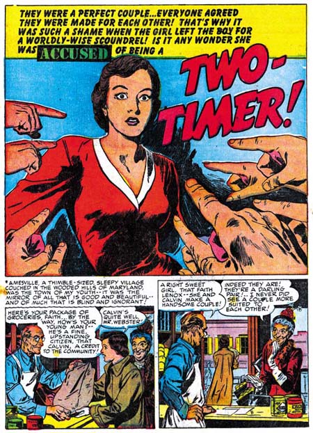
YL #4 Two Timer
Young Love #4 (August 1949).

Joe and Jack must have thought highly of John’s work because he was an important contributor to Bullseye #1. The Bullseye origin story was divided into three chapters (“The Boy”, “The Youth” and “The Man”). Jack did all of the first chapter and the splash pages for both of the other chapters, but Prentice penciled all the rest of the story for the last two chapters. Bullseye was part of the Mainline comics, Simon and Kirby’s attempt at self publishing. But while doing Mainline S&K continued producing comics for Prize (Black Magic and the romance titles) during that time. Presumably because of his work load, Jack stopped penciling for these Prize productions. Prentice seems to have taken up some of the work for the absent Kirby because his page output jumps from an average of about 12 pages a month to about 26 during the period from March to October, the last month for Mainline comics.

B #1 The Youth
Bullseye #1, “Bullseye, The Youth” (August 1954).

Like Bill Draut and Mort Meskin, John seemed to worked in all of the genre from the S&K shop. Romance genre were the most frequent stories produced by the studio and Prentice’s style was well suited for them. John was probably the most realistic artist to work for S&K. His men tend to have small eyes and long faces. John’s women are attractive, but are not what I would call glamorous, perhaps sophisticated would be a better description. For some reason Prentice never signed any of his work for Simon and Kirby. Attribution of this work to John is based on work done for the Rip Kirby strip (see below).

YL #45 I Like It Here
Young Love #45, “I Like It Here” (May 1953).

Simon and Kirby’s timing in starting their own comic publishing company, Mainline, was unfortunate because that was the period when anti-comic sediment swept the country fueled by Dr. Wertham and a Senate Investigation Committee. Many publishers felt the effects, but it was probably worst for new companies like Mainline. Mainline’s last comics were dated April 1955. John Prentice’s last work for S&K’s Prize publications was Young Love #69 February 1956. However Joe Simon did some editorial work for Harvey during this difficult period, and Prentice work there on romances until February 1957 (Hi-School Romance #60). If the GCD can be trusted, John returned to work for DC, mostly on their version of the horror genre.

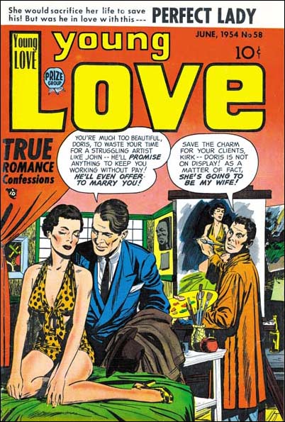
Young Love #58
Young Love #58 (June 1954).

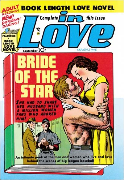
I would like to repeat a cover that I posted earlier, In Love #1. This is one of the few covers that Kirby shared pencil duties with an artist other then Simon. The foreground couple are clearly Jack’s, but the background men were done by John Prentice. Ignoring covers with unrelated inserts, there was only one other cover that Jack shared with another penciler other then Joe during the S&K years. If you don’t know which cover I am talking about, don’t worry I’ll post it shortly.

In Love #1
In Love #1 (September 1954)

On September 6, 1956 Alex Raymond, the artist for the syndication strip Rip Kirby, died. Two months later Prentice took over this popular newspaper comic strip. John would do Rip Kirby until he in turned passed away in 1985. I’ve always heard how much work was involved in producing a comic strip for syndication. But the GCD continues to list comic book work by Prentice from 1957 on into the early 70’s.


Rip Kirby (5/6/58).

Well now I’ve managed to give a brief review on each of the usual suspects. But work by Draut, Meskin and Prentice is so common in S&K productions I am sure to be blogging on them from time to time. Although the usual suspects did a lot of work for the studio, there were other artists who would work for Joe and Jack for shorter periods of time. Many of these artists were quite talented, some later on would achieve fame. I’ll post on some of the other artists some other time.