Category Archives: 2007/05

Harvey Horror: Black Cat Mystic #60

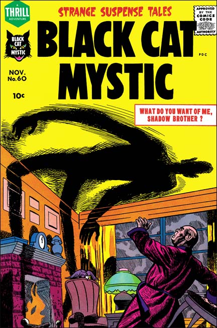
Black Cat Mystic #60 (November 1957) was another all Kirby issue. Previously that was quite unusual but with the launch of Challengers of the Unknown (Showcase #6, February 1957) all Kirby comics became more common. In my opinion BCM #60 was not quite as good as BCM #59 or Alarming Tales #1 it is still a rather nice read.


Black Cat Mystic #60 (November 1957), pencils by Joe Simon

Some people still attribute this cover to Jack Kirby but that position is hard to understand. Kirby was the master of comic book perspective. One look at the gentleman’s raised hand should convince anyone that this was not drawn by Kirby. It was Joe Simon that actually drew this cover. Joe was quite good at adopting styles used by other artists, particularly Kirby’s.


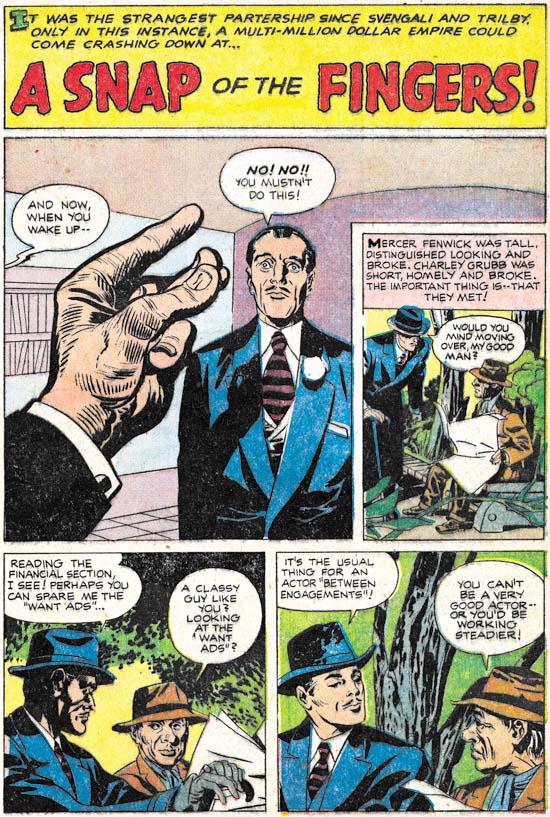
Black Cat Mystic #60 (November 1957) “A Snap Of The Fingers”, pencils and inks by Jack Kirby

Success requires a good appearance and exceptional talent, at least according to “A Snap Of The Fingers”. Two down and out individuals lack one or the other quality so they join forces. Of course this tale belongs to the horror genre so this story does not end with happy ever after. I have to say that I suspect that the story has been modified to get past the Comic Code. In the story an accident occurs that I believe originally was planned murder. The change would not affect the art work only some of the text.


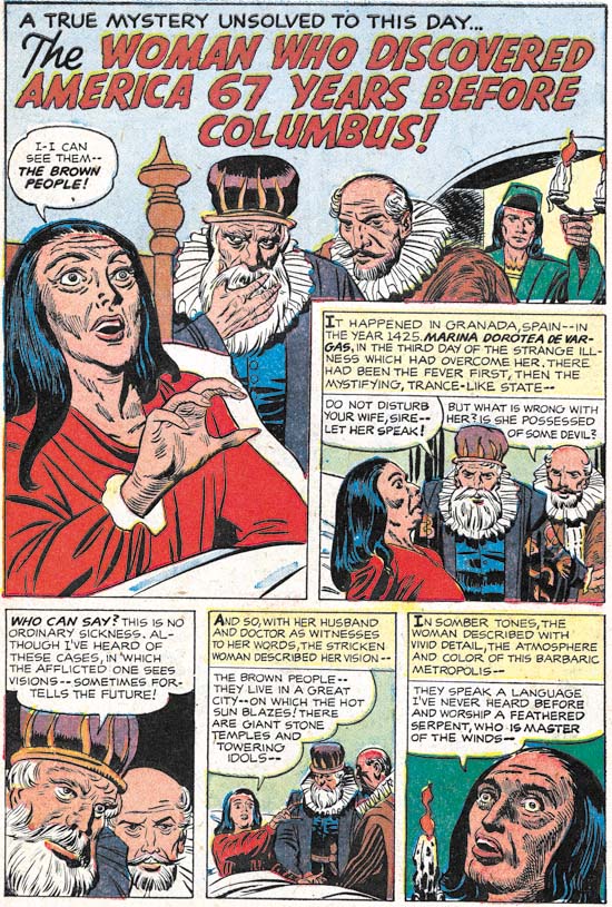
Black Cat Mystic #60 (November 1957) “The Woman Who Discovered America”, pencils by Jack Kirby, inks by Joe Simon

At one time I thought this piece had been drawn by Joe Simon but I later realized it was Simon’s inking that gave the appearance that he had penciled it as well. This is a short piece (two pages) that is about a supposedly true prophecy of the discoverer of the new world. I wonder what Simon and Kirby’s source was for this tale. I had thought it might have been “Stranger Than Science” by Frank Edwards. I remember reading Edwards’ book when I was young and it was full of such stories. However “Stranger Than Science” was first published in 1959 and so is too late to be the source.


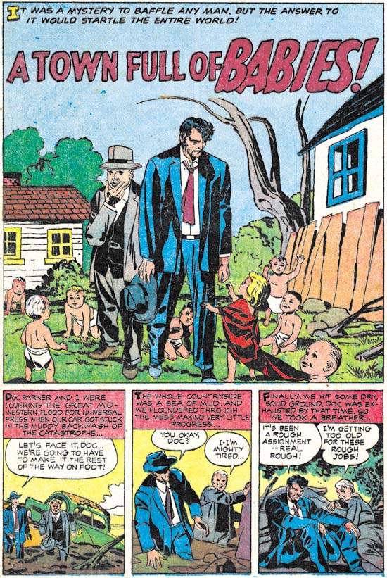
Black Cat Mystic #60 (November 1957) “A Town Full Of Babies”, pencils and inks by Jack Kirby

This story was inked by Kirby himself except for the last page. I am not sure who did that page but it was not Joe Simon. The theme of getting a chance to relive one’s life was used once before by Simon and Kirby. I have to say that somehow this would seem more like a death sentence unless somehow they retained their original memories. But even that might not be such a great gift. Would anyone really want to relive their childhood while retaining the memories of an adult?


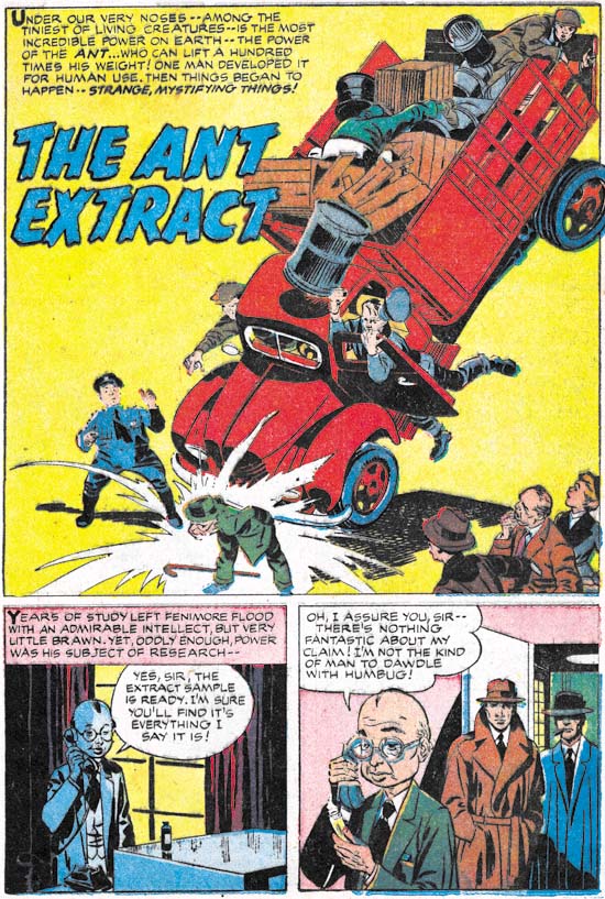
Black Cat Mystic #60 (November 1957) “The Ant Extract”, pencils and inks by Jack Kirby

A diminutive scientist creates a solution that endows the drinker with amazing strength. What is particularly surprising about this discovery is that the scientists announces it before he has even tested it. Simon and Kirby had a rather peculiar idea about what a scientist was and how he would go about his work. But while it was not an accurate portrayal it did make for an interesting story. What would society do with his new scientific breakthrough? It is a humorous story but I will not reveal anything more. You will just have to wait for Titan to release the next volume from the Simon and Kirby Library.


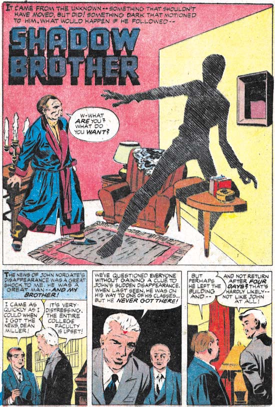
Black Cat Mystic #60 (November 1957) “Shadow Brother”, pencils and inks by Jack Kirby

Another story featuring scientists, in this case a professor type and a boy genius. The story contains some rather bizarre physics but hey, its just a comic. Unfortunately “Shadow Brother” is marred by rather poor printing. Harvey’s comics from the late 50’s had particularly bad printing that affects some stories more than others.


Black Cat Mystic #60 (November 1957) “Shadow Brother”page3 panel 4, pencils and inks by Jack Kirby

Comic books sometimes provide glimpses into the past. Panel 4 from page 3 shows a night watchman at a college. But why does the night watchman carry a purse? Well it is not a purse but a guard tour clock. Night watchmen were expected to petrol premises throughout the night when no one was expected to be around. But since no one was around how could an employer be sure the guard was actually conducting patrols and not sleeping on some couch? This clocking device was the solution to this problem. Special keys would be chained to the wall at various locations usually stored in a small container also mounted the wall. When the night watchman made his rounds he would insert these keys into his guard tour clock which would report what key was used and the time of its use. A record was therefore made that the employer could then examine later to verify that the watchman was performing his duty. Video cameras are so prevalent today that I would have thought that guard tour clocks would have become obsolete but a quick Google shows they are still being sold.

Dave Sim reviews Steve Ditko

In Chapter 8, More Harvey of Jack Kirby’s Austere Inking I briefly examined “This World Is Ours” from Alarming Tales #3. Some have suggested Steve Ditko as the inker but when I wrote that chapter I had not seen any Ditko inking from that period. Well Dave Sim reviews some Ditko comics from this period and links to images are included. If this material is any indication it looks like Ditko was inking mainly with a pen and it does not look like what is done in “This World Is Ours”. So as far as I am concerned this story was inked solely by Jack Kirby.

Kirby Imitating John Prentice Again

I got more of a response from my query about whether to continue posting on Kirby’s “ghosting” then I expected. Let me be frank, these are probably the poorest examples of Kirby art that you are likely to find. Because Kirby was imitating another artist he would give up much of what we admire about his artistry. At the same time Jack just was not very successful at adopting the other artist’s style. The shortness of the pieces and their marginal nature does not help much either. Although they are not great works of art, I still find them fascinating. It is interesting to see what Jack would keep, what he would let go, and what he would try to adapt.

Anyway my game plan is to do a couple posts each of Kirby imitating two other artists. Also an example which I believe is Joe Simon doing the ghosting. Then perhaps a more casual examination of some other content pages.

True Bride-To-Be #20
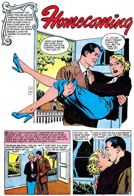
True Bride-To-Be #20 (October 1956) “Homecoming” page 1, pencils and inks by John Prentice

Newlyweds start their life in a small town. Originally the wife as a city girl and she finds life in a small town difficult. She struggles as best she can but the feeling of isolation takes its toll. Just as she decides to return to her family in the city things make a turn for the better. People, including her husband, begin to realize how difficult it has been for her and start to provide support.

A very different splash by John Prentice then the last one I reviewed (First Love #70). But still a real nice design and a great segue into the story. Once again Prentice leaves out a normal panel boarder. But this time he also leaves out some of the background as well, in particular the walls. Not all of it is eliminated, we can still see a view of the outside through the open door. Not much there, just a picket fence, a small house and some trees. (And this time picket fence does not refer to an inking technique). Just this simple view is all what we need to place the story in some small town. The man carrying the woman over the threshold is pretty much completes the visual introduction.

True Bride-To-Be #20
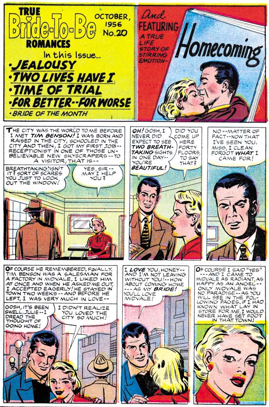
True Bride-To-Be #20 (October 1956) Contents page, pencils by Jack Kirby and Joe Simon

This content pages follows the most common pattern, a splash panel (in this case not much bigger then the rest of the panels) and a short introduction for the feature story.

The splash panel is a close copy of from the third panel of the first page. Well in this case close means without much change in the posture. That hardly means that it is a good enough copy to really look like a Prentice. Still the woman is closer to John’s version then found in the introduction story. The splash does not provide much to go on but it does not look like Kirby’s work. The inking does not look like Jack’s either but it could be by Joe Simon. Because of that and in view of previous examples of contents, I am going to attribute the splash to Joe.

The introduction is once more a prelude to the feature story. Showing how the couple met and fell in love. Yeah it really is superfluous but at least it does not spoil the story much.

Ignore superficial traits such as eyebrows we can see some typical Kirby poses and layouts. Also some typical Kirby rendition of architecture. Jack even uses a similar architectural drawing style for penciling the interiors. I feel confident that this is Kirby “ghosting” for Prentice. But it is another not so good imitation. This time Jack does the best job on the man’s eyes. Eyebrows are not so well copied but at least they are closer to art by Prentice then they are to that by Bill Draut. The woman still has Jack’s preference for a triangular face with widely separated eyes. Not at all the longer, more oval face and closer eyes that Prentice preferred.

Jack Kirby’s Austere Inking, Chapter 8, More Harvey

In Chapter 5 I limited discussion about Harvey work by Kirby to those with cover dates in 1956. Among those works was art for Black Cat Mystic #58 (September 1956). That title had some stories that were inked by Jack. Some were done in standard Studio style while others in the newer Austere style. The combination suggested that the work may have begun slightly earlier then the cover date suggested but basically agreeing with other work Jack inked in 1956.

In the next two chapters I discussed freelance work that Jack did for Atlas and DC. Work begun for Atlas in December 1956 and for DC in February 1957. The standard Studio style does not appear at all for that body of work. There is some Fine Studio Style used for some of the early Atlas work but otherwise everything is done in the Austere style. The main variation is how much use, if any, of spotting with a pen. I have not yet discussed Kirby’s inking for the Prize romance comics of this same period but it also was done with Austere inking.
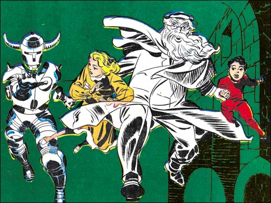
Black Cat Mystic #59
Black Cat Mystic #59 (September 1957) “Take Off Mr. Zimmer”, page 1 splash pencils and inks by Jack Kirby

Considering the type of inking Jack used in 1957 for Atlas, DC and Prize we would expect to find in Black Cat Mystic #59 (with cover date September 1957) the same Austere inking. Instead we find typical Studio inking very much like what we saw in BCM #58 from a year ago. In the splash panel for “Take Off Mr. Zimmer” shown above we can see some use of a standard picket fence. Also look how strong the form lines on Mr. Zimmer’s left billowing overcoat. Such bold lines would have been quite at home just a couple of years previously but are not found in any of the DC or Atlas work. There are some shadows in the background on our lower right whose brushwork does not reflect any stonework. Under Austere inking these would almost certainly been flooded with black ink.

So why did Kirby revert to his older inking style? The answer, in my opinion, is that actually he did not. I am sure this art was made some time in 1956 probably roughly the same time as that for BCM #58. The inking for BCM #59 matches well with what Jack did in BCM #58. The year between these two issues probably had not been part of the plan, at least as far as Simon and Kirby were concerned. Not long after they finished the art for BCM #58 they started working on BCM #59. But for whatever reason Harvey decided to delay publication for BCM #59 for a year.
Black Cat Mystic #59
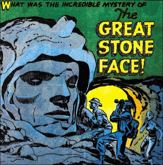
Black Cat Mystic #59 (September 1957) “The Great Stone Face”, page 1 splash, pencils and inks by Jack Kirby

I just wanted to provide another example from Black Cat Mystic #59. We can see from the splash to “The Great Stone Face” that once again it looks like typical S&K Studio inking. The shadows on the stone face are created by bold brush lines close enough to each other to leave only a small strip of “white” in between. This type of dark shadows would not be expected in the Austere where it would most likely been done by flooding the area with ink. The face’s left cheek is not inked quite so densely but still consists of robust brush strokes. Austere inking might have similar lines but I suspect they would be more finely done.
Alarming Tales #1
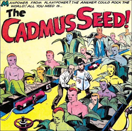
Alarming Tales #1 (September 1957) “The Cadmus Seed”, page 1 splash, pencils and inks by Jack Kirby

Surprisingly after a year’s publication delay when BCM #59 was finally released it is joined by a new title, Alarming Tales. Alarming Tales maybe a new comic but it has the same type of stories as BCM, excluding Mr. Zimmer. In fact the cover story, “Donnegan’s Daffy Chair”, was originally slated for BCM #59. At first Harvey did not seem all that interested in the horror genre, why else would he wait a year to publish BCM #59? Then suddenly Harvey wants to publish two horror titles at the same time and on the same bimonthly schedule. It just does not make sense.

Although I cannot explain Harvey’s motivation, it did result in a really great comic. As far as I am concerned Alarming Tales #1 is among the best of the comics that Kirby help create during this period, surpassed only by Yellow Claw #2 and #3. Other then the cover the entire comic was drawn by Jack. Kirby also did all his own inking except for one two page story. The stories themselves are quirky and just pure Kirby.

But back to Jack’s inking. A look at the splash for “The Cadmus Seed” might convince us that Kirby was doing Austere inking. No sign of the use of picket fence and an overall lightness. Where there are black areas they are flooded with ink without brushwork.
Alarming Tales #1
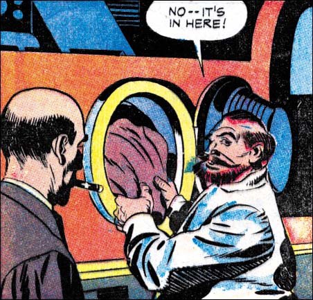
Alarming Tales #1 (September 1957) “The Cadmus Seed”, page 1 panel 3, pencils and inks by Jack Kirby

However with panel 3, on the same page as the splash, we find typical picket fence inking. The pickets are done with a brush, not with a pen. So like BCM #59 we seem to have a story inked in a manner resembling what Jack was doing in 1956. That is a combination of work with Studio and Austere inking.
Alarming Tales #1
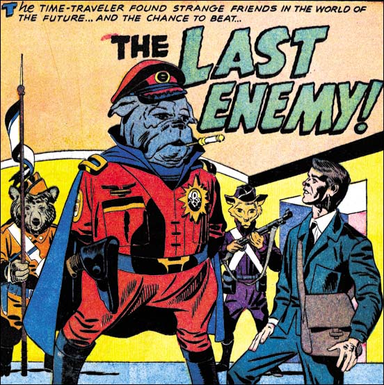
Alarming Tales #1 (September 1957) “The Last Enemy”, page 1 splash, pencils and inks by Jack Kirby

I want to provide another example of inking that looks like it is transitioning from S&K Studio to Austere style. For “The Last Enemy” splash we once again find some nice, typical picket fence brushing. We also find some areas flooded with ink very much like Austere. The cloth folds also are simpler shapes and used a little more sparing as in Austere. The image overall has the lightness found in typical Austere inking. So as we saw in “The Cadmus Seed” this story seems to fit better with the inking Jack did in 1956 then it does with what he was doing in 1957 for Prize, Atlas or DC.

How cool can you get. “The Last Enemy” is so obviously a prototype for Kamandi. Of course Kirby made changes when he revisited this theme so many years later. Jack would recycle other Simon and Kirby creations as well. For instance Bill Draut’s the Red Demon was the seed for Kirby’s Demon. You cannot call this copying because as part of the S&K team Jack was involved in the original creation. It is an interesting aspect of Kirby’s working method nonetheless.
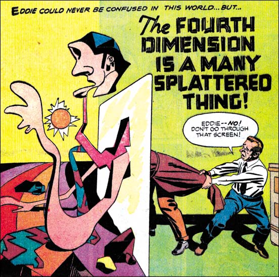
Alarming Tales #1
Alarming Tales #1 (September 1957) “The Fourth Dimension Is A Many Splattered Thing”, page 1 splash, pencils and inks by Jack Kirby

This story from the same AT #1 issue looks like full blown Austere inking. No picket fences or other S&K Studio techniques. Simple cloth folds and an overall light image. It maybe wise not to make too much of this because the story is such an oddity in Kirby’s oeuvre. Most of it takes place in another dimension where everything consists of simple but ever changing shapes, even the hero. Still what is there looks like typical Austere inking.
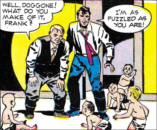
Black Cat Mystic #60
Black Cat Mystic #60 (November 1957) “A Town Full Of Babies”, page 3 panel 2 pencils and inks by Jack Kirby

With the next issue of BCM Jack is recognizably working in the Austere manner. Above I provide an image of a typical panel. Simple cloth folds, some of the just oblong ovals, a shape I describe as spatulate. Simplified negative folds on some of the lower legs, but still having the Kirby feel to them. Light overall image with blacks done by flooding ink. Even an abstract arch shadow makes an appearance. Although there was similar Kirby inking in 1956, it would also fit quite nicely with what he was doing in 1957 as well.
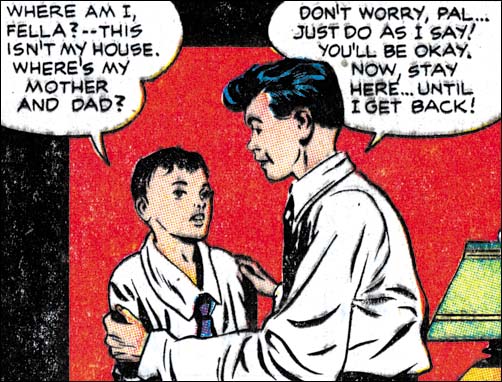
Black Cat Mystic #60
Black Cat Mystic #60 (November 1957) “A Town Full Of Babies”, page 5 panel 2, pencils by Jack Kirby, unidentified inker

Not all the inking was done by Kirby. Look at the panel from another page of the same “A Town Full of Babies” story. Some of it looks like Kirby’s Austere inking. Overall lightness and flooding blacks. However also examine the cloth folds. They are all long, narrow and rather pointy. Even the line inking makes the faces not quite look like the ones Kirby did. I cannot say who the inker is but he is not Jack.
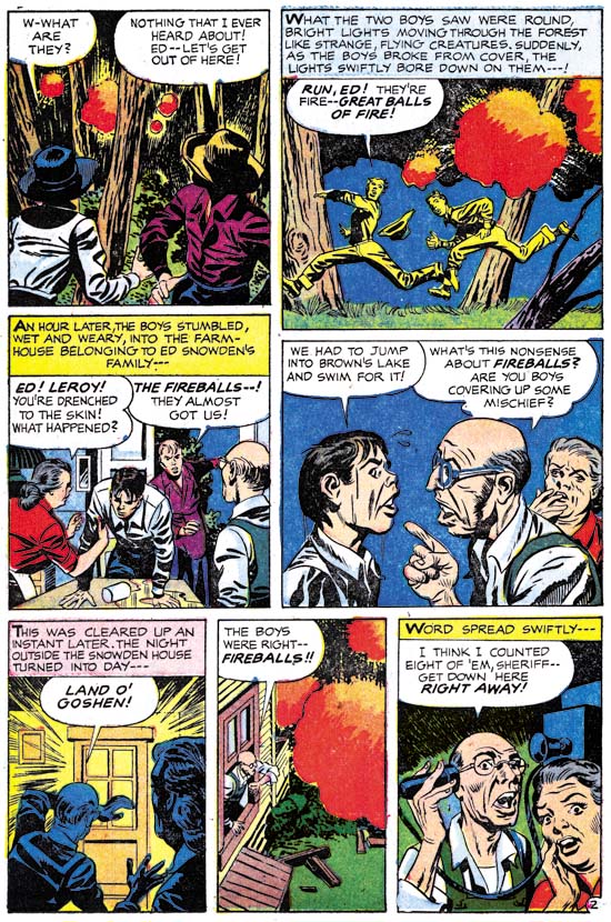
Alarming Tales #2
Alarming Tales #2 (November 1957) “The Fireballs”, splash, pencils and inks by Jack Kirby

Alarming Tales #2 came out in the same month as BCM #60. In it we find some things we did not see in BLM #60. Case in point is panel 4 from page 2. There we find picket fence spotting. But not just any picket fence, this was done with pen. The same sort of technique Jack used for some Atlas work he did at the end of 1956 and the beginning of 1957.
Alarming Tales #3
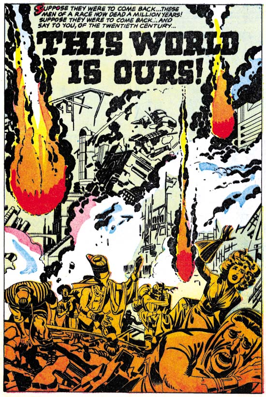
Alarming Tales #3 (January 1958) “This World Is Ours”, page 1 splash, pencils and inks? by Jack Kirby

Not long ago it was recently pointed out to me that a page from “This World Is Ours” was up for sale on eBay. In the listing the seller suggested that it was inked by Steve Ditko. In all fairness the seller later added that he had received some email indicating that some disagreed with that attribution. I wonder if some people have suggested Ditko inking based on the man in the lower right corner of the splash page. I think he has a Ditko look to him. Unfortunately I really have no idea what type of inking Ditko was doing at this time. I certainly would not want to base my attribution on that one face.
Alarming Tales #3
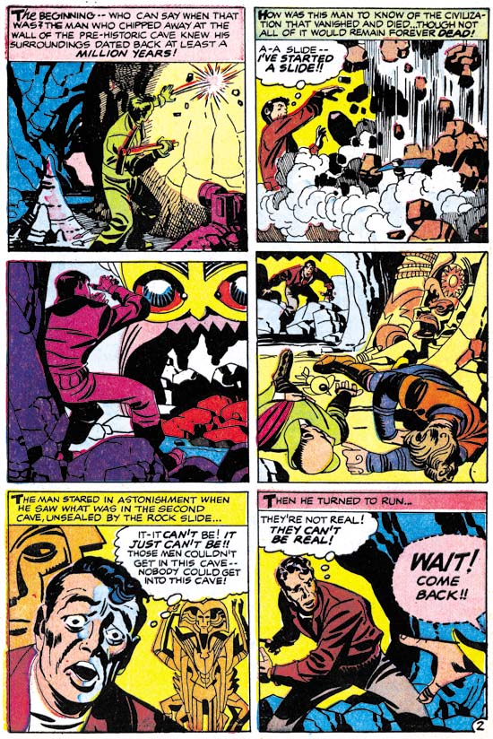
Alarming Tales #3 (January 1958) “This World Is Ours”, page 2, pencils and inks by Jack Kirby

Perhaps because the splash image is so filled with the fireballs, I find nothing else on it that provides me with any good clues for the attribution. Besides which I always like to look at the inking for the entire story. The second page has a very familiar look, it is Jack Kirby doing his Austere inking. We find simple, often spatulate, cloth folds, negative cloth folds, flooded blacks and even a shoulder blot. I have not yet reviewed Jacks late work for the Prize romances, but we will see the rather abstracted upper eyelids of panel 5 again there. The presence of pen spotting should not come as a surprise because we have seen it often before in the Austere inking for Atlas and DC. With this in mind and returning to the splash I find nothing in the brush work that I have not seen Kirby do previously. I will not discount the possibility of other inking hands at work on this story, but clearly Jack’s played an important part in the inking.
Alarming Tales #4
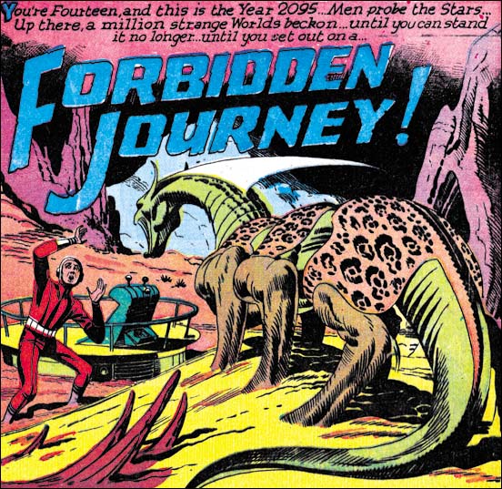
Alarming Tales #4 (March 1958) “Forbidden Journey”, page 1 splash, pencils by Jack Kirby, unidentified inker

For each issue of Alarming Tales there are less and less art penciled by Jack. Moreover there seems to be increase in the inking of Kirby’s work by other artists. For Alarming Tales #4 Jack only drew “Forbidden Journey”, but what about the inking? Let us start with the splash panel. One thing that stands out is there are some picket fence spotting on the rock formation on the right. It is done with a brush and looks pretty good although the pickets are bowed ever so slightly something I have not seen Kirby do. Let us next examine the form lines on the monster’s legs. You can find Kirby doing something like this on occasion. But again something looks a little off to me. The lines are pretty uniform in thickness along their length. Jack’s form lines tend to widen and then perhaps thin out again. But Jack is not an automaton and these small differences could just be explained as normal artistic variations. So perhaps it is best to reserve judgment until we look at some other pages.
Alarming Tales #4
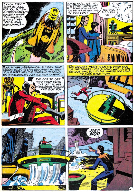
Alarming Tales #4 (March 1958) “Forbidden Journey”, page 2, pencils by Jack Kirby, unidentified inker

On page 2 we find what looks like Austere inking with some pen spotting. In the second panel we even find a shoulder blot. Normally I would consider that good evidence of Jack’s inking.
Alarming Tales #4
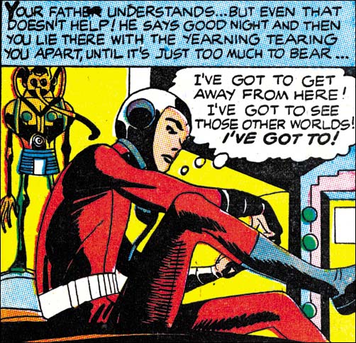
Alarming Tales #4 (March 1958) “Forbidden Journey”, page 2 panel 3, pencils by Jack Kirby, unidentified inker

What bothers me most is the spotting of panel 3 of the same page. Unfortunately the full page image does not make it clear so I provide a closer view. There looks like there is picket fence on the youngster’s leg. But look more carefully and you will find some other sort of pattern entirely. I have never seen Kirby do anything like this and I do think he did it here. I am convinced what we have is another inker whose is a good artist but initially was not quite sure how to ink Jack’s work. So he has examined S&K art with Studio inking and picked up some ideas. Of course there is no attempt to really mimic Jack’s inking because no art credits are given anyway. So although some of the brush techniques are modeled from Jack, the inker works with in his own particular fashion. Also some of the inker’s own techniques show up as well as in the odd (for Jack) spotting on the boy’s leg. Still whoever the inker is he did a real nice job.

Black Cat Mystic and Alarming Tales went on for some more issues but without any work from Kirby. That was not the end of Jack working for Harvey comics. He would return in September and November for Race To The Moon #2 and #3. None of that was inked by Jack, instead Al Williamson would do the honors (as well as penciling some of his own stories). Al Williamson is a great artist in his own right with a style somewhat different from Kirby’s. But you can tell Al had a lot of respect for Jack’s work and the inking job he did is just suburb.

Jack Kirby’s Austere Inking, Chapter 1, Introduction
Jack Kirby’s Austere Inking, Chapter 2, Mainline
Jack Kirby’s Austere Inking, Chapter 3, A Lot of Romance
Jack Kirby’s Austere Inking, Chapter 4, Prize Covers
Jack Kirby’s Austere Inking, Chapter 5, Harvey
Jack Kirby’s Austere Inking, Chapter 6, Atlas
Jack Kirby’s Austere Inking, Chapter 7, DC

Jack Kirby’s Austere Inking, Chapter 9, More Prize
Jack Kirby’s Austere Inking, A Checklist and a Glossary

other post with Kirby inking Kirby:

Strange Tale Indeed
Battleground, Jack Kirby’s Return to Atlas
Captain 3D
Continue With Kirby Imitating Other Artists?

The preview stories from the content pages of some Harvey romances had puzzled me for some time. Not that I gave them a lot of thought but they just looked funny to me. When eventually I did take a good look at First Love #69 and realized that it was Kirby imitating Draut things finally started to make sense. I have already posted on three of them but there are more. I did a quick look at some others and I believe there maybe six more Kirby “ghosting” other artists. It does get a bit complicated because there are some other content previews that look like it is Joe Simon doing the imitations. Also some that from a brief viewing are a little hard to be sure.

But just because I find these interesting does not mean that anyone else does. I fully admit that these are not great works of art. So what I would like to know is whether any of my readers think I should continue with these Kirby “ghosting”… posts?

Kirby Imitating John Prentice

First Love #70
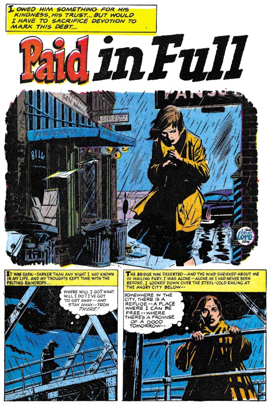
First Love #70 (November 1956) “Paid In Full” page 1, pencils and inks by John Prentice

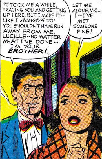
It is a dark and stormy night that we find our heroine. Alone and unsure as to what to do or where to go, she still is determine not return home. Looking out from a bridge (no mention of suicide but you got to wonder if that was the suggestion) a policeman confronts her. Rather then taking her in (as a vagrant?) he takes her to a boarding house run by an elderly lady. With the help of the cop and the landlady, our heroine begins a new life. A romance begins with the policeman. The lady is unsure about revealing her past to her love. However the cop has such high standards that she decides to keep it a secret. What this secret actual consists of is finally revealed when her brother suddenly appears. The brother is a criminal and is on the lam from the law. It was the discovery of that fact that originally led our heroine to leave home. The lady finally reveals her past to the policeman, but not about the actual presence of her brother. He is outraged because she is not the good person he thought she was. He breaks off there relationship. Later he has second thoughts and goes to her home. The brother pulls a gun but the lady prevents its use. A fight ensues between the criminal and the cop, which of course the cop wins. Afterwards the cop expresses his regrets and asks forgiveness, which the lady gives.

As usual, Prentice did an outstanding job on the art for this story. Particularly nice is his handling of the start of the story. The woman is alone, at the mercy of her inhospitable environment. A good visual presentation of her inner turmoil and despair as describe by the writer. The splash panel starts it off just right by rejecting a normal panel border and instead providing an rough edge to the art. John had a more realistic approach then most comic book artists. As seen in this example, John did not depend on that naturalism alone. He had a good sense of design and story telling as well.

First Love #70
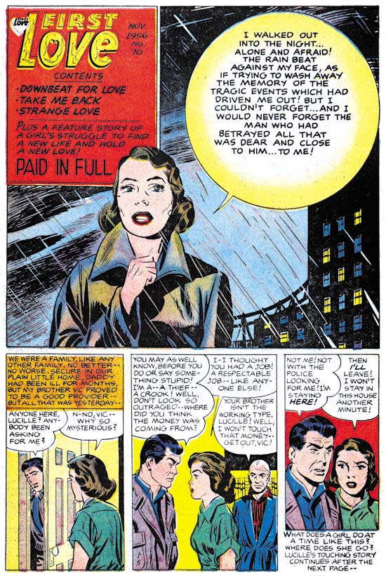
First Love #70 (November 1956) Content page, art by Jack Kirby and Joe Simon

The content page for FL #70 follows the same sort of pattern I posted about for FL #68 and FL #69. That is Jack Kirby providing a short story introduction to the comic’s feature story. As before Kirby is purposely imitating the feature artist. For FL #70 the introduction story is quite short, only three panels. Therefore there is less to go on for the correct attribution. Forearmed with previous examples of Kirby “ghosting” we know to ignore some superficial traits such as the eyebrows. So even with what little we have it looks like Jack was the actual penciler.

The Prentice imitation really does not come off that well. Actually the previous Draut imitations were not that close either. Draut’s very stylized eyebrows stand out in his art. Do a good imitation of the eyebrows and other inaccuracies get unnoticed. Prentice, on the other hand, did not have any single outstanding trait. All of his style’s traits must be mastered in order to make a good pseudo-Prentice. Jack succeeds most in the brother in panel 3, and to a lesser extend the father in panel 2. Kirby completely misses with the woman. This best seen in panel 3. Prentice’s females have a sophisticated beauty. This is due in part to the eyes being closer together and the face being longer and more oval. Jack’s version still has the more widely separated eyes and triangular face that he favors. Surprisingly all the eyebrows are closer to Bill Draut’s art then they are to Prentice’s manner.

Not all failure to provide a good imitation of Prentice can be laid on Jack. It seems to me that the inker has to take some of the “credit”. In FL #68 and #69 there was not enough of the inking for me to be certain who did it, although it clearly was not Draut. In FL #70 there is more then enough spotting to say that Jack did not do this inking. I am not certain, but some of it looks like Joe Simon’s work. Perhaps someday I should do an analysis of Simon’s spotting techniques. (I can see my readership dropping to even greater depths).

Before I leave the topic of the introductory story I would like to add a short comment on its use. Frankly in this case I think this was a really bad idea. A lot of the impact of the actual feature story rests on not providing the reason for the lady’s plight for most of the story. This effect is completely destroyed by the introduction which provides the explanation. This not only ruins the start of the story but makes story’s explanation repetitious.

First Love #70
First Love #70 (November 1956) “Paid In Full”, panel 3 of page 4, pencils and inks by John Prentice

The splash panel of the contents page was clearly not done by Jack. At a glance it would seem to have been done by John Prentice. Since previously we have seen Simon do close copies from the story art I went looking to see if that were true here as well. Sure enough the woman is from panel 3 of page 4. In this case the copy is so close that I really cannot see any distinctive Simon traits. There is a significant deviation in the exaggeration done in the lady’s eyebrows, but that cannot be considered characteristic of Simon. Because this sort of copying was previously Joe’s modus operandi for the First Love content page, I am going to attribute this swiping to him as well. Besides some of the inking looks like Joe’s.

Jack Kirby’s Austere Inking, Chapter 7, DC

Atlas may have started to use Kirby’s freelance work first but it was DC that published the majority of Jack’s art from this period. Part of the reason for this imbalance is due to Atlas undergoing the episode now call the Implosion. Although Atlas only stopped actual publication for a few months, a lot of what was used after the Implosion was left over inventory work. The Implosion may have biased Jack’s freelance work toward DC, I am sure the another reason was simply that DC paid better.

In any case there is a lot of work done between Jack starting at DC (February 1957) until when he left (June 1959). Potentially this chapter could have been the most significant one in this serial post about Kirby’s inking. Unfortunately I have very limited access to Jack’s DC work. Therefore I consider this chapter to be my most tentative. A more thorough analysis of Jack’s DC inking will have to wait but I fully intend to return to it someday.

Showcase #6
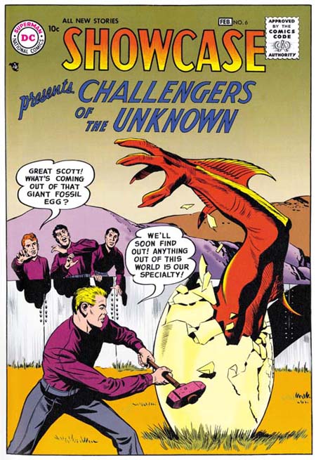
Showcase #6 (February 1957) from the Challengers of the Unknown Archives, pencils and inks by Jack Kirby

The Challengers of the Unknown was Jacks first freelance work to be published by DC. The Challengers were a Simon and Kirby creation but I have not detected any involvement of Joe in the production of the art. Jack did all of the inking of his pencils for the first two issues (Showcase #6 and #7). Considering the date, it is not surprising that we do not find any use of the Studio style. Besides Joe Simon has said that DC did not like the use of crosshatching, which they derogatorily referred to as hay. S&K Studio techniques such as the picket fence would have been seen by DC as particularly offensive. Perhaps DC’s attitude is why Jack abandoned the Fine Studio style that he used so successfully in the Yellow Claw. I may also explain the absence of pen work that Jack had been using for Atlas. So Jack used the Austere style when inking the Challengers. There are some holdovers from the earlier styles such as the abstract arch shadow that appears on the right side of the cover to issue #6.

Showcase #6
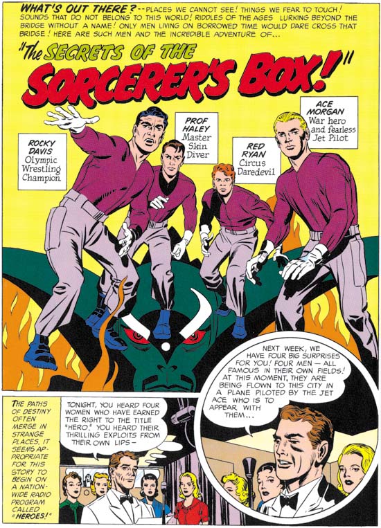
Showcase #6 (February 1957) “The Secrets Of The Sorcerer’s Box”, from the Challengers of the Unknown Archives, pencils and inks by Jack Kirby

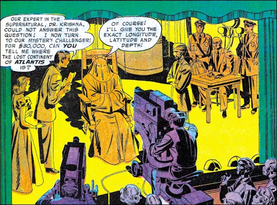
The first page of Showcase #6 probably gives an even better example of how Jack would ink the Challengers. No picket fences but there is the use of what could be called a modified drop string. Cloth folds are generally simple spatulate shapes. The image looks lighter with larger blacks done by flooding the area with ink. Also notice the shoulder blot in the circular panel. Kirby does nice inking for these stories but they seem to lack some of the spontaneity found in his Atlas and Prize work. It is possible that this is due to someone having “cleaned” up his inks. Since my observations are based on the DC Archive this might even have been done during restoration.

After the first two issues other inkers began to be used. I used to think that Jack may have been involved in inking some of the later covers. But on reviewing them again for this post I no longer think that is true.

House of Secrets #4
House of Secrets #4 (May 1957) “Master Of The Unknown”, pencils and inks by Jack Kirby

I am sure that for Kirby, and DC as well, the Challengers were probably Jack’s most important effort. It was not, however, the only material that he produced for DC. Jack also did a number of stories and some covers for DC’s horror comics. Perhaps because this work had a lower profile Kirby would do more of his own inking then he did for the Challengers. The inking style used was the same for both. The example of the splash panel from House of Secrets #4 is typical Austere inking.

I would like to draw attention to the casting of the chair’s shadow. During the Simon and Kirby collaboration, shadows often were presented in a very abstract manner. So abstract that I am not always sure what things like the shoulder blots or abstract arch shadows are supposed to represent. The shadow for the chair provides some its source’s distinct features such as its oddly shaped legs. It seems to me that in Jack’s DC work there is more of an effort to provide more “realistic” shadows.

Tales of the Unexpected #16
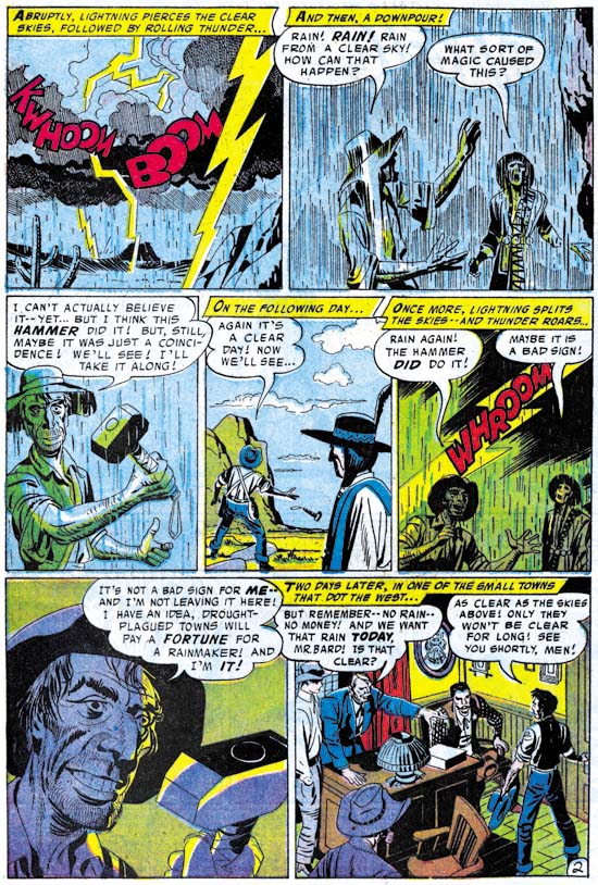
Tales of the Unexpected #16 (August 1957) “The Magic Hammer”, pencils and inks by Jack Kirby

Although we do not find pen work in the Challengers art, it does show up sometimes in what Jack did for DC’s horror genre. Often pen use is limited to special purposes, such as the depiction of rain and stormy weather. It is almost as if rain images provided Kirby with an excuse to use a pen, which he otherwise avoided when doing work for DC.

Tales of the Unexpected #17
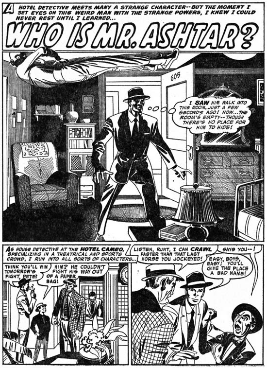
Tales of the Unexpected #17 (September 1957) “Who Is Mr. Ashtar?”, pencils and inks by Jack Kirby from Fantastic Tales #6 (reprint published by Thorpe and Porter, scan provided by Ger Apeldoorn)

The above splash is a case that received a lot of spotting using a pen. Is this an exception or was a pen used more frequently then I thought? Unfortunately my very limited examples of DC Kirby do not allow me to say. This example has more elaborate then pen use then what was done for Atlas. The frequent use of parallel pen lines, the spacing between lines, and some of the irregularities match what was done for Atlas. I suspect that the same hand did both. What I am less sure of is whether that hand was actually Kirby’s. The above example may look like complicated pen work but it is actually has a simple layout. Just the sort of thing that Jack could have directed an assistant to do. Provided that the assistant became comfortable with the use of a pen, they need not even had been an artist.

Tales of the Unexpected #22
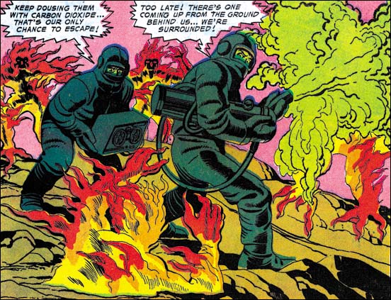
Tales of the Unexpected #22 (February 1958) “Invasion Of The Volcano Men”, pencils and inks by Jack Kirby

Most of this splash page from Tales of the Unexpected #22 is typical Austere inking. But look at the spotting along the centers of the arms and legs of the right figure. Spot lines of this general type often are not used to indicate shadows but just used to provide an volume to the art. Therefore I refer to these as form lines. In this splash these form lines are unusual in how densely that are used. Kirby is using this special treatment because the men are wearing special uniforms, almost like spacesuits. This is probably done to suggest a metallic nature to the suit’s surface. Years later Jack would devise a totally different way of handling the same thing. But this type of form lines was used frequently by Jack early in his career when he was doing science fiction stories (Early Jack Kirby Chapters 2, 3, 5, and 9.

House of Secrets #11
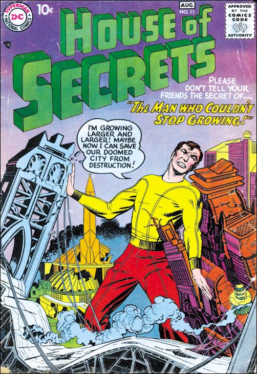
House of Secrets #11 (August 1958) pencils and inks by Jack Kirby

Kirby would also provide some covers for DC’s horror genre comics. These are inked in the Austere style very much the same brush techniques as the covers Jack did for the Challengers. Note the presence of drop strings which continue to be used but in a more reserved manner. There is some spotting using a pen but it is very unobtrusive. In this case the pen is limited to the dust cloud in the background.

Adventure #253
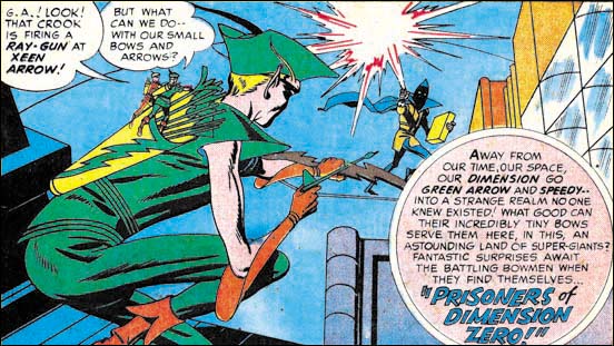
Adventure #253 (October 1958) “Prisoners Of Dimension 0”, pencils and inks by Jack Kirby

DC had a wide array of superheroes but Kirby would only get to work on one of them, the Green Arrow. The Green Arrow appeared in Adventures Comics where it was effectively a backup feature to Superboy. I do not know if I can say that the Green Arrow was DC least significant superhero, but it certainly was among the less popular ones. Was this reluctance to use Jack for standard superheroes because most of his recent work was outside the superhero genre or was it because they feared that Jack’s unique style might conflict with the previous image of these superheroes? In a way DC’s management was probably correct because the Green Arrow immediately showed the Kirby touch. Not just in the art either, the stories showed Jack’s influence as well. This may explain why Kirby only lasted seven issues. Jack had done something that was considered almost criminal by some at DC, he made the Green Arrow interesting.

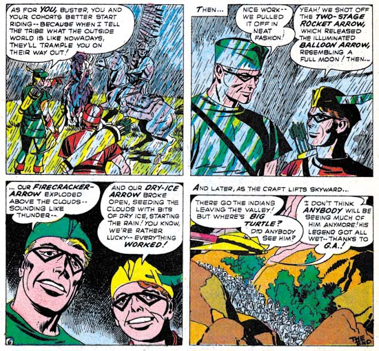
Jack did his own inking for all of his Green Arrow pencils. The inking was the same Austere brushwork that we have seen used else where at DC. Perhaps because the stories were on a regular schedule the inking seems a little bit more rushed then some of Kirby’s other DC work. In the introduction to the tradeback reprint, Mark Evanier says that Jack’s wife Roz helped with the inking. This was probably limited to filling in blacks or maybe even doing some outline inking with a pen.

Adventure #254
Adventure #254 (November 1958) “Green Arrow’s Last Stand”, pencils and inks by Jack Kirby

Spotting with a pen also limited in the Green Arrow art. But it does show up and once again is used for rain scenes. Could Roz have done some of this pen work under Jack’s direction? It is hard to tell from these stories but this is a topic that I will return to in this series.

Jack Kirby’s Austere Inking, Chapter 1, Introduction
Jack Kirby’s Austere Inking, Chapter 2, Mainline
Jack Kirby’s Austere Inking, Chapter 3, A Lot of Romance
Jack Kirby’s Austere Inking, Chapter 4, Prize Covers
Jack Kirby’s Austere Inking, Chapter 5, Harvey
Jack Kirby’s Austere Inking, Chapter 6, Atlas

Jack Kirby’s Austere Inking, Chapter 8, More Harvey
Jack Kirby’s Austere Inking, Chapter 9, More Prize
Jack Kirby’s Austere Inking, A Checklist and a Glossary

other post with Kirby inking Kirby:

Strange Tale Indeed
Battleground, Jack Kirby’s Return to Atlas
Captain 3D
True Love Problems and Advice #42 Cover

The Jack Kirby Blog has recently posted a scan of the cover to True Love Problems and Advice #42 (November 1956). I would like to think Bob was inspired by my recent serial post (Jack Kirby’s Austere Inking). A little over a week ago I did a chapter on Kirby’s Harvey work which included romance covers.

TLP #42 is certainly drawn by Kirby. Actually not one of his better efforts. I agree with Bob that the cop is the best part of the cover. This cover was not inked by Kirby. Judging by the spotting on the cop and his eyebrows I am certain this was inked by Bill Draut. Not one of his better inking jobs either. Again the best inking on the cover was done on the policeman.

Strange Tale Indeed, The Ending Revealed

I am always unsure how to handle how much to reveal in my Feature Story posts. I have received a request to provide the end of “Poker Face”. So I have decided to provide the ending as a comment to this post.

SPOILER ALERT: Do not click on comments if you do not want to know the ending for “Poker Face”.

Strange Tale Indeed

Strange Tales of the Unusual #7
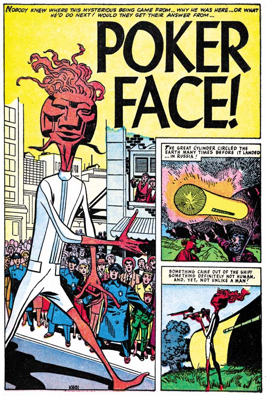
Strange Tales of the Unusual #7 (December 1956) “Poker Face” page 1 pencils by Jack Kirby

A giant alien arrives in an odd cylindrical spaceship. Without any attempt to hide, he makes visits all over the world. People’s responses vary, the Russians fire with all their available weapons, most citizens of Indian hide in the bushes but a few approach closely, New Yorkers gawk but quickly get bored and return home. But it seems that no matter how the people of earth react, the alien completely ignores them and just goes about his business. Only nobody can figure out what he is doing. He just seems to go everywhere with his weird gadgets. The answer to the riddle is provided at the end and of course it is an unexpected explanation.

When I was young I remember reading some DC comics, Superman, Batman, the Flash and so on. What I remember most about them was how boring they were. My DC phase did not last long and was never very intense. I then progressed to Marvel pre-hero fantasy, which was still filled with stories very much like “Poker Face”. I remember enjoying them very much for a while. Eventually I got tired of the formula. It may sound strange but I found the use of a surprise ending repetitious after a while. So I drifted out of comics. But later I somehow stumbled on an early Fantastic Four (probably FF #4) and I was hooked, a confirmed Marvel junkie.

This is another of those pre-Implosion Atlas where Kirby inked his own pencils. As described in Chapter 6 of “Jack Kirby’s Austere Inking” the spotting was a pared down version of the formerly used Studio style. Jettisoned from that older style were brush techniques like drop strings and picket fences. New to the inking was the use of a pen, often in parallel lines to provide grays.