I am rather busy and have little time for exploring the Internet, but there are some blogs that I try to periodically check out. Booksteve’s Library is one of them and there I recently found the post Rare Dick Briefer Non-Comics Art-1942. Booksteve inserts a You Tube video of Rumpelstiltskin as performed in the Playette Theatre. The Playette Theatre was the invention of Larry Wise and Dick Briefer. It is a little toy theater in which illustrations can be inserted. The illustrations were done by Briefer and they are just wonderful. They are narrated by Ben Wise (son of one creator and nephew of the other) and although it is not an Academy Award winning performance it makes for an enjoyable experience. Ben Wise has a You Tube page which includes five other Playette Theatre performances. It is so great that Ben Wise has saved these treasures and provided them as videos.
Category Archives: 2010/10
Jack Kirby’s Cityscapes
I recently came across a curious claim being made by a couple of authors. I do not have these writings in front of me but they went something like: Jack Kirby’s always drew his buildings like the tenements from the lower East Side where he grew up, while artist XYZ drew modern buildings. This is not an unreasonable statement since the work of artists often reflects their life experiences. But just because a statement is reasonable does not make it true.
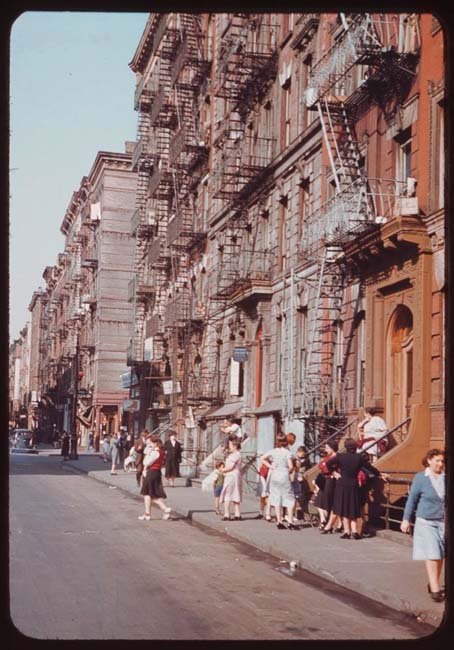
1942 photograph of tenement buildings (from Old New York in Color, Part III, Lower East Side 1942in Citynoise).
The above photograph was taken some years after Kirby lived in the Lower East Side but the buildings themselves did not change all that much. I have seen photographs from the turn of the century and they were not that different even then. Actually in many ways they still have not changed. Many former tenements have been renovated for modern living (I live in what used to be a cold water flat). These renovations were largely performed on the interiors leaving the external features relatively unaltered. Tenements were basically low buildings with no more than six floors. At some point a law was passed that required elevators for any building taller than six stories. Most tenements were built with bricks but some brown stone buildings became tenements when the neighborhood declined. Ornamentation was generally simple, often nothing more than cornices and raised brickwork. Since they were occupied by a number of families, fire escapes would appear on both front and back of the buildings.
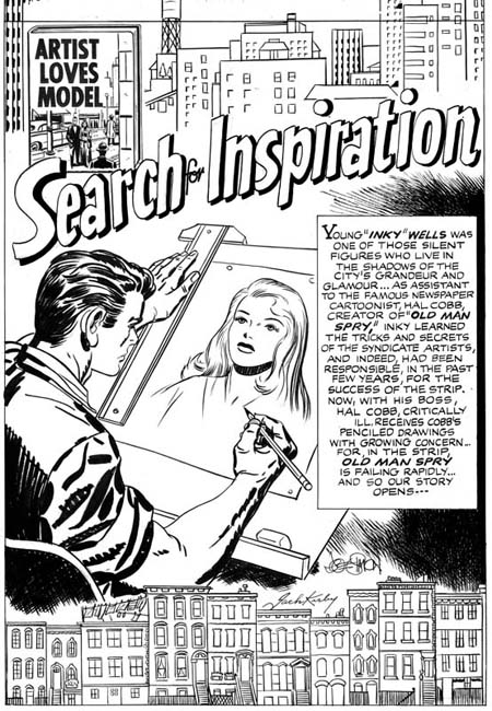
In Love #3 (January 1955) “Search for Inspiration”, pencils by Jack Kirby, inks by Joe Simon
There is no question that Kirby could and did draw tenements. The buildings at the bottom of the In Love splash shown above are easily recognized as such. Note the limited number of floors and simple ornamentation. If the buildings were not enough observe the wash hanging out to dry on the top of one of the buildings. The structures visible at the top of the splash are not tenements. While Kirby provides them with little ornamentation, the architecture is much more interesting than the tenements. The presence of water towers indicate that these are tall buildings since the lower heights of tenements would not require water towers to provide proper pressure. The lack of fire escapes is surely nothing more than artistic license.
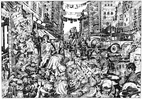
Street Code, Argosy vol. 3 #2 (1990) art by Jack Kirby
Jack’s use of tenements was not limited to the work he did in the 50’s. Kirby drew “Street Code” in 1983 but it was not published in Argosy until 1990. Despite the presence of some cars the scene really is not that different from the early photograph I provided earlier. Jack may have left the tenements many years before but the tenements never fully left him.

The Adventures of the Fly #1 (August 1959) “Come Into My Parlor” right half of splash, pencils by Jack Kirby
One of Joe and Jack’s final collaborations was the Fly for Archie Comics. Jack provided a multitude of buildings in the background for a double page splash in the first issue. These buildings look tall and have complex and imaginative architecture. Tenement buildings? Not by a long shot.
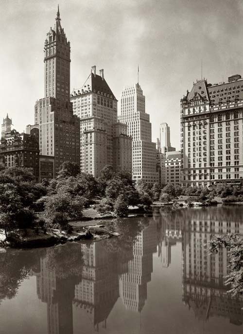
New York: 1933 (from Sharphy Historic Photo Archive)
If the buildings in the Fly splash were not tenements, what were they? While they are the product of Kirby’s ample imagination they draw heavily from buildings that could be seen in New York during Jack’s life and even today. I could provide further examples of later work by Kirby that seem to reflect a more modern architecture of buildings constructed of steel and glass. Actually examples of Kirby drawing tenements are much rarer. So while claims that Kirby always drew buildings that reflected the tenements that he inhabited as a youth may sound attractive, they just are not supported by Jack’s actually art.
Bullseye #7, This is the End

Bullseye #7 (August 1955), pencils and inks by Jack Kirby
The bulls-eye pattern returns to the cover image for Bullseye #7. The overlapping figures creates an interesting design where the background figures are carefully framed by the foreground ones. It is always little more than guesswork when trying to credit who did what in the Simon and Kirby collaboration, in this case I suspect that Jack did the layout since this sort of careful arrangement of figures was often found in the work he produced later when working without Joe. While it is an interesting composition, it is not at all clear what is being depicted. All three individuals appear to be aiming their arrows at different targets, so it does not appear to be a shooting contest. Bullseye’s smile would be out of place for a combat usage. In any case why would a cavalry soldier be using a bow and arrow? While Simon and Kirby covers generally can be decoded to reveal a story, the cover for Bullseye #7 seems meant to be nothing more than an compelling image.
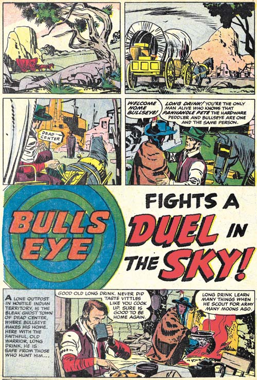
Bullseye #7 (August 1955) “Duel in the Sky”, pencils and inks by Jack Kirby
The first story, “Duel in the Sky”, has an unusual opening; no splash panel and the title occurs below two panel tiers and above another story panel. Kirby has used splash-less stories before but this one is special. The first three panels have no text and show nothing more than Bullseye’s alter-ego traveling over a western landscape. Simon and Kirby usually try to fill their stories with as much as possible so allocating the three panels used in this introduction is quite special. Obviously the introduction was considered worth it but perhaps the splash was sacrificed to make room for it (it is the only Bullseye story without a splash). This introduction shows Bullseye returning to Dead Center, his birthplace, to visit his friend Long Drink. Normally Bullseye traveled about; only in one other story (“The Ghosts of Dead Center”, Bullseye #3) does Bullseye visit Dead Center. This sort of reference to his past was unusual at that time where continuity was pretty much neglected in comic books.
Kirby always had a penchant for technology so I suspect it was his idea to include balloons in this story. The use of such a technology at that period is not unrealistic. During the civil war an attempt was made to use hot air balloons for observation. Unfortunately the balloons became a target and at least one was shot down. In any case the balloons adds interest to another Simon and Kirby masterpiece. It does not hurt either that the story ends with another fantastic Kirby fight.
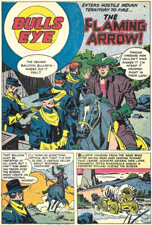
Bullseye #7 (August 1955) “The Flaming Arrow”, pencils and inks by Jack Kirby
While “Duel in the Sky” has a perfectly acceptable ending, “The Flaming Arrow” picks up from there with Bullseye going off to prevent an errant balloon from falling into the hands of Mexican bandits. It is a short but rather nice piece that ends with Bullseye returning to visit Long Drink once again, the last page being a bookend to the first page of “Duel in the Sky”. In fact the same three panels, with slightly different cropping, that showed Bullseye traveling show up again.
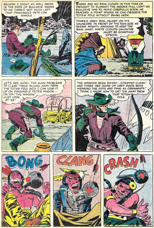
Bullseye #7 (August 1955) “The Stolen Rain God” page 5, pencils and inks by Jack Kirby
The next and what would turn out to be the final Bullseye story, “The Stolen Rain God” opens with a double page splash. I have discussed this piece of art previously in my yet to be completed serial post (The Wide Angle Scream, Almost an Afterthought). Simon and Kirby had a long history of the use of these wide splashes but there were only two created during the Mainline/Charlton period and this was the only one actually published on two pages (the other from Win A Prize #1 was rotated and printed on a single page, see the previous link).
Since I have already posted on the splash page, here I include an image of page 5. It serves as a reminder that while action was the key component of many Simon and Kirby productions, and Bullseye in particular, humor also played an important roll. The very physical humor found in the last three panels is very typical of Kirby.
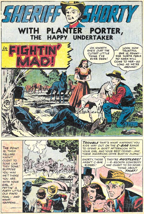
Bullseye #7 (August 1955) “Fightin’ Mad”, pencils by Jack Kirby, inks by Joe Simon?
This issues ends with a Sheriff Shorty feature drawn by Kirby. This makes Bullseye #7 the only issue from that title entirely drawn by Jack. Normally this would make issue #7 a very special comic. The Sheriff Shorty story is special alright but for the wrong reason. It is a rare example of a clunker drawn by Kirby. The action scenes are uncharacteristically poorly executed and this cannot be blamed on the inker. Further the humor does not quite work. Hey everybody can have a bad day.
None of the Mainline titles lasted very long at Charlton, they were usually terminated after two issues (except for Foxhole which lasted for a third issue but that last issue appears to have been produced by Charlton without any involvement from Simon and Kirby). Bullseye was not an exception and issue #7 would be the last. In my opinion, all the Mainline titles were special but for Kirby fans Bullseye would be the most important. None of the other Mainline titles has anywhere near as much of Kirby drawn material. The only comic from this period that does was Fighting American. Which makes it especially unfortunate that Bullseye has never been reprinted. With the resurgence of interest in Kirby, hopefully that will change in the not too distant future.
Bullseye #6, The Missing Tomahawks
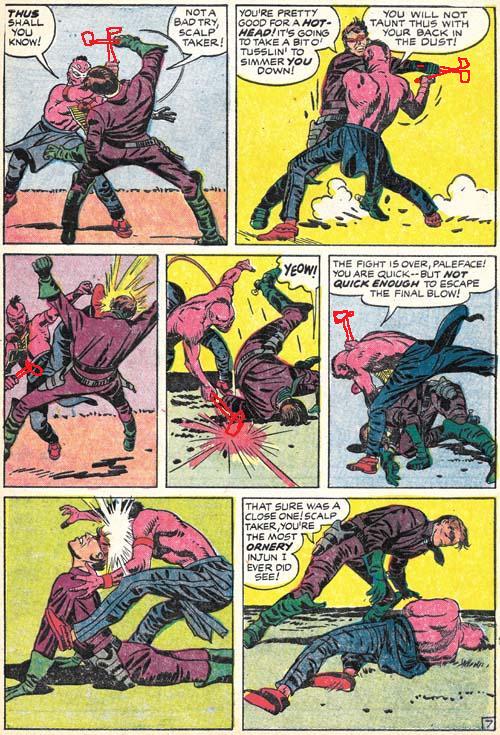
Bullseye #6 (May 1955) “Tomahawks For Two” page 7, pencils by Jack Kirby, inks by Joe Simon and Jack Kirby
Sometimes I miss the most obvious observations. Fortunately often one of my readers sets me straight. Shortly after putting up my Bullseye #6 post I got an email from Charles R. Rutledge:
Just out of curiosity, did the Comics Code make S&K remove the Tomahawks from the hands of the fighters? They’re fairly obviously blocking and hitting with things that aren’t there. It’s especially evident in panel four of page seven. Look at the Indian’s hand and follow it to where an object, presumably a tomahawk would be hitting the ground as Bullseye rolls out of the way. See my hastily scribbled tomahawks below. Also, one would expect tomahawks on the splash page of a story called tomahawks for two and Bullseye’s upraised hand does look as if it might have been drawn.
His tomahawks may be hastily scribbled but they made his point completely obvious. I have never seen the original art but I have absolutely no doubt that it would show white-out in those areas. The Comic Code was recently introduced, for Bullseye first appearing on issue #5. Either “Tomahawks for Two” was drawn before the Code was enforced or Joe and Jack had felt that the fight scene was not too violent even with the tomahawks. After all children could see that sort of thing on television at the time. But the Comic Code was rather excessive when it came to the use of weapons so the tomahawks had to go.
Nice work and thanks Charles.
Joe Simon’s New York Comic Con Appearance
Joe Simon made an appearance at the New York Comic Con on Saturday (October 9) as I had previously announced. It was not a well publicized event, in fact my report was the only announcement on the web. I believe Titan wanted to keep the crowds to a minimum. Not that there were any lack of fans. Joe was kept busy for the duration of the stay during which he had a continual line of fans seeking his autograph or just to shake his hand. There was a short intermission so that everyone there could sing Happy Birthday to Joe and present him with a cake. Both Jerry Robinson and Joe Kubert stopped by to say hello to Joe. I believe it was the first time that Simon and Kubert had ever met. All in all a very enjoyable event, particularly for Joe. Unfortunately I did not have my camera but if I am able to track down some of the photos that others took I will post them later.
Also of interest, Comic Riffs has written about a birthday interview with Joe.
Bullseye #6, The Composition
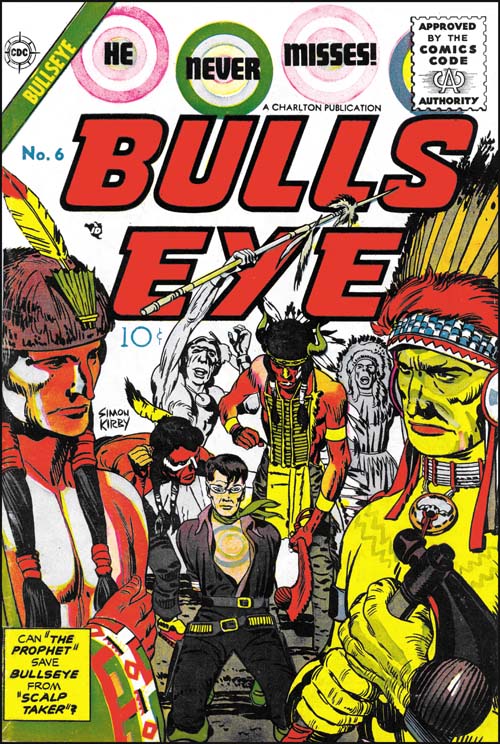
Bullseye #6 (May 1955), pencils by Jack Kirby, inks by Joe Simon and Jack Kirby
Among other things, Simon and Kirby are today celebrated for all the successful creations. Most comic book artists were fortunate if they had one popular creation while Simon and Kirby multiple successes (Captain America, the Newsboy Legion, the Boy Commandos and the romance genre are perhaps their most significant). But not every Simon and Kirby creation received favorable recognition. While today many consider Boys’ Ranch as Joe and Jack’s finest creation, in its day it just did not sell well enough to avoid an early cancellation. It is unclear how successful Mainline, the Simon and Kirby owned publishing company, would have been with Bullseye or any of their titles as Joe and Jack were doubly unfortunate in their timing. One problem was that under the pressure of public criticism the entire comic book industry had started to crash. The other difficulty was the economic difficulties that plagued Mainline’s distributor, Leader News. The second problem was not unrelated to the first as Leader News depended greatly on the revenues from EC, a comic publisher particularly attached by critics. When Leader News folded so did Mainline. Simon and Kirby then turned to Charlton to publish the former Mainline titles. Joe has said that Charlton offered them the best deal but with the collapsing comic publishing industry there probably were not many alternatives. Because of the amount of time required to print and distribute a comic book, the art for Bullseye #6 was probably already finished before Mainline had actually failed. The fact that Bullseye #6 was released by Charlton on its normal scheduled time indicates that Simon and Kirby spent little time looking for a replacement publisher for their Mainline titles.
The cover for issue #6 was the least successful of the Bullseye series. Unlike all the others issues, the bulls-eye pattern plays a part in the design of the title but not the actual image. What is presented is little more than an illustration from the interior story. Only from the cartouche would the reader understand the significant of the two foreground figures. It does have the distinction of being one of the only two cover art of the Mainline/Charlton titles that bares a Simon and Kirby signature (Foxhole #5 was the other).
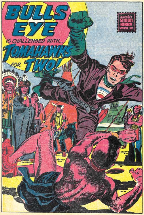
Bullseye #6 (May 1955) “Tomahawks For Two”, pencils by Jack Kirby, inks by Joe Simon and Jack Kirby
“Tomahawks for Two” is the start of the most ambitious story that Simon and Kirby did for Bullseye. With a total of twenty pages divided up into four sections, it is a much longer Bullseye story than any other. Actually it is longer than most Simon and Kirby stories created after the war. I use the term sections, because although they are essentially chapters, they are not actually called such.
It is not just the length that is special, the story is probably the most unusual Bullseye tale as well. Two Indian brothers, twins actually, one of who is peaceful (called the Prophet) and another a warrior (named Scalp Hunter). Bullseye saves the Prophet but later ends up in a hand to hand combat with Scalp Taker.

Bullseye #6 (May 1955) “Tomahawks For Two” page 7, pencils by Jack Kirby, inks by Joe Simon and Jack Kirby
I could not resist including the fight scene. Kirby was unequaled when it came to choreographing such fights and this is one of his best. In this case he deviates from the 3 by 3 panel layout that he typically used for such battles. Although this is not a grid layout, there is enough symmetry that the reader’s attention is not drawn away from what really matters. As usually Jack has also minimized the background so as not to distract from the fight.
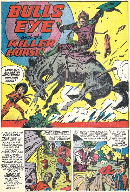
Bullseye #6 (May 1955) “Bulls-Eye And The Killer Horse”, pencils and inks by Jack Kirby
In an unusual and untypical manner, Simon and Kirby turn away from the tale of the two Indian brothers and now tell one about a boy and his love of a wild stallion. It is quite possible that this story was originally a stand-alone feature that was retrofitted into the Indian brothers story. If so its last panel was reworked to include a distant Indian observer and a caption that ties the scout to the next chapter of the story.
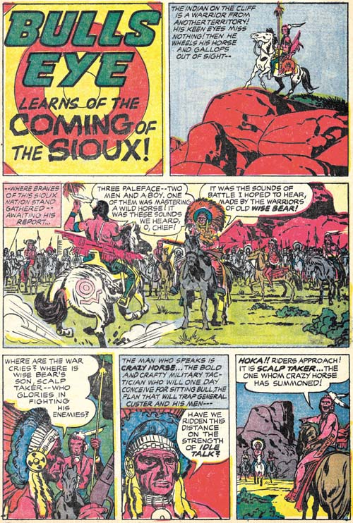
Bullseye #6 (May 1955) “The Coming of the Sioux”, pencils by Jack Kirby, inks by Joe Simon and Jack Kirby
This story picks up with the scout seen in the last panel of the previous chapter. Next we see Bullseye and the family from the “Killer Horse” story being interrupted at their dinner. This is followed by plenty of action and a rousing battle between two Indian tribes. I really do not want to provide too many details for fear of spoiling it for those who have not read it yet. But it is perhaps the most complicated plot ever used by Simon and Kirby and it ends with the death of one of the two Indian brothers.
While “The Coming of the Sioux” has a true ending, Joe and Jack follow it with a short coda, “The Man Who Lived Twice”. This piece in a way mirrors the beginning of “Tomahawks for Two” that initiated the story arc. Here we find the fate of the surviving Indian brother. Again I do not want to go into any spoilers but this story arc is one of the best that Simon and Kirby ever presented. Kirby’s art is in really top form as well. Bullseye #6 is a forgotten Simon and Kirby masterpiece.
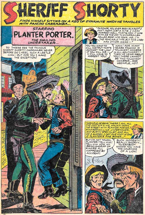
Bullseye #6 (May 1955) “Sheriff Shorty”, art by Al Gordon
Bullseye #6 marks the return of Sheriff Shorty, a feature first introduced in Bullseye #3. This time the artist was Al Gordon, whom I am not at all familiar with. Gordon’s depiction of the characters follows those from Bullseye #3 so closely that some have attributed that story to Al as well. However as we have seen (Bullseye #3, Here’s Kirby) the origin story was drawn by Leonard Starr. While Gordon is not as good an artist as Starr, he still does a respectable job on this short (four page) piece.
Happy Birtday Joe Simon
Today (October 11) is Joe Simon’s birthday. He is now 97 years young. In celebration I am posting some of the fine art he has done over the years.
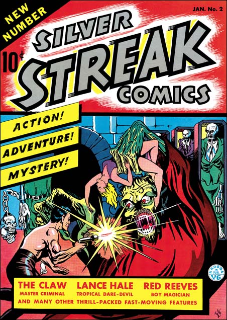
Silver Streak #2 (January 1940)
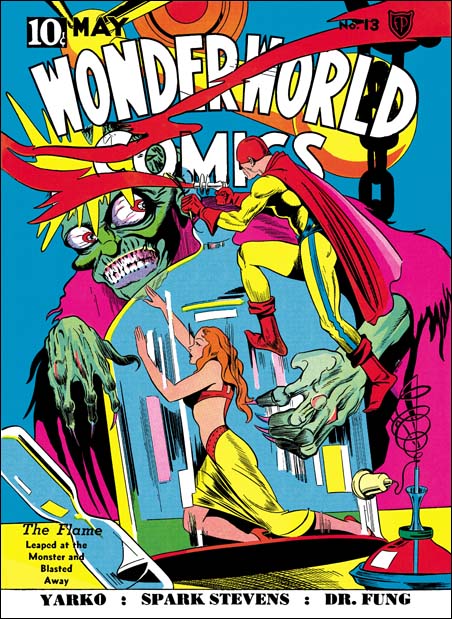
Wonderworld Comics #13 (May 1940)
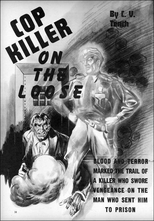
Complete Detective Cases vol. 3 no. 2 (March 1941)
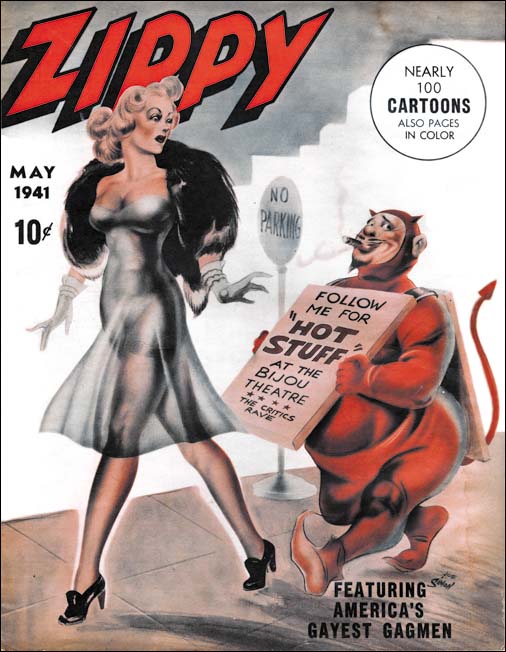
Zippy #1 (May 1941)
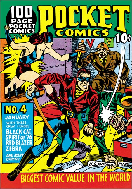
Pocket Comics #4 (January 1942)
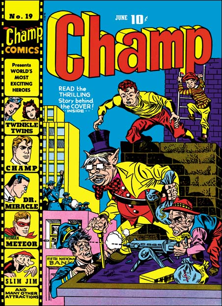
Champ #19 (June 1942) (signed as Jon Henri)
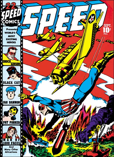
Speed #22 (September 1942) (signed as Glaven)
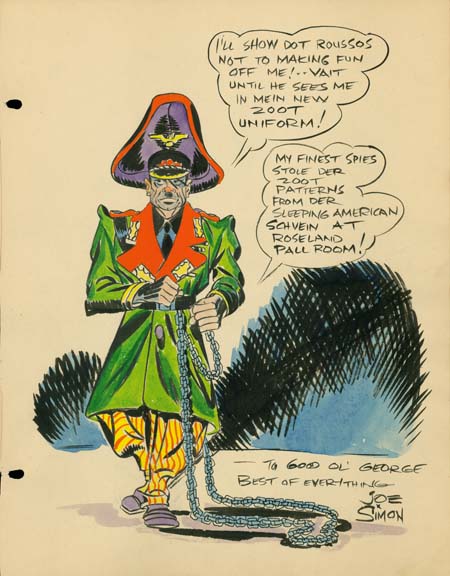
Sketch for George Roussos (1942)
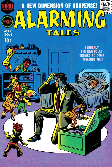
Alarming Tales #4 (March 1958)
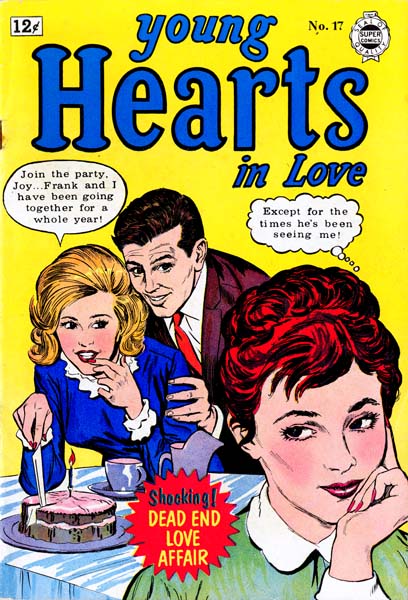
Young Hearts In Love #17 (April 1962)
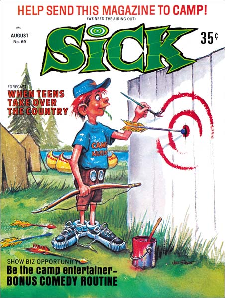
Sick #69 (August 1969)
Bullseye #5, The Secret is Out
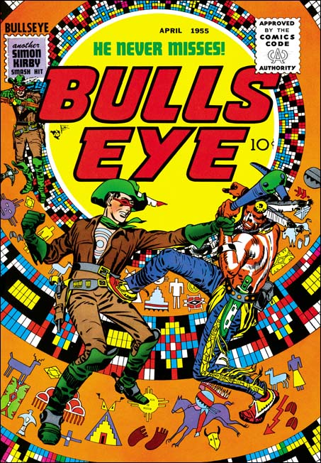
Bullseye #5 (April 1955), pencils and inks by Jack Kirby
Simon and Kirby were big self promoters. They often signed the art they created and included a “Simon and Kirby Production” label in the books that they put together for Prize Comics. Which is why it was so unusual that their names were never used in any of the earlier issues of the Mainline titles. Bullseye #5 was the first to include a stamp reading “another Simon and Kirby smash hit”. The exclusion of their names from the Mainline titles up to now was probably an attempt avoid a conflict with Prize for whom Joe and Jack continued to produce comics. I do not think it is a coincidence that the first issue with the Simon and Kirby stamp was also the one with the first postal statement in which Joe and Jack are listed as the editors. If the people at Prize had not figured out who was behind Mainline Comics before this, the gig would certainly have been up with this issue.
My favorite Simon and Kirby cover keeps changing depending on my mood, but if I were to pick the top dozen covers they would always include that for Bullseye #5. The bulls-eye pattern has played the central design element of all the title’s previous covers, but it was truly inspirational to convert it using Indian motifs. The bulls-eye now looks like some sort of flattened teepee. It is a pretty busy pattern, so the foreground is just Bullseye grappling with an Indian. The whole thing is topped of by some really beautiful inking of the figures by Jack Kirby. The image I provide has not been restored but rather was based on progressive proofs. Progressive proofs were made of the individual color plates and the sequential combinations that they would undergo during printing. This usually was done from the lighter colors to the darker ones so that proofs were made of yellow, magenta, yellow + magenta, cyan, yellow + magenta + cyan, black then the completed combination of all plates. The above image was made by scanning the individual proofs for yellow, magenta, cyan and black then overlapping them in Photoshop. No editing was needed to provide the most accurate recreation of the original Bullseye cover possible.
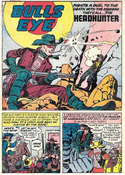
Bullseye #5 (April 1955) “Headhunter”, pencils and inks by Jack Kirby
A classic western tale of a cowboy accused of murder, a lynch mob looking to bypass justice, a bounty hunter aiming for a payoff at any price, the true killer trying to pin his crime on an innocent man, and off course Bullseye to save the day. This is the first issue of Bullseye published under the overbearing eye of the Comic Code Authority. However Bullseye was never overly violent and so the censorship does not really detract from this fine story.
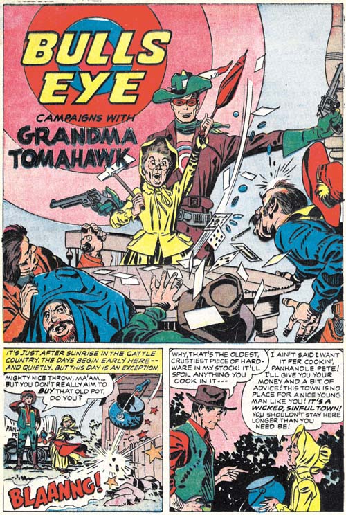
Bullseye #5 (April 1955) “Grandma Tomahawk”, pencils and inks by Jack Kirby
“Headhunter” was pure drama so Simon and Kirby backed it up with a humorous piece, “Grandma Tomahawk”. A small but spunky elder lady leads a crusade against alcohols and immorality with secret help from Bullseye. One again inked by Kirby himself except for page 2.

Bullseye #5 (April 1955) “Tough Little Varmint”, art by unidentified artist
Another humorous piece but this time drawn by an artists other than Kirby. Frankly few attributions have given me more trouble than trying to figure this piece out. There are suggestions of Mort Meskin throughout but on a whole this look so unlike his work that I very much doubt that he was the penciler. The inking is very distinct from Mort’s style as well. I played with the idea that this might be have been done by George Roussos whose work often shows Meskin’s influence. But comparing side-by-side this piece with some by Roussos shows they are very distinct. And again the inking is nothing like that by Roussos. It is very frustrating not to be able to come up with a convincing attribution because the artist clearly was very talented.
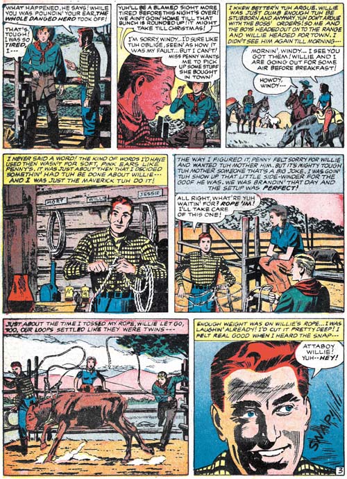
Bullseye #5 (April 1955) “Tough Little Varmint” page 3, art by unidentified artist
Mort was not that common a name so I consider the placard with that name in panel 4 as a homage to Meskin by the artist of this piece.
I do not think it is a coincidence that the leading lady of “Tough Little Varmint” and “The Adventures of Sheriff Shorty” (Bullseye #3 link 1) were both named Penny. The most likely explanation would seem to be that the scripts for both were done by the same writer.
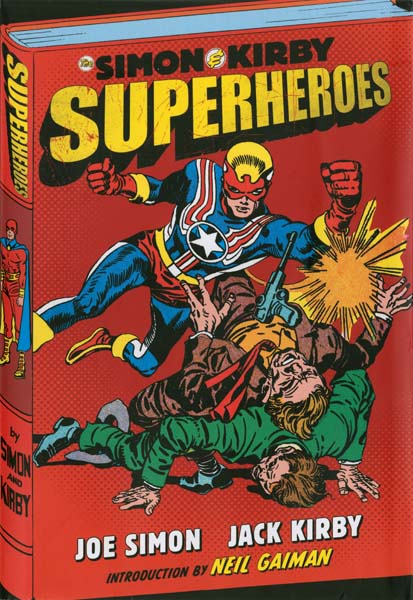
“Simon and Kirby Superheroes”, A Must Buy
Well Titan’s “Simon and Kirby Superheroes” is finally out and people have begun to take notice:
Mike Gold on ComicMix:
Pound for pound, you’re unlikely to find a better superhero collection than Titan Books’ “The Simon and Kirby Superheroes”
Charles R. Rutledge on Singular Points:
The great thing about the book is the sheer amount of gorgeous Simon and Kirby art. Figures leap and stretch across the pages, often seeming to threaten to break free of the panel borders
Geeks.Co.UK:
Jack Kirby and Joe Simon rewrote the rules for comic book art with their explosive action and cinematic techniques
Los Angeles Times:
They stitched together stories of the fantastic that jumped off the pages of comic books in the golden age of the medium
Falcata Times:
Simon and Kirby, it has to be said were the first to amalgamate the worlds of serious storytelling with the action panels that brought the fans to the fold in the first place, setting themselves as the standard for others to follow becoming the archetype that has held sway ever since
This book contains all of Simon and Kirby’s superhero work outside of Marvel and DC, a then some. For those readers who want to know specifically what that means here is the table of contents:
- Introduction by Neil Gaiman
- The 1940s: War and Peace by Jim Simon
- The Black Owl
“The Whistler”
“The Return of the Whistler”
“The Menace of Madame Mystery” - Stuntman
Cover Stuntman #1
Cover Stuntman #2
“Killer In The Bigtop”
“The Crime On Cauliflower Row”
“Stuntman Enters the House Of Madness”
“Curtain Call For Death”
“The Rescue Of Robin Hood”
Cover Stuntman #3 (unpublished)
“Stuntman Smashes Rest Camp For Criminals”
“Stuntman Battles The Diamond Curse”
“Stuntman Battles A New Menace on Terror Island” (unpublished splash)
“Stuntman Brings to Justice the Evil Sons of M. LeBlanc” (unpublished splash)
“Stuntman Crowns a Jungle Lord” (unpublished) - The Vagabond Prince
“Trapped on Wax” (unpublished)
“The Madness Of Doctor Altu”
“Death-Trap De Luxe” - The 1950s: Fighting Americans by Jim Simon
- Captain 3-D
“The Man From The World Of D”
“The Menace Of The Living Dolls”
“Iron Hat McGinty And His Destruction Gang” - Fighting American
Cover Fighting American #1
“First Assignment: Break The Spy-Ring”
“Second Assignment: Track Down The Baby Buzz Bombs”
“Duel To The Finish Line”
Cover Fighting American #2
“Assignment: Expose The League Of The Handsome Devils”
“Assignment: Find the King of the Crime Syndicate”
“Assignment: Investigate the City of Ghouls”
Cover Fighting American #3
“The Man Who Sold Out Liberty”
“Stranger From Paradise”
“Poison Ivan”
“Z-Food”
Cover Fighting American #4
“Tokyo Runaround”
“Homecoming: Year 3000”
“Operation Wolf”
Cover Fighting American #5
“Follow the Dangerous Trail of Jiseppi, The Jungle Boy”
“The Year Bender”
“Track Down Invisible Irving”
Cover Fighting American #6
“Deadly Doolittle”
“Super Khakalovitch”
Cover Fighting American #7
“Sneak Of Araby”
“Three Coins In The Pushcart”
“Space-Face”
Cover Fighting American [Vol. 2] #1
“Round Robin”
“Roman Scoundrels”
“The Secret of Yafata’s Moustache”
“Beef Box”
Cover Fighting American [Vol. 2] #2 (unpublished)
“The Mad Inker” (unpublished) - Double Life of Private Strong
Cover Double Life of Private Strong #1
“Meet Lancelot Strong”
“The Double Life Of Private Strong”
“Spawn Of The X World”
“Private Strong Sneak Attack”
“Mystery Of The Vanished Wreckage”
“The Menace Of The Micro-Men”
“Loveable Lou: The Toy Master
“The Ultra-Sonic Spies” - The Adventures of the Fly
Cover The Adventures of the Fly #1
“The Strange New World Of The Fly”
“The Fly Strikes”
“The Fly Discovers His Buzz Gun”
“Come Into My Parlor”
Cover The Adventures of the Fly #2
“Marco’s Eyes”
“The Fly: The Hide-Out”
“Tim O’Casey’s Wrecking Crew!” - Bonus Gallery
Cover Double Life of Private Strong #2
Introduction to “The Duke of Broadway”
Unused alternate cover to Stuntman #2
Unused cover to Thrills of Tomorrow #22
This is a big volume with 475 pages of comic art all of it published in the same size that they were original printed (with the exception of the Bonus Gallery were there are four images on the single page). Some have noticed that not everything in this volume was drawn by Simon and Kirby. There were a number of reasons for this. Mainly it was decided that all of Fighting American should be presented. In a couple of cases a story was included because it was the one featured on a Simon and Kirby cover. But really there is not that much that was not done by other artists, “Simon and Kirby Superheroes” contains 448 pages of Simon and Kirby created art. That is a lot of Simon and Kirby.
On a side note, one reviewer wrote that Captain 3-D was drawn by Mort Meskin and Inked by Steve Ditko. I regret to say he was wrong, all the Captain 3-D presented was drawn by Jack Kirby with the inking done by an assembly of artists including Mort Meskin, Joe Simon, Steve Ditko, Jack Kirby himself and at least one unidentified individual (Captain 3D).
The table of contents shows a number of pieces as unpublished. Title cancellations often meant that there was artwork that was created but would go unused. Some, like the splash pages for “Terror Island” and “The Evils Sons of M. LeBlanc”) have been included in volumes such as Joe and Jim Simon’s “The Comic Book Makers”. But the Vagabond Prince origin story (“Trapped on Wax”) has never been published in its complete form. Not only was “Jungle Lord” never published in its entirety, its artwork was scattered to various private collections. Bringing it back together was quite an accomplishment (with much thanks to John Morrows). The splash page for “The Mad Inker” is missing but the rest of the story is complete and none of it has ever been published before.

Fighting American #1 (April 1954) “Break The Spy-Ring” page 8, pencils by Jack Kirby (un-restored scan)
Now is the time that I have to fess up and admit that this is not an unbiased review. I was the art restorer of “Simon and Kirby Superheroes” as I was for “The Best of Simon and Kirby”. This was a lot of art to restore for this book and the work done to a difficult schedule. But I am quite happy with the results and feel they are even superior to the work I did for “The Best of Simon and Kirby”. I discussed restoration philosophy and method previously in an interview for Newsarama (Re-Mastering the Masters) so I will not repeat myself here.
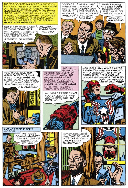
Fighting American #1 (April 1954) “Break The Spy-Ring” page 8, pencils by Jack Kirby (as restored for Titan)
When I worked on “The Best of Simon and Kirby” one of the pieces I was most happy with was the Captain America story. That was because I used flats, a proof made from the original art, that Joe Simon had saved. It meant extra work but the results were much superior to what could be done from scans of the comic book. Unfortunately the Cap story was also one of the last ones I worked on for that book. For “Simon and Kirby Superheroes” I was able in many cases to use either original art or flats for a number of stories:
- The Vagabond Prince
“Trapped on Wax” (unpublished)
“The Madness Of Doctor Altu”
“Death-Trap De Luxe” - Double Life of Private Strong
“The Double Life Of Private Strong”
“Spawn Of The X World”
“Private Strong Sneak Attack”
“Mystery Of The Vanished Wreckage”
“The Menace Of The Micro-Men” - The Adventures of the Fly
“The Strange New World Of The Fly”
“The Fly Strikes”
“The Fly Discovers His Buzz Gun”
“Come Into My Parlor”
“Marco’s Eyes”
“The Fly: The Hide-Out”
“Tim O’Casey’s Wrecking Crew!”
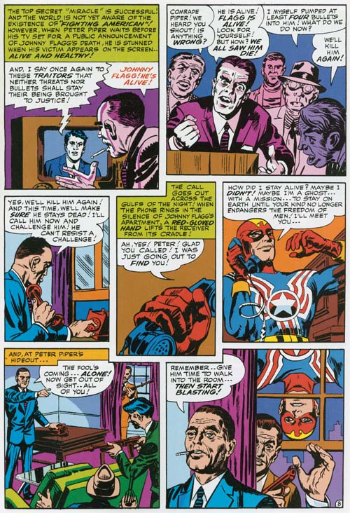
Fighting American #1 (April 1954) “Break The Spy-Ring” page 8, pencils by Jack Kirby (from the “Fighting American” reprint by Marvel)
Now I know there are some that are saying to themselves that they have the “Fighting American” book published by Marvel so perhaps they do not need “Simon and Kirby Superheroes”. Well they may have Marvel’s Fighting American but that does not mean they have Simon and Kirby’s Fighting American. Restoration technology and philosophy has changed greatly over the years. When Marvel did their book one of the techniques used was to place tracing paper over the comic book page and re-ink the art. The result was essentially re-created art whose accuracy depended on the talents of the inker. Compare the image I supply from the original or the Titan restoration and the reader will find them significantly different. The reader can use these links which will open a particular panel in another window which you should be able to maneuver near the other images to make the comparison easier (panel 1, panel 2, panel 3, panel 4, panel 5, panel 6, panel 7). While not every page in Marvel’s reprint was made using the tracing technique many were.
Comic book publishers have profited greatly, and are still profiting, from the work original done by Jack Kirby and Joe Simon. Titan’s books, “The Best of Simon and Kirby” and now “Simon and Kirby Superheroes” are the only books authorized by Joe Simon and the Jack Kirby Estate. Buy these books and not only do you get great comic book art but you also get a chance pay them back a little for all the wonderful work that they did.


