Category Archives: Archie

Questions on Some Inking in Adventures of the Fly

I have recently posted on the initial issues of the Adventures of the Fly (here and here). There are still unidentified artists that penciled those issues (and more in the two Fly issues that followed). Identifying inkers is an even bigger challenged particularly because I am not that familiar with the brushwork of most of the possible inkers. However I recently noticed some inking in the Adventures of the Fly that was very familiar.
Adventures of the Fly #2
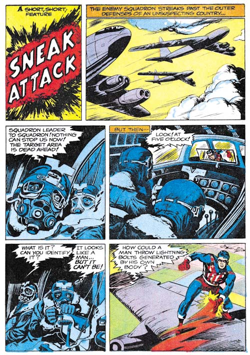
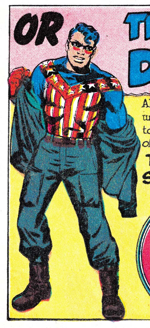
Adventures of the Fly #2 (September 1959) “Sneak Attack” page 2 (part), pencils by Jack Kirby

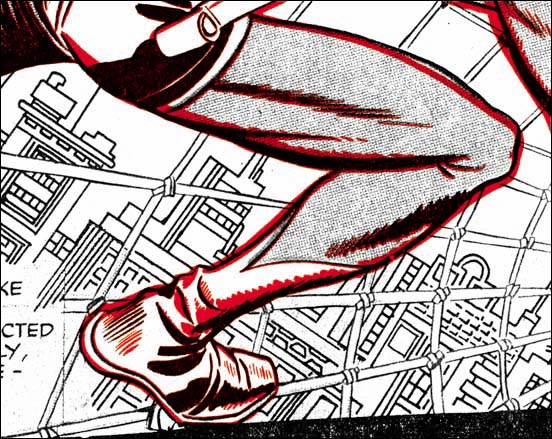
When I last wrote about “Sneak Attack” I attributed the pencils to Joe Simon. Well that was not the complete attribution. The bottom of the second page was an advertisement for the other Archie superhero comic, Double Life of Private Strong. The only art the ad contains is a standing figure of Private Strong changing into the Shield. It seems clear that the art was drawn by Jack Kirby. It is odd that the story and ad were done by different artists. I have studied the original art from Joe Simon’s collection and I can assure the reader that no cut and paste was performed to accomplish this.

The inking for the ad was really nicely done but unfortunately the details of which are obscured by rather poor printing. It is hard to see but the inner sides of both thighs were inked using picket fence crosshatching (Inking Glossary). The good news is that in the upcoming Simon and Kirby Superheroes volume from Titan “Sneak Attack” and the other stories I will be discussing here will be restored from the original art. Similarly robust picket fence brushwork was one of the characteristics of what I refer to as the Studio Style inking used during the Simon and Kirby collaboration. Not only did both Joe and Jack use this technique at that time but Mort Meskin did as well. I think, however, we can dismiss Meskin as the possible inker for the ad because he was no longer working with either Kirby or Simon and the inking here is a bit more spontaneous than was normal for Mort.
Adventures of the Fly #2
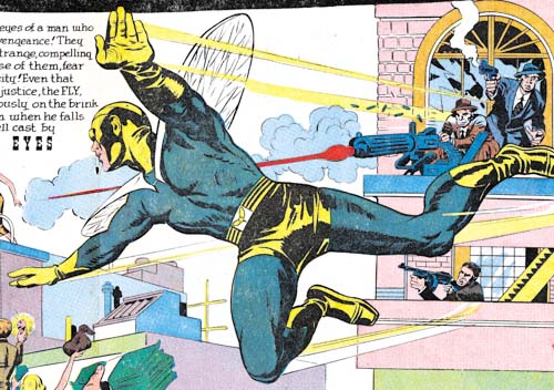
Adventures of the Fly #2 (September 1959) “Marco’s Eyes” splash (part), pencils by Jack Kirby

The spotting of the large figure of the Fly in the double page splash for “Marco’s Eyes is more finely worked than typical for either Simon or Kirby although either of them was certainly capable of it. Actually it is more finely worked than the inking found in any of the Fly art. So far I have not identified any brushwork in the figure that helps in determining an inking attribution.
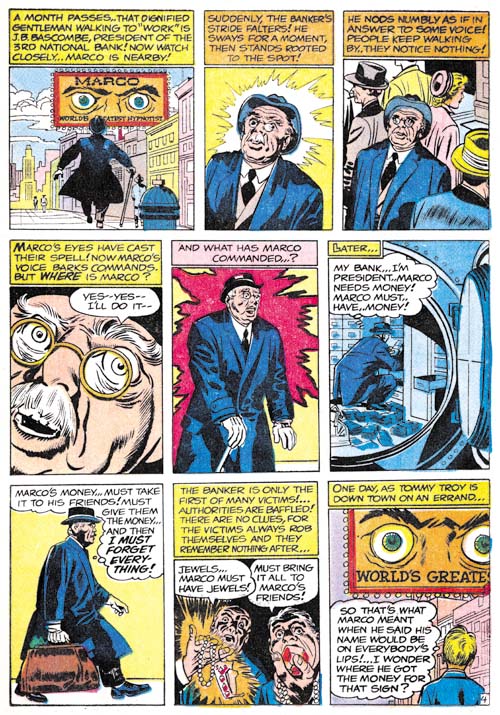
Adventures of the Fly #2
Adventures of the Fly #2 (September 1959) “Marco’s Eyes” page 4, pencils by Jack Kirby

The story art for “Marco’s Eyes” shows an important characteristic that was typical of Studio style inking, what I refer to as shoulder blots (Inking Glossary). It is prominently shown in panels 2, 3 and 5 from page 4 but occurs elsewhere in the story as well. Numerous inkers have provided their shoulders with shadows but shoulder blots are distinct in that they occur on both shoulders regardless of how a shadow would expect to be cast. So far I have only seen Joe Simon and Jack Kirby make use of shoulder blots in their inking.
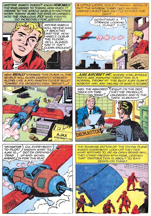
Adventures of the Fly #2
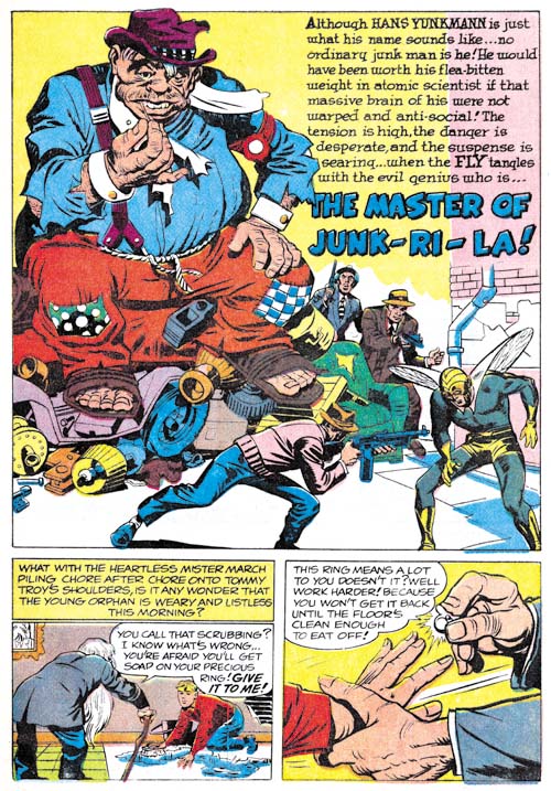
Adventures of the Fly #2 (September 1959) “The Master of Junk-Ri-La” page 2, pencils by Jack Kirby

There are no shoulder blots in “The Master of Junk-Ri-La” unless the shadow in panel 4 from page 2 is counted as one (but I am not inclined to do so). There are, however, a number of examples of course picket fence crosshatching. The first panel from page 2 shows a scallop pattern to the shadow on the boy’s arm. This scallop inking frequently showed up in Kirby’s inking. But the inking of the eyes and eyebrows of the boy look very much like the work of Simon.
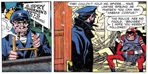
Adventures of the Fly #1
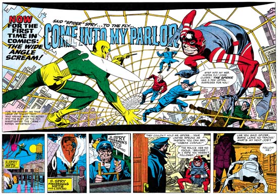
Adventures of the Fly #1 (August 1959) “Come Into My Parlor” story panels 3 and 4 from the double page splash, pencils by Jack Kirby

The double page splash and accompanying story panels of “Come Into My Parlor” also contains what looks like Studio style inking. Particularly note the spotting of the sailor from story panels 3 and 4. Observe the two cloth folds on the man’s shoulder in panel 4. These cloth folds show no indication of the tip of the brush which is a technique that was typical of Kirby’s inking. I am less convinced about the inking of the rest of the story. It should be kept in mind that it was common during the Simon and Kirby collaboration for Kirby to be involved with the spotting of the splash and leave the rest of the story to other inkers.

Studio style inking techniques are not limited to the four stories that I have discussed here. But their occurrence elsewhere in the first two issues of Adventures of the Fly seems limited to what looks like touch-ups of the work by other inkers. Such touch-up were almost certainly the work of Simon since Kirby was then a freelancer working from his house.

I only become confident about inking attributions after I have “lived” with them for some time. However it is my policy to present my current views in this blog even if they are likely to be subject to change. At this time I believe “The Master of Junk-Ri-La” was inked by Joe Simon. I am also fairly certain that Jack Kirby inked the splash pages of “Come Into My Parlor”. I am less confident about the inking attributions for the ad from “Sneak Attack” or “Marco’s Eyes”. I currently am crediting Kirby for that inking but I am bother about the frequent appearance of the tip of the brush in the inking which previously was not typical for Kirby although it was for Simon.

Adventures of the Fly, the Second Issue

Adventures of the Fly #2
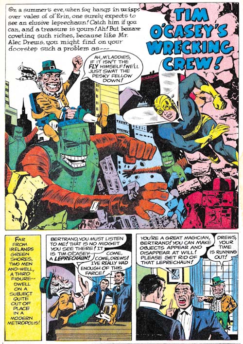
Adventures of the Fly #2 (September 1959) “Tim O’Casey’s Wrecking Crew”, pencils by unidentified artist

If a young boy can be transformed into a fully costumed adult superhero with a magic ring, why not have a leprechaun as an opponent? Not strange enough? Well then give the leprechaun some giant robots to play with. The only thing missing in this delightful story is Jack Kirby. Too bad because I am sure Jack would have added his own personal touches and transformed it into a masterpiece.

Adventures of the Fly #2
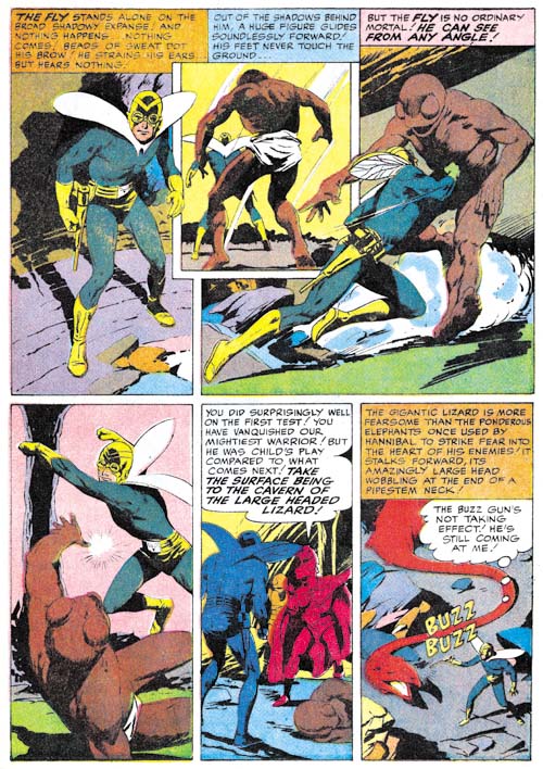
Adventures of the Fly #2 (September 1959) “One of Our Skyscrapers is Missing” page 3, pencils by Al Williamson

Al Williamson was already a talented comic artist when he did “One of Our Skyscrapers is Missing” for this issue. And I have little doubt that he did this story. The various monsters that inhabit these pages all possess the Williamson touch. If Williamson was working from layouts, he took great liberties with them. His panel layouts are the most interesting ones found in either the Shield or the Fly. Further his artwork is far superior to the other artists working on the Archie superheroes that I have reviewed so far with the sole exception of Jack Kirby. That said the art for this story is really far below his best efforts. The work Al did for Race for the Moon the previous year was much superior.

Adventures of the Fly #2
Adventures of the Fly #2 (September 1959) “Sneak Attack”, pencils by Joe Simon

“Sneak Attack” is another of the pieces that generally get attributed to Jack Kirby but were actually drawn by Joe Simon. The reason for this misattribution is a credit to Joe’s skills at mimicking Jack’s style, often with the help of plenty of swipes. The pilot with the funny head gear was swiped from Kirby’s “Hot Box” (Foxhole #2). However it shows that Joe is not just copying Kirby as the head is in full frontal view instead of the 3/4 profile that Jack drew.
Adventures of the Fly #2
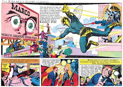
Adventures of the Fly #2 (September 1959) “Marco’s Eyes”, pencils by Jack Kirby
Larger Image

It is an old theme, but Kirby frequently returns to previous themes and improves upon them. In this case it is the idea of a stage performer using his power of hypnosis as a means of conducting crime. The earliest predecessor was probably an untitled story about sometimes called “Sando and Omar” from Captain America #1 (March 1941). “Marco’s Eyes” has some nice art and all in all a good effort, but certainly not among the better Simon and Kirby’s work. The double page splash is perhaps the weakest that S&K ever did. This is unfortunate since it is also the last the two would work on together.

Adventures of the Fly #2
Adventures of the Fly #2 (September 1959) “The Master of Junk-Ri-La”, pencils by Jack Kirby

While I would hardly call “The Master of Junk-Ri-La a masterpiece, it is a much better work than “Marco’s Eyes”. It does however contain some humor that might not be appreciated by many modern superhero fans used to bleaker tales. For instance the villain uses a giant fly swatter against the Fly.

The two stories in Adventures of the Fly #2 would be the last collaboration between Joe Simon and Jack Kirby for many years. The Jack Kirby Checklist includes “Muggy’s Masterpiece” from Adventures of the Fly #4 but that is clearly incorrect. Even the way the Archie superheroes were created made them more of a Simon effort than a Kirby one. Still the two had worked together in one form or another for a period of about 18 years. There may have been other comic book collaborations that were longer but there were none there were better. Or at least that is my opinion. But I may be biased; after all this is the Simon and Kirby Blog.

Since this is Kirby’s last work on the Fly I thought I would briefly touch on the part that it played in the creation of Spider-Man. Others have written in great depths about this issue but here I will only provide a brief outline of the events. Joe Simon, C. C. Beck and Jack Oleck got together in 1953 or 1954 to create a new superhero. Initially the name Spiderman was considered and Joe even created a logo using that name, but in the end the character was called the Silver Spider. Joe took the initial artwork by Beck and pitched the idea to Harvey Comics but they declined to publish it. Years later Archie Comics approached Simon to create some new superheroes and Joe came up with a new Shield and the Fly. Joe retrieved Beck’s Silver Spider art work from Harvey and sent it off to Jack to use as reference when he drew most of the art for the initial issues published in 1959. In 1962 Stan Lee worked initially with Kirby to create Spider-Man but in the end turned to Steve Ditko to provide the art. The work that Kirby did on Spider-Man has never been published but Ditko later described Kirby’s version as looking like the Fly.

The main source of contention about the creation of Spider-Man concerns not so much the history as the interpretation of that history. The most common subject of disagreement is whether Stan Lee and Steve Ditko should be considered the joint creators or if Jack Kirby should be included as well. While I have provided a broad history behind the creation of Spider-Man that I believe most comic scholars would largely accept there are numerous details that scholars seem unable to agree on. Even as simple a concept as the term creator turns out to have very different meanings depending on who is using it. I will not try to advance my own opinion as to who should be credited for creating Spider-Man. I prefer to let each reader come to their own conclusions. But I find it incomprehensible how some insist on crediting Jack Kirby as a Spider-Man creator while excluding Joe Simon.
Adventures of the Fly, the First Issue


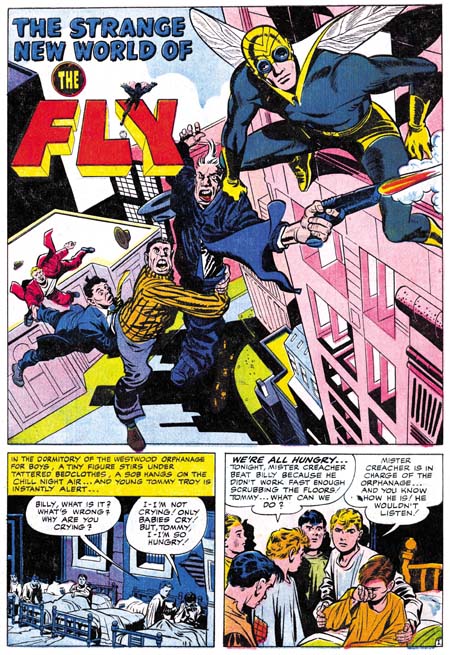
Adventures of the Fly #1 (August 1959) “The Strange New World of the Fly”, pencils by Jack Kirby

Recently I posted about Jack Kirby’s work on the origin story of Private Strong, aka the Shield. In Adventures of the Fly #1 (August 1959) Jack also had the honors of doing the same for the other new Archie hero, the Fly. Only in this case Kirby based the story on art that C. C. Beck did for the unpublished Silver Spider. Some have called the Silver Spider a Simon and Kirby creation but that simply is not true. Kirby had nothing to do with the Silver Spider which was a creation of Joe Simon, C. C. Beck and Jack Oleck. When I previously discussed the Silver Spider (The End of Simon & Kirby, Chapter 10, A Fly in the Mix) I dated this creation as 1953. To be honest I no longer remember where I got that date but it is not an unreasonable one. This would put it during the time of the Simon and Kirby collaborations but in “The Comic Book Maker” Joe writes about how the Silver Spider was created as a favor to Beck. An examination of xerox copies of the original art confirms Kirby’s absence.

Tommy Troy was an orphan like Lancelot Strong but the resemblance ends there. We meet Tommy in an orphanage but he ends up hired out to an elderly couple. Not kindly Kent-like farmers, but a mean, elderly couple with a reputation of dabbling in magic. Beck’s Silver Spider story had included a genie to add an element of humor, but Kirby has dispensed with him. However concept of a young boy who transforms into an adult superhero was Beck’s who repeated it from Captain Marvel.

Adventures of the Fly #1
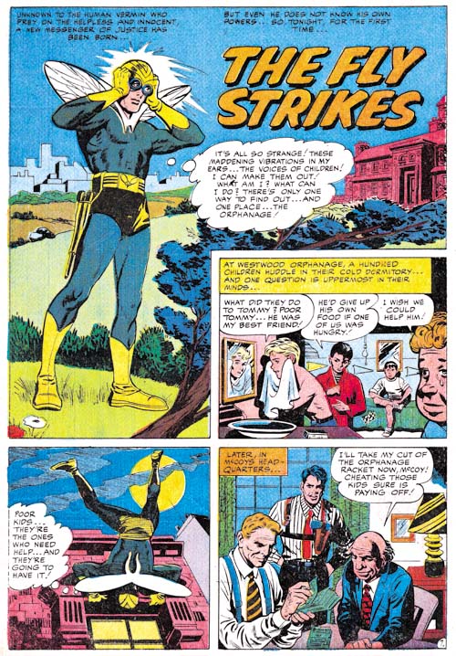
Adventures of the Fly #1 (August 1959) “The Fly Strikes”, pencils by Joe Simon

Just like in Private Strong, the origin story for the Fly is actually told in a series of separate stories. The first one ends with the Tommy Troy being given a magic ring and transforming into the Fly. The second, “The Fly Strikes”, tells of the Fly’s first combat against criminals. This second story is actually based on the end of the origin story that Beck drew.

“The Fly Strikes” is generally credited to Jack Kirby but I am not convinced. I suspect that it is another case of Joe Simon swiping from and imitating Kirby. Joe was particularly good at doing this. Note the Fly peering into the window in the second story panel. This is a swipe from Fighting American #1 (Captain America Returns). I have no indications that Kirby was working from layouts in the stories that he did for this issue. Nor do I believe Jack would bother to swipe from himself. Why would he when he could do it much faster without a swipe? So as I said I believe this story was actually done by Simon.
Adventures of the Fly #1
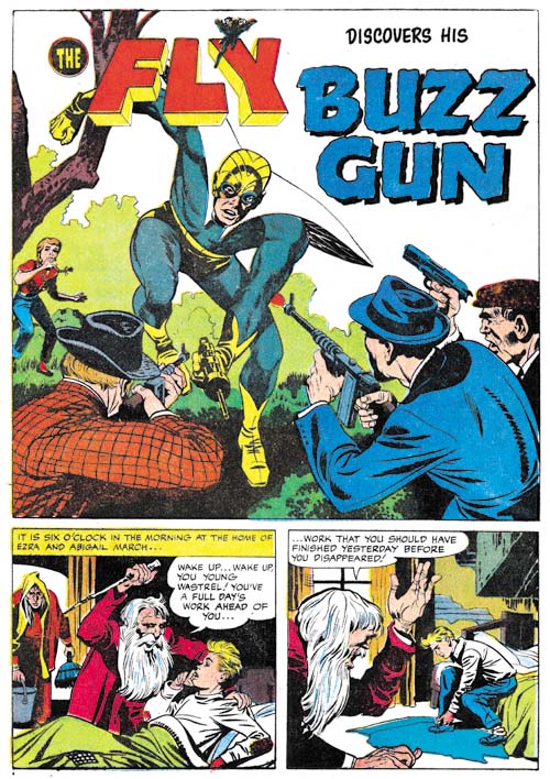
Adventures of the Fly #1 (August 1959) “Buzz Gun”, pencils by Jack Kirby

While the origin story came from Beck’s Silver Spider and the Fly’s powers seemed to be based on directives from Joe Simon, the Fly’s costume is derived from the Night Fighter, a Simon and Kirby creation that was considered for Joe and Jack’s publishing company, Mainline, but never used (Night Fighter, an Abandoned Superhero). Two characteristics stand out. One was the goggles. Similar eyewear appeared in the Black Owl from 1940 and 1941 (Simon and Kirby’s Black Owl). The presence of these goggles in two superheroes with a night theme suggests they were meant to be an aid for seeing in the dark. Of course such night vision would not be that appropriate for the Fly nor is it a power that the Fly ever used. Perhaps the eyewear was nothing more then a visual reference to the insect’s compound eyes or perhaps Jack saw no reason to remove them when he based the Fly’s costume on that of the Night Fighter.

One of the other features that the Fly inherited from the Night Fighter was a pistol of some kind. All that remains of the art for Night Fighter are two unfinished covers and neither offers any clues as to what use the pistol was put to. My guess is that it was for shooting a wire for scaling buildings such as that used by the Sandman, another superhero that Simon and Kirby worked on during the war. While a wirepoon might be a useful device for the Night Fighter it would be rather superfluous for a superhero like the Fly who is able to walk up walls. Well in “Buzz Gun” Kirby shows how the Fly’s pistol is used. It makes a noise! Oh well.


Adventures of the Fly #1 (August 1959) “Come Into My Parlor”, pencils by Jack Kirby
Larger Image

Jack Kirby’s last chapter for the origin story opens with a spectacular double page splash. The title exclaims “for the first time in comics: the wide angel scream”. Of course this really was not the first use of a double page splash a subject that I covered in a still unfinished serial post (The Wide Angle Scream). The chances are that none of the Fly readers had seen any of Simon and Kirby’s earlier uses. While Simon and Kirby did not originate the double page splash, nobody else did it better. Further by 1959 the wide splash was no longer used by anyone. I can imagine the impression the centerfold splash made for potential buyers of the comic. How could they resist. I am sure I would not have. I would have been 9 at the time but sometime around that period I had read some of the DC superhero comics. I found them boring and had given up on comics for a while. Unfortunately I never saw any of the Simon and Kirby creations.

Adventures of the Fly #1
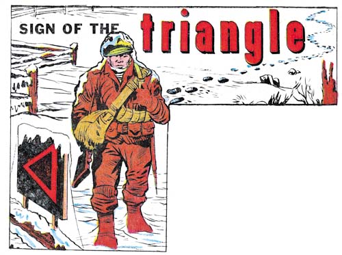
Adventures of the Fly #1 (August 1959) “Sign of the Triangle”, art by Joe Simon

The Jack Kirby Checklist includes this among the work that Kirby did for this issue but I am not convinced. To me it looks like Simon did the drawing. However this confusion is really understandable because the illustration appears to be a swipe from the cover of Foxhole #3 (February 1955) which had be drawn by Kirby. It is not an exact copy, but I do not believe Simon ever did exact copies. The inking looks like Joe did that as well.

Adventures of the Fly #1
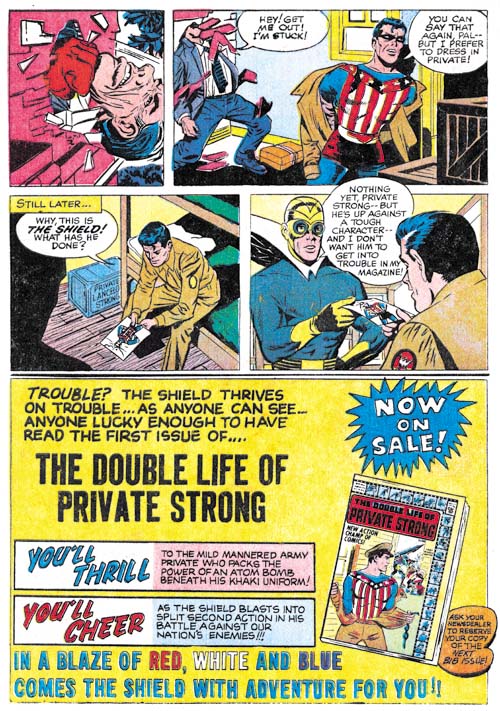
Adventures of the Fly #1 (August 1959) “The Search”, pencils by Joe Simon

I may not be confident about attributing the illustration for “Sign of the Triangle” to Simon but there seems little doubt that Joe did the two page Shield promotional piece called “The Search”. This one is full of swipes from art by Kirby. For instance the man being punched through a wall and then left hanging was from the origin story in Fighting American #1 (April 1954, Captain America Returns). Note that while Joe follows pretty closely the man stuck in the wall he has added the man’s face for the punching image which Jack had cut off by the panel edge.

Adventures of the Fly #1
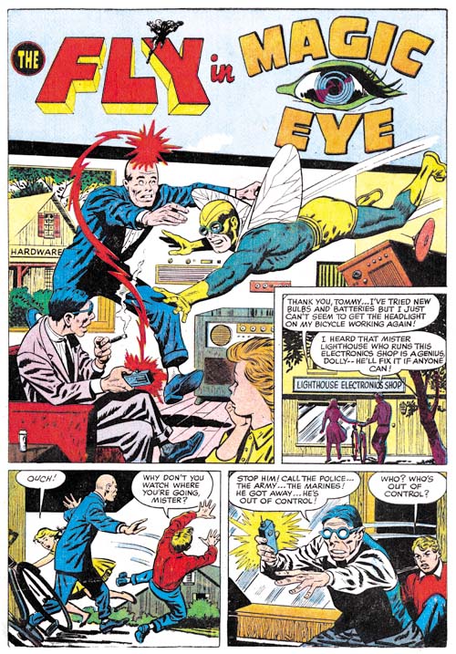
Adventures of the Fly #1 (August 1959) “Magic Eye”, pencils by George Tuska?

The final story is completely independent from the Fly origin and done by another artist, I believe it is George Tuska. I questionably attributed some work from Private Strong #2 to George as well; let us see if some of my more knowledgeable readers will agree with me on this one as well. This is another example where I do not see any obvious swipes of Kirby.

Double Life of Private Strong, the Last Issue

Double Life of Private Strong #2
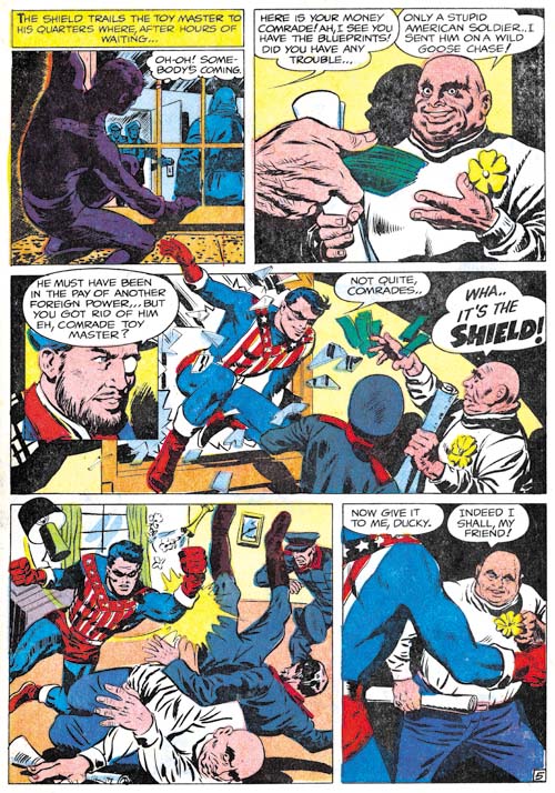
Double Life of Private Strong #2 (August 1959) “The Toy Master” page 5, art by unidentified artist

While the first issue of Double Life of Private Strong was almost completely drawn by Jack Kirby, he played a much smaller part in the second. I am not sure who drew the first story, “The Toy Master”, but he obviously was working from some sort of directions. In “The Comic Book Makers, Joe Simon writes about using Carl Burgos to create layouts. In fact Joe’s collection still includes layouts for a Fly story (Carl Burgos does the Fly). By supplying the artists with layouts, Joe was able to give the comic a distinct Kirby feel. Scattered through the art are swipes; most of them from the previous Simon and Kirby superhero, Fighting American. For instance the Shield in panel 4 of page 5 was based on a splash from Fighting American #1. Some experts have claimed that these are either stats or mechanical copies but I have disproved that by overlaying the art (The Fly, A Case Study of Swiping). Apparently all that was done was a free hand copy was created for the layout and the artist would finish it. This would provide the desired Kirby-feel to the story without making the swipe too incongruous with the rest of the art. There are other examples were the copy deviated even more from the original. I believe, for instance, that the Shield in panel 3 was swiped by the one Kirby did for the splash of “The Menace of the Micro-Men” from Private Strong #1.

Double Life of Private Strong #2
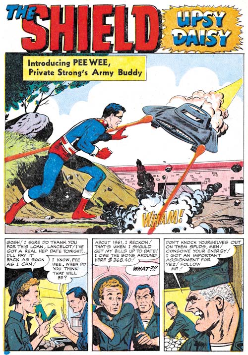
Double Life of Private Strong #2 (August 1959) “Upsy Daisy”, art by George Tuska?

I going out on a limb because I am not familiar enough with his work, but I believe “Upsy Daisy” might be the work of George Tuska. Joe Simon has written in “The Comic Book Maker” that Tuska worked on the Archie comics for him so it is not an unreasonable guess. Perhaps I missed them, but I do not spot any obvious swipes from Kirby in this story.

Double Life of Private Strong #2
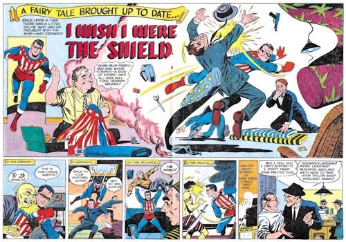
Double Life of Private Strong #2 (August 1959) “I Wish I Were the Shield”, art by George Tuska?
Larger Image

The two tier panel layout is pretty much identical to the one used for the double page splashes found in Adventures of the Fly #1 and #2. However there is no mention of “the wide angle scream” nor are the curved black bands of the top and bottom of the splash (The Wide Angle Scream, What Was Old Is New Again). Again my attribution of this story to George Tuska is by no means firm.

Here there are some examples of swiping from Kirby. For instance the Shield in the splash was based on the cover logo that first appeared on Fighting American #4 (October 1954). The presences of these swipes and the overall superiority of the story art over that for “Upsy Daisy” suggests that this story was done from layouts.

Double Life of Private Strong #2
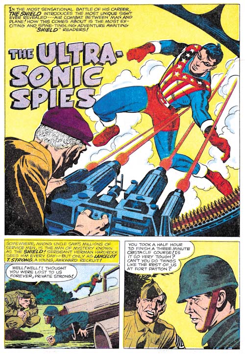
Double Life of Private Strong #2 (August 1959) “The Ultra-Sonic Spies”, art by Jack Kirby

The use of swipes was clearly an attempt to improve the look of the art not actually drawn by Kirby. But of course it was only partially successful since after all nothing beats the real thing. The single story by Kirby in this issue, “The Ultra-Sonic Spies”, just out shines all the rest of the comic. What a mixture of action and humor. Since the Shield’s alter ego, Lancelot Strong, was a private in the U.S. army, Jack was able to return to and improve upon the humor that was done years previously in Captain America. While Simon and Kirby had always preferred less powerful and more human heroes, Kirby makes exciting use the Shield’s greater power. I would say Jack was much more at ease with the Shield than he was with the Fly. What Kirby did in Private Strong prefigures more than any of his other work what was to blossom in the Marvel superhero line in a few years.

Double Life of Private Strong #2
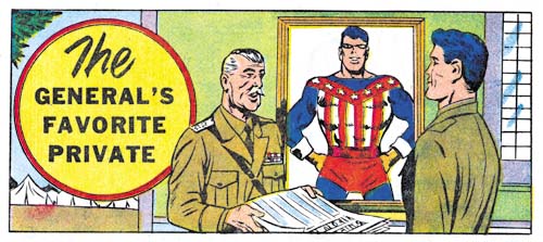
Double Life of Private Strong #2 (August 1959) “The General’s Favorite Private”, art by Joe Simon

There is a single page text piece about the Shield which tells how Lancelot Strong’s secret identity is discovered by General Smith. The story is nothing special but it contains an illustration by Joe Simon. Since the work that he did for the J. C. Penny (1947, A History Lesson) Joe drew very little comic book art. Probably the most significant work was “Deadly Doolittle” for Fighting American #6 and even that was a reworking of an earlier Sandman piece originally drawn by Kirby. After the Simon and Kirby studio broke up Joe did some more work on his own. Simon mostly did some covers but he also occasionally did an interior illustration such as the one accompanying the General Smith text story.
Double Life of Private Strong #2
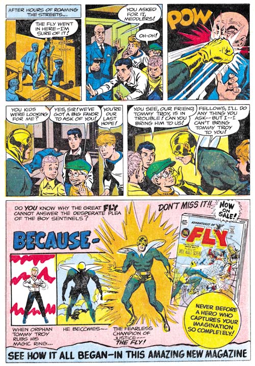
Double Life of Private Strong #2 (August 1959) “The Boy Sentinels” page 2, art by Joe Simon

For the most part one thing Joe Simon did not draw late in his career was full stories. Private Strong #2 included what is essentially an advertisement for the Fly, “The Boy Sentinels”. Should this two page piece be considered a story? What is interesting to me is that Joe makes little, if any, use of swipes from Kirby. Instead Simon drawing reflects back to the work he did for backup pieces for Stuntman and Boy Explorers, especially Vagabond Prince. The villain in the piece resembles that from “Trapped on Wax” (meant for the unpublished Boy Explorers #2), the close-up of the Fly hitting the villain seems taken from “The Madness of Doctor Altu (Black Cat #8, October 1947), and the young boys look like the one from “Death Trap De Luxe” (Black Cat #7, August 1947).

In “The Comic Book Makers” Joe writes:

Years later, I learned why John Goldwater had dropped his beloved Shield like a hot potato. DC Comic’s lawyers had sent him a cease-and-desist order which put forth the amusing claim that The Shield’s powers aped Superman’s too closely.

On the face of it this seems rather remarkable. After all the only important powers that the Shield and Superman seems to be the ability to fly and run at super fast speeds. The Fly can also, well fly, but there seems to have been no problem with that similarity. While not denying the question about some shared powers between the Shield and Superman, I would suggest there were other features that made the Shield more vulnerable to legal action than the Fly. While the Shield’s uniform was modeled on that Simon and Kirby created for Captain America, it unfortunately shared a color scheme with Superman; the same overall blue with red shorts and boots. Also regrettably the Shield’s origin story shared features with Superman’s; orphaned as a baby and raised by an elderly farming couple. All these factors probably contributed to Goldwater’s cold feet when presented with a legal challenge. After all the Shield had not yet shown whether it was a large enough money maker to warrant fighting a legal battle.

Double Life of Private Strong, the First Issue

For me it is still an open question exactly when the Simon and Kirby studio dissolved but it certainly had by the end of 1956 because Jack had begun doing freelance work for DC and Atlas. That did not mean the end of Simon and Kirby collaborations as Jack did most of the art for Race for the Moon issues #2 and #3 (September and November, 1958). Even though Joe and Jack were clearly not working in the same studio, I consider these issues of Race for the Moon to be the same sort of collaboration that had been done in the past. Certainly the results looked very much the same. However Race for the Moon was not very successful; actually none of the work Simon and Kirby did for Harvey Comics ever were.

In the early days of the silver age of comics DC had shown that once again there was money to be made in superheroes. John Goldwater, president and part owner of Archie Comics, thought it might be a good idea for his company to try superheroes again. Actually Archie Comics had started with superheroes only at that time the publisher called itself MLJ. Their flagship comic, Pep, featured the Shield, the first patriotic superhero. Simon and Kirby had even produced a cover for Shield Wizard #7 and (perhaps inadvertently) redesigned the Shield’s costume.

Goldwater approached Simon to create two new titles and Joe came up with up with the Fly and the Shield. Although they shared the same name, Joe’s Shield was to be a very different character. After receiving Goldwater’s approval, Joe approached Kirby to provide some initial art work. Now this work can properly be called collaborations but the collaboration was nothing like what had occurred before and the results looked very different. While I am sure that Kirby had made significant creative contributions to the stories he worked on he was doing so with directions from Joe. In the past the inking of Jack’s pencils either involved Jack himself or was done by others in similar style. But for the new Archie titles Jack supplied only the pencils and all the inking was done in a more modern silver age style. Also Joe lined up other artists to work on the titles so it is clear Kirby was only meant to work on the initial issues.

Double Life of Private Strong #1
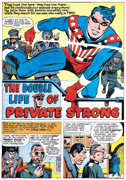
Double Life of Private Strong #1 (June 1959) “The Double Life of Private Strong”, pencils by Jack Kirby

The new Shield appeared in a comic with the awkward title “The Double Life of Private Strong” with Jack Kirby providing all the story art. Besides great strength, the new Shield could fly, throw lightning bolts, run rapidly and see in the dark; perhaps there are some other powers that I have forgotten. In some respects the origin story is a variation on the Superman origin. The main difference is that the new Shield was not an alien but acquired his powers as a result of being the subject of his father’s experimentation. However he ended up an orphan found and adopted by a farming couple. Basing the Shield’s origin on that of Superman’s may have had negative consequences.
PS1SpawnXWorld
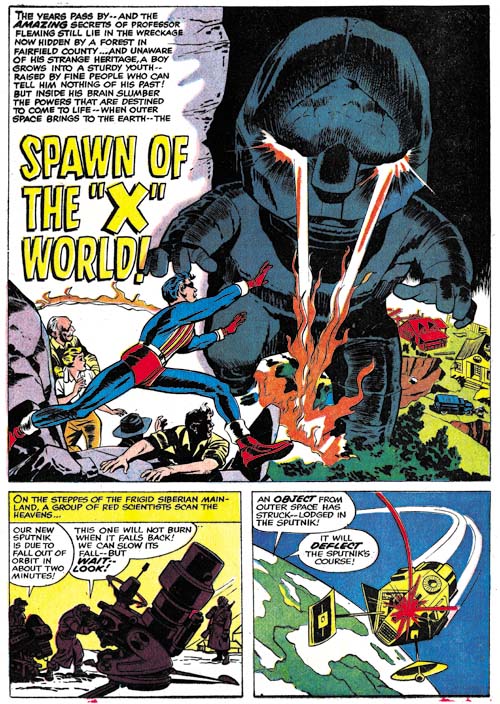
Double Life of Private Strong #1 (June 1959) “Spawn of the ‘X’ World”, pencils by Jack Kirby

The stories in issue #1 are actually chapters in one long origin story. The first story dealt with Lancelot’s youth in the next, “Spawn of the X’ World” we see his discovery and first use of his powers. At the beginning of the story Lancelot is accompanied by a friend, Spud, but at the end of the story we find that while Lancelot was off saving the world Spud was in critical condition having been caught in a fire. Some comic experts have tried to equate this with the death of Uncle Ben in the Spider-Man origin story. However it just does not wash. Uncle Ben’s death was the result of Spider-Man’s unwillingness to intercede in a crime while Lancelot was very much fulfilling the role of a hero when he left Spud. Further it is not clear that Spud would in fact die as the policeman says that they will try to save him. And if that was not enough, Lancelot does not seem that remorseful (“if only the Shield had known”) and was more concerned about learning about his powers.

Double Life of Private Strong #1
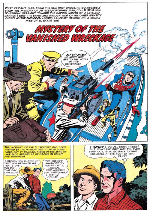
Double Life of Private Strong #1 (June 1959) “Mystery of the Vanished Wreckage”, pencils by Jack Kirby

The next “chapter” begins with Lancelot and a friend. Is the companion Spud? It is not clear but the person had been told of Lancelot’s deeds except he just does not believe it. At the end of “Mystery of the Vanished Wreckage”, Lancelot has received a draft notice.

Double Life of Private Strong #1
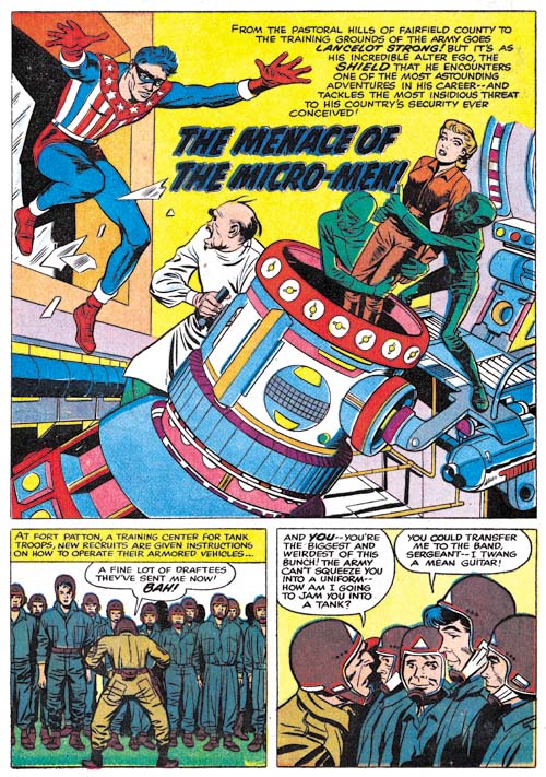
Double Life of Private Strong #1 (June 1959) “The Menace of the Micro-Men”, pencils by Jack Kirby

The final story of the issue takes place when Lancelot has just entered the army. It involves a villain who is able to shrink men, a theme that Kirby has used before (Yellow Claw #3, February 1957, “The Microscopic Army”).

The origin stories that Simon and Kirby produced had evolved as their career progressed. For Captain America the origin story seems little more the something to get past as quickly as possible. Greater attention was paid for the origin stories of the Newsboy Legion, Manhunter and the Boy Explorers but they still occupied a single 10 to 13 page story. For Boys’ Ranch Kirby drew an impressive 17 page story. For Fighting American the origin was broken into two stories; the first detailing how the hero came to be Fighting American and the second how he acquired his sidekick, Speedboy. With Private Strong and the Fly the origin story would be spread out over several stories in the first issue. As far as I know this early use of continuity, limited though it was, cannot be found in any other comics before the Marvel age. Unfortunately neither Kirby nor Simon seem to realize what they had stumbled upon and once the origin story was over, so was any real continuity.

Double Life of Private Strong #1
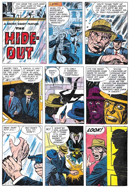
Double Life of Private Strong #1 (June 1959) “The Hide-Out”, art by Jack Kirby

The first issue also had a single page feature, “Tommy Troy Teaches Judo”. The first Fly comic had not been released yet so at the bottom of the page announces “see more of Tommy Troy in Adventures of the Fly”. I do not know who the artist was. Nor can I identify the artists who provided illustrations for the required text piece except to say it was not by either Simon or Kirby. “The Hide-Out” was a two page promo for the Fly also drawn by Kirby. Despite its short length (15 panels) it is really a nice piece. Kirby always seemed to give his work his best effort no matter the length.

I’ll write about the second issue next week.

The Wide Angle Scream, What Was Old Is New Again

Sometime after the demise of Mainline, Simon and Kirby’s attempt at becoming publishers, Joe and Jack’s partnership broke up. Jack returned to being a freelance artist but whenever Joe had some comic to produce Jack would always give a hand, at least for the initial issues. In 1959 Archie Comics asked Joe Simon to produce a couple of superhero comic titles for them. For one of the new titles Joe decided to resurrect an old proposal. Years before Simon along with the artist C. C. Beck and the writer Jack Oleck had created Silver Spider. Oleck wrote some scripts and Beck drew the origin story and it was proposed to Harvey Comics but was then rejected. Joe retrieved the original art and at least one script (which he still has) from Harvey but decided, probably because of the previous rejection, the hero should be changed from the Silver Spider into the Fly. Simon asked his former partner, Jack Kirby, to draw the art for the first issue using the C. C. Beck art as the basis for the origin story. (What happened to the C. C. Beck art is a tale that I will not repeat here, suffice it to say that through no fault of Jack’s the Beck art was never returned to Joe. All Simon has now are large photocopies of the original art. You can see some images of the Silver Spider in Chapter 10 of The End of Simon and Kirby) Kirby was also apt to turn to old ideas and so he based the Fly’s costume on an unused Simon and Kirby creation, the Night Fighter. (It is not pertinent to the theme of this post, but this was not the end of the recycling of the Silver Spider as years later it played a part in the creation of Marvel’s Spider-Man.)


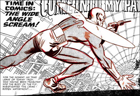
Adventures of the Fly #1 (August 1959) “Come Into My Parlor”, art by Jack Kirby
Enlarged view

The centerfold of the first issue of The Adventures of the Fly featured a double page splash with the declaration:

NOW FOR THE FIRST TIME IN COMICS: THE WIDE ANGLE SCREAM

This is of course where I have derived the name for this serial post about the Simon and Kirby wide splashes. Since Joe and Jack have been using double page spreads since Captain America #6 (September 1941), this issue of the Fly was hardly the first time for the use of this dramatic opening for a story. But in 1959 comic book readers were young and unlikely to know about the earlier comics.

The Fly splash pages are divided into two sections, the splash proper and the start of the story. At the top and bottom of the splash are two parabolic shaped borders making the image wider at the sides then in the center. The background buildings on the two sides of the splash tilt in different directions. All of this was to give the feeling of a wide angle presentation. But this was all just suggestive as a true wide angle lens would not distort the scene in these manners.
The two adversaries face off from opposites sides of the splash. The Fly seems quite at home on the Spider Spry’s web while it is the criminal cohorts of the Spider that seem to be most encumbered. The scale of the figures makes no literal sense. No realistic perspective would cause the rest of the criminals to be so much smaller then either the Fly or the Spider. The size difference is not due to any problem Kirby had with rendering perspective; he was the master of the illusion of space. Rather Jack has reverted to a pre-Renaissance technique, actually common to a great number of art cultures, were size indicates importance.

Not Jack’s best splash but still superior then most artists of the day could have produced. Some have said this was inked by Kirby but I cannot see Jack’s hand in any of the inking of these Archie comics. I doubt Joe Simon did the inking on the splash either.

Adventures of the Fly #1
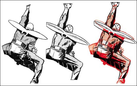
Overlay of the figure of the Fly from the cover (red) and the splash (black)

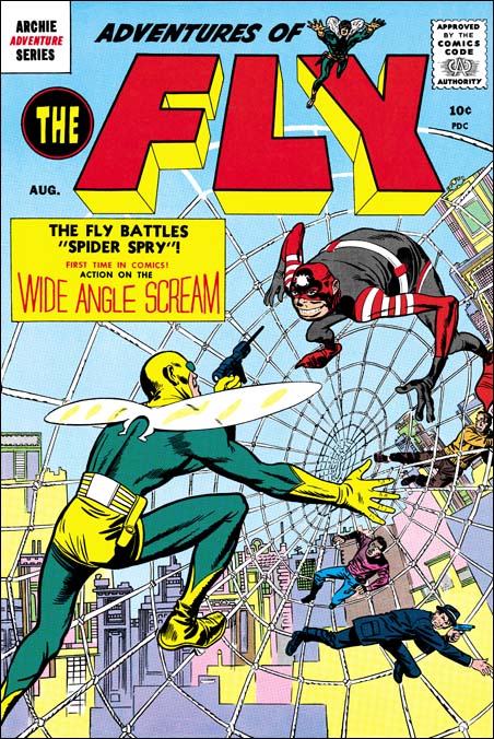
The cover for the first issue of the Fly is basically the same scene as this splash with the composition altered for the vertically oriented space. As I have shown previously, the cover is based on the splash and not the other way around. (See The Fly, A Case Study of Swiping, for further details.) First a stat was made of the splash and then cutup and reorganized for the cover. Then someone, most likely Simon, touched up some of the inking. It was all well done because cover is every bit as good a designed as the splash.

The Fly, A Case Study of Swiping

“Swipe” is a rather unusual term which in my dictionary is defined as a slang for to steal or pilfer. It has also found use in discussions about comic books as a term for copying. Considering its original slang usage it is not surprising that the word has a very derogatory association in comics. Other art studies, including the fine arts, do not use the term. That is not to say that activities equivalent to swiping do not occur, it is that more neutral words are used to describe those activities. The word swipe is so entrenched in the discussions about comic book art that I that I continue to use it. But I do not share the disapproval that most have who use this term. Swiping was common in comic book arts, actually in all the arts. Even Jack Kirby has been shown to swipe.

The first four issues of the Adventures of the Fly provides some good examples of various types of swiping that could be done. Some call this a Simon and Kirby title, but it seems to me that Simon was really the driving force. Joe brought together artists other then Jack to work on the books. In fact Jack’s involvement was less then what some people thought because of the use of swipes.

Adventures of the Fly #1
Adventures of the Fly #1 (August 1959) pencils by Jack Kirby (splash art in black, cover art line art in red)

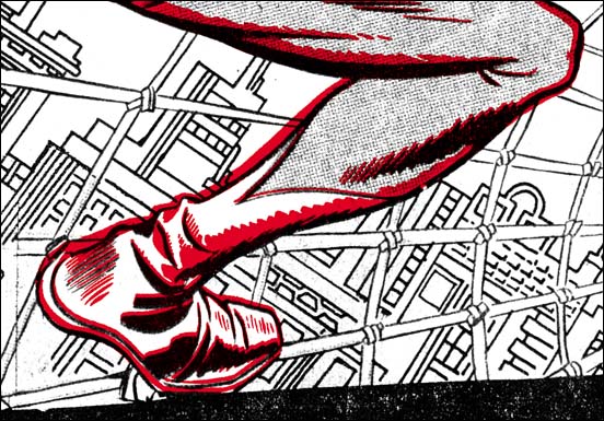
The four Fly covers only provide an interesting assortment of Joe’s working method. The cover for issue #1 is not really a swipe. Included in the story art that Jack did for the Fly #1 was a double page splash. The cover is basically parts taken from the splash and rearranged somewhat to fit the narrower proportions of the cover. It is possible to overlay the line art of the Fly from the cover and the splash with good accuracy. That is not to say you get perfect alignment between the two. In the overlay image I provide above I was as careful as possible in adjusting the size and angle of the images. I was able to get good agreement between the two in the area of the Fly’s head and foot. But look closely at his right hand and you will see they deviate slightly. Actually this is to be expected considering the various equipment used. I have often overlaid original art or proofs of line art over the published cover and have never seen one that could be perfectly aligned in all parts. The alignment in this case is especially good so I have little doubt that stats taken of the splash was used to assemble the cover. Since some of the fine spotting lines are present in both the cover and the splash the stat was taken after the splash had been inked. The cover had to be prepared at about the same time as the rest of the comic, so I believe Joe had the stats made of the splash made while assembling the book. Later the printer for Archie did stats of the entire comic in preparation for publication. In this case the small difference in alignment was due to different stat cameras being used.

Adventures of the Fly #1
Adventures of the Fly #1 (August 1959) pencils by Jack Kirby (splash art in black, cover art line art in red)

Even though some of the fine spotting aligns well, changes were made. For instance some new spotting was added in the shoulder region. Also the outlines were strengthen, often significantly, is some areas. This was not simply a retracing of the outline. By shifting the wider ink lines the form would be exaggerated in some places and subdued in others. There are two areas where the newly inked lines deviated significantly. One is the upper line for the right thigh as it approaches the knee. The cover version is more tapered while the splash has more of a bulge. The other change made was to the Fly’s goggles which were made more prominent on the cover.

I cannot prove it, but this entire process used to create the cover suggests to me that it was done by Joe Simon. When you consider how wide the splash was compared to the cover it is amazing how well the cover composition works. As for the inking alterations that is the sort of thing I have seen Joe often do today. When he wants to make a reduced copy of some art where the original is too large for his copier Joe copies it in pieces and then reassembles reduced sized parts. This often leaves lines where the parts were joined which Joe will retouch. But frequently he also proceeds to retouch the art on the copy as well. This is what I believed happened to the cover. For me most of the changes made greatly improved the art. The one exception is the tapering to the upper thigh. I feel the bulging in the splash is more appropriately as it makes it seem that the Fly is about to spring into action. If I am right that Joe re-inked the cover, then I doubt that he was the inker for the splash or the rest of the story.

SwipeFly2Cap7.jpg
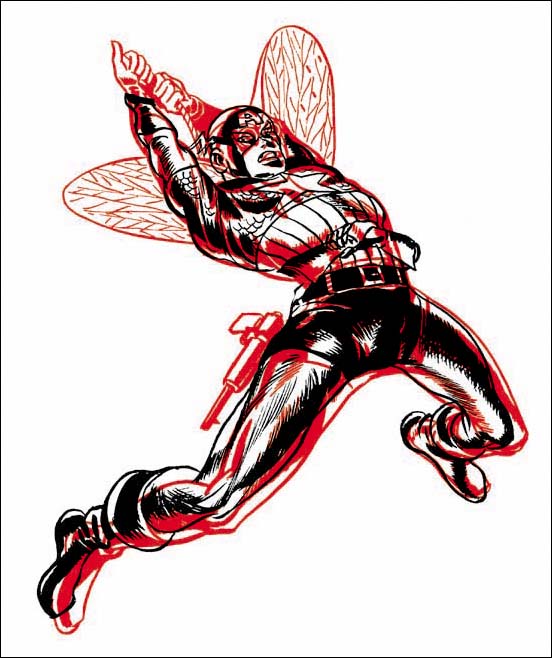
Overlay of figures from Adventures of the Fly #2 (September 1959) in red and Captain America #7 (October 1941) in black.

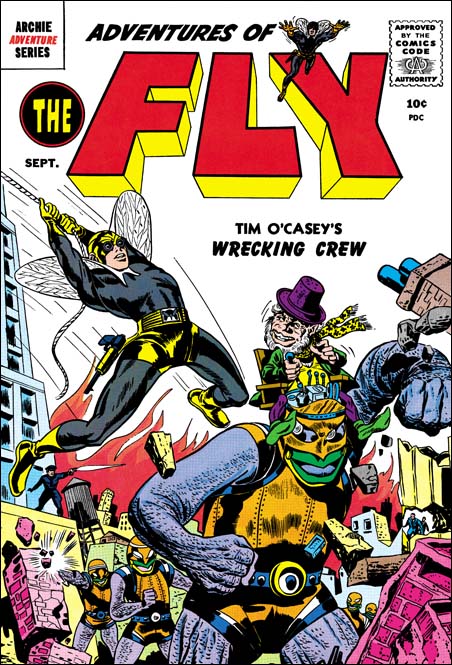
Many have recognized the fact that the swinging Fly on the cover of issue #2 was swiped from the cover of Captain America #7 (October 1941). When I produced the above overlay I found that a good alignment simply could not be done. So I aligned the top of the heads and an approximation of the figures left foot. This provided pretty good alignment for the torso. I will not provide a line by line description of the differences, there just are too many. Cap and the Fly figures are dissimilar both at the small and the large scales. As an example of a large scale note how the Fly’s right leg is further forward then Cap’s. For the other scale compare the figures’ right (as drawn this would also be the lower) outline to the torso. For one thing Cap had an indent to delimit the shoulder that is completely absent of the Fly. Of special interest is the figures’ left thigh. Cap’s has a distinct bulge to the upper part leading into a comparatively thinner region just above the knee. On the other hand the Fly’s thigh is more evenly tapered. This is the same sort of alteration that had been made to the cover of Adventures of the Fly #1, an indication that both may have been done by the same artist. With all the differences between the swipe and the source it is clear to me that the Fly for the cover was not done using a stat or any other mechanical copying device. However in my opinion there are way too many similarities for the Fly #2 to be based on just a remembrance of the Cap #7 cover. No the Fly figure was done by freehand copied from the Cap #7 cover. Joe has since used the pose on a number of occasions, although not as far as I know for a published comic. So once again I attribute this work for this to Joe Simon.

Adventures of the Fly #3 &  Black Hood #9
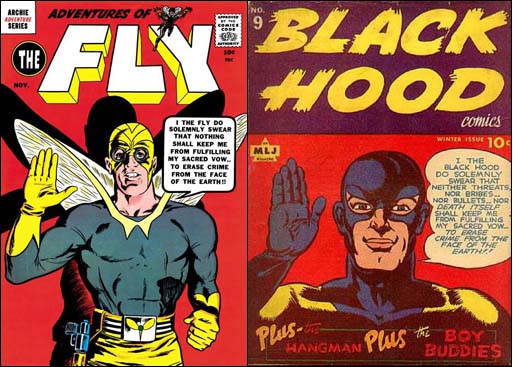
Adventures of the Fly #3 (November 1959) art by Joe Simon and Black Hood #9 (Winter 1943) [the Black Hood #9 image is from the Grand Comic Book Database (GCD)]

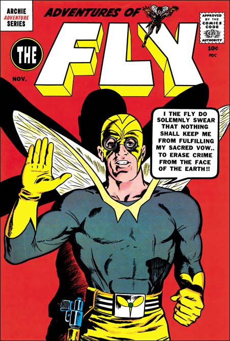
When I previously wrote about the cover for the Adventures of the Fly #3 Scotty Moore left a comment pointing out the similarity to the cover for Black Hood #9. Not only is the pose pretty much the same but both take an almost identical oath. It is hard to believe that the relationship between the two is just a coincidence. Particularly since Black Hood title had been published by the same company as the Fly. Although the pose and concept was swiped I would hardly call the Fly a close copy. Joe once told me he did this cover using himself in a mirror as model. This does sound right because the art does look like Joe’s work.

SwipeFly4Ad88.jpg
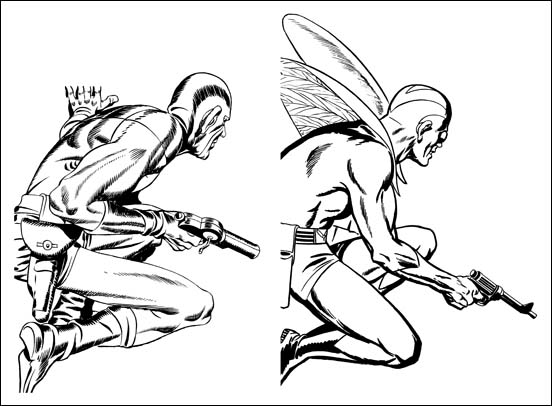
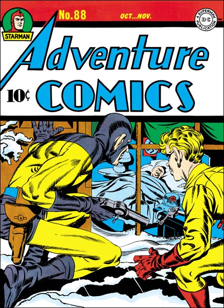
Figures from Adventure Comic #88 (October 1943) art by Jack Kirby and Adventures of the Fly #4 (January 1960) art by Joe Simon

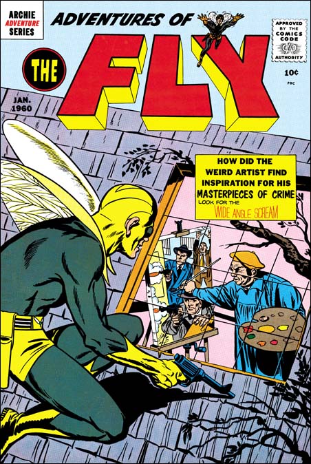
This is another example where the figure of the Fly was obviously a swipe, in this case from Sandman on the cover of Adventure Comic #88. I provide a side-by-side image of the two figures because overlaying them would just be confusing. It can easily be seen that the Fly is not a close copy of the Sandman. Things like the positions of the limbs, details of the anatomy, and the size of the ear all have been changed. Clearly the Fly was freely drawn with the Sandman source used only as a casual reference. Both were originally shown peering through a window but Sandman had been shown squatting on flat ground while the Fly was on a slanted roof. The change in the nature of the foundation probably had a lot to do with some of the changes made.

SwipeFlyWindow.jpg
Left figure from Adventures of the Fly #1, “Come Into My Parlor” page 4 panel 1 art by Jack Kirby.
Center figure from Adventures of the Fly #4, “Duped By The Dazzler” page 5 panel 4 (rotated and flipped)
The two overlaid where red is the Kirby figure.

The Fly comics swiping is not limited to the covers. The examples I have chosen from story art both show the Fly clinging to a building wall just outside of a window. However to place them in the same pose I had to rotate the one from Fly #4 and then make a mirror image (that is flipping the image so left becomes right and visa versa). I provide an overlay of the two but it is impossible to get them to properly align. The side-by-side versions give a better idea as to what the problem is. The limb and torso proportions dramatically differ between the two. Even small details such as the angle taken by the right hand fingers in relation to the legs is not the same.

There can be no doubt that the one from Fly #4 was a freehand drawing. But who actually drew the swipe? Well although the pose was swiped from Kirby, the artist articulates the muscles very differently then Kirby did. The same way of handling the figure’s form is found in all the other drawing of the Fly from the same story and these other Fly appearances do not seem to be swiped. I have little doubt that the swiper is the same as the story artist.

There are other swipes in the first four issues of the Fly as well as in the companion book The Double Life of Private Strong. Further more then one artist was used to draw these stories and all the swipes seem to be off of Jack Kirby. Kirby was greatly admired by other comic book artists so all the artists for the Fly and the Shield used Kirby as a source to swipe. Well that seems highly unlikely, there should be a more reasonable explanation. Joe Simon has said that he provided artists with layouts. Now Joe did not say what titles he did that on but his collection still includes a layout for the Fly that Carl Burgos did. I suspect that the layouts Joe provided for the artists already included the swipes. The layouts may have been as rough as the Burgos example so Joe may also have provided copies of the Kirby source for the artist to complete the swipe from.

Simon and Kirby Meet the Shield

I am doing a guest blog posting tonight at Comics Should Be Good called Simon and Kirby Meet the Shield. Check it out.

Featured Cover, Adventures of the Fly #1

Adventures of the Fly #1
Adventures of the Fly #1 (April 1954) by Jack Kirby

One of my contestents in my recent contest picked The Adventures of the Fly #1 as their favorite Simon and Kirby cover. I have previously written about Adventures of the Fly in Chapter 10 of The End of Simon and Kirby. There my main conclusion was that the Fly comics were not true Simon and Kirby productions. Joe seemed the main driving force in constructing these comics and he made use of other artists besides Jack. Having said this I hasten to add that Jack seemed to be primarily responsible for the final appearance of the Fly. The costume is very different from the Silver Spider by C. C. Beck whose story was the basis for the creation of the Fly. Rather the Fly seems largely based on Night Fighter, an unused creation that was probably originally considered for S&K’s publishing company Mainline. Although the origin story for the Fly was largely based on Beck’s penciled version that Joe provided Jack, the other stories Jack did seem to be his own. Included in one was a double page splash. The original art for this wide splash is still in Joe’s personal collection. It a beautiful piece of work with no signs of any cut and paste. That being the case along with the fact that the splash has one extra figure, the cover must somehow be based on the splash.

Joe Simon and Fly splash
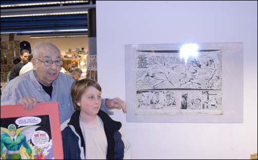
Photo of Joe Simon with splash page at Big Apple Con (4/3/04)

As far as I know the original art for the cover no longer exists. This is unfortunate because it might provide hints what method was used to transfer the art from the splash and rearrange it for the cover. As pointed out by Kirby scholar Stan Taylor the Fly comics contain a number of swipes from figures originally drawn by Kirby. Some of the original art for these still exist and clearly they were not done by using stats or any similar photocopying device. However when the line art for the Fly on the cover is compared to the splash page much of the inking, including some rather fine spotting, is the same. There does not appear to be any inking present on the splash that is absent on the cover. On the other hand the cover Fly has some spotting that does not appear on the splash. In particular the outlines have been made thicker on the cover. A lot of the lines for the web and the background do not actually touch the figure. I present a close-up of the cover line art (red) over the splash. The alignment and size adjustment are not perfect but it should give you the idea. From all this I have little doubt that Jack did the splash page, it was inked (not by Kirby), then Joe had some stats made, assembled the cover, and finally retouched and expanded the inking. Joe had previously used stats to help create covers, but for the Fly #1 cover it was a much more intricate procedure.

Adventures of the Fly #1
Part of the splash overlaid with the cover line art (in red)

The Art of Joe Simon, Chapter 12, Covering the Fly

When I “completed” my recent serial post “The Art of Joe Simon” Stan Taylor pointed out that I had left out Joe’s work on the Archie series “The Adventures of the Fly”. What a slipup! I have renumbered the chapters so that this one gets in the proper sequence. The stories are obviously the work of a number of different artists. Sorting out who did what would be a Herculean task which I am not prepare to venture into at this time. But I get the impression that Joe did little, if any, of the actual interior art. However Joe was involved in all the covers. In fact the Fly covers supply a full range of Simon’s working methods.

I included an image for the cover for Fly #1 (August 1959) in Chapter 10 of “The End of Simon & Kirby”. This cover was made from stats of the double page splash by Jack Kirby, the various parts rearranged to fit the cover properly. I say the cover was made from the splash and not the other way around because the original art for the splash still exists and it includes no stats. It is not certain, but Joe was probably responsible for the physical construction of the cover. Of course that does not take away credit and Jack Kirby should be regarded as the primary penciler for this cover.

Adventures of the Fly #2
Adventures of the Fly #2 (September 1959) part by Joe Simon

The cover for Fly #2 (September 1959) is generally attributed to Jack Kirby. But I believe Simon put it together using different sources. Joe did the figure of the Fly swiping the pose from Captain America #7. I do not believe that Joe drew the diminutive robot operator it looks like he was done by the same artist that did the interior story and is not a swipe. The robots on the cover however are done in a very different manner then the story. It could have been done by a different artist but it seems unlikely. The operator and the robot fit together so well it is hard to believe that different artist could have done them.

Adventures of the Fly #3
Adventures of the Fly #3 (November 1959) by Joe Simon

With the third Fly cover Joe appears to turn to a more standard penciling approach. It is not possible to prove swiping was not used. Nevertheless the pose seems to be original and not a copy. Joe told me once that he used himself as a model drawing in front of a mirror.

Adventures of the Fly #4
Adventures of the Fly #4 (January 1960) by Joe Simon

For the cover of the last Fly comic that he produced, Joe turned to what was for him a more standard technique. That is doing the entire cover and turning to swipes for portions of it. The source for figure of the Fly was the Sandman from the cover of Adventure #88 (see below). As by his normal practice, Joe did not do a close copy, but altered it to suit his purpose. The pose is adjusted slightly, largely because Sandman was squatting on a flat ground while the Fly is on a slanted roof. But the position of the right arm was also modified. Joe also corrected Sandman’s ears which Jack had made oversized as he so commonly did at that time. In the end even though the source was Adventure #88 the finished product was all Joe’s. I cannot say if there are any other swipes on this cover, but I would not rule it out. At this stage in his career, Joe is very adept at what he does and this is a nicely designed cover. Yes swiping was used but it is so well done that we know about it only by comparing it to the source material (Adventure #88). Otherwise there is nothing about the cover that gives it away.

Adventure #88
Adventure #88 (October 1943) by Jack Kirby

Art by Joe Simon, Chapter 11, The Party Is Over

Art by Joe Simon, Chapter 13, Wrap Up