Category Archives: Swiping

Early Joe Simon and Flash Gordon

The most certain way of spotting a comic book swipe* is, of course, to find the earlier version that from which it was swiped. But it is possible to recognize a swipe even when the original has not yet been found. Deviations in art style or level of detail in the art is one method that can be used to suggest that swiping has been used. Repetition of a particular image is another.
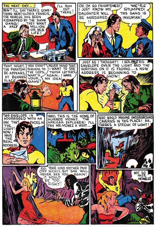

Daring Mystery #2 (February 1940) “Phantom Bullet” page 9, pencils, inks and letters by Joe Simon

An early assignment for Joe Simon (released only one month after his earliest published work) was “Phantom Bullet” for Timely Comics. Note the despairing female in the second to last panel from page 9. Actually there is little in the art to suggest that this is might be a swipe. Perhaps only that the woman’s pose seems not to match very well to the action. However such a defect could easily be excused since Simon had just begun to learn his trade as a comic book artist. His previous experience as a staff artist for a newspaper did not overly prepare him for the special requirements of sequential art.
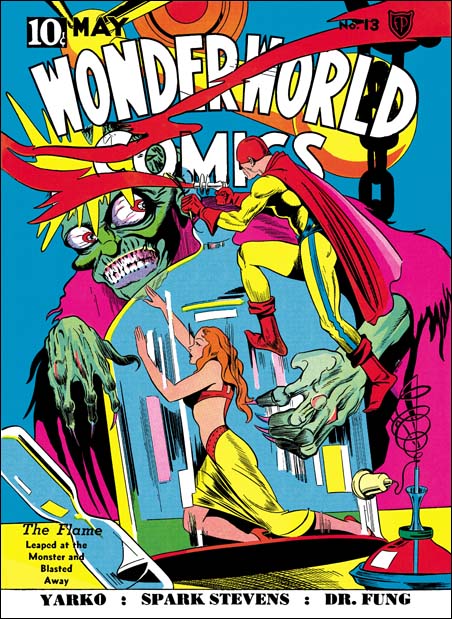

Wonderworld Comics #13 (May 1940), pencils and inks by Joe Simon

When Simon became editor for Fox Comics he would draw the cover art. The same damsel in distress shows up on the cover of Wonderworld #13. The Wonderworld figure is a close match for the one in Phantom Bullet but by no means identical.


Flash Gordon (February 4, 1934), art by Alex Raymond

So at this point nearly the same figure appears on two occasions. While this is not proof that the figure was swiped it certainly is strongly suggestive that it was. The proof came when I recently noticed a panel shown above from the newspaper syndication strip Flash Gordon. Simon was a big fan of Raymond’s Flash Gordon (as well as Hal Foster’s Prince Valiant). Other swipes by Simon from Flash Gordon have been previously reported (Art by Joe Simon, Chapter 4, Footnote) so the fact that Raymond is the source of the female figure is not totally unexpected. Still it is nice to have confirmation on a swipe that was already expected based on its repeated use. The biggest surprise is that date of the Raymond original, February 1934, six years prior to Simon’s swipe. It is possible that Simon and kept a copy over the years but it is also possible that he had picked up a reprint book. Raymond’s Flash Gordon was very popular at the time and reprints the publisher Whitman had released at least one volume in 1940.


Wonderworld Comics #13 (May 1940) art by Joe Simon
Flash Gordon (February 4, 1934) art by Alex Raymond
Daring Mystery #2 (February 1940) art by Joe Simon

Above I have scaled the figures to the same dimensions for an earlier comparison. It can be seen how much of the damsel in the Wonderworld #13 cover was copied from Flash Gordon. Even much of the detailing of the folds and shadows of the woman’s dress are shared between the two. Not surprisingly the figure from the Phantom Bullet panel has less details but even in it some of the folds of the dress were copied from Raymond’s work. While the similarity of both of Simon’s version to the Flash Gordon original are too close for anything other than swiping, they are not so close to suggest anything other than a hand drawn copy. There was a time on the defunct Kirby-list where some claimed Simon used a copying device such as an overhead projector. They may all seem very similar but when I tried to overlay one drawing over another there were so many differences that the resulting overlay was too confusing. As an example compare the female’s buttocks. They are much longer in the two drawings by Simon than they are in the Raymond original. Such mistakes would are quite typical of hand drawn copies but would not be expected to be found in a copy made with the aid of a mechanical or optical device.
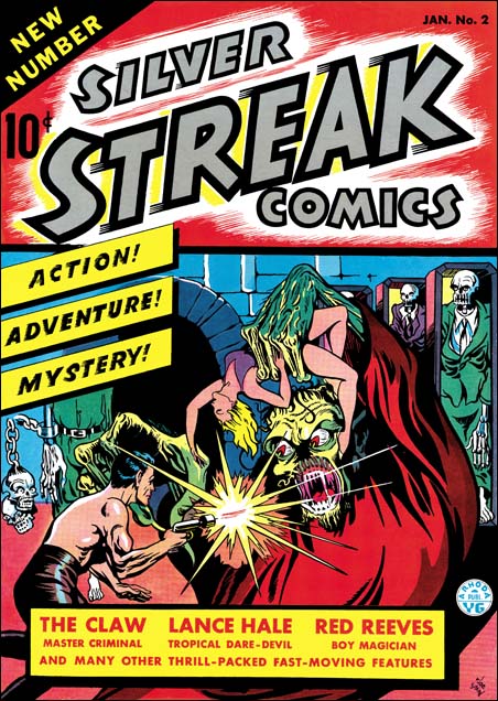

Silver Streak #2 (January 1940), pencils and inks by Joe Simon

One of the first pieces of comic book art that Joe Simon ever did was the cover for Silver Streak #2 (January 1940). One can question the anatomical accuracy but nonetheless it is a great cover full of energy and interest. Again by itself there is nothing in the cover art that glaringly suggests the use of swipes. However familiarity with Simon’s art style suggests that the gun firing hero might, just might, be a swipe because of the amount of detail provided for the anatomy.
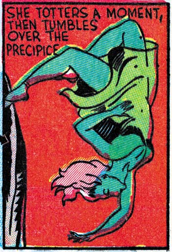

Blue Bolt #1 (June 1940) “The Human Lighting Streak” panel 4 of page 6, pencils, inks and letters by Joe Simon.

Not long afterwards Simon created Blue Bolt. Actually as I discussed in a previous post (In the Beginning, Chapter #1, Blue Bolt #1) the origin story for Blue Bolt may have been created earlier than its cover date indicates. The same female figure appears once again although under more general circumstances the green sorceress would not be described as a damsel in distress. But while usually a villainess she would periodically become in need of saving by Blue Bolt. Once more repetition suggests the use of a swipe.


Flash Gordon (April 22, 1934), art by Alex Raymond

Earlier I believed that this second female image was little more than an altered version of the first. However on reviewing the material in preparation for this post I concluded that there must be a different source for the second figure. However considering the great similarity between the two figures I believed that the Alex Raymond was also the source of the second swipe. I then did more searching and found the source of the second female figure in the Flash Gordon strip from April 22, 1934.
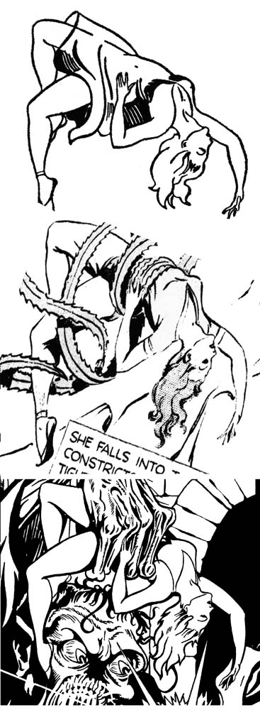

Blue Bolt #1 (June 1940) art by Joe Simon
Flash Gordon (February 4, 1934) art by Alex Raymond
Silver Streak #2 (January 1940) art by Joe Simon

AgainI have matched the original and the two swipes as closely as possible. While sharing some even rather small details the two Simon images are not exact copies of the Raymond original.

Flash Gordon is once again going to be reprinted this time by two publishers, IDW and Titan. IDW’s first volume is already out and Titan’s is scheduled for release in March. I am sure that many more sources for Simon’s swiping will be found in these volumes.

Footnotes:

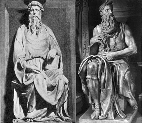
* I find “swipe” to be an objectionable term because of the connotation of theft that it is based on. There is no similar expression in the fine arts where no one would describe Michelangelo’s Moses as being a swipe of Donatello’s St. John the Evangelist (as shown in Kirby Swipes from Simon). However the term swipe is so entrenched in discussions on comic books that it must be accepted.

A Simon and Kirby Swipe


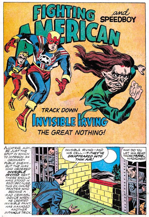
Fighting American #5 (December 1954) “Invisible Irving”

In a previous serial post on Fighting American (Fighting American, Chapter 3, Jumping the Shark) I discussed the story “Deadly Doolittle” (Fighting American #6, February 1955). That story was a rewrite of a Manhunter story from Adventure Comics #75 (June 1945). In the comments Ger Apeldoorn remarked that the “Invisible Irving” from the previous issue looked like it was reused art as well. Sometime later Lucas pointed out that “Invisible Irving” was based of the Starman story from Adventure Comics #77.

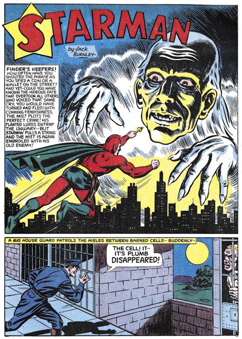
Adventure #77
Adventure #77 (August 1942) Starman, art by Jack Burnley

A quick check of the Jack Kirby Checklist showed this fact was reported there as well. It was, however, news to me so I thought a comparison of the two stories might be of interest. The first thing that can be noticed right from the splash pages is that the text “Invisible Irving” was not lifted from the Starman story. The text was re-written for the Simon and Kirby piece. While what was said by the characters may be very similar the actual words were by no means identical.

However the plots were pretty much the same. Both start with a prison break aided by the use of invisible paint. The escape villain starts up a criminal gang that uses use planted valuables that unsuspecting passersby find and keep. T “lost” valuables then hypnotize the victims into committing crimes for the gang. The gang attacks one lady who instead of keeping the “lost” object intends to take it to the police. Fortunately she is rescued by the hero who removes the effect of the invisible paint the gang was using. However the main villain escapes only to be pursued by the hero. The hero catches up to the criminal mastermind at a windmill. Initially the villain captures the hero only to have the table turned on him in the end. The only reason I have summarized the plot here is to show how similar the two stories are. This summary applies equally well to either story.

Fighting American #5
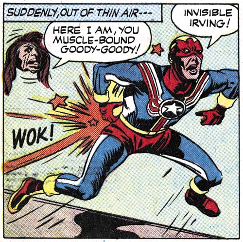
Fighting American #5 (December 1954) “Invisible Irving” page 4 panel 6

There are some small differences between the two stories. Many of the differences are due disparity between the lengths of the two pieces. Much had to be eliminated to bring the 11 page Starman story down to 6 page length for use in Fighting American. Other changes had to be made because while Starman could fly, that ability was not possessed by Fighting American. Starman also had a star-ray that could remove the effects of the invisibility solution while Fighting American had to rely on paint remover instead. Other differences have to do with the use of humor by Simon and Kirby. After the initial issues of Fighting American, Joe and Jack began to poke fun at their own creation. Scenes like the one above showing Fighting American being kicked in the seat of his pants are absent from the Starman story (or as far as I know of, from any other superhero comic book).

Adventure #77 Fighting American #5
Adventure #77 (August 1942) Starman page 2 panel 1, art by Jack Burnley
Fighting American #5 (December 1954) “Invisible Irving” page 2 panel 1

Could the writer have been responsible for swiping the plot from the Starman story? After all one of the writers that Simon and Kirby used was Jack Oleck and he was known to do that sort of thing. However some of the art is so similar between the two stories that there can be no doubt that the artist was swiping from the Starman story.

Adventure #77 Fighting American #5
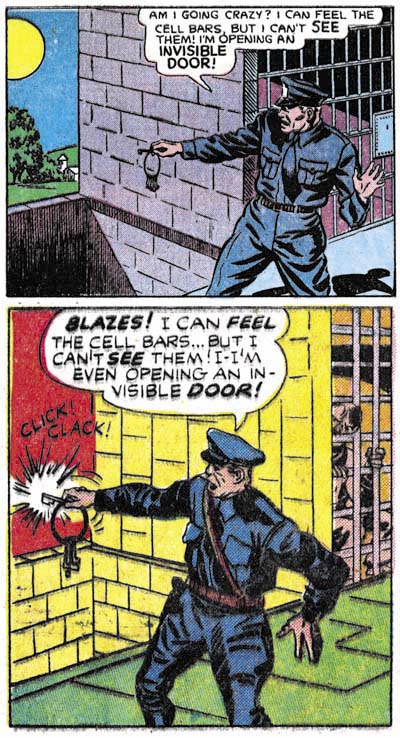
Adventure #77 (August 1942) Starman page 3 panel 7, art by Jack Burnley
Fighting American #5 (December 1954) “Invisible Irving” page 3 panel 6

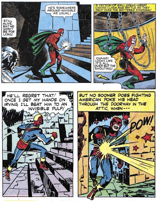
While the artist for Fighting American was clearly swiping from the Starman he was not drawing close copies. None of the figures would be mistaken for tracings. Poses were often adjusted and while the panels might portray the same events they are completely redrawn. It is the story that the artist is interested in, not help in drawing the figures.

Adventure #77 Fighting American #5
Adventure #77 (August 1942) Starman page 10 panels 3 and 4, art by Jack Burnley
Fighting American #5 (December 1954) “Invisible Irving” page 5 panels 4 and 5

Readers may have noted that I have not said who the artist was that provided the “Invisible Irving” story. I do not remember anyone that previously credited this story to an artist other than Jack Kirby. However prior experience indicates that once it has been shown that some Simon and Kirby piece was swiped it will then be attributed to Joe Simon (Jack Kirby, Fanboy). There are many who just do not like to admit that Jack Kirby would sometimes swipe, despite all the contrary evidence that have been unearthed. If the reader chooses to now attribute “Invisible Irving” to Joe Simon, he must also credit Joe for being extremely adept at mimicking Kirby. So good that he has fooled the experts. But then again, Simon and done that before.

Replacing Simon and Kirby, Chapter 1, The Newsboy Legion

While Simon and Kirby were working for DC they knew that at some time they both would be entering military service. To prepare for this the two went into hyper drive and started generating an inventory for DC to use while they were gone. This was very successful and Simon and Kirby covers and stories appeared long after Joe and Jack were working for Uncle Sam. But the inventory was not large enough to last until Simon and Kirby were back from helping to protect our country. By early 1944 (cover dates) there were no more Simon and Kirby story art left.

The question of Simon and Kirby’s replacement came back to my attention recently while reading DC’s Simon and Kirby Sandman archive. There were two stories in it that were listed as being done by Joe and Jack but to me looked like they were actually by some other artist (“Courage a la Carte”, Adventure #91, April 1944 and “Sweets for Swag”, Adventure #100, October 1945). The issue came up again when I recently obtained a copy of DC’s Simon and Kirby Newsboy Legion archive. For the Newsboy Legion volume, DC decided to include material that clearly was not drawn by Simon and Kirby. The replacement artist for most of the Newsboy Legion was credited in the DC volume as Gil Kane. It is an attribution that I have used previously as well. However when I talked with Joe Simon about this he insisted that Gil Kane was not the artist and suggested that it was the brothers Arturo and Luis Cazeneuve.

Simon and Kirby’s replacements was a subject that I have always meant to investigate a little further. This will be the start of another serial post. It will be a bit more erratic than most of my serial posts because I am not going to do this in a strictly chronological order. Instead I will begin with several chapters examining the Newsboy Legion, then look at Sandman and finally cover the Boy Commandos.

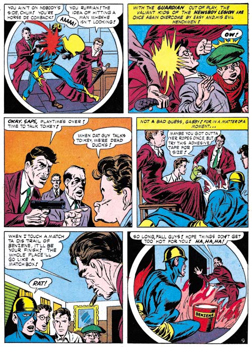
Star Spangled #29
Star Spangled #29 (February 1944) “Cabbages and Comics”, pencils by Jack Kirby

I will start with the Newsboy Legion because the work covered in this chapter can all be found in DC’s recent archive volume. Thus the reader will be able to view more examples than I can provide in this blog. The first story I will remark on is what I believe to be the last published complete Newsboy Legion story by Simon and Kirby before they went off into military service. Because of the push to create inventory and the use of other hands in the inking, the art by this time was not quite as good as early in the Newsboy Legion run. But even poorer quality Simon and Kirby art is still much better than what most other artists were doing. And while many artists might try to imitate Kirby’s dynamic art they were unable to keep it up page after page. In short I have no doubt that this story is in fact a Simon and Kirby production.

The Jack Kirby Collector (issue #21) published an interview with Gil Kane. Two of Kane’s answers are particularly pertinent to this discussion:

TJKC: What were your job duties with S&K?

Gil: Mine was penciling. I would try to turn out a job every week or so. [They were] 12-page stories. I was copying-tracing-Jack’s work.

TJKC: What happened when Simon & Kirby went into the service? What happened to you?

Gil: I got a “Newsboy Legion” job to do by myself (like I had done the rest of them except they didn’t fix it up or do the splash), but when I walked through the door with the finished job, they said, “You’re fired.” They didn’t even look at the work. I really was lousy and I was out! At that point, I was about seventeen and I worked for Continental Comics for a guy named Temmerson. (I penciled and Carmine Infantino inked.) But that only lasted until I went into the Army.

There are a couple of really significant points in Gil’s short answers. Kane describes having previously done work that Simon and Kirby fixed up or provided the splash. Now it is possible that Gil Kane had something to do with earlier stories such as “Cabbages and Comics” but if so it was only in a minor capacity. Kane may have done things like help with the inking but I am sure that Kirby was the penciler.

Star Spangled #30
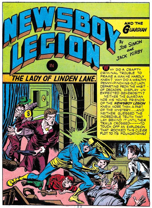
Star Spangled #30 (March 1944) “The Lady of Linden Lane”, pencils by Jack Kirby

There is no sign of Gil Kane, or any other artist other than Simon and Kirby, in the splash for “The Lady of Linden Lane” (Star Spangled #30, March 1944). It is a great splash with plenty of action and a little bit of humor with the normally fearless Guardian trying to duck from the blows of an elderly lady. The hoods in the background are a typical Simon and Kirby feature. This was inventoried material and so perhaps was executed in a hurry, but it still is great comic book art. Joe entered the Coast Guards before Jack went into military service so some of the inventory art may have been done by Kirby without Simon. However there is no reason to believe that DC published the inventoried art in the same order that Joe and Jack produced it. Nor are there any signs that I can find that distinguish this story from others there were done by both Simon and Kirby.

Star Spangled #30
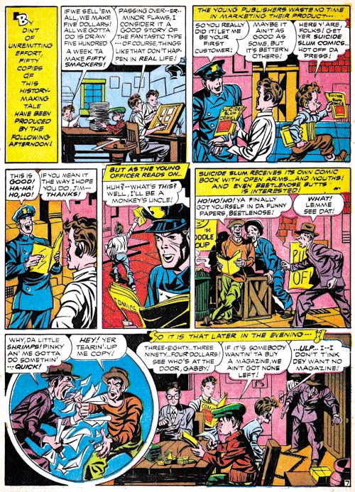
Star Spangled #30 (March 1944) “The Lady of Linden Lane” page 9, art by Gil Kane?

While the splash for “The Lady of Linden Lane” is work that can be attributed convincingly to Simon and Kirby, the rest of the story is not. The art is crude and stilted. There are parts that really do look like Kirby’s pencils but they appear to be swipes. For instance the cigar smoker in panel 5 of page 9 (shown above) is shown in the type of perspective that Kirby favored however it appears to be based on Guardian from the cover of Star Spangled #26 (November 1943).
Star Spangled #8 and #30
left Star Spangled #8 (May 1942) “Last Mile Alley” page 13 panel 2, pencils by Jack Kirby
right Star Spangled #30 (March 1944) “The Lady of Linden Lane” page 7 panel 5, art by Gil Kane?

An even more obvious swipe can be found in the figures of Snapper and Gabby shown above. Unlike my previous example this is a close swipe showing only minor alterations. Kirby did swipe on occasion but one thing I have never seen him do was swipe from himself. Jack did have some favorite poses that he often repeated but they are always done with such variation that it seems clear that he is not copying any previous drawing. Simon did swipe from Kirby, in fact rather often. But Joe was a good artist in his own right and his art is much better than this crudely drawn story. Further I can detect none of Simon’s drawing style in “The Lady of Linden Lane”. While I am not familiar enough with the work of Arturo or Luis Cazeneuve to confidently spot their work, what I have seen is much better than these crude drawings. The combination of a Kirby drawn splash with story done by another artist fits very well the interview reply that Kane gave. Add to that the use of swipes and Kane’s admitted poor artistry (he was 16 at the time). So assuming that there is at least some truth to his statements I am questionably attributing the story art for “The Lady of Linden Lane” to Gil Kane. The one problem with this attribution is that there is only one Newsboy Legion story that fits this description while Kane statement suggests he did multiple works in this fashion.

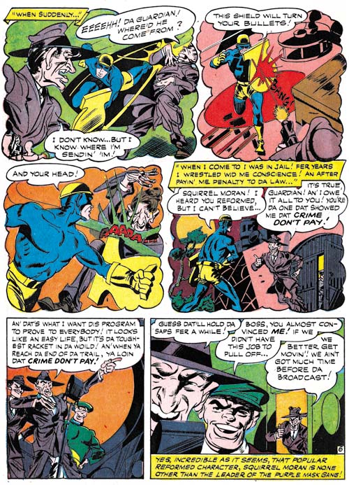
Star Spangled #31
Star Spangled #31 (April 1944) “Questions, Please” page 6, art by unidentified artist

The next issue of Star Spangled Comics had a very different Newsboy Legion story. No clear sign of Simon and Kirby here, neither in the splash or the story art. Nor is this the same artist that produced the story art from “The Lady of Linden Lane” I must admit that I have slighted this artist in the past. His more “cartoony” approach gives the impression that he could be considered an “anti-Simon & Kirby”. But it would be a mistake to dismiss this artist. Put aside any comparisons to Joe and Jack and I am sure the reader will see this is a rather interesting and talented artist. Sure his faces and figures are exaggerated but they are full of life. He makes good use of varying the point of view. He seems to purposely distort background scenery giving it an almost cubist look. This artist may be rather bizarre but he is definitely not boring. I will cover this artist in more detail in the next chapter of this serial post.

But who is this artist? In the past I, and at least some others, have thought this was Gil Kane. Now I attributing “The Lady of Linden Lane” to Gil Kane but is there any other reason to reject Kane as the replacement artist for “Questions, Please” and other Newsboy Legion stories? Actually there is. Gil Kane went into the army shortly after his 18th birthday and he spent 19 months in service. Since he was born on April 6, 1926 that would mean he was in the army sometime about April or May 1944. However, as we will see in the next chapter, this replacement artist would provide work up to Star Spangled #49 (October 1945). This is well into the time that Kane was doing military service. Unlike Simon and Kirby, I doubt that DC would consider the replacement artist important enough to provide an inventory of works to use while he was gone. So it can be said with good confidence that Gil Kane was not the primary Simon and Kirby replacement artist.

But what about Joe Simon’s suggestion of the Cazeneuve brothers? I prefer to put off trying to answer that question until the next chapter where I will review more of the primary replacement artist’s Newsboy Legion work.

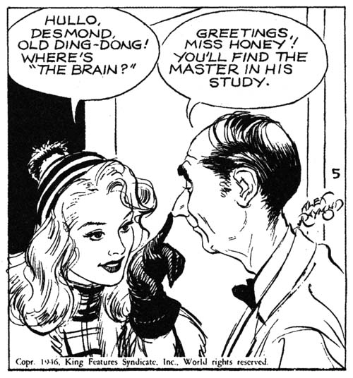
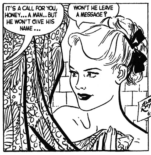
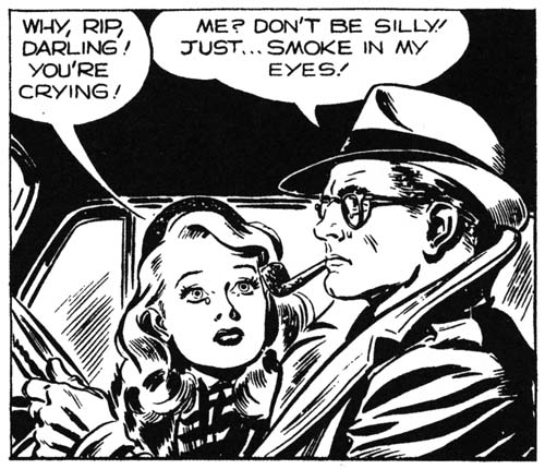
Alex Raymond’s Rip Kirby

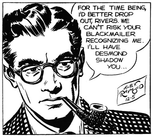
Rip Kirby (12/5/46)
Rip Kirby (12/5/46) art by Alex Raymond

Syndication strips had a great influence on comic book artists. The newspaper comics developed before comic books were widely read and their creators (at least with the more popular strips) were big money earners. Milton Caniff probably had the greatest impact on comic book artists either directly or indirectly. This was particularly true of the Simon and Kirby studio where most artists, including Jack Kirby, grew up reading Caniff’s Terry and the Pirates and had adopted much from Caniff’s style. However he was not the only influential strip artist, another was Alex Raymond. Raymond grew to fame with his earlier Jungle Jim, Secret Agent X-9 and especially Flash Gordon. However Alex’s most important work was, in my opinion, Rip Kirby.

Rip Kirby (3/5/46)
Rip Kirby (3/5/46) art by Alex Raymond

Raymond had a long successful run on Flash Gordon before he volunteered for the Marines during World War II. When he returned from service he found that King Features, his syndication company, had contracted Flash Gordon to another artist. I always thought that companies were required to give returning veterans their original jobs but it turns out that was only true if they had been drafted, not if they had volunteered for service. I guess it was just another example of no good deed goes unpunished. King offered Raymond to create a new feature and the result was Rip Kirby. Some good did come out of this as Raymond not only received a large percentage of the profits but owned the rights to the strip as well. Rip Kirby was immensely popular and became the fastest selling syndication strip.

Rip Kirby (10/25/46)
Rip Kirby (10/25/46) art by Alex Raymond

Some have described the art of Rip Kirby as photo-realistic. Frankly this is not an accurate description at all. True realism in the panel size used in newspaper comics would have made the strips difficult to follow. Raymond carefully worked his realism to keep his characters easy to recognize and expressive as well. Many comic artists that have attempted this sort of realism only ended creating rather dry art. Not Raymond, his lines seem natural and relaxed and his designs always interesting.

Rip Kirby (3/12/46)
Rip Kirby (3/12/46) art by Alex Raymond

Alex Raymond did not have nearly the influence on comic book art as Milton Caniff. This might have been just a greater appreciation to Caniff’s more cartoon-like approach, but the difficulty of adopting Raymond’s greater realism may have been a factor as well. Still some artists were clearly influenced by Raymond. I have mentioned in my recent post on The Art of Romance that Simon and Kirby studio artist Bob McCarty had in 1953 developed a style seemingly influenced by Raymond’s art. John Prentice was even more of a follower of Raymond. Raymond’s approach to Rip Kirby was something that would work quite well in romance stories that Prentice was often asked to do. Prentice’s romance work was so successful that I believe Simon and Kirby preferred to give him love assignments more so then work for Black Magic (although I feel he was quite good at that as well). John Prentice was so adept at Raymond’s approach that after Alex’s untimely death in 1956 John became his replacement on Rip Kirby. While I do not claim Prentice was as good an artist as Raymond, I feel fans have sadly underappreciated Prentice’s work on Rip Kirby. Raymond was a tough act to follow but I feel no one could have done it better then Prentice.

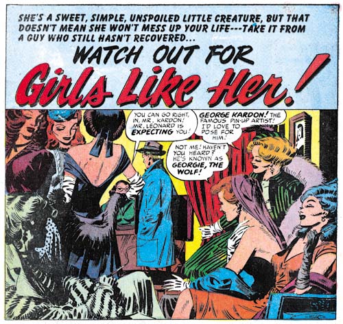
Young Love #14
Young Love #14 (October 1946) “Girls like Her”, art by Mort Meskin

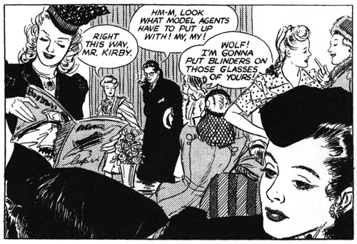
While Alex Raymond’s influence Bob McCarty and John Prentice was not unexpected I was surprised to find clear evidence of his impact on another artist. Of all the artists working for Simon and Kirby I would think Mort Meskin was the furthest from Raymond’s approach. Meskin had developed a stylized style that superficially seems quite different from Raymond’s more realistic manner. However I realized I had been underestimating Mort Meskin when I saw a panel from the Rip Kirby strip of March 10, 1946. The scene depicts Rip Kirby entering a model agency but while that is the true subject of the panel the entire foreground is occupied by some of the agency’s models. A similar composition, but by no means an identical one, was used by Meskin for “Girls like Her” (Young Love #14, October 1950). Obviously Meskin is not copying Raymond’s piece but clearly that was the original inspiration for his splash. Once again we view a man entering a modeling agency but only through a foreground of an array of models. There are telling differences. While some of Raymond’s models are actual doing something (reading a magazine or having a conversation) all off Meskin’s models look like just lounging around as if in some modern day harem. Raymond’s models seemed attired in the latest (for 1946) manner (I understand Raymond had a consultant keep him abreast of the latest fashions) but while the clothing of Meskin’s models is imaginative it does not seem realistic. Meskin has placed all his models in a rather confined space while Raymond’s models are arranged with a much greater depth of field. Meskin was obviously inspired by Raymond but created his own unique piece of art.

Rip Kirby (6/19/48)
Rip Kirby (6/19/48) art by Alex Raymond

I am happy to say that IDW will be reprinting the entire run of Raymond’s Rip Kirby. The first volume covering 1946 to 1948 is already out and the second volume should be released in March. The volumes are said to be based on syndication proofs of the original strips. The quality of the reproduction in the first volume varies a little bit but is always much better then I would expect if it was reproduced from actual newspaper strips (newspaper printing is as bad as that used on comic books). Rip Kirby was a daily strip so there are no color pages. All of the volume is printed on real nice flat paper (I do not understand why some people prefer glossy paper). The book’s width is greater then its height which is admittedly awkward for storing on a shelf but makes for much better reading. IDW does such a nice job on their reprints and I cannot recommend their Rip Kirby too highly.

Rip Kirby (12/13/46)
Rip Kirby (12/13/46) art by Alex Raymond

Jack Kirby, Fanboy


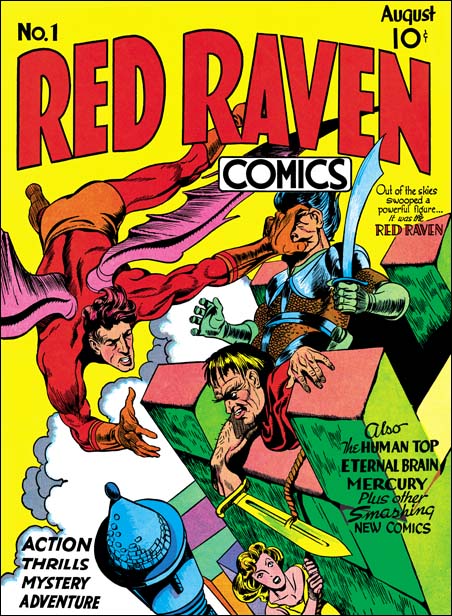
Red Raven (August 1940), art by Jack Kirby

Somewhere around February 1940 (calendar dates) Joe Simon left his position as editor for Fox Comics and became Timely’s first comic book editor. It would seem that the first thing Joe did on arriving at Timely was to produce a new title, Red Raven Comics (August 1940, cover date). My understanding is that until a salaried position was arranged for Jack Kirby, he stayed at Fox. Perhaps that is why the title feature of Red Raven was done by another artist, but Jack would do the cover and some backup features (Early Jack Kirby, Chapter 5, Timely and the Red Raven). It was a very imaginative cover showing the Red Raven rescuing a damsel in distress. It looks like a scene from some medieval castle and for good reasons.

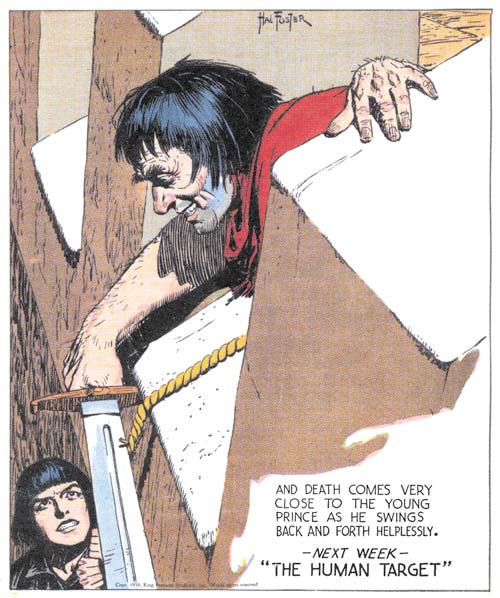
Prince Valiant (January 15, 1938)
Prince Valiant (January 15, 1938), art by Hal Foster

Kirby’s cover was clearly swiped from the popular Prince Valiant syndication strip. This is not new information that I am presenting here as my understanding is that the swipe was reported a number of years ago in Robin Snyder’s newsletter. I have not seen this particular newsletter but Joe Simon discussed it with Carmine Infantino and me around 2000 or 2001 so it should have been prior to that. Joe remarked that originally the Red Raven cover was attributed to Kirby but when it was found to be swiped from Hal Foster some now said it was by Simon. Joe was complaining about the attitude, pretty common at the time, that Jack would never swipe but Joe always did. Hopefully that false concept has been put to rest by the discovery of a number of swipes that Kirby did from various sources, many of them discovered by the diligent efforts of Kirby scholar Tom Morehouse. In the case of the Red Raven cover the drawing style leaves no doubt that Jack was the penciller. By the way when Joe made the remark about the newsletter Carmine asked “But Joe did you swipe”? Joe answered, “Sure, back then everybody did”.

It is interesting that Jack used a newspaper comic from about 2 years prior as material to base the Red Raven cover. Although Prince Valiant was very popular, I do not think it had yet been reprinting as a book. That meant that Kirby had kept at least this particular strip for some time. One normally does not think of Jack Kirby as a fanboy but it appears he was, at least for Hal Foster.

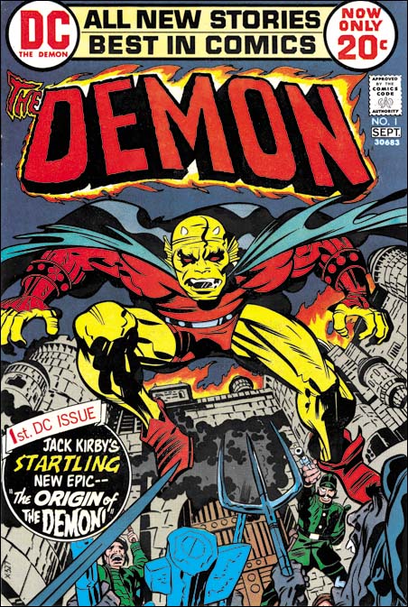
The Demon #1
The Demon #1 (September 1972), pencils by Jack Kirby, inks by Mike Royer

Of course that was all when Jack was very young; surely he wouldn’t do something like later in his career. Would he? Mark Evanier wrote a foreword to DC’s reprint “Jack Kirby’s The Demon”. Mark is such a marvelous writer and Kirby scholar that all of his introductions are great, but this one is particularly special. In it describes Jack creating and outlining the first issue of the title, The Demon, over the course of a family outing to a restaurant. On his return Jack would pull out a reprint volume and declare he would use it to model the new character as a sort of inside joke. You guessed it; it was a reprint of Hal Foster’s Prince Valiant. Over twenty years later and Jack still was a fanboy!

Prince Valiant (December 25, 1937)
Prince Valiant (December 25, 1937), art by Hal Foster

Both Prince Valiant images that I used above come from a new reprint volume by Fantagraphics (Prince Valiant, Vol. 1: 1937-1938). This is a gorgeous volume with coloring that is absolutely breath taking. I highly recommend it.

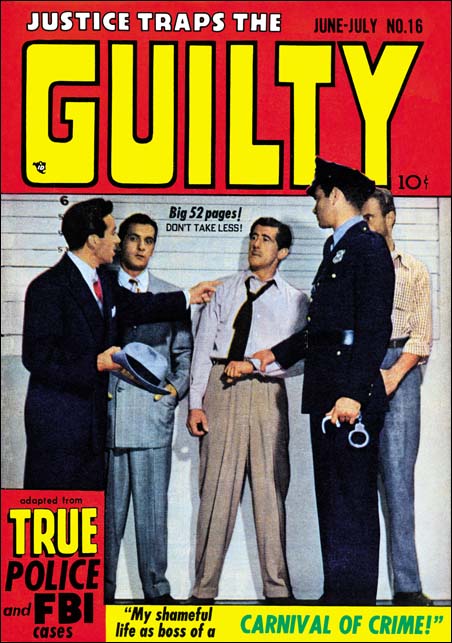
Justice Traps the Guilty #16 (June 1950)

Justice Traps the Guilty #16
Justice Traps the Guilty #16 (June 1950)

In the comments to my last post, “Lineup”, scholar Stan Taylor mentions another lineup cover, Justice Traps the Guilty #16 (June 1950). The crime genre was very popular at that time so I would not be at all surprised if police lineups showed up on other comic book covers as well. Although JTTG #16 was also published by Prize, it is clear that Marvin Stein’s model was Mr. District Attorney #4.

Stan questions why some comic books used such photographs. I have always believed the reason was one that Stan provided himself, that is to make the comic look more like a pulp magazine and hopefully attract more adult readers. I am with Stan, I prefer artist drawn covers to these photo versions but modern tastes are not likely to be a good reflection of those for potential buyers then at the newsstands.

It is not clear what would have been cheaper, having an artist draw and ink a cover, or use a photograph. Most cover photos were not made by the comic book producers themselves but rather supplied by an agency. I believe the chief aim of those agencies was the promotion of various actors and actresses. So it was probably the matching of some already existing publicity shot with the needs of some comic book title. Having their client appear on a comic book cover may have been viewed as more important then the financial gain for selling the photo. In any case the possible extra cost for the photograph was spread out over large print runs and therefore may not been viewed as too important. That was what Joe told me about the extra printing costs that photographic covers incurred.

The Lineup

Justice Traps the Guilty #56
Justice Traps the Guilty #56 (November 1953), art by Marvin Stein

The cover for Justice Traps the Guilty #56 is probably Marvin Stein’s most famous piece of comic book art. It has been reproduced in Joe Simon’s book “The Comic Book Makers” and “The Art of Jack Kirby” by Ray Wyman, Jr. (in fact my restoration above was made using the same comic book found in the Wyman’s book). The cover’s fame rests not so much on its artistic value but on the people portrayed in the police lineup. Here as the suspects we find starting from our left Ben Oda (Simon and Kirby’s letterer), Joe Simon, Joe Genalo (Prize editor), Mort Meskin and Jack Kirby. This was, of course, an inside joke because none of these individuals were actually criminals, nor were they likely to be recognized by the public. Most of the members of the lineup are people that have previously been discussed in this blog and should need no further introduction with the exception of Joe Genalo. Joe Genalo was working for Prize as an editor, not for Simon and Kirby. Annual postal statements may not be relied on completely but the one in Headline’s March 1953 issue shows Joe Genalo as editor (unfortunately I do not have the equivalent one for Justice Traps the Guilty). Genalo is again listed as editor in the postal statements found in the March 1954 issues of both Headline and Justice Traps the Guilty. The identification of the person in the line up as Joe Genalo is based on Joe Simon in “The Comic Book Makers”; however there is a problem with this. In a photo taken of the Simon and Kirby studio, there is a person that Joe also has named as Joe Genalo. The presence of Jimmy Infantino in the photograph indicates that it was probably taken in 1951. The photo “Genalo” does not wear glasses and is much younger then the man on Marvin Stein’s cover even though only a couple of years separate the two. It would be expected that the man portrayed by Stein would be someone important to Marvin’s work and that certainly would suggest that it truly was Joe Genalo in the lineup. I therefore believe that Joe’s photo identification is incorrect.

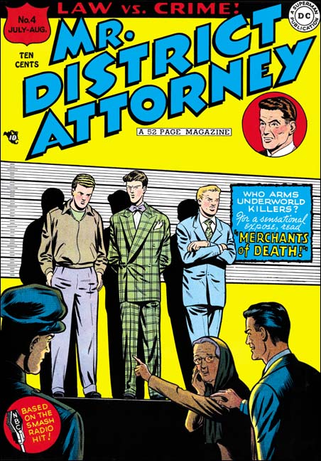
Mr. District Attorney #4
Mr. District Attorney #4 (July 1948), art by Win Mortimer

Stein’s police lineup was not the only one to appear on the front of a comic book. The similarity between the covers for Justice Traps the Guilty #56 and Mr. District Attorney #4 are striking. Both show the police and a female in the foreground with the lineup in the background higher up on a stage. Further the female for both is on the right pointing out a suspect on the left. Examples like this one are generally referred to in comic book discussions as swipes. It is also examples like this that are the reason I so thoroughly hate that term. I use it only because it is so entrenched in discussions about comic book artists and their art. Among many comic book fans the term swipe is used as a condemnation. However deriving art based on some previous art is not something unique to comic books. The same thing is done in the fine arts without all the negative associations. No one accuses Michelangelo of swiping from Donatello. If the reader wants to think that Marvin Stein swiped his cover from Win Mortimer that is fine. Just note that although the idea may have originated with Mortimer, nothing in Stein’s cover is a close copy of Mortimer’s work. Kudos for Mortimer for coming up with the idea, but kudos for Stein for using it to make something of his own.

As far as I know Win Mortimer never worked for Simon and Kirby and therefore I am not too familiar with his work. In my opinion a good piece of cover art should tell a story and Mortimer certain does that with his cover. An elderly woman points out one of the boys in the lineup while she looks back fearfully to a man in a suit, presumable the District Attorney. Mr. DA rests his hand on her shoulder to provide reassurance. At first glance the boys in the lineup do not appear to be criminal types, everybody seems so clean cut. But that is deceptive because it is based on today’s standards. The boy in the center of the line has a plaid suit with wide lapels and a lavender bow tie. At the time this was hardly considered conservative fashion and despite lacking baggy pants suggested the zoot suit. Zoot suits were infamous during the war and often identified in the minds of the public with Latino gangs. The boy on our right is more conservatively dressed but has a toothy squint that suggests he is not your normal teenager either. However even after a more extended examination, there seems little to suggest that the suspect on our left is not a clean cut American boy. The fact that his response to the lady’s identification is to hang his head in shame supports that notion. The question is what crime could such a seemingly nice boy have committed that lead him to this lineup? Unfortunately this is one shortcoming to Mortimer’s cover as no clue is provided as to his offense, nor is there an interior story to enlighten us. The cover is a little dry for my tastes but an excellent piece of comic book art nonetheless.

I frequently remark in this blog that one should not compare artists that worked for S&K to Jack Kirby. I do so not only as a warning to my readers, but as an admonition to myself. Kirby is such an outstanding talent that the shadow that he casts tends to obscure other artists. I guess that is what happened to me with Stein’s JTTG #56 cover. Previously I found it interesting for the people portrayed but considered it as not having much artistic merit. Having compared it to Mr. District Attorney #4, I now realize it has much to commend it. We may know no more specifics about the crime then with Mortimer’s cover, but no reason to question the woman’s accusation. As depicted on the cover, Simon clenches his fists, turns to face the woman and sneers something (probably “why you little…). Nor are there any doubts as to the criminal nature of the rest of the lineup. Oda has the cold hard stare of a gunman, Genola’s poorly fitting jacket makes him look like head of some small extortionist gang, Mort has the appearance of a bookie, and Jack, despite his size, could be a small time thug. Marvin Stein has also done a much better job of composing the image. In Mortimer’s cover the foreground and background figures are only connected by the woman’s gesture. However Stein raises the foreground figures up, added a figure, and arranges them in a ‘U’ shape. This all provides a strong visual link to the lineup. Another weakness on Mortimer’s cover is how the woman’s backward glance at the District Attorney directs our vision away from the image. Stein places the DA on the other side of the woman so that she now faces into the image; I find that a very satisfactory solution. Finally Stein uses a spotlight on the lineup which provides an arching shadow giving more focus to the image then Mortimer’s more photographic like approach. I am sure Stein picked up this use of an arch from Jack Kirby who used arcs frequently. All in all Marvin Stein has provided an excellent reinterpretation of Mortimer’s original concept.

The Fly, A Case Study of Swiping

“Swipe” is a rather unusual term which in my dictionary is defined as a slang for to steal or pilfer. It has also found use in discussions about comic books as a term for copying. Considering its original slang usage it is not surprising that the word has a very derogatory association in comics. Other art studies, including the fine arts, do not use the term. That is not to say that activities equivalent to swiping do not occur, it is that more neutral words are used to describe those activities. The word swipe is so entrenched in the discussions about comic book art that I that I continue to use it. But I do not share the disapproval that most have who use this term. Swiping was common in comic book arts, actually in all the arts. Even Jack Kirby has been shown to swipe.

The first four issues of the Adventures of the Fly provides some good examples of various types of swiping that could be done. Some call this a Simon and Kirby title, but it seems to me that Simon was really the driving force. Joe brought together artists other then Jack to work on the books. In fact Jack’s involvement was less then what some people thought because of the use of swipes.

Adventures of the Fly #1
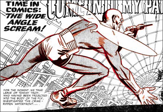
Adventures of the Fly #1 (August 1959) pencils by Jack Kirby (splash art in black, cover art line art in red)

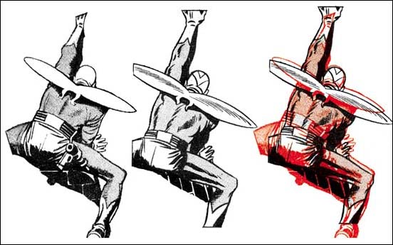
The four Fly covers only provide an interesting assortment of Joe’s working method. The cover for issue #1 is not really a swipe. Included in the story art that Jack did for the Fly #1 was a double page splash. The cover is basically parts taken from the splash and rearranged somewhat to fit the narrower proportions of the cover. It is possible to overlay the line art of the Fly from the cover and the splash with good accuracy. That is not to say you get perfect alignment between the two. In the overlay image I provide above I was as careful as possible in adjusting the size and angle of the images. I was able to get good agreement between the two in the area of the Fly’s head and foot. But look closely at his right hand and you will see they deviate slightly. Actually this is to be expected considering the various equipment used. I have often overlaid original art or proofs of line art over the published cover and have never seen one that could be perfectly aligned in all parts. The alignment in this case is especially good so I have little doubt that stats taken of the splash was used to assemble the cover. Since some of the fine spotting lines are present in both the cover and the splash the stat was taken after the splash had been inked. The cover had to be prepared at about the same time as the rest of the comic, so I believe Joe had the stats made of the splash made while assembling the book. Later the printer for Archie did stats of the entire comic in preparation for publication. In this case the small difference in alignment was due to different stat cameras being used.

Adventures of the Fly #1
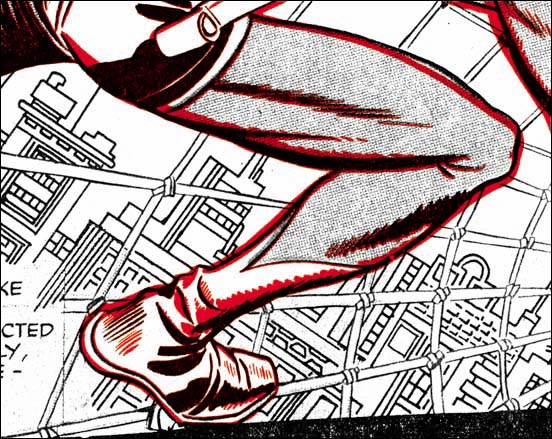
Adventures of the Fly #1 (August 1959) pencils by Jack Kirby (splash art in black, cover art line art in red)

Even though some of the fine spotting aligns well, changes were made. For instance some new spotting was added in the shoulder region. Also the outlines were strengthen, often significantly, is some areas. This was not simply a retracing of the outline. By shifting the wider ink lines the form would be exaggerated in some places and subdued in others. There are two areas where the newly inked lines deviated significantly. One is the upper line for the right thigh as it approaches the knee. The cover version is more tapered while the splash has more of a bulge. The other change made was to the Fly’s goggles which were made more prominent on the cover.

I cannot prove it, but this entire process used to create the cover suggests to me that it was done by Joe Simon. When you consider how wide the splash was compared to the cover it is amazing how well the cover composition works. As for the inking alterations that is the sort of thing I have seen Joe often do today. When he wants to make a reduced copy of some art where the original is too large for his copier Joe copies it in pieces and then reassembles reduced sized parts. This often leaves lines where the parts were joined which Joe will retouch. But frequently he also proceeds to retouch the art on the copy as well. This is what I believed happened to the cover. For me most of the changes made greatly improved the art. The one exception is the tapering to the upper thigh. I feel the bulging in the splash is more appropriately as it makes it seem that the Fly is about to spring into action. If I am right that Joe re-inked the cover, then I doubt that he was the inker for the splash or the rest of the story.

SwipeFly2Cap7.jpg
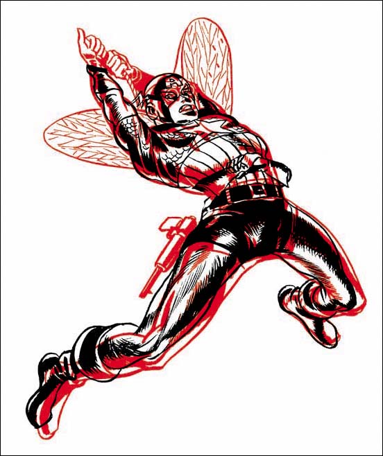
Overlay of figures from Adventures of the Fly #2 (September 1959) in red and Captain America #7 (October 1941) in black.

Many have recognized the fact that the swinging Fly on the cover of issue #2 was swiped from the cover of Captain America #7 (October 1941). When I produced the above overlay I found that a good alignment simply could not be done. So I aligned the top of the heads and an approximation of the figures left foot. This provided pretty good alignment for the torso. I will not provide a line by line description of the differences, there just are too many. Cap and the Fly figures are dissimilar both at the small and the large scales. As an example of a large scale note how the Fly’s right leg is further forward then Cap’s. For the other scale compare the figures’ right (as drawn this would also be the lower) outline to the torso. For one thing Cap had an indent to delimit the shoulder that is completely absent of the Fly. Of special interest is the figures’ left thigh. Cap’s has a distinct bulge to the upper part leading into a comparatively thinner region just above the knee. On the other hand the Fly’s thigh is more evenly tapered. This is the same sort of alteration that had been made to the cover of Adventures of the Fly #1, an indication that both may have been done by the same artist. With all the differences between the swipe and the source it is clear to me that the Fly for the cover was not done using a stat or any other mechanical copying device. However in my opinion there are way too many similarities for the Fly #2 to be based on just a remembrance of the Cap #7 cover. No the Fly figure was done by freehand copied from the Cap #7 cover. Joe has since used the pose on a number of occasions, although not as far as I know for a published comic. So once again I attribute this work for this to Joe Simon.

Adventures of the Fly #3 &  Black Hood #9
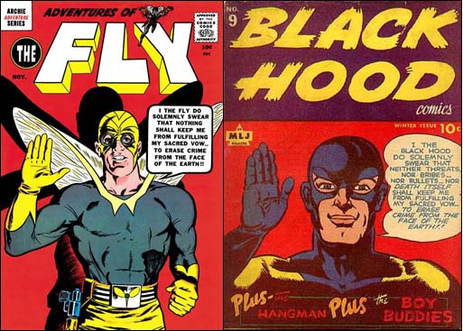
Adventures of the Fly #3 (November 1959) art by Joe Simon and Black Hood #9 (Winter 1943) [the Black Hood #9 image is from the Grand Comic Book Database (GCD)]

When I previously wrote about the cover for the Adventures of the Fly #3 Scotty Moore left a comment pointing out the similarity to the cover for Black Hood #9. Not only is the pose pretty much the same but both take an almost identical oath. It is hard to believe that the relationship between the two is just a coincidence. Particularly since Black Hood title had been published by the same company as the Fly. Although the pose and concept was swiped I would hardly call the Fly a close copy. Joe once told me he did this cover using himself in a mirror as model. This does sound right because the art does look like Joe’s work.

SwipeFly4Ad88.jpg
Figures from Adventure Comic #88 (October 1943) art by Jack Kirby and Adventures of the Fly #4 (January 1960) art by Joe Simon

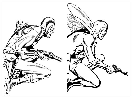
This is another example where the figure of the Fly was obviously a swipe, in this case from Sandman on the cover of Adventure Comic #88. I provide a side-by-side image of the two figures because overlaying them would just be confusing. It can easily be seen that the Fly is not a close copy of the Sandman. Things like the positions of the limbs, details of the anatomy, and the size of the ear all have been changed. Clearly the Fly was freely drawn with the Sandman source used only as a casual reference. Both were originally shown peering through a window but Sandman had been shown squatting on flat ground while the Fly was on a slanted roof. The change in the nature of the foundation probably had a lot to do with some of the changes made.

SwipeFlyWindow.jpg
Left figure from Adventures of the Fly #1, “Come Into My Parlor” page 4 panel 1 art by Jack Kirby.
Center figure from Adventures of the Fly #4, “Duped By The Dazzler” page 5 panel 4 (rotated and flipped)
The two overlaid where red is the Kirby figure.

The Fly comics swiping is not limited to the covers. The examples I have chosen from story art both show the Fly clinging to a building wall just outside of a window. However to place them in the same pose I had to rotate the one from Fly #4 and then make a mirror image (that is flipping the image so left becomes right and visa versa). I provide an overlay of the two but it is impossible to get them to properly align. The side-by-side versions give a better idea as to what the problem is. The limb and torso proportions dramatically differ between the two. Even small details such as the angle taken by the right hand fingers in relation to the legs is not the same.

There can be no doubt that the one from Fly #4 was a freehand drawing. But who actually drew the swipe? Well although the pose was swiped from Kirby, the artist articulates the muscles very differently then Kirby did. The same way of handling the figure’s form is found in all the other drawing of the Fly from the same story and these other Fly appearances do not seem to be swiped. I have little doubt that the swiper is the same as the story artist.

There are other swipes in the first four issues of the Fly as well as in the companion book The Double Life of Private Strong. Further more then one artist was used to draw these stories and all the swipes seem to be off of Jack Kirby. Kirby was greatly admired by other comic book artists so all the artists for the Fly and the Shield used Kirby as a source to swipe. Well that seems highly unlikely, there should be a more reasonable explanation. Joe Simon has said that he provided artists with layouts. Now Joe did not say what titles he did that on but his collection still includes a layout for the Fly that Carl Burgos did. I suspect that the layouts Joe provided for the artists already included the swipes. The layouts may have been as rough as the Burgos example so Joe may also have provided copies of the Kirby source for the artist to complete the swipe from.

Kirby swipes from Simon

Black Cat #8
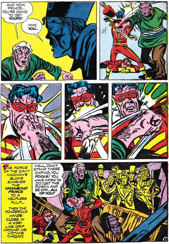
Black Cat #8 (November 1947) “The Madness of Dr. Altu” by Joe Simon

To swipe means to whip, to give a sweeping blow. But today it is more commonly used as a slang for to steal. In comics arts it means to copy a design or drawing, but still carries with it the connotation of theft. For many comic fans to show that a comic artist has swiped is paramount to saying that he is an inferior artist. With the artists Jack Kirby and Joe Simon the verdict in the past was generally Kirby = no swipe = good, while Simon = swipe = bad. I would like to think this attitude is changing. Tom Morehouse for instance has done some fine scholarly investigations that reveal the sources for some of Kirby swipes. Jack used this practice long after his period of collaboration with Simon. Actually Kirby’s collages can be considered a form of swiping.

Captain America #213
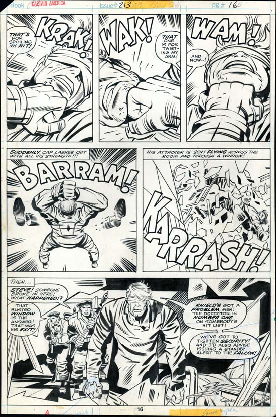
Captain America #213 (September 1977) “The Night Flyer” by Jack Kirby (original art)

Much has been said about Joe Simon swiping, including here in this blog. It is not surprising that one of Joe’s favorite sources is Jack Kirby. For example Joe used a close copy from Captain America #7 when he put together the cover for The Adventures of the Fly #2 (the cover is shown in Chapter 12 of The Art of Joe Simon). Here I would like to present an example of Kirby swiping from of all people, Joe Simon. Jack’s source was a set of panels that Joe did for a Vagabond Prince story “The Madness of Dr. Altu” in 1947. The use of three panels with close-ups of a face being hit by a fist also occurs in a Captain America story (“The Night Flyer”) by Jack Kirby done 30 years later. It is not a direct copy, Jack would not need any help on how to present such close ups, but it is a swipe nonetheless. I do not think it is a coincidence that in both cases it is the hero of the story receiving the punishment. However there are interesting differences also. In Joe’s story the hero, Prince Vagabond, is initially defeated by his opponent. A short time later there is a re-match which of course the hero wins. That is a plot device more frequently used today but was rather unusual at the time Joe did it. In Kirby’s example a blind and out of uniform Captain America is the receptor of the villain’s blows at the start, but Cap is victorious by the end of the page. Jack does this in an interesting formal device of using panels in a 3/2/1 vertical tier.

Donatello and Michelangelo
Saint John the Evangelist (1412-15) by Donatello and Moses (1513-1516) by Michelangelo

I use the term swipe because it is so entrenched in comic art discussions. But I have to admit I am rather uncomfortable with the word and it’s subtext of stealing. There is no similar expression in the fine arts. No one would speak of Michelangelo’s Moses being swiped from Donatello’s Saint John (By the way the Michelangelo and Donatello I am referring to are Italian Renaissance artists, not mutant ninja turtles). In the fine arts there is a better, richer, understanding on how artists really work. Art is not created from a vacuum by the artist acting alone like some deity. Instead artists (this includes comic artists) extract from previous art, from other art fields, and even from real life. The artist then combines these resources adding his own personal touch into a new piece of art. Recognizing that allows one to appreciate what individual artists bring to their own work and how art continually evolves.