Category Archives: Avison, Al

Joe Simon Cover Art for Harvey’s Pocket-Size Comics

I stopped posting on my Simon and Kirby blog over four years ago, primarily due to pressure from my day job and the restoration work I was doing for Titan’s Simon and Kirby Library. Work on Titan’s publications have since been completed and I have recently retired. Although I now have more free time, I have no plans to resume periodic blogging. But there were some investigations that I feel remained as unfinished business. One of which are the covers that Joe and Jack did for Al Harvey early in the startup of his comic publishing company. I recently did restorations for all these covers; redoing the ones I had done earlier and finally working on the covers that I previously had not gotten around to. Some of my views about these covers have changed and besides which much time has passed from my previous discussions. I feel the best way to handle this would be provide two long posts on all the covers, incorporating those parts of my previous discussions that I feel are still appropriate. It seems appropriate to post this discussion on Joe Simon’s 104th birthday.

In his book “The Comic Book Makers” Joe Simon describes how his friend Al Harvey approached him to do a cover for Al’s new concept, a small-sized comic book. Joe also tells how Harvey offered to make Joe a partner for $250. But Joe was then working on Captain America. At Timely he and Jack Kirby were supposed to get a share of the profits for this very popular comic. So Joe felt the safe decision was to stay at Timely and so turned Al down. It probably seemed at the time like a no brainer, but Simon would never saw much royalty money from Timely and would leave before the year was out. As for Harvey his new comic book concept would not last long but he still managed to build up a very successful comic publishing business.

On a visit to Joe’s place, I brought him printed copies of the pocket-size Harvey covers (Pocket #1-4, Speed #14-16). Initially Joe commented that he only did a couple of pocket-sized covers. But when he looked at the cover he said that Pocket #1, #2 and #4 were his. The only question was about Speed #16. Initially he said that he thought he did it, then later he said he may not have done it. Joe commented that the feathering on the legs of Captain Freedom was not like he would do it. Note that on page 116 of his book “My Life in Comics” Joe says he did the cover for Pocket Comics 1-3. This is Joe misremembering our earlier earlier conversation and confusing doing three of the first four covers with doing the first three covers. I am going to discuss the covers that Joe said he did first.

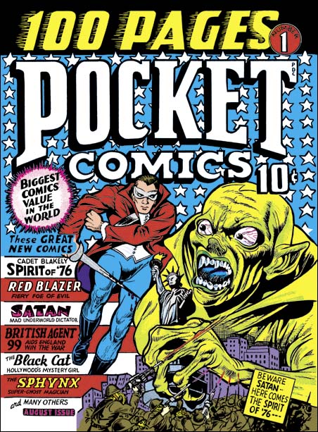
Pocket #1, Joe Simon (pencils and inks), August 1941

Joe’s first effort for Harvey appeared on Pocket Comics #1 with cover date August 1941. This comic came out in the same month as Captain America #5. Jack Kirby was doing some great stuff at that time, but the true Simon & Kirby style had not yet emerged. The Pocket #1 cover was not in the Simon & Kirby style either, and in fact it does not show much in the way of influence from what Jack was doing. Here we get Joe doing Joe.

There are things about this cover which I find unfortunate. The field of stars gives me a claustrophobic feeling. But the biggest problem may not have been Joe’s fault as he said he was working from a mock-up. Nearly half the top is occupied by the comic’s title. If that was not enough the left side has a list of the comic’s contents. This left little room on an already small cover for Joe to work, but he uses it well. Joe came up with a terrific design which was finely executed. The scene portrayed actually is not logical, but it was not meant to be and it works.

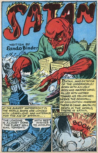
Pocket #1, Splash page from the Satan story, unknown artist, August 1941

There are similarities between Simon’s cover and the splash from the Satan story by the unidentified artist. (The GCD says the artist was Pierce Rice, but I remain unconvinced as all the work attributed to Rice in the GCD do not appear to be done by the same artist and I have yet to find any early work signed by the artist). Both have an oversized Satan holding the Statue of Liberty rising among a cityscape. The Statue of Liberty plays a part in the story whereas the spirit of 76 does not. Therefore I suspect Joe based his cover from the splash and took it into his own unique direction.

A small diversion, the writing of the Satan story was credited to Eando Binder, which is a pseudonym for the brothers Earl Andrew and Otto Binder. According to Wikipedia they used this name for their joint writing of science fiction. But by 1939 the writing was done by Otto with Earl acting as a literary agent. Otto Binder would go on to have a long career as a comic book writer.

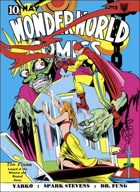
Wonderworld #13, Joe Simon (pencils and ink), May 1940

On the cover Simon provides a Satan that is a bit different then that in the comic itself. This is not just due to the colorist use of yellow instead of the classic red. Instead Joe has turned to a cover he did for Fox, Wonderworld #13 (May 1940). For the Fox cover, Joe was trying to work in the style of Lou Fine. His success is shown by the fact that this cover was often attributed to Fine despite the presence of a Joe Simon signature.

Silver Streak #2, Joe Simon (pencils and ink), January 1940

But there is also an even earlier version of Satan. That was the Claw as portrayed on Silver Streak #2 (January 1940). That, along with Keen Detective Funnies #14, were Joe’s first cover work. Simon gave the Claw more of a Frankenstein look in the face, but the hands are similar to both Wonderworld #13 and Pocket #1.

Pocket #2, Joe Simon (pencils and inks) and Barbara Hall (pencils and inks), September 1941

In Pocket Comics #2 the title has been reduced compared to #1 so there is more room for the art. The main scene once again depicts an oversized attaching Satan, being ineffectively fought by a miniature military (in this case some battleships) with a giant Spirit of ’76 coming to the rescue. Whereas in Pocket #1 the Spirit of 76 fought Satan on the cover but not in the story, for Pocket #2 this hero really did battle the villain in both.

On the left side of the cover is the Black Cat, seemingly not part of the scene with Satan, but oversized nonetheless. The Black Cat started in Pocket #1 just a month before, so her presence on the cover is too soon to be due to an unexpected popularity. Rather having depicted Satan and the Spirit of ’76, the Black Cat seemed more unique since the other features were the standard male heroes. The Black Cat on the cover was taken from the splash to the story from Pocket #1. The GCD attributes that story art to Barbara Hall. The story art is unsigned but there seems to be some documentary evidence to that effect. Women in Comics states:

She studied painting in Los Angeles, moving to New York City in 1940. She showed her portfolio to Harvey Comics in 1941, and was hired to draw the comic Black Cat. Her next strip was Girl Commandos, about an international team of Nazi-fighting women. This comic was developed from Pat Parker, War Nurse, about a “freelance fighter for freedom.” When stationed in India, this nurse recruited a British nurse, an American radio operator, a Soviet photographer, and a Chinese patriot. Hall continued this strip until 1943.

The work listed by Women in Comics does appear to have been executed by the same artist.

The similarity of design and execution of the Satan and Spirit of ’76 scene with that depicted on Pocket #1 leaves little doubt that this was also done by Joe Simon. Which makes it puzzling as to why the GCD attributes the cover for Pocket #1 to Joe and #2 to Bob Powell.

Pocket #4 Joe Simon (pencils and inks), January 1942,

I want to skip for now Pocket Comics #3, and proceed to #4. This is my favorite of the Pocket Comic covers. It is a great design, particularly since the text has been relegated to smaller areas as compared to the other issues. The Spirit of ’76 is a good match for that on Pocket #1 or Pocket #2. I am sure this cover was also done by Joe Simon. A new feature is the Nazi falling after being hit. It is not the way Jack Kirby would have done it, but you can tell that was the source for Joe’s inspiration. No longer do we find oversized figures. But although the design still works, it really doesn’t make logical sense. How could the Spirit of ’76 have delivered his blow if the Nazi had been standing behind him? Or how could the Black Cat jump through the window in the middle of the room and still manage to grab the arm of the Nazi in the back of the room? But as far as I am concern comics art is not meant to try to capture an instance in time. It is meant to tell a story. Without a single line of text, this cover is complete comprehensible. All the distortions of time and space were all done to advance that aim. The logical flaws are in fact its strengths.

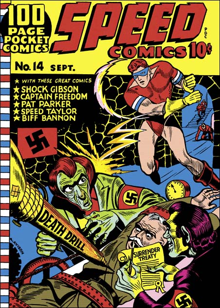
Speed #14, Al Avison (pencils and inks), September 1941

Al Avison was one of the artist that Joe Simon hired to help with Captain America and some other comics at Timely. I suspect that his presence in the early Harvey Comics may have been due to Joe. However it came about, this was the start of a long working relationship between Al Avison and Al Harvey.

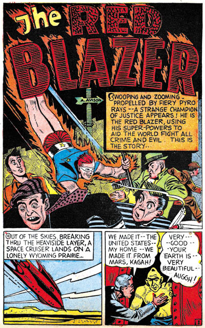
Pocket #1, Splash page for the Red Blazer story, Al Avison (pencils and inks), August 1941

Fortunately Al signed this cover and the Red Blazer story from Pocket Comics #1, so they serves as good references when trying to sort out the attributions. This was early in his career, so although he tried to use what he learned from working with Simon and Kirby he could not yet pull it off. But he matured quickly so that when Joe and Jack left Timely in a few months, Al became the head artist for Captain America for a while.

The background for the cover includes some stairs and some advancing adversaries. This theme would be repeated in a number of the early Harvey covers, although in some cases the stairs would be replaced with a long hallway. However Avison never seems to return to this theme in any of his other early work including what he did at Timely after Simon & Kirby had left.

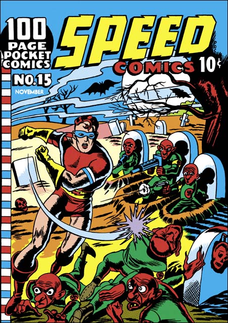
Speed #15 Unknown artist, November 1941

Unfortunately the cover for Speed #15 is unsigned. Compared to Speed #14, Shock Gibson has gotten much younger and less bulky. Although I would hardly call the work that Avison did on Speed #14 advanced, the art for Speed #15 is much cruder.

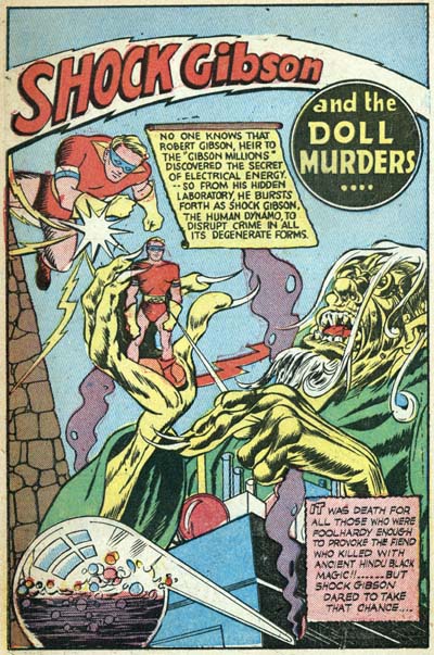
Speed #15, Splash page for the Shock Gibson story, Al Avison (pencils and inks), November 1941

The story art for Shock Gibson in Speed #15 is also unsigned, but is a good matched for Avison’s cover and story art from Speed #14 and Pocket #1 (both signed). The GCD lists Avison as the artist for the cover of Speed #15 and previously I asserted that as well, but I no longer believe that to be true. The Speed #15 cover artist style is just too dissimilar from the Avison’s story art from the same time period.

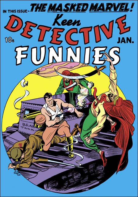
Keen Detective #17, Joe Simon (pencils and ink), January 1940

The Speed #15 cover has wispy mists in the background. This feature, sometimes used for smoke or clouds, occasionally appears in Simon’s work both with and without Kirby. For instance it shows up in the cover for Keen Detective #17; one of the two first comic book covers that he did. The presence of the wispy mist as well as the overall Simon and Kirby appearance makes me believe that Joe may have provided layouts for the Speed #15 cover.

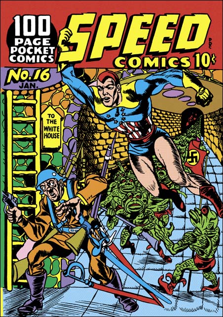
Speed #16 January 1942

Everybody makes mistakes, even experts. So when I say that when the Jack Kirby Checklist included Speed #16 it made a whooper, that does not diminish the value of that list. But all that needs to be done to dispel that misattribution is to compare the cover to one by Jack that came out in the same month (January 1942). There can be no question, Speed #16 was not done by Kirby.

But I have a confession to make. I included Speed #16 in the books I once made of the complete Simon and Kirby covers. I did so because I thought it was possible that Joe Simon might have been the artist. Later I attributed it to Al Avison due to some similarities to the layout of Speed #14 (a work signed by Avison). This cover is a pretty good match to the cover of Speed #15 and I do believe they were done by the same artist. But as I have already discussed, I find the art to be a too crude to have been done by Avison, especially compared to signed work done for Harvey at the same time. I may also add that Joe Simon once said that he was not the artist for this cover.

The cover art for Speed #14, #15 and #16 all have a Simon and Kirby feel to them. Speed #14 and #16 also share a theme of advancing enemies come from background stairs or hallway. This was why I once felt they were all done by the same artist. However there is a better explanation, or rather a choice of two explanations. One is that this unknown artist was working for Simon on the Timely comics and had thus learned some of the Simon and Kirby approach. That, or what I believe is more likely, Simon supplied layouts for these Speed covers. I do not credit Kirby as providing the layouts because he has not yet become involved with Harvey’s comics.

I do not believe that the humorous quality to Speed #15 was intentional. But in Speed #16 is clearly was. It is hard to believe that anyone would take seriously an attach by Hitler on the White House. But even if they did, it wouldn’t be this ridiculous Adolf carrying four rifles and three swords. This sort of visual humor would later be a Simon trademark in his comic magazine Sick.

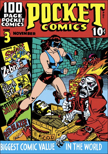
Pocket #3, Unknown artist (pencils and inks) and Joe Simon (pencils and inks), November 1941

I have left this cover last so that it could be compared to the art for the other Pocket and Speed comics. As I mentioned earlier, Joe did not believe he was the artist for this cover. I must say that it is hard to believe that the hooded ghouls were done by Joe, his were always more threatening and not goofy. When we examine the cover, problems set in. The soldier being prepared for shipping (via C.O.D) just does not seem to lay down in the box. The Nazis are white skeletal figures in red hooded clocks. I would describe the robbed figures with the same term I would use for Speed #15 and #16 (covers that look like they were done by this artist), goofy. The track record so far for the pocket comics is that Joe did well executed covers, this unknown artist rather crude ones, Joe presents intimidating villains, this one goofy Nazis.

The action takes place in a long corridor done in forced perspective. There are more red clocked Nazis advancing from the end of the hallway. This is all similar to the tunnel in Speed #16. This suggests that both covers were done by the same artist. But as I discussed above, may be due to layouts that were supplied by Simon.

It seems clear that the figure of the Black Cat was done by a different artist than the rest of the cover. The style for Black Cat does not match any of the artists who worked on the story art but is a good match for the Black Cat that appears in the cover for Pocket Comics #4, so I am crediting Joe for her figure alone.

Al Harvey thought he had a hit with his idea of pocket-sized comics. But as Joe and Jim Simon said in “The Comic Book Makers”

The size of the little magazines made it easy for kids to slip them into their pockets, or inside the pages of a standard-sized comic book, while browsing through the comic racks. Petty crime was a big problem in the little candy stores. So Pocket Comics were dead. But Al Harvey went on to bigger things.

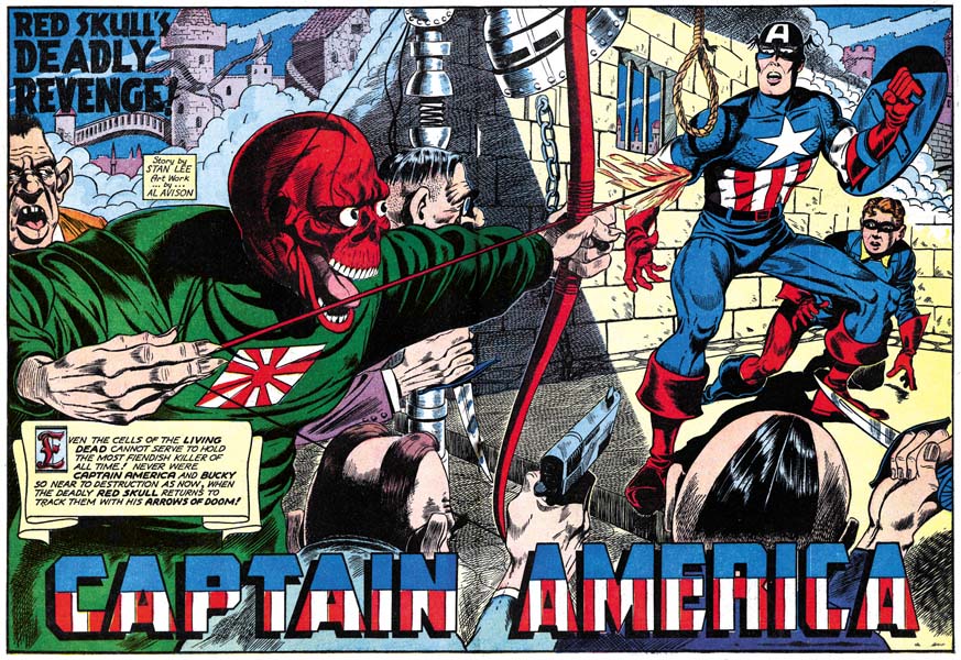
Pocket Comics #4 and Speed Comics #16 have cover dates of January 1942. Harvey would no longer publish pocket-size comics. Coincidentally this is the same month that the last Simon and Kirby Captain America came out.  The next time Simon and Kirby work would reach the racks it would be dated April. I will discuss the work Simon and Kirby  did for the revived Harvey in a post next week.

Not Kirby? Wrong! Marvel Masterwork’s Marvel Comics Volumes 6 and 7

I have never particularly liked the way that Marvel does their reprint volumes. But even coverless copies of golden age Marvel Mystery Comics are now so expensive and rare that I am certain I will never have a complete run. So I have been buying some of Marvel’s Golden Age Masterworks. I know I have to be careful in using them for study but still Marvel has done everyone a service in providing them. I recently picked up volume 7 of the Marvel Comics series which finishes Simon and Kirby’s run of the Vision feature. Imagine my surprise when I looked at the contents page only to find that some of the Vision stories have been attributed to other artists! I pulled out my copy of Volume 6 and found that this practice had started in that volume. I decided I would write about why these attributions are so very, very wrong. I will only be discussing the pencils as inking attributions are difficult to determine and there is nothing like a consensus of that subject. But hey, if Marvel Masterworks cannot get correct pencil attributions for such a distinctive artist like Jack Kirby, what chance is there that it got the inking attributions right?


Marvel Mystery Comics #21 (July 1941) “The Vision” page 6, pencils by Jack Kirby, letters by Howard Ferguson (from Marvel Masterworks Marvel Comics volume 6)

The Masterworks only credit Kirby for the pencils of splash page, the rest of the story is attributed to Al Avison. Not the inks mind you, but the pencils. There is an asterisk on this attribution for a footnote that states:

It was not industry standard in the Golden Age of comics to provide detailed credits for each story. The credits in this volume represents the most accurate information available at the time of publication.

Really? I would have thought that the Jack Kirby Checklist (Gold Edition) would be the most accurate information available and it attributes this story to Jack Kirby. Now I admit there are occasions when I disagree with the JK Checklist (most often because sometimes it credits work to Jack that Joe Simon penciled, an artist who was very familiar with Jack’s art and very good at mimicking him). However the Checklist is the best source for Kirby attributions and I always proceed cautiously when I disagree with it. Now in the case of these Marvel Masterwork credits it is important to remember we are discussing the pencils. Inkers often assert their own personal styles over another artists pencils. The art must be examined for features that would not be derived from the inker. For Jack Kirby two features that I often look for to spot his work is the presence and handling of exaggerated perspective and fist fights. Kirby was the master of these two art forms and no other artist every managed to do them quite like Jack. I am not saying that these are the only distinctive traits that can be used for spotting but that they so common that they often are all that is needed for attribution purposes. Both techniques are presented on page 7 of the Vision story from MM #21. Like many artists, Avison tried to copy Kirby’s slugfest style but he never came close to what can be seen on this page. Particularly panel 5, it is hard to believe that anyone would fail to recognize Kirby’s distinctive hand in that minor masterpiece.


Marvel Mystery Comics #22 (August 1941) “The Vision” page 2, pencils by Jack Kirby, letters by Howard Ferguson (from Marvel Masterworks Marvel Comics volume 6)

Once again for the Vision story in Marvel Mystery Comics #22, Marvel Masterworks only credit the first page to Jack and the rest of the story as penciled by Al Avison. While the story includes some fist fights that look to me like they were done by Kirby they are not as convincing as those found in MM #21. But look at panel 7 of page 2 shown above. Kirby loved to show figure heading forward to the viewer and this panel is a great example of the exaggerated perspective that is required to accomplish that. In this case Kirby brings the torso lower than usual even for his work but he still convincingly pulls it off. I have never seen Al Avison effectively use such exaggerated perspective. I will be providing an example below of how Avison tries something similar but as we shall see it is easy to distinguish from Kirby’s work.


Marvel Mystery Comics #25 (November 1941) “The Vision” page 6, pencils by Jack Kirby, letters by Howard Ferguson (from the original comic book)

Marvel Masterworks correctly credits the pencils for the Visions stories from Marvel Mystery Comics issues #23 and #24 to Jack Kirby so they need not be discussed here. The credits for MM #25 are rather peculiar as Kirby is said to have done the title page and the layouts while the “art” was done by Al Avison, Ernie Hart and Mike Sedowsky. It is well known that Kirby did some layouts during the silver age but he has often been credited for doing layouts during the golden age for such artists as Mort Meskin, Bill Draut and John Prentice. Such claims are bogus in almost all cases as I have frequently shown in posts in this blog, particularly in my Art of Romance serial post. However there was some work from the Simon and Kirby studio that looks like Kirby provided layouts and there are some others that I struggle with whether they are examples of Kirby layouts or inking that overwhelmed Kirby’s original pencils. During the silver age, Kirby’s layout could get rather tight and detailed in some places. Much more than would be expected for something described as an layout. But this would be true only for certain sections while the layouts for the rest of the story seem to have been much looser. so one of the criteria that I use for recognizing Kirby layouts is to look for how consistent the entire story is. A story that looks consistent throughout is more likely to be the result of the work of an inker’s heavy hand no mater how unusual it may look for a piece of Kirby art. Even so making these distinctions can sometimes be difficult but not so in the case of the Vision from MM #25. That story looks so like Kirby’s style throughout the entire story that it is hard to understand why anyone would think it is just Jack’s layouts.

It would not be legally right for me to provide the entire story so I will pick one of the more distinctive pages. This is another slugfest full with examples of exaggerated perspective. All done in so convincing a manner it is hard to believe any artist other than Kirby could have done it. The original pencils must have been so tight that no one should call it a layout. (It is pages like this that show what a master Kirby was at exciting action.) These are not Kirby layouts but true Kirby.

Note the way how some of the figures have their feet rotated somewhat so that the soles face the reader more than would strictly be expected. This is a typical Kirby trait. This is a style that could  be mimic by other artists. After all Simon adopted it as well even in work for the Coast Guard done while Kirby was serving in Europe. But still it would not be expected to show up in work done from layouts.


Marvel Mystery Comics #26 (December 1941) “The Vision”, pencils by Jack Kirby, letters by Howard Ferguson (from Marvel Masterworks Marvel Comics volume 7)

Of all the incorrect attributions found in Marvel Masterworks, the Vision story for Marvel Mystery #26 is the one I understand the most. Not that I agree, but I do think I understand why they went so wrong. This is probable the most unsuccessful Vision story that Kirby ever drew and also one of the most poorly inked. But quality is a poor tool to use when trying to determine the correct attributions. Even the best artist has his bad days. Again it is best to turn to things like the handling of exaggerated perspective when deciding who actually penciled the art. The Masterwork credits Al Avison and Ernie Hart for all the pencils, including the splash page. Look at the figure of the Vision from the splash page. He advances toward the reader in a typical Kirby pose. The neck is hidden and the torso is squat due to the effects of the perspective. One leg retreats while the other is thrust forward as the Visions strides toward the viewer. I have never seen Avison do anything nearly as successful and I doubt anyone can find something that Hart did that looks like this either. While the quality of the art in this story is not Kirby’s best, there are many other examples of exaggerated perspective that I do not think anybody but Kirby could have done.

This story is not without is problems. Look at the man with the blue suit in the splash. His upper body does not seem properly jointed to the lower portion. The tree monster’s root that crosses in front of the figure seems to have confused the artist. A similar thing can be observed on the cover for Young Allies #2 (Winter 1942) a comic that appeared not very long after MM #26 (advertisements for it appear in MM #28). I am uncertain what to say about this. Is it a rare Kirby failure or an example of another artist’s work? I tend to suspect the latter. I can easily see it as an later addition by another artist. If so it is not the only example of a Kirby splash modified during the Timely period (see Captain Daring from Daring Mystery #7 in Chapter 9 of Early Jack Kirby).


Marvel Mystery Comics #27 (January 1942) “The Vision”, pencils by Jack Kirby, letters by Howard Ferguson (from Marvel Masterworks Marvel Comics volume 7)

This is the last Vision story that I would credit to Jack Kirby. In this I agree with the Jack Kirby Checklist but not the Marvel Masterworks which says this was penciled by Al Avison. I must say I am rather puzzled by this as it is one of the better Kirby Vision stories. The inking is not as nice as some of the early Visions stories where Kirby inked his own pencils but superior to most of the inking from towards the end of Simon and Kirby’s stay at Timely. While I warn against using quality as a reference when deciding credits, I still would think that those responsible for the attribution in the Marvel Masterworks would have at least reconsidered when facing such superior work as this. Al Avison would do some great art after Simon and Kirby parted from Timely including the best golden age Captain America by an artist other than Joe and Jack. So good that some would claim Kirby provided layouts to him later in his career. That is another false claim (see Al Avison Did Not Need Any Help) but as good as Avison became his art never approached that shown in the Vision story for MM #27.

But there is no reason to depend on quality to decide who really provided the pencils for this story. Once again examining the exaggerated perspective and fist fights are sufficient. In the splash the Vision leans so far forward there is no sign of his neck while there is a very short distance from his arms to the top of his hips. His left leg advances toward the viewer will the right leg is trust backwards. This is the classical Kirby pose that Avison never truly used. similar expressive perspectives occur frequently elsewhere in the story as well as truly classic Kirby slugging.


Marvel Mystery Comics #28 (February 1942) “The Vision” page 4, pencils by Al Avison (from Marvel Masterworks Marvel Comics volume 7)

The last Simon and Kirby Captain America comic had a January cover date, the same month as Marvel Mystery Comics #27. After which Al Avison took over the primary penciling of Captain America. So it is not surprising that the Vision story from Marvel Mystery #28 (February 1942) was also drawn by Avison, one of the few Vision attributions that I agree with the Masterworks. But it also serves as a comparison for all the Vision work drawn by Kirby that preceded it. The splash page shows the Vision advancing more to the side than toward the reader. While Kirby would sometimes does something similar it is not the classic Kirby pose that dominates the earlier Vision stories. The closest Avison comes in this story to that pose is found in panel 4 from page 4. Yes the neck is hidden and the torso shortened (although not that convincingly) but his left leg is only slightly advanced from the right. While the Kirby pose makes the figure look like he is rapidly advancing towards the reader in this one it looks like the Vision is taking a bow. And while in the future Avison would sometimes draw a rather good fist fight (although not nearly as good as Kirby’s) there are no slugfests to be found in this story. Avison’s Vision compare well with the Captain America stories he did but it remains in stark contrast to Visions stories that should correctly be credited to Kirby.

Except for the occasional signature, golden age comic books almost never provided credits. Attributions are therefore opinions, not facts, and people can be mistaken about their opinions. Even me, which is why in this blog I like to try to explain what the basis is for the credits I supply. But such an approach is not possible for reprint books like the Marvel Masterworks. Which is why it is unfortunate that they choose to provide credits anyway. There will now be many people who will treat the Masterworks credits in these two volumes as fact not opinions. The disclaimer applied to some of the attributions actually makes it worse because of the implication implied to those credits that are not so marked. That is they are so accurate that no disclaimer is needed but they are actually just as prone to error. Readers of the Masterworks volumes would be better served had Marvel avoided detailed crediting rather than depending on the opinions of a small group of people.

The Golden Age of Captain America, Al Avison


Captain America #11 (February 1942) “The Case of the Squad of Mystery”, pencils by Al Avison

Any discussion of Captain America really should start with those issues that Simon and Kirby created. Not only were they the creators but during the golden age of comics nobody did Captain America like Simon and Kirby. However I am not yet ready to cover Simon and Kirby’s Cap in a manner the material deserves. Instead I will pick up after Joe and Jack were summarily dismissed, that is once they had completed issue #10. But when they left Timely, Simon and Kirby left behind the staff that they had put together. Stan Lee, previously little more than a gopher, became the editor, Al Avison became the associative editor and primary artist, and Syd Shores would do the inking. All were pretty new to the business but Avison had also been doing some work for Harvey Comics and the experience made him a better artist (Al Avison on Speed, Avison Takes on More Speed, Speed Comics #16, Pocket Comic #3) . Actually Avison’s work for Harvey seems comparatively primitive and his talent seemed to blossom once Simon and Kirby were gone.


Captain America #11 (February 1942) “The Symphony of Terror”, pencils by Al Avison

Avison learned a lot from Simon and Kirby to the extent that some mistakenly believe that Kirby supplied layouts for some of his work (Al Avison Did Not Need Any Help). Simon and Kirby used irregularly shaped panels when they did Captain America and Avison continued to use them. The art in Simon and Kirby Captain America often extended outside the panel borders and Al kept that device as well. Avison even continued to occasionally provide double page splashes that previously been used so effectively by Joe and Jack.


Captain America #12 (March 1942) “Rozzo the Rebel” page 11, pencils by Al Avison

Simon and Kirby became justly famous for all the wonderful action they put into Captain America. Now I am not going to claim that Avison handled action as well as Joe and Jack, but you can tell he was trying. Not only trying but doing a better job of it than most of his contemporaries. Avison was also keen to try new techniques. For example the page from “Rozzo the Rebel” shown above where Al places three stages of the action into a single page size panel.


Captain America #14 (May 1942) “The Petals of Doom”, pencils by Al Avison, inks by Syd Shores

While Al Avison seemed to have learned a lot from Simon and Kirby, Syd Shores did not learn enough. Shores certainly did most, perhaps all, the inking of Avison’s pencils. Unfortunately Shores had not learned the art of restraint from Simon and Kirby. Too much detailed inking can deaden a piece of comic book art and that is an error that Shore often fell into when inking Captain America. But I do not want to leave the impression that Shores could not do a good job. I particularly admire the splash for “The Petals of Doom”. Despite the over use of fine ink lines, Shores still manages to make the foreground figures stand out. The phantom figure in the background is made more ghostly by the adding white lines over the regular inking lines (probably by dragging the corner of a razor blade).


Captain America #16 (July 1942) “Red Skull’s Deadly Revenge”, pencils by Al Avison
Larger Image

As previously mentioned, Stan Lee did not occupy a very high position in the Simon and Kirby studio. His only contribution to the comics were some of the text only features (ignored by almost all readers) and scripts for the backup features. It is clear that Lee made no real contributions to the Captain America featured stories while he was working for Simon. All that changed with the departure of Simon and Kirby. Stan Lee became the editor and would write at least some of the Cap stories. How many of them is an open issue. Some experts claim that Stan Lee signed everything he wrote. However that seems to me to be an extreme position that should be backed up with good evidence. I am unable at this time to hazard a guess whether some of the unsigned Captain America stories were scripted by Lee but fortunately there are also some signed pieces. Perhaps the best was “Red Skull’s Deadly Revenge”. With this story Stan had already advanced beyond most of his peers. It certainly is my favorite golden age Captain America story not done by Simon and Kirby. It has been reprinted not only in the Captain America golden age archives but also in the Stan Lee Visionary volume. “Red Skull’s Deadly Revenge” has a special place in my heart because it was the first piece of comic book art that I ever restored.


Captain America #17 (August 1942) “Sub-Earthmen’s Revenge”, pencils by Al Avison

The Captain America stories are very imaginative. Filled with alligator men, Martians, subsurface dwellers, and other villains. In the end most of the more bizarre advisories would turn out to be a costume wearing Nazi spies. This was very much in keeping with the earlier version by Simon and Kirby.


Captain America #19 (October 1942) “On to Berlin” page 10, pencils by Al Avison, inks by Syd Shores

Today Captain America is often called a super-soldier but that description is quite incorrect for the S&K and most Avison stories. Captain America and Bucky fought spies not enemy soldiers. That is until “On to Berlin”. Here Cap joins the storming of a beach. But joining is the proper description, Captain America did not lead the charge. Also note that Cap does not sport a rifle, pistol, knife or other hand weapon. The lack of weaponry is not a response to a moral position against such violence because in panel four there is Bucky (without his superhero costume) holding a recently fired handgun. Neither Simon and Kirby nor Avison every showed Captain America using a hand weapon other than his shield.

Captain America #19 marked Avison’s last issue before he begin his own military service. Starting in the next issue Syd Shores would replace Avison as the primary artist for Captain America. I will discuss Shores contribution next week. I have not forgotten that there are further posts to write in order to finish up my series on Police Trap. All I can say is I do like to mix up the subject of posts. But right now for some inexplicable reason I just cannot get Captain America out of my mind.

Joe Simon and Timely Detective Magazines


Amazing Detective Cases vol. 1 no. 7 (November 1941) unidentified artist

Joe Simon was working as a freelance editor for Fox Comics for only a three month period before he left to take a position with Timely, still on a freelance basis. Some scholars have described Joe’s job at Timely as a General Editor but in his recent interview (Jim Amash, Alter Ego #76) Joe described it as Art Editor. Those that prefer to call Joe a General Editor usually give the Art Editor title to Jack Kirby. As far as I can tell the allocation of titles has been solely based on the testimony of either Joe Simon or Jack Kirby. Personally I suspect that at the time job titles held no real significance for Martin Goodman the only thing that mattered was the work to be done.

The work that generally holds the interest for most was for the comic books. Unfortunately none of the comics provide credits for the editorial personnel. Kirby did most of the drawing during the Timely period but Joe did some as well either alone or with Jack. But who did the drawing is not the issue here. One interesting suggestion comes from the splash to a Captain Daring story from Daring Mystery #7 (April 1941). The drawing for the story was all by Jack except for the figure of Captain Daring in the splash. That substitution is not what would be expected if Jack was the Art Editor. Otherwise I have not seen any evidence to help in this question about editorial attributions. This record stands in sharp contrast to Simon and Kirby’s post-war collaboration where a good number of examples of Kirby altering another artist’s work have been found along with some by Simon as well.

Comic books were not the only publications produced by Timely at this time. Pulps still played an important part of the company’s income. However so far I have found no help from the pulps about editorial functions either. Kirby does provide much of the art used to illustrate pulp stories but Simon and other artists show up as well. No editorial credits are provided. Joe has said (Alter Ego #76 interview) that he was not an editor for the pulps, he only put them together.

Although the artistic contributions to Timely’s comic books and pulps has been well known for some time, another of the publisher’s products, magazines, has generally been overlooked. Fortunately Kirby scholar and sleuth Tom Morehouse has been actively investigating Timely magazines. A number of magazine illustrations by Jack Kirby that Morehouse uncovered were included in the back of Greg Theakston’s “The Comic Strip Jack Kirby” Recently Tom has kindly loaned me some copies of Timely magazines with examples by other artists. Simon has described these magazines as “flats” which are “glossy magazines without the gloss”.


Complete Detective Cases vol. 3 no. 5 (September 1941)

The Timely periodicals under consideration are all detective magazines; Amazing Detective Cases, Complete Detective Cases and National Detective Cases. Amazing Detectives Case is listed as being published by Crime Files Inc. while Complete Detective Cases and National Detective Cases are said to be by Postal Publications Inc. However this is nothing more then the use of multiple company names by publishers of that day. It is not clear why Timely and other publishers did this but since it was such a common practice there must have been some benefit. These detective magazines are filled with supposedly true stories about various criminals. Stories of murder and other lurid crimes predominate throughout. A look at the covers reveals another important aspect of the magazines appeal. The five covers I borrowed all show images (four using photographs and one a painting) of a woman, generally bound. The recurring characteristic of these covers seems to be the showing of as much legs and cleavage as possible. Frequently words like sex and lust are prominently displayed on the cover. At the time these magazines would not have been considered respectable, but where they thought to be pornographic? I do not know about 1941, but in January 1958 issues of Complete Detective Cases and Amazing Detective Cases were list as prohibited on the grounds of that they were indecent or obscene as covered by the Censorship of Publications Act.

As with the pulps, most of the art used in the detective magazines was by Jack Kirby with other artists providing less numerous contributions. What is of particular interest is that the contents pages of all the magazines examined so far consistently list Joe Simon as the Art Director. (In his Alter Ego #76 interview Joe says the editor was named Levi but the content pages list him as Robert E. Levee. But who knows perhaps, as was so common in those days, the editor was trying to use a name that was less obviously Jewish.) The dates of the magazines known to include Simon credits as Art Director range from November 1940 through July 1941. As not all of the Timely detective magazines have been examined and Joe’s employment at Timely covered a greater period, further Timely detective magazines listing Simon as Art Director will undoubtedly be found.

The Timely detective magazines included extensive use of black and white photographs throughout the interior. This meant that better printing presses were used then those for the interiors of either comic books or pulps. Art generated for the magazines did not have to be the inked pencils used for comics nor the stipple boards frequently used for pulp illustrations. Instead the art was generally ink washes but some may have been done with an air brush. Pretty much any technique that an artist might desire to use could be accommodated except the use of color. Some of the photographs appear to have been retouched with an air brush. Sometimes this was done to improve an inferior photograph. The photographs looked like they were obtained from a variety of sources both professional (police files) and amateur. In other cases an air brush was used to add features that were not originally in the photo. For example firing blasts from gun barrels or flames of a fire (see the Complete Detective vol. 3 no. 5 cover shown above). I do not know whether Simon did the various photograph alterations himself but he certainly was capable of it. Joe’s previous years as a newspaper staff artist included a lot of photograph retouching with an air brush.


Complete Detective Cases vol. 3 no. 5 (September 1941) “Night Hides a Bloody Score” Artilio Sinegra (signed)

As Art Director, Joe Simon was also involved with the layouts used in the magazines. In his previous job as a newspaper staff artist, Simon had very likely been called to do paste-ups. However I doubt that the work he did for the newspapers had the unusual layouts found in these Timely detective magazines. In the magazines photographs were combined in unusual manners and art work would sometimes be mixed in. The first two pages for “Night Hides a Bloody Score” shown above is a good example. The art was signed by Artilio Sinegra, an artist I have not found any information on. I doubt that Sinegra had anything to do with the design of the spread. In this example circular photos were included on the right page so as to correspond to the form of the bowling ball. The legs of the dead man on the left page first underlie then intrude over the title. The body on the left forms a diagonal that is counter balanced by that formed by the skeletal arm, bowling ball, title and pins. This emphasis on design is characteristic of some of the comic book work particularly the double page splashes from Captain America. (See the chapters about Captain America #6, #7, #8, #9, and #10 of my serial post the Wide Angle Scream) Such designs are present throughout the detective magazines I have seen, even when other artists were used or in layouts consisting solely of photographs. I conclude that whether or not he did the actual paste-ups, Joe Simon was responsible for the designs. Only one of the magazines that Tom loaned to me was from early during Joe’s time as Art Director but it does suggest that perhaps Joe started out with simpler designs and progressively got more inventive. These Timely magazines may provide the means of showing Joe acquiring his skills at layout that he would use throughout the rest of his career.


Complete Detective Cases vol. 3 no. 5 (September 1941) “The Devil Strikes a Match” Artilio Sinegra (signed)

Photographs were the primary sources used for the introduction to a story and illustrations generally played a more minor roll. However in some cases the introduction was only artwork. “The Devil Strikes a Match” has an ink wash by Artilio Sinegra. Since I have never come across his name as a comic book artist, perhaps he only did illustrations. The two signed works by Sinegra that I have provided above are the only ones that I can safely attribute to him.


Complete Detective Cases vol. 3 no. 2 (March 1941) “The Mask Man of the Middle West”, art by Al Avison

Tom Morehouse has provided me with information for 15 Timely detective magazines. In this group there are a total of 30 illustrations that are either signed or can be attributed with reasonable certainty. There are a number of incidental graphic additions that just are not sufficient to even provide a guess as to the creator. The majority (19) of the illustrations were done by Jack Kirby. The next most prolific artist was Al Avison who I credit with 5 certain and 2 possible illustrations. The example I provide above is perhaps the best one. I like Avison’s work but his early stuff tended to be a little crude and his talent only really blossomed after Simon and Kirby left Timely. In this case he has created a great composition. The low angle provides an interesting view and I am sure Martin Goodman appreciated the lengthy legs as well. A similar importance placed on attractive legs can be found in another Al Avison illustration (“I Watched Him Love and Kill”, v. 1 no. 7, November 1941).


Amazing Detective Cases vol. 1 no. 7 (November 1941) “Man Who Framed Himself”, art by Al Avison (signed)

Unfortunately the rest of his illustration work was not nearly so well done. I thought I should include at least one other Avison illustration to give a more balanced view of his work in the Timely detective magazines. Even though it shares the same theme of an armed safe robbery it is not anywhere nearly as interesting as “The Mask Man of the Middle West”.


Complete Detective Cases vol. 3 no. 6 (November 1941) “Detroit’s Zombi”, art by Al Avison?

The art with the unusual witch-like creature for “Detroit’s Zombi” is unsigned. I cannot say precisely why, but it looks like Avison’s work to me. There is some similarity to the crude bat with one on a cover that Al did for Speed Comics #15 (November 1941) but both are nothing more then primitive silhouettes so I would not want to make too much of that similarity. The witch has a striking resemblance to the one of the Simon and Kirby wide splash for Captain America #8 (November 1941). The Kirby touch is clear in the Cap splash but he certainly did not draw the illustration for “Detroit’s Zombi”. However I am sure Kirby’s witch was the model that, shall we say, inspired Avison’s version. Incidentally the image of the young girl is one of those retouched photographs I mentioned before. In this case the photo has been so heavily work on with an air brush that it now blurs the distinction between photography and painting.


Complete Detective Cases vol. 3 no. 2 (March 1941) “Cop Killer on the Loose”, art by Joe Simon (signed)

Among the 30 illustrations that have so far been inventoried there are two by Joe Simon. Joe had experience at doing ink wash illustrations during his time as a newspaper staff artist. His brush work is truly confident as he combines detailed work (such as in the figures) with more sketchy rendition (particularly the background walls). The way Joe handles round stones in the wall is very reminiscent of some of his comic book work, for instance the cover for Weird Comics #3 (June 1940) or the Fiery Mask story “The Strange Case of the Bloodless Corpses” (Human Torch #2(1) Fall, 1940). Both Joe and Jack showed in these magazine illustrations a willingness to use bold brush strokes that is prescient for the work that they would do after the war.

I would like to extend my thanks to scholar Tom Morehouse for sharing these Timely detective magazines with me and allowing me to use them in this blog.

A Timely Bonus

I am providing some comic scans for an ongoing project. I am not a liberty to discuss this venture at this time but I believe my readers will find it of interest. Although I cannot elaborate on the project I can see no harm in presenting here some of the scans. After all, my readership is very, very small while this project’s audience should be gratifyingly large. Besides which my contribution is a very minor one. The Simon and Kirby connection of the images I provide below may be tenuous (they were done well after S&K departed Timely) but they provide an interesting comparison to what I have been writing about in my recently resurrected serial post “The Wide Angle Scream“.

Captain America #16
Captain America #16 (July 1942) “The Red Skull’s Deadly Revenge”, art by Al Avison
Larger Image

While the double page splashed would continue to appear at times in Captain America after Simon and Kirby left Timely, there was no longer any emphasis on design. What I refer to as the enactment dominated the splashes while items such as the title and introduction caption were relegated to minor, often intrusive, rolls. This is especially true with “The Red Skull’s Deadly Revenge” where the title takes up so little of the splash that it can almost be missed. Nobody did Captain America as well as Kirby could, but then again Jack was in a league all by himself. The second best depicter of Captain America during the golden age of comics was without doubt Al Avison. Unarmed except for his shield, Cap confronts a host of suitably ugly and beastly adversaries. With Captain America and Bucky faced with guns, knives, a flaming arrow and even a hangman’s noose, you can tell an epic adventure will follow. It would be expected that the visually larger figures would dominate a scene. While the Red Skull and his minions appear before a muted background, Cap and Bucky are literally placed within a spotlight. The pale yellow background gives the red, white and blue of our heroes’ costumes maximum contrast and thus counters the effect of the Red Skull’s larger size. Avison also makes use of our propensity to examine even visual images from left to right. While all of their foes emphasize the right to left eye movement, Cap and Bucky face the opposite direction and our eyes are no longer directed to move further off the page. Jack Kirby showed a similar understanding in some of his wide splashes for Stuntman. That however was later, in his Captain America work Jack did not make as much use of the right to left reading that we see Avison do so often. This was not always the case for Al, his early cover work for Harvey at times showed a right to left direction (Speed #14 and Speed #16). I am not sure where Avison picked up the technique of the use of a left to right direction, but it shows that he was more then just a Kirby-want-a-be.

I really have not studied Timely artists very much. I wonder if it is even possible for someone today to become a Timely expert. The high cost of the comics would seem to prohibit accumulating enough material to properly study the art. Hopefully that will change if Marvel continues to reprint their golden age comics. Having said that I find in “The Red Skull’s Deadly Revenge” story enough traits also encountered in Avison’s previous and future work for Harvey to convince me that he also had a hand in inking this story as well.

Captain America #34
Captain America #34 (January 1944) “Invasion Mission”, art by Syd Shores
Larger Image

As I wrote above, I am not a Timely scholar, but the splash for “Invasion Mission” looks like the work of Syd Shores, probably the third best artist of the golden age Captain America. Comparisons of this splash to the one with a similar theme by Avison, “On to Berlin” leaves little question that Al was the better artist. Still Syd does a valiant job and it is another classic clash between Captain America and our country’s Nazi foes. It makes you wonder why Cap stories of such battles were not done more often during the war. I have not seen enough of Shore’s art to determine whether the left to right movement he gives to Cap and Bucky is purposeful or just happenstance. However Shores did make some poor decisions. Having an explosion near Captain America and Bucky might seem a good way to add excitement; unfortunately its real effect is to visually obscure the two heroes. We can blame the colorist, not Syd, for the biggest failure of the splash; giving the German soldier on the right a yellow suit makes him the most prominent figure of the entire double page.

Recently Marvel Comics has Bucky, known as the Winter Soldier, replace the now dead Steve Rogers as Captain America. He has an ugly new costume and more controversially carries a pistol. Some have defended the use of a gun by the new Captain America by pointing out that Bucky uses a weapon on the some covers for the original Captain America Comics. Bucky’s often use of a gun on the covers does not seem to be carried over into the interior stories, at least for those that I have seen. The splash for “Invasion Mission” is the only example I am aware of. In the actually story Bucky carries a rifle two times, but for both occasions he uses it as a club! Before we conclude that killing was abhorrent for the original Captain America it should be noted that toward the end of the story Cap and Bucky capture a German big gun and turn it against the Nazi forces. While close-ups are not provided, who can doubt the deadly effect this was meant to produce?

Al Avison Did Not Need Any Help

In my last post for The Art of Romance I discussed the question of Kirby layouts. I gave some evidence to discount the use of Kirby layouts for some of the artists. However I also gave an example where I do believe Jack did provide layouts for another unidentified artist. As that serial post progresses I hope to show that while Kirby did work up layouts to be used by some of the lesser talents, it was not a practice used with most of the comic artists that worked for S&K. This is the opposite of the conclusion one would draw based on attributions given by comic art dealers. According to the dealers Kirby provided layouts for many artists working at the time. Of those artists purportedly working from Kirby designs, perhaps none is more surprising then Al Avison. I say surprising because Avison was not even working for S&K while he was doing the work for which Kirby had supposedly provided layouts. I would have thought that fact alone would have squelched any consideration of Kirby layouts but it has not.

Captain America #12
Captain America #12 (March 1942) “Rozzo the Rebel”, art by Al Avison

Al Avison was one of the first artists that I discussed when I started this blog almost two years ago. Those posts were about the covers that Avison did for early Harvey comics (Speed #14, Speed #15, Speed #16, and Pocket #3. At the time Al was working with Simon and Kirby in the Timely bullpen. It is apparent that Kirby greatly influenced Avison yet Al’s work was still relatively crude. This changed dramatically and seemingly instantaneously when Simon and Kirby departed Timely to begin working for DC. I can only conclude that only when S&K were no longer an intimidating presence could Avison’s talent blossom forth. Avison became the chief penciller for Captain America and did some really nice stuff. Excluding Simon and Kirby, no other golden age artist did Captain America nearly as well as Avison. Unfortunately it will probably be a number of years before any of this material ever gets reprinted in Marvel Masterworks Golden Age series. However one story drawn by Avison has been reprinted in “Marvel Visionaries: Stan Lee” (“The Red Skull’s Deadly Revenge” from Captain America #16). Both Lee and Avison were on top of their form and this is the best Captain America story that I have ever read (again excluding those by Simon and Kirby). The splash to “Rozzo the Rebel” imaged above is typical of Al’s work on Cap. The nice design shows that Al learned a thing or two from Joe Simon as well. Avison emphasis for action and exaggerated perspective (particularly with Bucky) shows Jack Kirby’s influence. Still at this point in his career his assimilation of Jack’s style is not complete enough to mistakenly suggest Kirby layouts. Al’s style is a bit cartoonier then Jack’s, but I do not say that disparagingly as I am not one who believes that the more realistic comic book art is the better it is. My primary criticism of Avison’s Captain America work is that it tends to be overwrought. This is particularly true for the inking, but that was probably done by someone else, often Sid Shore.

Captain America #19
Captain America #19 (October 1942) “On To Berlin”, pencils by Al Avison, inks by Sid Shores
Larger Image

One of the Simon and Kirby trademarks that was continued by Al Avison during his turn at Captain America was the double page splash. Avison may not have been in Simon and Kirby’s league, but he could still put together exciting splashes. What could be more thrilling then Captain America leading the invasion of Europe. Well perhaps having Captain America not only storming the beach but also rescuing an allied prisoner from torture as well. When this comic was created the invasion was almost as much a fantasy as Captain America himself. Not only had the American armed forces not yet really entered the European conflict, we had suffered some serious defeats in the Pacific theater. Even so “On To Berlin” certainly captured the American spirit at that time of crisis. I have not made a careful examination of these golden age comics, but it seems to me that Avison was the primary penciller for Captain America for 1942 after which he is replaced by Syd Shores. This is not supported by the GCD which shows Avison working throughout the war years. Frankly my policy concerning the GCD is trust but verify. Since I am not able to verify some of these attributions at this time, I am not inclined to trust them. Atlas Tales shows Avison last work on Cap has a cover date January 1943. In the past I have found Atlas Tales a more reliable source and in this case they seem to be in agreement with my own understanding. Avison’s disappearance from Timely can most likely be explained as his being drafted for service, the fate of many comic book artists at that time.

All-New #13
All-New #13 (July 1946) “Crime at Floodtime”, art by Al Avison
Larger Image

Atlas Tales shows Avison returning to do work for Timely after the war. But he does not resume being the principal penciller for Captain America nor does he seem to be working exclusively for them, I think he actually did more post-war work for Harvey. Unfortunately the Harvey comics are not covered by Atlas Tales and my own resources are spotty. My impression is initially Al provided work for the Green Hornet and Boy Heroes. The image of the double page splash form All-New #13 that I show above combines both, the Green Hornet story is sandwiched between some Boy Heroes panels. I am unclear what is meant by “a radio-comic feature via television” but it did provide an excuse for a little cross-over of the two features.

All-New #15
All-New #15 (March 1947) art by Al Avison

Harvey’s All-New title suffered from the same post-war comic glut that doomed Simon and Kirby’s Stuntman and Boy Explorers. The final issue of all three would be black and white copies reduced in both size and contents. As far as I know, All-New #15 was the only time the Boy Heroes appeared on a cover. Surprising they are not present in any of the inside stories. It is Boy Heroes work like this cover that drives the suggestion of the use of Kirby layouts. Although I disagree with the conclusion I perfectly understand what it is based on. This covers has a lot of the action and exaggerated perspective that is so typical of Jack Kirby. However Kirby layouts are not the only explanation, another is simply that Avison had studied and was influenced by Jack’s style. Although parts of this particular work look very Kirby-like in layout, as an ensemble the cover suggests the influence of Alex Schomburg as well.

It is important to realize that although All-New, Stuntman and Boy Explorers were all published by Harvey, Al Avison was not working for Simon and Kirby. All-New included Joe Palooka and Green Hornet stories as well as the Boy Heroes, features that were not produced by Simon and Kirby. Nor did Al Avison’s art appear in Stuntman and Boy Explorers that were Simon and Kirby productions. Boy Heroes was part of the kid gang genre that Jack seemed so fond of, but there can be no question of any direct involvement of Joe or Jack in the creation of the Boy Heroes as they both were in military service when the feature started.

Green Hornet #35
Green Hornet #35 (September 1947) art by Al Avison

Most of the so called Kirby layouts claims are for Boy Heroes art, but Jack Kirby’s influence on Avison can also be seen in his Green Hornet work as well. The fight scene in the third panel is a great example of this. Note also the use of semicircular panels, this along with circular panels were devices that Simon and Kirby developed for Captain America but were used infrequently by S&K at the time that Avison did this art.

Unpublished Boys Heroes
Unpublished Boy Heroes, by Al Avison

Frankly although I have begun to discuss the issue of Kirby layouts and will continue to do so, I do not expect mass conversions to my way of thinking. In the case of Al Avison, Joe Simon’s art collection contains what I would describe as a smoking gun that as far as I am concerned lays this issue to rest. These are two unfinished pages of story art penciled by Avison. The one I image above is unmarked but appears to be a Boy Heroes story. Note the circular panel and a figure drawn that could be mistakenly thought to be based on a Kirby layout. The rest of the page has no art, just the panels. It would seem that Al’s working method was to initially pencil out the page as three long panels. These may then be broken up into smaller panels as the work progressed. In the image above you can see that the second tier has already been marked off as two panels while the third remains undivided. What is not found anywhere on this page are layouts of any kind. There are a few pencil marks in the second panel but these would hardly be described as layouts. I am sure Avison knew what he had begun to draw but they certainly do not represent layouts done by Kirby. As meager as these few pencillings are, the rest of the panels are completely blank.

Unpublished
Unpublished comic art, by Al Avison

I do not know what feature the other unfinished page was meant for. I do not believe it was a Boy Heroes page since the leading characters seem to be a man (Dan), a woman (Diane) and a gorilla (Bomba). It is even a better example of Kirby-like art. Dan’s slug is the most Kirby-like I have ever seen done by an artist other then Jack himself. Also some excellently done exaggerated perspective. Note Diane’s pose as she runs into the room, practically as well executed as Kirby could have done it. But once again the lower two panel tiers are completely blank, no sign of any use of layouts.

In the past I have used Photoshop adjustments to bring out things that had been erased, but when I use that technique here on these two pages of art nothing surfaces. The only conclusion to be reached is that these pages were not done using layouts. If Avison could be so effective without Kirby’s help here, there is no reason to believe any of the other art he produced at this time required Kirby layouts either. Add to that the question of why Jack would provide designs for an artist who was not even working for him? Certainly Al’s earlier work on Captain America showed he did not need such help.

Pocket Comic #3 (November 1941)

I have saved Pocket Comics #3 as the last small sized cover that I would post on. If Speed #14 to #16 were done by Al Avison and if Pocket #1, #2 and #4 covers were done by Joe Simon, it would seem natural to say Joe also did Pocket #3. In fact the depiction of the Black Cat matches the one Joe does for Pocket #2 and #4. On none of the Speed covers is there any indication that Avison could execute such a convincing pose for the Black Cat. But as soon as we turn to the rest of the cover, problems set in. The soldier being prepared for shipping (via C.O.D) just does not seem to lay down in the box. The Nazis are white skeletal figures in red hooded clocks. I would describe the robbed figures with the same term I used for Speed #15 and #16, goofy. The track record so far for the pocket comics is that Joe did well executed covers, Al rather crude ones, Joe presents intimidating villains, Al goofy Nazis.

Pocket Comics #3

The action takes place in a long corridor done in forced perspective. There are more red clocked Nazis advancing from the end of the hallway. This is all similar to the tunnel in Speed #16 but not seen elsewhere. This suggests that both covers were done by the same artist.

My conclusion is that the cover for Pocket #3 was done by Al Avison, perhaps with an assist by Joe Simon on the Black Cat figure. After S&K left Timely, Al would not work for them again. But their paths would cross at Harvey comics after the war. I am sure I will post on that sometime but until then, and in difference to Nick (who wanted to see more Avison) here is a splash page from Pocket Comics #1.

Pocket Comics #1

At this point we have examined all the Harvey pocket comics. The best is yet to come, however they will be different not only in size but also in style. So let’s recap the attributions so far.

Pocket 1 (August 1941) Joe Simon
Pocket 2 (September 1941) Joe Simon
Pocket 3 (November 1941) Al Avison
Pocket 4 (January 1942) Joe Simon

Speed 14 (September 1941) Al Avison (signed)
Speed 15 (November 1941) Al Avison
Speed 16 (January 1942) Al Avison

Speed Comics #16 (January 1942)

Speed Comics #16

Everybody makes mistakes, even experts. So when I say that when the Jack Kirby Checklist included Speed #16 it made a whooper, that does not diminish the value of that list. But all that needs to be done to dispel that misattribution is to compare the cover to one by Jack that came out in the same month (January 1942). There can be no question, Speed #16 was not done by Kirby.

Captain America #10

But I have a confession to make. I included Speed #16 in the books I once made of the complete Simon and Kirby covers. I did so because I thought it was possible that Joe Simon might have been the artist. Now I am not so sure. Comparing it with the covers for Speed #14 and Speed #15, I wonder if perhaps like them it was done by Al Avison. Particularly the goofy Speed #15 with its little red Nazis. Speed #16 has little green froglike Nazis and is also goofy, but in a different way. I do not believe that the humorous quality to Speed #15 was intentional. But in Speed #16 is clearly was. It is hard to believe that anyone would take seriously an attach by Hitler on the White House. But even if they did, it wouldn’t be this ridiculous Adolf carrying four rifles and three swords. This sort of visual humor would later be a Simon trademark in his comic magazine Sick. But if Avison was the artist, as far as I know he would never return to this particular type of humor.

One feature of this cover that should be noted is the long corridor in forced perspective. It is from the end of that tunnel that Hitler and his green army have come. We have not yet seen such a long hallway, but we will when I next get to Pocket Comics #3. And there are a variations of this theme in a later Harvey publications (Champ #19). But we have seen an alternative version, and perhaps source, on Speed #14. On that cover beyond an entranceway we see another room and a staircase. In the room a uniformed figure, presumably defeated by Shock Gibson, is rising from the ground. More similarly clothed figures are coming down the stairs. Not quite the same thing as here on Speed #16, but it might have been the jumping point.

Assuming that my attribution is right, Speed #16 would be the last cover by Al Avison for Harvey’s wartime comics. Frankly I find Al’s efforts on Speed #14 to #16 on the crude side. Their interest lies mainly as early examples of Avison’s work. These covers really do not stand out from what a host of other artists were doing at the time. Al’s first cover for Captain America would come out in the next month. What a difference! It is hard to believe how great the improvement was. In fact if Speed #14 had not been signed I doubt I would have believed it. I can only surmised that it was only after S&K were out of the picture, that Al felt comfortable enough to push himself. It is small wonder that Avison became the primary artist for Captain America until he went into the service.

Avison Takes On More Speed

I fear this might be a little like a movie with a long introduction before the plot actually begins. But before I get to blogging about some of my favorite series of covers I want to show one more by Al Avison. This time it is Speed #15 cover date November 1941. This one is unsigned, but the similarity between the hero in it and Speed #14 leaves little doubt that they were done by the same artist. For some reason Shock Gibson has gotten younger and the whole cover somewhat goofier. The Nazi seem more menacing on Speed #14 then these little red men.
Speed Comics #15

Al Avison on Speed

Some of my favorite covers were done for a not yet popular line of comics; Speed, Pocket, Champ and a few Green Hornet comics. These covers were dated from August 1941 to October 1942. Considering the name of this blog, it should not come as a surprise that they were done by Joe Simon and Jack Kirby. Some were signed, but they were signed as Jon Henri, a pseudonym. But which artist did what? I’ve heard a number of different takes on the answer to that question, and I have my own opinions.

But before I get into that I want to write about a third artist that did some covers for these comics as well. Al Avison was part of the team at Timely producing comics like Captain America. There he work with both Joe and Jack and was obviously very influenced by them. Joe was a friend of Al Harvey who published these comics. Perhaps Joe introduced Avison to Harvey. However they met, there started a long working relationship.

The first cover Avison did for Harvey seems to have been Speed #14 dated September 1941. Fortunately Al signed this cover so it serves as a good reference when trying to sort out the attributions. This was early in his career, so although he tried to use what he learned from working with Simon and Kirby he could not yet pull it off. But he matured quickly so that when Joe and Jack left Timely in a few months, Al became the head artist for Captain America for a while.

Speed Comics #14