Category Archives: Restoration

Marvel Masterwork’s Daring Mystery Volume 2

Some time ago I posted about the practice of reconstructing art that Marvel was using in their Masterworks reprint volumes (Recreation Vs. Restoration, How Should Reprints Be Done?). I was, and still am, rather critical of that approach. My criticism is not just theoretical, some of the reconstructions made in the past have been very poor indeed (The Human Torch #2). I concluded my Recreation Vs. Restoration post with the observation that the use of reconstructed art makes Marvel reprints of little use for me and that I would no longer be buying them. But of course, one should never say never.

I have long been on the look-out for a copy of Daring Mystery #5 (June 1940). Some have claimed that the Trojak story contained in the issue was drawn by Joe Simon. This was altogether possible because I believe Joe did do the Trojak in Daring Mystery #4 (May 1940) and he certainly drew the Fiery Mask story in Daring Mystery #6 (September 1940). Even if Simon had not drawn Trojak story in DM #5 I still thought it would be nice to see the story of this Simon created character. However Daring Mystery comics are rare in any shape and I have searched for many years in vain for an affordable copy of issue #5. So when I saw the recently released Marvel Masterwork’s Daring Mystery Volume 2 I decided that even reconstructed art was good enough for my purposes and bought a copy.

Although I had not bought a Masterwork volume for some time I did have an occasion to see the quality of the reconstruction was done in a Marvel Mystery Comics reprint volume. When the Best of Simon and Kirby book came out I received some criticism on the Marvel Masterwork forum for the restoration that I did on the volume. At one point someone posted a scan of the splash page of the Vision story from a Masterwork book. A comparison of the scan with one from the same splash from BoSK showed some rather poor reconstruction in certain areas in the Masterwork version.
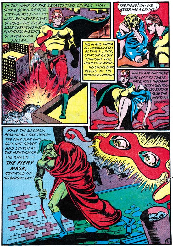

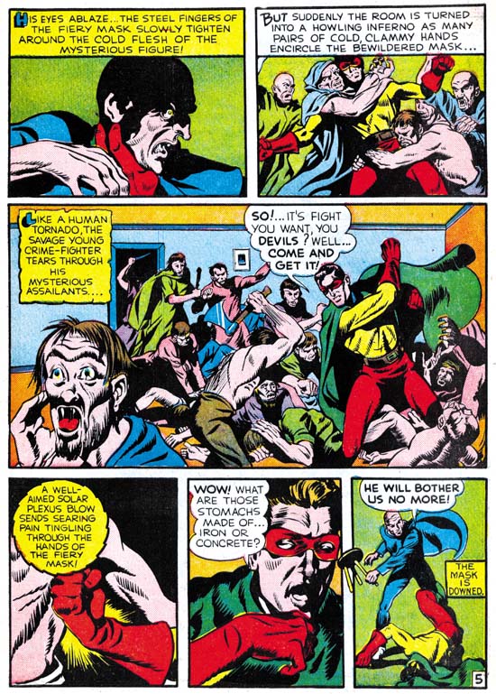
Daring Mystery #6 (September 1940) “The Fiery Mask” page 4, pencils by Joe Simon

Now that I had the Daring Mystery volume I was curious on how well the reconstruction was done. Of course I did not have a copy of DM #5 but I did have copies of the other issues. At a glance the reconstruction of the story art (by Pacific Rim Graphics) looked pretty good. But I decided to take one example (the demon figure from the Fiery Mask page shown above) and overlay scans from the original comic and the reprint.

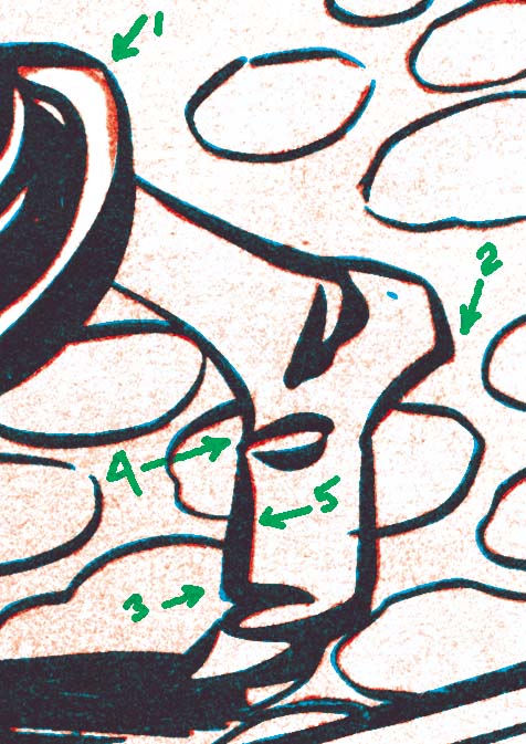
I digitally bleached both scans so that for the most part only the line art remained. I changed the line art of the original comic to red and that from the Masterwork to cyan (blue). If both were identical the resulting lines would look black but deviations would show up in one of the two colors. Experience has shown that you never get perfect overlays. Even scans from the same comic will vary from day to day. Paper “breaths”, it expands or contracts with humidity changes.
Daring Mystery comparison
Original: red line art
Masterwork: blue line art

To illustrate what I found I have shown a close-up of the Demon’s foot. I have marked the most glaring difference as item 1. However the error in this case is due to the digital bleaching I did. The robe was red while the background was green. The registration was not perfect and the cyan (blue) of the background printed over a portion of red. The red (magenta and yellow) and cyan inks combined to form black. Chemical bleaching would have removed the erroneous black but digital bleaching does not. But the black due to the registration error and the black ink of the line art are not identical. If I were doing the restoration I would edit the result based on that difference and as far as I can tell the Masterwork’s reconstruction is accurate.

My registration is not perfect and as I described above variations due to paper expansion or contraction are also expected. Therefore I would not judge most of the failures to overlay correctly to be of any significance. The one I marked as 5 shows that the original comic was slightly to our right. However the line on the opposite side of the foot is also slightly to the right. I expect both “errors” are due to the problems I described above and are not reconstruction errors. There are also other variations in line width that could be explained by variations in the printing. However it is also possible that they are reconstruction errors but I cannot tell without seeing the actual comic used in the Masterwork reconstruction.

Now look closely at the heel (marked as 2). The bottom of the heel in the original comic was not smooth but deviated slightly near the end. This cannot be explained by the factors discussed above and is I believe an error in the reconstruction. On the opposite side of the foot (marked 3) is a case were the reconstruction has added an angle that was not present in the original. The fold spotting pointed to by item 4 also deviates in ways that seem to reconstruction errors.

One might think that I am criticizing Pacific Rim Graphics for the reconstruction job they did. Actually far from it, I believe they did an excellent job. These are really small errors that can only be seen when magnified and would be difficult to spot with the naked eye.

The covers were reconstructed by another (Michael Kelleher). This is same reconstructor that I mentioned in my earlier post who admitted to using a primitive reconstruction method (inking on tracing paper) and was completely clueless why some would find this objectionable. I did not do an overlay of his work but careful examination suggests it was accurate. The only thing I noticed was that his lines were consistently narrower than those from the original comics. Perhaps the original comics he used had been better printed or perhaps this was done on purpose.

I did not have time to make detailed comparisons of all the work from Daring Mystery issues 6 to 8 with the Masterwork volume but overall they looked good. I feel this volume does justice to the original artists. Does that mean I approve of the use of reconstructed art? Not at all, I still prefer scans. No matter how well done, a reconstruction is still one artist’s interpretation of another artist’s work. But let us be frank, the reader will unlikely to find a single coverless issue of Daring Mystery for the price of the Masterwork volume.

One little warning about the Masterwork book, the cover for Daring Mystery #7 was not drawn by Joe Simon. I have no idea how such an obvious mistake was made.

Recreation Vs. Restoration, How Should Reprints Be Done?

Not long ago Daniel Best wrote a post on his blog about art recreations used in Marvel Masterworks (Original Art Stories: Marvel Masterworks Non-Original Artists). The gist of his comments was that he objected to Marvel’s use of recreated art in the Masterwork volumes. Mike Kelleher who does work for Marvel reprints posted a reply on the Marvel Masterworks Fan Site. The ensuing thread is typical of the sort of thing to be found in lists. It ranges from insightful discussion to meaningless name calling.

I have to give Mike Kelleher credit; he is open about what he has done. Apparently he felt quite justified in recreating art in some cases:

Marvel never gave me any instructions on how to recreate art. There is no way anyone could have known I redrew some of the pages on paper first before reconstructing them. My first 6-12 months of art recreation was done digitally, I then read an article somewhere ( might have been here but I don’t recall ) about how artists used to, and still do, literally redraw the pages for reprint purposes. Since I wasn’t happy with the results I was getting digitally, I decided to try drawing them (contrary to recent comments I am an accomplished, although unknown, artist :-). I’m still getting the feeling that some people are trying to attach sinister motives to this process, but there really are none.

He has an interesting post in the thread showing various stages in one of his reconstructions. Of particular interest to me was this statement:

Because Masterworks line art is printed 100% black just like the original comics, we need to digitally transform this image so that there is no grey. This is problem 1. There is no setting that will fill in the areas where the ink was light or dropped out completely. After playing with the adjustments for a few minutes I have decided that this is the best result I can get…

This explains the source of many of Marvel’s problems. Restricting the black plate to just line art was common in the original comics but is not typical of modern printing methods. In my opinion Marvels use of this technique in their reprints unnecessarily complicates the restoration process. With the level of correction that must be done the final results can be anything from a restoration to a recreation, depending on the person doing the work.

I found another of Mike Kelleher’s comments interesting:

Final points– All reconstructed artwork ( and most done from scans of stats and original art ) have some level of redrawn lines. Reality. Period.

This simply is wrong but I understand now why he believes it to be true. It is all back to that 100% black plate. Use a modern separation and you just cannot beat reproductions based on original art (assuming the original art is complete). I know original art is not always available so this is not a suggestion that Marvel take that approach.

In a previous thread on the same Marvel Masterworks Fan Site I learned from another that micro filch were used as the source for some of the golden age reprints. These micro filch were made many years ago but still occasionally show up in places like eBay. Their quality is fine for casual reading but as a source for reprints they leave much to be desired. Any reprint based on micro filch would almost certainly end up being a very poor recreation.


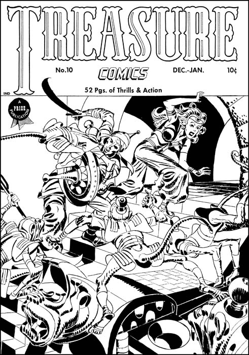
Treasure Comics #10 (December 1946), art by Jack Kirby

Years ago I decided digitally restore the line art for every Simon and Kirby cover. Even then I could not afford to chemically bleach the original comics. So I developed a method to remove the color using Photoshop. I must add that I am sure others have also figured how to do this on their own. Digitally bleaching is not as successful as with the use of chemicals so there was still a lot of work needed to clean up the final results.


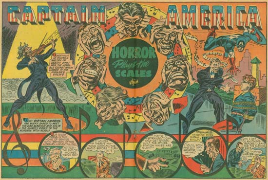
Captain America #7 (October 1941), art by Jack Kirby (original scan)
Larger view

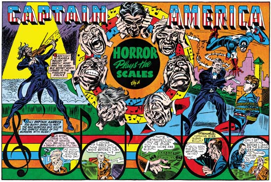
I did finish the project but in the end I came away with two basic realizations. One was this method required too much work. The second was that color really should be a part of the restoration process. I did not like Marvel reprints and felt there was a better and more accurate way of doing things. So once again I figured a process using Photoshop to do restoration. And yes I am sure others figured it out themselves as well. Usually I only post at least partially restored images in this blog, but now I will made an exception. The above image is an actually scan from a comic just as it came from my scanner. Below can be found my restoration based on that very scan. I was so pleased with my method that I once started a group (Digitizing Comic Books ). In that group I posted an explanation of some of my techniques. Well I do not think many got what I was trying to do so I never went past the basics. I am the moderator so there will be no problems if anyone wants to become a member. It is pretty much a dormant group but the archive still has my posts.

Captain America #7
Captain America #7 (October 1941), art by Jack Kirby (restored)
Larger view

Is Marvel being dishonest by presenting recreations in a reprint volume? My original reaction was yes. Some on the thread have said that this was all well known facts. That it was not hidden in either Marvel interviews or posting on lists. I do not feel that is true discloser as not everyone reads those interviews or reads all comic book lists. So I pulled out my Marvel Masterwork volume of Daring Mystery. There in the table of contents they credit those who did the color and art “reconstruction”. Yes reconstruction is their word. My dictionary provides this definition of the word reconstruct:

“1) to construct again; rebuild; make over. 2) to build up, from remaining parts and other evidence, an image of what something was in its original and complete form”.

Well I feel the first definition is certainly valid for what Marvel has been doing (though not the second since the final result is nothing like the original form). So yes Marvel is being honest. I should have been more careful when buying these volumes because here reconstruct is another word for recreate.

There are those who honestly like Marvel’s approach and think the Masterwork volumes are the correct way to do reprints. They would not spend their money on what they would describe as just scans. There are also those who really are only interested in the characters and have little concern for studying the original artists and inkers. For all of them these Marvel Masterworks are a good deal. There are others who never did like what the glossy pages and flat colors of the Masterworks. There are also some who truly admire the earlier artists and want to see their art and not some recreation by a modern artist. For those the Masterworks just do not have the same value. I fall in this second category and I will be getting rid of the volumes I have and will not buy any more.

The Human Torch #2

I do not think I will surprise anyone by observing that the early Timely comics are high price items, particularly the key issues. There are probably very few, if any, comic book collectors who can afford to purchase complete runs of early Timely comics. That is why I am grateful that Marvel has reprinted some of them in their Marvel Masterworks Golden Age series. I would like my readers to always keep this in mind as I write some negative criticism on one of these books, The Human Torch Volume 1.

Human Torch #2
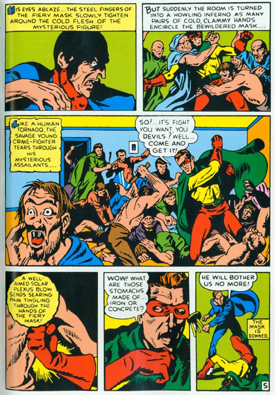
The Human Torch #2 (Fall 1940) “The Strange Case of the Bloodless Corpses” by Joe Simon

I have recently been able to scan a coverless but not too beat-up copy of Human Torch #2. That is actually the first issue for that title as it took over the numbering from the defunct Red Raven Comics #1. Seeing the original comic was a revelation. In Chapter 2, “Before Kirby” of my serial post on The Art of Joe Simon I discussed the Fiery Mask story by Joe Simon. I included an image of page 5 scanned from the Masterwork book. You can see the image I used below. I have since replaced it with a scan from the original comic, which you can see above. Take the time to compare the two images. Even with the relatively low resolution that is needed to include in this blog page it should be pretty obvious the difference in quality. The reprint version looks rather blurry. Because of the glossy paper used and the modern printing technology this cannot be blamed on the printing. Rather it looks like it was re-inked with an insensitive hand. Joe did a much better job inking this story then you could tell from the reprint.

Hunan Torch #2
The Human Torch #2 (Fall 1940) same page as above as reprinted in Marvel Masterworks.

Simon’s story was not the only story to be adversely affected by the poor art restoration. Actually all the features in this comic look so much better in the original. Colors in Golden Age comics just can not compare with what modern presses can produced. Yet the colors in this reprint are actually inferior to the original.

Hunan Torch #2
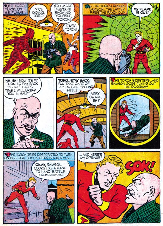
The Human Torch #2 (Fall 1940) “Introducing Toro, The Flaming Torch Kid” by Carl Burgos

I could not resist including an image by Carl Burgos. Not because it shows how much better the original art was, since the reprint’s job on this page was better then most. I include it because it is such an great example of Carl’s excellence at telling the story. His progressing from the entrance of the Human Torch, the weapon removing his flame, the villain issuing his threat to the now disarmed hero, and ending with the Torch showing what he can do with his intelligence and courage. The only problem I have with this page is the awkward use of the circular panel. In a few months Simon and Kirby would show the right way to use this device.

Hunan Torch #2
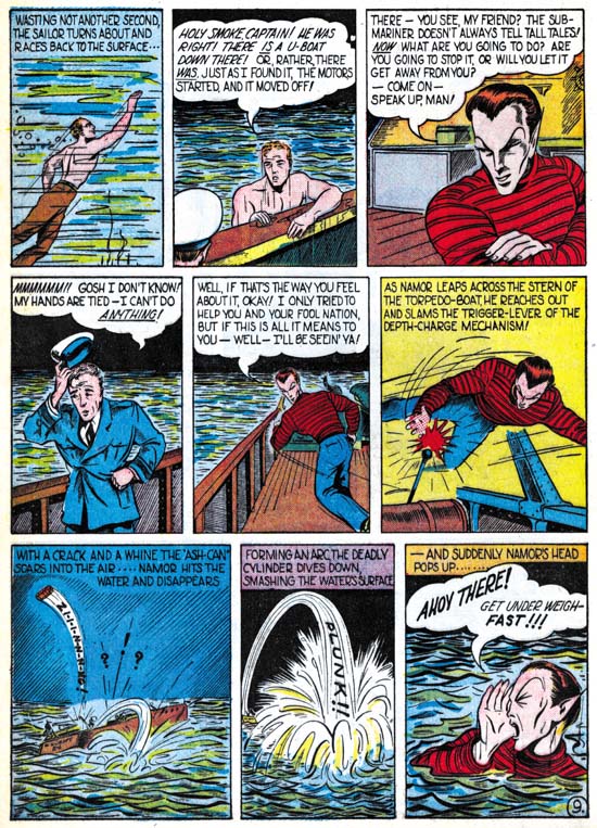
The Human Torch #2 (Fall 1940) “Sub-Mariner Crashes New York Again” by Bill Everett
Enlarged Image

Sometimes the differences between a masterpiece and a more routine piece of art is actually very small. When I originally read Everett’s Sub-Mariner story in the Masterwork volume I was not very impressed. Do not get me wrong, you could tell Everett was doing a great story telling job. But the art itself did not do much for me. In my opinion none of the stories in this comic suffered as much as Everett’s from the reprint. The reprint inking was not any worst in Sub-Mariner but it completely masks what a masterpiece this story really is. Even the image I provide above does not do it justice, but I hope you can get a better idea from the enlarged image.

I am not able to compare the reprint with the original for the other issues in the Masterpiece volume. But it sure looks like they suffer from the same problems. I want to repeat what I said above, that even in the current somewhat poor restoration this Masterwork volume is a welcome addition to a fan’s library. But it is a shame that Marvel missed a chance to provide a volume that could have been absolutely amazing.