(Justice Traps the Guilty #9 – #12, Headline #35 – #38)
This chapter will cover the Prize crime comics from the period March through November 1949. Both Justice Traps the Guilty and Headline were bimonthly titles. The other nominally crime title, Charlie Chan, had been discontinued after February. Simon and Kirby were also producing Young Romance at the start of this period as a bimonthly but switching to a monthly in September. The first Young Love was released just prior to this period in February and would be a bimonthly throughout the time covered by this chapter. The western romance titles came out during this period; Real West Romance in April and Western Love in July. They were both bimonthlies. Thus at the start of this period Simon and Kirby were producing 4 titles and by the end 6 titles. Most of the titles were bimonthlies and I find it more significant to count bimonthlies as half a title. Using that counting technique at the start S&K were producing 2 titles and by the end 3.5 titles.

Justice Traps the Guilty #9 (April 1949) “This Way to The Gallows”, art by Jack Kirby
As is generally the case when discussing Simon and Kirby productions, Jack was the primary artist during the time covered by this chapter. This is however a little misleading as Kirby only supplied 5 stories with 38 pages out of a total of 43 stories with 325 pages. While not quite at Kirby’s level, other artists supplied significant amount of work. John Serevin did 5 stories and 32 pages; Vic Donahue had 4 stories and 30 pages and Warren Broderick may have done 4 stories with 31 pages.
A trend that started earlier was continued; Jack’s splashes for the crime titles no longer seemed to have the impact that they did with the earlier issues. Part of this due to all of the splashes now being half pages splashes, but part was the result of the art itself. This may not have just been a declining interest on Kirby’s part; it is possible that he was toning down the violence because of the criticism that crime comics were receiving at this time. Whatever the reason, if you want to see great Kirby splashes from this period you have to look at the romance titles where Jack was turning out some of his best splashes.
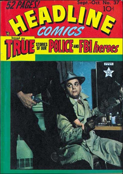
Headline #37 (September 1949) That is Jack Kirby in the cover photograph. An uncropped version of the photograph shows that the policeman was actually Joe Simon.
Jack also supplied 4 of the 8 covers, and the covers that Kirby did were all excellent. Starting with Justice Traps the Guilty #11 (August) and Headline #37 (September) the crime titles began to use photographs for their covers. A similar change over occurred for the romance titles; Young Romance with issue #13 (September); Young Love seemed to start it all with issue #2 (April). The western romance titles (Western Love and Real West Romance) were both introduced with photographic covers. Simon and Kirby’s involvement in the crime photographic covers is shown by the presence of Jack himself in one of them.

Headline #37 (September 1949) “The Accusing Match””, art by Jack Kirby
Jack Kirby’s declining contributions to the crime titles is even greater then the numbers indicate. That is because this chapter covers a transition in these titles. While Jack contributed to Headline #35 to #37 and JTTG #9 to #11, he would provide no work for Headline #38 or JTTG #12. “The Accusing Match” would be the last Kirby crime story released until Simon and Kirby published Police Trap. A drop in Bill Draut’s contribution to the crime genre comics was noted in previous chapters. Bill’s last crime story, and the only for this chapter’s time period, would be “Willie the Actor” from JTTG #9 (April). Draut’s drop in from the crime genre was not a reflection about his art in general because he still played a leading roll in the standard romance titles as well showing up often in the western romance comics all of which were produced by Simon and Kirby. Other artists who worked for the Simon and Kirby studio also stopped appearing about this time in Headline and Justice Traps the Guilty. I will touch on this subject as I review some of these artists and at the end of this post draw my conclusions.

Headline #37 (September 1949) “Death of a Menace”, art by Vic Donahue
Vic Donahue’s provided 4 stories and 30 pages which is a surprisingly high number relative to Jack Kirby. He is one of the Simon and Kirby studio artists that would disappear from the crime titles. The last work that I know of appeared in JTTG #12 (October). Donahue appears in Simon and Kirby production often enough during this period that I consider him among the second tier of studio artists (along with John Severin, Leonard Starr, Bruno Premiani?, Jo Albistur and Ann Brewster).
Donahue art during this period is consistent with what I have presented before. Traces of the Studio style inking are found sporadically in Vic’s art. Note the abstract shadow arc in the splash panel, the drop string on the back of the car seat in story panel 1 and the picket fence crosshatching in the second panel (see the Inking Glossary for explanations of the term I use to describe inking techniques). I am increasingly becoming convinced that in Vic Donahue’s case, the presence of Studio style is due to Joe or Jack coming in afterwards as an art editor and strengthening Donahue’s work.

Headline #37 (September 1949) “The Artistic Swindler”, art by Bruno Premiani?
Bruno Premiani first appeared in a Simon and Kirby production in August (“Two-Timer”, Young Love #4). The story “The Artistic Swindler” that appeared in the following month was Premiani’s only crime genre art for Simon and Kirby. Bruno only worked for Joe and Jack until December 1950 but during that time he was an important contributor. Although he would not appear in another crime genre, he would be used for all other Simon and Kirby productions.
Perhaps I should explain (for those readers who have not read my previous explanation) why I provide Bruno Premiani attributions with a question mark. The Simon and Kirby stories whose art I attribute to Premiani are all quite similar and easily recognized. The problem is none of them were signed. Crediting of this work to Premiani is based on the credits found in the trade back “Real Love”. Unfortunately that publication does not explain the reason for the attribution. Bruno Premiani is also credited with work at DC but that work looks very different then the art for Simon and Kirby. While none of this means the S&K studio artists could not have been Bruno Premiani, neither is there good evidence to support that attribution. Until I find some way out of this conundrum, I will continue to indicate by uncertainty by adding a question mark to the Premiani attribution.

Headline #37 (September 1949) “One-Man Posse”, art by John Severin and John Belfi
Another prominent artist during this period was John Severin who contributed 5 stories with 32 pages of art. He would, however, appear in all four Headline comics covered by this chapter as well as JTTG #11 (August). He would also show up in JTTG #14 (February 1950). Severin’s appearance in the Simon and Kirby comics seems somewhat sporadic, but unlike some of the other S&K studio artists, his contributions to the Prize crime comics seems to continue after this period. I am unclear exactly when it started, but Severin was an important artist for Prize Comics Western. As far as I can tell, outside of producing a couple of covers, Simon and Kirby had little to do with that title.

Justice Traps the Guilty #10 (June 1949) “Counterfeit”, art by John Belfi
Many of John Severin’s art at this time were signed. The signature often included the inker and that was almost always John Belfi. I gather Belfi was primarily an inker and “Counterfeit” from JTTG #10 is the sole example of pencils by John Belfi for a Simon and Kirby production. Because his pencil work is not very often seen I thought I would include an image. Frankly John Belfi is not one of the better artists that worked for Simon and Kirby.

Headline #36 (July 1949) “Shoe-Box Annie”, art by Warren Broderick
Warren Broderick was one of the lesser artists of the Simon and Kirby studio. Yet he did a surprising 4 stories and 31 pages for the crime comics covered in this chapter. His last crime story seems to be “Hijackers” in JTTG #11 (August). However he normally does not sign his work and I have only fairly recently identified him. I have made an examination of some of the following Prize crime comics and so far failed to detect him. However he seems to have only rarely was used for the Simon and Kirby romance comics. So he is not a good example of the transition that seems to be occurring in the crime titles.

Justice Traps the Guilty #10 (June 1949) “Death Played Second Fiddle”, art by Manny Stallman
Manny Stallman work for the Simon and Kirby studio has an interesting aspect. I have previously presented examples by Stallman (It’s A Crime, Chapter 6 and Chapter 8 and remarked at the time that they seemed to be done in two different styles neither one of which was a good match for what Stallman did at Atlas a few years later. Yet a third style is evident with “Death Played Second Fiddle”. This style seems particularly crude compared to the art that I previously shown.

Headline #35 (May 1949) “The Golf Links Murder”, art by Manny Stallman
If the presence of three styles by Manny Stallman was not bad enough, “The Golf Links Murder” is done in yet another style. This one is done in a manner that does look similar to Stallman’s Atlas work. Note in particular the almond shaped eyes. Similar eyes can be found in older work as well (The Captain Aero Connections) I believe the existence of four distinct styles over such a very short period of time is good evidence that Manny Stallman was providing work to Simon and Kirby most of which was actually drawn by ghost artists.

Justice Traps the Guilty #11 (August 1949) “Amateur Hypnotist”, art by Dick Briefer
Dick Briefer makes a surprise appearance in this chapter. Well it was a surprise to me. Briefer is mostly known for his work on Frankenstein but we previously saw him supply work for some Charlie Chan issues. Now to the work that he did for Simon and Kirby can be added “Dutch Joe Cretzer’s Other Business” (Headline #36, July), “Amateur Hypnotist” (JTTG #11, August) and “The Nightmare Murder Mystery” (JTTG #12, October). All of the work that he did for Simon and Kirby was unsigned and these three examples are more realistic then what he did in Charlie Chan. But enough of his stylistic tendencies are present to leave little doubt that he was the artist. In the example page shown above note the triangular head give to the man in the splash, the shallow depth to the face of the man on the left of the first story panel, and the small head of the man with the blue suit in the same panel. Dick Briefer’s appearance in these Prize crime comics and work done at the same time for other publishers was undoubtedly due to the cancellation of Frankenstein after issue #17 in February 1949. Frankenstein Comics would resume, with Dick Briefer, in March 1952.

Justice Traps the Guilty #10 (June 1949) “Confidence Man”, art by Bernie Krigstein
The story “Confidence Man” was signed B. B. Krig in the splash. I must admit that I did not realize who it really was until I went searching to the Internet for Krig. I quickly found that B. B. Krig was actually Bernie Krigstein. In fact I had missed an earlier unsigned work by Krigstein (“First Great Detective”, JTTG #8, January 1949). These are the only two works by Bernie for Simon and Kirby. I do not know if part of the reason for that was the transition in the Prize crime comics that happened at this time. Krigstein had a great style for crime stories, but I doubt that it would have been very effective for the romance genre. Whatever the reasons for his short stay at the Simon and Kirby studio, it was certainly a shame he was not around longer as he went on to do some great art for some other publishers and especially for EC.
When the Simon and Kirby’s Young Romance first came out it primarily used Jack Kirby and Bill Draut as artists. After that initial period, the artists used for the romance comics would largely be the same ones used for the Prize crime genre as well. The core artists for Simon and Kirby around the time covered by this chapter were Jack Kirby, Bill Draut, Vic Donahue, Leonard Starr and John Severin. I would include Manny Stallman, but as I mentioned above he appears to be using ghost artists and thus sorting out the unsigned work is problematical. Bruno Premiani? was an important S&K studio artist who started working for Joe and Jack just at this time. Mort Meskin was an even more important studio artist who started just after the period covered by this chapter (December). Kirby’s last crime story was for September, Draut’s was April, and Donahue last was October. Starr never did much crime and his only work in that genre appeared in February. Severin does not follow the same history; he would do a crime story in November 1949 and again in February 1950. Severin would later become an important contributor to Prize Comics Western. Bruno Premiani started working for Simon and Kirby during this time period; he would only do a single crime story (September) but would provide a lot of work for the romance titles for the following year. Mort Meskin would arrive shortly after the period covered in this chapter. While initially Mort would only work on the romance titles before long he would provide occasional stories for Headline and JTTG and would do so for the rest of stay with Simon and Kirby. So to summarize there were 4 artists (Kirby, Draut, Donahue and Premiani) who stopped providing crime stories during this period and 2 (Severin and Meskin) who continued to work on the crime titles.
However it was not just a question of the important S&K studio artists there were also a number of minor, mostly unidentified, artists as well. These minor artists were used in the romance titles but only in limited amounts. In the crime they became more commonly used especially after the S&K studio artists were no longer providing art. They are particularly abundant in the crime titles during the period covered by this chapter where the artist for 13 out of the 46 stories have not been identified. Two other stories have signatures (Dick Rockwell on one and Nicholson and Belfi on the other) but otherwise similar to the unidentified artists as being lesser talents. If Nicholson and Rockwell are included, these artists account for 103 pages of art out of 325 total.
In the first story of Real West Romances #3 (August 1949) there is a label with the declaration: “Produced by Simon and Kirby”. This label would then appear on the first story of nearly every Young Romance, Young Love, Young Brides, Black Magic and Strange World of Your Dreams until near the end of 1954. Some have mistaken it for a claim that Joe and Jack drew that story, but it really meant that Simon and Kirby put together the entire comic. The “Produced by Simon and Kirby” label never appeared in any issue of Headline of Justice Traps the Guilty.
The interpretation that I draw from all of this is that at about this time the Prize comics would begin being made “on the cheap”. That is that the pay rate given to artists working for these titles was lowered. The new pay rate could no longer attract the better artists. Artists like Bill Draut, Bruno Premiani, Vic Donahue and Jack Kirby had work they could do for the Prize romance comics where the pay rate had not changed and Jack had a share of the profits. As for Mort Meskin, he was so prolific that to pick up extra money beyond what he could get from the S&K studio he would accept the lower page rate for the crime titles. Perhaps the same was true for John Severin. Lowering the costs of producing a title was a strategy that Prize would repeat in the future.
But if the Prize crime comics were now being cheaply made, were Simon and Kirby still producing them? That is a question that is harder to provide a satisfactory answer. The lack of the “Produced by Simon and Kirby” label might suggest they were not producing the crime comics. But when the use of photographic covers was dropped for the crime titles, Jack Kirby provided cover art for 7 issues over the period from September 1950 to February 1951. My tentative conclusion is that in 1949 Prize directed Simon and Kirby to produce a cheaper version of the crime titles. By October or so they had achieved that end but continued to be involved in the production of the titles. Because Headline and JTTG were now inferior comics, Joe and Jack purposely left out the “Produced by Simon and Kirby” label. This was the state of affairs until early 1951 after which Simon and Kirby’s involvement in the Prize crime comics completely ended.
Chapter 1, Promoting Crime
Chapter 2, A Revitalized Title
Chapter 3, Competing Against Themselves
Chapter 4, Crime Gets Real
Chapter 5, Making a Commitment
Chapter 6, Forgotten Artists
Chapter 7, A Studio With Many Artists
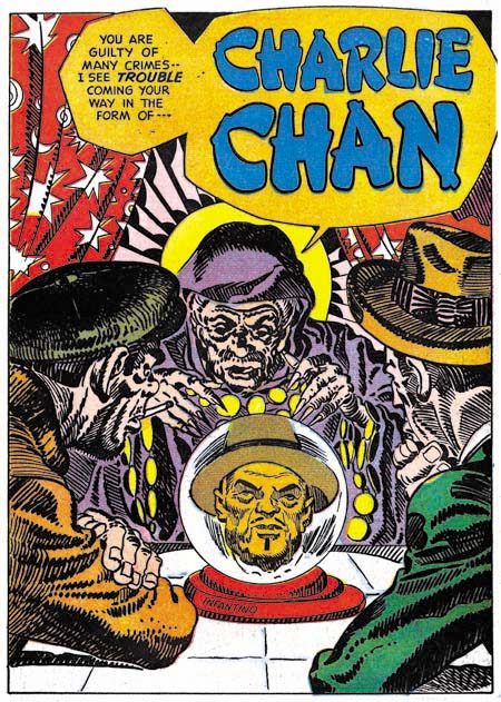
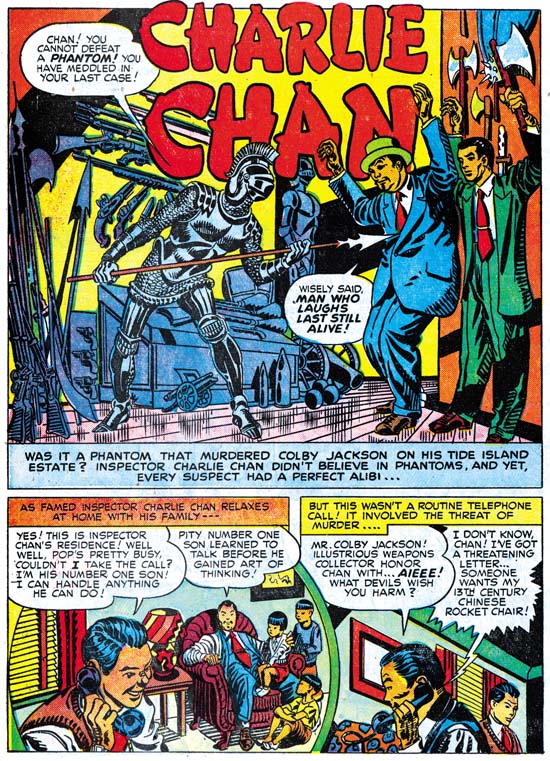
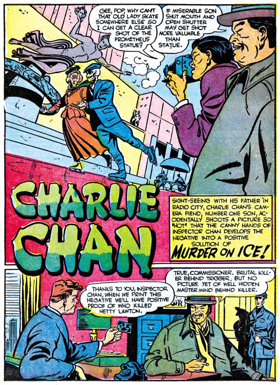
Chapter 8, The Chinese Detective
Chapter 10, The Master and His Protege
Chapter 11, The New Team