Category Archives: 2009/07

DC’s New Book, The Sandman by Joe Simon and Jack Kirby

The Sandman by Joe Simon and Jack Kirby

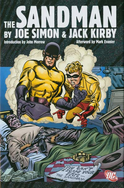
Joe Simon gave me a copy of DC’s new book “The Sandman by Joe Simon and Jack Kirby”. Amazon lists the release date as August 18, but it may be in comic books stores sooner then that. Simon and Kirby worked on Sandman (along with Manhunter, the Newsboy Legion, and Boy Commandos) just after leaving their highly successful run of Captain America at Timely. It was with Captain America that Simon and Kirby achieved fame but it was at DC that their unique collaboration really took root. This book provides all the Simon and Kirby Sandman stories that appeared in Adventure and World Finest Comics. That means the book contains all the independent Sandman stories that Joe and Jack did but excludes Sandman’s appearance in All Star Comics as part of the Justice Society of America. The Sandman also excludes some Sandman stories done by other artists while Simon and Kirby were doing their military service during the war. Included also is Simon and Kirby’s last comic book collaboration, a remade Sandman from 1974. Only the first issue of the 70’s Sandman is here since Joe and Jack once again went their separate ways. With 290 pages of art that is a lot of Simon and Kirby and at $39.99 a real steal. At that price you could not even buy a single issue of the original comic let alone the entire run.

There are two basic philosophies about how to reprint old comic book art. One approach is to recreate, or as Marvel calls terms it reconstruct, the art. The other approach is to use cleaned up scans. Recreated reprints can look superficially attractive but the reader is actually getting a modern artist interpretation of the original work. Depending on the artist doing the recreation this may or may not be very accurate. Reprints using scans are accurate but not always pretty because of the primitive printing of the original comics and the deteriorations that they have suffered with age. I prefer reprints that use scans and I am happy to say that is the approach that DC has adopted for this volume.

The Sandman by Joe Simon and Jack Kirby

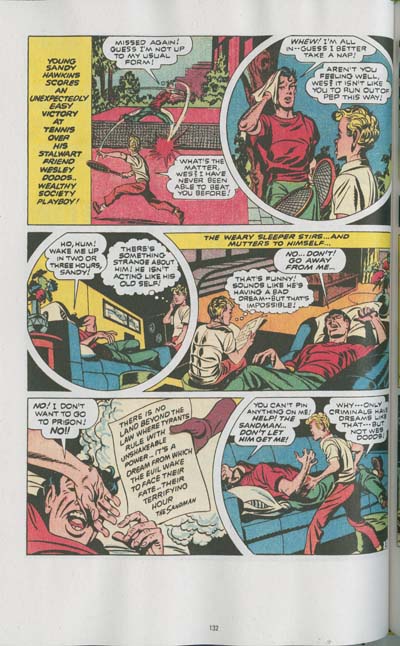
In all honesty there are some problems with The Sandman. The book is 7 by 10.5 inches in size. This is a common dimension for books of this nature but it meant that the art had to be reduced in size. However it is not much smaller then the original and reading is not really impaired. I would have preferred the original size but that would have meant a larger book with a correspondingly higher sales price. It is not the height of the original comics that caused the difficulty but rather the width. DC was obviously trying to limit the amount of size reduction and so the margins and gutters are rather narrow. The image above shows the resulting page format. The narrow gutter does not really affect the reading but as can be seen it does make scanning difficult.

There is a nice introduction by John Morrow, publisher of The Jack Kirby Collector. Morrow provides some much needed background for those not steeped into the history of Simon and Kirby. However there is a secret rule that says that every volume reprinting Jack Kirby material must include an essay by Mark Evanier, in this case it is an afterword. Of course I am being a little bit facetious about there being such a rule, but only a little bit. Evanier not only knows more about Jack Kirby then anyone else but he is also a marvelous writer. His presence in The Sandman, or any other Kirby volume, is always much appreciated.

What can I say, this is after all the Simon and Kirby Blog and this book is prime Simon and Kirby. Buy this book to find out how a second rate backup feature became the star of Adventure Comics. Buy this book to see how exciting Simon and Kirby could be. But buy this book.

Art of Romance, Chapter 18, Meskin Takes Over

(February 1952 – April 1952: Young Romance #42 – #44, Young Love #30 – #32)
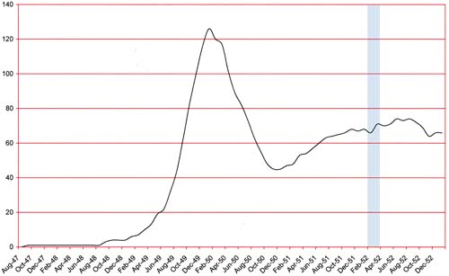
Number of Romance Titles 1947 - 1953
Number of Romance Titles 1947 – 1953 (the period covered in this chapter is shaded in blue)

There has not been much change in what the Simon and Kirby studio was producing which were two monthly romance titles and one bimonthly horror all for Prize Comics. I believe all three titles were doing well but I will leave off explaining what is behind my belief until Chapter 20 of The Art of Romance and Chapter 4 of The Little Shop of Horrors.

Mort Meskin provided an astonishing 105 pages of art for the period covered in this chapter. This was much more then what Kirby drew (37 pages). To provide perspective Kirby only drew one more page then Bill Draut (36 pages) an artists not known for his speed. At this point Meskin has been the primary romance artist for about a year. You have to go back 3 years to find a period when Kirby produced more pages then Meskin did in these three months. The pool of other studio artists used during this period is rather small; John Prentice (27 pages), George Roussos (13 pages) and an unidentified artist (6 pages).
Young Romance #44
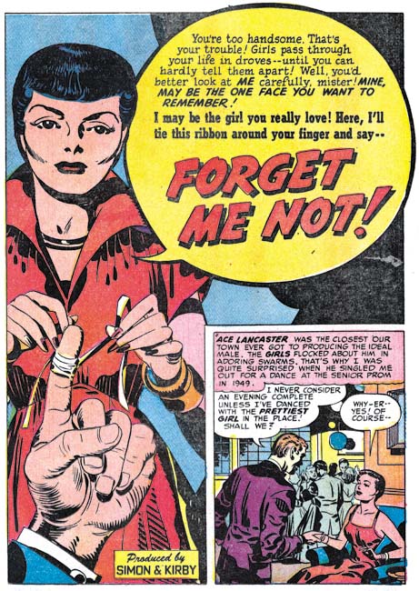
Young Romance #44 (April 1952) “Forget Me Not”, art by Jack Kirby

Kirby was the artists for the lead story for YR #42, #43 and #44 as well as YL #31. He continues to use the confessional splash where someone introduces the story to the reader and their speech balloon is also the title. The splash for “Forget Me Not” is perhaps the best of the Kirby splashes for this chapter.
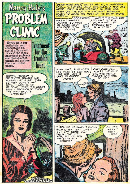
Young Love #30
Young Love #30 (February 1952) “Problem Clinic”, art by Jack Kirby and George Roussos

Kirby has been known to provide a splash page for a story otherwise drawn by another artist. But it is unusual to find another artist doing the splash for a Kirby story. I find it particularly surprising that the artist would be George Roussos. The “Problem Clinic” is a standard Nancy Hale feature but this particular one is different from the others. The large vertical splash is not found in other Nancy Hale and is also not a typical splash format for Kirby. Normally “Problem Clinic” starts with Nancy Hale introducing the story, but not in this case. All this makes me suspect that the story was not originally meant to be a Nancy Hale “Problem Clinic” but was re-edited to become one.
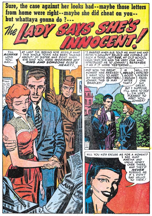
Young Romance #44
Young Romance #44 (April 1952) “The Lady Says She’s Innocent”, art by Mort Meskin

While I commonly find phrases in romance stories drawn by Jack Kirby that suggest that he was at least modifying the scripts I normally do not find such phrases in the work of other studio artists. This not to say that Jack did not contribute to the writing of stories for other artists, some writers have reported that Kirby would help provide the writers with plots. But Jack did not seem to re-write the scripts the writers returned unless he was going to draw the story. However the splash for “The Lady Says She’s Innocent” might be an exception. The last line of the soldier “you were wearing my ring and someone else’s heart” sounds so like Kirby to me. Even the whole concept of a person entering the room to verbally disrupt the proceedings is one typically found in Jack’s art. Unusually Kirby did not alter Mort Meskin’s art as he sometimes did with other artists. However I suspect that is what happened here. The composition suggests that there always was a figure on the right side of the splash. Perhaps Kirby was not happy with it, removed the old figure and added a layout and text for the balloon. With other artists Kirby would just have proceeded to draw and ink the figure but since Meskin worked in the studio Jack just left it to Mort to finish it up.
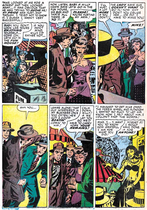
Young Romance #43
Young Romance #43 (March 1952) “Gentlemen Prefer Ladies” page 5, art by Mort Meskin

As I have previously mentioned, Meskin has seemed to pick up the use of tall narrow panels for some pages in a story. I find the above page from “Gentlemen Prefer Ladies” particularly effective both in how well Mort uses the narrow panels and for the cinematic approach to presenting the story. Mort likes to provide the man of his stories with a pipe as a suggestion of their sophistication. I love how this pipe is prominently displayed even in fight scenes.
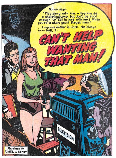
Young Love #32
Young Love #32 (April 1952) “Can’t Help Wanting That Man”, art by Bill Draut

Despite the fact that Meskin was providing more pages of art then anyone else, it was Bill Draut that was used for those lead stories not done by Kirby during this period. Draut was not as good an artist as Kirby (who was?) but he still did an excellent job on the confessional splashes. The one for “Can’t Help Wanting That Man” provides a complete story. The struggling starlet torn between ambition and desire is venting her dilemma on a busy television studio while here love interests looks on. It is everything a splash should be, particularly for the all important first story of the comic.
Young Love #30
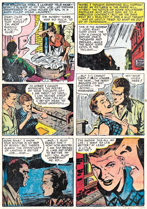
Young Love #30 (February 1952) “Learn to Love” page 5, art by John Prentice

John Prentice had his own way of graphically telling a story and I provide an example above. The way he works up to the dramatic close-up in the last panel is quite good. I do have some qualms about panel 4. The simple hatching used for the sky unfortunately inappropriately suggests rain. It is not Prentice’s fault but the handkerchief that the lady holds has suddenly become the same color as the man’s shirt making it all a bit more confusing then it really would have been. Note the way the brickwork is handled in the last panel. The use of scattered groups of black bricks done in rough brushwork is often seen in Bill Draut’s work.
Young Romance #43
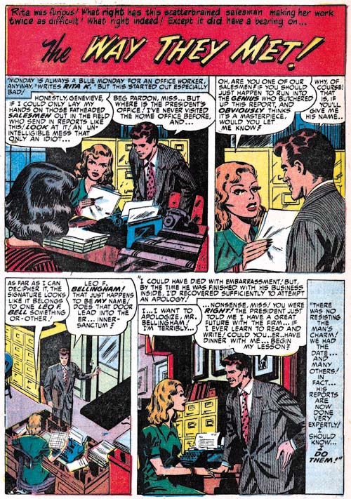
Young Romance #43 (March 1952) “The Way They Met”, art by George Roussos

George Roussos drew 6 features during this period and except for one they were all 1 or 2 page long. It is easy to see why; Roussos really was not that great of a romance artist, at least at this time.
Young Love #31
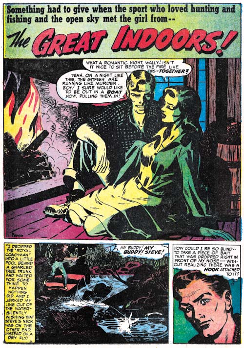
Young Love #31 (March 1952) “The Great Indoors”, art by Mort Meskin and George Roussos

Like most of the comic book industry at that time, Simon and Kirby did not normally provide credits for the artists that worked for on their productions. However they always allowed, perhaps even encouraged, artists to sign their work. So I always pay attention to the signatures because they provide the means to learn how to identify the various artists. The signature for “The Great Indoors” is a bit hard to make out but I thought it might have said Persius. It was the only story by Persius in my database and I could never uncover any further information or work by that artist. That is how it stood for a long time but my work for The Art of Romance has really tuned me in to the style used by George Roussos and when I saw the last panel of the splash page I immediately recognized it as his work. There are some parts, such as the man in the splash panel, that look like Mort Meskin’s style but initially I just attributed that to the large influence Meskin had on Roussos. When I closely looked at the signature again, I thought it actually read Roussos. Hey what can I say? Both the signature and the printing were poor.
Young Love #31
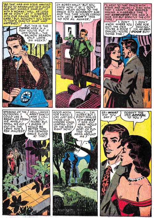
Young Love #31 (March 1952) “The Great Indoors” page 3, art by Mort Meskin and George Roussos

Going through the story I came across page 3 and saw the tall narrow panels. This is not a panel layout that I have seen Roussos use but it is one that Mort Meskin often turned to (see above). Then it all made sense. “The Great Indoors” was laid out by Meskin and finished and inked by Roussos. I have seen Jack Kirby do this with some less talented artists but this is the first example I have found of Meskin doing it. Roussos was one of Meskin’s inkers for work done previously at DC. I often find him listed as the inker for Meskin’s S&K work as well but I have not seen any evidence of that. Further Joe Simon has told me that Meskin inked his own work. “The Great Indoors” gives an indication of what Roussos inking Meskin have looked like at this time.
Young Love #32
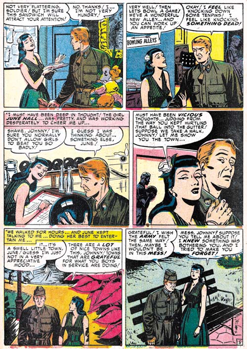
Young Love #32 (April 1952) “Three Day Pass” page 3, art by unidentified artist

There is one artist I have not been able to identify but he only did a single piece, “Three Day Pass”. I find some resemblance to the work by Al Eadeh (Art of Romance, Chapters 5 and Chapter 7). Eadeh worked for Simon and Kirby back in 1949 and if “Three Day Pass” is by Al then his work has evolved a bit. Unfortunately I have no interim Eadeh pieces to compare it with, so for now I am just leaving it as unidentified.

Chapter 1, A New Genre (YR #1 – #4)
Chapter 2, Early Artists (YR #1 – #4)
Chapter 3, The Field No Longer Their’s Alone (YR #5 – #8)
Chapter 4, An Explosion of Romance (YR #9 – #12, YL #1 – #4)
Chapter 5, New Talent (YR #9 – 12, YL #1 – #4)
Chapter 6, Love on the Range (RWR #1 – #7, WL #1 – #6)
Chapter 7, More Love on the Range (RWR #1 – #7, WL #1 – #6)
Chapter 8, Kirby on the Range? (RWR #1 – #7, WL #1 – #6)
Chapter 9, More Romance (YR #13 – #16, YL #5 – #6)
Chapter 10, The Peak of the Love Glut (YR #17 – #20, YL #7 – #8)
Chapter 11, After the Glut (YR #21 – #23, YL #9 – #10)
Chapter 12, A Smaller Studio (YR #24 – #26, YL #12 – #14)
Chapter 13, Romance Bottoms Out (YR #27 – #29, YL #15 – #17)
Chapter 14, The Third Suspect (YR #30 – #32, YL #18 – #20)
Chapter 15, The Action of Romance (YR #33 – #35, YL #21 – #23)
Chapter 16, Someone Old and Someone New (YR #36 – #38, YL #24 – #26)
Chapter 17, The Assistant (YR #39 – #41, YL #27 – #29)
Chapter 18, Meskin Takes Over (YR #42 – #44, YL #30 – #32)
Chapter 19, More Artists (YR #45 – #47, YL #33 – #35)
Chapter 20, Romance Still Matters (YR #48 – #50, YL #36 – #38, YB #1)
Chapter 21, Roussos Messes Up (YR #51 – #53, YL #39 – #41, YB #2 – 3)
Chapter 22, He’s the Man (YR #54 – #56, YL #42 – #44, YB #4)
Chapter 23, New Ways of Doing Things (YR #57 – #59, YL #45 – #47, YB #5 – #6)
Chapter 24, A New Artist (YR #60 – #62, YL #48 – #50, YB #7 – #8)
Chapter 25, More New Faces (YR #63 – #65, YLe #51 – #53, YB #9 – #11)
Chapter 26, Goodbye Jack (YR #66 – #68, YL #54 – #56, YB #12 – #14)
Chapter 27, The Return of Mort (YR #69 – #71, YL #57 – #59, YB #15 – #17)
Chapter 28, A Glut of Artists (YR #72 – #74, YL #60 – #62, YB #18 & #19, IL #1 & #2)
Chapter 29, Trouble Begins (YR #75 – #77, YL #63 – #65, YB #20 – #22, IL #3 – #5)
Chapter 30, Transition (YR #78 – #80, YL #66 – #68, YBs #23 – #25, IL #6, ILY #7)
Chapter 30, Appendix (YB #23)
Chapter 31, Kirby, Kirby and More Kirby (YR #81 – #82, YL #69 – #70, YB #26 – #27)
Chapter 32, The Kirby Beat Goes On (YR #83 – #84, YL #71 – #72, YB #28 – #29)
Chapter 33, End of an Era (YR #85 – #87, YL #73, YB #30, AFL #1)
Chapter 34, A New Prize Title (YR #88 – #91, AFL #2 – #5, PL #1 – #2)
Chapter 35, Settling In ( YR #92 – #94, AFL #6 – #8, PL #3 – #5)
Appendix, J.O. Is Joe Orlando
Chapter 36, More Kirby (YR #95 – #97, AFL #9 – #11, PL #6 – #8)
Chapter 37, Some Surprises (YR #98 – #100, AFL #12 – #14, PL #9 – #11)
Chapter 38, All Things Must End (YR #101 – #103, AFL #15 – #17, PL #12 – #14)
Joe Simon’s Hot Stuff

Zippy #1
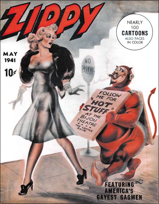
Zippy #1 (May 1941), art by Joe Simon

When Joe Simon was young he tried his hand in a number of different types of art work; political cartoons, sport illustration, portraits, story illustration, and oh yeah comic books. One art media Joe did not do was adult humor, that is except for the cover of Zippy #1. Here Joe provided a lecherous short man wearing a devil’s costume and an advertisement sign for Hot Stuff trailing a tall beautiful woman with a rather revealing dress. No punch line, just a visual gag that is more naughty then humorous. Joe executed the art with an air brush, a tool that he had become an expert at when he was a newspaper staff artist.

The first, and I believe only, issue of Zippy was cover dated May 1941. It was a large, tabloid size, publication. The cover reflected the work found in the interior both in subject and in size although some pages had 4 cartoons to a page. Much of the work is unsigned and based on the art styles done by a number of different cartoonists. There is nothing that today would be considered pornographic but all of a sexually suggestive humor. Back in the early 40’s, however, many would call it pornographic and such magazines sometimes brought legal difficulties to the publisher. So it is not surprising that the indicium is very short:

Zippy is published bimonthly by Manvis Distributors at Dunellen, N. J. May, 1941, Vol. 1, No. 1

Dunellen is a small community in central New Jersey that in 2000 had a population of 6823. It might seem to be an odd address for a publisher but in 1941 the town’s principal industries were R. Hoe Printing Press (manufacturer of letter presses) and Color Printing Company (owned by the W. F. Hall Printing Company of Chicago which at one time was the largest printing company in the world). Color Printing was almost certainly the printer of Zippy #1.
The subject matter is not the only thing that makes Joe’s work for Zippy unusual, the date does as well. Simon and Kirby’s Captain America was released to great success just two months before Zippy #1. Even before Captain America had made it to the newsstands, Joe and Jack had discontinued moonlighting for other publishers. Simon and Kirby must have felt they had a hit and with the promise of a share in the profits decided to concentrate their efforts to Timely alone. So why at this point would Joe decide to venture out into adult humor?

The answer is that actually Joe was not moonlighting when doing Zippy. A Google search found Manvis listed as a subsidiary of Magazine Management Company and publisher of the pulp Western Short Stories, and the comics Navy Combat and Sub-Mariner. Magazine Management was the name often used by Martin Goodman for his company that today is commonly referred to as Timely. Goodman would want to avoid legal hassles that Zippy might generate and the use of Manvis Distributors in the indicia could be nothing more then a smoke screen. Joe Simon was Timely’s first comic book editor and his handiwork can be found not just in the comics but the pulps and crime magazines as well. Joe would have been a logical choice to oversee Zippy and he had used the opportunity to put his own work on the cover.

Many years later, 1957 to be precise, Warren Kramer would create a little devil for Harvey Comics that was also called Hot Stuff. Just a coincidence? Perhaps, but in that year Joe Simon was also working for Harvey and he could have shown Harvey and Kramer one of the copies of Zippy from his collection, copies that he still has today. If so it would not have been the only time that a Simon original had inspired the creation of a popular comic book feature.

Little Shop of Horrors, Chapter 3, The Same Old Gang

(October – December 1951: Black Magic #7 – #8)

During the period covered in this chapter, along with the bimonthly Black Magic, Simon and Kirby were producing two monthly romance titles (Young Romance and Young Love). Not the largest work load for the prolific duo but apparently all the titles were doing well. Since Simon and Kirby received a share of the profits, sales volume was more important then the number of titles produced.

As was true with the concurrent romance titles (Chapter 17 of The Art of Romance), Jack Kirby was producing less then his normal amount of pages of art work. In BM #7 and #8, Jack would do the two covers and a single 8 page story. It was Mort Meskin who was the most prolific artist providing 23 pages for these two issues. Even John Prentice and Marvin Stein produced more pages then Kirby (both with 12 pages each). Bill Draut would provide a single 7 pages story. That was the complete artist line-up for BM #7 and #8; just the regular studio artists of that time. This is another of those chapters where I have been able to identify all the artists who worked on these issues.

Black Magic #7
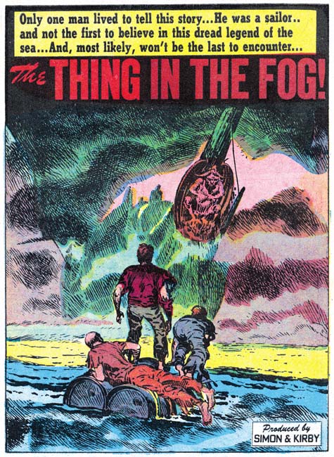
Black Magic #7 (October 1951) “The Thing in The Fog”, art by Jack Kirby

The full page splash for Jack Kirby’s single story, “The Thing in the Fog”, is quite unusual for the artist. Typically Kirby focuses on the human elements of a picture but here all we see are the backs of three individuals on a make shift raft. The center of attention is the approaching ship and even it is mostly lost in the fog with only the masthead distinctly delimitated. The depiction of fog would normally be expected to be billowing cloud shapes but instead the mists are rendered by a complex of strong crosshatching. The whole effect is one of eerie mystery and impending doom. It may be an unusual splash for Kirby but still one of his greater pieces of art.

Black Magic #8
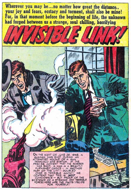
Black Magic #8 (December 1951) “Invisible Link”, art by Mort Meskin

Meskin’s splash for “Invisible Link” consists of a repeated image although with different clothing and surroundings. Today the artist would probably simply draw one, make a copy and work on the copy to produce the second image. But at this time there were no cheap copiers and so a stat would have to be made. This not only meant added costs but added delay as well. Instead Mort simply redrew the figure. By quickly going back and forth between the two images you can verify the differences between the mouth, nose and other details. The use of a double image is a simple device but one that captures the essence of the story.

Black Magic #8
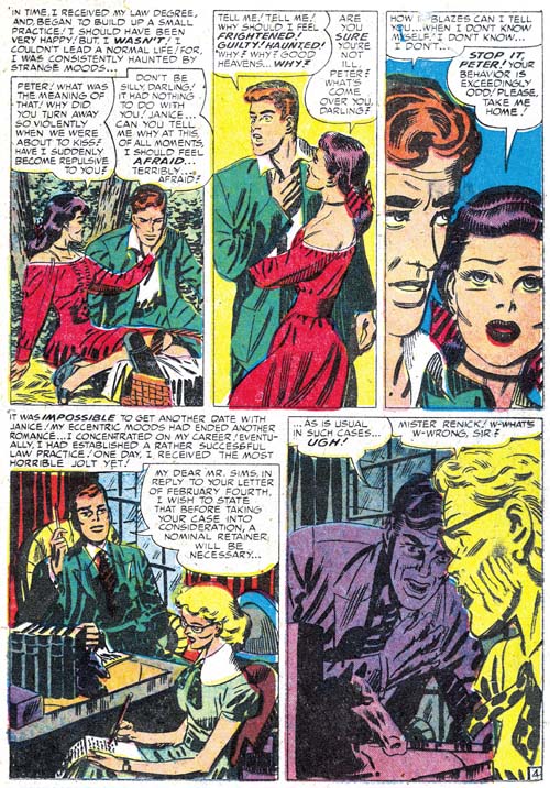
Black Magic #8 (December 1951) “Invisible Link” page 4, art by Mort Meskin

I have previously remarked that Meskin would sometimes adopt the tall narrow panels that earlier were used by Leonard Starr. In Mort’s case this typically meant dividing the page into two rows each with 3 panels. Above I provide a page with a slightly different approach. The height of the bottom row has been reduced giving even more vertical dimension to the narrow panels of the top row. To make up for the loss of height, the bottom row only has two panels. These tall narrow panel layouts are normally not found in the works by Jack Kirby during this period and that is another of the recurring indications that Kirby was not providing layouts to Mort as some people have claimed. Further it suggests that whatever script was provided to Meskin it either did not completely detail out the art on the page, or if it did Mort felt free to deviate from the directions.

Black Magic #7
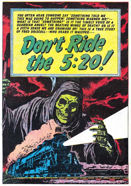
Black Magic #7 (October 1951) “Don’t Ride the 5:20”, art by Bill Draut

A skeletal cloaked figure of death looms over a speeding train in this full page splash by Bill Draut. Of course none of these elements are found among Bill’s romance art so it is by depictions of people in the story that allows this work to be safely attributed to him. The detailing of the drawing of the train indicates it was based on a photographic image. But the sharpness, so untypical for Draut, suggests that rather being swiped from a photograph that perhaps the picture was literally glued down on the board and then inked over to provide the desired effect. If true this would be an unusual occurrence at this time although years later Simon would often build up a cover using stats.

Black Magic #7
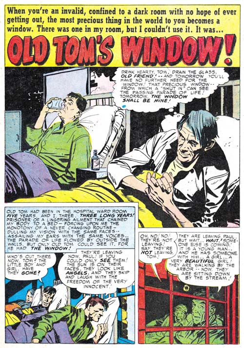
Black Magic #7 (October 1951) “Old Tom’s Window”, art by John Prentice

It is not unusual for Jack Kirby to assume the role of art editor and make alterations to the work submitted by artists employed by the studio. Normally this is for less talented artists and I do not recall ever seeing Jack fix up the work of Bill Draut or Mort Meskin. I consider John Prentice as in the same talented class with Draut and Meskin which is why I am surprised to see Kirby art editor’s hand at work in some of art submitted by Prentice when he first appeared in Simon and Kirby productions. Compare the first story panel for “Old Tom’s Window with the rest of the page and you will note subtle but important differences. The figures in panel one are simpler and lack the craggy feel found in the splash and the second panel and which is typical of Prentice’s depictions of men. Also observe the difference in brush techniques. Those in the first story panel include picket fence crosshatching, drop strings and abstract arch shadows (see my Inking Glossary for explanations of these terms) that are typical of the Studio Style inking. The brush work is blunt but nuanced and was almost certainly done by Kirby. The inking on the rest of the page lacks these elements and is typical of Prentice’s approach. It is hard for me to understand why Jack felt compelled to work on this panel since the depiction of the men in hospital beds is really not that different from those done by Prentice on the rest of the page. Perhaps it was not so much Jack correcting John as providing him with guidance about how to do the story. If that was true it was with this single panel as the rest of the story is laid out in Prentice’s characterizing manner.

Black Magic #7
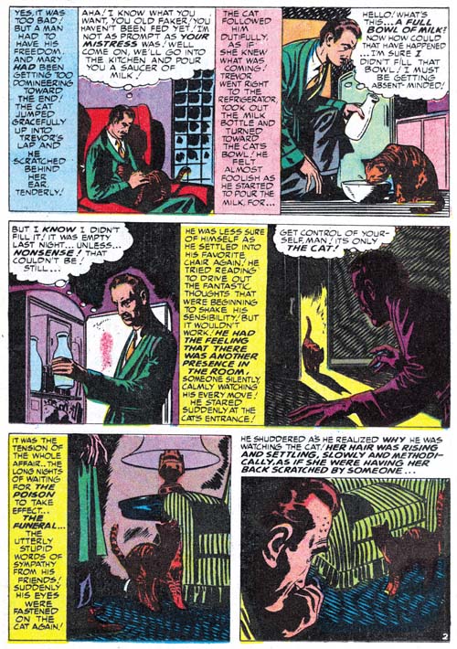
Black Magic #7 (October 1951) “No One Human” page 2, art by Marvin Stein

By this time as I mentioned in The Art of Romance (chapter 16), Marvin Stein’s art was beginning to show some significant improvements from his earlier more crude style but has not quite reached his more mature style. I credit much of Stein’s improvement to his close study of Kirby’s art either through close observation while working in the same studio or perhaps by actually inking Jack’s work (although I have not yet verified Stein’s inking of Kirby at this early date). Marvin’s inking has particularly improved from his early version to this one. Normally I prefer to present a splash, but in the case of “No One Human” it is difficult to recognize Stein’s hand in the first page. Instead I show page 2 where the man in panel 3 is very close to Stein’s mature art style. Note Marvin’s frequent angular crosshatching. While this is not generally found in Stein’s work it plays a prominent part of this story but I have to admit I find it rather distracting. Also observe the vertically oriented captions. Kirby would only occasionally use vertical captions so this is an indication that this story was not based on Kirby layouts. Interestingly vertical captions are often used by Mort Meskin who also occasionally uses similar angular crosshatching. I find it hard to believe that Meskin would be supplying Stein with layouts and even harder to accept that Mort would be inking Marvin’s pencils so I suspect that Stein was also carefully studying Meskin’s work as well.

Black Magic #8
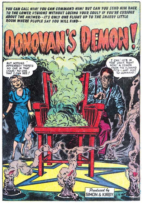
Black Magic #8 (December 1951) “Donovan’s Demon”, art by Jack Kirby and Marvin Stein

I have discussed the splash for “Donovan’s Demons” in the past (Summoning Demons). The only modifications of my previous views is that I know come to credit the artist for the story as Marvin Stein. But to quickly review, while the man appears to have been drawn and inked by Stein, the woman is clearly the work of Jack Kirby. Both are background elements with the most important part of the splash being the chair, candles and star pattern on the floor. The candles are good matches for those done by Kirby found elsewhere. Chairs do not normally play such a prominent part in Kirby’s art so it is difficult to make a comparison. However the perspective on the chair is so well done and since this sort of dramatic perspective played such an important art I believe Jack did the chair as well. It is not that unusual to find a Kirby figure in a splash otherwise done by another studio artist but it is odd to see a single figure by another artist in a splash otherwise done by Kirby. Perhaps this was done so that there would be some continuity between the splash and the rest of the story art.

The Little Shop of Horrors, Chapter 1 (#1 – 3), Expanding Their Fields
The Little Shop of Horrors, Chapter 2 (#4 – 6), Up and Running

The Little Shop of Horrors, Chapter 4 (#9 – 11), Another Hit
The Little Shop of Horrors, Chapter 5 (#12 – 14), New Faces
The Little Shop of Horrors, Chapter 6 (#15 – 17), Mix Bag
The Little Shop of Horrors, Chapter 7 (#18 – 20), Kirby Returns
The Little Shop of Horrors, Chapter 8 (#21 – 23), The Gang’s All Here
The Little Shop of Horrors, Chapter 9 (#24 – 26), The Party’s Ovetr
The Little Shop of Horrors, Chapter 10 (#27 – 29), A Special Visitor
The Little Shop of Horrors, Chapter 11 (#30 – 33), The End

Ted O’Neil

1940 was a difficult time for many Americans. Although the economy was improving the country was still in the grips of the Great Depression. The relatively new comic book industry provided work for some artists but it did not provide the big time money like a successful syndication strip. For a comic book artist to make a good living he had to be talented and hard working. Well the newly formed team of Simon and Kirby were certainly both hard working and talented. Newly arrived to form the core of Timely’s first bullpen, the duo were hard at work on the Fiery Mask, the Vision and the short lived Red Raven. But that was not enough for Joe and Jack, as they also moonlighted for other publishers. Kirby, probably by himself, would do the Solar Legion for Crash Comics. Jack would also join Joe on Simon’s earlier creation, the Blue Bolt. The two would also work on some existing features for Prize Comics one of which was Ted O’Neil.

Prize Comics #7
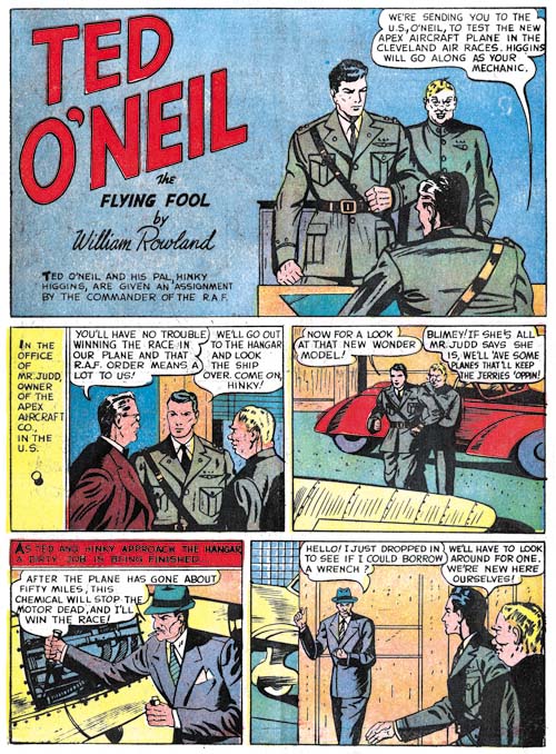
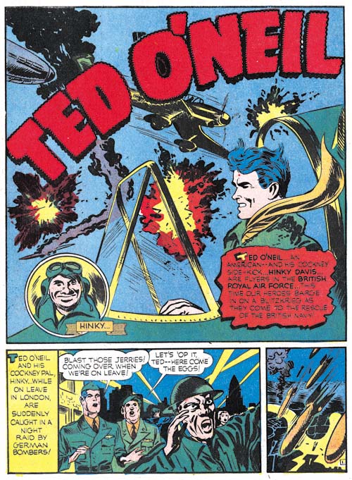
Prize Comics #7 (December 1940) “Ted O’Neil”, art by William Rowland

Prize Comics was a fairly new title with the first issue having a March 1940 cover date. Ted O’Neil was a feature of Prize Comics right from the start. Unfortunately I have seen none of the earlier issues so I have little idea how the feature started out. By Prize Comics #7 (December 1940) Ted O’Neil was an American in England’s Royal Air Force. The splash page credits William Rowland with for the story. Early in the golden age of comics such credits often refer to the writer and not the artist. However Who’s Who of American Comic Books shows Will Rowland as the artist for other titles so I think we can safely say he is the artist for this Ted O’Neil story as well. Rowland may also have written the story as well as was so commonly the case this early in the history of comic books.

Prize Comics #7
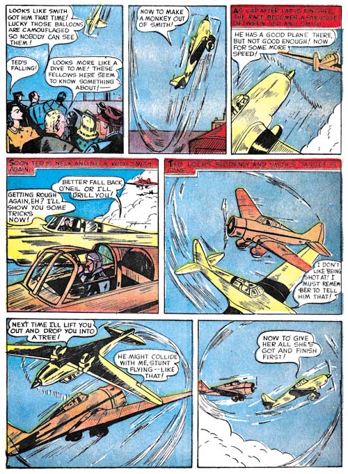
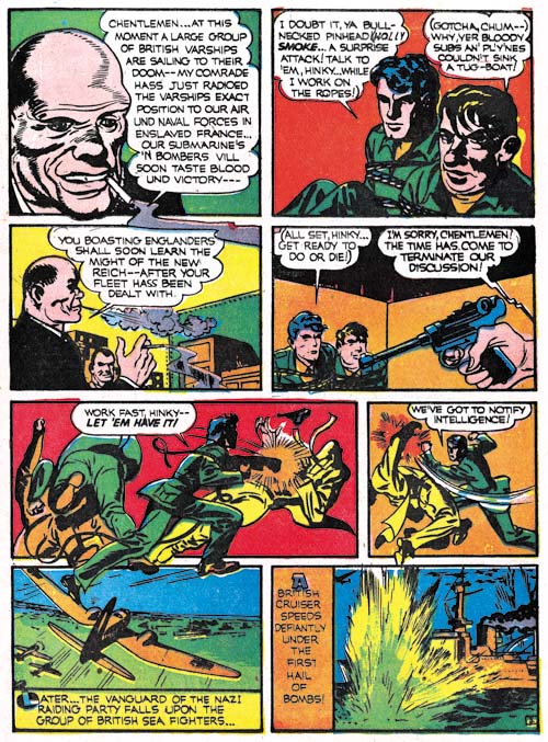
Prize Comics #7 (December 1940) “Ted O’Neil” page 4, art by William Rowland

What can I say, while I would not call Rowland a bad artists, I just cannot get to exciting about him either. Rowland tries hard to make the story interesting but he just is not quite up to it. The story itself is a bit clunky and the artwork a bit stiff. While the flying scenes are easy to understand they just do not grab the reader. I really do not mean to be too hard on William Rowland’s work on this Ted O’Neil story because it compares well with most comic book stories from that period.

Prize Comics #8
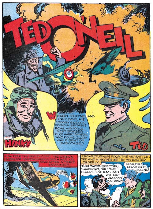
Prize Comics #8 (January 1941) “Ted O’Neil”, pencils by Jack Kirby

Simon and Kirby’s work for Prize are all unsigned. Some fans like to give Kirby all the credit for this work, but just because we cannot see clear indications of Simon’s participation does not mean that this was not a collaborative effort. I prefer to provide joint credits for their work once Simon and Kirby had teamed up unless there is good reason to do otherwise. (The only exception that comes to mind is the Fiery Mask story from Human Torch #2 which is so close to Joe’s earlier efforts that I wonder if it had been left in inventory for a time).

Prize Comics #8
Prize Comics #8 (January 1941) “Ted O’Neil” page 5, pencils by Jack Kirby

It should come as no surprise that Kirby’s pencils for the Ted O’Neil story found in PC #8 was much superior to Rowland’s from PC #7. Simon and Kirby were not yet famous but you have to wonder if some of the more observant artists had not begun to take notice of Jack’s art. Perhaps not since Simon and Kirby traits have not taken full effect. Here and there part of a figure will extend beyond the panel boundaries but it is all very tentative and easily overlooked. There is a circular panel but it is a small insert and not the larger ones that Joe and Jack would use later to such great effect. A couple of panels have a sinuous edge but none of the panels have the irregular borders that played such an important part of Simon and Kirby art for a time.

But observant readers might have noticed something special. Rowland’s flying scenes are all viewed from a distance while Jack would pan in and out. It does not sound like much but it reminds the reader of the very human occupant of the cockpit and keeps the eye interested. Rowland does not provide a single close-up in his story while Kirby provides many.

Not just the art is interesting but the story is as well. If Joe and Jack were presented a script they already had developed the habit of rewriting it. Rowland’s story was a straight forward action tale but Joe and Jack would add a little humor. One scene were Blinky receives a kick in his rear end for good luck reminds me very much of a scene from a much later Kirby story, “Street Code” where a kid’s hunchback is rubbed for similar reasons.

Prize Comics #9
Prize Comics #9 (February 1941) “Ted O’Neil”, pencils by Jack Kirby

While America had not entered the war, Britain was in the thick of it with their Royal Air Force battling Germany for command of the skies. However Edward R. Murrow’s live broadcasts from London during the Blitz incited many Americans to support England. This certainly was the reason that Ted O’Neil ended up in the R.A.F. But Rowland hardly made use of that connection. While the Germans are mention in PC #7, the bad guy works for another plane manufacturing company. Simon and Kirby places Ted O’Neil in the thick of it. We see the Battle for Britain and the London Blitz. There are saboteurs and spies. Ted O’Neil may not have worn a colorful costume and his only power came from flying a plane, but Simon and Kirby were already laying the ground works for their soon to be released Captain America.

Prize Comics #9
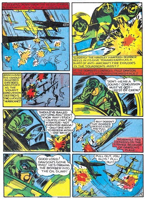
Prize Comics #9 (February 1941) “Ted O’Neil” page 3, pencils by Jack Kirby

By PC #9 even the art work was becoming more powerful. Note how the figures have begun to escape the boundaries of the panels in a more obvious fashion. Joe and Jack had flexed their artistic muscles and they were ready to explode in full force with Captain America. Even before it hit the stands they must have known they had something special in Captain America. Issue #9 would be their last work for Prize for many years. Joe and Jack would do a rush job to produce a special edition of Captain Marvel that would get released in the same month as the first Cap comic. That would be the end of their moonlighting for a while except for some covers that Joe would do for free as a favor to his friend Al Harvey. Previously Simon and Kirby almost went unnoticed but with Captain America a big success everyone in the industry took paid attention and comic books were never the same.

Fighting American, Chapter 4, The End Game

Fighting American #7
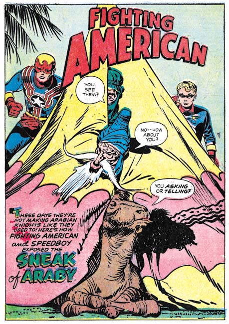
Fighting American #7 (April 1955) “Sneak Of Araby”, art by Jack Kirby

The lead story for issue #7 has Fighting American fighting the commies in Arabia over oil (of course). A clever splash but one with a frequently used theme of villains trying to avoid detection but clueless as to their impending encounter with Fighting American and Speedboy.

Fighting American #7
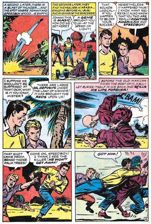
Fighting American #7 (April 1955) “Sneak Of Araby” page 4, art by unidentified artist

The Jack Kirby Checklists assigns 4 pages of this 8 page story to Kirby but other then the splash page none of it looks like his work to me and I do not think they are his layouts either. Panel 5 of page 4 looks to me like Kirby’s pencils and inking but that panel is the only convincing work by Kirby in the story. I suspect this particular case was Kirby acting as art editor and fixing up a poorly done panel. So far I have not been able to identify the artist.

Fighting American #7
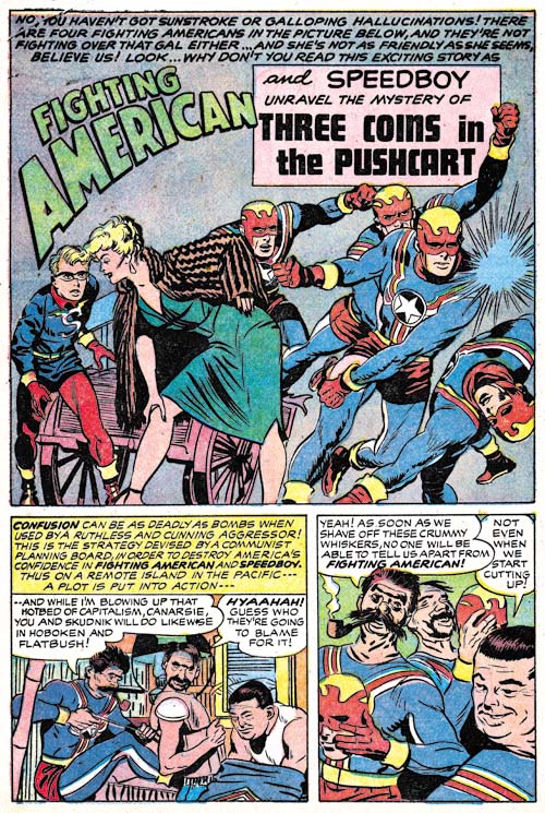
Fighting American #7 (April 1955) “Three Coins In The Pushcart”, art by John Prentice

For “Three Coins In The Pushcart” the Jack Kirby Checklist only credits the splash to Jack. Frankly I do not see Kirby in any part of the story including the splash and again not even the layouts.

Fighting American #7
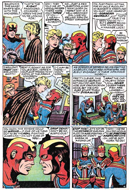
Fighting American #7 (April 1955) “Three Coins In The Pushcart” page 4, art by John Prentice

There a clues on the splash page that John Prentice is the correct artist to attribute this story to but it can best be seen with page 4. As far as I know Prentice did no other superhero work so there is nothing to compare this story to. However John’s women are usually quite distinctive and the lady in the second panel was clearly done by him. Comparison of this work to four pages of “Super Khakalovitch” from Issue #6 convinces me that John Prentice was also the artist for part of that work as well. This may not have been his finest work but he handles both the action and humor surprisingly well considering both are elements not normally associated with Prentice.

Fighting American #7
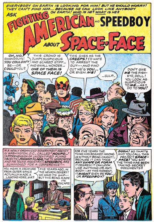
Fighting American #7 (April 1955) “Space-Face”, pencils by Jack Kirby and inks by Mort Meskin

What a delightful set of characters in the splash panel for “Space-Face” each with their own distinctive features and emotions. The inking for this splash is has a characteristic simplicity particularly in the eyebrows that identifies Mort Meskin as the inker. One striking feature of the splash is the way the bottom edge cuts off the lower part of two faces. While I am not going to say Kirby never does this, it certainly is not typical for Jack but it was a frequently used device by Meskin particularly in the Vigilante work Mort did for DC during the war (link). Because of this I briefly entertained the notion that the splash was actually drawn by Mort but the faces are so typical of Kirby that I just as quickly rejected the idea. In particular note the one guy to our left of Speedboy; take away the cigarette and he looks just like Scrapper from the Newsboy Legion.

Fighting American #7
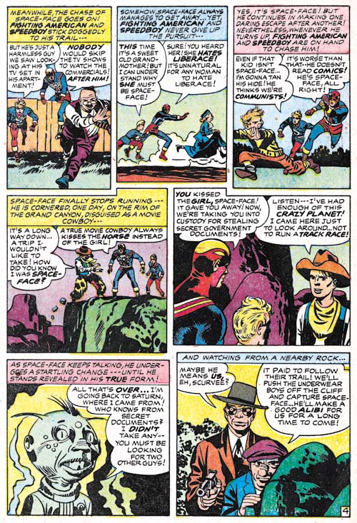
Fighting American #7 (April 1955) “Space-Face” page 4, pencils by Jack Kirby and inks by Mort Meskin

Because of the splash panel I paid close attention to the story pages to check if they were done by Kirby or Meskin. Well the layouts generally look like Jack’s and page 4 is especially convincing. The way the figures run in the top panels is typical for Kirby. Note how the sole of the foot of the running boy in panel 3 turns to the viewer. This device was frequently used by Kirby (also by Joe Simon) but I have never seen Mort do it. So while I believe Mort Meskin did the inks, I am convinced Jack Kirby did the actual pencils. Fighting American #7 was the last issue published by Prize Comics. Occasionally you will come across a claim that Fighting American was cancelled because of the Comic Code. However the evidence does not support that view. It is true that the earlier issues had art that would have been unacceptable under the Comic Code, but issue #7 was published with the Comic Code stamp without any apparent problems. Further the art work had been completed for issue #8 and would be published years later again without any difficulties with the Comic Code. Because Fighting American is today viewed by many as one of Simon and Kirby’s greatest creations it would have been nice to blame its failure on the Comic Code but the correct explanation is simply that it did not sell well enough. That it was a tough time for comics in general and superheroes in particular probably did not help.

Fighting American #1 (Harvey)
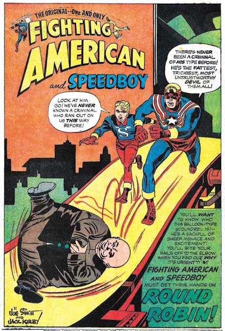
Fighting American #1 (October 1966) “Round Robin”, art by Jack Kirby

In 1966 Harvey published a Fighting American comic that was a combination of reprint material and previously unpublished stories. The cover and the “new” art were all done by Jack Kirby and were inked in a manner typical of the original Simon and Kirby productions. Fighting American #7 had 20 pages of Fighting American stories and that is exactly the same number of pages for the new stories found in the Harvey’s Fighting American #1. There is little doubt that this material was originally meant for issue #8 of Prize’s Fighting American but went unused when that comic was cancelled. The biggest difference between FA #7 and what would have been FA #8 was that Kirby contributed all the art for the cancelled Fighting American stories while he did not do all the art for FA #7.

The lead story for the Harvey FA comic was “Round Robin”. The shortness of this story (only 5 pages) is not obvious because it is broken up by the inclusion of a reprint of the Fighting American origin story. The splash seems to have been modified specifically for the Harvey comic. I believe the “the original one and only” text in the title as well as the small Fighting American and flying figures were late additions. Also the Simon and Kirby signature is in Joe Simon’s handwriting and does not match the original style and was added later.
There was a lot of variation in the costumes in the original Fighting American series. The most glaring was perhaps the way Speedboy would usually have blue trunks and red leggings but sometimes red trunks and blue leggings. But for the Harvey comic invariably both the trunks and leggings of Speedboy are red, a combination not seen previously.

Fighting American #1 (Harvey)
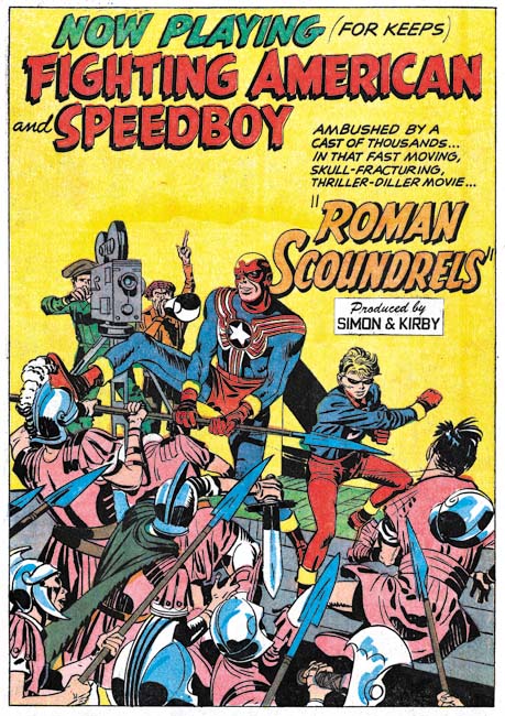
Fighting American #1 (October 1966) “Roman Scoundrels”, art by Jack Kirby

The splash for “Roman Scoundrels” has the car touche that reads “produced by Simon and Kirby”. Comics put together by the Simon and Kirby studio almost always had this car touche on the lead story. Thus this is another indication that the new art in the Harvey comic was original intended as issue #8 of the Prize title and that “Roman Scoundrels” was meant to have been the lead story for that cancelled issue.

In “Roman Scoundrels” the heroes take part in the filming of a Hollywood movie where the villain replaces harmless stunts with ones meant for lethal consequences. I am sure that Simon and Kirby had used this plot before, but at this moment I do not remember where.

Fighting American #1 (Harvey)
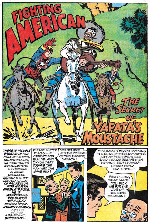
Fighting American #1 (October 1966) “Yafata’s Moustache”, art by Jack Kirby

I may feel that Simon and Kirby jumped the shark in “Super Khakalovitch” from FA #6, however all the stories for the defunct issue #8 are actually quite good. My favor ate is “Yafata’s Moustache” a story that perfectly balances the action and humor the two elements that made Fighting American such a unique superhero.

Superheroes were once again a big thing in 1966 and at least a second issue of Fighting American was initially planned by Harvey. It was to be a combination of reprint and new material like the previous issue. However there was no more unpublished Fighting American art left over from the Prize series so Joe Simon created a new cover and had George Tuska create the art for two new stories (“The Beef Box” and “The Mad Inker”). Unfortunately Harvey’s Fighting American #2 was cancelled. “The Beef Box” would eventually be included in the Fighting American reprint book published by Marvel in 1986. “The Mad Inker” has never been published probably because the splash page was already missing from Joe Simon’s collection by 1986.

The Early Frankenstein of Dick Briefer

Prize Comics #7
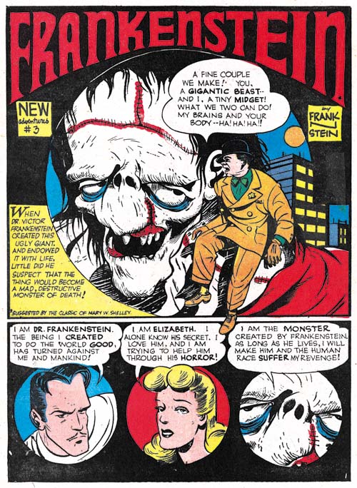
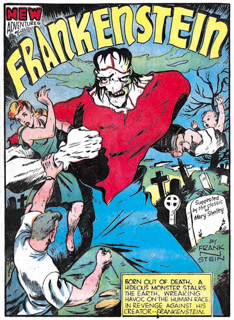
Prize Comics #7 (December 1940) “Frankenstein”, art by Dick Briefer

Prize was reinvented when Simon and Kirby arrived in 1947. Before long old titles were transformed (Headline comics went from action hero anthology to a crime comic), new titles added (Justice Traps the Guilty and Young Romance) and other old titles discontinued (Treasure and Wonderland Comics). Even Prize Comics was transformed into Prize Comics Western. The only original title that was unaffected by all of this was Frankenstein. This odd comic book did not belong in the horror genre but was actually a humor comic. Even more unusual was the fact that Frankenstein Comics was the work of a single artist, Dick Briefer (although he signed the initial issues as Frank N Stein).

Prize Comics #7
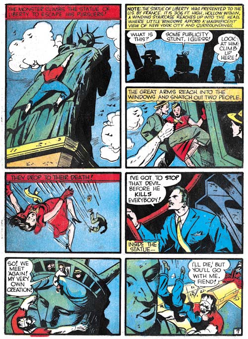
Prize Comics #7 (December 1940) “Frankenstein” page 7, art by Dick Briefer

But Briefer’s Frankenstein did not start out as humor, or even in its own title. The first appearance was in Prize Comics #7 (December 1940) and it was a true monster feature. The feature borrowed heavily from both the original novel by Mary Shelley and the Hollywood movie. On some occasions the monster seemed intelligent as in the novel and he seeks to take revenge on his creator for the dismal existence he, the monster, must endure. But his revenge does not consists of killing his creator instead the monster leaves him to live in order to see the suffering that his creation will inflict on mankind. Violence was not unusual this early in the golden age of comics but even so mayhem caused by the monster seems well above what typically occurred in comics. For instance, when the monster runs along a crowded Coney Island beach he literally leaves a trail of human victims.

Prize Comics #8
Prize Comics #8 (January 1941) “Frankenstein” page 8, art by Dick Briefer

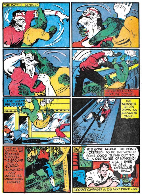
Dr. Frankenstein did try to fight back and destroy his creation, but to no avail of course. One attempt was to create Croco-Man however as seen above that was not successful either.

Prize Comics #9
Prize Comics #9 (February 1941) “Frankenstein”, art by Dick Briefer

Physically the comic book version of the monster resembles the movie version with the most glaring difference being the distorted and highly placed nose of Briefer’s monster. There are times that Briefer’s monster seems to share the movie version’s limited intelligence.

Frankenstein did not appear in Prize Comics #10 but reappeared in issue #11. However this time Dick Briefer would drop the humorous alias and sign with his true name. Frankenstein would appear in each issue of Prize Comics until PC #68 (after which the title became Prize Comics Western). Somewhere along the line Frankenstein went from a monster genre to humor and would get its own title in 1947. It was a long run from December 1940 to January 1949 (Frankenstein Comics #17). Frankenstein Comics would reboot and run from March 1952 to October 1954 and again Dick Briefer would provide the art. During all that time no other artist did a Frankenstein story for Prize. I do not know if that is a record but it sure is impressive.

Fighting American Checklist

Last update: 6/7/2020

Codes:
    r:  = reprint
    s:  = script
    l:  = layout
    p:  = pencils
    i:  = inks
  name  = signed
 <name> = signed with an alias
 {name} = signed as Simon & Kirby
 [name] = unsigned attribution

Fighting American (Prize)
   #1 April 1954
       (cover) 1 pg P:[Kirby] I:[Kirby]
       "Break The Spy-Ring" 10 pg P:[Kirby] I:[Kirby] Lt:[Oda]
       "Reuel Gridley" 1 pg  (text)
       "Baby Buzz Bombs" 6 pg P:[Kirby] I:[Kirby] Lt:[Oda]
       "Abracadabra" 1 pg  
       "Eagle Trap" 1 pg  (text)
       "Homer" 1 pg  
       "Duel To The Finish Line" 7 pg P:[Kirby] I:[Kirby] Lt:[Oda]
   #2 June 1954
       (cover) 1 pg P:{Kirby} I:[Kirby]
       "The League Of The Handsome Devils" 9 pg P:[Kirby] I:[Kirby] Lt:[Oda]
       "Gerard" 1 pg  
       "The Champion" 1 pg  (text)
       "Meet Doubleheader" 7 pg P:[Kirby] I:[Kirby] Lt:[Oda]
       "A Blue Note" 1 pg  (text)
       "Gerard" 1 pg  
       "City of Ghouls" 7 pg P:[Kirby] I:[Kirby & Meskin] Lt:[Oda]
   #3 August 1954  
       (cover) 1 pg P:{Kirby}  
       "The Man Who Sold Out Liberty" 6 pg P:[Kirby]  Lt:[Oda]
       "Gerard" 1 pg  
       "Stranger From Paradise" 2 pg P:[Kirby]  Lt:[Oda]
       "Hunted" 1 pg  (text)
       "Poison Ivan" 8 pg P:[Kirby]  Lt:[Oda]
       "Fast Buck" 1 pg  (text)
       "Gerard" 1 pg  
       "Z-Food" 7 pg P:[Kirby]  Lt:[Oda]
   #4 October 1954  
       (cover) 1 pg P:[Kirby]  
       "Tokyo Runaround" 8 pg P:[Kirby] I:[Kirby & Meskin?] Lt:[Oda]
       "I Am Ignorov" 1 pg P:Tomey  
       "Poor Richard" 1 pg P:Malm  
       "Homecoming: Year 3000" 9 pg P:[Kirby] I:[Kirby] Lt:[Oda]
       "Poor Richard" 1 pg P:Malm  
       "Mission Accomplished" 2 pg  (text)
       "Operation Wolf" 5 pg P:[Kirby] I:[Kirby] Lt:[Oda]
   #5 December 1954  
       (cover) 1 pg P:[Kirby]  
       "Jiseppi, The Jungle Boy" 8 pg P:[Kirby]  Lt:[Oda]
       "The Year Bender" 8 pg P:[Kirby]  Lt:[Oda?]
       "Invisible Irving" 6 pg P:[Kirby]  Lt:[Ferguson?]
   #6 February 1955  
       (cover) 1 pg P:[Kirby]  
       "Deadly Doolittle" 8 pg P:[Simon]  Lt:[Ferguson?]
       "The Making Of Fighting American" 3 pg P:[Kirby]  
       "Speedboy" 1 pg P:[Kirby]  
       "Super Khakalovitch" 10 pg P:[Kirby & Prentice]  Lt:[Ferguson?]
   #7 April 1955  
       (cover) 1 pg P:[Kirby]  
       "Sneak Of Araby" 8 pg P:[Kirby & ?]  Lt:[Ferguson?]
       "Three Coins In The Pushcart" 7 pg P:[Prentice] I:[Prentice] Lt:[Ferguson?]
       "Space-Face" 5 pg P:[Kirby] I:[Meskin] Lt:[Ferguson?]

Fighting American (Harvey)  
   #1 October 1966  
       (cover) 1 pg P:{Kirby}
       "Round Robin" 5 pg P:[Kirby]  Lt:[Ferguson?]
       "Roman Scoundrels" 8 pg P:[Kirby]  Lt:[Ferguson?]
       "Yafata's Moustache" 7 pg P:[Kirby]  Lt:[Ferguson?]