Category Archives: 9 DC (late)

Spirit World

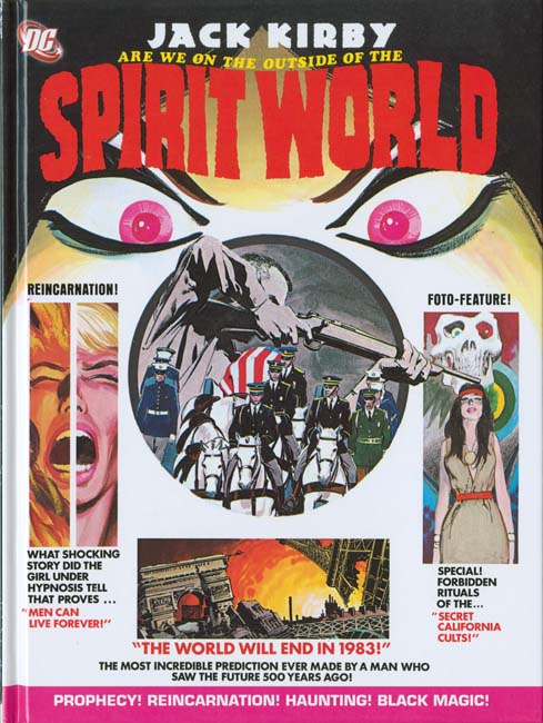
I got a pleasant surprise when I visited my comic book store last night, DC’s reprint of Spirit World. What a marvelous time this is for Kirby fans as more and more of his work is being reprinted. Had someone told me a decade ago that DC would reprint Spirit World I would not have believed them, actually I would have thought they had lost their grip on reality. Spirit World was by no means a Kirby classic. It received remarkably poor distribution. Mark Evanier describes not being able to locate any copies at newsstands but finding bundles of them at a distributor’s warehouse that had never been delivered. DC’s confidence in it was so low that it was cancelled after a single issue, much too soon to be based on any sales figures. It is not even a cult classic, it rarely comes up in discussions about Jack Kirby’s art. But everything Jack did he did well so it is great to see this work back in print.
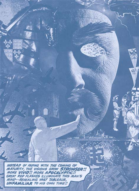

“Amazing Predictions” page 3 (from the reprint)

Kirby wanted Spirit World to be a high quality magazine printed in color but that is not the way DC would publish it. Instead a wash was applied to the line art and the results were printed using a dark cyan ink. Frankly it was not the best approach. But that is the approach that was originally made and was repeated for the reprint. Although I wish DC had initially followed Kirby’s wishes I believe their decision for the reprint to reproduced the effect of the original publication was the correct one. The quality of the reproduction in the reprint is exceptional. There are times when the original magazine was a little clearer but others where the reprint did a better job of presenting the art. But these differences are minor variations unnoticeable unless the two are compared side by side. One important improvement made for the reprint was the paper. I have never been a fan of using a yellowish paper in an attempt to match the current look of comic books. That look is due to aging and was not the look the books had when they first appeared. Using a yellowish paper for the Spirit World reprint would have darkened the cyan inked and ruined the effect. Instead DC has wisely used a flat white paper for this reprint.
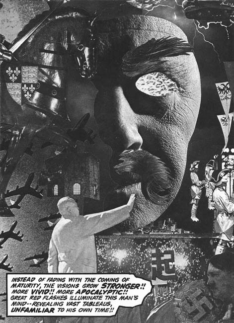

“Amazing Predictions” page 3 (with Photoshop adjustment)

One of the special treats of Spirit World was all the collages that Kirby created for it. Kirby’s collages have been receiving more and more attention in recent years. Recently Steven Brower has devoted an article on the subject (Jack Kirby’s Collages in Context). I must admit that as a young reader I was not overly impressed with Jack’s collages but as an adult I greatly admire them. Part of the problem with the collages was the rather poor printing they originally received. I could not resist using Photoshop to convert one of the Spirit World collage to a better quality black and white. In my opinion it is a distinct improvement. However remember that Kirby originally meant Spirit World to be printed in color and take a look at the original art of the same collage that is included in Brower’s article. What a difference and what a lost opportunity that DC did not follow Kirby’s wishes.
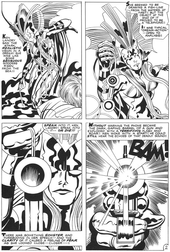

“Witch Queen of Ancient Sumeria?” page 2 (from the reprint)

Spirit World was cancelled after a single issue but Kirby had already completed the art for the second issue. The Spirit World reprint includes the work that had been meant for Spirit World #2. I understand that these stories had been used in some of DC’s horror and mystery comics but the reprint only uses the line art. What a contrast between the two sections of the current book. While Spirit World #1 was inked by Vince Colletta and issue #2 by Mike Royer that is not the real reason for the difference in the appeal of the two sections. What is really shown is the rather detrimental affects of the wash and cyan ink had on the initial issue art. Kirby was at the top of his artistic form and it really shows in this last section.

There is a small essay in this latest book by Mark Evanier. Evanier’s writings have appeared in a number of books on Jack Kirby (including Titan’s The Best of Simon and Kirby). With good reason as there probably is no one more knowledgeable on Kirby (if only he would finally publish his full biography on Jack). But what Evanier has to say is particularly important concerning the Spirit World as he was present and involved in its creation.
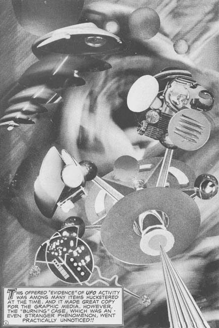

“The Burners” page 6 (from the reprint)

Colleges played a small part in the second issue of Spirit World. But I could not resist including the sole exception. I hope to someday to discuss the Spirit World more fully, this has been more a review of the reprint book. I will not try to predict how successful the Spirit World reprint will be but I do believe it is a worthy addition to the collection of any Kirby fan.

Black Magic at DC

It has been some time since I posted about Black Magic. The last, and only, blog entry solely about the title was almost three years ago (The Old Black Magic). I hope to begin posting more about it in the near future but today I would like to write about the nine Black Magic reprint comics that DC published between November 1973 and May 1975. These show up frequently on eBay and at comic conventions and generally are still reasonably priced. Given the value placed today on even poor copies of the original Black Magic series the DC reprints may seem like a cost effective alternative. They may be as long as the purchaser is aware of what he is getting.


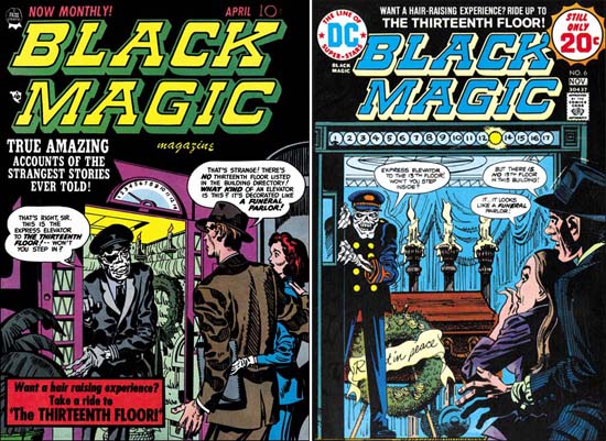
Black Magic #11 (April 1952) by Jack Kirby (on left)
DC Black Magic #6 (November 1974) by Jerry Grandenetti (on right)
Larger image of Black Magic #11
Larger image of DC Black Magic #6

Seven of the covers of the DC reprints were penciled by Jerry Grandenetti and inked by Craig Flessel. Actually my crediting of the inking to Flessel is not based on any study but from conversations with Joe Simon. Joe told me that Craig did a lot of work for him at the time. When I asked what work that was Joe said he used Flessel to do Grandenetti’s inking but he did not identify any work in particular. Most of the covers, like issue #6 shown above were reinterpretations of the covers that were originally done by Jack Kirby. Today it sounds like an odd thing to do but when the reprints were published most readers probably had not seen any of the original Black Magic comics. Three of the coves were original compositions by Grandenetti based on reprinted stories. Frankly Jerry’s reinterpretations are better then his own more fully original covers.


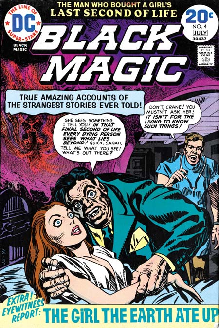
DC Black Magic #4 (July 1974)

One of the covers used for DC’s Black Magic reprints was one never published before. There are at least three versions of this image that Simon and Kirby intended for the first Black Magic cover. I guess in the end they were not satisfied with any of the versions and used a story about an evil doll as the basis for the published cover. The version used for DC issue #4 was altered slightly by the odd inclusion of an upside down lion in the upper left. I really do not know what to make of it. It seems so out of place with Simon’s typical designs and the art does not seem to match Grandenetti’s style either.


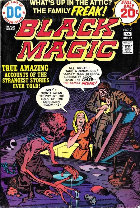
DC Black Magic #7 (January 1975)

The other Kirby cover appeared on DC issue #7 but originally on Black Magic #17 (October 1952). It was a great choice it was one of the best from the entire Black Magic series. But look at that woman’s face, that does not look like Kirby! In fact it does not match the original version and looks like the work of Joe Simon.


Black Magic #29 (March 1954) “The Greatest Horror of Them All” page 2, art by Jack Kirby

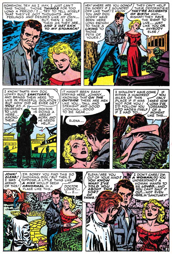
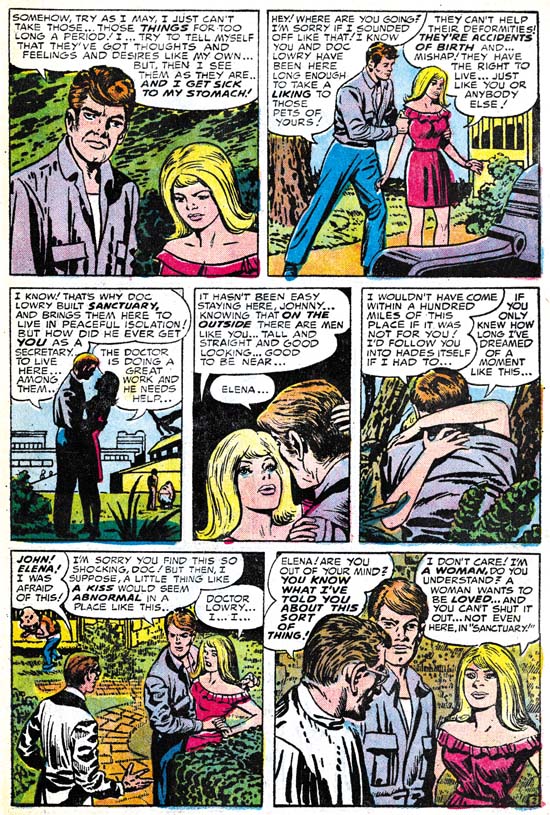
I have heard it from many people, Kirby did not draw beautiful women. It is a remark that I truly do not understand, at least for the period of the Simon and Kirby collaboration. Granted the lady in the first panel of the image above leaves much to be desired but surely as depicted in panel 4 she would be described as pretty? Even in the last panel where she is overwhelmed by emotions, I would hardly call her unattractive.


DC Black Magic #1 (November 1973) “The Greatest Horror of Them All” page 2, art by Jack Kirby and Joe Simon

Surprisingly Joe Simon shares the same general opinion. In the earlier issues of the DC reprints he replaced Jack’s woman with a creation of his own. Is it truly an improvement? Well the first panel came out better and I leave it up to the reader whether which version of panel 4 is the most attractive. However in the last panel Joe has completely lost the emotion. It is in conveying the emotions of woman that Kirby is truly at his best and that, for me, is why his females are truly beautiful.


“The Angel of Death” panel from page 6, art by Jack Kirby
Black Magic #15 (August 1952) top
DC Black Magic #3 (May 1974) bottom

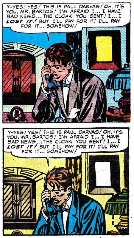
A careful observer may have noticed that the two pages of “The Greatest Horror of Them All” are not identical even when Joe was not purposely changing the art. There are subtle differences in the inking as well. The art presented in the DC reprints was not made from bleached comic pages. Simon probably knew even then how to remove the color from old comic books. But the bleaching process does not completely remove the color and more importantly the copiers need to provide a quality finish to the process were not yet commonly available in the early ’70s. Instead I believe Joe worked with a technique that I know he used earlier in the Harvey reprints of Fighting American. He re-inked the art on tracing pages over blown up copies the original, but probably bleached, comic book pages. Generally Simon was very careful to trace the original brushstrokes, but sometimes, such as the panel from “The Angel of Death” he did not do so. It may seem surprising that Joe, who had done so much inking over Kirby’s pencils, would have trouble re-inking the reprints, but the use of tracing paper obscures the art in a way that working on the original pencils did not.

Also not that panel from the DC reprint is higher then the original. Oddly this was due to the smaller size of the comics in the ’70s as compared to the ’50s. The size difference is not in the height but in the width of the page. The art in the DC was slightly reduced in size to accommodate the narrower page. To avoid an overly large top and bottom margins some panels were extended in a vertical direction. There in a small strip of art that was not present in the original comics. Expanding the panels was only done in the earlier DC issues. Later the Black Magic title that appeared at the top of the page was replaced with a larger version that was also moved further from the panels. This fixed the problem of the over sized top and bottom margins without the extra work involving in adding the new art to the extended panels.


“The Girl Who Walked on Water” page 6, art by Jack Kirby

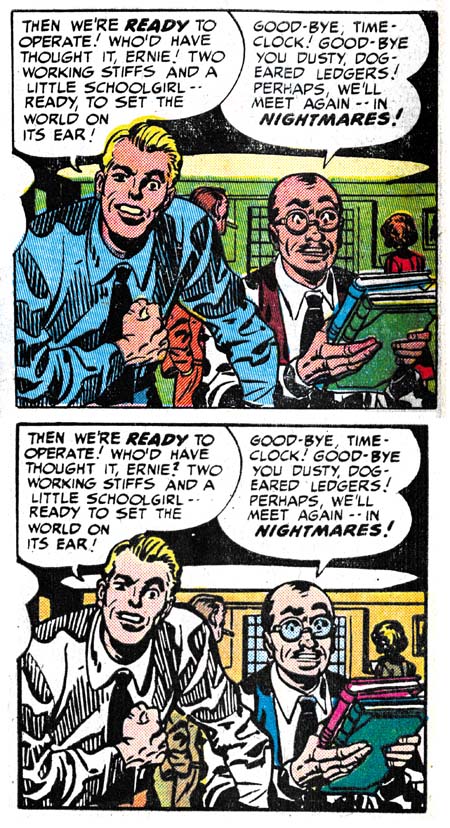
The examples I have provided of the re-inking are really the extremes. Most of the art was recreated well enough that only a close examination reveals the differences. But starting in DC issue #6 and completely dominating issues #7 to #9, are some completely heavy handed re-inking. Even without comparison to the original Black Magic stories it is easy to see something is wrong. Look at the inking in the bottom panel from “The Girl Who Walked on Water”; it looks more like a wood cut then the work of a brush. The sudden appearance of this type of inking convinces me that Joe was not the re-inker. He had handed off the work to less skillful hands with rather disastrous results.


“The Clock”, panel from page 6, art by Jack Kirby
Black Magic #2 (December 1950) top
DC Black Magic #7 (January 1975) bottom

It is like watching a train wreck. I just cannot help myself from providing another comparison between the “woodcut” inking and the masterly studio style inking of the original.


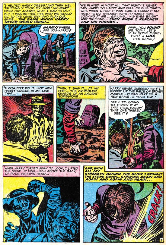
Black Magic #32 (September 1954) “Maniac” page 5, art by Jack Kirby

So far I have been describing the art, but were the stories changed when DC reprinted them? There is good reason to expect that they might have been as the original Black Magic was produced before the creation of the Comic Code Authority. In fact one aim of the Comic Code was to eliminate horror comics completely. In this they succeeded and Black Magic was one of the casualties. But after awhile the Code was relaxed slightly and Prize resurrected the Black Magic title in 1957 this time with the help of Joe Simon alone. Although the title was brought back the content could not be, the Comic Code would not allow it. However by the ’70s the Code had been relaxed even further. In fact horror comics were in a period of popularity. It was still tame stuff compared to what was done pre-Code at say EC, but at least it was permissible to have stories about vampires, werewolves and other monsters. It is an indicator about how relaxed the Comic Code had become in the ’70s as well as how comparatively tame the original Black Magic series were in the early ’50s that I have only found a single case of a story changed for the DC reprint. This was the total elimination of page 5 of the story “Maniac” along with some minor modifications to the captions of the next page to accommodate the sudden leap in the story.

So are the DC Black Magic comics a relatively cheap replacement for the much more expensive Prize Comics version? Yes if all you want is a good read. But if you want to study the art closely the reprints are simply not the thing to examine. The best description of the process used in making the reprints is recreation. In discussions about the art recreations in recent Marvel reprints many have pointed back to the technique that Simon used as justification for similar methods used today. This is ironic because while Simon was limited by the primitive technology then available, today we have computers, scanners and quality printing.

I have created a checklist for the DC Black Magic that includes references to the original source. It is available in the sidebar as well.

Sandman Revisited

Sandman #1 cover rough
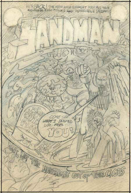
Sandman cover rough by Jerry Grandenetti

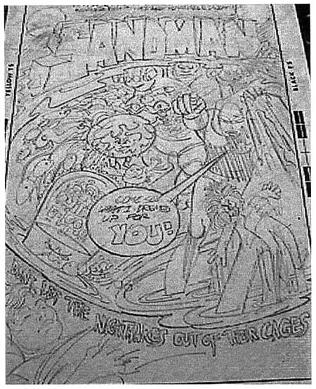
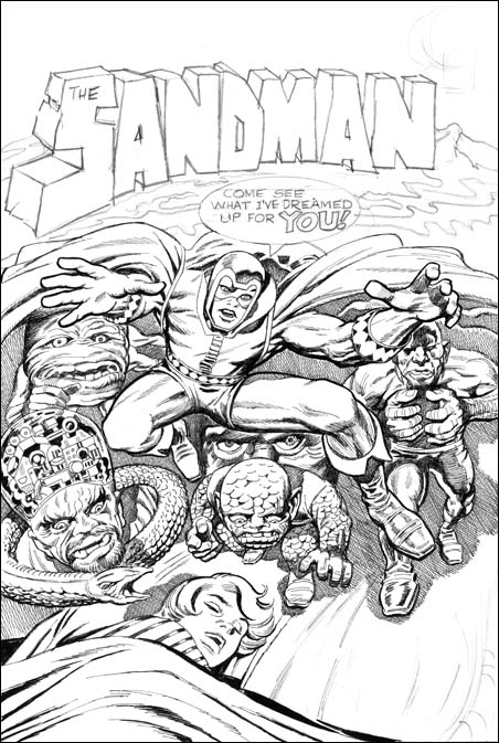
A few months ago I posted on a cover rough that Jerry Grandenetti did for the 1974 version of the Sandman. Kris Brownlow provided an image from an old eBay listing which, to put it kindly, was of a rather poor quality (the eBay lister’s fault, not Kris’s). Happily I have been able to obtain the original piece through the help of Scotty Moore.

The better image of the Grandenetti cover is welcome indeed. Now we can make out the text from the top of the cover:

HE’S BACK! THE MAN WHO BROUGHT YOU ALL THOSE WONDERFUL STORIES AND HORRIBLE DREAMS

This obviously refers to the golden age version of the Sandman that Simon and Kirby produced. Potential readers would likely have been aware of that Sandman from reprints that had appeared in the back of the various New Gods titles.

Sandman #1
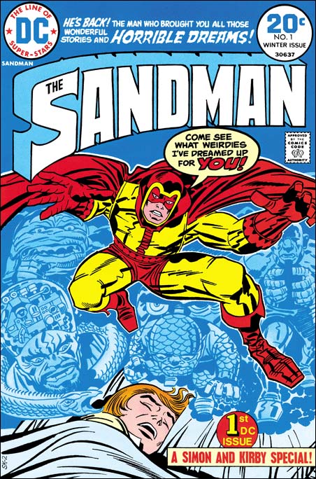
Sandman #1 (Winter 1974) art by Jack Kirby

Now that it is possible to have a good understanding of the cover rough, it is clear that there is a correspondence between Grandenetti’s rendition and Jack Kirby’s published version. I previously pointed out that the machine head guy on the lower left was common to both. Also the group of snakes became represented by a single serpent. Now it can be seen that other figures correspond as well. The small man a little left of center on the cover rough becomes the scaly man on the bottom of the dream scene on the published cover. Also a little left of center is a figure whose body is nothing more then a circular head with small face surrounded by a rough or folded skin. In Kirby’s drawing the face becomes larger to encompass the entire head, but the folded skin and lack of a true body leave little doubt that it represents the same figure. Grandenetti’s muscle man on the upper right was retained by Kirby although the arms, originally in a Frankenstein pose, were changed to bring the hands together. Grandenetti had a number of circles with multiple legs (spiders?) on the left, which Jack did not made use of. Further Jack dropped the arm holding the doll and added a mysterious and threatening set of eyes. Of course the most important change is that Grandenettis’s Sandman had been delegated to the side almost lost among the dream figures. Kirby instead placed Sandman front and center using his signature exaggerated perspective. There is no doubt in my mind now that Jack saw either this Grandenetti cover or, less likely, yet another version of it.

This is convincing evidence that the bronze age Sandman was originally a Joe Simon concept. At that time Joe had been doing a number of projects for DC. Simon would be the creator and writer while another artist, generally Grandenetti, would do the art. Originally Sandman was going to be nothing more then another comic that Simon would produce for DC. However remembering the success of the golden age Sandman, Carmine Infantino probably twisted Kirby’s arm to got him to team up once again with Joe. But Jack had a long period of creating and writing material without getting the proper credit and had only recently been able to escape that fate. Now he was thrust back to teaming up with another and, worse yet, working on someone else’s concept. Despite the success of the new Sandman, Jack would not, in all likelihood refused to, continue his collaboration with Joe. Thus a Sandman was the first comic that the Simon and Kirby teamed did for DC and it would turn out the last not only for DC but anyone else as well.

The resurfacing of the Grandenetti cover is very fortuitous as I was planning to sometime in the next few weeks to post on the golden age Simon and Kirby Sandman. If that is not enough Sandman for you, I will also post sometime soon on a question I was asked by Scotty Moore about what was used as the basis for the inking of the published version of the Sandman #1 cover.

The back of the Grandenetti cover draft has some enigmatic text:

I’VE GOT IT, JUST
WHAT YOU DEMANDED
THE CASH –
THE LOOT –
THE/A COOL
MILLION

An idea for a crime comic proposal?

Jerry Grandenetti and Sandman

Original Art
Sandman cover rough by Jerry Grandenetti

Some time ago I received an email from Kris Brownlow asking if I knew anything about a Sandman cover drawn by Jerry Grandenetti. Kris thought he remembered seeing it on eBay in the late 90’s. Unfortunately I knew nothing about the cover nor was Kris able to find anyone on various comic lists who knew anything either. When I asked Joe Simon he confirmed that Jerry was involved in the early stages of the Sandman proposal. That tantalizing state was were things remained until recently Kris stumbled on a printout that he had made, and forgotten, of the original eBay image. I would like to thank Kris not only for the scan of the printout he provided but also for his diligence in uncovering this fascinating piece of comic book history. I have done some Photoshop adjustments of the scan, but because it is a second generation copy of what was probably a poor scan to begin with, there was a limit to what I could do.

Both Kirby and Simon were working for DC in the early 70’s. Jack’s New Gods titles had not been as successful as hoped and DC had him doing other things such as Kamandi. Joe’s DC work was more on the lines of a creator, writer and editor. The art for Joe’s books was done by others, including Jerry Grandenetti. Since Joe’s titles would last only a few issues I would hazard a guess that his books were not big sellers. It must have seemed obvious to Carmine Infantino to try re-uniting the Simon and Kirby team. Perhaps with a bit of arm twisting, Carmine persuaded Jack. So after many years of working separately, Joe and Jack produced Sandman. The comic seemed to sell well enough but Kirby had his own personal goals which did not include turning back the clock to a long past working relationship. More issues of Sandman would follow and Jack would contribute covers and eventually some story art, but he would do so without Joe’s help.

Original Art
Unpublished Sandman cover, pencils by Jack Kirby and inks by Joe Simon.

Joe Simon inked a version of the Sandman cover drawn by Jack Kirby. Perhaps because of Joe’s use of crosshatching (which DC staff derogatorily called hay) or because of the liberties that Joe took (such as rounding off of finger tips), this cover was never published. But it does stand as an intermediate state between Jerry’s version and the final published cover. Kirby must have seen Jerry’s rough, or perhaps some other intermediate layout that we do not know about, because Jack keeps a couple figures. Most notable is the machine headed guy on the left in both versions. The pose of the legs of a scaling demon on the second state is similar to a larger figure higher up on the page in Jerry’s sketch. Jerry had a number of serpents on the left side which was reduced to a single one in the Kirby/Simon cover.

The above similarities were unchanged in the final published state. But there are other features shared between the Grandenetti and the Kirby/Simon versions that did not survive to the final cover. Both have the Sandman logo looking like it was made of stone. The logo in both sits on what looks like a swirling river. This river sweeps down from the right to the left but in Jerry’s rough, though not the Kirby/Simon art, the river turns back in to form part of the divide between the nightmare world and the sleeping boy. Both early states seem to have a mountain formation the immediate right of the end of the logo.

On the Grandenetti version the Sandman declares:

Come see what I dreamed up for you!

This was modified slightly for the Kirby/Simon art:

Come See what I’ve dreamed up for you!

The text was again altered slightly in the published cover to:

Come see what weirdies I’ve dreamed up for you!

Other features are only found in the initial Grandenetti state. Such as the text that also separates the nightmare scene from the sleeping boy. Or the hand raising up from the river holding a doll. There are other figures but with the poor quality of the scan of Grandenetti’s drawing it is hard to make out what some of them represent. The most dramatic change was made to the Sandman. In Jerry’s rough the Sandman is easy to overlook standing on the right among all the chaos. With the second state the hero becomes front and center with the exaggerated perspective that Kirby so favored.

Sandman #1
Sandman #1 (Winter 1974) art by Jack Kirby

Except for the inking, the published cover is not very different from the rejected Kirby/Simon version. The rock formation logo has been replaced with a more modern and sleek version, but otherwise keeps the overall form. The flowing water and mountain have been completely eliminated.

Since we have three versions of the Sandman cover, are there more? Joe’s collection includes two copies of the Kirby/Simon state. These copies do not differ significantly in layout from the second state and I believe they were actually made years later. The published comic has a job number of SK-2 so what was SK-1? Very likely SK-1 was the Kirby/Simon version. I have seen on a couple occasions the original art of another Sandman cover rough purportedly done by Joe Simon. On that example the drawing is very amateurish and was certainly not done by Joe. Who knows, maybe there are more Sandman covers out there?

Featured Cover, The Sandman #1

The Sandman #1
The Sandman #1 (Winter 1974) by Jack Kirby

This is my last post about Simon and Kirby covers selected as their favorite by participants of my recent contest. I saved this particular one for last because it was, at least for me, the most unexpected. When I think about the Simon and Kirby collaboration I think about the period from when they first teamed up in 1940 until the work they did for the Adventures of the Fly in 1959. There were some S&K work published later like Blast Off and Harvey’s Fighting American. However this was not new truly new work but earlier work that just had not been published before. From 1960 on Joe and Jack had gone their separate ways, that is until Sandman #1 in 1974.

In 1970 Kirby, dissatisfied with his treatment by Marvel, had signed up to work for DC. Here he started to create his New Gods opus. But Jack wanted more then just to draw these comics. He desired to initiate new titles and then hand them over to other artists. What Jack wanted was to produce these comics. In effect to return to the type of business arrangement he had during his collaboration with Joe Simon, but to do this by himself. However Jack was not successful in this endeavor. He never managed to pass the drawing chore to anyone else and worse yet some of his titles were cancelled. Jack continued to work for DC but the arrangement was not the same. Although he still was more then just another artist, he started to receive direction from DC’s Carmine Infantino. It must have been a bitter disappointment for Jack. Even more so when Joe Simon started to also work for DC in an arrangement very much like the one Jack had failed to development. Joe was more then just an editor, he was producing his comics for DC.

With both Joe and Jack now working for DC, it must have been an obvious idea to Carmine to have them team up once again. After all Simon and Kirby had a number of great successes in the past, why not see if they could re-create their old magic? Of course with Jack living in California and Joe in New York, there was no question of the same type of collaboration that they had previously. I have been told that there is a cover proposal for the Sandman drawn by Jerry Grandenetti. If that is true it would suggest that originally Sandman was Joe Simon’s idea as Jerry was one of the artists doing work for Joe. (I have seen another Sandman cover reported to be by Joe Simon, but that is clearly a misattribution because it is not in Joe’s style.) The credits for the comic give Joe as the scripter and Jack as editor and drawer. You can see that the cover for Sandman #1 has a job number, SK-2. The same job number was used on the first page. Well the SK obviously stands for Simon and Kirby. But if that is true why the ‘2’? Does that suggest there was a previous piece of artwork given the job number SK-1?

The Sandman #1
The Sandman #1, unpublished cover by Jack Kirby and Joe Simon

There is another version of this cover that was actually inked by Joe Simon. Joe has said that this the original cover that was rejected by DC because of all the “hay” (crosshatching). That may very well be true, but I also wonder if perhaps Jack was unhappy with some of the liberties that Joe took. For instance Jack’s square finger tips were rounded off in Joe’s inking?

With the type of distribution at the time it is hard to be absolutely sure how well comic books really sold. But it appeared, at least to Carmine, that The Sandman had been a big success. However issue #2 had a cover date of April 1975. This suggest that the original was planned as a one shot but that with its success more were published. However succeeding Sandman issues were not Simon and Kirby collaborations. After a brief revival for one issue, the Simon and Kirby team had again ended and would not produce any further comics.

Alternate Takes, The Thirteenth Floor

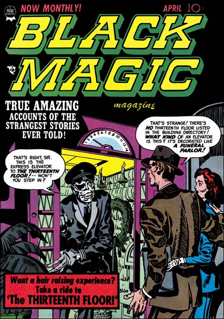
Black Magic #11
Black Magic #11 (April 1952) by Jack Kirby

For this cover Jack Kirby provides an interesting combination, an elevator made out as a funeral parlor. The operator is even stranger with a white complexion, an eye patch and (despite the gloves he is wearing) skeletal hands. The man is taken aback by it all, but it the woman who is most surprised and seems to be drawing back. The old fashion floor indicator shows them on the third, but the operator invites them to a ride to the thirteenth floor. Do you really think the couple will take him up on it? Although imaginative this is not one of Kirby’s better efforts. The elevator operator is meant to be spooky, but he comes off more like one of those friendly old men you would sometimes meet years ago when many elevators did not run automatically.

Black Magic #11
Black Magic #11 (April 1952) “The Thirteenth Floor” by John Prentice

John Prentice did so much romance work for the S&K studio that it is easy to mistakenly believe his talents were limited to that genre. John also had done some fine work for Black Magic (he would further go on to a very successful run of the syndication detective strip Rip Carter). A story like “The Thirteenth Floor” actually would suit his talents more then Kirby’s. In this story we are not presented with any unnatural demons. The devils can only be distinguished by their red complexion and angular eyebrows. This “humanization” of the characters is a necessary part of the story. Nor is there much in the way of action. This is much more of a talking heads kind of story about a man planning suicide who takes the stairs to the thirteenth floor but finds himself in an eerie waiting room. The “people” running the operation do not know what to do with him since he is not in their records. Eventually the man convinces them to let him return back and they direct him to an exit door. But when the man uses the door he wakes up in an elevator and his former life.

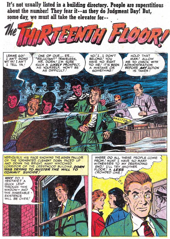
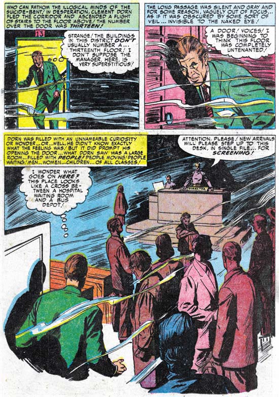
Black Magic #11
Black Magic #11 (April 1952) “The Thirteenth Floor” by John Prentice

The splash panel that John provides is little more then a double panel. Prentice provides a scene from the waiting room. The splash illustrates one of the few action events from the story, when the devils escort away a very reluctant individual. It is hard to image a splash more unlike the cover that Kirby provided for the same story. John did some great splashes, but this is not one of them. On the second page John provides a story panel much larger then the splash. The large story panel is even more unlike what one would expect had Jack done the story. The scene is very mundane with just a group of shadowing figures standing around and a director at his desk in the background. Although seemingly mundane, John’s careful use of shadows and a few wispy lines make the whole panel rather unnatural. This pivotal panel sets up the mode from which the rest of the story develops. John was much more effective with this large story panel then he was with the splash.

It seems odd that the cover emphasizes the use of an elevator to go to the thirteenth floor but in the story the man walks up a staircase to reach it. From this it might be implied that Kirby had no idea what the story was really about. But the text in the title of the story also refers to the elevator. This makes it seem more likely that S&K was well aware of the story. But the story did not seem to have anything in it that suited Jack’s strengths. Therefore this became one of the minority of covers where Jack just made something up. Because the story is so far removed from Kirby’s vision it is hard to believe Jack had much to do with it. This work seems to contradict the claim made by some that Jack Kirby did the layouts for the stories done by artists working for the S&K studio. It is rare to see Kirby do such a small splash panel. But I have never seen Jack do anything like the large panel on the second page. Like Bill Draut and Mort Meskin, John Prentice was much too talented a comic book artist to require layouts by Jack. Further Joe and Jack were much to savvy business wise to spend time doing work that was not needed by the artist they would have draw the story.

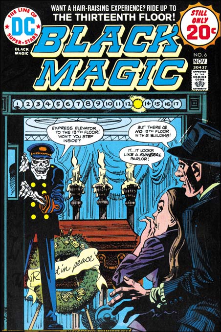
Black Magic #6 (DC)
Black Magic #6 DC (November 1974) by unidentified artist

DC ran a series of Black Magic reprint comics produced with the help of Joe Simon. The covers for these reprints were generally new interpretations of original Kirby covers. I do not know who this particular artist was but it is hard to believe that anyone thought that this was an improvement. I would say that this cover is more goofy then scary. There are covers that I call goofy as a complement, but this is not one of them. Even though Kirby’s BM #11 is not a favorite of mine it is so much better then this one that I will forego any comparison. I am also a critic of the art in these DC Black Magic reprints. Generally I find the reprints look like wood cuts, loosing much of the effects of splendid inking of the originals. However the job done on the reprinting of “The Thirteenth Floor” actually came out rather well.