Captain America with a pop gun, who thinks of these things?
Category Archives: 2007/10
Sandman Revisited
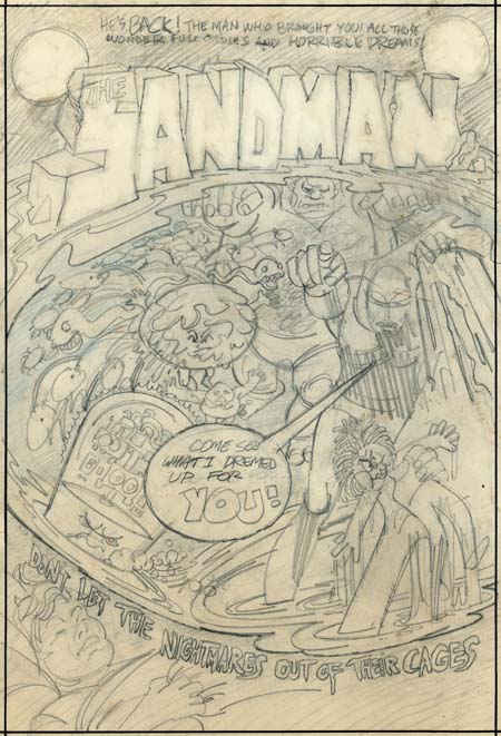
Sandman cover rough by Jerry Grandenetti
A few months ago I posted on a cover rough that Jerry Grandenetti did for the 1974 version of the Sandman. Kris Brownlow provided an image from an old eBay listing which, to put it kindly, was of a rather poor quality (the eBay lister’s fault, not Kris’s). Happily I have been able to obtain the original piece through the help of Scotty Moore.
The better image of the Grandenetti cover is welcome indeed. Now we can make out the text from the top of the cover:
HE’S BACK! THE MAN WHO BROUGHT YOU ALL THOSE WONDERFUL STORIES AND HORRIBLE DREAMS
This obviously refers to the golden age version of the Sandman that Simon and Kirby produced. Potential readers would likely have been aware of that Sandman from reprints that had appeared in the back of the various New Gods titles.
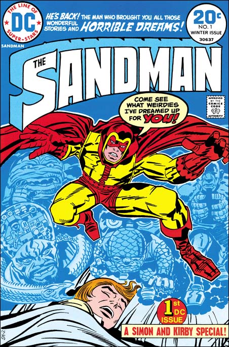
Sandman #1 (Winter 1974) art by Jack Kirby
Now that it is possible to have a good understanding of the cover rough, it is clear that there is a correspondence between Grandenetti’s rendition and Jack Kirby’s published version. I previously pointed out that the machine head guy on the lower left was common to both. Also the group of snakes became represented by a single serpent. Now it can be seen that other figures correspond as well. The small man a little left of center on the cover rough becomes the scaly man on the bottom of the dream scene on the published cover. Also a little left of center is a figure whose body is nothing more then a circular head with small face surrounded by a rough or folded skin. In Kirby’s drawing the face becomes larger to encompass the entire head, but the folded skin and lack of a true body leave little doubt that it represents the same figure. Grandenetti’s muscle man on the upper right was retained by Kirby although the arms, originally in a Frankenstein pose, were changed to bring the hands together. Grandenetti had a number of circles with multiple legs (spiders?) on the left, which Jack did not made use of. Further Jack dropped the arm holding the doll and added a mysterious and threatening set of eyes. Of course the most important change is that Grandenettis’s Sandman had been delegated to the side almost lost among the dream figures. Kirby instead placed Sandman front and center using his signature exaggerated perspective. There is no doubt in my mind now that Jack saw either this Grandenetti cover or, less likely, yet another version of it.
This is convincing evidence that the bronze age Sandman was originally a Joe Simon concept. At that time Joe had been doing a number of projects for DC. Simon would be the creator and writer while another artist, generally Grandenetti, would do the art. Originally Sandman was going to be nothing more then another comic that Simon would produce for DC. However remembering the success of the golden age Sandman, Carmine Infantino probably twisted Kirby’s arm to got him to team up once again with Joe. But Jack had a long period of creating and writing material without getting the proper credit and had only recently been able to escape that fate. Now he was thrust back to teaming up with another and, worse yet, working on someone else’s concept. Despite the success of the new Sandman, Jack would not, in all likelihood refused to, continue his collaboration with Joe. Thus a Sandman was the first comic that the Simon and Kirby teamed did for DC and it would turn out the last not only for DC but anyone else as well.
The resurfacing of the Grandenetti cover is very fortuitous as I was planning to sometime in the next few weeks to post on the golden age Simon and Kirby Sandman. If that is not enough Sandman for you, I will also post sometime soon on a question I was asked by Scotty Moore about what was used as the basis for the inking of the published version of the Sandman #1 cover.
The back of the Grandenetti cover draft has some enigmatic text:
I’VE GOT IT, JUST
WHAT YOU DEMANDED
THE CASH –
THE LOOT –
THE/A COOL
MILLION
An idea for a crime comic proposal?
Quote
Joe: I think I am going to have to start being serious.
Harry: After all these years, why start now?
Joe Simon as a Newspaper Staff Artist
Despite what has been said by what would normally be considered reliable sources such as Jack Kirby, Joe Simon did not go to college. Instead Joe used what experience he gained during his high school years to get himself a job after graduation as an artist assistant for the Rochester Journal American. Later he would go on to work for the Syracuse Herald. Much of what Simon learned during his time as a newspaper staff artist would serve him well during his career. The skill he developed with the air brush (for retouching photographs) would be used years later for creating the covers for Sick (a Mad-clone humor magazine). Joe became quite proficient in all manners of things needed in the publication of art. I am sure that this experience had a lot to do with why Joe was able to advance so quickly when he later entered the comic book industry.
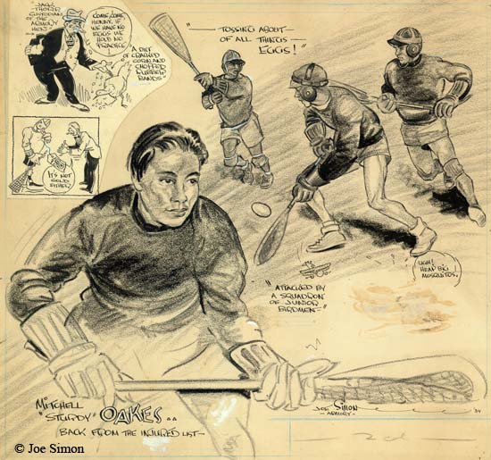
Sport Illustration by Joe Simon (1934)
However Simon’s experience was not limited to production, he would provide illustrations as well. Much of this was sports illustrations such as the example I provide above. This piece, as well as most of Joe’s sport illustrations, was done on stipple board. These boards had a textured surface that allowed pencils to be easily transferred to printing plates. The art was created in a size larger then the intended published version, with measurements provided in terms of the number of columns. Joe says that at the time a column was two inches wide. The above illustration therefore would be 10 inches wide in the actual newspaper. This piece originally had two paste-ups added, one of which has since been lost. The art on the remaining paste-up does not appear to be Joe’s work.
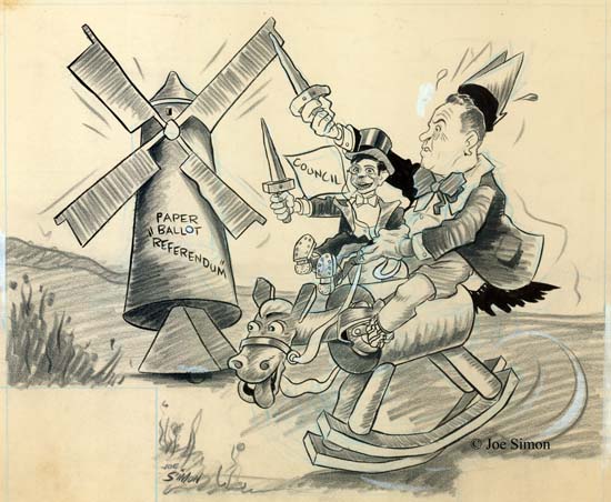
Political Cartoon by Joe Simon
According to Greg Theakston (The Complete Jack Kirby) and even Joe himself (The Comic Book Maker), sport illustrations were pretty much all that Simon did. However Joe’s own collection indicates that was not the case, Joe did political cartoons as well. In the example I provide above (a four column or eight inch piece) Joe takes on a local political issue. I have no idea what the “Paper Ballot ‘Referendum'” is all about, but there is little doubt that Simon had a low opinion of the portrayed politician. The windmill brings to mind the futile quest from Don Quixote. Our politician will fare no better since he is on a rocking horse, but I love the way Joe cannot resist providing a very animated horse’s head. The council is degraded even further, being depicted as a Charlie McCarthy dummy under the politician’s control.
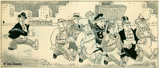
Political Cartoon by Joe Simon
Some of the other political cartoons still in Joe’s personal collection concern Daylight Savings Time. Apparently Syracuse was one of the few local communities not to adopt the time change. Joe depicts a parade being viewed by the public. A small group of Daylight Time supporters proudly march together, each individual representing a different New York locality. Syracuse trails behind, out of step and goofy looking. There can be little doubt that Joe was calling to Syracuse to adopt the Daylight Savings Time.
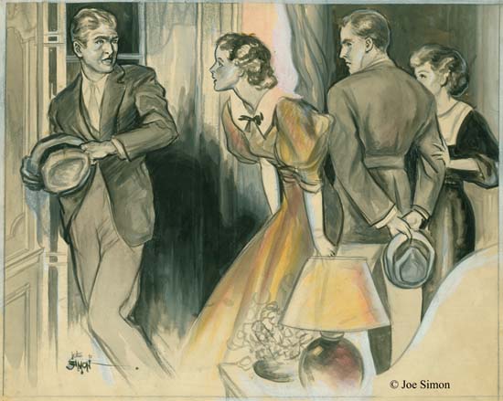
Fiction Illustration by Joe Simon
If we can use his collection to judge by, Joe did do a fair amount of political cartoons, just not as many as his sports illustrations. Joe Simon also at least occasionally contributed illustrations for fictional pieces. I must admit I am a little surprised at this. I was well aware that previously newspapers would often include fictional stories but I had thought that practice had been discontinued by the time Joe was doing newspaper work. Joe used a different media for this work, the three examples from his collection were all done using ink, gouache and, in the case above, some watercolor on illustration board. Because the result is more painterly, more effort must have been made to prepare them for printing. Perhaps they were used in a magazine insert were higher quality photographs would also be used. As in pulp magazines, these fictional illustrations would often include a caption. The board for the above illustration has on it in Joe’s handwriting:
“IT’S VERY SIMPLE” MARTIN SAID, “I’M GOING TO MARRY LYNN”
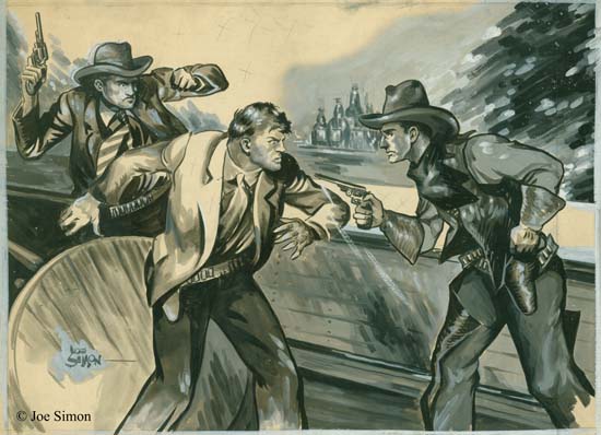
Fiction Illustration by Joe Simon
The first example of fiction illustrated that I provided was done in a style that is unusual for Simon. The second example that I show above, as well as another work in Joe’s collection, are immediately recognizable as Simon pieces. Despite the difference in media, the characters look very much like those in Joe Simon’s early comic book work. Not only that but in these two pieces Joe also used his own features for one of the men in the scene. Perhaps it is just a coincidence, but in each case it was as the man whose quick draw gains control of the situation. In an earlier post I had suggested that Bill Everett was the source for a technique that Joe adopted of combining eyebrows and eyelids as one angular feature. This illustration work shows that I was wrong, Joe was already using pretty much the same technique before starting his comic book career. Regrettably there is no caption on the above illustration. Still I think we can be pretty certain that our quick drawing cowboy is the hero of the piece. Despite some pretty badly drawn hands, it is a exciting piece of art. Perhaps not as polished as other illustrators might do, but just the sort of thing that work well when Joe began doing comic books. The published piece would have looked a bit different. Simon marked with penciled ‘X’s the background, the counter top and parts of the center man’s jacket. This is a indication to the printer to fill theses areas with black.
Joe thought he did these fiction illustrations in the mid ’30’s, at which time he would have been in his early 20’s. That is a little surprising since Joe’s character in the paintings looks older. This might suggest that this work was actually done in the late ’30’s. Or it just might be that Joe purposely or unconsciously added a little weight to the face giving it an older look.
All indications are that Joe was doing quite well in his career as a newspaper artist. However there was a change going on with local papers were being bought up and consolidated. That included the one Joe worked for, and so he was out of a job. I suppose Simon could have moved and tried to get work in another community’s paper. However there was a shrinking supply of such possibilities and increasing number of competitors for the jobs. But I think more important was that Joe was ambitious. So he moved to New York and, as they say, the rest was history.
Really Bad Clowns
20th Century Danny Boy has been on a roll lately providing a series of interviews with assorted comic book artists. His latest is Alan Kupperberg. I have to admit there is a rather large period from when I stopped reading comics as a young man until I started with them once again. Some of what happened in between I have since picked up on, some of it I am still ignorant about. I have heard of Evil Clown comics but have no first hand experience with them. Frankly I find some of the art that Danny provides somewhat offensive (so be forewarned) but there is no denying Kupperberg’s talent.
The idea of a (morally) bad clown was not new, others have used it as well. There is something about the juxtaposition of a funny costume and an evil nature. It was not a big part of the Simon and Kirby repertoire, but Joe and Jack did use it. And of course anything that Simon and Kirby did, they did very well indeed.
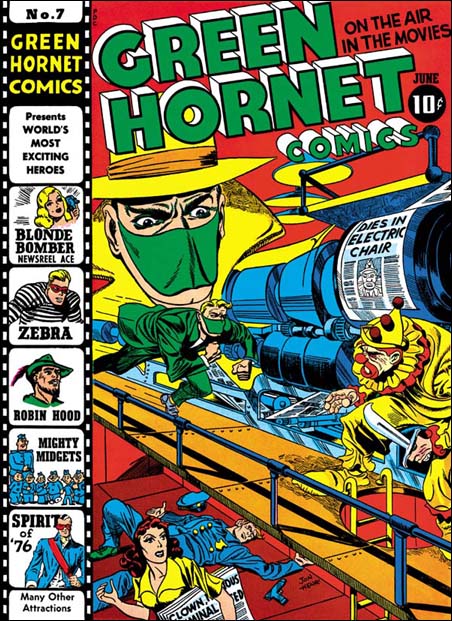
Green Hornet #7 (June 1942), art by Jack Kirby and Joe Simon
I am thinking particularly about the cover for Green Hornet #7 (June 1942) that Joe and Jack did for Harvey Comics. I have already posted on this cover but Danny’s blog has brought it back to mind. This was a joint effort, Jack did most of the pencils but Joe drew the large floating head. The signature says Jon Henri, but do not let that fool you. Henry is Joe Simon’s middle name and Joe was so fond of the name Jon that he gave it, with that unusual spelling, to his first son. I am still uncertain about who did the inking, but my suspicions are that it was done by Al Avison. I like my original description of this piece of art so I am just going to repeat it.
I love the way Simon and Kirby make a cover tell a story. The Green Hornet is rushing to attach a killer clown. If the clown carrying a wicked knife wasn’t enough, the lady on the lower level carries a newspaper with headlines that are hard to make out completely but clearly includes “CLOWN … CRIMINAL …”. Behind her is a fallen policeman, his gun laying at his side, clearly the Green Hornet will be taking on one tough clown. The press above is printing the front page for the latest edition declaring “DIES IN ELECTRIC CHAIR” with a picture of the clown, obviously printed ahead of time because the clown escaped before facing his execution. The Green Hornet had better be careful because this clown has nothing to loose.
Poking Fun at Adolf
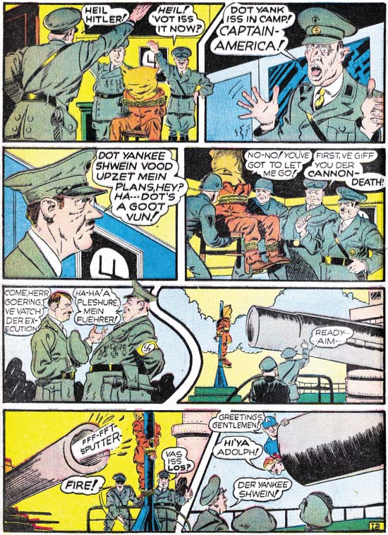
Captain America #2 (April 1941) “Trapped in the Nazi Stronghold”, art by Jack Kirby
Simon and Kirby really hit it big with Captain America. I am sure an important reason about why it became such a large selling comic was the cover. The U.S. was not yet in the war but there were still many who could appreciate a depiction of Captain America slugging Adolp Hitler. What fictional villain could compare with the evil of the all too real Hitler? But brute force was not the only means that Simon and Kirby would use to take Hitler down a peg or two, humor was used as well. It should be obvious from the image above that S&K portrayed Hitler as somewhat of a buffoon.
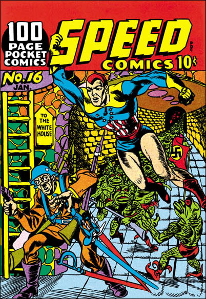
Speed #16 (January 1942), art by Al Avison
Of course once Hitler graced the pages of Simon and Kirby comics, other artists would use Adolf as well. Al Avison had a special advantage, he was one of the crew working for Joe at Timely. Al even drew some Captain America stories. Avison’s efforts never made it into Cap comics, they were recycled as the Patriot in USA #1. (Other then Kirby, the only artist to draw Captain America in the early issues was Simon.) Avison also did some work for Harvey Comics and you tell he learned a lot from Jack. For the cover of Speed #16 Al provides Hitler leading an attack on the White House. Armed with a gun, four rifles and four swords, Avison has also makes Hitler out to be a buffoon. But Avison has overplayed his hand, Adolf and his army are so ridiculous that they hardly seem a threat to Captain Freedom.
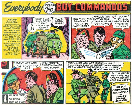
Adventure #83 (February 1943) house ad at the end of a Sandman story, by Jack Kirby
Just because Joe and Jack left Timely and Captain America does not mean that they stopped making fun of Adolf Hitler. Far from it. The original Axis of Evil was jokingly portrayed in a house ad for the Boy Commandos. Only four panels but that is all S&K need. I guess the Axis leaders were the original Three Stooges.
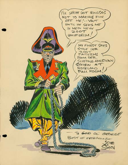
Sketch for George Roussos by Joe Simon (1942)
The above sketch is one of the reasons I have been thinking of Adolf Hitler lately. It is undated but it was from the same George Roussos sketch book that included a drawing by Jack Kirby dated as 1942. Further Joe would shortly be joining the Coast Guard during which I doubt that Roussos would have the opportunity to have Joe add something to his sketch book.
George Roussos was not only a talented artist, he was also an early fanboy. He had some of the greatest talents of the day provide drawings for his book. What a treasure it was. I say was because it recently has been disassembled and the individual pages auctioned off. It is a shame that it was not published before it was taken apart. If you are willing to register with Heritage Auction Galleries you can see the work by searching their Auction Results Archives under original art for George Roussos. Joe’s entry is not dated, but it must have been done about the same time as Jack’s, 1942.
Joe Simon has his own particular brand of visual humor of which this is a very early example. What could be more incongruous then Adolf Hitler in a Zoot suit? Where did he every come up with that? I have no idea. But this sort of irreverent humor would show up again when Joe produced the Mad-close magazine called Sick. In fact it still shows up in the art that he produces today.
I remember years ago someone criticizing Mel Brooks for his movie The Producers. They asked me how anyone could find something funny in Adolf Hitler. Make no mistake about it, Hitler was a monster, the most evil person of our century. We should never forgive or forget the horrible things he did. That however is not enough. There are people who will try to praise Hitler for some of those very awful things. So we must add ridicule on top of our scorn. That is something Joe Simon still understands very well.
Joe Simon’s Correct Age
Mark Evanier wrote a nice post about Joe Simon’s birthday. But Mark got it wrong when he gave Joe’s age as 92. Well let me set the story straight, Joe is now 94 years young. When I last talked to Joe he commented:
I’m telling everybody that I am 95. I mean what kind of number is 94? No, 95 is a much better number. I’m going to say I’m 95.
Is it any wonder that people get confused about Joe’s age? I love Joe, but I always try to remember he favorite piece of advice:
Never let the facts get in the way of a good story.
Joe Simon’s Birthday
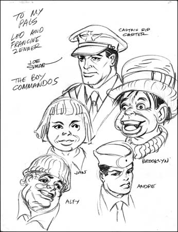
Boy Commandos sketch by Joe Simon (1943 – 1945)
I called Joe yesterday to wish him a happy birthday. He was pleasantly surprised with all the emails he has received. I do not know how many, or what percentage came from readers of my blog. I know Joe answered at least some of them, but if you did not get a reply do not be offended. Joe is not perfect when it comes to using his computer, I know that in the past a number of his emails to me never made it. So even if you did not get a reply from Joe, rest assured from my conversation with him that he was quite pleased by all the attention.
Diego Maya provided his own birthday card to Joe.
For my somewhat tardy Jack Kirby birthday post I included a sketch that he did in 1942 of the Boy Commandos. So here I thought I would use a sketch of the Boy Commandos that Joe did. I asked Joe if he remembered the Zenners and he replied that they must of written him requesting a sketch. Joe added that he had done this while he was in the Coast Guard. So this work can be dated as sometime from 1943 to 1945. Not quite as early as Jack’s version, but still from a period where we have very little independent art by Joe Simon. For examples of his published work from this time see my Chapter 8 of The Art of Joe Simon “Off to War“. I will post about another Simon piece of art from this period in a day or two.
A Special Request for Joe Simon’s Birthday
Sigh, I guess I was too naive. I had hoped that people would honor my request to keep this on this blog. But it got posted on Byrne Robotics forum. It is no longer there but the damage has been done. I hope Joe does not get too many crazies sending him email. Anyway I felt I had to remove Joe’s email address before any more harm was done. Anyone still wishing to send Joe birthday greatings can email me athmendryk at yahoo dot com and I will provide it privately.
It seems a list called Imvan has also ignored my request to keep this on this blog. I have no idea what that group is about but obviously they have little respect. I guess I am going to have to file this as one of my worse ideas.
I visit Joe every two or three weeks and he seems in excellent health. His birthday is approaching so I have a special request to make to the readers of the Simon and Kirby Blog. Actually it is a two part request.
- I would like to keep this request and Joe’s email address here, and not have it posted to any other group, blog or list.
- I would like my readers to send happy birthday greetings to Joe sometime between now and his birthday (October 11). Say what you like but I am sure Joe would appreciate a kind word about what his work has meant to you. His email is:
Surely my readers are also fan’s of the work done by Simon and Kirby. We no longer have the opportunity to tell Jack what he meant to us, but it is not too late for Joe.
“Romance Without Tears”
Simon and Kirby created the romance comic book genre in 1947 when they produced Young Romance. It was a big success, which in the world of comic books meant that other publishers would shortly release their own romance titles. A better description would be that S&K opened up a flood gate. I have read very little of the romance titles by other publishers, there is just so much that it is overwhelming. That is why I really appreciate “Romance Without Tears”, a collection of stories by the publisher Archer St. John. I was a bit late in coming across this book since it was published by Fantagraphics in 2004. However it is still available at places like Amazon St. John published more then just romance titles and Ken Quattro provides a nice history of the company. Great story, particularly the early part where newsman Archer St. John confronts Al Capone.
“Romance Without Tears” was compiled by John Benson who also wrote the introduction. Benson makes the case that St. John’s romances were unique in having heroines that were intelligent and free spirited. Yes they make mistakes, but they learn from their failures and generally do not suffer because them. Judging from the selection of stories that he provides, Benson’s analysis is accurate. Benson credits most of this to one writer, Dana Dutch. Dutch was obviously an unusual comic book writer. He sometimes places his characters into situations that while not explicitly sexual, are certainly suggestive. Two young couples have a secret overnight trip to a city. A couple returning from a date are caught in a storm in a rather leaky car take refuge by renting a cottage as husband and wife. That sort of thing. Even darker things can be suggested. A woman accompanies a man to a room to do some typing but finds that is not what the man really had in mind. She protests but from the man’s replies it is clear that this would not end well. A rape is not presented but only because of the fortuitous arrival of a bellhop allows her to escape.
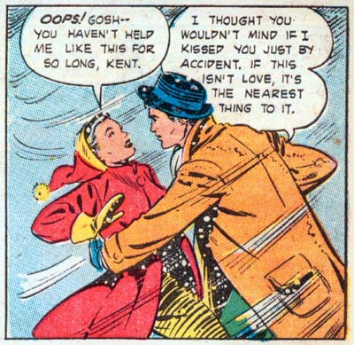
“I Played Kiss and Run” page 8 panel 4 art by Matt Baker
The stories are good, just not as good you might expect with such unusual story lines. The problem appears that Dutch is not so much writing love stories as morality tales. In doing so Dutch can at times be a bit heavy handed in his scripting. Would you really expect a couple to say something like found in the panel I provide above? Examples of such stilted writing are common and are the primary reason for parts of the stories appearing too preachy.
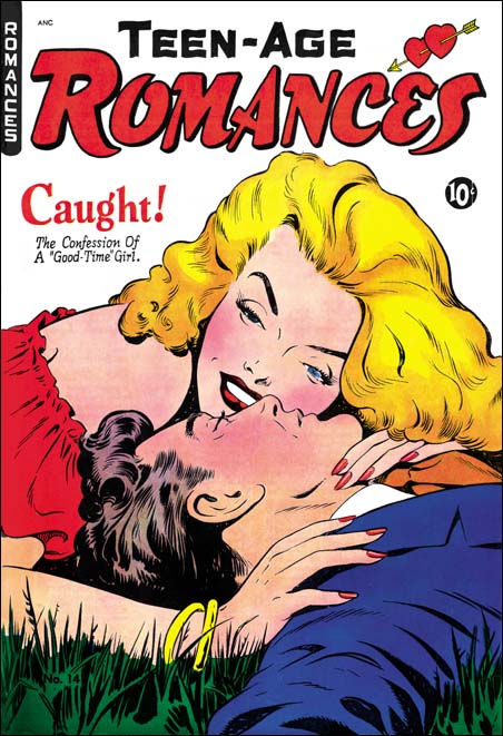
Teen-Age Romances #14 (February 1951) art by Matt Baker
Of course comic books are not just about words, the art is just as important, perhaps even more so. The St. John romance comics were fortunate to make use of the talented Matt Baker. Baker did not do all the art, but the other artists clearly either were greatly influenced by Baker or were selected because they tried a similar approach. The best description of Baker’s style is that it is very illustrative in the best sense of the term. Matt’s art gives the impression of being very realistic, but actually that is misleading as his style is very attuned to the comic book media. Unlike many who try to be realistic, Baker’s art is the antithesis of dry. I do not think there is any comic book artist whose women are as sexy and sensual as Baker’s. Matt’s men are ruggedly handsome as well. His covers are special treats, even though I am a die hard Simon and Kirby fan my collection includes the Teen-Age Romance #14 and I could not resist restoring the cover art.
As a student of Simon and Kirby productions, it is their work that I compare other publications to. Although the S&K romance plots were not as daring or unusual as the St. John stories they were better written. I am just not as big a fan of Dana Dutch’s writing as John Benson is. As for the art, well it just would not be fair to compare Matt Baker to Jack Kirby. The S&K studio artist that comes closest to what Baker was doing was John Prentice. Prentice’s women, at least when he was doing comic books, have a sophisticated beauty while Baker’s are sexier. Prentice did not do many romance covers. Those he did are generally quite nice, just not nearly as well done as those by Baker. Matt’s illustrative approach really comes out well with his covers. As far as interior art is concerned, Matt probably is a better story artist then John as well, but not by so great a margin. While Prentice may not compare well with the talented Matt Baker, he does much better in comparison to the other St. John artists who were not as talented.
All in all I am quite pleased with “Romance Without Tears”. I am not ready to abandon Simon and Kirby and start studying St. John publications, but I now understand why St. John’s fans are so enthusiastic. One thing I really like about this book is how the art is presented. Most golden are reprints are make first by bleaching the comic pages and then re-coloring. With one exception (DC Spirit Archives) I have always found the results completely loose their original feel and look very flat. “Romance Without Tears” uses good quality scans instead. This may seem like a cheap technique, but I actually prefer it. Personally I think it would look even better if the scans were cleaned up a bit.

