Category Archives: 2011/09

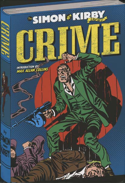
My Advance Copy of Simon and Kirby Library: Crime

I am thrilled to say that I have received an advance copy of “Simon and Kirby Library: Crime”. This is the second book in the Library series and it matches the size of the previous Superheroes volume. Well not completely matches but with 320 pages the Crime book is still an impressively sized book. For those readers that have not seen the Superheroes book, the Library books are 7 3/4 by 11 1/4 inches in dimension. This allows the comic art to be reproduced at slightly larger than their original dimensions for enhanced readability.


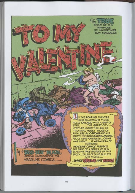
scan from the book

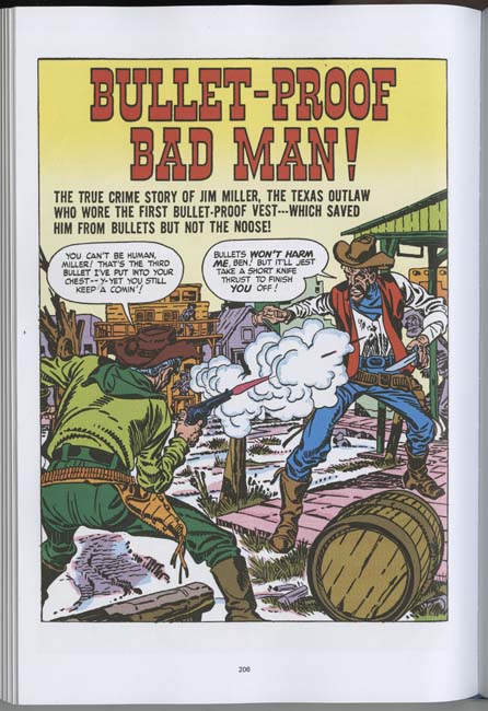
I love everything that Simon and Kirby produced but I do have some favorites. While superheroes are popular and were a logical choice to start the Library, it is not my favorite genre. What I love above all others are Simon and Kirby’s work on crime and romance which makes this volume very special for me. I think it will be special for many readers as well. Simon and Kirby were masters at making interesting comics but with crime they had a natural source for excitement and action. And boy did they take advantage of it. Simon and Kirby worked on crime comics for two relatively short periods but put together an impressive amount of work. This book brings together 315 pages of what has been described as the best of Simon and Kirby crime. I am not sure that “best of” is completely accurate. Joe and Jack did such a great job on the crime genre that I do not think it is possible to pick the best ones. There is only one crime story (not included in this volume) that I feel was not up to par for Simon and Kirby (and I suspect there would be many fans that would say my opinion of that story is wrong). However much effort was made to provide this book with a lot of variety in the stories. This volume contains a little less than half the Simon and Kirby crime so that if it sells well enough the rest of the material could be collected into a second volume. I am not saying that is the plan but I have no doubts that it could happen.


scan from the book

I am very proud of the Simon and Kirby books that Titan has published. However I have to admit that certain things came out better in the proofs than in the actual printed books. Now some publishers might have just blamed the printer or said that good was good enough but Titan took a different approach. Instead each book has been examined to determine what could be done to make the next one even better. This approach has really paid off. I am truly please with the crime volume and I am sure the readers will be as well.

Amazon lists the book as being released on October 25 but it is likely to appear in some stores earlier than that. “The Simon & Kirby Library: Crime” will be sold by Titan at the upcoming New York Comic Con. Joe Simon will be doing a panel on his autobiography at 3:45 on Friday. Joe rarely makes public appearances anymore so this is something special. I suspect that afterwards he may be doing a book signing.

In the Beginning, Chapter #2, Blue Bolt #2

Blue Bolt #2


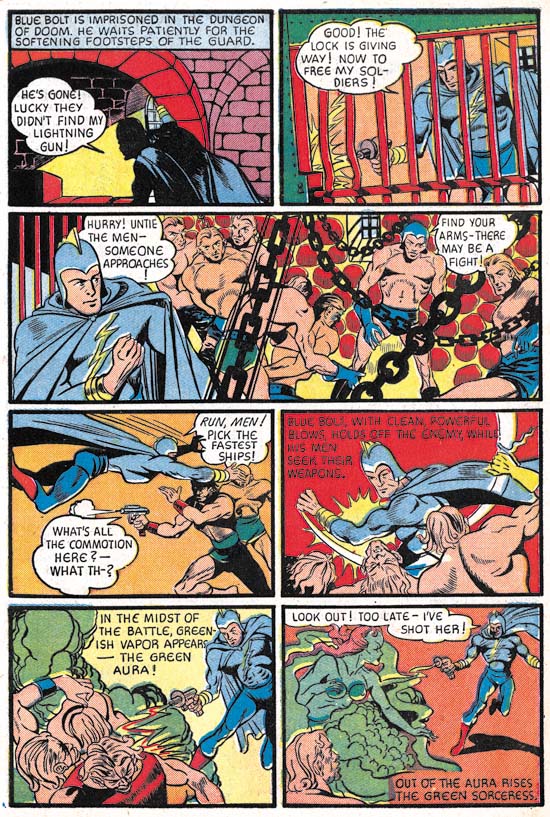
Blue Bolt #2 (July 1940) page 9, pencils and inks by Joe Simon

The story art for Blue Bolt #2 looks rather different from that from its predecessor. One reason for this is that (as mentioned in the previous chapter) the first issue was created earlier then the cover date would suggest. While Blue Bolt was drawn earlier it really was not that much earlier, probably just a matter of a few months. The difference between Simon’s art for the two stories show how rapidly he was adapting to working on comic books. The figure art has improved as well as what can be best described as his ability to graphically tell a story. There also appears to be a greater use of design. For example the interesting architecture in the first panel. Even better examples can be found in the long third panel. The wall is built with round stones giving an overall pattern to the background. Frankly this was not so successful as it gives the image a rather cluttered look. More effective are the chains which besides reflect on the imprisonment of Blue Bolt’s men add interest to the panel without disturbing what is important to the story. The chains are inked as silhouettes which removes them of the third dimension but emphasizes their function as a design element.


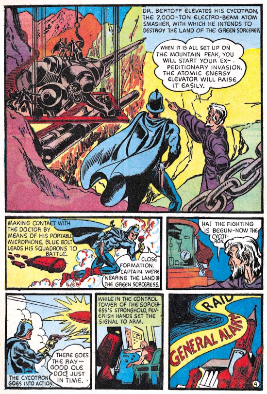
Blue Bolt #2 (July 1940) page 4, pencils and inks by Jack Kirby

The other reason that the art for Blue Bolt #2 looks so different from that in #1 is that some of it was created by Jack Kirby although only Joe Simon was given credit in the splash. In the future Kirby would be the primary penciller of Simon and Kirby productions but that was not the case here. Simon created 6 1/3 of the pages while Kirby only did 3 2/3 pages. Fractions are used in these counts because on the first page Joe did the splash while Jack did the story art. The precise tally is that Simon did pages 1 (splash only), 3 and 6 through 10 while Kirby did pages 1 (story only), 2, 4 and 5. Each artist inked his own pencils.

Note that Kirby introduces a foreground chain in the first splash-like panel but to very different effect. Here the chain is not so much a design element as a means of adding depth to the image. The chain is also carefully inked to provide it with a full dimensionality that is very different from the flat silhouettes that Simon used.


Blue Bolt #1, art by Joe Simon
Blue Bolt #2, page 10, panel 7, art by Joe Simon
Blue Bolt #2, page 1, panel 2, art by Jack Kirby

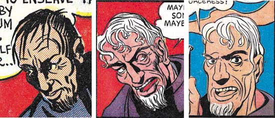
It is interesting to compare Simon’s artistic progress from Blue Bolt #1 to #2 as well as Kirby’s efforts from issue #2. I have chosen close-up of Dr. Bertoff to provide these comparisons. In BB #1 and much of BB #2 Simon portrays Dr. Bertoff as a rather “ratty” looking individual. A surprising unflattering depiction of a scientific genius. However Dr. Bertoff gets better treatment in some of Simon’s BB #2 art. Now part of this improvement can be credited to Joe’s rapid advancements as a comic book artist. However comparing Simon’s best depiction of Dr. Bertoff with that by Kirby suggests that Joe was also being influenced by Jack. Kirby was never very good at adopting other comic book artists styles but that was something that Simon was very adept at. During this time Joe was doing the cover art for the Fox Comics successfully mimicking Lou Fine. Now Joe was trying to copy Jack’s style. This was desirable because it would give stories produced by Simon and Kirby a unified look. At this early time Simon only achieved limited success at mimicking Kirby but he would greatly improve in the future.


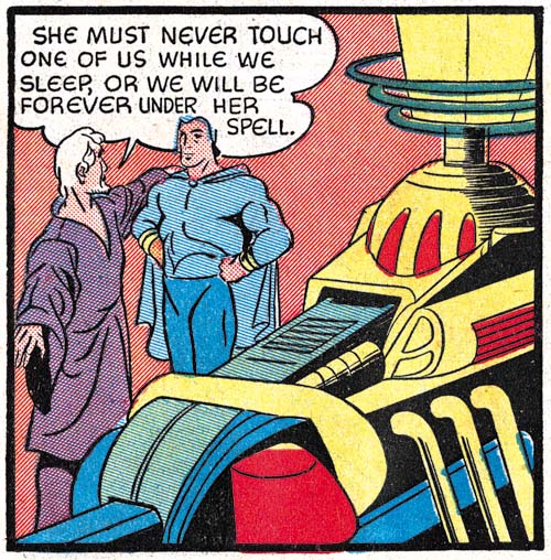
Blue Bolt #2 (July 1940) page 3 panel 5, pencils and inks by Joe Simon

Kirby drew impressive machinery throughout his career. This can be seen even at this early stage in his career as for example the “electro-beam atom smasher” from the splash-like first panel of page 4 shown earlier. Jack did similarly impressive devices on every page of this Blue Bolt story that he drew. Machinery appeared on some of the pages that Simon did but generally more distant views less rich in details. Even in the few close-ups that Joe provided (such as the example from page 5 provided above) his versions were no match for Kirby’s more interesting depictions. It is not clear whether Kirby was given those pages to draw because they would contain such machinery or that Jack inserted such fantastic devices whenever he could.


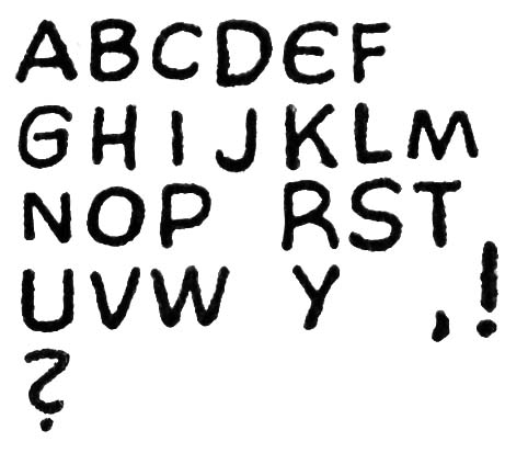
Blue Bolt #2 (July 1940) story letters by unidentified letterer

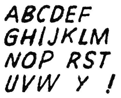
From past work that Joe Simon and Jack Kirby did it might be expected that either they would letter the pages that they drew or the lettering would be done by one of them. But neither of these likely possibilities was the case. Both Joe and Jack had very distinctive lettering styles (see Early Lettering by Joe Simon and Jack Kirby as a Letterer). But nowhere in Blue Bolt #2 can be found the unique lettering such as Joe’s ‘W’ or Jack’s ‘U’. Instead the story has one rather remarkable ‘E’, shaped like a ‘C’ with a bisected with a short horizontal stroke. I have never seen either Joe or Jack use anything quite like it. Joe’s lettering would improve in years to come and some of his more eccentric traits would become more conservative. In particular his peculiar ‘W’ would become more standardized. So while it is possible that Joe might have temporarily stopped using his more unusual ‘W’ and adopted an equally unique ‘E’ the rest of the lettering still do not look like Simon’s. The BB #2 letters seem rather squat and blocking compared to Joe’s. The ‘R’ often exhibit a curved right leg however when Joe curved that same leg it he curved it in the opposite direction. As for Kirby not only does the Blue Bolt #2 lack Jack’s horseshoe shaped ‘U’ but the manner of writing ‘K’ is also different between the two. My conclusion is that just like Simon brought Jack in to help with the art, he brought in someone else to do the lettering.


Blue Bolt #2 (July 1940) splash letters by unidentified letterer

The lettering in the splash looks different from the story lettering. Of course much of this is due to the fact that the splash lettering is slanted while in the story the letters are all very vertical. But the splash lettering also looks less squat and uses a more standard form for the ‘E’ and ‘R’ letters. There is one exception found on the last panel on page 8 where the tilted splash lettering is used for a single word. The switch in lettering could have been done to put more emphasis on the word (nowhere in the story does the letterer use the common technique of employing bold lettering to provide emphasis). But it is also possible that the tilted lettering was added later to correct some problem with the original script or lettering. Without the original art it is hard to be sure. My suspicion is that all the lettering, including the splash, was done by one individual. The main piece of evidence to support this is the form of the letter ‘G’ common to both where there is a straight vertical or near vertical segment attached to the horizontal stroke.


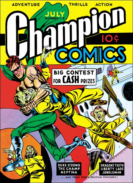
Champion Comics #9 (July 1940) art by Joe Simon and Jack Kirby

Champion Comics #9 came out the same month as Blue Bolt #2. It featured cover art that should be credited to Joe Simon and Jack Kirby. As I mentioned in the previous chapter of this serial post (Blue Bolt #1) I suspect that the Champion #8 (June 1940) cover was the first joint work by Simon and Kirby but I admit not everyone may favor that opinion. Most agree that Champion #9 was a Simon and Kirby production. It appears that Kirby was involved in at least some, if not most, of the penciling. Some have pointed out the way the sole of the runner’s foot is turned to the viewer and have credited this as a Kirby trait. However both Joe and Jack would use this device in the future. As far as I know this is the earliest occurrence of the peculiar technique and therefore it cannot be used to distinguish between the two artists. For it to be used an earlier example would have to be found used by one but not the other artist and to date I have not seen one. While the figure art has a Kirby appearance it is not completely typical of Kirby. I attribute that to Simon’s involvement in the art. The form lines on the runner’s boots look like the work of Simon but much of the rest of the inking does not look like either Joe’s or Jack’s work. So I suspect a third artist may have been involved in the inking.

In the Beginning, Chapter #1, Blue Bolt #1

I have decided to do a serial post on the first ten issues of Blue Bolt (June 1940 to March 1941). It was during this feature that the Simon and Kirby collaboration first developed. There were other comics that Joe and Jack worked on during the start of their partnership but that work was done a piece here and a piece there. However Blue Bolt was a monthly feature allowing us to examine Simon and Kirby learning to work together. But I will use this opportunity to discuss some of the other early work that the two did together or individually during that period.

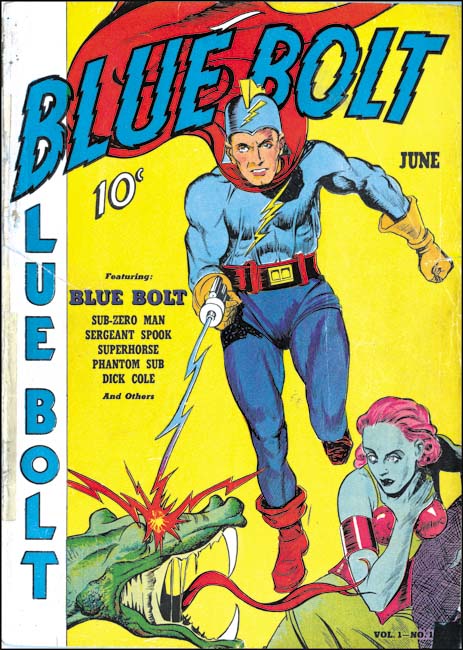
The first issue of Blue Bolt is cover dated June 1940*. At that time Simon was editor for Fox Comics having started in May. Jack Kirby was also working for Fox primarily on the Blue Beetle syndication strip. Kirby previous experience had also been in syndication strips (although some ended up published in comic books) but in May Jack did some comic book art for Fox as well as moonlighting elsewhere. It surely is no coincidence that Kirby provided stories for Fox during the same month that Simon began as editor. It is even possible that Joe encouraged or even helped Jack to find work moonlighting outside of Fox as that happened at the same time.

Joe Simon had spent about seven years working as a staff artist for newspapers before entering the comic book field. His earliest published comic books were “The Fantastic Thriller of the Walking Corpses” (the Fiery Mask story for Daring Mystery #1), “Solar Patrol” and cover for Silver Streak #2 and another cover for Keen Detective Funnies #17 all cover dated January 1940. However the publication dates for Joe’s early work did not reflect very well the order that the art was actually created. Simon’s earliest comic book work appears to have been the western “Ranch Dude” but that did not appear until Amazing Man #10 from March. Joe was supplying this early work to Funnies Incorporated a shop run by Lloyd Jacquet who apparently held on to some of the stories before finding a use for them. Something similar happened to the first Blue Bolt story but for a special reason. Although Simon supplied it with no more special thought than any of the other art he did, Jacquet recognized the potential for using it for launching a new comic book title. This was quite a coup especially for someone so new to the comic book industry as Joe was. It is uncertain when the art for first Blue Bolt story was actually created but judging from the style I would say it was quite early. Of course not as early as “Ranch Dude” but not too long afterwards.


Blue Bolt #1 (June 1940), art by an unidentified artist

Since Simon had no idea about Jacquet’s intentions of using the first Blue Bolt story as the main feature of a new title, he would not have supplied cover art with the story but of course theoretically Joe could have supplied it later. Some have credit Simon for the cover art but I disagree. The style does not seem quite right to me compared to work that Simon is known to have done at that time. Further the dragons in the story have beaks while the one from the cover has a mouth more like an alligator.


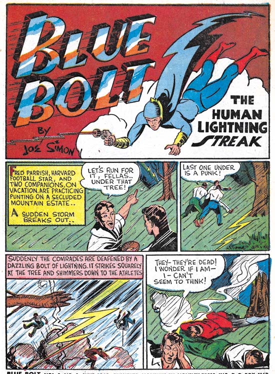
Blue Bolt #1 (June 1940), pencils, inks, script and lettering by Joe Simon

Joe Simon not only penciled the story but he inked and lettered it as well. I remember when the reprint books on Fletcher Hanks came out the introduction remarked that one of the things that made that artist special was that he did all penciling, inking and lettering the story himself. Actually that was not so unusual during the comic book industry’s earlier years. Joe provided all the art except coloring on most of his early works. That is not to say Simon was equally proficient in all aspects of the art. While unconventional and interesting, I would not describe Simon’s lettering as very good. Even today Joe feels his lettering never became truly professional. The lettering for Blue Bolt #1 is in his initial style, examples of which can be seen in my post Early Lettering by Joe Simon. Two aspects of the lettering that may seem unusual to modern readers are the use of borderless captions and the placing of some captions at the bottom of the panel. Joe was a fan of Hal Foster who used low and borderless captions in his Prince Valiant syndication strip.

The art itself is somewhat primitive. While Simon was an accomplished newspaper staff his previous work did not include sequential story telling. Further his newspaper work had been either realistic or cartoonish while comic books required something in between. So it is not surprising that Joe’s earlier art was a bit rough and the story a little weak. This was earlier in the history of comic books and the industry employed many artists whose work was not even as good as Simon’s initial efforts. We can be critical of Simon’s early work knowing what was to come but it should be remembered that the Blue Bolt character and the first story that went with it was good enough for a publisher to release a new title based on it. Something that never happened for most comic book artists and Joe’s time in the business then could be measured in months. Joe learned fast and by the time that Blue Bolt #1 was released he had already been doing covers for Fox Comics that in the past had been attributed to Lou Fine until his small signatures were found (Art by Joe Simon, Chapter 3, Working for the Fox). Even at this stage Simon was better than most comic book artists working in the industry.

One of characteristics of Joe’s early work was one that stayed with him throughout his career, his frequent use of swiping. Some of the swipes come from Prince Valiant (by Hal Foster), Flash Gordon (by Alex Raymond) and pulp art. There may have been other sources as well since some images occur multiple times in Simon’s art but the source of the swipes has not been identified. This topic has been discussed more thoroughly in the serial post Art by Joe Simon. Further discussion of Blue Bolt #1 can be found in Chapter 4, Transition.

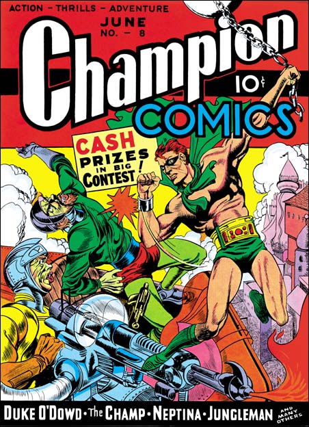
Champion Comics #8 (June 1940) art by Joe Simon and Jack Kirby?

The covers that Simon did for Fox Comics were not the only art that came out the same month as Blue Bolt #1. I have long been puzzled by the correct attributions for the cover art of Champion Comics #8 (June 1940). The art has generally been credited to Joe Simon and in the past that had been my opinion as well. But Joe had certainly met Jack Kirby by this time. The background architecture uses an unusual and varied perspective that can be found in a number of the Fox covers that Simon did but does not occur in any of Kirby’s solo efforts. The figure art is different than that found on the covers that Joe did for Fox Comics. But that is not surprising because Joe was purposely mimicking Lou Fine for Fox in order to provide continuity with the earlier covers now that Fox was no longer using Eisner and Iger to produce the comic art. Not only would Simon not have to mimic Fine for the Champion #8 cover but since it was for a different publisher it would actually be undesirable to do so. Unfortunately there are no earlier cover art by Jack Kirby to compare with Champion #8. There is something Kirby-ish about the figure art but Joe could have picked that up having seen Jack’s work. Kirby would become famous for his slugfests but the hero’s advisory falls back from the punch in a rather stiff and awkward manner that seems hard to accept as something Jack would do even at this early stage in his career.

One rather intriguing aspect of this cover is the elaborate gun. Kirby had a long history of drawing interesting and elaborate machinery. A fanciful gun also appears in the splash for Cosmic Carson story for Science Comics #4 (May 1940, see Early Jack Kirby, Chapter 2, Working for Fox). It has been suggested that the gun from Champion #8 was swiped by Simon from that Cosmic Carson splash. However it is not a close copy and the two guns are quite different. Unlike Kirby, Simon does not have a history of drawing elaborate devices. We shall in future chapters that when machinery appears in Blue Bolt it is Jack, not Joe, that provides it. It is hard for me to accept that Kirby did not have something to do with gun from Champion #8. While I still give Joe Simon most of the credit for the Champion #8 cover I now feel Jack Kirby was involved in some capacity as well. This is important because if I am right than the cover for Champion #8 would be the earliest Simon and Kirby collaboration.
 
footnotes:

* Like most of my posts, I am going to be using cover dates. True calendar dates for the release of the comic would be about two months earlier and for the creation of the art five or six months earlier except in special cases like Blue Bolt #1 were the art was not used for some time.

Evolution of Kirby Krackle


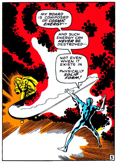
Fantastic Four #57 (December 1966) “Enter, Dr. Doom” page 5 panel 4, pencils by Jack Kirby, inks by Joe Sinnott (from the Marvel Omnibus)

In the 60’s Jack Kirby began to draw clusters of round black dots to depict enormous but not necessarily directed energy, often of a cosmic nature. This simple graphic technique was so effective that it has been picked up by other comic book artists and can still be found in comics of today. The device has been given the name Kirby Krackle. It is an annoying cute* name but one that has become so entrenched that I feel that it must be accepted.

But what are the origins of Kirby Krackle? Some comic book scholars have pointed to a panel from Fantastic Four #46 (January 1966) where the Inhuman Triton is depicted in water surrounded by bubbles and black shapes that look surprisingly like Kirby Krackle. Nothing to suggest energy or anything cosmic but visually similar enough that perhaps it formed the basis for an imaginative leap by Kirby. Old grainy photographs of Quasars (astronomical objects discovered in 1963) have also been suggested to be the inspiration for Kirby Krackle. Because at the time inkers were encourage to embellish the pencils some have even suggested that it was the inker Joe Sinnott that actually created Kirby Krackle!
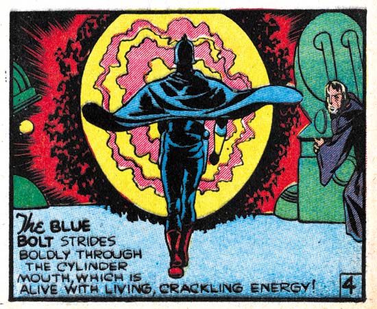

Blue Bolt #5 (October 1940) last panel of page 4, pencils by Jack Kirby, inks by Joe Simon

Such explanations for the origin of Kirby Krackle were all reasonable but those who presented them overlooked Jack Kirby’s long career. Jack had a long memory and old ideas would reappear many years later. There is no better example than Kirby Krackle. The first appearance of Kirby Krackle appears to be found in Blue Bolt #5 (October 1940)**. This really is likely to be the earliest example of Kirby Krackle. Kirby did some previous science fiction stories on his own but nothing resembling Kirby Krackle appears in them. Nor did it appear in Simon’s earlier science fiction nor in the previous issues of Blue Bolt. It is unclear who to credit with this device as Kirby did the pencils and Simon the inking. Unfinished art from later in the Simon and Kirby collaboration shows that while Kirby’s pencils were pretty tight they were line art only with all spotting left to the discretion of the inker. However this example of Kirby Krackle is from early in the Simon and Kirby partnership (which started with Blue Bolt #2, July 1940). This is so early in their collaboration that is would seem reckless to make any assumptions on what were their working methods at that time.

In some respects this is a perfectly acceptable example of Kirby Krackle. But it is not yet the perfected form. While the massing of particles is very much like typical Kirby Krackle the particles are not round but irregular, often angular, in shape. However it is clear that this early example shares the same intent as the caption describes it as having “crackling energy”.
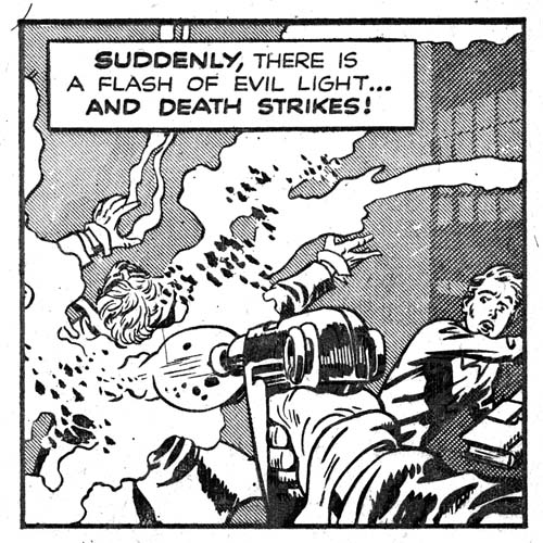

Captain 3-D #1 (December 1953) “The Man from the World of D”, page 2 panel 6, pencils by Jack Kirby, inks by Joe Simon

Simon and Kirby did not do much science fiction and it would be years before something very much like Kirby Krackle made its appearance once again. In 1953 Simon and Kirby put together Captain 3-D for Harvey Comics. It was a rush job to try to take advantage of the 3D craze. All the pencils were by Jack Kirby but the inking was done by an assortment of artists which besides Jack and Joe included Mort Meskin and Steve Ditko (for a more complete examination of the inking see Captain 3D). In the origin story, “The Man from the World of D”, a villains uses a special weapon which releases energy outside the actual firing path. The weapon from the Captain 3D story has a cosmic connection as it is described as a gamma ray gun. In some ways this is not as close an example to Kirby Krackle as that found in Blue Bolt perhaps because of the difference between a dimensional doorway and a weapon. The particles are not clumped together as well as in the Blue Bolt example but have become less irregular in shape. While some have become more rounded other particles still are rather angular.

There is good evidence from unfinished art that by this period Kirby’s pencils provided outlines only with only simple lines to indicate things like the folds in the clothing. How the spotting was to be done was left to the inker. Most of this page was inked by Steve Ditko but Joe Simon applied a lot of retouching. While it is difficult to say with any certainty who to should be credited with the inking of the Kirby Krackle the similarity with the next example suggests it was likely Simon who applied the it.
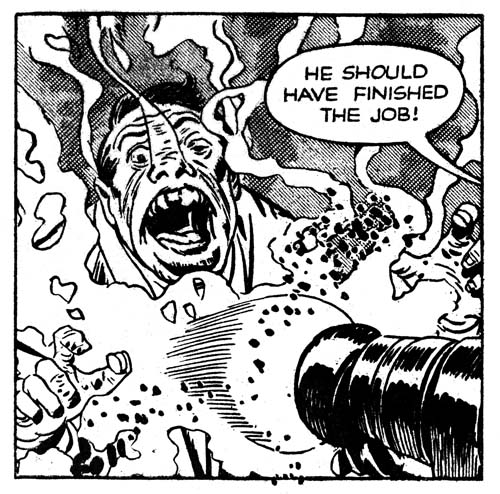

Captain 3-D #1 (December 1953) “The Man from the World of D”, page 3 panel 6, pencils by Jack Kirby, inks by Joe Simon

The futuristic gun appears once again in the next page from “The Man from the World of D”. The arrangement of the particles is very much the same as the previous example but the particles themselves have lost any angularity and become more rounded. They would not however be described as truly circular in shape. This page was inked by just Joe Simon and so he was likely the one to supply the Krackle.
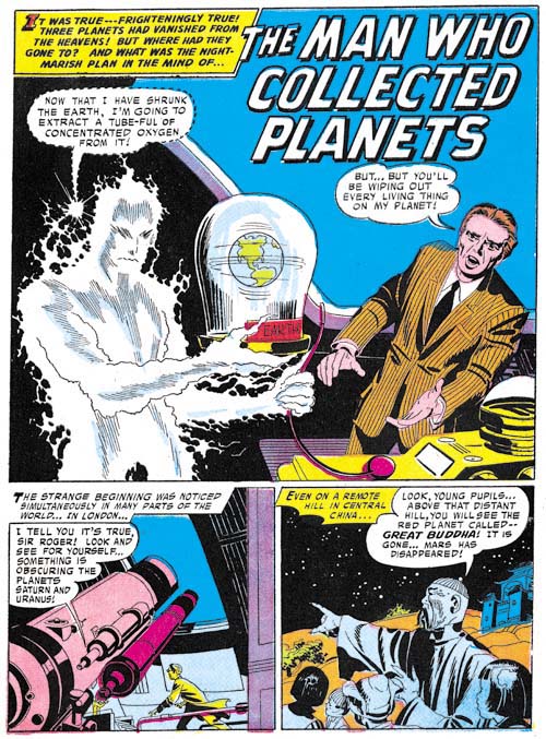

Tales of the Unexpected #18 (October 1957) “The Man Who Collected Planets”, pencils and inks by Jack Kirby

Once again the use of anything akin to Kirby Krackle does not appear for some time largely because there were few if any stories where it might be appropriate. After the Simon and Kirby partnership ended Jack began to do freelance work mostly for DC. Something akin to Kirby Krackle appears in the depiction of the alien in a story called “The Man Who Collected Planets”***. While the alien is surrounded by something not dissimilar to Kirby Krackle it covers an uncharacteristically narrow area and the primary purpose appears to be more of a means of providing him with a fiery aura than of suggesting a form of energy.
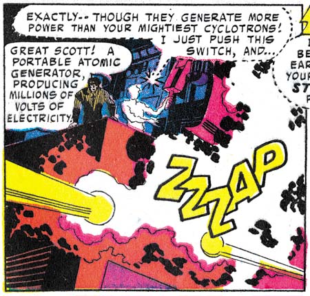

Tales of the Unexpected #18 (October 1957) “The Man Who Collected Planets” page 3 panel 5, pencils and inks by Jack Kirby

However “The Man Who Collected Planets” contains panels that show something very much closer to true Kirby Krackle than that used in drawing of the alien. Here it truly is energy that is being depicted. The particles have become more varied in size a more clumped together. However unlike typical Kirby Krackle the particles are still not very rounded in shape.
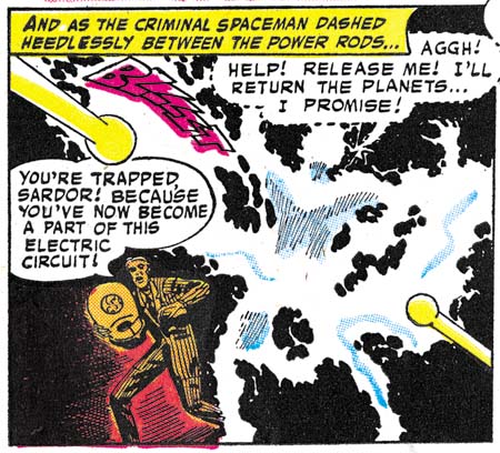

Tales of the Unexpected #18 (October 1957) “The Man Who Collected Planets” page 5 panel 5, pencils and inks by Jack Kirby

This was no accident as the same Kirby Krackle precursor appears elsewhere in the story. Kirby did his own inking for most of the horror or science fiction stories that he did for DC. “The Man Who Collected Planets” is a great example of Kirby inking Kirby. So in this case we can safely give Kirby the credit for this Kirby Krackle prototype.
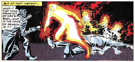

House of Mystery #84 (March 1959) “The Negative Man”, panel from page 3, pencils by Jack Kirby, inks by Marvin Stein?

Further examples of a Kirby Krackle prototype appear in another story that Kirby drew for DC, “The Negative Man”. This story is again about an unearthly being and something similar to Kirby Krackle is used to provide the being with a fiery aura. But once again it is elsewhere where even better examples of Kirby Krackle can be found such as the energy wake left behind the negative man of one panel from the third page.
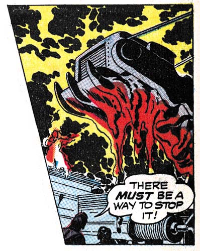

House of Mystery #84 (March 1959) “The Negative Man”, panel from page 5, pencils by Jack Kirby, inks by Marvin Stein?

An even better example of Kirby Krackle prototype is found in small panel from page 5 where the negative man unleashes his power. The particles are relatively large and not at all circular but the clumping is very much like typical Krackle.
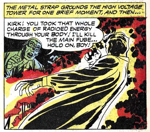

House of Mystery #84 (March 1959) “The Negative Man”, panel from page 2, pencils by Jack Kirby, inks by Marvin Stein?

The Kirby Krackle prototype from “The Negative Man” is very similar to that found previously in “The Man Who Collected Planets”. However while Kirby inked his own pencils in the earlier story some other artist inked “The Negative Man”. I am not positive as to who that inker was but the blunt but fluid brushwork looks very much like the work of Marvin Stein so I questionably attribute it to him. The two stories are similar enough that perhaps Stein used the earlier Kirby inked story as a reference when inking this one. Or perhaps Kirby had already begun to include how a story should be spotted in his pencils. In either case the use of the Kirby Krackle in this story should be credited to Jack Kirby.
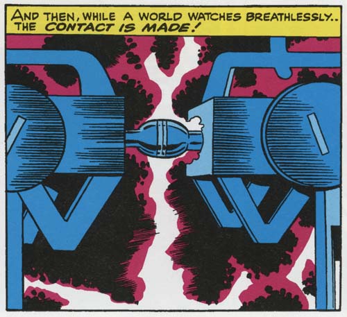

Fantastic Four #49 (April 1966) “If This Be Doomsday” page 12, pencils by Jack Kirby, inks by Joe Sinnott (from the Marvel Omnibus)

While the infrequent use of Kirby Krackle in the earlier publications can be explained by the lack of appropriate stories, its absence from Kirby’s earlier silver age work for Marvel is more difficult to understand. There certainly were a number of stories with subjects seemingly well suited for Kirby Krackle. It would seem that Jack had just forgotten about it. Perhaps there is some truth in the explanations previously used to explain the emergence of Kirby Krackle but not as inspiration for its creation but rather as a reminder to the artist of an almost forgotten technique. Once true Kirby Krackle appeared it was already exhibited the classic clumping of round particles and in this respect it differs from the earlier prototypic versions. Not perfect circles but not the more extended shape of the prototypes.
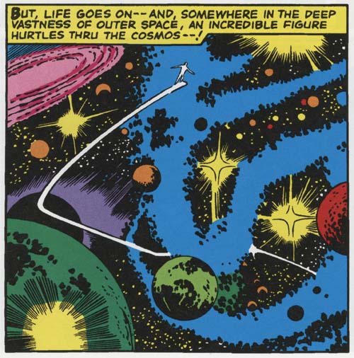

Fantastic Four #48 (March 1966) “The Coming of Galactus” page 12, pencils by Jack Kirby, inks by Joe Sinnott (from the Marvel Omnibus)

While classic Kirby Krackle was used to portray a simmering energy, the same purpose the prototypic form had been put to, Jack also used it when depicting the cosmos. Kirby Krackle always seem to have a cosmic connection but had not previously been used when drawing outer space. I suspect Kirby was using this device to suggest that space was more than vast distances of vacuum but a place filled with potent energy. Certainly with the help of Kirby Krackle, Jack’s astronomical visas became more exciting than any other comic book artists had ever achieved.

P.S.
I have previously written about Kirby Krackle but I have decided to gather it all together with some new information. I will provide links to my previous posts but the reader will find little more than what is covered here (Kirby Krackle, More Kirby Krackle). Shane Foley has written an excellent article available online exploring the appearance of Kirby Krackle in the Marvel comics (Kracklin’ Kirby, Jack Kirby Collector #33). While he understandably failed to make the connection with previous examples of Kirby Krackle, his article does a marvelous job of tracing its use in silver age comics.

Footnotes:

* The overuse of Kirby K… is so extensive that my reaction is to wonder whether the originators of these terms were more interesting in getting credit for coining a cute name than in any serious investigation into Jack Kirby’s artistry.

** I do not know who to credit for first trying to draw attention to this early example of Kirby Krackle. It was brought up on the now defunct Kirby List where the poster provided a page number based on the Verotik Blue Bolt book. Unfortunately that volume lacks paging and the image that at the time I thought was being referenced was not an example of Kirby Krackle. I came across the panel from Blue Bolt #5 during a recent review in preparation for a serial post I hope to do on Blue Bolt. I am sure it is that panel that the Kirby list poster was trying to refer to.

*** The use of Kirby Krackle in “The Man Who Collected Planets” was originally pointed out to me by Ger Apeldoorn in the comments to one of my early posts on Kirby Krackle.