It has been about eight years ago that I ended regularly posting to my Simon and Kirby Blog. It was a sudden ending not brought on by the lack of subject matter but rather a lack of free time. When I retired I did a couple of posts on the covers that Simon and Kirby did for Harvey. But I was pretty much convinced that I would do no other postings. It is not that I lost an interest in the Simon and Kirby subject, just that my attention and time had become directed to other projects. Along came Covid-19 and sheltering in place and suddenly my current projects could not proceed for the duration. I am not one to remain idle for long so I decided to take up a Simon and Kirby investigation I had always wanted to do. While I had once posted on Simon and Kirby letterer Howard Ferguson, I had never gotten around to doing something similar for Ben Oda. Although my initial intent was about Ben Oda alone, I found my research expanding bit by bit until it ended up covering most of the Simon and Kirby collaboration. Unfortunately I no longer have as a complete access to the comics that I once had. I made much use of the Digital Comic Museum to help with what I was missing. Even so there are some gaps and unanswered questions which I will point out at the appropriate occasions. Because my topic became so extensive, I have decided to break it into seven chapters.
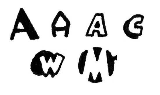
Drop Cap Types: Simple, Elaborate, Outline, Shadow, Geometric and Negative
Before proceeding it would be best to explain some of the terminology I will be using. In literature the first letter of a chapter of a book is often enlarged and sometimes made elaborate. These are called drop capitals, or as I prefer, drop caps. Something similar is sometimes used in captions found in comic books. Generally comic book drop caps can take six basic forms that are shown in the image above. While simple and elaborate drop caps may ultimately derive from literature, I do not believe outline, shadow, geometric and negative drop caps do so. I have not done the research but I suspect comic book drop caps my have originated from syndication comic strips, particularly the Sundays.
At times a description will be made of which way a part of a letter tilts. This will always be as going from left to right, the same direction that reading is done. So the character ‘/’ could be described as sloping up, while the character ‘\’ slopes down.
Identifying an individual letterer can be tricky. As a general rule, comic book lettering is done in a non cursive manner and is made to be clearly legible. Therefore identifying comic book letters is more difficult than recognizing someone’s cursive hand writing or even someone’s casual printing. One of the aids I will provide will be letter charts showing examples of all or most of the letters of the alphabet plus a couple of punctuation marks. But letterers are not machines and there will be variations in how their letters get written. Plus there is always the chance that some alterations were made by another letterer. So when assembling a lettering chart I first try to find six examples of each letter and then select the one that seems to be close to the mean of the variations.
In my experience it turns out that not all alphabetic letters are equally useful when trying to identify a letterer. Some like ‘Q’, ‘X’ or ‘Z’ are not common and may not even occur in a particular comic book feature. Other letters are common enough but often are not helpful; such as ‘L’, ‘V’ or ‘T’. The common letters that are useful for identification varies depending on the letterer. The letter ‘J’ falls in between in terms of frequency. It can almost always be found but often not enough for six examples to be located. Still I have often found the letter ‘J’ to be useful when studying letterers.
Generally only capital letters are used in comic book panel pages. Therefore letters have only one form (discounting bold and italicized lettering). That is except for the letter ‘I’. Some letterers draw all the uses of ‘I’ as a simple vertical bar. But many consider this to be amateurish. For them the correct rule is to apply small horizontal serifs to the top and bottom of the vertical bar when the “I” is used in the first person singular and without the serifs when used within a word. I do not know how this rule became established but perhaps it was to make clearer the distinction between the ‘I’ of the first person singular and the number ‘1’. There seems to be some difference of opinion about the use of ‘I ‘ in a contraction (such as “I’LL”). Some letterers provide serifs in this case, some do not.
This series of posts are largely devoted to Howard Ferguson and Ben Oda. While they were responsible for the bulk of lettering done for Simon and Kirby, many other letterers were also used. Not all these other letterers will be discussed in these posts but for various reasons many will be. The generally lack of credits during the golden age presents a problem because in most cases a name cannot be provided. But a lack of a name to attach to these letterers resulted in confusion during my research. So as an aid, nicknames were created. Although it was not clear at the start of my studies, it turned out these other letterers would show up to do some work for Simon and Kirby for a relatively short time, never to return. So while these nicknames will be used in this serial post, do not feel a need to memorize them. I suspect I will forget them before long.
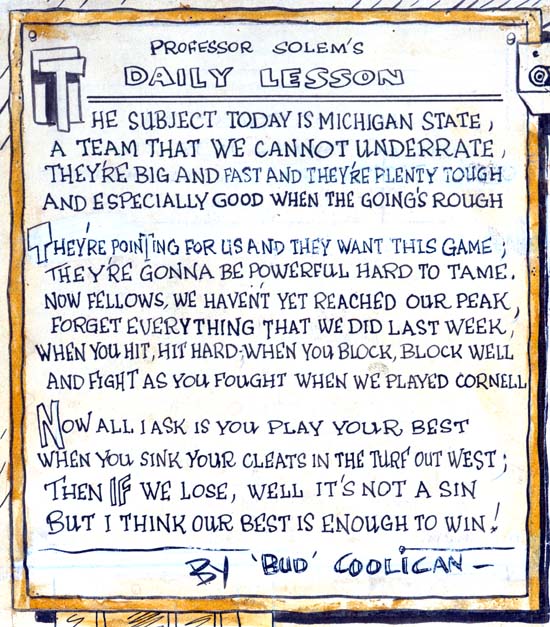
Syracuse American (1938) in “Professor Solem’s Gridology Klass” by Joe Simon
Joe Simon’s career did not begin in comic books. Actually he would likely had remained a newspaper staff artist if his employer was not one of the upstate New York papers to go out of business. While the above selection from one of Joe’s sport features was clearly not done in the same manner used in comic book lettering, it already shows some of Simon’s characteristic letters. In particular note the execution of the letter ‘W’. This ‘W’ is one of the most distinctive of Joe’s letters. It can be found not only in some of the comic book features that Simon lettered himself, but also be found in editorial alterations Joe made right up to the end of the Simon and Kirby collaboration. Also note the vertical outer bars he used for the letter ‘M’. While other letterers also used a similar design, it was not the most common form used for ‘M’. Even at this early date there appears the use of both outline and shadow drop caps.
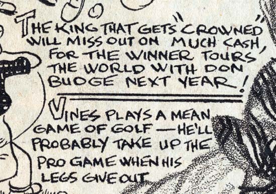
Syracuse American (April 1938) “Ellswort Vines” by Joe Simon.
The above is perhaps an example closer to the lettering used in comic books. Still the previous observation still hold, although the outer strokes of some of the ‘M’ letters are not vertical.
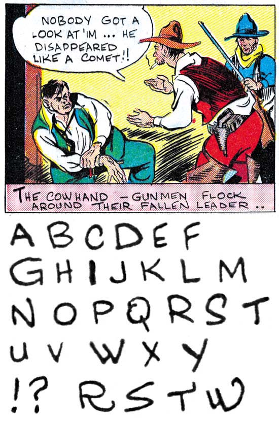
Amazing Man #10 (March 1940) “Ranch Dude” by Joe Simon
“Ranch Dude” was the first comic book work that Simon executed although it would not be the first published having been delayed by two or three months. In the early days of comic books it was not unusual for the artist to do all the writing, penciling, inking and lettering, and this was true with Joe as well. Some of the characteristics seen in Joe’s newspaper work are also found here. Particularly Simon’s distinct ‘W’. While the outer strokes to the letter ‘M’ are not quite vertical they nearly so. Sometimes Joe cannot help doing small elaborations on his letters; some examples are provided in the last line. In this particular example only simple drop caps were used. Joe’s lettering exhibits much variation in the letters and the spacing between lines. Note Joe did not use serifs on any of his ‘I’ nor do they appear on his ‘J’.
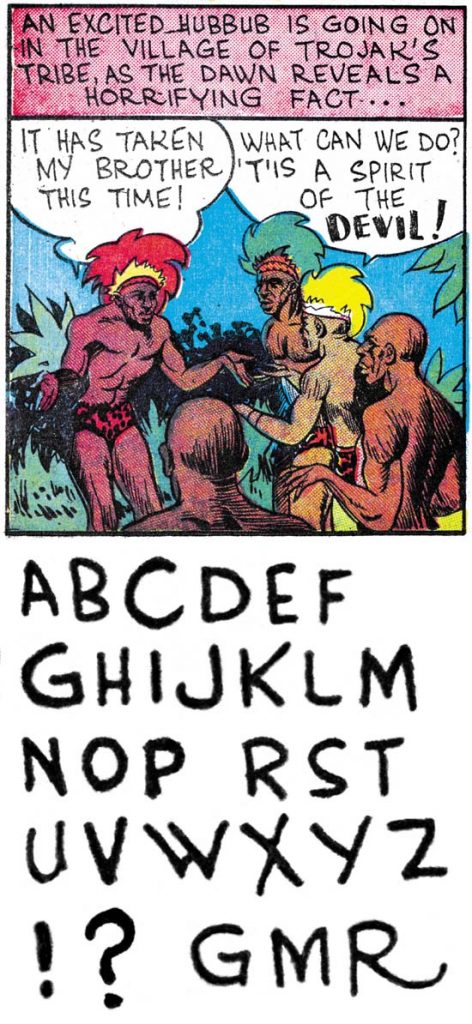
Daring Mystery #3 (April 1940) “Trojak” pages 1-11 and part of 13 by Joe Simon
Daring Mystery #3 probably was done some three or four months after “Ranch Dude”. Simon’s lettering has improved somewhat but his characters were executed pretty much the same. Perhaps the most significant difference is that the vertical stroke on his ‘G’ generally no longer extends down to form a distinct serif although as can be seen in the final line that is not always the case.
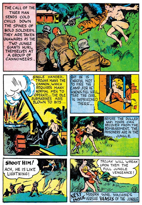
Daring Mystery #3 (April 1940) “Trojak” page 13
The GCD correctly comments that Simon did not do all the art for this feature although I would disagree in that I also credit page 11 to Joe. They surmise that perhaps Simon left the art unfinished when he went on to become the editor for Fox Comics. That however would be very unlike Joe who never hesitated to do jobs on the side while working for any particular publisher. A more likely explanation is that Simon submitted a 12 page feature but someone decided to extend it to 13 pages. So a new page 12 was drawn and lettered by someone else and Joe’s original page 12 was altered to become the new 13. The art for page 13 was redone as was much of the lettering. However Joe’s original lettering can still be found in panels 3 and 4 as well as the closing caption.
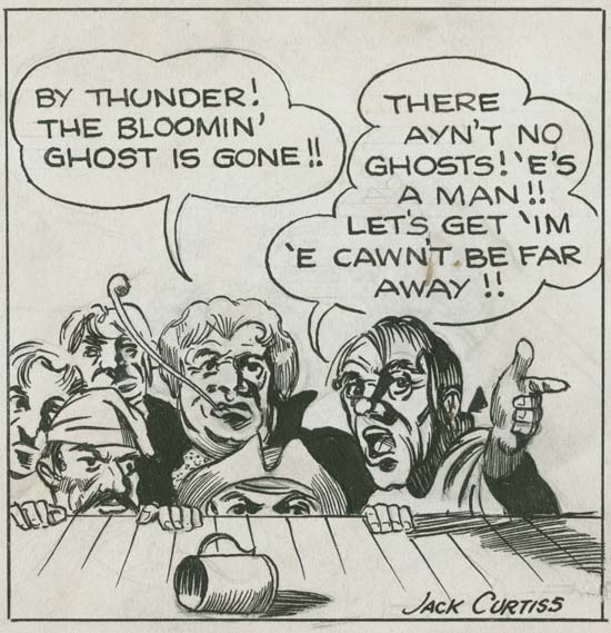
Black Buccaneer panel by Jack Kirby
Jack Kirby’s career also did not start in comic books. Rather much of his earlier efforts were directed at attempts at syndication comic strips. Perhaps because of those efforts Jack’s lettering was already more professional than that of Joe Simon. I would point out Kirby’s distinctive ‘U’ with its horseshoe shape.
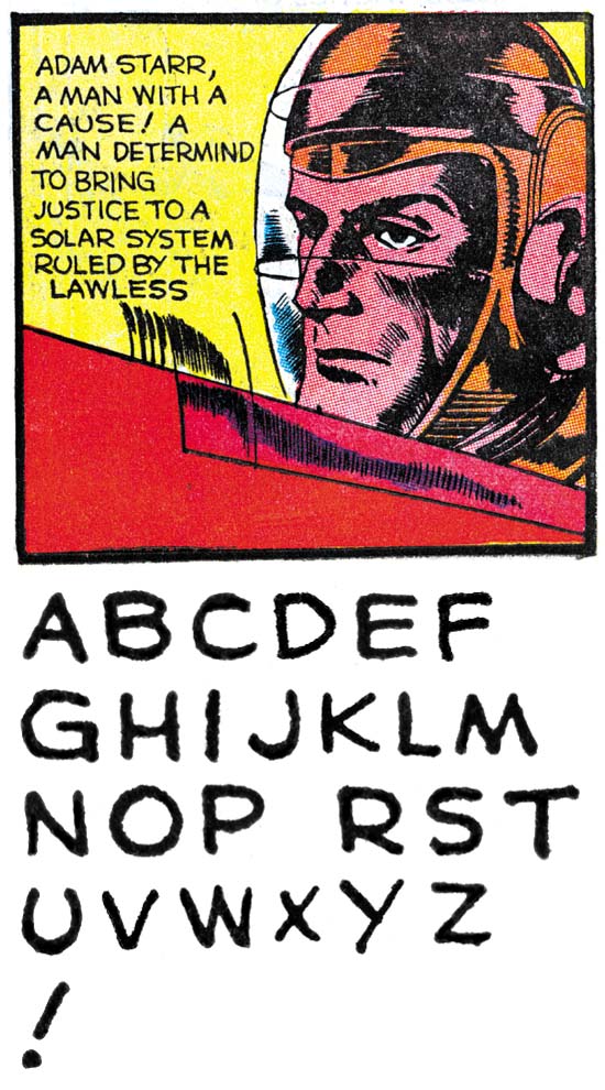
Crash Comics #1 (May 1940) “The Solar Legion” by Jack Kirby
Jack Kirby’s early comic book work was done about the same time he met Joe Simon. However they do not appear to be a collaboration as Jack did all the writing, penciling, inking and lettering himself. Kirby’s comic book lettering had not changed much from his syndication strip work. His distinctive horseshoe ‘U’ remains. No serifs were used on either ‘I’ or ‘J’ but do appear on the at the bottom of the vertical stroke of ‘G’.
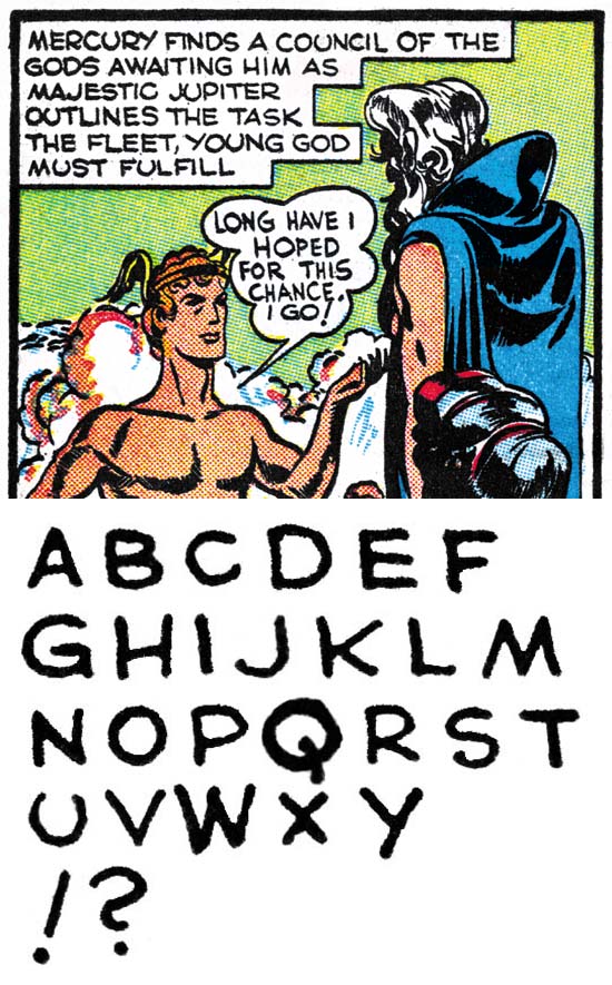
Red Raven #1 (August 1940) “Mercury in the 20th Century” by Jack Kirby
Five months later, Kirby’s lettering has not undergone any significant changes. I wanted to provide this letter set because it includes the question mark.
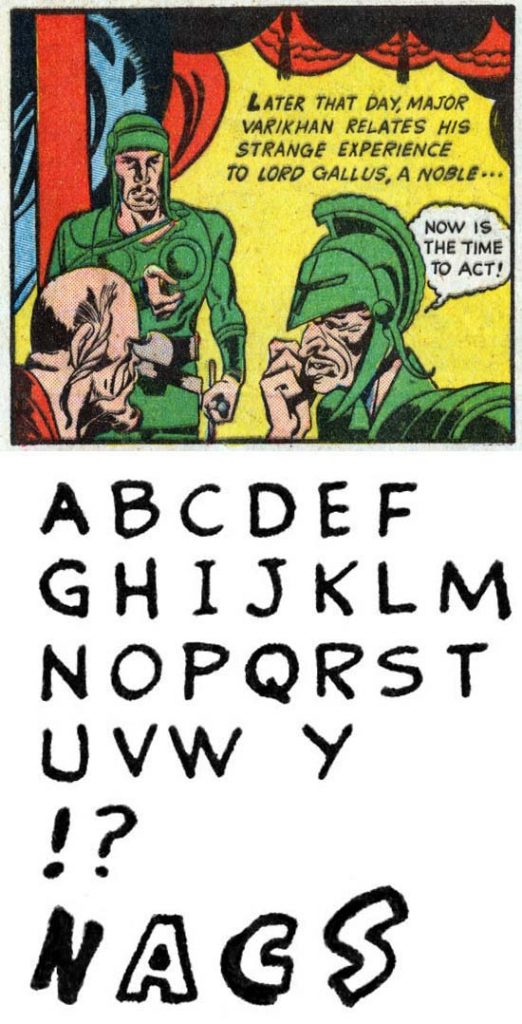
Blue Bolt #4 (September 1940) “Blue Bolt” pages 1-8 and 10 by unidentified letterer
As the collaboration between Joe Simon and Jack Kirby began they would often turn to others to do their lettering. Since credits were not provided during the golden age we do not know who these letterers were. Letterers like this example may be used for one feature and not again. In this letter set note the use of serifs on ‘I’ and ‘J’, the almost vertical outer strokes for ‘M’ and the vertical stroke for ‘G’ that provides just a suggestion of a serif at its bottom. Also the use of simple, outline and shadow drop caps.
My research for all the coming chapters has already been done so I hope to be posting a new chapter every couple of days.
Lettering S&K Chapter 2 Timely, DC and the War
Lettering S&K Chapter 3 Return from the War
Lettering S&K Chapter 4 The Oda Monopoly
Lettering S&K Chapter 5 Mainline and the Studio End
Lettering S&K Chapter 6 Post Studio
Lettering S&K Chapter 7 Conclusion
Lettering Checklists:
Alias
Draut, Bill
Ferguson, Howard
Kirby, Jack
Oda, Ben
Simon, Joe

