Introduction
It was always my intention to finish the serial post “It’s a Crime” by covering the Prize crime titles during the period when they were no longer produced by Simon and Kirby. My reluctance to continue may have been in part due to how inappropriate it seemed to review the material as a series of sequential time periods as I had been doing previously. Unlike what was seen in the Simon and Kirby produced crime titles, the later issues did not change that much over most of their runs. Much of the consistency of the crime comics was due to the presence of one single artist providing most of the covers and lead stories. So I have decided to end my original serial post and start a new one. In this one I will be covering the crime titles Headline and Justice Traps the Guilty from March 1951 to April 1958 (cover dates) but by devoting a separate chapter to different artists.
When Joe Simon and Jack Kirby started producing crime comics for Prize the stories were rather strong. Gun battles with lots of bullets and pools of blood were not uncommon. I do not believe they went as far as some publishers but still it was pretty violent stuff. At that same time there was a vocal oppositions to comics, particularly the crime ones. I am sure that it was because of this public criticism that Simon and Kirby began to tone down the violence. There were still gun shootouts but little if any blood. These less violent crime stories continued even after Simon and Kirby stopped producing the titles. I am sure this is why comic book fandom has pretty much forgotten about the later Headline and Justice Traps the Guilty comics. However I am not sure this is justified. The stories are well written and while the artists are not well known today many of them did really nice jobs. The most detracting thing I can say about them is that there are so many issues and as I said above they all looked pretty much the same. An analogy (which I am sure some readers will reject) can be found with Marvel monster stories. Good reads but I doubt anyone would read through them all without occasionally taking a break with some other genre.
Marvin Stein
The first artist for this serial post had to be, just had to be, Marvin Stein. The Prize crime titles were virtually defined by his presence. Marvin did all the non-photographic covers for Headline that were not done by Jack Kirby (issues #46 to #77, March 1951 to September 1956). This is almost true for Justice Traps the Guilty (issues #20 and #24 to #88, November 1950 and March 1951 to August 1957). Only the covers for the last 4 issues of JTTG were done by someone else. Similarly Stein generally provided the first (lead) story. Unfortunately I am still uncertain about identifying some of Stein’s earlier work. There are a few early lead stories that may or may not be attributable to Stein. There is at least two that were definitely not done by Marvin. But before long Stein would take over the lead story and keep it. Up until the end of Headline and to issue #89 of Justice Traps the Guilty. And while some other artist did the lead story for JTTG #90 he imitated Marvin Stein! Not only was Marvin the cover and lead artist, many issues had a second story by him as well. Even after he was no longer the lead artist, each JTTG would have a story done by Stein up to the very last issue (#92, April 1958).
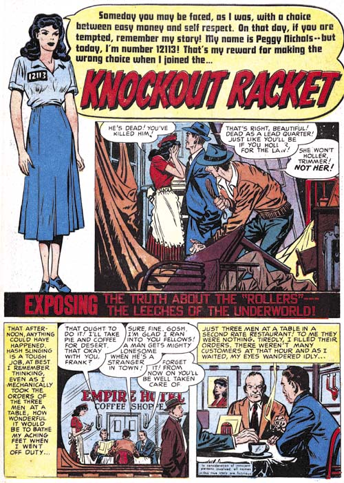
Justice Traps the Guilty #14 (February 1950) “Knockout Racket”, art by Marvin Stein?
The earliest work for Prize Comics signed by Marvin Stein was in JTTG #22 (January 1951). Although unsigned, the cover for JTTG #20 (November 1950) was almost certainly done by Stein as well. There are a number of earlier pieces whose attribution to Marvin becomes progressively more difficult and uncertain. One thing is clear is that Stein did not arrive at the Simon and Kirby studio with his mature style. “Knockout Racket” is the earliest lead story that I am comfortable to even questionably assign to Stein. But it is tentative; perhaps the only thing on the page shown above that I can point to that suggests Stein’s mature style are the eyes of the lady in splash. The first page shows a device often used by Simon and Kirby for their romance stories, the confessional splash. This is a format where a character in the splash introduces the story and where the speech balloon contains the title. All of Stein’s lead stories use a confessional splash while those other early lead stories by other artists did not. However I am not prepared to assign all lead stories with confessional splashes to Marvin.
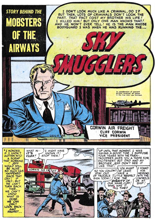
Justice Traps the Guilty #27 (June 1951) “Sky Smugglers”, art by Marvin Stein
Marvin Stein was still far from his mature style when he did “Sky Smugglers”. Although unsigned, as most of his crime stories were, there are enough examples of typical Stein traits to leave no doubt that this was his work. One trait in particular to note is the shadow that trails down the right side of the face for the man in the splash. Normally comic book artists draw shadows that originate from a single light source but in this face Stein is using two light sources; a prominent one from the front a little to our right and a secondary one further back and from the left. The shadow exists in the region not fully illuminated by either of these light sources. I refer to this type of shadow as a negative highlight. Marvin would use this technique often and in the future would even move the shadow towards the center of the face. Negative highlights are something I have not noticed used by Kirby or any other artist working for the studio. However this device was also used by Wally Wood from whom I suspect Stein picked it up.
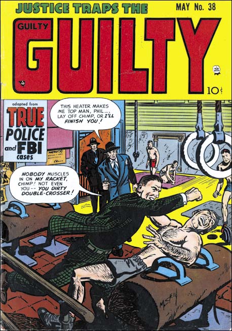
Justice Traps the Guilty #38 (May 1952), art by Marvin Stein
Stein had arrived at his mature style by 1952 and the cover for JTTG #38 is a good example of that style. Stein was comfortable with action but handled it in his own manner. His characters would throw a punch with a rather forward motion unlike the more rotational manner Kirby would use. While he lacked Kirby’s exaggerated perspective, Stein still had good command of perspective and used it well in establishing a point of view. He seemed to have picked up Kirby’s penchant for flat edged fingers. Stein developed a simplified drawing for more distant faces in a manner that was distinctly his own. Marvin inked with a rather blunt brush which can easily be mistaken for crude inking but is actually rather nuanced. Note the inking on the gymnasium equipment at the bottom center; Stein would often use this sort of rice kernel pattern for inking shadows.
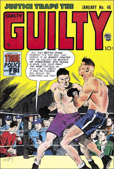
Justice Traps the Guilty #46 (January 1953), art by Marvin Stein
The romance, western and crime genre that Stein most often drew generally did not provide much opportunity to depict the human body. Examples such as this boxing scene show that Marvin could do a real good job. I do not know if he was working from some reference material but it still is a very respectable piece.
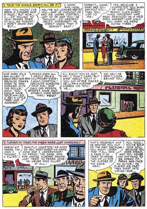
Justice Traps the Guilty #42 (September 1952) “Scandal Sheet Shakedown” page 9, art by Marvin Stein
Stein’s depiction of men improved more rapidly than that of his women. The lady in the first panel still retains some of the artificially arched eyebrows found in Stein’s earlier work. The same lady in panel 3 seems more realistic. It is just me or does she somewhat resemble Jack Kirby’s work? I think this is most likely a case of Kirby influencing Stein. Observe how Stein’s rather blunt brush still manages his characters with individuality and expressiveness. I particular like Marvin’s work on the three thugs in panel 5. Each has his own distinct personality.
Also note Stein’s manipulation of the point of view. Starting with a close-up to establish the main characters before moving to a more distance shot to place them on the street. Then another close-up is followed by what looks like yet one more but actually introduces a group of secondary characters in the background. Stein then makes a large jump in the viewpoint placing the thugs in the foreground and the main characters in the distant back. As we will see Marvin Stein very carefully controls viewpoint and pacing.
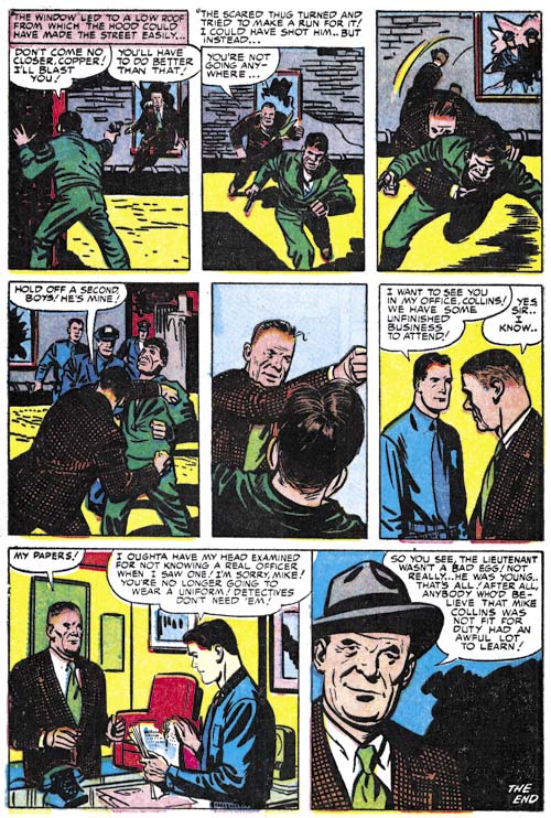
Justice Traps the Guilty #68 (November 1954) “Not Fit for Duty” page 6, art by Marvin Stein
I admit that I am searching for a word to use for describing a technique Stein frequently uses. For now I will use choreography for the way that Stein would sometimes arrange panels into a short time interval sequence, but I admit it is not the best term for my purpose. But note how in the first five panels shows the policeman’s capture of a thug. Not only does each panel only advance the time by a small amount but look how Marvin brings the action closer and closer to the reader.
I have mentioned Stein’s blunt brush but look how masterfully he has captured the older cop in the last panel!
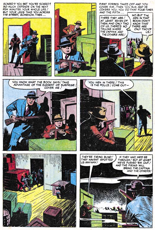
Justice Traps the Guilty #84 (December 1956) “Stakeout” page 3, art by Marvin Stein
Another choreographed sequence occupies the entire page although perhaps not as successful as the previous example. This might have been at least in part due to the Comic Code’s restriction on the depiction of violence. The more distant viewpoints may have satisfied the Comic Code but the also lessened the impact.
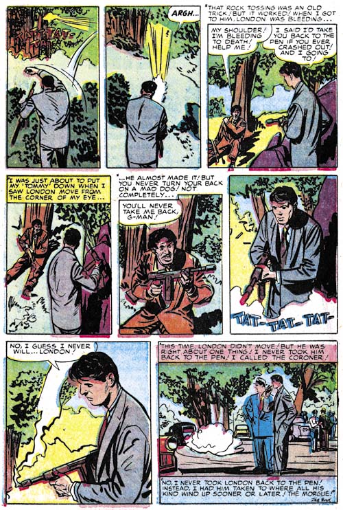
Justice Traps the Guilty #70 (January 1955) “Feud” page 8, art by Marvin Stein
Here is another choreographed sequence that is still successful despite the Comic Code. By keeping the thug outside of the viewpoint we do not actually see the results of the cop’s use of his machine gun but there can be little doubt about it’s effectiveness.
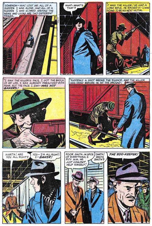
Justice Traps the Guilty #75 (June 1955) “Tragic Circle” page 7
A final example of a choreographed sequence by Stein. But again ruined by the Comic Code. Any child could see gun fights by gangsters or cowboys on the television and in the movies but for some reason the Comic Code had to protect them from seeing someone being struck by a bullet. Without the accompanying text the reader would be left perplexed by the killer’s sudden collapse.
Despite the Comic Code this is still a great page. Further it is a good example of the way Stein often used blacks to enhance the story. While not realistic in the technical sense of the word, the eye isolated in the killer’s shadowed half of the face seems appropriate as he takes aim (panel 4). Even the industrial ceiling adds interest to the images.
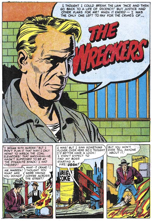
Justice Traps the Guilty #53 (v.6, n.11) August 1953 “The Wreckers”, art by Marvin Stein
Some of Stein’s more simpler splashes are actually very strong. Here we have nothing more than a talking head and a simple background. But the person’s clothing and the bars on the window indicate we are being addressed to by a prisoner. Once again Marvin is using a rather blunt brush but notice how masterly he handles the nuances that make this portrait so successful. Here also is an example of Stein’s use of a negative shadow. In fact much of the interest of this head shot is generated by this deceptively simple device. The colorist makes it even better by giving the farther portions of the face a purple color showing one of the two light sources as being more powerful than the other. Typically Marvin makes the depth of the head too shallow but far from detracting from the image this makes it all the more expressive. The lack of a good distinction between the eyebrow and the associated shadows is another of Stein’s mannerisms one that sometimes even appears when he inks Jack Kirby’s pencils.
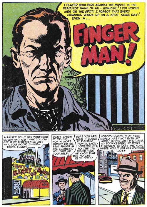
Headline #60 (July 1953) “Finger Man”, art by Marvin Stein
Here Marvin Stein provides an even more stripped down version of a prisoner in a confessional splash. The image may be simpler but with nothing lost in it’s impact. In fact I believe this is perhaps the best portrayal of a criminal by a comic book artists I have ever seen. The reader has no doubt that he is being addressed to by a hardened individual. An important contributor to the effect of this image is the strong negative highlights. No longer delegated to one side, here the shadow traces a path down the center of the face.
Before closing I should mention the influence of Jack Kirby on Marvin Stein. I am not that familiar with Stein’s earlier career but he seemed to have had 5 to 7 years experience when he arrived at the Simon and Kirby studio. Marvin was one of the few artists that actually worked in the studio (at least for a period) and the presence there of comic book greats Jack Kirby and Mort Meskin had to have made an impression on him. His artwork certainly seemed to blossom over a relatively short time. Kirby seemed to have the greatest influence on Stein. It does not seem an accident that Stein’s use of point of view, carefully sequenced panels, and action became so important to his art. These same qualities can be found in Kirby’s own work. However Stein is not a Kirby imitator; he developed his own drawing style and methods for graphically telling stories. Still from time to time some have claimed that Kirby provided layouts for some of Stein’s work. I even succumbed to that error (It’s a Crime, The Master and His Protégé). The problem with this claim of Kirby layouts is that Stein’s work consistently shows the same characteristics throughout his career. If Kirby was helping this would have to have been for everything Stein did including work done after the Simon and Kirby studio had broken up. In addition Stein’s art included elements for handling action was generally quite distinctive from Kirby’s. I think we can safely dismiss all claims of significant Kirby help except for his roll as a mentor.
Marvin Stein is one of those forgotten comic book artists. When remembered at all it is for his being one of Jack Kirby’s inkers. Partly this is because Marvin Stein’s work was largely for two titles for Prize, a small publisher (Headline and Justice Traps the Guilty). But Stein did work on other Prize titles and for other publishers as well including Atlas. I think another reasons for his neglect among comic fans was the distortions his figures often exhibit. From certain views his heads seem too shallow. When using a high viewpoint his heads have a distortion that is hard to describe but so typical of Stein. These distortions were not so visible in Marvin’s earlier work and seemed to become more pronounced over the years. But I do not considered academic accuracy a requirement for comic book art, quite the contrary. I have come to appreciate Stein’s distortions and the expressionistic quality they gave to his art. I will say that while Marvin’s drawing style worked well with the crime and western genre it seemed a poor match for romance stories. The final factor in the decline of Stein’s reputation was his inking. Stein’s inking looks deceptively simple. It certainly does not offer much for those that are fans of detailed and intricate art work. However I hope that some of the examples I have provided in this post will show that his brushwork was capable of great subtleties. While some have claimed Stein’s work looks rushed I think a more accurate description would be economical. Stein carefully provided the essentials for the story and left out that which he considered extraneous. It is an approach that I admire.


Interesting post. I gather from the presence of some of his work in a recent auction that Stein has passed away. Do you know what happened with him in terms of his later career?
Marvin Stein passed away last February. I was quite surprised about some of the items in the auction since I was pretty ignorant of Stein’s later career. Here is an outline of it taken from Who’s Who:
1958-61 Cellomatic
1961-62/64-65 Batton, Barton, Durstine and Osborn
1963 Steve Cabnyon asst pen&ink
1965-68 McGurk’s Mob
1967 Archie
1967 Wham-0 Manufacturing
1968-69 layout Spider-man cartoon
1971-89 Barnell Loft
1972 Twilight Zone comic
1979 Ad agencies
Cellomatic was a company that created broadcast graphics for television news programs. He also worked in animation, I believe for Hanna Barbera and also with Ralph Bakshi. When he retired he never drew again, preferring to golf.
Forgot to add: Great post Harry, as usual.
Oh, one more thing: What were the issue numbers of Headline and Justice Traps the Guilty after S&K left those titles, and was Stein in charge?
I do not know precisely when S&K stopped producing the crime titles. But I feel a good guess would be when the last Kirby drawn material (covers) appeared. This was Headline #45 (January 1951) and JTTG #23 (February 1951). As for who was in charge, all I have to go by are the annual postal statements that list the editor as:
Headline:
1951 – Nevin Fiddler
1952 – Norman Wexler
1953 – Joe Genalo
1954 – Joe Genalo
1955 – Joe Genalo
JTTG:
1951 – Nevin Fiddler
1952 – Norman Wexler
1953 – Joe Genalo
1954 – Joe Genalo
1955 – Joe Genalo
1956 – Joe Genalo
1957 – Joe Simon & Jack Kirby
1957 – Joe Genalo
1958 – Joe Simon & Jack Kirby
1957 was odd because there were two postal statments. I believe that S&K were listed as editor was an error so they released a second to correct it. The 1958 entry may have been an error as well but one where the title was cancelled before it could be corrected.
May I add my compliments as well. Great stuff.