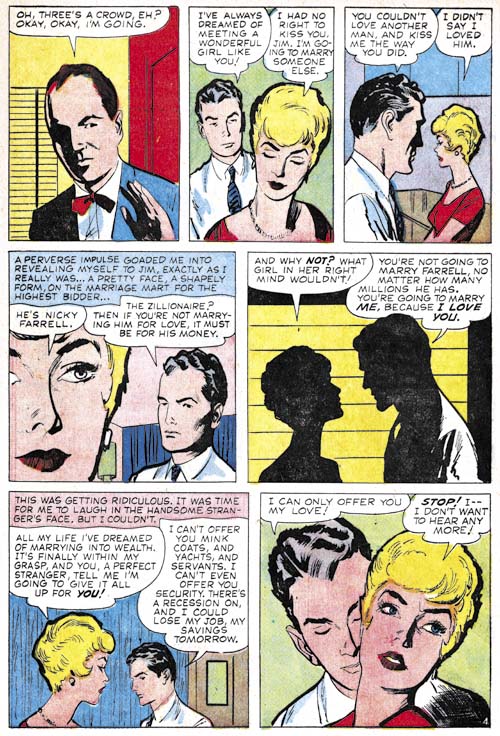
Tag Archives: dick briefer

In the Beginning, Chapter 4, Red Raven #1

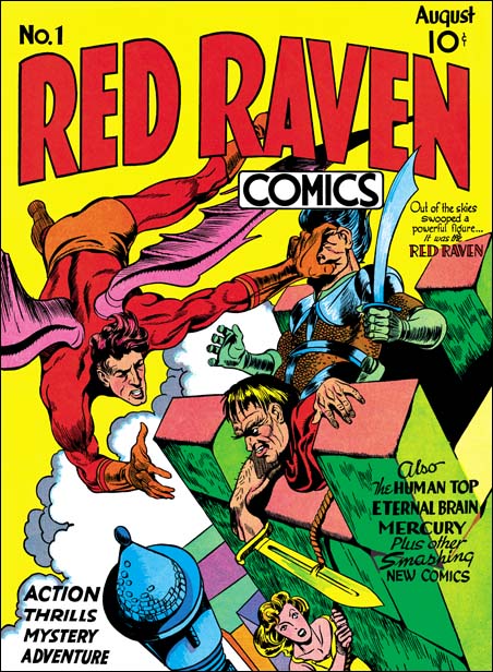
Red Raven #1 (August 1940), pencils by Jack Kirby, layouts, inks and letters by Joe Simon

It is not surprising that Joe Simon became Timely’s first comic book editor in August 1940 (cover date, the calendar date would be around February or March). After all he had been working with that title for Fox Comics so he certainly had the credentials. Fox was a small publisher that had recently started up with an output limited to comic books while Timely was a larger outfit with a variety of publication formats who wanted to take control of and expand their comic book line. Just the place to provide better opportunities and probably a financial boast as well. What is surprising is that at that same time Simon managed to get Timely to release a new comic book title, the Red Raven.

The cover was penciled by Jack Kirby however the layouts were probably provided by Joe Simon. This conclusion is supported by a cover with a similar theme that Joe did for Science Comics #5 (June 1940). Further the Red Raven #1 cover has an unusual perspective. Simon had used similar unusual and distorted perspectives for the covers for Science Comics #5 and Blue Beetle Comics #3 (July 1940) (for both see Art by Joe Simon, Chapter 3, Working for the Fox). While previously Kirby had not done anything similar. The Red Raven covers is a swipe from Hal Foster’s Prince Valiant (Jack Kirby, Fanboy) which both Joe and Jack followed.
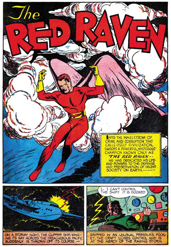
Red Raven #1 (August 1940) “The Red Raven”, pencils by Louis Casenueve

The artists that have been identified with work in Red Raven #1 did not seem to have previously worked for Timely. This is not surprising because before Joe Simon’s arrival as editor Timely comic books were put together by Funnies Inc. run by Lloyd Jacquet. Joe was expected to create a comic art bullpen for Timely and therefore would likely use artist not affiliated with the Funnies shop. The choice of the artist, Louis Casenueve, to draw the feature story is a bit surprising. Did Joe think Casenueve was a better artist than Jack Kirby? I doubt it. In “The Comic Book Makers” Joe tells how Kirby did not immediately follow him to Timely but instead continued at Fox. Joe said it took three months for Kirby to come to Timely however the evidence seems to indicate otherwise. The last Blue Beetle strip that Kirby did for Fox was published on March 9, 1940. Syndication strips are usually created only a week or so before publication. Comic books however have a longer period between creation and release. Further the cover date is actually advanced to indicate when it might be removed from the newsstands. All together the cover date is expected to be dated five to six months after the work began. This means that the first comic books that Jack would work on after Fox would be cover dated August or September. I therefore believe that Joe was correct about Jack staying at Fox but not a few months but instead a couple of weeks or so. Therefore when Joe started working on Red Raven #1 Jack may still have been working at Fox and available only on a moonlighting basis. Simon may have assigned the feature story to another artist and by the time Kirby transferred to Timely it was too late to change artists.

Red Raven #1 (August 1940) “The Red Raven”, letters by unidentified letterer

The lettering for “The Red Raven” feature story uses the same double line border for captions as had been seen in the Blue Bolt #3 story that appeared the same month. As mentioned previously, some have stated that this was trait that was characteristic for Howard Ferguson.
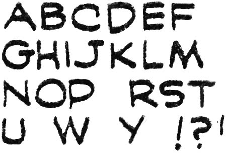
Prize Comics #7 (December 1940) “The Black Owl” letters by Howard Ferguson

However I do not believe Ferguson lettered “The Red Raven”. Above is an early but very typical example of Ferguson’s lettering. Note the differences between the two in the letters ‘G’, ‘K’ and ‘Y’. The letterer for Red Raven also had an unusual ‘E’ with unequal arm lengths. There is a bit of variation but generally the shortest is the upper arm and the longest the middle one. I have to caution that the earliest lettering that I do attribute to Ferguson differs from the Black Owl example that I have provided. For instance it lacks the small vertical stroke on the letter ‘C’ that was characteristic of Ferguson. I will provide examples when I return to this subject in a future chapter.
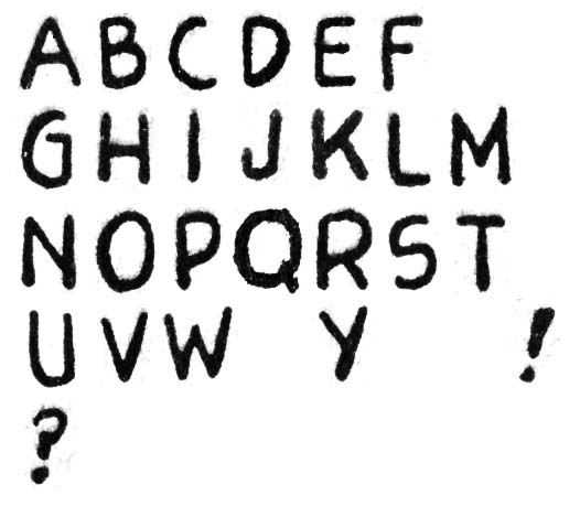
Blue Bolt #3 (August 1940) letters by unidentified letter

I repeat above the lettering for Blue Bolt #3. Note the differences between ‘G’, ‘J’, ‘M’, ‘W’ and ‘Y’. Since there were both published the same months these certainly were done by different letterers.

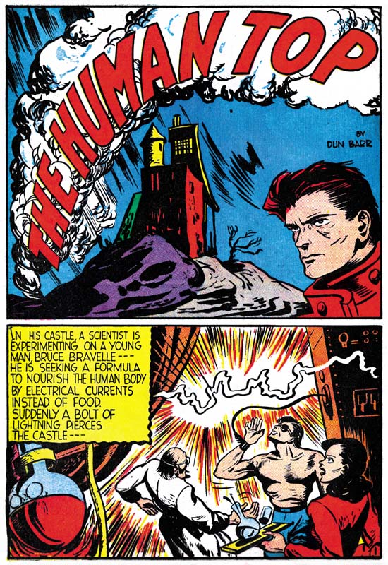
Red Raven #1 (August 1940) “The Human Top”, pencils and inks by Dick Briefer

Dick Briefer had previously worked at the Iger and Eisner shop (Jumbo Comics) at the same time as Jack Kirby so perhaps that was the association that gave him the opportunity to be included in this comic. In a few months Briefer would create his first Frankenstein story (Prize Comics #7, December 1940, The Early Frankenstein of Dick Briefer) so this story gives a view of his style before Dick began his more cartoon-like approach began. The lettering for “The Human Top” is unlike that found in any of the other stories included in Red Raven so perhaps it was lettered by Briefer himself. Briefer provided initials on the last page of the story.
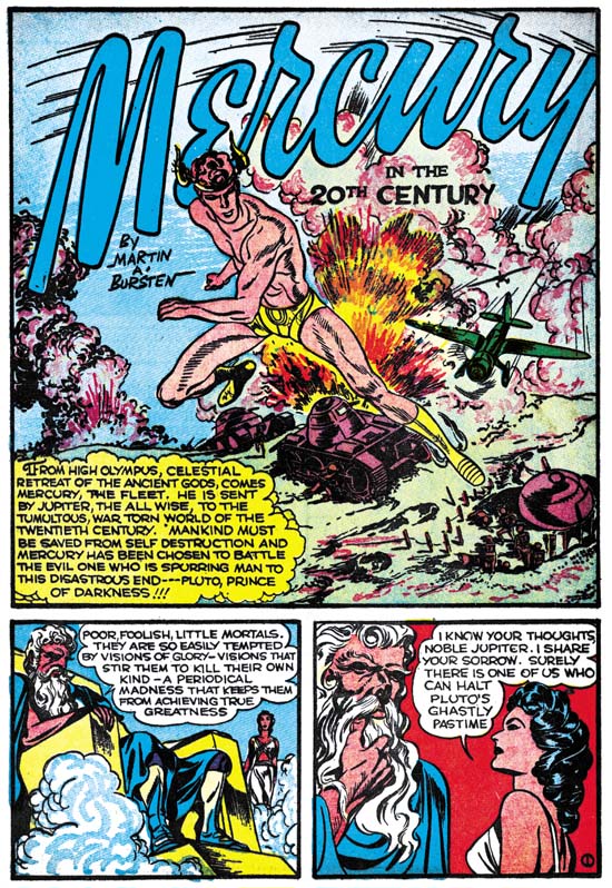
Red Raven #1 (August 1940) “Mercury in the 20th Century”, pencils, inks and letters by Jack Kirby

Jack Kirby did two stories for Red Raven #1. The first, “Mercury in the 20th Century”, was an early example of a mythological theme. Kirby would return to the use of mythology frequently in the future. The story was written by Martin Bursten (the correct spelling should have been Burstein). It is unclear how closely Kirby followed Burstein’s script as in later years Simon and Kirby often altered scripts that they drew. Certainly Kirby had the opportunity since not only did he do the pencils but he also did the lettering. The inking on the first page appears to be Kirby’s as well but the rest of the story looks like it was inked by another artist). I believe the other inker was Joe Simon. If my inking attribution is correct this would be the first story drawn by Kirby and inked by Simon. Simon inked Kirby’s pages for Blue Bolt #3 but Jack only contributed three pages to that story. Together they seem to mark a change in the working relationship between Joe and Jack. Probably not yet a full partnership but different than the relationship between an editor and an artist.
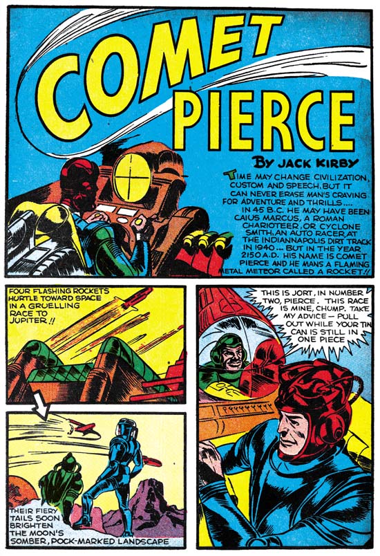
Red Raven #1 (August 1940) “Comet Pierce”, pencils, inks and letters by Jack Kirby

Kirby also drew “Comet Pierce” which was the first piece to bear the Jack Kirby name. This story’s science fiction theme is so similar to others that Kirby had previously done that the suggestion is that he was involved in either the plotting or the writing of the script. The inking is consistent throughout the story and I am pretty certain that it was inked by Kirby himself. Jack also provided the lettering.

The question is should “Comet Pierce” be considered Simon and Kirby creation. There is no way that this can be answered with any certainty. Joe Simon was the editor of the comic and therefore likely provided some input to the story as well as those done by other artists. However so far I can find no definitive evidence that Joe’s involvement in “Cosmic Carson” was any different from that of any editor. So while Joe and Jack were working together I do not consider this a Simon and Kirby story.

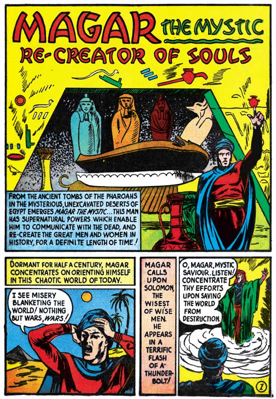
Red Raven #1 (August 1940) Magar the Mystic, “Re-Creator of Souls”, art by unidentified artist

The lettering for each story in Red Raven seems different and the Magar the Mystic story is no exception. I suspect that most if not all the stories were lettered by the same artist who drew it. This was not that unusual during these early days of the comic book industry and Joe Simon had just arrived at Timely and likely had just begun putting an artist bullpen together. Perhaps the Red Raven story is an exception as the lettering seems more professional than the rest of the stories.

Red Raven #1 (August 1940) “Eternal Brain”, art by Robert Louis Golden

Robert Louis Golden initialed the last page but in later years he seemed to have dropped using Robert. Golden was another former Iger and Eisner studio artist and therefore perhaps another Kirby connection. Golden would do a few stories for Simon and Kirby in 1948 (Its A Crime Chapter 7 and Chapter 8). His drawing style for the Eternal Brain story agrees very well with a Captain Aero story he did a couple of years later (The Captain Aero Connections).

The Golden Age of Captain America, Crime Fighter

Unfortunately I do not have access to any of the Captain America Comics from immediately after the war ended. It would be interesting to see how Timely handled the transition to peace. Did they use up stories about Axis spies even after the war had ended? Or did they trash the outdated stories and create new ones? Or rework them to seem new? With the war over Captain America might seem a hero without suitable foes. Actually the post-war period was a difficult time for all superheroes, not just the patriotic ones. But Cap problems really began during the war. Captain America Comics became a bi-monthly with issue #42 (October 1944), a clear indication of diminished sales. Because Cap never was a true Super Soldier, the transition from spy smasher to crime fighter really was not that great.


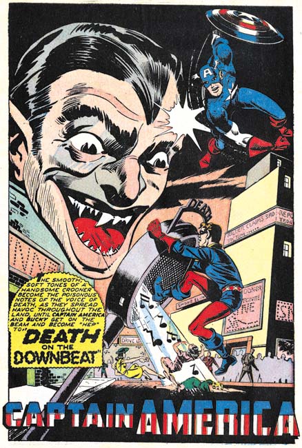
Captain America #57 (July 1946), “Death on the Downbeat”, pencils by an unidentified artist

Identification of the artists working on Captain America is a greater problem in this chapter compared to previous ones. There is not a single artist signature from Captain America #57 on. (Such a complete absence of signatures surely was a policy decision.) The way inking was handled seems to have changed. Previously the same inker would be used on a particular penciller. It appears that Al Avison was generally inked by Syd Shores and when Syd Shores became a penciller he was inked by Vince Alascia. While I have not been able to identify the other Cap pencillers they seemed to be finished by the same unidentified inkers. However after the war it seems that the inker used for a particular penciller could vary. Another problem is that the quality of the art had become more variable. None of the art produced after the war ended seems to have the attention to detail that previously was found.

The GCD lists Al Avison as the artist for “Death on the Downbeat”. There really is nothing by Avison that seems comparable. Certainly his earlier Captain America art was done in a very different style. But that may not be a sufficient criteria since some artists returned from the war with a changed style. Some art by Avison was appearing in some Harvey titles at this time so he was back working as a comic book artists. I have not seen Avison’s Harvey work from this same time but a story done a year later is in a very different style. Although without some uncertainty my opinion this was not done by Al Avison. The boots that Cap and Bucky wear lack flaring and so I am sure this was not done by Syd Shores either. Whoever the artist was he did a real nice job. Look at the great handling of Cap in an unusual perspective although it is always possible this was swiped.


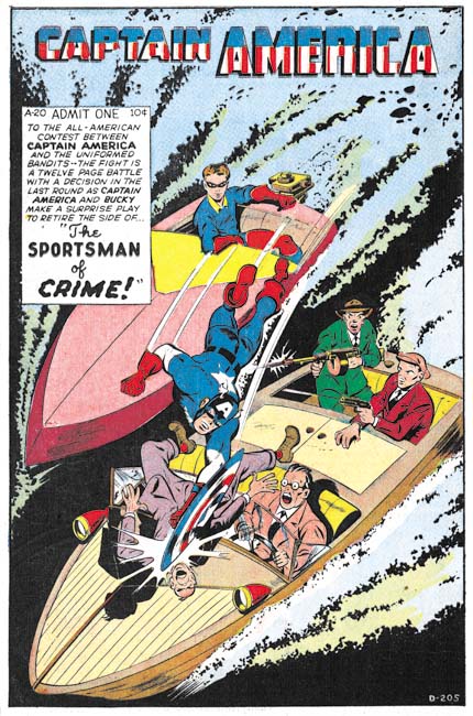
Captain America #58 (September 1946), “The Sportsman of Crime”, pencils by Dick Briefer?, D-205

GCD also lists Al Avison as the artist for “The Sportsman of Crime”. The thugs in the splash seem consistent with Avison’s style. However Cap’s figure is much more robust that I have seen Avison use. The rest of the story art is even further removed from Avison’s style. It does remind me of another artist’s work and here I am really going out on a limb but I think it may be Dick Briefer. Briefer was doing Frankenstein and an occasional Prize Comics Western piece for Prize Comics in a much more simpler and cartoon-like style so this attribution might seem a bit far fetch. However Dick used a more realistic style both earlier and later in his career. The Human Top story Briefer did for Red Raven Comics #1 (August 1940) is actually a fairly good match for “The Sportsman of Crime” despite the years that separate the two works. Unfortunately I have not seen anything by Briefer in a more realistic style from this period to compare with so I consider my attribution to Briefer as very tentative. Since this is a blog I prefer to voice my latest opinions even though there is a good chance that I may change my mind in the future.


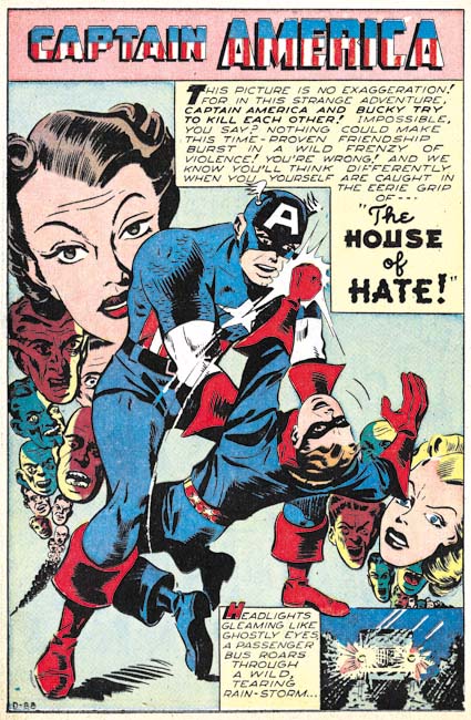
Captain America #58 (September 1946), “The House of Hate”, pencils by an unidentified artist, D-88

I have no idea who the artist might have been for “The House of Hate” and frankly he is not one of the better artists used in Captain America. But I use it here as a segue into a short discussion of job numbers. Job numbers were not used for Timely art during the war years but become prevalent afterwards. During the period covered in this chapter there is only a single story without a job number somewhere in the splash. There really is nothing that can be said with any certainty about the significance of the job numbers other than they obviously were used to help keep track of the work. Other than that we are left with deductions based on the occurrence of the job numbers themselves.

The best discussions of job numbers can be found in Tom Lammers’ “Tales of the Implosion”. Lammers has observed that there are three periods; at first job numbers had a prefix (D, R, SL and others), by 1948 the job numbers were without prefixes, and finally starting in 1952 prefixes returned. But there is a difference between the two prefix periods. During the final period prefixes seemed to be reintroduced as a method to simplify overlong job numbers. As the job number for a given prefix became too large a new letter (generally the next letter in the alphabet) was chosen and the numbering restarted. Thus generally there would be no long periods of concurrent use of two or more different prefixes.

In the earlier period prefixes were used concurrently. The prefixes found in the Captain America Comics covered in this chapter are ‘D’, ‘R’ and ‘SL’. Within each prefix series the numbers generally increase with time but not with any great consistence. For instance issue #58 has one Cap story with the job number D-88 and the other D-205. The numbers for prefixes ‘D’ and ‘R’ were lower and seemed to progress slower than those for ‘SL’. The ‘R’ job numbers appear only in the Human Torch stories that appeared in each issue of Captain America Comics and only one Human Torch story has a ‘SL’ prefix. With two exception the Captain America stories all have ‘D’ or ‘SL’ job numbers. One exception was one without any job number and another with a job number without a prefix. The prefix-less job number is in the same numerical range as some of the ‘SL’ job numbers so I suspect the ‘SL’ was just inadvertently left off.

So what does it all mean? Well it seems likely that ‘SL’ has some connection to Stan Lee. But what connection? My interpretation is that the prefix has some editorial connotation. ‘SL’ job numbers were used for stories that Stan Lee was the editor while the ‘D’ and ‘R’ were for stories handled by another editor. Now that interpretation is nothing more than a working hypothesis but if it is true may help in winnowing out the stories that could have been written by Stan Lee. Not that an ‘SL’ job number means that Lee wrote the story but rather any story with a ‘D’ or ‘R’ prefix number would probably not have been written by Stan.


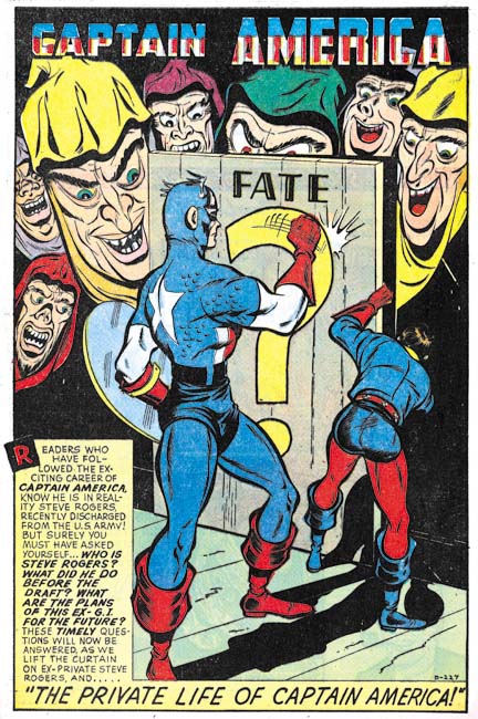
Captain America #59 (November 1946), “The Private Life of Captain America”, pencils by Dick Briefer?, D-227

Captain America #59 marked a special occasion as it formally brought Captain America into the post-war period. Previously Cap’s alter ego, Steve Rogers, was a private in the army. With the war over he now became a teacher and Bucky became his ward and pupil. With his spy-smashing days behind him (or at least for now) Roger’s life as a civilian simplified his new crime fighting career.

Issue #59 also provided the first editorial credits that have appeared in Captain America Comics for some time. Stan Lee was the Editorial and Art Director, Syd Shores the Art Associate and Al Sulman the Editor. I do not know if this marked the first Cap issue since Stan Lee returned from the military but it is suggestive that previous Captain America issues lacked ‘SL’ job numbers.


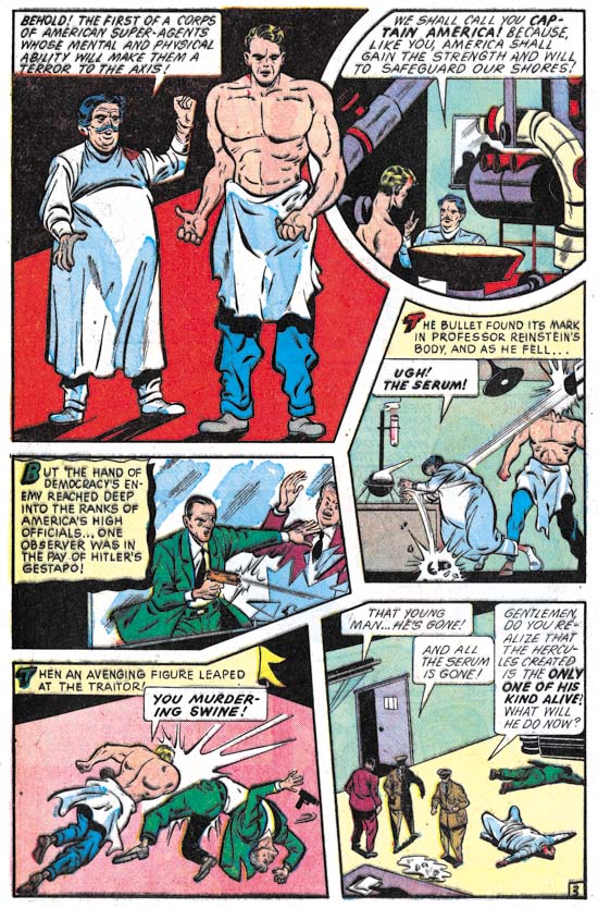
Captain America #59 (November 1946), “The Private Life of Captain America” page 3, pencils by Dick Briefer?

“The Private Life of Captain America” also includes a retelling of Captain America’s origin story. I believe this is the first time Cap’s origin has been told since his creation in March 1941. The story follows the original one close enough that I suspect the artist and writers were using a copy of Captain America Comics #1 as a reference.


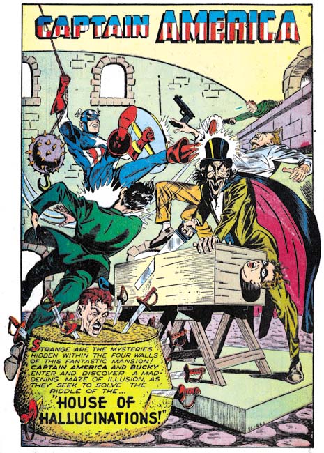
Captain America #59 (November 1946), “House of Hallucinations”, pencils by Syd Shore, SL-663

“House of Hallucinations” matches Syd Shore’s style so well that a signature really is not required to provide him credit. With all the fine inking I wonder if Shores was inking himself as well. It is a great splash with lots of action going on.


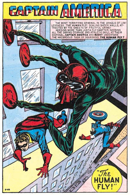
Captain America #60 (January 1947), “The Human Fly”, pencils by Syd Shores?, D-163

It seems so obvious today that if you are going to have a superhero you should also have super-villains for him to combat. But this simple concept was not followed very often during the golden age. Most of Captain America’s foes were nothing more than spies or criminals. Some might put on a costume but otherwise they were just normal people. The Human Fly of this story is an example of a proper super-villain. Not only does he have a costume and a secret identity but he has special gear that allows him to walk up walls (he was not bitten by a radioactive fly).

I like this splash but there are lots of problems with the perspective. The Human Fly’s foot and hand gear does not sit properly on the building’s side, the perspective of the upper part of the building is at odds with the lower part, and Captain America is precariously placed on the ledge (although that might have been intentional). But the odd perspective used in portraying the Human Fly and Bucky seemed handled rather well. This is all not surprising if my attribution of this piece to Syd Shores is correct. Shores did a better job handling perspective than most golden age artists but he still had problems with it.


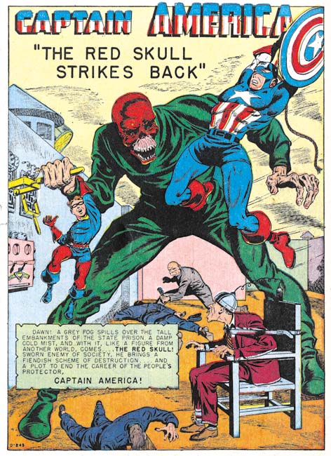
Captain America #61 (March 1947), “The Red Skull Strikes Back”, pencils by Syd Shores?, D-243

The Red Skull was Captain America’s arch nemesis during the period he battled Axis spies and saboteurs. The reader may be forgiven for thinking that the Red Skull would have been dropped now that the war was over. But of course he was much too impressive a villain to retire. No explanation was given on why he was back and had become just another criminal mastermind. Captain America in the splash is a mirror image swipe from the cover to Captain America #7 (see Genesis of a Cover, Captain America #105). Not a close or mechanical copy but a swipe nonetheless. Such swiping is unusual in either Captain America Comics or art by Syd Shores.


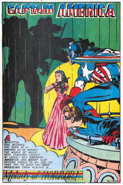
Captain America #62 (May 1947), “Melody of Horror”, pencils by Syd Shores, SL-1394

I do not believe all the Captain America art from this period was done by Syd Shores but it does seem that all the interesting art was. The splash for “Melody of Horror” is simply a great compositions. Only the villain shadow is shown which make him all the more mysterious and threatening. The unusual posses of Cap and Bucky are handled very well. The lady violinist, the center of all the attentions, seems sufficiently endangered. What more can you ask from a splash?


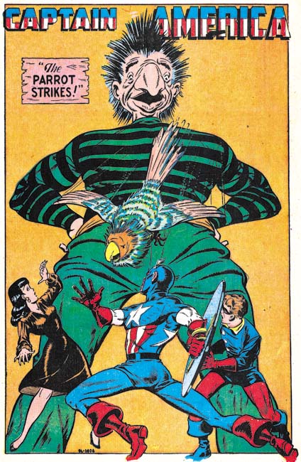
Captain America #63 (July 1947), “The Parrot Strikes”, pencils by Syd Shores, SL-1406

Is it just me or are some of the villains just lame. I mean how dangerous could a bad guy called the Parrot be? How threatening could a big nose be? This splash reflects Shores often penchant for symmetrical and triangular compositions. The one saving grace is the very dynamic pose that Shores has given Captain America.


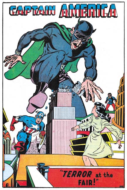
Captain America #64 (October 1947), “Terror at the Fair”, pencils by Syd Shores, 1445

Another triangular and somewhat symmetrical compositions. But in this case the villains’ dramatic stomp saves the day. It helps that the villain wears a costume. He may not have had true super-powers but at least he was no ordinary criminal.


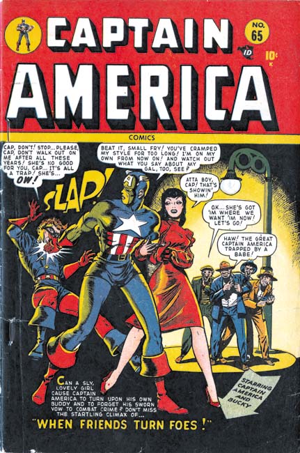
Captain America #65 (January 1948), pencils by Syd Shores

For these posts I have concentrated on the stories and not the cover art. During the war many of the covers were done by Alex Schomberg. Schomberg was a great artist but his covers generally had nothing to do with the comic book’s contents. But the cover for Captain America #65 actually does a better job of indicating the theme of story “When Friends Turn Foes” than the splash does. Horrors, a woman has come between Captain America and Bucky. Say it ain’t so! Well of course it ain’t so. But it appears that Timely was thinking about Captain America and his partnership with Bucky which would lead to dramatic changes that began in the next issue. It is also a good place to end this post but next week I hope to discuss what I believe are some of the most interesting Captain America comics since Simon and Kirby left Timely.

Interesting Dick Briefer Work

I am rather busy and have little time for exploring the Internet, but there are some blogs that I try to periodically check out. Booksteve’s Library is one of them and there I recently found the post Rare Dick Briefer Non-Comics Art-1942. Booksteve inserts a You Tube video of Rumpelstiltskin as performed in the Playette Theatre. The Playette Theatre was the invention of Larry Wise and Dick Briefer. It is a little toy theater in which illustrations can be inserted. The illustrations were done by Briefer and they are just wonderful. They are narrated by Ben Wise (son of one creator and nephew of the other) and although it is not an Academy Award winning performance it makes for an enjoyable experience. Ben Wise has a You Tube page which includes five other Playette Theatre performances. It is so great that Ben Wise has saved these treasures and provided them as videos.

Art of Romance, Chapter 37, Some Surprises

(January – June 1959: Young Romance #98 – #100, All For Love #12 – #14, Personal Love #9 – #11)

Young Romance #98
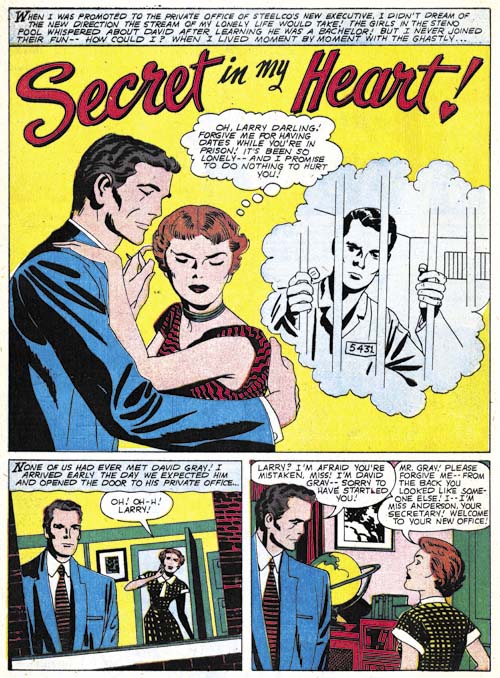
Young Romance #98 (February 1959) “Secret In My Heart”, pencils and inks by Jack Kirby

Kirby provides four stories for two issues of Young Romance (YR #98 and #99). I believe Jack inked three of the stories himself as well as the splash page for the fourth story. It is hard to be sure because some of the old inking techniques such as arched shadows (Inking Glossary) do not show up often. Further the other inker, who I believe was Marvin Stein, was doing a pretty good job matching Kirby’s work.

Note the tilted image in the first story panel. This is a bit unusual for Kirby but then again Jack was always trying something different.

Young Romance #99
Young Romance #99 (April 1959) “Man Wanted” page 2, pencils and inks by Jack Kirby

Above is an example of the great graphical story telling Kirby was doing during this period. Jack’s drawing style has taken on a more abstract quality. Note the eyelids of the woman in the second panel. They really are not natural or realistic but are very expressive nonetheless.

Young Romance #98
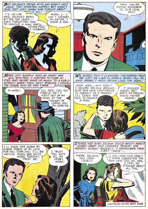
Young Romance #98 (February 1959) “A Husband for My Sister” page 3, pencils by Jack Kirby, inks by Marvin Stein

While I believe the splash page for “A Husband for My Sister” was inked by Kirby himself, the rest of the story does not look like his inking. Perhaps the most obvious difference is the shadow inking found in the first panel of page three. The inker obviously had a poor understanding of the shape of the head. Particularly grievous is the shadow around the eye of the woman. Nor would one expect the man’s lips to catch the light as it does here. I have never seen Kirby do this sort of thing but I have seen Marvin Stein do similar unnatural handling of shadows (“Tragic Circle, JTTG #75, Criminal Artists, Marvin Stein).

Young Romance #99
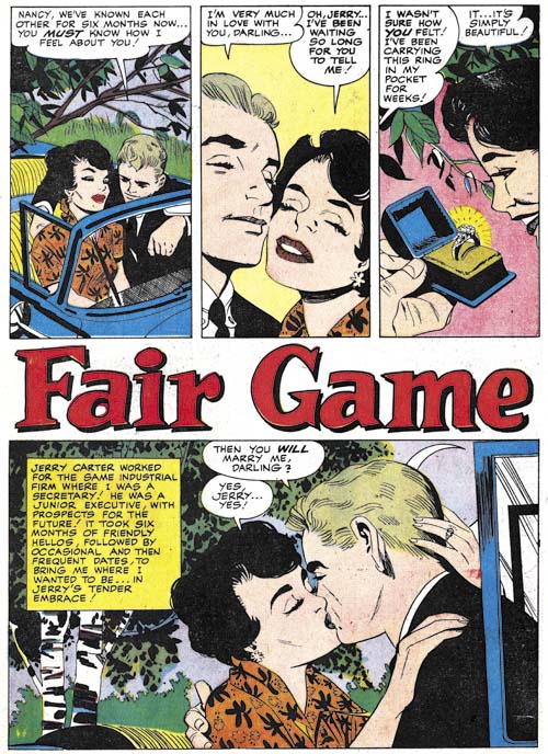
Young Romance #99 (April 1959) “Fair Game”, art by Paul Reinman

Paul Reinman was used often during this period, providing five stories for Young Romance. His abundant appearance in Young Romance and absence from All For Love and Personal Love is another indication that they titles were produced by different editors.

Young Romance #98
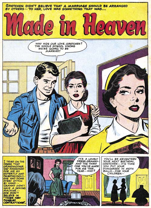
Young Romance #98 (February 1959) “Made in Heaven”, art by John Prentice?

I am not sure what to make of “Made in Heaven”. The art superficially resembles that by John Prentice but is no where nearly nicely drawn as was typical for John. At this time Prentice was primarily working on the syndication strip Rip Kirby but he may also have been doing some work for DC. Was this Prentice quickly dashing something off or was it some other artists copying John’s style? Like I said, I am not sure but I will deffer my opinion until the next chapter when I will have further examples to examine.

All For Love #14
All For Love #14 (June 1959) “Lost Paradise” page 4, pencils and inks by Marvin Stein

Marvin Stein only did a single story during this period. Stein had begun working for Cellomatic in 1958 so presumably his comic book work was done during his spare time. Perhaps this explains his the increasingly looser style that Marvin was using. Still “Lost Paradise” is a graphically well told story.

In the previous chapter I mentioned an unidentified artist who, like Stein, used a rather blunt brush. I wrote that this unknown artist liked to provide very thick outlines in parts. Well it looks like Stein has adopted that style as well. I still believe they are different artists because of the very different manners they drew woman.

Personal Love #10
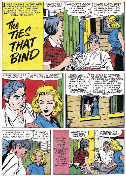
Personal Love #10 (March 1959) “The Ties That Bind”, art by Ted Galindo

Ted Galindo’s attractive work continues to show up frequently in All For Love and Personal Love. Would you call this a splashless story or one with just a reduced size splash? An unusual panel layout for Galindo or any other artist doing work for the Prize romance titles.

Personal Love #11
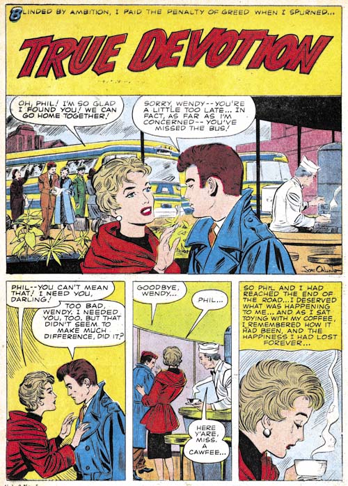
Personal Love #11 (May 1959) “True Devotion”, art by Joe Orlando

I would have saved myself much effort had I noticed before the signature on the splash for “True Devotion”. There as clear as day is Joe Orlando’s full signature. Even the letters J and O are executed in the same manner that he used on cover art for All For Love, Personal Love and Justice Traps the Guilty. No question about it all that cover art was done by Joe. Orlando was no longer providing covers but he was now drawing full stories. Besides “True Devotion” there are two other unsigned stories from this period. Considering the quality of the covers Orlando did, it is not surprising how excellent the story art was.

All For Love #14
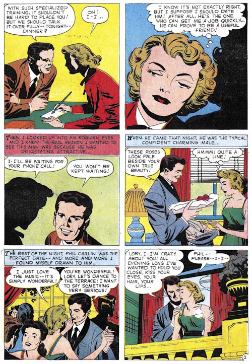
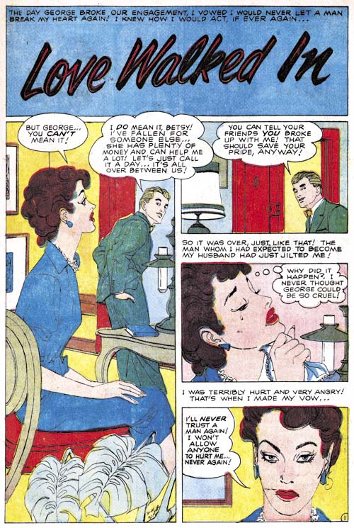
All For Love #14 (June 1959) “Love Walked In”, art by Dick Briefer

Unlike Orlando’s “True Devotion”, I had previously seen the signature on “Love Walked In” but I had misread it. So I was rather surprised when I reviewed it for this post to find the correct reading was clearly Dick Briefer. What a pleasant but unexpected find. A fortunate one as well, I doubt I would have identified Briefer as the artist without the signature. I have never seen romance art by Dick before and he does it surprisingly well. Once you know it was done by Briefer you can pick out some of his traits, particularly Briefer’s love of asymmetry. But the style on a whole is a lot more conservative and realistic than typical Briefer art especially compared to his Frankenstein.

Personal Love #11
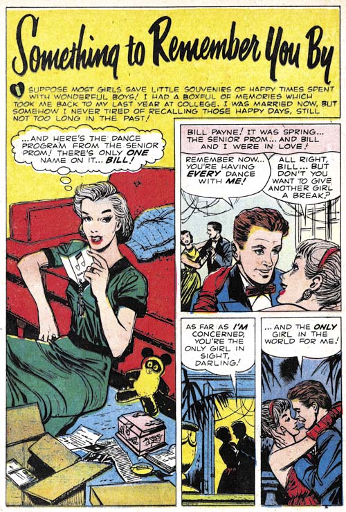
Personal Love #11 (May 1959) “Something To Remember You By” , art by Dick Briefer

Briefer also did two unsigned pieces during the period so I could not resist including another example. I really love what he does with these stories.

I thought Dick had pretty much given up work as a comic book artist after Prize’s Frankenstein was cancelled in 1954 (a casualty of the Comic Code). The GCD only lists reprints for him after that date. “Who’s Who” has him as a non-comics freelancer from 1956 to 1960, followed by advertisement art (1960 – 1972) and fine arts (1962 – 1972). But now we know he did not completely abandon comics.

Chapter 1, A New Genre (YR #1 – #4)
Chapter 2, Early Artists (YR #1 – #4)
Chapter 3, The Field No Longer Their’s Alone (YR #5 – #8)
Chapter 4, An Explosion of Romance (YR #9 – #12, YL #1 – #4)
Chapter 5, New Talent (YR #9 – 12, YL #1 – #4)
Chapter 6, Love on the Range (RWR #1 – #7, WL #1 – #6)
Chapter 7, More Love on the Range (RWR #1 – #7, WL #1 – #6)
Chapter 8, Kirby on the Range? (RWR #1 – #7, WL #1 – #6)
Chapter 9, More Romance (YR #13 – #16, YL #5 – #6)
Chapter 10, The Peak of the Love Glut (YR #17 – #20, YL #7 – #8)
Chapter 11, After the Glut (YR #21 – #23, YL #9 – #10)
Chapter 12, A Smaller Studio (YR #24 – #26, YL #12 – #14)
Chapter 13, Romance Bottoms Out (YR #27 – #29, YL #15 – #17)
Chapter 14, The Third Suspect (YR #30 – #32, YL #18 – #20)
Chapter 15, The Action of Romance (YR #33 – #35, YL #21 – #23)
Chapter 16, Someone Old and Someone New (YR #36 – #38, YL #24 – #26)
Chapter 17, The Assistant (YR #39 – #41, YL #27 – #29)
Chapter 18, Meskin Takes Over (YR #42 – #44, YL #30 – #32)
Chapter 19, More Artists (YR #45 – #47, YL #33 – #35)
Chapter 20, Romance Still Matters (YR #48 – #50, YL #36 – #38, YB #1)
Chapter 21, Roussos Messes Up (YR #51 – #53, YL #39 – #41, YB #2 – 3)
Chapter 22, He’s the Man (YR #54 – #56, YL #42 – #44, YB #4)
Chapter 23, New Ways of Doing Things (YR #57 – #59, YL #45 – #47, YB #5 – #6)
Chapter 24, A New Artist (YR #60 – #62, YL #48 – #50, YB #7 – #8)
Chapter 25, More New Faces (YR #63 – #65, YLe #51 – #53, YB #9 – #11)
Chapter 26, Goodbye Jack (YR #66 – #68, YL #54 – #56, YB #12 – #14)
Chapter 27, The Return of Mort (YR #69 – #71, YL #57 – #59, YB #15 – #17)
Chapter 28, A Glut of Artists (YR #72 – #74, YL #60 – #62, YB #18 & #19, IL #1 & #2)
Chapter 29, Trouble Begins (YR #75 – #77, YL #63 – #65, YB #20 – #22, IL #3 – #5)
Chapter 30, Transition (YR #78 – #80, YL #66 – #68, YBs #23 – #25, IL #6, ILY #7)
Chapter 30, Appendix (YB #23)
Chapter 31, Kirby, Kirby and More Kirby (YR #81 – #82, YL #69 – #70, YB #26 – #27)
Chapter 32, The Kirby Beat Goes On (YR #83 – #84, YL #71 – #72, YB #28 – #29)
Chapter 33, End of an Era (YR #85 – #87, YL #73, YB #30, AFL #1)
Chapter 34, A New Prize Title (YR #88 – #91, AFL #2 – #5, PL #1 – #2)
Chapter 35, Settling In ( YR #92 – #94, AFL #6 – #8, PL #3 – #5)
Appendix, J.O. Is Joe Orlando
Chapter 36, More Kirby (YR #95 – #97, AFL #9 – #11, PL #6 – #8)
Chapter 37, Some Surprises (YR #98 – #100, AFL #12 – #14, PL #9 – #11)
Chapter 38, All Things Must End (YR #101 – #103, AFL #15 – #17, PL #12 – #14)