What information do we collect?
We collect information from you when you register on our site or place an order.
When ordering or registering on our site, as appropriate, you may be asked to enter your: name, e-mail address or mailing address.
What do we use your information for?
Any of the information we collect from you may be used in one of the following ways:
To personalize your experience
(your information helps us to better respond to your individual needs)
To improve our website
(we continually strive to improve our website offerings based on the information and feedback we receive from you)
To improve customer service
(your information helps us to more effectively respond to your customer service requests and support needs)
To process transactions
Your information, whether public or private, will not be sold, exchanged, transferred, or given to any other company for any reason whatsoever, without your consent, other than for the express purpose of delivering the purchased product or service requested.
To administer a contest, promotion, survey or other site feature
To send periodic emails
The email address you provide for order processing, will only be used to send you information and updates pertaining to your order.
How do we protect your information?
We implement a variety of security measures to maintain the safety of your personal information when you place an order or enter, submit, or access your personal information.
We offer the use of a secure server. All supplied sensitive/credit information is transmitted via Secure Socket Layer (SSL) technology and then encrypted into our Payment gateway providers database only to be accessible by those authorized with special access rights to such systems, and are required to?keep the information confidential.
After a transaction, your private information (credit cards, social security numbers, financials, etc.) will not be kept on file for more than 60 days.
Do we use cookies?
Yes (Cookies are small files that a site or its service provider transfers to your computers hard drive through your Web browser (if you allow) that enables the sites or service providers systems to recognize your browser and capture and remember certain information
We use cookies to help us remember and process the items in your shopping cart, understand and save your preferences for future visits, keep track of advertisements and compile aggregate data about site traffic and site interaction so that we can offer better site experiences and tools in the future. We may contract with third-party service providers to assist us in better understanding our site visitors. These service providers are not permitted to use the information collected on our behalf except to help us conduct and improve our business.
If you prefer, you can choose to have your computer warn you each time a cookie is being sent, or you can choose to turn off all cookies via your browser settings. Like most websites, if you turn your cookies off, some of our services may not function properly. However, you can still place orders by contacting customer service.
Google Analytics
We use Google Analytics on our sites for anonymous reporting of site usage and for advertising on the site. If you would like to opt-out of Google Analytics monitoring your behaviour on our sites please use this link (
https://tools.google.com/dlpage/gaoptout/)
Do we disclose any information to outside parties?
We do not sell, trade, or otherwise transfer to outside parties your personally identifiable information. This does not include trusted third parties who assist us in operating our website, conducting our business, or servicing you, so long as those parties agree to keep this information confidential. We may also release your information when we believe release is appropriate to comply with the law, enforce our site policies, or protect ours or others rights, property, or safety. However, non-personally identifiable visitor information may be provided to other parties for marketing, advertising, or other uses.
Registration
The minimum information we need to register you is your name, email address and a password. We will ask you more questions for different services, including sales promotions. Unless we say otherwise, you have to answer all the registration questions.
We may also ask some other, voluntary questions during registration for certain services (for example, professional networks) so we can gain a clearer understanding of who you are. This also allows us to personalise services for you.
To assist us in our marketing, in addition to the data that you provide to us if you register, we may also obtain data from trusted third parties to help us understand what you might be interested in. This ‘profiling’ information is produced from a variety of sources, including publicly available data (such as the electoral roll) or from sources such as surveys and polls where you have given your permission for your data to be shared. You can choose not to have such data shared with the Guardian from these sources by logging into your account and changing the settings in the privacy section.
After you have registered, and with your permission, we may send you emails we think may interest you. Newsletters may be personalised based on what you have been reading on theguardian.com. At any time you can decide not to receive these emails and will be able to ‘unsubscribe’.
Logging in using social networking credentials
If you log-in to our sites using a Facebook log-in, you are granting permission to Facebook to share your user details with us. This will include your name, email address, date of birth and location which will then be used to form a Guardian identity. You can also use your picture from Facebook as part of your profile. This will also allow us and Facebook to share your, networks, user ID and any other information you choose to share according to your Facebook account settings. If you remove the Guardian app from your Facebook settings, we will no longer have access to this information.
If you log-in to our sites using a Google log-in, you grant permission to Google to share your user details with us. This will include your name, email address, date of birth, sex and location which we will then use to form a Guardian identity. You may use your picture from Google as part of your profile. This also allows us to share your networks, user ID and any other information you choose to share according to your Google account settings. If you remove the Guardian from your Google settings, we will no longer have access to this information.
If you log-in to our sites using a twitter log-in, we receive your avatar (the small picture that appears next to your tweets) and twitter username.
Children’s Online Privacy Protection Act Compliance
We are in compliance with the requirements of COPPA (Childrens Online Privacy Protection Act), we do not collect any information from anyone under 13 years of age. Our website, products and services are all directed to people who are at least 13 years old or older.
Updating your personal information
We offer a ‘My details’ page (also known as Dashboard), where you can update your personal information at any time, and change your marketing preferences. You can get to this page from most pages on the site – simply click on the ‘My details’ link at the top of the screen when you are signed in.
Online Privacy Policy Only
This online privacy policy applies only to information collected through our website and not to information collected offline.
Your Consent
By using our site, you consent to our privacy policy.
Changes to our Privacy Policy
If we decide to change our privacy policy, we will post those changes on this page.


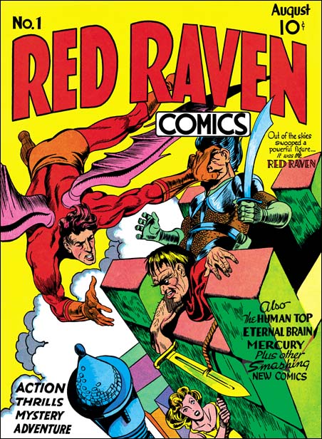
Harry, I’ve always been confused by Kirby being credited on the Red Raven cover. If it is by Kirby it’s one of the worst looking things he ever did.
I’m of the mind it’s a patchwork job representing several different hands.
My guess is Kirby quickly added the Red Raven figure which is awkwardly squeezed into the top of the composition, and reflects the kind of energetic but rushed drawing he was producing under the weight of the heavy workload he’d taken on.
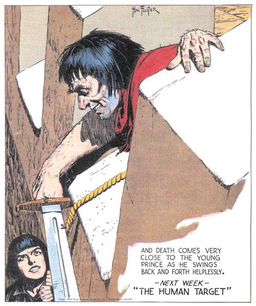
I don’t think the Foster swipe is by Kirby mainly because of how closely it matches the Foster drawing in details like the spread of the fingers. For Kirby to find a reference and then closely copy a fairly straightforward drawing would have taken more time out of his work day than just drawing the figure on his own.
You are correct that just about all comic book artists used swipes, and especially from Foster and Raymond. Kirby did this many times in his early days I’m sure. If you look at the early work of Frank Frazetta on Thunda it’s amazing to find almost ever panel is swiped from Foster’s Tarzan or Prince Valiant. Most of Kirby’s later swipes look like they started off by way of Kirby needing a reference, and ending up adapting the image (say the interior of a Police station) he found.
Patrick,
I can find little in the Red Raven cover that differs from his other early covers. As for saying that Kirby could have not done the swipe because how closely it follows the original just does not fly. Kirby did not do a close or mechanical copy so his stylistic traits still come through in the figure cutting the rope. Further he did similar swiping before, including the police station swiping you mentioned and the famous Foxhole #1 cover (Day at the Beach). I know a lot of Kirby fans want to hold on to the image of a Jack Kirby who did not swipe, but it has been disproven too often.
Jack did occasionally swipe…no question. But I’m not as sure as Harry that the RED RAVEN cover isn’t partially by another penciller.
Harry, To me the figure holding the sword looks like a line for line copy not a typical Kirby swipe. It’s hard for me to believe who ever inked the figure didn’t pencil it as well, to much of the detail in the linework is almost identical to the Foster original.
Areas I notice:
The smile lines next to the mouth.
The cast shadow on the right forearm.
The slavish duplication of the left hand.
The highlighting of the hair.
The hilt and blade of the sword.
About the only difference I notice is the rope in the RR cover is being cut further from the hilt, and the whole composition has been tilted forward, although the angle of the blade is still in the same relationship to the edge of the battlement.
Basically I think this is a very poor composition compared to any of the Captain America covers.
No one can try to argue Kirby didn’t swipe. It’s not a matter of opinion. Kirby did swipe it’s just a fact.
Incidently the Birthday covers you posted: Are they from scans or the older restoration method you previously used? Either way they look great, but I don’t notice any Ben-Day dots on the the one interior page “The Girl Who Tempted Me.”
Hi Harry,
Nice find with the Foster source. The earliest outright swipe I have found by Kirby was in a 1937 Socko the Seadog where he swipes from a Popeye strip from 1934. I first read about the Foster swipe from an early Greg Theakston book or article from the early 90’s I would guess. I wonder if Kirby kept an ongoing reference file? I will say that the hand on the rope cutter and the hairy arm don’t appear Kirbyish to me but not enough to suggest another person assisting on the cover.
I’m with Joe, it is funny nobody had a problem with attributing the Red Raven cover to Kirby until the question of swipes came out. But despite the figure being swiped from Foster, the face still looks to me to be clearly drawn by Kirby. I will say that I do not think it was inked by Jack.
And Pat, don’t compare this cover with Captain America, where Kirby finally got his stuff together in a big way, but with other early covers like Champion #9 and #10.
Gee, I wonder what people are going to say when I do my next chapter of “The Little Shop of Horrors” and show that a later story that everyone credits to Kirby was completely swiped from a Bill Draut story from Black Magic?
As for the Ben-Day dots, they often disappear with the low resolution images that are required for use on the Internet. Pat, I think you have somehow gotten a mistaken idea. I have only used one restoration method for color comics. I had previous used a technique to “digitally bleach” a comic but the end result was line art only, no color.
Harry, At the risk of seeming a pain in the butt…take a look at the exposed ear on the figure swiped from Foster. The visible left ear is the only substantial change to Foster’s drawing. Can you really see Kirby placing an ear where that ear is placed? It’s totally wrong, far to high, and far forward. Is it possible that Kirby didn’t know an ear is attached to a head behind the jaw line? I still think the composition looks constructed from disparate parts, much like the awkward looking Young Allies #1. Champion #9 is well composed in my opinion, USA #1 is another bad looking cover. For me the swipe is irrelevant, everyone swiped. It’s the poor composition that doesn’t look like something either Jack or Joe would do, but rather something that was assembled from parts in great haste.
Beautiful scans, and thanks for the explanation.
Patrick,
Have no fear about being a pain, disagreements are natural in such subjects. But I still do not agree with your approach. It seems based on finding elements that look wrong and then saying Kirby would not do that. Using that approach will result in rejecting much of the early work as being done by Kirby. Jack had a particular problem with ears; making them too large or placing them too far forward. I feel that it, and your objection to how close the swipe is, are circular reasoning. A similar reasoning was once used to discount examples of Kirby swipes entirely attributing them to Simon but in the end that failed when it was shown that Jack swiped during the Marvel years.
I do not question Red Raven being rushed, but I do not think that means Kirby did not do it. I find his touch in every figure of the cover, even in the face of the man swiped from Foster. Every artist can have his bad day so just because something was not well done does not mean the artist did not do it.
I find it surprising that you say Red Raven was a bad composition, Champion #9 a good one, and U.S.A. #1 a bad one. The figure of the Red Raven maybe awkwardly twisted to fit but otherwise, in my opinion, there is nothing wrong with the composition of this cover. On the other hand Champion #9 is just a composition mess, it tries hard but just fails. As for U.S.A. #1, it is one of the worse Simon and Kirby covers but not because of the composition, which makes complete sense, but because of the poor quality of the drawing, perhaps because of the inker.
Thanks for the understanding Harry, and as long as you don’t mind.
First off, the idea that Kirby didn’t use swipes is absurd, anyone who tries to claim the contrary has no credibility.
I think the ear problem on the Foster swipe supports Kirby not being the artist. The figure is a close copy, the only variation is the ear, so the only place where the artist makes a substantial change results in a error I’ve never seen Kirby make. It’s such a glaring error it’s hard to imagine Joe Simon making it either. It isn’t that the ear is to big or poorly drawn. The ear is in front of the jaw line. Take a look at the Champion cover, the ear is attached just behind the jaw line, The same with all the figures on the Captain America covers, The Red Raven figure on the cover in question, I just can’t see Kirby making this kind of basic anatomy error. The jaw line on the swiped figure is completely behind the ear, and it’s not a random wrinkle on the neck, the jaw line come all the way up behind the ear.
I agree I’m using circular reasoning,but I think the circle supports my reasoning.
Kirby used swipes, but didn’t slavishly copy minor details like the exact spread of the fingers on the left hand.
In the one substantially altered part of the figure the artist makes a beginners type error.
Here’s why the Champion cover is well composed in my opinion.
The hero is leading the eye off the page stage left. This would be a serious flaw, but Kirby in typical masterful fashion balances this, leading the eye back towards the right. The gun butt of the Oriental on the right hand edge, and the metal bulk ward on the lower right combine to create a very strong directional arrow. The circular arch, lower left, is also balanced by the raised scimitar of the Oriental on the lower left. That direction is continued on up the left leg of the hero, and then down the extent of the right leg until it meets another directional arrow, created by the legs of the villain in the grasp of the hero. This leads the eye back towards the center again. Far from being a mess this is exactly what an artist strives for in a composition. The eye is lead through the elements of the composition in a circle.
No, I still do not mind, but I still think you are making the same circular argument. And the trouble with circular arguments is that they always work but they do not convince. John Doe never makes errors when drawing anatomy, therefore any drawing that has an anatomy error is not by John Doe. Kirby made all kinds of basic anatomy error, in fact his anatomy was rather poor. Ears placement was a problem with him, especially during these early years. And your claim that Kirby does not copy minor details when swiping does not stand up with the Foxhole #1 and Police Trap cover swipes.
If composition was only about moving the eye around then Champion #9 would be moderately successful cover and Red Raven with its circular eye movement a very successful one. But composition is also about balance and the relative importance of the parts. The Champion #9 cover is a mess, with the most important part of the image off to the viewer’s left running out of the picture and the rest a jumble of conflicting parts. As far as I can recall, these were mistakes that Simon and Kirby would not repeat.
Harry, I’m not trying to convince you, just offering my observations. We’ll just have to forget trying to convince one another and admit we disagree, but like to talk about comics art.
I’ll let it stand as is after these last comments on the Red Raven cover.
I see it as a poor composition because every element of it is tilted towards the left and not one part of it brings the eye back towards the center.
You could literally draw a triangle with strong diagonals from the right hand top and bottom edge meeting in the center of the left hand edge. There is nothing to balance this. Even the tip of the rope cutting sword although pointed back towards the right is part of a much larger diagonal thrust to the left reinforced by the mortar lines of the stone blocks, the angle of the turret, and the right arm of the Red Raven.
At the top of the picture is another strong unbalanced diagonal comprised of a raised sword blade, the top far edge of the battlement, the angled shoulders of the armored figure, and the left leg, arm, and wing of the Red Raven.
I see the Champion cover as a beautiful composition with the kind of complexity seen in the Captain America #7
What is your feeling on the cover of Champion #8? Despite the ubiquitous raygun first seen in Cosmic Carson, It doesn’t look like Kirby to me, but #9 and #10 do.
As to the ear. I’ve looked through everything I have at hand, and can’t find a single example of Kirby having the jawbone joining the cranium behind the ear even going back to his earliest drawings
OK, I’ll shut up on this now, I promise.
Patrick, you don’t have to shut up, I really have no problem with your comments. First let me remark on the ear. You are obviously looking for a particular error because Jack often put his ear in the wrong spot. Personally I do not use errors to discount some attribution, although I will frequently use them to as confirmation. As far as I am concern any artist, even Jack Kirby, can make an error. No artist is perfect and they all are human and human make errors. And with comic book art you can’t even be sure an error was from the penciller, it could have been the inker and I am pretty sure Jack was not the inker on this cover.
While I do not consider Red Raven the best compostion, I am still surprised on your praise for Champion #9. I will not repeat my last comment, but as far as I am concern it is one of Simon and Kirby’s worse compositions. At this moment I cannot thick of a worse one.
Champion #8 was pencilled by Joe Simon.
Hi Guys,
You have to remember that when Prince Valiant premiered, Jack was only nineteen, and he was just fourteen (!) when Fosters color Tarzan run began. To a teenager, Foster and Raymond were gods. What artistic teenager doesn’t cut out and saved their favorite strips (Ive seen Al Williamsons Prince Valiant strip collection)? Swipes were a way of meeting the deadline, and it was a common practice at the time. It is no different than a student painter copying the masters in order to learn from them.
All best wishes,
Brian M. Kane