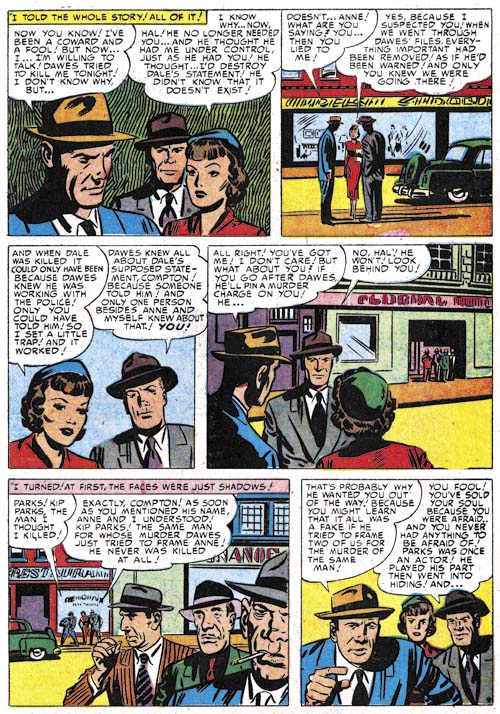
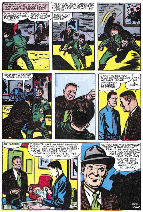
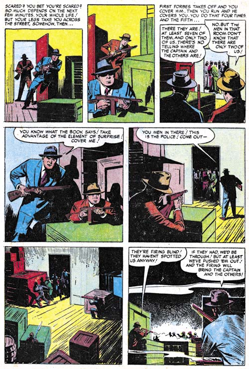
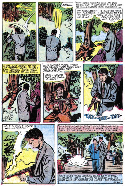
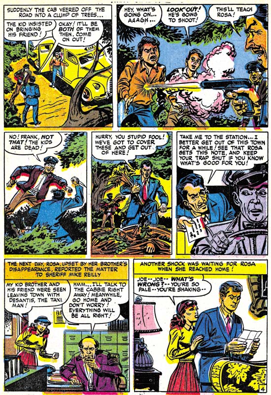
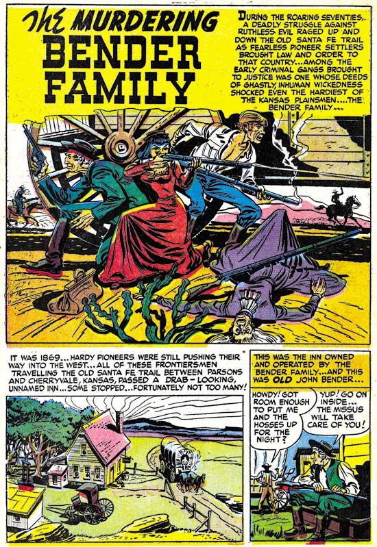
This is the second of my post of the various artists who worked in the Prize crime titles Headline and Justice Traps the Guilty after they were no longer produced by Simon and Kirby. In the previous chapter I wrote about Marvin Stein who was the dominant artist for these crime titles. Now I will review the crime art by Mort Meskin, the second most used artist. Meskin provide art from 1950 to 1955 and while he does not appear in every issue from that timeline he does appear in most. Mort is one of the forgotten masters of the comic book art form. Hopefully Steven Brower’s upcoming book, “From Shadow to Light: The Life and Art of Mort Meskin”, may help to correct this undeserved neglect.
There are a number of reasons to explain Meskin’s neglect by today’s fans. Perhaps the most pressing is the current emphasis on superheroes. Meskin did some great superhero work but it was older work on heroes that no longer play much of a part in modern comics; the Vigilante and Johnny Quick. The original comics are very expensive and little of Meskin’s war time work have been reprinted. Most of today’s fans have never had much of a chance to see Mort’s superhero work. The only superhero work that Meskin penciled for Simon and Kirby was on Captain 3-D and that was never published (Captain 3-D #2 ). Most of Meskin’s art done in the 50’s was for romance. The romance genre is probably the most underrated one for today’s fans. This unfortunate because Mort really showed his skills as a graphic story teller. Those skills, however, were still evident in his work for the Prize crime titles with the additional benefit or more action and drama.
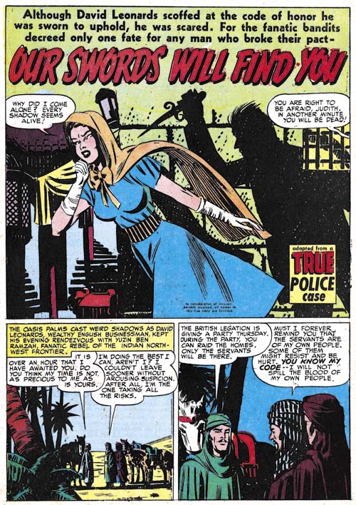
Headline #43 (September 1950), “Our Swords Will Find You”, art by Mort Meskin
Mort Meskin had initially provided work for the Prize crime titles in 1948 but that was in collaboration with Jerry Robinson. Meskin returned to the Simon and Kirby studio by himself in 1950 at which time Simon and Kirby were still producing the crime titles. By this time Simon and Kirby had toned down the violence in the crime titles to a level that would continue even after they stopped producing the titles. Even though the stories lacked the violence found in crime comics by other publishers, they still are enjoyable to read.
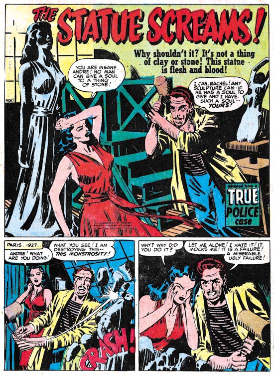
It appears that Meskin did most of the inking of his own pencils for the Prize crime comics (I think this is true for the romance titles as well). In the earlier issues Mort’s inks give the art an overall dark look. Not surprisingly this works out particularly well for night scenes such as in the splash for “Our Swords Will Find You”. Years before the first stalker movies, Meskin provides all the essential elements. A beautiful girl alone in the night pursued by a mysterious knife holding figure which in this case is scene only through the shadow he casts on the wall.
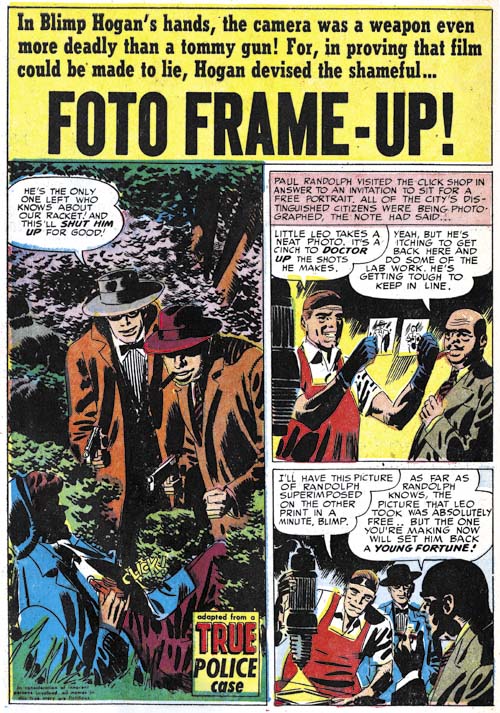
Justice Traps the Guilty #28 (July 1951), “Foto Frame-Up”, art by Mort Meskin
Another example of the darker inking initially used by Meskin for his crime stories. Even though the clothing folds are thick and dark, it can still be seen that they were constructed from long sweeping but narrow brush strokes. This is typical of Meskin inking. However it should be used with caution for inking attribution because unlike Jack Kirby, Mort would include spotting in his pencils. In this case it is accompanied by some other typical Meskin inking techniques. For instance note the way that the shadow on the man’s shoulder has a distinct border strip and is not completed filled with ink but rather formed by thick black strokes separated with narrow spaces.
Here Meskin uses a vertical splash; a format that he seemed particularly fond of. Still most of the time Mort uses a horizontal 2/3 page splash like most of the artists did in Headline and Justice Traps the Guilty. Full page splashes did not appear in the Prize crime comics after Simon and Kirby stopped producing them.
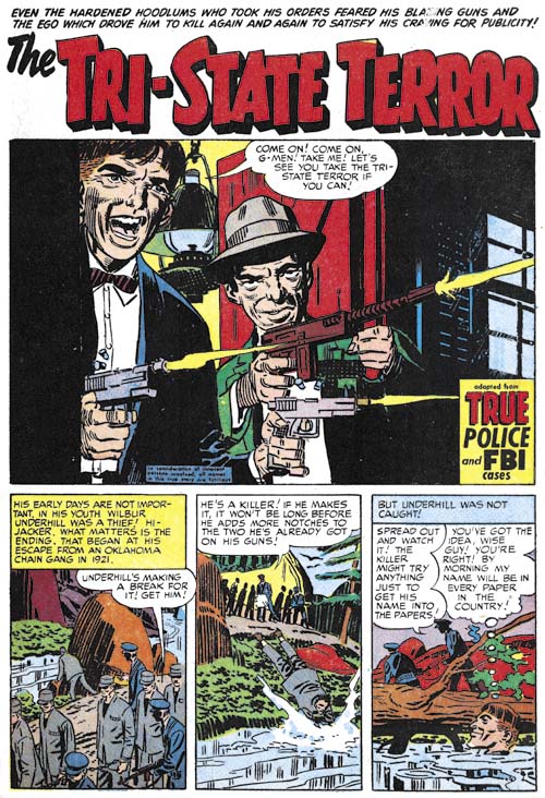
Justice Traps the Guilty #57 (December 1953), “The Tri-State Terror”, art by Mort Meskin
“The Tri-State Terror” is perhaps one of Meskin’s finest splashes from the crime titles. The G-Men are not shown but hopefully are sheltered from the blistering attach by the two criminals. The near distance view highlights the defiance of the one hood and the casual determination of the other. These two seem determined not to be taken. Our focus is concentrated by the careful use of blacks.
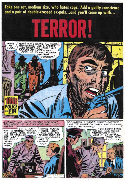
Justice Traps the Guilty #39 (June 1952), “Terror”, art by Mort Meskin
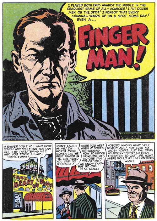
Close-ups did not play as important part of Mort Meskin’s art as they did for artists such as Marvin Stein. Still he did make effective use of this device from time to time. This splash is a good example. This close-up of a fleeing man may seem more stylized than some other artists but it still is a gripping portrait of a man filled with fear. Hiding the faces of his pursuers in shadow makes them mysterious and heightens the effect.
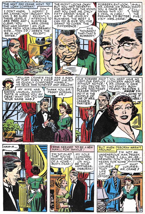
Justice Traps the Guilty #54 (September 1953), “Fatal Mistake” page 3, art by Mort Meskin
The page I selected from “Fatal Mistake” provides another example of Meskin’s use of a close-up. I particularly like the sequence for the top row of panels. Mort goes from a more distant shot, to just the upper body, and then finally just the face while simultaneously rotating the view point. This all plays into the story line that starts with a declaration of reluctance by the loan officer, to a admittedly unfavorable offer and finally to blatant arm twisting. Thus both the art and the writing are increasingly revealing the character of the loan officer.
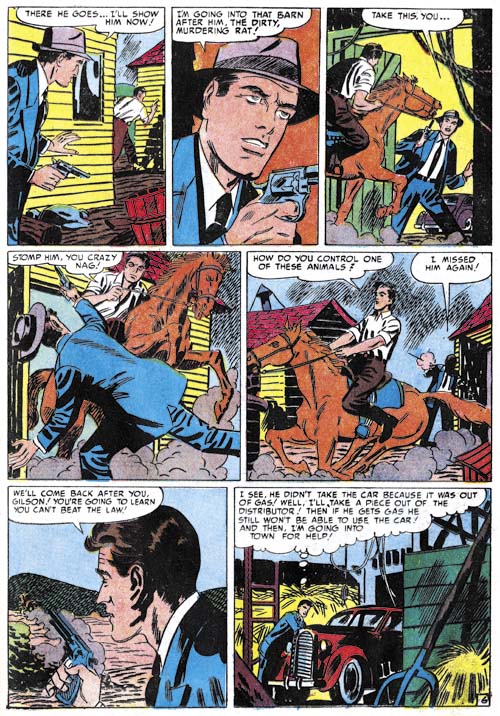
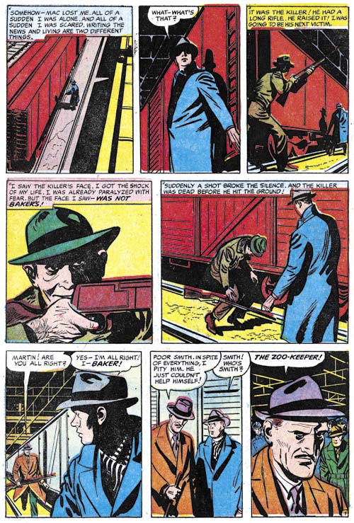
Justice Traps the Guilty #41 (August 1952), “No Place To Hide” page 6, art by Mort Meskin
Crime stories are very different from ones about superheroes but at least they provide more opportunities for the use of action than the romance genre. Mort does not do the sort of choreography (for lack of a appropriate term) that Marvin Stein used but he does make careful use a shifting viewpoints. Note how the pursuer appears in the foreground in the first panel, switches to the criminal in the third, only to have the rolls repeated switch in the fourth, fifth and sixth panels. The distance between the two varies as the sequence proceeds as well; starting with a greater separation, working up the close confrontation in panel four then the separation between the two increases again until panel six.
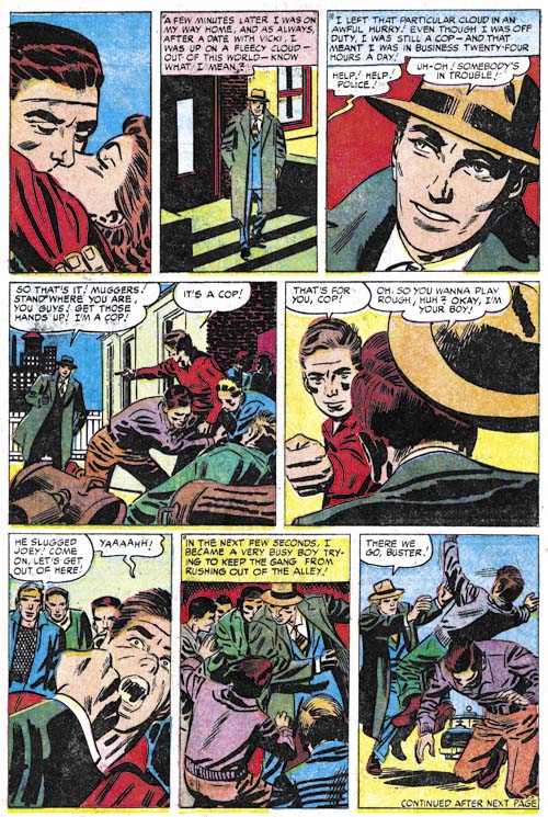
Headline #72 (July 1955), “My Beat” page 2, art by Mort Meskin
Another action sequence starting with a panel that would have been right at home in Young Romance. Note how once again the foreground/background relation between the cop and the muggers keeps alternating with the exception of the final panel. Also how the viewing distance goes from a more distant one, to two close-ups than moves back again. Meskin handles the action so well that I am sure most readers did not notice a logical inconsistency. After showing the cop’s hat flying off his head in panel five, how did it manage to return to being firmly attached in the last two panels? The lose of the hat in panel five is required to show the strength of the impact of the youth’s fist but is a required part of the cop’s “costume” allowing him to be easily identified in the group shots in panels six and seven. What is required for the clear graphical presentation of the story sometimes outweighs the needs of logic.
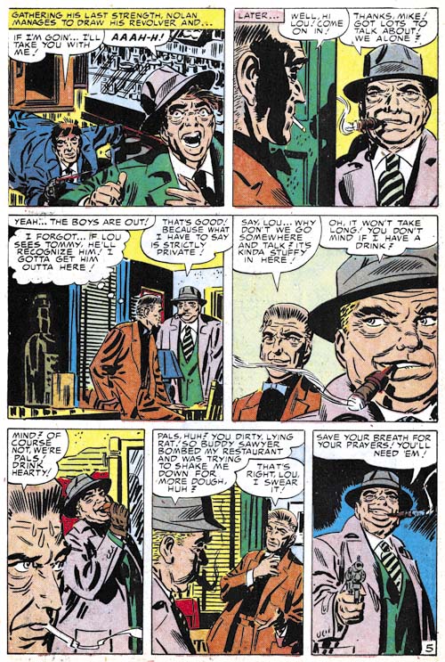
Justice Traps the Guilty #56 (November 1953), “Side-Liner” page 5, art by Mort Meskin
I cannot resist providing another example of Meskin’s graphical story telling talent. Meskin draws in a very stylized manner that perhaps causes many of today’s comic book fans to overlook his other skills. But other artists did notice and were influenced by Meskin. Steve Ditko is probably the most famous of those paid close attention to Mort Meskin.
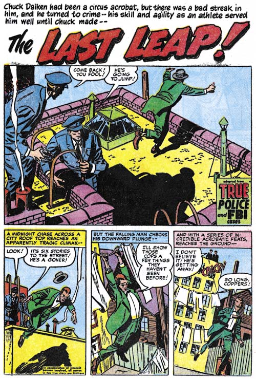
Justice Traps the Guilty #62 (May 1954), “The Last Leap”, art by Mort Meskin
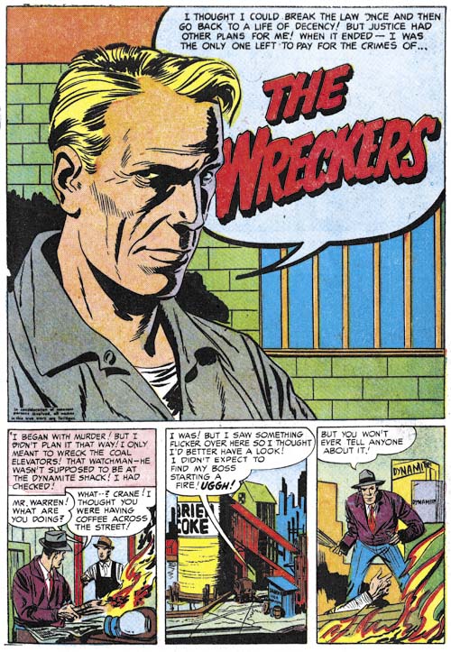
There seemed to have been a move of some sorts in Simon and Kirby productions of 1953 to modify the splash from its tradition roll as the equivalent of a movie trailer. Instead the splash would actually become part of the story. This only lasted about a year in Simon and Kirby comics but this device would turn up from time to time afterwards even in comics not produced by S&K. Was this an artist’s choice or something dictated by the writer? Unfortunately we have no scripts for Prize comics from this period and I do not care to guess at the answer. Still Meskin makes effective use of the device. The splash panel is certainly a classic but the page is made even better by the subsequent panels. What a exciting start of a story! Note the tilted view in the final two panels. I am not sure when Meskin started to regularly use this device but it became an important element in his story telling technique in his later years.
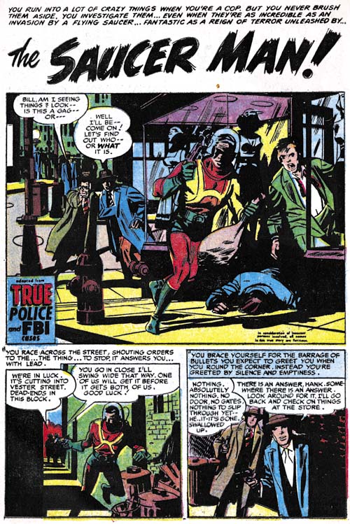
Justice Traps the Guilty #72 (March 1955), “The Saucer Man”, art by Mort Meskin
As mentioned above, after the war Mort Meskin did not have many occasions to draw superhero stories. Features like “The Saucer Man” provide some hints about what such superhero stories might have looked like. Although from late in his career, in this story Mort has reverted to the darker inking style that predominated his earlier work.
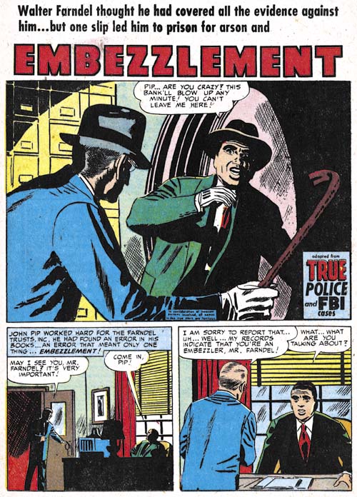
Justice Traps the Guilty #45 (December 1952), “Embezzlement”, pencils by Mort Meskin, inks by George Roussos
As a rule an artist has an advantage when inking his own pencils. Still examples of Meskin inking Jack Kirby (Kirby Inkers, Mort Meskin ) show that Mort was a talented inker. Meskin generally inked his own work in the 50’s but there were occasional exceptions. In most cases where the inking was not done by Meskin it was George Roussos who did it. Frankly I am not a fan of Roussos’s inking. I feel it is a little too sloppy. However George’s use of full blacks were often quite nice as in the splash for “Embezzlement”.


