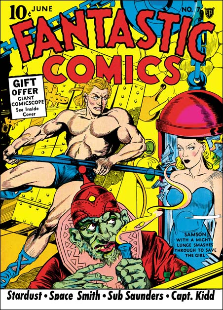
Fantastic Comics #7 (June 1940) by Joe Simon (signed)
Originally Fox comics were produced by the Eisner-Iger shop, with Lou Fine doing many of the covers. But the owner Victor Fox apparently had little scruples and asked the shop to come up with a superhero based on the popular Superman. Out of this work came Wonderman. Superman was big money for the publisher DC, so it is not surprising that they took Fox to court over this imitation. Victor Fox’s initial strategy was to get Eisner-Iger to say they came up with the idea for Wonderman on their own. It may not seem surprising today, but times were tough then and it must have been difficult for Eisner-Iger to refuse to take the blame. But it may not have been just a moral stand for Eisner-Iger. Any lawsuit initiated by DC against their shop would almost certainly have driven them out of business regardless of the outcome. With the failure of Victor’s initial strategy, it would appear he did not have a very good replacement idea. Fox lost the court case on April 7, 1939. The Eisner-Iger’s Wonderman testimony lead quickly to a end of their business relationship with Fox. At least by December 2 when an ad appeared in the NY Times, Victor Fox was looking for artists to provide work for his comics. The above summary is largely based on an excellent history by Jon Berk first published in Comic Book Marketplace #107. Berk has further expanded it into a web version. It is a superb piece of scholarly writing that my summation just does not give justice to. I heartedly recommend a visit.
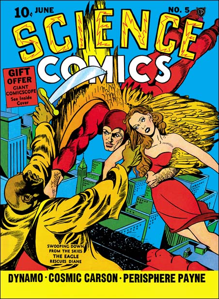
Science Comics #5 (June 1940) by Joe Simon
Joe Simon was one of the artists to answer Fox’s ads. But Joe got more then an artist position, he became the editor although on a freelance basis. This may seem surprising considering that Joe had not been in the comic book business for very long when he got this job. But then again the industry was still very young. One of the things Joe did as editor was to personally draw most covers. Previously many of the covers had been done by Lou Fine, the last cover by Fine would be Weird #2 (April 1940). Lou Fine did incredibly beautiful and exciting covers that certainly helped in the success of those comics. As editor Simon wanted that success to continue and so in the covers he created Joe copied Fine’s style. Simon did this so well that for years experts have been attributing some of Joe’s covers to Lou. In fact a recent volume of Lou Fine reprints includes a checklist that has some of the Simon covers listed as work by Fine. Fortunately Joe signed many of the covers, but the signature were small and easily overlooked. Actually once you start comparing these signed Simon covers with the rest, it really is not that difficult to pick out even the unsigned Simon covers. But the experts apparently were used to searching out Fine’s stylistic features without realizing that if they could see those features someone like Simon could also.
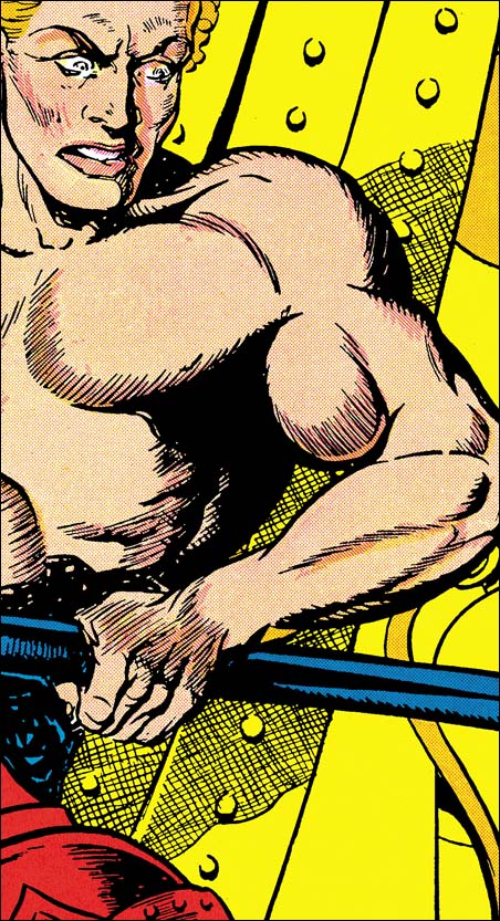
Fantastic #7 (June 1940) by Joe Simon (close-up)
One important thing Joe did for these covers was to adopt Fine’s use of a pen for intricate spotting. Joe did not abandon his use of a brush completely but when he did use a brush it was generally done in a much finer way. Joe copied from Fine the use of crosshatching. Now in areas that Simon wanted a shadow he might use crosshatching instead of flooding the area with black. But the pen lines in some this crosshatching were done without the aid of a ruler and the lines are not perfectly straight. The result is a crosshatching that I think of as a cheese cloth pattern. A good example is the shadow behind Samson from the Fantastic #7 cover. Note that in this example the shadow if rather abstract, it does not show a the same shape as Samson. Instead the shadow has wavy edge with an overall arch. Abstract arched shadows, without the wavy edge, would be a trademark of the S&K studio inking style in later years. Crosshatching an area would also show up in S&K inking later, but usually not so finely done. However the use of cheese cloth crosshatching appears to be limited to this time period.
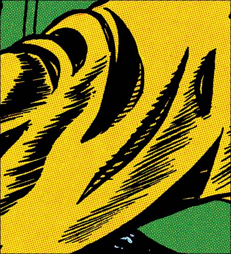
Science Comics #5 (June 1940) by Joe Simon (close-up)
Joe begins to use a crosshatching technique I think of as picket fence. Two long lines following a similar path are intersected at a right angle with regularly spaced shorter lines. The arms of the villain in the Science #5 cover is a good example. Once again in later years we will find picket fence crosshatching done in a bolder manner as part of the S&K shop inking technique.
Science Comics #5 (June 1940) by Joe Simon (close-up)
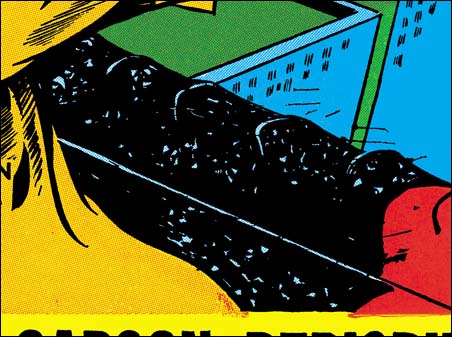
Another Fine procedure copied was a special way of inking shadowed areas. Instead of flooding the area completely with ink, Joe would irregularly crisscross the area with brush marks. When enough of this sort of brushing was done the end result would be an area mostly black but with small irregularly shaped areas without ink. When looking at just the line art this type of spotting can look rather sloppy. On the printed cover these areas are filled generally with blue or purple, occasionally with the ground color. This gives the shadowed area a texture that is really very effective. This spotting technique, and some variations of it, would be used in S&K inking for a number of years before eventually being abandoned.
Wonderworld Comics #13 (May 1940) by Joe Simon (signed)
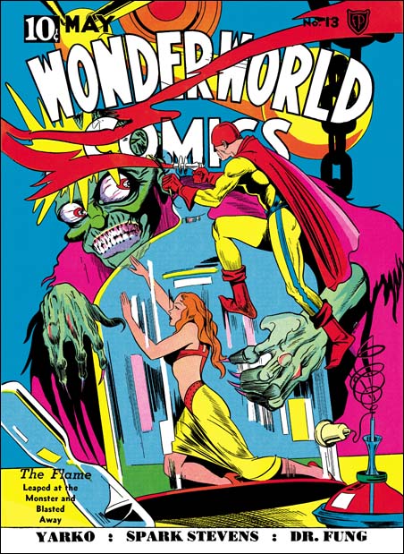
Some of the Simon Fox covers seem (at least to me) to be successful attempts at producing a Lou Fine-like composition. Wonderworld #13 is a good example. The monster looks like it could have been done by Fine. I do not know of any Fine cover that one could say Joe swiped this monster from. But Wonderworld #7 does have monsters that could have served as a template. Joe also seems to have added elements from his Silver Streak #2 cover, particularly the hands. As for the figure of the Flame, again I do not know of any particular source that Joe swiped, but I would not rule it out either. There are some covers not too dissimilar in pose that Joe might just have adapted. The whole ensemble is put together in a manner not unlike covers by Lou Fine.

Silver Streak #2, Daring Mystery #2, Wonderworld #13 all by Joe Simon (close-ups)
Look at the bottled female on Wonderworld #13 and compare her to the cover of the Silver Streak #2 and a panel from Phantom Bullet in Daring Mystery #2. Joe obviously like the source material as this is the third time he swiped it. But also notice that Joe is not at all adverse to making changes. Simon swipes seem to range from pretty close copies to the much altered.
Blue Beetle #2 (May 1940) by Joe Simon
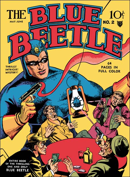
Although Joe seemed to produce layouts that look like they could have been done by Lou Fine, he also did some with features I would not expect Fine to have used. In the cover for Blue Beetle #2 (above) Simon draws the hero much larger then the rest of the figures. This is not to be taken literally, no powers of growth are being suggested for the Blue Beetle. The use of size to indicate importance is not a technique used much in western art since the Renaissance. However it is a common in the art of many other cultures. I know of no example of Lou Fine doing this, but Joe would return to oversized representations of the hero from time to time.
Blue Beetle #3 (July 1940) by Joe Simon
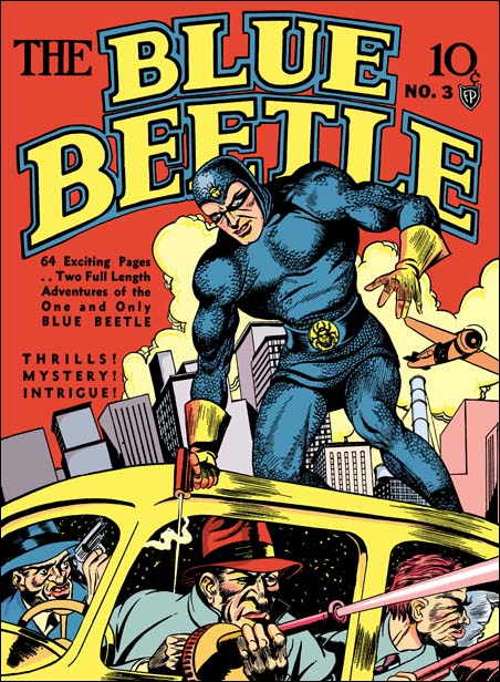
Blue Beetle #3 exemplifies another feature that Simon would use but Fine probably would not, exaggerated, or in this case distorted, perspective. Joe preferred to show buildings not with their sides all parallel, but with sides going to some common vanish point. In most cases this was used when the view point was up high looking down. In that case Joe’s common vanish point provides an exaggerated perspective that gives a dramatic depth to the image. On the cover of Blue Beetle #3, the vanish point is below while the viewer is looking at the sides of the building. This results in an impossible perspective. I have no doubt that Joe was fully aware that this was inaccurate. Later we will see other examples of techniques Joe used that were not literally correct but provided pictorial interest. In the case of exaggerated perspective Joe is doing something very different then what Jack Kirby would do. Jack would put his figures in exaggerated perspective but seemed to have little interest in doing it to his buildings.
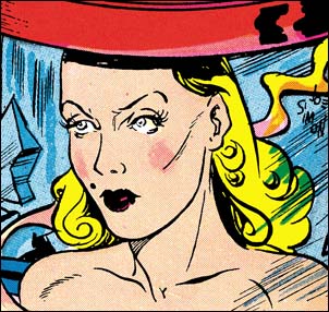
Fantastic #7 (June 1940) by Joe Simon (close-up)
Because Joe gives more detail in the Fox covers, some of the stylistic features seen in his prior work do not occur. However Joe still seems to be having trouble in drawing a woman’s long hair. He now provides more lines but he still has difficulty depicting curls. Generally on these covers Joe will indicate a curl with a crescent or circular outline. It is better then not indicating a curl at all but still gives the hair an unnatural appearance.
Joe only worked for Victor Fox a short time. Over a period of three months he did 16 covers (cover dates May to July). He probably left Funnies Inc when he began to work for Fox. But Joe still did some work during this period for other publishers, that will be examined in the next chapter. It was while Simon was at Fox that he first met Jack Kirby. Jack had done some small comic book features and was currently doing Blue Beetle syndication strips. Unfortunately Jack had not yet done any comic book covers. Nonetheless Kirby had developed into good artist. As far as I can detect, none of the work that Joe Simon did for Fox shows any Kirby influence. But Joe did seem to notice Jack’s talent and that will also be touched on in the next chapter.

