Tag Archives: Simon

It’s A Crime, Chapter 6, Forgotten Artists

(Justice Traps the Guilty #3 – #5, Headline #29 – #31)

Jack Kirby remains the principal artist for the six crime issues discussed in this chapter. All 6 covers were drawn by Jack as well all the lead stories. Kirby’s did 10 stories with a total of 117 pages (including the covers). However Bill Draut now assumes a more important roll becoming the second principal artist. Bill supplied 11 stories, one more then Jack, but fewer pages (81 pages). The other three artists contributed much less then either Jack or Bill. The next most prolific (A. C. Hollingsworth) drew just 3 stories with 25 total pages.


Justice Traps the Guilty #4 (May 1948) “Queen of the Speed-Ball Mob”, art by Jack Kirby

The first story consistently uses the motif of a character introducing the story with the word balloon forming the title caption. I have noticed that when a story is being narrated, it is often by a woman. Almost certainly this was because male criminals generally have fatal endings (and therefore would not be able to tell their story) while females normally survive.
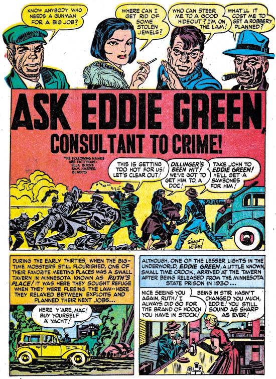

Justice Traps the Guilty #3 (March 1948) “Ask Eddie Green, Consultant to Crime”, art by Jack Kirby

A motif that would occur often in Kirby’s splashes at this time was having a cast of characters make a series of statements to introduce the story. Actually it was a return to an old technique as we have seen it as far back as in Captain America. When used in a splash covering two thirds of the page, this type of design did not leave much room but in “Ask Eddie Green” Jack makes effective use of what is available by supplying a small shoot out scene. The depth of field is so narrow that the results look like a frieze. Despite the small size everything is clear and the scene is filled with interest.
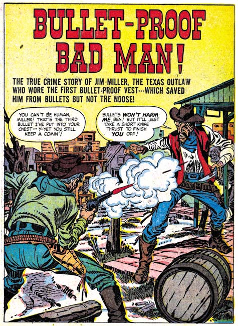

Headline #30 (June 1948) “Bullet-Proof Bad Man”, art by Jack Kirby

Perhaps it is just my tastes, but I feel that Kirby’s splashes are not as exciting as before. This may have been a result of Kirby’s declining use of full page splashes. Only 3 splashes out of his 10 stories received the full page treatment. “Bullet-Proof Bad Man” provides a typical Kirby dramatic shoot out. Well not so much as gun fight as one man has only drawn his knife although it turns out this is not as unwise as it seems. It is clear that the bullet has found its mark but note how Jack seems to downplay the actual hit. The story is about a gunfighter that uses a special vest to protect himself from bullets. However I have notice that Jack seems averse to showing the actually striking of a bullet even though that is a moment he often depicts. Generally Kirby hides the action in a cloud of gun smoke. When, because of layout, that is not possible, such as above, Kirby will simply not include any impact lines.
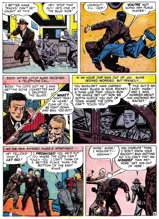

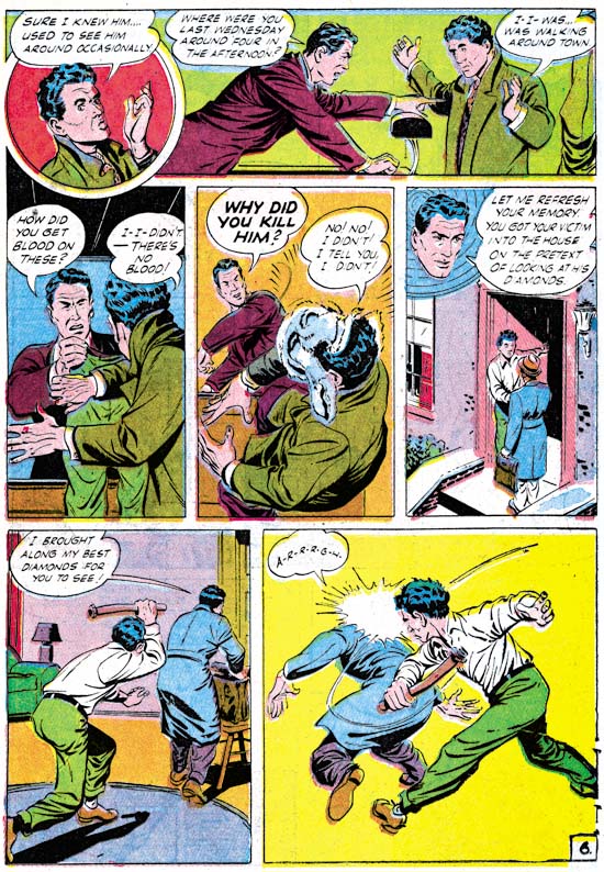
Justice Traps the Guilty #5 (July 1948) “A Fortune in Slugs” page 6, art by Bill Draut

Bill Draut did so much romance work for Simon and Kirby that it is nice to see his efforts for the crime genre. These comics gave Bill a chance to provide more action then he would normally use in romance comics. Draut was better at adding excitement then would be expected based on his work towards the end of his career. Here on one page we find a man running, being tackled and in the final panel bludgeoned with a blackjack. All of which Bill handled quite nicely. I particularly like his use of perspective in the second panel. Draut shows the tackler flying into the page whereas Kirby would have had the action coming out toward the reader, but otherwise it was well handled.
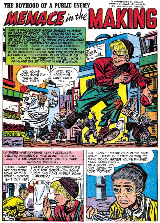

Headline #30 (June 1948) “Menace in the Making”, art by Bill Draut

Draut’s effective use of perspective is seen again in the splash for “Menace in the Making”. The low viewing angle allows the running figure to tower over all others without seeming to be unnatural. Action was not, however, the only outlet that Bill found in the crime genre. Crime stories allowed Draut to work, to extent that romance did not, in a more cartoony style. Note the caricature that Bill has provided the irate grocery man. Such interesting but fundamentally unrealistic depictions are found often in Bill Draut’s work in Headline and Justice Traps the Guilty but rarely in Young Romance or Young Love.


Justice Traps the Guilty #3 (March 1948) “My Strangest Crime Case”, art by Bill Draut

One story drawn by Bill Draut may not be exception as far as the art is concerned, but it is unusual in that the protagonist was a female private investigator. The story reads more like something from the hero genre then a true crime story. This is not the first time that Draut drew a story about a lady detective. In 1946 Draut worked on a feature called Calamity Jane originally for Boy Explorers Comics but when that title quickly failed (due to the comic glut after the war) subsequently published in Green Hornet Comics. It is likely that “My Strangest Crime Case” was left over material from that earlier effort that, with minor revisions such as to the detective’s name, was now put to use. The art style does seem to be a better match to Draut’s earlier work then to what he was doing at this time.


Headline #29 (April 1948) “The Night of the Freak Murder”, art by Jerry Robinson and Mort Meskin

The team of Jerry Robinson and Mort Meskin continue to appear in the crime issues covered by this chapter. The work is unsigned but the similarities to the signed works by Robinson and Meskin are numerous. “The Night of the Freak Murder” is unusual for Jerry and Mort in that it has a full page splash. Generally R&M’s splashes for Simon and Kirby productions are vertical with two story panels also arranged vertically. The composition is interesting in the way it plays off the grieving women with an almost mirror image of two detectives discussing the crime. The staircase might seem odd but it was introduced as part of a pattern that confines the eye in a circular composition. None of the other splashes that Robinson and Meskin supplied to Simon and Kirby were so well composed but as I said they did not normally use a full page splash.
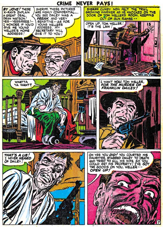

Headline #29 (April 1948) “The Night of the Freak Murder” page 7, art by Jerry Robinson and Mort Meskin

As I mentioned in the previous chapter, I am not sure what Jerry Robinson’s contribution was because both the pencils and the art look very much like Meskin’s work. Mort was one of the best graphic story tellers and pages like the one above suggest why he had such an impact on artists like Steve Ditko. Here on this page the same diagonal is present in every panel. The page starts with close-up then switches to a distant show and then progressively comes closer. An increasing tension is formed by the combination of increased nearness, the diagonal design and off course the fear Meskin imparts to the criminal. Nothing really happens but the page is explosive nonetheless.


Justice Traps the Guilty #4 (May 1948) “Guilty Boys”, art by Jerry Robinson and Mort Meskin

Not all of Robinson and Meskin’s splashes were vertically oriented; here is another case where they deviated from that pattern. This is a standard two thirds splash page with two story panels arrayed on the bottom. Nothing unusual in the design itself but it does allow Jerry and Mort to provide a memorable splash. Although the image seems cluttered, everything serves a purpose. Debris and damaged items abound and a row of buildings in the background all combine to show that this is a location in some slum. But the shabbily dressed musical boys are not the Newsboy Legion and this is not Suicide Slums. Here Robinson and Meskin convert the boy gang genre into crime. They are not saints and in the end are more in need of rescue then providing it.
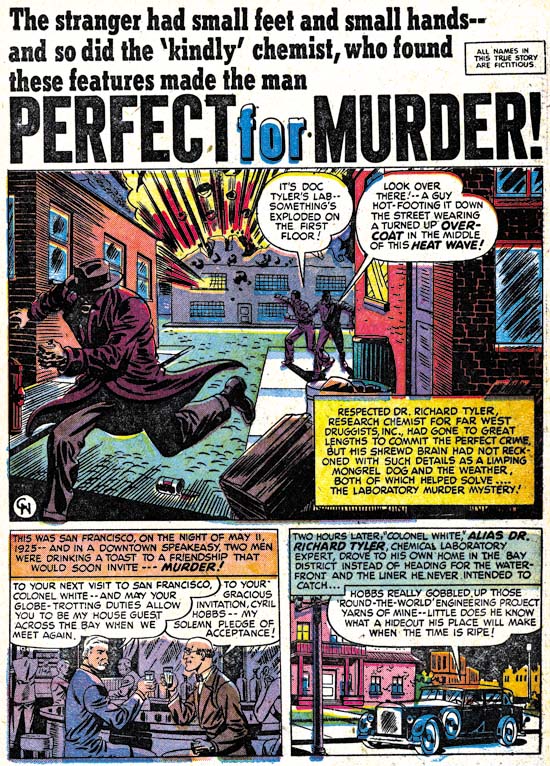

Headline #31 (August 1948) “Perfect for Murder”, art by Charles Nicholas

Only initials were used to sign “Perfect for Murder” (Headline #31, August 1948) but I am pretty certain it was Charles Nicholas. Originally Charles Nicholas was a house name used by Fox Comics for Blue Beetle stories. Over the years the work of many different artists appeared under that name, including Jack Kirby. However there were two individuals who continued to use the name outside of Fox and who claimed to be the creator of the Blue Beetle; Charles Wotjkowski and Chuck Cuidera. There is nothing I can add to that particular question here but it was the Wotjkowski version of Charles Nicholas who worked for Simon and Kirby at this time.
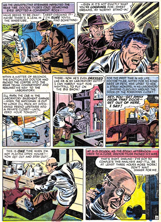

Headline #31 (August 1948) “Perfect for Murder” page 3, art by Charles Nicholas

While interesting, the splash page does not present a very good idea of Nicholas’ art so I have included an image of a story page as well. Nicholas does a good job drawing this story but he never achieved great success in his career as a comic book artist. Nicholas inked the art in a very individualistic style, as particularly seen in the form lines used in panels 6 and 7 and the swirling crosshatching in panel 7. (See my Inking Glossary for an explanation of my terms.) What is not found are any traits of the Studio style inking. While Nicholas is certainly a candidate for being one of Jack Kirby’s inkers, it is hard to understand how his name has become associated to the inking of particular pieces such as “Summer Song” (Young Romance #1, September 1947). “Perfect for Murder” was the only worked for Simon and Kirby signed or initialed by Charles Nicholas but other unsigned art by him surely remains to be identified.
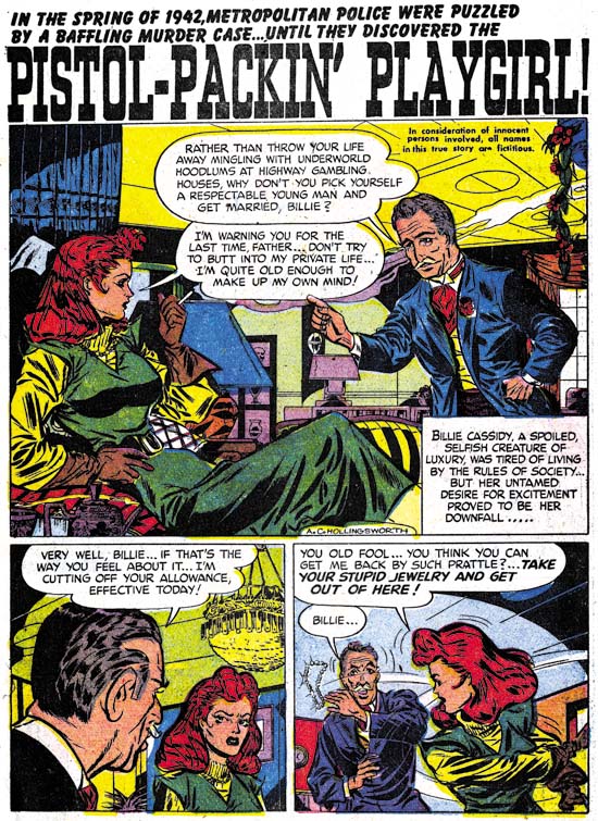

Headline #30 (June 1948) “Pistol-Packin’ Playgirl”, art by Alvin C. Hollingsworth

Another artist that shows up working for Simon and Kirby during this period is Alvin Carl Hollingsworth. A search of the Internet indicates that Hollingsworth was an African-American artist from New York who was born in 1928 and died in 2000. Previously he worked for Holyoke Publishing Company working on Catman. Hollingsworth was also a talented fine arts painter. Joe Simon remembers Alvin and has a high opinion of him. Joe remarked that he thought he was the only African-American working in comics at that time. This is not truly accurate since there was also Matt Baker who played an important part in the early history of comics. But Matt Baker never worked for Simon and Kirby and so Joe was not aware of him, or at least of his background.
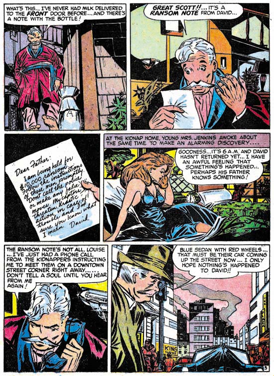

Justice Traps the Guilty #5 (July 1948) “Held For Ransom” page 5, art by Alvin C. Hollingsworth

Hollingsworth is another of those artists whose current reputation is much lower then warranted by his talent. This is largely because he left the comic book field in the late ’50s first for syndications strips and then the fine arts. It is a recurring pattern that I have noticed that comic book artists who did not take part in the superhero revival of the 60’s and later generally do not get much attention today. I have included a story page because it provides a better example of Alvin’s strengths. Note the use of varied and unusual viewing angles.


Headline #31 (August 1948) “A Gangster Dies”, art by Warren Broderick

The Jack Kirby Checklist includes “A Gangster Dies” among the art works by Kirby. This is a bit surprising because close to the center of the splash page is Warren Broderick’s signature. Before I sound too self righteous I should add that when working on this chapter I found I had listed this story in my database twice; once as done by Broderick and the second crediting it to Kirby. I have no idea how I made the mistake in my database, but it is easy to understand why anyone who failed to notice the signature might attribute this work to Jack. Warren has obviously made a careful study of Jack’s work and has adopted, at least for his work for the S&K studio, much of Kirby’s style. Warren was not, of course, as successfully as Jack himself and there are more then enough clues to properly attribute his work even without a signature. Note for instance how in the splash Broderick uses picket fence crosshatching where the rails are cloth folds. Besides simple lines, Kirby would use drop strings and wide lines for the rails but I do not recall him ever using cloth folds. Kirby would often make expressive eyebrows but Broderick’s versions were even more exaggerated.

This is the only signed work by Warren Broderick that I have found among Simon and Kirby productions. Frankly I have forgotten about it until I reviewed for this chapter. It turns out that we have seen some of Warren’s unsigned work previously. In just the last chapter I attributed “The Killer Thought He Was Satan” (Justice Traps the Guilty #2, January 1948) as Kirby layouts finished by an unidentified artist. A comparison between it and “A Gangster Dies” leaves little doubt that it also was by Broderick. In fact I no longer believe Kirby laid it out. Yes there are parts in both stories that look very much like Kirby but there are also parts that do not. Previously I failed to follow my own advice and only noted the similarities and neglected the differences. For instance there is a panel I provided from “The Killer Thought He Was Satan” that showed a boy being shot by the villain. While the scene and the boy in particular look very much like it was done by Jack, the artist shows the bullet actually striking the boy. That is something I have yet to find Kirby doing.

Another example of Broderick’s work was “Mother Said No” (Young Romance #7, September 1948) seen in Chapter 3 of the Art of Romance. There I attributed the pencils to Jack Kirby (correctly) and the inks questionably to Carmine Infantino. The primary reason for my earlier caution was that I was bothered by Carmine’s statement in an interview that he had never inked Kirby’s pencils. While in the work for Charlie Chan, Infantino was also providing expressive eyebrows some of the other brushwork found in “Mother Said No” is more like that in Broderick’s work. Although Broderick was very good at mimicking Kirby, I find the layouts in “Mother Said No” are much too consistently like Jack’s that I still believe that Kirby did the pencils.
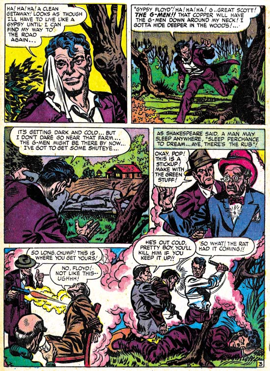

Headline #31 (August 1948) “A Gangster Dies” page 3, art by Warren Broderick

Broderick could mimic Kirby quite well but occasionally, such as in the first panel shown above, the similarity to Kirby’s style is very striking. This was either due to Kirby stepping in his roll as art editor and fixing up the finished art or it was the result of a careful swipe by Broderick from some Kirby art. Without the original art it is hard to be sure but I suspect the latter explanation to be the case. Once again Broderick has drawn a scene where a man is clearly hit by a bullet, something that Kirby would hide in a cloud of gun smoke.
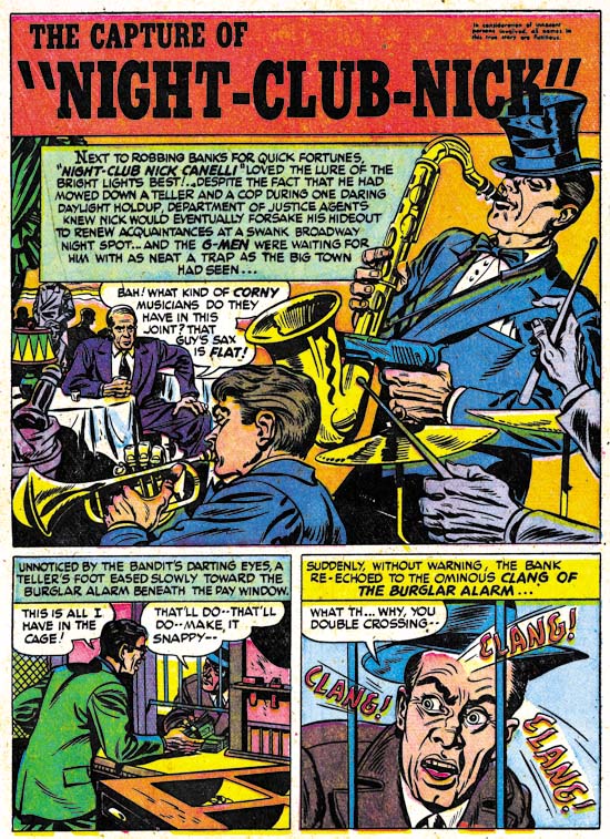

Justice Traps the Guilty #3 (March 1948) “The Capture of Night-Club Nick”, art by Warren Broderick

Broderick did not always so carefully mimic Jack Kirby’s style. In “The Capture of Night-Club Nick” Warren has abandoned the Studio style inking. Still the influence of Kirby is clearly discernable.

I have found little in my search for more information about Warren Broderick. I queried Joe Simon about him but he did not remember Warren at all. Joe does not remember all the artists who had worked for him over the many years, but in Broderick’s case this is surprising because the one thing I had found out was that he also was African-America. Joe was clear in his memory of A. C. Hollingsworth and that Hollingsworth was the only African-American to work for Simon and Kirby. How could Joe have failed to remember, even if not by name, one other African-American comic book artist? The answer maybe found in an interview given by comic artist, Harry Harrison:

After Wally and I broke up I was working mostly for Fawcett, and I had a friend by the name of Warren Broderick, who was also in school with me, doing my penciling. He was a black guy who didn’t want to get in there and push, didn’t want to face whitey in the office. We developed a nice clear style, no great shakes, but it worked.

This suggests that Broderick may have been reluctant to deal with Simon and Kirby directly and used someone, either an agent or another artist, as a go between. Joe may never have known about Warren’s ethnicity. The irony is that, considering their dealings with Hollingsworth, Joe and Jack probably would not have cared about Warren’s background, all that was important was that he could do the work.

The GCD only has three entries for pencils attributed to Broderick and three more for inking work. Atlas Tales has about a dozen works attributed to Warren. To that I can now add three further pencils and another inking job. Now that I have a small body of work to go by, I am sure I will find more work by Broderick as I continue to review Simon and Kirby productions. Warren Broderick is truly one of the forgotten comic book artists and it is rewarding to shed a little light on his career.

Chapter 1, Promoting Crime
Chapter 2, A Revitalized Title
Chapter 3, Competing Against Themselves
Chapter 4, Crime Gets Real
Chapter 5, Making a Commitment

Chapter 7, A Studio With Many Artists
Chapter 8, The Chinese Detective
Chapter 9, Not The Same
Chapter 10, The Master and His Protege
Chapter 11, The New Team

The Art of Romance, Chapter 9, More Romance

(Young Romance #13 – #16, Young Love #5 – #6)


Chart of the number of romance titles from September 1947 to December 1950 with the period covered in this chapter marked in blue.

My discussions of Young Romance and Young Love were left off in Chapter 5 after which I then spent the next three chapters on Simon and Kirby’s two western romances titles Real West Romance and Western Love. Returning to Simon and Kirby’s purer romance titles, Young Romance was starting its third year. Previously Young Romance and the newer Young Love were both bimonthlies on an alternating schedule so that one would appear on the stands each month. With the Young Romance #13 issue (September 1949) that title would now become a monthly. The house ad announcing this new schedule declared there were three and a half million readers. An exaggeration? Perhaps, but this was the golden age of comics and readerships were much larger then found today. Taking Young Romance to monthly schedule clearly indicates that Prize was doing quite well with that title. Since the deal with Prize provided Simon and Kirby with a percentage of the sales, the creative duo were receiving great financial benefits. There was competition, however, as September 1949 was well into the start of the love glut.


Young Romance #15 (November 1949) “Back Door Love”, art by Jack Kirby

For whatever reason, Jack Kirby was not that prolific during the period covered in this chapter (September to December 1949). The covers for YR and YL were all photographs and so Jack would not be providing any covers. Kirby would supply a single story for YR #13 to #15, two for YR #16, and none for YL #5 or #6. His diminished presence in YR and YL was also true for the other Simon and Kirby titles (Headline, Justice Traps the Guilty, Real West Romance and Western Love). While Jack may not have been his usual prolific self he still was an important contributor to the two romance titles. Kirby would provide the lead story for Young Romance and while these stories may not have been as long as some from the past they still had the highest page count compared to any others in the same issue. So while there were two artists that provided more stories then Jack only one of them actually drew more pages. For the record Jack did 5 stories and 58 pages for the 6 issues. Unlike the case found in previous chapters of “The Art of Romance”, or even “Its A Crime”, I conclude that Kirby did not provide layouts to any of the other artists in these issues.

Jack provided great splashes for all the lead stories for YR #13 to #16. All made use of the motif of a character introducing the story with the word balloon forming the title. All lead stories were meant to suggest provocative themes as can be seen by their titles alone (“Sailor’s Girl”, “Runaway Bride”, “Back Door Love” and “Dance Hall Pick-Up”). Today they might seem tame but in the late ’40s they would be considered risque. I have chosen two of them as examples not only because they are the best but also because of their contrasting nature. The splash for “Back Door Love” shows a couple on one side, a large word balloon/title, and three overlapping panels crowded into another corner. The panels are not the beginning of the story, but rather provide examples of the shameful love and its emotional price the woman has to pay. The couple was inked in the standard Studio style with abundant picket fence crosshatching and drop strings (see my Inking Glossary for explanations of my terms to describe inking techniques). This was overlaid with much relatively fine simple and more complicated crosshatching; techniques not commonly found in Simon and Kirby art. The inking is meant to provide the couple with a nighttime setting which is enhanced by the colorist blocking them out in a light blue. While the woman’s face turned to the viewer (I do not understand why many do not find Kirby’s woman beautiful) the man’s remains concealed in the shadows; all in keeping with the mystery of their relationship. Not much in the way of action, but one of Kirby’s more interesting splashes nonetheless. However there is a “but”; while some like comic art with a lot of detail work, I generally do not. I find all the crosshatching in this splash gives the figures a hard edge, almost like they were carved out of stone and are not flesh and blood. A small detraction from what was otherwise a masterpiece.


Young Romance #16 (December 1949) “Dance Hall Pickup”, art by Jack Kirby

Shame was the theme for the splash of “Dance Hall Pickup” as well, but its similarity to the “Back Door Love” splash pretty much ends there. This time it is the man’s turn to be found in a shameful relationship. Nothing mysterious here, everything is in full lighting. The woman’s low cut dress, fake flowers on her belt, costume jewelry, and false eyelashes clearly mark her as the type of woman a gentleman would be uncomfortable with bringing home to meet his mother. Of course the story will reveal that the somewhat trashy appearance of the woman really hides a warm and loving heart. The inking for this splash is truly a text book example of Studio style inking. It has all the typical hallmarks; lots of picket fence crosshatching and drop strings along with an abstract arch shadow and shoulder blots for the man. No fastidious brushwork here, each stroke is boldly marked; straddling the boundary between working with others for indicating the shadows and maintaining an independent existence. Most fans are attracted to his action scenes but for me this is Kirby at his best; telling a complete story with just some simple gestures and some abstract marks.

I cannot leave this splash without pointing out the hanging curtain in the top corner. It serves no logical purpose. The windows in the back are complete bare, so why is that drapery hanging from the ceiling in the middle of a dance floor in front of a pillar? It is a mistake to look at Kirby art, or any comic book art, as if it was an attempt at rendering a truly realistic image. Elements are added for their suggestive power and how they provide visual interest. The hanging curtain is a motif that Jack will use often.


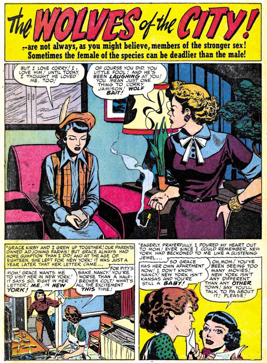
Young Romance #16 (December 1949) “The Wolves of the City”, art by Bill Draut

The largest contributor to YR #13 – #16 and YL #5 and #6 was Bill Draut. Bill did twice as many stories compared to Kirby (10 vs. 5) and 10 more pages (68 vs. 58). Bill’s strength was his clear visual story telling and his effective use of body language. The simplicity of faces drawn by Bill did not lend itself to a wide range of emotions. Perhaps that is why Draut was very careful in the poses he provided his characters. Upturn faces could portray admiration or wonderment. Thrusting the head forward and providing clenched fists would reveal a person’s anger. In the splash for “The Wolves of the City” you do not need to read the story to realize how demure and proper the lady on our right is. Hands folded on her lap and eyes cast down tell it all. Her friend has her hand on her hip, the way her head pushed forward, and even the way she holds her cigarette shows she has a harsh and sharp personality. Despite the similar profiles, she presents quite a contrast to the mother figure from the second story panel.


Young Love #6 (December 1949) “For Handsome Men Only”, art by Bruno Premiani?

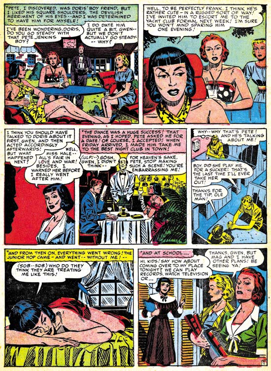
The third most prolific artist for the issues cover in this chapter was possibly Bruno Premiani. I say possibly because none of the work this artist did for Simon and Kirby was signed and none of it compares well with work done for DC that has been credited to Premiani. Either the attribution of this work to Premiani is wrong or he adopted a different style for romance compared to his superhero comic book art. Whoever the artist is, and for now I continue to refer to him as Premiani, he was one of the more talented individuals to have worked for Joe and Jack. Bruno first showed up in Young Love #4 (August 1949) and would provide work to the S&K studio until December 1950). During that period of a little over a year, Simon and Kirby would include about 25 stories by Premiani. For the issues covered in this chapter, Bruno did 6 stores (one more then Kirby) for a total of 48 pages (much less then Jack’s 58 pages). One of the stories supplied by Bruno was even used for the all importing lead story (the “For Handsome Men Only” shown above). It is easy to see why Premiani was used so often. Although his woman are perhaps a little plainer then some other studio artists, they (and the men as well) seem to radiate an emotional energy. Like Draut, Premiani could make effective use of body language as well. The hands on the hip and face in profile as superficially similar to Draut’s pose in “The Wolves of the City”. But by pulling the head back and thrusting one leg forward, Bruno makes his protagonist much more alluring. In the second panel the lady ostensibly uses her hand to keep her scarf in place but the gesture is actually part of a physical withdrawal from a disappointing blind date.


Young Romance #14 (October 1949) “Nancy Hale’s Problem Clinic” page 2, art by Vic Donahue

There were a number of other artists who contributed to these issues of YR and YL but nowhere nearly as much as Draut, Kirby or Premiani. One was Vic Donahue who we have seen in previous chapters of “The Art of Romance” both for the standard romance as well as the western love titles. Vic’s work for the issues covered her has diminished and is restricted to three “Nancy Hale’s Problem Clinic” features. These are all short work of 2 or 3 pages long. There is no more I can add to my previous discussions of Donahue; his woman are attractive and Vic often provided them with a tilt to the head. Vic was careful in the inking of hair and he sometimes filled shadows with fine simple hatching. Aspects of the Studio style inking also show up in his work. The page above shows drop strings (panel 1 and 3), shoulder blots (panel 3), an abstract arch shadow (panel 6) and picket fence crosshatching (panels 4, 6 and 7). I am still undecided whether this was Joe or Jack stepping in as art editor to strengthen up the work. Alternatively is may have been Vic adopting portions of the Studio style. Joe Simon has described the inking of Kirby’s pencils as being like a factory line involving many different inkers. Although I cannot point to any specific work by Kirby that Donahue could have inked, as one of the more minor but still talented artists continually employed by S&K Vic certainly was a candidate to help in inking.


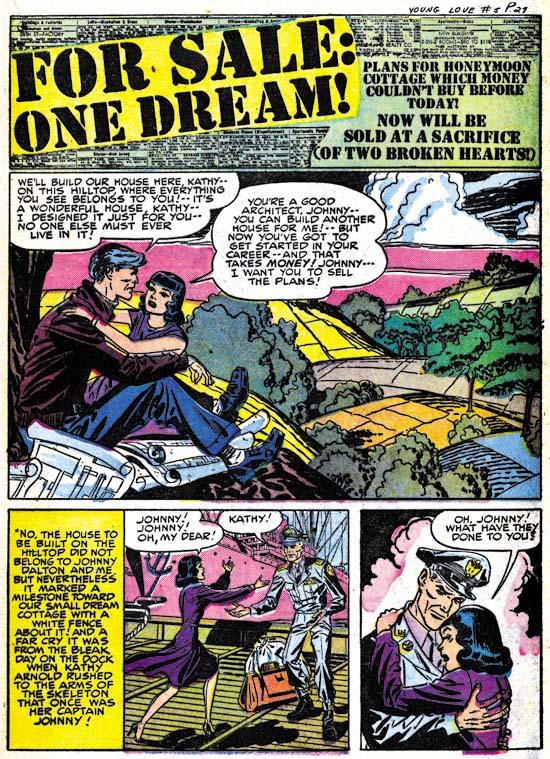
Young Love #5 (October 1949) “For Sale: One Dream”, art by Al Eadeh and John Belfi?

Another minor contributor, or rather an artist team, that we have seen before was Al Eadeh and John Belfi. The work is unsigned and my attribution provisionally, but I believe Eadeh and Belfi did “For Sale: One Dream”. While talented, Eadeh and Belfi were still among the lesser lights of the S&K studio.


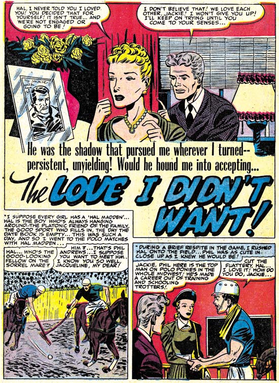
Young Love #5 (October 1949) “The Love I Didn’t Want”, art by George Gregg

Signatures found in three comics (Young Love #4 and Justice Traps the Guilty #17 and 19) have allowed me to identify one of Simon and Kirby’s studio artists, George Gregg. Since then I have spotted an unsigned work in Western Love #1 and here I can add two more. Even without a signature, Gregg’s style still stands out. His art has a sort of stylized cartoony edge to it and frankly a touch of primitivism. Gregg’s often provides his characters with distinctive, but varied eyebrows. The leading ladies frequently have a pinched look to their faces. While “The Love I Didn’t Want” is no masterpiece, it is still nice to be able to assign a name to some of work produced by the Simon and Kirby studio.

Young Love #6
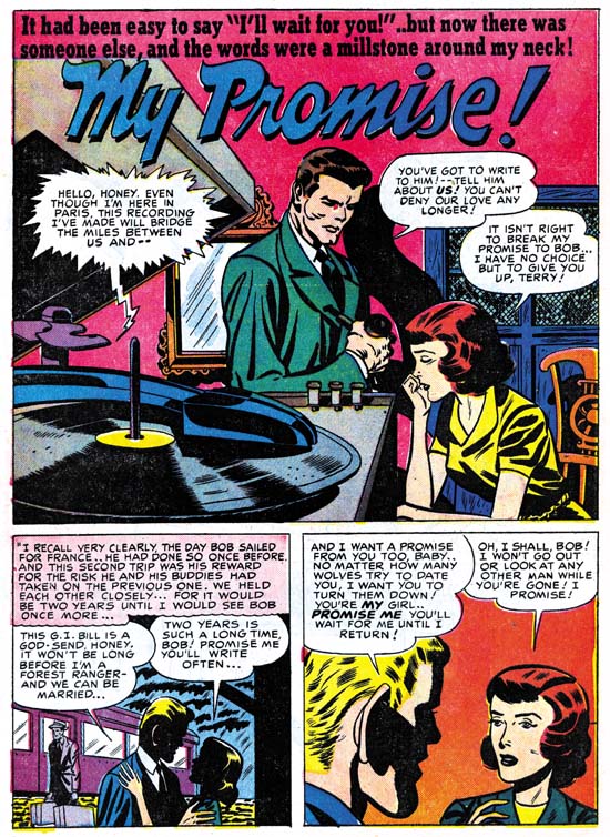
Young Love #6 (December 1949) “My Promise”, art by George Gregg with help from Jack Kirby in splash panel

“My Promise” is another unsigned work by George Gregg. The Jack Kirby Checklist includes the splash as being done by Kirby. While it is true man was clearly done by Jack, the rest of the splash and the story panels were by Gregg alone. This is another example of Kirby acting as art editor stepping in to help the all important splash. I believe the man in the splash was inked by Jack as well, but he is deliberately working in a simpler manner to blend in better with Gregg’s inking. Careful examination, however, will show that Jack’s brush has a subtlety that was beyond Gregg’s capabilities. The over sized ear in the second story panel was a mannerism that Kirby often fell into, particularly on work done before he went into military service (for Timely and DC). This suggests that Gregg may have been using old Simon and Kirby comics as source material for swiping.

Young Love #5
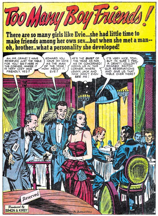
Young Love #5 (October 1949) “Too Many Boy Friends”, art by Ann Brewster

New to Simon and Kirby production is the artist Ann Brewster. S&K must have like her work because they used her first submission, “Too Many Boy Friends”, as the lead story for Young Love #5. I am not sure that “first” is the proper description. I do not believe there were any earlier works for Simon and Kirby but I am unaware of any other works by Ann from this period either. In 1955 Ann would provide a number of stories for the Prize romance titles during the time when Joe and Jack were trying to get their own publishing company, Mainline, going.

When I previously discussed this splash, I thought that this might have been delivered as pencils and inked in the S&K studio. That conclusion was largely due to the presence of Studio style inking throughout the story. However, I no longer hold that viewpoint. There appears to be at least two inkers involved. One, Ann herself, working with a fine brush and another inker, probably Joe or Jack) working with a broader, more loaded, brush. The Studio style inking was probably added later to strengthen the art.


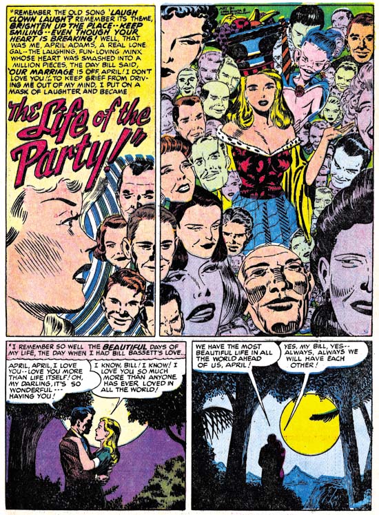
Young Love #6 (December 1949) “The Life of the Party”, art by John Guinta and Manny Stallman

Another new team to appear was John Guinta and Manny Stallman. Fortunately the work is signed because I am completely unfamiliar with John Guinta’s work. Manny Stallman has done his own penciling for Simon and Kirby primarily in the crime titles (not yet covered by my serial post “It’s A Crime”) but also in Western Love #1 (July 1949). “The Life of the Party” is the only story that I know that they did for S&K but perhaps more will show up.

The art for Guinta and Stallman’s “The Life of the Party” is good, but I am particularly impressed by the splash panel. It actually is two splash panels as neither of the top panels belong to the story proper. Floating heads are not used often by Simon and Kirby but they do occur. However I do not recall any of theirs approaching the avalanche of heads as produced here by Guinta and Stallman. I particularly like the way they spill from the right panel into the left with the gutter bisecting two heads. While I attribute most of this to work to John and Manny, I wonder about the single head at the center bottom of the panel. It is the only head without hair and the uppermost contour looks decidedly unnatural; almost as if it was cut from some other work. I cannot help but wonder if that one head was actually done by Jack Kirby. Perhaps, though, this is due to the inking with its aspects of Studio style. This was probably done by either Joe or Jack as most of the story is inked in a different style. Again the presence of places with Studio style inking in the story probably is due to Joe or Jack stepping in to strengthen the art.


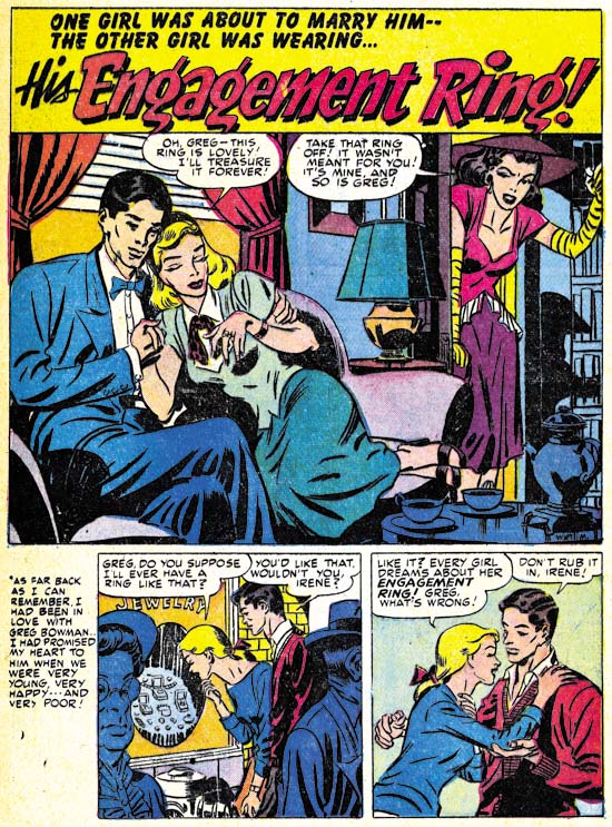
Young Romance #16 (December 1949) “His Engagement Ring”, art by Mort Meskin

Young Romance #16 marked the return of an important artist Mort Meskin. Perhaps return is not the proper word as a little over a year ago he had appeared teamed up with Jerry Robinson. In the same month of December 1949 Mort also appeared in Real West Romance #5. Joe Simon has described in his book “The Comic Book Makers” the difficulties Meskin faced overcoming the artist’s equivalent of the writer’s block. However once this problem was passed, Mort became the most prolific of the Simon and Kirby studio artists. There were periods when he out produced Jack Kirby (no small feat) despite the fact that Mort would do all his own inking while Kirby often was inked by others. During his career, Mort was much admired by many of his fellow artists including Jerry Robinson, Joe Simon and Steve Ditko. Unfortunately today he is largely overlooked among comic book fans failing even to be voted into the Will Eisner Awards’ Hall of Fame. Partly this is due to the stylized drawing that Meskin adopted. Also a lot of his later work was done for Simon and Kirby romance titles; a genre not much appreciated among today’s fans. Perhaps the most important reason was that Meskin dropped out of comics in the late ’50s and afterwards avoided any contact with fans. However Mort was one of the best graphic story tellers from the golden age of comics. Meskin’s skill in presenting a story is easy to overlook due to the unobtrusive methods he used. Probably the only thing I can say against Meskin as an artist was that his work sometimes suffered from his efforts to produce lots of work.

The splash page for “His Engagement Ring” uses a layout that Meskin typically preferred; two thirds of the page for the splash panel with two or three story panels at the bottom of the page. It is a common layout used by many artists but different from the layout most frequently used when teamed up with Robinson which had a vertical splash panel with two story panels on the right side of the page.

The December issue of Young Romance was released just a few months prior to the peak of the love glut. The rise in the number of romance titles in such a short period was nothing short of dramatic. The decline following the peak was almost as rapid when publishers found that there just was not enough room on comic racks for all the new titles.

Chapter 1, A New Genre (YR #1 – #4)
Chapter 2, Early Artists (YR #1 – #4)
Chapter 3, The Field No Longer Their’s Alone (YR #5 – #8)
Chapter 4, An Explosion of Romance (YR #9 – #12, YL #1 – #4)
Chapter 5, New Talent (YR #9 – 12, YL #1 – #4)
Chapter 6, Love on the Range (RWR #1 – #7, WL #1 – #6)
Chapter 7, More Love on the Range (RWR #1 – #7, WL #1 – #6)
Chapter 8, Kirby on the Range? (RWR #1 – #7, WL #1 – #6)
Chapter 9, More Romance (YR #13 – #16, YL #5 – #6)
Chapter 10, The Peak of the Love Glut (YR #17 – #20, YL #7 – #8)
Chapter 11, After the Glut (YR #21 – #23, YL #9 – #10)
Chapter 12, A Smaller Studio (YR #24 – #26, YL #12 – #14)
Chapter 13, Romance Bottoms Out (YR #27 – #29, YL #15 – #17)
Chapter 14, The Third Suspect (YR #30 – #32, YL #18 – #20)
Chapter 15, The Action of Romance (YR #33 – #35, YL #21 – #23)
Chapter 16, Someone Old and Someone New (YR #36 – #38, YL #24 – #26)
Chapter 17, The Assistant (YR #39 – #41, YL #27 – #29)
Chapter 18, Meskin Takes Over (YR #42 – #44, YL #30 – #32)
Chapter 19, More Artists (YR #45 – #47, YL #33 – #35)
Chapter 20, Romance Still Matters (YR #48 – #50, YL #36 – #38, YB #1)
Chapter 21, Roussos Messes Up (YR #51 – #53, YL #39 – #41, YB #2 – 3)
Chapter 22, He’s the Man (YR #54 – #56, YL #42 – #44, YB #4)
Chapter 23, New Ways of Doing Things (YR #57 – #59, YL #45 – #47, YB #5 – #6)
Chapter 24, A New Artist (YR #60 – #62, YL #48 – #50, YB #7 – #8)
Chapter 25, More New Faces (YR #63 – #65, YLe #51 – #53, YB #9 – #11)
Chapter 26, Goodbye Jack (YR #66 – #68, YL #54 – #56, YB #12 – #14)
Chapter 27, The Return of Mort (YR #69 – #71, YL #57 – #59, YB #15 – #17)
Chapter 28, A Glut of Artists (YR #72 – #74, YL #60 – #62, YB #18 & #19, IL #1 & #2)
Chapter 29, Trouble Begins (YR #75 – #77, YL #63 – #65, YB #20 – #22, IL #3 – #5)
Chapter 30, Transition (YR #78 – #80, YL #66 – #68, YBs #23 – #25, IL #6, ILY #7)
Chapter 30, Appendix (YB #23)
Chapter 31, Kirby, Kirby and More Kirby (YR #81 – #82, YL #69 – #70, YB #26 – #27)
Chapter 32, The Kirby Beat Goes On (YR #83 – #84, YL #71 – #72, YB #28 – #29)
Chapter 33, End of an Era (YR #85 – #87, YL #73, YB #30, AFL #1)
Chapter 34, A New Prize Title (YR #88 – #91, AFL #2 – #5, PL #1 – #2)
Chapter 35, Settling In ( YR #92 – #94, AFL #6 – #8, PL #3 – #5)
Appendix, J.O. Is Joe Orlando
Chapter 36, More Kirby (YR #95 – #97, AFL #9 – #11, PL #6 – #8)
Chapter 37, Some Surprises (YR #98 – #100, AFL #12 – #14, PL #9 – #11)
Chapter 38, All Things Must End (YR #101 – #103, AFL #15 – #17, PL #12 – #14)

Jerry Robinson at the Jack Kirby Tribute Panel

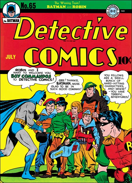
Detective Comics #65
Detective #65 (July 1942), art by Jack Kirby and Jerry Robinson

I mentioned in a previous post a review of the Jack Kirby Tribute Panel that Comic Book Resources has posted (written by Jim MacQuarrie).

At the very end of the article is found:

Jerry Robinson closed the panel by recalling his participation in one of the very few collaborations that Kirby did with anyone but Joe Simon. “The only time Jack collaborated with anyone but Simon on a cover was an issue of “Detective Comics” when the Boy Commandos joined the book. The cover showed Batman and the Boy Commandos shaking hands. I drew Batman and Jack drew the Commandos.”

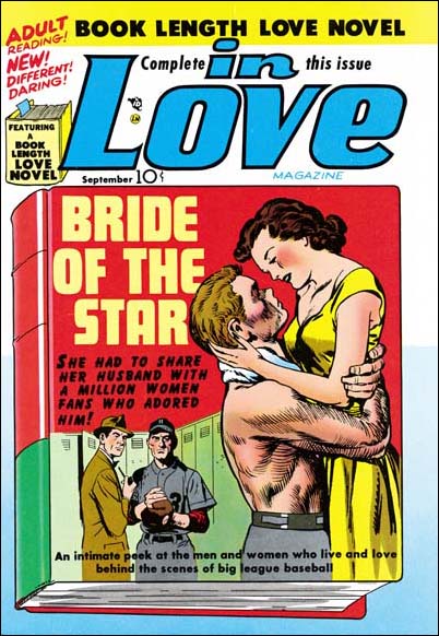
In Love #1
In Love #1 (September 1954), art by Jack Kirby and John Prentice

While of course Jerry is right about his contributions to the cover of Detective #65, he is not correct about being the only artist, other then Joe Simon, to collaborate on a cover with Jack Kirby. John Prentice, one of the usual suspects of the Simon and Kirby studio, also had that honor. Jack did the foreground couple while John did the two background figures.

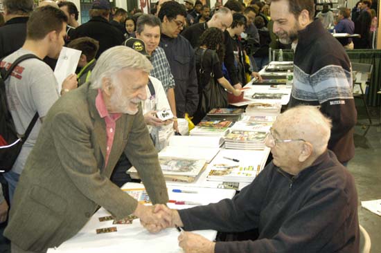
Jerry Robinson and Joe Simon
Jerry greeting Joe Simon at the Big Apple Con of 2006

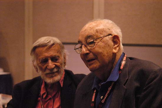
Jerry Robinson and Joe Simon
Jerry and Joe at New York ComicCon 2008

It’s A Crime, Chapter 5, Making a Commitment

(Headline #26 – #28, Justice Traps the Guilty #1 – #1)

September 1947 (cover date) was the release of Simon and Kirby’s Young Romance. This marked a milestone for the creative duo. Previously Joe and Jack had not signed any of the work that they provided for publishers Prize or Hillman with the exception of Hillman’s My Date. Starting in September Simon and Kirby signatures would appear not only in Young Romance but in Headline Comics as well. Jack Kirby drew four stories of Headline #26 and three of those were signed. From this point on Simon and Kirby signatures would frequently be found on Kirby’s drawings for Prize Comics. Despite all the work that S&K provided to Hillman, in the end it was Prize that got Joe and Jack’s commitment. Right from the start the crime version of Headline was produced by Simon and Kirby while they never seem to have the same influence with Hillman. Surely whatever deal that Joe and Jack made with Prize must have reflected their greater control over Headline while at Hillman they had remained only marginally better then just work for hire. In the end Simon and Kirby were businessmen and it was all about the money. By early next year Simon and Kirby’s work for Hillman would end.

The crime version of Headline Comics must have been a very successful seller. After just the first four bimonthly issues Prize introduced a new crime title Justice Traps the Guilty. Simon and Kirby produced JTTG as well and there really was no difference in the contents between Headline and JTTG. Since both were bimonthly titles, effectively there would be a crime comic released by Prize each month. There must have been some difficulty because JTTG #2 should have been scheduled for December but was released in January instead; while Headline #28’s normal January release was pushed back to February.

Jack Kirby would still be the main contributor to Headline Comics and the new Justice Traps The Guilty. Jack drew 4 out of 6 stories for Headline #26 (September), but would only draw two stories each for issues #27 (November) and #28 (February). The first issue of Justice Traps the Guilty followed the Simon & Kirby’s modus operandi of starting a title with lots of Kirby; Jack penciled 6 out of the 8 stories. However with the second issue Jack returns to supplying a more modest 2 stories. Still no other artist appeared more often then Jack in these issues.


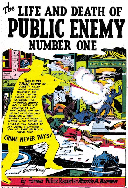
Headline #26 (September 1947) “The Life and Death of Public Enemy Number One”, art by Jack Kirby

The splash for “The Life and Death of Public Enemy Number One” uses a silhouette. There seemed to have been a flurry of the use of this device because we have seen it previously. However it would be pretty much dropped by Simon and Kirby and this may be its last use. While making the overall design of the splash more interesting, the use of silhouette diminished the impact as well.


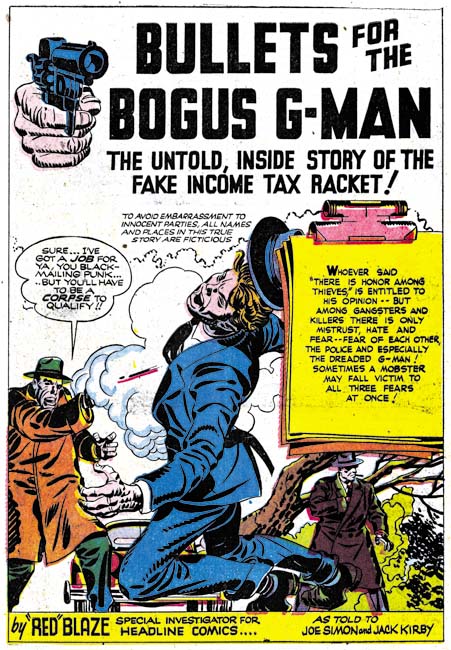
Headline #26 (September 1947) “Bullets for The Bogus G-Man”, art by Jack Kirby

Another device used by Simon and Kirby in the early Prize crime comics was having “Red” (or “Red-Hot”) Blaze introduce the stories. While I suspect that Simon and Kirby found it a useful idea when they were promoting the idea of crime comics to Prize and for the initial in-house advertisements, in the end it just took up story panels that would had been better served for telling the actual story. “Bullets for the Bogus G-Man” may have been the last use of “Red” Blaze and even there he is only mentioned in the caption at the bottom of the splash page and never makes an actual appearance in the story.


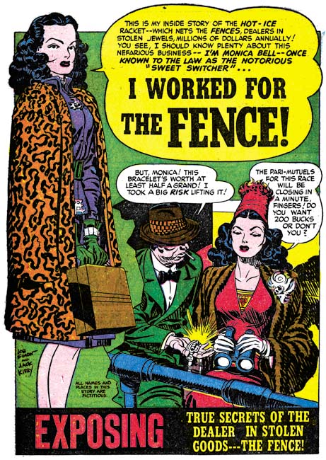
Headline #28 (February 1948) “I Worked For the Fence”, art by Jack Kirby

One motif Simon and Kirby sometimes used for the first story was adopted from previous use in Young Romance. That is having a character introducing the story and using the word balloon as the title caption. Simon and Kirby did not use this design technique as frequently in the crime titles as they would in Young Romance but it still was an effective part of their repertoire.


Headline #27 (November 1947) “Spirit Swindlers” page 7, art by Jack Kirby

I have remarked before that circular panels was largely limited to an occasional splash page for the work that Simon and Kirby did for Hillman. For the Prize issues discussed in this chapter, Joe and Jack continued to use circular panels. What was new is that while previously almost all the Prize comic stories used circular panels in Headline #26 to #28 and JTTG #1 and #2 about half of the stories did not use round panels at all. For the stories that still featured circular panels they are used in lower proportions. For Headline #23 to #25 ratios of rounded panels to all the panels was over 16% and in one story reached 20%. Remember for a story done in the standard 6 panels per page, this would work out to an average of a semi-circular panel for each page (although they rarely were distributed so evenly). For Headline #26 to #28 and JTTG #1 and #2, when rounded panels were used they were generally used in the range of 14% to 10%. This is only a small decrease, but it seems to be consistent. In one story (“The True Life Story of Alvin Karpis” it drops to 4%. The last issue covered in this chapter (Headline #28, February 1948) did not have any rounded panels.

I have also been trying to track the evolution of the inking techniques used. Previously in Headline drop strings and abstract arch shadows, typical Studio style mannerisms, had become commonly used. Picket fence crosshatching and shoulder blots were still rare and when found are not typical in execution. (See my Inking Glossary for explanations of the terms I use to describe these techniques). In the last chapter we saw those final typical Studio style techniques show up suddenly in the Hillman crime title. The same thing happened at Prize. The earliest typical picket fence brush work for Prize that I have noticed was in “Spirit Swindlers” (see above image, particularly panels 4 and 6. There seems to be no gradual conversion of previous simple crosshatching to picket fence crosshatching; picket fence just suddenly appears. The picket fence inking shows up elsewhere in the story as well. Not every story in the same issue, however, shows the use of this most distinctive inking. Also note the shoulder blot in panels 1 and 2.


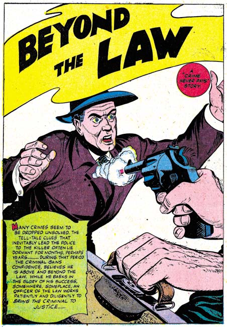
Headline #26 (September 1947) “Beyond the Law”, by unidentified artist

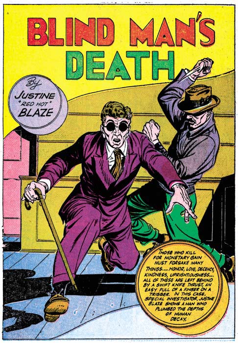
As mentioned above, Kirby drew 4 of the 6 stories for Headline #26. The other two stories (“Test of Death” and “Beyond the Law”) were done by the same artist. I have not been able to identify him but he also did “Murder’s Reward” and “Blind Man’s Death” from Headline #25. Ger Apeldoorn has suggested that it might be Bob McCarty. I am most familiar with McCarty’s work for S&K’s Mainline titles. The Mainline material does not resemble these four stories but that could be explained by the seven years separating the two groups of work. In any case the work in Headline #25 and #26 was done by a talented artist who played an important part in the early Headline issues. After issue #26 the artist stopped providing work to Simon and Kirby.


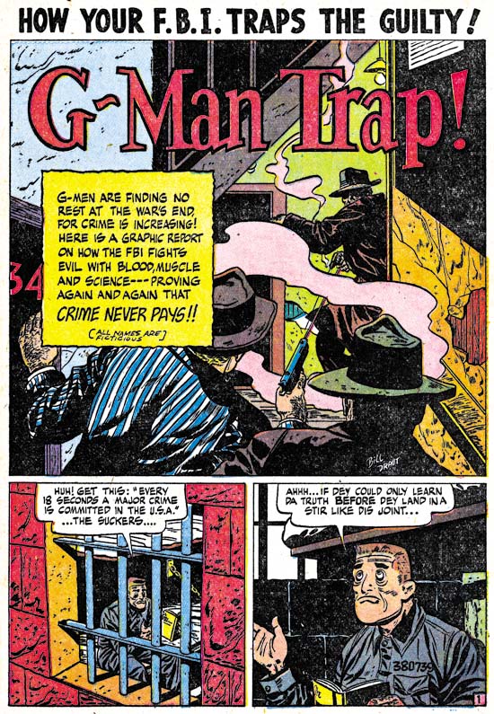
Justice Traps the Guilty #1 (October 1947) “G-Man Trap”, art by Bill Draut

After the mystery artist last appearance in Headline #26, his place as the most important supporting artist (after Kirby) was taken by Bill Draut. Draut’s first returned to the Simon and Kirby productions in Young Romance #1 (September 1947). From that point on Bill would be a mainstay of the S&K studio until its breakup. Draut would provide two stories each issue for Headline #27 and #28 as well as JTTG #1. In those issues Draut’s contributions of stories equal that of Jack Kirby. It is interesting to see Draut’s take on crime since so much of his output for the Simon and Kirby studio was for romance titles. Bill could be surprisingly effective with action and he also did some interesting splashes. The one for “G-Man Trap” is a good example. The use of diagonal elements makes the splash visually stimulating. However, the placement of the gun smoke and the odd pose of the shooter in the background really did not work well and diminishes what should have been an interesting confrontation. Still you have to admire Draut for the attempt made even if it was not completely successful.


Justice Traps the Guilty #1 (October 1947) “Try an FBI Test” page 2, art by Bill Draut

As I have mentioned a number of times in the past, I am convinced that Kirby did not supply layouts for Draut as some experts have suggested. Bill’s means of telling a story and his splash designs (such as the one from “G-Man Trap” shown earlier) are often different from Jack’s. There is one story, “Try an FBI Test”, that might suggest otherwise. Note the use of circular panels. These appear throughout the story and are the same form that Kirby uses. While this might suggest that Kirby did the layouts, I am not convinced. In “Try an FBI Test” the captions and word balloons frequently extend beyond the border of the circular panels which is unlike Kirby’s use where both captions and work balloons invariable are confined within the circular boundary. Nor was there any real change in the way the story is graphically told compared to other work by Draut. I believe Draut has just trying a layout technique that he previously observed Kirby using. Whatever the reason for the use of circular panels, it was a one time occurrence as I do not believe Bill would ever used it again.


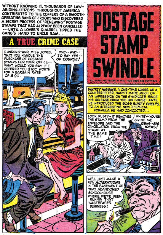
Headline #28 (February 1948) “Postage Stamp Swindle”, art by Jerry Robinson and Mort Meskin

Young Romance #3 (January 1948) saw the first appearance of the Jerry Robinson and Mort Meskin team working for the Simon and Kirby studio. “Postage Stamp Swindle” (Headline #28, February 1948) was the first crime work that they did for S&K. As a team, Robinson and Meskin would only work for Joe and Jack for about seven months and provide a total of ten pieces of work. Only two of the stories are signed but the unsigned work is very consistent with those bearing signatures. Jerry and Mort had a preference for splash pages with a vertically dominated splash panel with two story panels also vertically arranged. The first page of “Postage Stamp Swindle” exaggerates that motif by placing the title over the story panels in a caption shaped like a stamp. Otherwise the splash panel usually had the shape of an inverted ‘L’.

I have been assigning the pencils to Jerry and the inks to Mort. This was due to the order that their names appear in their signature. Further the inking does predominately look like Meskin’s. Recently I have been spending some time looking over some of Meskin’s work from 1946 and 1947. I find that the work Robinson and Meskin’s supplied for Simon and Kirby look very much like the early work that Mort did on his own. So much so that I wonder what Robinson’s contribution was? I am tempted to attribute all the early unsigned art for S&K as Meskin alone and only credit the last three stories, two of which are signed, to the Robinson and Meskin team. I have two reasons for not taking that course. One is the still great similarity of the signed and unsigned work. The second is Joe Simon’s story of when Mort came to work for the Simon and Kirby studio as described in his book “The Comic Book Makers”. Joe really makes it sound like that was the first time Mort had worked for them which would not be true if Meskin was solely responsible for the work from 1948.


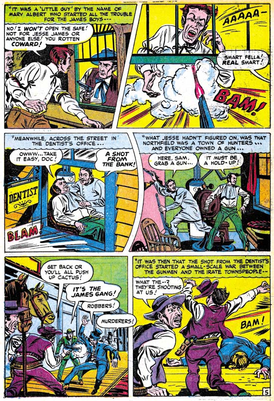
Headline #27 (November 1947) “The Guns of Jesse James” page 5, art by Jack Kirby and an unidentified artist

“The Guns of Jesse James” is one of those stories that at a glance were obviously done by some artist other than Jack Kirby; the drawing is just too crude. There are some places where the art, although still crude, looks like Jack’s style. The second panel in the page above is a good example. This story even uses rounded panels like those that Jack would use for some of his own stories. While it is possible that the artist was trying to mimic Kirby’s techniques, I think it more likely that he is working from rough layouts provided by Jack.


Justice Traps the Guilty #2 (January 1948) “The Killer Thought He Was Satan” page 4, art by an unidentified artist (Jack Kirby layouts?)

The possibility of rough Kirby layouts may also apply to “The Killer Thought He Was Satan”. Note in particular the second panel from page 4 shown above. In many ways the graphic story telling is even more like typical Kirby mannerisms then “The Guns of Jesse James”. Both of these stories come from a period where Kirby’s contributions had diminished and the use of layouts may have been an effort to filling the titles without using too much of Jack’s time.


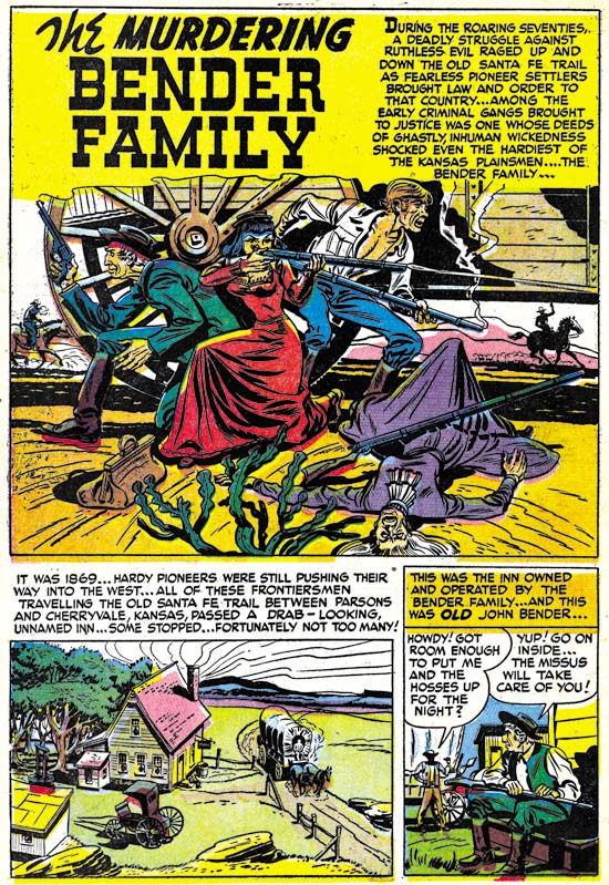
Justice Traps the Guilty #2 (January 1948) “The Murdering Bender Family”, art by an unidentified artist

As I precede in future chapters of this serial post I will certainly not try to cover every unidentified artist in these titles. While I would consider most, if not all, talented some were more deserving of recognition than others. Besides there will be too many artists that I have not identified yet. In these early issues of the crime titles, however, the number of artists appearing is much more limited. So I will close with the splash page of one of mystery artists. I sure wished more of them took advantage of Simon and Kirby’s willingness to allow artists to include their signatures.

Chapter 1, Promoting Crime
Chapter 2, A Revitalized Title
Chapter 3, Competing Against Themselves
Chapter 4, Crime Gets Real

Chapter 6, Forgotten Artists
Chapter 7, A Studio With Many Artists
Chapter 8, The Chinese Detective
Chapter 9, Not The Same
Chapter 10, The Master and His Protege
Chapter 11, The New Team

Abrams to Publish Simon and Kirby Art Book

Comic Book Resources has a commentary on the Jack Kirby Tribute Panel from the most recent San Diego Comic-Con International. Of greatest interest to this blog was an announcement made:

After discussing his recent book, “Kirby: King of Comics,” which he said was doing phenomenally well, Evanier turned the mic over to his publisher, Charlie Kochman from Harry N. Abrams Co., who announced that Joe Simon is opening his archives and Abrams will publish “The Art of the Simon & Kirby Studio” in Spring 2010. The large-format book will have oversize pages, with faithful reproductions scanned from the original art boards.

I am really happy to be able to finally post this. Abrams is one of the largest publishers of art books (if not the largest). The job they did on “Kirby: King of Comics” was just fantastic. I do not believe that any publisher has previously devoted a large book to original comic book art. I cannot begin to describe how excited I am about this project.

It’s A Crime, Chapter 4, Crime Gets Real

(Real Clue Crime Comics vol. 2 num. 4 – 7, vol. 4 num. 4)

With Hillman’s June 1947 issue, Clue Comics became Real Clue Crime Stories. It was not just a cosmetic name change, the contents changed as well. Real Clue became a true crime comic. No longer would costume heroes Nightmare or Micro Face make any appearances. The feature Iron Lady, which was not a pure crime genre, would not appear again until three issues later (September). Most importantly the star feature, Gun Master, would no longer be the first story and would only appear once in each issue. In my opinion Simon and Kirby had little influence on Clue Comics; Hillman was already moving the title to give it a more crime genre feel. In essence though, Clue remained a hero genre book. I cannot help conclude Simon and Kirby had much to do with the change to Real Clue. Joe and Jack stories for Clue had showed how effective a purer version of the crime genre could be. Simon and Kirby would dominate the newly titled comic and for the first time provide all the covers.


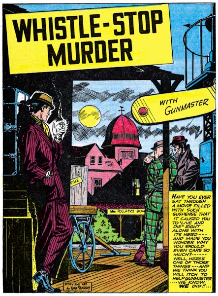
Real Clue Crime Stories vol. 2, num. 4 (June 1947) “Whistle-Stop Murder”, story and art by Dan Barry

Gun Master may have been pushed out of the leading feature spot but it was not completely abandoned as an important part of the new Real Clue. For the first three issues of Real Clue, Gun Master would place as the last story in the comic. Even more significant the stories would be, at 15 pages, the longest story in the comic. In an uncommon move the first Gun Master story, “Whistle-Stop Murder”, credits both the story and art to Dan Barry. In the early days of the history of comic books it was not at all unusual for the artist to do all aspects of the story. But that soon gave way to an industrial like division of labor with the penciler working from a script written by someone else. Examples like Dan Barry’s “Whistle-Stop Murder” became rather rare. Barry is an excellent artist but this shows he was a talented writer as well. I do not know if it was his idea or he was working from some directive, but Barry made an important change to Gun Master. No longer would the mysterious Councils of Elders appear and now Gun Master would get involved in a case through the simple expediency of a call for help from the authorities. Gun Master had now pretty much dropped all the trappings of the hero genre. This change may explain why although Simon and Kirby did further Gun Master stories (I was in error when I said in the last chapter that they would not) they never returned to the Packy Smith story arc. Mastermind criminals and explosive element X while fine in the hero genre, just had no place in the more typical crime stories that Gun Master would now appear in.


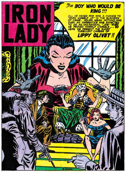
Real Clue Crime Stories vol. 2, num. 7 (September 1947) “The Boy Who Would Be King”, art by Bernard Sachs

For whatever reason, in the fourth issue of Real Clue the Gun Master ending feature was replaced by an Iron Lady story. No changes were made to Iron Lady so her feature seems a little out of place in Real Clue’s emphasis on a purer variety of crime stories. The artist was Bernard Sachs who we saw in the last chapter as an inker for a Carmine Infantino story. Sachs would ink a number of different artists for Hillman Publications but here he is acting as penciler.


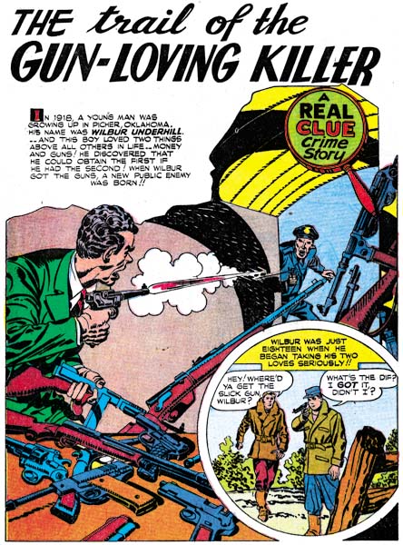
Real Clue Crime Stories vol. 2, num. 4 (June 1947) “The Trail Of The Gun-Loving Killer”, art by Jack Kirby

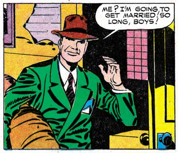
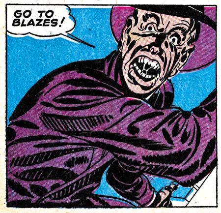
The splash for “The Trail Of The Gun-Loving Killer” has a multitude of guns. Those on the table are particularly well handled even though some of the guns are laying on top one another. There is only one gun on the table that does not seem quite correct. On the other hand I have no idea how the rifles and other weaponry on the right are being held up. There is one rifle that seems leaning on something, but it is a story panel that visually holds it up. Simon and Kirby continued in Real Clue to exclude rounded panels from their story art and the above splash page is the only one from that title to have a semicircular panel. The drawing style adopted for Simon and Kirby crime stories remains in use. In reality the style is not so much adapted for crime as it also appears in The Flying Fool feature for Airboy. The inking style remains the same as seen previously in Clue Comics. Some of the traits for the Studio style are found such as drop strings and, as seen in the splash above, abstract arch shadows (see my Inking Glossary for explanation of the inking terms I use). The criminal has something akin to a shoulder blot but note how it seems made from overlapping form lines. This is an approach seen much earlier in work done for DC such as the Newsboy Legion.


Real Clue Crime Stories vol. 2, num. 4 (June 1947) “The Trail Of The Gun-Loving Killer” page 7 panel 4, art by Jack Kirby

Shoulder blots typical of the Studio style appear in the same story. This one panel has shoulder blots, drop strings and an abstract arch shadow; the only key Studio style technique missing is picket fence crosshatching.


Real Clue Crime Stories vol. 2, num. 5 (July 1947) “Wyatt Earp’s Bluff”, art by Jack Kirby

The shadow on the figures whose back is turned to us is not a typical Studio style shoulder blot, but those of his two opponents certainly are. At this time shoulder blots seemed to be used either to depict a shadow (as in the splash above) or to provide some form to the shoulder (in which case the blot would be narrower). Later Simon and Kirby would use of shoulder blots more abstractly; shoulder blots would appear without a hat to suggest a shadow or without providing a real sense of form. Again we find drop strings and abstract shadow arches in this splash. But no picket fence crosshatching. Simon and Kirby did make more frequent use of simple hatching as here in the center man’s hat and waist. At times the parallel lines would butt up against a line or row of drop strings so as to begin to resemble typical picket fence brushwork.

Simon and Kirby never produced a pure western genre comic. Boys’ Ranch was a combination of western and boy gang genre while Bullseye brought together the western and hero categories. The western romance comics were more romances then western. It is stories like “Wyatt Earp’s Bluff” in the crime comics that provides an idea of how Simon and Kirby would have handled a western comic. Too bad they never did, it would have been great. But then again S&K were great at just about every genre they tried their hand in.

The splash page has a compositional device that Simon and Kirby had made use of before; a low view point combined with a symmetrical placement of figures. The low viewing angle allows the central figure to tower above the others without seeming to look unnatural. The whole arrangement results in a triangular formation, a classic compositional device in the fine arts. For other examples of this type of layout see the covers for Daring Mystery #8 and Boy Commandos #1. In this splash however the central figure has his back turned to the reader thereby adding an element of mystery to the image’s tension.


Real Clue Crime Stories vol. 2, num. 6 (August 1947) “Get Me The Golden Gun” page 12 panel 4, art by Jack Kirby

“Get Me the Golden Gun” from the August issue provides the earliest example of true picket fence crosshatching in the Hillman comics. When it does show up the picket fence brushwork is completely typical of the Studio style. The pickets are thick bold brushstrokes and they are associated with well defined rails. It would seem that the typical picket fence crosshatch did not evolve from the simple crosshatching but was just suddenly picked up. Perhaps when we return to Headline we may learn something more. The picket fence technique would be used in other panels in this story but not many of them. Further other stories from the same issue and the next one would not use this type of brushwork. After trying the new technique, it seemed that Simon and Kirby were not yet committed to it.


Real Clue Crime Stories vol. 2, num. 6 (August 1947) “Get Me The Golden Gun” page 12 panel 4, art by Jack Kirby

Jack Kirby considered himself primarily a story artist. Yes he did great covers and splashes but they were not as important to him as the story. I am sure at least some of the credit for the great splashes and covers goes to Joe Simon who Jack would later describe as a master at cover layouts. By this point in Jack’s career I seriously doubt that Joe did any story layouts for him. So when I see a panel like the one shown above I have to believe the credit goes to Jack. It is the final panel of the Gun Master story. The page uses a 4 panel layout and so the panel is larger then Kirby generally used. Even so it only covers a quarter of the page but the design gives it as much an impact of any splash or cover.

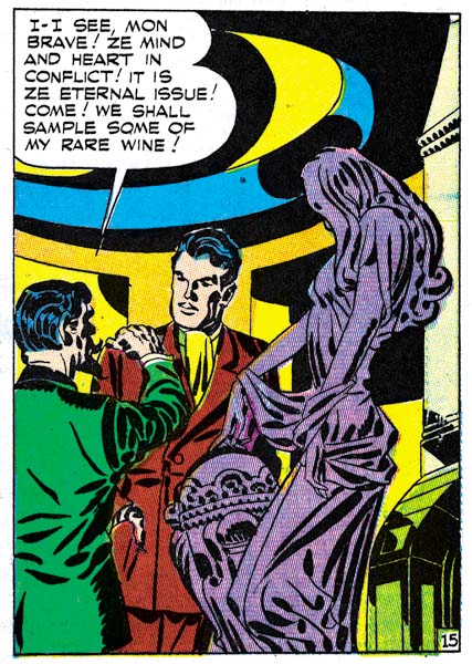
I simply cannot be sure what the pattern on the ceiling is meant to be. I presume is some sort of dome but it seems so oddly done. But that is my rational mind talking, as a design element is makes complete sense; in fact is crucial. The swirl it provides a bridge between the word balloon and the figures. Echoes of this swirl are found throughout the room; which if anything seems even more irrational then ceiling. Are those recesses in the background? How would that cornice on our right edge have connected to the ceiling? How could the round shape of the room in the background meet the rectangular shape of the cornice? What is that thing in our lower right corner? I do not know the answers to any of those questions but the bold curvilinear patterns visually connect all of these elements of the room and keep the eye constantly moving.

The foreground sculpture does not truly share the room’s pattern but has its own instead. The spotting on the figurine is bold but not when compared to the background. Still the spotting of the sculpture provides a life of its own giving the eye much to explore. I am a great admirer of how well Kirby handled the figure under the clothing. There is no doubt that the figurine’s leg nearest the view is flexed while the other leg is represented as holding the weight yet both legs are hidden by the flowing dress. The classical Greek sculptors figured out how to do this but while many fine artists have studied classical art there were few that could do it well. Kirby consistently makes it look easy even though as far as I can tell he never studies classical Greek sculpture.

The background room and the foreground statue provide busy surfaces to look at and therefore normally would be expected to dominate the image. However the simpler and more stable spotting provided to the two men actually attracts the eye and gives them an importance that overcomes their diminished size. The whole panel is a tour de force.


Real Clue Crime Stories vol. 2, num. 4 (June 1947) “Dandy John Dolan”, art by unidentified artist

Simon and Kirby provided a lot of the art for the early issues of Real Clue. Besides the cover the duo would contribute 3 to 4 stories. But other artists make their appearances as well. Unfortunately I have no idea who drew “Dandy John Dolan”. He did other work for Real Clue and really is an excellent artist. Compositionally the splash for “Dandy John Dolan” is a good job but I have to admit what the seated figure is supposed to represent. He obviously is meant to be the same person ascending the gallows, but as he does not seem to be telling the story, what other function was he meant for?


Real Clue Crime Stories vol. 2, num. 5 (July 1947) “The Car Barn Gang”, art by unidentified artist

“The Car Barn Gang” is another work by an obviously talented individual that I am unable to identify. Another of those splashes that action is not always required for a good piece of comic art. In this case much of the interest comes from careful depiction of a dilapidated neighborhood. But another reason I like this splash had nothing to with the artist’s original intention. The dapper gang members that have taken over the neighborhood are an amusing comparison to the clothing that a modern day gang-banger would wear while in the hood.


Real Clue Crime Stories vol. 2, num. 6 (August 1947) “Brain-Man of Crime”, art by Robert Fujitani

One artist who makes his appearance in Real Clue is Robert Fujitani (who sometimes signed his work as B. Fuje). My primary interest is the Simon and Kirby studio but by no means does that mean that I do not admire artists who did not work for Joe and Jack. Certainly what little I have seen of Fujitani’s work impresses me a good deal. Overall what strikes me about the artists appearing in Clue and Real Clue, and that includes those I have not identified, is that they do not appear to have worked elsewhere for Simon and Kirby (except perhaps much later Dan Barry would). Keep in mind that S&K were producing Headline at the same time and would also create Young Romance in September. This suggests that despite the large influence that Simon and Kirby may have exerted on Real Clue Crime Stories, they really were not actually producing it.

Simon and Kirby would only work on four issues of Real Clue with the last cover dated September 1947. Other work for Hillman would end as well in the next few months. This suggests that although Hillman represented a good opportunity for well needed income to keep the Simon and Kirby collaboration going, it was not all that rewarding in the long run. The agreements Joe and Jack struck with Prize Comics were clearly much better financially and provided plenty of work. Having finally escaped the difficulties caused by the collapse of the Stuntman and Boy Explorer titles, Simon and Kirby would now build up their comic production studio.


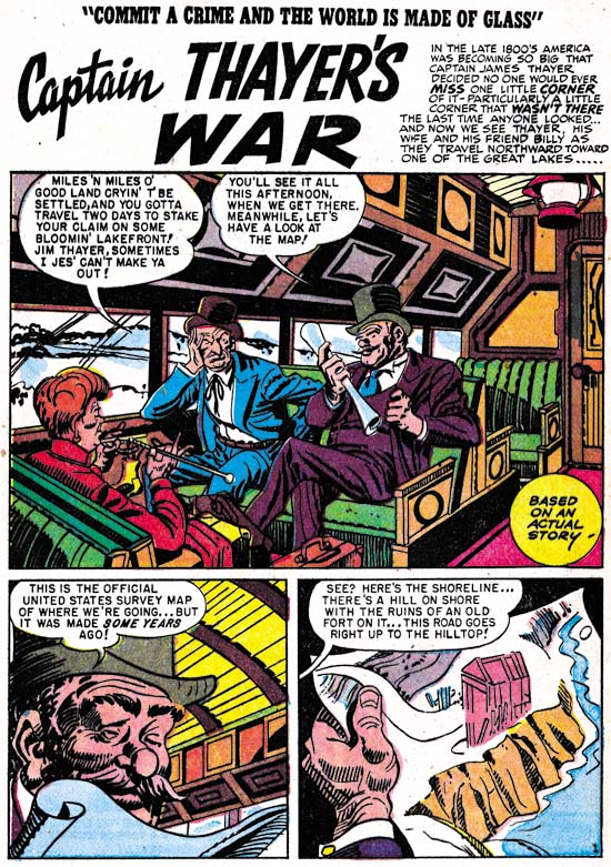
Real Clue Crime Stories vol. 4, num. 4 (June 1949) “Captain Thayer’s War”, by an unidentified artist.

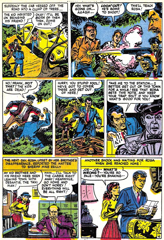
Normally with Simon and Kirby’s exit my discussion of Real Clue Crime Comics would end. Frankly with a single exception I have no access to any further issues. The Hillman titles deserve a good examination, but unfortunately I am not the one able to do it. However The Jack Kirby Checklist includes “Captain Thayer’s War” from the June 1949 issue as being inked, but not penciled, by Jack Kirby. As I have said before I would love to see how Jack would ink another artist’s work. However on close examination I do not find any of these inking attributions convincing and “Captain Thayer’s War” is no exception. I certainly understand how this mistake was made as the story is inked in the Studio style. Picket fence crosshatching and drop strings, hallmarks of the Studio style, are found in abundance. There are no true abstract arch shadows, but there are some rounded shadows of the type that S&K often used such as the one on the seat in the back. The only common feature of the Studio style that is missing is shoulder blots. However there are other inking manners that do not match those used by Jack Kirby. It is a little hard to make out in the image I have provided, but the shadow on the hat of the man on our right is made from five broad lines with rounded ends. I have never seen Jack use that inking technique. Nor have I ever seen an example by Kirby like the shadow of the hat in the second panel. Similar disparities occur throughout the story. I am convinced that this was not inked by Kirby, or Simon either for that matter. Do not let the cartoony style of the drawing mislead, the penciling of this story mimics Kirby’s style as well. The artist obviously has made a careful study of Simon and Kirby’s work. In cases like this one must not just look at the similarities between inking styles but also study the differences.

Chapter 1, Promoting Crime
Chapter 2, A Revitalized Title
Chapter 3, Competing Against Themselves

Chapter 5, Making a Commitment
Chapter 6, Forgotten Artists
Chapter 7, A Studio With Many Artists
Chapter 8, The Chinese Detective
Chapter 9, Not The Same
Chapter 10, The Master and His Protege
Chapter 11, The New Team

Further Responses to Joe Simon’s Open Letter to Marvel

A couple of days ago I posted Joe Simon’s open letter to Marvel Comics. Gerard Jones posted a response in the comment section of that post. To make things easier for the reader here is Gerard Jones comment:

Harry:

Thanks very much for posting this. Joe has certainly earned the right to tell me (or anyone else) that I’m full of shit–and I’m sorry if I gave offense or got things wrong. I actually made repeated efforts to contact Joe about this issue when I was writing my book but I was told he couldn’t or wouldn’t talk about it (I assumed for legal reasons). I’m doing my best here to piece the truth together from what’s available, and any more information would be very much appreciated. Whatever helps us get closer to the truth. Many of my most valuable learning experiences have followed someone telling me (if not in exactly those words) that I’m full of shit.

Thanks again,
Gerry Jones

I passed on Gerry’s response to Joe and have recieved from him the following:

Dear  Jerry:
I apologize for the crude remark. I was annoyed by your statement that there was no information ever about the royalty history. Actually, I have no record of you ever checking with me or with the Kirby family. If so, you would have known that there were papers and  notified letters confirming our position, some from Morris Coyne, the chief accountant of Timely who told his story backing up Simon and Kirby.

I loved the Masterworks book but my problem with all of them is the dust cover or introductions are mostly pure fiction. The collectors need more and deserve more research . As a journalist you should do more of this  .

Thank you for your controlled reply.
 
Joe Simon

The material from Mister Coyne was presented at the recent legal circus where Marvel Sued Simon, not the other way around. There were other affidavits


Coming Soon from Titan: Simon and Kirby

It is not much, but Titan has a little announcement about their Simon and Kirby books on their web site.

It’s A Crime, Chapter 3, Competing Against Themselves

(Clue Comics vol. 2 num. 1 – 3)

The same month that the first crime version of Prize Comic’s Headline was released, Simon and Kirby also appeared in Hillman’s Clue Comics (v. 2, n. 1, March 1947). Over the rest of the year Joe and Jack would do a wide variety of work for Hillman Publications; a Caniff style adventure (“The Flying Fool” in Airboy Comics), funny animals (“Lockjaw the Alligator” and “Earl the Rich Rabbit” in Punch and Judy Comics), teenage humor (My Date Comics) and crime (Clue Comics and Real Clue Crime Comics).

Clue Comics had started out in January 1943 as a hero genre anthology. The covers featured the costumed hero, the Boy King, and the interior included features such as Nightmare and Micro Face. It must not have been very successful because it began as a monthly, switched to a being a bimonthly with issue #4 and then quarterly with issue #8 before being put on hold after issue #9 (Winter 1944). Hillman rebooted Clue Comics after the war (cover date October 1946) and introduced Gun Master as the cover feature. Gun Master gave a more crime genre feel to Clue Comics but it remained as essentially a hero anthology with Nightmare and Micro Face continuing to be included. The revamped Clue must have been successful because it started as a bimonthly but switch to being a monthly with the March 1947 issue.


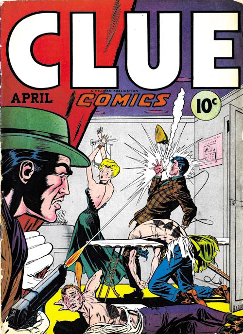
Clue Comics (volume 2, number 2, April 1947), art by Dan Barry

Since the Gun Master did not wear a costume or have any super-powers, the covers for Clue very much had a crime genre feel to them. This can particularly be seen in the cover for the April issue shown above. This cover drew its inspiration from the more graphically brutal covers that some crime comics then used. The depiction of torture by electric iron certainly appeals to the more prurient tastes and goes way beyond what artists like Simon and Kirby would ever produce. The April cover is a bit exploitive and misleading as it does not represent the type of stories actually included in the comic book. Hillman would not repeat such a graphic depiction again for any cover of Clue Comics or the later Real Clue Crime Comics.


Clue Comics (volume 2, number 1, March 1947) “Gun Master”

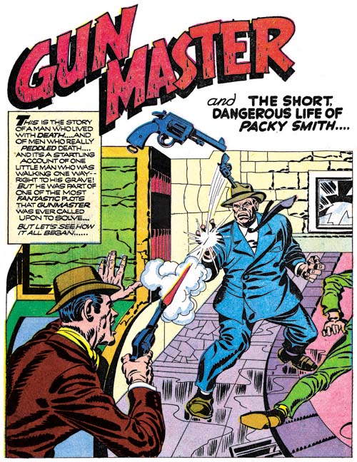
With the March and April issues, Gun Master played an even greater roll for Clue Comics as there were now two Gun Master stories in each issue. If Gun Master’s uncannily accurate ability with a pistol were not enough to convince one that he really belongs in the hero genre then perhaps the Council of Elders will. They were mysterious robed figures who directed the Gun Master. Not the sort of story device expected to be used in a typical crime story.

I do not know who the artist was for the above splash, but despite the complete lack of any real action he has managed in any case to make it interesting. Much of the effect of the splash is due to the low viewing angle and unnatural but effective perspective. From such a low view point the sides of the buildings and lamp post should converge towards the top but diverge instead, giving the scene an other-world appearance. The architectural details enhance the strangeness of the scene which I suspect is meant to be in Europe. Perhaps the weakest element of the splash is the upper of the two dead men. The way he is prompt up on his elbows seems unstable and unexpected for a corpse.


Clue Comics (volume 2, number 1, March 1947) “Iron Lady”

A new feature, “Iron Lady”, was added to Clue Comics that both gave the comic a more crime comic feel while actually making the title untypical for that genre. “Iron Lady” was a feature about a female villain. Such an anti-hero theme had been used previously (such as The Claw) and female lead characters were also not that unusual but I am not sure if the combination had ever been done before. Her use of special gloves that gave her great strength shows once more that this really is not a crime story. Iron Lady’s appearance in Clue Comics is not her debut as I believe she appeared previously in Airboy Comics.


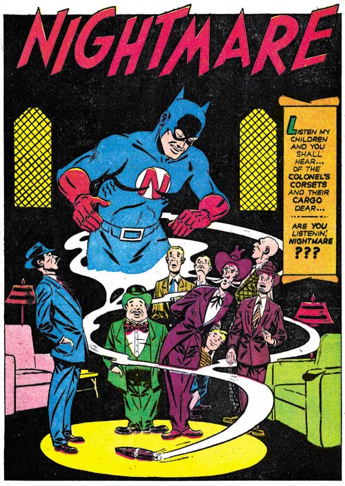
Clue Comics (volume 2, number 2, April 1947) “Nightmare”

The revamped Clue Comic still retained some of its older features. Nightmare appeared in the March and April issues while Micro Face showed up in the May release. Judging solely by the covers of the early issues of Clue Comics, Nightmare originally had a young sidekick who somewhere along the line had been dropped. This hero appears from the smoke of a cigar which is reminiscent of the Flame from Fox Comics or Simon and Kirby’s Vision for Timely. Micro Face has a peculiar face gear that almost looks like a welder’s mask. These two costume heroes certainly work against the crime genre look that the revamped Clue seemed to be striving for.


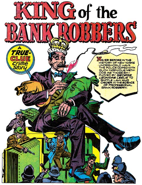
Clue Comics (volume 2, number 1, March 1947) “King of the Bank Robbers”, art by Jack Kirby

The Simon and Kirby’s contribution to the March 1947 issue of Clue was unabashedly crime genre. It was supposedly a true story and considering it was a period piece it probably was based on some real life criminal. No special powers here, just the career of a colorful criminal and his eventual downfall. Despite its short term attractions, in the end crime does not pay. The use of an oversized figure in the above splash is unusual for Jack Kirby particularly when doing crime comics. I tend to believe that when such oversized figures were used it was based in part on a Simon layout as oversized figures played a part in Joe’s art both before and after working with Jack.


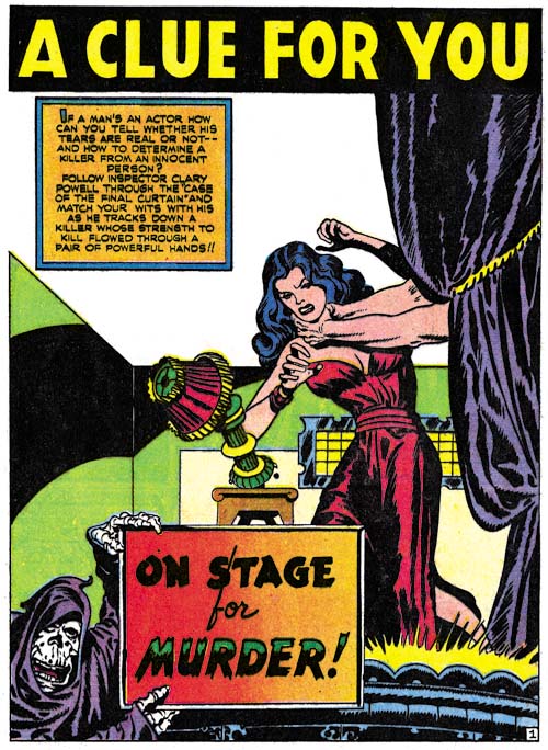
Clue Comics (volume 2, number 2, April 1947) “On Stage for Murder”, art by Jack Kirby

There was only a single Simon and Kirby piece in the March issue but their presence increased as they did two stories for the April issue and three for May. The art work done in the Clue Comics seems to be indistinguishable from that appearing concurrently in Prize’s Headline. This includes the type of inking done. In the previous chapters I have described this as part of the Sculptural style. Actually the use of style names is for convenience as inking used by Simon and Kirby was continually evolving and there really were no distinct breaks in the type of inking used. To lump it all together would mean to ignore the real changes that were made, but to divide the inking too finely into different periods would just confuse the issue. As I have been reviewing the art for this and the serial post “The Art of Romance” I have been coming to the realization that although during this period Simon and Kirby have not adopted all the characteristics of the coming Studio style of inking, they also were no longer working in quite the same manner as they had used during the war. In particular there was less emphasis on what I call form lines (see my Inking Glossary for explanation of my terms). These form lines were previously very dominantly used and were the reason I gave the name to the inking the Sculptural style. I am not going to try to answer this issue now but I am still interested in how the Studio style came into being. As with the art done for Headline, that for Clue Comics does not include the common use of picket fence crosshatching or shoulder blots. However as previously seen in Headline, abstract shadow arches, another technique of the Studio style, begins to appear more frequently. A good example is the splash shown above. Another Studio style technique is the use of drop strings and that mannerism also begins to become more common.


Clue Comics (volume 2, number 3, May 1947) “Flowers for Roma”, art by Jack Kirby

Although the art used for Clue and Headline comics is pretty much the same the panel layouts are not. In my previous chapters on the crime art that Simon and Kirby produced for Prize Comics I noted that circular and semi-circular panels were used at just about the same level as previously in Stuntman and Boy Explorers. On an average this would work out to be about one round panel for every story page. The round panels are completely absent on any of the story pages that Joe and Jack did for Clue. There are two occurrences of circular panels in Clue and they both are restricted to the splash page. The circular panels on the splash page are truly story panels and so must still be considered, but even so there is a clear distinction between the panel layouts for Headline and Clue. I am just not sure what to make of that distinction.


Clue Comics (volume 2, number 2, April 1947) “The Short, Dangerous Life of Packy Smith”, art by Jack Kirby

Simon and Kirby’s contribution to Clue Comics was not limited to “true” crime stories. They also had a chance to work on Gun Master as well. Because it was the key feature for Clue Comics it is not surprising that Joe and Jack did not make any serious changes to Gun Master. Gun Master remained an uncanny marksman who continued to receive his direction from the robed Council of Elders. However Simon and Kirby did make one innovation, they tried to provide the feature with a continuing story line while previously all the Gun Master stories had been stand alone units. What Simon and Kirby did was to introduce Packy Smith a man born with “element X” in his body and as the result doomed to an early death. If that were not bad enough it turns out that element X could be used to turn Packy into a human bomb. This results into a manhunt for Packy by not only Gun Master but by the criminal element as well. In the April issue the story ends with Packy Smith disappearance after haven taken a nose dive off a bridge. In the May issue Simon and Kirby continue the tale revealing that Packy had survived the plunge. Even the ending for the second tale was clearly not meant to be the finish as not only does Packy get away again but Gun Master has obtained the phone number to the criminal mastermind behind the manhunt. Unfortunately although Gun Master would make some further appearances, Simon and Kirby never returned to the feature to continue the story. Clearly Joe and Jack were not simply following someone else’s script.


Clue Comics (volume 2, number 2, April 1947) “The Finger Man”, art by Carmine Infantino and Bernard Sachs

As previously discussed there were a number of continuing features in Clue Comics. Simon and Kirby would produce most of the remaining “true” crime stories, but not all. “The Finger Man” is one such example. Fortunately it is signed otherwise I am not sure I would have recognized Infantino’s work. Besides his silver age comics I am most familiar with the Charlie Chan Comics that Carmine drew for Simon and Kirby in 1948 and early 1949. Despite the fact that Charlie Chan was done only a little over a year later, the style Carmine used was very different then the one shown here in “The Finger Man”. It would seem that Infantino adopted a Kirby influenced style just for the work on Charlie Chan. Carmine is an excellent artist and it would be interesting how his style evolved over the years. Unfortunately Infantino only worked for Simon and Kirby that once and so my knowledge of his art is otherwise limited to occasional pieces such as this. In “The Finger Man” Carmine is inked by Bernard Sachs. Sachs was a commonly used inker at Hillman at this time and he also did some pencil work.

Like the initial Headline art that Simon and Kirby did for Prize, the duo did not provide signatures on any of the work they did on Clue. The only work for Hillman that they signed was for My Date and a single cover for Western Fighters. As I mentioned in the last chapter it was very untypical for Simon and Kirby to leave out their signature on so much work. My Date was probably their idea and nothing like it was being produced at Prize so it is not surprising that they would sign work in that title. Otherwise Joe and Jack probably did not want to make it too obvious that they were providing work for two different publishers at the same time.

My conclusion after reviewing the material is that the drifting of Clue Comics into a more truly crime comic had little, if anything, to do with Simon and Kirby. But S&K’s influence on the title seemed to increase as time went on. The May issue of Clue Comics (v. 2, n 4) was the last before the title was renamed into Real Clue Crime Comics. This was more then just a name change but that will be covered in my next chapter.

Chapter 1, Promoting Crime
Chapter 2, A Revitalized Title

Chapter 4, Crime Gets Real
Chapter 5, Making a Commitment
Chapter 6, Forgotten Artists
Chapter 7, A Studio With Many Artists
Chapter 8, The Chinese Detective
Chapter 9, Not The Same
Chapter 10, The Master and His Protege
Chapter 11, The New Team
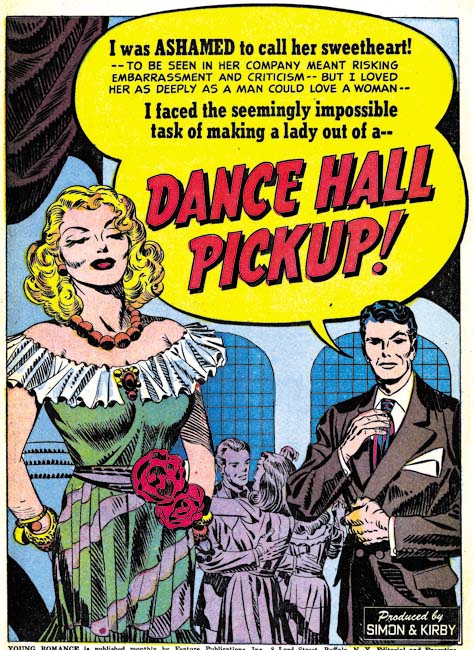
It’s A Crime, Chapter 2, A Revitalized Title

(Headline #23 – #25)

In chapter 1 I described Prize’s comics in 1946 as tired. With the arrival of Simon and Kirby things would never be the same for that company. Their effect on Headline is obvious. With issue #23 (March 1947), the title made a sudden transition from an anthology with an emphasis on the hero genre into a crime comic. That was significant, but more important was Simon and Kirby’s effect on the entire Prize comic line. Treasure Comics #10 (December 1946), the same issue that ran the first promotional S&K crime story, would be the last bimonthly for that title. Issue #12 (Fall 1947) would be the last Treasure Comics issued. In September 1947 Simon and Kirby would introduce a new title and another genre with Young Romance. The crime version of Headline must have been a success because Simon and Kirby and Prize would start Justice Traps the Guilty in October. Wonderland, Prize’s comic of funny stories for the younger readers, would end with issue #8 (December 1947). Prize Comics, the last of Prize’s hero anthologies, would become Prize Comics Western with issue #69 (May 1948). I have no reason to believe Simon and Kirby had any direct involvement with the switch of Prize Comics to the western genre. However once Simon and Kirby showed the value of publishing the more modern comics it would not have taken a genius to come up with the idea of publishing another of those popular genre. The only one of Prize’s original titles that was unaffected was Frankenstein. In a little over a year Prize went from having a tired comic line to a more modern one. Simon and Kirby would not produce every title that Prize would publish from this point on but they would dominate the company’s output and even have influence on titles other then their own. Prize would never become a big publisher but it is clear that Simon and Kirby generated a lot of income for the company and I cannot help but doubt that the publisher would have survived much longer without their arrival.

The attribution question for the first two issues of the crime version of Headline is simple, it is Jack Kirby. It was part of Simon and Kirby’s modus operandi to start a new title with Jack penciling much, if not most, of the art. However these two issues take it to an unusual extreme in not just most but all of the art is by Kirby. Such exclusion is not part of the Simon and Kirby MO. The starting issues for Young Romance, Justice Traps the Guilty, and Boys’ Ranch would all include some work by other artists. All Kirby issues would not appear again until Fighting American (1954) and the even more exceptional case of the Young Romance, Young Love and Young Bride comics of 1956. Surely the explanation for the all Kirby Headline issues was that it was a consequence of the failure of the Stuntman and Boy Explorers titles of 1946. With the sudden termination of those titles Simon and Kirby had both the time to produce stories and the need to generate money. It was only when Joe and Jack were once again regularly producing comics that they had both the need and the ability to bring other artists into their projects.


Headline #23 (March 1947) “The Last Bloody Days of Babyface Nelson”, art by Jack Kirby

The first page of Headline would exemplify the Simon and Kirby approach to crime, at least in its beginning. There in the spotlight is Baby Face Nelson standing with his smoking machine gun over two victims. Baby Face Nelson, whose name was actually Lester Gillis, was a real person and at one time was Public Enemy Number One. The story that Simon and Kirby provide is a true one, or at least as true as any made by the entertainment media. We are told of a chance encounter on a country road of one car that included Baby Face Nelson and John Chase with another car occupied by two federal agents. In the ensuing gun fight the two agents were killed and Baby Face mortally wounded only to die later. At the end of the story we find Chase behind bars. Missing from S&K’s account are Helen Gillis, Baby Face’s wife, who was also present. Also missing was a previous encounter with another vehicle with federal agents. But the gist of the story was all there and dramatically portrayed. By today’s standards, the story is very moralistic. Baby Face Nelson is not presented in a favorable light and while his end had a certain courage it was above all shown to be the act of a brutal nature. The persistent theme of all the Simon and Kirby crime stories is shown in large letters at the bottom of the splash page, “Crime Does Not Pay”. In light of all this it is surprising that critics of crime comics at the time could not see this and would instead insist that these stories glorified the criminals.


Headline #23 (March 1947) “To My Valentine”, art by Jack Kirby

“To My Valentine” is another example of a great splash and a story based a real event. The machine gun toting cupid is a nice touch. The truth of the story as presented is debatable as no one was ever convicted of the gangland murder. Sometime later there was a gang member under custody who claimed to have taken part. However there seem to be some conflicts in his testimony as compared with that of other witnesses present on the scene (but not viewing the actually killing). In this splash there is no question about the brutal nature of the death of the gang members. What with their contorted posses and obvious bullet holes in the wall. But note the lack of bullet holes or blood on the actual victims. This is typical for Kirby who was actually restrained in his portrayal of violence. Jack would on occasion include blood in a crime scene but no where near to the amounts that could logically be expected.


Headline #24 (May 1947) “Murder on A Wave Length”, art by Jack Kirby

A lot of the splashes by Kirby for the crime genre are just masterpieces. Even though we have a good view of both the gun and the victim Kirby hides the effect of the bullet behind of a screen of gun smoke. The dramatic effect of this splash is based on the victims grimace of pain and not on the depiction of any gruesome details. The story theme of the connection of a radio broadcast to a crime is an old one for Simon and Kirby having been used in a Captain America story in 1942. Note the presence of an abstract arch shadow on the side of the radio set (see my Inking Glossary for an explanation for the inking terms I use ).


Headline #25 (July 1947) “Death Takes a Honeymoon”, art by Jack Kirby

The Simon and Kirby art for these issues of Headline made was pretty much the same as used in the promotional pieces discussed in the last chapter. Figures do not extend beyond the panel borders; a motif that S&K used frequently during their years with Timely and DC and occasionally for Stuntman and Boy Explorers as well. Page layouts still include the frequent use of non-rectangular panels. For example in “You Can’t Forget a Killer” (Headline #24) circular and semi-circular examples comprise 18% of the story panels. This is the same level of semi-circular panels as found in Stuntman. (Remember that if the all pages were the standard 6 panels with 17% there would on average be a semi-circular panel on each page). While this level of the use of semi-circular panels is typical of all the stories in Headline #23 and #24, there is a change in Headline #25. “Pay Up or Die” is the only Kirby story in Headline #25 that continues to use semi-circular panels (20%), such panels are completely absent from the other three Kirby stories.

The inking still is done in what I call the Sculptural style with some of the hallmarks of the Studio style (picket fence crosshatching and shoulder blots) are rarely found and when used it was generally not done in the soon to be typical manner. However drop strings, another characteristic feature of the Studio style, begins to become common in use. It was not abundantly used in the first crime issue of Headline but by the third it can be quite commonly and distinctively used as for example in the splash page shown above. Abstract arch shadows, another Studio style technique, also were beginning to become more frequent.


Headline #25 (July 1947) “Prophet of Death”, art by Bob Powell

For Headline #25 I can only provide the credits for one of the artists other then Kirby. “Prophet of Death” is signed, but Bob Powell’s style is so distinctive that his work in this story would have been easily recognized anyway. I am a great admirer of Powell’s work, although I am mostly familiar with the romance stories he did for Harvey Comics. Powell’s style is different from that of Kirby’s and although he is not as great an artist as Jack (who was?) he was still immensely talented. I find it ironic that here he is working for Jack and yet he is quite free to render this story in his own unique manner. Years later when he would work for Marvel, in response to Stan Lee’s desire to do art the Kirby way, Powell altered his style. In my opinion the results was most unfortunate and Bob’s late work is but a shadow of his former art.
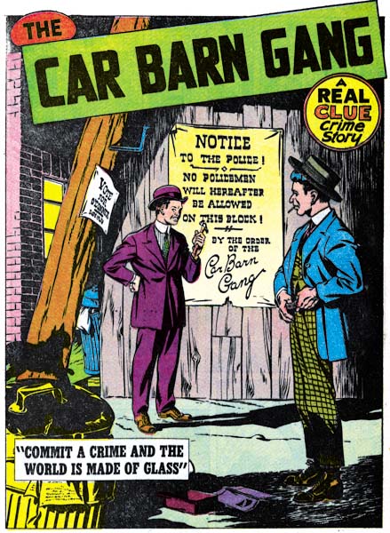
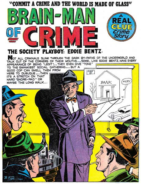
Bob Powell was said to have done some work for Fox Comics. Perhaps Simon and Kirby first met Powell there. However I have not recognized Powell’s work in the Fox comics issued during the time Joe Simon was an editor. Most likely Bob came to Joe and Jack’s notice during the time that Simon and Kirby were first producing Stuntman and Boy Explorers for Harvey Comics. After the war Bob Powell had his own studio and Harvey was one of his important customers. Considering Powell’s obvious talent, his presence in this early Simon and Kirby production is perfectly understandable. What is surprising is that this would be the only work he did for the Simon and Kirby studio. I have no idea why that should be since Powell did not work exclusively for Harvey. After the break up of the S&K studio, there would be a number of occasions where Bob would work for Joe Simon.


Headline #25 (July 1947) “Blind Man’s Death”, art by unidentified artist

There is one other artist in Headline #25 who I have not been able to identify. Interestingly he provided two stories. This is particularly regrettable in this case because he really is an excellent artist. What a great splash page. The exaggerated perspective is not at all the way Jack Kirby would have handled it but it is very effective nonetheless. You can really feel the blind man’s predicament as he stumbles while knowing he is in danger. The murderer’s pose is very effective as well.


Headline #25 (July 1947) “Murder’s Reward” page 6, art by unidentified artist

Frankly I am not as impressed with the splash page this artist did for “Murder’s Reward”. But his talents were not limited to splash art but extended to graphic story telling as well. Again the artist presents action in a way different from Jack Kirby but he it still is very effective.

When doing these examinations I am always on the lookout for indications of whether Kirby provided layouts for the artists (a claim some have made). Often the layout of just the panels is enough to decide the issue. Both Kirby and this unidentified artist use semi-circular panels but the manner of their use differs. Kirby’s semi-circular panels are generally as large the standard panels. This artist uses circular panels that largely are about 3/4 the height of the standard panels and he then uses area above, or less commonly below, the round panel for a speech balloon or caption. (While the round panel in the page above has some of these characteristics, it is not typical of the artist’s method).

Like the promotional pieces I discussed in my last chapter, none of the Simon and Kirby pieces for Headline #23 to #25 were signed. With 3 covers and 16 stories (19 if you include the promotional stories) this is highly uncharacteristic for Joe and Jack. Why were the normally self-promoting Simon and Kirby circumspect about their contributions to Feature Publications? The answer is not hard to find because in the same month that Headline #23 was released by Prize Comics, Simon and Kirby’s work would also appear in Clue Comics, a crime genre comic by another publisher, Hillman. Simon and Kirby had no problems with working for different publishers at the same time but knew that it was best not to be too obvious about it. The Simon and Kirby work for Clue will be the subject of my next chapter.

Chapter 1, Promoting Crime

Chapter 3, Competing Against Themselves
Chapter 4, Crime Gets Real
Chapter 5, Making a Commitment
Chapter 6, Forgotten Artists
Chapter 7, A Studio With Many Artists
Chapter 8, The Chinese Detective
Chapter 9, Not The Same
Chapter 10, The Master and His Protege
Chapter 11, The New Team