(Real Clue Crime Comics vol. 2 num. 4 – 7, vol. 4 num. 4)
With Hillman’s June 1947 issue, Clue Comics became Real Clue Crime Stories. It was not just a cosmetic name change, the contents changed as well. Real Clue became a true crime comic. No longer would costume heroes Nightmare or Micro Face make any appearances. The feature Iron Lady, which was not a pure crime genre, would not appear again until three issues later (September). Most importantly the star feature, Gun Master, would no longer be the first story and would only appear once in each issue. In my opinion Simon and Kirby had little influence on Clue Comics; Hillman was already moving the title to give it a more crime genre feel. In essence though, Clue remained a hero genre book. I cannot help conclude Simon and Kirby had much to do with the change to Real Clue. Joe and Jack stories for Clue had showed how effective a purer version of the crime genre could be. Simon and Kirby would dominate the newly titled comic and for the first time provide all the covers.
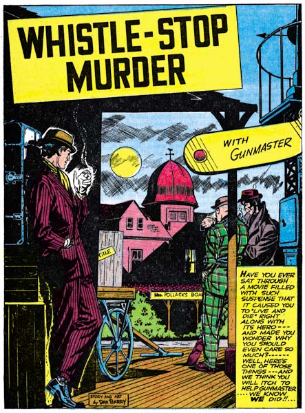
Real Clue Crime Stories vol. 2, num. 4 (June 1947) “Whistle-Stop Murder”, story and art by Dan Barry
Gun Master may have been pushed out of the leading feature spot but it was not completely abandoned as an important part of the new Real Clue. For the first three issues of Real Clue, Gun Master would place as the last story in the comic. Even more significant the stories would be, at 15 pages, the longest story in the comic. In an uncommon move the first Gun Master story, “Whistle-Stop Murder”, credits both the story and art to Dan Barry. In the early days of the history of comic books it was not at all unusual for the artist to do all aspects of the story. But that soon gave way to an industrial like division of labor with the penciler working from a script written by someone else. Examples like Dan Barry’s “Whistle-Stop Murder” became rather rare. Barry is an excellent artist but this shows he was a talented writer as well. I do not know if it was his idea or he was working from some directive, but Barry made an important change to Gun Master. No longer would the mysterious Councils of Elders appear and now Gun Master would get involved in a case through the simple expediency of a call for help from the authorities. Gun Master had now pretty much dropped all the trappings of the hero genre. This change may explain why although Simon and Kirby did further Gun Master stories (I was in error when I said in the last chapter that they would not) they never returned to the Packy Smith story arc. Mastermind criminals and explosive element X while fine in the hero genre, just had no place in the more typical crime stories that Gun Master would now appear in.
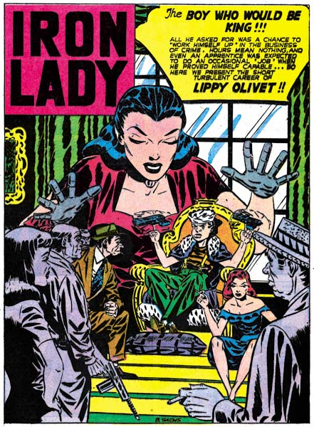
Real Clue Crime Stories vol. 2, num. 7 (September 1947) “The Boy Who Would Be King”, art by Bernard Sachs
For whatever reason, in the fourth issue of Real Clue the Gun Master ending feature was replaced by an Iron Lady story. No changes were made to Iron Lady so her feature seems a little out of place in Real Clue’s emphasis on a purer variety of crime stories. The artist was Bernard Sachs who we saw in the last chapter as an inker for a Carmine Infantino story. Sachs would ink a number of different artists for Hillman Publications but here he is acting as penciler.
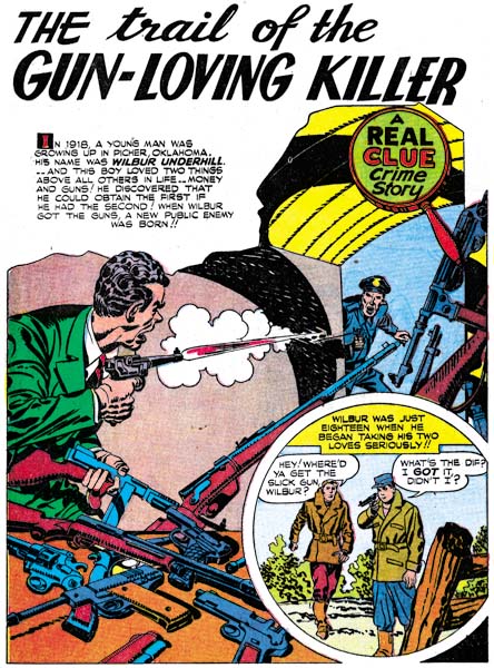
Real Clue Crime Stories vol. 2, num. 4 (June 1947) “The Trail Of The Gun-Loving Killer”, art by Jack Kirby
The splash for “The Trail Of The Gun-Loving Killer” has a multitude of guns. Those on the table are particularly well handled even though some of the guns are laying on top one another. There is only one gun on the table that does not seem quite correct. On the other hand I have no idea how the rifles and other weaponry on the right are being held up. There is one rifle that seems leaning on something, but it is a story panel that visually holds it up. Simon and Kirby continued in Real Clue to exclude rounded panels from their story art and the above splash page is the only one from that title to have a semicircular panel. The drawing style adopted for Simon and Kirby crime stories remains in use. In reality the style is not so much adapted for crime as it also appears in The Flying Fool feature for Airboy. The inking style remains the same as seen previously in Clue Comics. Some of the traits for the Studio style are found such as drop strings and, as seen in the splash above, abstract arch shadows (see my Inking Glossary for explanation of the inking terms I use). The criminal has something akin to a shoulder blot but note how it seems made from overlapping form lines. This is an approach seen much earlier in work done for DC such as the Newsboy Legion.
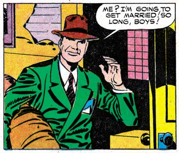
Real Clue Crime Stories vol. 2, num. 4 (June 1947) “The Trail Of The Gun-Loving Killer” page 7 panel 4, art by Jack Kirby
Shoulder blots typical of the Studio style appear in the same story. This one panel has shoulder blots, drop strings and an abstract arch shadow; the only key Studio style technique missing is picket fence crosshatching.

Real Clue Crime Stories vol. 2, num. 5 (July 1947) “Wyatt Earp’s Bluff”, art by Jack Kirby
The shadow on the figures whose back is turned to us is not a typical Studio style shoulder blot, but those of his two opponents certainly are. At this time shoulder blots seemed to be used either to depict a shadow (as in the splash above) or to provide some form to the shoulder (in which case the blot would be narrower). Later Simon and Kirby would use of shoulder blots more abstractly; shoulder blots would appear without a hat to suggest a shadow or without providing a real sense of form. Again we find drop strings and abstract shadow arches in this splash. But no picket fence crosshatching. Simon and Kirby did make more frequent use of simple hatching as here in the center man’s hat and waist. At times the parallel lines would butt up against a line or row of drop strings so as to begin to resemble typical picket fence brushwork.
Simon and Kirby never produced a pure western genre comic. Boys’ Ranch was a combination of western and boy gang genre while Bullseye brought together the western and hero categories. The western romance comics were more romances then western. It is stories like “Wyatt Earp’s Bluff” in the crime comics that provides an idea of how Simon and Kirby would have handled a western comic. Too bad they never did, it would have been great. But then again S&K were great at just about every genre they tried their hand in.
The splash page has a compositional device that Simon and Kirby had made use of before; a low view point combined with a symmetrical placement of figures. The low viewing angle allows the central figure to tower above the others without seeming to look unnatural. The whole arrangement results in a triangular formation, a classic compositional device in the fine arts. For other examples of this type of layout see the covers for Daring Mystery #8 and Boy Commandos #1. In this splash however the central figure has his back turned to the reader thereby adding an element of mystery to the image’s tension.
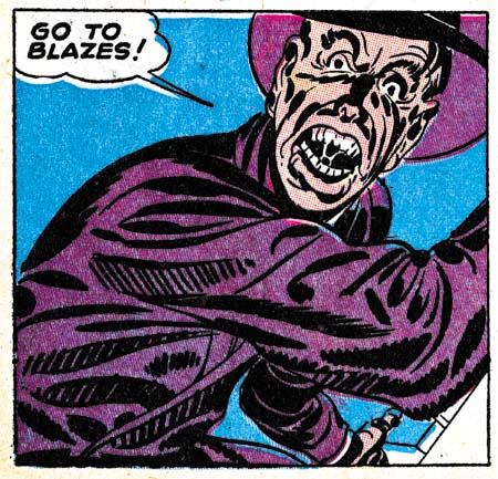
Real Clue Crime Stories vol. 2, num. 6 (August 1947) “Get Me The Golden Gun” page 12 panel 4, art by Jack Kirby
“Get Me the Golden Gun” from the August issue provides the earliest example of true picket fence crosshatching in the Hillman comics. When it does show up the picket fence brushwork is completely typical of the Studio style. The pickets are thick bold brushstrokes and they are associated with well defined rails. It would seem that the typical picket fence crosshatch did not evolve from the simple crosshatching but was just suddenly picked up. Perhaps when we return to Headline we may learn something more. The picket fence technique would be used in other panels in this story but not many of them. Further other stories from the same issue and the next one would not use this type of brushwork. After trying the new technique, it seemed that Simon and Kirby were not yet committed to it.
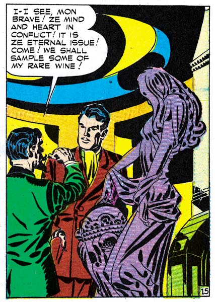
Real Clue Crime Stories vol. 2, num. 6 (August 1947) “Get Me The Golden Gun” page 12 panel 4, art by Jack Kirby
Jack Kirby considered himself primarily a story artist. Yes he did great covers and splashes but they were not as important to him as the story. I am sure at least some of the credit for the great splashes and covers goes to Joe Simon who Jack would later describe as a master at cover layouts. By this point in Jack’s career I seriously doubt that Joe did any story layouts for him. So when I see a panel like the one shown above I have to believe the credit goes to Jack. It is the final panel of the Gun Master story. The page uses a 4 panel layout and so the panel is larger then Kirby generally used. Even so it only covers a quarter of the page but the design gives it as much an impact of any splash or cover.
I simply cannot be sure what the pattern on the ceiling is meant to be. I presume is some sort of dome but it seems so oddly done. But that is my rational mind talking, as a design element is makes complete sense; in fact is crucial. The swirl it provides a bridge between the word balloon and the figures. Echoes of this swirl are found throughout the room; which if anything seems even more irrational then ceiling. Are those recesses in the background? How would that cornice on our right edge have connected to the ceiling? How could the round shape of the room in the background meet the rectangular shape of the cornice? What is that thing in our lower right corner? I do not know the answers to any of those questions but the bold curvilinear patterns visually connect all of these elements of the room and keep the eye constantly moving.
The foreground sculpture does not truly share the room’s pattern but has its own instead. The spotting on the figurine is bold but not when compared to the background. Still the spotting of the sculpture provides a life of its own giving the eye much to explore. I am a great admirer of how well Kirby handled the figure under the clothing. There is no doubt that the figurine’s leg nearest the view is flexed while the other leg is represented as holding the weight yet both legs are hidden by the flowing dress. The classical Greek sculptors figured out how to do this but while many fine artists have studied classical art there were few that could do it well. Kirby consistently makes it look easy even though as far as I can tell he never studies classical Greek sculpture.
The background room and the foreground statue provide busy surfaces to look at and therefore normally would be expected to dominate the image. However the simpler and more stable spotting provided to the two men actually attracts the eye and gives them an importance that overcomes their diminished size. The whole panel is a tour de force.

Real Clue Crime Stories vol. 2, num. 4 (June 1947) “Dandy John Dolan”, art by unidentified artist
Simon and Kirby provided a lot of the art for the early issues of Real Clue. Besides the cover the duo would contribute 3 to 4 stories. But other artists make their appearances as well. Unfortunately I have no idea who drew “Dandy John Dolan”. He did other work for Real Clue and really is an excellent artist. Compositionally the splash for “Dandy John Dolan” is a good job but I have to admit what the seated figure is supposed to represent. He obviously is meant to be the same person ascending the gallows, but as he does not seem to be telling the story, what other function was he meant for?
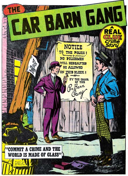
Real Clue Crime Stories vol. 2, num. 5 (July 1947) “The Car Barn Gang”, art by unidentified artist
“The Car Barn Gang” is another work by an obviously talented individual that I am unable to identify. Another of those splashes that action is not always required for a good piece of comic art. In this case much of the interest comes from careful depiction of a dilapidated neighborhood. But another reason I like this splash had nothing to with the artist’s original intention. The dapper gang members that have taken over the neighborhood are an amusing comparison to the clothing that a modern day gang-banger would wear while in the hood.
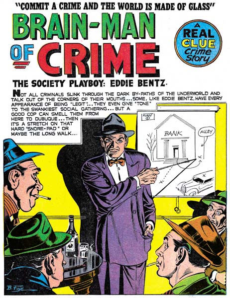
Real Clue Crime Stories vol. 2, num. 6 (August 1947) “Brain-Man of Crime”, art by Robert Fujitani
One artist who makes his appearance in Real Clue is Robert Fujitani (who sometimes signed his work as B. Fuje). My primary interest is the Simon and Kirby studio but by no means does that mean that I do not admire artists who did not work for Joe and Jack. Certainly what little I have seen of Fujitani’s work impresses me a good deal. Overall what strikes me about the artists appearing in Clue and Real Clue, and that includes those I have not identified, is that they do not appear to have worked elsewhere for Simon and Kirby (except perhaps much later Dan Barry would). Keep in mind that S&K were producing Headline at the same time and would also create Young Romance in September. This suggests that despite the large influence that Simon and Kirby may have exerted on Real Clue Crime Stories, they really were not actually producing it.
Simon and Kirby would only work on four issues of Real Clue with the last cover dated September 1947. Other work for Hillman would end as well in the next few months. This suggests that although Hillman represented a good opportunity for well needed income to keep the Simon and Kirby collaboration going, it was not all that rewarding in the long run. The agreements Joe and Jack struck with Prize Comics were clearly much better financially and provided plenty of work. Having finally escaped the difficulties caused by the collapse of the Stuntman and Boy Explorer titles, Simon and Kirby would now build up their comic production studio.
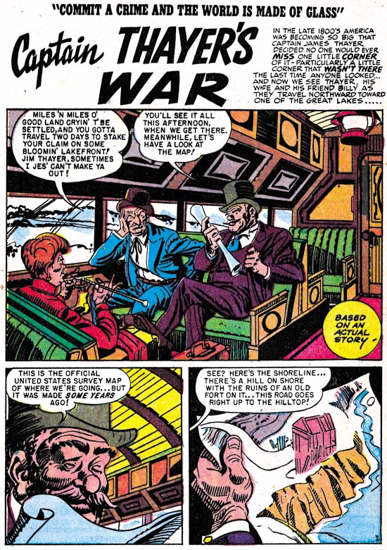
Real Clue Crime Stories vol. 4, num. 4 (June 1949) “Captain Thayer’s War”, by an unidentified artist.
Normally with Simon and Kirby’s exit my discussion of Real Clue Crime Comics would end. Frankly with a single exception I have no access to any further issues. The Hillman titles deserve a good examination, but unfortunately I am not the one able to do it. However The Jack Kirby Checklist includes “Captain Thayer’s War” from the June 1949 issue as being inked, but not penciled, by Jack Kirby. As I have said before I would love to see how Jack would ink another artist’s work. However on close examination I do not find any of these inking attributions convincing and “Captain Thayer’s War” is no exception. I certainly understand how this mistake was made as the story is inked in the Studio style. Picket fence crosshatching and drop strings, hallmarks of the Studio style, are found in abundance. There are no true abstract arch shadows, but there are some rounded shadows of the type that S&K often used such as the one on the seat in the back. The only common feature of the Studio style that is missing is shoulder blots. However there are other inking manners that do not match those used by Jack Kirby. It is a little hard to make out in the image I have provided, but the shadow on the hat of the man on our right is made from five broad lines with rounded ends. I have never seen Jack use that inking technique. Nor have I ever seen an example by Kirby like the shadow of the hat in the second panel. Similar disparities occur throughout the story. I am convinced that this was not inked by Kirby, or Simon either for that matter. Do not let the cartoony style of the drawing mislead, the penciling of this story mimics Kirby’s style as well. The artist obviously has made a careful study of Simon and Kirby’s work. In cases like this one must not just look at the similarities between inking styles but also study the differences.
Chapter 1, Promoting Crime
Chapter 2, A Revitalized Title
Chapter 3, Competing Against Themselves
Chapter 5, Making a Commitment
Chapter 6, Forgotten Artists
Chapter 7, A Studio With Many Artists
Chapter 8, The Chinese Detective
Chapter 9, Not The Same
Chapter 10, The Master and His Protege
Chapter 11, The New Team

