Tag Archives: Hollingsworth

The Captain Aero Connections

There was no true connection between the team of Simon and Kirby and Captain Aero Comics. Captain Aero was just one of a number of wartime publications (lasting from December 1941 until August 1946). Holyoke is usually said to be the publisher for this comic but the indicia from later issues list Continental Magazines. This may be nothing more then the use of an alternative name, a common practice at the time, but irregularities in the issue numbering (there are no issues #18, 19 or 20) suggests that the title may have truly had a change in publishers. The connection referred to in the title concerns some of the artists whose work appeared both in Captain Aero as well as in various Simon and Kirby productions. There is nothing particularly surprising about this as both were small outfits getting work from an assortment of comic book artists. I am sure that careful examinations of other smaller publications would reveal artists that had also worked for Simon and Kirby. Because Captain Aero comes from an earlier period it nicely shows how extensive these artists’ style had evolved. Had these works been unsigned, I doubt that I would have identified any of the artists.
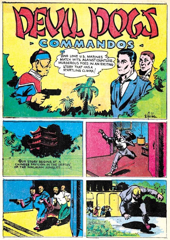

Captain Aero #7 (July 1942) “Devil Dogs Commandos”, art by Louis Golden?

The first artist from Captain Aero with a Simon and Kirby connection has been somewhat of an enigma. His two known S&K works were signed on the last page but the signature has been difficult to decipher. The handwriting of the signature found on the splash panel of “Devil Dogs Commandos” is the same but a little clearer. The initial is either an ‘L’ or a ‘T’ or an amalgamation of both. The first letter of the last name looks like a ‘G’ so my current reading of the name is L. or T. Golden. There is an artist named Louis Golden listed at Atlas Tales as having contributed to Mystic #10. The Who’s Who of American Comics cites Golden as having worked for Holyoke in 1942-43 on Blue Beetle, Enchanted Woods and Monkey Fencer. Captain Aero #7 has not been indexed yet in the GCD but one of the few works that the CGD lists for Louis Golden is from Veri Best Sure Fire Comics #1 listed as a reprint form an unspecified Captain Aero issue. The title in Sure Fire #1 (“Commandos of the Devil Dogs”) is just a slight rewording from the title found in Captain Aero #7 as to leave little doubt that they are the same story. While I have not seen any of the work these various Internet sites attribute to Louis Golden this information is favorable enough that I am now tentatively identifying him as the artist in question. Golden did not do much work for Simon and Kirby but it is still nice to be able to provide a name for that work.

Fortunately the signature is very distinctive because the artist’s style here is so different from his work for Simon and Kirby (Justice Traps the Guilty #7 and Charlie Chan #1). There is no sign of the massive, square faces that is such a distinctive feature in his later work. While I admire the art he did for S&K, I find this Captain Aero piece to be rather crude.
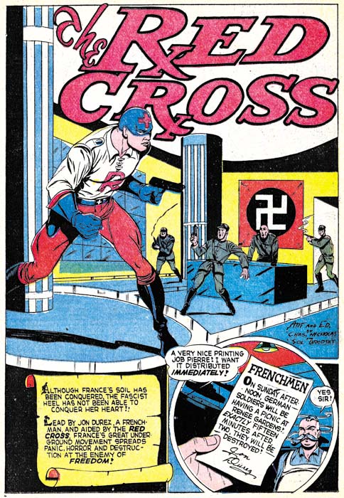

Captain Aero #9 (November 1942) “The Red Cross”, art by Charles Nicholas & Sol Brodsky

Charles Nicholas has been credited with being the creator of the Blue Beetle, but which Charles Nicholas is this one found in Captain Aero? Is this the artist otherwise known as Charles Wotjkowski who worked for Simon and Kirby after the war? I am not positive but the style suggests it is. Actually the work for Captain Aero (two stories and one cover all of the Red Cross feature) seems more professional then his S&K crime story (Headline #31). Perhaps that is due to the inking by Sol Brodsky, a talented artist in his own right who did the pencils for another piece in Captain Aero.
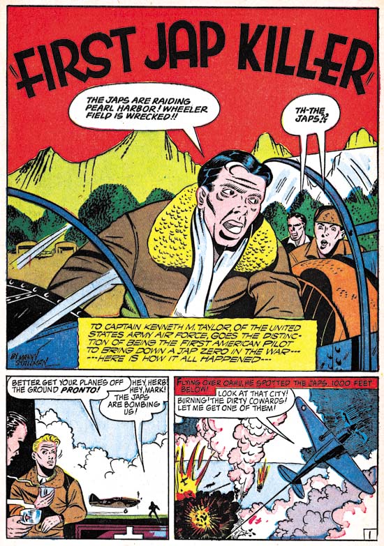

Captain Aero v. 4 n. 3 (#17) (October 1944) “First Jap Killer”, art by Manny Stallman

Will the real Manny Stallman please stand up? Well that was how I felt after examining three distinct styles from stories of the late ’40s and ’50s all of which were signed as Manny Stallman (Chapter 7 and Chapter 8 of It’s A Crime, and Atlas Tales). The Captain Aero pieces signed by Stallman could be considered a fourth style. However, in this case that is not particularly surprising because a common theme of this post is how much the work of these artists changed over the years.
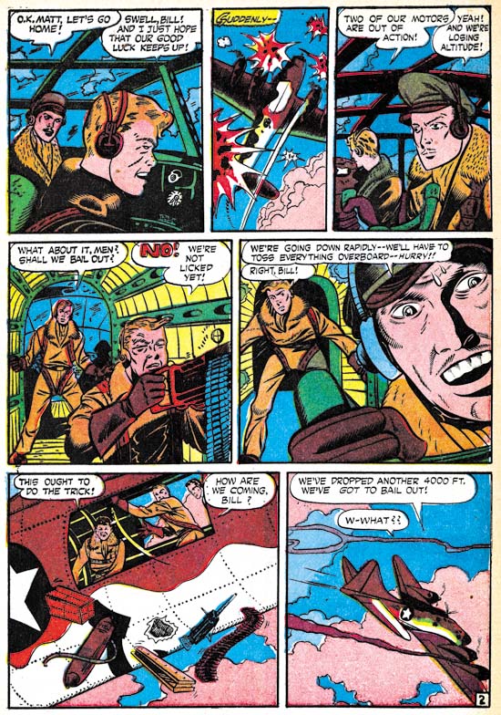

Captain Aero #21 (December 1944) “Next Door to Death” page 2, art by Manny Stallman

In his art for Captain Aero, Manny drew eyes with an almond shape; little indication of the tear ducts and the upper and lower eyelids having curves that are almost mirror images. Despite a separation of over 10 years, similar eyes are found in the work that Stallman did for Atlas in the ’50s. In contrast, Almond shaped eyes are not found in any of the work done for Simon and Kirby. Further investigations will need to be made, but I am beginning to suspect that ghost artists were used for all the work that Stallman submitted to Simon and Kirby.
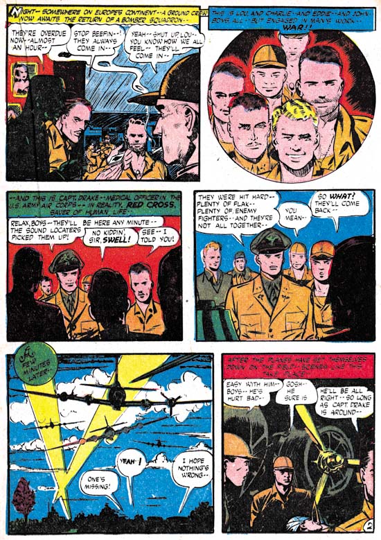

Captain Aero #21 (December 1944) “Red Cross” page 2, art by John Giunta

John Giunta appears in the same issues of Captain Aero as Manny Stallman. The team of Giunta and Stallman signed also two works for Simon and Kirby (Chapter 9 of The Art of Romance, and Chapter 7 of It’s A Crime). Mark Evanier’s in his obituary for Manny Stallman states that Stallman and Giunta teamed up on a number of occasions. Even though there are no jointly signed works in Captain Aero, their mutual presence does suggest the connection between the two artists extended at least back into 1944. John did a couple of Mighty Mite stories for Captain Aero but that feature called for a cartoon style that makes it difficult to compare with his Simon and Kirby art. Such comparisons are not easy even with his “Red Cross” story, however the eyebrows are rendered in a rather distinctive manner that has some correspondence to those drawn in Giunta’s S&K work.
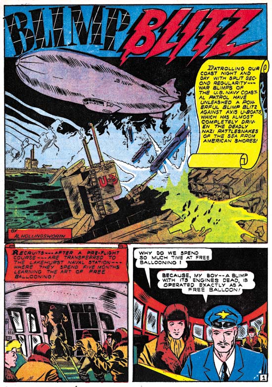

Captain Aero #23 (August 1945) “Blimp Blitz”, art by Al Hollingsworth

The African American comic artist, Alvin C. Hollingsworth, only worked for Simon and Kirby for a short time (It’s A Crime Chapter 6 and Chapter 7) but left a lasting impression on Joe Simon who remembers him to this day. It is not the talented Hollingsworth that we saw in the art produced for Joe and Jack, but a much more primitive, earlier version. Still, it is nice work.
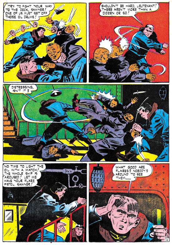

Captain Aero #25 (February 1946) “The Wail of the Whaler” page 4, art by George Gregg

George Gregg’s Captain Aero work is cruder then what he did for Simon and Kirby (Chapter 5, Chapter 7, and Chapter 9 of The Art of Romance) but, at least on this page, more fun. I just love the multiple images of the fist in the first panel, which certainly is not how Jack Kirby would portray a slug fest! The art on a whole is more unrefined then the admittedly still not very sophisticated form of his Simon and Kirby work. Frankly, I prefer this more primitive but energetic version of George Gregg.
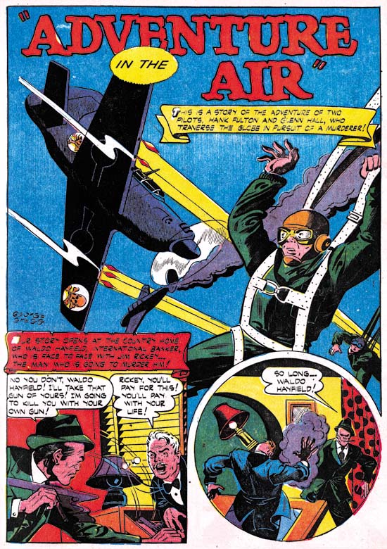

Captain Aero #26 (August 1946) “Adventure in the Air”, art by George Gregg

Did George Gregg undergo a prodigious advancement since the last issue? The Gregg’s art in Captain Aero #26 is much more realistic then issue #25. Actually the art may have been done months apart since about six months separate the two issues. Captain Aero #26, however, was the final issue so there is a good possibility that its publication was delayed and that the art was actually done much earlier. Whatever the reason, “Adventure in the Air” sports a more realistic style.
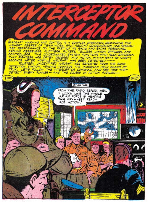

Captain Aero #23 (August 1945) “Interceptor Command”, art by Carmine Infantino

We have seen Carmine Infantino’s work not only for Simon and Kirby’s Charlie Chan (It’s A Crime, Chapter 8) but earlier for Hillman’s comics. Simon and Kirby were just freelance artists for Hillman and not producing the comics, so Carmine was not working for Joe and Jack at that time. Infantino was about 20 years old when he did “Interceptor Command”. That may seem young but Carmine first published work was done when he was about 16 years old and still in high school. The splash shown above looks like the work of a mature artist; nicely composed with solid inking. I like it better then what Carmine did for Hillman a couple of years later and inked by Bernard Sachs. However the splash is misleading as the story art is much sketchier.
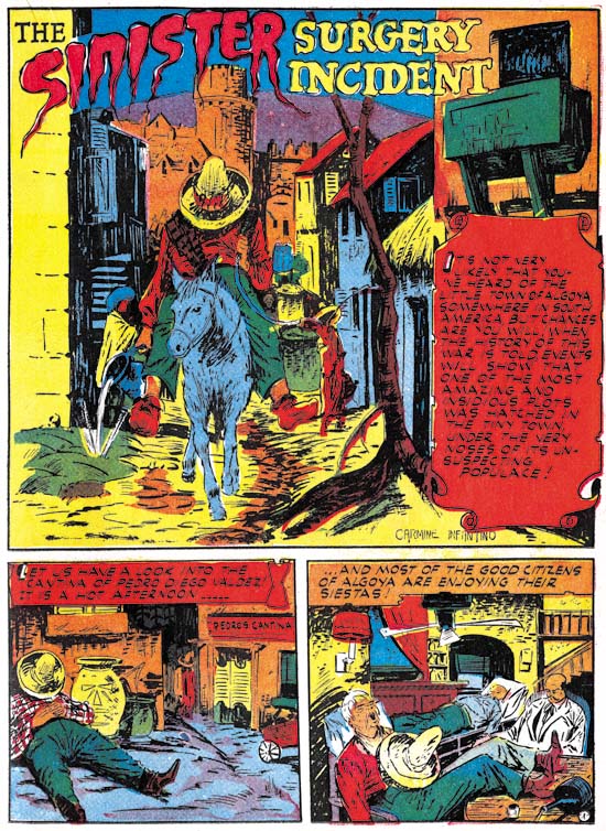

Captain Aero #26 (August 1946) “The Sinister Surgery Incident”, art by Carmine Infantino

A better idea of Infantino’s story art can be seen in the bottom panels of the splash for “The Sinister Surgery Incident”. While it has its interesting points, the art is somewhat sketchy. More then the art itself, I am impressed with the amount of progress that it indicates Infantino made over the years. Once again I suspect that a good study of the evolution of Carmine Infantino’s art over his life would be highly rewarding. Unfortunately it is a study that requires much more then my current resources and so it is a study I do not think I could ever attempt.

I plan to return to my ongoing serial posts, The Art of Romance and It’s A Crime, in a few weeks. But it was never my intention for those serial posts to monopolize the Simon and Kirby blog. Still it has been rewarding, at least for me, to concentrate on them (I only wish I had started It’s A Crime earlier and kept the two serials synchronized). In the mean time I want to explore a little of the earlier work by Simon and Kirby studio artists. Having here touched on examples of various studio artists found in Captain Aero, next week I plan to have a short post on a few earlier works by Leonard Starr and the week after that a longer one on early Mort Meskin with a little Jerry Robinson thrown in.

It’s A Crime, Chapter 6, Forgotten Artists

(Justice Traps the Guilty #3 – #5, Headline #29 – #31)

Jack Kirby remains the principal artist for the six crime issues discussed in this chapter. All 6 covers were drawn by Jack as well all the lead stories. Kirby’s did 10 stories with a total of 117 pages (including the covers). However Bill Draut now assumes a more important roll becoming the second principal artist. Bill supplied 11 stories, one more then Jack, but fewer pages (81 pages). The other three artists contributed much less then either Jack or Bill. The next most prolific (A. C. Hollingsworth) drew just 3 stories with 25 total pages.


Justice Traps the Guilty #4 (May 1948) “Queen of the Speed-Ball Mob”, art by Jack Kirby

The first story consistently uses the motif of a character introducing the story with the word balloon forming the title caption. I have noticed that when a story is being narrated, it is often by a woman. Almost certainly this was because male criminals generally have fatal endings (and therefore would not be able to tell their story) while females normally survive.


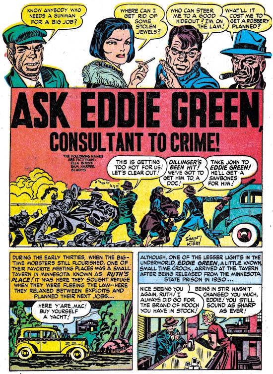
Justice Traps the Guilty #3 (March 1948) “Ask Eddie Green, Consultant to Crime”, art by Jack Kirby

A motif that would occur often in Kirby’s splashes at this time was having a cast of characters make a series of statements to introduce the story. Actually it was a return to an old technique as we have seen it as far back as in Captain America. When used in a splash covering two thirds of the page, this type of design did not leave much room but in “Ask Eddie Green” Jack makes effective use of what is available by supplying a small shoot out scene. The depth of field is so narrow that the results look like a frieze. Despite the small size everything is clear and the scene is filled with interest.


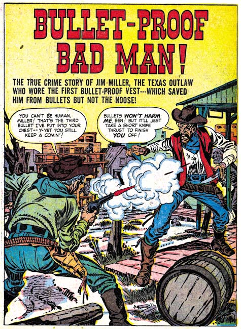
Headline #30 (June 1948) “Bullet-Proof Bad Man”, art by Jack Kirby

Perhaps it is just my tastes, but I feel that Kirby’s splashes are not as exciting as before. This may have been a result of Kirby’s declining use of full page splashes. Only 3 splashes out of his 10 stories received the full page treatment. “Bullet-Proof Bad Man” provides a typical Kirby dramatic shoot out. Well not so much as gun fight as one man has only drawn his knife although it turns out this is not as unwise as it seems. It is clear that the bullet has found its mark but note how Jack seems to downplay the actual hit. The story is about a gunfighter that uses a special vest to protect himself from bullets. However I have notice that Jack seems averse to showing the actually striking of a bullet even though that is a moment he often depicts. Generally Kirby hides the action in a cloud of gun smoke. When, because of layout, that is not possible, such as above, Kirby will simply not include any impact lines.


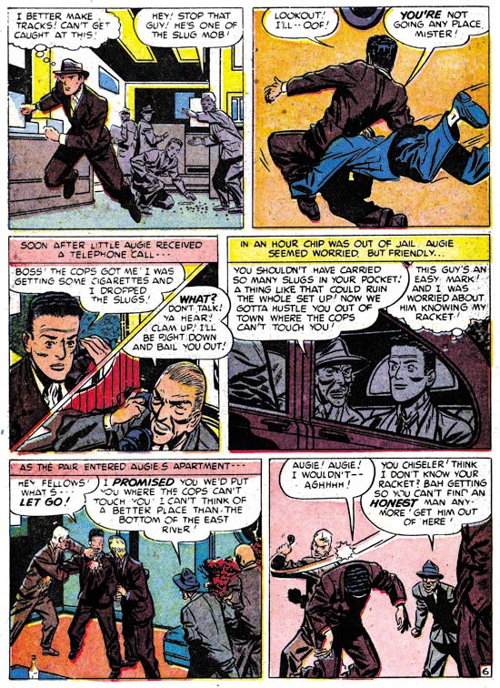
Justice Traps the Guilty #5 (July 1948) “A Fortune in Slugs” page 6, art by Bill Draut

Bill Draut did so much romance work for Simon and Kirby that it is nice to see his efforts for the crime genre. These comics gave Bill a chance to provide more action then he would normally use in romance comics. Draut was better at adding excitement then would be expected based on his work towards the end of his career. Here on one page we find a man running, being tackled and in the final panel bludgeoned with a blackjack. All of which Bill handled quite nicely. I particularly like his use of perspective in the second panel. Draut shows the tackler flying into the page whereas Kirby would have had the action coming out toward the reader, but otherwise it was well handled.


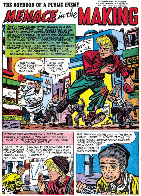
Headline #30 (June 1948) “Menace in the Making”, art by Bill Draut

Draut’s effective use of perspective is seen again in the splash for “Menace in the Making”. The low viewing angle allows the running figure to tower over all others without seeming to be unnatural. Action was not, however, the only outlet that Bill found in the crime genre. Crime stories allowed Draut to work, to extent that romance did not, in a more cartoony style. Note the caricature that Bill has provided the irate grocery man. Such interesting but fundamentally unrealistic depictions are found often in Bill Draut’s work in Headline and Justice Traps the Guilty but rarely in Young Romance or Young Love.


Justice Traps the Guilty #3 (March 1948) “My Strangest Crime Case”, art by Bill Draut

One story drawn by Bill Draut may not be exception as far as the art is concerned, but it is unusual in that the protagonist was a female private investigator. The story reads more like something from the hero genre then a true crime story. This is not the first time that Draut drew a story about a lady detective. In 1946 Draut worked on a feature called Calamity Jane originally for Boy Explorers Comics but when that title quickly failed (due to the comic glut after the war) subsequently published in Green Hornet Comics. It is likely that “My Strangest Crime Case” was left over material from that earlier effort that, with minor revisions such as to the detective’s name, was now put to use. The art style does seem to be a better match to Draut’s earlier work then to what he was doing at this time.


Headline #29 (April 1948) “The Night of the Freak Murder”, art by Jerry Robinson and Mort Meskin

The team of Jerry Robinson and Mort Meskin continue to appear in the crime issues covered by this chapter. The work is unsigned but the similarities to the signed works by Robinson and Meskin are numerous. “The Night of the Freak Murder” is unusual for Jerry and Mort in that it has a full page splash. Generally R&M’s splashes for Simon and Kirby productions are vertical with two story panels also arranged vertically. The composition is interesting in the way it plays off the grieving women with an almost mirror image of two detectives discussing the crime. The staircase might seem odd but it was introduced as part of a pattern that confines the eye in a circular composition. None of the other splashes that Robinson and Meskin supplied to Simon and Kirby were so well composed but as I said they did not normally use a full page splash.


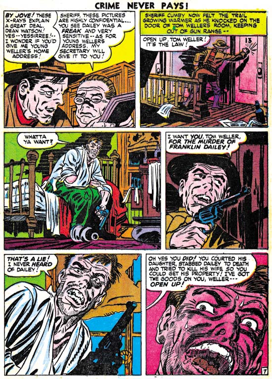
Headline #29 (April 1948) “The Night of the Freak Murder” page 7, art by Jerry Robinson and Mort Meskin

As I mentioned in the previous chapter, I am not sure what Jerry Robinson’s contribution was because both the pencils and the art look very much like Meskin’s work. Mort was one of the best graphic story tellers and pages like the one above suggest why he had such an impact on artists like Steve Ditko. Here on this page the same diagonal is present in every panel. The page starts with close-up then switches to a distant show and then progressively comes closer. An increasing tension is formed by the combination of increased nearness, the diagonal design and off course the fear Meskin imparts to the criminal. Nothing really happens but the page is explosive nonetheless.


Justice Traps the Guilty #4 (May 1948) “Guilty Boys”, art by Jerry Robinson and Mort Meskin

Not all of Robinson and Meskin’s splashes were vertically oriented; here is another case where they deviated from that pattern. This is a standard two thirds splash page with two story panels arrayed on the bottom. Nothing unusual in the design itself but it does allow Jerry and Mort to provide a memorable splash. Although the image seems cluttered, everything serves a purpose. Debris and damaged items abound and a row of buildings in the background all combine to show that this is a location in some slum. But the shabbily dressed musical boys are not the Newsboy Legion and this is not Suicide Slums. Here Robinson and Meskin convert the boy gang genre into crime. They are not saints and in the end are more in need of rescue then providing it.


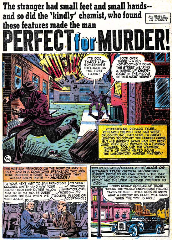
Headline #31 (August 1948) “Perfect for Murder”, art by Charles Nicholas

Only initials were used to sign “Perfect for Murder” (Headline #31, August 1948) but I am pretty certain it was Charles Nicholas. Originally Charles Nicholas was a house name used by Fox Comics for Blue Beetle stories. Over the years the work of many different artists appeared under that name, including Jack Kirby. However there were two individuals who continued to use the name outside of Fox and who claimed to be the creator of the Blue Beetle; Charles Wotjkowski and Chuck Cuidera. There is nothing I can add to that particular question here but it was the Wotjkowski version of Charles Nicholas who worked for Simon and Kirby at this time.


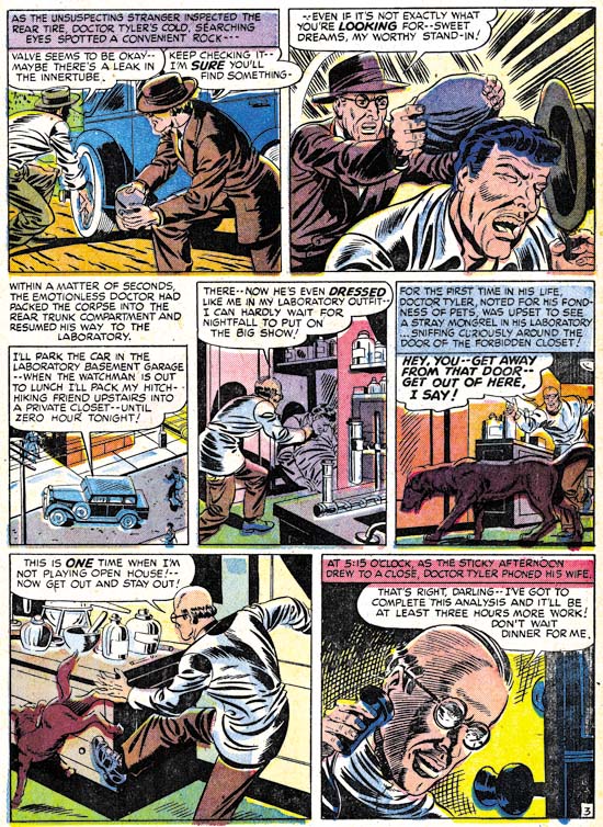
Headline #31 (August 1948) “Perfect for Murder” page 3, art by Charles Nicholas

While interesting, the splash page does not present a very good idea of Nicholas’ art so I have included an image of a story page as well. Nicholas does a good job drawing this story but he never achieved great success in his career as a comic book artist. Nicholas inked the art in a very individualistic style, as particularly seen in the form lines used in panels 6 and 7 and the swirling crosshatching in panel 7. (See my Inking Glossary for an explanation of my terms.) What is not found are any traits of the Studio style inking. While Nicholas is certainly a candidate for being one of Jack Kirby’s inkers, it is hard to understand how his name has become associated to the inking of particular pieces such as “Summer Song” (Young Romance #1, September 1947). “Perfect for Murder” was the only worked for Simon and Kirby signed or initialed by Charles Nicholas but other unsigned art by him surely remains to be identified.


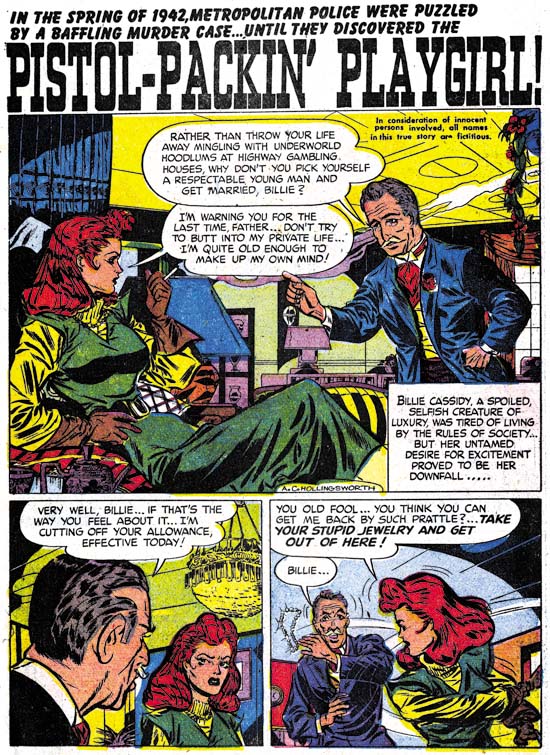
Headline #30 (June 1948) “Pistol-Packin’ Playgirl”, art by Alvin C. Hollingsworth

Another artist that shows up working for Simon and Kirby during this period is Alvin Carl Hollingsworth. A search of the Internet indicates that Hollingsworth was an African-American artist from New York who was born in 1928 and died in 2000. Previously he worked for Holyoke Publishing Company working on Catman. Hollingsworth was also a talented fine arts painter. Joe Simon remembers Alvin and has a high opinion of him. Joe remarked that he thought he was the only African-American working in comics at that time. This is not truly accurate since there was also Matt Baker who played an important part in the early history of comics. But Matt Baker never worked for Simon and Kirby and so Joe was not aware of him, or at least of his background.


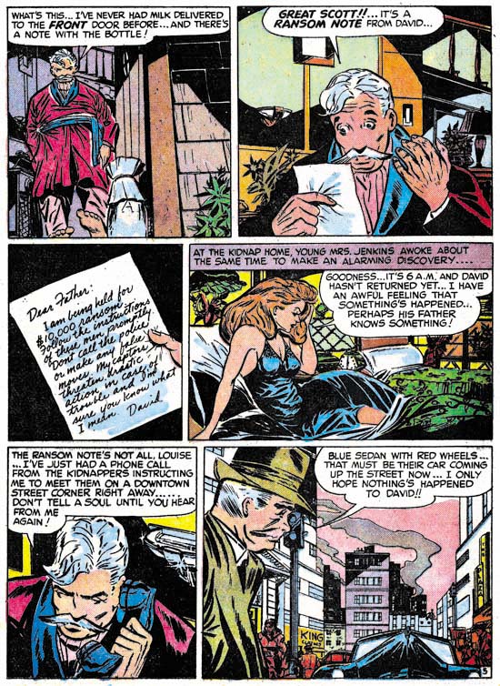
Justice Traps the Guilty #5 (July 1948) “Held For Ransom” page 5, art by Alvin C. Hollingsworth

Hollingsworth is another of those artists whose current reputation is much lower then warranted by his talent. This is largely because he left the comic book field in the late ’50s first for syndications strips and then the fine arts. It is a recurring pattern that I have noticed that comic book artists who did not take part in the superhero revival of the 60’s and later generally do not get much attention today. I have included a story page because it provides a better example of Alvin’s strengths. Note the use of varied and unusual viewing angles.


Headline #31 (August 1948) “A Gangster Dies”, art by Warren Broderick

The Jack Kirby Checklist includes “A Gangster Dies” among the art works by Kirby. This is a bit surprising because close to the center of the splash page is Warren Broderick’s signature. Before I sound too self righteous I should add that when working on this chapter I found I had listed this story in my database twice; once as done by Broderick and the second crediting it to Kirby. I have no idea how I made the mistake in my database, but it is easy to understand why anyone who failed to notice the signature might attribute this work to Jack. Warren has obviously made a careful study of Jack’s work and has adopted, at least for his work for the S&K studio, much of Kirby’s style. Warren was not, of course, as successfully as Jack himself and there are more then enough clues to properly attribute his work even without a signature. Note for instance how in the splash Broderick uses picket fence crosshatching where the rails are cloth folds. Besides simple lines, Kirby would use drop strings and wide lines for the rails but I do not recall him ever using cloth folds. Kirby would often make expressive eyebrows but Broderick’s versions were even more exaggerated.

This is the only signed work by Warren Broderick that I have found among Simon and Kirby productions. Frankly I have forgotten about it until I reviewed for this chapter. It turns out that we have seen some of Warren’s unsigned work previously. In just the last chapter I attributed “The Killer Thought He Was Satan” (Justice Traps the Guilty #2, January 1948) as Kirby layouts finished by an unidentified artist. A comparison between it and “A Gangster Dies” leaves little doubt that it also was by Broderick. In fact I no longer believe Kirby laid it out. Yes there are parts in both stories that look very much like Kirby but there are also parts that do not. Previously I failed to follow my own advice and only noted the similarities and neglected the differences. For instance there is a panel I provided from “The Killer Thought He Was Satan” that showed a boy being shot by the villain. While the scene and the boy in particular look very much like it was done by Jack, the artist shows the bullet actually striking the boy. That is something I have yet to find Kirby doing.

Another example of Broderick’s work was “Mother Said No” (Young Romance #7, September 1948) seen in Chapter 3 of the Art of Romance. There I attributed the pencils to Jack Kirby (correctly) and the inks questionably to Carmine Infantino. The primary reason for my earlier caution was that I was bothered by Carmine’s statement in an interview that he had never inked Kirby’s pencils. While in the work for Charlie Chan, Infantino was also providing expressive eyebrows some of the other brushwork found in “Mother Said No” is more like that in Broderick’s work. Although Broderick was very good at mimicking Kirby, I find the layouts in “Mother Said No” are much too consistently like Jack’s that I still believe that Kirby did the pencils.


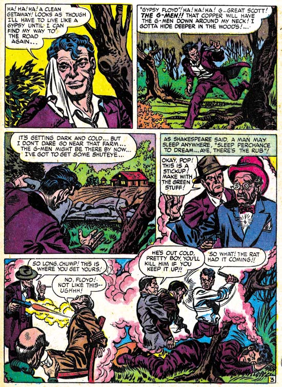
Headline #31 (August 1948) “A Gangster Dies” page 3, art by Warren Broderick

Broderick could mimic Kirby quite well but occasionally, such as in the first panel shown above, the similarity to Kirby’s style is very striking. This was either due to Kirby stepping in his roll as art editor and fixing up the finished art or it was the result of a careful swipe by Broderick from some Kirby art. Without the original art it is hard to be sure but I suspect the latter explanation to be the case. Once again Broderick has drawn a scene where a man is clearly hit by a bullet, something that Kirby would hide in a cloud of gun smoke.


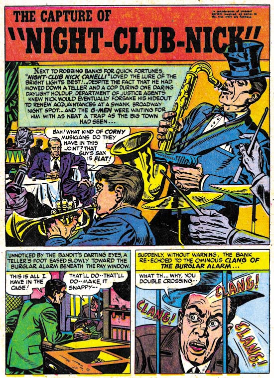
Justice Traps the Guilty #3 (March 1948) “The Capture of Night-Club Nick”, art by Warren Broderick

Broderick did not always so carefully mimic Jack Kirby’s style. In “The Capture of Night-Club Nick” Warren has abandoned the Studio style inking. Still the influence of Kirby is clearly discernable.

I have found little in my search for more information about Warren Broderick. I queried Joe Simon about him but he did not remember Warren at all. Joe does not remember all the artists who had worked for him over the many years, but in Broderick’s case this is surprising because the one thing I had found out was that he also was African-America. Joe was clear in his memory of A. C. Hollingsworth and that Hollingsworth was the only African-American to work for Simon and Kirby. How could Joe have failed to remember, even if not by name, one other African-American comic book artist? The answer maybe found in an interview given by comic artist, Harry Harrison:

After Wally and I broke up I was working mostly for Fawcett, and I had a friend by the name of Warren Broderick, who was also in school with me, doing my penciling. He was a black guy who didn’t want to get in there and push, didn’t want to face whitey in the office. We developed a nice clear style, no great shakes, but it worked.

This suggests that Broderick may have been reluctant to deal with Simon and Kirby directly and used someone, either an agent or another artist, as a go between. Joe may never have known about Warren’s ethnicity. The irony is that, considering their dealings with Hollingsworth, Joe and Jack probably would not have cared about Warren’s background, all that was important was that he could do the work.

The GCD only has three entries for pencils attributed to Broderick and three more for inking work. Atlas Tales has about a dozen works attributed to Warren. To that I can now add three further pencils and another inking job. Now that I have a small body of work to go by, I am sure I will find more work by Broderick as I continue to review Simon and Kirby productions. Warren Broderick is truly one of the forgotten comic book artists and it is rewarding to shed a little light on his career.

Chapter 1, Promoting Crime
Chapter 2, A Revitalized Title
Chapter 3, Competing Against Themselves
Chapter 4, Crime Gets Real
Chapter 5, Making a Commitment

Chapter 7, A Studio With Many Artists
Chapter 8, The Chinese Detective
Chapter 9, Not The Same
Chapter 10, The Master and His Protege
Chapter 11, The New Team